#also i challenged myself & didn't use pose reference
Text

EiMiko 🌸💜
#i started to play genshin 2 years ago bc i wanted to know the characters for fanart purposes#and then i didn't draw anything until now?? xD#anyway#have some EiMiko now uwu#also i challenged myself & didn't use pose reference#raiden shogun#yae miko#eimiko#genshin impact#genshin fanart#ei x miko#ei x yae#raiden#raiden ei#genshin#genshin raiden#genshin yae#shrine maiden#kitsune#archon#electro archon#game fanart#anime fanart#yuri ship#art commissions open#art commission#w/w
36 notes
·
View notes
Note
Hello! I was looking for some standing poses yesterday, using all three sites, and I ended up just having to kind of blindly scroll through the “General poses” DA folder and clicking on the “more like this!” deviations in the side bar. I ended up snagging a pose or two from you and a cluster from JoonPubStock, I think her name is.
I was specifically looking for poses I could use for costume design/ideation, where I could draw a fairly neutral front-ish pose that still had a little personality in like, how the hips were canted, arms folded, head tilt, etc, that I could draw and then come up with clothes ideas on like, layered tracing paper or something. Character design lineup/paper doll kinda thing. I think I ended up using one of your OG Sailor Moon poses as a jumping off point, since they are more static, though they had a little too much anime sass for me to use for my character. :(
Next time you’re doing file maintenance stuff, could I request adding “standing” to the list of pose types/subfolders/tags? And, if it’s not too much trouble for the next round of website iterations, being able to filter using multiple tags at once? Like, being able to specify that I want to look at single, female, slim, standing images instead of having to look through each category individually.
Thank you so much for all the work you and your team do, as well as the network of pose artists you collaborate with! And thank you for offering so much of it for free, and for the other tools you’ve developed and shared. As an unemployed, disabled, non-university-student artist, these resources are really, really valuable. I appreciate you!!
I hear you but there's a few challenges with this because *most* poses are standing. It's the same reason I don't tag myself as a model because it's mostly me.
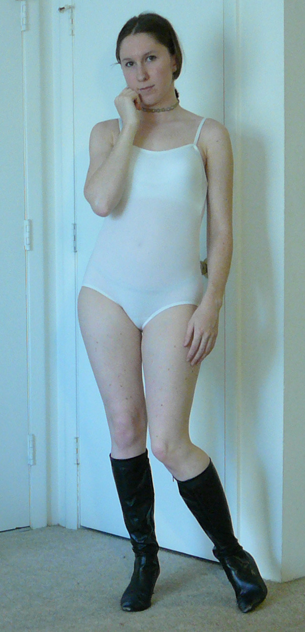
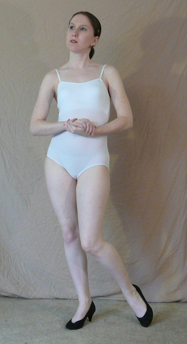
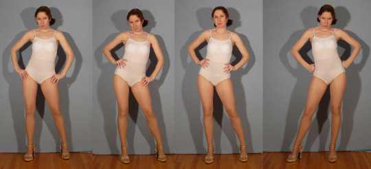
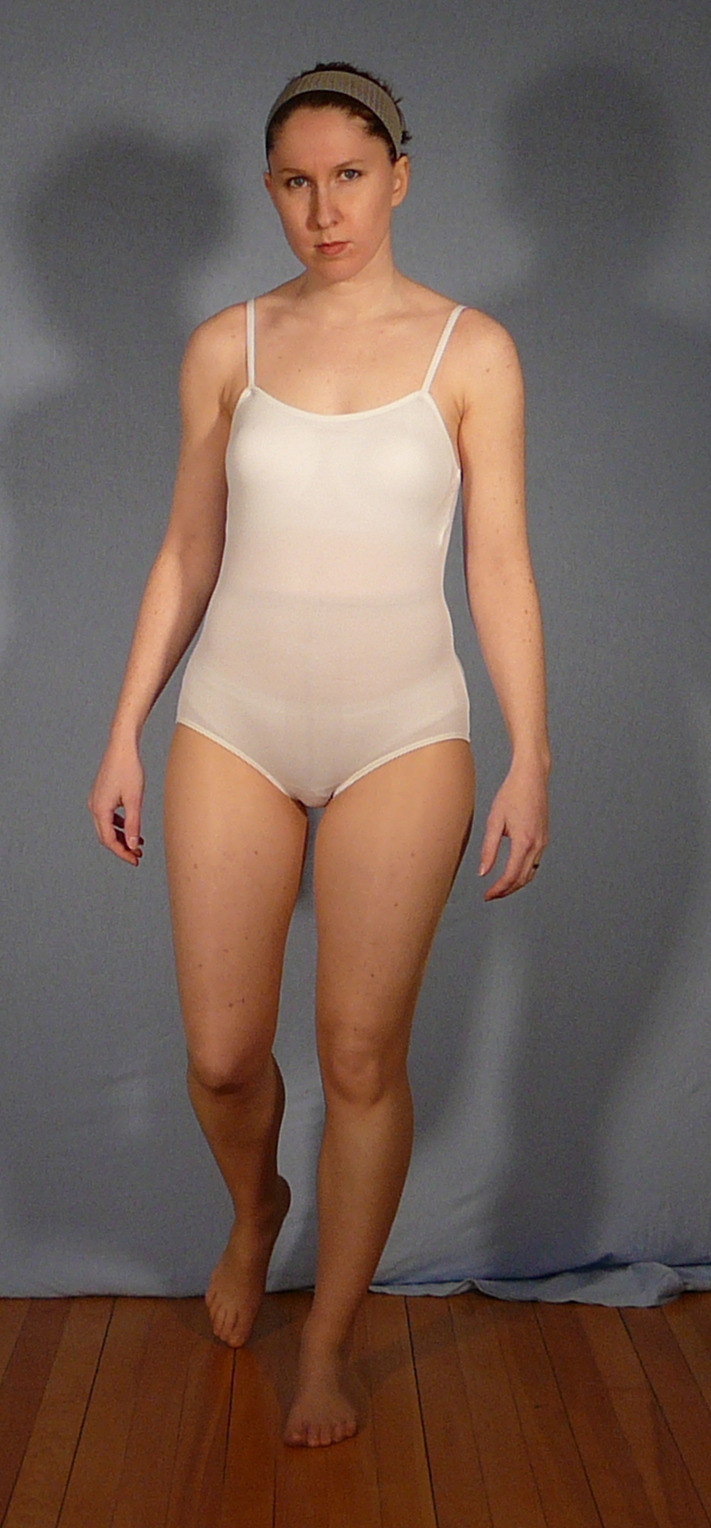
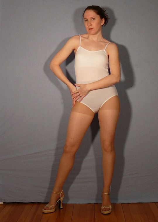
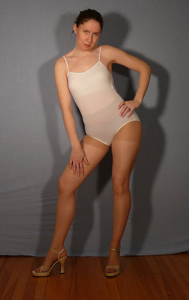
But maybe I can still help by directing you to something like my Character Reference Sheet Pack or maybe even some of the standing poses in the free Anniversary Pack.
There's also the old 3D model packs which might be *too stiff* for this but could be a jumping off point.
The farther back you scroll on in the DA archive the more static the poses will get because I didn't have a camera good enough to catch much movement or action. Here's a few from Shoots 1-25 that might be helpful for the type of thing you're looking to do.
I am SO helpful the stock is useful! 🥰 Hope this helps and Happy Drawing!
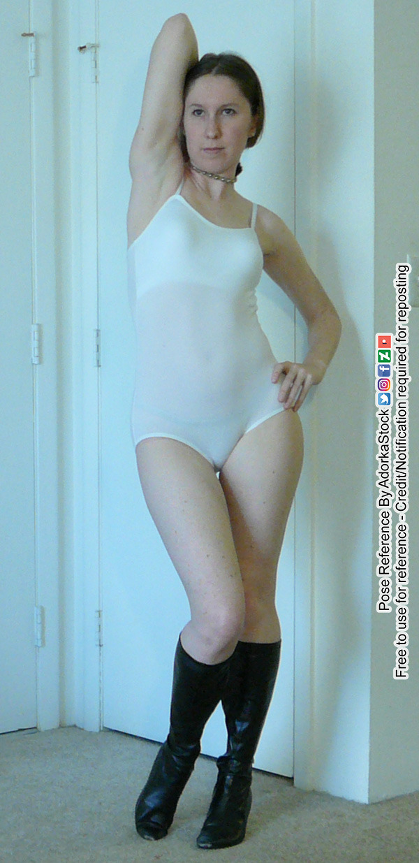
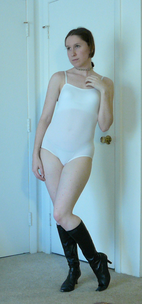
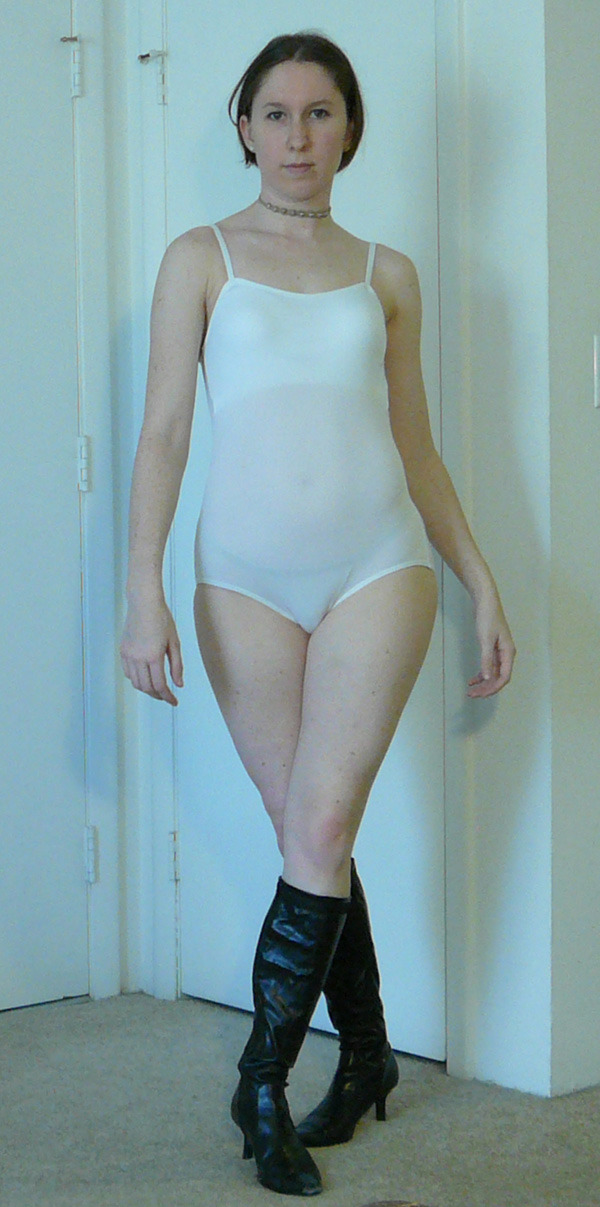
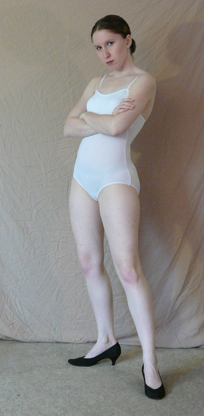
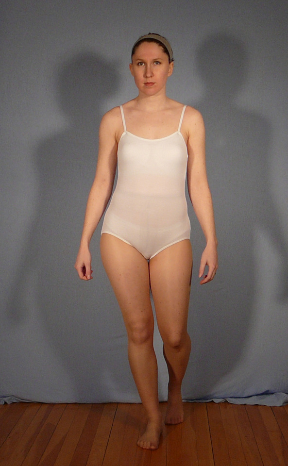
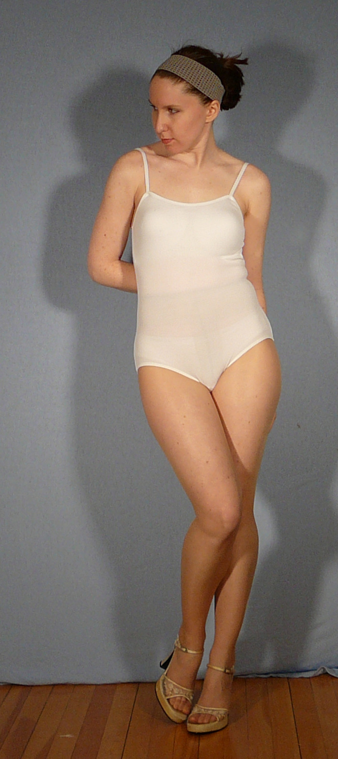
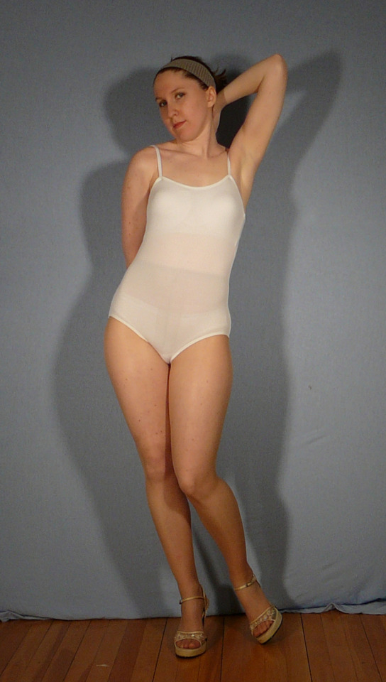
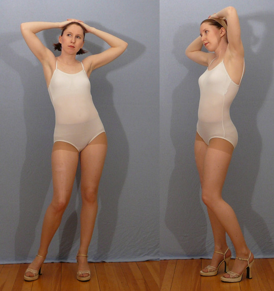
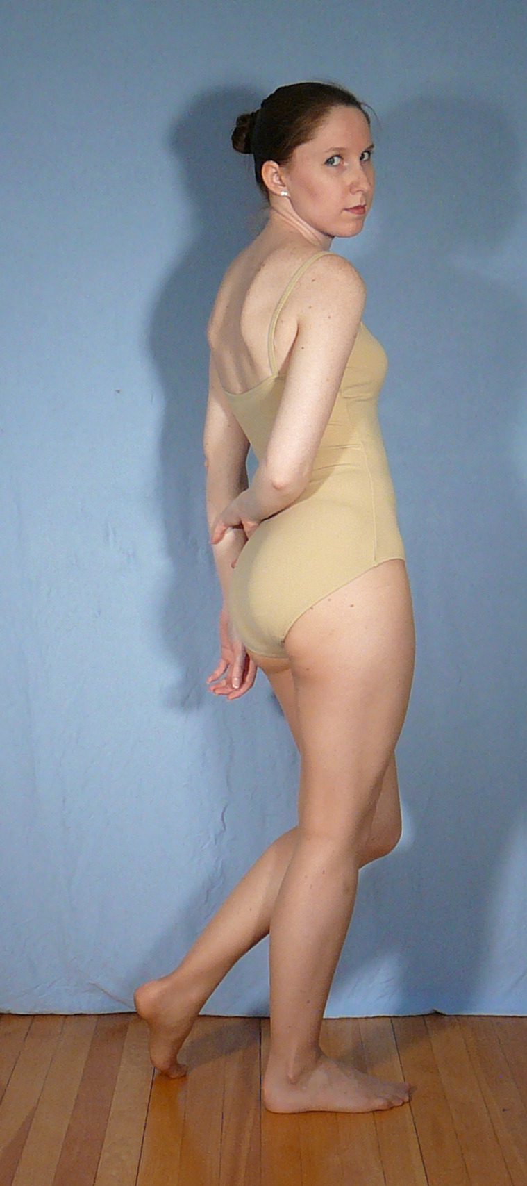
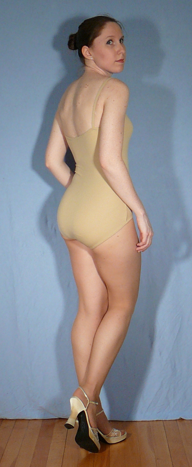
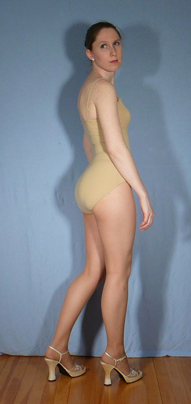
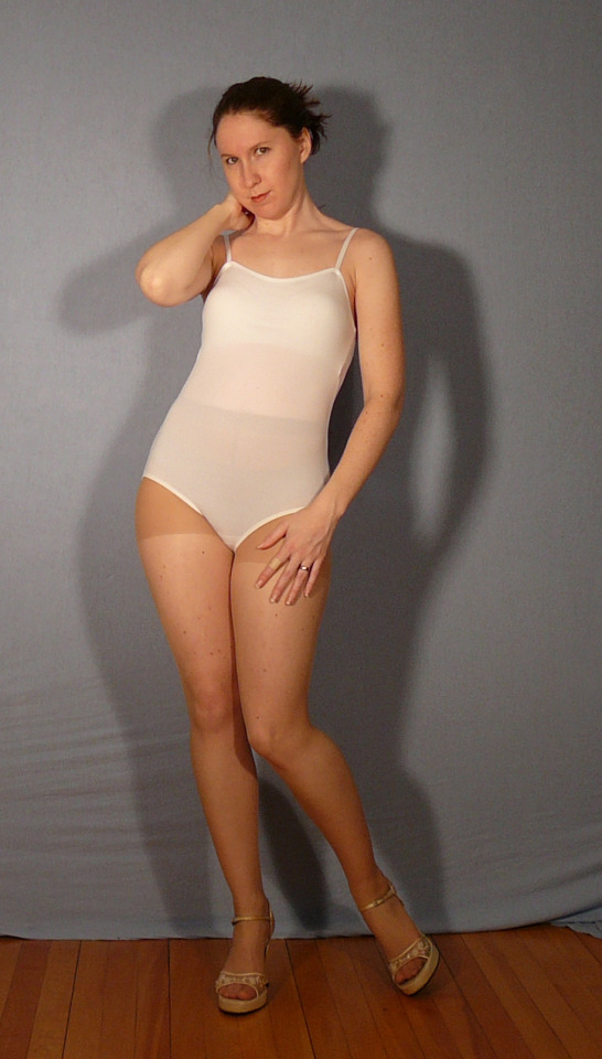
#ask adorkastock#character reference sheet#basic poses#<- maybe a good tag?#simple poses#casual#generic standing human female poses
352 notes
·
View notes
Text
youtube
▽ Subway to Stardew - Adoptable Joltik ⚡️
This would play after Emmet's 8 heart event and getting Joltik up to 8 hearts as well.
I released a separate mod specifically for adopting Joltik, so you only need to get them up to 8 hearts to adopt them! You can do it right now!
Adoptable Joltik Mod Link: https://www.nexusmods.com/stardewvalley/mods/21002

And of course... Commentary under the read-more.
Joltik's adoption event sat in the drafts for quite a while. It took me whole a day to implement and I didn't let myself sleep until I finished everything. (It's 1 PM now...)
The event ended up wildly different because of how extra custom pets are implemented. You would think that they would be added in the same way as you get your cat/dog that you select during character creation. No. You have to buy a license. Only Marnie is authorized to sell them.
Here's the original script for Joltik's adoption event:
[Joltik Adoption Event]
Emmet: @! Joltik likes you verrrrry much. They want to stay with you. I'm letting you adopt them. Yup. I filled out all the paperwork. The Joltiks are legally documented now.
I never gave ours a name... Galvantula wouldn't let me. She is verrrry picky about it. But that's okay. Joltik is yours. You should name them. She came along for approval. So. What name should I put on the adoption form?
[Name input box like Marnie's adoption thing...]
[Galvantula pauses for a moment to think and then offhandedly agrees.]
Emmet: Galvantula didn't shock me for that. That name is okay. Yup. I will file that with the Ferngill Republic. Don't worry about it. Make sure you take verrrry good care of our little Joltik!
[Joltik jumps and heart emotes]
◇──◆──◇──◆
The whole naming portion was a source of much more frustration than it should have been. In events, the name input box is brought up by the "catQuestion" command (which applies to dogs chosen at the start, too...
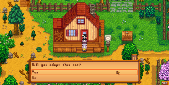
If you refuse, then Marnie also shows up no matter what you do. Farmhouse positions are also tricky and made even harder to find reference for after 1.6 added the farmhouse being moveable. Joltik kept spawning where Emmet was supposed to be so I had to use a move command just to get them to spawn one tile to the side. Galvantula was fine. I didn't get to updating her vanilla portraits yet so she's staying quiet.
The catQuestion command also only adds the pet you pick during character creation. There's no fields to target the usage. You have to buy a license. It's the only way to get another pet. I didn't want Joltik to replace a cat either since in-story you would have to earn the trust of both Emmet and Galvantula... There's no way you can do that by the first 25 days of spring. It's immersion breaking and you lose a cat.
I did find the license aspect funny though. It was oddly fitting for the mod's lore of Pokemon being pretty much banned from the region. Emmet is a threat to Stardew Valley's ecosystem. Not the best guy for the task of combating anti-Pokemon xenophobia.
Pet sizes are apparently hardcoded so I had to make a new spritesheet for Joltik as if they even need a 32 x 32 pixel area per frame. I did end up making new sprites for them while I was at it. I tried to base it off of the cat's behaviors so I have less animation fields to edit (I was tired). The cat loafs a lot. Trying to convey that in a tiny spider posed quite the challenge.

After everything was done, I figured that the whole adoption portion of the mod could easilly be taken apart to be its own mod as a demo of sorts for the expansion. So I went and made a content pack to post.
Bringing up your starter pet's friendship level takes quite some time, so it would be awkward if I let the event play with no preconditions. Because of that, I ended up including Joltik as an NPC and locking their adoption behind their heart level.
We actually only had two lines per day of the week (not including season) for daily dialogue. That shot up to six lines per day of the week for a full 0-2-4-6-8-10 in spring because I was determined to publish a mod. (I've been modding for nearly a year nonstop and I don't have anything playable... humiliating...)
Anyways! I hope you're all having fun with 1.6! It certainly brought new challenges and opportunities to the modding scene!
▷ Station Steward Thylak
76 notes
·
View notes
Text
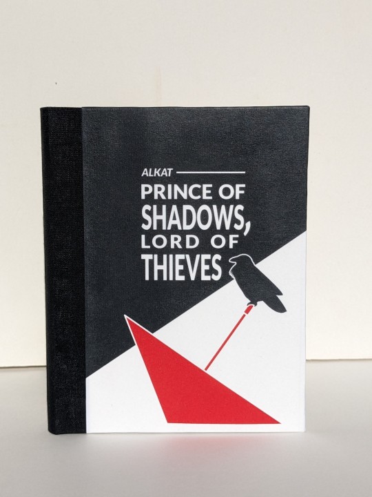
Prince of Shadows, Lord of Thieves by alkat
Fandom: The King's Avatar | 全职高手
Rating: Teen And Up Audiences
Category: Gen
Words: 1 929
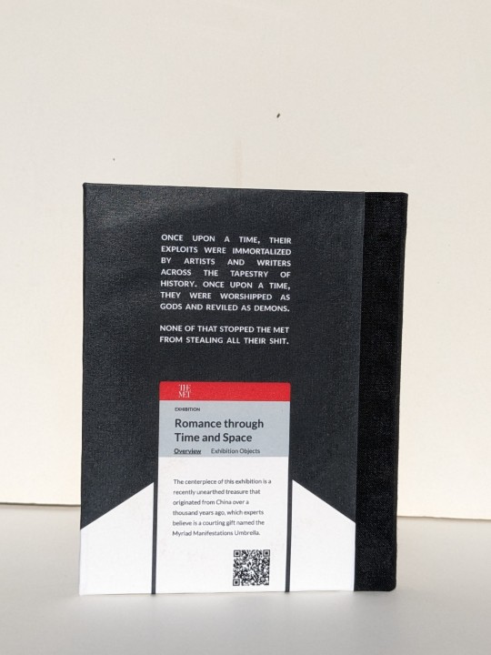
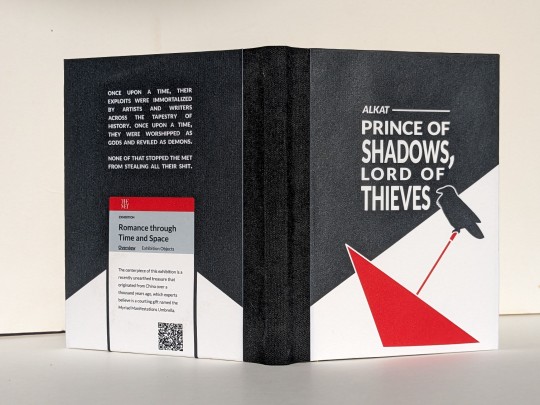
Once upon a time, their exploits were immortalized by artists and writers across the tapestry of history. Once upon a time, they were worshipped as gods and reviled as demons. None of that stopped the Met from stealing all their shit.
About the Book
FONTS: Alegreya [Google Fonts], Lato [Google Fonts]
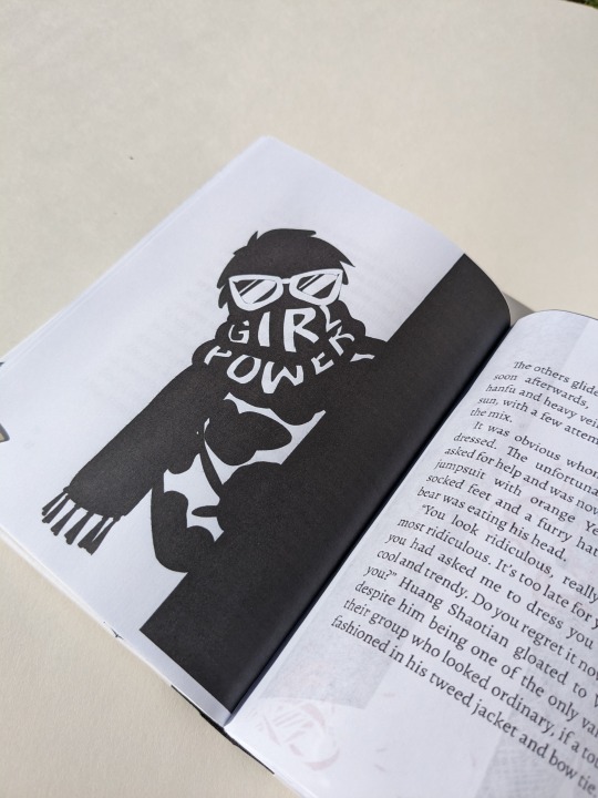
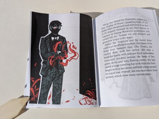
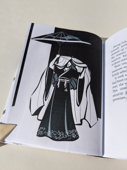
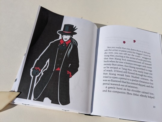
IMAGES: all art made by myself @greenhorn-art for this fic
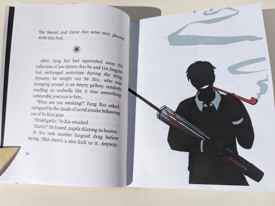
MATERIALS: regular ol' printer paper (8.5"x11", 20lb, 96 bright); ~2-2.5mm binder's board; Neenah cardstock (8.5"x11", 65lb, bright white); Cialux bookcloth (black); waxed linen thread (30/3 size, white); wheat paste (1:4 flour:water); paste wax (from a friend, unknown ingredients&quantities, some kind of wax and turpentine/mineral spirits)
PROGRAMS USED: Affinity Publisher 2; Affinity Designer 2; Bookbinder JS | Renegade's Community Imposer (settings: Quarto, snug against binding edge, custom signatures of 2, 1, 2 sheets).
Text & QR codes printed with colour laser printer (duplex, flip long edge), images printed with inkjet printer. QR codes generated with LibreOffice Writer, snipped, saved, and inserted where needed.
BINDING: quarto (quarter-letter) size, sewn board binding with french link stitch and breakaway spine.
.
So this one all started because the visual of HST's outfit was so fun that I was possessed by a visceral need to draw it. Inspiration slapped me across my mind's eye, and much like a medieval knight being slapped in the face by a glove (which didn't actually happen, that's a myth that sprung from the throwing down of a gauntlet. but that's beside the point), I felt bound to take up the challenge. Which lead me to draw a few more, and then I ended up binding the whole thing.
(Also, I find it really amusing that the famous Terracotta Warriors were just storage for YXs stuff. And the gang going 'shopping' at various exhibits for gifts for friends/family,, like that sure is SOME window shopping! I can hear it now: 'Oooh I'll take one one those SMASH, and that SHATTER, and throw in some of those CRASH, they're going to love these! 😇'. All in all, it was a fun little read, and fun little project! :D)
About the Art
Because this was initially a one-off drawing I tried a new art style (and struggled to at least not stray too far for the rest). It was fun and helped me think more about shape and visual focus, instead of being caught up in the details.
The crow (based off of image ID: 4039963 from Rawpixel) and the red umbrella on the front cover were filled curves made with the pen tool. The illustrations' poses were based off of a combination of images found on Google and photos taken by myself.
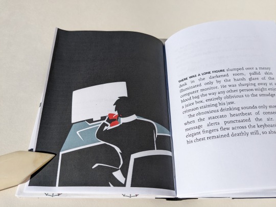
Pinterest is awful for sources, but it would have been handy to pin the references I'd googled. Only remembered to save the one of a man sitting at a desk. (I deliberately searched for someone sitting with bad posture because YX is described as being "slumped" over the desk. I figure that since "the laws of physics held no meaning to ["cursed souls eschewed by the natural order"]", they'd also be immune to mundane things like discomfort from sitting hunched over for too long. Back pain images were a gold mine! All I had to do was choose one with lighting that would give me a silhouette.)
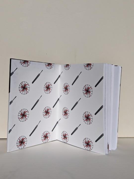
The Myriad Manifestations Umbrellas and illustrations were drawn in Procreate.
I opted for a more plain umbrella design because it's not (presumably) a fantastical weapon in this story. Though the initial version did have YX cradling the donghua!MMU.
For the scene breaks I inserted the images, pinned them inline as character, and adjusted height and baseline in the pinning menu to fit.
The author wrote one scene break differently than the others, using multiple empty paragraphs instead of just one. Following suit, I used a different image for that particular break. I wanted to reference vampires somewhere, so for that break I made two bloody spots resembling bite marks. The blood spots were made with a group of shapes in Designer.
On cover design:
Because the MMU is what sparks the whole heist, I wanted it on the front cover.
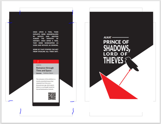
Earlier iterations involved a full cover spread with a man's shadow standing before a shattered glass case, with a plaque mounted on the wall to the left providing information. The plaque was formatted like a museum label and had the author, date published, title, event collection, and story description. I'd also added a QR code to it. Ultimately, I abandoned the concept because it was difficult to decipher what is was when only looking a one cover at a time.
My second idea for the cover would have been a bookcloth-only cover with a cut-out of the MMU on the front, acting like a window showing off an image of the MMU on paper below it. (Inspired by the work of a number of folks over on Renegade's Discord. Here's a few examples gleaned from a quick search: szynkaaa's lung cutouts, some of EHyde's books, and the front cover of Spock's massive all-in-one TGCF). As fun as that would have been to try out, I felt it didn't quite suit the style of the art so I nixed that too.
Eventually I landed on the back cover design with the Met exhibition webpage. At last, I felt that the back & white and simple-shapes-background went with the artwork. The webpage viewed on the phone is based off of the Met's actual website. I took a snip/screenshot of the Met's logo from the banner at the top, then looked at their exhibitions' pages and eyeballed it to create my own. (Threw in the QR because I wanted the easy access to the fic online on the back cover). I chose to use a phone screen rather than I computer monitor because it worked better composition-wise. And besides, while YX may be allergic to owning a phone, SMC is not. I imagine that she saw the news while on her phone then messaged him.
The front cover came together after that. An umbrella for the MMU, and a pop of red. One of YX's messenger crows. A black shape in the background similar to the back cover's, sort of creating a spotlight over the umbrella and placing the rest of the cover in shadow.
Trying New Things: Applying a protective finish to printed covers
Over on the Renegade Bindery Discord, folks have spoken about using a beeswax & turpentine/mineral spirits 50-50 mix to seal printed covers (thank you Kate). According to my dad that's just a paste wax, so he threw 3 different ones at me and said 'have at it'.
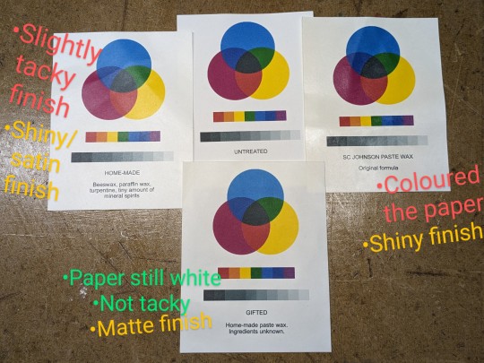
I tested them out using the same paper and inkjet I'll use for the cover. I was looking at 1) whether the paste wax affected the paper colour or print quality, and 2) the finish. After applying one coat each and buffing them out I had my winner. Then I applied & buffed two more coats to it and tested 3) water resistance by dripping tea on it. The liquid beaded up and wiped away without staining -- good, three coats will work nicely.
(Test results: Mystery paste wax from a friend wins.
The commercial SC Johnson Paste Wax Original formula (intended for woodworking) has a nice dry shiny finish, but coloured the paper slightly brown -> disqualified
My dad's homemade stuff has a nice shiny/satin finish and didn't change paper's colour, but it felt slightly tacky even after buffing it -- maybe I didn't buff it enough?
The gifted paste wax has a matte finish, didn't change paper's colour (in the image below this one has 3 coats. The paper is now slightly off-white, but still acceptable), and while not as dry-to-touch as the Johnson it was not as tacky as the other homemade stuff.)
When I print out my quarto covers, I print front and back covers side-by-side on the same page*, with some guides to ensure I'm cutting and gluing in the correct place. (The guides mark the boundaries of the covers and start of the turn-ins, and stop at the edge of where I cut. Before cutting I flip it over to mark the guides [see marks indicated in image below] on the wrong side and connect them so I can see where to glue/place book. Then flip it back over to cut, right side up.)
*I'm being economical here at the cost of possible warping damage. This layout means that I'm only using one sheet of paper, but the grain is running in the wrong direction (across the book instead of preferred head-to-tail/top-bottom). This could cause warping issues, but I'm OK with that. I'm hoping that by just gluing at the edges, instead of pasting down the whole thing, warping will be minimized. (I use wrong-grain endpapers most of the time with larger books anyways).
I applied the paste wax before cutting out the covers, working carefully to avoid accidentally creasing/bending the paper (which happened twice, but it was minimal and I hardly notice it). Doing so before cutting ensured that the cover material was completely covered. Even the turn-ins -- something I later came to regret. After all, wax is used specifically so that things don't stick to it. It made it rather difficult to drum on the endpapers because I was trying to glue something down onto a waxy surface. It all worked out in the end -- perhaps due to the fact that there were multiple layers of wheat paste which could adhere to each other, followed by being squashed in a press.
92 notes
·
View notes
Text

So after a lot of back and forth with myself and a poll of my members I decided to play around with AI, both as a tool for my traditional drawings and to create actual finished pieces. Every day in December I will be posting one of my AI creations on my Patreon for my members as a special bonus. Here's what I wrote about it there:
Well, the poll was overwhelmingly for showing what I've been creating with AI tools, so I've decided that for the month of December my Patreon fans will be getting daily updates of what I've been up to with this new tool. Consider them a Christmas gift. These will not replace my typical 4 traditional drawings per month, this is just a bonus.
I want to make it clear I intend to use AI in the future to help me with my traditional drawing. If there's a challenging pose I'm having trouble with or a piece of equipment I need at a specific angle, it's a great way to get reference material. But I was curious about what I could get it to create for a finished piece, using the very limited parameters at hand. I also didn't want to create "hot muscled guy in room with robotic arms" over and over again, which you see so much of. I wanted to create images with all ages and sizes of men. I also am going to avoid using celebrity likenesses and am only going to make generic people and not specific ones. I'll do my best to make interesting and unique scenarios.
I know there is a faction of people that won't be okay with this. Honestly it feels to me like a "if you can't beat 'em, join 'em" kind of moment. At several times in my artistic career I was left behind by missing the boat on new technology (web design completely passed me by). Part of me feels that to keep current even in my real-world day job I need to know what AI is capable of. So consider all of this an experiment and you're along for the fun ride.
In making some of my first AI pieces I came to the realization that the classic "circus strongman" is probably my ultimate type: bald, muscled, hairy, mustached. They push ALL of my buttons. I also love the old trope of "strong man tickled while trying to hold up something heavy". And let's face it: evil clowns make the perfect nemesis for a strongman.
I made a lot of these but this was one of the best in terms of expression and composition. On a technical note, I will tell you that it is extraordinarily difficult to get character A to actually touch character B. The word "tickling" has been blocked as a prompt, so you have to describe a different way to get fingers to actually come in contact with a body. It only works about 1 out of 10 tries.
My Patreon is HERE
#tickling#ticklish#male tickling#tickle community#tickling community#tickle#tickling illustration#AI tickling#AI generated
32 notes
·
View notes
Note
Really curious to know how you got so good at art? Bc you've improved so much in the last few years but even back then you were really good...
Hmmm I'm not sure about which "back when" you're referring to 🤔 I've been drawing seriously for over thirteen years so I've got a few "stopping points" of skill
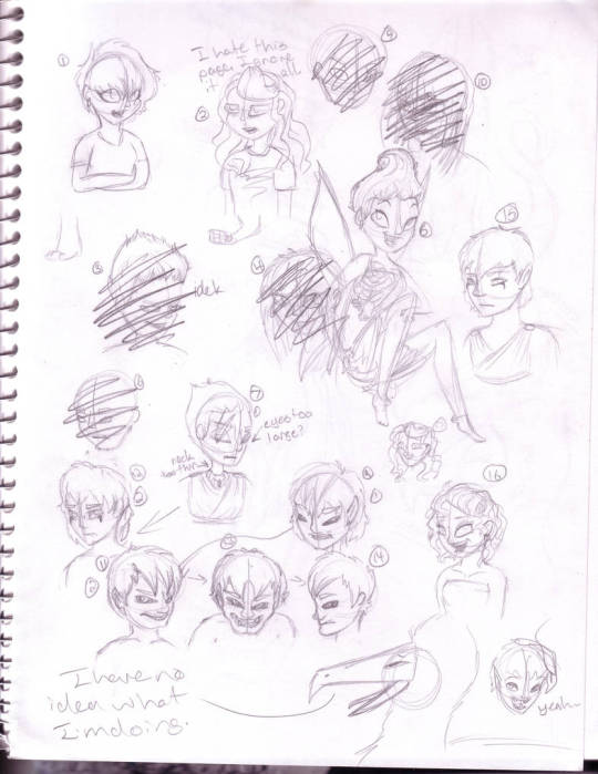
This is about where I started, if that gives you a good reference point. It's... bad. I am pretty sure it was my best attempt at a stylized human face, but it was not supposed to have cartoonist anatomy. At this point I was going for realistic proportions, and it was a struggle. It's not awful but it's got a lot of room to improve.
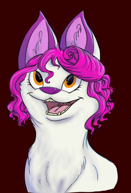
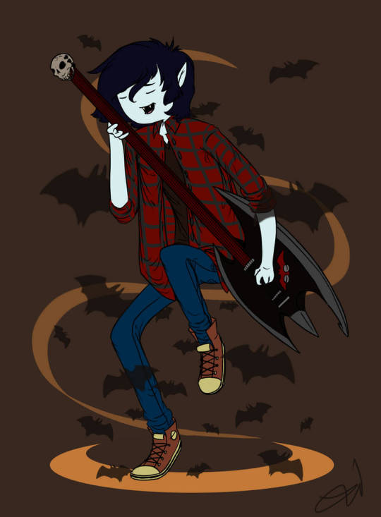
A year or two later and I'm in my adventure time phase, but I have a better understanding of form and posing. Human faces are still hard for me so I avoid them, animal faces are easy enough that I'm trying to experiment with more difficult angles. My digital art knowledge is very very low.
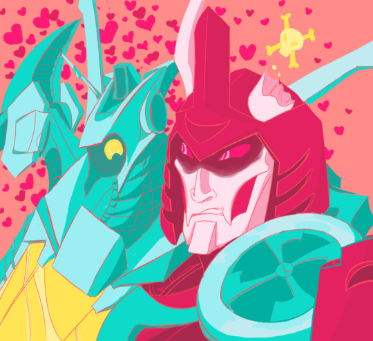
I branched out into bots for the next couple of years and that gave me a much better idea about form and perspective just because it was trial by fire. Mecha are incredibly hard but I had (and have) brain worms so I did it all out of love. It was challenging but fun (and rewarding), I tried a lot of new color palettes and tried to figure out how to make digital art look better.

Even going back to something I hadn't drawn in a long time after drawing bots showed I'd made significant improvements overall, but drawing human faces was still extremely hard.
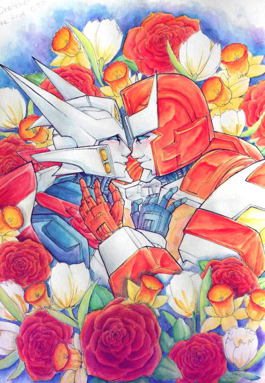
At the end of the bot era I've massively improved, but I still shy away from humans. My traditional lines are very controlled and uniform, my digital lines still leave a lot to be desired.
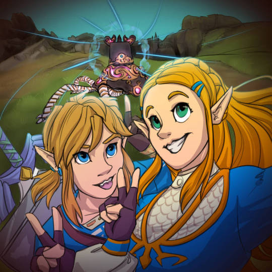
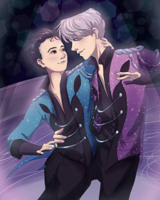
I finally have to learn how to draw humans but it's a struggle. I draw every day, not vigorous traditional studies but just small sketches, practicing over and over. I'm starting to understand digital art a little better and I have a much better sense of posing and framing characters

Around this time I finally have a firmer grasp of how to draw humans and how to use a tablet. I want to show this piece even if it wasn't my favorite because I still wasn't happy with it. My composition is better and there's a lot of improvement on my line steadiness and varying width, but even the two profiles were giving me trouble. The movement felt dynamic but disconnected.
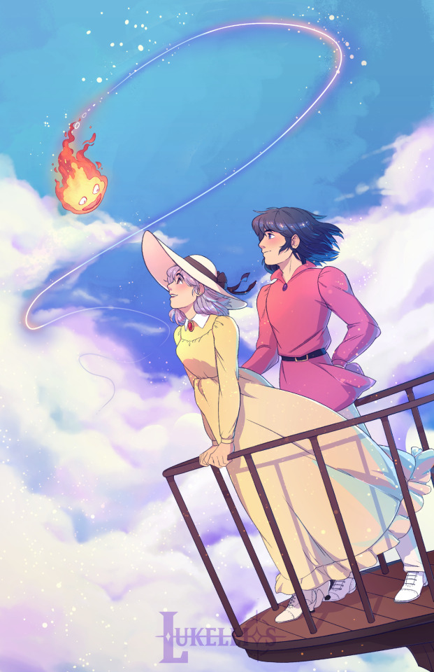
I redid this piece a year ago because I could finally see what I was unhappy with and change it. The profiles are much better, the hair and clothes are following the same direction of wind, the clothes have weight to them, and the shoes have much better form. Everything is also just a little more polished, and I didn't even have to change the background from the first attempt.
Really over the years it's just been about fixing a few things at a time by branching out and trying a lot of different things. Dipping my hand into a lot of subjects and really challenging myself has helped me learn a lot. Even though I wasn't always studying the same thing, learning as I went helped me in a lot more areas than just the ones I was focusing on at the moment. Hope this helps, if even a little! It's a really hard question and there's no one right way to improve, so take a mixed bag of advice and try it all c:
14 notes
·
View notes
Text
Reviewing past projects - Airships 'N' Aliens
Airships 'N' Aliens was the 3rd project I worked on and I'm super happy with how it turned out. It was created to be an arcade game so I had the challenge of making the game work with a limited controller. Notably, the controller only had 1 joystick. This posed quite the challenge later down the line once I decided to make the jump from 2D to 3D, though I'm getting ahead of myself so let's start from the beginning.
Originally, Airships 'N Aliens was planned to be a top-down 2D game in which the player would control a little pirate guy on a flying pirate ship, and would have to run between cannons to shoot UFOs. Each cannon would have a different type of ammunition that was effective against a different type of UFO each. There would be 3 waves increasing in difficulty each time, and then a final boss wave afterwards with some kind of giant ship that you had to utilise each cannon for (perhaps weak points would appear associated with a certain cannon?) I didn't end up developing the idea for the boss very much though, it was more of an afterthought.
Work started off pretty slow, I'd made a single untextured platform the player spawned on, and I set the camera into a fixed top-down position. I had also created a couple basic sprites for the pirate the player would control, and had created a second sprite as I decided I wanted to try to incorporate a 2-player mode (this didn't end uo happening).
After creating these sprites, I struggled to decide whether to animate them at the time, or to first create a sprite for the ship itself. I decided on the ship and started looking at reference images but then multiple thoughts entered my mind;
"I shouldn't be creating assets this early."
"Do I even know what style I want to go with?"
"Is top-down even a good idea?"
"I should really develop some basic gameplay first."
"I really don't like 2D stuff in UE5, should I switch to 3D?"
Eventually, after that last question I considered my options and decided yes, I should go 3D. Working with 2D in UE5 isn't impossible (after all, my first game was a 2D platformer made in UE5), however it is pretty tedious as UE5 is a 3D engine at heart and you have to take extra things into account if you want to make it pretend to be 2D. I wasn't willing to do all that and decided to instead go from a top-down 2D game to a first-person 3D game.
I really embraced the Voxel-art style for Airships 'N Aliens after going to 3D. I created everything out of Voxels except for the sky itself which is just the default UE5 sky with some modified attributes (moved the clouds lower down & made them larger). I also moved from MagicaVoxel over to Blockbench as one of my friends suggested. Blockbench is often viewed as being designed for Minecraft, and to an extent that is true, however whilst Minecraft support is heavily advertised and used as some of the default templates, Blockbench is also capable of just being a really solid voxel modelling program without having to care about Minecraft stuff. So that's what I used going forwards and what I still use now for any voxel stuff.
The first big obstacle from the switch to 3D was the controls, specifically movement and camera. As I mentioned earlier, these arcade machines only have a single joystick, so how could I possibly make it so the player can look around AND walk around? Perhaps I could make a button toggle between moving and looking? Or maybe I could have it so you move with the joystick and can turn 90 degrees with a button? None of those felt very natural though. Then I turned to somewhere rather unexpected, DOOM. Yes, that DOOM, the big bloody demonic game in hell with the cool music. You see, old DOOM games worked very similarly to what I was doing here, in that movement and turning are kind of tied together. This led me to replicating this style and having it so the player cannot look up or down (thankfully, there's no need to... is there?) and instead up/down would move the player forwards/backwards, and right/left would rotate the player clockwise or anticlockwise respectively.
The cannons... oh boy the cannons. These damn things took up the vast majority of development time on this project. It took so many attempts to get them to work as intended and that's not to mention that I very much did in fact need to let the player loop up and down in order to aim the cannons properly. Thankfully this was actually one of the simpler issues to sort out, I ended up making it so when the player uses a cannon, they actually "possess" it, which then means the player's controls change to match whatever controls the cannon itself has. So I basically just made it so the cannon has different rules to the player, in simple terms, the cannon could turn but not move.
If I were to explain every single issue i had with the cannons this post would be longer than the damn bible, so i'll just say there were plenty of them, and if you want to see some of the more prevelent ones and see how it progressed, it's all availiable on my blog for Airships 'N' Aliens here:
Alright time to evaluate some of the strengths and weaknesses from this project.
Strengths:
- Developed skills in UE5
- Voxel Models
- Kept ideas realistic
- Problem solving skills
- Knew how to deal with a drastic change in direction
- Learned some of UE5's Niagara System
- Created a finished game I was happy with
- Worked around controller limitations well
- Gained lots of feedback to work on
- Learned how to play videos on UI Widgets
- Used prior skills in Davinci Resolve to edit a video for the main menu
Weaknesses:
- Slow start
- Cut a few corners
- Didn't get round to adding a high-score that saves
- Didn't get round to adding 2-player mode
- Moving around & having multiple cannons ended up being pointless as a result of not getting round to adding multiplayer & different ammunition types
youtube
#gamedev#video games#unreal engine#devlog#3d game#game design#game development#voxel#reflection#videogame#Youtube
5 notes
·
View notes
Text
Darth KOTOR Post Mortem
While they're still being posted, I finished drawing @darthkotorcomic a little over a week ago. While it might not look like it, this was a deceptively challenging project for me and I find myself wanting to talk about it. So... here we go.
The comic was a challenge I set myself because I was finding the experience of a dark side play through of KOTOR 1... unpleasant. But mixed with these odd moments where the game didn't feel like it was reacting appropriately to the things it let your character do. I wanted to see how it worked out, but I needed a reason to push through. Making short comics riffing on the experience ended up being that reason. But there were a few non-obvious obstacles here.
First, color blindness. I've got some moderate red/green color blindness. At the very start I'd planned to stick to black and white to dodge this, but very quickly decided that wasn't going to work. I tried to compensate by using a color picker to get colors from screenshots, but that had its own challenges. I assume there's probably some color weirdness in the result. Not much for it.
The second is I'm one of those people who can't really picture things in their head. Which means I struggle to picture what it is I'm trying to draw. Even trying to draw a character or scene from reference the moment my eyes leave the reference it just tumbles out.
Third, I am both untrained and unpracticed. I've fiddled with programs like GIMP and Inkscape off and on over the years, but I basically haven't tried to draw since I was a teenager, and even back then I wasn't drawing much.
And finally, I have a habit of getting caught in revision loops with anything creative.
With those in mind, here are the strategies I used to get this done.
First, breaking big problems into smaller and smaller problems until a big, unmanageable task became a lot of small manageable tasks. In this case, that meant making drawing characters, drawing scenes, and posing characters in scenes separate problems. There are probably better tools out there, but I knew I could do this with some very basic vector graphics tools so that's what I did. Hence, the character template.
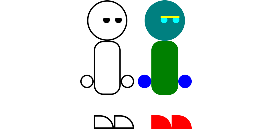
Inkscape doesn't do character skeletons so no arms or legs to fiddle with. Also no mouths or eyebrows. I figured I could do a decent range of expressions by manipulating the hidden rectangle you can see in the color block version, which ended up being mostly true. I never did find a good way to convey an eye roll.
The second thing I had to do was time boxing every task. I didn't use a rigid timer or anything, but if I spent more than a few hours working on any individual character or scene I'd stop, look at what I had so far, and if it at least vaguely looked like the thing I was trying to make I'd stop and move on. I just accepted that this was going to be a bit of a sloppy project. The goal was for a thing to exist, not for that thing to be perfect, or even good.
With that in mind, I also didn't spend much time writing any individual comic. I'd play the game until I had 3ish events pop out at me and spend a little time riffing on those moments before making whatever I'd come up with. Then repeat the cycle.
The last thing was actually sharing the comics here. Making them public forced them to be done. Which helped maintain forward momentum.
The result of all this is... fine. I ended up making 45 comics in 35ish days, heavily weighted towards the end. I don't know that I got much better at drawing in that time, but I did get a lot faster. Some are more amusing than others. Some characters never looked quite right. I need to work on posing (especially eye lines since Player is slightly shorter than everyone else). If I could go back I'd probably find a different way to do the dialog bubbles. And I have mixed feelings on the early choice to have Player and Bastila speak in different fonts than everyone else.
But at the end of the day, goal achieved! A thing exists. I hope it amuses you.
3 notes
·
View notes
Note
Happy Whumpmas (•∇•。) 🎅🎄🎁🦌 🍪 🥛!!! You have just been snowballed by a secret whumper. Help to keep the snowball fight going by anonymously sending this to five other whumpers with a whump-related question of your choice: What's your favorite thing you've created this year?
thank you for this question bc it made me go back through the stuff i made this whole year and i realized that im actually really happy with most of my recent works. it's a. kinda foreign feeling to me lmao but a very good one, to have trouble picking a favourite cause i like all my stuff so much (◡‿◡)
for art, i think it's the "New scars" whumptober prompt and i like it bc i challenged myself to draw a pose that seemed difficult to me and also used references to consciously try to improve how i draw scars. and among that i still had loads of fun drawing it and it didn't just feel like a study.
for writing i was torn between "favourite whump", "favourite idea", "favourite prose", and "favourite overall" but in the end i think it's gonna be "No anesthesia" from febuwhump cause it's got a bit of everything and also includes dialogue, which i always find difficult. honorary mention to "Failed rescue attempt" for bailing me out of a day's worth of nanowrimo because i'm happy enough with it to include it wholesale in the full-length version of Kintsugi
#answers#but for real im v grateful for this ask#i have like Clinically low self esteem and i struggle so much w/ appreciating my art#but i really came a long way w/ it and even the stuff i didn't like when i finished it seemed really good now#and also seeing just how much i created this year even though it felt like i barely did anything#with burnout and stress and all that i still managed to do a lot of what i love#it honestly makes me feel like it's all fine fdksjghfjdkkhjgh#like as long as i just casually do things for fun when i want to i'll end up creating art that i like
2 notes
·
View notes
Text
Place of Words
DEVELOPMENT
For Monday's tutorial/studio day, I worked on some spreads and printed them for the tutorial. These were the two I liked most:


Since I did my research on Vogue, I had a solid idea of their layout and applied these to my spreads - save for the number of columns, which I did as 5 instead of Vogue's usual 3 or 4. (I used placeholder images from Unsplash for now since I don't have illustrations yet). In my test layouts that I printed, I felt like the 5 column grid made my text columns too wide (I used 2 columns for the width of the body text, 3 or more for other text), so I plan on trying out a 4 column width instead.


I also played with a lot of different fonts for this test round so that I can get an opinion on them. Like in Vogue, I took a decorative/special font for main headings, a sans serif for subheadings, then a serif font for the body text. I'm not too sure I was happy with what I chose though.
I thought for this fashion magazine, I could take a sharp, edgy font (see left image above) to make the article look more contemporary, but in the tutorial I was told that it might not be fitting. But this will be reliant on the images I create - so I can put that off for now.
It was also suggested to me to look at more current magazines rather than Vogue.
IMAGE MAKING
For my image making, I did a quick test of the marker-and-digital idea I had. I did this in the studio so I didn't have my drawing tablet with me, so I was only able to make something roughly. I referenced random models from Pinterest and drew them:


Then, I scanned one drawing and put it into Photoshop:


Personally I'm not too big of a fan of this one but my tutorial group thought otherwise. The combination of marker and the texture of the clothing looked novel. I also tried drawing digitally:

-but this was not at all great since I would've drawn properly with my drawing tablet; which is my next task.
A problem I encountered while working on these illustrations was that the fashion references I needed to do these images have to be connected to the article's contents. I could draw random models like in Vogue, but I feel like that misses the point of the brief. On the other hand, finding the right images of models with clothing relevant to my article is tricky too; and I do not have the material/clothing needed to take the pictures myself.
This gave me two options off the top of my head:
Do full illustrations and forego the photography, saving me from the reference picture hunt But raising the challenge of drawing up outfits from my mind. Also, this sacrifices the interesting combination of textures.
Look for model photographs and possibly sacrifice relevance to the article, saving me from the struggle of drawing clothes.
During the studio day, I found these images on Pinterest that interested me:


It has a collage feel but isn't crowded and distracting, which I enjoyed. I also liked the interaction of text and image here. I also like the model's poses and feel it's perfect for our demographic. However, I cannot use these images for my actual work because not only are they unrelated to my article, but referencing might be an issue since it's from Pinterest.
I'm going to try the full illustrative route for now and see how detailed I can make the clothes.
0 notes
Text
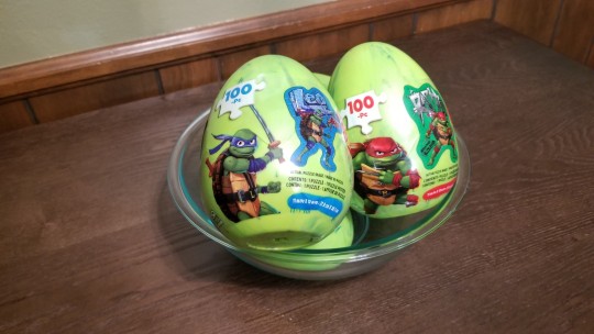
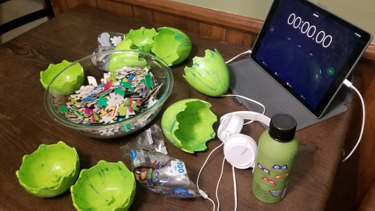
Puzzle 14: Mixed Puzzles - Speed Puzzling:
Four - 100 Piece
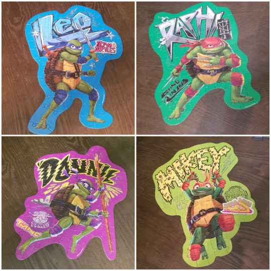
Teenage Mutant Ninja Turtles: Mutant Mayhem Jigsaw Puzzles
Created by Spin Master Puzzles
Puzzle Classification: Jigsaw Puzzles
Price: ~ $9 per "Egg" in stores
Prices online are wildly different
(All four puzzles were gifted to me - Mikey and Donnie puzzles were "used" - Raph and Leo puzzles were brand new/never been open)

Review/Commentary:
First off - I am by no means an expert/competitive puzzler, but I do enjoy doing puzzles.
"Fun" Fact:
A Dissectologist is a term to describe a person who enjoys puzzles - a puzzle enthusiast. The term derives from the "original" name for jigsaw puzzles - supposedly in the late 1700's early versions of puzzles were referred to as "Dissected Maps". Currently you wont find "Dissectologist" defined in any dictionary as the term is currently under review even though the word has been reportedly used since the mid 1980's.
"Fun" Fact over... Anywhosel...
I told friends that my weekly challenge for myself this year would be solving puzzles - so - I had few friends donate puzzles to the cause.
Enter these (4) Teenage Muntant Ninja Turtle Puzzles - I have a soft spot for Ninja Turtles - a well known fact amongst my friends. I have been a huge fan since I was a little tyke and I kinda still am - I really enjoyed Muntant Mayhem. So, mixing my passion for Turtles and Puzzles felt like a no brainer.
One interesting thing - well, interesting to me - I have been doing puzzles for years - but - just recently it was brought to my attention that some hardcore/avid puzzle enthusiasts will challenge themselves by mixing multiple puzzles together. It has never dawn on me, but to be fair I don't think I have ever owned multiple puzzles of the same "caliber and difficulty" level in order to mix them up.
With these four puzzles being donated to me I thought this would be the perfect opportunity to dip my toes into the Wild World of Dissectology.
Now - Granted - upon reviewing all the puzzles at the same time they are uniquely different - they have vastly/starkly different backgrounds and font styles and of course if you vaguely know anything about TMNT you know each Turtles brand of color and weapon - so separating the pieces was not all that difficult.
Also, the there was only 100 puzzle pieces per puzzle - 400 total - not too bad, normally when I do puzzles I am doing 500-1000 piece puzzles.
Where it became "challenging" is the puzzles didn't fit the conventional square/rectangular shape - the edges where fluid and fit the form of the Turtles' poses.
All the turtles belts, shells, green skin blended together. Unless there was something distinct to separate all the pieces I pretty much had to make fifth pile just for undetermined pieces.
With a portion of the puzzles being "used" I was without image references for two of the puzzles (Mikey and Donnie) - so - for added challenge - I decided to do all the puzzles without reference images.
Even further I was having issues distinguishing between between Raph and Mikeys red and orange (respectively) elbow/knee pads. Not sure if it is due to the art style or if I suffer from some sort of minute color blindness.
And another bit that added to the "fun" - I put on some tasty tunes.
Yep, popped on the headphones, settled into my "This Magic Moment" Pandora radio station, and melted into the pieces.
It was very chill and helped me reach some zen I haven't had in a while. It has been a long time since I was able to sit down with no interruptions and just focus on a "simple" task without worry.
Diving In - I did have a plan of attack.
Assembly the puzzles based on my Least Favorite Turtle to My Favorite... JK.
No, I my plan was to start off by attacking the most identifiable pieces/character to help clear up the table and that just so happened to be Leo.
Leo's heavy hues of blue stood out immediately and were the easiest to separate followed by Donnie - again - the Reds/Orange pieces were touch my for my eyes.
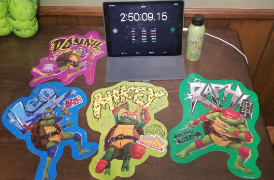
The order of attack ended being - Leo, Raph, Donnie, Mikey - BUT - the actual order which they were completed (100% finalized) was Donnie, Mikey, Raph, Leo.
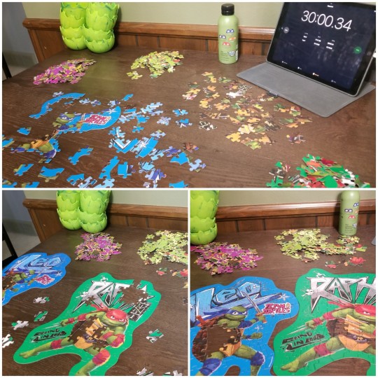

In Summation:
It was fun, relaxing, and refreshing to work up some puzzles instead doing another tabletop escape room like I have been doing for last month or more.
If trying mixing the puzzles - Inthink I would take it to the next level - more pieces or puzzles and similar theme/color palette.
So what will the next puzzle/theme?
Tune in Next Week!
... My One Follower...
or Dont!
Like I said it just gonna be me talking about puzzles and to be honest - believe you me - I am surprised at the amout of syllables I spewed out on the stagnant subject matter of Dissectology.
Check you later.
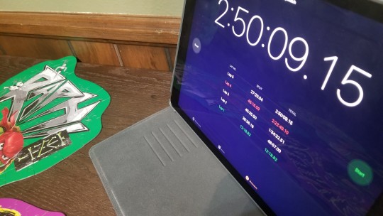
Total Completion Time:
2hr50min09sec15ms
Sorting Time: 12mins18sec82ms
Leo's Time: 36min38sec18ms
Raph's Time: 45min35sec50ms
Donnie's Time: 48min16sec59ms
Mikey's Time: 27min20sec04ms
Average Puzzle Time: ~39min27sec
Hints /Clues Used (0)
Items Not Included / Needed:
Large Clean Surface
Optional: Tasty Tunes
Personal Rating: 7.5/10
2024 Puzzle Record: 12/14
#52 in 24#puzzle#puzzles#speed puzzling#teenage muntant ninja turtles#mixed puzzles#jigsaw puzzle#Muntant Mayhem#Teenage Muntant Ninja Turtles Muntant Mayhem
1 note
·
View note
Text
Since 2024 is right around the corner I wanted to type out a list of things I wanna do next year since I wasn't able to do most of the things I wanted to do this year because of the accident. I also thought posting em here would help motivate me to actually do them, so here we go!
I wanna get back into traditional art. It used to be my primary way I did art but over the years I kinda went full digital without realizing it so I think it would be a fun challenge for me to get back into the swing of traditional art. I also think it could help me in areas of my art I struggle with such as making interesting color pallets/moods by eye instead of relying on filters and blending modes along with doing poses without refs (note references are very good and very useful tool I ain't knocking em but I feel like I've been relying on them TOO much this year cause of just art block issues)
I want to post art more. I haven't really posted much art to my socials this year cause I haven't really been proud of anything I made and the few things I did post to various social media's never did well so it discouraged me from posting even more, But nothing ever did good cause I didn't post regularly so it was just a really bad cycle of art block and insecurity for me. So I wanna start posting more consistently on all my main socials I like posting art to no matter how good I think the quality is, i wanna build confidence in my art no matter the medium and just build a name for myself online. I don't really care too much about how popular I get I just wanna connect with people who love art just as much as I do and inspire people with my art and stories!
I wanna write more. I actually really like the idea of making my own webcomic/graphic novel so I'll plan these huge projects and get really far into the process but when it's time to actually write the story I just immediately burn out, I wanna get better at writing in general so it doesn't feel like a chore to me. I was thinking of actually making fanfiction again as practice to start off since fanfic communities have always seemed very welcoming to beginner writers like myself so all I really need to do is shake off the shame of my middle school klance fanfic writing days and create something. Honestly the only reason this really got delayed wasn't because I didn't have the time but it was because it was too much strain on me physically, because of the accident it was harder for me to focus on words on a screen/page so not only did I stop writing completely I also stopped reading for the most part too cause it made me really light headed and sick but now that I'm not suffering from the effects of a skull fracture as intensely as I was at the first half of 2023 I feel confident enough to give writing a try again. Also my spelling sucks i wanna fix that.
I wanna get outside more. I actually wanted to get into skateboarding really bad this year but after the accident I basically had to relearn to walk completely so even now that I can be up and about for way longer then I've been able to I still don't feel like my ankle could support me enough to skateboard. BUT I think I would be able to handle roller skating so I wanna get myself some skates and start doing that in my free time, nothing really intense or anything just kinda skating around my neighborhood or at a park or a rink. I've been doing daily walks in the morning but I feel like something more exciting and engaging would really benefit my physical health.
And thats my list for the most part, there's other stuff I left out but I wanted to focus on how to improve myself when it comes to my hobbies and how the accident effected those things, I'm not out here getting too personal on the internet. Ik this won't get seen by anyone but I'm not taking my chances lol
1 note
·
View note
Text

I have an idea to formulate some families, mainly from the base game.
And there is no better family to start with than the most iconic of the entire franchise, the Goth Family.
There I was, looking through my tray folder, when I came across yet another unfinished project (for a change). I wasn't very satisfied with the revamp that EA gave to the Goth Family, so I decided to adjust them myself. I took other games as a basis (The Sims and The Sims 2 ♥) to reformulate their appearance. I didn't propose to make them identical to their previous versions, both because I'm not skilled enough with CAS ʕ ͡ಥ ͜ʖ ͡ಥʔ and also because that's not the proposal.


I wanted to give Bella a more youthful look, like in The Sims 2 (in her rare appearances). I read some theories that she would use that career reward, which rejuvenates Sims.

As for your husband, I tried to go more towards The Sims 1, with a slightly longer face and a defined jawline.
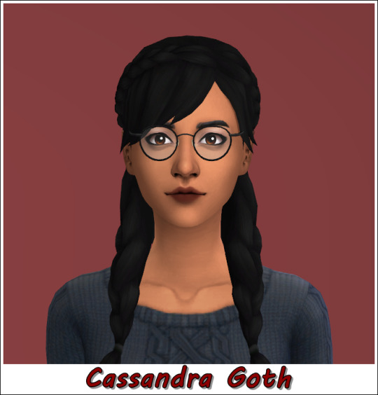
The woman who was betrayed the most in the history of this franchise, my dear Cassandra.

Finally, the little prodigy boy (some say there is a book written by him in The Sims 3, telling the story of his mother's disappearance) is cursed to grow up and, let's say, look very different from what he expected lol
Images I used as references.
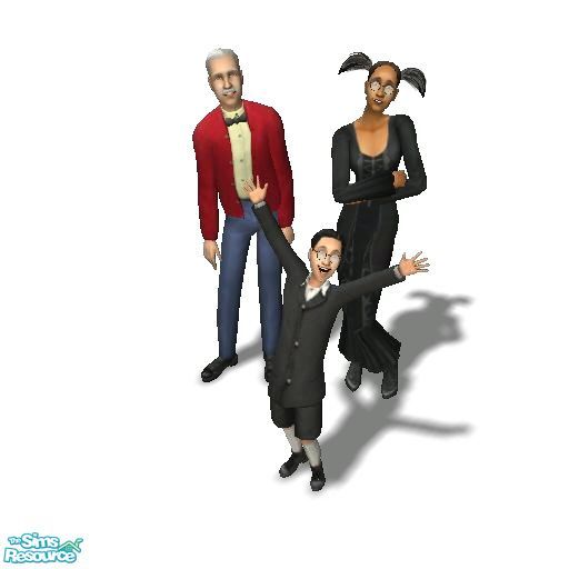

Deciding to change their skin tones, the ones EA put in gave me a feeling of being more "Arab", especially Alexander. The Goth family has a clear reference to another very popular family, the Adams, which in turn, is inspired by Latin American families (of which I am part). I thought it would be cool to make this specific change.
Note: Not one of the CC used is my authorship, the files have the name of their creators.
Many people have already done this, it's the kind of "challenge" that you find a lot out there, but I think it will be fun ʕ ͡^͜ʖ ͡^ʔ.
DOWNLOAD
default skin i use: here
default eyes i use: here (LuzEyes-Defaults)
Poses used
SENMOE: here
ReMaron: here
NELL: here
Note: Their names are not the original in English, as they were changed, by EA itself, in my country. I was too lazy to make the change, sorry.
1 note
·
View note
Text
NM3217: Assignment 2 commentary
When I first came across this assignment, the first thought that came to mind was the paradox of creativity which argues that decreasing the number of options helps to enhance creativity. The theory behind this is that humans naturally place a higher value on objects that are scarce in supply. Seen in the context of this assignment, limiting myself to creating a storyboard based around a specific item would likely enhance my creatively by forcing me to conjure an interesting storyboard based around said item. I didn't spend too much time on choosing an item, I simply chose the chess set I had just bought that week.

Initially, I toyed with the idea of making one of the chess pieces the centerpiece of my story, and tried thinking of interesting stories involving the chess pieces. Something epic - like a pawn's journey on its path to ascension to becoming a queen came to mind. I liked the idea of not including people in the assignment, since I thought it would make the assignment more challenging and fun to accomplish. However, I realized that it would also make the assignment unnecessarily tedious, since the pieces had no expressions and it would be extremely difficult to tell an interesting story with different camera angles being the only variable I could play with.
I sat on the idea for a couple of days, and met up with my friends at ArtBox later that week. I decided to involve them in this assignment of mine and thought of creating something entertaining; something that could tap on the strengths of Hafidz, the charming malay friend I was meeting. Using his cheeky personality as an inspiration, I came up with a story based off something I imagine he'd pull off in real life - cheating in a game of chess.
While I did take reference to my storyboard during filming, I used it more as a guideline so that I could decisively instruct my friends on how to pose. During the process, I got them to play out the natural sequence of events and made impromptu adjustments to the shots that I would be taking. It was important that the sequence was natural, succinct, and clearly conveyed my intended idea. Crafting a storyboard based on the natural personalities of my friends (who were very natural in playing their characters) really helped to sell the story in my opinion.


"Variety is a spice of life" is a quote I live by. As someone who hates boredom, I integrated this quote into the non-repetitive shots I picked, trying my best to ensure that each individual shot told a story. I also took shots from various angles to introduce different perspectives.
Regarding areas for improvement, I would probably change the first shot to have them both half standing and shaking hands to signify the beginning of a chess match. I quite dislike how similar the first and second pictures look currently. For the fifth picture, I would probably make the white piece Hafidz was holding in his right hand to be more obvious. Perhaps I would even have him hold multiple pieces. One last thought I had was to make the change in board state less dramatic. Since it probably looks WAYY too obvious that changes were made as it currently stands.
I didn't have too many comments from the class. Karine suggested that I changed the font since "wins" looks like "mins" currently. I won't be implementing her suggestion because I like it as it is.
There also isn't much to say regarding the workspace for this assignment. I used different layers for the pictures and text, and arranged my main storyboard pictures in a neat and symmetrical fashion since I wanted the focus to be on the pictures and not the layout. For the rejected pictures, I varied their sizes and layout because "variety is a spice of life"~


0 notes
Text
DIGITAL MEDIA SOURCES AND SIGNIFICANCE - CRITICAL ANALYSIS
Weaver, T. (2013). Comics for Film, Games, and Animation: Using Comics to Construct your Transmedia Storyworld. [online] CRC Press LLC, Oxford, pp.15–16. Available at: https://ebookcentral.proquest.com/lib/herts/detail.action?docID=1092832 [Accessed 3 Jan. 2023].
Tyler Weaver, the author of "Comics for film, games and animation : Using Comics to Construct your Transmedia Storyworld" pitched a very interesting take specifically in the chapter "Elements of story: character," which immediately caught my eye and made me want to pick this for my critical analysis. He challenges the readers by posing a general question regarding why viewers enjoy movies and television programmes. After stating the obvious response, "Entertainment," he goes further by posing the question, "What makes it entertaining?" He responds to this question by stating that we watch these movies and television series more for the characters than for the storytelling, plot twists, etc. because seeing these characters gives us the same feeling as having friends or family over. He then expands on this comparison with some logic that I find both interesting and very valid, namely the idea that watching these characters on a weekly basis fosters our natural propensity for empathy and causes us to care about and relate to them. As a result, we support and cheer for these characters when they face challenges in the series, just like we would do for any of our friends and loved ones.
He then continues by discussing one of his current personal favourites, the American science fiction drama television show "Lost." He admitted that it took him more than two months to finish the entire show, which I would say is fairly outstanding and dedicated for a show with more than a hundred episodes, each of which is close to an hour long. He also acknowledged that he didn't realise he was going to write this book at the time, but the notion that characters are the heart and soul of a show propelled him to spend a year conducting extensive research and analysing well-known television programmes that extol the value of characters. Just to name a few, these shows included Leverage, Human Target, Fringe, and House.
Returning to the topic of the "Lost" series, he said that it exhibited plot density with branching narratives, perceived interactivity, and plot twists that couldn't be captured by a single medium. He called it a unique product of 21st century media consumption. But the author said that none of these factors were important to him because the characters were the only thing that kept him reading and were important to him.
His argument is that the characters, not the mysteries and plot twists, were what made "Lost" so enduring and brilliant. He also discusses how series like the event, flash forward, and V tried so hard to emulate and mimic the "Lost" formula but failed because they did so in the wrong way. He noted that the loss of specific show characters, such as Jin and Sun, left a void in his life that he is still trying to recover from, and he asks if any readers share his sentiments.
The author admitted that because he believed in and cared about his characters, he created them first and built the story around them. The end aim or the ending of the story would be for the character to fulfil an inciting incident caused by their defects, which initially sparked the story. He also asserts that "fully developed and engaging" does not always equate to "likeable," and he used Greggory House from the television drama "House" and Louie de Palma from the comedy "Taxi" as two of the few instances he provided to support this argument. He refers to these tales as "Midwest stories" because they include passive, one-dimensional people who agree on everything. The chapter is then concluded with a humorous note before moving on to the next.
In this specific chapter, I found myself being astonished by the author’s views on several instances, which gives me more confidence and makes me happy that I chose this one for critical analysis. I also find his viewpoint reasonable though it could be controversial to a big group of people that think otherwise. I also strongly believe that a well contructed character/ characters are one of the most vital elements in media and will keep the audience engaged even if the plot isn’t the best and there are so many examples I can give to back that point. I have seen movies with little or no plot, yet very enjoyable mainly because of the characters and the characters alone. Some great examples would be Iron Man 2, Spiderman 3 etc. these movies were hated by the critics so much yet holds such a special place in fans hearts. I would argue that the biggest reason behind that would be the well developed and lovable characters such as tony stark, peter parker etc, the emotions they express and the solidification of their legacies. To me that does justice to an enjoyable film rather than a film with a great plot but boring characters.
I would like to summarise and conclude this analysis by saying that the author has dedicated a chapter to how characters play the biggest role when it comes to movies and tv shows. He first tells us that we watch films and tv shows to entertain ourselves. He then follows up by saying that the characters are what makes the media object entertaining. He asks us to contrast between the characters in the tv shows, to the characters in real life ,and tells us how we get more attached to these characters the more we see them and their behaviours and start rooting for them and caring about them, just like we would for our loved ones in our lives. To back his points up, he gives out a few examples of some of his favorite tv shows and explains to us why his points are actually reasonable and after which he also explains how the other shows failed despite trying to replicate the same formula and pointed out that they replicated the wrong “formula”, referring to the characters and making his whole argument reasonable and almost flawless.
0 notes
Note
Hi there! Idk if you've ever answered this but I just wanna know how you got into drawing, and how you found your art style! Your art is really beautiful and I tried to get into drawing, but whenever I sit down with pen and paper I just... stare and don't even know how and where to begin. Do you have a way to motivate yourself or do you just start without thinking about it?:0
hi :-) i've been drawing for a really long time, since i was a kid, though i did stop for quite a few years and only picked it back up again in 2019/2020.
i'm actually pretty insecure about my style hahaha i feel like it's really inconsistent and it never really looks how i want it... so thank you for saying that 💗 i also don't really draw that often, i typically draw in sprints where i'll suddenly draw a bunch in one week and then not touch my tablet again for 6 months lmfao so that doesn't help with my inconsistency.
something that helped me a lot was a period in 2019 where i didn't have my tablet and ended up drawing a lot of traditional stuff (literally just pencil and paper) that was just for me in a little journal. drawing from life - just random stuff, furniture, landscapes, bottles, people, etc - improved my art quite a bit, at least in my opinion. and since it was just for me i didn't feel pressured to make it perfect so it made me try more challenging pieces and if it didn't work out it wasn't a big deal.
usually i just get an idea out of the blue... lately i've been working on specific scenes with both Noel and Merry so that's what made me want to draw them. when i figure out what i want to draw i start hunting for references - i Always draw with a reference. adorkastock is my go-to especially with all the weapon references they have, since i tend to be drawing my fantasy characters. i actually used two different adorkastock images to come up with the sitting pose for Merry.
as for my style specifically i try to find a little spot between realistic and stylized - for a while i tried to emulate a more "animated" art style which is simplistic and distinct, but now i've started to move back into a more realistic/illustrative look. i also just... stopped trying to make myself do stuff i don't like - i hate doing lineart, so i don't really do it anymore! i like how my sketches look more so now my style is a bit rough and sketchy.
and there are a lot of artists i definitely take inspiration from, i follow quite a few here and i always like seeing how other people draw this or that - there are a lot of really good artists in the IF community. one of my favorite artists on tumblr is clickbaitcowboy, who also has a few tips and tutorials on his blog (i aspire to this one day figuring out how to draw body hair...) i also really like gacpars who makes really beautiful watercolor illustrations, and my friend dani crimsiswrites has a really nice style i admire, too.
if you struggle coming up with general ideas i definitely suggest checking out other artists (for me seeing other people's art is a direct inspiration), or even just scrolling through various references like on pinterest could give you some ideas!
#the last two times i've drawn now has been because someone else showed me some of their art lmfao#dani and laura if u read this mwah#ask#anonymous
37 notes
·
View notes