#alphabettes
Text
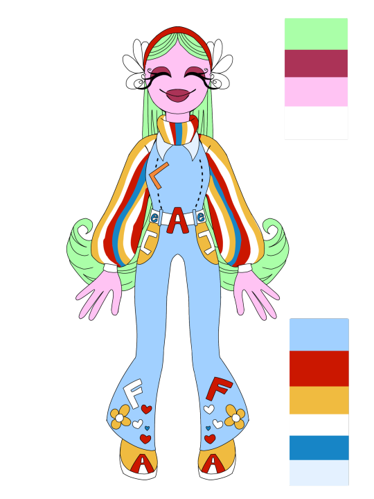

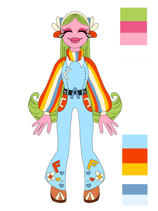
working on my Welcome home OC Alfie and these were the color pallets I did for her. the first one was just to get what I wanted out of my head. Alfie is inspired by Janice from ''The Muppets" so my goal was to let that be recognizable but just like the rest of the cast make her, her own character so of coarse I not only wanted it to show through the clothing but also through colors.
I actually ended up liking the combo so I did 2 more with a warmer pallet resulting with the last one that I like a lot.
I thinking I'm going to change small things on the outfit as I feel some cluttering is happen with the extra details but who knows.
#Welcome home oc#Fan character#Welcome home#quartzdawn#my art#illustration#art#digital art#oc#quartzdawn thoughts#quartzdawn talks#Alfie Alphabette
10 notes
·
View notes
Text
musicals special interest is so funny. why do i keep singing magic fooooooot
4 notes
·
View notes

Text
CONTRA2023-12 DIE LAUGHING
TRACKLIST:
Upchuck - Freaky
Osees - Sleazoid Psycho
Nite Music - (I've Got To Make) The Call
Benny J. Ward - I Didn't Mean It
King Tuff - Symphony Of A Man
Snõõper - Music For Spies
Axis: Sova - Hardcore Maps
Panda Bear & Sonic Boom - Whirlpool Dub
Black Mekon - Buhlak Me Kong
Goat - I Became The Unemployment Office
PABLO X - Mad Dog
DAIISTAR - Repeater
Sparklehorse - Listening To The Higsons
Wilco- Evicted
The Whiffs - Satellites
The Linda Lindas - Resolution/Revolution
PAL - Alphabetter
Sufjan Stevens - So You Are Tired
The 12th playlist of the year!
#all new#osees#goat#black mekon#wilco#sufjan stevens#king tuff#daiistar#the whiffs#snooper#pablo x#PAL#axis: sova#panda bear & sonic boom#sparklehorse#the linda lindas#benny j ward#nite music#upchuck#garage rock#punk#post-punk#alternative#indie#playlist#mixcloud
2 notes
·
View notes
Text
Explain to me why my parents gave me a name that over half of the entire alphabette!
15/26 fucking letters
1 note
·
View note
Text
This reimagined alphabet is the perfect combination of entertaining and enlightening!
Check it out on:
0 notes
Text
Ruth Sykes
Senior lecturer on graphic design and illustration course at university of hertfordshire.
She founded her own founded design practise with emily wood. she is a researcher of graphic design history.
Graphics UK Women website
Most documented history within design are from men.
Baseline Shift-untold stories of women in graphic design history. Sykes wrote a chapter within this.
Dorrit Dekk (1917-2014)
Why Dekk?
Women had to work extra hard to make a career for herself. A sketch Dekk made is of her running with her portfolio in arms. Her name is a not her actual name.
Dekk got her first job in the uk government, she put it down to how good she looked in her uniform. It was easier for women to get into advertising design during this period (Dekk was rejected for theatre designer position). Dekk would sign her pieces using just 'Dekk'-suggests a more masculine name. Learnt theatre production in Vienna but had to move because of the Nazis.
1951 was her big break. She become a freelance designer and worked for the festival of britain. This was her first time being introduced to the general public. She created a mural that demonstrated party games. Dekk was a great socializer and got this job by lying that she did murals before-created a persona. She did work for Air France.
In the 1960s she created personality panels, such as UK priminiseter Harold Wilson. She got various press cuttings and made a collage.
Enid Marx-another leading pioneer in the field of design (1902-1998). Women had to sell their work. Men didn't have to work as hard-just left portfolio with them. Women were paid less. Marx wasn't allowed to sign her work.
In 2010 she produced a range of t-shirts with Tender Co.
Norma Kitson (1933-2002)
Sierra Leone have her face on her stamp. She took advantage of new technological advances to take control of her own life. She had to move to london from south africa to escape government. Her husband was imprisoned and her sister was murdered by authorities.
1950s/60s She had learnt about printing south african communist party materials. Once in england, she got a clerical job with FHK Henrion.
She set up her own typesetting company in 1973 near Red Lion Square in London. Mechanical typesetting was not a feminised environment but there had been throughout history many attempts to make it suitable for women-Delcambre Type Composer 1843. This was focused on the profitable gain of using women and child labour, but companies saw their involvement as undervaluing the job and as a result, lowering the pay of men.
During the 1970s, type setting was accessible and many women took on these jobs. The Quaderik keyboard was introduced and typing was seen as a womens job. 'If you have a typist, you have an operator'-press ad for Apha Corp advertisement, women empowered.
Kitson was not particularly feminist, she employed women as they were cheaper and unionised. She was however, left leaning and against imperialism.
Websites:
Women in Type - shows the history of women in industry
Alphabettes - organisation that supports and promotes women in type
Books:
Hall of Femmes
Women in Graphic Design
Women Design
Designer (H)ers
Women in Design
Groups:
Kerning the Gap-supports women in moving into senior roles in design
lwd.bournemouth-networking organisation to get women together
My question:
Would you say the feminisation of type work is still prevalent today?
Reasons associated with feminisation is unknown but Sykes puts it down to the action of typing as being an elegant task-'nimble fingers'. She also explains how type designs sometimes have curvy features associated with the female anatomy.
0 notes
Text
Week 1: Speaker Research
Carol Twombly, Joseph Churchward, Veronika Burian
Carol Twombly
Carol Twombly is an American type designer. She created several prominent typefaces of the second half of the 20th century, including Myriad, Adobe Caslon, and Nueva. Much of her well-known work comes from her time creating adobe original typefaces, alongside Robert Slimbach. Originally Twombly pursued sculpture, before turning to Graphic Design, and eventually type design, where she worked with early digital design systems.
Sources: Carol Twombly Profile, Linotype. https://www.linotype.com/606/carol-twombly.html. Carol Twombly Profile, Adobe. https://fonts.adobe.com/designers/carol-twombly. The Digital Wave, Eye Magazine. https://www.eyemagazine.com/feature/article/the-digital-wave

Above: Carol Twombly, font shop.

Above: Nueva, a serif typeface by Twombly based on calligraphy, is made as a lowercase companion to her display typeface Charlemagne. The stroke is high contrast, and the counters on some letters (p, b) are asymmetrical, as are the apertures of others (m, u). This gives the typefaces a loose, hand-written and historical feel.
Above (Adobe Fonts): Viva, designed by Twombly in 1993. The typeface is inline and serif with narrow kerning (note the distance between ‘T’ and ‘h’), with an ascender height taller than the x-height. The letterforms are wide and fairly short. Like many of Twombly’s typefaces, Viva has a classical feel, as though it wouldn’t be out of place in a medieval manuscript. Viva showcases the skilful re-interpretation of historical type forms that made Twombly so successful in digitising classic typefaces for Adobe.
Joseph Churchward
Joseph Churchward was a Samoan New Zealand typographer of international renown, responsible for over 600 typefaces. His career began in the late 1950s, but he rose to prominence in the 60s with his typeface “Churchward 69”. He was known for his skill creating letterforms by hand, a practice he maintained throughout his life. His typefaces were digitised in the 2000s, but he noted that the computer renditions did not do justice to the original hand-drawn forms. He drew inspiration from his heritage and his family, naming many of his typefaces after family members.
Sources: Akeli Amaama, S. (2021). Story: Churchward, Joseph. Te Ara. https://teara.govt.nz/en/biographies/6c10/churchward-joseph
Joseph Churchward, The Designers Institute. https://designersinstitute.nz/initiatives/black-pin/2009/joseph-churchward/interview/

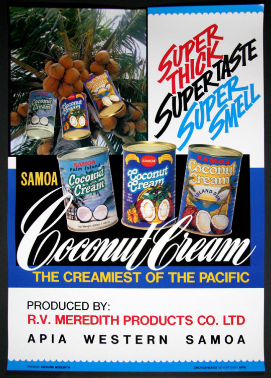
Above: Joseph Churchward (Image: Louis Hatton & Grant Fell)
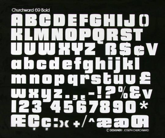
Above: the bold font of Churchward 69, Churchward’s most well-known typeface. The sans serif, block-like forms, narrow counters, and low/no contrast stroke of the type-face give it a clean, modernist feel, popular during the mid-20th century. The simple forms look as though they were created with a single stroke.
Below: An advertisement for Samoa Coconut Cream created by Churchwood in the 1980s. The warm, tropical colours pair well with the campaign tone (island sun, the creamiest of the pacific) which draws on geographical context. The serif, calligraphic display type used for “coconut cream” reminds me of advertisements of the 1950s. It suggests luxury and comfort, which supports the copywriting (creamiest of the Pacific, super thick, super taste, super smell) which implies quality and reliability. The rounded serif typeface used on the tins suits the rounded letters (double cs, double o,) and the curved details support the idea of luxury like the display type.
Veronika Burian
Veronika Burian is a Czech type designer, and co-founder of the foundry TypeTogether, alongside Jose Scaglione. She began her studies in industrial design, but eventually found a talent for type design. Her typefaces have been recognised for various typographic awards, including The TDC certificate of excellence in typography. She is also a co-creator of Alphabette, a digital typography platform for women. She lectures on type design at various universities, and mentors young type designers. Burian is a supporter of digital and print fonts co-existing, and believes type design on the internet has lots of potential. “the internet...(has) significantly increased the complexity of the type design profession.”- in her opinion, type, as a “carrier of culture”, matters more and more in the digital age. She focuses on creating quality, versatile typefaces that work in a range of different contexts, digital and print.
Sources: Veronika Burian profile, Adobe, https://fonts.adobe.com/designers/veronika-burian. Veronika Burian, type together, https://www.type-together.com/veronika-burian. Burian, V. & Esterton, S. (2010) Veronika Burian and TypeTogether- How we learned to stop worrying about pirates and love type on the Web. Eye Magazine. https://www.eyemagazine.com/blog/post/veronika-burian-and-typetogether. Why do we need more typefaces? Burian, V. (2016). Alphabette. https://www.alphabettes.org/why-do-we-need-more-typefaces/

Above: Veronika Burian, Granshan.

Above : Maiola, which won the TDC Certificate of Excellence in Type Design 2004. The wedge serifs, thin, high contrast strokes, diamond tittle and combination of straight and curved strokes give the typeface a sharp, calligraphic feel. It reminds me of old Blackletter styles, although more subtle and therefore more versatile.

Above (Burian and Scaglione): Abril is available in over 20 fonts, the range of which can be seen in the top image (Abril Display Black and Abril text Italic ?). The bolder fonts have very thick strokes, narrow, arch-shaped counters, and narrow kerning (note the serif overlap on h, r and i, f). The text fonts have a narrower stroke and wider counters, making them more readable, but retain key characteristics like a combination of hairline and curved serifs. In my opinion the serif combination gives the typeface a mid-century look, especially with very thick strokes and emphasised stroke contrast as in Abril Display Black.
0 notes
Text
VERONIKA BURIAN
Born in Prague Veronika Burian is the co-founder of type foundry TypeTogether. Veronika worked all around europe in different locations but got her degree in Munich, Germany for Industrial design. She then worked as a product and graphic designer in Italy and Austria. So she has gained a lot of influences from the places she has lived, studied, worked and visited. Veronika Burian also created the typography platform the ‘Alphabettes’ which is run by women, for women.
TypeTogether was created after Veronika Burian and José Scaglione met at University and grew a friendship while working on their degrees. TypeTogether is an indie company started by the two but does a range of things like creating custom type, teaching others how to design and work with type and they even give out awards to people who create typefaces. So overall it’s a company that does a lot of diverse type related things.


Veronika Burian has created 17 font families that can be obtained online. Most of them feel like fonts that would be used for headings and/or body paragraphs as they are simple and easily legible, although all still unique and interesting. While looking through all her fonts as well the names were very familiar to me and it made me realise just how iconic and famous Veronika Burian’s type designs are and how widespread they are used which is a good show of how awesome the typeface design that went into these fonts is.
0 notes
Photo

A short sweet collaboration with @dottedpress printed at @starshapedpress last year, serenaded by @jostarshaped. Happy birthday, Beatrice. #letterpress #badassladyprinters #alphabettes #beatricewarde https://www.instagram.com/p/CFXiTAYhS9b/?igshid=ul88n09mcvcx
1 note
·
View note
Photo

HEADS UP! There are only two days left to pick up the discounted copy of the FEMME TYPE book from Kickstarter. Link in @femmetype bio. And in case you missed what this incredible project is about, "FEMME TYPE" is a book celebrating women in the type industry • The FEMME TYPE publication is a 256 page book featuring over 40 international women covering three categories: essays, type design and typography. @PressisionLtd will be printing a run of only 750 copies. • Conceptualized by ex-University of Arts London Chelsea student Amber Weaver, the book aims to celebrate over 40 skilled, international women to create a valuable stage and platform for designers to showcase their brilliant typographic achievements, simultaneously creating a valuable source of inspiration and education for future and established designers across the globe. • Published by @peopleofprint (in perpetuum). • Featured typeface is Mars Extended from @productiontype • Contributors include: TienMin Liao / María Ramos / Bianca Berning / Amy Papaelias (Alphabettes.org) / Floriane Rousselot (typelab.fr) / Verena Gerlach / Johanne Lian Oslen / Andrea Tinnes / Sibylle Hagmann / Leonie Martin & Laura Brunner / Pooja Saxena / Maria Doreuli / Laura Meseguer / Nadine Chahine / Veronica Feurte (Founder of Hey Studio) / Shanti Sparrow / Marta Gawin / Catherine Griffiths / Ana Duje / Nuria Lopez / Mobel Type foundry / Lilly Marques / Sahar Afshar / Natalie Rauch / Charlotte Rohde / Nova Type Foundry / Lynne Yun / Isabel Pena / Liron Lavi Turkenich / Marina Chaccur / Yarza Twins Rita Matos / Hui Yeon Hwang / Caterina Bianchini / Marta Cerda/ /Rachel Joy Lettering / Sandrine Neugue / Inga Plönnigs / Alice Savoie / Erica Carras / Letitia Lin / Hello this is Kae / Noelia Lozano / Anastasia Liolio / My Name is Wendy / Tina Touli #femmetype #goodtype #peopleofprint #printisntdead #womenoftype #typography #typedesign #graphicdesign #womenoftype #letterarts #lettering #handlettering #typism #tyxca #thedailytype #alphabettes #novatype #typefoundry #foundry #mobeltype https://www.instagram.com/p/Bw2CsU8nsZx/?utm_source=ig_tumblr_share&igshid=mfu4tz160kov
#femmetype#goodtype#peopleofprint#printisntdead#womenoftype#typography#typedesign#graphicdesign#letterarts#lettering#handlettering#typism#tyxca#thedailytype#alphabettes#novatype#typefoundry#foundry#mobeltype
8 notes
·
View notes
Photo
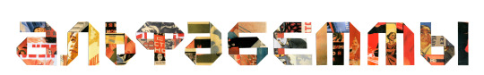
АЛЬФАБЕТТЫ / Header design for Alphabettes.org, a showcase for work, commentary, and research on lettering, typography, and type design, and a network to support and promote the work of all women in our fields
#lettering#cyrillic#editorial illustration#Alphabettes#collage#collage lettering#illustration#customlettering
0 notes
Text
The door, though sturdy enough to resist being kicked open, isn’t all that strong. Which is actually the problem. Geralt and Yennefer can’t seem to agree on which of them should bust it in. Jaskier can’t hear all of the hushed debate, but can see them both making vaguely mystical gestures. Geralt seems to be of the view that a fireball would draw overmuch unfriendly attention, whereas, as far as Jaskier can tell, Yennefer’s position is mostly based on aesthetic. She has in the past held forth on “how embarrassing it is to be seen with someone using magic that [redacted]”.
Jaskier rolls his eyes and moves over towards the door. A few moments later it’s swinging open. They don’t notice for several seconds, and Jaskier uses a stage whisper to break into their argument. “Hey! Do I need to carry you both over the threshold, too?”
Geralt and Yennefer both turn towards the door, look at it, look at the lockpick set in his hands, and look at him. Their faces are judgy. At least, Jaskier’s pretty sure those are judgy faces, and, frankly, neither of them is in any position to be making judgy faces about something this mild.
“There are plenty of perfectly innocent reasons to carry lockpicks, you know,” Jaskier says.
Geralt accepts this with an assenting hmm. Yennefer, on the other hand, raises an eyebrow. “Do any of those reasons apply in this case?”
Jaskier narrows his eyes at her. “This is why Geralt is my favorite.”
#geraskefer#geralt x jaskier x yennefer#I use that order because of the Alphabette#witcher ficlet#mine
103 notes
·
View notes
Photo
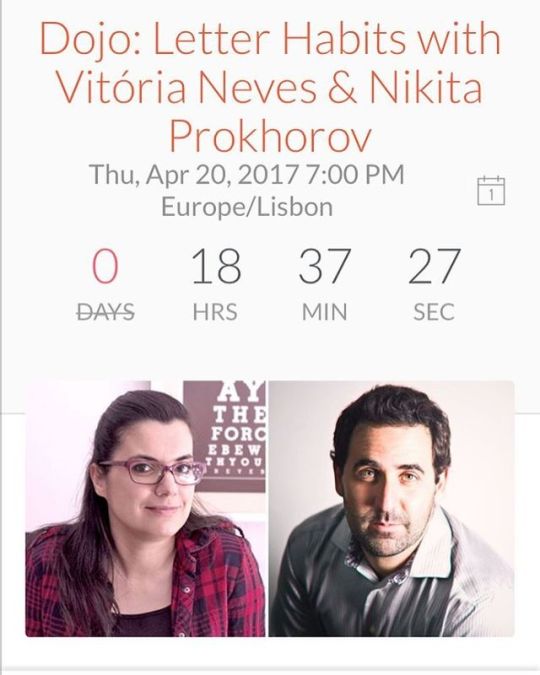
Join our panel discussion, led by Rachel, as @typebynikita and I talk about education, training, influences, passion projects, and rituals; all to help improve our lettering practice. If you are a calligrapher, lettering artist, type designer or just love letters, be sure to join in our group discussion to discover how internal and external factors can help us letter better. Link is in my bio @typeedla #lettering #typedesign #calligraphy #passion #letterhabits #typographydojo #typelove #typed #handlettering #alphabettes #letteringpractice #design #brushlettering #typography
#calligraphy#handlettering#typography#brushlettering#typelove#alphabettes#design#typedesign#typed#letteringpractice#typographydojo#letterhabits#passion#lettering
1 note
·
View note
Text
guess who gets to put on n.ewsies to try and find good a.lbert lines for his verse tags
#((me: let's do tag drops! // also me: the first character alphabettically is the dude you wanna add dumbass))#i'll stop wearing black when they make a darker color (ooc)
1 note
·
View note
Last Seen Blogs

stroyka-veka
Строительство

myvanityisavirtue
My Vanity Is A Virtue

ash1a
ashi

paralien
Play Outer Wilds

mootoyou
A Moo from Me to You