#Stinehour Press
Text


Marbled Monday
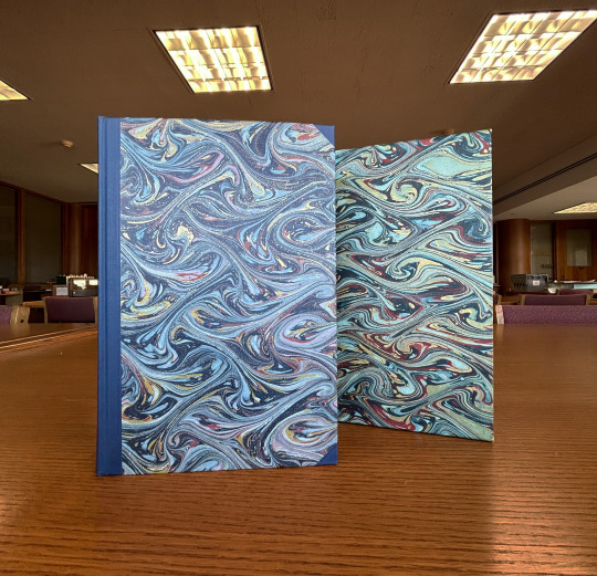
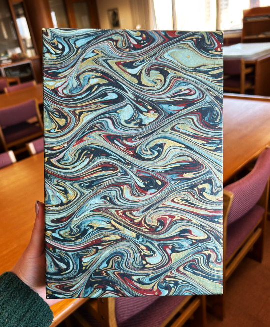
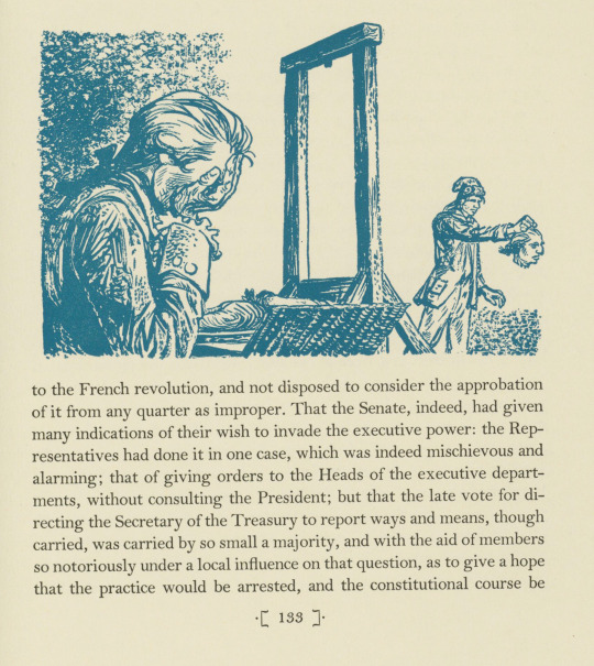
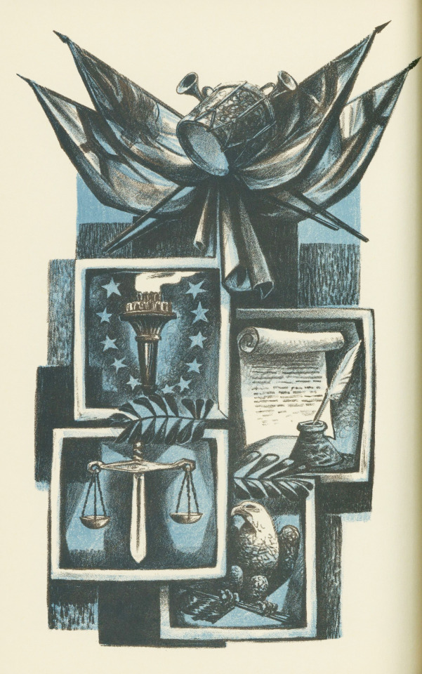
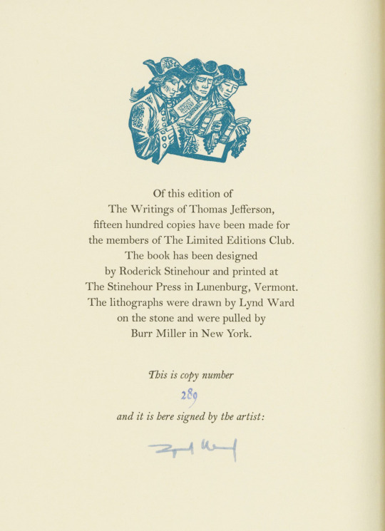
This lovely example of fantasy pattern marbling is from the Limited Editions Club's 1967 publication The Writings of Thomas Jefferson. The book was designed by Roderick Stinehour with text set in Monotype Bell types and printed at the Stinehour Press in Lunenburg, Vermont in an edition of 1500 copies. It includes 16 full-page lithographs and 36 monochrome drawings by Lynd Ward (1905-1985), who signed each volume. The paper was made by the Curtis Paper Company in Newark, Delaware.
The paper used for the cover and slipcase is a blue, red, pink, and gold marbled paper. It features a fantasy pattern primarily in light and dark shades of blue with red, pink, and gold accents. The colors of the paper are similar to those used to print Ward's two-color lithographs. You can see in the difference in the color of the paper between the slipcase and the book itself that there has been some yellowing of the paper on the slipcase, most likely from light damage.
View more Marbled Monday posts.
View more posts featuring the work of Lynd Ward.
View more Limited Editions Club posts.
View more posts featuring books by the Stinehour Press.
-- Alice, Special Collections Department Manager
#Marbled Monday#fantasy marbled paper#fantasy pattern#The Writings of Thomas Jefferson#Roderick Stinehour#Stinehour Press#Lynd Ward#Curtis Paper Company#Thomas Jefferson#light damage#Limited Editions Club#LEC#lithographs#drawings#marbling#marbled paper
27 notes
·
View notes
Photo

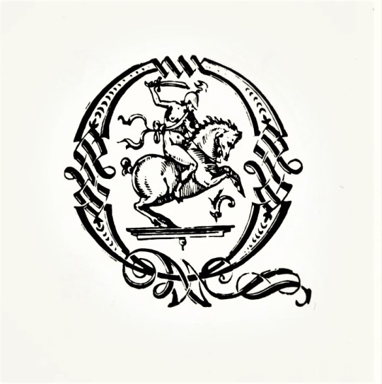
Bernard Kirschenbaum, Cover art for Jalaluddin Muhammad Rumi: 'Ruminations', Translated from the Persian by Zahra Partovi, Vincent FitzGerald & Co., New York, NY, 1998. Designed by Jerry Kelly & Vincent FitzGerald. Printing: The Stinehour Press. Type: Hermann Zapf’s Renaissance, Aldus and Michelangelo
#graphic design#typography#art#geometry#book#cover#book cover#bernard kirschenbaum#jalaluddin muhammad rumi#zahra partovi#jerry kelly#vincent fitzgerald#vincent fitzgerald & co.#the stinehour press#1990s
44 notes
·
View notes
Link
New York : Limited Editions Club, 1980 . Fred Meyer. Hardcover. Octavo 6-3/4 x 8-5/8 bound by the Stinehour Press in full gray buckram stamped with a design by Deborah M. Evetts of a vintage automobile with silver headlights. Copy #887 of 2000 illustrated with 14 color gouaches by Fred Meyer and SIGNED by the artist on the colophon page. Monthly Letter laid in. Fine in a close to Fine slipcase. Item #019687
0 notes
Text
Jerry Kelly on great type and book designers
Jerry Kelly is a calligrapher, book and type designer. His work has been honored many times - his designs have been selected more than thirty times for the AIGA “Fifty Books of the Year.” In 2015 he was presented with the Goudy Award from The Rochester Institute of Technology.
Kelly has served as Chairman of the American Printing History Association, and President of The Typophiles. He is an active member of several committees at The Grolier Club. He has written many articles and several books on calligraphy and typography, including The Noblest Roman: The Centaur Types (co-authored with Misha Beletsky; winner of the 2016 Bibliographical Society of America Prize).
Kelly has taught typography at Pratt Institute and Parsons School of Design, and has lectured on the subject for The Cooper Union and numerous other organizations.
Before starting his own design business in 1998, Kelly was Vice President of The Stinehour Press, preceded by a decade as designer at A. Colish.
We met to discuss some of the great type and book designers Jerry writes about in A Century for a Century. The two other books of special interest to collectors mentioned during our conversation are The Best of Both Worlds: Finely Printed Livres d Artistes, 1910 2010, and The Art of the Book in the Twentieth Century
Check out this episode!
0 notes
Photo


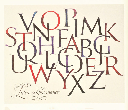
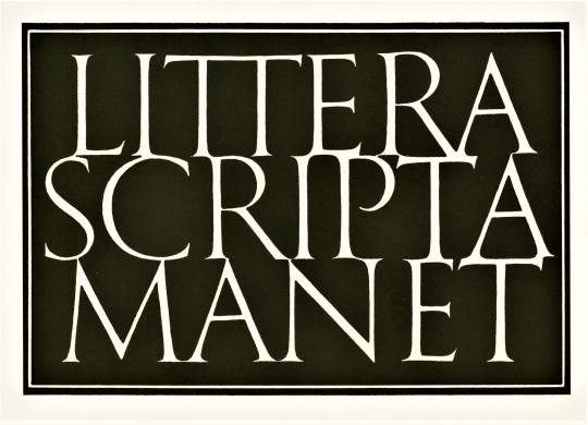
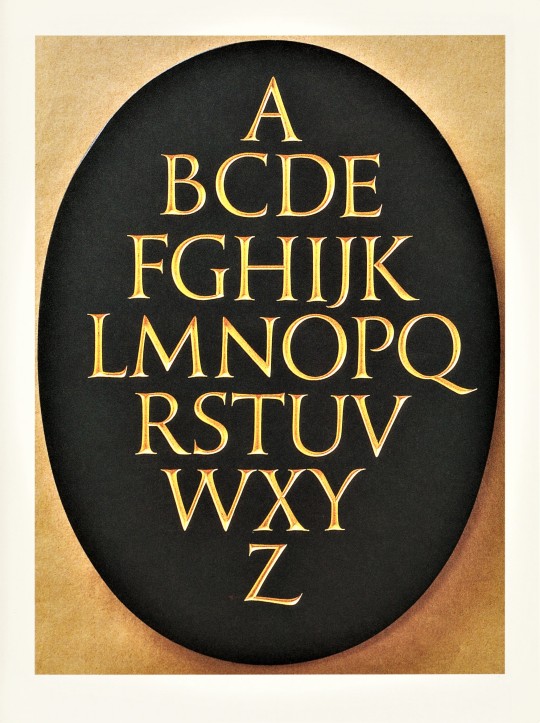
Decorative Sunday
Kandinsky said, “Letters act as practical and useful signs, but also as pure form and inner melody.” This quote appears on a Society of Scribes 10th Anniversary Keepsake from 1984, one of the pieces featured in Artist & Alphabet: 20th Century Calligraphy & Letter Art in America.
The exhibition catalog was published in Jaffrey, New Hampshire in 2000 by David R. Godine in conjunction with the American Institute of Graphic Arts and the Society of Scribes and was printed in at The Stinehour Press in Vermont. The exhibit and catalog were curated by Jerry Kelly (who was also the book designer) and Alice Koeth (who provided the title page calligraphy). The catalog includes an introduction from Donald Jackson.
While Artist & Alphabet contains a wide overview of the lettering arts of the 20th century, for this Decorative Sunday I have focused on the specimens that embody that spirit of what Jackson calls “spontaneously made, deeply personal pirouettes of the pen, blots and all.” These works show how letter forms can be utilized not just to convey information, but as a visual grammar in and of itself.
You can find more publications from Godine here.
View more Decorative Sunday posts here.
-Olivia, Special Collections Graduate Intern
#Decorative Sunday#Artist & Alphabet#Artist & Alphabet: Twentieth Century Calligraphy & Letter Art in America#David R. Godine#Godine#American Institute of Graphic Arts#Society of Scribes#Stinehour Press#Jerry Kelly#Alice Koeth#Donald Jackson#calligraphy#letter arts#decorative art#decorative arts#decorative plates#olivia
204 notes
·
View notes
Photo


Typography Tuesday
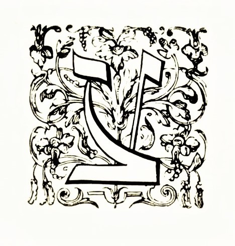
LETTRE CADEAU
On this last #Typography Tuesday of 2022 we present a few examples of what is known as Lettre Cadeau from Ornamental Initials,The Woodcut Initials of Christopher Plantin by the American type designer and stonecutter Stephen Harvard, published in 1974 by the American Friends of the Plantin-Moretus Museum in New York, and printed at the Stinehour Press with design and lettering by Stephen Harvard.
Cadeau or cadel which means “gift,” are a form of embellished letters that were first created by Jean Flamel, secretary to Duc de Berry at the turn of the 15th century. The term appears to be derived from the Latin catellus (small chain) because of the shape of the pen strokes that often create a series of diamond shapes within the letter. In the manuscript tradition, lettre cadeau were applied most often to writs, patents, and other documents of legal and lasting value. Since copies of such documents would not include ornamented initials, those ornamented with cadeau would be understood as being the original document.
These ornamented letters found their way into the print tradition as ornamental woodcut initials. The notable sixteenth-century Antwerp printer Christophe Plantin had a series of lettre cadeau cut for his use between 1563 and 1585. These initials are preserved at the Plantin-Moretus Museum in Antwerp. Shown here are examples from series 36 to 41 in the museum’s collection of ornamental woodcut initials. Click or tap on the images for details.
Our copy of Ornamental Initials is once again a gift from our friend Jerry Buff.
View other posts from Ornamental Initials.
View more Typography Tuesday posts.
#Typography Tuesday#typetuesday#Typography Tuesday#Christophe Plantin#Ornamental InitialsThe Woodcut Initials of Christopher Plantin#ornamental initials#Lettre Cadeau#woodcut initials#Stephen Harvard#Stinehour Press#Jean Flamel#16th century type#Jerry Buff
56 notes
·
View notes
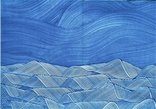
Photo


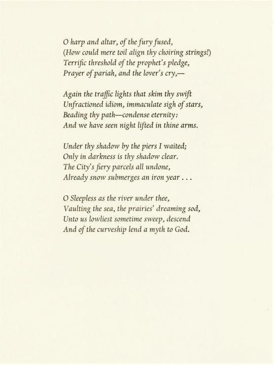
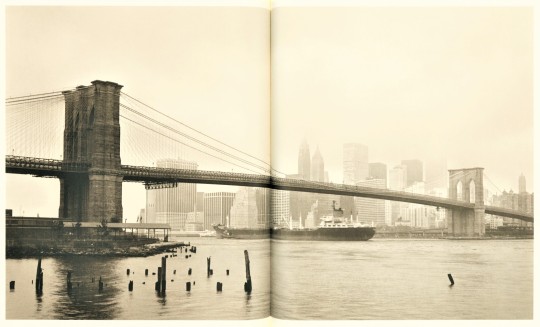
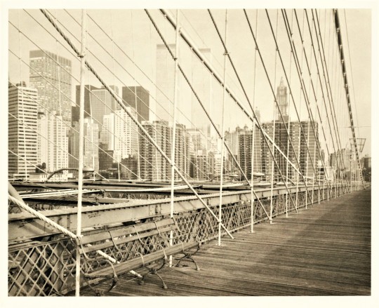


Staff Pick of the Week!
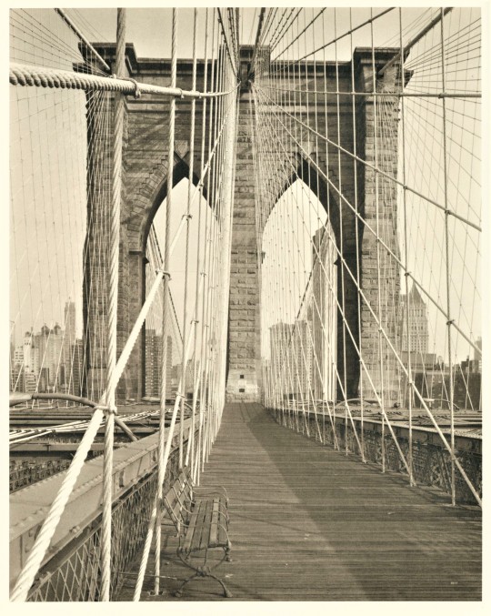
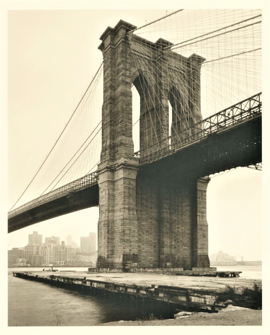
This week I am sharing The Bridge: a poem by Hart Crane with photographs by Richard Benson, printed in 1981 for the members of The Limited Editions Club in New York in and edition of 2000 copies signed by the photographer..
This book caught my eye with its bright blue paste papers wrapping the box and making up the end sheets in the book. The papers are reproductions of the originals made by Carol Blinn. Paste papers are made by mixing pigment with a starch to create a paste that can be painted on a paper to decorate it, the paste mixture allows you to push the pigment around, moving it with different tools until the desired effect is created. Once you have seen some decorated paste papers they are hard to miss. Blinn’s designs suggest a body of rolling waves under blue sky, perhaps they are the waves bustling beneath the Brooklyn Bridge which inspired Hart Crane to write his first long poem.
This edition maintains many of the visual themes of the first edition of The Bridge, first published in 1930 by the Black Sun Press, which is wrapped in a blue paper cover and features photos of the bridge by Crane’s friend Walker Evans.
This book was designed by Stephen Stinehour. The font of the main text is Fourteen-point Monotype Dante, the headings are also Dante in other sizes. The text was set and printed by Michael & Winifred Bixler in Somerville, Massachusetts. The five photographs are by the photographer Richard Mead Atwater Benson and were printed by The Meriden Gravure Company in Meriden, Connecticut. The smooth white papers were produced specially for this edition at the Mohawk Mill in Cohoes, New York. The edition was bound at The Stinehour Press in Lunenburg, Vermont.
Use this link for more Staff Pick of the Week posts!
Use this link for more Limited Editions Club posts!
Teddy- Special Collections Graduate Intern
#staff pick of the week#pastepaper#decorative papers#photography#New York City#hart crane#Limited Editions Club#Stinehour Press#Dante type#dante typeface#Michael and Winifred Bixler#Stephen Stinehour#the stinehour press#the bridge#poetry#Poetry Books#fine press books#Teddy
73 notes
·
View notes
Photo
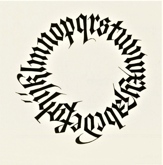
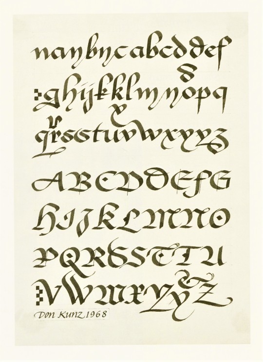
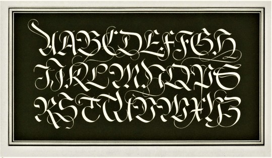

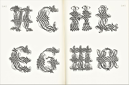
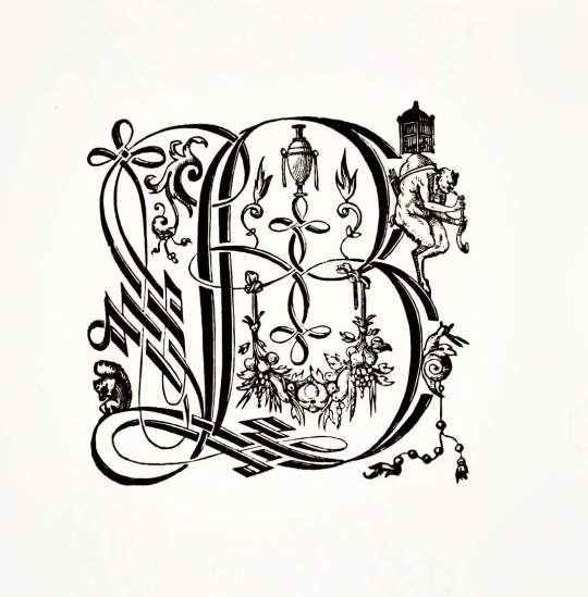
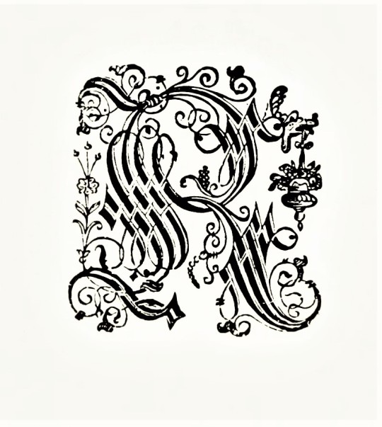
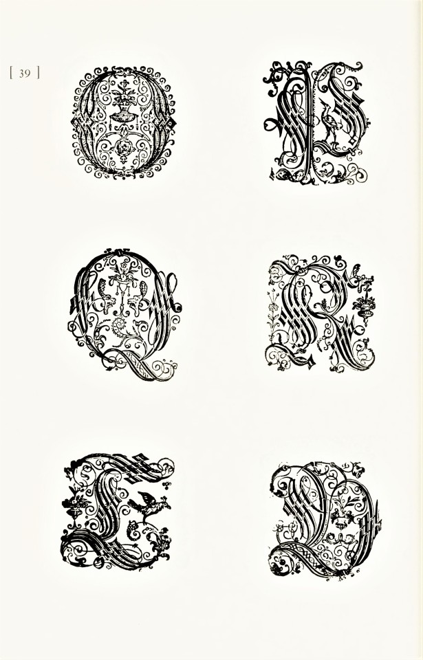
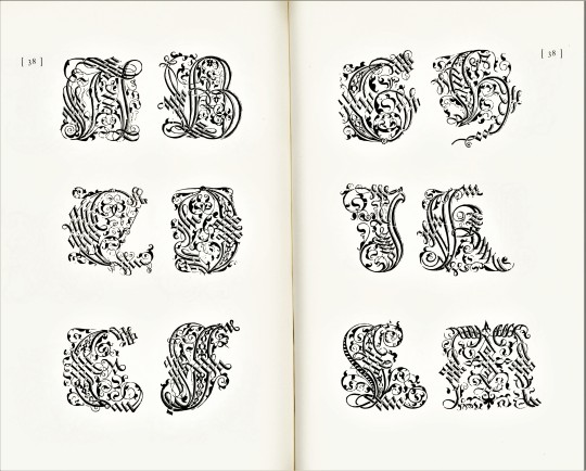
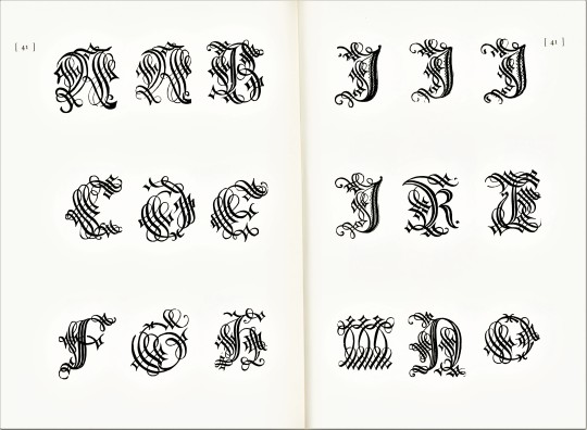
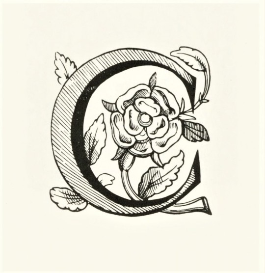
Typography Tuesday
Last Sunday we brought you a few highly decorative calligraphic designs from the 2000 exhibition catalog Artist & Alphabet: 20th Century Calligraphy & Letter Art in America, published by David R. Godine in conjunction with the American Institute of Graphic Arts and the Society of Scribes and was printed in at The Stinehour Press in Vermont. On this #Typography Tuesday we present some of the more formal letterforms from this same volume.
Click or tap on the images for details.
View more Typography Tuesday posts.
#Typography Tuesday#typetuesday#calligraphy#letterforms#Artist & Alphabet: 20th Century Calligraphy & Letter Art in America#David R. Godine#American Institute of Graphic Arts#Society of Scribes#Stinehour Press#Jerry Kelly#Typography Tuesday
68 notes
·
View notes
Photo


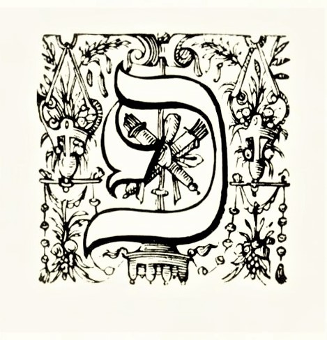
Typography Tuesday
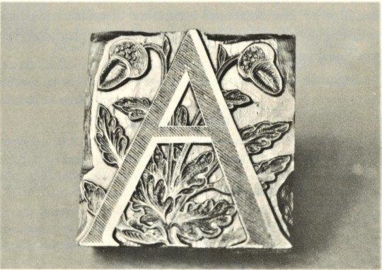
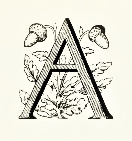
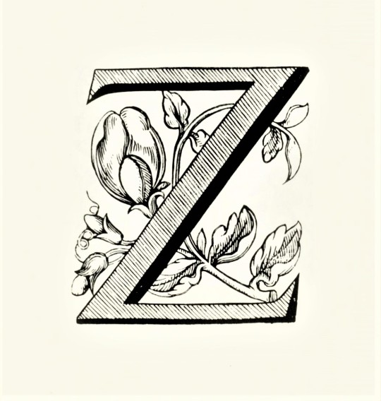
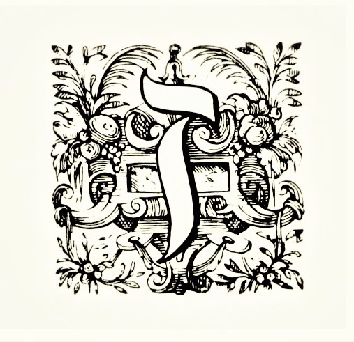
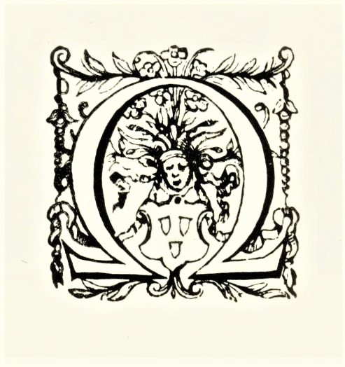
Shown here are some examples woodcut floriated initials used by notable sixteenth-century Antwerp printer Christophe Plantin from Series 4 and 7 in the ornamental initials collection at the Plantin-Moretus Museum in Antwerp. These examples come from Ornamental Initials,The Woodcut Initials of Christopher Plantin by the American type designer and stonecutter Stephen Harvard, published in 1974 by the American Friends of the Plantin-Moretus Museum in New York, and printed at the Stinehour Press with design and lettering by Stephen Harvard. The catalogue assembles, for the first time since the 16th century, the entire collection of decorative initials that Christophe Plantin acquired. Fifty-eight different series of initials are reproduced in their original size in the catalogue.
The initials shown here were cut by Gerard Van Kampen who cut a number of large initials for Plantin, mainly for music printing. Most of the initials above are from Series 4, which were probably cut in 1567. The first two images show the original block and the letter A printed from it. The last two letters, C and E, are from Series 7, cut by Van Kampen around 1578.
Our copy is another gift from our friend Jerry Buff.
View other posts from Ornemental Initials.
View more Typography Tuesday posts.
#Typography Tuesday#typetuesday#Typography Tuesday#ornamental initials#Ornamental InitialsThe Woodcut Initials of Christopher Plantin#Christophe Plantin#Plantin-Moretus Museum#American Friends of the Plantin-Moretus Museum#Gerard Van Kampen#Stephen Harvard#Stinehour Press#floriated types#floriated initials#woodcuts#woodcut initials#wood type#Jerry Buff
137 notes
·
View notes
Photo


Typography Tuesday
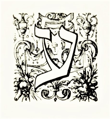
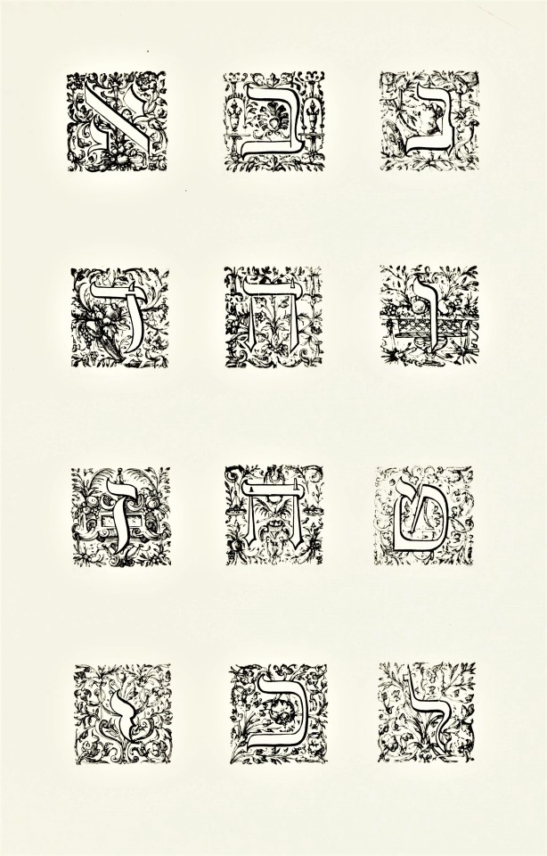
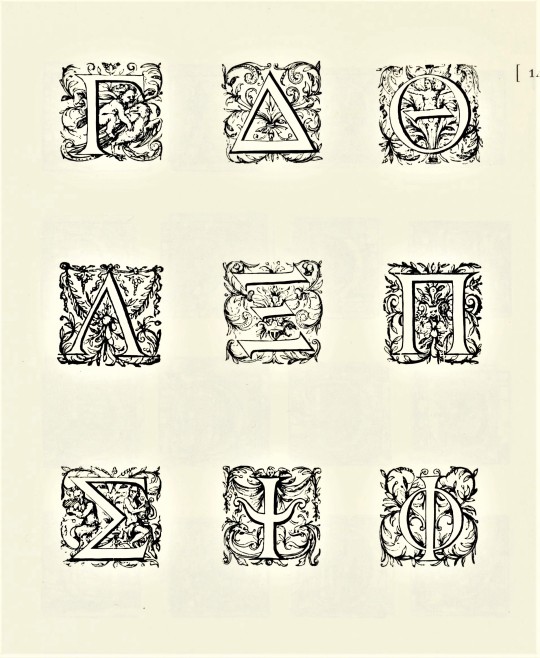
PLANTIN’S HEBREW AND GREEK ORNAMENTAL TYPE
The very-notable sixteenth-century Antwerp printer Christophe Plantin amassed an enormous collection of wood-cut ornamental initials for his many book projects, but when he embarked on the most ambitious project of his career, a multi-volume, folio-sized polyglot Bible for the king of Spain, he needed to have Hebrew and Greek initials cut for those languages. The floriated Hebrew and Greek initials shown here were designed for Plantin by French painter and draughtsman Geoffroy Ballain. The Hebrew font was cut by Cornelis Muller, from the noted family of Dutch engravers, and the Greek by the Flemish woodcut artist Arnold Nicolai.
These initials are from series 13 and 14 in the ornamental initials collection at the Plantin-Moretus Museum in Antwerp, and are drawn form the collection’s complete catalogue, Ornamental Initials, The Woodcut Initials of Christopher Plantin by the American type designer and stonecutter Stephen Harvard, published in 1974 by the American Friends of the Plantin-Moretus Museum in New York, and printed at the Stinehour Press with design and lettering by Stephen Harvard. The catalogue assembles, for the first time since the 16th century, the entire collection of decorative initials that Christophe Plantin acquired. Fifty-eight different series of initials are reproduced in their original size in the catalogue..
Our copy is another gift from our friend Jerry Buff.
View other posts from Ornemental Initials.
View more Typography Tuesday posts.
#Typography Tuesday#typetuesday#Typography Tuesday#Christophe Plantin#initials#ornamental initials#Geoffroy Ballain#Cornelis Muller#Arnold Nicolai#Ornamental InitialsThe Woodcut Initials of Christopher Plantin#Plantin-Moretus Museum#Stephen Harvard#Stinehour Press#type catalogs#American Friends of the Plantin-Moretus Museum#woodcuts#floriated initials#floriated types#woodcut initials#wood type#Jerry Buff
64 notes
·
View notes
Photo


It’s Fine Press Friday!
Special Collections just keeps on giving. Every time I find a book with amazing original prints I think for sure its the last, but there are more!
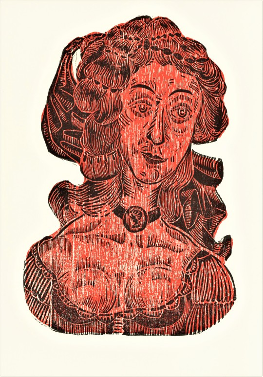
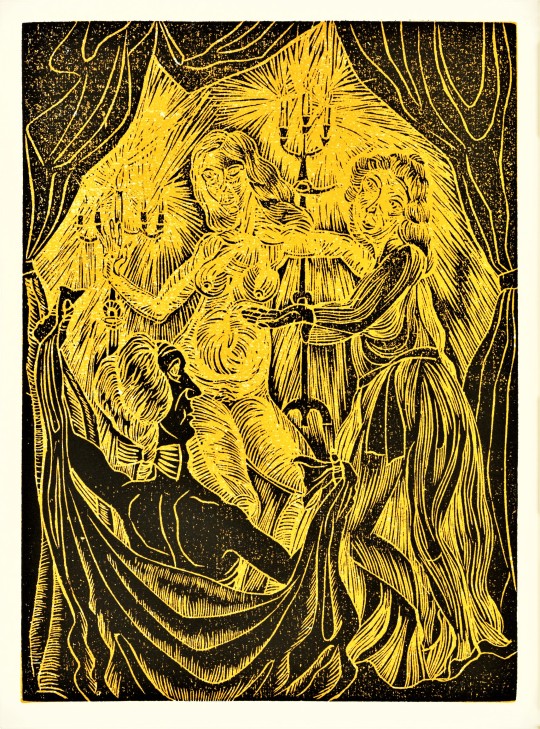
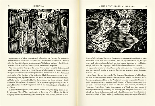
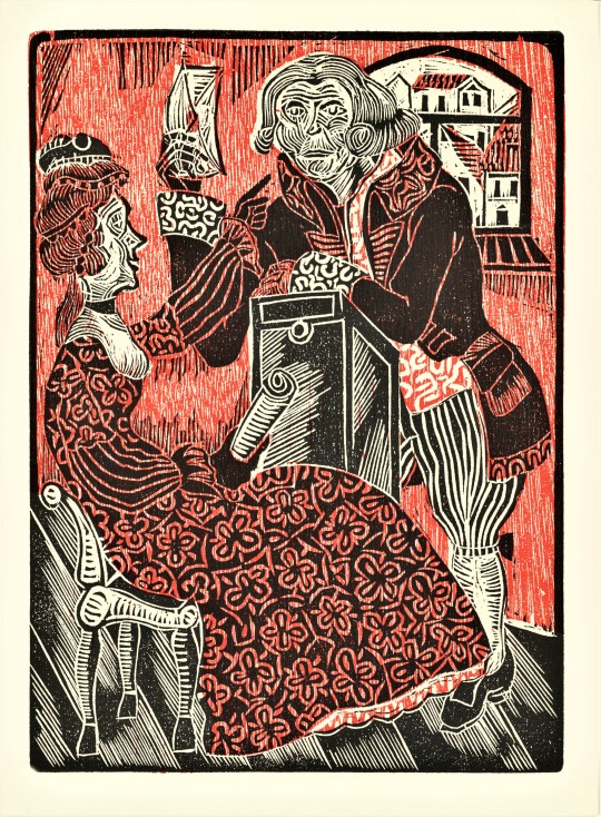
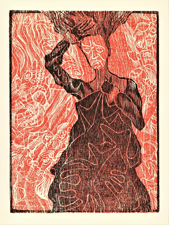
This week we bring you Roxana, The Fortunate Mistress, by English writer Daniel Defoe (1660-1731) with woodcuts by Austrian printmaker, Bernd Kroeber (B.1942), printed in 1976 at The Stinehour Press in Lunenburg, Vermont for the members of The Limited Editions Club in an edition of 2000 copies signed by the artist. It was first printed for Thomas Warner at the Black-Boy in Paternoster Row, London in 1724.
Bernd Kroeber cut twelve full page two-color woodcuts and fourteen smaller black-and-white woodcuts to illustrate this text. The prints embrace the grain of the wood blocks and the expressive cuts and figures seem to reference back to German Expressionist printmakers, like Ernst Ludwig Kirchner.
Roxana could be considered a proto-feminist character, as she raises concerns over sexual freedom and women’s right to own their own estate. Roxana is quoted saying “the Marriage Contract is...nothing but giving up Liberty, Estate, Authority, and everything, to the Man.”
Book designer Adrian Wilson (1923-1988) designed this book using Bembo type and larger sizes of Bembo and Goudy Ornate for display lines. Wilson also designed the crossed-sword heart motif. The paper was specially made for this edition by Monadnock Mill in Bennington, New Hampshire and the book was bound by Tapley-Rutter Company of Moonachie, New Jersey.
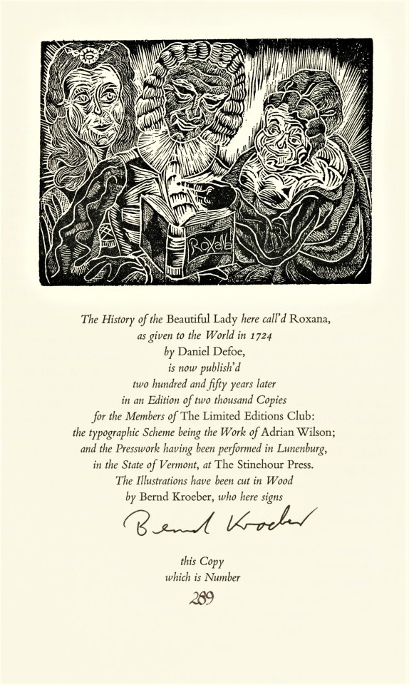
For the colophon, a print of characters reading Roxana. Too Funny!

View more Limited Edition Club posts.
View more Fine Press Friday posts.
-- Teddy, Special Collections Graduate Intern
#Fine Press Friday#Limited Editions Club#LEC#Roxana#Daniel Defoe#Roxana The Fortunate Mistress#bernd kroeber#English Literature#Fine Press Books#Adrian Wilson#Stinehour Press#Monadock mill#woodcuts#color woodcuts#illustration#book illustration#letterpress#bembo#goudy ornate#black and white illustrations#relief printmaking#relief prints#austrian art#austrian artists#teddy
25 notes
·
View notes
Last Seen Blogs