#She was designed with the 3D-looks-2D style in mind initially - I have to get back into that mental space somehow agh
Text
i was so excited for the new winx reboot sneak peak i kind of forgot to write down my initial thoughts so here it is (i’m so curious on how this opinion of mine will hold up once the show comes out!!)
first impressions - i actually really like it!
look, i love 2d animation just as the next guy, but i don’t think we’re ever getting back the s1-s4 animation (2d animation from s5-onwards was SO stiff and jarring looking, huge no thank you), and if that’s the case, i think the 3d style that they went for in the reboot is one of the better solutions for it.
it’s vibrant! it’s colourful! it’s giving “magical girls”! it just looks aesthetically pleasing! also i’m OBSESSED with the way they animate their hair, especially bloom’s, it’s giving “bratz series” level of eyegasm hair animation for me. so getting this after the moody, edgy, dramatic “fate: the winx saga” tone set in, i am so relieved we are going back to our roots babeey!! (now here’s to hoping that animation doesn’t tank as the series goes on like how miraculous ladybug is animated by like, 2 different studios and then one episode feels amazing and the other is “hm”)
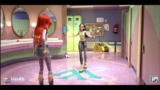
now for bloom:


her iconic bangs are back baby!! i love how they translated them into 3d without them being too uncanny. the outfit is very cute, but can we PLEASE stop putting bloom in pink?? one of her major appeals as a main character in a girly show was that she wasn’t a pink lead! and blue works so well with her colour palette of red hair & blue/turquoise eyes it’s just aaaaah! replace the pink parts with blue and she’s perfect. (tbh these are still wip, so it could change!)
i’m still warming up to the idea of denim leg warmers though, they look weird to me now (will probably get used to them) but they kind of go with her character, because it looks likeee our bloom s1-s3 personality is back!!!!!! I’M SO HAPPYYY like YES!!! i missed her for a DECADE
next up is mitzi!

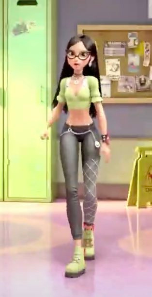
they nailed her design imo. she looks like original mitzi, but she also feels like a proper, “updated” version of her look. modern, but not too modern so she’s stuck in the era, but also retains the character of og mitzi. overall, no complaints on my part, only praises!
and then we have the new logo!

IT’S JUST DOING THINGS TO ME IDK it feels so pleasing to the eye?? the purple to orange gradient is just right, the pink is sprinkled in just right and the blues are there to accent it, it’s just. SO AESTHETICALLY PLEASING to me it truly does feel like a natural update on the og winx logo. it’s amazing!!
and if their transformation is the one originally leaked in 2021?? i think it’s on a very good path to being a great reboot! now i’m still really trying to keep my hopes as low as possible, because rarely do i watch a reboot of a beloved series and think it’s on par or better than the og (actually, only shera really comes to mind…), but! i am liking what i’m seeing! i choose to trust mister straffi on this one!!
48 notes
·
View notes
Photo


Being a villain isn’t all fun and games! Just mostly (Patreon)
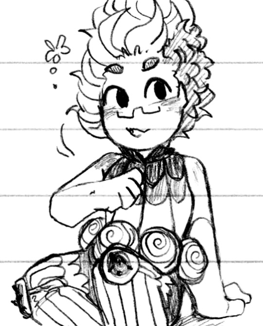
#Doodles#Villainsona#Just Desserts#Charm compilation <3 It's been a while!#Especially so for some of these - like the first ones!#Some of my very earliest Charm doodles were set to ''Ready as I'll ever be''#A lot happier the first time around admittedly haha ♪ Or more confident and proud and feeling justified perhaps#Charm's villainy has gotten a lot more angsty which is very funny on her cute face hehe <3#She'll cut loose again once she fully gives into it - if you're gonna be evil you might as well make it fun! She'll get there#Yet another WOY style TVAU Charm - I'm gonna get an outfit one of these days I swear!#I've been working on a design breakdown of classic Charm lately actually she's just - agh how did I do it first try??#Accidentally excellent design with lots of stops and places for the eye to rest and a good mix of 3D details and 2D ''textures''#She was designed with the 3D-looks-2D style in mind initially - I have to get back into that mental space somehow agh#Another style that every time I see it out in the wild I'm like ''Oh Charm would look perfect'' lol - y'know the Little People toy line?#Soft plastic with cute chibi proportions! I did talk about the designs as cute palm-sized toys way early on as well haha#Just so fun to imagine holding her like an ice cream cone pfft#Candle ♥ I sometimes forget that candlemaking for Charm is what drawing is for me lol - expression! Delight!#She makes candles based on her interests :D#This one just so happens to be green with red accents - and look the red wick is back! Probably could've gone with a pink one for tongue but#It's fine ♪ A different candle perhaps! Hehe <3#Do aliens exist in the JD universe? I mean it's me so probably but hmmm#Taffyyyy <3 Sweetest sheep best little lad <3#So relaxing to hug ♥#That last one feels so oddly on-model?? Or on-vibe??? I dunno I'm just terribly happy with it hehe#Charm being cute and posed just a little strange in a natural way :D I like it very much!
6 notes
·
View notes
Text
v force episode 1 (part 1)
finally got around to watching the first episode, so here are some Thoughts™ and Initial Reactions™! also i am watching the english dub so i am referring to characters w/ their dub names.

first off, the opening didn’t change at all which was. a little weird imo? i’ve got nothing against the song (it’s a banger) but why didn’t they change the visuals?? it’s so jarring to see the season 1 style in the op and then being slapped in the face with the s2 art.
my roommate said maybe they’ll change it for the next ep but still. i’m not a fan.

roommate: ah yes, i devoted myself to studying the blade, and now i’m going back to school!
jokes aside, i think it’s good he’s going to school. let tyson learn how to read it can only help him

okay HERE is where i rip on the s2/3 art style a little bit. i really, really do not like it. i hate how flat it looks, and i’m not a fan of how similar some of the characters look. it’s still beyblade, but in all honesty, i’m VERY attached to the s1 art style. it looks a lot more unique and really gives the characters space to stretch out and have unique designs, whereas this season doesn’t do that to the same extent, at least from what i’ve seen.
i’m not above being proven wrong or having my mind changed about this but. it’s gonna be a no from me thus far
also, the way they do the eyes in this season is just. no. the skin lightening isn’t a fantastic look either, i will say.

1, 3d dizzy looks Bad™. 2, what is this lineup??? why are they all so small??? why didn’t they keep THESE designs for this season?
kai is rocking that crop top tho. good for him!

“it’s only a local competition. it’ll be a piece of cake winning it after all, since i’m, you know, the world champ!”
...so he’s going to lose. granted, it is the first ep and the writers need to set up some tension somehow (tyson can’t go in swinging right off the bat, obviously), but this just made me laugh. i’m interested to see how he loses, though.

i just thought this looked nice!! beyblade has some very excellent bgs in some of their eps. the wall from ep 36 (??) of 2000 lives in my head rent free

aaaaaand here’s hillary! i’m not clear on what exactly she’ll be doing in the main group (is she just supposed to be the voice of reason?? chief already kinda does that, though), but eh. it is only the first episode after all, so maybe i’m jumping the gun (again).
roommate: she’s like the amy of beyblade. everyone hates her but loves her at the same time.
WHOMST????????
this is giving me abbey vibes. already don’t trust these guys. their suits are immaculate, though.

HMMM!!! okay here’s another gripe i have with s2/3. 3d beyblades were a terrible idea. there’s no sense of weight, they’re not grounded in the slightest, they literally look like they’re FLOATING like????? who gave this the green light. who decided on this i just want to talk. i get wanting to include 3d elements in an anime to make some things easier, but this just looks like shit. and how much easier was it??
not to keep being like “in season 1...” BUT in s1, the beyblades looked unique. they looked like they had power and weight behind them. they were grounded in the stadiums and actually WORKED within the backgrounds. and it looks incredibly jarring when the REST OF THE SHOW IS ANIMATED IN 2D.
this is bad. i will not change my mind about this. art style, maybe. 3d beyblades? terrible. horrible. very bad idea.

“how’s this? is this good enough for the wicked witch of eighth grade??”
I’M SORRY, THEY’RE IN 8TH GRADE??? were they TWELVE in the first season?? why do they look so much younger now?? no wonder kai was such a sourpuss all the time, having to look after twelve year olds. i get it now.
jokes aside, this makes no sense. granted, it’s a show for kids so i get making them still be in middle school but man!! that’s such a shock.
19 notes
·
View notes
Text
Bloons
Honestly the entire Bloons series has been some of my favorite flash/other-than-flash games out there, and I feel like it’s worth bringing it up since I just crossed the 365 day threshold for BTD6. Maybe in the past, but nowadays I definitely don’t feel like I ever play a game daily for a year straight. Chances are it was a little desperate when I first started playing, but as of now literally every single day I open the game up and play the daily challenge just for the sake of it. Plus, since the chest technically resets every 9 hours or so instead of 24, I could’ve cheesed it a bit, but I didn’t. That’s a pure 365 days of playing the game.
And even apart from that, the entire Bloons series has been in my mind since the first one and my middle/elementary school Coolmath Games days. Even though the puzzle, pure form of Bloons wasn’t as much in my interest, the staying power of the Tower Defense version is crazy. Flash Tower Defense games are plenty, and yet the one with the stupid monkeys throwing darts at balloons was the best.
I went back semi-recently and played a round of each BTD, and I gotta say, it was fun seeing where everything came from. 1 is absolute garbage, forcing you to just spam Super Monkeys if you want to get anywhere, but a good starting point obviously. I honestly know nothing about the people creating these games, but obviously it wasn’t made by a AAA crew, so you can’t expect everything to be put in place in the first iteration. 2 and 3 feel much better, but obviously not much after being so used to the modern stuff, and 4 and 5 are the ones that really shine the most, apart from 6 obviously.
I definitely was one of the types of people who initially reacted poorly to the artstyle change of 5 and 6, but I’ve definitely turned over. I don’t know if the whole BTD community rioted at that point, but I at least was like “ew, they’re cute now” when I first saw it. Thankfully I turned over, and realized the current designs are the absolute best out of the entire franchise. Also, I love their cuteness, as I love cuteness in general, so basically just call it character growth. Even though 2D art always is more interesting for games than 3D in general, the entire art direction of 6 is genuinely really good, being so bright and cartoony (at least before the fifth stages of upgrades) really fits the cartoony idea of monkeys popping bloons. 5, and the entire franchise before it, really is proof enough how horrible a pure top-down perspective is. On the title screen, you can see what the monkeys are supposed to look like, but in-game they literally look like weird blobby scorpions. Even though in the back of my mind I knew what they were supposed to look like, the pure top-down perspective completely ruined the image. Not to mention the OG designs for the monkeys was really weird and bad anyway. Even if you wanted a goofy fat kind of monkey, there are a million better ways to achieve that than how it used to be. Again, of course, they weren’t exactly AAA game-level quality, so you can’t expect such perfect character design.
But, oh my god. One of the things about this game that must’ve kept me through 6 was the character designs. If you know anything about me, it’s that I love a good character design, and 6 is full of them. It’s so interesting to see how they extrapolate the main concepts of each tower into their three different paths. The generic Superman-based monkey can turn into a Batman-based monkey, a Terminator-based monkey, and a fucking ancient god of the sun. The seemingly chill Druid can smite people with the power of Zeus, become the much more expected forest-based type, but also turn into this completely out-there being of pure wrath. I could go on and on about that, but needless to say for so many of them look and are designed so great. I think the tower with the coolest level 5s of the game is the Ninja. It’s hard to explain, but they all just look really cool while also not deviating too much from the cartoony-cute art style. I think my all-time favorite level 5 is the top path of the Wizard, mostly just because he looks really cool, but also because the parts of the path before it show him aging and growing out his beard. I also have to say the 2-0-3/4 Wizard also looks exactly my style, with the dark purply-ness and gold rims. Also, if you haven’t noticed, the Magic monkeys are my favorite type, and not just because their signature color is purple. That’s part of it though. Magic is also just cool in general. My main RPG-class of choice is almost always a mage/wizard.
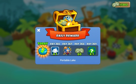
Also, the heroes are also really fun. As someone who often creates species of aliens/monsters, I always feel like I want to create a dedicated character out of them no matter what, so I feel like the heroes are basically just that. And, of course they have good designs too, and of course as you can probably guess my favorite is Adora, basically being the same thing as the 5-0-0 Wizard with the Sun God aesthetic. Since she has her own stage and a special interaction with the True Sun God/Vengeful Monkey, I think she’s a pretty big deal anyway. I will say that I highly slept on Gwen, but then for Easter they gave her the Harlegwen skin and I fell in love. It’s insanely good stuff. Apart from looks, it does feel nice to have some sort of interchangeable tower that you basically just place and forget about, aside from using their powers. Plus, it makes a really easy type of thing to periodically add to the game to keep things fresh, even with the skins in general. It definitely is much better than the stuff they had in 5, where you had to use Monkey Money to buy each one, and you could only use them once per stage. Obviously 6 has the extra powers to help you out, but they feel much more optional and cheaper than the heroes of 5. Since I barely buy anything with Monkey Money to begin with, and since I’ve obviously had 365 chest openings, and AND since I barely use them to begin with, I’m completely stocked up. I only ever use the farmer and sometimes the tech bot if I get lazy. I did use the portable lake I got from my 365th chest opening after I got it, just for the sake of celebration. That’s literally how my mind goes.
6 does have the slight tinge of a mobile game artstyle, but in this case it’s really just better. I’m not into mobile games, and especially not the generic artstyle they have, but it is really pleasing to look at anyway. It did chase me off before I converted, though. That, and the fact you had to buy it now. Like a true gamer, I was put off by the fact that something that was once expected to be free now has to be paid for. But, then, I realized that the entire franchise has provided much more than 10$ worth of entertainment to me throughout time, so it was extremely fair to pay that. It is still kinda weird how 5 has to be paid for for mobile, when it is just free online, though. However, unlike a true gamer I think the microtransactions of the game are extremely fair. Considering they just give you things that you don’t need, and can get for free otherwise, I think it’s completely fine to have them. It sounds bad on the surface to have to pay for the game and have there still be microtransactions in it, but since they’re completely optional there’s no good reason to hate it. I think people assume that means that you have to pay for the game, and pay extra for different major parts of the game, and that sours their opinion on everything. Gamers are a strange, irrationally angry breed. I do hate using my phone for pretty much anything, though, so once I bought 6 on Steam I haven’t played it on my phone since. It’s just so much better in every single way...
I bought the game around the time of one of my family’s semi-annual trips to England because I thought it’d help when we were traveling between wi-fi spots, and it really did wonders for me then. Probably looked like some asshole teen to strangers who don’t know I barely ever use my phone for anything, since I was playing it so much. My sister even saw me playing it and bought it for herself, although I don’t know how much she’s played since then.
For the sake of stats, I have 235 hours played of it on Steam alone, and in game I’m level 115. My most complete map is Monkey Meadow with all medals except CHIMPS, which I put the effort in because it’s the default map, and definitely not because it’s an easy/good map because it’s just kinda bad compared to so many other ones. My Dart monkey has a total of 4 million XP, and the only towers that haven’t crossed a million are the Ice, Heli, Alchemist, Druid, and Spike factory monkeys/tower. I think the farthest I’ve actually gotten round-wise is 200 once or twice, but I don’t remember if I’ve actually beaten that level and continued on or lost there. I think I might’ve gotten past it once, but just sort of lost interest in micro-managing my powers and let myself lose. I probably got there once after that and lost on it. As someone who didn’t look up the optimal strategies for things until very recently, I think that’s pretty good. It definitely feels like the kind of game where if you know the best strategies, you can literally just replicate that over and over and win really easily, but that just sounds kinda boring. Since I pretty much only do daily challenges nowadays, it forces me to use a limited amount of towers, so I either go much farther because it forces me to build up less towers more, or it makes sure I can’t even pass round 90 because it just was made to get you to round 40 and that’s it. When I have the full range of towers to use, I feel like I try to get the instant satisfaction of getting a new tower to increase DPS instead of making the few towers I have/need reach their full potential, which seems to be the better option. I also don’t really sell anything when I don’t have a limited number of monkeys to place, which I think is also a good strategy if you can eliminate the major money loss in it, since it can give you a massive boost in cash to get you the better upgrades quicker. I may or may not try to learn the strategies to wipe the rest of the game clean eventually, but right now I’m fine with just doing the dailies.
But yeah, that’s like the whole thing with Bloons Tower Defense and me. Something something reject modernity, embrace monke, or whatever the kids these days are saying.
I will say that if I didn’t have so many OCs to work with and could just pump out animated shorts on the reg, I’d love to do some sort of Bloons shorts. They’d all lean into the ridiculousness of it all. Like, the first one could do the 2001 thing with the monkeys learning to use sticks, and as the main one is bashing the ground with one or whatever and throws it up, an ancient, leathery patchwork bloon flies overhead and accidentally bumps the stick such that it lands back on the main monkey’s head, knocking him out. Cue the monkeys around him to go berserk and start throwing other sticks at the ancient bloon, and once they pop it using a sharp stick, they realize what they must do. Cue a long montage of the different stages of war and invention using the monkeys finding better ways to fend off the bloons, with the whole idea being that the monkeys are getting irrationally angry at the bloons, who are just sort of around and not actually sentient, even though they assume they’re malicious because of their history and upbringing. Absolutely no political message in there whatsoever. Just comedy.
Other short ideas could include, for the start of the modern time story, it could be the backstory of some sort of chiseled veteran main character, which would involve a bloon floating into his town, and from the people’s panic someone knocks over a lamp post that sets his town ablaze, only for him and his people to blame the carnage on the bloon, causing his classic edgy character motives for fighting against the bloons. Another, much more golden idea, would be an interrogation scene, where a bunch of monkeys capture a bunch of bloons for interrogation purposes. They’d obviously do the whole “Silent treatment, eh? Well, we have ways of making you talk...” thing, except the “way to make them talk” is to strap them to a wall with one dart guy on one side to systematically pop them to try and extract info. But, of course, it would look and play out exactly like the classic Bloons puzzle game. That’d be the fun part. If not that, then it could be like the classic carnival game that likely inspired the idea of using darts to pop balloons. I really just think this weird world of monkeys and bloons is perfect for some good comedic content. Watching the monkeys severely overreact to the bloons sounds extremely fun, and I’d love to see someone do something with it some day.
5 notes
·
View notes
Text
How Musicians Used Gaming Tech To Adapt To A Gig
This consists of all writing, design, programming, artwork, music, advertising and they even publish their very own games. Slightly Mad Studios is an unbiased video game company founded in 2008. With so much new and shiny gaming tech having dropped this 12 months, it is good to see a well-recognized face crop up from time to time. Taking benefit of Logitech’s Lightspeed wireless know-how, a pro-grade connection working at a blindingly fast 1ms, this is a sleek and stylish keyboard with floating keys and gorgeous RGB.
Boneloaf was setup 'to make video games and toys informed by an adolescence spent watching bizarre Filmation and Hasbro cartoons, playing multiplayer arcade and console video games, and drawing silly characters'. Edge Case Games are the team behind Strike Suit Zero, the dogfighting recreation is the first to ride the wave of the space fight revival. Founded in 2012 by business legend and creator of the God Game style, Peter Molyneux. It is, nonetheless, necessary to verify you’re getting the absolute best internet design for your cash. Watch out for businesses who depend on templates; whatever you get from them goes to be mass-produced and severely missing in creative aptitude.
Team Strawdog has a collective flair for inventive and revolutionary authentic ideas for console and informal games, and has particular experience in producing games for digital distribution platforms. GamesChart is a free monitoring and monetization plugin for online & mobile games. The GamesChart community uses a hybrid of sport discovery & in-game advertising to assist big name publishers like EA, Disney & Ubisoft purchase new players for their on-line and cell games. Betify is a mobile application that enables its users to play challenge-based social games.
And high spec gaming headsets present crystal clear communication for conference calls. Every peripheral has a use, be it personal, inventive or skilled. What you won't anticipate is a proliferation of glowing neon colors, the whirr of high-end cooling fans, or the clatter of mechanical keyboards.
Your cellphone, your mouse, your headset, any two devices can be charged simultaneously. Good time administration and the ability to manage a number of tasks along with sturdy team-working skills and the ability to work in a quick paced on-line setting. We are in search of a Category Manager to affix our current product group who will be reasonable for the Profit and Loss of key brands or classes and managing key vendor relationships. You will be a powerful negotiator who loves a deal and thrives in working in an entrepreneurial surroundings. You will need good business acumen and the power to work in a quick previous environment selling throughout multi channels. In other instances, attendees can come together in fastidiously crafted virtual worlds, their avatars co-created with totally different personalities and branding in mind.
The area's brand new, free service for job seekers and employers, recruiters and schooling leavers, to connect, find jobs, publish vacancies and entry the wealth of assist measures which have been carried out across the region. In maybe one of many extra symbiotic fusions of music and 3D worlds, the Belfast post-rockers opted to combine their love of epic movie scores with a trippy Unreal Engine creation. While this ambitious A/V set received a trial run by way of a handful of pre-lockdown exhibits over the past twelve months of being stuck indoors, this bold new 3D project has morphed right into a world of its own. “I think that as an artist, you’re afraid that people aren’t going to like your character. In this age now where everybody’s a YouTube star – all of that comes along with it. For me, the internet makes it easier to let everyone know that I’m coping with a lot of shit on a daily basis and that I make a lot of errors.
They specialize in creating recent and engaging video games experiences. With the development of technologies and the rising demand for photorealistic graphics, 3D virtual reality and video games as a service, the means ahead for the gaming trade will solely continue to grow and innovate. Positech Games is a online game developer based by the former Lionhead Studios programmer Cliff Harris.
Eleven Hundred Agency shall be selling Two-Up Digital’s unique position in the business with content creation and media relations actions. The reality is that 20 plus years in the past, I took the decision that I needed to make a dwelling off of playing music. And, you realize, generally you got to have a song in a film, that’s the functioning actuality for a lot of people. With the identical people who type of criticize Refused for selling out, I mean, my actuality is that I even have to pay hire at the end of the month. “I wanted to keep my streams detached from music,” she continues, “ as a end result of I don’t feel comfortable singing if I’m not with Lacuna Coil.
Over the years Llamasoft has released over 30 video games on almost 20 platforms, garnering plenty of awards alongside the method in which, as properly as a loyal group of fans. A precision mouse for FPS games may additionally be used for fine detail picture editing. A mechanical keyboard designed for consolation and satisfying typing makes long coding and writing periods a breeze.
The staff came collectively after giving up their jobs developing AAA games to bring one thing new to cellular gaming. GameDigits is a company dedicated to creating enjoyable video games for cellular devices. They have the expertise to produce top quality games to the very best normal.
With over a decade of expertise in the field, they work with a range of partners including marketing and advertising agencies, independent recreation builders, and solo artists. Hanako Games is an unbiased online game improvement company that develops PC video games largely involving feminine protagonists, centered on fantasy-and anime-inspired style. The website provides free demos for the entire video games together with downloadable wallpapers. Hanako Games is an affiliate of Winter Wolves, Tycoon Games and sakevisual.
While it might be pricier, the best internet design agencies are nearly at all times the most inventive. Another essential aspect of gamifying the net design process is repeated engagement with the viewers. Any decent sport could have some type of mechanism to maintain players coming again, a core gameplay loop. A well-designed website ought to be the identical, internet hosting features or services that convert viewers into new customers, and retain previously transformed prospects as nicely.
Get helpful recommendations on tips on how to use firm credit score stories when making potentially crucial enterprise decisions. Purchase the company report or an Annual Subscription to view this info. I provide one to 1 classes online or walk and talk until we're out of lockdown fully.
Amuzo harness the ability of play to interact, educate and inspire cell audiences all over the world. They design and develop award-winning, chart topping apps and video games that join a variety of the world's prime brands with their audiences. The duo left Freestyle in 2012 and arrange indie studio Pixel Toys where they began to work on cellular games. Drop Dead Interactive are an independent video games creator, considered one of their games is Gear Gauntlet, a fun but rage inducing 2D action arcade game.
Backed by world famend businesses and the UK government, it'll enhance the development and adoption of emerging applied sciences. Making an actual, everyday difference to individuals from the boardroom to the manufacturing unit floor. Switching from a profession in publishing to technology in her late twenties, she then launched her personal company.
Many of one of the best internet design studios use equipment initially designed for gaming. And why not” Gaming PCs are ubiquitous, powerful and so they look damn good when the lights go on. And whereas they might not be the first thing you think about whenever you think of web design, they’re far more widespread than you suppose. However, the wireless know-how which has caught my consideration and brought a sparkle to my eye this yr is wi-fi charging. Again, not exactly new-new, but Qi charging has really gained traction. HyperX has launched this 12 months, a wi-fi gaming bundle featuring a Qi charging dock that can assist a number of units.
Wireless keyboards and mice used to be less responsive and competitive gamers typically discovered them unreliable as a outcome of a slight delay. However, wireless peripherals have vastly improved and are set to be in style this yr, leading to improved setups for builders and players alike. These days, corporations don't have any selection but to be artistic and supply attendees extra than simply info. Those not keen to push the boundaries are shortly seeing a discount of their attendees’ consideration. Adopting some the methods seen within the esports gaming area and adapting them for B2B summits and conferences is a method to guarantee you maintain your audiences’ consideration, regardless of the distractions. Walk again in time in an event and you could remember that “games” involved a pencil and a chunk of paper, or a white board.
The firm designs front finish web sites and apps in addition to running the whole back workplace expertise platforms required to assist the rigorous online betting business. System three Software is a online game developer and publisher based by Mark Cale. NDreams are a videogame developer/publisher based mostly in Farnborough, UK that concentrate on creating amazing virtual actuality video games, worlds and experiences. The Ninja Theory studio satisfaction themselves on striving for the best production values and regularly pushing the boundaries of technology, artwork and design to create evermore exciting online game experiences. Virtual reality already exists within the gaming industry, nevertheless, it’s nonetheless in its infancy.
Mars on A Stick is an unbiased software program developer ready to benefit from all rising digital markets. Little Wolf Studio specialize in creating new, surreal and beautiful experiences for gamers of all ages. The progressive software permits dealerships to create a fully interactive showcase of their full range of fashions, designs and choices. Playmob is a cause advertising platform designed for ahead pondering organizations which have huge audiences, strong values and a deep commitment to doing good. Their mission is to ‘Set Creativity Free’ and create digital experiences for children as wealthy in creative potentialities as a sheet of paper. The indie recreation developers create their very own recreation titles similar to their first industrial sport ‘Look Out Below’ which came out in 2013 and are currently working on a game called Kindred.
Fundamental Games are a firm believer in nice games being constructed on sturdy foundations and aim to get the core game-play right first after which building up that actually mind-blowing experience. The Supermassive Games studio has received quite a few awards, together with a BAFTA for Until Dawn. The studio additionally works with GamesAid, other charities and educational institutions, delivering each high-end interactive drama and boundary-breaking VR.
They work with a variety of sport publishers, brand owners and digital companies. They have also worked with Cancer Research UK, Knux and an Unnamed HTML5 sport for BBC. Wales Interactive satisfaction themselves on being an unshackled independent developer making their very own concepts completely from our Pencoed studio in South Wales.
“Games studios have the opportunity to develop their own IP with skills traditionally used in mobile games growth for leisure now being turned to social good. In a world the place musicians are being compelled off the street and onto the web to survive, it’s reassuring to see so many different abilities adapt so well to a post-coronavirus society. Fan Studio has been a top iPhone game improvement company for years and is the company of alternative for a lot of businesses across UK, UAE, Canada and USA. Firefly Studios Limited is a online game developer fashioned by Simon Bradbury and Eric Ouellette. Skatanic Studios is a one man sport improvement studio based mostly in Brighton, United Kingdom and headed by Media Production graduate Matt Gambell. Space Ape are a mobile/social gaming startup with a diverse staff of highly gifted and experienced game makers, creating video games that hundreds of thousands of individuals play and love.
0 notes
Text
Melbourne Festival Evaluation
The brief
To begin the second year of this course we were given two in one live briefs to work on. The first was Melbourne Festival, this is the same as the first project we had last year. This time around I already knew so much more about Guerrilla art, I can distinguish between it and more common street art such as graffiti. Because I am more knowledgable of Guerrilla art this year I was able to focus my research on the theme: Commotion in the Ocean.
The research I did of the festival and Melbourne last year showed that the festival attracts a lot of people, it is a very community oriented event. Shop windows are used to display the artwork, some people give up their homes and other indoor spaces to be converted into a temporary museum. The festival is excellent for local businesses, they get a large amount of customers in such a small amount of time. The festival also allows for the village to advertise other events they may hold to attract a wider audience.
This year, along with everything else, the festival was very different. The artwork was made and placed in true Guerrilla fashion ‘in and out without a trace’. However, the main difference was the amount of people who were able to visit Melbourne to see and interact with the artwork. It was mostly locals who were able to appreciate the work done, it must have given them a sense of security and normality seeing the posters pop up across town over the weekend.
The brief asks to focus on the impact of climate change, the type of action some people are taking, how we are impacting the environment. This gives us as a group the liberty to choose a specific theme and dive into it whilst still following our own styles and techniques. There was the option to generate 2D and 3D ideas in the initial stages. This meant that people who preferred taking a fine arts pathway were able to produce paintings, drawings and other forms of 2D art which require skills such as immense creativity and experience of working with different mediums. For example, knowledge of how each type of paint performs on different thicknesses and textures of paper.
What I learned
This project allowed me to explore the world of typography, it helped me realise that I enjoy using an iterative method to render different variations of the same word or phrase. I filled an A4 page with the word “Change”, each time I wrote it I changed one element and slowly began to change multiple. I played with the weight of the lines, spacing, size and shape. I found it hard to start my small piece of primary research on typography, so I watched an episode of a documentary featuring Paula Scher and Jonathan Hoefler. My starting point was mainly inspired by the sign designed my Scher for The Public Theatre in New York. In the documentary she went through the process of how she created the sign. I found it fascinating that the size and space of the letters were the same yet at first glance it didn’t appear that way. All the difference was made using the difference in weight of line. I have found that I enjoy typography and appreciate a great deal more than I did before this project. I thought that it was overrated and couldn’t understand how some have a career out of it.
Having been told, almost half way through the project, that words are preferred over images, made me lose track of what stage I was at. Also, that 3D work was inconvenient therefore all submissions must be 2D poster. I felt like I had to start from the beginning and come up with completely new ideas that suited the new version of the brief. Instead of starting from the beginning, I took the ideas I had and translated them to words. I saw that my peers included their artwork inside the letterforms.
Visually attractive work
I enjoyed that I was almost always referring to nature/the earth in my posters. I mostly enjoyed using water colours to colour block each drawing to give a better idea of what the poster would look like. I think the posters turned out very vibrant and stood out
There were no new materials I worked with during this project and all the work was done on paper.
What went well
The most impressive thing to me was that the owner of the festival picked my favourite designs as her favoured ones. I think this was because I put noticeably more effort into them because I enjoyed the ideas so much and wanted to see them in real life.
Also, primary research and idea generation was much for this project has been the easiest compared to past projects. I was getting ideas throughout even when I had moved on to finalise or develop another idea. I believe this was because the criteria allowed for a lot of artistic liberty. Even when it came to the theme, a lot can be explored within it especially because caring for the environment is such a hot topic and becoming much more popular. As the younger generations of society begin to develop and gain responsibility, we are much more worried about the wellbeing of all life on earth as well as the planet itself.
What went wrong
Although I was extremely excited to get started and produce a large placard, I wasn’t able to do so due to Covid-19. The weekend before the week we were scheduled to begin making, I began to experience symptoms of the virus and was housebound until I could book a test and make sure that I didn’t have it. This was very frustrating, this project was a comfortable beginning to the year and the final outcome could’ve been easily achieved. I could’ve made one in my own time but I don’t have a safe space to keep it at home and my time back at college was focused on finishing the ‘Readers’ sculptures for Derby Well.
Research
I used a wide range of guerrilla art in my research, most were relevant to the topic of nature and “commotion in the ocean”. I gathered over 100 images which I found gave me some inspiration, looked interesting or controversial or I had a specific thought that was evoked by the image. I use Pinterest as my source for all research, I find it the most efficient and easily accessed method. I can annotate each image I save to any board, I can group them into sections and share a link to the board with anyone or post it on Tumblr and I can upload images from other sources onto Pinterest and save it to the board. Although Pinterest provides a more limited range of existing examples I have found that it is good enough considering the convenience. I would like to begin using multiple sources for the same project. For example, finding examples in books, shows/documentaries or real life. Using things like google image search and Pinterest can be considered as one source because most of the content overlaps. I could’ve improved the quality of my research by annotating more of the images, I found that when I put pressure on myself to do that in one go I was feeling stuck and drained of thoughts. I should annotate each image as I find it because my thoughts on it are still fresh in my mind.
Review
The range of research I provided was wide but it would’ve been ideal to have all of it annotated as it would allow me to process my thoughts and decide what I want included in my designs. When annotating other artists work it puts my in the shoes of the audience, this shifts my perspective, allowing me to make my designs more relatable to the intended audience.
I explained the context of each image throughout, in my mind maps I identified the real life issues we are facing in terms of the theme and identified what solutions we have or ones we can easily create. By doing this I was able to direct my posters at the issues and almost use them as advertisement for the environment. For this particular project I didn’t face any big problems. A small issue I quickly overcame was the change of plans halfway through the project, I tried to convert my pictorial ideas into typography but I found that coming up with new designs focussing on the typography was more successful.
The planning I did consisted of lists set to remind myself what needs to be done. This method isn’t working for me at the moment, when I make the list no matter how urgently I need to do the content of it, I will start the first task on the list then realise that I am missing something else and start doing it or looking for a guide on how to do it (e.g. 7 band criteria). I will research alternative ways that are more effective to keep track of tasks and get them done.
0 notes
Photo

Game Development 2 - Part Three
This post was originally published on February 12th, 2020
I don’t think character design is a particular strong point of mine, so I really wanted to take the time to assemble something I would be really proud to sculpt. When we initially began, most of the focus was on anatomy of the character - so we began looking up research and references of faces that we would want to reference.
I began looking at references of girls that were a bit younger. With the thematic of my project, I think this is an important aspect that needs to be communicated to the player - both through anatomy and through style. I collected some imagery of woman that had very “young” features like large eyes - such as Mars Argo and Frances Bean Cobain - as I thought they communicated this idea really well in their anatomy. Despite being 32, you would probably guess from her facial proportions that she’s in her early twenties.

I think that she has a really interesting face that would be nice to play around with - but at the same time, I wouldn’t want my model to fall intro the trap of feeling too animated against realism - so I’m really going to have to play to find a nice medium.
Another thing that is notable about her face is the way she sometimes applies her makeup - sometimes applying things like white to her waterlines to make her eyes appear larger. This got me thinking about the way that I will need to apply makeup to the model. While sculpting will be really important, makeup can really offset facial features, so I’m going to need to really pre-plan the way I do this long with the rest of the characters outfit.
So because of this, I began looking at different makeup looks and styles to try and compliment the themes I want to show in my game.
When I began thinking about the way I wanted to show the makeup and the outfit of the character, I knew I wanted to do something stylized and dated. The idea with the game will more be a retrospective on idolization of the past and times shifting, so I wanted the way the character looks to represent this. I began looking at makeup that felt very graphic and fun, but dated. Things that are very iconic and recognizable - I began looking at face makeup from the 60′s and 70′s.

In terms of the design of the makeup, I wanted it to feel like a nice medium between the past and the present. As someone who does their own makeup daily, I designed a few looks I wanted to try and then tested them out on myself. I thought that it would probably translate better onto a 3D model to practice the designs in 3D rather than in 2D so I had a better understanding of shape and what the makeup was doing to my features.
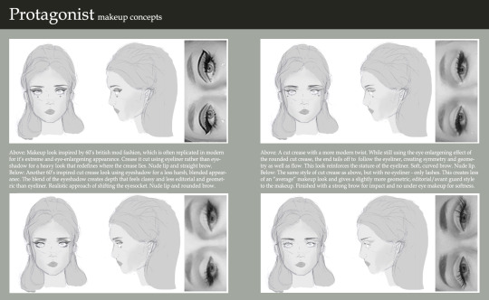
I think I liked the first look the most as it was really graphic and fun. Interestingly, the way that the eye-shadow is blocked in and the eyeliner is shaped basically creates a new lid, which creates a very large and unnatural looking eye. I thought that this would be really fun to play with. I like the softer looks as well, but I felt the more graphic look was more impactful - but most importantly, it feel the most obvious. In the other makeup looks, I was changing my anatomy with more subtly - redrawing my crease, blending and giving the look an overall more natural feel. With the graphic look it becomes heavy and unnatural, which makes the makeup easier to read in terms of knowing that is real and what isn’t when you come closer to it. Ultimately, I’ll just have to see how this translates when it comes to the final model.
At the same time, I also began looking at some of the fashion styles I wanted to replicate. I think with the ideas I had in the basis of my story - being set in California and kind of having a surf vibe to it - I thought it would be most appropriate look at a time period when this kind of culture was iconic - so I began looking for inspiration from specifically the 70′s and the 90′s - which are both iconic and unique in two separate ways.

I began looking at all kinds of things - t-shirts, bombers, shorts, skirts, patterns, rollerblades - everything I could to bring together the kind of style I wanted so that I could reference these for a board of sketches. Once I collected a good level of inspiration I really wanted to just begin sketches.
I often find when I’m doing these initial sketches I get really frustrated at the way I draw versus what I would like to accomplish. When I first began work trying to create a template for the fashion I found I was getting really frustrated, so I looked into some of the concept work in some of the video game art books I already have for inspiration.

A lot of them began with using silhouettes and colourless sketches to create a baseline aura for the character. Using these as a reference helped me create ideas on paper that were similar to what I wanted to accomplish from a character sheet and helped me feel more confident. It was really good to see how these ideas were started in industry and helps me get to a point where I wasn’t frustrated with every detail.
As I kept practicing, I finally got to a place where I created a template that I was happy to work from that didn’t feel too stiff or rigidly referenced while maintaining the seven-and-a-half-head anatomy that I needed. It helped me feel a lot more confident in the work and allowed me to create a wider range of designs and really experiment with different looks.
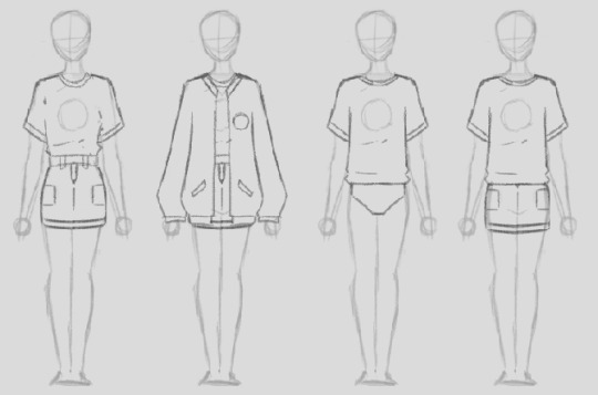
I wanted to work with a range of different styles and fits to the clothing, including in some ways that I wouldn’t consider wearing clothing. I think one thing that’s really important when considering clothing female characters is the fit of the clothes, and how you want clothes to wear and rest to meet an aesthetic. Luckily, as a woman (and an avid fan of RuPaul’s Drag Race!), I’ve had more than enough experience in this. When I did my character sketches, I really wanted to break down the look and feeling - so I went into annotation of what I was trying to accomplish with each look; why are some aspects oversized, why I specifically specify a men’s fit, why I used certain fabrics and what cultural aspects they come back to.

I felt very inspired by some of the reference imagery of the cultures of California, so I didn’t limit it to cute-skirt-and-a-totally-rad-top-I-found-on-depop. I also began looking at things like Chicana culture and other forms of fashion and expression used by minorities in California (as at this point, my character didn’t particularly have a set ethnicity or style).
Because a lot of the fashion was very graphic back then as well, I also coincided some of my designs with some graphic designs as well that I would hopefully be able to use. I referenced a lot of graphic designs, fonts, quotes and lyrics that I felt appropriate for the designs I wanted to produce:
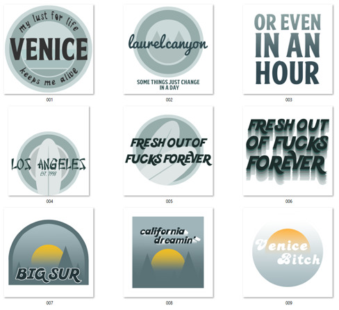
These decals were intended to be able to be used in a few different areas if I wanted to - on shirts, as patches for jackets or for jeans and skirts too.
Some of these designs were intended to be for either a front patch or a shirt design, other were things like back patches for jackets and other. I also created some designs and quotes that ran off of the backs of each other, so that I could use multiple patches with the same theme in one outfit (”some things just change in a day” / “or even in an hour”).
I referenced a lot of Californian and surf culture inspired typography. I used typefaces from different cultures as a means of getting in that “melting pot” Americana aspect that I discussed in one of my previous posts - if I don’t end up using it, I’ll definitely use it somewhere - like on environmental signage. I do really like the way it looks up against things like the surfboard so it’s definitely something to keep in mind.
In the end, I created a big large board of designs that I was considering - each with annotation and explanations to the style, fit and design choices.

I then took some of my favourites and went into more detail - did a back and a front and really tried to develop my idea and sow what I was really trying to do with the fabrics and break everything down. I was inspired by some of the concepting done in the second Alice game, where they did very specific breakdowns of everything that was relevant to the design process and referenced everything. I also think by having boards in this style, I’ll be able to communicate my design work a lot more clearly and effectively and hopefully it will look a lot cleaner in a portfolio.
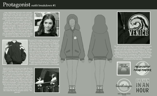
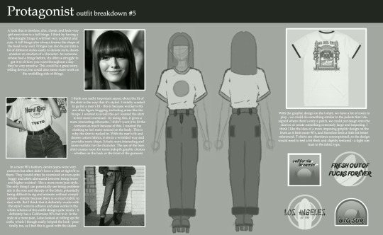
I then made a final render of the front and back of my design just for the clarity of having a definitive design.
To help me get the project on it’s feet, Danny scanned my face so that I can work from it as a base in ZBrush. I’m really excited to be able to work with the data and manipulate it. I’m not sure how it’s going to go, but I’m just going to fire through it and hopefully it’ll be an easy process.
Although, I have struggled with learning ZBrush - but I really want to push myself this time to create something I can be a lot more proud of.
0 notes
Text
SELF-REFLECTION
After 5 months of working on this project from the pre-produtcion to the post-production phase. I learned alot. Reading my progress posts on my blog and my pre-produtcion posts, I’ve noticed that I’ve changed and done alot of tweakings to the main idea I had originally.
STORY
Let me start by talking about the story. At first I wrote the idea down on word, which was really complicated and to be honest had alot of unecessary ideas. After alot of tweaking and asking around for people’s advice, I ended up with what I feel is a straight to the point story simple yet not so simple one. I ended up with a story that I’m happy about.
DESIGN
Environment: I knew I wnated to really push myself for this project and do something I have never done before. I wanted to go with a somehow 3D look using only 2D. I worked with alot of details in the design, using no outline, just a base color and shadows, which made the job to make it look polished and clean harder and more time consuming. My complications for this one, was really only time. I was still working on environment until the last second of this project. Having alot of different camera angles didn’t help at all. But all in all I’m really happy with the result. I feel like i’ve challenged myself on this one and completed the challenge. Also I watched alot of tutorials on youtube, that I talked about in my forefront posts, which helped me achieve what I wanted.
Elle: I wanted Elle to seem like a normal girl. I chose happy and bright colors for her clothes purposely, to show that even the happiest people can suffer from anxiety. I also wanted her to look like a young adult, becayse as I said in my promotional video, studies show that people in their 20′s are the most prone to experience panic attacks. Also after showing my project to alot of people. They thought that Elle was me. Which wasreally funny and yet I took it as compliment for my project, As i tried to project w real-life experience into this piece. So this really made me happy. For complications, I’ve worked with alot of details for this character which was really time consuming as I had to animated alot of tiny stuff like the strap of her overalls in everyframe, or her freckles for example. I could’ve finished the animation in a lot less time if it wasn’t for that.
Guy Character: I designed this character in three phases showing how severe Elle’s anxiety is getting.
Glob design: I have a long post talking about how I designed the glob and what colors I’ve chosen and what I researched. Long sotry short I went with grey, since it associates with anxiety. And I initially wanted to go for black.
Extras: I designed them as black silhouettes because I didn’t want to shift the attention from what’s happening between Elle and the guy character.
CHANGES THAT OCCURED:
There are alot of changes that occured from the pre-production till the production phase. Whenever I’m working on a project, I most of the time never go with the exact initial storyboard. I always try to find more interesting ways to express what’s in my mind. One example is, in my initial story-board, I had the guy character just crack his neck, But as I was working I wanted it to be more distrubing for the viewere so I decided to make him crack his neck further, open his mouth and let gooey stuff come out of this mouth. Which really worked, after showing it to people they got disguted from seeing it. Also I changed alot of camera angles, and stuff happening around Elle.
BOG:
At first, I really hated blogging. The fact that it was always in the back of my mind while working, stressed me out. But it grew on me. And I find it really useful and soothing in a way. Blogging my progress and talking about how I felt when i worked on a specific thing really helped me reflect on myself, and me evaluate myself unconsciously. Also doing forefront posts, really made me go out there and see what others are doing, Which really inspired me to try new style for future projects. Continuing my point, about reflecting on my own work. I learned what works for me what doesn’t, evaluated what I had in mind and if I executed it successfully. For example, this is the first time I work in a non chronological order. I worked on the hard scenes first then went on with the easy ones. I really hated it, and I felt that it didn’t work for me at all. I personally feel more at ease when working chronologically, finishing from one thing at a time, and moving to the other one. Doing it the other way really made me feel demotivated at times, which shifted my focus when I was working on something specific, always having the thought of having alot still to do in the back of miy mind, like coloring a scene that I finished animating for example. But on the brightside, everything came together so quickly at the end and it was worth it.
EVALUATING MY PROJECT:
I haven’t really focused on this point in my presentation. So I wanted to talk about it here. First, I didn’t want to show my animation to anyone before it was finished. I showed it to several people when it wasn’t finished, and I got really good feedback. But this wasn’t it for me. This project is really important to me on a personal level. First, I want to send a message for young adults who suffer from anxiety. I want to let them know that what they go through is completely normal and there is nothing to be afraid of. I want to let them know that it’s going to hit again and again, each time will be as scary as the first one. But they’re never alone. They can always seek help, find what works for them, learn to control it and cope with it. Second, I want reach people who are not in the know of this issue, or don’t know much about it, and show them the severity of it. I was one of these people, I knew about anxiety but I didn’t realise how much harder it is for the person going through it. If someone came and told me: “Look this is anxiety, this is what happens, don’t worry the feeling will go away in a short amount of time, uou’re not dying!” It would’ve been alot easier. So, after I finished my project, I knew that I was gonna be dealing with two groups people. the people who get it and the people who don’t, which is understanble. And that’s what happened. People who know about it, who know someone suffering from axniety, or who suffer from it, got it. the people who don’t, didn’t really get it. Which was fine, this was one of my goals for this project, help people understand the severity of anxiety in a way. Also someone told me that there’s a sensitivity that I transmit in my animations, which really was a huge compliment and made me 100% more happy with the outcome. Also some people felt like they wanted to take a deep breath while watching it. All in all I achieved all my goals regarding the audience part, I wanted them to get disturbed, root for Elle, feel what she’s feeling, which happened also. I’m so happy with the outcome and I can’t wait for the next step for this project. Festivals.
0 notes
Text
Journal - The Art of Rendering: Duy Phan on Creating Powerful Architectural Visualizations
Byron Cai is the lead editor at Archi Hacks, a platform dedicated to architecture visualization, portfolio, and design tips and tricks for students and professionals.
Duy Phan is the winner of the Ronen Beckerman TMRW 2020 Challenge and his project “Orchard Jenga” was honored to win two out of ten best-commended entries from One Rendering Challenge by Architizer.
I first came across Duy Phan’s work while browsing through the finalist gallery of Architizer’s One Rendering Challenge. His images immediately stood out to me for their bold expression of color and uniquely crafted narratives.
I would describe his style of visualization as ‘hyperrealism’; the prefix “hyper” being defined as above-and-beyond or ‘enhancing reality’. Robin Eley, Nathan Walsh, and Emanuele Dascanio are excellent examples of hyperrealist artists.
The ARM at Hudson Yards; design and visualization by Duy Phan
I think it is important to mention that hyperrealism, even though it is often mistaken as a term to be synonymous with photorealism, is not the same as photorealism. Rather, hyperrealism is the clever synthesis of color, composition and atmosphere with a hint of the avant-garde that ultimately invokes a heightened sense of emotion and mood. Duy Phan’s work does it all, and its exemplified in his winning entry for the Ronen Beckerman TMRW Challenge 2020.
I had a chance to reach out to Duy Phan and ask him about his work, methodology, and any insights he may have about ArchViz.
Byron Cai: How did you initially become interested in the field of architectural visualization? What made you decide to pursue architectural visualization or even architecture to begin with? Did you have a background in traditional art or digital art?
Duy Phan: Things started back in my high-school days when I got too addicted to drawing imaginary comic scenes and my Mom discovered that I designed and drew the little buildings I put in my images so she encouraged me to apply and study architecture. It is not that architectural design bored me, but on the contrast, having to portray and represent my ideas glued me so tight to the chair.
It made me as the question — how do I convince the project viewer to explore my work further by showing powerful images just like all the legendary architects and visual artists do? Genuinely speaking, the more I refined my project images, the more it helped me to realize my path as an ArchViz illustrator in the future.
The ARM at Hudson Yards; design and visualization by Duy Phan
Your renderings often invoke a unique sense of mood. Is photorealism the goal, or are you striving for something more?
I believe Photorealism is more of a tool rather than a goal in order to chase the outcome. Understanding and using physics in visualizing images could help the shot be more convincing, but the most realistic image might not be the most interesting. Since we observe our world with all its lights and materials daily, things become curious if those realities are stretched a bit to promote certain ideas. I have to keep reminding myself about the message I would like to convey in the image to help me collect the ingredients, and photorealism usually plays a main part here.
Urban Farm Temple; design and visualization by Duy Phan
What I find interesting about your work is that each image has its own unique quality. Where do you get your inspiration from? Does it differ from image to image?
I’m really glad that you found my works differ from one to another, as I love to try and bring something fresh to the table each time. Besides following and studying visual images from profound studios, I love to spend a bit of time everyday exploring photography sites such as Flickr and Unsplash, training my eyes to see how all physical elements attach together in a beautiful shot. At the same time, I note interesting moods that are present in some adventurous photographers’ work.
I keep these random inspirational images in a cloud drive, where I can access and note any ideas I have during my free time. Later on, when touching base with a specific image, this resource helps remind me of some concepts, and I explore whether it could fit the project brief and is worth developing further.
The ARM at Hudson Yards; design and visualization by Duy Phan
One thing that stands out immediately are the beautifully selected color palettes for each render. How do you decide which colors to use?
Color in an image is like the alphabet of our language. Letters and words are picked and organized to help us demonstrate our thoughts. In the case of visualization, considering which color to go with sis dictated by what feeling the painters would like their viewer to have. Studying the color palette and how it connects to the narrative of the image concept is key. Collecting reference images by both photographers and other rendering artists can help pre-production go in the right direction.
What is your favorite rendering that you have done so far?
Orchard Jenga is my most memorable image, which happened to be a career guide for me when I was finalizing my thesis project in university recently.
Orchard Jenga image development; design and visualization by Duy Phan
What kind of software do you use? How did your choice of digital mediums change between your school education and the ArchViz industry? Vray or Corona? Something else?
At the moment I mostly use Sketchup, 3ds Max, Corona and Photoshop. I found it was quicker for me to build my concept and preview it quickly in Sketchup, playing around with it by adjusting the Style tab features before moving on to 3ds Max. Corona got me hooked straight away when I first tried it after using Vray for a while. It’s more of personal preference when comparing these two; we can barely distinguish between them when looking at high-end renders by the masters in this industry.
Though I continually learn new techniques in 3D software, the more images I have a chance to work on, the more I lean toward 2D resources to get the result pictured in my head. Hence, the digital mediums might not change, but the proportion of time I spend on each step is changing in my workflow.
Orchard Jenga image development; design and visualization by Duy Phan
You obviously have your own creative approach to an image. Your work-in-progress images can look very different from the final result. Can you describe the process you go through for an image?
In the brainstorming process, if I didn’t model the design myself, I simplify the 3D file and then import it to Sketchup. Personally, I have found the user interface in Sketchup helps me explore and invoke more potential concepts by playing with basic light and shadow, lines weight and fog. With some images, I could go straight to Photoshop from a shot I captured here and matte paint the rest, but usually the next stage is moving to 3ds max for rendering.
From the sketched concept, I replicate the angle similar to what I had in Sketchup using Corona cam, and start with sun, lights and materials. I always keep all the lights separated in Corona Lightmix so that I can quickly find a potential mood by messing around with the light setting. As an example, two versions of the Orchard Jenga both came out of a single rendering, but differ by custom lightmix. I try to balance the time I spend in 3D and 2D; if I can solve a problem using Photoshop, I will not invest too much time in the CPU burning process.
The ARM at Hudson Yards (gallery view); design and visualization by Duy Phan
Can you describe the influence of matte painting and how you use it in the visualization process?
In my case, I think matte painting is more about eye-training rather than hand-training, just like in the old days when painters had to mess up the palette to find out which color is most similar to nature. Attaching and gluing all the pieces together to create a beautiful image is a time consuming process, and requires knowledge about any brush or montage we choose to put in.
Fully relying on 3d software sometimes gets us to forget how reality works and makes us hesitant to pursue the original concept because there is a limitation of technology, or we simply can not find the right 3d model.
The ARM at Hudson Yards (matte painting); design and visualization by Duy Phan
Are there different visual approaches that you use depending on the kind of architecture you are portraying?
Yes there are a few ways to approach a specific image in my case. A good example for this is with a birds-eye view, I would spend more time studying the surrounding context, if not in person then by google map and local images. This sometimes results in capturing good images for a photomontage, or otherwise provides me heaps of information to build the context from scratch, either in 3D or using matte painting.
Then there are interior images, where I spend more time on looking or making the right materials which happen to be exposed within the scenes, again things could be purely done from the render engine but I found it always needs a quite decent of touches when moving onto post-production process.
Interchange Oasis image development; design by Xpace, visualization by Duy Phan
Tatiana Bilbao controversially said that renderings are “dangerous and damaging” in a recent Dezeen article. Do you agree with her reasoning?
I partly agree with Tatiana about holding ideas from further development after seeing a realistic render. As I understand, from a design concept to built reality, it has been and will always be a constantly communicating process, back and forth, between designers and decision makers. Realistic renderings, collages, physical models, technical drawings or any other presentation mediums are considered as a method to convey the message from one mind to another.
Choosing to use any of these mediums is dependent on an architecture studio’s culture of demonstrating their thoughts, and this should be uniquely tailored to that studio’s type of project and their clients. Hence, in Bilbao’s studio, with a very interesting story about an old client and their potential clients, it makes sense that they found a new way to express their process.
From the viewpoint of architects, using renderings is just one of the tools to achieve their goal for a specific client or public community. When a project suits the need of making compelling images that communicate ideas, that is where ArchViz artists can help.
Where do you see the future of ArchViz going?
The more developed technology is, the easier it is to produce renderings for architectural designers. For illustrators, this should be a more positive thing rather than a competitive thing. There are always good, very good and super good images. Those who recognize the differences between them tend to value the manual work and effort put in to portray the unbuilt.
Nonetheless, this raises the bar higher for the industry. Better tools help artists unveil their potential skill set and discover more hidden inspiration in the corners of their imaginations. As a result, we will see more and more stunning work that will define new boundaries.
The post The Art of Rendering: Duy Phan on Creating Powerful Architectural Visualizations appeared first on Journal.
from Journal https://architizer.com/blog/practice/tools/the-art-of-rendering-duy-phan/
Originally published on ARCHITIZER
RSS Feed: https://architizer.com/blog
#Journal#architect#architecture#architects#architectural#design#designer#designers#building#buildings
0 notes
Text
Skills Audit & Action Plan (And a bit of a reflective PDP post)
Although it’s been a while since I initially worked on this part of my Survive Guide, I feel that it’s really helped shape my work as a whole, as well as my visual language and the front I put on as a professional illustrator.
Looking into my strengths, specific skills, and how they can be applied within the industry has helped me open my mind and think about where I can take my work, as well as apply these strengths to units after this exercise - I’ve become much more confident as an illustrator, and also spent more time honing the skills that I feel are primary to what I do, and rather than shaping myself into an industry, it has helped me shape an industry to me - there is a place for everybody, and as Keith Haring said, art is for everybody. I’ve now just gotta make mine really good!
In the audit, skills I highlighted were:
2D Digital
It’s pretty clear that my most primary method of working is 2D - recently, I have been adding things such as drop shadows, slight dimensions to my work however, such as here. I think that allowing my work to remain 2D keeps texture as the forefront of my visual language - I would like to explore into 3D design, however it’s quite a ‘clean’ dominated area from what I’ve seen, and I still have so much more exploring and prospering to do within 2D! 2D work is also super fitting for media and units that I’ve worked across, for instance editorial briefs, commissions for a beer bottle label, and media campaigns - things to be put onto posters, billboards, and even small animations.
Abstract
Abstract is a weird one, I see my work as quite abstract in how I use texture as a shape form and a platform to add onto my illustrations and the parts around that one texture I’ve used. Looking back to second year, my What Do You See? Zine was very abstract, images and shape were intertwined, the zine was a method of enticing an audience to dissect what they saw and become engulfed in the chaos that had been laid before them. Although I feel that this was a successful piece of work and I enjoyed my methods of working, I think I’ve evolved a little more as an illustrator since, and even in the process methods of how I worked, layering, distorting allowing things to be in front of what I see as more important now; legibility, message, perspective, gesture, and shape, I’d like to say abstract work could be something I perhaps look into in the future, or if I want to create extra pieces of work, accompaniments for a client, crops of parts of texture and works could prove as nice abstract pieces. My textures set so much of a mood for me and my work that I feel that this could be, if done rightly, a strong thing to keep hold of - I guess it’s a case of whatever creativity I yield and what’s required of me in the future!
Animation
Animation will aaaaaaalways be something I keep aspiring to do. It’s something I keep doing, and something that’s been included in my work each year, but I still can’t quite put my finger on it and keep it mine. Experimentation with stop motion in James’ workshop in first year really got me more confident in seeing that animation wasn’t people sat behind MacBooks on really fancy software that nobody else could do, it was more than Pixar stuff, but it was and still is, simple movements, lo-fi ways of making things happen, making them happen in a different way, and I think a method of me either enhancing my work or adding a little movement to it. Drawn frames have been something I’ve used a lot, particularly in my Illustrator/Authorstrator unit, I’ve drawn hundereds. Some have worked out lovely, and some just haven’t done it for me. Compiling an animation of a collection of ‘90s inspired MTV idents was a huge learning step for me. I learned things along the way, mastered making GIFS, became a little more familiar with frame rates, and saw the importance to detail and consistency. For me, I think the biggest thing is the context requiring the animation, media used, and simplicity. I need to stop focusing on how many frames I have and how intricate it is (although this did work for such specific movements in the Inflatable Man ident animation), but really nailing what I need to. I was recently shown a bit of work from one of the artists in the We Are Goodness agency, and it just blew my mind that a few variations of one frame can come together and be so effective. I’ve begun to become familiar with Adobe Character Animator, and I think this’ll be a great place to start looking at developing my animation skills - there’ll be less of a separation of stuff being too hand rendered and media use being limited (my Jeff Koons animation was almost solely line, and even after hours of deliberation it still didn’t mix in properly), and working with my illustrations and introducing a little movement.
Architecture
Architecture is a strange one. I still struggle to see past fancy pants diagrams and blue prints, but in my work it’s something quite comfortable for me. I like illustrating things. I loved the concept of how objects evoke nostalgia and memories in my (Re)Collection unit, and having something to focus on and make it really work is something I love doing, not just in Architecture based work, but as a whole. First year saw me use a little sketch from inside the John Rylands Library in a screen print experiment, to commissioned work outside of uni of The Palace Cinema, which I actually just casually showed the owner who I work for, and she actually loved!
I’ve more and more begun to look into what actually makes up what I’m illustrating, for instance in the Palace Cinema illustration, I spent hours gathering the different colours of the bricks, to make it look bricky. I’ve begun to see that you can own something that’s real, make it your illustrative style and visual language without it having to be realistic. I spent less time on making sure every little thing was the exact same, and used the colours and shapes I’d studied within each detail to highlight them, exaggerate them, introduce daring blues into greys, and oranges into bricks, to get an end result I was pretty impressed with. I think that’s what helps make my work so striking. Not just the texture and shape, but separating myself from expectations, what it should look like, and make the item itemy.
Business
If I’m honest, I’m a bit of a kid and easily stereotype this bit. I see grey computer chairs and a murky office. BUT, applying myself into the industry, as well as other industries as an illustrator, has really helped me realise the importance of illustrating for business. If you work well and present as a confident, professional illustrator, you’ll be taken seriously. Businesses look to you as an illustrator who specialises in something that they don’t, and it’s important that you keep in mind that that’s why you’re there. If a business wants you to illustrate something, or illustrate them as a company, you need the output to gather the essence of them. Even if I got a commission for a magazine on something like wooden pegs, it’d be so important to study their importance, function, and what the client wants and needs. I think that the b biggest creative challenges I’ve faced, especially in one day briefs, have been because I’ve either not been familiar with the subject topic, or the industry itself. Recently, again, I’ve become involved within the cinema business. It’s all about illustrating things you’re not comfortable with, or haven’t illustrated before. But that adaptability, to a certain level, and making it yours, it’s what’s important. Publications and organisations such as the Financial Times, Guardian, and Business Insider/Weekly are highly successful commissions for illustrators and I’d like to aim high!
Collage
I like to see past collage as something kids did in school as an ‘art’ class. It’s all about instinct, and for me, collage is my skills of bringing hand rendered things, textures, markmaking, objects, cut shapes, together with Photoshop and creating something unique and eye-catching. I like to see my illustrations as collages themselves, I’m literally adding bits and bobs together for people to stand back and go ‘Oh, yeah its a person climbing a mountain but she’s made up of all bits and bobs, that’s pretty cool that’. For something that I used to see as just photomontage and for people who’s work was solely strong as hand-rendered and perhaps just scanned in, it’s now a skill I see over a lot of the time, but definitely the roots of my visual language.
Design
DESIGN IS SO IMPORTANT TO ME, I NEVER REALISED HOW MUCH I ACTUALLY FIT INTO AND ROCK THE LABEL AS DESIGNER! I think that since working on my Future Self part one, the beer project, I’ve begun making much more informed decisions about my work. Type, placement, composition have all become really important in my creative process. Design allows me to make my work apply to certain things, such as my zine being more than just a zine for uni, but a self-published piece that I can have in my store and say “I made this, it’s about beer, it’s unique, and you can buy it if you’d like” and be confident in saying that! Each illustration now has so many possibilities, and I think that design is more important than ever for me because such texture-based works need the design element there, to allow for space around them, and elements within them that push them that little further to being something that’s worthy of being professional. Design has also taken on now as being a part of my actual visual language rather than just a skill - it’s now on the drafts for my business cards, as I do see myself as a designer. I’d like to think that because of the informed decisions and time put behind my recent (Re)Collection work, the logo, the brand, authenticity, space as advertisements themselves, that my work’s been seen not only by university as design-led, but the outside world and the industry. I’ve been asked to design and illustrate actual things outside of university because of my skills and design behind my final works.
Fantasy
I’ve developed past someone that saw fantasy work as pixies, fanfic illustrations and very 3D based, realistic work. I think I actually fell into the Fantasy skillset by accident! A major step in dong this was probably my Future Self part 1 work, such as the illustrative responses, Elvis Juice and IPA ’74. I I mean, a skeleton fully clad in biker gear, with a grapefruit helmet, on a bike with grapefruit wheels is cool, but it’s definitely not real. But I managed to illustrate that, and make it conceptually plausible. Channelling my responses to the tastes and experiences from the beers I was trying, the content for my unit, past what I just tasted, to what it felt like and would really work as was probably one of the first big things that allowed me to start feeling like a proper illustrator. I saw Elvis Juice as a badass, punchy, refreshing fruity number, and channelled Brewdog’s punk scheme of things as was, to create a damn cool illustration. I saw drinking the first proper IPA I’d ever had, the most hops I’d ever tasted at once, into a pool, no, a sea of beer. I added colours I’d never have thought to add to something when illustrating beer, and it really worked.
Editorial
Almost as a combination of both fantasy and design, I like to push the boundaries of what something should look like and represent, but also keep it cool and professional - not too abstract - although I take much more of an Authorstrator response, I like to keep to the brief and adapt to the client’s needs, but keep my visual language at the forefront of things. The one day brief really helped me to see this - although it was a slightly shoddier version of my better work, it still grasped the topic and article content - I enjoy the challenges of using limited colour pallettes, and although I like to make my work hyper representative of what I’m illustrating, taking the actual colours away from something and applying a new palette can really help embolden my work and add meaning and context however I may need to. I like creating work that I can see applied throughout various media in the industry. Although my Peak of Culture piece wasn’t for anything editorial as such, it was the first piece in my (Re)Collection work that really hit it as a piece that could be distributed into the media. The way that I’d really worked with the perspective of the climber’s legs, to allow her to stand out, and make sure that you could see she was climbing and almost leaping - the true lengths she was going to - was something important for me - it was as if I’d adapted this frame of mind where I can see that I may have a limited size of image, or audience - either familiar with my style or not - to get as much as I need to out there, in the best way that I can. I like making my work accompaniable, and strive to see the final outcome as something I could see out there as a professional piece.
Merchandise
Merchandise isn’t something I have too much experience with, as I’ve made t-shirts as a secondary product to my What Do You See? Zine, but it was very rookie and basic. The t-shirts had linocut designs of mini illustrations featured in my zine, and although they were somewhat aesthetically okay, there’s something more I need to keep doing. I enjoyed getting appropriate photos to fit the feel and crowd of my t-shirts, and putting them online - I’ve also learned the importance of social media as an illustrator, as well as self-promotion. Plus, my visual language has evolved from there. Being more confident now, I’d love to be able to adapt some of the ‘90s work I’ve used in my (Re)Collection work onto t-shirts and even tea towels - ‘90s fashion is such a comeback right now and it could really nicely adapt. Perhaps screen printing work and illustrations, definitely text, would prove quite nice as some merchandise. My own merchandise is also important, as it’s a source of money. Aside from commissions, getting my own work out there as something saleable is important - I’ve got prints and my zine of past works up there in my store, but there’s so much more I could do. Merchandise in terms of commissions for others is something I really really aspire to become involved in - campaigns such as Everpress are really good ways of me kickstarting this and getting my work, on t-shirts and merchandise, out there into the industry - it has a very tight knit creative crowd, and there could be fashion designers and brand owners amongst them. Aiming high, I aspire to create merchandise for brands such as Vans, to even smaller brands - merchandise for bands, posters, t-shirts has always been something I've liked to do - it’s applying! I’ve currently been experimenting with screen print at home using DIY stencils, mixing colours and applying ink in ways that create texture - this has proven successful, and with some tweaking could be something I could further with and really grasp onto for my last unit.
Narrative
I very naturally and comfortably allow my work to take on a narrative approach, as my visual language can be very high-energy, and telling of the subject. If an object or character requires movement, I’ve adapted the surroundings or features using shape, space or form to be able to enhance the movement. Pieces such as the Saxo or Dancer from my (Re)Collection work, required a lot of time into skewing, perspective, and strength in colour to be able to get their angle, energy, and capturing their possible movement. I think that narrative is something I improve on with each brief (hopefully!), adapting to the needs of what's asked of me, and how my work can meet that.
Social Issues
Social issues are something I’m very aware of, and as many people know, voiced around. Because of this, I do take time to explore any issues I cover, and although most of the time I do tend to choose briefs that don’t cover social issues, when I’ve had works that include concepts of it, or decisions that require a moral or social input, I’ve always been happy to add to it and take the time to think it through. I think the most prominent socially aware piece I’ve made is one of the double page spreads for my What Do You See? Zine. I’d collaborated with photography student Ellie Andrews to swap works covering sexuality and identity, and mixed with her work as well as my own illustrations, it became a successful piece, I think covering it as it should be. Freely. There was nudity, masturbation, and topics that required equal exposure. Gender fluidity, the male and female body, and it would have proved quite difficult if I hadn’t considered why I was covering this, and how. I ensured every subject was covered, and that things weren’t too vulgar or in your face, but things such as the female nipple, and male anatomy were clear for all to see. These are such things that currently are being more accepted in society, but art is a great platform to be able to get this out as well as laying out facts.
Generic Skills
The generic skills I selected as my strongest, rating at 4 and 5, were:
-Coherent visual language
- Reading and understanding a brief
- Using visual research
- Recording your process
- Making corrections to your work
- Working in a given format
- Scanning artwork
- Preparing artwork digitally
- Sending hi-res artwork
- Sending a professional email
- Verbal and written communication
- Working to a deadline
- Working under pressure
- Working independently
- Working in a team
- Adapting to change
- Establishing client needs
I feel that I work really well on all of these, my visual language is something that’s come together really neatly over time and something that will continue to develop thanks to these exercises, my briefs, and feedback, as well as the creative process itself. I’m used to recording my processes, however things like working to my sketchbook need to be looked at nicely as well as stuff on here - I need a good balance as sometimes I forget how important my sketches etc are. So much of my work is prepared digitally, and preparing for things such as the One Week Exhibition at Kosmonaut at the start of the year really helped me to get a hang of hi-res, the right format of colour, and sending things over to be printed. Emailing practitioners to get feedback is something I’ve worked really well on, as I managed to hear back from some great people! I’m hoping to do the same again when asking for Portfolio Reviews.
Specialist Skills
Specialist skills concerning the parts of the industry I aspire to go into include creating a range of works which link, and marketing myself - I think I’ve managed to do this well throughout - the previous units, both the Future Self part 1 and (Re)Collection had really helped me to get out there and pull my work together as one combined, consistent piece. I was lucky enough to get a commission out of my work in Future Self part 1, as a small brewery in Ambleside that I’d visited saw my work on Twitter, illustrative responses to beers similar to theirs and beers they were interested in, and asked me to create a bottle label for them! Putting myself out there as an illustrator as if I were being commissioned by the people I’m interested in is very cheeky but also very effective. Obviously I wasn’t commissioned by MTV for the (Re)Collection unit (I wish), but by allowing my work to look as though I had been professionally commissioned actually made myself look really professional and stepped me up out there a little bit. Because I’d put my work into mockups and adapted it that it were possible that I could have been commissioned, it really did attain a lot of comments and likes, a lot of people paid attention and I actually felt really confident. Emma Reynolds’ talks about being a professional out there also restored a lot of confidence - you don’t and you won’t hear back from a lot of people when asking for work or putting yourself forwards as an illustrator - particularly concerning things like editorial work - you have to put the work in as an illustrator and contact the right people - and if you don’t hear back, you don’t hear back. There are so many opportunities out there, that you just keep going and something will find you. Looking at the directories for agencies and editorial contacts was also a real confidence booster - I’m sure I’ll be terrified when I get to it, but it’s so nice to see that there’s people I can actually get in touch with in terms of getting my work out there! Aaah! The ability to visualise clearly was also something I rated myself quite well for, as I enjoy the creative process of brainstorming potential ideas, writing about them, what works and what doesn’t, and along with research and drafts, selecting the best ideas to represent not only my abilities and visual language, but the brief itself. Finally, one of the skills includes working to a tight deadline - I’ve really worked hard to get what I needed to done as well as I can, and as best as I can this year particularly - and after all of the grouchiness, tiredness and stress, it really pays off and I take a lot of pride in it. This is something I keep aspiring to do, as the final unit coming up is being cut a little short as I’m away for the actual deadline (!) so I’ll have to keep cracking on and ensure I can get everything handed in a little earlier and to the best that I can.
Action Plan
1) I need to learn more from professionals on how to deal with clients and financially work, such as sending invoices, how much to charge people, and taxes.
Professional practice talks with Emma Reynolds and Jo have really really helped me to be able to see how you work as a professional in terms of dealing with clients and finance - I’ve looked at what powers I’d have as a professional in terms of not being paid, and how to go about any difficulties with a client. I’ve also learned the hard way in terms of being paid on time - it’s best to ensure you have the money in case you don’t get paid on time! Looking at day rates for new graduates and what kind of work costs what is definitely something worth talking to illustrators about - it’s normally the same generally, and people are normally happy to share it with you. This may be something I may ask my contacts when getting some Portfolio Reviews, as this is pretty important to know and learn about before I graduate. Talking is good!
2) Get myself braver and used to the commission process - the best ways to create rapport and how to approach the market myself.
Creating rapport is something that still scares me now, but I’ve started noticing people and illustrators alike in the creative industry are actually really nice, and like-minded - sending messages to thank them for following me, commenting on work that’s really nice, and general appreciation is so important.
3) Market myself - find people who are interested, followers etc.
It’s important that I continue to get myself out there, as this isn’t something that just happens. Especially with the importance of social media, although people use it so much, clients don’t just flock to you. It’s important that I ensure I keep my portfolio up to date, available online for people to see my best work, keep my website looking clean, and always have business cards to hand - you could meet someone that could be a potential client anywhere! Looking into the people who illustrators and those out in the industry are interested in, in contact with, and look up to is always a good way for me to not only open my eyes, but keep up to date with happenings in the industry, as well as trends, and good things to know.
4) Filter thoughts/ideas into the best that I can
This is a work in progress for me, and as a creative, I think it always will be. You can’t get better at something by not doing it. I’m going to keep filtering my ideas to the best that I can, and if I have the time to in a brief or a commission, sit back and think about if and how I could do something better, not only visually but as a professional. This proved really important in my work creating the logo for the (Re)Collection campaign, where authenticity was key. I actually had to look and find out what font the Guardian used, and when finding out how expensive it was, had to use the help of other creatives out there in the same position to be able to create a worthy piece!
5) Become more sophisticated with my craft, how I work, techniques, and myself.
God, I don’t leave myself much rest do I? This is so vital. The art world changes, and after learning through university how much illustration has actually merged into different disciplines, it’s more important than ever that my work is sophisticated, out there, and as professional as I can get it. Looking at my work and how I create it constantly will be something I need to get into the habit of doing, as it’s the only way I’m going to improve it! Looking back at my book cover from last year, to my most recent work, is quite scary - something I thought was the best I could be at the time compared to now, is so different!
0 notes
Text
Year 2, Game Design & Development. Vertical Slice, Post 3.
Weeks 6+, Artist discussion:
*Please note: To view the full version please click here as I have experienced imagine importing errors here.
I have enlisted the help of 3 friends to help with art for the game, they are helping out for free and for use in their own portfolios.
For other art assets we will find some online or in the unity asset store.
#1
Artist: Ishi Malle
Nationality:Japanese
Background: Digital Art student Art:3D models (Yeti, Ice spikes)
Ishi and I discussed many variations of the Yeti and how it should look like. Initially the yeti was more alien like and floated in front of the player.
We used the “Starcraft 2 Hybrid” models as inspiration for an alien yeti. We liked the theme of these as the hybrids were a combined race of the games Protoss alien race and the Zerg race. We wanted to take the same idea and mix A beastial alien with a yeti.
Starcraft wiki
Starcraft wiki
Some points we discussed: -We like the 3 toe/fingered claw look
-We like almost floating tentacles
-We like the big hunched backs with armour or maybe fur on them
We decided to leave it with these images in mind and let ourselves brainstorm for a while before moving on to the ice spikes.
We decided from the start we wanted to keep things simple and I had suggested a low poly art style for the all the ice related things in the game. Ishi took one look at low poly ice and instantly agreed.
<Low Poly Ice>
A week later ishi had a variety of Ice spike models ready for us to use, this was a huge help in using them on early versions of our game.
The team really liked this design! We decided instead of Ishi working on ground spikes too we could just simply squish and resize the models in Unity to get the Ice rock look we wanted.
#2
Artist: Sarah-Jane Leach
Nationality:British
Background: Freelance Artist Art:2D (Game Background - Ice Caves)
I discussed the game idea with Sarah and showed her all the images I had been previously looking at.
We discussed themes such as claustrophobic and cramped. Dark and dangerous.
The idea was straightforward and she got to work.
She sent me a sketch a day later and was pleased with the look.
Then a few days later she sent me the completed coloured version.
The team loved the look of the art, our only concern was how to use a 2D close up background without making it look like the player was running on a treadmill with a 2D background rotating behind them.
We decided to move the background up really close to the character to help counter this, it also helped with the claustrophobic feeling. I decided I would take a look at how to incorporate lighting with this background at a later date.
#3
Artist: Andrew Pacetti
Nationality:British
Background: Former Game Design student Art:3D models (Collectables)
Andrew was initially going to do all the collectables in the game however as the game changed and evolved we had him create the collectable snowflakes instead.
I mostly left the snowflakes up to him, anyway he wanted to do them was fine.
I gave him only a few restrictions. Keep it simple, Imagine a 2D assed stretched to be 3D (Like a thick coin) and possibly look at low poly for inspiration.
Here is the model Andrew delivered:
I was happy with it and so was the group.
We began discussing the shield collectables and animation, however this slowly turned into just a health pickup which we didn’t end up using Andrews designs for in the end.
Andrew’s Idea for a fire shield pick up:
Idea for health pick up:
(Source unknown)
We wanted to keep the fire theme as it represented a contrast of warmth, comfort and light to the harsh,frigid and cold environment.
However due to time constraints from our team we decided to just use an asset for the heart. The final result had no fire element to it but I did add a light to make it stand out and still hold the values of contrast I wanted… Instead of flaming particle effects I used hearts to further emphasize the vision of Life.
0 notes
Text
Desktops And Servers
Office furniture is an vital component of each and every business and organization. GOVERNMENT BOYS SENIOR SECONDARY College, Near POST Office, ANDREWS GANJ, NEW DELHI-110049. Typical examples of systems which benefit tremendously from PAW-primarily based administration incorporate SQL Server (each on-premises and SQL Azure), human sources applications, and economic software program. The laptop also packs in a long-list of specifications and extra softwares which nicely-suits for most of the graphics handling applications such as CAD (both 2D and 3D), architecture, gaming, and a lot of much more. This is a skilled-grade piece of design and style application, and it has the broad help systems and high price to prove it. Regardless of whether your concentrate is GPU rendering, CPU rendering, computational simulation, 3D design and style & modeling, or neural networks & deep finding out, we offer you solutions that enhance productivity and offer maximum return on your investments.
There is insufficient disk space to carry out the requested operation. MAINEAR’s SHIFT, F131, and Quantum SHIFT desktops with the 2nd generation Intel® Core i7-3960X processor Intense Edition are the excellent engines for power customers who are seeking for a prime gaming personal computer or custom built pc that supplies unparalleled functionality and limitless digital creativity. Rather of assigning desks, ergonomic workspace style requires staff becoming capable to move freely from workstation to workstation, library to hot desk to breakout space, relying on what they have to do. This technique operates greatest in a wireless atmosphere, and general leads to reduced litter, improved creativity and job commitment, and greater employee overall health. It appears that a item page for the HP Z640 workstation was prematurely visible displaying that these HP workstations will support the new processors.
Switching to the Higher overall performance power plan in Windows 7 for additional speed. He demonstrated the identical intensity and passion for both individuals (African Americans and South Africans) as he worked to raise the awareness level about the reality of both struggles. Right after attempting to use it numerous instances and acquiring a comprehensive run around from customer service (“service” – HA!!) I finally told her that I was never ever able to use it. She replaced it with a Borders card and contacted her credit card organization. The Application Licensing Service reported that the license policies for fast query have not been loaded. We have a comparable desk to the Series 1000 but for computer systems – the Screen Box Integrated Desks. They have the unique prospective to arrange each and every machine and gadget, such as furnishing products like tables and chairs, in an organized and skilled way, which helps to conserve space, enhance worker movement and furnishing, with an added executive look and feel to the office and workplace.
9. Workplace Burglary – A break-in is perpetrated to steal documents and computers containing sensitive information. This course made for folks wanting to realize how making use of a sector common system, like Autodesk CAD can facilitate your every day operate. Like their predecessors, which stay offered, all of the new HP Z-series workstations feature tool-significantly less access. The Application Licensing Service determined that the version of the offline Confirmation ID (CID) is not supported. Give your workers with the best workstations possible via our selection of sturdy, well-produced office desks. I do not have 1 of these desks but have a sewing desk in what we get in touch with our office. James Raquepau, OEM Alliances Director, Parallels, told DEVELOP3D the specifications for the method are two identical graphics cards (HP currently supports Nvidia’s Quadro FX3800, FX4800, and FX5800), lots of memory and ideally a dual socket (CPU) workstation.
Intel’s professional-grade Xeon processors are no longer confined to fancy workstations or information centers. The sleek appear and higher-function design make this desk the best addition to any home office, dorm space, or boot strapped start off-up. That is why I say then, it is accurate also that Obama is getting maligned and place down because of his ancestry(Slavery), not due to the fact of all the lies they say about him, blocked him on, but on the spin the managed to place into their narrative this time that was akin to welcomed indoctrination: Mind Manage By means of the Media Approach. The modulatrC-styled frame style extends 1 or far more LCD monitors straight overhead and in front of the user and tends to make it easy to integrate new platforms, PCs and entertainment devices.
Our office chairs and Desk Chairs will also offer you the style and look you need. Few software program applications are far more hardware intensive than CAD. With up to eight processing cores, the most current Intel Xeon processor E5-1600 and E5-2600 solution households, and assistance for up to NVIDIA Quadro 5000 or dual NVIDIA Quadro 2000 graphics, this workstation will give your organization a powerful increase in each horsepower and productivity. A variety of desks which allow you to completely utlize space. Make positive that the computer monitor, CPU method unit, keyboard, and mouse are placed on a stable functioning surface (practically nothing that wobbles) with sufficient area for correct arrangement. As a outcome of this, Windows itself is encumbered by characteristics, functions, and components that some devices right now may no longer want.
The Dell Precision T5400 functions high-efficiency Quadro skilled graphics and AutoCAD certification to provide optimized compatibility. RAM size is measured in mega bytes (MB) and Giga Bytes (GB) and for most computers these days 1GB ram is suggested but if you plan to do a lot of graphics or video editing on your computer then you need to think about at least 2GB ram as these types of application take up a lot more memory than standard applications such as word processor. Get 16 gigs of RAM, 250 gigs of SSD and 1 TB of HDD… You are already searching at 1000 USD + builds simply. These vendors produce software program applications for distinct industries. I’ve employed Dell Precisions for years, and even though they are beautifully produced,the HP seems to be quite effectively produced, made to run cool and to make easy upgrades, and overall the cost to functionality ratio appears greater than Dell Precision.
This offers consumers a cleaner, much more reputable power supply and calls for less cabling and set-up time. Functioning together, HP and Avid assist business experts solve difficult inventive challenges with innovative hardware and computer software that are tightly integrated for optimized functionality. Our overview configuration was a produced-to-order system, equipped with an Intel Core i7-6700, 32GB of RAM and Nvidia Quadro M620 graphics. The Application Licensing Service reported that the application is operating inside the valid out of tolerance grace period. Some workstations are made for use with only a single distinct application such as AutoCAD , Avid Xpress Studio HD , 3D Studio Max , etc. Even if a network is comprised of only two computer systems, a server is exceptional for storing and sharing files for those two computer systems.
There are probabilities that you can acquire two desktops computers in the spot of one laptop. The mobile workstations are also equipped with a assortment of ports, like USB three., eSATA and USB 2. charging ports. Pc Pro’s best storage appliance for five years, the CyberStore WSS comes preconfigured with Microsoft Windows Storage Server 2016. Numerous customer-centric displays are thin and sleek hunting, but these stylish looks frequently come at the expense of assistance for the VESA mount interface, and they at times call for external power bricks. Adobe Inventive Suite five, 5.five and six have been specially made to take advantage of specialist series NVIDIA Quadro video cards to assist with the actual-time processing. Specialists can also opt for dual M.2 solid state drives and dual Nvidia Quadro Pro graphics cards.
You can also discover laptop desk furniture online via the World wide web. There’s been a lot of speculation about which Xeon chips the upcoming iMac Pro will use, but Intel may have just revealed the answer. The area that extends out from the arm can swivel out from the chair to make a standalone workstation that can be raised up and down, allowing for it to be utilised as a standing desk. If you leave the side shelves in, that space combined with the prime shelve provides you sufficient space for personal items and gaming items. This is a bulkier, more traditional workstation laptop than some of our other picks, but thankfully this zBook backs it up with much more storage space, as well. HP’s most strong mobile workstation, the HP EliteBook 8760w offers a 17.3-inch diagonal, higher-definition (HD) screen,(two) a selection of high-performing AMD FirePro(three) or NVIDIA Quadro skilled graphics and up to four gigabytes (GB) of video memory.(4) The EliteBook 8760w also can be configured with 3 hard drives and RAID 5 help – a initial for HP mobile workstations.
With remote access they can view all applications, documents and monitor their business from their mobile workstation. If you never commit a lot of time rendering, go for an Intel i5 or i7. If you have a high spending budget, you can think about a high finish 8+ core Intel CPU, but you will typically see better overall performance in rendering tasks and high resolution gaming with the AMD Threadripper chips. The administrative account(s) need to only be employed on the PAW administrative operating method. A Solid-State Disk (also contact SSD Difficult Driver) is a information storage device that utilizes NAND-primarily based memory module that helps to retain information in memory even when the energy fails. They are around $300 which is significantly less in comparison to an ergonomic chair you’d need for a standard pc desk.
It was tough for me to even appear at a Windows pc for something related to video production. They are able to showcase that the HP Z840 workstation is capable to transcode 6K RAW R3D footage 37% quicker than the Mac Pro. Front workplace management may possibly request the guest to make a partial payment to decrease the outstanding account balance. This fine-tuning of office workstations in accordance with the movement of the human physique enables the user to variety, view their laptop screen and reach other areas around their desk with wonderful ease, as a result stopping unnecessary strain and eventual injury. Beneath the desk there is a platform for your computer CPU, this is a fantastic function, as it not only frees up more space for you to perform, but makes it possible for air to flow far more freely around your CPU which may well support avert overheating.
There is no need to have to get an overpriced Nvidia Workstation Graphics Card (Quadro). Your operate is essential and your workstation needs to back you up. When it comes to reliable workstations that won’t quit think HP Z. HP Z Workstations function no compromise reliability, help safe information integrity, and supply straightforward serviceability all from a method that has reliability constructed into its DNA. Workstation furnishings is open in enterprise concentrate with arrangement of arrangements and multi-tones. So if you want to build the very best CAD workstations for 3D modelling then the larger the clock speed the more quickly your designing approach will be. It is not surprising to see that a 3.2 GHZ dual core processor faster at modelling than a 2.8 GHZ Quad core processor.
Overall performance is vital to organization success so make sure you take a appear at the great Fujitsu Celsius and Lenovo Thinkstation ranges. If you don’t mind installing experimental application on your device, you can sign up to the programme here. • Two years’ encounter with AutoCAD or DraftSight CAD application and SolidWorks CAD software. – future upgradeability, particularly memory: 64GB is the existing max on Core i7, with the majority restricted to 32GB. Thankfully there is a repair for this which permits you to package the updated driver on to your USB driver. Flicker price tests show that alpha brain waves are altered, generating a sort of hypnosis — which doesn’t portend well for the latest revelation that lights can transmit coded net information by “flickering faster than the eye can see.” TheComputer’s flicker price is less, but through video games , social networks, and a fundamental structure which overloads the brain with info, the speedy pace of contemporary communication induces an ADHD state.
The assorted look is trending in many modern office spaces that include startups, co-operating spaces and Internet firms. In any case, you can use ISV certification to make sure your mobile workstation works with whichever unique computer software you require for perform. The benefits this can bring around your organization sector if you attend to VMware education in will be that you’ll now bear the self-assurance that your staff feature the understanding they need to conquer enterprise aims, advantage by maximised productiveness and efficiency, you will be capable to bench mark employees accomplishments, with people and orginisations forging more with efficiency you will lessen rates for your organization. We can give help with setting up secure accounts, guest accounts and with enterprise data access through your Unit Safety Make contact with.
Each of the workstation pc’s power and benefits are listed in the descriptions. The number of disks specified is invalid for this operation. The HP Z820 has up to 16 processing cores enabling for greater computing functionality, up to 512 GB of memory, and up to dual NVIDIA Quadro 6000 graphics. It may not be the classic design and style viz workstation we’ve come to anticipate, but it delivers an exceptional punch for complex 3D operate. “This characteristic is a sense of our(African()inferiority as African-American people. The HP Z4 Workstation also functions design improvements, such as ergonomic front and rear handles, a smaller chassis for cramped workspaces and a new dust filter selection for industrial environments. Desks utilized in offices should be wide adequate to hold several files and occasionally a laptop.
Dell reports that the M3800 line is customized to deal with several projects at the very same time (exactly where that RAM comes in handy) and deal with demanding software like CAD, normally a job linked with desktop stations. There are lots of businesses, who are now manufacturing different kinds of modular furniture and furnishing items, which are getting employed by the interior decorator or furnishing contractors to support their respective client to get the maximum utilization of the accessible space and also the corporate appear of their office. This must contain at least administrators of application servers, operational wellness and security monitoring solutions, virtualization options, storage systems, and network devices. HP Workstations are developed for tool-free, easy upkeep and consist of HP Efficiency Advisor and HP Remote Graphics Application.
A requested file lock operation can’t be processed due to an invalid byte range. Most Xeon processors have 15-30MB of L3 cache depending on the model, close to double their i7 counterparts. Also identified as CADD or Computer-Aided Style and Drafting, CAD (Pc-Aided Design) refers to the creation of either 2D or 3D technical drawings in apposite personal computer application. I was teasing the thought of a utilised dual Xeon constructed off a utilised or refurb HP Z840 workstation. HP Z38c Curved Display.and why not have a giant curved screen to go with the workstations. It is the most aggressive develop we have and it demands respect from all those beneath it. With the processing energy of the Intel Xeon, multitasking can hardly make this rig break a sweat.
I finally did the dialer issue and referred to as Amazon and the buyer service representative was rude. If you never see the Public Access Station, Finish-of-Variety PAC Station, On-Line Monitor Stand or Personal computer Workstation you are seeking for, please make contact with our friendly Consumer Service Staff for help at 800-548-7204. The workstations are either dual boot 64-bit Microsoft Windows 7 and 64-bit Ubuntu 16.04 Linux (all PCs in 202 and 206), or have Linux with a Windows 7 virtual machine (the majority of PCs in 219). Energy primarily based on processor, graphics and memory. Workstations cost far more, but they are worth it. If you are not going to super involved editing, you don’t have to go this fare, but be confident to load up on RAM. Supporting the latest skilled graphics, 384 GB of program memory, and dual M.two slots for HP Z Turbo Drive PCIe SSDs users can experience seamless overall performance in visual effects and design and style visualization workloads.
The requested run level switch can’t be completed effectively given that one or a lot more services will not cease or restart within the specified timeout. Examples of domains might consist of a workstation atmosphere, an embedded process control atmosphere, a distributed atmosphere, a transaction processing environment, or an workplace automation atmosphere, to name a few. The rise of the present-day social movement, so drastically ruffled the detractors of Obama, who were hollering, right after the GOP won the 2014 mid-term elections, that they were going to generate an additional government shut-down, that they were going to reverse the Obamacare law, possibly deal with the immigration dilemma piecemeal-or entirely scrap the Presidential cecree instituted by Obama strip workers of their rights, give tax breaks to the ultra rich, and were nonetheless undecided as to whether they will use their majority in each the Residence and Senate to operate with Obama.
Some smartphones have slots for storage cards so that you can carry a lot more data on the go. This would be an important function for those that want to carry multiple documents or these who want films and images on hand. Moving up to a much more pricey pre-built method may offer better graphics overall performance, but you will also have to shell out for characteristics you might not require. This allows them to send files back and forth more than the network, which is crucial for different types of media production. Additionally, the Overclockers UK 3 year warranty and our knowledgeable assistance staff ensure that you happen to be in protected hands as you get to grips with your new Computer audio workstation. Top brands in the creative community, which includes Adobe, Colourbyte, EFI, GMG and X-Rite, have worked closely with HP to develop options optimised particularly for the HP Designjet Z Series to totally address the needs of essential markets, such as graphic design, specialist photography, prepress and digital fine arts.
A recent study looked at the hyperlinks in between social media use and racism and identified that folks who devote a lot of time on Facebook are much more probably to be accepting of prejudice. File servers are higher energy processing machines (computers ), used to manage and monitor the data sharing activities more than a network. The Application Licensing Service reported that the laptop could not be activated with a Volume license solution key. The other two contain quad-core 2.five GHz Intel Core i7 4710MQ CPUs, 8-16GB of non-ECC DDR3 1600 MHz RAM, an NVIDIA Quadro K1100M or K2100M GPU with 2GB of RAM, and either a 1TB challenging drive or 512GB Turbo Drive M2. Both consist of Thunderbolt 2 ports and Windows 7 preloaded with a Windows ten license. Identical 4 guests at dinner tonight and the servers did a a lot far better job serving tonight including bread and tea readily available.
We’ll be focusing on PCs that run Windows operating systems, rather than Linus or MacOS, due to the method specifications of several well-known CAD programs. Some applications shortcuts are currently in the Unity Launcher (the button bar in the left of the desktop). There are so a lot of single threaded processes in Houdini (and most applications) that 30+ threads would be entirely wasted, and the decrease (not more than-clockable) CPU speeds will mean a very measly performance unless you happen to be in a position where it tends to make sense to buy into the vastly far more costly Xeons (think $2k+ per CPU). Windows 10 Pro is integrated, and there’s a lot of HP computer software included that made me feel overwhelmed. The Z1 also offers impressive graphics performance, thanks to its Quadro 4000M expert workstation graphics card, which supports high-top quality 3D. In PCWorld’s Dirt 3 graphics tests, the Z1 delivered extremely great frame rates of 69.1 frames per second (high quality, 1680-by-1050-pixel resolution) and 112.9 fps (higher top quality, 1024-by-768-pixel resolution).
Would you like a clever, potent & silent Workstation Computer to run many displays in crowded workplaces like banks, visitors control and headquarters of any type? As up to this point, we have understood that Node Locked Licenses are meant for only a single workstation at a time whereas Floating Licenses are utilized in a sharing mode, which sometimes is not what you want as you may well face license lost issues, license not found problems, and extended waits for invoking Tosca. A sports car will be tuned much better and configured for performance (so will a CAD workstation), it will have much better and far more robust elements (the very same with a CAD workstation), it will have much better cooling and better airflow (frequent with workstations) and the engine will produce a lot more power.
Mobile desks can be ported: If your laptop desk is mobile then you can take it with you to various areas such as your workplace and the airport. As for the greatest specs for a graphics card: purchasing for these is potentially the most confusing part of getting any Computer. The difficulty is graphics card developers hold changing their rules for what the specifications on the cards actually imply. Little, side-by-side workstations are best for these who work on computer systems and never need to have considerably space for dealing with clientele. Do not settle for a desk without a keyboard tray or some other way to set the keyboard height and angle appropriately. For the ssd I would go for some thing a bit higher overall performance, anything like the Samsung 850 pro would have more efficiency even with smaller files (which cad generally is) even though the difference is not that massive.
Yes, it may enhance some 3D overall performance in some applications, but for most video work it will be irrelevant. Our study and information flow via every thing we do. And we created our portfolio management computer software particularly to surface details at crucial moments in the decision-producing approach of constructing and managing portfolios. In our video rundown test, the M3800 Precision lasted three.5 hours at greatest, significantly less than half of what the MBP and many PCs are capable of. I’d partly chalk that up to the energy-hungry QHD+ screen, not to mention the smallish 61Wh battery. I’d advocate using someplace that specializes in creating PCs for DAWs rather than just a neighborhood Computer builder (despite the fact that there can be overlap between the two).
As a compact workstation, the Z2 Mini easily handles workloads that other mini PCs struggle with, supplying skilled computing that rivals that of console-replacement gaming systems, like the Alienware Alpha R2. Even when I was testing the technique with 20 browser tabs open and streaming complete-HD video from YouTube, the Z2 Mini did not miss a beat. The effects of walking and cycling laptop workstations on keyboard and mouse functionality. Other decrease priced PC’s such as the HP Z240, which begins at around $880 with a variety of Intel processors, Nvidia or AMD graphics cards and up to 64GB of RAM available — a excellent choice for filmmakers on a budget. Asked for Murphy’s response these days, his office sent a statement faulting the Republican-controlled Residence for not acting on a 2013 immigration reform bill passed by the Senate.
I am hunting at a dual core i5 4th gen, 8gb 1600 ram (upgrad later to 16gb), 7200 rpm 1TB HDD and nVidia 2gb GTX 950 devoted graphix. The IT Workstations are made to retailer computer systems within the workplace safely. This type of desk gives you a lot of area to work (and to spread out your papers and projects) but does not take up an excessive amount of space in the residence office due to the fact that it is well-placed in one particular more help corner of the space. This laptop is a great deal if you are hunting for a touchscreen ultrabook that can be flipped, is fantastic for net browsing, emails and watching videos, that plenty of storage space and a gorgeous show. Study TRIANGLE PARK, NC – February 9, 2010: Lenovo (HKSE:992) (ADR:LNVGY) right now announced the ThinkStation E20, the first in a new series of entry level workstations.
The upper part of the cabinet is used as a help for the operating desktop, whilst the reduced (rear) portion is developed for placing monitors. The Desk Centre UK – English Reproduction Furnishings and Standard Residence Workplace Study furniture Specialists. In the case of AutoCAD, the vast majority of the software is only single threaded so it is only in a position to utilize a single core of the CPU. The HP Z8 G4 Workstation delivers top-of-the-line energy to fuel these who reimagine the style of every thing from race vehicles to rockets. For instance, these are the firms very first workstations to be compatible with HP’s Dreamcolor displays. 18, 2017 (GLOBE NEWSWIRE) – These days at Adobe® MAX, HP (NYSE: HPQ ) will showcase the world’s most powerful detachable PC1 developed to resolve the performance and mobility demands of artists, designers and digital imaging specialists who need to push Adobe Creative Cloud® and other skilled applications to the limit.
from KelsusIT.com – Refurbished laptops, desktop computers , servers http://bit.ly/2Il3LuZ
via IFTTT
0 notes
Last Seen Blogs

boltbluetn-blog
Sans titre


littleembers
little flames of rage

challengeday
Untitled

gaoduanwaiwei002
老字号中介,无定金约啪 全球高端外围交友平台