#Ligatures
Text
the Aurebesh isn't very great from a conscripting perspective. not only because it's a fucking cipher (a mere font to write in English, with English nonsensical spelling rules) but also because all letters are blocky squares.
Which us fine because this isn't the focus of Star Wars, it's purpose isn't to work well linguistically or practically, it is to set an atmosphere and pretend it's not English
Chinese, Japanese and other syllabic scripts work that way because each symbol stands for a while syllable, not an individual sound. and English has syllables with massive consonant clusters like scratch
an alphabet needs many tall, thin letters like l i r q r t p d f h j k l b
if all letters are fat and wide like ლ then any text occupies far too much space and is overly long. and larger chunks of text consume exponentially more space, paper, ink, digital pages, stablishment titles, etc, not to mention being annoying to read
the simplest solution is to create thinner versions of each letter, making them thinner and thinner until it's a totally different alphabet
a different solution that preserves the blocky feel is to combine letters together into ligatures, like in Hindi, specially for common words and consonant combinations, so, fusing E and R into a single ER letter, for example.
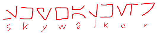
to illustrate, this is "Republic" in canon Aurebesh:

and this is "Republic" after combining some letters:

we could go more aggressive and combine more than two letters, but speakers would have to know all ligatures, but that's fine, Hindi speakers learn hundreds or millions of letter combinations and they're not random, they are intuitive
now with Skywalker:

of course, i'd still prefer to make an alphabet which actually makes sense

real life example: Korean
if we wrote English with the Hangul, Republic would be 러풉맄
[ㄹ=r][ㅓ=e][ㅍ=p][ㅜ=u][ㅂ=b][ㄹ=l][ㅣ=i][ㅋ=k]
ㄹ+ㅓ=러
ㅍ+ㅜ+ㅂ=풉
ㄹ+ㅣ+ㅋ=맄
canon Aurebesh would spell it ㄹㅓㅍㅜㅂㄹㅣㅋ
Hindi:
र=e रे=re फ=p फु=pu
ब=b ल=l ब्ल=bl ब्लि=bli ख=c
रेफुब्लिख = Republic
canon Aurebesh would spell it रएफउबलइख
#languages#alphabets#alphabet#aurebesh#star wars#ligature#ligatures#clone wars#star wars prequels#sw prequels#conscripting#conscript#worldbuild#worldbuilding#hangul#devanagari#devanāgarī#देवनागरी#한글
37 notes
·
View notes
Text
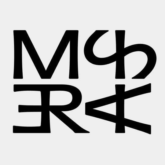
w/ Daniel Barek
MISERIA logo (concept ligatures) 23
#typography#logo#lukasberan#lukasberandesign#graphicdesign#clubculture#darkmusic#berlin#logotype#ligatures
45 notes
·
View notes

Text
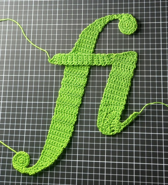
an ABSOLUTELY STUNNING fi ligature crocheted by @caliconiko for our 1000-members glyph challenge!!!!!!!!!!!
#thanks niko#glyphs#type design#typography#glyphs & alphabets#ligature#ligatures#times new roman#fi#crochet
24 notes
·
View notes
Text

#girls with braces#braces#orthodontics#metal braces#ligatures#orthodoncia#orthodontic correction#close up#pretty mouth
7 notes
·
View notes
Text
the little things that bring big delight
look at tumblr's text fonts and how some have an fl ligature
fl
fl
mrrrrrlllll our mind's mouth is watering

it occurred to us that this might not be a cross platform thing, so this is what it looks like on the iphone tumblr app
4 notes
·
View notes
Text

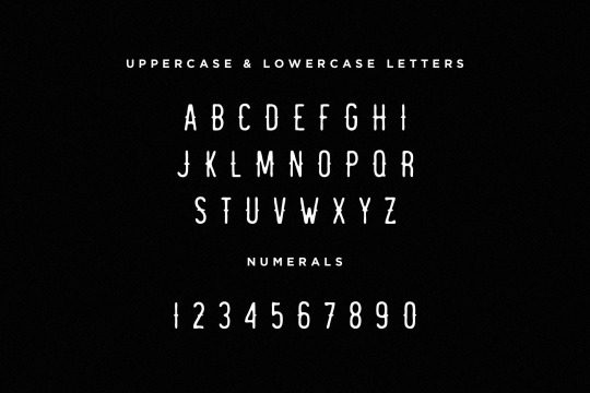


Redwood is vintage sans serif hand drawn font with a rough look with alternative version. Redwood is perfect for branding, logos, t-shirts, shirts, hoodies, etc.
DOWNLOAD REDWOOD HERE
#60s#70s#80s#Brand#Branding Font#Font#Grunge#Halftone#Ligature#Ligatures#Logos#Logotype#Multilingual#Popular#Popular Font#Retro#Retro Font#Round#Sans#Sans Serif Font#Serif#Serif Font#Soft#Type#Typeface#Vintage#Vintage Font#Eagle#Sight#Redwood
2 notes
·
View notes
Text
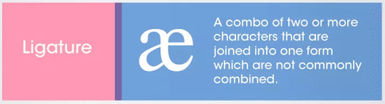
Diagram And Description Of Ligatures In Typography Design
#ligature#ligatures#typography#design#educational#infographic#microfact#quick facts#quick fact#fun facts#fun fact#facts#fact
1 note
·
View note

Text


orangecrush is a stylish natural handwritten fonts that is fun to play with your every craft projects.
Get this fonts for FREE at Omaikraf Studio
9 notes
·
View notes
Photo

Beverly Hills Font by Krismagraph
Download here.
Follow WE AND THE COLOR on:
Facebook I Twitter I Pinterest I YouTube I Instagram
6 notes
·
View notes
Photo

Took a break from the unpacking with @tim.whitmore as the gardeners are laying the grass. Só haply about that, 4 months late but it is being completed. We cycled into Setúbal to the local boot sale market and imagine my luck. A Portuguese writing manual, a box of assorted nibs and a box of small ruling pens. I was over the moon. @pascribe @viarcoportugal #pascribe #pascriber #calligraphy #ligatures #flourishing #copperplate #spencerian #ligatures #pointedpen #writing #handwriting #handwritten #formal #traditional #lecture #workshop #learning #caligrafia #portugalcaligrafia (at Setúbal) https://www.instagram.com/p/CdQylT7oidL/?igshid=NGJjMDIxMWI=
#pascribe#pascriber#calligraphy#ligatures#flourishing#copperplate#spencerian#pointedpen#writing#handwriting#handwritten#formal#traditional#lecture#workshop#learning#caligrafia#portugalcaligrafia
4 notes
·
View notes
Text

WANDERER.
DOWNLOAD NORTHERN LIGHTS HERE
#60s#70s#80s#90s#Badge#Badges#Classic#Classic Font#Design#Display#Drawn#Grunge#Grunge Font#Halftone#Hand#Handcrafted#Handmade#Handwritten#Ligature#Ligatures#Logo#Logo Font#Logos#Logotype#Modern#Modern Font#Retro#Retro Font#Sans#Sans Serif
0 notes
Text

11 notes
·
View notes
Text

https://monads.online/@PhoebeWallerPalladino/110725289837429851
0 notes

Last Seen Blogs

alwaysklako
AlwaysKlako

youabadidea
You're a bad idea

gr0vndz3ro
Welcome to the Mob

lovelybee666
Bee

pilkachu
this place is not a place of honor