#It's so trippy to look at the landscape and notice that
Text
Project 1952: Day 60 Round Up!
First, here are some stats from days 31-60:
TV: I watched 72 episodes of TV, and 19 different shows. The total for all sixty days is- 129 episodes, 39 different shows!
Radio: I listened to 78 episodes, and 25 different shows. The total for all sixty days is 156 episodes, 37 different shows.
Film: I watched 30 films, 31 if you count the Westinghouse sales film Ellis in Freedomland. In total over the last 60 days, I've watched 59 films.
Magazines: I read 13 magazines, 7 different titles
Books: Still zero. I’m going to postpone reading books until after the project ends. For any kind of life balance, I just can’t do it right now. I don’t have the time. When I did project 1939, I only had radio to listen to/watch besides films. Now, with the addition of TV, it’s just too much.
Awards!
Best TV show: Of the new ones I’ve seen since day 31, it's gotta be What’s My Line? I look forward to every episode I watch.
Best Radio show: Again, counting only the new ones since day 31- The Chase. Honorable mention: NBC’s coverage of the Democratic National Convention.
Best Film: High Noon. Honorable Mention: Europa 51.
Best Magazine: Good Housekeeping
Worst Film: There haven’t been any atrocities like there were in the first 30 days, but I would say Son of Paleface and What Price Glory? are the two worst/least entertaining films on my list.
Worst TV: Maybe Guiding Light or Gangbusters?
Worst Radio: Honestly, I don’t know if I’ve listened to any new shows that are all that bad.
Surprises and Trends!
Biggest surprises about specific shows/episodes:
Esther Williams! I unexpectedly fell totally in love with her. She’s got it all- she's gorgeous, talented, and she’s got this certain grace and dignity about her. I also find her speaking voice soothing.
I could listen to 3 ½ hours of radio coverage of a political convention and be utterly riveted. Never would have guessed that!
The movie The Girl in White really surprised me. I expected it to be a saccharine melodrama, but it turned into a thrilling riveting story about a pioneering female doctor. It's the kind of movie that sticks with you so much, you tell your friends and family about it.
Biggest overall surprises/trends:
Vintage puzzles! I didn’t think I’d be able to find any reasonably priced puzzles from the 40s or 50s, but I have. Those Tuco puzzles are a joy to work with- the pieces are so thick and satisfying, and the colors are vibrant.
A Jello mold obsession re-occurring! But now that I’ve been sick, I can’t even look at most Jello molds without wanting to retch. Literally. I don’t know how many I can make from here on out.
I didn’t expect to get so wrapped up in the political landscape of 1952. It’s been fascinating to see the way both parties have changed in the last 71 years. Republicans boasting about their progressive ideas? Democrats fighting with segregationist racists within their own party? It’s trippy, man.
Unsurprisingly, the horrible way men talk to women has continued unabated.
The East Asian racism in media has toned down somewhat in what I’ve seen from day 31-60. It’s still disgustingly there, but it’s not nearly as ubiquitous as it was the first 30 days. I have no idea why- it could even be just random chance.
The group of people this time that have been the victims of the most overt racism are the Native Americans. All the sorry old stereotypes have been there, with a heaping dose of dehumanization.
Racism against African Americans has been more overt in these last 30 days. I’ve seen several of those stereotypes of stupid or childish black porters, elevator operators, servants, etc. It has surprised me just how awful the portrayals are. It’s everything you think of when you hear the name Stepin Fetchit or Butterfly McQueen. Even on The Beulah Show, which I think was created with good intentions, it’s noticeably bad.
There has continued to be almost no hint of gayness anywhere. This time, there was one “sissy” comedic role with undertones of queerness, but that’s literally been it. There was also an ad in the back of a magazine (in the cheap ads section) for some Gold Medal paperbacks, one of which was a lesbian pulp novel. It again gave hints as to what it was about, but it didn’t come out and actually say it.
Stuffed green olives! Apparently stuffed green olives were considered fancy haute cuisine by middle class folk, cause they put them in everything! In all the worst most stomach-churning places you can imagine! With salmon and celery soup! With mac and cheese! In lemon Jello with grapefruit! With a pineapple lime Jello dessert! It’s insane.
This project is getting to be hard. I didn’t expect to struggle so much to keep going, or even consider throwing in the towel. I’m not going to quit now, while I’m 2/3 of the way there, but this is a challenge in every sense! Being sick for a week and a half now has not helped, either, I know.
0 notes
Text
✨the legends but i fed their names and descriptions to wombo dream so they turned out as pretty but weird pictures✨
shattered glass and a distorted face with rainbow hair and one blue and one yellow eye
dead bodies, a strange colourful planet, someone in militaryish uniform and what can only be described as weird interweaving tree roots
a natural looking twisty spaceship in a busy city. there is a helicopter.
an alien- looking thing with smooth green skin. there are green glowing things attached to it, and glowing creepy monitors and control panels
a hooded person in a colourful city with lots of tall buildings
looking at fuse's for too long makes my head spin. picture A Dad but melted slightly
a sunny island covered with houses and markets (?)
bright distorted glass and machinery (looks a bit like bubbles in the light) with a person in white in the middle of it
soldiers bodies in a pile, there is an ambulance im the background. one seems to be bleeding purple glowy stuff into a river
a hooded human-wolf hybrid
half a face floating in the sky of what looks like a holographic trading card sort of thing
a very fast vehicle launching over a city. in the sky floats something that is both a car and a human face
a person. maybe theyre going on a quest?
a thing with a few too many eyes, in a warm-coloured place with pretty patterns on the walls
again too much eyes and flesh and, ew theres machinery in there too i just noticed ew i hate that
a weird little gremlin thing with big eyes holding a knife
humanoids with wings fighting in a bar
a selection of weird figures in a trippy lake. there is a thing that looks like a dolphin with wraiths face

a cyborg with two (2) swords in a hellish landscape
note- id be happy to send ppl the actual image(s) if asked but theres A Lot and some are super weird
2 notes
·
View notes
Text
80s and 90s Rave Flyers

The rave flyer represents early electronic music's most emblematic artist medium, they document an era of peace and love, unity and respect and eradication of barriers. Flyers are an artistic history of the subculture of which hold memories that can never be buried or discarded, however it is because of these crazy, unique designs that makes them mean something. Whereas any boring and normal flyer would be thrown away and forgotten.
Rave flyers from dance music’s early days showcase a unique style of artistry that portrays the hustle, physicality, DIY spirit and harmony of the subculture in its various habitats around the world. Their colourful, trippy style incites imagination and kicks off vibrant stories of musical influence and hedonism, and I think it’s amazing how these strange designs can really capture that sense of passion for fun and freedom.

This first example of rave flyers is filled with different hypnotic patterns, that when put together is really trippy to look at. It shows just how effective simple patterns can be when used well, like in this piece where different shapes act as a frame to showcase the patterns, then layering these shapes to create simple but busy imagery. To top it off an eye has been placed inside of the triangle, eyes are commonly seen in rave flyers because they connect to spirituality and soul. They can also represent the illuminati which is all about a conspiracy, one that opens your mind to unthought of things for many people.
With these crazy patterns comes just two colours, black and yellow, however this isn’t a dull combination and is rather a bold, punchy mix with a prominent contrast. Once again you see this in a lot of rave flyers as these are the colours of the smiley, a symbol of positivity in and outside of rave culture.

Next is one of Fantazia’s many rave flyers where shadows have been included effectively, the shadow of a hand covers a lot of space which I think is a clever and simple way to fill in empty space. Nothing in this collage really makes sense but this is just reason it’s so intriguing and makes you wonder, however everything of course could have a possible meaning. For example the pyramid could be yet another indication of the illuminati, or it could just be there for absolutely no reason, it’s up to you to decide but either way it adds curiosity.
I really like the style of this piece, compared to most this design is quite toned down and not so crazy. The colours are pleasing to view and are actually quite calming, this is uncommon because rave flyers must attract partiers and that usually associates with bright colours. However in this piece the illustration speaks for itself, it also covers a lot of space with the text and makes it an important part of the design.

This flyer displays a really interesting concept about the world and the way we think of it, usually see see the world as gigantic however this piece shows that, from a different perspective, the same thing can look completely different. This is done by collaging fingers onto an image of space and earth, to look like its pinching it. The not add another layer it looks as though you can see it through a hole, ripped open in the sky which to me suggests looking through the simulation.
The colours are really appealing to me because they're bold but comforting, the sky blue is really rich, beautiful and a good contrast to the dark space colours. The font used for the text is interesting because it’s really quite simple, usually in these rave flyers the text is distorted in one way or another. However for this piece the designer chose to keep it clear, in both the font and layout.

The next flyer consists of floating head that’s cut open, with spheres flying out of it. The description of it sounds absurd and pointless, however when you see it as art it’s really intriguing and interestingly weird. This shows that the concept doesn’t have to make sense or there may not be one at all, because the art speaks for itself and leaves lots of room for curiosity.
Behind these objects is a CGI background, this gives them a space to be in so it looks like it is somewhere and not just an illustration. Lines have been used to determine depth and length of the floor, similarly seen in the face and spheres. This is a very clever technique that also adds an aspect of geometry to the piece, therefore if I was to create something with a digital background I would be sure to use this feature.

Finally this rave flyer’s main focus is the illustration, it holds so much importance as it is jam packet with different objects and characters. The first thing I notice is a woman holding a baby up to the sky (or universe), above this baby is a beam of light which I think represents a sacrifice to other life (aliens in UFOs). Meanwhile there 8 of these strange looking, tiny beings surrounded in a circle, their arms are up as if they're praising/supporting the act which is almost cult-like. Trying to figure out a concept is an adventure in itself and in the end you can come up with some crazy thoughts, but once again it’s all there for interpretation as well as looking really interesting and impressive.
Universal imagery was very popular in rave flyers back then including pictures of aliens, flying saucers, CGI landscapes and optical illusion art. There is a clear aspect of space in this piece thanks to the background, it’s filled with stars and includes many planets that might not be realistic but that's what makes it just a little more intriguing, possibly referring to another galaxy.
2 notes
·
View notes
Text
2018 Annual List of Favorite Film Experiences
HAPPY NEW YEAR!!
I hope you’ve been having a great holiday season. It’s been another fun year in film, television, and streaming. It felt like a particularly good year for diverse voices, visions, casts, and storytelling. While I still feel like I’m catching up on year-end releases, here’s my annual list of the ones that have entertained, moved me, provoked thoughts, or just plain stuck with me the most with their story-telling and artistry (In no particular order).
All the best for a wonderful 2019!
Cheers, Ed
Indelible (But VERY Different) Cinematic Experiences
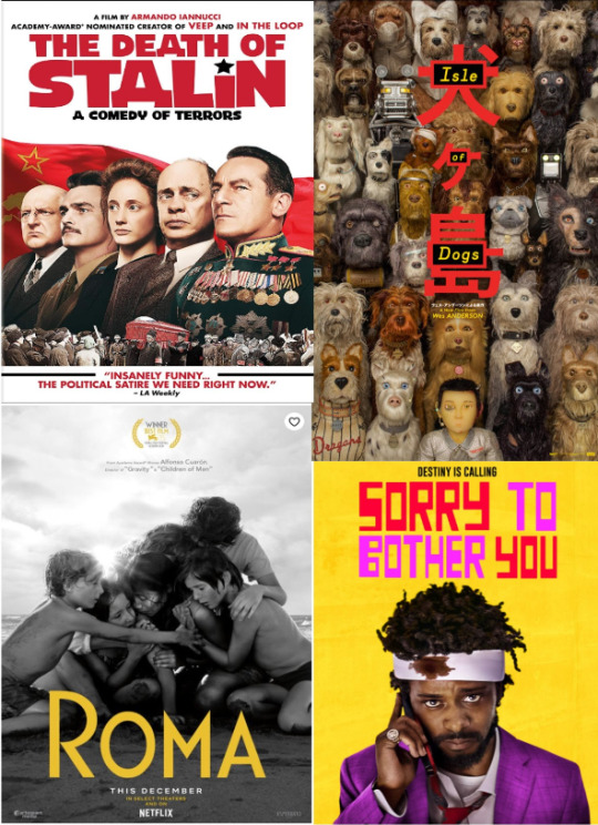
Roma—I wasn’t sure what the hype was about for the first hour which leisurely unfolds before you, but it’s just the build-up as Alfonso Cuaron’s beautiful and powerful film slowly draws you in, and then suddenly grabs you with unexpected emotional impact. An intimate, yet sweeping story of a maid who holds together a crumbling family as her own life combusts. Based on the director’s own life and the woman who raised him, Roma is a complex multi-layered domestic/social/political drama with some truly haunting and indelible sequences. Some may be challenged by the pacing and seeming lack of narrative. Be patient and stick with it; it’s worth it.
Sorry to Bother You—Audacious, original first film and new vision from rapper/hip hop musician Boots Riley starring a terrific Lakeith Stanfield as down on his luck young man who gets a job as a telemarketer and advised by veteran caller Danny Glover to use his “white voice” to become a power caller. The story then takes a twisted wackadoodle turn that truly defies description. This bold and outrageous absurdist social satire/surreal anti-capitalist black comedy also stars an excellent Armie Hammer in a bizzaro role.
A Full House of Documentaries: A Pair of Giants of Our Time and Three of a Kind
Won’t You Be My Neighbor—Celebrating a true hero, it’s a warm and loving look at this pioneer of children’s television who became a role model of kindness and compassion for generations. Little did I realize when watching him as a child the bold and courageous manner in which he addressed the social issues of the day. And it is worthwhile to see the full six-minute video of Fred Rogers Senate testimony that saved funding for public television: https://youtu.be/fKy7ljRr0AA.
RBG—An inspirational telling of the brilliant legal mind who shaped America’s legal landscape on gender equality and women’s rights and became a pop culture icon.
Three Identical Strangers—Fascinating documentary that starts as a “can’t believe it’s true” tale of separated-at-birth triplets who miraculously find each other as young adults, and then takes a very dark turn as the layers of the story are revealed, raising some real ethical questions about research and the debate about nature vs. nurture.
Additional Docu-series to watch: The Staircase (a gripping and powerful docu-series that is an intimate and detailed look at our criminal justice system as seen through the eyes of a man accused of murder who claims the death of his wife was an accident); The Fourth Estate (a fascinating behind the scenes look at the NY Times and their reporters as they cover the beginning of the Trump administration).
Historical Dramedies
The Death of Stalin—Dark and bitingly funny, this relevant political satire by Armando Iannucci of Veep portrays the intrigue surrounding the flock of sycophantic bureaucrats who vie to become the next Soviet leader after the sudden stroke and death of Stalin. A masterful historical farce with a great cast that includes Steve Buscemi, Jeffrey Tambor, Michael Palin, and Jason Isaacs. And it’s worth noting that the most absurd moments actually did take place (e.g., a rerun concert just to make a recording for Stalin; the alcoholic and meglomaniacal son of Stalin who lost the entire national hockey team by ordering their flight into a snowstorm and then replacing the dead players in hopes his dad wouldn’t notice).
The Favourite—While I decidedly did not care for filmmaker Yorgos Lanthimos’s much acclaimed The Lobster, this is a much more accessible outing. A highly original period/costume piece with an amazing trio of performances from Olivia Colman, Rachel Weisz, and Emma Stone, The Favourite is a dark and wickedly humorous look at the conniving palace intrigue, love triangles, and back-stabbing world of Queen Anne’s court, complete with fops, duck races, pigeon shooting, and rabbits that rule the roost.
Vice—Not your typical biopic. From the man who brought you The Big Short, Adam McKay delivers an entertaining dark dramedy. Christian Bale wholly transforms into the enigmatic Dick Cheney in this boldly told tale (including a faux Shakespearean pillow talk bit and a mid-film happily-ever-after credit sequence) of a ne'er do well who becomes the most powerful man in the world, all “in the service of the people.” With a very strong supporting cast of Amy Adams as Lynne Cheney, Sam Rockwell as George W. Bush, and Steve Carell as Donald Rumsfeld.
BlacKkKlansman—Director Spke Lee and the producers of Get Out deliver the unbelievably true buddy-cop tale from the 1970s of a black man who goes undercover to infiltrate the KKK by phone while his white Jewish partner stands in for him in face-to-face meetings. Told in a funny and entertaining manner, it’s one of Spike Lee’s best film in years, though it’s unfortunate how little the racial issues have changed over time.
Odes to Stan Lee and the Marvel Cinematic Universe
Black Panther—This is not just another Marvel superhero movie. This is what every origin story should be: a totally immersive world is created with a sophisticated and impressively well-told story, balancing big themes, character development, action, mythology, and strong messaging, including female empowerment. Black Panther is perhaps the best (and most political without being heavy-handed) entry in the MCU while leaving a very large cultural footprint on Hollywood.
Spider-Man: Into the Spider Verse—I really didn’t think we needed another entry into the Spidey world, but this one was truly fantastic, perhaps the best of the bunch. With visually stunning animation unlike anything I’ve seen before, it’s the most trippy, inclusive, and soulful Spider-Man ever, and the one most true to its comic book roots.
More Fantastic Animation, Stop Motion, and CGI
Isle of Dogs–I am an unabashed fan of Wes Anderson, and here he creates a masterful stop motion universe, much more sophisticated and intricate than his last one, the wonderful Fantastic Mr. Fox. Taking place in a fictional dystopian Japan, he creates yet another Andersonian obsessively detailed world, infused with Japanese culture and canines. On the surface, it’s a simple story of a boy seeking his pet dog in a world where dogs have been banished to a trash-filled island, but it works on so many other levels, existential and political. A great cast of voices infuse each character with individuality and nuanced personalities, including Brian Cranston, Edward Norton, and Bill Murray.
Ready Player One—An unexpectedly wild and entertaining journey, this Spielberg film that takes place in a dystopian future steeped in the nostalgia of the 1980s (video games, movies, music) where its citizens find salvation and escape in a virtual world called the OASIS. The central story of a teen in a whirlwind contest seeking control of the OASIS is a visually stunning and thrilling ride combining live action and CGI that is thoroughly satisfying (though I feel I need to go back to take in all the pop culture references that whirl by).
Incredibles 2–Well worth the wait after 14 years. Just what you would hope for in summer film. Well-developed characters, action, and story with amazing animation and a terrifically snazzy Michael Giacchino soundtrack.
Other Enjoyable Film Experiences Worth Mentioning
22 July, A Quiet Place, Beautiful Boy, Boy Erased, Crazy Rich Asians, Eighth Grade, Green Book, Love, Simon, Mary Poppins Returns, Mission Impossible: Fallout, Paddington 2, The Price of Everything, Ralph Breaks the Internet, Science Fair, Searching, The Hate U Give, Tully, Victoria & Abdul
In the Queue
A Star Is Born, Burning, Cold War, First Man, First Reformed, Free Solo, The Frontrunner, If Beale Street Could Talk, Shoplifters
Binge-Worthy Television
The Americans, Barry, Succession
For the Foodie Set
Fat Salt Acid Heat, Ugly Delicious
Favorite Theater Experience
Harry Potter and the Cursed Child--if you’re a HP fan, it’s like being reunited with old friends. Great story and incredible stagecraft.
Trailers
Black Panther: https://youtu.be/xjDjIWPwcPU
BlacKkKlansman: https://youtu.be/0vWHEuhEuno
Incredibles 2: https://youtu.be/i5qOzqD9Rms
Isle of Dogs: https://youtu.be/dt__kig8PVU
RBG: https://youtu.be/biIRlcQqmOc
Ready Player One: https://youtu.be/cSp1dM2Vj48
Roma: https://youtu.be/6BS27ngZtxg
Sorry to Bother You: https://youtu.be/PQKiRpiVRQM
Spider-Man: Into the Spider-Verse: https://youtu.be/g4Hbz2jLxvQ
The Death of Stalin: https://youtu.be/kPpXFnHoC-0
The Favourite: https://youtu.be/SYb-wkehT1g
Three Identical Strangers: https://youtu.be/c-OF0OaK3o0
Vice: https://youtu.be/jO3GsRQO0dM
Won’t You Be My Neighbor: https://youtu.be/FhwktRDG_aQ
1 note
·
View note
Photo
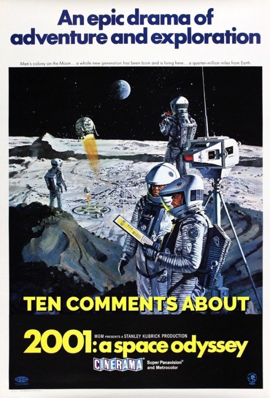
TEN COMMENTS ABOUT 2001 A SPACE ODYSSEY
“2001” is one of two movies from 1968 that I’ve seen most often in my life. (The other is the original “Planet of the Apes”.)
This week I saw “2001” on an IMAX screen (a real one, not those mini-IMAX screen popping up at malls) and it looked and sounded terrific.
There’s so little dialogue, the movie makes you pay attention.
The sequence with the apes is realistic without Andy Serkis and WETA’s CGI; and the moment they become calm by touch the monolith is chilling.
Kubrick spent a lot of time of the journey to the moon; lingering shots of space ships waltzing to the “Blue Danube”; space crafts landing and docking with precision; the ships never looked more realistic.
Although the computer screen displays aren’t to modern graphical interface standard, they don’t feel dated and fit with the design aesthetic of the film.
Keir Dullea and Gary Lockwood’s performances as astronauts Dave and Frank are neutral but you really sense their shock and determination when they realize the never-wrong-HAL controlling the ship has in fact made a mistake.
HAL9000 demonstrates true signs of a psychopath - after he casually kills 4 astronauts, he suggests that Dave take a stress pill so they can talk about it.
Although it needed to be done, one of the saddest moments of the film is when Dave dismantles the computer’s brain and HAL can feel his mind fading away.
The only weak point for me is the 2nd half of the Stargate Journey - while first half using slit-screen photography is marvelous and trippy, the second have with negative but colorized landscapes is over long and boring.
What did Dave evolving into and what does it all mean? Who cares! Just enjoy the ride!
BONUS: Next time you watch the film, be on the lookout for the disappearing Russian sweaters on the space station; one moment they are draped on the chairs; the next they’ve fallen to the floor; or have disappeared altogether. It’s a minor continuity error that Kubrick caught during editing so at some point he added an announcement over the speakers on the station that a blue sweater is at lost and found. It still doesn’t make sense because the announcement is before the sweater goes missing but it’s a fun bit to notice.
#2001: a space odyssey#stanley kubrick#arthur c. clarke#keir dullea#gary lockwood#hal9000#Stargate#moon#Jupiter#dawn of man
3 notes
·
View notes
Text
Fascination About Men Gym Clothes
Our final yoga equipment is an incredible creation by HDE. This device is constructed from spandex and cotton, which makes it a high quality and very snug set of yoga trousers. We love the HDE Yoga Trousers only mainly because it encourages totally free and versatile motion always as a result of its practical style and design.
All hail the hedonists! Led by Dries Van Noten, whose lush florals and plunging ruffled tops ran incredibly hot, designers have taken up a siren track for spring. The choices for sexing it up are numerous—and rather musically inclined. At Valentino, “activate, tune in, fall out” psychedelia and the cost-free enjoy associated with the ’60s and ’70s arrived by on silk shirts printed with Of course collaborator Roger Dean’s trippy landscapes.
It absolutely was multiple year back that Vogue Runway to start with noticed a new note of tenderness within the Guys’s reveals, but again then, in 2018, loveliness was nonetheless within the fringes of aggression, graphics, along with the immediacy of streetwear.
I’m also a supporter of the caliber of content Lulu utilizes—clothing from other brands turn out smelling eventually if you exercise in them lots. My Lululemon gear doesn’t and I have on them about the standard.”
In search of Principles? White or pale blue button-down shirts will probably be your best close friends. They can be dressed up or down for numerous instances. No matter whether you put on them with jeans or your preferred go well with, you'll always seem set jointly. You also could select a brilliant soft flannel shirt If you need an off-the-cuff, laid-back look.
Your recently seen items and showcased recommendations › Perspective or edit your browsing history
And when we probably won't return to sporting satisfies all the time, we're Obviously from the midst of a long-overdue menswear renaissance.
Should you’re the sort of male who likes to stick with a traditional wardrobe of neutrals, take into consideration these undesirable boys to become your new go-to spring fashion staples. Modern, tailor-made styles manufactured from extend fabrics for motion without difficulty, this sporty-nonetheless-polished outfit is usually a confident bet for some situations this season.
You’ve got your lifting plus your cardio down—but you have to be making time for yoga. That’s ideal: yoga. Yoga has all kinds of benefits for men, including improved snooze, better sexual intercourse, and reduced tension. Plus, yoga will help continue to keep you muscles loose, to help you hit the weights even harder.
Specifically made for circulation workouts, these yoga trousers are crafted from a bamboo viscose-cotton blend. The 200g bamboo jersey is a signature for this manufacturer, preferred on account of its softness and talent to regulate temperature.
Examine my entire evaluation right here. Despite the fact that they didn't make the cut for this manual, they're even now terrific menswear near me shoes. In the course of my future update of the guidebook, I'll take into account them for your several categories.
This designer bandhgala by Raghavendra Rathore is a sublime alternative as a wedding reception dress for guys.

We resource premium Rhone fabrics across quite a few continents to deliver higher functionality activewear for guys that endures rough terrains and powerful fitness center exercise sessions. With tanks, tops, and shorts, we offer the Necessities for just about any sports activities, exercise, or consolation wardrobe. We had been Uninterested in Adult males currently being an afterthought for quality sportswear and remaining stuck with subpar ‘provide everyone’ models, where good quality and in good shape aren’t paramount. So, we decided to do a little something about it. Men’s athletic clothes are usually not an afterthought. That is the founding principle of Rhone, which evokes our guarantee: Rhone Guys’s premium activewear and training clothes will often seem superior and execute better yet.
Shut icon Two crossed lines that type an 'X'. It suggests a way to close an conversation, or dismiss a notification.
The Jack Erwin Ellis Chelsea boot is definitely a modern take on the dress shoe, and Though its mid-century British flair isn't for everyone, this European-crafted Chelsea boot is the highest choice for any gentleman who wishes a dressy shoe with a definite and slightly a lot less traditional appear.
Whole convenience is the title of the sport using this dampness-wicking and brief-drying material that’s best For decent yoga—if you’re experience so brave. Plus, a upper body pocket provides a contact of style.
It had been more than one yr ago that Vogue Runway initial observed a fresh Be aware of tenderness while in the Gentlemen’s reveals, but again then, in 2018, loveliness was continue to over the fringes of aggression, graphics, as well as the immediacy of streetwear.
They are really louche and languid and lovely—and Sure, they actually exist. Scan the front rows and also you’ll locate Males, both the well-known along with the fashionably employed, giving up their rugged jeans for slouchy slacks, their graphic tees for silk camp shirts, and their large-top rated sneakers for Lemaire’s boy ballet flats.
Each K&G retail store delivers an on-web page tailoring services to verify every bit suits in your technical specs. With A variety of dimensions & many different products and solutions, we offer traditional, slender suit & Major & Tall sizes to accommodate any physique type.
They're snug, and also have ample stretch in them that enables zero restriction. The clothing is presentable and fitted, which in my line of work really is useful.”
From Doing the job really hard for the Office environment to comforting afternoon yoga and all the things between, Rhone engineers the best Health attire and exercise gear for guys. Rhone has major of the road outerwear which include base layers, jackets and hoodies.
Taxes and delivery calculated at checkout Checkout Choosing a variety brings about a full web page refresh.
The Holden incorporates a wingtip structure with a brogue pattern along the toe, heel, ankle, and lace eyelets. They've a substantial number of cushioning for sneakers that aren't precisely made for comfort.
There’s menswear near me a reason why tights are so well-liked among the yogis on the fairer sex. The tender Infinalon material of the Nike pair hugs the skin to get a distraction-no cost follow, although introducing a sense of support through poses that happen to be taxing in your leg muscles. £44.ninety five. nike.com
Go through my entire review right here. Despite the fact that they didn't make the cut for this guidebook, they're however terrific shoes. For the duration of my upcoming update of the guidebook, I'll take into consideration them to get a number of groups.
will be the get with the working day. Our different collections often have home in any party or predicament mainly because it has an incredible selection for all preferences. Blazers, shirts, brief sleeve shirts, t-shirts, denims, trousers, shorts and accessories created with details in mind, we warranty that We have now a garment For each and every gentleman that speaks in his individual unique temperament and taste. for every entire world without the need of limits.
A yoga brick is the perfect bit of package to simplicity oneself into poses, serving to you stabilise and insert some peak to moves which can be or else a struggle. Choose cork for the best environmentally sound, non-slip possibility. £fourteen. At amazon.co.British isles
A growing number of makes are catering to your rising uptake of yoga by Adult men, while possibilities remain missing compared to the myriad boutique womenswear brands. You’ll find a choice of our favourites, from Lululemon to Rhone, in GQ
0 notes
Text
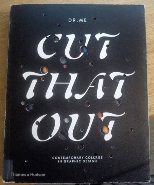
Cut That Out
What is it?
This is a really cool book I found in the library, it is authored by the studio DR. ME and when I went on to their website the founders of the studio are Ryan Doyle & Mark Edwards.
The book is described as “The very best in contemporary collage by 50 of the world’s leading creative studios and graphic designers”. and further on Google books - “Cut That Out focuses on the compositions of 50 leading designers and studios from 15 different countries for whom collage has been the key to creating vibrant, effective work - among them Hort, Paul Sahre and atelier bingo.”
The book itself
The first thing I noticed was the cover of the book I has a really nice feel to the paper, it has small bumps and I think it adds a lot to the product itself when it can deliver something different in terms of quality and a unique take on how the book is a product.
It has small circle cut out on the front revealing small bursts of colour and then when you look inside a really nice illustration collage piece reveals itself and it looks really nice. The book makes a really nice introduction for itself and let’s the user appreciate the quality of the delivery of the content.
Cameron Searcy
Originally From Knoxville, Tenessee, Cameron Searcy is a graphic designer who lives and works in Seattle, Washington. His commercial work has seen him create pieces for large brands such as as Starbucks and Coca Cola alongside other more independent musical acts and venues.
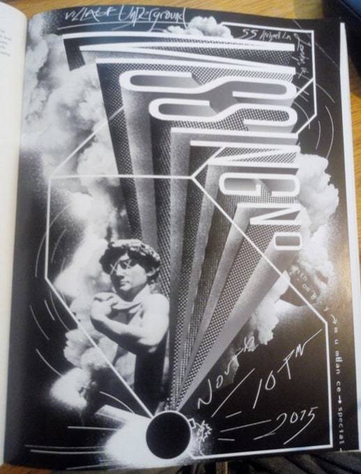
Poster for MSSINGNO. Digital collage, 2015.
I really like this style of poster and I think that it’s a really good example of digital collage. the title is really interesting because it makes the person looking at it to put a little bit of effort to see what it reads as and it sort’ve goes against what a poster is meant to normally do which is get the attention of the audience and clearly give them the information. Here however there is a bit of give and take.
The unusual geometric visuals are really interesting and unusual in the way that they seem a bit more measured and considered in contrast to the rest of the elements on the page.
The inclusion of the statue is an odd move but I really like it. It always interests me when a modern style of graphic design dips into more ancient pieces of art because in this case it fits in really well and just becomes another visual element within the poster.
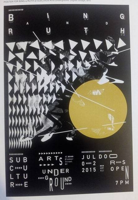
Poster for Bing & Ruth at SubCulture Arts Underground.
This is another cool example of a poster from Cameron Searcy in this poster he sticks to the geometric style we see in small doses in the other posters displayed in the book, but not as prevalent as in this poster here.
The black and white palette that pretty much dominate the poster brings a grunge and edgy quality to the poster and it is pretty nicely by the yellow used for the circle and it just makes the rest of the poster pop and stand out nicely.
The typeface (or lack thereof) is unusual and I probably wouldn’t suggest going this route but I understand the route he has went with here because the style he employs generally gives a sense chaos and projects more of an attitude rather than precision.
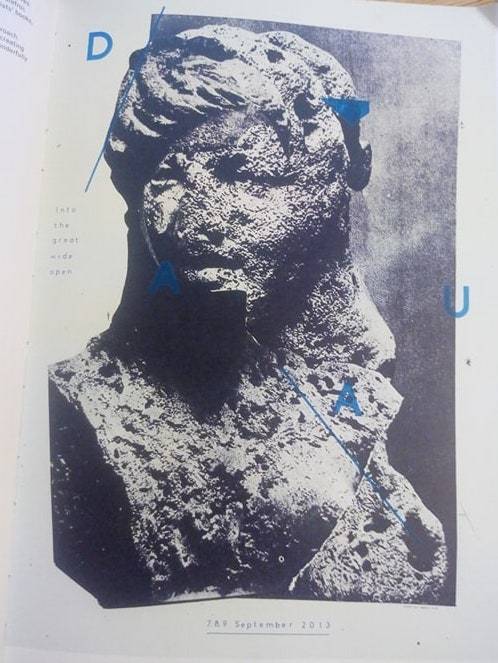
Damien Tran
Damien is a graphic designer and printmaker who works and lives in Berlin. He is the co-founder, along with Marion Jdanoff, of Palefrol, a micro-publishing company producing limited editions of artists’ books.
Poster for DAAU at Into the Great Wide Open festival
This is one of my favourite example from the book because the statue is rugged and looks like it isn’t in the best of shapes and I think it makes it look a lot more interesting to look at, I looked to see if there is any significance to the statue choice or any thought behind the effect on it.
The choice of blue really makes the image pop when it is in contrast with the grainy black and white statue and background. The acronym DAAU is a really simple and the audience can identify easily so the unusual layout chosen for the title is pretty creative but toes the line of being confusing really well.
Anna Peaker
Anna Peaker is a Leeds-based graphic artist who has worked on record covers, tape packages and posters for a range of musicians and record labels including The Tetleys, Soft Power Records and Too Pure Records. She has also had exhibitions in the UK and US.
Cassette Tape cover for ‘Life at the Planetarium’EP by Trogons
This is a really powerful Cassette cover and I love the monotone colours because it gets the balance perfect between it being to “out their” and easy on the eyes, I also think they would have a lots of conversations to discuss what the band wanted in terms of tone and feel.
The contrast between the purple colour and the unusual blue colour is really cool and they complement each other while matching each others tone and loo. I also really like the way both colours contrast with the black, it isn’t a pitch black as it appears to have a gradient over the top to give it a gritty and edgy look to it.
in terms of the different things on the cassette they all look like they are representations of something for the band or they reference certain things on the album (I couldn’t find anything) but I do think they all look really good, it doesn’t seem squashed with the amount of white space giving everything room to breathe as well as allowing every element to have prevalence on the page.

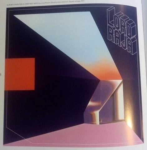
Robert Beatty
Kentucky based Robert Beatty is an artist and musician who creates wrk that transports the viewer to digital, otherworldly and often dystopian landscapes. Famed for his record design for Tame Impala, Beatty’s aesthetic stands out from the rest of his contemporaries.
Album cover for Currents by Tame Impala
I am really interested in album cover design and I feel like it has became it’s own sub category of design due to the way that you have your own style like any other designer but you have to mould it to suit the mood and feel of the band and maybe include elements that are conducive to the songs on the album.
For Tame Impala’s cover which has became famous as the music it represents, I love the way that Robert has dived into the trippy, ‘60s look and it meets Tame Impala’s music really well so I think it was a good match.
I love the colours used, it has the same ‘60s look as the elements on the page, I think they gel well together and suit the music really well, I usually don’t see the shading when it comes to a more flat design style but I think it works well here and helps to deliver the tone and feel.

Album cover for a Constant Moth by Lord RAJA.
Another great album cover that I like the look of and really delivers on the tone and feel of the artist and album, I think this cover has more of a ‘80s look to the colours and texture used on this cover, they are very complimentary of each other although they’re opposites in terms of the colour wheel.
I think the position and typeface of the logo is really cool and the use of making it the border as well is pretty cool but having certain element not adhering to the border is similar to what is normal for Roberts style.
Overall I really enjoyed this book and it had a lot of great example of collage style designers, the designers and pieces they chose to showcase all looked well, it was hard to choose which ones I would talk about.
I think it would be better if they took some time to discuss the significance of the piece and what the designer was aiming to do or what they were hoping to achieve with the art so that their decisions had context and reason.
0 notes
Text
William Gibson interviewed: Archangel, the Jackpot, and the instantly commodifiable dreamtime of industrial societies
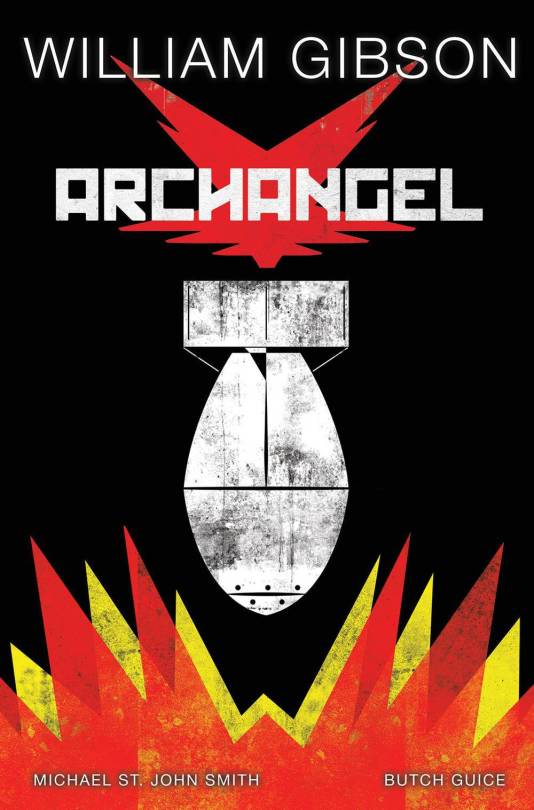
William Gibson's 2014 novel The Peripheral was the first futuristic book he published in the 21st century, and it showed us a distant future in which some event, "The Jackpot," had killed nearly everyone on Earth, leaving behind a class of ruthless oligarchs and their bootlickers; in the 2018 sequel, Agency, we're promised a closer look at the events of The Jackpot. Between then and now is Archangel, a time-traveling, alt-history, dieselpunk story of power-mad leaders and nuclear armageddon that will be in stores on October 3.
It's been nearly 20 years since I first interviewed Gibson and in the intervening decades we've become both friends and colleagues. He was kind enough to submit to an email interview again, in advance of Archangel's publication.
Cory Doctorow: This feels like an intermediate step between today and Agency, which is, in turn, an intermediate step on the way to The Peripheral. I know that when you first wrote The Peripheral, you didn't really know what The Jackpot was... Is this you taking successive runs at either side of The Jackpot, trying to get up to the edge of it so you can get a better look at it?
William Gibson: It feels like that to me now, but the whole thing’s been completely unintentional.
Mike and I (Michael St. John Smith, the actor, who’s also a screenwriter) started bouncing things around after I’d finished The Peripheral, which I assumed would be a one-off, but I found myself still in the grip of the “stub” alternative timeline thing, so Archangel wound up with a similar mechanism (rules of time travel invented, as far as I know, by Sterling and Shiner). Meanwhile, Agency was conceived as a book set in 2016 San Francisco/Silicon Valley, but treating contemporary reality there as if it were a near future (which of course it feels like to me, because I’m old). But I’m also slow, so Trump got elected before I’d finished, and suddenly I had about half of an ms that felt like it was set in a stub, a world that never happened. Extremely weird feeling! So I had this one extra thing to be pissed off with, about Trump! But then I wondered what would happen if I considered it as exactly that, a stub, but to do so I felt I needed to hook it up with the further future of The Peripheral, the London of the klept. Meanwhile, Archangel had been coming out from IDW, and when I went down to meet them at ComicCon, in 2016, the possibility of a Trump win naturally came up. So, through to November 8th, part me was looking at that, and the other part was No Fucking Way, and, well, you know.

For the record, in the graphic novel's script, pre-election, the Pilot winds up where he winds up in the comic, but it’s a nice WTF moment.
CD: You've written screenplays and novels but not, AFAIK, comics. You're on record as thinking that the comics previously adapted from your work were visually disappointing. You are one of the most visual writers I know, a font of extremely specific and striking visual details -- tell me what it was like to be able to collaborate with drawing-type people who could make visual things happen? How did it compare to screenwriting, how close did it come to your mind's eye, did this scratch some long-felt itch to conjure those visuals up and make them tangible?

WG: Well, previous attempts were well-intentioned, I don’t doubt, but comics have gotten a lot more sophisticated in the meantime.
Maybe because I'm a very visual writer, I don’t actually have any specific urge to see someone else render the things I’ve already seen, myself, in mind’s eye.
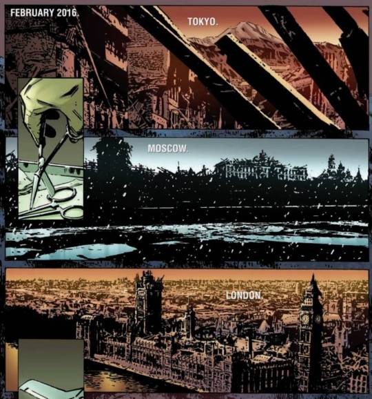
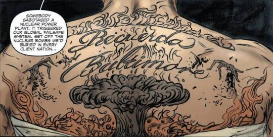
That said, the process with IDW was extremely gratifying. The talent and experience of a lot of professionals, all bent toward making this thing right. And budget not an issue, just a question of what could be drawn and fit in available space. You want an atomic explosion, you’ve got it!
CD: You once told me that Neuromancer was optimistic because it only featured a couple of limited nuclear exchanges instead of the holocaust we'd all be expecting. The futures you've written this decade all feature much more grave catastrophes, with much higher death-tolls. Is your optimism (such as it was) waning?
WG: I think I was relatively optimistic then, and remain so, but less so. I’ve never felt that my optimism, such as it was, was particularly logical. Often it felt deliberately quixotic to me.
But I’ve also observed a tendency, over my years as an sf reader, for sf writers of a certain age to give the After Us The Deluge speech, so I promised myself I’d try to be watchful of the onset of that, try to fend it off as best I could. I suspect that when people notice how much of the world they grew up has already ended, it’s quite natural to feel that the world is ending. Because the world one knew quite demonstrably is. But it always has been ending, that way. You can read the ancient Greeks, say, doing it at great length. When younger, though, this sounds like something one can simply choose to avoid, just as old people, to the young, appear to have made some sort of inexplicably terrible decision to become old.
There aren’t many catastrophes in my work, in our traditional cultural sense. There’s the California quake that forms the backstory of the Bridge trilogy, and the somewhat deliberately goofy Singularity that closes it. Otherwise, the catastrophic landscapes are simply human civilization, ongoing. The Peripheral introduced something new, for me, with the idea that our cultural model of catastrophe is still largely one of a uni-causal event of relatively short duration. We are ourselves of relatively short duration as individuals, and thus do we look at the world. Is our widespread use of fossil fuels a single extended catastrophe? Did it become one at some relatively late point? Is our species itself catastrophic (see Sterling’s “Swarm”)? Would it seem so to tigers, could they consider such things, and know that we’re on the brink of bringing about their extinction? I don’t see why it wouldn’t.
It seems to me in retrospect that Ballard’s work had a certain arc, in its employment of catastrophe. Early on, he’d unleash catastrophes of the sort our culture recognizes as such, though with wonderfully poetic results. As he continued, however, the catastrophe became humanity. Not a world made desert, or drowned, but a world made Cannes writ large, and terrible through being the very opposite of deserted.
CD: One place where this catastrophic business wraps around to touch your visual sense is in the cyberpunk aesthetic: for decades, you've been frontrunning the mainstreaming of bohemian subcultures. Archangel features gorgeous, eyeball-kicky sequences in an illegal nightclub in war-torn Berlin, with lots of well-dressed weirdos (there's also a Bowie-esque protagonist in the cast of characters). Today, it's hard to imagine a genuinely underground culture that isn't also something you can buy at the mall, with a few exceptions (e.g. extreme racist alt-right Pepe trolls who have to order their t-shirts off the internet or get them in a flea market). Can you imagine an uncommodifiable futuristic bohemian subculture that today's post-cyberpunks could deploy to make really edgy teens and young people? (Scott Westerfeld suggested that tomorrow's punks might opt for acne in a post-zit world)
WG: I accepted Sterling’s description of bohemias as “the Dreamtime of industrial societies” immediately, but I also took it (and still do) to imply that that might not be true for post-industrial societies. Bohemias were the product, if Sterling was right, of societies in which information was relatively unevenly distributed, specific information being what you needed in order to auto-other yourself into subculture. Roots of “hip”: to know, to be "with it”. A more universal, post-geographical availability of information seriously messes with that, because you don’t need to physically go to Montmartre or the Haight to get with it.

Mr. Baby’s club in Archangel is envisioned as a scaled-up version of what you get when Berlin’s Weimar bohemia becomes a platform for the postwar black market, so imagine it as primarily extra-legal, but staffed in part by pre-war counterculturists.
It’s interesting to consider the Pepe trolls as a subculture, because if they aren’t, why aren’t they? Yesterday a friend showed me a passage from Joshua Green’s book about Steve Bannon, Devil’s Bargain, describing René Guénon as an influence. So I checked out Guénon’s Wiki for the first time. Highly recommend it. Trippy, as we used to say! Guénon was, among other things, a convert to Islam (albeit a raging esotericist along with it, so not just any Islam) and otherwise deep into Egypt. So in the way of things internet I wound up diving his correspondence with Julius Evola, who kept him up to date on what Aleister Crowley was up to, and explained why this Jung character was even more dangerous than Freud. Both these guys, Guénon and Evola, were obviously total hipsters (in the original sense of the term). Subculturalists, unmistakably. With-it dudes. Whatever “it" was.
But then I never felt I truly understood many aspects of what I’d experienced in the countercultural ‘60s until I got a prof at UBC whose central interest was the mass psychology of fascism. Guénon and Evola and, hell, Bannon, come with big deja-vu, that way. Guénon also influenced Andre Breton (doesn’t surprise me). So the Pepe trolls, however distantly, have this weird lineage, which feels countercultural to me. (Is Bannon hip to the Dark Enlightenment?)
Subcultural “cool”, it seems to me, is inherently commodifiable. Subcultures may have pre-dated cool, but I wouldn’t bet on it. There was a countercultural boutique in Greenwich Village in the 1890s, called The Sorcerer’s Apprentice, the first I know of. Sold the outfit a girl needed to self-other into Village-ness (but she still needed cigarettes, too).
CD: Last question: When I first interviewed you, 20 years ago (!!), we talked about why Japan was a wellspring of cool futurity and China was (in the cyberpunk pantheon, at least), an also-ran. Now, Chinese authors are winning Hugo awards and China is projecting more heavy zaibatsu-style force into more territories (including orbit) than Japan ever dreamed of. In The Peripheral, China is a mysterious, closed technocracy that may or may not be the source of interdimensional semi-time-semi-travel. Now that you've written two more books that circle The Peripheral's future, are you homing in any more on what role China plays in this future you're playing in?
WG: In The Peripheral, I thought of China as a much more sophisticated and advanced species of klept. So that “the” klept, as Netherton thinks of it, comes out of the jackpot controlling everything still habitable that isn’t China. Which has become some sort of super-advanced sphere of its own, with little need of dealing with outsiders. Which gave me this other, unknowable realm, a sci-fi Faerie, where impossible magic can conveniently happen without my having to invent an explanation for it. But that’s not any literal prediction for China. That’s me using China as a plot device.
What I wanted from Japan, when I started writing sf, was that it was Japan. It was wonderful for me that it was Japan during the Bubble, because that slotted perfectly into my being sick of sf futures basically being America. But that was really just another excuse for me to write about Japan. The thing that makes me nuts about Japan, as near as I’ve ever been able to express it, is the way in which all of all their culture, their stuff, seems to be fractal. You can break it down into smaller and smaller bits, and each one is still Japanese. For whatever reason, I’ve never gotten that from China. For me, Japan’s gotten steadily more interesting as that Next Big World Player thing has receded. I don’t want to hang with whoever has the most money and spaceships. I want to hang with whoever has the best shadows, the most exquisitely weird and poetic history of being whacked with alien technology, becoming the first industrialized Asian nation, trying to take over their side of the world, getting nuked for their trouble, and inventing the Walkman. I think it’s probably something like you and Disneyland: I’m just so there.
https://boingboing.net/2017/09/22/the-jackpot.html
19 notes
·
View notes
Photo
The many ways to link shapes using HTML and CSS
#411 — October 2, 2019
Read on the Web
Frontend Focus

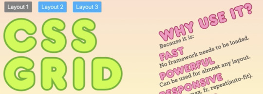
Layout-Fun with CSS Grid — Tobi experiments with various CSS Grid layouts here, explaining how to work with layout changes that occur following a browser resize.
Tobi Reif
The Many Ways to Link Up Shapes and Images with HTML and CSS — Once you move beyond squares and rectangles, you need to step beyond traditional techniques and try out things like SVG, image maps (as old as they are!), and clip-path.
Bailey Jones
Webinar: Building Great Search Experiences with Search UI — Building a search application from scratch doesn’t have to be a complex task. Join our webinar on Oct 16 to learn how to create premium search experiences with our free and open-source Search UI. No expertise in UI required.
elastic.co sponsor
An HTML Element 'Potentially Worth $18M' to Indiegogo Campaigns — I’m not so sure of the math here, but this is an interesting play on the recent 'HTML attribute potentially worth $4.4M to Chipotle' post that makes the point that small tweaks to user experience on the web can mean big money at scale.
Adrian Roselli
WebHint in Firefox DevTools: Improve Compatibility, Accessibility and More — This excellent tool provides feedback about your site’s compatibility, performance, security, and accessibility. It’s now available in Firefox as an add-on.
Harald Kirschner (Mozilla)
Europe’s Top Court Says 'Active Consent' Is Needed for Tracking Cookies — The ruling notes that pre-checked consent boxes for dropping cookies are not legally valid and that consent must be obtained prior to storing or accessing non-essential cookies, such as tracking cookies for targeted advertising.
Natasha Lomas
Mozilla Disables TLS 1.0 and 1.1 in Firefox Nightly in Preparation of Deprecation — Support for both the TLS 1.0 and TLS 1.1 protocols are now disabled in Firefox Nightly.
Martin Brinkmann
💻 Jobs
Frontend Developer at X-Team (Remote) — Work with the world's leading brands, from anywhere. Travel the world while being part of the most energizing community of developers.
X-Team
Can You Help Our Client Migrate to Node.js? (Docklands, London) — Do you have experience and strong opinions on Node best practices? Come and share your advice with an engaged, friendly team of excellent software engineers.
CareersJS
Find A Job Through Vettery — Vettery specializes in tech roles and is completely free for job seekers. Create a profile to get started.
Vettery
📙 Articles, Tutorials & Opinion
Enhancing The Clickable Area Size of UI Elements — Sometimes only very tightly defined parts of your UI elements will be clickable, but there are ways to improve the experience.
Ahmad Shadeed
How CSS Grid Changes The Way We Think About Structuring Our Content — A look at how the “extra layer of control” that Grid offers helps simplify your markup and lets us write less code.
Kevin Powell
▶ Building Privacy-Conscious Projects — Advice for integrating best privacy practices into your next project.
Heather Burns
Accessibility for Web Developers: Whitepaper. Get Your Copy
Progress Kendo UI sponsor
Some Things You May Not Know About Chrome DevTools — Ten quick-fire features you may have not stumbled across.
Loftie Ellis
A Love Letter to My Website — Now this isn’t particularly related to development, but here Tobias shares his “declaration of love for personal websites” — and thinks we should be making more of them. I’m inclined to agree.
House of van Schneider
3 Easy-to-Apply CSS Improvements That You Can Use in Your Project Right Now
Mac Daniel beginner
💡 Tip of the Week
supported by

Styling links with CSS selectors
CSS selectors offer a powerful way to add style, and contextual information, to HTML elements, and while you can target element IDs, classes, etc. the spec hash been fleshed out over the years to support lots of other things you can easily select to style.
John Rhea highlights the wide variety in which they can be used in this excellent article, but for today we're just going to look at how they can be utilised for links.
Let's say you want to style links to PDF documents, signifying to the user that the link is to a 'document', rather than a Web page. This can be achieved like so:
a[href$=".pdf"] {
background: url('https://ift.tt/2n0g9v0)
0 50% no-repeat;
padding-left: 20px;
}
The $= operator in the attribute selector targets the end of the attribute value, looking specifically for links to PDFs. It will then add the linked PDF icon before the full link, like so:

This is just one quick example of how this can be used. You could also use this technique to style links to certain sites, style internal links differently to those that are outbound, or even to style certain images by targeting the src attribute of a file. It's worth playing around and experimenting!
This Tip of the Week is sponsored by Flatiron School, where you can learn software engineering, data science, or UX/UI design in just 15 weeks online or on campus.
🔧 Code, Tools & Resources

A Zero DIV Pure CSS Pixel Art Animation — This is a fun experiment in CSS art, using no HTML, JavaScript or images. Not practical in production of course as the resulting CSS file is massive. Here’s a time-lapse video showing the 'making of.'
Ben Evans codepen
Cutestrap: A Powerful 2.7KB Pure CSS Framework — Bills itself as “a progressive CSS Framework built with modern techniques and an eye towards the future with a simple API and robust customization options”.
Tyler Childs
OGL: A Minimal WebGL Framework — WebGL is not the easiest technology to use on its own, so libraries like Three.js are often used to make its functionality more accessible. This is a lighter weight attempt to keep you close to the metal without cutting your hands.
Nathan Gordon et al.
Proactively Identify Front-End Issues with Datadog Synthetics — Try Datadog Synthetics and run root cause analyses to resolve issues before your customers notice them.
Datadog Synthetics sponsor
Screen Size Map for Responsive Webdesign — An interactive map that illustrates the responsive and adaptive device landscape and popularity of various screen sizes.
Boana
remove.bg: Remove A Background From Image — This free tool has been updated to support images up to 25 megapixels.
Kaleido
Cursor? — This is a somewhat weird and trippy cursor effect, making use of SVGs.
Hazem Osama codepen
🗓 Upcoming Events
SmashingConf New York, October 15-16 — New York, USA — The conference is sold out, but some workshop tickets are still available.
Accessibility Scotland, October 25 — Edinburgh, UK — One day of talks. Friendly, open discussion about accessibility.
Performance Now, November 21-22 — Amsterdam, Netherlands — A single track conference with fourteen world-class speakers, covering the most important web performance insights.
Frontend Con, November 26-27 — Warsaw, Poland — Brings together 30+ top experts with over 500 experienced frontend pros from all over the world.
by via Frontend Focus https://ift.tt/2nUCuun
0 notes
Text

One of my favourite things about Vancouver after the Ocean and the Mountains is the abundance of public art. You can find it on most street corners downtown and always in pubic parks. My favourite piece is the A-maze-ing Laughter found at English Bay. Visiting Vancouver turned me on to public art in a way I never noticed in Edmonton.
Some people I know usually talk about art in terms of its stupidity or waste of money. Someone always has an opinion on how to spend tax dollars better. I think public art is culturally important. It helps identifies us as a people who recognize the value arts brings into a community. No doubt art is subjective. You either love it or hate it but its intent is to make you feel and start a conversation.
In 1991, Edmonton passed a policy called Percent for Art. Currently, Edmonton allocates 1% of the qualifying construction budget of any publicly accessible municipal project (% project) for the procurement of art to be publicly displayed. The Edmonton Arts Council is the steward of this program. I never thought of Edmonton as a city invested in the arts, I looked at the public art in Edmonton as an element of design – not a city being deliberate in supporting the arts. Then I stumbled upon THIS WEBSITE. It is an online gallery of all the public art in Edmonton.
It was as if I woke up.
That meant the giant shoes at the Southgate LRT were deliberately put there as public art. The Talus Dome, arguably Edmonton’s most controversial art installation is also a part of this program. “Before the Quesnell bridge was constructed, talus forms of earth occurred naturally along the river valley. The artwork reminds us of the landscape that has been altered by the bridge, a rigid, controlled construction that meets our need to traverse the obstacle of the river. It refers to the coexistence of the man-made and the natural.” Okay – so there is significance to the sculpture. It was all coming together for me.
As I scrolled through the City of Edmonton Public Art Gallery, I decided to tour my ‘hood and check out the different pieces of public art. I am guilty of travelling to the river valley far too often to explore Edmonton and I never looked at my neighbourhood as a place to tour. I made a list of the public art pieces in my neighbourhood and spent an afternoon exploring. My East-West grid was 17 street – 91 street. My North-South grid was Whitemud Freeway to Ellerslie Road.
Landscape Series 1 by Erin Ross was my first stop. This installation is located at Mill Woods Park on the northside of the building by the football field. All prairie paintings that showcase Alberta skies.
Next stop was Mill Woods Public Library for three separate installations.
Jordie Bonet’s Untitled. 10 panels each weighing over 2000lbs. Can you imagine the undertaking it took to install this piece? It was originally located at the Cenntenial Library before it became the Stanley Milner. This is located in the fiction section on the east side of the library.

This next piece, Phantasien by Tim Edler and Jan Edler is inspired by The Neverending Story. It is a study room clad in mirror with coloured lights. Its kind of trippy and students were studying in it. But I can see the appeal of being in there. Art can be functional too.

Upstairs in the Mill Woods Senior Centre is Milled Wood by Destiny Swiderski.

After leaving the Library, I travelled a block away to the South Division Police Station to see the nine canvasses of Encompass by Allen Ball.
Then off to Ivor Dent Sports Field to see Inspiral Arches from one of my favourite artists, Dylan Toymaker. If you have been to Victoria Oval or the Flying Canoe Festival and have seen the light installations, then you are already familiar with Toymaker’s work.
It was time to go closer to home and visit the Meadows. The Meadows Recreation Centre and Public Library also has a couple installations. My favourite is Wheatfield with Crows by Konstantin Dimopoulos. I love how it sways in the breeze just like wheatfields.

Inside the library was Sculpture in Landscapes by Cliff Eyland. Catalogue card-sized landscapes. This was a cool choice for the library.

And finally, Parade 1 by Gabe Wong (Parade two is aquatic animals located at Lewis Transit Centre) located on the west side of the Meadows Transit Centre. The ladybug is my favourite.
Wandering around my neighbourhood gave me a better appreciation for where I live and the fact that we have art accessible to everyone thrills me. I wonder who notices it? Let me know your favourite Edmonton Piece – maybe I will visit it next!
Edmonton Tourist: South East Public Art One of my favourite things about Vancouver after the Ocean and the Mountains is the abundance of public art.
0 notes
Note
Prompt were Sonic's in trouble this time and Amy is going to save him. I know this is going to be hard to keep it in character, but if you can, that'd be nice. Sorry if I'm bothering you
You never bother me, sweetie~ ;)
Prompt:
With the storm beating heavily upon him, Sonic was slammed to the ground once more.
His vision blurry, he tried to lean his head up, but the robot shocked the ends of it’s metallic, blender like hands, and slammed them into the wet ground.
The rain water was so heavily piled up on the land, that the electricity flowed straight through the puddles and electrocuted Sonic.
“AHH!!” He cried out, as the robot lifted his hands up in a quick, cocked jerk from the ground. He spun them around, as Eggman, having a dome over his eggpod, came up alongside the robot and snickered a greedy laugh.
“Looks like nature’s on my side this time, Sonic! Isn’t it sad? The very thing you try and save is against you. WHOHOHO! Now you know how I feel!” Eggman slammed his fist on his control panel, but the water was so fierce, the cold so bitterly chilled, that Eggman rubbed his arms, seeing the breath on the dome make it foggy.
He ‘haa’d into his hands, trying for warmth, before his teeth clattered and he rubbed his elbow on the dome to try and see better.
“Blast this fall rain! Why does it have to be so c-cold!”
“Soooniicc!!!”
“What was that?”
Eggman turned his pod around, as the robot also was looking about before being slammed from behind, a hammer striking it’s back before Amy leaped up to Eggman, freaking him out as she knocked him away.
“WHAT!? WHO BROUGHT YOU HEREEEEeeeeeee…” *ding*
Eggman was hit off out of orbit, but came shooting back to try and slam his eggpod into her.
She grabbed the robot, soaking wet and her bangs hanging down just lightly over her eyes, giving her a very edgy look before she swung and threw the entire robot with one hand up at Eggman.
“Oh cripes!” Eggman pulled back, but it was too late.
The robot slammed into him, it’s blender hands spun out of control and electric shocks suddenly bunched up and electrocuted Eggman from within his pod.
Black steam and a burnt face blinked from within the eggpod, as he coughed and scowled.
“I won’t forget this, HEDGEHOG!!” he flew off, sneezing as he now felt the wrong kind of ‘warmth’… and felt the fried skin hit with the cold to make it even more stinging and excruciating.
Amy huffed in the large downpour of rain, before turning to see Sonic motionless, and quickly rushing to his aid.
“Sonic!” She hesitated a moment, looking him over, before seeing his face down in the water and gasping, turning him over as he coughed.
His muscles had tightened from the electricity, and because of the cold, had locked in place.
Amy didn’t know this though, but just tried to get him up.
When she noticed how stiff he was, his groans and winces at being moved, she knew she could only do one thing.
She refused to drag him, so she plopped him up on her back, carrying him the best she could, wobbling a little to a nearby cave.
She couldn’t get a fire going because of the wetness all around her, so she held him close, breaking the ‘no touchy’ rule as she knew that with two bodies, the warmth would be enough to keep them alive during the night.
What was he doing way out here? Battling Eggman under such conditions?
She wondered this, before feeling his breath on her neck.
His head was over hers, straight as his muzzle lay at the crook of her neck, breathing silently as she tried to rub his back and get him some warmth.
She had followed the cries of pain all the way to him, her heart and running keeping her warm during the cold rain storm, and having been worried about him that whole time.
Was her instincts that told her that he was unwell? Probably hurt or lost?
She didn’t know, Sonic didn’t usually get lost, but she felt the need to find him.
It was stronger than ever now that she was beside him, holding him intimately as she was, but she knew it was more to warm him then anything else.
Still… she had never been this close before.
She found herself falling asleep, but shook her head, refusing too.
If she fell asleep, they could both die of cold.
she moved him away a moment, straining as she did some sit-ups, getting warmth at her core to make sure she could keep him going too.
After a few hours, she was growing sick.
Her back was towards the cave’s entrance, and everything windy and wet was splashing out on her back, keeping her freezing but she knew Sonic would be alright.
He trembled in his sleep, but this made her all the more persistent in keeping where she was.
He had to be okay… he just had too…
—-
Sonic slowly opened his eyes, seeing the morning due before he noticed the hail outside.
Hailing? In the morning?
The weather was super trippy, but was shocked him even more was what was beside him, breathing faintly, looking exhausted and chilled to the bone; like stone…
“Wha!!” He flinched, leaning up and away as he felt fine, a little cold, but alright.
Amy was shivering, her eyes squinting and her muzzle looking red with fever.
Something was wrong… what had happened again?
He raised an eyebrow, wondering how he even got into this predicament.
He squinted his eyes to her, trying to remember the night…
Eggman.
The thought immediately triggered other memories, and suddenly, Sonic was swarmed with an anxious feeling of helping Amy.
With his muscles back to normal, he quickly moved to examine her, reaching a hand to her forehead.
He hesitated… uncertain… but then concern moved passed that as he realized with a slight uncomfortable relief that he had spent the night in her arms.
Touch shouldn’t exactly be an issue right now.
He lightly put the back of his fingers to her forehead, and flinched back, wincing with a harsh, breathy sound.
She was like ice!
“Hang on,… Amy!” He whispered, bending down to say it before darting out.
Getting pelted with hail, he held a hand up and flinched at the hits that made it through, gathering what little dry wood he could find and slipping time and again on the heavy amounts of puddles all around his feet.
The landscape had turned into a marsh overnight.
He ran back to the cave, slipping and sliding but trying to keep the few sticks he could fine dry…
Rushing into the cave, he quickly lit a fire, using his own sneakers to rapidly up some friction to do so.
A trick he had learned a long time ago on his own. Which,.. he was very proud of.
He put his shoes back on, since they were fully dry from all the rubbing and scooted Amy closer to the fire, turning her back to it.
She smiled in her sleep, as if she knew.
He smiled too, sighing in relief, before deciding body-warmth was best right now.
He was worried about all the things that could go wrong…. ammonia for example.
How long had he been out?
He slid close to Amy’s side, and then cautiously… trying to figure out what to do, he moved his arms through her hair and over her body, pulling her into a close hug and then rubbing his hands at light-speeds to try and get warmth back into her.
He wasn’t worrying about her reaction to all this.
This was survival.
She did it for him.
He was meant to do it for her.
“Come on, Amy. Come on.” he softly chanted, looking to her face, seeing her condition not lighten up, and continuing to try and spread warmth through her.
“That a girl.” he saw her suddenly trembling, a good sign that she was feeling the warmth returning, instead of the numbing he knew the cold was doing.
He began to grow tired again, and after rubbing her boots to give her feet some warmth, he sighed and leaned back, just holding her, feeling his body give way since he did get up in quite the alarm.
Resting a moment, he closed his eyes and put his head to the top of hers, and waited…
It was long before her breathing came back to normal. Some sneezes and some coughs.
She even slowly blinked her eyes a moment, before drifting back to sleep.
She had saved him from a similar fate. It was his job now to keep her from it too.
Her back was warming up and he peeked through the slits of his eyes, feeling the fire with his arms and reaching towards it.
“…Y…Your back…” Amy softly spoke out.
“It’s fine.” Sonic smiled lightly, seeing her revive from the frost.
“B…But.. HA-choo.” she sneezed, sniffing and then turning to pull him over her.
“W-woah!” he stopped her, pushing his arms out. “Amy! You need the heat!”
“You’ll… you’ll catch a cold…” she coughed a moment, and he gave her a stickler’s eye.
“A cold, huh?” he sarcastically stated, seeing her condition.
“Emhmm.” he nodded, seeing her fade in rushed strength as he now held himself over her, no longer fighting her as she seemed to slowly move her head back down, her eyes closing into a restful state again.
He sighed, lowering himself over her, “You’re the one I’m worried about…” he then turned, pushing her closer to the fire before she woke up again, looking around.
“It’s warm…”
“Good. That’s how it’s supposed to feel.” he crawled up beside her and laid down, letting out some air from the effort.
He was still tried too… still a little cold.. but better off than Amy was.
“I… Heh.” she smiled, closing her eyes again. “Almost forgot how that felt.”
He looked up, that comment sending a wave of gratitude and guilt over him.
“…Thank you… Amy.” he stated, eyeing her with a look she hadn’t before seen in him.
Amy turned to try and get a better look, raising her head up towards his gaze, scanning his eyes.
“…I appreciate it.” he had his head straight again, but this time his chin was to the ground, not her neck.
His face looked exhausted, but also, strangely humble in appearance.
His eyes half-opened, looking to her with a sense of, possibly, love in them.
“If you hadn’t of come… I may still be face down in the mud… or worse, heh.” he gave a pity-chuckle, before turning away from her.
“Eggman might have actually gotten his way…”
“Sonic…” she lightly spoke, lifting a hand up to him.
He looked back down, and greeted her hand with a smile.
“You really are stubbornly loyal to me… aren’t you?”
She smiled back.
“Just madly in love. You know.” she lightly shrugged, with the best of her effort, anyway.
“Same diff.”
83 notes
·
View notes
Photo

New Post has been published on https://toldnews.com/lifestyle/13-great-things-we-saw-at-milans-design-fair/
13 Great Things We Saw at Milan’s Design Fair

It’s hard to gauge the exact scale of the Salone del Mobile furniture fair in Milan — where most international design brands and studios debut their annual collections — because it encompasses both the city’s fairgrounds and also hundreds of nearby pop-up shows in galleries, retail spaces and even an abandoned panettone factory. But it certainly feels more ambitious each year, at least in terms of the work on view. Last week’s fair featured no fewer than five presentations by the Milan-based design firm Dimore Studio; a sprawling Kvadrat show with a restaurant, a flower field and two Jean Prouvé cabins; and a major interactive interiors installation by Google developed in partnership with neuroscientists. Not to mention the ever-growing, ever-more-elaborate involvement of the world’s biggest fashion brands, which this year included Tod’s — the company presented full-size yurts, huts and other archetypal shelters reimagined by the architect Andrea Caputo — and Louis Vuitton, who debuted the latest collection from its Objets Nomades series of travel-inspired furnishings. Here, our 13 other highlights.
[Coming later this spring: the T List newsletter, a weekly roundup of what T Magazine editors are noticing and coveting. Sign up here.]
The Italian curator Nicolas Bellavance-Lecompte recently launched a design residency program at the century-old Milanese foundry Fonderia Artistica Battaglia and chose as his first subject the Stockholm-based designer Anton Alvarez, who used a special machine to extrude huge noodles of wax that were then cast in bronze using a lost-wax technique. The results debuted last week in the 5Vie district inside a private 15th-century church, open to Salone visitors for the very first time.
Though they look like simple, free-form marble tables, the pieces in Studio Binocle’s Six Tableaux series have an entertaining back story that made the series a favorite. Challenged to design a dining table by a client who didn’t like anything on the market, the architect Lorenzo Bini attempted to avoid making a piece too boring or too pretentious by creating an amoeba-shaped tabletop that he called “an impudent rip-off” of one of Ellsworth Kelly’s leaf drawings. Five more versions soon followed, traced directly from details of works by Louise Bourgeois, Cy Twombly, Christopher Wool and others.
The French-Italian rug brand CC-Tapis has made a habit of inviting up-and-coming designers to translate their aesthetics into striking floor coverings each year, and this collection was no exception. The standouts were soft, irregularly shaped gradient rugs by the Amsterdam-based designer Germans Ermics and a trippy harlequin grid series by Martino Gamper.
This year marked the fourth edition of Doppia Firma, a project by Fondazione Cologni dei Mestieri d’Arte and Living Corriere della Sera that pairs designers with highly skilled craftspeople to create a collaborative object. The highlight was a stained-glass-and-marble floor lamp by Maarten de Ceulaer and the Belgian glass purveyor Atelier Mestdagh, but we also spotted a nice take on one of the fair’s most ubiquitous objects this year — a room divider — by the designer Vito Nesta and the wallpaper artisans at San Patrignano.
Though it officially launched with a tiny preview last year, Far, the Nilufar gallery’s new offshoot dedicated to experimental contemporary work, got a proper introduction last week, taking over the majority of Nilufar’s Depot space with pieces by 10 different designers. The work, curated by Studio Vedèt, was memorable, especially the pieces by Julien Manaira and Odd Matter, but so was the scenography: a landscape of enormous plastic exhibition bubbles dreamed up by Space Caviar.
Every two years, Flos builds a massive booth at Salone del Mobile that inevitably fills up with crushing stampedes of curious people. The stampede is usually justified — as it was this year by four key releases: an enormous chandelier of interlocking leather parabolas by Formafantasma, a poetic curved track-lighting system by Michael Anastassiades, the resurrection of Mario Bellini’s 1964 flat-pack Chiara lamp and a brilliantly sculptural outdoor lighting collection by Nendo.
This year, rather than just presenting commercial products, Artek showcased a playful initiative called the FIN/JPN Friendship Collection. It’s a group of six projects that represent various thoughtful mergers of Finnish and Japanese design, from new versions of Aalto’s Stool 60 — including one with Technicolor tops by the Tokyo architect Jo Nagasaka and another that was indigo-dyed by the Japanese workshop Buaisou — to a bench by the designer Koichi Futatsumata that channels the shared public bathing traditions of the two countries.
If this year’s show felt short on new discoveries, a clear exception was Kabinet, a brand founded just months ago by two young designers interested in revitalizing the craft industry in the Veneto region of Italy. The line stood out for its contemporary take on sumptuous materials like burl wood, tortoiseshell and mohair.
“No Man’s Land” by Kvadrat and Raf Simons was not just an exhibition but a destination; visitors came not only to see Simons’s sixth collection for the textile brand — corduroy, shimmering or speckled bouclés — but also to taste food from a pop-up outpost of the London restaurant Rochelle Canteen, gaze at a field of wildflowers installed by the Belgian florist Mark Colle and wander around the Jean Prouvé prefab cabins that were part of the presentation’s elaborate mise-en-scène.
One of the best projects on view at Satellite, the section of the Salone fairgrounds dedicated to showcasing young designers, wasn’t furniture at all but Zurich-based Marie Schumann’s luminous wall hangings. Made from ombré cotton or polyester and draped threads of metallic Lurex, they were almost three dimensional, more like artworks than textile designs.
The American artist Matthew Day Jackson showed three versions of his loopy new table and chairs for the Finnish brand Made by Choice. Arranged within three color-coded rooms, the pieces came in bright green; black, with a subtle rainbow sheen; and a more conservative natural wood. Jackson engineered the tables’ legs to work entirely by an elaborate system of interlocking parts, so that no tools or screws are needed to take the table apart or put it back together again.
The New York-based designer Bec Brittain’s angular Heron lamps — particularly a version in pink and gray stone — were the stars of the Carrara-based marble brand Mmairo’s small but admirable collection, along with new tables by Karen Chekerdjian and an architectural table lamp by Niko Koronis.
The Parisian design publicist David Giroire decided to become his own client at this year’s fair, joining with the creative director Jerome Bazzocchi to start an ambitious new furniture brand dedicated to making limited-edition works by lesser-known talents. Called Theoreme Editions, its first collection features a chubby shearling chair balanced on a copper cube by Pool, a colored resin console by Francesco Balzano and a huge pebble-shaped floor mirror by Joris Poggioli.
#7 news lifestyle#healthy options lifestyle news digest#lifestyle galaxy news#lifestyle hot news#lifestyle news inquirer#lifestyle news update#lifestyle news us#lifestyle news websites#lifestyle store news#news24 lifestyle
0 notes
Text
Samsung galaxy note 10+
Not every decision Samsung made when building the Galaxy Note 10+ was a winner. But its blend of performance, an immersive screen and some clever S Pen tricks mean it’s still the best big phone out there right now. If you never felt any affection for the Note line in the past, though, you probably won’t find much here to change your mind.
Hardware and design
After years of incremental improvements, it probably won't come as a surprise that this year's Galaxy Note 10+ is a beautiful phone. The bezels around the 6.8-inch Dynamic AMOLED display are nearly nonexistent. The metal frame and the front and rear glass panels fit together perfectly. And the Aura Glow finish our review unit is rocking is absolutely eye-catching -- the best word to describe it shifting from blue to yellow and everything in between is "trippy." Unfortunately, apart from sparking conversations, the other thing this finish is really good for is showcasing how greasy your hands are.
At the risk of sounding a little too obvious, the Note is also a big phone: You're going to need two hands to use it. But Samsung has made better use of all this space by squeezing an even bigger screen into the Note 10+ has a rigorous breakdown of what makes it so excellent, and I'd suggest you read through if you're aching for technical detail. That said, this HDR10-certified display is excellent for curling up in bed and bingeing on movies, and it's more than bright enough for reading and note-taking under harsh sunlight. I do wish the company embraced the kind of high-refresh-rate displays used in devices like the Razer Phone and the One plus 7 pro though. They make motion look so buttery smooth and spoil more-traditional displays for you.
Going into this, I was concerned that Samsung's decision to move its camera cutout into the center of the screen would be distracting. Nah. That hole is (thankfully) much smaller than the cutout used in the Galaxy S10s, and it's far enough out of the way that it's pretty easy to ignore. You'll still notice it from time to time, like when you're watching videos with brightly lit scenery, but trust me -- you'll find your eyes glazing over it quickly.
There is one thing I have to gripe about though. Compared to Samsung's last big phone, the Galaxy S10+, the Note 10+'s screen has narrower bezels and follows the curve of the glass a little too far down the phone's side. These are minute changes, but they're enough that the fleshy part of my hand near the thumb joint touches the bottom corner of the screen accidentally. I'll be scrolling through my Instagram feed and oops -- I'm looking at my profile instead. And a few times, when I reached for the notification shade, I launched the camera by mistake. After talking to a few people who have also been testing the Note 10+, this might be more of a "me" problem. Still, you should test out a Note 10+ before you decide to buy one.
Cameras and video
If it ain't broke, don't fix it. That's the philosophy Samsung embraced for the Galaxy Note 10+'s three rear cameras. As with the Galaxy S10 and S10+, there are a 16-megapixel ultra-wide, 12-megapixel wide and 12-megapixel telephoto around back. The few changes Samsung did make were minor: The aperture on that zoom camera has been widened slightly to f/2.1 to help in low light, and the Note 10+ inherited the depth-sensing time-of-flight array we first saw on the Galaxy S10+ 5G. Ultimately, though, the difference in photo quality is negligible.
That's not necessarily bad. The S10 family proved to have solid cameras, and the Note 10+ is just as good, especially in broad daylight. You can expect loads of detail and lots of bright, vibrant colors. And Samsung's auto HDR is remarkably helpful when you're shooting outdoors, since it prevents well-lit parts of your scene from being blown out. Beyond that, I'm always thankful when a smartphone packs an ultra-wide camera; this one captures a 123-degree field of view that's helpful for shooting landscapes. The Pixel 3's machine-learning-powered camera produces slightly nicer photos with less fuss, but the flexibility these three sensors offer can't be dismissed.
Mobiles, Tablets, Mobile accessories, computer accessories, MP3 players, Smart watches. Mobile shop vapi, Mobile shop daman.
A dealer of mobiles and tablets, M K Mobile Shop in Tin Batti has been providing an extraordinary service to the citizens ever since its establishment in 1999. Connecting people, this mobile store ensures to offer its products at the best prices and offers thus helping the buyers to buy their favorite gadget at cheap. High on quality, all its products carry the warranty of their respective brands making them reliable for purchase. Customers have an option to choose from the vast range of products under its roof leaving an almost endless choice for them
.
0 notes
Text
Sneak Peek of “René Magritte: The Fifth Season”
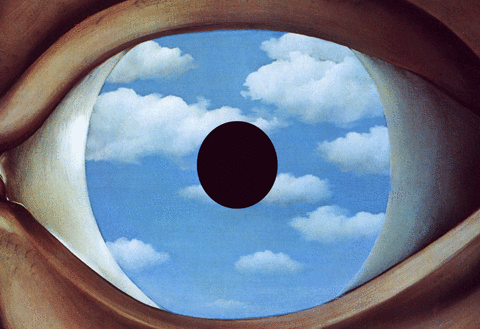
Put on your bowler hat and take a trip to Magritte’s world.
SFMoMA is celebrating the artwork of our favorite Belgian surrealist with their newest exhibit “René Magritte: The Fifth Season.” Featuring over 70 artworks spread across nine galleries, the exhibit is the first to look exclusively at Magritte’s later works completed from the 1940s to 1960s. Tickets to “The Fifth Season” are available now until October 28th, but fellow contributor Harley and I got a sneak peek of the exhibit before it opened to the public. Like Magritte himself, we don’t want to give everything away! Here are just a few of our favorite highlights from “The Fifth Season.”
The exhibit entrance gave us serious Twin Peaks vibes.
La premeditation (Forethought), 1943
Wait a minute… this doesn’t look like Magritte at all! Turns out in 1943, when the Germans began their occupation of Belgium, Magritte abandoned his refined painting style for a more experimental one. To him, Surrealism wasn’t appropriate for a time of worldwide devastation. Inspired by Impressionist artists like Renoir, he began a brief but powerful rebellion where he broke away from typical Surrealism and instead experimented heavily with color and lighting.
La moisson (The Harvest), 1943
This nude painting wouldn’t be that strange if the woman didn’t look like a human Everlasting Gobstopper. The Harvest depicts the same woman in Magritte’s Les Bon Jours de Monsieur Ingres (Monsieur Ingres’ Good Days) which was basically a copy of Magritte’s favorite Louvre painting La Source (The Spring) by Ingres- but with a multicolored woman. This painting implies the woman has to take a nap after pouring water after a vase, and her artificial coloring further questions the authenticity of humanity’s connection with nature.
Le Lyrisme (Lyricism), 1947
I know what you’re thinking: “WHAT?” A-pear-ently this pear-headed man was supposed to resemble King Louis XVI, the last king of France before the French Revolution. His well-known selfishness and dramatized ego is reflected in the greedy glare at another pear. Despite having context to the painting, it’s still disturbing and I’m definitely not going to be sleeping anytime soon.
Le vie des insectes (The Life of Insects), 1947
For a painting titled The Life of Insects, there sure is an astounding lack of bugs. The two men are supposed to be fighting off the instinct for survival, similarly to how bugs do. The Simpson-esque skin tone against an overbearing green sun doesn’t make the situation any less unsettling.
Le galet (The Pebble), 1948
This weirdly erotic nude is discomforting enough, with her being both on the beach but also set against what looks to be bathroom tiles. Some believe the “pebble” in the title refers to her pearl necklace or the pin in her hair, but Harley was convinced the pebble was actually her nipple. She’s probably right.
La condition humaine (The Human Condition), 1933
Ah, there’s that classic Magritte trippiness we know and love. In 1949, Magritte returned to his classic style but still sought ways to what we see and what knew, particularly with windows. This entire gallery called “The Human Condition” featured paintings that encourage dual thinking when it comes to representation- in other words, how objects can be both “inside and outside, natural and artificial, original and copy.”
La belle captive (The Fair Captive), 1950
This painting complicated the illusion that the canvases perfectly capture the scenes behind them. The nearby fire’s reflection on the right side of the canvas disrupts the math between painted surface and what lies beyond the canvas, reminding us that pictures can obstruct views as well as create new imaginative visions.
Les monde des images (The World of Images), 1950
This beautiful painting doesn’t feature a canvas, which makes it all the more interesting that the landscape of the sunset is both inside and outside of the broken window. Magritte not only focused on paintings within paintings, but also on the “problem of the window” to generate the same paradoxical effect.
La survivant (The Survivor), 1950
With the current controversy surrounding gun control in the United States, this painting really hits hard. The absence of any people and the gun’s upright position almost implies that it is moving of its own accord, and the blood at the barrel causes us to to question just exactly who has been attacked and who has survived.
La résponse imprévue (The Unexpected Answer), 1933
How do we get through a closed door? The unexpected answer provided by Magritte is to make an oddly shaped hole in the door. Despite creating an opening in the door, we still cannot see what lies beyond the door because it’s shrouded in darkness. In addition to forcing viewers to figure out what the question is to the “unexpected answer” - who created the hole? Why? What lies beyond the door that we are trying to see?- Magritte also makes note of the contradiction that doors manage to both hide and expose simultaneously.
Theory: Perhaps Botero’s Dancer at the Barre created the hole?
.
Le bain de cristal (The Cut Glass Bath), 1946
I like to imagine the inspiration for this came from Magritte noticing the “giraffe” cocktail on a bar menu, but that’s likely not the case. The long neck of the giraffe resembles the stem of the enlarged wine glass, creating a resonance between forms that at first glance seem unsimilar. Still, there is an actual giraffe cocktail out there- it calls for melon liqueur, pineapple and cranberry juice, and vodka. Cheers to surrealism!
Harley’s bag matching with The Treachery of Images
Is it really a Magritte exhibit if you don’t have this pipe that isn’t a pipe? Magritte’s debut of this now-iconic pipe in 1928 confused people with its meta language. Of course it’s a pipe! But Magritte’s sentence below called for a questioning of our relationship with images but pointing out that they are merely symbols of what they represent rather than the actual thing it is representing. Simple yet trippy, which I think you could say about all of Magritte’s works.
Le fils de l'homme (Son of Man), 1964
And is it really a Magritte exhibit if you don’t have at least one bowler-hatted man with a face concealed by an object?? Magritte’s most famous work now stands in a SFMoMa in a gallery full of paintings featuring bowler-hatted men. Magritte explained that to him, the bowler hat was a symbol of the average middle-class working man.
Side note: while I was trying to look at Son of Man, I found this guy’s awesome jacket of Magritte’s Waterfall, which was featured earlier in the exhibit!
Dear Schulmeister (The Schoolmaster), 1954
Overheard while taking this picture: “What’s so special about that painting? People must really like the moon.”
You’re darn right I like the moon! And so did Magritte- we lost count of how many artworks featured a little crescent in them. There’s nothing particular about this painting that signifies the man’s profession. But the moon provides illumination in darkness, and its placement above the figure’s head like a light bulb in a cartoon suggests that this person is granted illumination, or knowledge, in darkness, or dark times (or just life in general). The title suggests they are subsequently responsible for passing that knowledge to others.
The Dominion of Light, 1953-4
There are seventeen total artworks by Magritte that share this title and image. In the exhibit there’s an entire gallery in this exhibit with just the seven or so variations of this painting- the most ever displayed together as a collection. Inspired by Victorian landscape artist John Atkinson Grimshaw, these paintings display a paradox of daytime and nighttime occurring simultaneously. The picture later inspired the movie poster for classic horror film The Exorcist.
La clef de verre (The Glass Key)
Harley and I really enjoyed this painting of a large rock on top of larger rocks. Magritte used this oblong rock in a lot of his paintings. The rock essentially loses its meaning here. At the same time, the rock calls for our attention, to try to figure out its worth despite its placement on the mountains, thereby suggesting that objects mean a lot more than what they appear to be.

Of course, there were a lot more paintings than what we’ve shown you here- we want you to go see the exhibit for yourself! We will let you in on one secret-ish part of the exhibit- the end included a cool interactive section where guests could take trippy pictures among the trees from Le Blanc Seing, which oddly enough was not in the exhibit. There was also a face-scanner that put your face in Sheherazade and plenty of places to take wistful staring-at-the-moon selfies.
Le Blanc Seing (The Blank Signature), 1965
Harley and I among the trees
What exhibit isn’t complete without a gift store at the end? Our favorite items were these bowler hat colanders that I now regret not buying.
The Member Preview had an exclusive party with cool cloud decorations and tacky rolling cloud animation projected on the walls. We showed up just as the bar closed, but apparently there were apple-themed desserts, cocktails, and the debut of a new beer called “Son of Hops” by Seven Stills brewery.
Partying hard in the name of art
Yum! (by tashadrew on Instagram)
Definitely the coolest beer can ever (by sevenstills on Instagram)
Despite missing all the edible and drinkable content, we managed to get in line for this adorable Magritte-themed photobooth!

Who needs photobooth props when you have apples on sticks?
If you’re in the San Francisco Bay Area, be sure to check out “René Magritte: The Fifth Season!” Don't forget your bowler hat, and bring a couple green apples to snack on while you’re at it.
By: Alannah Clark
#rene magritte#magritte#sfmoma#art exhibit#art museum#san francisco#surrealism#art history#son of man#the treachery of images#bowler hat#green apple#history of art#modern art#sartle news#press preview
1 note
·
View note
Text
3 early Donald Glover music videos that will help you understand 'This Is America'

If there is one piece of pop culture that will define 2018, it's Donald Glover's music video for his song "This Is America."
The video, released as Glover's rapper alter ego Childish Gambino, debuted on Saturday when Donald Glover was doing double duty on SNL, hosting the show and performing as the show's musical guest. In less than a week since "This Is America" was released, the video has already garnered more than 63 million views and has been analyzed by everyone from Doreen St. Felix at The New Yorker to Dear White People creator Justin Simien on Twitter.
SEE ALSO: All the things you might have missed in Donald Glover's 'This Is America' video
The video has been lauded in part because of its densely packed criticism of racism and violence in America. Everything from the dance moves Glover uses to figures in the background all come together to form a resounding condemnation of how black people have been treated in the U.S.
youtube
But "This Is America" is not the first time Glover has used music videos to make salient critiques of pop culture and American culture.
Glover began making mixtapes as Childish Gambino in 2008 and his first studio album Camp debuted in 2011. Since then, the rapper has sporadically released music videos, many of which feature strange twists to them. For instance, in "Telegraph Ave," Glover depicts what seems to be a romantic vacation...until the rapper is hit by a car and remerges as a tentacled monster.
But even with those trippy scenarios, Glover's music videos have been filled with themes and ideas that the rapper is highlighting in "This Is America."
Here are three older Donald Glover music videos you should watch to help you understand "This Is America."
"Bonfire"
youtube
A big theme explored in "This Is America" is the question of who is seen and what pain is acknowledged. In that video, every time Glover shoots someone, the gun, which is delicately placed on a cloth, is treated with more care than the actual victims, who are dragged away.
But Glover actually broached idea that certain people and certain pain is invisible in 2011 in his music video for his song "Bonfire."
The video is directed like a horror movie. At the start Glover wakes up in a forest with a rope around his neck and he coughs up blood. In the distance he sees a bonfire with campers sitting around it, one person telling a story. As he runs toward the bonfire, he also notices another person in the woods walking towards the group holding a noose and a knife. Donald gets to the campers and tries to warn them but none of them are able to see Glover. The man with the knife then jumps out of the woods and it's revealed that it was all an elaborate ghost story.
At the end of the video, as the camper walks away, Glover falls to the ground, and once again wakes up with a noose around his neck, suggesting that the victim of the story was Glover himself.
At the time, the video seemed to be about Donald Glover's reputation — everybody is talking about him but nobody can see him. "It’s a bonfire, turn the lights out/ I’m burnin’ everything you muthafuckas talk about," Glover raps. But now the video carries new meaning when watched alongside "This Is America."
"Sweatpants"
youtube
One of Glover's breakout songs as Childish Gambino was his 2013 song "Sweatpants." On the surface, the song seems to just be Glover flexin' his wealth and success. "Still spitting that cash flow – DJ Khaled/ I got a penthouse on both coasts – pH balance," he raps. And he ends the song with the refrain "Don't be mad cause I'm doing me better than you doing you."
However, Glover's music video added a new element to the song. In the video, Glover is stuck in a loop: he enters a dinner through the front door, walks past people eating, sits with his friends, gets up to put music on the jukebox, and then walks out the back door where he sees someone puking in the bushes and two people kissing. Then he looks up...only to suddenly be transported to the front door where he enters the loop again.
It's a trippy concept by itself, but as Donald Glover goes through each loop, slowly people in the scene are replaced by versions of Donald Glover, which adds another layer to the video.
"[The video is about] the idea of you doing you so hard that you can't do anything else," Glover explained to Complex in 2014. "I never wanted him to freak out when he saw himself. I wanted him to be like this is what I'm supposed to be but it's scary at the same time. Being you to the utmost is scary because you don't know what you're capable of. You may turn into a version of you might not like."
That idea of a multitude of versions of yourself comes back in the "This Is America." In that video we see scenes of Donald Glover dancing with kids in a carefree, nonchalant manner contrasted with scenes of the rapper perpetuating horrific violence. Details like his clothing, poses the rapper strikes, and more allude to Jim Crow in America. Put together, "This Is America," like "Sweatpants" seems to be highlighting a multitude of selves, but this time instead of showing differing versions of Donald Glover, in "This Is America" we see different versions of the black experience.
"3005"
youtube
Donald Glover's video "3005" toned down the level of weird Glover exhibited in past videos, but it still uses some strange elements to highlight an argument.
The video finds Glover at a fair, sitting on a ferris wheel next to a stuffed bear. Throughout the video, two things happen: first, the bear begins to move, blinking and interacting with Glover. Second, the camera rotates, revealing the what's happening in the rest of the fair.
As the ride goes round and round, both of those scenes, the stuffed bear and the fair, begin to fall into chaos — the bear gets increasingly ruined and the environment in the background of the fair burns in flames. However, neither Glover nor the other riders on the ferris wheel seem to notice. At the end of the video, after panning to reveal the blazing landscape, the camera returns to the ferris wheel which is now empty except for the bear, which is in tatters.
In 2015, Vice writer Trey Smith speculated that the video is about the loss of innocence.
"The change from '3005,' a light feel-good song, to the second section of 'Zealots of Stockholm,' a much more dark and menacing track, is representative of how his views of the world have changed. It is no longer the cheerful place he knew it was—now that he’s seen the violence it is capable of in more than one way, he can’t continue to believe any other version of it."
Of course, that's the same transition we see in "This Is America." That video opens with Glover dancing while a man strums the guitar. However, that peaceful scene is quickly shattered when Glover suddenly shoots the guitar player.
The loss of innocence is also echoed with the kids that accompany Glover. Throughout the video, even as Glover commits acts of violence, he is accompanied by children who are either unaware or unconcerned by what Glover has done. That is until he holds up an invisible gun in the middle of the group. Scared, they kids flee and join the scenes of chaos unfolding around them.
Ultimately, "This Is America" is making waves because it seems to be signaling a new era for Glover. "What 'This Is America' suggests is that the next—and apparently last—Childish Gambino record will be far more pointed and political and uncomfortable," writes Rob Harvilla for The Ringer. But look closely and you can see that Glover has quietly been infusing his videos with social commentary all along.
WATCH: These celebs brought their star power to March for Our Lives

#_author:MJ Franklin#_uuid:0fb4950c-5b53-3cd5-9d83-3250813d5190#_lmsid:a0Vd000000DTrEpEAL#_revsp:news.mashable
0 notes
Text
S4. Post A - Final Draft of Evaluation
In Post A, I stated, “I am studying Sergio Leone as an auteur and trying to incorporate aspects of his style into my film”, and I think I have made a five minute film that is reflective of my creative investigation as well as incorporating stylistic elements, as well as genre and theme that is characteristic of Sergio Leone’s movies into my own.
Sergio Leone’s work is generally defined as ‘Spaghetti Western’ which seems like a clear cut term for his work, however this term was relative to other factors than just the style of the film, such as the nationality of the director (typically Italian) as well as the production budget and filming location. Leone did in some ways invent this genre and this allusive term was coined for his work. At its most basic level Leone’s films are westerns with similar themes such as redemption and solitude. I kept this in mind when creating my own film, “The Milky bar Kid”, and referenced my creative investigation and returned to Leone’s films to see what elements of his filmmaking I could incorporate into my own. One critic said that Leone’s style is “the contrast between big and little” (referring to the shot types that Leone chose to use). This is a style I actively tried to make a part of the cinematography of my film. As Leone emphasises cinematography over dialogue, I tried to do this, as well as showing contrast between shots of wide and close up shots.

(The Milky bar kid, 2018)

(The Good, the Bad and the Ugly, 1966)
(The Milky bar kid, 2018)
In the final sequence I change the aspect ratio so that it is similar in another aspect to some of Leone’s work. I withheld this technique until the final scene for a few reasons, one being that I thought it was a bit over the top to have that aspect ratio for the entire film and that if I did it would not be noticeable. So I kept it for the final sequence where the change is clearly notice, I also kept it for the final sequence because it was the most visually stunning and drawn out, and the change in aspect ratio is interesting to observe. The final sequence is also hard to make out because of the dark lighting, yet the most picturesque, so I decided to change the ratio to in essence ‘put a frame’ around it.
(The Milky bar kid, 2018)
(The Good, the Bad and the Ugly, 1966)

(The Milky bar kid, 2018)
The lack of dialogue is traditional of a Sergio Leone spaghetti western, which is why there is extremely limited use of diegetic dialogue in my film. It is also because the unnamed protagonist is the only character in the film and it wouldn’t really make sense for there to be too much dialogue between one person.
In ‘The Milky bar Kid’ I tried to create a spaghetti western with a post modern approach so it did not feel dated. I achieved this with the use of a non-diegetic voiceover, explaining the events and giving the audience more context of the events as they unfold. I did use some visual effects to heighten the fiction of the story and to break the illusion of the film to some extent. I think that a notable example of this is when my unnamed protagonist is sat on the log over a small lake. In this scene where the shots are wide there is a ‘brown’ filter to re-create the look of a spaghetti western and the natural browns that traditional celluloid film on which most spaghetti westerns were filmed on to make the film look more visually connected to Sergio Leone’s work in some shots. Whilst in other shots such as the shot where there is some ‘trippy’ effects on the unnamed protagonists face, which would not traditionally appear in a Western, let alone a Sergio Leone feature.
I tried to incorporate some iconography that is quiet typical of Sergio Leone, such as extreme close ups, cigarettes, open spaces and a costume that slightly subverts cultural views of what a cowboy is, as Leone did with ‘the good, The bad, and the Ugly’ and ‘ Once Upon a Time in the West’ by giving the cowboys big duster jackets. I did this by using a sleeveless jacket and cherry red boots. I think the costume is also a large part of the film, as different audiences interpret it differently, which contributes to my film not having one singular message.
To shoot my film I used one DSLR camera, which made it more time consuming to shoot shots from two perspectives or angles, but made me consciously think about what shots I needed and I think the film was of a higher quality because of this, and I think the cinematography is definitely of a higher standard than my first year film. The film runs from daylight, into nighttime, and it is implied by the voiceover that several days have passed. The film following the course of a day visually gives the film a chronological film, even though some shots gives the impression that some sequences are non-linear even though they are not.
I decided to make the score for my film basing it off of the theme from ‘The good the bad and the ugly’. I adopted the ‘dm-em’ musical motif to my film, which completed the film and added another dimension to it. I think the score sounds quiet traditional of a spaghetti western and doesn’t subvert audience expectations, as well as complimenting the cinematography quite well.
I think that I could apply auteur theory to my film, especially because I scored the film, and wrote and directed it, however I think that because I didn’t act in it myself, and because the style is trying to emulate the style of another directors vision (Sergio Leone) I could not fully attest to being a true auteur. I did try and create inner meaning by the use of a voiceover, which allows for audience insight, and symbolism, by the use of cigarettes and sparse landscapes to foreshadow the death of the protagonist and heighten the feeling of isolation.
I picked my locations because it was the closest thing I could get to the locations Leone used in his films, as well as having a similar impact on an audience visually, because it think that it wasn’t just the open landscapes that made Leone’s work impressive, it was the way he shot and focused on them in choice moments, which I tried to do, especially in the beginning to have a form of visual exposition, and I think having similar ending shots creates a cyclical feeling and creates a visual sense of resolution.
0 notes
Last Seen Blogs

theultimatefanficwriter
(Oneshots CLOSED!)Danganronpa Oneshots/Headcanons

witch-hazels-musings
Matron Witch-Hazel

imswimmingback
absolute fool about it

moonthiefs-archive
moved

cholover7
CHOLOVER7 videos