Last Seen Blogs
simpleboox-blog
Kat
beamishdaydreamer
Day Dream

hmbrarcrec
Hmbr Arc Rec

voids-fics
Void writes fics
aullandote-noches-de-luna-llena
Un Liricista en el Tejado

Text
Vinyl Packaging Mockups
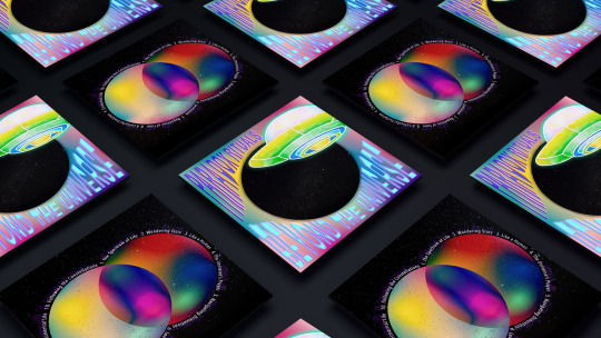

These are mockups of designs that I created for vinyl packaging, this includes the front cover, back cover and label. It shows my art in its full potential because you can see it on the product its designed for, so you get a really good feel for what it would be like in real life. I think overall I have done a good job at presenting the multiverse theme, as I have shown imagery of space, UFOs, planet like objects etc. I also really like how the front and back covers contrast, one being mainly light, bright colours and the other mainly dark, starry space. But even though they’re different they all fit well with each other, and looks like a group of designs that are meant to go together.
Both sides are linked together through multiple elements, one of which is blended colours. These mixtures of colour are displayed in opposite ways where one is circular shapes and the other is anything but a circle, and for the label you can also see the colours incorporated. This contrast is an effective way to connect all of the packaging together, as is the starry sky photograph that appears on both sides of the cover. However I could have also replaced the black pattern in the label with the stars too, then all 3 would be linked through both colour and stars.


0 notes
Text
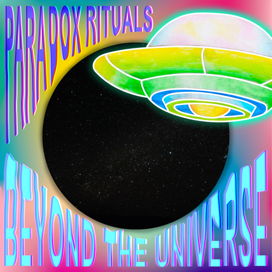
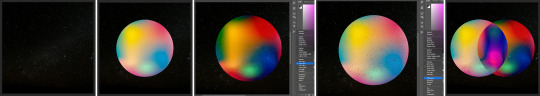
Designing a Vinyl Cover - Front
Here I have created the front design for a vinyl cover, incorporated is the album title, artist/band name and digital, hand-drawn space related imagery. I think the combination of digital and hand-made aspects work really well together, because it lets each thing stand out like the UFO and the text. Like the back side I have used negative space but in the opposite way, so rather than having colourful objects in space there's a dark hole of space inside colour. Overall I think this design really stands out thanks to the bright colours, intriguing/unusual imagery and morphed typography.
Even though I am really pleased with the design, if I had more time I would have experimented further into finding the best colour for the bottom text. I found it difficult trying to get together a colour that pops out but still fits, because a lot of the time dark colours would get lost as did the light colours. Despite this I think I found a good combination and by adding a faint outline, it helps separate the type from the background in a very subtle.
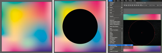
To begin with I created a square filled with colour, using the mesh tool on Illustrator, and filled it to fit the whole document. I then added a circle into the middle with the shape tool, and fit it to a size that left space on the sides for the text. This was used as a clipping mask for an image of stars which would completely replace it, making it look like a hole into space.
Next I used the paintbrush tool and my drawing pad to digitally draw a UFO, I only drew out the outlines because the fill will be hand-drawn. For now though I grouped the lines together, expanded the appearance and made it a live paint object, so it could be filled in and made into a solid shape for editing in photoshop.

For the fill of the UFO I printed out the lines so I knew exactly where to fill, but first I flipped the paper around traced over those lines with a pencil so they weren’t so distinct. Afterwards, I used coloured pencils to fill in the spaces with gradients and block colours. I thought that colouring it by hand would give more of a charm, than if it was filled with perfectly solid colours.

Once I was happy with the drawing I scanned it into photoshop, and removed the background of the drawing with the magic want tool. Then with the digital drawing I removed the white fill, and placed the drawing beneath it whilst making sure the lines are in the right place. When I placed it in the colours of the UFO looked dull compared to the rest, therefore I adjusted its vibrant and solution to match the bright quality.

For the text I had an idea to have it distorted and stretched around the planet, to do this I wrote out the words ‘Paradox Rituals’ with the type tool and rasterised it. I then duplicated the text 3 times so I could chop sections off and have them as separate layers, the reason for this is because I want to stretch out the type in parts so it fits the round corner shape. Once this was done I liquified each layer, and used the ‘push to left’ option for distortion.
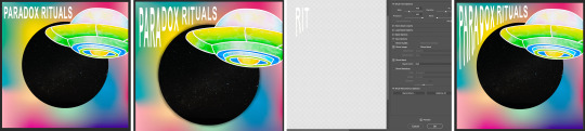
With this I experimented with the blending options and colour overlays, until I found a combination that complimented the rest of the piece perfectly. It has a luminosity to it which is always eye-catching, and it smoothly blends with the mixture of colours behind. I then repeated the whole process with the artist/band name ‘Beyond the Universe’, except it stretched around the bottom half and displays different colours.

Finally I added a shadow around the dark hole and a glow around the UFO, both being made to look more 3D whether the depth is far back or forward. To give the hole a shadow I simply turned the opacity of the paintbrush tool down, and using a small brush size I carefully drew around the edge of the circle. As for the UFO I added an outer glow through the layer style, choosing a bright green but at an opacity that's not too bold or distracting. It was perfect against the colour but against the black hole it was too bright, therefore I duplicated it, removed the outside section (not inside the circle) and lowered it’s opacity even more.

0 notes
Text
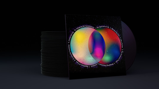
Designing a Vinyl Cover - Back
The next part of the packaging I designed was the back cover, this typically holds the number and names of each song and so I did just that. Sometimes the back side can be forgotten about and less cared for when it comes to designing, however with my cover I made sure to make it just as interesting and appealing as the front. I really like this design because its simple and clear, yet still bold and filled with extra details. I think the use of negative space has been used really effectively because it not only makes the bright shape stand out, the text that follows the shape can be super clear and readable which is crucial.
Sometimes vinyl cover include a ‘side A’ and ‘side B’ as a record can play music from both sides, so even though I haven’t written this out I have represented them with the two circles. Because it’s not super important it doesn’t matter if it’s not obvious, but the reference is there and in a subtle but smart way. Although if I had more time I would have experimented with adding a faint A and B, shaped the fit the separated sides of the shape.

The process begins by taking a copyright free image of stars in the sky, and placing it over the whole document which is 30cm by 30cm, the typical size of a vinyl cover. I then created an orb filled with colour on illustrator and took it over to photoshop, where resized it and experimented with the blending options. I found that two of the options, hard light and difference, looked really appealing thanks to the colours displayed and the stars coming through. Therefore I duplicated the circle, blended them with these and overlaid them in the middle, which created a whole new group of bright and pleasing colours.
Next I added the text and wanted to have it go around the outside of the shape, to do this I used the shape tool as a path and created two circles around both of the shapes. With this I took the type tool and clicked on the line for where I wanted to start typing, I chose this font because it’s thin, long and square which to me fits well with space. After I wrote out all the songs I rasterised and enlarged it slightly, so when I place it back in the centre there’s a gap between the text and the shape.

To add to the plain white text I played around with duplicating, offsetting and overlaying different colours. This was extremely subtle, but I managed to add a bit of colour and luminosity to the writing.

Afterwards I duplicated the text and put it into liquify, here I used the ‘push to left’ option to stretch out the outer side of the type. Finally I once again experimented with duplications, colours and blends to find the perfect balance between effective and subtle.

0 notes
Text
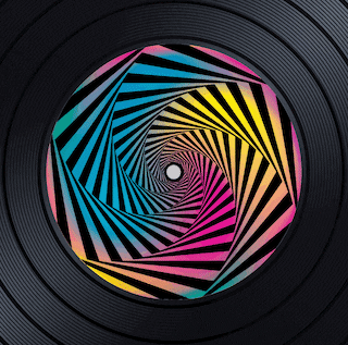
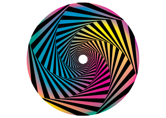
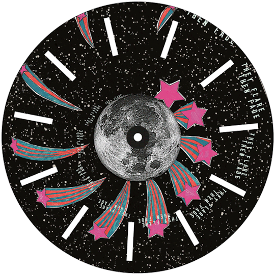
Designing a Vinyl Label
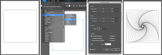
For the vinyl packaging I am designing the sticker for the vinyl record as well as the cover, my idea was to create an effect when the record is playing so I displayed a trippy spiral. When rotating, the spiral looks like its constantly going deeper and further into the middle, which to me is really intriguing and makes the most out of the label.I think the whole design is really fun and attractive thanks to the colours that fill the pattern, the blend of bright colours are super pleasing but also bold and in your face which is a perfect combination with the black lines.
However because of the illusion I didn’t include the information of songs or sides, otherwise it would ruin the effect of an inwards spiral. Therefore if I could improve anything it would be by adding an A or B into the spiral, by faintly placing 6 in each section that get smaller and lower each time. This would if anything add to the effect in a subtle way, with what’s essential being shown.
I was inspired by the idea of black holes in the universe and how they supposedly go on forever, not only is the concept interesting but this links in with the multiverse theme I’m basing all my outcomes on.
Here I have animated the label so you can see it in it’s full effect.

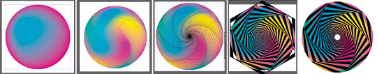
To begin with I experimented with spiralling different shapes, starting with a triangle. I used the technique learnt from my op-art lesson, but this time trying out different options in the ‘transform effect’ settings. As I was experimenting I came across the ‘random’ button which created a filled, smooth swirl that I thought would look effective for the spiral. And once the alternating fill was in place it did looked much like an illusion, however when I went to make it into a circle it wouldn’t fill the shape completely. I then tried using ‘clipping mask’ but the round effect was lost, as the lines around the edge were straight and not round.

I retried this process with a square as I had done before, and then used ‘flatten transparency’ so I could edit it with colour fill and strokes. Next I took the gradient stroke technique from the line shapes lesson, and played around with the different colours, type of gradient, duplicating etc. Once I was happy with the colours I realised it being all black made its illusion less effective, therefore I excluded every other fill to bring back that contrast. However I wasn’t satisfied with the amount of spirals there were, so I repeated this whole process but with a hexagon.

Despite all of this I still wasn’t too happy with the outcome because the colours and illusion effect were unclear, therefore I came up with the idea of making a ball of colour like I did in my orb lesson and using that for the fill of the pattern. So I did this using bright, vibrant colours and repeated the hexagon swirl process over the top. This left the colours showing through and some of the shape poking out the edges, with which I easily removed in photoshop using the magic wand tool. I think this outcome is much better because its clear, colourful and conspicuous.
0 notes
Text
Creating my own Op Art

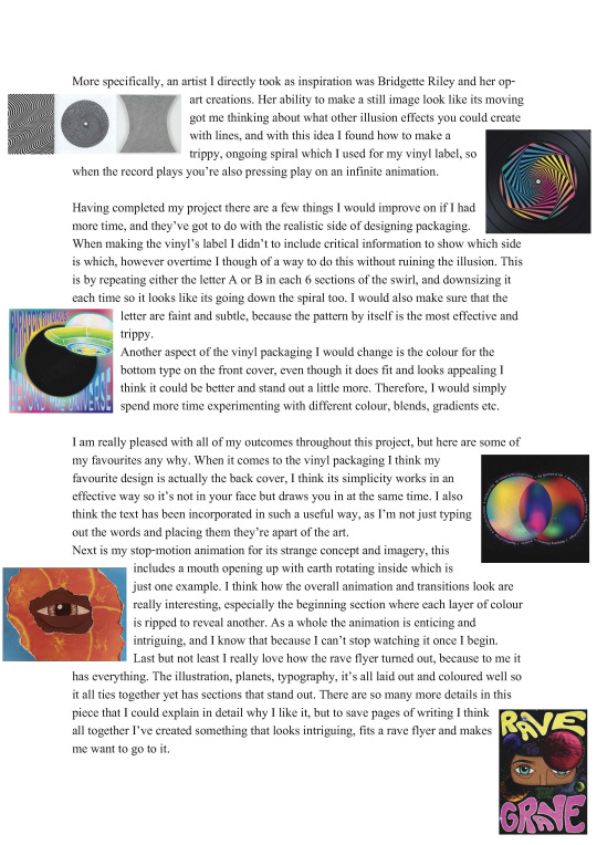
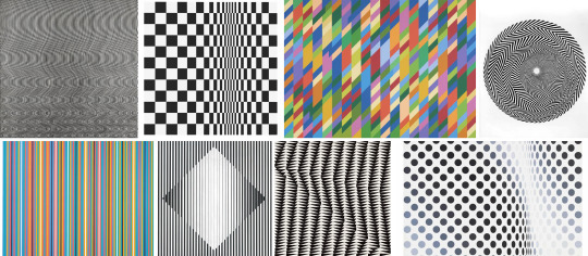
Inspired by Bridgette Riley, I have created my own op art using both hand-drawn and digital techniques. I think I did a good job at showcasing something that’s kind of trippy to the eye, however the hand-drawn pieces could be even more accurate and effective. Therefore I do prefer the digital piece because its super precise, and you can easily make a lot more complicated imagery like this. This kind of art would work really well with creating a label for a vinyl record, as I can imagine when it turns the trippy effect will increase even more, especially a spiral design.
Hand-Drawn Op Art 1
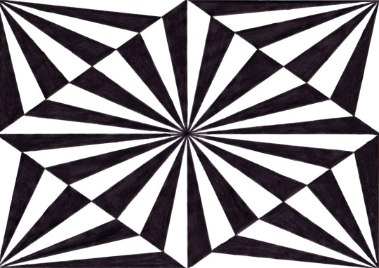
The process of making these involved lots of measuring, lines and colouring in, using only a pencil, fine liner, posca pen, ruler and rubber. However the only ruler I have is broken in half and therefore reaches 15cm maximum, this was not long enough for most of the lines so to compromise I carefully used the side of a piece of paper. Surprisingly this worked really well to draw long, straight lines, there were just a few messy parts which you can’t notice in the end product anyway.
Firstly I drew out all the main lines (horizontal, vertical and diagonal) to act as a base, with these I then drew in the rest off the lines which were accurately spaced out from measuring. Once all the lines were down I rubbed out any pencil markings and began to fill the sections in, for this I used a black posca pen and coloured in every other section. This pattered contrast is very important so you can clearly see the separation between each shape, and view that contrasting effect that kind of messes with your eyes.

Hand Drawn Op Art 2

I repeated this same process for the other drawing, just with different lines and points to draw between.

Digital Op Art

To create the digital op art, I started by drawing a square on Illustrator with no fill and a thin, black stroke. With this I went on ‘transform effect’ and established the settings to have a slight decrease in scale, increase in the rotation angle and larger increase in copies. This left me with a swirl of squares that get smaller and smaller, which makes a really cool and interesting effect to view.
Next I wanted to add in that every other filled in contrast like the hand-drawn pieces, so to do that I swapped the fill and stroke and clicked ‘expand appearance’. I then used the ‘click to exclude’ button which excluded every other section of colour, finally looking like some trippy, optical illusion art.

This could have been left as a square, however I think a circle would make it look even more swirly and give it more movement. Therefore I placed another shape over the square, this time being a filled in and no outline circle. With both objects selected I used the ‘envelope distort > make with top object’ button, so that all the swirly imagery was morphed and fit inside of the circle only.

Rather than leaving it with a plain black fill, I thought adding some shine could add more dimension and movement to the piece. Firstly it was important that I selected ‘edit contents’ for the shape, so the colour change would appear in those sections and not the whole circle. Looking through the colours swatches you will find a gradient metal section, where I found a grey/silver colour that adds some shine to the object. However I didn’t think it looked as punchy when it was completely black, so to compromise I simply darkened the contents of the object to make it nearly black with subtle shine.

0 notes
Text
Op Art - Bridgette Riley

Op art (aka optical art) is a type of abstract art famous to be creates in black and white, these typically display the impression of movement, hidden images, flashing and vibrating patterns or of swelling/warping. As a viewer you may see things that aren’t there or movement from a still image, and I think art that can do this is really powerful because it’s an illusion made of simply lines and shapes.
Bridgette Riley

Bridgette Riley is one of the original and most famous op artists, she began to create her black and white abstract paintings in the 1960s and the she did people were amazed at how they seemed to move. You can only imagine how strange that was to see for the first time, because your eyes are deceiving you from what is really there. Riley experiments with the aspect of movement and how she can incorporate movement into a still image, and whether it be intense or suggestive she surely makes it apparent.
0 notes
Text
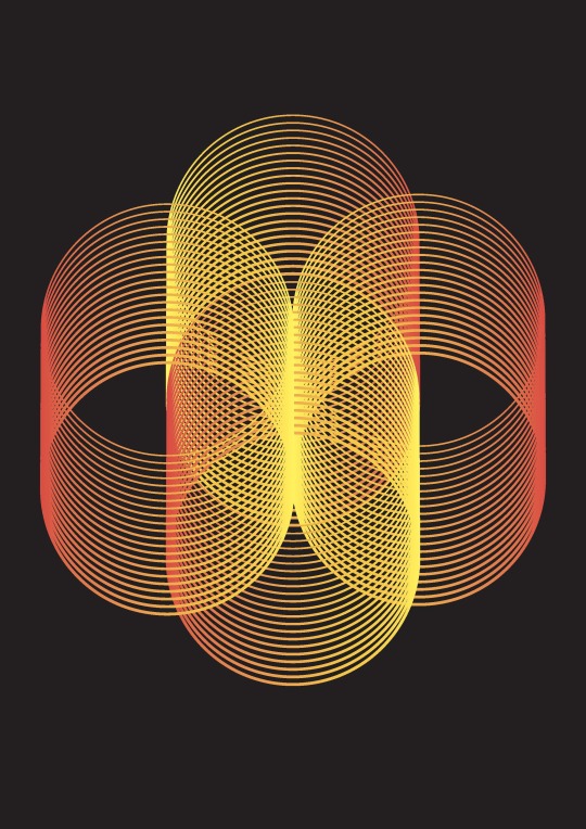
Creating Orbs and Abstract Shapes
I have created 6 colourful orbs and abstract shapes using Illustrator, these hold colours that merge and fade between each other making it a smooth and silky fill. I think these orbs are really pretty and sort of fascinating, because even though its just a circle filled with blended colours I find myself looking at them for a while. These orbs and abstract shapes could go perfect with my distorted type, or even act as an exoplanet in future designs.


To make these I started off by placing in a circle shape with no stroke and a bright fill, then with the mesh tool I selected a complimentary colour and clicked anywhere inside of the circle. I repeated this step and used the lasso tool to fill any large areas of the original colour, adding in more colours that work with each other until I was happy with the outcome.
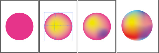
To blend the colours together even more I took the twirl tool and set its size to the same as the orb, and twisted the colours slightly so they go in the direction of a swirl. It may be a small change but I think it makes all the difference, because the shapes of the colours are now stretched and have movement. I then repeated the whole process for the rest of the orbs, except I incorporated different colours for a variety of colour themes.

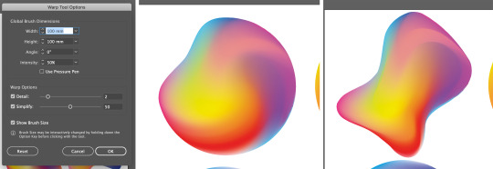
To turn these orbs into abstract shapes I simply took the warp tool, set it at suitable size, and pushed around the circle to whatever shape I want.
0 notes
Text
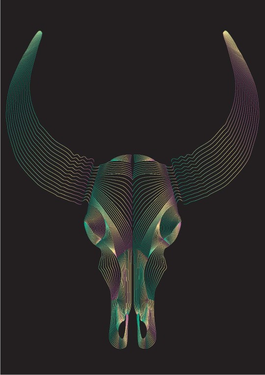
Line Animal Skull Drawings

I have created 3 skull drawings made using the same technique as the line blend shapes, these are again inspired by Patrick Seymour but more related as he usually illustrates animals. To make this I worked with a similar method to the shape creations where I used the blend tool on Illutrator, however instead of placing in shapes I am drawing to create the shape I want. I think these have come out really cool and impressive to view, by simply adding in more lines or making them compact you form contours and shadows. All the effects in these creations are simple, yet they look so interesting and eye-catching because of its precision and perfection.
I also added bright, gradient colours to the strokes so they could stand out against a black background, I think this as always made it even more appealing because it’s boldness catches your eyes and attention. I feel that colour also makes the lines themselves more prominent, and as a viewer you can really see and appreciate how it works and is created. Since I wanted to improve on the colours of my line shape illustrations, I made sure that the colours I do incorporate were bright, vibrant and fun/pleasing to look at.
Deer’s Skull


To begin the process of making these I started off with an image of an animal’s skull, in this case I chose a deer’s skull whilst making sure it's a large sized image for clear detail. I placed this photo onto an A3 Illustrator document, locked the layer and added a new layer which would be my drawing layer, on here I used the pencil tool to draw two lines around the section making sure they’re separate. I then clicked between the two with the blend tool and set the number of lines to blend with, the direction can change completely depending on where you’re making your points and I tried to keep it flowing with the shape and neat.

I repeated this for one whole half of the skull whilst using the direct selection tool for any adjustments, I noticed when creating this that I could simply and easily change the number of blending lines for shapes already drawn. Therefore I lessened each section by two lines because the whole face looked too dark and unclear, except for the horns because they are larger and so have more to fill. Once I was happy with the one side I grouped and duplicated the whole thing, then flipped it vertically to complete the whole skull.

Lion’s Skull
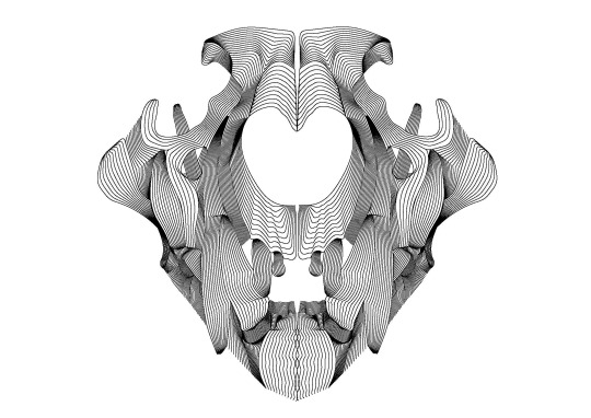

When it came to drawing over a dark image, I used red as the stroke colour to begin with because it stands out against the black. Once finished with the photograph I simply changed the stroke colour to black, you can then see clearer if the lines are too compact and dark or not.

Bull’s Skull

0 notes
Text
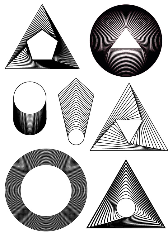
Line Blend Shape Edits

With my line shapes I created I put them together to make these designs of overlapped shapes, to help them stand out I displayed them all against a black background which brought out the lighter colours especially. I really like the way these have turned out, they’re bold, precise and striking which really draws me in especially the brightly coloured ones. It’s also interesting to see what comes up when you merge these shapes together, as well as viewing how they interact and affect each other.
Design 1

Here are a couple examples of exactly how I made them. This first piece simply began with one of the coloured triangles, with which I removed the fill and duplicated. I then horizontally reflected one of the triangles and placed it over the other so the circle was in the same place and clear of lines.
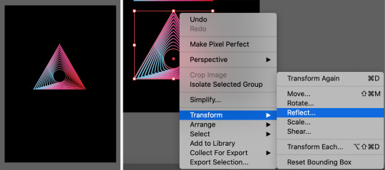
I was going to leave it as this but I thought having the colours contrasted against each other would be a lot more interesting and effective, therefore I flipped one of the triangles vertically and added another colour to the gradient as it wasn't standing out as much, choosing yellow to really contrast against the black.
I think this piece is my favourite because its colours are super bright and vibrant, I also really like how the circle in the middle had remained empty and at it was but now with even more lines surrounding it. This creation is definitely simple yet effective as it’s really just two shapes and lines merged together, but looks so much more than that.
Design 2
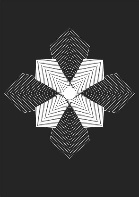
This next example is a black and white shape combination, that consists of layering the same shape 8 times. What’s different about this piece is that the shapes still have a fill, meaning that the layered line effects aren’t displayed. To begin with I duplicated this shape 3 times and rotated them to face every side, I then layered them so the circle was in the same place and duplicated the whole thing. This was rotated and placed over the other shape, but a bit smaller so it all fit into one diamond shape.
Finally I changed both the background and the fill of the back shape to black, and its stroke to white. This added a contrast and transparent effect without actually being see-through and mixing all the lines.
Design 3

For the rest of the designs I carried on experimenting with all the shapes, colours, fills etc. I found myself duplicating, reflecting and rotating many of the shapes because they’re simple ways to add with what you’ve already got. However if I could improve on anything it would be the vibrancy of some of the colours, because compared to a couple designs the colours look quite dull and therefore don’t stand out so much.

Design 4


Design 5


Design 6

0 notes
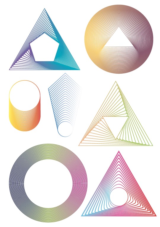
Text
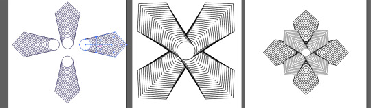
Line Blend Shapes
I have created line drawing shape blends inspired by the art of Patrick Seymour, these drawings show two shapes that’s blended together with lines in between. Even though it’s simple I think the effect of the lines is really eye-catching and intriguing, because a circle and a triangle are very different yet the blend is so smooth and gradual. As well as the shapes themselves you can also adjust the thickness of their lines which will also apply to the blending, I really like the look of thick lines merging to thin because it creates a natural gradient and extra contrast/contours.

To make this I drew two shapes on illustrator using the different shape tools, making sure that the fill is white and stroke is black. I then played around with the size, placement and thickness of the shapes so they're ready to blend, however before using the blend tool I had to double click on it and make sure it was set to ‘specified steps’. This allows me to choose how many lines would go in between, which changes the intensity of the fill looking darker or lighter.

I repeated the same process with lots of other shapes, experimenting with placing shapes outside and on top of each other. Blending from different points on the shapes can also make a difference, displaying different movement to the blend which I also played around with.

Once I had created these black and white line shapes I wanted to add colour into them, however rather than simply selecting a colour for the stroke I thought a gradient colour would look much more interesting. To do this I selected one of the shapes and opened up the ‘gradient’ window, here I could change the colour of the stroke to a gradient but not before setting the colour option CYMK, otherwise it would be black and white. Next I could add, change and adjust the colour bar with the colours themselves, or even where the blending occurs etc.
I then repeated this with all of my shapes, trying out more than two colours, the angle of the gradient and of course the colours themselves. I think adding colour makes the shapes a lot more appealing and interesting to view, it’s also really useful for the shapes that might look too compact and dark, because you can fill the lines with light colours so it’s less intense.

0 notes
Text
Patrick Seymour

Patrick Seymour is a Canadian digital artist known for his elegant, rhythmic line illustrations, what's amazing about his work is the precision and symmetry he creates by using mainly just two tool, the pen and blend tools. Seymour’s inspiration comes from the work of artist M.C. Escher, who created illusion like woodcuts made of lines. His vision was to copy this style but digitally, specifically using Adobe Illustrator where he can draw perfectly sharp and easily curve lines. This so happens to be where his work is most famously seen, as Adobe used his work to showcase the program’s artistic potential.
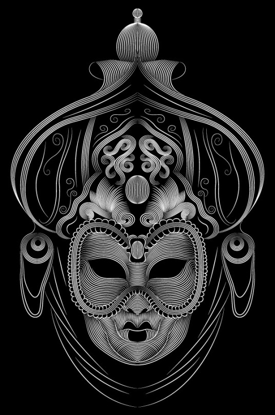
This first piece is a good example of Seymour’s work as it displays everything he aims to create, it’s a perfectly symmetrical face made of beautifully curved lines of which shows depth, direction and detail. I have seen and used this technique before however not in such a way that’s so accurate, and I think this is what makes his work stand out. Another preference of his is black and white art like M.C. Escher’s, this is translated through some of his own work like this mask illustration.

This next piece is one of his animal illustrations, of which is simple yet powerful and includes appropriate colours. What I mean by appropriate is how the colours fit the animal drawn and even the kind of animal it is, to me foxes come across as quite classy and elegant which is then projected through the rusty orange and off white. Whats also classy and elegant is the style of the illustration, using long, wavy lines to really communicate the kind of animal it is as well as movement of the hair.

This next piece is of the well known Disney villain Ursula, she is filled with evil and mystery which I think has been very well portrayed through this illustration. Here he has used much brighter colours compared to the fox, however this is to fit the character and its image more accurately. A fox is a classy animal and so has used rustic colours, whereas Ursula is a brightly coloured cartoon that stands out a lot. I also noticed how Seymour uses black backgrounds effectively, this not only helping the drawings to stand out it also acts as depth for where needs be.

The lion illustration is arguably Seymour’s most famous piece, as it’s displayed on Adobe Illustrator’s loading screen and shared widely as an example of what the program can create. I think there is so much in showcasing this because it’s so amazing yet so simple, all it’s made of is colour and lines which is super impressive and inspiring. You can do so much with so little, you can show the world how you perceive things artistically and I will keep this in mind when creating my own art.

Finally this piece differs from other in a couple ways, firstly the illustration isn’t completely symmetrical as you can see through the hair direction and colour around the eye, but despite this it’s still very symmetrical for the most part. Seymour has also used a slightly different technique when it comes to drawing on the lines, rather than drawing clear, equally spaced individual lines he had filled in most of the gaps, leaving the hair to look softer and more realistic.
0 notes
Text
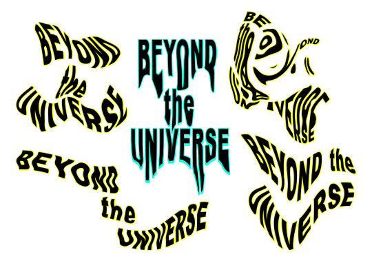
Type Distortion
I have experimented with different type distortions for my album cover designs, these will include lots of text so I think it’s more effective to think of ways to make it into the art, rather than just text slapped on top. To grasp an idea of what I could create I used 2 programs, photoshop and illustrator, to digitally distort some of the words I’ll be incorporating.
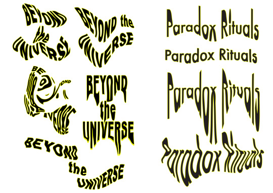
Firstly I experimented with photoshop’s liquify tool and its different options within, to do this I used the type tool to individually write out the words ‘beyond the universe’. It was important to keep the words on separate layers so I could move them about, I also wrote the ‘beyond’ and ‘universe’ in capital letters so they would stand out more than the ‘the’.
With this I rasterised the type, merged the layers together and selected filter>liquify, here I could play around with all different types of distortion tools like forward warp, bloat, push left etc. For this example I am using the twirl clockwise tool, which as you can see distorts the text a lot with enough pressure and density. I then repeated the whole process but using different distortion tools, and placing the words in different positions.

I have for the first time discovered ‘push left tool’ option, and am really happy with how this one in particular came out. With this I created a melting/bleeding effect which I think looks really strange and interesting, when you compare it to the crazy, unreadable version above this type looks clear and normal but still distorted. You can see this version highlighted in blue.
Next I experimented distorting type on Illustrator which began by writing ‘Paradox Rituals’ with the type tool, once I was happy with the size, font etc. I selected ‘envelope distort’ and ‘make with mesh’ so I could drag and angle points on the object. To do that I used the direct selection tool and played around with the direction I pulled to, as well as the length and angles.
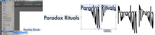
As you can see they can range from slightly wavy to super stretched out, showing that each element makes a different impact. Using Illustrator makes the lines and angles perfect because you have full control, however I think I prefer more messy and loose movement for the theme I am try to portray.

0 notes
Text
Artist, Album and Song Names

Here is a spider diagram of album and song names that I came up with, using words related to the multiverse theme and putting them together. Looking at the diagram I have decided to use ‘Paradox Rituals’ as the album name, I think it sounds really intriguing and the words themselves look pleasant. As for the 10 songs I will name them:
The Spectrum of Life
Wondering Stars
Like a Human
The Universe’s Prayer
Navigating Dimentions
Levitation
Repetition of Time
A Colourful Evolution
Chimerical Life
Following the Constellations

To name the artist/band I used a generator to help me with ideas, here I had to write out words like a colour, animal or number. I made sure each word was somewhat related to the multiverse theme, leaving me with a large list of names. As I was reading through I came across many potential names, however ‘Beyond Universe’ stuck out to me and therefore I have decided to name my artist/band ‘Beyond the Universe’.
0 notes
Text
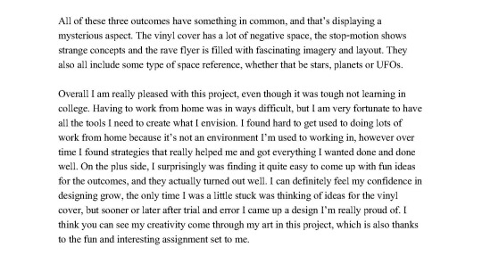
My Multiverse-Inspired Phenakistoscope
I have created a phenakistoscope animation based on the ‘multiverse’ theme, to show this I displayed a man walking along a planet and getting levitated into a UFO. The circle in the middle represents an exoplanet I made that you can view rotating from the top, I think this is really effective because by drawing a spiral it looks like the loop is zooming further and further inside. Each detail throughout the design has an importance and an effectiveness, that you may or may not have taken note of. To create what I’ve made I used three different examples that inspire me for just one technique each, these are the running mice, the side-to-side eyes and the never-ending spiral piece. For example the movement of levitation repeats as another one it still ending, you see this happening as the mice run to the edge and one starts to appear before the one above fully gone, a subtle but effective way to create a smooth transition.
Overall I am really happy with my final outcome, the visuals are clear, fitting and interesting, however if I could change one thing it would be the outer colour of the twinkling stars. I feel that surrounding it with a lighter colour like yellow would help them stand out more, it would also be an added contrast that fills the space rather than being less visible and hidden against the dark background. Despite this I think the rest of my colour choices have been matched well, brining my little animation to life.
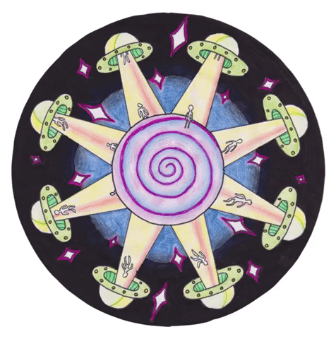
To begin with I had to have a perfect cut-out circle with 8 accurately distanced sections, rather than trying to find a circular object to trace and measuring where each line should go, I simply drew out these shapes on illustrator for accuracy and printed it off. However the lines were too dark and prominent so instead of tracing and redrawing, cut it out and flipped it to the other side where I could see through enough to mark with faint pencil. In all phenakistoscopes you will see a circle in the middle, large or small, but usually they don’t really consist of anything and are just blank spaces. But when I was planning my design I thought it would be more effective to make it a big part of the whole piece, therefore I drew a large circle which would fit my spinning exoplanet.

Next I sketched in all the drawings with pencil which alone look quite long, this is because I had to really make sure that a lot of what I was drawing would remain in the same place so they stay still when animated. To do this I drew some faint guidelines using a ruler, making sure they’re perfectly horizontal and at the same point of the section.
As I was drawing I was going to stop at the UFO, light beam and figure, however it looked a bit empty so I decided to incorporate twinkling stars. To create this I alternated large, regular and small sized stars for each segment, I think this was a really effective idea because it adds to the concept as well as another kind of movement. Once I was happy with the drawing I used a fine liner to draw over it, and rub out the pencil for clean lines.

Next I added colour to the piece with colour pencils and pens, starting off with the exoplanet. For the swirl I wanted to display a mix of blue and purple because they remind me of space, whereas for the UFO I used brighter colours like green and yellow. As I was filling in the light beam with yellow I came up with the idea to have a moving orange strip of light, scanning from side to side as it picks up the figure. This is another simple but effective movement that I think works perfectly for the imagery, it also subtly fills in the emptiness and adds yet another phenakistoscope technique. To complete it I filled in the background with black and dark blue, this contrast helped the illustration stand out and be focused on by the viewer.
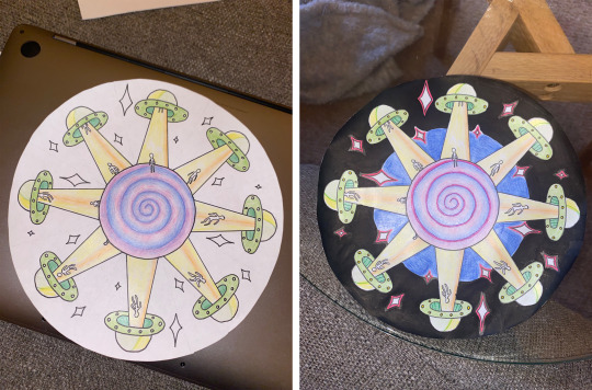
Finally to put it together I scanned in the drawing and opened it into photoshop, then using the magic wand tool I removed the background by selecting the outside and deleting it. Next I made sure the circle was straight and saved it each time I turned it 1/8, these images were then put together in video fashion and I selected the speed so it looked smooth but slow enough you can take in the animation. This was then cropped and turned into a GIF to create a continuous loop.

0 notes
Text
Phenakistoscope Examples
The phenakistoscope is one of the first forms of moving media entertainment, this optical toy was made in 1841 as a spinning disc attached vertically to a handle. The idea was to create an illusion of fluent motion in a short continuous loop, similar to todays GIF animations. Here are 8 examples of phenakistoscopes that I find interesting and inspiring for when I create my own, even though they’re all made the same there are so many different kinds of imagery you can display.
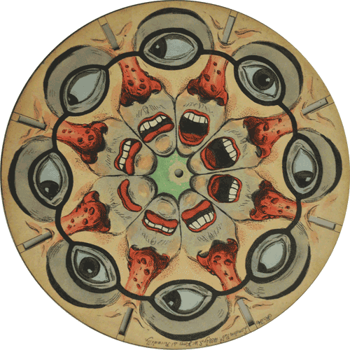
This first example shows a moving image of many faces looking from left to right, because the eyes are movie side to side it doesn’t have that effect of the drawing moving round in a circle. However if you just focus on the mouth, it open and closes round and round. I think the two directions of movement look really effective together, because it brings a kind of hectic-ness to the piece which matches perfectly with the imagery. As for the imagery I really like how two slots are merged to make one whole, large face, usually the drawings would stay roughly within its slot but this does the opposite and uses it effectively. It also just looks really weird which stands out a lot, therefore attracting the viewer.
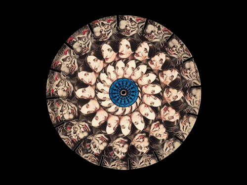
Next is this spiralling piece that's imagery expands and merges from a pretty woman to an ugly goblin, the never ending spiral reminds me of those optical pattern illusions that just go on forever. This makes it really intriguing because you can continuously watch the slow transition of a woman to a goblin, there is so much detail in the drawings that each change ever so slightly which makes it merge super smoothly. The fact it spirals reminds me of the hypnotising technique, watching the pattern go round and round to put you in a trance.
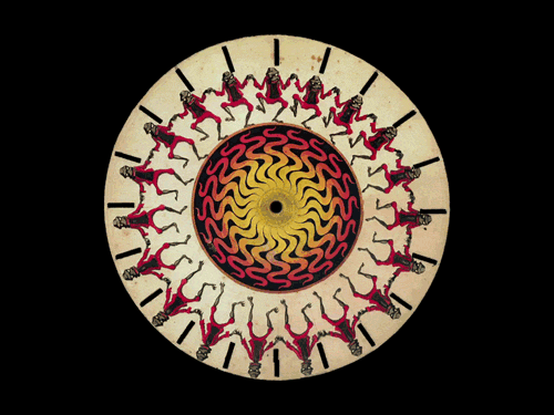
This piece displays some kind of figure jumping up and down, what stands out is how it focuses on one object that's constantly moving. They have re-drawn the same thing over and over but in a slightly different position, going every step from bending down to high in the air creates a clear animation of a figure. I think keeping it uncomplicated and relatively simple helps the viewer to really focus on the animation, which is an effective way to fascinate and impress the audience.
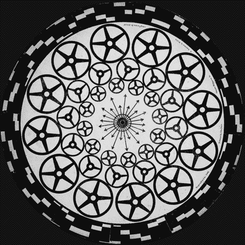
My next example is of a phenakistoscope that animates turning cogs, whats different about this one is that nothing looks like is moving round and instead is turning on the spot. To make is so smooth the cogs only had to rotate a fraction for it to then repeat for the next fraction, this means that every section is barely different from the next and therefore is really smooth. The colour choice also reminds me of trippy, hypnotising designs, which works because of the high contrast of black and white for your eyes.
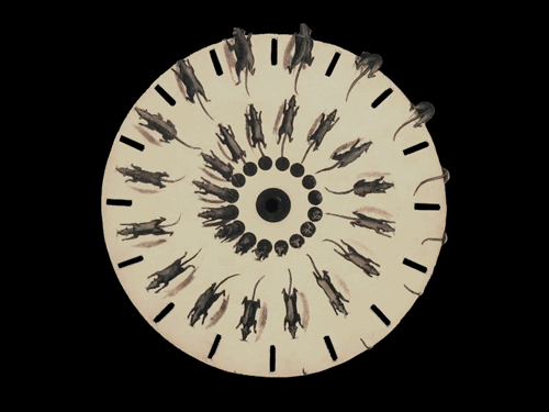
Another animation is this one of mice running over the edge of the circle, this looks super realistic which is thanks to the accurate illustration of the mouse. However a small yet effective detail is having part the mice actually drawn outside of the paper, because it makes it look like they are actually running off the circle. This is done my simply leaving some space around where the circle will be cut, and missing out any drawings exterior to the circle when you do cut. I think I might use this technique because it subtly adds a whole new element to the phenakistoscope, making it not just last forever but also slightly 3D.

Next is a design similar to the first example, however in this piece the focus is more on the opening and closing mouth. I think the illustration in this piece is really wacky and strange, it also has a hint of creepiness which weirdly intrigues me more. Another thing in this animation is a man moving into the mouth, I don’t think this aspect is very effective or worth being included because it's simple unclear to see, however I think the concept of walking into a mouth is intriguing and strange.

This piece loosely relates to the multiverse theme, where planets are shown turning on the spot and stars moving round the circle. I think this difference in movement is effective because it really replicates how they move in space, therefore I will take this into consideration for designing my own phenakistoscope.
Finally I’m showing this animation because not only does it slightly relate to the theme, but it also displays that never ending spiral look that's to entrancing. Seeing the two work together began to spark ideas of my own, it made me think to take different elements of many examples and combine them for a unique, phenakistoscope animation.
1 note
·
View note
Text
Alien Worlds

Alien Worlds is a four part series that blends fact with science fiction, it displays what alien life might be like applying the laws of life on Earth. Each episode focuses on a different planet: Atlas, Janus, Eden and Terra, these were inspired by the astronomers’ discovery of many Exoplanets outside our solar system. The creators thought what planets could hold alien life, and what would the aliens or environment look like. To visually reciprocate this they used GCI animation because you can realistically create anything, I think this was extremely effective as it makes it really intriguing and informative for the viewer.
0 notes