#I just really *really* don't like rendering color
Note
for pokemon reviews, have you done diglett/dugtrio and their alolan forms?

Diglett is what I'd consider to be a quintessential Gen 1 design—no frills, barely any detail, just a wack-a-mole creature with a face. Visually, it's honestly pretty bland, but it helps compensate for this with its "gimmick", if you can call it that: you never see its entire body, with it being perpetually stuck half underground at all times. What the lower body even looks like is a meme in and of itself, even referenced by PMD:
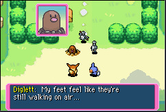
However, I'd also consider this a result of Gen 1 design, and not in a good way this time. Diglett poking halfway out of the ground worked fine on a Gameboy game, because there were no backgrounds, or anything you could define as "ground" in general. But in recent games, Diglett and its dirt keep being rendered as separate from the ground, which really kills the entire concept. I'm not a game dev, but shouldn't it be possible to make it so the dirt part of Diglett's model automatically picks up the ground texture of wherever it spawns? It's 2024, I feel like we can do better than this. Or hell, just don't model in the dirt mound at all if that's too hard to do.


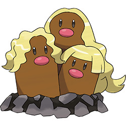
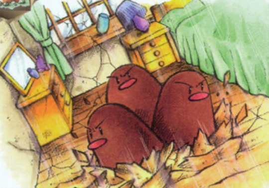
I'm not really that big on Dugtrio, just because this style of "copy/paste the same Pokemon twice" is... well, pretty boring. I'm not even opposed to the idea of multiplying Diglett to evolve it (it kind of ties back into the wack-a-mole thing, and really, what else would you do with it), but the design could've changed more in the process—different faces/expressions, different colors, different body lengths, that kind of thing.
For example, when their lookalikes Wiglett evolve, they change their position relative to the ground, change color, and change facial proportion. It's not a lot, but it's enough to differentiate the two, which is what I feel is missing here.

Speaking of being boring, Alolan Diglett is mostly just regular Diglett but with three blond hairs added. To its credit, I do get what they were going for progression-wise here, and it does change as much as it can about the base design; different, much more saturated colors and dark gray dirk and rocks resembling that of the volcanic minerals in a place like Alola, which is a nice touch. Still, I feel like you could've just skipped this one and done the Cubone thing, with regular Diglett just evolving straight into Alolan Dugtrio, and not really lost much.
I do find myself liking Alolan Dugtrio just a little more than the original. This might be a hot take, but if the original is going to be slightly silly, I'd rather just take the version that goes all the way with the silly. It also fixes the progression issue I had with regular Dugtrio, changing A. Diglett's individual hairs into long flowing surfer-dude manes.
As alluded to in the 'dex, the "hair" here isn't hair at all, but actually metallic whiskers. This in turn is a nod to Pele's hair, a type of volcanic formation found in Hawai'i, which is technically not also hair but is actually glass.

I like this concept, but at the same time, something about the line never quite sat 100% right with me. I think it's because Pele's hair doesn't really have anything to do with the Diglett line to begin with (I thought it maybe formed on the ground, but from what I understand it's actually partially airborne). Like, A. Marrowak turns into a fire dancer because of the bone, A. Vulpix is an arctic fox, G. Corsola is bleached coral, etc. Whether it be visually or conceptually, there's generally a connection between the original 'mon and the new theme, whereas here it just feels kind of random. You could technically slap that hair on any Pokemon and have it make as much sense, though it at least fits Dugtrio from a visual standpoint.
As a whole, Diglett is a fun 'mon with standard visuals but a neat visual quirk, even if it doesn't translate well into the games. Dugtrio is fairly bland, A. Diglett is fine but still kind of bland, and A. Dugtrio at least cranks the silliness up to 100.
Between all three Diglett and Diglett-related 'mons, I think I like Wiglett the best; it's a little plain and could've gotten the eel thing across better, but it has a fitting concept and evolves in a distinct way, which is something I like the actual Diglett line is lacking a bit.
24 notes
·
View notes
Note
hi sry this is a lil long but i just felt like giving my own comments about ur post re: feeling left out/regarding more detailed work, and wanted to say that your work singlehandedly has inspired me SO much to the point that because of your more simplistic coloring/shading and focus on movement/body language, i was finally able to find a coloring/rendering style that i actually like aesthecially and enjoy doing! i've struggled w replicating color in a way i like digitally for over 6 years but your work, and especially so your sketchbook scans on patreon have been so useful for inspiration and for my own understanding of anatomy and what not. we're always our own worst critics with comparison and whatnot, but please know that your work and your style are a huge accomplishment and skill in their own right, and your comics inspire me to keep studying so i can one day make my own!!! i'm so thankful you share your work with us and to have come across it and be able to draw inspiration off it! your colors, expressions, and the palpable intimacy and dynamic character interactions are so amazing and specifically unique to your work, never doubt the impact it has just because of other's having a different style or approach or something <3
This is so extremely nice I don't even know what to say!!! I honestly feel so hyped that my style inspired someone else, I feel like it's not something I expected and its SO COOL. I sometimes feel like my style isn't particularly STYLISH you know, I often admire really strong punchy styles, so it's nice to hear my own kind of chiller style is inspiring! And that the things I enjoy come across as strengths, too!
Also I am so happy to hear someone enjoys my sketchbooks haha, they're really precious to me but I also try not to be too fussy about my art in them which means it's not 'beautiful'*- they're for studying and/or chilling out, so it's SO nice that it's inspiring nonetheless!
Wishing you the best in your art journey and also I think if you want to make comics you should just give it a go! Make teeny tiny comics! [it does not have to be good]
[tangent oh my god] I feel very hypocritical because for the longest time comics were something my friends made and I didn't know how to, and I felt like my style didn't work for comics, but honestly when I eventually sat down and started a long comic the style happened out of necessity, I Had to simplify or I wouldn't be able to keep up. And you can see from the links that I just did sketchy comics before and that was fine! I think it was just as valuable as making polished pages. I actually probably ended up making comics For Real because I made a silly fandom ask blog, where I kept wanting to say more than I could do in one image, and that gave me the confidence to try something longer with OC's.
ANYWAY thank you so much!
*I find polished sketchbooks so inspiring, but its so limiting imo to try to make a beautiful sketchbook HAHAHAH
#this is so many backhanded negatives about my own work im sorry i swear I am not fishing#I love my work!#but i always want to get better!#I get really excited about learning new stuff#opening my sketchbook to draw fucking collarbones or some shit lol#mal talks
32 notes
·
View notes
Text

And when your 5 PM's turn Orange
Know the skies are paying homage
To the way I'll always think of you
#codywan#obi wan kenobi#clone commander cody#star wars#the clone wars#I'm so happy to finally post it bc that means I don't have to look at this colorful abomination anymore#not that I hate it I'm actually relatively happy with how it turned out#I just really *really* don't like rendering color#I'm more of a sepia guy#murphy draws
2K notes
·
View notes
Text

I'm personally blaming @starbiology and everyone who has reblogged or commented the other piece for this.
Bonus comic featuring my grundo:

#every minute i keep working on this i take psychological damage#neotag#neopets#vin memes#you'reall to blame for this monstruosity#i literally just searched “babygirl” pose and went “I... i can do that”#i didn't stop to think if i should though#Star i was gonna respond 2 the reblog with the first image only but decided it needed its own post for quarantining this... thing#again if youre seeing this with no context#you dont need context#i... i don't think there's any for that matter#just picture me writing all this tags while losing health in posion damage every turn#i am working on neo oc images i just need to render them but i.... i needed the world to see this before#my blog's already tainted anyway LMFAOO#yeah uh im dead in neo canon i drew this and inmediately got taken back by yours trully and never came back#also i'll try making a ref as well for my sona so i can draw them more im just really indecisive in what color to make him#split it is for now#i don't want to look at this anymore end me#i am making more drawings to kinda cover this thing from the light but at this point it just keeps reappearing like a mold#thats it im done see u all in kreludorian therapy#kreludorian health insurance in a farse
69 notes
·
View notes
Note
REQUESTING NOMS WITH TOMMY AND WILBUR PLEASE?????
Much love -Cat
warning for soft/safe vore under the cut! click with caution,,,
looks like a little tiny tommy got caught up in some of wilbur's antics, much to his annoyance,,, ckdnsksnsjd. at least wilbur seems to be enjoying it!

#asks#mcyt gt#mcyt g/t#my art#vore tw#tiny!tommy#giant!wilbur#been a hot second since i drew some noms!#really happy with this!!#apologies for the wait; took an hour-long break bc my ipad was dying;; fkdndkdjdk#then it took me two and a half hours to draw this#i told myself i wouldn't put mush effort into this one so i wouldn't stay up too late drawing requests#*much#and then i proceeded to put in All of the effort#i am an unwilling victim of the 'go big or go home' motto.#sometimes i don't wanna go big. sometimes i just wanna go home.#anyway– hope you like it; cat!!!#realllllly love how i rendered the glasses#i like making gray-scale art where only the eyes are colored;; to make them pop out more#wilbur's already got black eyes w/out much color; tho;; so. i opted to use color for the glasses instead;; djdndkndkd#and tommy's eyes are closed so i couldn't color them in;; fjnfkdndkd#also ngl i was kinda making up the designs as i drew;; fkfndkdjdk#i mean tommy's basically the usual borrower design i give him#+ a basic ctommy outfit#but when i started drawing wil all i knew is that i wanted the funky glasses; and i just threw on the revivedbur outfit alongside it#and then i was about to give him normal ears; or maybe some longer tipped ones#but then i thought. 'what if. ~feathers~.'#so yeah that was my thought process if anyone was curious#virtual cookie for anyone who read this far down -> 🍪
75 notes
·
View notes
Text
The Pokemon HOME app limiting random features and information to either the mobile or console versions is SO clunky and annoying.
My goal: to check which of my favorite Pokemon and shinies stored in HOME don't have the Paldea Champion Ribbon yet, so I can bring those into Scarlet and get it for them. But! You can only view what ribbons a Pokemon has on the mobile version of the software! And you can't move Pokemon to your switch games from mobile!!! So you have to:
quit out of the console app, if you opened it already because you thought this would be a relatively simple task
open the app on mobile
manually document which Pokemon don't have the ribbon- like, on a piece of paper or something
close the mobile app (you can't have both versions of the app open simultaneously)
open the app on console
move them from HOME into Scarlet, referring to aforementioned list
Now you might say "There is a custom tag feature in Pokemon HOME! You could apply a tag to the Pokemon you plan to move instead of making a physical note on a piece of paper!" But unfortunately, the only aspect of the tag you can see on the console version is the color- the name of the tag isn't visible. and I'm already using every color of tag available
(also: you can only make and apply tags on mobile. other mobile exclusive things: wonder trade and gts, viewing 90% of achievements, viewing models, switching between a pokemon's stats for different games it can go in without switching what game you're planning on moving things between)
#pokemon home#pokemon#i need a text post tag#i have more complaints too. i should make a comprehensive list. just for me#like: shinies don't have any symbol marking them as such on the GTS. so for the really subtle shinies? you just have to look REAL careful#whenever you import pokemon from Bank they automatically get tagged with a new tag with the name of the Box that they were imported from#which is maybe useful to somebody but its just super annoying for me to have to keep deleting the 'Kanto 1' tag from all of my Bank imports#the lighting in the model viewer is really fucking bad and makes the pokemon look flat and undefined#overlapping areas that are the same color blend together visually#for that matter; the HOME renders are really fucking ugly. compare them to the sugi art they're posed after sometime. terrakion. its WILD#the lag when moving between pages of boxes on the console version when you have a lot of pokemon stored in HOME is MISERABLE#the mobile app and console app have different sets of achievements that are only viewable on their respective apps???? its weird#can't reorder pokemon's box positions on mobile; you just get a big list that you can sort different ways#this doesn't affect their box placement at all#the tags seem really useful at first but if you're moving pokemon between HOME and games a lot?#you have to reapply the tags to those pokemon every time you put them back in HOME because that data is lost once they leave the app#they never fixed the Spinda problem with BDSP; they just made it so that you can't bring Spinda in or out of those games
24 notes
·
View notes
Text
getting a sudden resurgence of art motivation is such a blessing and a curse tbh. bc on one hand im drawing a lot and having a lotta fun doing so but on the other hand i wanted to make Even More secret stuff for atbb that requires drawing so i told myself i would make a few very sketchy things that would have to be quick and don't have to be Insane Awesome Quality since they'll be blurry as hell in the final product anyway and i have like less than a week / a couple days at most to get it all ready in time
so anyways now it's 3am and i just finished the first of what i still want to do after 3 days
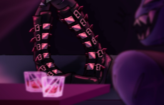
#trousled dumb#WHAT THE HELL IS IT WITH ME AND OVERDOING SHIT THAT'S JUST GONNA BE BLURRED!!!!!!!!!!!!!#there are THERE characters in this fucking thing btw. and a background. whats wrong with me who have i become#i was sooo close to just leaving it with minimal shading & detail and finishing it like So Many Hours Ago I Don't Even Know#but i had that thought. you know the one. the one that says Wait I Can Push This More. and well i fucking pushed it#i think im gonna have to do an art dump when this event is done. because where this is gonna be seen beforehand it's gonna be 400px wide.#its original width is 1694px for the record. can you imagine the compression#motion blur + scanlines filter + several gaussian blurs + ungodly compression.......................why did i . do this#sigh. at least i am extremely proud of it and at least i lost track of time solely because of how much fun i was having#but also fellas i do not think i will be drawing everything i want to be prepared by the time of the reveal lmaooo#head in hands. i have drawn a really really good pair of boots. and also a lesbian. and also fully rendered drinks with ice cubes in them#ice cubes that you cannot see. because they are already so small that they had to be drawn with a 2px brush. and now they are blurred#and also obscured by the glass details in general. but by god do they change color under the liquid and everything#goodnight . i would put a cute little emoji here but there isnt anything that represents a smile akin to baring my teeth like a wild animal
7 notes
·
View notes
Text
I feel like this is important for analysis but WxS's plays/in-story scripts have been getting gradually darker.
Like this isn't me reaching or anything they've factually have gotten darker and in some ways more ""realistic"" (keep in mind i'm not counting the play at the end of Happy End cos that's just a rewritten version of an old play).
I think the best way to really see this change is to kind of go through each arc and kinda view how the plays are. Now I'm doing this by memory so if I get a play wrong that's why.
1st arc.
So from Rui's first to Emu's first, we have the zombie play, the christmas play and the play to help revive Pheonix Wonderland's popularity.
Those are all pretty child friendly plays, that can be seen as lighthearted even if they do have their own emotional moments.
2nd arc.
This is where things start transitionning into a more serious tone in terms of the plays.
At first we have the play in Nene and Tsukasa's second event which both are kind of the same vibe as the 1st arc plays.
HOWEVER it's when we reached Rui's 3rd even that things take a turn in my opinion.
The story focusing on the tragic story of two androids having lived different lives, one being turn into a weapon for war.
Rui's 3rd event kind is overall a massive turn in WxS's story in general and it was kind of the point where extremely painful events started being handed like candy.
There is the Peter Pan play in Admist a Dream that kinda contradict this switch in tone but I don't really count it since it's story is not really the focus of the event and more so serves to push certain themes with Emu.
Then we have the famous Pheonix event...which like I think I don't need to explain.
3rd arc.
Now things get weird since, the Android and Pheonix play while both being a lot more dramatic and "darker" still had aspects of fantasy in them.
However the two "plays" (the second one is not a play but a film script but shhhhhhhh) are purely set in a realistic setting and obviously feel a lot more mature as a result.
This is also without pointing that both of the stories are extremely similar with a depressed male lead who is said or hinted to have suicidal thoughts until something brings them out of it.
So yeah, here's some food for analysis for what this means for WxS's story as whole
#wxs#wonderlandxshowtime#project sekai#pjsk#prsk#project sekai analysis#project sekai colorful stage#prsk analysis#pjsk analysis#and i think like the scripts or in-game stories in general getting darker is a huge factor in why#wxs stories feel so weird to read now#because i feel like if the plays weren't so “mature” i would've read tsukasa and rui's most recent events as though it was like a first arc#event but the plays really just renders it impossible for the events to truly feel lighthearted#like how am i meant to go “'ahaha silly clown unit” when the play is literally about a failed writer who wants to drown himself#or how am i meant to read the rui event and be like “aww he's progressing” when the film he's helping direct is just so unbelievably#depressing#LIKE YOU KNOW WHAT I MEAN#btw i use mature and dark very freely here i'm not one of those people who is obsessed with these terms i just don't have better words to#use
5 notes
·
View notes
Text
ah yes I missed the days where all the references that existed for a character was bullshit and hard to make out because they were recently added or barely in the game
anyways look at this goofy ahh render on the wiki
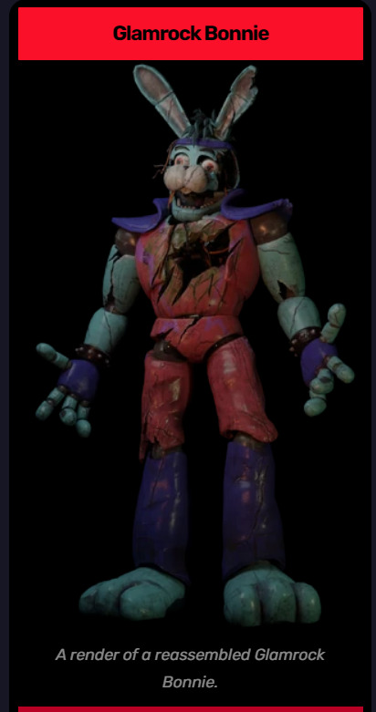
#they fucked up my boy#I'd love it if steel wool made a not broken render because holy shit some parts are really hard to figure out#like what if he had markings on his chest or something more going on with his head#anyways I like the fanmade one more#like they made him bland besides a few funky features on his face and head#I need my boy that I waited a year to see to look silly not just have different colored segments#also they don't have the monty golf ride cut out on the wiki when that would help quite a bit#I guess I'll look at someone's playthrough to get a good reference 😔
14 notes
·
View notes
Note
hi, i ireally love your work and i don't know if you've answered this before but, what kinds of studies do you do or how did you learn color theory? i wanna get better at rendering and anatomy but im having trouble TT TT
Hi! Long answer alert. Once a chatterbox, always a chatterbox.
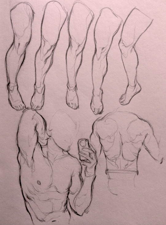
When I started actively learning how to draw about 10 1/2 years ago, I exclusively did graphite studies in sketchbooks. Here's a few examples—I mostly stuck to doing line drawings to drill basic shapes/contours and proportions into my brain. The more rendered sketches helped me practice edge control & basic values, and they were REALLY good for learning the actual 3D structure behind what I was drawing.


I'd use reference images that I grabbed from fitness forums, Instagram, Tumblr, Pinterest, and some NSFW places, but you could find adequate ref material from figure drawing sites like Line of Action. LoA has refs for people (you can filter by clothed/unclothed, age, & gender), animals, expressions, hands/feet, and a few other useful things as well. Love them.
Learning how to render digitally was a similar story; it helped a lot that I had a pretty strong foundation for value/anatomy going in. I basically didn't touch color at all for ~2 years (except for a few attempts at bad digital or acrylic paint studies), which may not have been the best idea. I learned color from a lot of trial and error, honestly, and I'm pretty sure this process involved a lot of imitation—there were a number of digital/traditional painters whose styles I really wanted to emulate (notably their edge control, color choices, value distributions, and shape design), so I kiiind of did a mixture of that + my own experimentation.
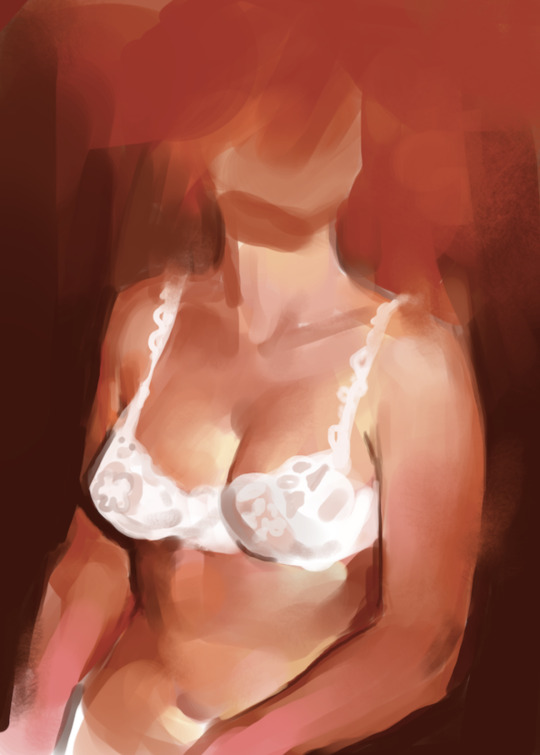
For example, I really found Benjamin Björklund's style appealing, especially his softened/lost edges & vibrant pops of saturated color, so here's a study I did from some photograph that I'm *pretty* sure was painted with him in mind.
Learning how to detail was definitely a slow process, and like all the aforementioned things (anatomy/color/edge control/values/etc.) I'm still figuring it out. Focusing on edge control first (that is, deciding on where to place hard/soft edges for emphasizing/de-emphasizing certain areas of the image) is super useful, because you can honestly fool a viewer into thinking there's more detail in a piece than there actually is if you're very economical about where you place your hard edges.
The most important part, to me, is probably just doing this stuff over and over again. You're likely not going to see improvement in a few weeks or even a few months, so don't fret about not getting the exact results you want and just keep studying + making art. I like to think about learning art as a process where you *need* to fail and make crappy art/studies—there's literally no way around it—so you might as well fail right now. See, by making bad art you're actually moving forward—isn't that a fun prospect!!
It's useful to have a folder with art you admire, especially if you can dissect the pieces and understand why you like them so much. You can study those aspects (like, you can redraw or repaint that person's work) and break down whether this is art that you just like to look at, or if it's the kind of art that you want to *make.* There's a LOT of art out there that I love looking at, probably tens of thousands of styles/mediums, but there's a very narrow range that I want to make myself.
I've mentioned it in some ask reply in the past, but I really do think looking at other artist's work is such a cheat code for improving your own skills—the other artist does the work to filter reality/ideas for you, and this sort of allows you to contact the subject matter more directly. I can think of so many examples where an artist I admired exaggerated, like, the way sunlight rested on a face and created that orange fringe around its edge, or the greys/dull blues in a wheat field, or the bright indigo in a cast shadow, or the red along the outside of a person's eye, and it just clicked for me that this was a very available & observable aspect of reality, which had up until that point gone completely unnoticed! If you're really perceptive about the art you look at, it's shocking how much it can teach you about how to see the world (in this particular case I mean this literally, in that the art I looked at fully changed the way I visually processed the world, but of course it has had a strong effect on my worldviews/relationships/beliefs).
Thanks so much for sending in a question (& for reading, if you got this far)! I read every single ask I receive, including the kind words & compliments, which I genuinely always appreciate. Best of luck with learning, my friend :)
3K notes
·
View notes
Text


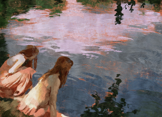
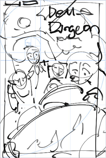
ah, dungeon food... delicious in dungeon!
1 | 2 | 3 | one out of three dungeon meshi illustrations i did for a class! 🍲🐲
id in alt text | like this art? it's a print, here! | like what i do? support me on ko-fi!
hi there! this is actually the first illustration i finished out of the three but i decided to post the falin one first because it seemed fitting when the dragon episode came out pftt
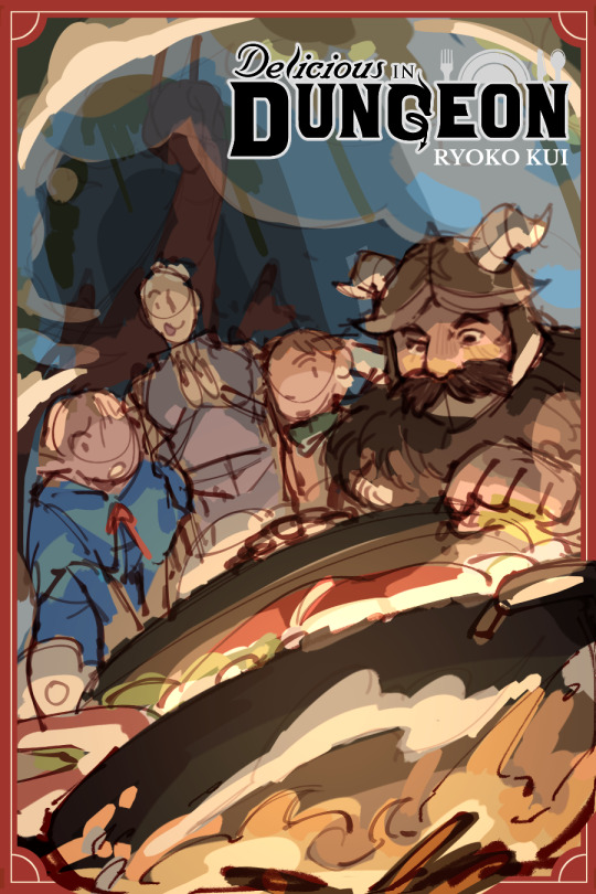
and since a while has passed, i'm very happy to say that i got a high grade for the mock covers i did! which i'm really happy for since ngl, the venn diagram of "drawings for school that i got a high grade for" and "drawings for school that i'm actually proud of" is very, very small lmao
to save time, i had to forgo coloring in the lines for this drawing which gives it a fair amount of contrast, while i still enjoy looking at it, i wonder what it would look like if i softened it with colored lineart.

i used a different pen for inking this and i was actually surprised at how quick i was! if you don't know, i love doing lineart but i usually am terribly slow at it, inking this one was a pretty fast ordeal!
i streamed this over on the klapollomb server as i was drawing it and i just distinctly remember that after the flats stage and onto shading it: i paused, pen in my hand, looking at the screen with a blank look before i typed into voice chat in all caps, "I FORGOT HOW I RENDER" ASKSKSK
it's been a while since i've actually drawn anything digital that's like, a fullass piece, so yeah 😭 i can forget sometimes. i've been doing trad art for school for like 2 years straight now so the moment i got the opportunity to do digital art i went all out lol
#dungeon meshi#delicious in dungeon#senshi of izganda#marcille donato#chilchuck tims#laios touden#sunnysidedraws#sunnysidemeshi#described#id in alt text
2K notes
·
View notes
Text

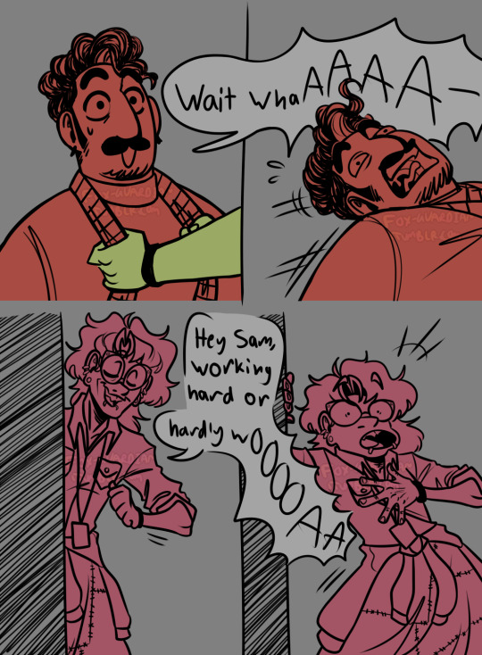


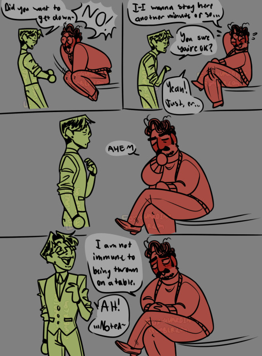
[ID: An eight page digital comic featuring Sam, Celia, and Alice from The Magnus Protocol on a gray background. The characters are all colored with a single color each. Sam is red, Celia is green, and Alice is pink. Sam is a fat Arab man with short curly dark hair, a mustache, and a small goatee, and he is wearing small black earrings, a cardigan, a turtleneck, trousers and loafers. Celia is a taller Korean woman with short dark hair and she is wearing rectangular glasses, piercings including an industrial piercing, an x-shaped earring, and snakebites, a button-down shirt with the sleeves rolled up, a vest, trousers, and black wrist cuffs. Alice is an even taller white woman with long fluffy hair and crooked teeth, and she is wearing cat eye glasses, three pairs of earrings, snakebites, a flannel shirt, a hoodie tied around her waist, a patchwork skirt, bracelets, and a lanyard.
Sam and Celia are stood at a table covered in papers. Celia urgently turns to Sam.
Celia: Alice is coming! She can't catch us researching, we need a diversion, QUICK! How can we make her think we're not doing what we're doing?
Sam, shrugging really hard: UHHHH she thinks I have a crush on you??
Celia, sweating, turns back to where Alice is coming from, panicked, and turns back to Sam, shrugging and reaching for him.
Celia smiling a bit manically: Yeah, that'll work, sure!
Sam, with Celia's hands grabbing his cardigan: Wait whaAAAA-
He is pulled out of frame.
Alice walks in: Hey Sam, working hard or hardly woOOOAA
She leans on the doorframe as she holds a hand to her chest in shock.
The next panel is rendered with soft pink shadows and "shoujo sparkles" in the now pink background. Sam is sitting on the table holding onto Celia, whose face is buried in his neck as she wraps one arm around his back and the other holds up one of his legs under his knee. Neither of their faces are visible. The rest of the page fades back to gray from there.
Sam and Celia look over at Alice, hair ruffled, Sam is now blushing.
Sam: ALICE!!
He pushes Celia away and they look at each other for a moment, panicked.
Sam: It's- .... exactly what it looks like!
Celia: Aw, you've caught us!
He rests his hands on her shoulders and they both look in opposite directions as though embarrassed. Celia is also blushing lightly. There are red and green neon signs pointing to them reading "Totally Ham-Slammin'" and "GAY! (in an M/F way)" respectively.
Alice looks to be in shock with a vacant expression and a computer pop up over her forehead reading "Alice.exe has stopped responding". In the next panel she is fine again and back to smirking.
Alice: WOW SAM, didn't know you had it in you! Now I'm no snitch, so I didn't see anything, BUT- you lovebirds should cut it out before Gwen catches you.
Celia and Sam look at each other anxiously, cheeks pressed together as she speaks.
Alice: You KNOW she'd tell Lena.
Celia, pulling back and smoothing her hair out: Oh, for sure.
Sam: Th-Thanks, Alice.
Alice: Don't mention it! I'll give you crazy kids a minute to straighten up, TA-TA~
She waves as she leaves.
Sam and Celia listen to her steps fade before going "phew" and finally pulling away from each other, now holding hands at an arms distance.
Celia: You alright? That was kinda sudden....
Sam: It's fine! Just a bit caught off guard.
Celia: I can't believe she actually bought all of that!
Sam: Me either! Works for me, though.
Celia: Did you want to get down-
Sam, pulling away suddenly, blushing again: NO!
He crosses his legs and looks away sheepishly, scratching his head.
Sam: I wanna stay here another minute or so....
Celia, concerned: You sure you're alright?
Sam: Yeah! Just, er....
Celia looks at him, confused.
Sam, blushing increasingly harder: Ahem. (He folds his hands in his lap politely.) I am not immune to being thrown on a table.
Celia, smiling and politely stepping away: AH! .... Noted~
She walks away casually, still smiling.
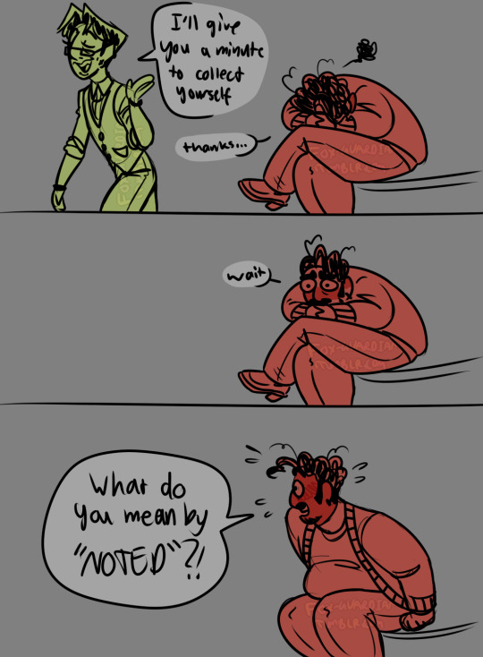
Celia: I'll give you a minute to collect yourself.
Sam, head down in his lap, embarrassed: Thanks....
He looks up after she leaves.
Sam: Wait.
He straightens up, slightly panicked, face entirely red.
Sam: What do you mean by "NOTED"?!
end ID]
~~~~
i am SO glad this episode didn't entirely debunk the silly headcanon that birthed this comic. initially i wasn't convinced sam actually had a crush so i made this like "well if he didn't before, HE DOES NOW" so.... here's this silly comic thing <3 i just think they're neat <3
#fg's art#the magnus protocol#tmagp#samama khalid#celia ripley#alice dyer#do sam and celia have a shipname yet. idk.#also i am REALLY proud of the expressions in this one#also also if you see inconsistencies no you don't <3#also also also i hope the id is good!! still not used to doing comics and stuff but i hope it works!
2K notes
·
View notes
Text
The Changes Through Time

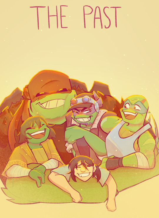

And my project is finish! My gift to the CAS series and @somerandomdudelmao! (This is technically supposed to be for the 1 year anniversary of CAS, but I don't have the time to post it on the 12th and I don't understand the queue system lol)
I deeply love this series as I have made fanart for it before several times and honestly it really improved my art. Cass is also an amazing creator and I look forward to anything they post in the future.
(A bit of a spiel about the illustrations from this point on)
I was honestly going to go for more of a tarot card style with boarders and everything, but as I was composing the 1st illustration, I ditched the idea and just when for simple text. The third image (like how tarot cards read the past, present/current, & future) was going to be the present, but honestly I was confused enough trying to decide which illustration was the past & future with the first two. Plus the "current" state of the story doesn't have much significance yet (and references of them aren't made because it's generally their other outfits) so I went with their spirits!
1st illustration: Representing the start of it all with the current state of all the characters. Of course we didn't know the condition of Raph in the beginning, but since he remained static until Casey found him I believe it's safe to assume that he was in that state the whole time. This illustration is unfortunately my least favorite because it's not rendered the same as the others, due to it being the first fully rendered image I've done in a while. But oh well, I still like it for the most part.
2nd illustration: Representing all of the turtles resurrections with a group hug. Not much else to note about the meaning other than the fact that I almost gave Leo an arm that he does not have. This one was also the greatest to render as I had the most fun with the bright colors. This one is definitely my favorite.
3rd illustration: Representing the turtles spirits when they were dead. Though the last one was the best to render, this one was the best to compose as a whole. Mikey and Donnie were the easiest to do since their broken states were shown in the comic, but with Raph and Leo I had to be a bit creative. With Raph I wanted to show the lack of his senses due to being in a robot for a long time and everything being subconscious. It's not as strongly detailed as the others, but he did have the most stable conditions compared to the rest of his brothers. With Leo I wanted to display his lack of self physically. Since he was fading away, at first, I wanted his spirit to be more faded and weaker compared to the rest.
Nothing else to be said that wasn't said before, but I am very glad that I started reading CAS. I've never felt more invested and moved by a fanmade comic before, so this experience is actually life changing for me. And seeing others fanart for it only inspired me! I am truly amazed by Cass and this series. Happy early 1 year anniversary
#rottmnt#cass fanart tag#cass apocalypse series#rottmnt leo#rottmnt donnie#rottmnt raph#rottmnt mikey#rottmnt casey jr
2K notes
·
View notes
Text
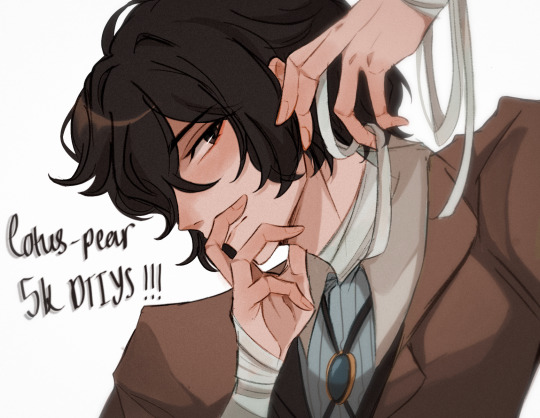
YAAAAAYYYY ITS FINALLY HERE!!! ty guys sm again for 5k i rly appreciate it <3
rules and guidelines under the cut!
rules and due date (i've never done this before so bear w me ok!!):
-due date will be march 1st! i will accept entries a few days late dw i'm nor ur professor or smth BUT I WOULD RLY PREFER IF U GET IT DONE BY THEN (just dm me if u need more time)
-pls tag ur finished piece under #lotuspear5kdtiys and dont forget to mention my user @lotus-pear! if i neglect to reblog ur piece then pls lmk even though that probably won't happen bc i'll be checking that tag every day for new entries👹
-pls don't trace the art.. i'll be really sad if u do that :(((( if u need help at all w the posing or hands then shoot me an ask or weed ur way into my dms bc ik this is kind of a complicated piece
-anyone can participate!! u don't have to be following me or anything and it's fine if we've never interacted before
-colors and expression are completely flexible and i'd even encourage playing around w it since the final product isn't meant to mimic my style. if u can then pls try to keep the pose relatively similar although i don't mind if it's changed a little bit. whatever is most comfortable to u as the artist.
-if u guys want to see the piece without any shading or rendering then pls dm me, ik it might be easier for some ppl to just see the bare sketch or the lineart w base colors
prizes🤩 (ik this is what u guys are rly after /j):
-alr so ik everybody's all like "well what's in this for me🤨" oh my god if u would just let me explain 😐 i'll be choosing three winners and two honorable mentions amongst all the contestants
-the top three winners get a follow (yea ok kinda sucky but wtv) AND they get to commission a fully rendered piece from me of a single character of their choice for free >:) (i'll discuss the details w the winners in two months)
-the two runner ups will also get a follow from me AND they get to commission a sketch of a single character from me (again, i'll discuss what this entails in further detail when the honorable mentions are selected in two months)
————
ermmm yea i think thats it for now i'll come back and edit the post if i feel the need to add anything.. HAVE FUN GUYS I CANT WAIT TO SEE WHAT U GUYS DO🫶🏼🫶🏼
1K notes
·
View notes
Text
Ok! I've finally decided to put together a (somewhat) comprehensive tutorial on my latest art~
Please enjoy this little step-by-step 💁♀️
First things first--references!
Now I'm not saying you have to go overboard, but I always find that this is a crucial starting point in any art piece I intend on making. Especially if you're a detail freak like me and want to make it as realistic as possible 🙃
As such, your web browser should look like this at any given point:

Since this is a historical piece, it means hours upon hours of meaningless research just to see what color the socks are, but...again. that isn't, strictly, necessary 😅
Once I've compiled all my lovely ref pics, I usually dump them into a big-ass collage ⬇️
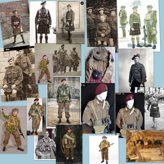
(I will end up not using half of these, alas :'D)
Another reference search for background material, and getting to showcase our models of choice for this occasion~
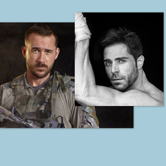
When picking a reference for an actor or model, the main thing I keep in mind (besides prettiness 🤭) is lighting and orientation. Because I already kinda know what pose I'm gonna go with for this piece, I can look for specific angles that might fit the criteria. I should mention that I am a reference hound, and my current COD actor ref folder looks like this:

Also keep in mind, if you're using a ref that you need to flip, make sure you adjust accordingly. This especially applies to clothing, as certain things like pants zippers and belt buckles can be quite specific ☝️
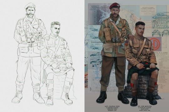
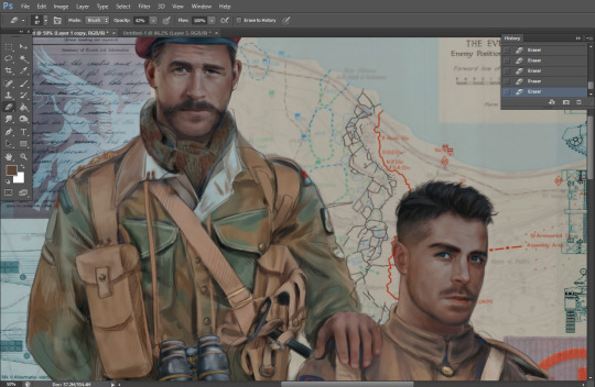
Now that we've spent countless hours googling, it's time to start with a rough sketch:
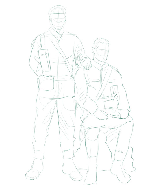
It doesn't have to be pretty, folks, just a basic guideline of where you want the figures to be.
The next step is to define it more, and I know this looks like that 'how to draw an owl' meme, but I promise--getting from the loose sketch above to below is not that difficult.
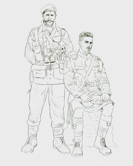
Things to keep in mind are--don't go too in-depth with the details, because things are still subject to change at this point. In terms of making a suitable anatomically-correct sketch, I would suggest lots of studying. This doesn't even have to be things like figure drawing, I genuinely look at people around me for inspiration all the time. Familiarize yourself with the human form, and things like weight, proportions, posing will seem a little more feasible.
It's also important at this stage to consider your composition. Remember to flip the canvas frequently to make sure you're not leaning to one side too often. I'm sure something can be said for the spiral fibonacci stuff, which I don't really try to do on purpose, but I think keeping things like symmetry and balance in mind is a good start ✌️
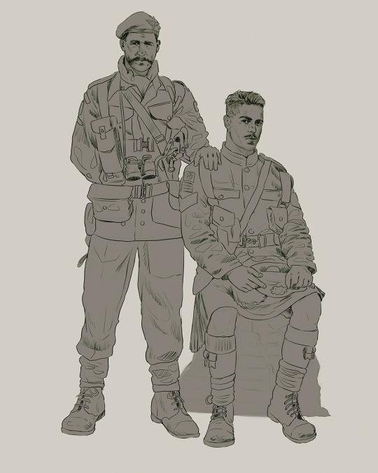
Next step is just blocking in the figures. Standard. No fuss 👍
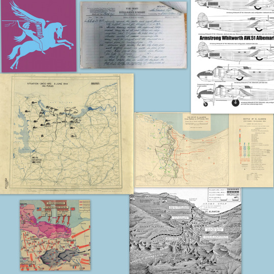
Now onto the background!
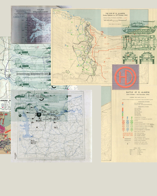
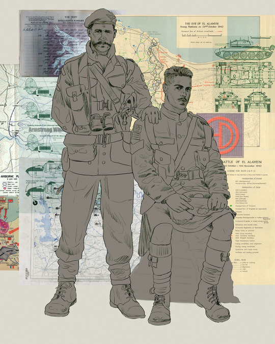
It's frankly hilarious how many people thought I was *hand-drawing* these maps and stuff 😂😂 I cannot even begin to comprehend how insanely difficult that would be. So yeah, we're just taking the lazy copy and paste way out 🤙
I almost always prepare my backgrounds first, and this is mostly to get a general color scheme off the bat. For collage work, it's really just a matter of trial and error, sticking this here, slapping this there, etc. I like to futz around with different overlay options until I've found a nice arrangement. Advice for this is just--go nuts 🤷♀️
Next, I add a few color adjustments. I tend to make at least 2 colors pop in an art piece, and low and behold, they usually tend to be red and blue ❤️💙There's something about warm/cool vibes, idk man..
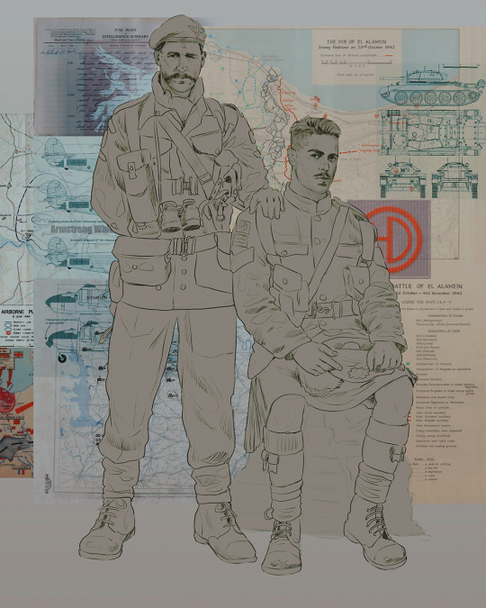
Now we move on to coloring the figures. This is just a basic block and fill, not really defining any of the details yet.
Next, we add some cursory values. Sloppy airbrush works fine, it'll look better soon I promise 🙏
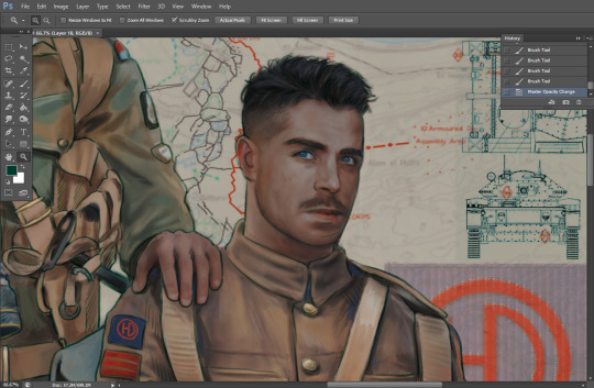
And now--rendering!
I know a lot of beginner artists are intimidated by rendering, and I can totally understand why. It's just one of those things you have to commit to 💪
I've decided to show a brief process of rendering our dear Johnny's face here:
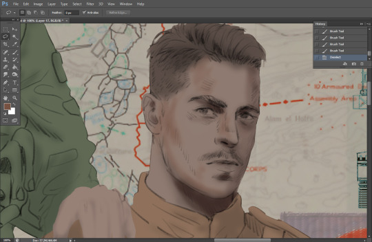
Starting off, I usually rely on the trusty airbrush just to get some color values going. Note--I've kept my sketch layer on top, but feel free to turn it on and off as you work, so as to not be too bound to the sketch. For now, it's just a guideline.
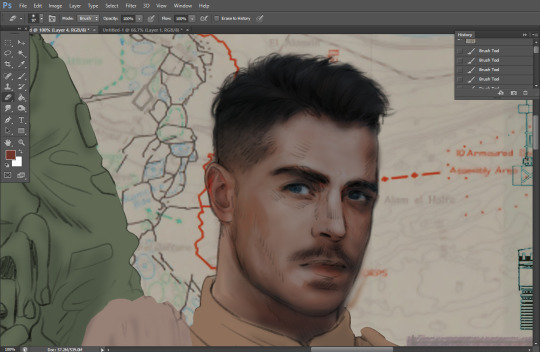
This next stage may look like a huge jump, but it's really just adding more to the foundation. I try to think of it like putting on make-up in a way~ Adding contours, accentuating highlights. This is also where I start adding in more saturation, especially around areas such as ears, nose and lips. Still a bit fuzzy at this point, but that's why we keep adding to it 💪
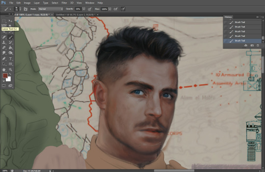
A boy has appeared! See--now I've removed most of the line layer, and it holds up on its own. I'll admit that in order to achieve this realistic style, you'll need lots and lots of practice and skill, which shouldn't be discouraging! Just motivate yourself with the prospect of getting to look at pretty men for countless hours 🙆♀️
I'll probably do a more in-depth explanation about rendering at some point, but let's keep this rolling~
Moving forward is just a process of adding to the figures bit by bit. I do lean towards filling in each section from top to bottom, but you can feel free to pop around to certain parts that appeal to you more. I almost always do the faces first though, because if they end up sucking, I feel less guilty about scrapping it 😂 But no--I think he's pretty enough to proceed 😚
They're coming together now 🙆♀️ Another helpful tip--make sure you reuse color. By that, I mean--try to incorporate various colors throughout your piece, using the eyedropper tool to keep a consistent palette. I try to put in bits of red and blue where I can
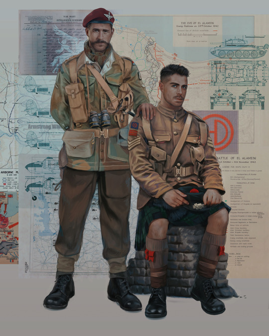
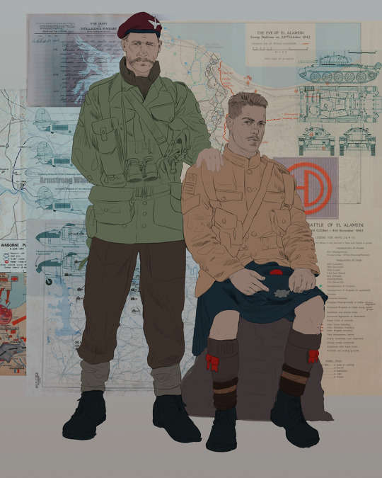
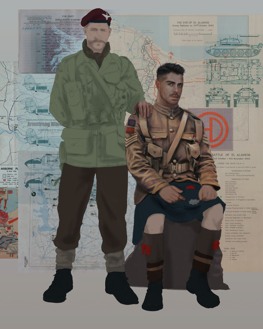
Here they are fully rendered! Notice I've made a few subtle changes from the sketch, like adjusting the belt buckles because I made a mistake 😬 Hence why you shouldn't put too much stock in your initial sketch~
The next step is more of a stylistic choice, but I usually go over everything with an outline, typically in a bright color like green. Occasionally, I can just use my initial line layer, but for this, I've made a brand new, cleaner line 👍
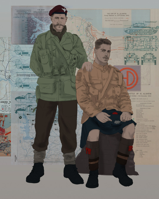
And the final step is adjusting the color and adding some text:
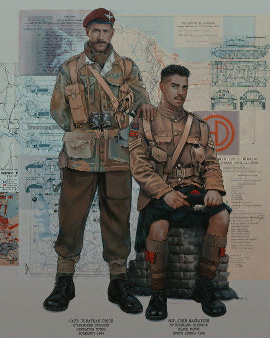
Tada!! It's done!
All in all, this took me the better part of a week, but I have a lot of free time, so yeah ✌️
I hope you appreciated that little walkthrough~ I know people have been asking me how I do my art, but the truth is--I usually have no clue how to explain myself 😅 So have this half-assed tutorial~
As a bonus, here is a cute (cursed) image of Johnny without his mustache:
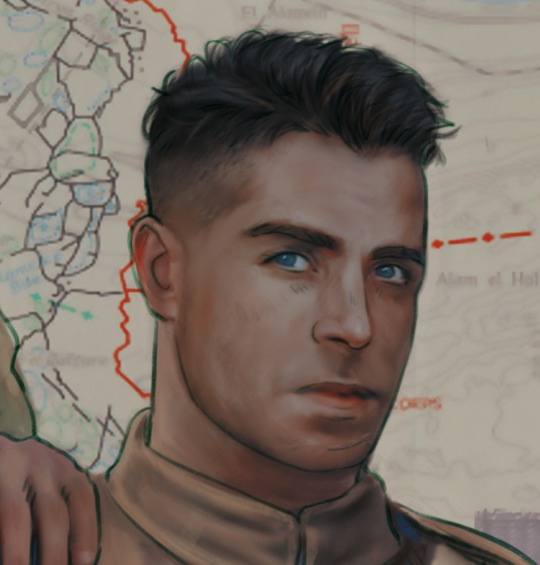
A baby, a literal infant child !!! who put this wee bairn on the front lines ??! 😭
Anyway! peace out ✌️
#tutorial#my art#art tutorial#since people have been asking#I remembered to save my process from this latest work~#enjoy 🙆♀️
1K notes
·
View notes
Note
Hey I was wondering if you would do a post about how you make your feralnette au? I really like how you color it and was curious about your process.
Yes this is absolutely for plagiarism purposes /j
(I want to incorporate something similar on a smaller scale within my artwork, I don’t plan on posting anything but I can run the art past you if your worried about me actually stealing your style)
sure! as a note I'm not a pro or anything, this is just how I render my comic for ease of access
as a general note I draw everything in black and white first

I use a LOT of texture heavy brushes for effects, and specifically because I render with gradient maps a lot. people ask me why I do AU's in different styles - usually anything outside of feralnette is done in color - but that's because the rendering process is different.
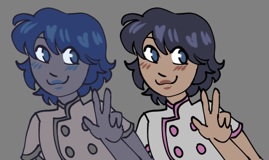
for instance in the dad villain au, I do basic linework and chunky colors. if I was to do Feralnette in the same style, the gradient maps wouldn't nearly have the same effect, as you can see up there ^
when a gradient map is applied I can fiddle with the color values to set a Tone for the update I'm going for, while also making it really pretty, bc textures can really bloom the subtle colors in a gradient map. I get a lot from the CSP page itself, but I also MAKE a lot too. this specific map I made by color picking off of a neuron map from a brain scan I thought was pretty~
I don't do the feralnette AU in full color because generally, anything IN full color will have significance - either to show that a scene is important character development,
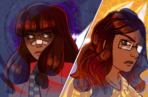
is a flash back,

or to put emphasis on something supernatural happening.
with Feralnette, when something is colored purposefully, its to emphasize it, whether that be to highlight character moments, or to stress that something eldritched and unnatural could be occurring, as its colors that do not exist in the pre-existing gradient map. Color out of space, yknow?
((SOMETIMES I put gradient maps on my colored chunky stuff, but once again, for the purpose of creating a tonal shift, like when papa Tom shows up in the dad villain AU!))
anyway I hope that helped!
#replies#tutorial#sort of#im answering a lot of questions bc im bedridden w/ ms rona herself#my kitty retail sis caught it too (she's a champ so she's beating it like a fuckin pro)) and nudibranch sister remains unscathed!!!!!#we stay winning even if im dying!!
784 notes
·
View notes
Last Seen Blogs
the-gilded-rose
Untitled

jvnvess-blog
stay clvssy
singingcatlady
Lauren O

devherdssoftwaresolutions
Devherds
singingcatlady
Lauren O