#I can't draw 3/4 or 4/5th angle of the head unless it's at an angle like Rain's
Text

"Do you think we can keep it?"
Illustration for The Art of Losing (Is Hard to Master) by the amazing @insertmeaningfulusername
Summary: On a mission into Separatist space, Rex loses his entire squad except for one - and gains a friend who leads him through the labyrinth of grief to a brighter day.
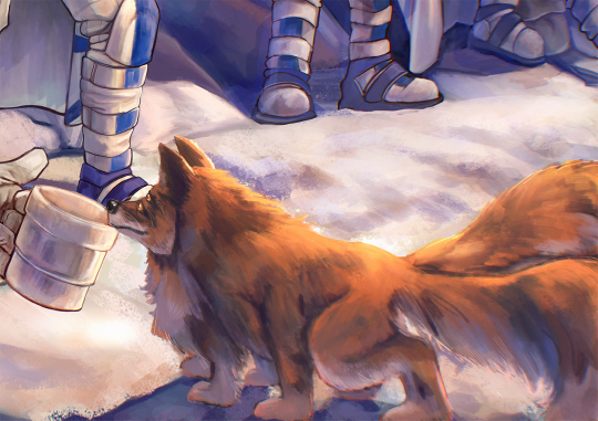
I'm so happy to finally introduce this poor doomed squad to you: from left to rigth that's Rain, Amber, Rex (obviously), Bug, Whiplash and Clear. And you'll just have to read the fic to learn the name of the curious fluffball who's trying to befriend them ;)
With @xylionet as our wonderful beta for the story (and who also tirelessly cheered us on) we made up Team 16 for the @clonebang! I loved working with them so much! <3
ID and some closeups under the cut ->
[ID: A picture of 6 clone troopers resting. The landscape is snowy. Rain is standing furthest to the left. Their helmet is held in their hand. They are scowling at Rex. Next to them is Amber, standing with her back turned to Rain. Rex is crouched in the foreground, hand on one knee, as he offers his mug to a fox like creature with 4 eyes, 6 legs and 2 tails. Behind Rex to the right Bug is slightly bent over, mug in hand, grinning, other hand resting on his thigh. Off to the right side of the picture are Whiplash and Clear. Whiplash is standing, head turned to Rex but face obscured by his helmet. Clear is sitting, helmet balanced on one knee and mug in his hand. He is watching Rex, too. /End ID]
Close ups:


#clone bang#the clone wars#tcw fanart#star wars fanart#the clones#clone oc#captain rex#sw tcw#clone troopers#clone trooper oc#my art#digital art#fanart#digital illustration#star wars the clone wars#I'm so so proud of how everyone came together#and then there is Rex whose face gave me so much grief#I can't draw 3/4 or 4/5th angle of the head unless it's at an angle like Rain's#I'm a little heartbroken over that... so please look at Bug's grin instead!#he's the bestest boy and I love him to bits!!!#also look at Rain and their judgmental eyebrow too!#I love them all so much your honor#I'm so so happy I got to work with this team!!! <3#Bug (clone OC)#Rain (clone OC)#Amber (clone OC)#Clear (clone OC)#Whiplash (clone OC)#just establishing some tags here#because you can bet this is not the last time you see them
602 notes
·
View notes
Note
This is maybe weird question, but. I'm strugling with drawing faces. My problem is, that any method of admeasuring face can't help me .Is there anything you can recommend me to do it better?
…this is a first art ask I ever got, this is exciting! =))
You wanted an essay. Here is an essay.
Let me start with a preface:
Faces are complicated. They are formed not only by bone and muscle, aka the ANATOMICAL STRUCTURE, but the also exist as parts of HEADS, that are parts of BODIES, and out bodies are basically objects like any other that exist within the multi-dimentional space of perceived reality, aka SPACIAL POSITIONING.
Sounds terrifying, I know.
Good thing about it is - we all are unique, therefore all faces are unique! Before starting with anatomy and such, I think it is important to welcome this idea that this Uniqueness IS Beauty. Therefore every face, no matter the proportion, racial features, anything else, is BY DEFAULT beautiful.
Basically, when drawing a face, the artist’s job (especially if this artist is of academic school, or focused on realism) is to detach from personal perception of aesthetical, and focus on studying the beauty of nature’s design. There will be time for personal taste and creative decisions.
To break the rules you need to know what rules there are.
How to Draw a HEAD
(Mostly because you can draw a disambullated head with some of that shoulder action and get away with it. When you draw just a face - it’s… well it can serve a purpose, but there will be questions. It’s generally better to think of a face as part of a head, it makes life a lot easier.)
As it is customary, the process of drawing an object starts with understanding two basic concepts:
The base shape: if you simplify the object to it’s most basic 3-dimentional shape, what shape would it be (a box, and elongated box, a sphere, a pyramid and so on.) Out of which comes the next one-
Where that object exists in relation to you, aka the Artist, since you are the one who will be drawing it. You have the power. The Power of Perspective.
A head is an object like any other. And a head, as an object, is A BOX.
The basic proportions of the box - and I’m talking the commonly art teacher accepted medium - are:
4 units tall : 2 units wide : 3 units deep
What is a unit, you ask? Will come to that, when talking about points and proportions.
So we have a box, and it’s something like this.
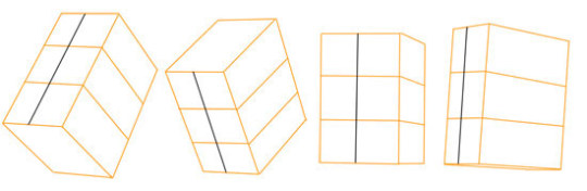
(Picture belongs to Stan Prokopenko, who is a remarkable artist of anatomical drawing, and generally a professional art teacher. I suggest watch everything he ever made, he has ton of stuff on anatomy. http://www.stanprokopenko.com/)
The grey line in the middle signifies the line of symmetry of the face. It’s on the front plane of box, in the middle. The box is much easier understand that a head with a face.
What we do with the box? We rotate it in any possible we can come up with, while keeping in mind the proportions. It’s important to always keep those proportions in the back of your mind.
Why we do this? Because this box will tell us about about the lines of perspective that will interact with our portrait’s features. As you can see on Stan’s picture, the yellow lines indicate which way perspective goes.
(Perspective is a whole another topic altogether that would require a separate tl;dr post, so I’m going to step over it in this essay.)
I took the liberty to use one of your pictures to illustrate, especially since you asked for some feedback.
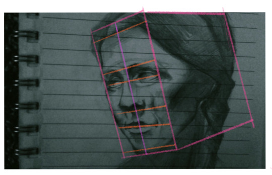
Overall this is a good drawing, but see how the orange lines start to stray away from the perspective the box exists in? By sticking to the directions the box helps us with, we can get rid of that feeling of something being crooked - becasue all the facial features will exist in the same architecture as the rest of the head.
Second reason why the box is our friend is becasue on the box we can clearly understand: okay, this side is facing the light, and this is the side is in the shadow. This is the break line between the planes of the object.
But Ler, you may say, the face is curvier than a box.
Yes, young padavan. Here is a trade secret: first we tackle the overall, and then we go into details. (then we come back to overall, then back to details, and so on, until you can’t find anything sticking out of the unity of the piece, and you can decide that your job here is done. [it is never done, but perfect is an enemy of good, and sometimes good is “good enough” and “as good as I can do at the moment which is still good”)
This may sound familiar, because it is - it’s a lot like the Loomis method, which is, in it’s essence, your good old illustrative version of academic portrait, but without the hassle of learning all skull bones and facial muscles and crying yourself to sleep.
See how he clearly identifies here the border between the frontal planes of the faces and the side ones? Look how is is not afraid of laying that tone on the sides? This is what I’m talking about. He got it from The Box.
(I would suggest reading Loomis’s books in general, and especially “Drawing the Head and Hands”, where the illustration above is from. His method of drawing heads is quite good, and he explains it in a very approachable way.)
Now that we sorta figured out the head in space, and the box the head truly is, lets figure out
Where Do We Put The FACIAL FEATURES
There are a few different school of thought on “where the features are” and “what are the proportions”, so I’m going to share with you how I work around them.
My personal approach is a mix of different methods, and years of life studies - as I explained in the beginning every face is unique and has different proportions, and the more “cartoony” and “caricaturistic” (is this a word?) the style is, the more those proportions are exaggerated.
My approach to placement of features goes like this [unless I got a life model before me, then I measure with my pencil, old school style.] It’s pretty math intense, so buckle up.
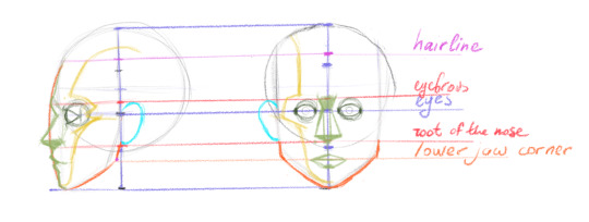
1) [Purple] Cranium is a SPHERE. The axis of the sphere is your friend. Cut it in 3 equal parts. Add one part down - hey presto, this is the height of your head. [Remember the thing about the proportions of the box? These are the units I was talking about. It’s all coming together now.]
2) [Purple] Eyes exist in the middle of the axis.
3) [Orange] The protrusion of the face is *design* and may vary. Rule of the thumb: make it an arc, similar to what I did. The lower jaw corner falls into the same cathegory, but I prefer it to be on the same level as the corners of the mouth.
4) [Magenta] Mark 1/7th of the height from the top - that’s your hairline.
5) [Red] After you mark the hairline, divide the remaining part of the height in 3 equal parts. Lower part is chin to root of the nose, the middle one is root of the nose to eyebrows (actually to the glabella, but let’s call it eyebrows), the upper - from eyebrow to hairline. this is the Rule of Thirds. In reality nothing is perfect.
6) [Yellow] This is the tricky part. This is where I personally mark the border between the frontal facial planes and the side ones. There is a general guideline on how it’s done, but it does require understanding the skull and the subplanes of the frontal plane of the face. In layman’s terms, go from the hills of the forehead down to the middle of the brow, around the eye socket, over the cheek bone, through the middle of the cheek (preferably on an arc) to the chin bone, not foregetting the chind also has upper plane and lower plain and yes, there is a break between them, rounded as it is.
7) [Dark green] Back to eyes. They are also spheres. In the drawing above I marked them as “width of 1 eye = 1/5th of the face’s width”. This is my design (and also the “fashion portrait design”, but don’t get me started) . What is not my design is that the distance between eyes is about the width of one eye, very convenient. The distance between the ear and the outer corner of the eye is 1 third of the rule of thirds. (see point 5) Don’t forget: eyelids cover the eyeball like peel covers the orange. It has thickness.
8) [bright blue] EAR! Love ears. Their traditional space is snuggly in the middle third. Also their angle usually follows the angle of the nose.
9) [light green] Nose and Mouth.
Nose.Take your middle third. Divide it by three (approximately). The top part is where the dip of the nose is. For reference is about the same level as the eyes, maybe a bit higher. The nose itself is a trapezoid. The general width of it - the space between the eyes. There is a shadow under it, in most cases. When drawing from reference, pay attention is the root of the nose goes lower than the edges of the nostrils. It’s important. That’s where character hides.
Mouth. Take your lower third. Divide it by two. That’s - no, it’s not the slit of the mouth. That’s the dip under the lower lip. Take the distance between the eyebrows and the eyes, measure it, and apply from the root of the nose down. That’s where the upper edge of the upper lip is. The width of the mouth is very different, but I prefer somewhere between the irises.
Oof, that’s about it.
If you are looking into indepth anatomy, I’m going to recommend the bible of all anatomy artists, Mr Gottfried Bammes, and “The Complete guide to human anatomy for artists and illustrators”. No better book was ever assembled. I wouldn’t suggest “reading” it, it’s dry as stale bread, but it has hundreds of illustrations that are pretty self-explanatory.
How to combine this whole knowledge together?
By drawing. Honestly, the rest comes with practice. Lots and lot’s of it.
I would personally suggest downloading a million photos of faces, plugging them into photoshop and studying then step by step as per process above.
Second, I would suggest making studies of separate parts of the face: mouth, ear, eye and nose. Break them down into basic shapes. Look at what covers what. There things do in, where they come out.
Third. After you do your studies on photos, draw the faces you studied. But don’t draw them to minute details. Be as constructive as possible. Basic shape - ok. Hairline - ok. Thirds in proper perspective! - ok. Border of light and dark sides - ok. And so on.
First hundred many look like crap. It’s okay. You are learning. Then things will get better. The more you draw - the better it goes. The more your drawing chakras open.
I hope this was helpful. Have fun. Do art. Post art.
#Ler loves asks#oh this is long#but honestly there are whole books on how to draws heads#and this is extremely fast way to explain basic principles#mirrinka
25 notes
·
View notes
Last Seen Blogs

diachronical
Diachronical

nonoel-28
°.•.° Oi, Oi, Oi!! °.•.°

eryonfallssumtime
Falls

edvinception
Edvinception