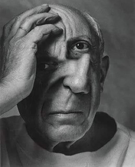
#Fernand Mourlot
Photo


Shakespeare Weekend!
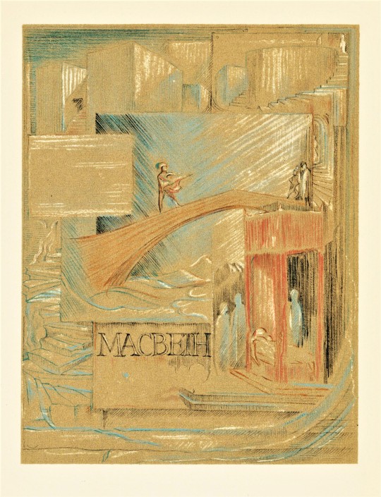
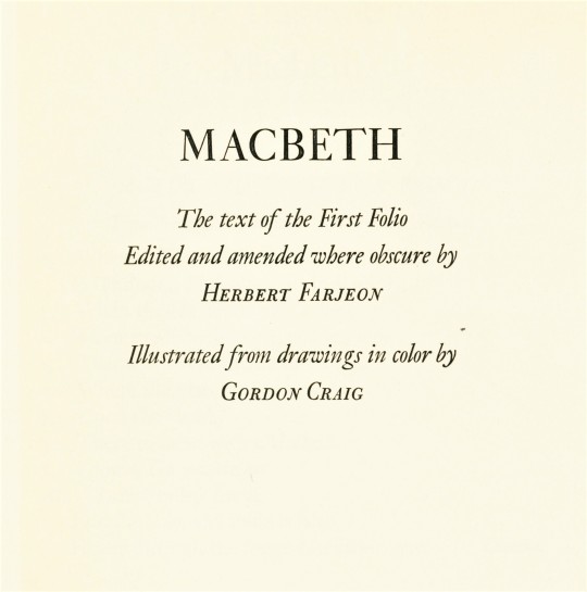
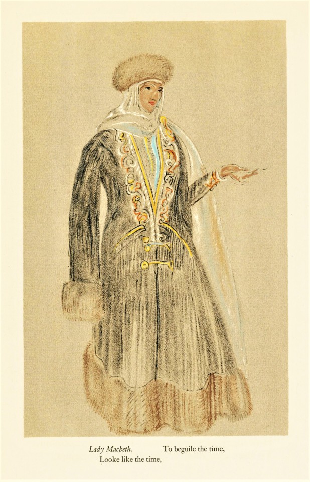
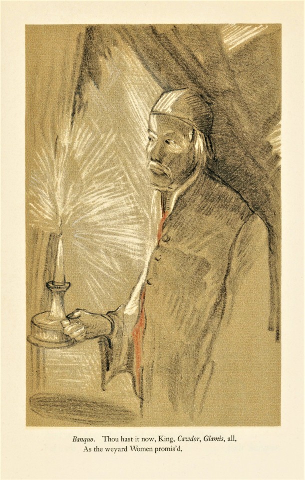
Shakespeare’s tragedy Macbeth, is volume twenty-one of the thirty-seven volume The Comedies Histories & Tragedies of William Shakespeare, published by the Limited Editions Club (LEC) from 1939-1940. Macbeth was first printed in the folio of 1623.
Edward Gordon Craig (1872-1966) illustrated Macbeth. He was an renowned actor, son of the even more renowned Ellen Terry, who was once considered one of the worlds most famous men in theater. He also was also a noted wood-engraver, even though he only actually illustrated one book with wood engravings, an edition of Hamlet published by Count Harry Kessler at The Cranach Presse.
His illustrations for Macbeth, perhaps unfortunately, are not done in wood-engraving. Those working at The Limited Editions Club seemed to have excitedly pushed for the use of color, to express the rich costumes in the play. These illustrations were drawn with lithographic crayon on brown paper then reproduced in lithography by Fernand Mourlot in Paris.
The volumes in the set were printed in an edition of 1950 copies at the Press of A. Colish, and each was illustrated by a different artist, but the unifying factor is that all volumes were designed by famed book and type designer Bruce Rogers and edited by the British theatre professional and Shakespeare specialist Herbert Farjeon. Our copy is number 1113, the number for long-standing LEC member Austin Fredric Lutter of Waukesha, Wisconsin.

View more Limited Edition Club posts.
View more Shakespeare Weekend posts.
-Teddy, Special Collections Graduate Intern
#Shakespeare Weekend#teddy#william shakespere#Limited Editions Club#macbeth#shakespeare#fine press books#Press of A. Colish#Gordon Craig#Bruce Rogers#Fernand Mourlot#Lithography#Herbert Farjeon#LEC
37 notes
·
View notes
Text
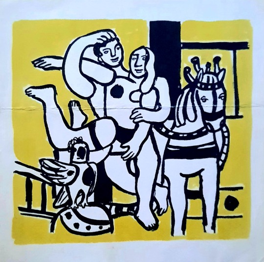
Fernand Léger (1881-1955) - Couple amoureux, lithographie Fernand Mourlot, éditions Maeght
0 notes
Photo

Francis Ponge – Jean Dubuffet, Matière et mémoire ou les lithographes à l'école, Fernand Mourlot, Paris, 1945, Edition of 60
#graphic design#typography#art#binding#book#cover#back cover#francis ponge#jean dubuffet#fernand mourlot#1940s
30 notes
·
View notes
Photo
Pierre Bonnard, lithograph par Paul Verlaine’s Parallèlement, 1900
et Marc Chagall, La leçon de Philétas, 1961
#paul verlaine#été#parallèlement#1889#poésie#pierre bonnard#marc chagall#la mer#daphnis et chloé#amour#tériade#lithograph#fernand mourlot#printmaking#illustrations#lithography#lithography 200 years of art history & technique#littérature#parallelism#human nature#human love#goodreads#sleepydrummer
24 notes
·
View notes
Text
La Colombe de Picasso

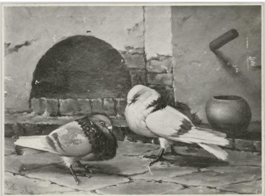
En 1944, Picasso, suivant son ami Louis Aragon, adhère au parti communiste français. Profondément heurté par les horreurs de la guerre, cette adhésion lui semble un geste important et fort, ignorant qu'il est, comme tous à l’époque, des horreurs perpétrées par les régimes communistes. A l’occasion du Congrès mondial des partisans de la Paix qui a lieu à Paris en 1949, Aragon choisit parmi les lithographies réalisées par Picasso chez le maître lithographe Fernand Mourlot celle représentant une colombe et l’utilise pour l’affiche. La colombe ou plus précisément le pigeon est un animal récurrent dans l’œuvre de Picasso. Il était le sujet principal des œuvres de son père le peintre José Ruiz Blasco pour lequel le jeune Pablo avait le droit de finir leurs pattes sur ses toiles. La colombe est un motif qu’il reprend tout au long de sa vie et sur tous les supports. Il prénomme d’ailleurs sa deuxième fille Paloma (colombe en espagnol). La colombe devient aussi l’image de son engagement politique et plus tard un symbole universel de la paix. Et pourtant, pour Picasso, il n’y avait pas d’animal plus cruel que le pigeon… Ainsi naît le symbole.

Pablo Picasso, Colombe, 1949, lithographie. © Succession Picasso 2020
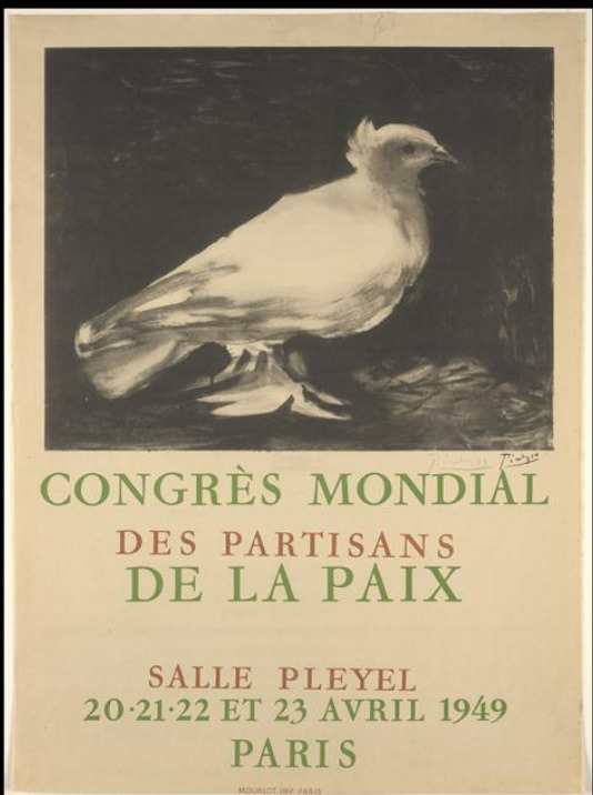
Affiche du Congrès de la Paix, 1949. © Succession Picasso, 2020
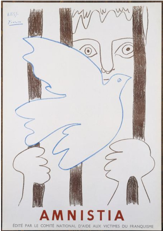
Pablo Picasso, Affiche pour le Comité National d’aide aux victimes du franquisme, 1957, lithographie. © Succession Picasso 2020

Pablo Picasso, Colombe, 1953, céramique. © Succession Picasso 2020
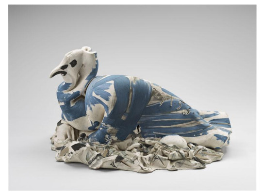
Pablo Picasso, Colombe aux œufs, 1953, céramique. © Succession Picasso 2020
José Ruiz Blasco, Deux pigeons dans une cour, vers 1890, huile sur toile. © Succession Picasso 2020

José Ruiz Blasco, Colombe noire, 1895, huile sur toile. © Succession Picasso 2020
33 notes
·
View notes
Photo

Maurice Brianchon Lithograph, 1964.
(A vintage print from "Prints from the Mourlot Press", which was published in 1964. Fernand Mourlot enlisted the artists who used his press to produce original works which he printed and then bound into a lovely and rare catalog to accompany the landmark traveling exhibition of the same name. This exhibition, which was "a manifestation of Franco-American friendship", was sponsored by the French Embassy and The Smithsonian.)
(via eBay)
#art#maurice brianchon#lithograph#printmaking#vintage print#20th century print#artwork#1960s#1964#french artist#french printmaker#landscape print#seaside
21 notes
·
View notes
Photo

Copy (20th century) of plate III of one of P. J. Redouté's Books on Roses.
Colour lithograph printed by Fernand Mourlot (French, 1895–1988).
Image and text information courtesy The Met.
8K notes
·
View notes
Photo

JOAN MIRO First Run Lithograph Print, Plate 2 from Joan Miro Lithographies Vol 1 Comes with a Charles Scott Gallery COA The volume, "Joan Miro: Lithographs Vol. I" contained 11 original lithographs (five of which were double pages, plus the dust jacket), of which this is Plate 2 (II). The edition was limited in Spain (the volume this is from) and represents the complete Catalogue Raisonne of the artist’s work between 1930 and 1952. It was printed in Paris/Barcelona by Fernand Mourlot in 1972 wi
0 notes
Photo


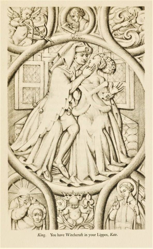
Shakespeare Weekend!
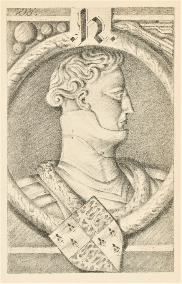
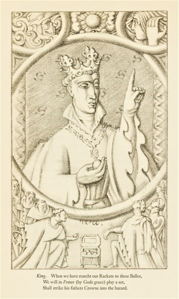
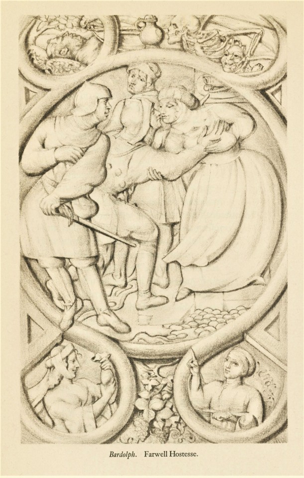
Volume 11 of the thirty-seven volume The Comedies Histories & Tragedies of William Shakespeare, published by the Limited Editions Club (LEC) from 1939-1940, is King Henry the Fifth. This play was likely produced around 1599 and was first printed in the folio of 1623.
This edition was illustrated by British illustrator, painter, and poster artist, Vera Willoughby (1870-1939). This were her last important work, and she died before she could finish them. The drawings made in soft pencil by Willoughby were transferred to lithographic stone by Fernand Mourlot at his Paris studio where he printed them. Of Willoughby’s work on this project, an announcement for the volume notes:
She spent days of research in the British Museum, picking up a close knowledge of the appearances and costumes of the people of the play. Then she made close drawings, putting detail after detail in them until they are now illustrations worthy of study as close as that required by stained-glass windows.
The volume in the set was printed in an edition of 1950 copies at the Press of A. Colish, and each was illustrated by a different artist, but the unifying factor is that all volumes were designed by famed book and type designer Bruce Rogers and edited by the British theatre professional and Shakespeare specialist Herbert Farjeon. Our copy is number 1113, the number for long-standing LEC member Austin Fredric Lutter of Waukesha, Wisconsin.
View more Limited Edition Club posts.
View more Shakespeare Weekend posts.
-Teddy, Special Collections Graduate Intern
#Shakespeare Weekend#William Shakespeare#Henry V#Limited Editions Club#LEC#Vera Willoughby#lithographs#Fernand Mourlot#Press of A. Colish#Bruce Rogers#Herbert Farjeon#Austin Fredric Lutter#Teddy
34 notes
·
View notes
Photo
Joan Miro (1893-1983) - Lithographie VII, éditée par Fernand Mourlot pour le livre Miro lithographes I, 1972
0 notes
Photo
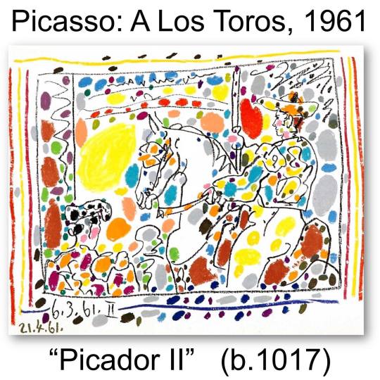
One of my favorite Picassos of all time… partially because it is joyful (not the usual adjective for most of his work) and partially because of the story. It’s worth a 3 minute read … notice 2 dates: 3/6 & 4/21. - A Los Toros, 1961 (Reprinted from Cramer below ... ) - Picasso made 4 black and white lithographs on March 6, 1961 at Vauvenargues (Mourlot 346-349); these depict La Pique (I), Jeu de cape (III), and Les Banderilles (IV). - The publisher, Andre Sauret, asked Fernand Mourlot (lithographer) to suggest to the artist that "he put a little color into these plates," and Mourlot communicated the request during a visit to Vauvenargues on April 21, 1961. - Picasso obliged by coloring Le Picador with wax crayons from a box of twenty-four. Fernand Mourlot tells proudly of how his atelier succeeded in the difficult task of printing all 24 colors - plus black - that the artist used and concludes: 'That time, I believe it was our great friend [Picasso] who was a little surprised'. " You must understand that telling Picasso to do anything with reference to his art was a fearful thing for these men. He had an explosive temper and would often react badly to comments or criticism about his art. His decision to accommodate the suggestion of the publisher by using the wax crayons was largely a spiteful response to the request. He intentionally used every color in the box (these would have been the same Crayolas that we used, the same ones our parents used, & the same ones our kids use), knowing it would make the piece almost impossible to print as a lithograph (basically flipping a specific finger at his publisher). Mourlot succeeded and was very proud of the result. Picasso was pleased. The publisher was pleased. The result is a festive, confetti-like, carnival atmosphere that accurately portrays the joy and the energy he derived from the bullfight. - #picasso #pablopicasso #fineart #affordablefineart #iknowwhythistime #martinlawrencegalleries - Email is best: [email protected] — view on Instagram https://ift.tt/lw8gb7B
0 notes
Text
GEORGES BRAQUE
Ok so everybody knows Picasso. Somehow history has made something of a “god” out Picasso, not that he wasn’t an innovative pioneer of the modern art movement or anything, but was he really all that better than his contemporaries? I suggest that Picasso was no better or worse an artist than his good friend Georges Braque, whose work I just so happen to prefer.
Now I know you are probably wondering who George Braque is, and if you think you know him, than you only know the part of his collective works that are relevant to Picasso. But Braque was just as radical to the early 1900’s art scene as Picasso, and he shook the traditional methods of art creation just as fiercely. Most biographies on Braque begin with his friendship to Picasso and how together their collaborative efforts produced Cubism, one of the most shocking and polarizing styles to ever be invented. But Braque was an established painter in his own right before he ever met Picasso. Braque began as a house painter and decorator in his hometown in Le Havre. During the evenings he studied painting as the École des Beaux-Arts from about 1897 to 1899. In Paris, he apprenticed with a decorator and was awarded his certificate in 1902. But the next year he met Marie Laurencin and Francis Picabia (Impressionists) attending the Académie Humbert, also in Paris, and began to experiment with Impressionism. As such, Braque’s earliest paintings are soft and textural studies of light and shape and these are elements that would always be singular to his paintings even after he and Picasso later try to paint so similarly that no one could tell who painted which canvas.
In 1905 the Fauves (Beast) debuted their work in Paris. When Braque saw the show he began to experiment with this new style that used brilliant colors to represent emotional response. Braque worked closely with Raoul Dufy and Othon Friesz, who shared Braque’s hometown of Le Havre, to develop a somewhat more subdued Fauvist style more in touch with his Impressionist roots. In May 1907, Braque successfully exhibited works of the Fauve style at the Salon des Indépendants; a very controversial series of art shows that scoffed at the “stuffy” academia conventions used to judge art choosing the device “No jury nor awards” (Sans jury ni récompense). The same year, Braque’s style began a slow evolution as he became influenced by Paul Cézanne, who had died the year before. No doubt Braque saw Cezanne’s work when they were exhibited in Paris for the first time in a large-scale, museum-like retrospective in September 1907 at the Salon d’Automne. This exhibit would greatly affect the avant-garde artists of Paris, foreshadowing the advent of Cubism.
In 1908-09, still before Braque was working with Picasso, the painter began to experiment with geometry and simultaneous perspective, the curious method of painting subjects in at least two angles in a physically impossible manner. He conducted an intense study of the effects of light and perspective and the technical means that painters use to represent these effects. His experiments were a challenge to the most standard of artistic conventions: perspective. For example the painting Houses at l’Estaque, Braque reduced an architectural structure to a geometric form approximating a cube, yet rendered its shading so that it looked both flat and three-dimensional by fragmenting the image. He was well in to his study when, finally, in 1909 Braque and Picasso meet and begin to work collaboratively. Both artist were interested in Cézanne, and perspective, and as I mentioned earlier, the two went beyond merely working together bouncing ideas off the other; they lived together in a studio and endeavored to paint in a style so radical and devoid of human signature, that no one could distinguish their work. Art Historian Ernst Gombrich described their Cubism as “the most radical attempt to stamp out ambiguity and to enforce one reading of the picture— that of a man-made construction, a colored canvas.” And I think this quote from Braque is also a good one to describe his working relationship with Picasso: ” The things that Picasso and I said to one another during those years will never be said again, and even if they were, no one would understand them anymore. It was like being roped together on a mountain.”
But the collaboration did not diminish Braque’s unique contributions to Cubism, and as history reminds us certainly did not tarnish Picasso’s popularity. Though there are similarities in their paintings and other works, there are differences also. A comparison of a series of works over the years the artists worked together and after reveals that the effect of Braque’s encounter with Picasso accelerated and intensified his exploration of Cézanne’s ideas, rather than to divert his thinking in any essential way. Braque’s main subjects are still-lives in which he abstracts the perspective and color of musical instruments, stairs, fruit, architecture, and other traditional subjects. In these paintings Braque is still clinging to Impressionist and Fauvist style of light and shape, color and form, thought and emotion. Picasso, who was greatly inspired by Gauguin, African Masks and Iberian sculpture, used the Cubism method to abstract people, movement and action. A great way to distinguish the two artists is to consider that Picasso celebrates animation, while Braque celebrates contemplation.
So yes, in the early 20th century, Georges Braque and Pablo Picasso invented Cubism and shook the foundations of Western art. But Braque’s story did not begin with Picasso, nor does it end with him. In 1914 Braque enlisted with the French Army to fight in WWI, ending his partnership with Picasso and his painting endeavors for a time. In May 1915, Braque received a severe head injury in battle at Carency and suffered temporary blindness, requiring a long period of recuperation. In 1916 Braque resumed painting, alone and he began to moderate the harsh abstraction of Cubism. He developed a more personal style characterized by brilliant color, textured surfaces, and—after his relocation to the Normandy seacoast—the reappearance of the human figure. But, he painted many still-life subjects during this time, maintaining his emphasis on structure. He is quoted saying that he is drawn to sell-lifes “because in the still-life you havea tactile, I might almost say a manual space… This answered to the hankering I have always had to touch things and not merely see them… In tactile space you measure the distance separating you from the object, whereas in visual space you measure the distance separating things from each other. This is what led me, long ago, from landscape to still-life.” His devotion to still-life subjects gave an introvered meditation feel to his works after the war that was criticsed sometimes for not being political enough. In the 1930s the rise of fascism brought new urgency to questions of aesthetics and politics, and art critics want to art that spoke to reactions from the war. Picasso’s Guernica (1937) seeks to find a resolution to questions that entered mainstream consciousness and it is works like this that perhaps satisfied critics’ need for sensationalize and thus gave Picasso leverage in publicity and fame. Braque’s fractured still lifes and bourgeois interiors remained emphatically inward-looking as Picasso work became more and more controversial for political subject matter that proved to sell more news papers and art shows than Braque quieter abstract of method and form. I find it odd that it would be Picasso that turned into the political artist when it was Braque that served in the war, but is a matter for another post.
Anyway, it my opinion that Braque’s later paintings were not as separate from outside events as historians and critics would have you believe. While his attention to the private, secluded realm of the still life suggests disengagement with historical and political circumstances, the paintings themselves convey a more complex narrative. The artist’s exactingly internal gaze was precisely what made his work relevant to questions of art, engagement and responsibility to contemporary issues. And I believe that scholars would benefit the cannon by exploring this further. Oh, and I am not the only one who feels this way.
Braque died on August 31, 1963, in Paris. He is buried in the cemetery of the Church of St. Valery in Varengeville-sur-Mer, Normandy, whose windows he designed. The artist had continued to work during the remainder of his life, producing a considerable number of paintings, graphics, and sculptures. In his last years, Braque worked with prints and lithographs with Fernand Mourlot (who he introduced to Picasso) and most of the book illustrations he created during the 1940’s and ’50s were produced at the Mourlot Studios. In 1962, a year before his death, Braque was still working and collaborating to make new innovations in art, this time with master printmaker Aldo Crommelynck. His last works are a series of etchings and aquatints titled “L’Ordre des Oiseaux” (“The Order of Birds”) which was accompanied by the poet Saint-John Perse’s text. These prints are dreamlike and are praised for honoring truisms related to birds as spiritual and sacred.
~
SHAREBEAR19 · AUGUST 28, 2013.
0 notes
Text
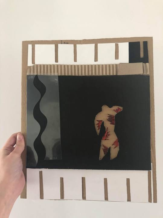
Avec Alix, fabriquez une oeuvre à toucher, à partir du “Clown” de Matisse!
Durée estimée de l’atelier : 1h
Temps de manipulation : 5 minutes (10 minutes si celle-ci est accompagnée d'un commentaire de l'oeuvre)
Atelier de fabrication à partir de 10 ans avec un adulte, et pour les familles et les adultes.
Manipulation de cet outil tactile : dès 3 ans avec l’accompagnement d’un adulte.
L’outil est adapté à l’usage des personnes mal- et non-voyantes pour aborder des oeuvres d’art visuel avec l’accompagnement d’une personne voyante.
Qui n’a jamais rêvé d’effleurer une œuvre d’art au musée ? Avez-vous déjà entendu la phrase « on ne touche qu’avec les yeux ! » ? Pourquoi ne peut-on pas toucher les oeuvres exposées ?
Au Louvre-Lens, cela n’est pas possible pour des raisons de conservation. La Galerie du Temps expose plus de 5000 ans d’histoire de l’art, les œuvres ont traversé le temps. Si vous les voyez aujourd’hui, c’est parce qu’elles ont été conservées dans les meilleures conditions. On les bichonne. Les équipes du musée doivent veiller aux différents facteurs de dégradation comme la lumière, l’humidité, la température, la poussière. Imaginez si chaque visiteur touchait une peinture, une sculpture : il déposerait de la poussière mais aussi des petites bactéries invisibles qui s’attaqueraient à la surface des œuvres et les abîmeraient.
Toucher des œuvres est donc fortement déconseillé si l’on veut permettre aux générations futures de les contempler encore pour des années, voire pour les siècles à venir !
Mais, comment font les personnes mal et non voyantes pour « voir » et comprendre une œuvre s’ils ne peuvent pas la toucher ?
Le Louvre-Lens propose régulièrement des visites en “audiodescription”. Il s’agit d’un procédé qui permet de rendre accessible les œuvres grâce à une description orale et très précise. Le médiateur guide par la voix et fait parcourir l’œuvre d’art grâce à des mots, des phrases, maîtrisées et surtout fidèles à l’image. Le choix du vocabulaire et l’ordre de la description (élément après élément, de bas en haut ou de haut en bas, en partant de la forme général pour aller vers les détails), sont très importants.
Ces audiodescriptions peuvent être associées à nos différents sens. N’avez-vous jamais pensé à une odeur, un goût ou encore une sensation tactile lorsque vous regardiez un tableau ou une sculpture ?
Je vous lance le défi de faire l’expérience lors de votre prochaine visite !
Quand cela est possible pour le musée, l’audiodescription peut être associée à une reproduction tactile de l’œuvre. On utilise des matériaux avec des textures différentes pour figurer les différentes formes ou parties de l’œuvre. Celles-ci sont créées spécialement pour être touchées !
Je vous propose de réaliser une interprétation d’une œuvre d’Henri Matisse (1869 - 1954) intitulée Le Clown, afin d’en faire ensemble l’expérience tactile ! Vous pouvez la découvrir en ligne en cliquant sur le lien suivant : https://www.centrepompidou.fr/cpv/resource/cqjRdj/rxxGkbp
Cette œuvre fait partie d’une des œuvres du livre « Jazz » réalisé en 1947 par le peintre français, Henri Matisse. Il s’agit de vingt planches mettant en lien ses œuvres colorées et ses réflexions manuscrites et calligraphiées.
Le « Clown » est tiré de la planche 8 du manuscrit. Matisse y a représenté plusieurs formes de couleurs réalisées avec la technique des « gouaches découpées ». Tout d’abord, il peint de grandes bandes de papier avec de la gouache et finit par les découper, les assembler, pour créer une œuvre avec formes, pleins et vides.
Une fois son œuvre en papiers gouachés terminée, il la remet à son imprimeur Fernand Mourlot pour qu’il puisse l’introduire dans le manuscrit « Jazz ». L’imprimeur va reproduire les mêmes formes et les mêmes découpes que Matisse mais avec la technique du pochoir, ce qui permettra de réaliser plusieurs exemplaires de « Jazz ».
Cette oeuvre figure dans l’exposition “Soleils Noirs” au Louvre-Lens, du 10 juin 2020 au 25 janvier 2021, et nous a été prêtée par le Musée départemental Matisse, au Cateau-Cambrésis. En effet, le noir est très important dans l’oeuvre de Matisse et en particulier dans celle-ci. Cette couleur apparaît ici comme une matière ayant la capacité d’accentuer le fait que l’oeuvre est en deux dimensions (le noir en aplat n’est pas travaillé pour créer une impression de volume ou de profondeur). Et en même temps, le noir permet à Matisse de créer un espace autre, ce n’est pas une imitation de l’espace réel mais un espace qui n’appartient qu’à la peinture elle-même.
https://www.louvrelens.fr/exhibition/noir/
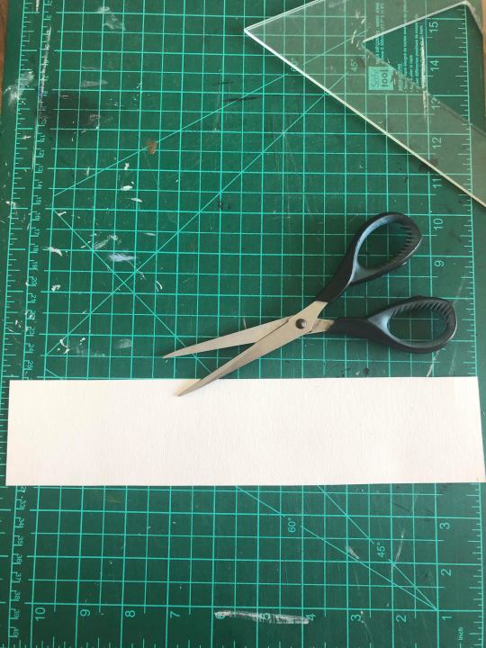
Pour réaliser votre reproduction tactile, il vous faut :
- plusieurs sortes de carton (épais, fin, emballage…),
- plusieurs sortes de papier (épais, fin, gaufré, texturé...),
- crayon de bois,
- calque,
- une paire de ciseaux,
- un cutter,
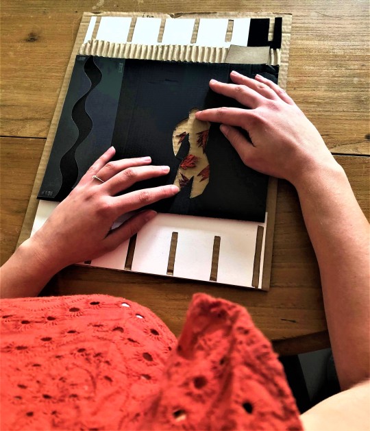
- de la colle.
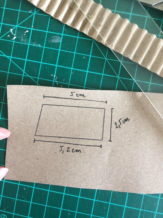
1. Choisissez un morceau de carton qui servira de support et qui, ici, représente la page blanche du manuscrit. Coupez ce carton pour obtenir un format rectangle de 27 x 36,5 cm.

2. Mesurez les différentes parties de l’œuvre et tracez directement sur le support en carton au crayon de bois.
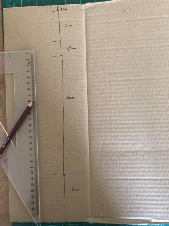
3. Dans un carton épais, découpez une forme de 27,2 x 22 cm.

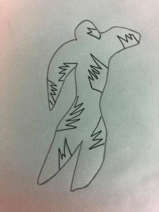
4. Pour la figure du clown, vous pouvez la dessiner directement sur un papier ou bien décalquer le modèle ci-dessous.
Il faudra bien respecter une hauteur de 12 cm entre le haut de la tête et la base des pieds. Si vous décidez de décalquer, reportez le dessin sur une feuille blanche
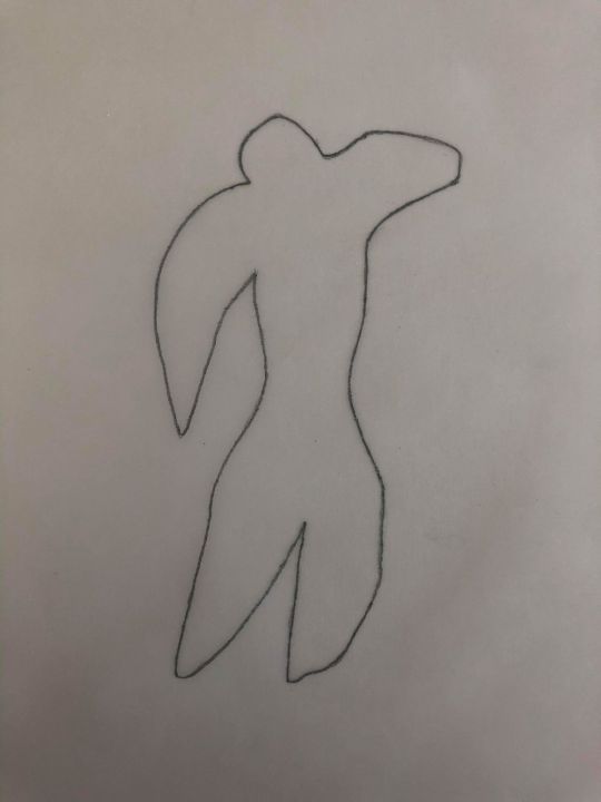
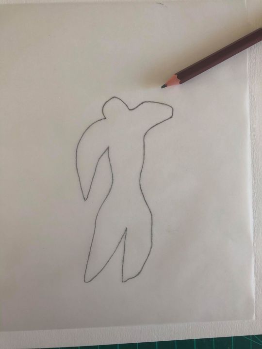
5. Découpez les contours du « Clown » dessiné sur la feuille blanche afin d’avoir un gabarit.

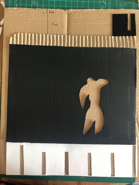
6. Placez le gabarit du « Clown » sur le format en carton épais (27,2 x 22 cm). Le clown doit être situé de façon excentrée, à droite.
L’extrémité de son bras droit doit être placée à 6 cm du bord droit vertical du carton et sa tête à 8 cm du bord horizontal haut du carton. Reportez les contours au crayon de bois.
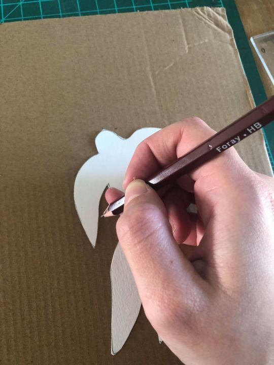

7. Découpez au cutter la forme du clown en suivant les contours tracés (il est préférable que cette partie soit réalisée par un adulte).

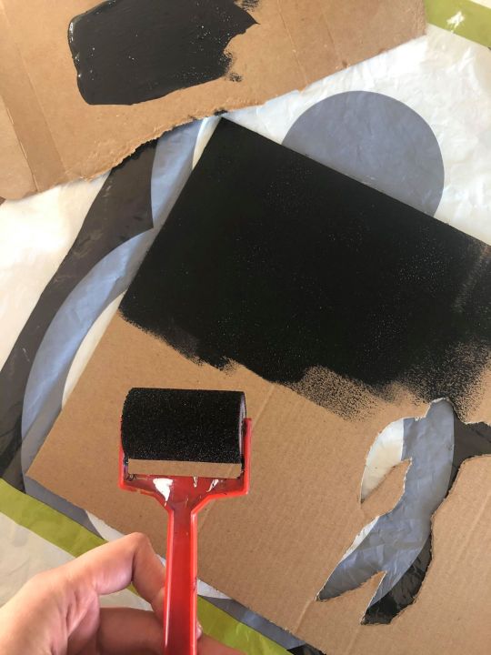
8. Peignez ce carton en noir ou d’une autre couleur.
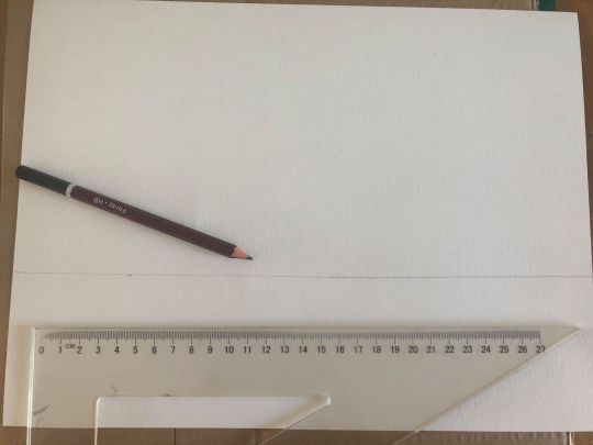
9. En attendant que la peinture sèche, munissez-vous d’une feuille de papier afin de créer la bande inférieure de l’œuvre. Tracez et découpez une bande d’une hauteur 8 cm x 27,2 cm.

10. Sur cette même bande de papier, tracez 5 rectangles verticaux d’une épaisseur de 0,6 cm. Découpez au cutter l’intérieur de ces rectangles.
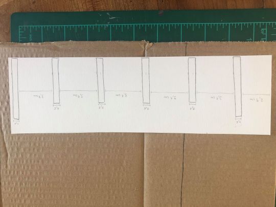


11. Maintenant, réalisez les mêmes étapes pour la bande supérieure de l’œuvre. Découpez un rectangle de 23 cm x 5 cm.
12. Dans cette bande de papier, tracez 5 rectangles verticaux d’une épaisseur de 0,6 cm.
Pour vous aider à les tracer, suivez bien le modèle ci-dessous en vous aidant également de la première bande réalisée précédemment.

13. Découpez l’intérieur des rectangles au cutter.

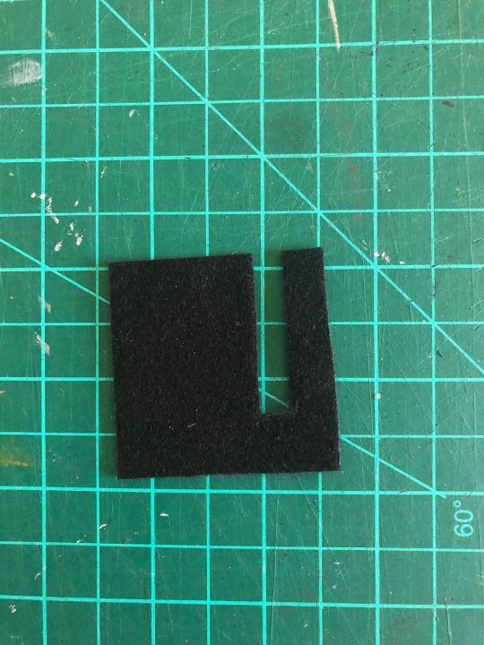
14. Ensuite choisissez un nouveau matériau qui n’a pas encore été utilisé. Ici, j’ai choisi de la feutrine. Découpez un carré de 5 cm x 5 cm.

15. Découpez à l’intérieur un rectangle vertical de 0,6 cm d’épaisseur. Placez-le à droite de la bande supérieure.

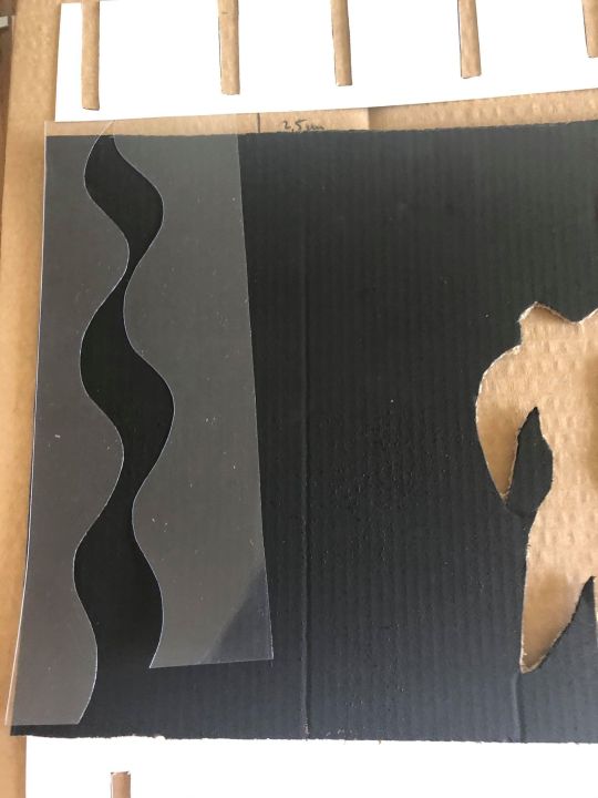
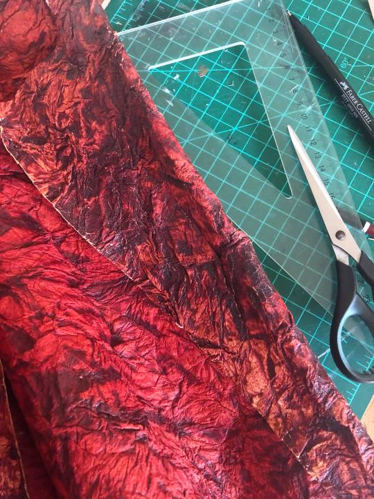
16. Maintenant, utilisez encore un autre matériau (le but est de diversifier les matériaux afin que l’on distingue bien chaque forme de l’œuvre).
Ici, j’utilise un papier plastique transparent où je découpe un rectangle de 6 cm x 21 cm. Avec vos ciseaux, découpez une vague verticale.

17. Une fois la vague découpée, faites-en sorte que les deux formes pleines (en plastique transparent ici) se rejoignent par les deux extrémités du haut. Attention à laisser une vague vide, créée par le carton noir du fond !
Observez bien le modèle ci-dessous ! Pour le reproduire, il faut que la vague de droite soit légèrement de biais vers la gauche et un peu plus courte en bas. Il faut donc que vous découpiez un petit morceau.

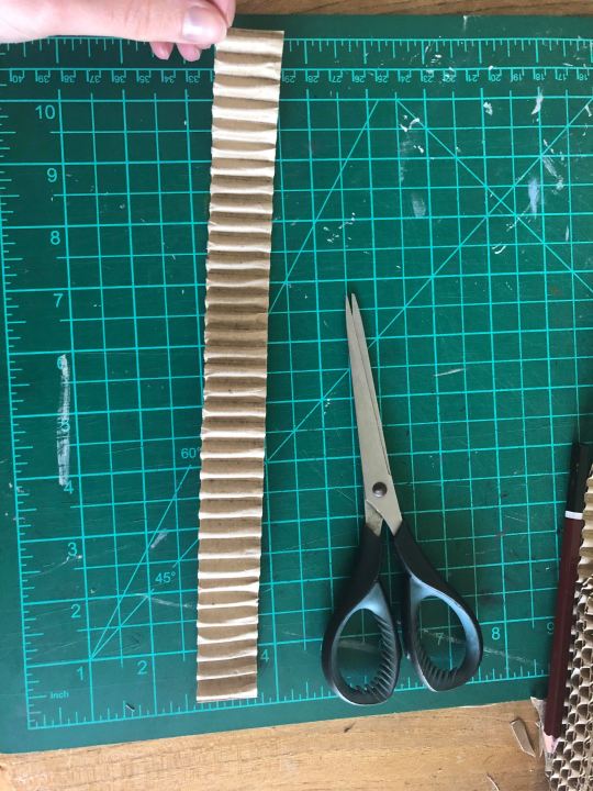
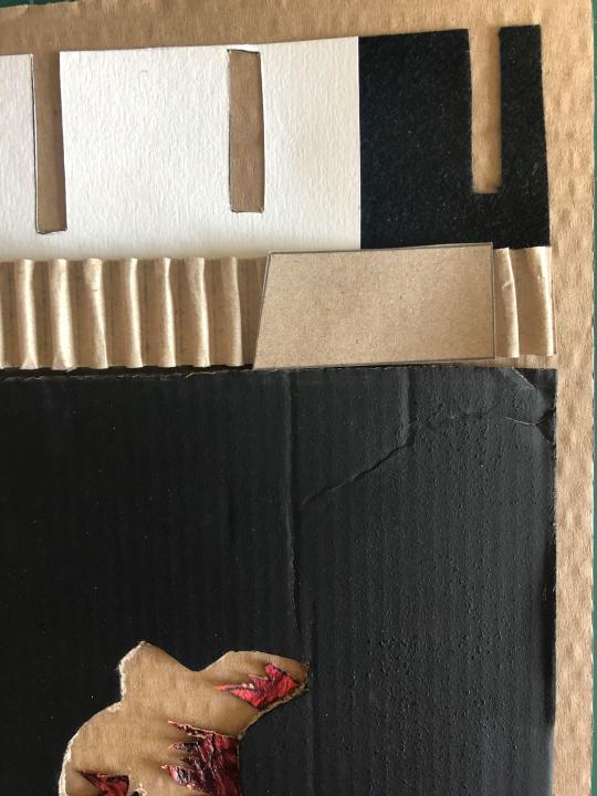
18. Il vous reste à créer une fine bande horizontale entre la bande supérieure et le carré noir.
Découpez un rectangle de 27,5 cm x 2,5 cm dans un autre matériau ; ici j’ai pris du carton ondulé.
19. Puis découpez, dans une feuille de papier, la forme ci-dessous que vous placerez à droite de la dernière bande découpée.

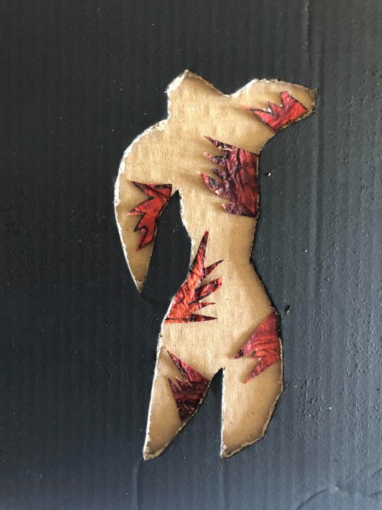
20. Pour terminer le découpage, prenez un dernier matériau (papier texturé, sequins…) pour réaliser les flammes dans le corps du clown.


21. Une fois toutes les formes de l’œuvre découpées dans divers matériaux, commencez à coller sur le support en carton, les éléments du bas vers le haut.

22. Faites en sorte que le carré noir soit très légèrement penché vers la droite.

23. Collez la fine bande verticale et le carré incisé d’un rectangle.
24. Puis, placez la bande supérieure : elle vient légèrement se superposer sur le carré de droite.

25. Ensuite la vague.
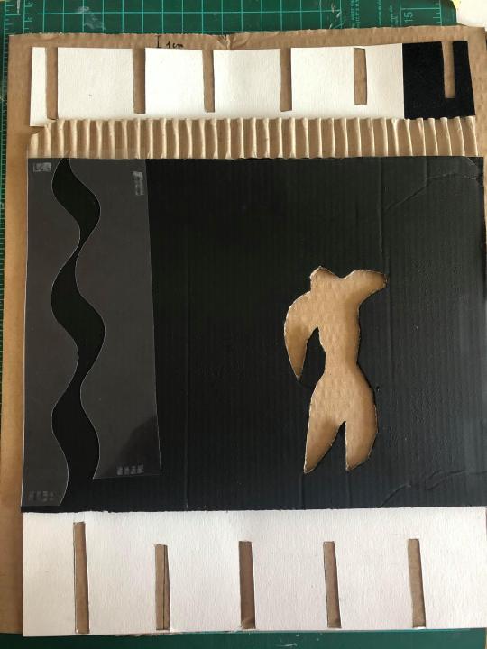
26. C’est le tour des « flammes » à l’intérieur de la forme du clown.
Félicitations ! Vous venez de réaliser une reproduction tactile qui reprend les formes de l’œuvre Le Clown de Matisse.
Maintenant, à vous de découvrir l’œuvre comme vous ne l’avez jamais « vue » ! Faites l’expérience sensorielle : du bout des doigts, parcourez l’œuvre. Prenez en compte, grâce au toucher, toutes les formes découpées, assemblées, superposées, que Matisse a utilisées pour composer l’image.
0 notes
Photo

I proud to be part of the Mourlot edition new letter. Since the establishment in 1852 in Paris and later, New York, @mourlotart has offered original fine art lithographs and lithographic. For more than half a century Fernand Mourlot was synonymous with the resurgence of lithography, a process which would attract the greatest artistic masters of our times. Under the direction of Fernand Mourlot, artists such as Picasso, Matisse, Chagall, Miró, Braque, Dubuffet, Léger, and Giacometti enriched their own work as well as contemporary art in general with a new medium of expression, lithography. Fine art lithographs offered a new realm of experimental possibilities for the printing of their masterpieces. Thanks to Fernand Mourlot, modern lithography took on a personality and found a future. #aimasainthunon #mourlotart #newyork #artloversnewyork #artnew #ongoingart #serafinaludlow #soloshownyc (at New Your City) https://www.instagram.com/p/B283-_gluZy/?igshid=g1h3r6uf73ql
0 notes
Photo
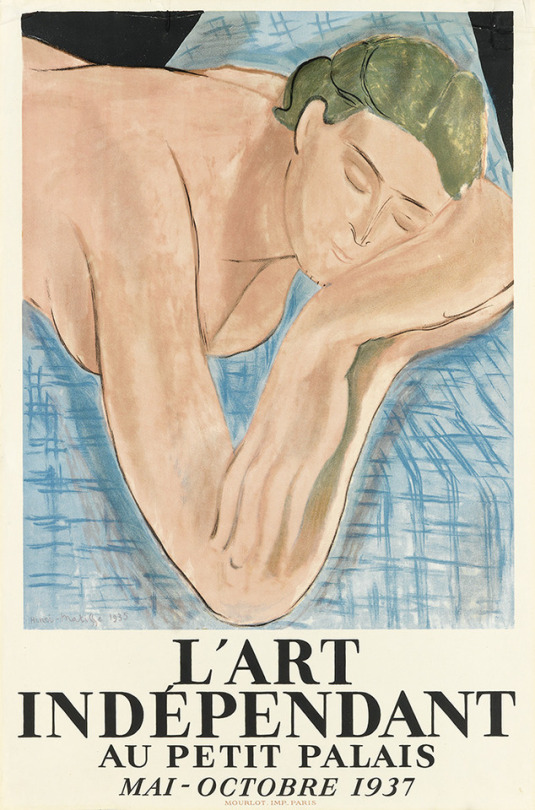
L'Art Indépendant au Petit Palais, Paris (1937). Henri Matisse (1869-1954). Mourlot, Paris. Poster.
The poster was printed by Fernand Mourlot who worked with Matisse on this project (the first time the two men collaborated), using the artist's painting, Le Reve (1935). The painting was brought to Mourlot's studio at the printing plant where Matisse "transformed freely the reproduction and did the same for the typography."
44 notes
·
View notes
Last Seen Blogs

bmeaker
bmeaker

banedaily
Bane Daily

always-andromeda
not a lot, just forever

yoseoji
lumière

ofspy
Code Name : Twilight