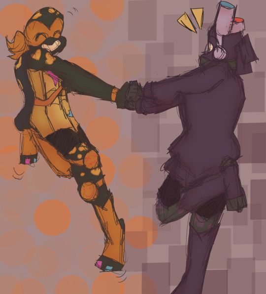
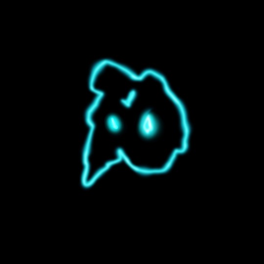
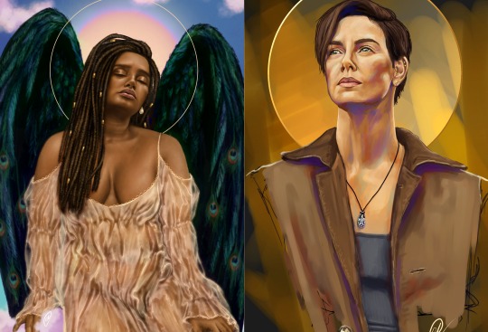
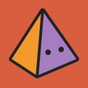
#Drew this in procreate btw I just started using it
Note
Hi, this post made me think of you https://nitashinori.tumblr.com/post/696813229073186816
AWW THANK U... :')) aldjakdj tbh it is a Challenge but the perk is i can rly draw anywhere at any time (in theory) eg on the toilet LMFAOAO (drew some of my best work while taking a dump ngl 😪
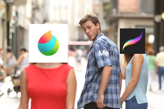
#no one asked but in case ppl r wondering ive been drawing on my phone w finger since abt umm 2016?#bc i started w doodling on snapchat lol#w their shitty doodle feature#and then in 2017 i switched to a drawing app called tayasui sketches pro (my 2017 phone sketches r embarassingly bad lmaoo#and then from then on i just gradually started making my doodles more detailed and tried fitting more on there#i should mention sketches doesnt let u resize ur canvas😬 so i also drew in super skinny vertical phone orientation and cropped afterward#ANYWAY i used that program for uhh... ig abt 5 yrs???#and then they recently updated the app and i hated it sm that i quit LMFAOO#so now i use an app called sketchbook app!!#ive been drawing my recent stuff on it#ITS BETTER TBH... but the ui is a little annoying#ok that was too long srry#ask#edit: o btw i also tried medibang and ibis and. I HATED THEM IM SRRY LIKE THEY R NOT OPTIMIZED FOR FINGER DRAWING AT ALL!!!!#same w procreate... those programs only rly work w pens/stylus :(( disappointing...#but its ok bc sketchbook is surprisingly rly great for finger drawing???#btw#does anyone want to see an evolution of my phone art...
4 notes
·
View notes
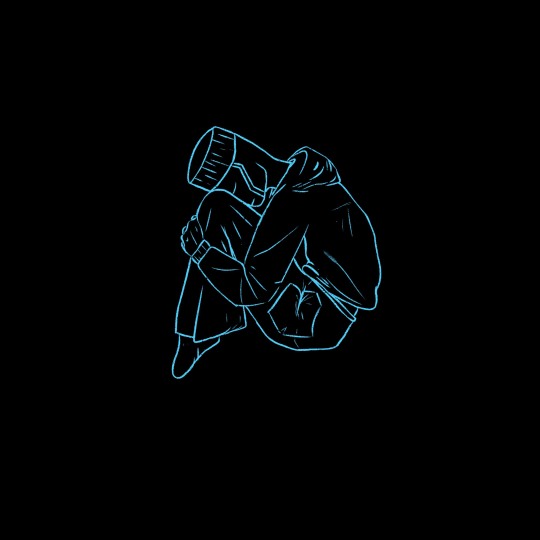
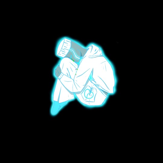
Photo


WIPs of some of my drawings where i made a full little painting for the sketch to nail colours or values first. i thought it would be fun to do a Behind The Scenes and also show u how some drawings changed, what i kept and what i discarded and at what point i just started adding unplanned details
all these were done using a mixture of sai and procreate
more comments on The Process under the cut
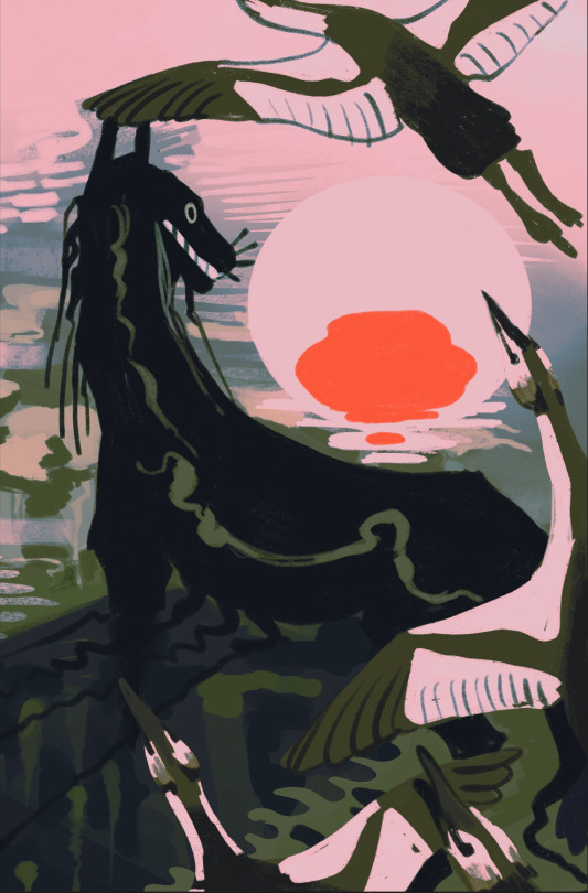
eye of the otherworld is inspired by a real photo i took two weeks ago!

i soooo wanted to draw water that looked like this, weeds and all, so the original colours of that sketch were picked direct from the photo. but i wasn’t satisfied with it so i changed it using a gradient map (you can see it’s crunchy on the borders between colours). for the final, i re-painted everything again using the sketch colours as a guide so that i would not end up with the crunchy edges a gradient map will give u, and so that i could add in extra contrast over the top. the black swirl pattern in the final was an ad lib lol but i’m really happy with how it gives the impression of water or liquid even if it’s not realistic... i will try again to recreate something like this photo tho because i am obsessed. the birds were originally swans but the necks were driving me crazy i needed a bird with a shorter neck and grebes are associated with this location in canon so it was perfect. they have very funny feet. the last detail i added to this was the white flashes in their primary flight feathers (which do not occur in nature btw)
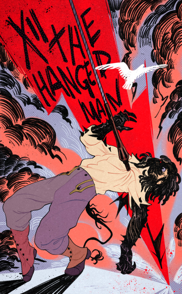
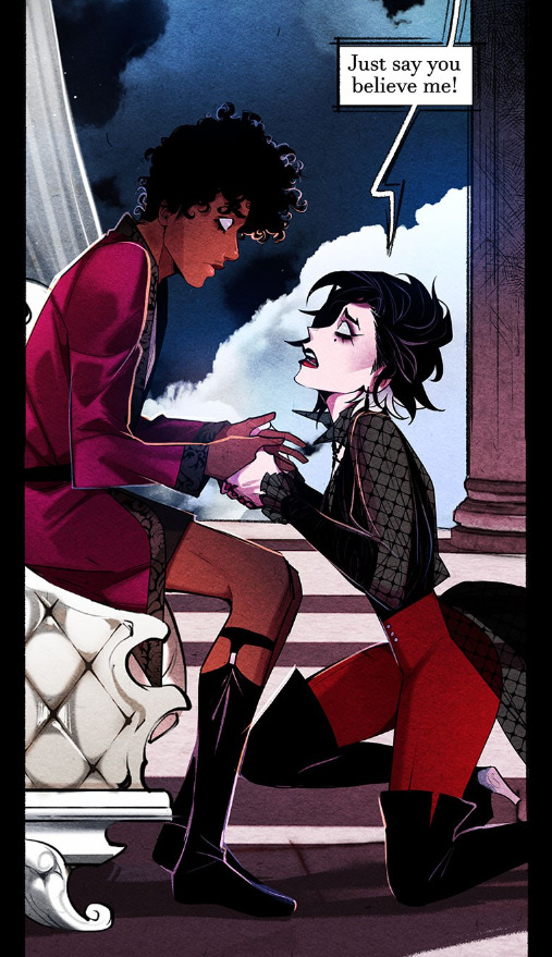
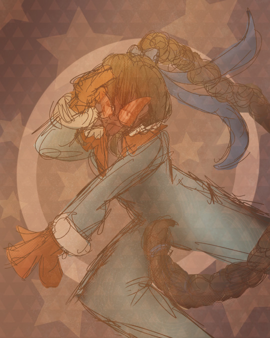
hanged man was an interesting one because it’s based on a sketch i made in 2020 when i first wrote this fun impalement scene
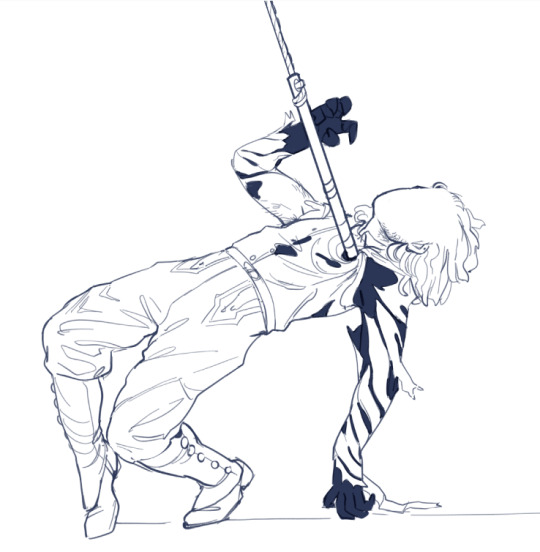
here is félix being impaled for the first time in 2020 by a rusted harpoon that essentially rips his human disguise off to reveal the black carapace underneath
for the coloured sketch in the photoset i re-lined this exact sketch in sai to update it to match my current lineart style, but as you can see i realised the pose itself needed work and not just a re-line so i completely redid it in procreate to exaggerate the pose and gestures. i went into this one already knowing exactly what bg colours i wanted so that was no issue but the hardest part was weirdly figuring out what he was going to be standing on. in canon he is standing on top of a very high wall and leaning back over a fatal drop. the black pencil lines in the clouds and the bird were ad libbed but i liked the idea of throwing the bird in as some extra symbol of freedom the likes of which you will not experience if you have been shot with a harpoon. the green was not working at all so the swap out to more purpley pink tones was last minute. i unified the different colours by using a colour-shifting brush (you’ll see that his gaiters are different colours - i didn’t hand pick those, the colour jitter did)
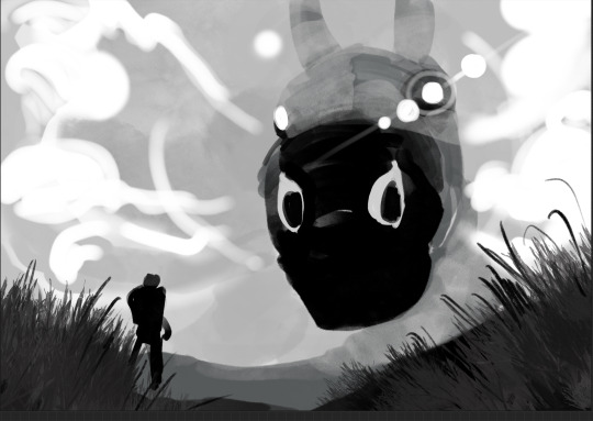
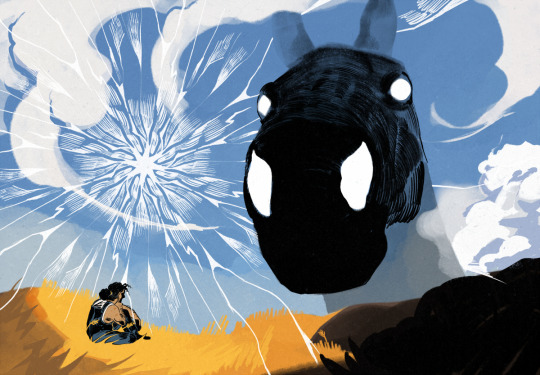
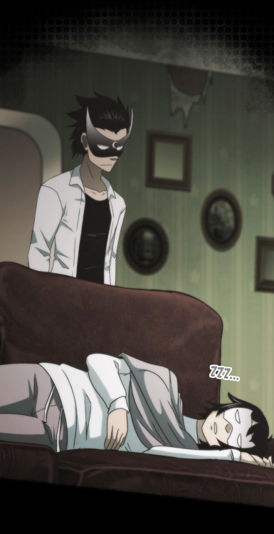
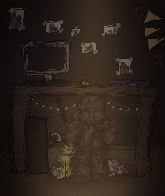
for Big Pascal... originally it was going to be a confrontation between the guy on the ground and pascal but i wasn’t feeling the standing pose and it ended up being... if not restful then at least maybe a little more benevolent than the shadow of colossus shit it was before. the white cracks in the sky were originally going to be black but it just didn’t work. a lot of people tag this one as some form of cowboy aesthetic which is funny to me. there’s no cowboys here
i do like the lens flare effect in the b&w thumbnail tbh and i think i kind of lost the low camera angle effect in the final
i drew a bonus comic of the two characters interacting during this scene (mostly the lil guy just trying to ignore what’s happening in the sky)
4K notes
·
View notes
Note
Let me preface this: I'm an architecture major
I used to be a big LO fan but obviously fell out of love of it like a lot of us did, and I know LO uses SketchUp for backgrounds. That is not an issue I have with the comic or any comic, I want artists to have an easier time in any way they can. I was always under the impression Rachel imported the models into Photoshop and drew over them like you can see in the early episodes with the sketchy lines. Well, school just started recently for me and I now have access to SketchUp for my coursework, and I made a few discoveries:
1. Photoshop cannot read SketchUp files, and while you can import them into Clip Studio through some configuring, they can be finicky and will lose parts in the importing process, so they are best used into the original SketchUp program to export as PNGs.
2. Many of the models Rachel uses are incredibly easy to find, especially if you put "modern", "luxury", or "classy" before the main part of the search. Many of the houses and rooms for example are first page results.
3. The biggest discovery: You know how we all assumed Rachel was hand-drawing all the lines over the SketchUp models and how she gave up the longer LO went on? Well, it's actually worse. It turns out SketchUp has a thing called "Styles" in it, which means you can mess with the lines and look of the model, such as making it look more like a blueprint or playing with the colors. Well, they have a lot of styles on SketchUp known as "sketchy lines", which are the exact ones Rachel used early in the comic to fit with her style, and it takes a literal click of a button to do. All she would do is pose the model, click the sketchy line style, and export the PNG. That's it.
So, yeah, Rachel is so checked out of the comic that she can't even bother to click a single button to make the models fit into the comic's style anymore. Use that information however you like.
Ouhhh sorry OP, I'm about to like, undo all the work you just put into that ask. We've already known about the 3D background problem for a long while now.
First off, it's more likely LO doesn't use SketchUp but actually Acon3D, which is a website that offers 3D models both for free and at cost, which are actually compatible with software like Clip Studio. As soon as you open it up you'll likely see a lot of very familiar backgrounds that are often used in romances, isekais, and period pieces. It's literally the go-to spot for Webtoon Originals creators. Like, to the point that I wouldn't be surprised if Naver was partnered with them because of how many of their creators use it.
Second, there's plenty of up-to-date evidence to support the fact that Rachel doesn't exclusively stick to one software, sometimes she's drawing in Photoshop, sometimes she's drawing in Clip Studio Paint, sometimes she's drawing in Procreate. She's undoubtedly using Clip Studio for her paneling, speech bubbles, and backgrounds, as there are built in tools to utilize and convert 3D materials into lineart, among other features that are recognizable as coming from CSP because they're not available in PS or Procreate.
Third, yes, she just uses filters to turn her backgrounds into lineart, this has been apparent since S1. The only backgrounds she's ever 'hand drawn' were the ones involving lots of nature and even those are mostly just Photoshop brushes stamped on.
Like I realize I'm probably bursting your bubble here and I apologize for that lmao but these buildings were never hand-drawn, this is not new information ( ̄﹏ ̄;) I appreciate you mentioning your own experiences with it as you're learning it though, I find once you start to learn the process yourself you really start to notice what others are doing. Even I've gone through that over the past couple years as I started to use 3D models and more advanced tools specifically for drawing webtoons.
I will mention btw, there's nothing wrong with using 3D models for your character drawing and backgrounds. The only time it tends to get frustrating is when you're reading a comic that isn't making any attempts to blend the background in with the art style.
Like, The Kiss Bet probably uses 3D models to help with perspective and laying out scenes quickly without second-guessing, but you can tell they still hand-draw over the models because they look natural and like they belong to the comic's stylization. The characters don't look out of place sitting in a living room and the living room doesn't look distracting.
But then you get stuff like Lore Olympus, Let's Play, and Midnight Poppy Land, and it becomes a bit more obvious they're not giving a shit about backgrounds lmao


I get it, WT's deadlines are cutthroat as fuck, but if it's getting to the point that you have an entire team behind you and you're literally just copy pasting video game models from Phantom Hourglass, then it's probably time to re-focus your priorities a bit. There are comics with as few as 1-2 assistants (and even in some cases no assistants at all!!) pulling off backgrounds better than this, even when they're taking shortcuts.
(Nevermore and City of Blank)
But a lot of that does come down to how WT manages its expectations as well as support for their creators. The deadlines and requirements WT puts their creators under are insane and awful in the long-term, and they're not acting with the amount of professionalism they ought to be for a platform that's trying to breakout as a major publisher here in the West. I feel like it comes down to WT loosening the choke chain around their creators, but also creating a standardized level of quality to ensure it's not suffering for the sake of quantity. The traditional literature industry has real editors and stages of quality control for a reason, whereas WT is more interested in just throwing as many series at the wall and dumping all their stock into the ones that stick.
#lore olympus critical#lo critical#webtoons critical#antiloreolympus#anti lore olympus#ama#ask me anything#anon ama#anon ask me anything
86 notes
·
View notes
Text

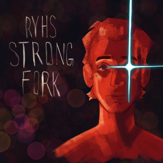
drawtober day 3! rhys strongfork from tales from the borderlands 😏
EDIT: noticed a month later that i spelt his name wrong after playing scrabble with the letters when trying to get the typography as close the the album as possible! *deep breath* ahhhhhHHHH. i did reblog the corrected version, but i dont think enough people will see that, so im just gonna edit my og post!

ramblings, playlist link, & alternate version under the cut :)
i have so many thoughts and feelings about this!! i got the idea for this bc of the attached playlist (love it a lot btw. good job), and i was so excited to do a piece referencing album art. ive like never done any art that does a reinterpretation of another piece of art (theres another word for it that i believe starts with R but im having a brain fart and can't remember, bleh), so this was tons of fun!
u can bet ur bottom dollar i was listening to touch tone telephone for a while as i drew this 💀 it truly gets me hype. and for those unaware, this replication (theres the word!) was based off of the album spirit phone by lemon demon! at some point while going though this playlist i had a Vision ™ for today's drawtober (aka tuesday's, but ive been busy working so) and HAD to execute it 😎
uh, i used a brush i havent really used before for this as well! i tried to be painterly and it was quite fun :3c it's called spectra and it's on procreate for all my ipad babies out there. 10/10 i recommend it. i think i'll be painting with it more when im in the mood for those vibes tbh
so yeah, this is basically my fav so far. like, i enjoy this piece an unreasonable amount. i made it my wallpaper 😭
oct. 6th edit:
I said id add the alternate version under cut and then never did 😭 my bad yall. here it is, actually under a cut
42 notes
·
View notes
Text
2023 YEAR IN REVIEW!!!


My artstyle changed a lot this year, especially after my shift from ibis paint to procreate after getting my iPad (drawing on an iPad is the BEST btw 100% recommend I love it way more than a phone and it didn’t die after a month like my old wacom 💀💀). I’m relatively happy with where my art is atm and I hope to continue to improve in 2024!
Explanation of all the silly art down below! (Mostly so I can tell y’all who the fanart is for but also cause I like rambling)
January: A drawing of my Rise Leo human design I did to test out a pixel brush I found for Ibis Paint. He’s very fun to draw hehe I need to draw him more-
February: I wanted to learn how to draw the future designs of Leo and Mikey along with CJ so I planned to draw them all together! I struggled with Leo though so I just got rid of him. Sorry Peepaw 😞😞💔💔💔
March: Fanart for @beannary ‘s TLP au! I love it so much so I had to draw smth for it hehe 😈😈💥💥💥 which reminds me I need to draw more at some point- might redraw it at some point cause I’m not super happy with how it turned out but I do like the idea a lot
April: The month I created Reticent! April’s Fools was the first episode I came up with so I drew a chapter poster! It ended up being very different to the chapter cover I drew a couple months later but it’s still cool :D Leo is being weirdly affectionate to Mikey though what the heck that isn’t like him smh. Although I guess it was meant to be purposefully exaggerated sooooo 🥰
May: Reticent Casey!!! I don’t have much to say it’s just Reticent Casey HDKSGXKSHD this wasnt a very good art month
June: Krangified Donnie is literally my favourite concept ever thats it that’s all I have to say dbskdbwkh I adore Krangified Donnie and if the Rise brainrot takes over the Reticent brainrot for a while then I will probably be drawing Krangified Donnie during that time sorry not sorry
July: Reticent Chapter 3’s cover yippee!!! Still my favourite Reticent cover although Chapter 8’s is a close second (I can’t wait to post it once it’s been betaread yippee!!!). The scribble over Leo’s eyes is literally just because I was struggling to draw his eyes and i was getting annoyed dbskdbskdb it’s actually a very common issue with him (common Ret!Leo L). Also Mikey being reflected in the mirror is a reference to Mirror Man by Jack Stauber which I’ve basically considered his theme song since @aaronymous999 introduced it to me ebwjcbkwhd thank you Mr. Aaronymous! Also somebody said he was in the barbie box and I still need to draw that to this day because Mikey would’ve killed to go see Barbie.
August: RET DONNIE WOOOOO he’s being bullied again!!! I drew that piece for a colour palette challenge request and realised I got the prompt wrong so I just made it into its own thing 💥💥💥 it’s usually a flickering light gif but I chose to just use the version with the light on for this post. The photos in the background were really fun to draw hehe either April’s or Mikey’s is my favourite.
September: MY 500 FOLLOWER DTIYS YIPPEE (/my 150 follower DTIYS for tumblr). This one took me. Forever to draw and I love it to pieces hehe it was really fun to design Mikey’s room and figure out outfits for the sillies and idk the concept of a sleepover just seemed really fun to me dbskbdkdb- and all the entries I got were so so awesome I loved them all to pieces!!! I still look at them all the time hehe
October: FANART OF @endlesslogo ‘S HUMAN RISE LEO DESIGN WOOOOOO!!! This was the piece I started rendering on hehe it was so much fun to draw!!!! Although I did have a fight with rendering the hair for over an hour svsjegksbdk HOW DO PEOPLE DO IT FR!!!
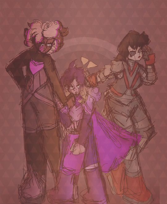
November: Me and my friends were working on a crossover between our TMNT iterations so I drew all of our Karai’s together!!! Confluence Karai is on the left, created by Salem and Marine, New Stars Karai is in the middle created by Starla, and Reticent Karai is on the right created by me! All our Karais have such cool designs AHHHHH literally dead over them constantly/pos
December: Most of December I spent drawing Christmas presents so this was my present for Salem!!! Confluence!Jonatello my beloved….
10 notes
·
View notes
Text
Hey! First proper post on this account!
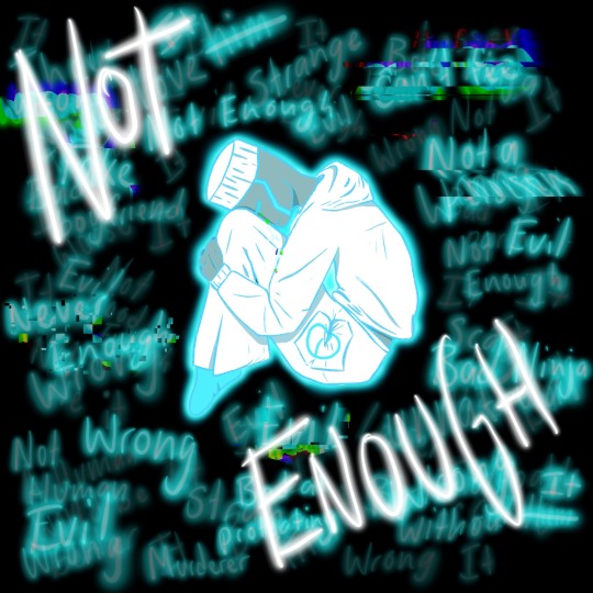
I’ve recently gotten into the Lego Ninjago fandom and I drew Zane, I’m gonna put the image here but then I’m probably gonna end up rambling a bit under the cut so proceed with caution

so. like i said i've gotten into the ninjago fandom recently, and basically how that happened is like maybe five years ago? or thereabouts when I was but a child my brother was watching it and so i sorta watched it with him in like bits and stuff and then recently he was watching some of the more recent stuff that's come out and i was sorta just there and i watched a bit and i was like "oh this isn't half bad" and then i read a couple fics and looked at some fanart, and then i started shipping polyninja and coming up with headcannons, and then I spent like my whole time that was meant to be like a three day holiday with my family on a three day holiday in bed and i read like most of the polninja fics on ao3 and zane became my blorbo so I read some zangst um and yeah here we are. so yeah I am currently rewatching the show (I'm only up to like episode 4 i only started at like midnight last night) but I drew this.
But about the actual drawing bc you probably care more about that then my random rambling so um yeah:
so if you can't tell my boi is having a panic attack and all those words around him? yeah those are things that he's thinking about himself. yeah the shading isnt great but honestly? hes floating in the middle of a black void glowing with glowing words floating around him so fuck shading lighting doesn't make sense and that's ok
I'm not 100% happy with how I've drawn him but that's just something I'm gonna have to figure out through trial and error and time and shit so w/e
also um I found the glitch effect on procreate and had to stop myself from using it on like p much everything so yeah um his tears are glitching as well btw if you didn't notice
also titanium zane has white hair in my heart ok sue me
what was that? no of course his feet don't get cold what? he's a nindroid and also the master of ice why would you- the socks? oh they um- they help with stealth! and keeping quiet! no he definetly dosen't wear them around the monastery/bounty because they were a gag gift from his boyfriends and they're soft and fluffy and remind him of them why would you think that?
also all of them have matching trackies like this in their elemental colour with their symbl thingo on the pocket (even wu and nya and lloyd and pixal) and polyninja wear them like all the time when they're not in their ninja shit to be cheesy or whatever and the others like never wear them but lloyd secretly loves his and nya has honestly sorta forgotten she owns some until kai pulls hers and lloyds out one night and makes them wear them andd have a rgb sibling movie night and wu is just like what ???? why woukd you get me these??? ??? ??? and they're literally just an item of clothing to pixal.
oh also i forgot to sign this and i don't have the energy to go back and do it and then get all the images to my laptop again and everything so just. don't steal my art ok? coolio
oh also i intend to write a fic to go with this at some point but don't hold me to that.

#charli tries to be creative#2d visual art#On My IPad#lego ninjago#zane julien#zane#zane ninjago#titanium zane#ninjago#panic attack#zane is my autistic gay depressed robot ninja child ok i would do anything for him
12 notes
·
View notes
Note
9, 23, 26, 30 :3
HI!!!!!! :3
9. What are your file name conventions
i usually draw on ipad so i don't even name them HSIDVHWOEFI whatever the default procreate and medibang names are ... on pc though it's usually the subject's name spelt incorrectly i.e. jyoosh, josh, jyushey, juice, etc...
23. Do you use different layer modes
YES DARKEN LAYERS MY BELOVED i use them soooooo much theyre so good for touchups for me in particular who tends to accidentally start with really desaturated colours and gradually darkens/saturates them as i work on it lol... otherwise i'm not huge on multiply or the other usual suspects just bc it doesn't work super well with my palettes, if i start from grayscale i'll usually use just use gradient maps and wing it from there but occasionally i will throw a hue layer over the top at the end of a piece if the colours don't look very harmonised
26. What's a piece that got a wildly different interpretation from what you intended
i don't really think i draw anything with enough story or symbolism for it to be interpreted in any way other than "wow! nice!" SDKJVN but i'm not a huge shipper so sometimes when i draw two charas for funsies and get ship tags i'm like huh... this reads as ship art? which i don't mind but it's just like an oh. i guess so! kind of moment
30. What piece of yours do you think is underrated
TBH... nothing in particular i think the social media netizens have been very kind to me over the past few years and a lot of the things i post get a lot of love so i'm very grateful ;w;...
if anyone wants to check something underrated out though they should take a peek at this CHUUOKU AU ZINE I PARTICIPATED IN which is really awesome and is only one order away from the first stretch goal!!!!!!!! I DREW JIRO AND JYUSHI TOGETHER FOR IT BTW!!!!!!!!
2 notes
·
View notes
Text
Art Advice #4 - A Beginner’s Guide to Digital Art
Hi all!
This weeks entry into my Art Advice tag, where I offer various advice for artists of any skill level, is about digital art! Now, I am by no means an expert at digital (I’ve been doing it for nearly 8 years at this point and that is almost entirely self taught), but I have picked up a few pointers in that time which will hopefully help anyone just starting out!
(this blogpost is a little over 2000 words long btw)
A Beginner’s Guide to Digital Art
I know that the world of digital art has changed drastically in the 8 odd years since I started, but I’d still say that some of the options I started out with will be just as good for anyone who’s starting out now!
As always, I’ll be splitting this into sections to make it easier for you to navigate this post!
Part 1 - Equipment/Hardware
There are a lot of drawing tablet options on the market at the moment, and I’m not going to pretend that I know anything about half of them lol. But I think for a beginner, don’t worry about going for the most expensive option, even if the reviews are really good or your favourite artist uses it, especially if it is way above your budget!
An important thing to know is that there are two types of tablet. One is the plug-in kind. These are essentially a pad which you plug into your laptop or computer and draw on that whilst looking at the screen (they basically work the same way as a plug in mouse works). The other kind is the screen variety, which is a lot more like what most of us know as ‘tablets’ nowadays. And you draw directly onto the screen.
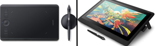
(a plug-in vs on screen tablet, both from Wacom)
Now, as for choosing between these, it is honestly a personal choice. But I’d say if you’re just wanting to try digital and you’re on a budget, a plug-in tablet can be really useful since it gets you used to the mechanics of what digital is like, and they are often significantly cheaper than the screen alternatives. I would say that plug-in tablets are a big learning curve, especially if you’re used to doing traditional stuff, but I do know a lot of professional artists who still use this kind of tablet when doing their work, so if it’s something you can get used to I would definitely consider it! Also, they’re often a lot more portable than some screen tablets! The first one I had was a Huion (a model so old that I can’t even find a link to it now lol), and I also know that Wacom are a well known brand that do some decent plug-in tablet. I’d recommend you do your own research on other brands and options, though!
Screen tablets are often a lot more expensive, but if you’re used to traditional art, they are a lot easier to get a handle of! But I know if you already have something like an iPad, or other general use tablets, then they offer apps that you can use to draw on (as well as things like the Apple pen, or other stylus’). The big difference between using these general tablets and ones specifically designed for drawing is pretty much purely a personal choice. I personally prefer the bigger screen of my XP-Pen tablet, along with a special screen protector that removes the shininess of the tablet screen and makes it feel more like ‘paper’ over when I used a general use tablet it draw. But if you already have an iPad, or something similar, then it’s honestly a really great starting point!
I think it’s important for me to mention that you don’t need fancy equipment to be an artist. The incredible Elicia Donze has revealed countless times how she has very basic equipment but still manages to produce the most stunning artworks! All you really need is some kind of drawing apparatus and a lot of patience lol! Getting good at any kind of art takes a lot of time and effort, but I would definitely say it’s worth it when you’re able to look back at your progress!
Part 2 - Software/Drawing Programs
Much like with the hardware discussion, choosing which program to use is entirely down to personal preference. I personally have never really liked Photoshop purely because it’s really complicated, but I know so many artists swear by it.
I think the main aspect to consider when you’re starting out is whether you want to pay for a program. Software like Photoshop, Clip Studio Paint and Procreate are some of the popular ones I hear about a lot of people using, but all require you to purchase or subscribe to them. So if you’re young or on a very tight budget, I’d honestly recommend the free alternative versions of these, such as Krita (Krita is quite a large program, but it has a lot of really awesome features and is very similar to Photoshop!), Gimp (this one is similar to Krita, but has slightly less options, I’d honestly recommend Gimp for anyone who does photo editing though!) or FireAlpaca (this is the one I use, by the way and it’s a pretty simple program, but has a lot of fantastic features and is perfect for how I work!). These don’t have as many features as some of the paid alternatives, but I honestly think all you really need to start digital art is some kind of ‘canvas’ and set of brushes!
Another great free program for beginners I’d recommend is MyPaint, which is great for doodling and just getting used to how digital art feels in comparison to traditional! It also has a bunch of ‘traditional style’ brushes, to make it look like charcoal or watercolour (which I’m sure the paid alternatives have too, but it’s always better when it’s free, I find lol...)

(this is an example of a drawing I did on MyPaint using the ‘charcoal’ effect brush!)
Most of the sites are pretty self explanatory, with sections dedicated to different brushes (I’ll go into the types of brushes later on in this post btw!), adjusting brush size, shape and opacity, a colour wheel, etc. You also have a section dedicated to ‘layers’ (another thing I’ll go into more detail later), and various ‘filters’ and editing options and effects you can add to your work to make it more interesting!
I’d really just recommend playing around with programs until you find your one!
Part 3 - The Pros of Digital Art!
I realise this section should probably earlier in this blog post lol, but I kinda wanted to go into what digital art can achieve in comparison to traditional art, and how beginner artists can utilise this!
I definitely didn’t take advantage of certain aspects of digital art when I first got into it, and they’re things that would have definitely made my life a whole lot easier lol!
Digital art allows you to tweak drawings as you do them. So if you accidentally drew the eye too far to the right, then you can easily move it to the right place. (I usually do this by selecting whichever area is wrong, cutting it out and then pasting it into a new area... And yes, there is probably a better and quick way of doing this but...I haven’t found that way yet lol...). And I honestly think that this has allowed me to look a lot more at a reference image in order to figure out where I’ve gone wrong with a drawing! Whereas with traditional art, I usually spend so long trying to get an eye right, that even if it’s slightly in the wrong place, I don’t want to completely redo that section. Digital allows you to completely rub out sections without leaving indents, which is honestly such a saving grace!
Another pro of digital is the Undo/Ctrl Z function! This means you can easily go back to before you made a major mistake with just a click of Ctrl Z... Though I have to say that this function has honestly ruined traditional art for me... Oh what wouldn’t I give for a real life Ctrl Z... But yeah, this is a great part of digital art and definitely something you will grow to love lol!
Another great thing about digital is that it allows you to flip and turn a canvas as you’re drawing on it. I spent a lot of time trying to turn my tablet around in order to draw certain parts of a piece before I realised you can turn the canvas itself without having to move yourself or your tablet!
Layers are another part of digital that can be super useful, and I have to be honest but I don’t really use them a lot. I know a lot of artists create layers for every section of their artworks (so, one for the linework, one for colouring, a separate one for the background, etc etc...). And there’s something really great about being able to paint without worrying about smudging into a previous section of the painting. This works well for my work since I do a lot of bright backgrounds. I also often create a lot of ‘versions’ of my works, so it’s useful to be able to change the background without affecting the main figure of the piece! (I have to say that I often work in one big layer when I’m doing paintings, just because I like how it feels more like ‘traditional’ art that way, but layers are such a brilliant tool, and definitely something you should play around with!)
The eyedropper tool is another one that is really useful! Although I never colour pick from my reference photos, I know some artists find this useful when they were just starting out (especially if you’re not sure what colour to make shadows or how to mix skin tones, etc etc). The eyedropper basically means you don’t need to mix your colours every time
Part 4 - Just some other things I wish I had known about when I was starting out lol...
This last section is just dedicated to a few things that I would have liked to have known when I was just starting out all those years ago.
First one is fluffy/textured brushes!
I spent most of my art life from 2013 until 2016 using ‘round’ brushes which are notoriously hard to blend with, so I’d recommend either downloading some fluffy/textured brushes (DeviantArt was where I got mine from a few years back, but there are probably other places you can get them for free too!) to your program of choice, since most of the programs I’ve used haven’t had fluffy/textured brushes as pre-set.
I may make another post about how I blend in my artworks if that’s something people would be interested in?
(this is an example of textured brush blending vs round brush blending... I usually opt for round brushes for rougher blending styles and the textured brushes for more smooth and ‘realistic’ blending... for a lot of pieces, though, I use both brushes (the round brushes are good for details!) in the same way that you use different sized brushes for real paintings!)
The next thing I wish I’d discovered earlier is the Brush Stabiliser option. Some programs may do this automatically, but the one I use (FireAlpaca) requires you to manually change the amount of stabilising you have on your brush. This is particularly useful if you want to draw neat lines or straight lines (the stabiliser essentially slows down the ‘ink’ as you’re drawing). I only recently started using the stabiliser, and although I still like having it mostly turned ‘off’ for doing sketchy work, it does make doing line work a lot easier, and also gives pieces a more polished look!
Next advice is to explore all the options you can in whatever program you use!
I feel like with certain programs, you can get overwhelmed by choice and you end up just using a few of the functions. But I’d really recommend just playing around with these programs, trying all the filters and editing options to get used to how the program works. You can often find interesting ways to adjust your artworks this way! In a way I’d recommend this way of working more than finding tutorials made by other people... Unless there’s a specific function you want to learn how to do, just having fun with digital art is a major part of it’s appeal to me!
~
There are probably a lot of other options I could go into, but this is already over 2000 words long, so I’ll leave it here for now lol! (I may do a part 2 though so... keep a look out for that!)
As always, if you have any questions to things I’ve said here, or are just looking for more advice, don’t hesitate to message me!
And if you like my work on here (art & blog posts) feel free to support me on my Ko-Fi! <3
#art advice#digital art#art advice for beginners#digital art for beginners#artist advice#digital art tips#artists on tumblr#just want to say again that i am not an expert at this at ALL lol#i just want to offer some really basic advice to anyone interested in starting out with digital!
92 notes
·
View notes
Note
You drew with your ipad and stylus when I first started following you, have you updated your setup or still use that one. I'm asking cause I want to try my hand at drawing and I'm not sure where to start. You've improved tremendously btw!
Thank you so much!
I still mainly use my iPad and Medibang Paint Pro for a good chunk of my art. I just really like the mobility and I’m used to the set up. I have however been dipping my hand into Procreate from time to time. I like the effects and texture brushes so if I need a little extra oomf I move stuff over there. But if you ever need to change line colors, Medibang is better.
I’ve also started using Clip Studio Paint a lot more often. I’m trying to figure out the animation stuff on there and I mainly use it for boards. It’s a nice combo of Medibang and Pro but not as mobile. I want to get accustomed to Storyboard Pro or Toon Boom (but they’re so dang expensive 😭) maybe I’ll get into those if I ever start a Patreon and have money dedicated completely to improving my art.
I’ve just learned a lot of the time that it doesn’t matter what your setup is as long as you know how to use it to the fullest. Tools are nothing without the artist. Experiment and see what works best for you.
42 notes
·
View notes
Photo

Just another #procreate #drawing I did a while ago, topped with a #lettering and made with mostly the same steps as the #drawings before. For all who might be new here, down below‘s an summary instruction for interested ones. Btw : The drawing is inspired from my window view. ❤️ 💬comment/ Motivation I never thought that I would be so interested and also become so good in #handlettering over time just from what I‘ve expected. I‘m Not aiming to become a professional like for example @madebyjoesen or reach any goals, I just want it to use it as an addition here and there. But for this, even if I have still some trouble with single #letters , I become better over time and liking own #creations more and more. So if you ever want to do something, start doing it and try to hold on even if you might be disappointed during the progress. 🎨Materials and methods (includes non-paid advertisments) I opened an A5-sized canvas, picked a #blue shade I liked and did a gradient from light to dark in the background. On a next layer, I drew #trees with an even darker shade in the foreground and used a clipping mask to shade them and added the white #snow with kind of splatter brush. I also used the same brush to add all the additional ‚normal‘ #snowflakes for the scene. Because snowflakes are tiny, symmetric #crystals, I drew some of them with the symmetry tool in procreate (each on a separate layer) and placed them where I thought they looked best. In the end I added the lettering on another layer. #️⃣ #art #artwork #procreateart #procreateartwork #winterart #wintertime #winter #snowflake #winterscene #digitalart #digitaldrawing #snowflakeart #creation #creative #natureinspired #letitsnow #snowtime https://www.instagram.com/p/CXRv0PdMUhi/?utm_medium=tumblr
#procreate#drawing#lettering#drawings#handlettering#letters#creations#blue#trees#snow#snowflakes#crystals#art#artwork#procreateart#procreateartwork#winterart#wintertime#winter#snowflake#winterscene#digitalart#digitaldrawing#snowflakeart#creation#creative#natureinspired#letitsnow#snowtime
0 notes
Last Seen Blogs
cassandra742
Trans girl 🥰
spdermen
¯\_(ツ)_/¯

sahdornelllas
Sah
nctesting
nctesting
sndssamy68
Untitled