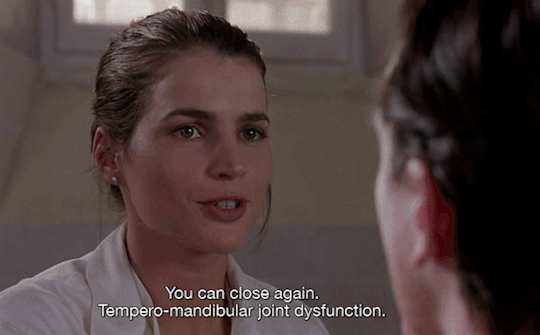
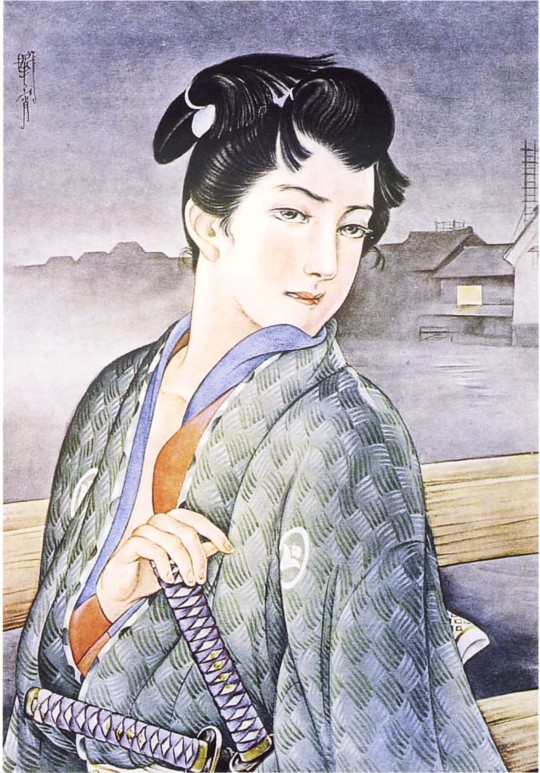
#Captives (1994)
Text

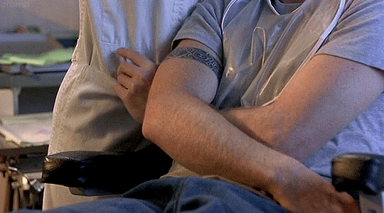
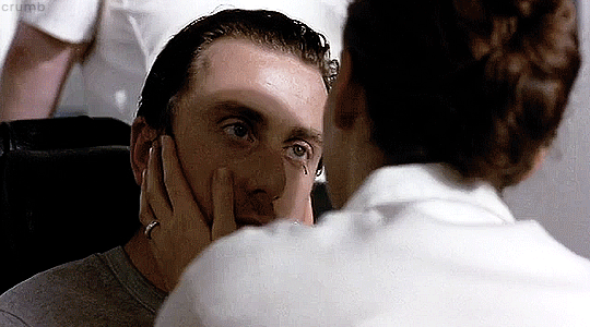
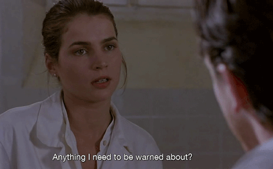
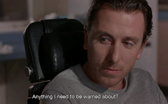
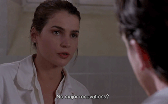
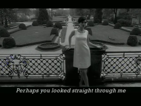
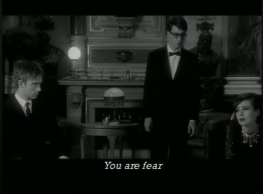
Captives (1994) dir. Angela Pope
#Captives (1994)#captives 1994#Tim Roth#filmedit#dailyfilmsource#dailyflicks#cinemapix#filmtvdaily#filmtvsource#90s cinema#junkfooddaily#fyeahmovies#filmtv#cinematv#tvandfilm#women directors#userfilm#crumbedit
442 notes
·
View notes
Text

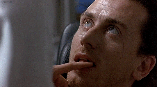
im sick in bed rn so this is what im doing <3
#coughing and sniffling while watching captives. What a life#tim roth#philip chaney#captives#captives 1994
19 notes
·
View notes


Text
CAPTIVES (1994) FANCAM LOL
30 notes
·
View notes
Text
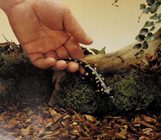
A pet European fire salamander
By: Neil Sutherland
From: A Practical Guide to Exotic Pets
1994
#captivity#fire salamander#salamander#amphibian#1994#1990s#Chris Mattison#A Practical Guide to Exotic Pets
114 notes
·
View notes
Text
to the end (1994) - blur ft. françoise hardy
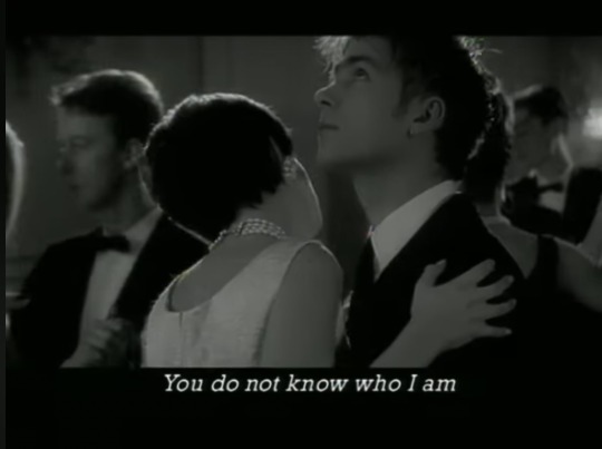

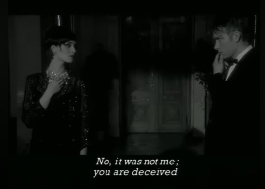
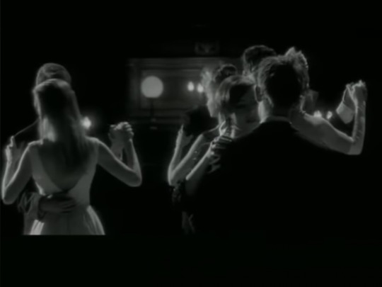
#blur#to the end#parklife#1994#damon albarn#graham coxon#alex james#dave rowntree#francoise hardy#had this video on loop for hours. its beautiful#love an artistic b&w music video based of a 1960s french new wave film!#damon is so serious in this. its captivating to me#anyone else sensing homoerotic vibes from damon and graham in this mv. or is it just me
22 notes
·
View notes
Text
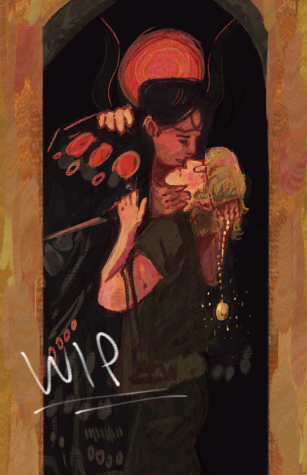
There can only be one Ra // WIP
still on my grind of never finishing anything
#stargate#stargate 1994#ra#daniel jackson#my art#fanart#this movie wasn't even that good i just love ra's costumes and daniel jackson's dumb ass personality has captivated me#not to put on my history student hat#but the entire premise of the movie uses “mystery race” ideas to discredit the accomplishments and culture of ancient egyptian society#very much in a eurocentric colonial way#a fun movie but i'd like to think we've moved past “aliens built the pyramids”#anyway. gustav klimt's the kiss anybody
14 notes
·
View notes
Text
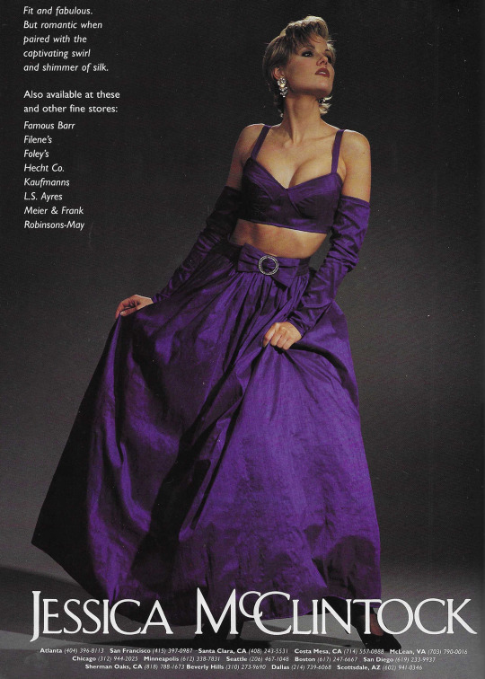
March 1994. 'Fit and fabulous. But romantic when paired with the captivating swirl and shimmer of silk.'
126 notes
·
View notes
Text


⠀⠀⠀⠀ ⠀⠀⠀❝ 𝐀𝐀𝐋𝐈𝐘𝐀𝐇’𝐒 𝐔𝐍𝐒𝐓𝐎𝐏𝐏𝐀𝐁𝐋𝐄 𝐈𝐍𝐅𝐋𝐔𝐄𝐍𝐂𝐄 ! ❞
⠀⠀⠀⠀⠀⠀AALIYAH’S UNFORGETTABLE FASHION SENSE ⠀⠀⠀⠀⠀⠀EXPLORED, ─── AN ARTICLE WRITTEN & PHOTO ⠀⠀⠀⠀⠀⠀⠀ ⠀⠀⠀⠀⠀⠀⠀ EDITS MADE BY MIA GOLDS

If you ask anyone in the world to define the legacy of Aaliyah, you’ll receive a myriad of responses. Some will praise the rising IT Girl whose precious life tragically ended too soon, while others will reflect on the profound impact she’s made on their existence in one way or another.
Many others will recount her evolution from a young R&B sensation to a mature artist exploring pop music and other sounds on the brink of her prime. But regardless of the response you get, one thing reigns true as the definition of her essence: her iconic fashion sense.
From the moment she burst onto the music scene in 1994 with her first album “ Age Ain’t Nothing but A Number “ as a fresh-faced teenager, Aaliyah captivated audiences not only with her angelic and smooth vocals but also with her distinctive sense of style.
In her early years, she came out the gate pushing the envelope of what it means to be a budding artist and a free-spirited young black girl. Many of her looks effortlessly blended streetwear stylings with subtle couture pieces, rocking oversized sports jerseys and baggy pants paired with sleek, feminine touches like crop tops and crop jackets to create uniquely balanced silhouettes and cuts.
A fashion format she carried throughout the entirety of her career, through time she changed the way she presented it but the elements of it remained. As she soared into her stardom and maturity as an artist, so too did her fashion sense.
Later she embraced more feminine and refined aesthetics, favoring sexy silhouettes, tailored gowns, and minimalistic elegance. Her iconic tomboy ‘ sweet but street ‘ chic look became synonymous with effortless coolness, and inspired countless fashion trends.
Establishing her as the true style icon she was, ahead of her time and still remains today. Regardless, it was her ability to seamlessly transition between various fashion personas that truly set her apart from any of her peers.
Whether she was rocking a glamorous gown on the red carpet or effortlessly slaying in a baggy tracksuit on stage, Aaliyah exuded confidence and authenticity in every ensemble.
That very same confidence and coolness continues to resound in the world around us today. From celebrities and influencers, to everyday fashion enthusiasts who pride themselves in their physical expression.
The beauty of creating art is that it is big— and permanent enough to live beyond us. Within her short time on earth, she continued to push boundaries and explore new musical territories, and her fashion choices unwound alongside her, reflecting her growth as an artist and into a woman.
From the streets of Brooklyn to the stages of the world, Aaliyah's fashion journey was as dynamic and diverse as her music, leaving an unforgettable imprint on the industries of fashion and music alike.

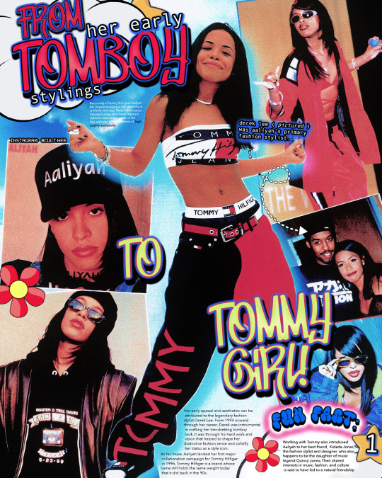
𝐄𝐀𝐑𝐋𝐘 𝐒𝐓𝐘𝐋𝐈𝐍𝐆𝐒: From Tomboy to Tommy Girl
During her debut era in 1994, Aaliyah not only captivated audiences with her smooth, soulful vocals on hits like “ Back & Forth,” “ At Your Best ( You Are Love ), “Old School, “ & “ Age Ain’t Nothing but A Number “— the title track of her debut album, to name a few… but also with her distinctive sense of fashion.
The way she dressed didn’t just resound the casual and laid-back lifestyles of the R&B & Hip-Hop scene of the 1990s, but it also reflected her confident, humorous, yet collected personality.
There wasn’t a single teen girl in America that didn’t want to be like Aaliyah. Black girls everywhere aspired to make oversized jerseys, baggy pants, cropped tops, statement sunglasses, numerous colored bandanas, and baseball caps look as chill as she did. Her uniqueness quickly made her a sensation and role model to look up to.
In addition to her loose-fitted hoodies and starter jackets, a wrist full of silver bangles and standout nail polish colors added feminine contrast to anything you’d see her in, and how could we forget her “ A “ initial necklace? Simple but effectively iconic.
Her early appeal and aesthetics can be attributed to the legendary fashion stylist Derek Lee. From 1994 onward through her career, Derek was instrumental in crafting her trendsetting tomboy aesthetic. It was his hard work and vision that helped to shape her distinctive fashion sense and solidify her status as a style icon.
Under his guidance, she became known for her effortless blend of masculine yet sweetly feminine elegance, taking risks, setting trends, and inspiring fans worldwide. Derek has also styled Lil Kim, Bobby Brown, and Macy Gray, to name a few.
As his muse, Aaliyah landed her first significant collaboration campaign for Tommy Hilfiger in 1996. Tommy Hilfiger is a brand whose name still holds the same weight today as it did in the 90s.
Becoming a Tommy Girl allowed Aaliyah to express her creativity in a new way. Their collaboration blended urban streetwear-inspired styles to cater to the day's youth and offered a sense of high-quality exclusivity. Her laid-back touch perfectly complemented Tommy’s preppy dynamic and made a memorable partnership that we still recognize and associate with the R&B star.
Working with Tommy also introduced Aaliyah to her best friend, Kidada Jones, the fashion stylist and designer, who is also the daughter of music legend Quincy Jones. Their shared interests in music, fashion, and culture are said to have led to a natural connection and friendship over time. The two young women were just alike.

𝐖𝐄 𝐍𝐄𝐄𝐃 𝐀𝐍 𝐄𝐕𝐎𝐋𝐔𝐓𝐈𝐎𝐍: Get it? Anyways, Aaliyah’s Evolution from Teen Idol to Full Blown Superstar!
In the Mid to Late 1990s, Aaliyah’s style evolved into something with the makings of a rebirth—a renaissance for her womanhood. The teenage tomboy crooner had grown into a young woman navigating mainstream success, and her fashion began to reflect that portion in her narrative.
Many of those who adored her for her music also adored her fashion sense as it became less practical and increased in intricacy. She traded her baggy pants, oversized leisure wear, and cropped tees for sleek leathers, fitted dresses, and high-fashion-grade ensembles that added more contrast and texture to her wardrobe.
Though she never shied away from wearing color, her palette during this era took on a more toned-down colorway to emphasize her maturity: rusted earth tones, browns, grays, and lots of black.
Her red carpet looks became increasingly refined during this era, showcasing her versatility and ability to transition between different fashion personas seamlessly. As she navigated her way through the entertainment industry, tackling acting roles and additional modeling campaigns, how she presented herself began to attest to her evolution as a person with each project she put out.
Her ‘One In A Million’ era was the dawning of a new point in her career, with the sophomore album marking a transition into a more cultivated sophistication in her artistry and welcoming bolder accessories for her coming-of-age narrative. She showed versatility as she was praised on cover shoots for teen magazines nationwide and reserved her edge by allowing her signature shades, oversized jackets, and necklaces to appear.
Her self-titled “ Aaliyah “ album era was the last project released during her time here. This era was the pinnacle of her evolution. This portion of her art saw her embracing sultry vocals and lyrics, all the while coming into the glamor of stardom and confidence with every public appearance. Statement pieces and bold colorways once again found themselves in her look. Avante-garde designs, high fashion designer-brand labels, and intricate detailed pieces and patterns, to name a few— demonstrated her fearless approach as a trendsetter and tastemaker.
This era leaves a bittersweet imprint in the minds of many. While we applaud the woman she was becoming, we cry for the sweet spirit we lost so tragically and too soon.
𝐀𝐀𝐋𝐈𝐘𝐀𝐇, 𝐓𝐇𝐄 𝐌𝐔𝐒𝐄: Her Homage to High Fashion
Her partnership with Tommy Hilfiger in the mid-1990s was a groundbreaking moment, as she became the face of Tommy Jeans, effortlessly blending mainstream fashion with hip-hop culture.
Aaliyah's influence also reached luxury fashion houses like Versace, Gucci, and Alexander McQueen, where she was admired for her daring fashion choices and ability to push boundaries.
She seamlessly incorporated pieces from these brands into her wardrobe during photoshoots, music videos, and other public appearances, showcasing her impeccable taste and fearless approach to style.
Aaliyah's affinity for luxury fashion not only elevated her image but also helped raise the visibility of these brands within the urban music and fashion scenes.
She famously wore a custom-made Tom Ford for Gucci leather jumpsuit in the music video for her song "Try Again," a look that continues to be complimented.
She rocked a stunning black silk organza gown from Alexander McQueen’s Spring/Summer 2000 collection in her final music video for "Rock the Boat." Along with designs by Thierry Mugler, including a metallic silver jumpsuit during her performance at the MTV Video Music Awards in 1998.
Her legacy as a style icon inspires designers, artists, and fashion enthusiasts worldwide, solidifying her status as a timeless muse for high fashion designer brands with an unstoppable influence.
𝐓𝐇𝐄 𝐔𝐍𝐒𝐓𝐎𝐏𝐏𝐀𝐁𝐋𝐄 𝐈𝐍𝐅𝐋𝐔𝐄𝐍𝐂𝐄: 23 Years Later…
Aaliyah's influence on fashion transcends time, resonating even in present-day trends 23 years after her untimely passing. The entire thesis of this exploration is to emphasize how her style continues to inspire a new generation of fashion enthusiasts, celebrities, and influencers all these years later. I aim to stress how her incredibly unmatched talent and passion for fashion collaboratively created a legacy that still holds her light.
Modern-day stars like Zendaya, known for her boundary-pushing fashion choices and effortless blend of streetwear and high fashion, often cite Aaliyah as a source of early inspiration.
Similarly, Ciara's bold and glamorous style pays homage to Aaliyah's rule-breaking approach to fashion, with her outfits and statement accessories reminiscent of the late icon.
Tinashe, an independent artist and producer, embraces Aaliyah's signature tomboy-chic aesthetic, infusing it with her own modern twist to create a unique and captivating look.
Aleali May, who in my opinion is a fusion of Aaliyah & Kidada Jones’ essence, is a designer stylist and continues to be a rising star in the fashion world, channels Aaliyah's relaxed and understated elegance in her streetwear-inspired looks and all of her designs, proving that Aaliyah's influence knows no boundaries.
Even global superstar Rihanna, known for her daring and trendsetting style, acknowledges Aaliyah's impact on fashion, paying homage to her in her music and fashion choices. Along with the beautiful and eclectic Teyana Taylor further attesting to the power of a legacy as well.
Beyond celebrities, influencers and public figures across social media platforms continue to celebrate Aaliyah’s fashion that came before her time, reinterpreting it for the digital age and keeping her legacy alive for generations to come.
Aaliyah's style and unapologetic individuality continue to serve as a reminder that true fashion icons are immortalized not only in memory but also in the enduring influence they leave behind. Great art never expires.
━━━━━━━━━━━━ 𝐒𝐎𝐔𝐑𝐂𝐄𝐒 & 𝐒𝐎𝐂𝐈𝐀𝐋 𝐌𝐄𝐃𝐈𝐀:
CULT HER INSTAGRAM
CULT HER TWITTER
PERSONAL TUMBLR PAGE
ADDITIONAL LINK TREE
COPYRIGHT & REPOSTING NOTICE: All written content and picture edits in this Tumblr post are original creations by me, from my own mind. Reposting or unauthorized use without permission is strictly prohibited. Please respect my work. I also have stated numerous times I do not own the original images used in my edits for this post. I claim no ownership over those. © MIA GOLDS / CULT HER.
━━━━━━━━━━━━ 𝐅𝐎𝐋𝐋𝐎𝐖 𝐅𝐎𝐑 𝐌𝐎𝐑𝐄!
#cult her#ch closets#fashion#black culture#90s#black women#early 2000s#fashion blogger#style icon#fashion icon#2000s fashion#aaliyah#aaliyah haughton#aaliyah dana haughton#baby girl#rap#rnb#tommy hilfiger#streetwear#hype beast#2000s#2001#trendsetter#aaliyah unstoppable#blackground records#blackground#zendaya#aleali may#tinashe#ciara
105 notes
·
View notes
Text
I assume that engineers are very busy, and so they don’t necessarily have time to make the things they design serviceable. I get it – you’re not building a masterpiece to survive all of eternity, you’re just doing your job. You’re over here, working on the radiator and cooling program, this other guy is doing the radiator support, and the mid-senior-junior-vice-president electromechanical engineer down the hall is up to her neck in work trying to figure out how to mount the horns in a way that doesn’t anger the crash testers.
The chances that the three of you, collectively, slow your productivity shit way down – or worse, have a meeting – to make it easier to reach the electrical connector for that horn so you can remove it without cutting your hands on the fins of the air-conditioning condenser are about negative one billion percent. That would be preposterous – horns don’t break, right? Tell that to the dumpster-dove Spider-Man bandages that I have applied to my right hand because of your shortsighted design decisions.
And your boss isn’t gonna show up and demand repairability become a priority. No, your boss gets paid because people buy cars, and people will stop buying cars if the car lasts forever. Even if they jam an Android tablet in the dash sideways and start making the wheels bigger. Hell, my neighbour is still booting around in a 1994 Camry XLE, and the minute he expresses even the slightest subconscious desire to be rid of it, he will have a lawn full of folks offering top dollar for such an esteemed chariot. Toyota probably would have gone bankrupt back then making shit like this, if they hadn’t had all those trucks to sell to terrorist organizations in distant foreign wars. Those guys are gonna have to buy a new truck every couple of months when their old one gets shot up, so it’s okay to make those super-durable.
All I’m asking for is that you think once in awhile about making a bolt accessible. It’s not hard, just make sure they drill a hole over top of it, so that I can stick a nice long socket in there when the captive nut on the other end breaks off and just spins forever. Even though you might have a good day at work because of taking a shortcut like that, I guarantee you that the massive amounts of bad karma I am heaping upon your name while intermittently sobbing in my garage are not worth it. You’ll get reincarnated as a lighting engineer.
242 notes
·
View notes
Text
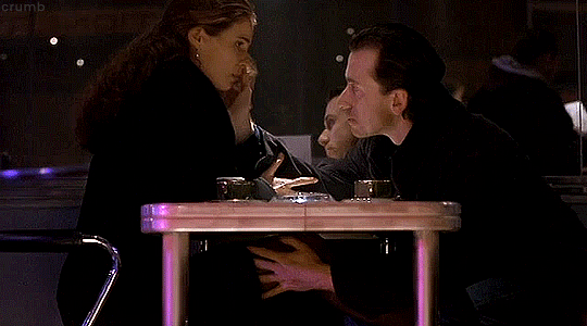
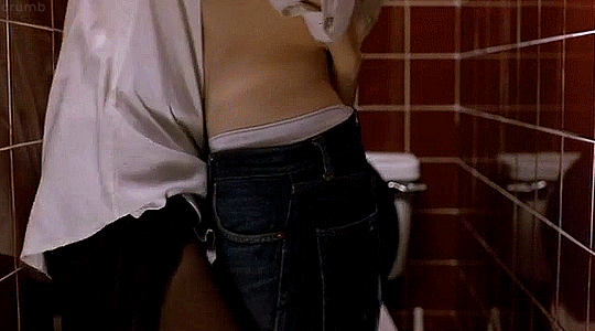
movies where two people are pathetically horny for each other while the people around them die and/or are put in extreme danger, including themselves. Each couple also contains at least one murderer (currently or in the future) who may or may not have facilitated their dangerous circumstances to some extent.
Only one of these pairs ends up fucking on a bathroom floor, and the answer might surprise you
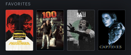
#randy and benson#soph and reg#adam and lawrence#philip and rachel#the passenger#the passenger 2023#100 bloody acres#saw#saw 2004#captives 1994#captives (1994)
103 notes
·
View notes
Text
Whumptober Masterlist 2023
Masterlist of fic
(Warnings at the start of every chapter, please be kind to yourself. Gif not mine; I do not possess that kind of power. This will be updated with links as we go and when placed on ao3 will be updated with the link. A lot of these can be read as one shots (I’ll try and mark the ones that can be read as such with a *) but together make a whole story; the story of how Clint and Natasha got married.)
the language of flowers and silent things.
2011 - Kashmir (how many fingers am I holding up) *
1984 - Russia (I’ll call out your name but you won’t call back) *
1984 - Iowa (make it stop) *
2012 - New York (shock)
2012 - New York (it’s broken)
1999 - Iowa (made to watch)*
2013 - New York / Wichita Falls (radio silence)
2013 - New York (it’s all for nothing)
1994 - Ohio (Polaroid) *
2014 - Budapest (you said you’d never leave)
2014 - Singapore (Captivity)
2014 - Singapore / Malaysia (Red) <now with amazing art by @oceanspirit9 >
2009 - New York (I don’t feel so good) *
2010 - Okinawa (just hold on)*
2010 - Okinawa (I’m fine) *
2014 - Rome (don’t go where I can’t follow)
2007 - Russia/France (leave me alone)*
2014 - New York (I tend to deflect when…)
2011 - Iowa (floral bouquet)*
2013 - New York (found family)*
2014 - New York (vows)
2012 - New York (watch out)*
2014 - New York (Shadows)
2014 - New York (I thought they were with you)
2014 - New York (buried alive)
2014 - New York (you look awful)
2014 - New York (scars)
2014 - Berlin (aftermath of failure)
2014 - New York (what happened to me)
2014 - New York (borrowed clothing)
2014 - New York (take it easy)

Elevation - Charles Baudelaire
Above the lakes, above the vales,
The mountains and the woods, the clouds, the seas,
Beyond the sun, beyond the ether,
Beyond the confines of the starry spheres,
My soul, you move with ease,
And like a strong swimmer in rapture in the wave
You wing your way blithely through boundless space
With virile joy unspeakable.
Fly far, far away from this baneful miasma
And purify yourself in the celestial air,
Drink the ethereal fire of those limpid regions
As you would the purest of heavenly nectars.
Beyond the vast sorrows and all the vexations
That weigh upon our lives and obscure our vision,
Happy is he who can with his vigorous wing
Soar up towards those fields luminous and serene.
He whose thoughts, like skylarks,
Toward the morning sky take flight
- Who hovers over life and understands with ease
The language of flowers and silent things
Translated by - William Aggeler
#whumptober Masterlist#clintasha#natasha romanoff#black widow#clint barton#my fic#hawkeye#natasha romanoff fic#clintasha fanfiction#clintasha fanfic#clint barton fic#yelena belova#avengers fanfic#marvel fanfic#marvel fic#whump fic#clint barton x natasha romanoff#Natasha Romanoff x Clint barton#the language of flowers and silent things
89 notes
·
View notes
Text

In 1994, the Muppets made one of their most bizarre films to date.
An adaptation of Goncharov, a cult classic that languished in obscurity until the 2020s. While the film was referred to internally and in public reviews of the film as "The Muppets of Naples", the actual marketing of the movie instead titled it after its main lead: "Gonzorov". This was one of many enigmatic choices made by the production crew, and has never been elaborated on by the cast or crew. The film was a gigantic flop for multiple reasons, but most agree that the source of the troubles stems from the nature of Goncharov as a tragedy and a generally depressing movie to watch.
Reportedly, conflicts among the writing staff began almost immediately due to being unable to decide on which cut of Goncharov to base the film on. Eventually, however, director Brian Henson put his foot down and forced the writers to adapt the Ambrosini Cut. Generally agreed to be a less depressing movie than the Morelli Cut, it was expected that "Gonzorov" should have been a much more entertaining and narratively adept movie than it was. As the Muppets proved just two years later in "Muppet Treasure Island", they are very capable of handling otherwise dramatic material with aplomb. This leaves the question of why this movie was such a flop.
To quote Kermit the Frog during the interviews after the cinema debut, the movie was allegedly emotionally draining for the crew to adapt. "You know, we have a script. Mostly. But we do a lot of improv too. I'd wager it's about 60% script, 40% improv on a good day of filming. But, uh… We just weren't feeling it with this one, you know? We watched the original, and… Boy, it's really sad. Goncharov's just kind of a lonely guy trying to make himself a life. And it's not a good life, but it's his to own, and it ultimately kinda falls apart. Gonzo tried to make the role his own, but I think we all realised that we couldn't really make a joke out of the movie in the way that we wanted to."
The Muppets were skillful enough to change the genre to an absurdist tragicomedy, a film where the tragic and meaningless cycle of violence is paradoxically played for laughter. However, despite this, the film is well-known for its bizarrely melancholy air and almost hopeless atmosphere. Everybody seems thoroughly certain that their improv will have little to no impact on the film as a whole, creating a strange and compelling meta-narrative where not even the actors themselves can escape the almost gravitational pull of the ticking clock. Their characters will die, and any attempts to joke their way out of it comes off as desperate, almost deluded in a sense.
The original Goncharov held a deep fascination with inevitability. Clocks are the primary theme, though it appears in other forms. It is this same inevitability that strangles the Muppets, their impressive comedic skills held captive by their own belief that the narrative is inescapable.
Of particular note is the bridge scene, wherein Gonzorov and Katya (played by the dazzling Miss Piggy) discuss the slow collapse of the Italian mafia. The original Goncharov scene had Goncharov desperately trying to hold things together, even as they slipped through his fingers, but here… Gonzorov realises that it's pointless. He can't fix it, but at the same time he can't let it go. He begs Katya to shoot him. Cut to the chase. She's going to shoot him anyway, that's how the movie ends, right? Might as well go out on his own terms. But this horrifies Katya, and she throws her gun away, accidentally saving Gonzorov in the process.
This adds a new layer to the themes of inevitability that Goncharov is wrapped up in, and it's this: Inevitability goes both ways. You're going to die, but only when you're meant to. You don't get lucky. You don't have accidents. Inevitability is a ticking clock, but that countdown is a safety net. As long as you can still hear that clock ticking down, it means you've stitll got time to burn. When a bomb is counting down, just five minutes until it detonates, you do everything you can to buy yourself more time on the clock. Even if all your effort only gains you an extra second, that's what you have to do, right? A single second is worth the blood of innocent men.
But again, inevitability. That second you earned cost you minutes, cost hours days weeks months years. The clock WILL run out.
[read more]
44 notes
·
View notes
Text
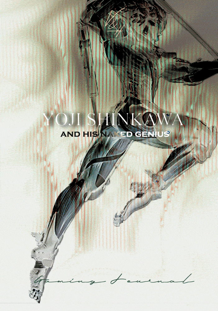
One of my friends asked me by what criteria I choose games. I said there should be a pretty male character. He continued: "Of course, but what else besides a handsome man can you be captivated by the game?" No, my friend, you don't understand. A handsome character is often the only reason I pick up a game. I'm not saying that this is the only thing that defines for me such a complex work as a video game. But it is futile to deny the fact that we are living beings who like beautiful things and especially attractive bodies. Yoji Shinkawa understands this too. As well as the fact that the player spends most of his time looking at the protagonist's back. So why not make that back as attractive as possible?

At around the age of 19, Yoji Shinkawa entered Seika University in Kyoto. It is a private university known for its manga and anime departments, often taught by mangakas. Young Shinkawa's passion for art blossomed as he got acquainted with the books of his compatriots, illustrators Hikozo Ito (1904 - 2004) and Kashō Takabatake (1888 - 1966). Both graphics, the theme of a warrior is present in the works of both. As a technique, Shinkawa first chose gel pens. According to him, the reason he started using his brush pens was because of the influence of Yoshikazu Yasuhiko. In junior high school Shinkawa read a book on how to draw manga and tried using a dip pen, which turned out to be a failed attempt.
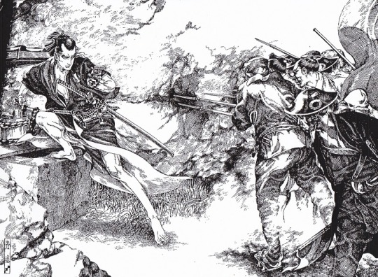
Kakubei Jishi (written by Jiro Osaragi). Illustration for a Shonen Club serialized novel. Hikozo Ito, 1927
His desire can be understood. Drawing with a dip pen allows to create things of incredible sophistication and detail. Just look at drawings of another Shinkawa's inspirator Hikozo Ito. How detailed his works are, how accurately he conveys the mood and characters of the heroes on his works. No wonder they made an impression on Shinkawa. In further practice, he began to use a brush pen, which brought the future designer closer to the technique of his teachers Yoshitaka Amano and already mentioned Yasuhiko, who drew with brushes. Already at a young age, Shinkawa began creating his own illustrations for anime magazines.

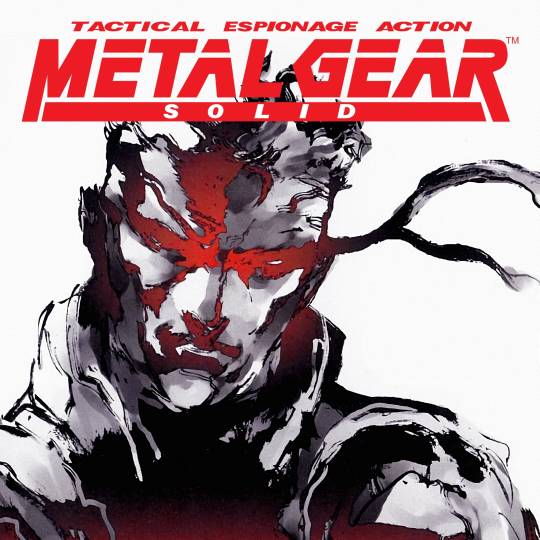
After graduating from university in 1994, Shinkawa began working at Konami, one of the leading video game developers and publishers. Here he meets the game designer Hideo Kojima, whose brilliant star has yet to shine on the gaming industry. Maybe it wouldn't shine so brightly if it weren't for Shinkawa. The person who gave birth to a brilliant idea met the person who breathed life into this idea with his brush. One of the first projects that Shinkawa worked on was the game Policenauts, created by Kojima. In this work, one feels that he is still on the way to developing his style - his drawing is similar to anime and manga and lacks any personalized features.
At the same time, in 1995, under the direction of Kojima, Shinkawa began working on his Metal Gear Solid project. Significant changes in Shinkava's style are felt in the work on this project. Almost not a trace remains of the bright anime drawing from Policenauts. The design feels more grim, the characters themselves look more "western" than most Japanese games of the time. As Shinkawa himself noted, Kojima has provided complete creative freedom. The designer only described the intended characters to him in general terms, often indicating only the gender itself. This approach took more time to develop, but at the same time, freed Shinkawa's hands both as an artist and as a designer.
Design, no matter how many beautiful things it creates, is a utilitarian thing. It is not enough to draw 'pretty'. Your work should have practical significance. In the case of video games, character design is about creating an image that is easily remembered in the player's imagination and makes the hero unique. This uniqueness comes from the features of the character itself: his occupation, character, role in the game, relationships with other characters, etc. With space for imagination, Shinkawa tells their story directly on paper, conveying it in poses, clothes, facial expressions and the way their bodies are composed. In the world of Metal Gear, the player is constantly on the battlefield. The main activity of the characters is focused on their confrontation, so they must be in good physical shape. And Shinkawa emphasizes this in every possible way.
The figure of young Solid Snake, the protagonist of Metal Gear Solid, is very stable and tense, but not without flexibility. Shinkawa's line breaks like waves, drawing the relief of the body under the baggy suit. By adding colors on the computer, Shinkawa creates three-dimensional shapes that convey the roundness of muscles. Snake's entire body is covered. But even under the folds of a tight suit, you can see a well-built body.
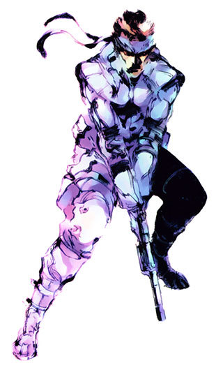
Notice that Snake's figure is heavily shaded: you cannot see his face. In the first works, Shinkawa did not draw faces and eyes in detail, because the graphics power of the PlayStation did not allow to reproduce the textures in detail. Shinkawa smooths out the facial features, but you can definitely understand Snake's emotion and character.
Much more interesting and artistically opposite to Snake is the figure of Gray Fox. Shinkawa's vision of a character goes beyond just a form designed to perform a certain function. For Shinkawa, the body is another way to tell a character's story, to reveal his essence before the player discovers more information about the character. This is how the means of artistic expression in art work. Looking at a picture, you subconsciously note the things that the creator put into it. You can't always explain exactly what you see, but you always accurately identify the emotion that excites your mind in the very first second of contemplation.
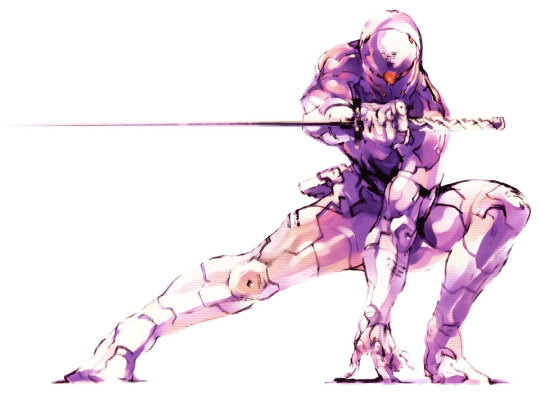
Shinkawa plays with the player's imagination. Gray Fox is a cyborg, but in his image there is not the slightest hint of the artificial nature of his body. It is sculpted by the muscles that transmit the plastic to its exoskeleton. It seems to be pieced together from scraps and feels lighter and more flexible compared to Snake's living body. The designer goes deeper than just trying to convey the image of a ninja literally. He depicts a slender solid silhouette - only a shadow of a mercenary, in which the embedded image of a ninja can be clearly read. A victim of horrific experiments, he hides his mutilated flesh behind a cold cyborg body made in the colors of steel and human flesh. The gaze of the eyes disappears behind the mask with an eerie glint of a red sensor that resembles an eye. Shinkawa does not resort to excessive or even any careful detailing. The designer moves away from unambiguous and finished images. All superfluous and unnecessary details are cut out, leaving the content embodied in a fragile, fleeting form.
As Shinkawa noted, one of his inspirations is the French artist and author of comics Jean Giraud, better known as Moebius. Giraud is closely related to cinematography. He worked with Ridley Scott on the films Alien (1979) and Blade Runner (1982), created costume design for the cyberpunk film Tron (1982), was involved in the creation of The Fifth Element and many other projects. Although this fact may seem insignificant, it is still quite symbolic in Shinkawa's work. Kojima, with whom the artist created images for games, opened another means of artistic expression for the game industry, including elements of cinematic art in the game, namely cutscenes. Prior to this, narrative was part of the gameplay, presented in the form of long notes or short notes. Cutscenes made it possible to directly connect the gameplay with the story, making the work a single whole.
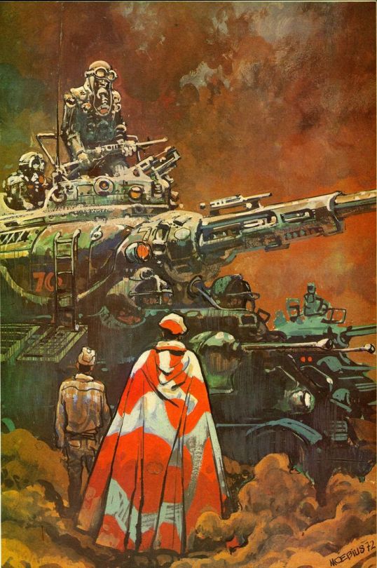
Illustration to Gordon R. Dickson's work Pour quelle guerre. Jean Giraud, 1972.
The large number of cutscenes typical of Kojima's games deliberately create an opportunity to examine the characters from every possible angle, revealing Shinkawa's genius. For the designer, this is a kind of art camera, where his creations are presented in various poses and lit up like curiosities, playing with the player's imagination. When I started playing Metal Gear Rising: Revengeance again recently, this became more apparent than I thought. Alongside cinematic scenes, there are plenty of close-ups with unexpected angles. The characters are not just pleasant to watch. You want to interact with them.
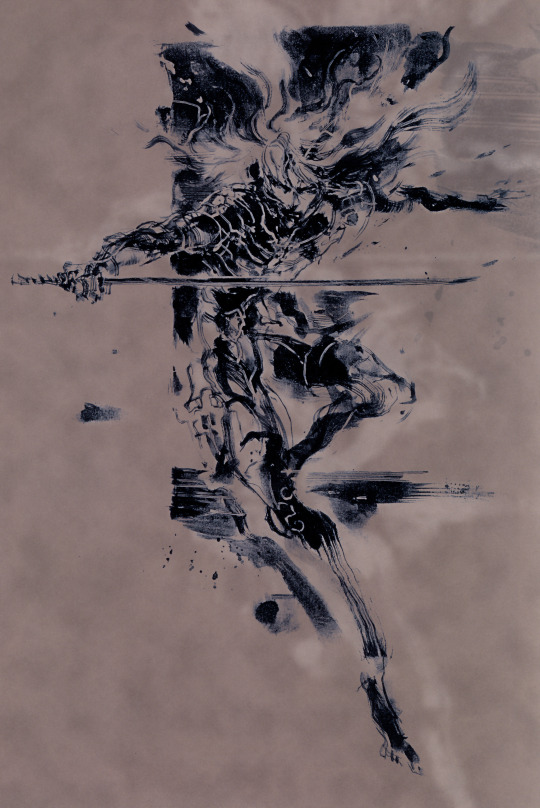
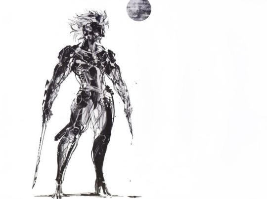
My favorite work of Shinkawa. Stylistically, it is very similar to the works of Yoshitaka Amano: a smooth silhouette that practically melts on the plane of the sheet. The composition is minimalistic, but very meaningful. With one sketch, Shinkawa conveys the character's name (in Japanese mythology, Raiden is the god of lightning), the plasticity of his young body, and the killer's concentrated gaze.
Raiden's design is probably my favorite. He appeared in the franchise with the release of Metal Gear Solid 2: Sons of Liberty in 2001, via a fan letter to Hideo Kojima. Its author complained about the old characters constantly repeating themselves in Metal Gear. In creating the image of Raiden, Shinkawa moved away from the image of a strong, stereotypical male figure, inspired by the popular heroes of the 90s and the American superhero comics from which he took inspiration. The designer resorted to a more Japanese view of male beauty, which was used by the same Kashō Takabatake in his works.
Kashō Takabatake's work on exposition in Takabatake Kasho Taisho Roman Museum. Compare Takabatake's warrior with Hikozo Ito's one. Takabatake created advertisements and illustrated magazines in which the influence of modern is noted. The faces of his soldiers are very gentle and graceful. It was his unique illustrations of beautiful boys (bishōnen) and beautiful girls (bishōjo) that took the world by storm, bringing fame to the artist.
The concept of Bishōnen, or literally from Japanese "beautiful youth (boy)" characterizes not just a man with good looks. In the Japanese view, this is an aesthetic principle that transcends gender and sexual orientation. The roots of this concept stretch back to ancient Chinese literature, the homosocial and homoerotic ideals of the medieval Chinese imperial court, which are found since the Middle Tang Dynasty (~700s). Gradually, this concept penetrated into Japanese and other Asian cultures, and we can observe its examples in the realities of today.
The introduction of such a character did not cause much excitement among fans of the series. Overly refined and too androgynous, Raiden with his silly backstory looked out of place against the muscular Snakes with complicated pasts. However, analyzing Shinkawa's subsequent works for Metal Gear and the gradual change in Raiden's design in particular, it can be assumed that Raiden's image to some extent helped Shinkawa develop more deeply the idea of glorifying physical beauty, born in the image of Gray Fox. On the character concepts for MGS 2, it is noticeable how the designer focuses on anatomy. Raiden's suit fits his body tightly, revealing his supple muscles. Shinkawa leads the line very carefully, it feels taut and elastic, revealing a sculpted form to the viewer. The volume is complemented by the play of light and shadow, which slides along the curves of the figure. To enhance the impression, Shinkawa lengthens the katana, making it more curved to enhance the sense of tension in the composition.
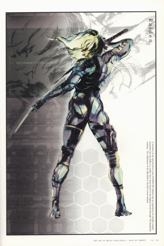
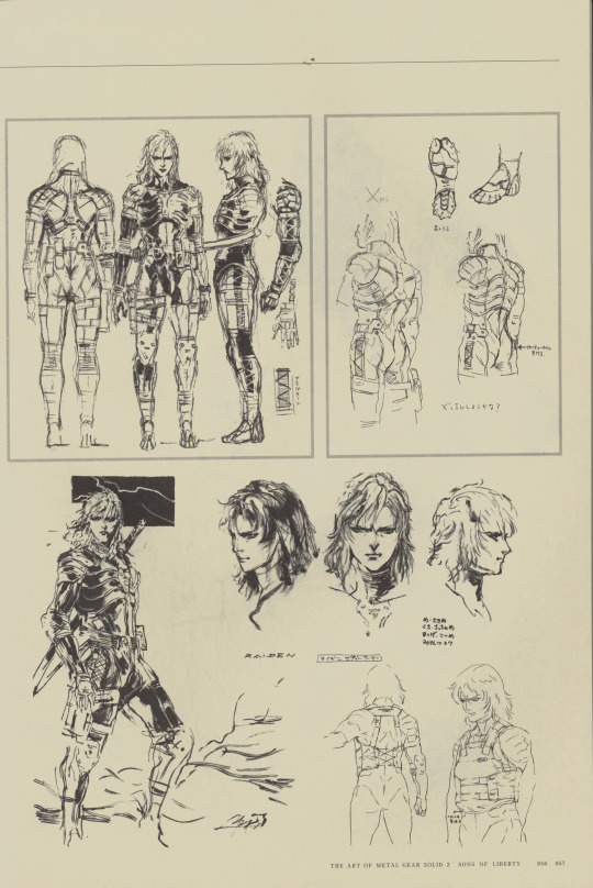
Although we mostly know Raiden today as a cyborg ninja, in the sketches for MGS 2, Shinkawa makes his suit look like samurai armor by adding shoulder and chest plates.
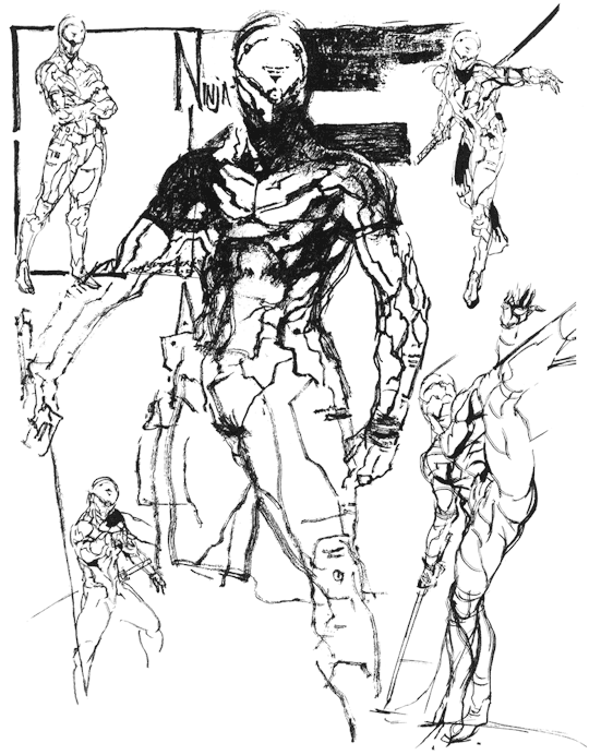
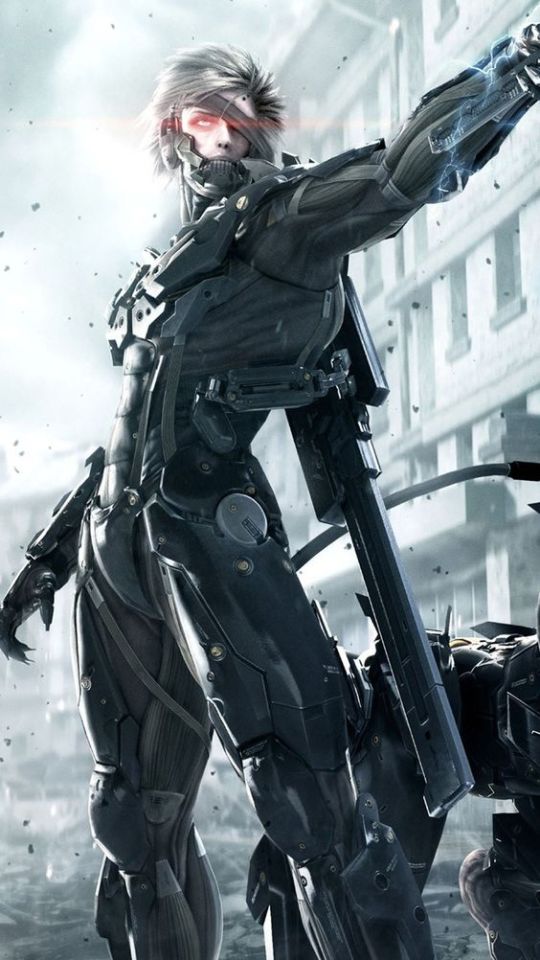
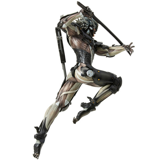
In the work on Metal Gear Rising: Revengeance (2013), Shinkawa continues the chosen path. During this period, the experience and acquisition of one's own style allow the designer to create incredible things according to his artistic solution, twisting the concept of aesthetics to the maximum. The image of Raiden evolves from a fragile young man to a brutal cyborg endowed with superpowers.
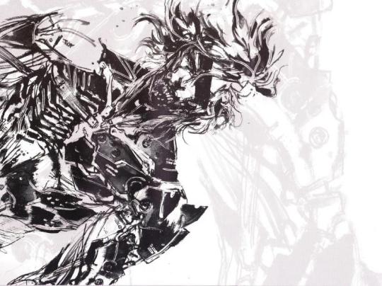
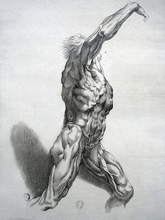
The flexibility of his human body is replaced by the monolithic heaviness of the exoskeleton. Shinkawa abandons the streamlined design used in the image of Gray Fox, which conveyed the ease of movement inherent in a ninja. He appeals to the "pure form", stripping the hero of even his skin as something unnecessary, and turning Raiden into practically a living Écorché (an educational figure showing the muscles of the body without skin). In his desire to get rid of the excess, Shinkawa goes even further. He does not depict a beautiful body, but what makes it beautiful - a skeleton and muscles - the initial form on which everything else is superimposed.
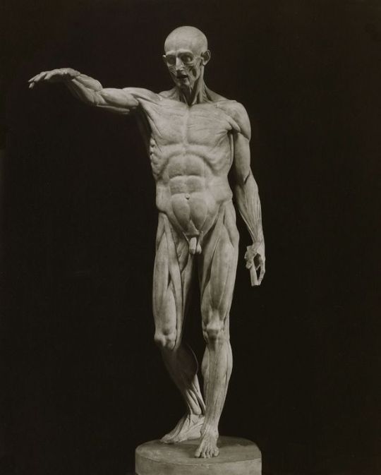
Ecorché. Jean-Antoine Houdon, 1776
Here I should explain what I mean by "pure form". Depicting a simple sketch of a character or creating a complex composition, Shinkawa draws as simply as possible. At the same time, it is important for him to depict not only the design of the character. In the figures of the heroes, attention is drawn not so much to their appearance as to their inner state expressed on their faces. Shinkawa did not specify the details. Characters in rough drawings are perceived as very conventional. Their images are personalized, but conditional.

Eva, Naked Snake, & The Boss. Art to the Metal Gear Solid 3: Snake Eater
Shinkawa avoids unnecessary trifles, preferring empty space. The artist's brush moves almost chaotically, revealing the smallest nuances of the image. With each subsequent game, his technique acquires clear features of traditional Japanese painting. In unfinished, at first glance, ink spills, Japanese artists sought to convey not the appearance of things, but to capture their spirit, to imprint their state or their own impression on the canvas. The artist lays down a minimum of lines and tones sufficient to recognize the form, texture and effects to be felt. Ink spills change in all possible shades of black, the vague outlines of the image make you feel the changeability and fleetingness of the moment.

Screen with pines and bamboo. Tohaku Hasegawa, Nanao Museum of Art, Ishikawa, 17th century
This approach to the image has advantages that could turn into disadvantages for the designer. Since the main point of Japanese painting is not the realistic accuracy of the surrounding world, its reproduction does not require a thorough knowledge of the anatomy or structure of objects. But there is one more thing that I deliberately did not mention before this. Despite the fact that Shinkawa appears as a graphic artist in his design works, he studied oil painting at Seika University. Painting, unlike graphics, is not characterized by vagueness and sketchiness. Shinkawa does not completely get rid of the influence of the acquired equipment. The volume of his figures protrudes beyond the surface of the sheet, creating the illusion of depth. But Sinkawa's best pictorial past can still be felt in his appeal to anatomy as the basis of the physical embodiment of the hero, the transmission of the story behind him. At the same time, Shinkawa's works are almost painterly, with a lot of color strokes, even if he uses only one color. This is a characteristic feature of Japanese painting, the flatness of which the artist transforms to his own needs. Thus, using the ideas of Japanese painting and removing the excess, Shinkawa exposes a pure form. And his experience in oil painting allows him to depict it accurately.
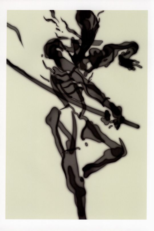
Raiden collectible figure Écorchéchisel. Paulus Pontius,
~1640. Engraving by Rubens
In the concept art for Rising, Shinkawa focused on finding the perfect representation of anatomy that would emphasize the athleticism of the character. From athleticism, in turn, comes sexuality, which Shinkawa instills in robots and cyborgs. Raiden is a killer machine. Even if his blade is an instrument of justice, he himself admits that in order to protect the weak, he kills the strong. His desire for battle, thirst for blood, and pleasure in pain - all find expression in his appearance.

Much more can be said about the work of Yoji Shinkawa. Maybe I would like to do a review on his metal gears themselves, where it's also possible to discover a lot of interesting things. Or about his concepts for Death Stranding and the game itself in general when I finally get through it. In this part, I wanted to share my thoughts on what most touches me in the designer's work.
So yes, it was review on Raiden's butt
Credits:
Metal Gear Solid galleries
The Art of Metal Gear Solid 2: Sons of Liberty
Metal Gear Solid 3: Snake Eater Art
Metal Gear Rising Revengeance Artbook
In the shadow of Kojima: Yoji Shinkawa, designer of Metal Gear Solid and Death Stranding
Gif used for cover image by Erica Anderson
#metal gear#metal gear series#mgs#mgs2#mgs2 sons of liberty#mgs raiden#raiden mgs#mgs2 raiden#mgs3#mgs3 snake eater#metal gear solid 3#mgrr#metal gear rising#metal gear rising revengeance#metal gear raiden#mgs snake#solid snake#metal gear art#yoji shinkawa#shinkawa#japanese art#hideo kojima#kojima#my articles
347 notes
·
View notes
Text
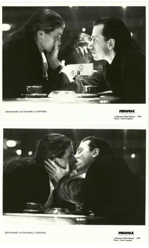
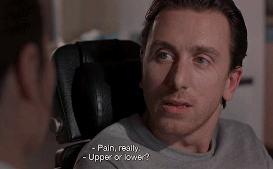
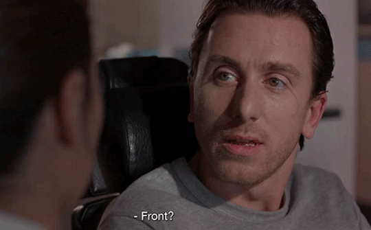
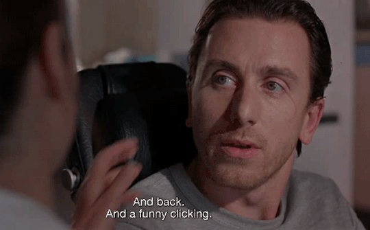
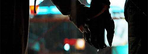
in captives (1994) when they put their hands over each other’s faces and cover each other’s faces with their whole hand I’m so totally normal about that I promise
13 notes
·
View notes
Last Seen Blogs

seowale08
Untitled

kondensaduhhh
just a mess of things

nade25
Nadie

maybegee
a fucking toilet mojito
nade25
Nadie