
kenzi-koffee
Kenzi Koffee
I'm Kenzi, I make cute art, fantasy art, and everything in between! I love collecting houseplants and music. I also have commissions open!
8 posts
Don't wanna be here? Send us removal request.
Last Seen Blogs

-elliotness-
Saving Elliot
dronmusic
drøn

vrsocialsystem-com
VR Social System

incorrect-bmc
Incorrect Be More Chill

kg-rarepairs
Rarepair Ships!
Text
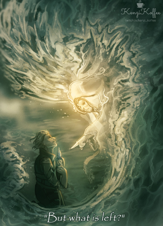
Ansul stared back into the dead eyes of the ghost. A harrowing sorrow overwhelmed him; it felt as though he was being swallowed whole by emptiness. His words died on his lips and he could not answer the question.
‘What was left?’
---------------------
Original Character art of a story I'm working on. :)
#anime art#art#artists on tumblr#artwork#commissionsopen#digital art#drawing#anime and manga#anime#illustration#illustrator#oc#original art#original character#oc art#ocs#my ocs#my art#kenzikoffee#twitch streamer#small streamer#pngtuber#streamer#livestream#twitch stream#fantasy#dark fantasy#fantasy art#digital drawing#digital artist
1 note
·
View note
Text
instagram
Ysera as a gift for a friend over twitch!
#ysera#wow#world of warcraft#artwork#commissionsopen#drawing#anime#digital art#artists on tumblr#art#anime art#anime and manga#cute art#dragon girl#fantasy#high fantasy#fantasy art#dark fantasy#medieval fantasy#character#kenzikoffee#Instagram
4 notes
·
View notes
Text
instagram
Axolotl Monk DND Character Commission! I really had fun with this project and am so grateful to have gotten to create this!
#artists on tumblr#art#commissionsopen#digital art#drawing#anime and manga#anime art#dnd#dungeons and dragons#dungeons and dungeons#roll20#npc#axolotl#artwork#monk#fighter#dnd art#dnd character#dnd5e#dnd oc#clipstudiopaint#illustration#digitalpainting#digitaldrawing#digitalillustration#character design#original character#character art#originalcharacter#character concept
0 notes
Text
Color Theory Basics
Color Theory Basics for Beginners
A growing artist's understanding of color theory
Introduction
I don’t know about you, but the understanding of color and more so learning how to apply it to art feels intimidating and perhaps even scary. I’m going to try and avoid overwhelming your brain with technical facts about color theory and focus more on applying it to your artwork, because if you’re anything like me…you’ve been avoiding this topic in fear that it’s too linear and technical for us creatives to grasp. Color theory shows us how colors mix and contrast with one another, so I believe it’s essential to have some idea of how to implement it in your work.
The Color Wheel
The color wheel is based on red, blue, and yellow. Sir Isaac Newton developed the first circular diagram of colors in 1666. There are a lot of opinions regarding the color wheel and how to use it, but I’ll just give you the basics so you know what terms to use when discussing your art and some ideas on how to implement them into your work.
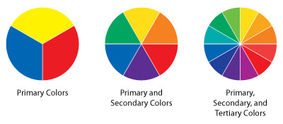
Categories of the colors based on the color wheel:
Primary colors: These colors are used as the base for the color wheel, Red, Blue, and Yellow. All other colors are derived from these three colors.
Secondary colors: Green, Orange, and Purple. These colors are formed by mixing the primary colors.
Tertiary colors: Yellow-Orange, Red-Orange, Red-Purple, Blue-Purple, Blue-Green, and Yellow-Green. These colors are formed by mixing a primary and a secondary color.
Properties of Color:
Value: Describes the lightness or darkness of the color.
Hue: Refers to color in its pure state, it also determines a color's position on the color wheel.
Intensity: The brightness or dullness of a color based on its saturation. A color is most intense in its purest form, (or hue). Intensity becomes lower when a pure hue is mixed with a complementary or neutral color.
Complementary Colors
A complimentary color is a color that is the opposite of a color on a color wheel. If you choose any color on the wheel, you’ll be able to find its complement by just dragging your finger straight through the center until you reach a new color. The complimentary color for red is green, the complimentary color for blue is orange, and so on.
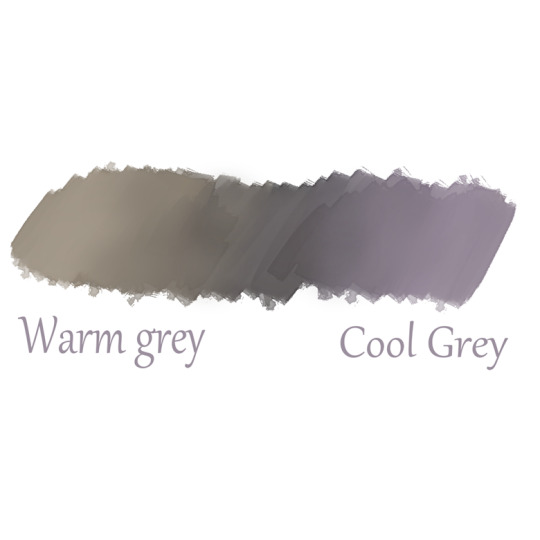
Color Temperature:
Color temperature can greatly impact the mood of a piece, it can be
used to create contrast between subjects or separate pieces. Warmer colors are usually deemed striking, energetic, or happy. Cooler-themed pieces are often considered peaceful, sad, or moody.
If you draw a line across a color wheel, half of it will be considered ‘cool’ and the other half will fall into the ‘warm’ category.
Examples of cool colors are Purples, blues, and deep greens.
Examples of warm colors are Reds, Yellows, and Oranges.
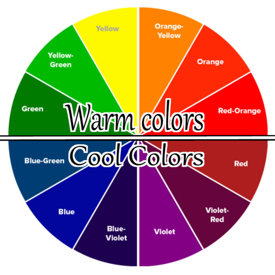
Warm and Cold are not limited to bright colors, greys can even have a warm or cool tone to them.
Shadows and highlights in art:
A common way to use color theory is in how you apply it to shadows and highlights in your artwork. For example, it’s common that in an environment that has warm highlights (like a bright sun), then the shadows will actually reflect the complementary color of the highlight. If the sun is your highlight source, then your highlight color is probably yellow. The complementary color to yellow is purple and blue, so you can use this knowledge to find the color that best suits the mood of your scene. -show some examples-
You can also swap this around if your highlight color is a cool icy light in the blueish-grey range, then sprinkling some deep yellows and oranges throughout the piece will help it pop.
You’ve reached the point in color theory where it’s up to opinion and preferences. If you want a really ‘cold’ and ‘dreary’ feeling, then only using cool colors might benefit you more than attempting to use a blue-complimentary color. Rules in art only exist so we know the fundamental structure of how they work, once you have that understanding, breaking the rules can be beneficial to your art. Don’t be afraid to get creative and try something new once you’ve figured out the basics.
How Color changes based on the environment
Colors will obviously look different depending on the setting of the subject. Human skin is a fascinating topic when it comes to this logic. For example, it is redder in areas where the skin is thin. It picks up the blood and veins underneath it, or the warm glow of the sun behind it depending on its transparency.
Color and light bounce off of different objects in different ways, so that’s where photo reference comes in. If you can find images of your subject in the environment you’re wanting to paint, you’ll have a better understanding of how color interacts with itself. If something is sitting outside in the grass, for example, it will have the warm yellow highlight of the sun. However, it may also have green gently bouncing up from the grass and onto your subject. It may also have blues from the sky reflecting off of the grass and onto your subject. Color is truly fascinating when you start observing it from an artist's perspective.
A lot of this isn’t directly linked to color theory, but rather lighting, ambient occlusion, and so on. I just thought it would be good to hint at it here as well. I plan to write more on the topic of lighting and ambient occlusion in the future so be on the lookout for that if this subject interests you.
Using other Artists as a reference
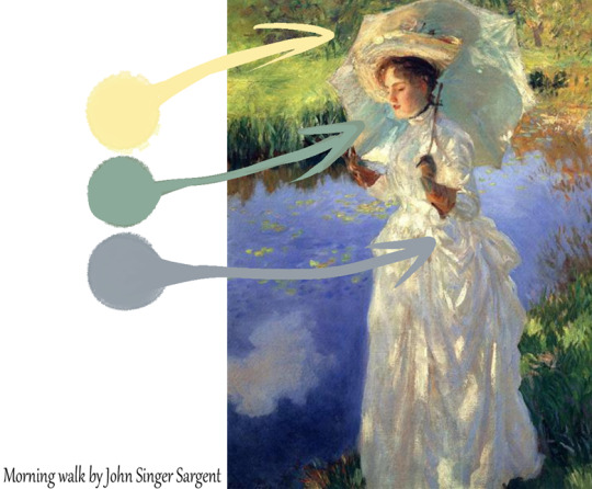
I always recommend beginners, and even non-beginners, to look at their favorite artists to better understand their process. Color is no different when it comes to that. Look at your favorite artists with the knowledge you’ve taken from this article and see how they’ve applied it to their works. Did they use primarily cool colors, with just a patch of warm colors to emphasize a point as they did here? Did they use saturation or desaturation to help draw the eye into where they want your attention? There are many different ways to use color to your benefit, and the more you expand your visual library by looking at other artists' work, the more you’ll be able to imagine unique color combinations and set-ups to benefit your work and growth as an artist.
Summary
Color is an extensive topic that could span across many many articles and fills multiple encyclopedias, however, the basics are pretty simple to grasp and I feel that unless the topic calls to you–are all you need to get started with color in your art. Your eye for color will develop over time as you look at the work of artists you admire and challenge yourself to try new things.
#art#artists on tumblr#digital art#drawing#painting#color theory#tutorial#art tutorial#art tumblr#art tips#art reference#artwork#commissionsopen#refs#reference#save for later#art reflection#art hacks#art blog#small artist#artists of tumblr#beginner artist#illustration#art style#character design#creative writing
14 notes
·
View notes
Text

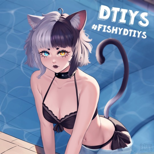
This is @fishiestfishfish’s character for their DTIYS challenge! I had a lot of fun painting this character and I love the design! You guys should enter if you have the time hehe!
#anime art#anime#anime and manga#art#artists on tumblr#artwork#commissionsopen#cute art#digital art#drawing#anime girl#neko#DTIYS#dtiys instagram#dtiys entry#dtiyscontest#cute#cute girl#poolside#summer#summer art
1 note
·
View note
Text
♡ A Day In The Life Of a Cottagecore Pokemon ♡
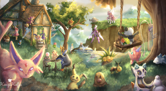
This was a piece where my twitch chat helped me put it together! I asked them what Pokemon they wanted me to add to the painting and they got to request their favorites! I'm still super proud of this one even if it took forever to complete haha.
#pokemon#espeon#mimikyu#diglett#anime#anime art#anime and manga#anime fanart#squirtle#charmander#snom#pokemon snom#snom my beloved#snom fanart#nurse joy#snorlax#alcremie#wooloo#jigglypuff#ceruledge#cottagecore#cottage aesthetic#fairy cottage#cozy cottage#cozy#cozycore#cozy aesthetic
6 notes
·
View notes
Text
instagram
A little Art V Artist post so you guys can get to know me a little! These are some of the pieces I was most proud of when I put together this post!
#art vs artist#fantasy art#artwork#art#artists on tumblr#digital art#art style#illustration#cute art#drawing#my art#commissionsopen#pokemon#magic the gathering#vampire#anime art#Instagram
0 notes
Text
instagram
Hello friendos! Woohoo, my first Tumblr post since 2014! I'm new to the platform again so I'd love to meet other creatives!
♡ This is my OC Adelaide, she's my PNGtuber and stream mascot as well! She owns a bakery and makes magical cupcakes. ♡
#art#artwork#artists on tumblr#anime#anime and manga#anime art#satyr#fantasy art#high fantasy#cute#cute art#curvy and cute#commissionsopen#oc#oc art#original character#my ocs#digital art#drawing#Instagram
2 notes
·
View notes