
glamourzombie
Glamour Zombie
{ My name is Ana }
Ever changing thirty-something, always Mediterranean.I like pretty things and zombies.I practice self-care in the form of tarot meditation, skincare rituals, physical activity and a positive mindset.
This is my lifestyle blog, where you can find personal musings and visual inspiration. Enjoy your stay ♥
5795 posts
Don't wanna be here? Send us removal request.
Last Seen Blogs

4sett
ケイン
moonlit-arts
Moonlits Cluster of Junk
ciligifs
Hello I'm Cili and I like to make a lot of gifs

lehuyenanh19082000
Huyền Anh Tblog

Text

We got rid of all the 70s wallpaper. You may find it criminal, but I found it entirely too overwhelming. I did save an intact piece that I will frame to honor the home's spirit.
It may look like I'm embracing the beige mom aesthetic, but do not be fooled: I am creating a clean, neutral canvas to which I can then add the pops of colour and design I want later on. By the way, the kitchen furnishings will be done in white and greige, and the countertop is Silestone's Ethereal Glow.
I carry a floor sample pretty much all the time. You never know when home design is going to find you. We're choosing wallpaper for the master bedroom accent wall. I liked these two from Leroy Merlin.
3 notes
·
View notes
Text

Recent eats:
Bentō futomaki with salmon, kanikama, avocado, cucumber, asparagus and mayo
Torreznos with red pickled onions and shichimi tōgarashi
Fried sea anemone with quail egg, guacamole and caviar
(I'm trying out the feature by which no reblogs are possible - great for personal posts!)
6 notes
·
View notes
Text
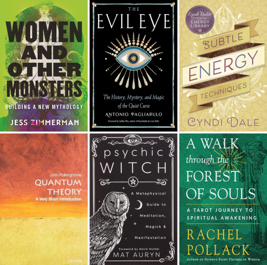
Seasonal reading!
Women and Other Monsters: Building a New Mythology, by Jess Zimmerman
The Evil Eye: The History, Mystery and Magic of the Quiet Curse, by Antonio Pagliarulo
Subtle Energy Techniques, by Cindy Dale
Quantum Theory: A Very Short Introduction, by John Polkinghorne
Psychich Witch: A Metaphysical Guide to Meditation, Magick & Manifestation, by Mat Auryn (currently reading)
A Walk through the Forest of Souls: a Tarot Journey to Spiritual Awakening, by Rachel Pollack (TBR)
17 notes
·
View notes
Text

Working on a little something something...
I have been away for a while. Lots of stuff going on! One of them being that I bought my own apartment. It needs renovations - it was abandoned for years. To me, that means a blank canvas.
I'm creating a few moodboards... my spiritual room is at the center of my mind. Featuring string cotton lights from Happy Lights in Deep Purple, Conway table from Next, and Cono lamp from Umbra (other elements are either stock images or AI generated by Canva).
0 notes
Photo
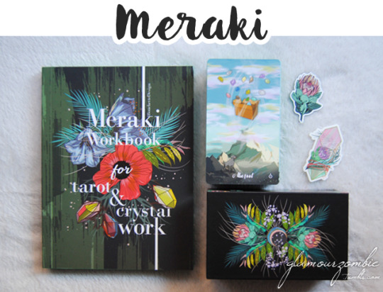
I’m going through an unpredicted depth year. My deck collection has grown a lot over the past years, and I have reached a point where I just want to spend long, quality time with those decks I already know and love. That is why the additions to my collection (and hence, reviews for you) have slowed down: I’m being extremely selective of what comes into my shelf. One of those newer additions is a deck I’ve been working with for a while now: The Meraki Tarot, by Kerri Snook at Bouchette Design.
This deck, which speaks directly to my heart chakra, features the classic 78 tatot cards plus one extra major called The Meraki. On top of that, we find 8 extra oracle cards with concepts like yes, no, apathy or aspiration. Aside from those, and since it doesn't come with an included traditional booklet, it has 14 extra guide cards that work as a condensed guidebook. One of them is an introductory & thank you card, followed by astrological signs, solar system associations, crystal and tarot associations, astrological and elemental major arcana associations, and keywords for all of the cards - including the oracle cards. So, while not in booklet format, you get tons of information in your deck box.
This is clearly an animal deck, but it also contains a lot of other natural elements (like plants) that may be missing in other animal decks. Besides, the crystals tie in each card theme. There are a few instances of humans or human-made elements, such as a hot-air balloon, or the hands in the aces. Even if it can be logically thought as an earthy deck, it feels very airy to me. This is due to the artwork, which is very spacious, giving you a lot of room to feel, think intuitively, and find a spot for yourself in each cards. There is a combination of light colours (usually in the background) and darker shades that create contrast to draw your eyes in.
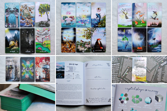
Though airy, there is a strong sense of texture (and here I have to mention the wonderful clouds!). The animals in the cards have their own strength and presence, but at the same time, they all feel very soft in their way of conveying messages. Even in more challenging cards, like the eight of swords (with a ladybug trapped in an orb weaver spider web), there is a balance – so that even in the darkest situations there is a sense of connection and natural flow to be found. The cards are beautifully designed, featuring a botanical back, and gorgeous matte green edges. The cards are borderless, and have a soft rose petal finish. It comes in a sturdy two-piece box done with a matte finish and spot-gloss designs.
Aside from the deck, Kerri has created the Meraki Workbook for tarot and crystal work. This is a juicy softcover book, standing at 225 pages, an excellent tool for exploring this deck in depth. It starts with a letter from Kerri, and follows up with the sections: working with the Meraki tarot, working with crystals and tarot, how to use the workbook, layouts, tarot keywords, crystal keywords, numerology, symbology, astrology, elemental insights, defining divination, defining crystal work; and in page 40 it starts with the tarot cards themselves, with an introduction to the major arcana and a two-page spread for each card. This spread features the number and title of the card, associations, light and dark keywords and extended messages, and a section to take notes on your own interpretations, reflections, and tarot and crystal notes, finishing with an affirmation. What I really like is that this whole spread is repeated for the minors and oracle cards, and not something exclusive of the majors. This book is an engaging tool for beginners, but it’s also fantastic for those who want to introduce crystal associations into their practice, adding another layer to their knowledge. The book is exquisite in its production, including matching green edges like those on the cards.
The Meraki Tarot is a fun and enchanting deck that reminds us of the flow of nature, its gentleness and its power. The illustrations feel comforting to the eyes and to the heart, and they do a great job at conveying their messages. It can be described as an animal and crystal deck, but one in which cards you can easily find a place to accommodate yourself. Though the book is not a necessity to work with the deck (as the text cards feature a lot of information) it is a fantastic tool to both learn or explore more about the cards themselves, but also how they engage with the energy of crystals. If you want to know more, head over Bouchette Designs to learn more about Kerri Snook’s work!
22 notes
·
View notes
Photo

I usually work with the energies of the divine feminine, and in fact, one of my short-term goals is to work more with goddess figures. However, I have come to realize that I cannot ignore the divine masculine, not only on itself, but also as an element of balance. This is where the visually stunning Tarot of the Divine Masculine, by Marko and Filip Vasich, comes into play.
This is an exquisite work of art. The cards are designed to feel mythical, magical and timeless, a “gate to the sacred garden”. It is elegant, with an uncommon approach to details, carefully elaborate, and painted in oil. It is one of the most beautiful decks I have ever seen, and one that screams high art. The delicacy with which each card is painted is surprising, and you know I use the metaphor of tarot decks being art galleries quite often, but this deck in particular really exemplifies what I mean with that. It is very easy to just stop and bask in the sheer beauty of the cards, but it is important to also value its symbolic quality as a tarot deck. The cards are character based, flourishing with diversity (though obviously male-centred), designed to be gender-role provocative, multi-ethnic, body inclusive. There is an abundance of nature, and I feel that it vibes with ancient energy, as it features elements from different ages, but without seeing anything from our contemporary times.
The deck can definitely be moody and intense, but at the same time, it can also be cheerful and easy-going depending on not only the characters, but also the backgrounds, which have a lot of detail and are not a secondary feature of the illustration. There is a lot of energy coming from each of the cards, being completely different from one another, while retaining a grade of cohesion that is sometimes difficult to find, but that is extremely valuable. The images are quite realistic, but it doesn’t mean that there isn’t magic, sometimes being outright explicit with the otherworldly phenomena (such as ghosts). There are many animals layered in the cards to add to the symbolism. No colour is left untouched, but within the limits of natural palettes, and no sight of really in-your-face, neon hues. Fair warning, there is some nudity and phallic references, but they are not done in a distasteful way, and they are completely blended in the full network of symbolism.
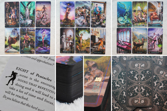
The cards have a delicious matte finish, and are gilded in mat dark brown. I would say they are borderless, but they do feature an inner frame which is very thin and unobtrusive. At the bottom of the card we can find a semi-transparent box with the number and suit off the card, as well as a small symbol in the bottom right corner in the minors to signal the suit. Above this corner we can find a subtle author signature, and a gold foil stamp of authenticity.
The 48 page companion guide book is a black and white booklet. It features the following sections: introduction, about, using your deck, a few spreads, and the card meanings. In the latter we find introductions for the majors and the suits, as well as a brief description of the meaning of each card. In them, you can find a highlighted sentence or keywords, and a closing question for each of the cards. It is possibly in these questions where I have found most of the intention behind each of the cards.
What I get with the Tarot of the Divine Masculine is a journey of discovery and beauty. I am not used to work with the divine masculine, but this deck has really made the first foray very easy for me. There is no trace of toxic masculinity or patriarchal attitudes, giving men space to be men how they want. I feel this deck brings balance into my collection in a way I didn't know I needed; and even if I were not interested in the divine masculine, this is such a beautiful work of art that I could not let it go unnoticed. Make sure you check out at least one full-size illustrations at Vasich Arts, as just that one view will tell you a lot of what I have expressed here.
14 notes
·
View notes
Photo
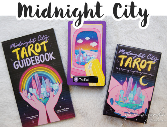
I’m trying out a new review process. I tend to hand-write all notes I take about the decks I work with. However, I have switched to a voice-to-text system, and today’s post is the first result of it. The Midnight City Tarot, by Jackie Franco, is the Fool's journey through the city that never sleeps, a New York inspired tarot deck for those seeking dreamy cityscapes.
This deck is Jackie’s love note to New York, and the cards are constant and dependable friends, and they are created with the intention of being a bridge connecting you to your own intuition. It features a limited colour palette, which is very prominent even at first sight, creating a very cohesive visual experience no matter how big the spread. At the same time, manages to be colourful, in what I can only describe as neon pastel. There’s a huge presence of purple, but also pink, blue, teal, black, white and yellow. I think the combination has a cheeky feeling, something that really awakens my inner child! This is also highlighted by the apparent simplicity of the art style (though there is no forgetting details, no matter how small). One particular feature I would like to pinpoint is how the characters are presented: they are silhouettes reflecting the city sky at midnight. (and the court cards glow the colour of their suit!). You can see yourself and others in them as if they were mirrors. However, I would not say that this is a character-based deck, but rather a spatial, atmospheric work.

The cards really showcase those aspects of our life that are often taken for granted. In them, you can find a lot of architectural elements, exteriors, interiors, concrete, stone, and steel. Each card is considered a subway stop on your journey, with the titles along the bottom mirroring the MTA signage. The illustrations have a double border (thin yellow and broader purple), but they often extend beyond them, creating an invitation to step into the cards, and imbuing life and movement into them. The cards have a delicious linen finish as well as fully-reversible backs; and they come in a sturdy, completely illustrated two-piece box with a small information leaflet.
The companion book (can be bought separately) is an 82 page guide which mainly focuses on the cards themselves after a brief welcome plus a section about the art. Each card is given one page of information, including its vibe, art, advice (upright and reversed), and something that I found incredibly interesting, which is the location of the card. By doing this, Jackie really adds realism and pragmatism into the cards, while at the same time manifesting that inspiration and signs can be found anywhere. It is in this book where we find that the cards are designed to evoke the synchronistic times when you look up and realize the scene in front of you is a symbol conveying the precise information that you need at the exact moment. The guidebook is as wide as and a bit taller than a postcard, which I know because the bundle comes with a couple custom postcards!
The Midnight City Tarot is an example of how a lot small details really make a deck powerful, personal, and evocative. Every design element, from the cards to the book, to the box, have been intentionally created to hold meaning. Its dreamy vibe, pleasing colours, and the magic it evokes for the mundane make this deck a super immersive experience. Even if I have never been to New York, I have come to love the image of it that Jackie offers. This vibrant, urban deck is great for city dwellers, even far away from NY (like myself!), so if you want to know more about it, visit the Midnight City Tarot site!
#tarot#new york#midnight city tarot#art#cards#insight#intuition#divination#meditation#design#products
16 notes
·
View notes
Photo
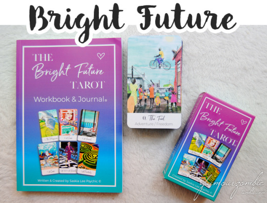
September really flew by, for which I’m grateful, as it is my least favourite month of the year. Work is flowing smoothly, and I think we’re finally ready to adopt rats again (the shelter just rescued four pregnant females, so it’s the perfect time). Now that October is here, I want to focus more on my extended tarot practice, which includes blogging! Today, the spotlight is on the Bright Future Tarot, a modern, refreshing deck by Saskia Lee.
Saskia designed this deck to be fun, relevant and easy. And I have to say, it really excels at these! I noticed early on I used this deck for others, because the imagery was relatable to them, and easy to understand due to the more mundane, daily-life approach of the cards. This hand-painted deck blends ancient symbolism with modern psychology, and overall I must say it leans more on its moderness and contemporary feel. It is colourful, with a huge palette where no hue is left untouched, but I feel the vibrancy is balanced with the soft look of the illustrations - and there are angles, straight lines, architectural features and sharp gazes... but it does feel gentle.

There are two versions, one with keywords (the one you see here) and one without. The keywords are good, they are not distracting, and they can be great training wheels. They are specific, but at the same time I don’t feel they restrict the card. Most of the cards have just one keyword, but some have a couple (eg. The Devil with habitual actions and guilt). Both versions feature a white space at the bottom where the names and keywords (or names alone) are written in a sleek font combination.
Aside from the deck, I also got the companion workbook. It comes at almost 250 pages, and it is definitely more of a guidebook than a journal. It features the following sections: introduction, assessing your intuition, creating a reading and working with layouts, and telling your own story in three simple steps before reaching the cards themselves. It starts with the major arcana, which represent your journey through life and include the name, image, number, element, keywords (also reversed), meanings, and examples from Saskia's experience. Then we get to the minors, which are everyday experiences, featuring the same information found in the majors. Finally, there’s the actual workbook which features practical exercises, including questions in multiple choice format.
The Bright Future Tarot is great for learners (especially if paired with the workbook), but it’s also fantastic for those who are more experienced and read for others. The fact that you can choose with or without keywords is amazing, because I know they are not everyone’s cup of tea, but loved by some. The energy is very vibrant and exciting as it relays on modern imagery, but it is also a deck that offers gentle companionship and guidance. Saskia offers more tarot goodies, so be sure to check them out!
6 notes
·
View notes
Photo

I’ve been sticking to a schedule, which is good because I go back to work on the 1st. And today’s post is a result of said schedule. The Lovely Om Tarot, created by Darshanie Sukhu, is a 78 card watercolour deck (and booklet) featuring gods and goddesses from the Hindu pantheon, as well as mystical beings from, in Darshanie’s words, “the many dimensions that intersect our reality”.
For her, tarot is a process of self-reflection, so her intention for these cards is that they help you to access your intuition so that you can explore different perspectives, communicate with your subconscious and bring in the wisdom of your higher self. The creative process behind the deck is very interesting: she had a vision of brilliant lights emerging from a candle, flooding the room, and forming the Ace of Wands. I took this inspiration and started painting. She continued with the other Aces, opening the elemental energies of the suits, followed by the Princesses (the courts follow the Thoth structure). I feel that this more natural, intuitively guided process (rather than working numerologically) adds freedom and layers to the deck, making the energy of each card very potent and concentrated.

The art style is soft, a feature of the watercolours and the broad palette used, which mixes muted hues, pastels and bright colours as well as playing with the darkness and light of each card, though overall I’d say that, visually, it leans more towards the light. However, as Darshanie says, “it can go very deep into realms of despair and also reach very high into realms of divine vibrations”. I wanted to include this because I feel that on a visual level it looks softer than what it is when actually working with it, in a good way. There are many cultural and mythological elements, mainly from Hinduism, and surprisingly they vibe really well together, and I think it’s mostly because of the clever inclusion of cards that feel more natural, non-theistic or just do not feature characters at all. They just do not clash, but rather talk to each other to create a detailed, layered message, which is the reason why I think this deck really shines with pulls bigger than one card. Btw, the cards are wider than the standard size, and feature a light cool grey border, and a satiny finish.
The companion guide is a 208 page, full-colour book chockfull of information. It includes so much, that I have divided it into four parts to explain it better, starting with a general part with an introduction, a how-to, information on the structure (including a note on reversals), chakras, deities in the deck, the symbol Om, and connecting to the cards; the second part is for the majors, including an introduction, spreads, plus the messages of the cards themselves, which in turn feature pictures of each card and its name, keywords, symbol highlight, meaning, and tips for when you get the card; the third part is for the minors, with an intro to each suit, spreads, and the same features and care found in the majors; finally, the fourth part is shorter, including an about the author and recommended reading, always a highlight! Both the guide and the cards come in a flip-top box, and let me tell you, the production quality is top-notch: aside from the box, it also comes with a custom velvet drawstring bag which actually fits inside the box while holding the cards!
The Lovely Om Tarot is a culturally rich, energetically connected deck that really shines at weaving cards and meanings to deliver a cohesive, detailed message. It is a great tool to take a more intuitive approach to tarot while having fun submerging yourself in the stories that can be found in it. The artistic quality is great, and it feels airy and ethereal in a way, even with all the earthy elements it features. Darshanie Sukhu really poured her creativity, knowledge, care and love into this deck, from the images, to the book, to the details in production, making it a really solid deck for readers of all levels. If you want to know more about it, or even draw a card, head over the Lovely Om site!
4 notes
·
View notes
Photo

In opposition to my previously listed “light decks”, rich decks are those where my eyes can’t stop working and discovering, decks for hours-long fascination, decks that are full. In alphabetical order, these are:
Tarot decks:
Alchemical Tarot: Intriguing deck with rich alchemical wisdom and an antique feeling of the exquisite illustrations.
Blood, Bread & Roses Tarot: Expressive collage deck with a modern and vintage vibe (at the same time). A jewel of diversity.
Children of Litha Tarot: Celebrating the summer solstice, this exquisite deck’s primary inspiration was to explore humankind’s relationship with nature.
Darkness of Light: A deck that shines with its own light despite its dark mood, able to transport you to the places and times found in the cards.
Ellis DecK: An otherwordly beauty full of expressive vector artwork, this deck is perfect to piece stories together. One of my first tarot loves!
Heart and Hands Tarot: Its intricate, black and white artwork makes it feel like there is a hidden path on each card. Fascinating and exuberant.
Mother Tarot: Square-shaped, flowy, colourful and women-centered with a knack for metamorphosis and connection.
Prisma Visions Tarot: Expressive, swirly artwork in lots of colours, with gorgeous framed majors and panoramic minors of unparalleled beauty. One of my all-time favs.
Tarot de St Croix: Fiery deck with uplifting artwork, where different traditions and cultures meet in the “tapestry of life”. Unmissable.
Wheel of Change Tarot: A volcano of a deck with detailed, rich illustrations which get you to a moment and a place. Masterfully diverse.
Oracle decks:
Creatures of the Moon Oracle: A double-sided storytelling deck with Moon and Creature guidance (and a juicy guidebook).
Illuminated Earth Oracle: Mixing hand-paintings and collage, it combines concepts of human experience with the mystery of the natural world. Astonishingly beautiful deck for exploration!
Oracle of the Essences: Vibrant multi-artist deck with essential oils as a theme. Great for learning, meditating and affirmations.
Primordial Sound Oracle: Its landscape-oriented cards are full of vibrant geometric and kaleidoscopic artwork. It reaches deep and awakens pieces of wisdom within us.
Synchronicity Oracle: This mixed technique deck, full of movement and life, brings me joy every time. It is a well-balanced and expressive jewel.
How do you prefer your decks? Is there a rich, busy deck you love in your collection? For more lists like this one, click here!
33 notes
·
View notes
Photo

Shortly after my last post, I lost my second rat. Losing both of them in such a small amount of time has been rough, but I am in the process of making peace with the fact that their lifespans are simply that short. For the past weeks, I have been either a hardcore social animal or a full-time Hermit depending on the day, no in-between. Today’s deck was there for me in my Hermit days. It’s the Mother Tarot, created by Wren McMurdo (also the creator of the Dark Days Tarot).
Indeed, the Mother Tarot’s vibrancy, colours, and earthy presence have helped me navigate the changes that have been taking place. It feels summery, but it is its ability to gauge and express change in a rich but lightweight way what has helped me the most. Let me explain: the illustrations contain lots of details, small treasures, and great symbology that make each of them unique. However, there is some level of metamorphosis always going on in each card, weaving them all together, and delivering a message of advancement. In fact, while creating the deck, Wren drew ideas and inspiration from Earth, birth, creativity, and climate change. She says: “this deck is lit with dynamic energy to spur you along your path. Take guidance from this deck as we embrace this dynamic time on our planet”.
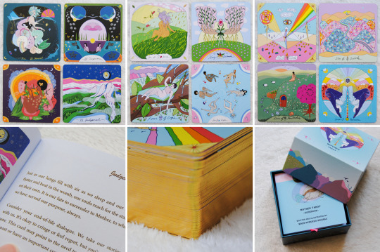
This collective, dynamic feeling really emphasizes the connection of individuals to everything around us. This is a deck where nature feels alive in a conscious way, harmonizing with the characters and their archetypal features. Following this idea, I have found it super easy to identify with the people in the cards from day 1. There’s abundant diversity, though it is clearly female-centered. This way, Wren hopes for “maternal figures and creators of all kinds [to] find reverence for themselves in these cards”. Some cards are busier, some are more laid-back; in general, there’s a flowy art-style, sometimes it feels kind psychedelic. There’s nudity, and a fav detail (you may know this is a fav if you’ve been following along for a while): body hair. You can see from the pictures how colourful it is, but also, a particularity: it is square. In a reading, you can incorporate the four seasons, four elements, four directions, or four phases of the lunar cycle, and it is suggested to use this deck “on waxing moon days when the collective consciousness is building creative energy”. The cardstock has a buttery matte finish, they are flexible (more so vertically than horizontally, pretty sure it’s the core) and they are gilded.
The full-colour guide stands at 173 pages, and it includes: a “getting started”, tips, intro to major and minor arcana, intro to the suits and numbers, a brief text on card orientations, and the messages of the cards themselves. These, in turn, include a picture of the card, and a single meaning (that is, you do not find one for each of the orientations, that’s up to you). The messages are amazing, very on point with what is seen in the cards. Both cards and book (which is also square) come within a two-piece box, very sturdy and decorated all around.
The Mother Tarot is intriguing, deep, and it flows. It reclaims a very primal but gentle part within ourselves, making us present in the moment; but at the same time, its sense of connection shows us the path to branching out and reaching further. It is very expressive, and though you definitely can work with it on its own, it’s a wonder to pair it with the Dark Days Tarot. Wren McMurdo has managed to create something entirely different from her previous work, but keeping it surprisingly cohesive. If you want to read and see more of both decks, head over her site!
6 notes
·
View notes
Photo

July was a very Death-esque (as in, tarot Death) month for me. I lost one of my pets, I got assigned to a new highschool (a yearly occurence for most of us working in the public school system), some of my hubs’ projects didn’t come to fruition, others did. There wasn’t as much me-time as I anticipated, tbh! But today, I’m going to showcase one of the tools that did make an appearance during the highs and the lows of the month: the Dirt Gems Oracle, a botanical deck by Anne Louise Burdett & Chelsea Granger. These friends were inspired by their love for the earth and all the medicine and healing that it holds, and it is a stunning set of cards and guidebook.
I know the deck already looks awesome by the pictures, and the first time I read about it, it really caught my attention. But there’s no way of expressing how much power and beauty it has when you see it in person and work with it. It has such a strong energy, vibrant but steady. It has its own structure, created by combining the elements, weather systems, alchemy, and energetic signatures of the plant allies. The 65 cards are in fact divided into suits: ablaze (15 cards), afloat (14), adrift (17) and amidst (19). The division is clever and based on the different charactersitics of each of the plants involved, and each suit is associated with an element and a colour palette (most clearly seen in adrift with its b&w).
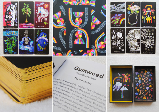
And it is incredibly fun. It doesn’t mean it can’t get deep (it does!), but honestly working with it is just so enjoyable even if it can look dark and kinda moody. The art style is very unique, with a dreamy feel, and the use of colours (including the restricted palettes) feels magical. It does show the care, experiences and knowledge that went into it. The illustrations make use of the black background to give them space and a lightness that works amazingly well when using these cards with other decks. Most of the elements presented are plants and animals, but there are also other natural elements, charachters, and human-made objects. The cards have a buttery matte finish (they are able to slide, unlike with the rose-petal finish), they are gilded (in either gold or copper) and they come inside a fully illustrated two-piece sturdy box.
The companion guide is juicy, at 165 pages. It has a small intro which includes plant magick, the suits exploration with intro to and associations for each, a how to, example spreads, and a few words on tradition, arriving at page 25 to the cards’ information: a b&w image, the plant name (including its scientific name), an assigned title (eg. The Transmutter for Gumweed), and the message and meaning of each card itself. The illustrations can offer enough of an intuitive hit to work with them alone based on the symbology that goes with the plants and the way in which they are presented and coloured (especially if you’re versed in plant lore), but in my case I find this to be a deck whose guide I find necessary and enriching.
The Dirt Gems Oracle is a deck that links the very tangible reality of plants to their ethereal aspects, as well as guiding us along this bridge to (re)connect with the earth, and hence, with ourselves. Though the four elements are present, I feel it’s mostly a grounding and reassuring deck with lots to teach. It is fun, eye-catching and well-designed, and it vibrates to an energy that should be very basic and present for and in us, but that the modern world can tamper with frequently. Anne Louise Burdett & Chelsea Granger have done an amazing job with this deck, so if you want to know and see more, head over the Dirt Gems site!
39 notes
·
View notes
Photo
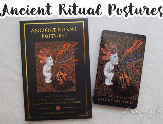
I hope you’re ready for what’s coming up next: this set is quite something. I have had decks before that prompted me to move, or to remain still. This one has done both, and it’s been a complex experience: physical, intellectual, visual, spiritual. This is a post for those who like the intriguing and the gorgeous, this is my introduction to the Ancient Ritual Postures Oracle cards and book, by Belinda Gore.
This deck features ancient ritual postures drawn from indigenous art and ancient artifacts from around the world. Dating from 36,000 years ago to the present day, the images in the deck encompass many ancient cultures and traditions. It’s a 52 card deck with its own structure, with 5 suits made up of 10 cards each (Healing, Divination, Metamorphosis, Spirit Journey and Initiation) and a sixth suit (Ritual) with just 2 cards that act as “brackets” or “bookends”. Each suit has a different back, a distinctive mandala for each.
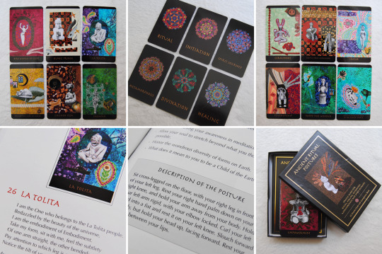
The cards are intended to be a tool for accessing one’s own intuitive guidance, and a guide for physically practicing each posture. There’s a lot that can be done with these cards, and though I’ve worked with them exhaustively, they still surprise me. The figures against the collagey background manage to be primal and raw but also exquisite and sophisticated. There’s a mix of colour and texture, and I feel this deck could perfectly belong in a curiosity cabinet to be simply admired.
The super rich companion book, at 140 pages, frames body positions within a ritual context, by stating that “praying is something you can do with your body”. It features a working process: breathing, rhythmic sounds and the enactment of the posture for 15′. This is not meant to return to earlier times, but to honouring our ancestors. But anyway, there’s no need to actually go through the ritual to use the cards, which can totally be used as your regular oracle deck. In fact, after a how-to, the book includes different ways to use the cards, as well as a dive into the suits and ways of integrating the experiences. From page 24 onwards you can find the actual card exploration, including its name, picture, a dedicated poem, and the posture description. Both the book and the deck come in a two-part box that could have been sturdier, but that keeps the goodies safe.
The Ancient Ritual Postures is a fascinating deck and book combo full of surprises and details to uncover. The images are rich and evocative, and they encourage you to do work as you deem appropriate, offering different explorations and options that seem to evolve with you the more you work with them. This set shows the knowledge, passion and care that Belinda Gore put into it, and I can’t believe how under the radar this is, because it’s pure genius. Belinda offers more information and pictures on her site, so go check it out to quench your curiosity!
9 notes
·
View notes
Photo
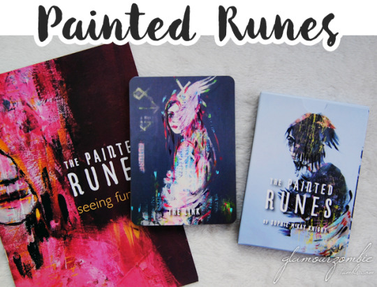
Long time no see! Whew, it’s been long. And hard. COVID hit my family hard (we’re all safe now), work became increasingly stressful after February, and I had 0 energy in me. But summer holidays are around the corner, and that means me-time and blog-time. And, why not, rune-time. This is my first foray into runes, so I was happy to go ahead with this learning process holding a familiar (and metaphorical) hand: The Painted Runes, by Sophie Mckay Knight, is a sibling deck to her Painted Tarot, which I reviewed a while ago.
For Sophie, painting the tarot was “the proverbial Fool’s journey” in itself. But before the paintings for the tarot were finished, she was already thinking about painting this rune deck. As with her previous deck, these cards feature equal parts movement and stillness, but the structure is, of course, very different. This deck features 26 cards: 24 Elder Futhark runes, an interpretation of the “Blank” or “Unknowable Rune”, as well as an additional card called “The Link”, which according to Sophie “can be used in the reading process or taken out to help with spiritual connection” - I have tried both and liked them equally.

This is a very cohesive deck, artistically speaking, making use of colour and texture in clever and expressive ways. One of the main differences I noted with respect to her Tarot is that there’s practically no use of white space, so this can be categorically classified as a colourful, vibrant deck. However, this is balanced by using more muted hues when needed, especially in the backgrounds, creating a fascinating and flowy reading experience. The images are character-focused, so they feel up-close and personal. The cards come in a custom tuckbox and have striking backs.
As this has been a learning tool for me, I need to pay special attention to the booklet. It’s an A5, 23 page guide with a great structure and a heavy link to tarot in its interpretations - which is marvellous for those of us who are already well-versed on it, using what we know as a “way in”. The cards are structured into 3 families of 8 cards, called aettir: Freya’s, Heimdall’s (aka Hagal’s), and Tyr’s. The booklet features a bried how-to, an even briefer note on reversals, and spreads. The meaty part is the rune information itself, featuring its symbol, card image, name, keywords, message and meaning, and tarot associations. It’s full-colour so you can just grab a cuppa and read it to learn without even needing to physically reach for the cards. As extras, Sophie included four postcard-sized art cards, which I always love receiving!
The Painted Runes is a deck which feels very personal, and hence, also very similar to the Painted Tarot in its energy. I feel the same deep reflection of spirit and an endorsement to appreciate beauty, just under a different structure. Runes in general have felt more primal (in a positive sense), but I feel Sophie has refined them to perfectly align with those of us who just love tarot. The stillness of its figures conceals an inner movement, and the colour play is fantastic for summer. The characters feel alive, so I have found it to be a fantastic introduction to runes. If you like what you’ve read so far, head over Sophie’s site to know more about the deck!
9 notes
·
View notes
Photo

Today I am presenting something a little bit different from what I usually post here, but still within the realm of tarot: colouring books by Liminal 11. These are the Modern Witch Tarot colouring book, and the Cosmic Slumber colouring book. However! I need to say that these books are not only tools to make put your art toolkit to work, as they include other interactive experiences for tarot lovers. Keep reading for all the details!
I must say, the colouring experience is radically different from that of reading. The engagement is not better or worse, not even more active nor more passive… but indeed different. Aside from the actual colouring, the contents that are included are: deep insights into the cards (not found in the guidebook), activities, extra artwork, and journal prompts. Both books have 152 pages, and feature ribbon markers.
Let's go over the structure of the Modern Witch Tarot book: first of all we find textured softcovers. On its inside, they features the illustrations of the tarot (and in the first flap will also find a colour guide). Later we find: a foreword, an introduction, a how-to, and then we get into the majors. After that we have the minors (which present a different structure to the majors), and this is finished by a further reading section, and a tracker in the other flap. It is in the structure of the majors where we can find the juiciest activities and information. Each features four pages: we are presented with the line art of the card and an exploration of its symbols and depth, plus a section called what this means. In the next two pages we find space for our reflections, with guided questions, the cards connections, a kaleidoscopic, tarot mandala, and a tarot tip.

But the minors are radically different. We have a page that acts as an introduction to the minors themselves, the numbers, and the court cards; and the next page focuses on the suit themselves, offering a small reflection and tarot tip for each suit. After this, aside from some exclusive illustrations, what we find is the line art for each card of the four suits, without the addition of further reflection or symbolic analysis as it was done in the majors.
Since the structure for the Cosmic Slumber Tarot book is pretty much the same, I will go over the differences. The cover, flaps and initial sections are the same. When it comes to the majors we find the four pages we did in the previous book, but with a few differences. We start with the presentation of the card, which includes its dreamscape, its archetype, its symbols, its dream, and a tarot tip. In the next page we find the lineart for the card and its colour code. In the third page we have space for reflections with guided questions, and in the fourth page we find again the tarot mandala. This goes on for all of the majors. We get into the minors just as we did before, with a small introduction, the numbers, the courts, and a brief paragraph for each suit with a small area for a general reflection. Then, again, we are presented with the lineart of the single cards.
What they offer is pretty much the same in the two books, and the variations are due to the very own natures of the decks: the Modern Witch tends to be more practical and symbol-oriented; whereas in the Cosmic Slumber we are more concerned with dreamscapes and otherworldly signs. But in terms of the work they do. they are pretty much the same, so the choice to pick either or both is more in the realms of personal taste. These books have a twofold way of being used: as deck companions, or as a way to explore new deck art in a different way.
I think the addition of tarot colouring books to the Liminal 11 catalogue is of great significance for readers. Before, we only had decks and books; but now we also have companion journals and other fun interactive activities such as the ones I have presented today. Even those who do not want to read tarot on itself, but want some introduction in a way that it is still active (while doing a relaxing activity such as colouring and journaling), can approach these books easily.
#tarot#colouring book#coloring book#coloring#liminal 11#modern witch#modern witch tarot#cards#meditation#creativity#insight#products
30 notes
·
View notes
Photo
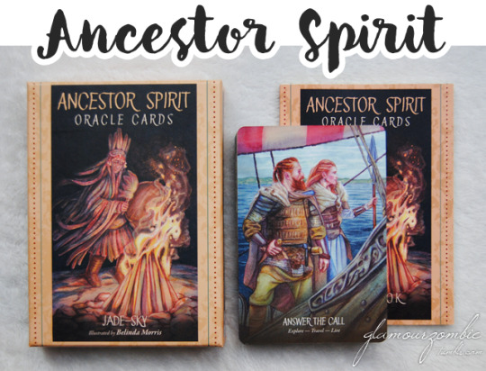
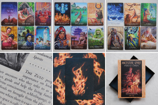
I didn’t plan on not writing during December, but folks was it a busy month! There were meetings, there were deadlines, and after all of that... there was relaxation and family time to be enjoyed. So this is, officially, the first review of 2022! I have chosen one of those decks that I keep rediscovering and falling in love with every time. Like even when I was on my draft of the review I kept saying to myself: honestly wow. And which is it? The Ancestor Spirit Oracle! Created by Jade-Sky, with art by Belinda Morris and the top-notch quality from Blue Angel Publishing, this deck was an amazing discovery of 2021.
“The knowledge of those who came before us can never be lost. It is alive within our hearts, our souls and our DNA”. With this in mind, the deck invites us to “answer the call of the ancestors to connect to their wisdom, discover their truths and accept their support”. Aside from the main ancestral theme, what has captivated me the most is its diversity, not only in the obvious geographical variety with people from different ethnicities, skin colours, and cultures; but also in body sizes, genders, and ages. It feels extremely natural and human, and it is very easy to connect with.
The cards are superb: colourful, saturated and very expressive. In her artwork, Belinda Morris uses watercolour, gouache, pencil, and digital touches, so they are very detailed and lavish. Most of them are very character focused, and each of the faces is different in features and expressions - and I also love the attention to the clothing. The cards that do not feature characters are very atmospheric, in the sense that you feel transported to the places being shown. It feels open and expansive because it covers many areas of the world, but it also feels interconnected, homely, intimate.
Within the sturdy two-piece box you can also find the guidebook: at 103 pages, features a short introduction and the card meanings. Within the introduction we find a foreword, a way to prepare the cards, a how-to on using the cards, and card layouts. Then, for each card, we find its title, three keywords, its cultural background, Ancestors Speak (which is the message of the card itself), and it ends with a divinatory meaning. The writing is beautiful and respectful, and you can go beyond the cards and actually research the cultures that are represented in each card, so the amount of hours that you can get from this oracle are endless. Although the backs feature fire, I think this is an oracle that you cannot associate with a single element, and if I had to choose, it would be humanity on itself, Spirit.
Aside from being a stunning work of art, a great useful deck, and a lovely collection piece, the Ancestor Spirit Oracle is also a great too to learn about other cultures. It shows the utmost respect and love that went into its creation, which makes it approachable and deep. It is a comforting deck, but one that lays many lessons in our way. Honestly, what a treasure! Without a doubt, this has become not only one of my favourite oracles from Blue Angel, but also one of my favourite decks of all time.
15 notes
·
View notes
Photo
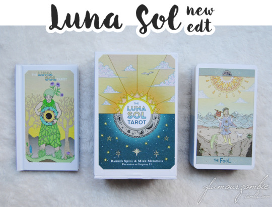
I have been very work-focused lately (in a healthy way, please take care of yourself first). That means I am trying to squeeze in my blog reviews (tarot in my life is never stopping, though) to give myself a breather. It's time for the Luna Sol Tarot, produced by Darren Shill and Kay Medaglia at Liminal 11. This deck is not new to me, as what you'll see today is its newer edition - in fact, it's a deck I've known and worked with for three years!
I tend to label my decks (mentally) to easily locate them in my collection for the moments when I need something particular. What has stood the most about the Luna Sol is its inclusion and its softness. It's a gentle, charming deck with revitalized symbolism, and lots of characters that "invite you in with moments of delicate vulnerability"; being "an uplifting, healing tarot deck that reflects our beautifully diverse world". Indeed, the Luna Sol makes space for everyone. The palette choice, leaning on pastels, is the very first thing that made me smile. The artwork feels soft, but not blurry or diffused. The diversity of the characters promotes a more realistic, inviting environment - and of course, it highlights the issue of representation.

I mentioned a “revitalized symbolism” because the cards feel really modern and fresh. The diversity and the laid-back and honest vibe of the characters encourages deep conversations with oneself. And the artwork is so pretty! It features thin lines of different colours (instead of just using black) and the shapes feel organic. There's a natural flow into the card, even in the moodiest ones - allowing for an easy way to weave thoughts among different cards that may seem contradictive at first.
Let's go over the differences between the editions. The box now is the same as the usual Liminal 11 boxes, with a magnetic slipcase box. The backs in the second edition feature the same design, but they are borderless. The cards are a sliver taller than in the first edition, and in terms of the finish, the second edition is more matte - the first edition was not glossy to start with. The cards are the same, and if I were to find a difference, I would say that in the second edition the illustrations appear either darker or a little bit less saturated - and I feel that in the second edition the textures show better. In this edition there are also two extra cards: Wu Wei and Duality.
The booklet has new features, with the inclusion of new pages, its being in full color, and having a hardcover. It includes a foreword, an introduction, information on how to read the cards, tips, spreads, and information on the cards themselves. This information is more extensive on the majors (which also include a quote for each card) and shorter, but still very valuable, in the minors.
The Luna Sol Tarot breathes a gentle but energizing vibe that can enchant very different people. The diversity, the beautiful colours, the striking artwork and the ease when connecting different cards make it a highly approachable deck that doesn’t sacrifice depth or symbolism in its quest for openness. This is an unmissable deck - and this new edition, with its wonderful box and two extra cards, is an amazing addition to the Liminal 11 repertoire.
11 notes
·
View notes