volkadoma
peristeronic and petrichor
Chay | He/They | Minor | Drawing requests are open for now | I draw Dream SMP stuff and sometimes other things
13 posts
Don't wanna be here? Send us removal request.
Last Seen Blogs

romanttia
Killing me softly.♡ ݁ ˖
yugyeom-bear
kpop Icons

pantymagic6-blog
Situs Dominoqq & Agen Pokerqq, Bandarqq online
rocket-prose
Rocket Prose
findingmylight
Finding My Light☼
Text
why butch hartman's dream smp character designs feel so damn wrong
as of writing this, i've seen six designs that butch has done for dream smp characters - in order, he designed dream, techno, wilbur, tommy, quackity and ranboo. the general consensus, not necessarily about the art style or the technique in general is that the designs are just wrong and that the specific choices he makes are incorrect or do not properly represent the character.
and to be honest, this isn't necessarily a critique of hartman - although that man can be heavily criticised from transphobia to ableism to tracing and plagiarism and some more cursed lore that i won't dare dwell on - this is more of a perspective on how different the fandom's consensus designs are in comparison to the famed 'pov outsider'.
like in my exhibit post where i dunked on all of the designs here, i want to clarify that i'm not an artist. i can't design for shit, and what i'm mainly doing here is just making an observation on how different the fandom consensus is on how characters are and how variety is treated within that in comparison to how people creating fanart for the series who are from outside of the fandom is seen as incorrect.
i also want to suggest that technically, yes no design is 'incorrect', it's just that some choices are so far removed from what we know of characters that it can be seen as incorrect.
exhibit 1: dream
dream's design isn't really an offender, here. it's the one that matches the most closely with actual fanart of dream, specifically humanoid fanart, and to be honest the actual design choices hartman has made are very common with fanart.
there's nothing necessarily special about hartman's dream design, but on a broader note, dream designs tend to work well because they're very simplistic and lack a lot of visible emotion. the mask acts as a way to hide the face in designs like his, and most often than not, especially regarding manhunt or smp -based designs, it makes him intimidating or imposing because we can't see his face, and it creates a distance between the viewer and the actual character in front of us because it's less human and less involved. most of the time, the only skin we get to see in designs like this are the fingers.
exhibit 2: technoblade
this is where we start to have an issue.
there's sort of a spectrum of techno designs in five stages:
skinny human techno (pigskull) <-> buff human techno (piglin characteristics) <-> piglin/human hybrid (sad-ist) <-> big buff pigman (straight up piglin) <-> literally a pig (biblically accurate)
hartman seems to have gone with option four, big buff pigman (straight up piglin), which is a fine option to pick, techno himself on multiple occasions has said he prefers the animal designs, it's just the specific design choices are wrong.
these are dream smp character designs, so there are certain consistencies that we see. in the retirement arc, we see techno clad in blue. techno's weapons are also consistent - the orphan obliterator and the axe of peace are weapons we see him use and we see him drawn with a lot. to see hartman's design incorporate two differently designed swords held together by a wire or a cord feels,,,, wrong. it's not something you'd see in a techno design because he doesn't wield two swords.
the hairstyle is also another offender. most commonly techno is drawn with longer hair - sad-ist's braid is a popular one, but i've also seen her design evolve: the braid was cut in the duel animatic, and then it was short in dawn of 16th, and then it had grown out a little by hog hunt to just below the shoulders. i've also seen techno commonly drawn with a bun or with waist-length pink hair.
hartman's design has him with an awkward bob, and some hair within the crown that goes straight upwards. disregarding the physics or the logistics of that, this isn't something you'd see in a techno design.
exhibit 3: wilbur soot
this is where we really start to have a problem.
there's a lot different about hartman's wilbur design to the point that many, myself included, didn't even think he'd designed wilbur.
hartman has interpreted common wilbur designs very oddly. he seems to have interpreted the beanie he's commonly drawn with as a bandana, and he also sports a bandana around his neck - something that's seen a lot more in designs of tommy and tubbo. i'm not going to touch on the fashion implications of wearing two bandanas.
he's also wearing big chunky boots, which doesn't seem to be a staple of most wilbur designs, and wilbur's typical big gross sweaty trenchcoat that we're used to makes him look more like a pirate.
the design strays so much from what we expect of wilbur that i've joked that hartman designed his own dsmp oc, and i'll get into why this may have happened later*.
exhibit 4: tommyinnit
again, this one's a pretty big offender.
a lot of the design elements are straight up stolen on this one from the very first result on google for 'tommyinnit dream smp fanart', which is a real shame, because especially in recent arcs, tommy designs have become really varied.
you have the compass, i guess, which is typical of tommy designs, and you have a few bandages - suggests he's a scruffy kid.
where you lose people is with the inclusion of a cape, something not seen at all in designs of tommy, and with a random potion on his hip. he looks more like an adventurer, which isn't him at all. he's also sporting odd boots, when tommy's only ever drawn with sneakers.
exhibit 5: quackity
quackity's one is kind of jarring, because you technically have all of the elements of what makes a quackity design, but they're all incorrect. you have the LAFD beanie and the zip up jacket, a staple of regular or election era designs, but you also have playing cards, a blind eye and a scar facing the wrong way, a staple of casino arc quackity. it's very obvious that hartman's seen various design elements and kind of mashed them all together to create an amalgamation of what he thinks is quackity, and oddly enough, having all of these incongruent puzzle pieces does not finish the jigsaw. this is not quackity.
exhibit 6: ranboo
this is not a dsmp!ranboo design. this is an irl!boo design. there's nothing wrong with that, people do irlboo fanart all the time and it's great, it's just that it doesn't make sense to market irlboo as dsmpboo when dsmpboo is very clearly nonhuman.
it's very obvious that hartman typed 'ranboo' into google and found a bunch of pictures of ranboo irl and assumed that was him in the dream smp too.
--
to conclude*:
it's very obvious that designs from fandom members are vastly different to someone who has no love for the source material. there's no research done, no proper references, there's no decent inspiration - the closest we get is hartman copying elements from a tommy design, and copying a mishmash of quackity design elements.
i think what else i can note is that these designs are horribly bland and boring. not that there's nothing wrong with more human designs, there's nothing wrong with that at all and if you want to interpret characters that way i'm not going to stop you. the thing i want to observe is that there's so much more variety in fandom that's not seen as wrong.
for example, tommy designs are really varied in current fandom. most people draw c!tommy as human, but there are also others who draw him with notable raccoon-like features, people that draw him with devil horns and a tail, people who draw him as an avian - these are all common and these aren't incorrect. if butch were, for example (not suggesting he's creative enough to do so, but i digress), to draw tommy as a bee would be seen as wrong, because that's not his thing - that's tubbo's thing. the same as including a cape on a tommy design, when capes are more of a staple of people designing wilbur, niki or eret.
and c!tommy designs are so fun, as well! a lot of them are based off of headcanons such as the raccooninnit headcanon, the friend cardigan based off of the tailor headcanon, the bandana headcanon - all really staple and fun and common c!tommy designs that hartman has ignored because he copied design elements from the first image on google, and then filled in the blanks based on his perceptions of a character he doesn't know.
let's say for example that butch hartman's next design is tubbo. when you search for tubbo on google images, you'll get a lot of pictures of tubbo irl, and you'll also get his profile picture. what hartman will end up drawing is a c!tubbo with brown hair, the tweek shirt, and probably the discs (because on the first page of google, you're more likely to see the discs than you are for a tommy design).
what you won't see is the actual brilliant variety of c!tubbo fanon design elements - you won't see the burn scars, you won't see the snowchester coat, you won't see any references to nuclear weaponry or radioactivity, you won't see michael, you won't see any references to fireworks, you won't see him in his presidential suit, you won't see goat horns nor will you see any bee characteristics. you'll see what hartman thinks is tubbo, because he has no love for the source material. either that, or he'll gather some of c!tubbo's characteristics, such as the fact that he was a spy and he'll end up drawing one of charlie's angels, or he'll see that c!tubbo makes nuclear weaponry and draw him as a mad scientist.
169 notes
·
View notes


Photo

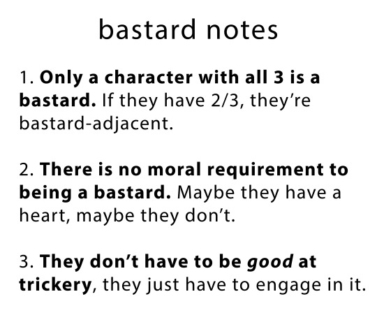
Ever wondered how to tell if a character is a bastard?
Well, look no further, for I have distilled the 3 pillars of bastardom for all your oc/char tagging needs!
69K notes
·
View notes
Text
new art blog besties
heres my plan for new spot
- put some art that i like from here over there (there will also be at least one piece of new art!)
- delete this blog (@oldartblogkjhgjkfgh) in about a week
- gonna use new blog the way i use this one, but hopefully i’ll be more active! i’m going to try to make art once a week now that i don’t have school
new blog is @volkadoma
12 notes
·
View notes
Text
👏👏okay besties new blog we're abandoning this one im gonna put up some old art there just for consistency
2 notes
·
View notes
Text
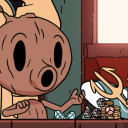
meanwhile, in some forgotten and dusty hallway. . .
#dream smp#c!wilbur#wilbur soot#wilbur soot fanart#/rp /dsmp#l'manbur#ghostbur#l'manburg#takes place in december on the lore timeline#fanart#dream smp fanart#dsmp#digital art#my art#autodesk sketchbook#please i have no clue whats happening in current lore take this#wow that tumblr quality tho /s
2 notes
·
View notes
Text


techno and dream together in Pandora’s Vault like
0 notes
Text

meow meow is back
1 note
·
View note


Text
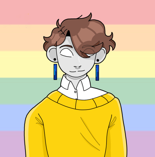
Pride ghostbur
16 notes
·
View notes