#the suit is really beautiful!
Text
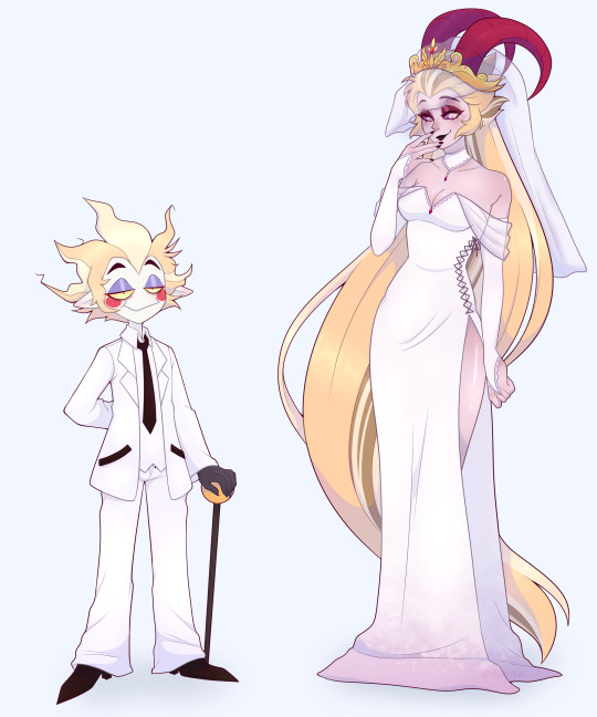

Someone probably already did this meme with these two, but shhh. I just wanted to.
#rot's art#art#artists on tumblr#hazbin hotel#fanart#hazbin hotel lucifer#lucifer morningstar#lilith morningstar#hazbin hotel lilith#beautiful bride and ugly ass groom#shitpost#but a really high effort shitpost#I made Luci's suit oversized on purpose#thang fits blud like a parachute <3#lucilith
2K notes
·
View notes
Text

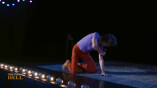
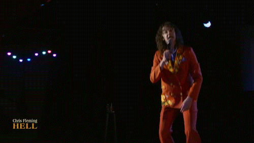
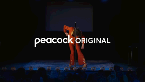

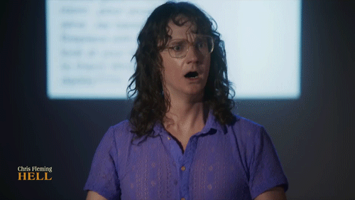
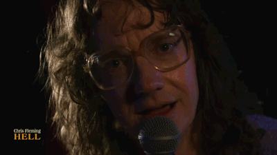
Chris Fleming: Hell (2023)
Official Trailer
#I’m so excited holy shit#if you see this hi again Kiki it was so nice to meet you#the suit is beautiful. really leaning into the Mother Goose energy#and the shirt! can’t believe I didn’t realize you wore it at the Milwaukee show it’s glorious#Chris Fleming#K.gif#GIF .
3K notes
·
View notes
Photo
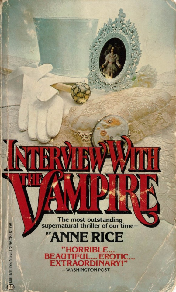
I think often about this cover art
#It doesn't even really suit the vibes of the novel all that well but it is so pretty that i dont even care#very beautiful#tvc#iwtv#interview with the vampire
3K notes
·
View notes
Text

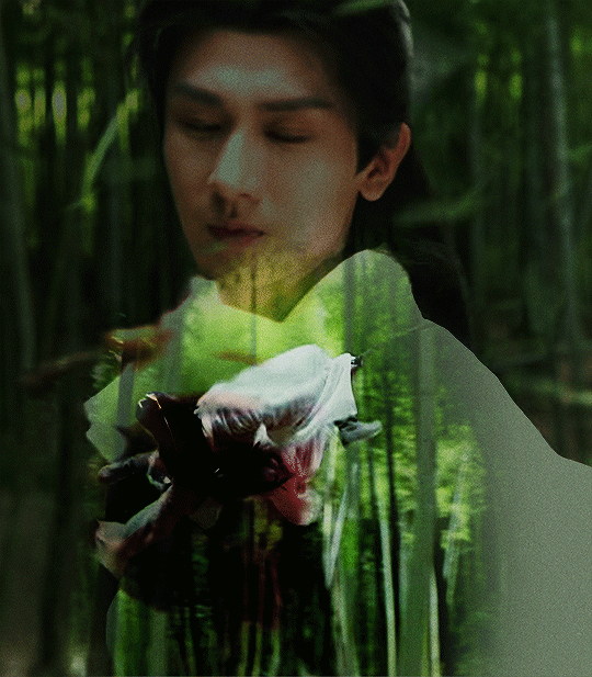

美人舞如莲花旋 a beauty dances like a spiralling lotus flower [x]
li xiangyi/li lianhua + sword dances | 莲花楼 mysterious lotus casebook EP 9/34/40
#莲花楼#mysterious lotus casebook#asiandramasource#dailyasiandramas#cdramasource#asiandramanet#cdramagifs#cdramanet#cdrama#cheng yi#lhlgifs#jielin's edits#my posts#drama#do you know how painful it is for me to gif action scenes#as basically someone with ZERO patience for action scenes#bc it means i have to actually watch the scenes over and over to find what is gifable AND suits the composition#but god i LOVE his sword dances. they are beautiful and they are character studies of lxy/llh. so.#it guts me to leave out most of the other really cool sequences in fact#anw this was still very fun to make!!! haven't done blending since the first time i did#tried my best with the 2nd one lmao the fuckin' bamboo forest 😔#also if you contrast this with the set i posted last night lmfao. duality of a man <3#i'm begging everyone to watch that fmv. it's my fave lxy/llh solo fmv of all-time
225 notes
·
View notes
Text
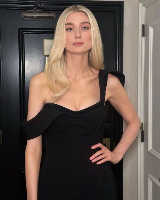


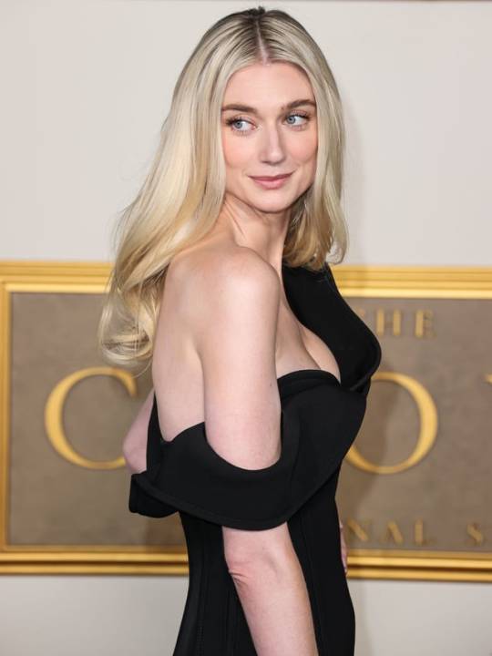

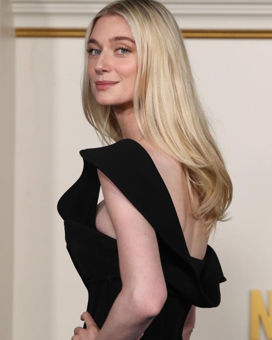
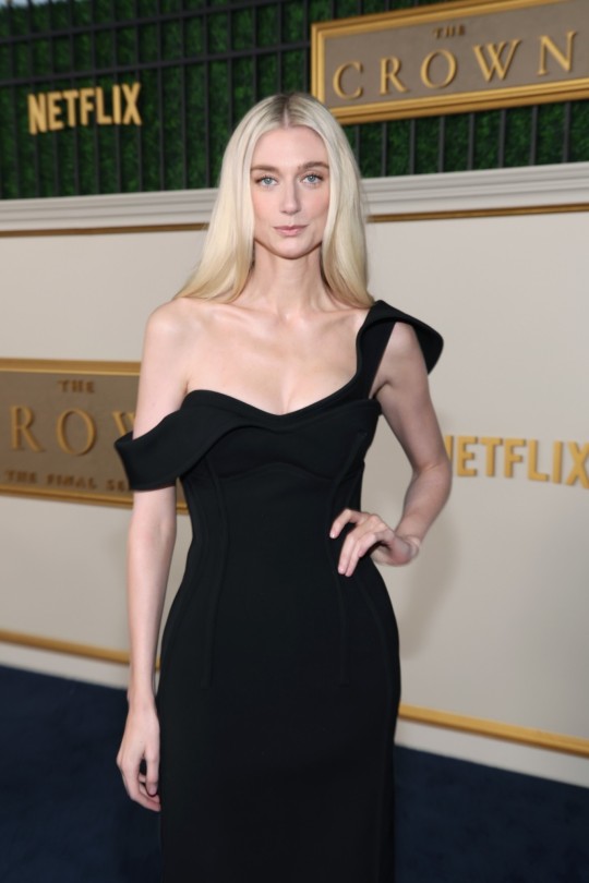

Elizabeth Debicki attends the premiere of Netflix's "The Crown" Season 6 Part 1 at the Regency Village Theatre on November 12, 2023 in Los Angeles, California.
#elizabeth debicki#netflix#the crown#princess diana#series premiere#stunning#beauty#aussie celebs#actress#long hair really suits her#gorgeous#celebrities
218 notes
·
View notes
Text
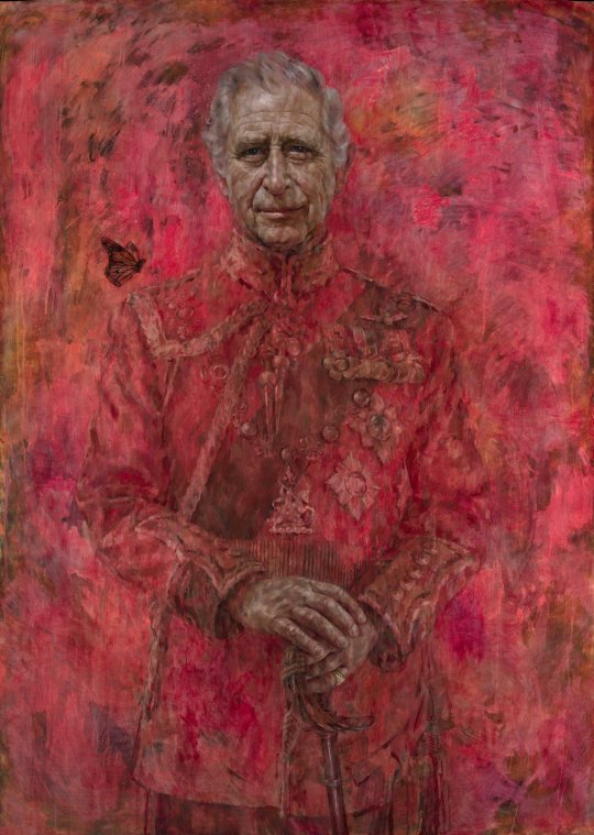
This painting would totally be in the meat castle from Alice madness returns
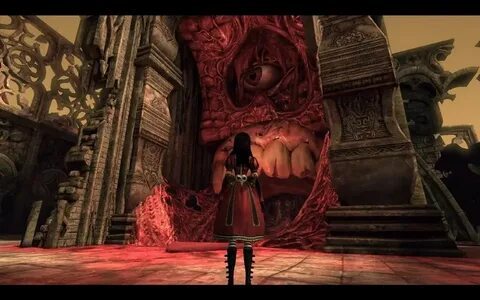
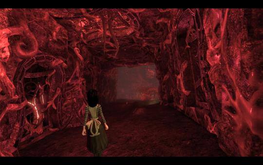
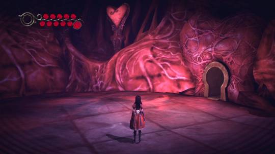
It suits the vibe so well😍😍😍🎉
#alice madness returns#american mcgee's alice#amr#queensland#king charles lll#i have very mixed feelings about this painting#it's beautiful and totally in my style#but it doesn't really suit a KING#the vibe of this piece suggest that the monarch is very bloody person
80 notes
·
View notes
Text
Misha Collins • Suited Roles


Bow Ties Red Ties Waistcoats Suit & Tie Ties
#misha collins#suit and tie#tuxedo#no brainers on taxes#karla#kittens in a cage#timeless#gotham knights#aging like fine wine#my favorites are from gotham knights#it was really hard to narrow it down to a few#misha is beautiful
232 notes
·
View notes
Text
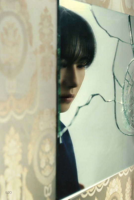


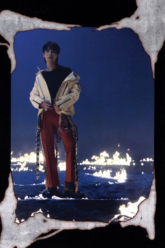

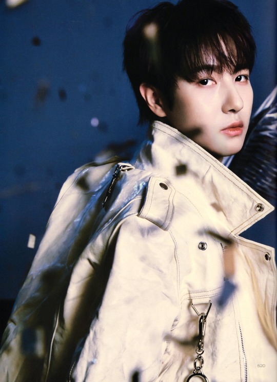
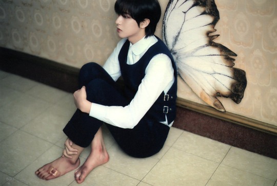
DREAM( )SCAPE // RENJUN
#he's so beautiful i could only cry#wings really suit him my smol fairy angel prince#nct#nct dream#renjun#loml#huang renjun#renjun pics#dream()scape photobook#dream()scape#ctto 520gifs
70 notes
·
View notes
Text
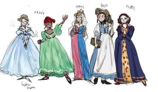
Disney princess with a bit more accurate outfits...
.
.
.
#art#fanart#disney#princess#historical fashion#i know cinderella is supposed to be set in the 1860s#but the 1830s suit the story so much better#like she can still have her hair bun and bangs#and full dress#and her stepmother can have those long regency-esque dresses#and ruffles#and the stepsisters can have those crazy haistyles#i'm sorry i went on a rant#also my little mermaid is more inspired in the live action#because the og movie can go either 1830s os 1890s puffs#but the live action has a more late 1830s aesthetic#still i think they did the actress dirty in term of clothes and hair#especially hair color#so nothing really pops out#don't ask me why snow white is in the 1570s#i also don't know#Sleeping Beauty is supposedly set somewhere in the late 14th century#so i chose the 1380s because i like it
78 notes
·
View notes
Photo
Andrew Garfield for GQ+Saint Laurent
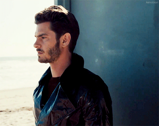
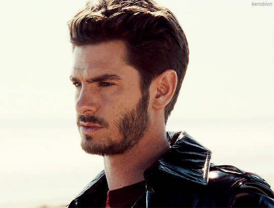
#you know I had to do it#andrew garfield#my gifs#this video was a bit out there#but some of the themes mentioned in it (and the article) remind me of how Andrew talks about his mom#and upon realizing that it felt like the whole video made more sense#also I love how the article mentions how he loves both the skate/surf style and really formal attire#cause same#I love that kind of casual but trendy look#but also the idea of dressing in something incredibly swanky is so appealing#I wish someone would invite me to a fancy event and supply me with a really good suit#I just know it'd feel right#also the emotional depth Andrew has is incredible#it makes me wish to have a conversation about the way things are with him#ugh and he looks so good here too#he looks 100% like cuddle material in that sweater#please hmu anytime Andrew you beautiful being
644 notes
·
View notes
Text
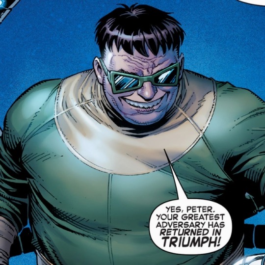
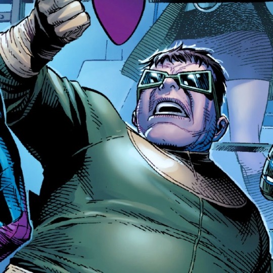

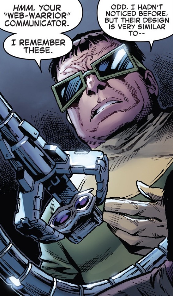
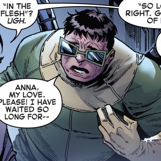
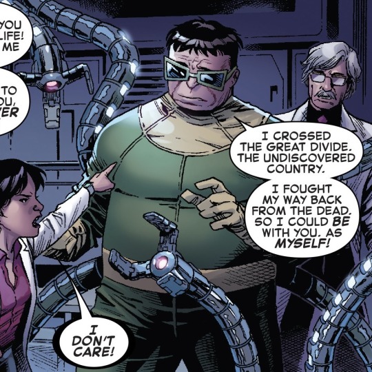
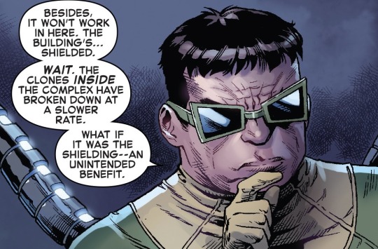
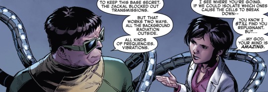
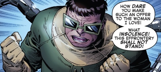
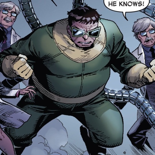
Pics of Doc Ock from The Clone Conspiracy Event
#marvel#doc ock#doctor octopus#otto octavius#marvel comics#dare I say this is most beautiful and sexy Otto has ever looked#his bowl cut hair is perfect#his glasses are perfect#his body size is undeniably large and perfect#his suit is perfect#his mechanical arms are too thin for my liking but that doesn’t bother me at all#and dan slott is the master of giving Otto his unique voice#say what you will about this event but I’ll never take for granted how fine Otto looked here#side note: I love that Miles Warren clones are sometimes in the background because he too is hot#sadly they’re all the equivalent of power ranger grunts so they don’t really do anything#still#having an almost stereotypical old silver fox right next to Otto just shows the range of old men i love
68 notes
·
View notes
Text
BATFILES: Dick Grayson
FULL NAME: Richard John Grayson
ALIAS: Nightwing, prev. Robin
DATE OF BIRTH: March 21, 1991
HAIR: Black, wavy and thick
EYES: Dark blue
SKINTONE: Deep tan
HEIGHT: 5'10"/177cm
WEIGHT: 175lbs/80kg
ETHNIC BACKGROUND: Romani (tracing back to Spain, Romania, France and India mainly)
DISTINCTIVE SCARS AND MARKINGS: moles on face and body, piercing scar on left earlobe, small scar on chin
LANGUAGES: English, Romani (not fluent anymore), Japanese, Mandarin, Cantonese, Russian, Spanish, French, ASL (not entirely fluent), and some Tamaran
ADDITIONAL INFORMATION: suffers from regular pain in left knee due to injury acquired during early Nightwing days
#dick grayson#nightwing#dc comics#dc universe#headcanon#dc headcanon#romani dick grayson#I'm gonna go back and edit this 1000 times but here it is#I wanted to include some random facts but I didn't really know where to fit them#Dick is excellent at picking up languages#he might canonly speak more than Bruce#don't quote me on that though#as upsetting as it is I don't imagine he is fluent in his mother tongue anymore#and it does upset him#maybe he can find a way to be more fluent again#we will see where his story takes him#and thats right he had an earring when he was 17-22#he had it at the same time as the mullet#beautiful#and the discowing suit#he doesn't see the problem#batfiles
53 notes
·
View notes
Text

omg it’s yujiro’s first song as “someya yujiro” what if i cried
#can’t believe i missed it the first time but aaaaaaaaaaaa#(ignore the 5s ago at the bottom this ss was from when it went up 2 hours ago)#but. guys… i can’t believe how much the someya bros secretly care about each other. brotherly love sure is sweet~~~~~#still waiting on the someya bros duet hw—#i want them to have flower symbolism like how the shibasaki bros have their dogesque selves x their cat-like lovers thing going on#n o you see the flower symbolism suits them bc y’know the longleg was like ‘you aint got any flowers kid’ wrt yujiro’s beauty#and yet shortleg says ‘your flowers will never wither’ which i g u e s s could be telling yujiro that he’ll be pretty forever y ‘ k n o w#and this is coming from shortleg who is allowed to perform kabuki [read: passes longleg’s unrealistic beauty (read as ‘flower’) standards]#w h i c h i guesssss could be taken a step further in that shortleg’s song was originally sung by flower on omoiai. hm. w ait a sec.#i think my tinfoil hat’s stuck on way too tight lol i dont think hw were putting this much thought into using flower for shortleg’s song#see you next week for shibasaki aizo’s debut single!!!!! (is joke)#i’d ascend fr if aizo’s wearing a matching necklace as yujiro (as seen in this illust) in his yuko song ‘mv’ lmao#if aizo’s solo really does drop next week (or the week after) y’all owe me one dollar
28 notes
·
View notes
Text
The real question is are we going back and changing the names in the fanfics or are we stuck with William and Teddy for the rest of time?
#bbc ghosts spoilers#bbc ghosts#the captain#capvers#red lever#i will say i do think its beautiful that the only time we hear his name is theough the one man he loved the most#thats really cute and sweet and gay#but i will miss his name being teddy i think it suited him#though william im not too attached to
63 notes
·
View notes
Text
Shoko in the new Jujutsu Kaisen Season 2 Opening 「King Gnu - SPECIALZ」
#shoko ieiri#jujutsu kaisen#HER HANDS ARE BEAUTIFUL#AHHHHHH#AND SHES IN THE MIDDLE OF EVERYBODY#my poor baby has to suffer so much through shibuya arc#omg#and red really really suits her#oh god why did i say that now im sad#jjk season 2
83 notes
·
View notes
Note
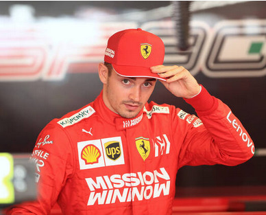
One thing I genuinely don’t understand is why there needs to be two hp logos on the front of the suit? Like the big one can’t be missed why add another smaller one. It’s so ugly. It’s giving mclaren with its 163829 sponsors on the suit
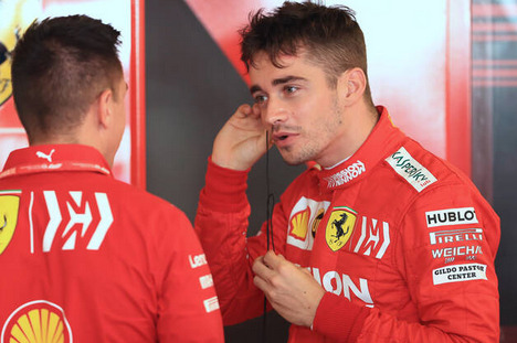
As much as I hate them, it has been pretty standard, even for Ferrari. Back when it was Mission Winnow, we also had a smaller and big logo on the front, plus another one on the collar:
and another one on the back:
And check out the suit when it was Marlboro:
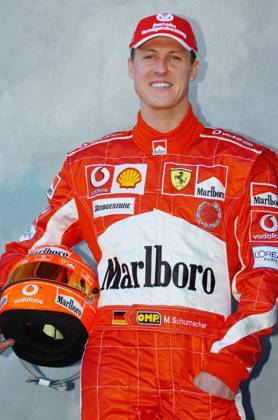
Three on the front, 1 on each sleeve, a big one on the back, 5 on the helmet, 1 on each side of the cap... Oh, and there was also a massive Marlboro on the back wing.
But because those logos were also red/white, they just blended a lot better on the suit than the HP logos. I suppose we'll have to get used to them though.
📷Leanne Boon, Thierry Gromik/ABACA
#i mourn the beautiful race suits all the same#really wonder though why we need a title sponsor in the cost cap age#it's not like we can spend more#unless we hire someone as a consultant#you know#like newey at red bull#oh wait...#charles leclerc#michael schumacher#scuderia ferrari#hp sponsor monstrosity
16 notes
·
View notes
Last Seen Blogs

sitiwebtoscana
Siti web Viareggio

imbehindacamera
I'm
Behind.A.Camera

daticijiwud
Untitled

kiribaku-trash
Kiribaku gives me life

spirithand
SpiritHand