#script mt bold font
Text

#don’t talk to me#gif warning#glitter text#oie#pink#script font#pink outline#script mt bold font#flashing lights
199 notes
·
View notes
Text
🐓🤠Jake and Bradley's Penmanship🤠 🐓
Reading @cryinginthebronco's amazing fic Are you thinking about me too? ('cause I can't stop thinking about you) got me thinking about Bradley and Jake's handwriting...
For Bradley, I decided that his horrible penmanship is the real reason why his callsign is Rooster. CHICKEN SCRATCH! Nothing but chicken scratches... People (or Jake) got so annoyed at trying to decipher Bradley's writing, they simply had to give him a chicken callsign.
(I have several headcanons for the Rooster callsign, this is one of them.)
As for Jake? Well, his particularly strict childhood education and/or his deep sense of perfection led him to write in nothing but perfect calligraphic handwriting!
*
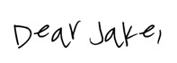
Bradley's writing:
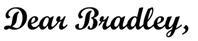
Jake's writing:
*
To read the fic:
#hangster#sereshaw#hangaroo#bradley rooster bradshaw x jake hangman seresin#There is a font called Chicken Scratch. This is the one I used for Bradley... It was too good to be true! xD And Jake's is Script MT Bold.#🐈red🐈furry🐈cat🐈tag🐈
40 notes
·
View notes
Photo

anonymous asked 💬 hi! i know you guys already made a font rec but can i request a font combination rec?
USERGIF FONT PAIRING RECS 🪄 PER MEMBER
Here are some of our members’ favorite font pairings! Check out our previous FONT RECS and our #typography or #fonts tags for more inspo! TIP: On mobile, slide your finger over the gif to slowly scrub through frames.
CREDITS:
— retro video game backgrounds: [one] [two]
— all fonts & links listed below the cut
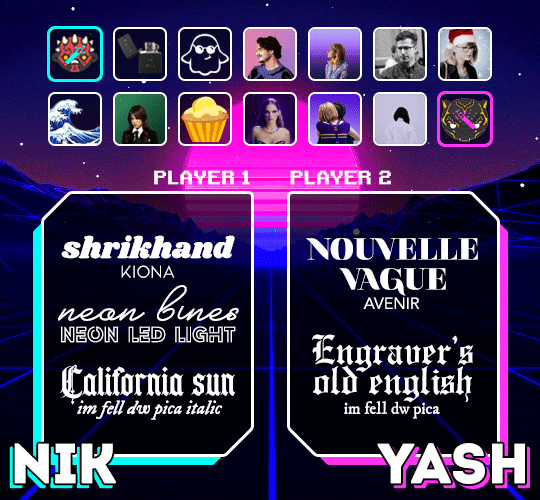
nik @sith-maul:
– shrikhand + kiona
– neon bines + neon led light
– california sun + im fell dw pica
yash @wakandasforever:
– nouvelle vague + avenir
– engraver’s old english + im fell dw pica
kate @zoyanazyalensky:
– golden hopes + biotif
– hamstring + aemstel
jennifer @antoniosvivaldi:
– reggy black + sevastian inside
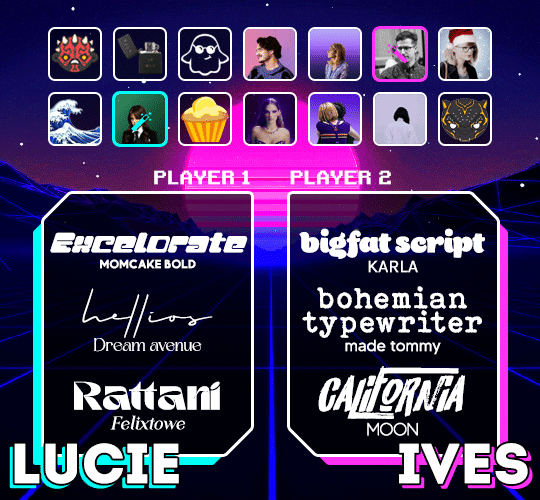
lucie @van-eck:
– excelorate + momcake
– hellios + dream avenue
– rattani + felixtowe
ives @jakeyp:
– bigfat script + karla
– bohemian typewriter + made tommy
– california + moon
abbie @midnightsdlx:
– nouvelle vague + intro
– amalfi coast + avenir
– buffalo script + abril fatface
v @shangs:
– nagita + gotham
– blacksmith signature + gotham
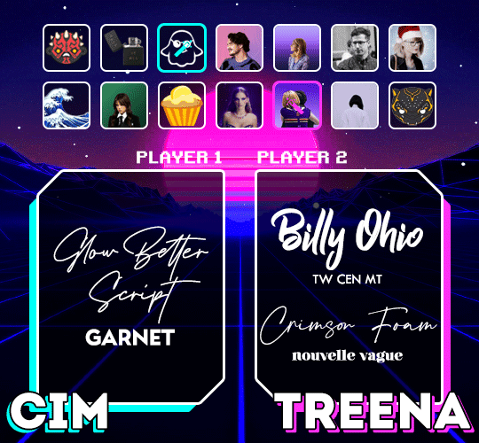
cim @itstruthtime:
– glow better script + garnet
treena @jeschastain:
– billy ohio + tw cen mt
– crimson foam + nouvelle vague
luz @lemoncupcake:
– breathing + avenir (all caps)
– quickpen + montserrat
hella @kathrynshahn:
– donitta + kiona
– flood + futura
– amalfi coast & bebas nueue
natalia @usersmidnights:
– losta masta + the artisan
– bougher + faminela
– georgia script + headwind
elio @djarin:
– nouvelle vague + lemon milk
– doctor glitch + lemon milk
– I tell you all my secrets + the bold font
#resource#typography#fonts#request#completeresources#allresources#userelio#useryoshi#userrobin#uservalentina#usertreena#usernums#userhella#usershreyu#userk8#uservivaldi#userives#*usergif#*tutorial#by nik
1K notes
·
View notes
Note
Hey, I read your FAQ, about the psds, do you happen to have the Barbie gifset settings to share? Please?
Also could you tell me how you make the gifs clear and noiseless?
heloo!! i unfortunately do not have the barbie gifset psd but i use the same sharpen settings for all my live-action gifs! here’s kind of a super basic overview of how i make my gifs, i know there’s a lot of tutorials out there (would rec rina’s bc it’s super comprehensive)
1 - get ur screencaps
2 - load ur screencaps into photoshop with file --> stack --> load files into stack
3 - resize ur image in ps
4 - i use actions bc they make things super fast and easy, rizz’s action is rly good
- use ‘scripts’ right after you load screencaps into ps and then resize
- then run the sharpening action, rizz’s action has two diff ones and it depends on the gif as to which one you wanna use bc u don’t want to oversharpen a gif (i pasted my settings for live-action stuff below)
- then run the ‘save’ setting and then color your gif with adjustments
re: the barbie set specifically, i used a 5.something GB file, ran the sharpen settings below and then mostly colored with an adjustment layer of exposure (my fave for brightening up, increasing contrast) and then some selective color in yellow
for the text settings; my usual font is ‘arial rounded mt bold’ and then you type something and then right click that text layer and add ‘stroke’ on the outside and a drop shadow, the color for the barbie one specifically was #ffabf6
for save settings: i pasted my settings below + there’s an option under ‘animation’ on this save tab so make sure you have the looping options set to ‘forever’

my sharpen settings from where it was mentioned above
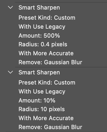
overall, the best way to get crispy/noiseless gifs is that extra layer of 10,10 sharpening BUT ALSO to get a good 1080p file. for the movies i gif i usually try to get files that are around 7gb+ but i know some gifmakers prefer like 25gb+ so it’s up to preference. i usually try to avoid files that big just bc i don’t have space
for barbie set, i could only find a 5gb-ish file which turned out okay so sometimes it’s just kinda the material u have available and u try to color/mess around best u can
this got very rambly sorry a;lsjd;g please feel free to reach out if something didn’t make sense or if you have more questions <3
5 notes
·
View notes
Text
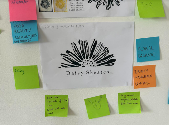
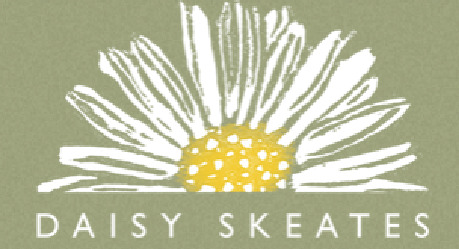
LOGO DEVELOPMENT
TYPEOGRAPHY

I then had a look at typefaces for my logo. I had a look at both serif and sans serif and then also calligraphic and script fonts. I evaluated that the calligraphy fonts were too hard to read, so I tried out different luxury looking serif fonts.
COMPOSITION

I then used this serif font ‘Cormorant Garamond’ and tested out different compositions with my black and white digitalised lino print.
I overall really liked the look of the first layout, the second and the 6th.
I wanted to develop the 6th layout further because I believe using half of the flower cuts down the amount of detail leaving more effective negative space and also leaves a perfect straight edge for

After our tutorial, I Tried a few experiments using just the main letter from my name however I did not like how the boldness of the letter clashed with the dainty flower.
After being given feedback also, I was advised to change the serif font to a sans serif as the serif font adds extra unneeded detail to the logo when put against the flower.
I really liked the look of the 2 last fonts as they are clear to read and simplistic against the detailed flower.
I chose the font ‘Gill Sans MT’

I really liked the simplicity of the black and white logo however, it could be seen as any type of flower.
To make it look more specifically like a Daisy flower I used my other experiment with the yellow centre which I believe makes it more fun and interesting to look at. Adds a small fun pop of colour to the logo.
WEB PORTFOLIO TUTORIAL


This tutorial helped me in deciding which logo design worked the best
FINAL LOGO
0 notes
Text
The Art of Font Selection: Creating Impactful Print Materials at Graphic Studio"
Introduction:
At Graphic Studio, we believe that font selection is a crucial aspect of designing impactful print materials. The right font can evoke emotions, establish brand identity, and enhance the overall visual appeal of a design. In this blog post, we will explore how our experienced designers at Graphic Studio expertly balance fonts and design elements to create captivating print materials across a range of industries. We will showcase additional examples and even suggest specific fonts, including popular ones available in CorelDRAW, a widely used design software.
Corporate Brochures: Professionalism and Elegance
Corporate brochures require fonts that exude professionalism and elegance while maintaining readability. For a financial institution or law firm, our designers often opt for sophisticated and classic serif fonts such as Times New Roman or Garamond. These fonts lend an air of authority and trustworthiness to the brochures, establishing a strong brand presence.
Restaurant Menus: Reflecting Culinary Delights
Restaurant menus should capture the essence of the cuisine and reflect the establishment's personality. For a contemporary restaurant offering fusion cuisine, our designers might choose a clean and modern sans-serif font like Montserrat or Helvetica. These fonts convey a sense of sophistication and align with the restaurant's innovative and cosmopolitan image.

Wedding Invitations: Romance and Elegance
Wedding invitations demand fonts that embody romance, elegance, and personalization. Our designers often recommend stylish script fonts like Edwardian Script or Great Vibes for the couple's names and headings. Complementing these with a classic serif or sans-serif font, such as Baskerville or Futura, for the main content ensures readability and balance.
Fitness Brochures: Energy and Dynamism
Fitness brochures should convey energy and dynamism to attract potential clients. Our designers might suggest bold and vibrant fonts like Bebas Neue or Impact to create eye-catching headlines. For the body text, they may opt for a clean and modern sans-serif font, such as Myriad Pro or Arial, to ensure legibility and maintain a professional appearance.
Art Exhibition Flyers: Creativity and Expressiveness
Art exhibition flyers call for fonts that reflect creativity and expressiveness. Our designers might recommend artistic display fonts like Brush Script or Broadway for capturing attention and setting the tone. Complementing these with a minimalist and modern sans-serif font, such as Futura or Gotham, for additional information ensures clarity and contrast.
Some suggested fonts from the Graphic Studios library include:
Bickham Script Pro: Perfect for elegant and formal designs, such as invitations or certificates.
Franklin Gothic: A versatile sans-serif font suitable for a range of designs, from brochures to posters.
Bodoni MT: A classic and elegant serif font ideal for conveying sophistication and refinement in various print materials.
Conclusion:
Font selection plays a crucial role in creating impactful print materials across industries. At Graphic Studio, our skilled designers carefully balance fonts and design elements to evoke the desired emotions, establish brand identity, and ensure readability. Whether designing corporate brochures, restaurant menus, wedding invitations, fitness brochures, or art exhibition flyers, the thoughtful selection of fonts contributes to the overall success of the design. By leveraging a combination of industry knowledge and access to a wide array of fonts, including those available in Graphic Studio consistently delivers captivating print materials that effectively communicate the intended message.
0 notes
Text
Download caslon font

#Download caslon font pro
There’s a popular saying among type setters: ‘when in doubt, use Caslon’. The result is organic letters that bear close resemblance to the beloved serif of kings. Twombly designed them by studying specimen pages printed by William Caslon between 17. In 1990, type designer Carol Twombly created a Caslon revival called Adobe Caslon, which was more suited to digital needs. Soon, they also became famous outside of England, making their way to the New World, just in time for the signing of the Declaration of Independence. The Caslon fonts were used extensively by people from all ranks, particularly in political arenas. His works gained fame because of their attractiveness and functionality. A notable English punchcutter, he designed many typefaces during this time, until his death in 1766.
#Download caslon font pro
Sfns Display-Regular Helvetica Bold Font Download Swiss 721 Bt Bold Condensed Font freeload Clarendonbt Bold Helvetica World Font Free Laudatio Font Unisansheavycaps Font Nexarustsans-Black Font Helvetica Tt Sfns Display-Regular Ultrateens Adam Cg Pro Swiss Bold Condensed Helvetica World Bold Font Avenir Lt Medium Helvetica True Type Font Helvetica Regular Adam.Cg Pro Unisans Heavy Caps Helvetica Light Download Futura Lt Extra Bold California Sans freeload Helvetica World Regular Font freeload Font Helvetica World Download Helvetica.Ttf Helvetica Bold Oblique Font Helvetica Normal freeload Helvetica Font Family freeload Avenir Lt 65 Medium Bold Swis721 Cn Bt Font freeload Geometric Slabserif 703 Free Universltstd-Black Universltstd-Cn Font Free Futura Lt Bold Univers Lt Std Font Family freeload Nexarusthandmade Extended Futuralt Book Helvetica True Type Font Raleway Black Italic Font Download Helvetica Normal Font Indir Iowan Old Style Free Ck Journaling Font Univers Lt Std Bold Cn Avenir-Medium Font freeload Sfnstext Font Helvetica-Condensed-Light Download Minion Pro Helvetica Narrow Oblique Futura Lt Heavy Raleway-Black Nexa Rust Sans Black Font Corporate S Font freeload California Sans Font freeload Formata Regular Pablo Skinny Font Avenir 65 Medium Geometric Slabserif 703 Bold Helvetica Font Regular freeload Calvert Mt Copyright © 2022 download-fonts-free.Fonts 5,805 Fonts History of the Caslon FontĬaslon in essence refers to Old Style serifs originally created by William Caslon in 1722. Top Searches Helvetica-Normal Download Universltstd Lightcn Impact Font Download Helvetica-Oblique Font freeload Adam.Cg Pro Font Minion Pro Font Free Helvetica World Regular Swiss 721 Condensed Minion Pro Download Helvetica Truetype Download Adam.Cg Pro Font freeload Universltstd-Lightultracn Swiss 721 Bold Condensed Oswald-Demibold Helvetica World Bold freeload Univers Lt Std Font freeload Helvetica Ttf Font Download Helvetica Font freeload Helvetica Bold freeload Ttf Gill Sans Mt Bold Oswald Extra Light Helvetica Regular Font freeload Helvetica freeload Oswald Medium Font freeload Pokemon Font Helvetica Font Ttf File Download Oswald Demibold Font League Spartan Font freeload Amatic-Bold Nexa Rust Script L-0 Font Melmablack Font Helvetica Light Oblique freeload Helvetica Oblique freeload Futura Lt Condensed California Sans Font Free Univers Lt Std Cn Sfns Display Regular Fonte Helvetica Normal Download League Spartan Font Download Avenir Lt 65 Medium Helvetica Light Helvetica Light Oblique Font freeload.
0 notes
Text


Template 013: Open Water
◈ a free 2 panel roleplay blog promo template.
◈ 540x540 pixels each.
◈ fonts used are Script MT Bold and Tw Cen MT.
◈ PSD is NOT included. ( PSD 016: Crystal Clear ).
◈ Textures and graphics are INCLUDED.
◈ credit when using.
◈ DO NOT redistribute, repost, or claim as your own. for PERSONAL AND NON-COMMERCIAL USE ONLY.
download link is in the sourcelink !!
#RPH#INDIE RPH#INDIE RP#RP PROMO TEMPLATE#PROMO TEMPLATE#FREE PROMO TEMPLATE#FREE RP TEMPLATE#FREE RP RESOURCES#FREE RP PROMO TEMPLATE#RP TEMPLATE#* MINE: RESOURCES.#* MINE: TEMPLATES.#* MINE: PROMO TEMPLATE.#SUPPORTCONTENTCREATORS
224 notes
·
View notes
Note
Hi I was wondering if u mind sharing what are ur favorite fonts you like to use?
This has been sitting in my inbox for ages so I'm sorry anon for not responding sooner, but I wanted to give you a good answer and get links/examples together.
I have decided to split the fonts into categories and how I like to use each type of font. I'll also give some links to where you can find the font 😊
Because I hardly ever save my psds I can't remember which fonts I used exactly for some of my sets so I will have a bit of trouble being specific with examples, but will try my best to list some sets at the end with font pairings I remember.
Whenever I get the chance, I like to browse and find new fonts to use. Typically when looking for fonts I'll look at dafont, fontsquirell, fontspace and even tumblr.
Scene captions
Typically I use Arial Rounded MT Bold for gif captions and I put it on faux italic. This font should be pre-installed on your computer.
Sans-serif fonts
Young
Keep Calm
Typo Formal
Intro
Quartz (I haven't used this font yet, but I love the look of it and am keen to try it out).
Cheerful Dynamite (I'm not sure if this counts as cursive or not, but I'm putting it here)
Serif fonts
Achiela
Abril Fatface
Bodoni Seventytwo
Carina W04 bold - this font is probably my favourite font and one of the ones I use most. It looks great in all uppercase and lowercase.
Playfair Display
Tornado: I've only ever used this font on my Angelica Schuyler set, but I do really like the flourishes it has.
Cursive fonts
Amberla/Amberla alt
Breathing - this is another font I use very often
Golden Stanbury
Great Day
Millk Child
Moderna Script
November Starlight/November Starlight Alt
Santa Fe Spring
Example Sets
Descendants tropes - font used Achiela in all caps with some warp applied.
Rina supercut - cursive font is November Starlight (I think the Alt version), print font is Young
Faith set - serif font (purple text) is Carina W04 bold. I can't remember which sans-serif font I used but it is probably one of the ones listed above.
Gina Porter + traits - serif font (pink text) is Carina W04 bold. I think sans-serif font is Keep Calm with lots of spacing applied.
Curse of Sarah Fier Nursery Rhyme - I think the font used here was Bodoni Seventytwo
#asks#resources#fonts#i really hope this helps#again sorry for taking so long!#if you have any particular sets/fonts you wanted to know feel free to send it in and I'll do my best to answer :)
12 notes
·
View notes
Text

#script mt bold font#script font#gif warning#glitter text#pink#pink outline#oie#negative#flashing lights
64 notes
·
View notes
Note
pode me indicar algumas fontes? principalemente para capas dark e romanticas por favor?
DARK:
- Astonished
- Grouch BT
- Renogare (pode ser usada em capas dark mas depende da forma como é usada)
- Palatino Linotype
- Bodoni MT (de preferência tudo em letras maiusculas)
- SerifMedium
- ClementePDak
- BlenheimSignature
- Arrière Garde
- Bebas (mas depende ok)
- Shorelines Script Bold
- AngleciaProDisplay
ROMÂNTICA:
- Arial Rounded MT Bold
- Arial (em negrito e itálico)
- Autumn Chant
- Renogare (pode ser usada tanto em letras minusculas como maiusculas e o efeito será igualmente bom)
- Palatino Linotype
- mottona demo
- Bodoni MT (de preferência em letras minusculas)
- Book Antiqua
- End of the dream
- Champagne & Limousines
- BlenheimSignature
- Shorelines Script Bold
DIVERTIDA/CLEAN/FLUFFY:
- Arial Rounded MT Bold
- Arial (em negrito e itálico)
- Autumn Chant
- Renogare (pode ser usada tanto em letras minusculas como maiusculas e o efeito será igualmente bom)
- Palatino Linotype
- mottona demo
- Book Antiqua
- End of the dream
- Champagne & Limousines
- Bebas
- Shorelines Script Bold
CRÉDITOS:
- PF Arma Five (no tamanho 8 e sem formatação (onde diz "bem definida" coloque "nenhuma"))
- Arial (negrito)
- Arial Rounded MT Bold
- Calibri (ou qualquer outra fonte idêntica)
FRASES:
- Champagne & Limousines
- Arial (negrito)
- Calibri
Não é nem metade do que eu uso, mas são as principais. Eu baixo as minhas fontes no DeviantArt >https://www.deviantart.com/dayaze/favourites/77910381/fonts. Você pode criar uma pasta para dar fav nas fontes e sempre que não souber qual usar você volta lá e vê as previews e o nome delas.
Espero ter ajudado <3
129 notes
·
View notes
Note
Hey sorry!! anon again. do you have any place to download those fonts free? thanks so much ;_;
😌
inspecture script
tw cen mt condensed
inkheart brush dry -- no idea, i’m sorry :/ i never save where i get my fonts so :(
fillia sans bold
times new roman -- you should have this already
#no problem#i have no idea where i got them initially but i definitely have never paid for a font#inkheart can be substituted easily probably it's just for the You're in you're special#anonymous#asks
2 notes
·
View notes
Text
For those of you following my current fic, it is very clear in my head that Jean’s tattoo is in Palace Script MT and Lucien’s tattoo is in Impact Bold, because if there is anything more authentic than a soulmate AU it’s a soulmate AU that takes place in 1959 using all Microsoft Word 97 fonts.
6 notes
·
View notes
Photo
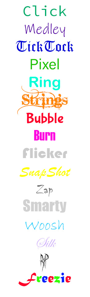
Because writing (as in drawing letters and words) on the computer is p hard for me, I decided to have the TechToons speak with different fonts to indicate who's talking. (yes, like the skeletons from Undertale. I wouldve had Pixel speak in fixedsys but for SOME reason thats not an option in photoshop wtf.)
FONTS: (as much as I can remember)
Click-Consolas
Medley-Ink Free
TickTock-Old English Text MT
Pixel-Arial
Ring-Arial Rounded MT Bold
Strings-Bleeding Cowboys
Bubble-Bubblegum Sans
Burn-Haettenschweiler
Flicker-Bauhaus 93
SnapShot-Brush Script MT
Zap-Chiller
Smarty-Impact
Whoosh-Bradley Hand ITC
Silk-Edwardian Script ITC
Rip-Ghastly Panic
Freezie-Matura MT Script Capitals
7 notes
·
View notes
Note
What are your favourite fonts for edits/gifsets? And which would you avoid like the plague? Genuinely curious ^-^
Ah, fonts are such a sore subject for me, hahaa. Well, the ones I avoid like le plague are ones that are pre-installed like Times New Roman and do not come near me with Vladimir Script. I do use Arial (Arial Rounded MT) for subtitles on my gifs but wouldn’t use them for any other edits. The fonts I’m currently using are;
Mermaid
Eras Bold ITC
la Chatte à Maman (graphics only)
3 notes
·
View notes
Photo
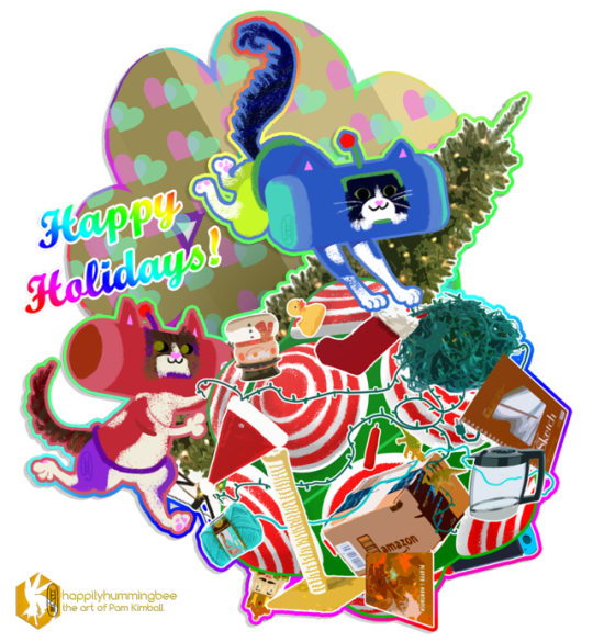
“Catamari Wishes”
...my cat babies have been getting into so much trouble this month, but really they're just yearning to play (and romp outside).
Happy holidays and happily be!
Adobe Photoshop
Katamari Damacy © Namco
font: Script MT Bold
Art, Faba and Sario designs by Pam Kimball
#Katamari Damacy#Catamari Wishes#Faba#Sario#Fado#Saria#cattails#Happy Holidays#cat#Katamari Damacy cousin#cousins#cousin#digital#artists on tumblr
1 note
·
View note
Last Seen Blogs
newjanathastores
New Janatha Stores
vegasindo
Vegasindo

eddyfugero-blog
UFABET BLOG

andreschuindt-blog
Sem título

gapwith-blog
GapWith