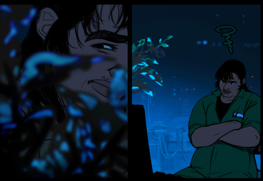
#read superpose
Text
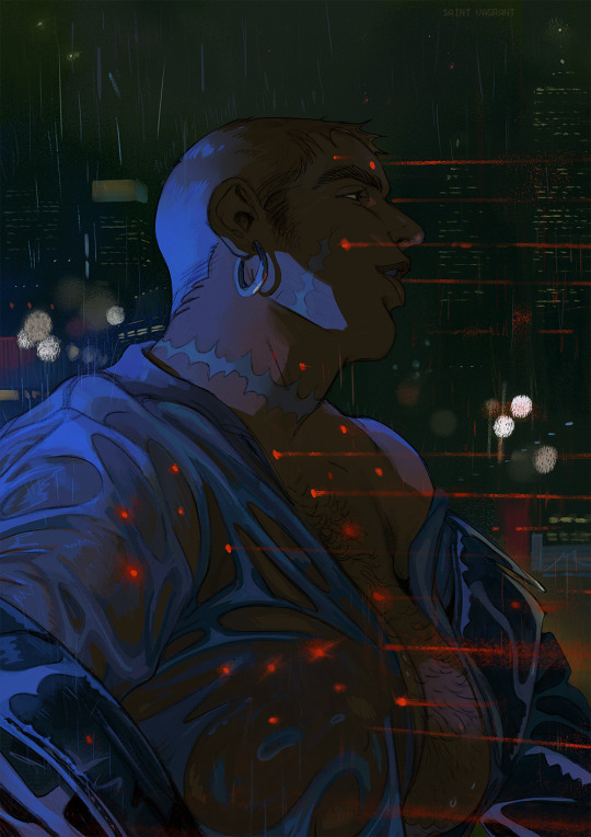
Sab stops running.
mine, he/him
#thygatrion#illustration#butch#trans#not sapphic just brutal dykes#sab#cyborg#sci fi#trans art#trans artist#idk if i'll get back to this story now that my life's been taken over by a different one#and besides that#read superpose#he/him#i'm also he/him thank you!#trans man#not transmasc just trans man
2K notes
·
View notes
Text
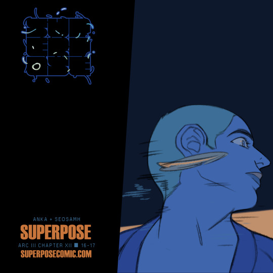
SUPERPOSE UPDATE!
. ˚ * ˚ ✵ . . * ✦ ˚ ˚ · * . ⋆ ✦ ˚ ⬤ *
⭑✶ Arc III Chapter XII | 14-17✶⭑
HOME | TAPAS
▮ New readers start here
content warnings always in effect; this is a long-form story. please see the home site for more information!
▮ SUPERPOSE is a dark and sweeping trans + queer sci-fi comic from 198X about glitches, black holes, and love. In seaside Port City, three desperate and struggling young trans adults stake everything on a physics-breaking machine, altering their future forever ✶
a prism-winning, ignatz-nominated 🔞 comic by Seosamh & Anka
#superpose#comic#webcomic#artists on tumblr#trans#queer#indie comics#i suggest reading these pages all together <3
76 notes
·
View notes
Text
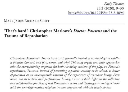
This is a really good article (I have mentioned it a few times before) but also, the final sentence of this abstract simultaneously gives me feelings AND makes me giggle at the author for giving the impression that he was definitely thinking of Doctor Who when he wrote it. Look, I know what that kind of person is like.
(it's me, hi, I'm that kind of person, it's me)
#doctor faustus#hot faust summer#i mean i think faustus is basically schrödinger's soul#not in the sense that he is the soul of the physicist erwin schrödinger of course ykwim#but in the sense that he exists in a superposed state of salvation and damnation#but i do like this article's conclusion that maybe a theology of predestination is more damaging than salvific#like my read on the theology of DF is basically:#okay let's say some people just don't get god's grace for whatever reason#let's say everything we've been taught about the universe and how it works is true#that would actually really fucking suck wouldn't it?#as i say all the time#i think it's key to all faust variants that his fate never quite feels fair#(i think a lot of later adaptations don't incorporate this concept fully)#this is true in both the marlowe vein and the goethe vein#ANYWAY i mostly wanted to giggle about the 'lonely doctor' thing
15 notes
·
View notes
Note
hello! this is from one of your posts a while back but i saw you mentioned a lot of "baby trans comics" and as a trans person currently drawing something like that, are there any pitfalls or advice you could share to avoid falling into cliches etc?
omg. no. not at all. in this fucking political climate? make whatever comics you want to make about the trans experience and the joys and despairs of transness and about pronouns and sex and haircuts and trauma and your journey of transness among peers and family. it's great and a lot of people will find it relatable and encouraging to know they're not alone. (ETA: some people will also find it incredibly novel and come away from it having learned something! yours could be the trans diary comic that cracks someone's egg, even.)
I have long since 'transitioned' to my own satisfaction, and have found a happily agender existence among community. I am in an extreme place of privilege to basically not be forced to think about the trans 101 type stuff all the time. don't mind me. I made a passing gripe about baby trans comics only because I HAVE read a lot of them over the years and found nuggets of beautiful, mutually shared experience among them, but find myself wanting more of the complex, messy stories we have in us. that's not to say that the former is unwanted or unneeded. write what compels you!
10 notes
·
View notes
Text


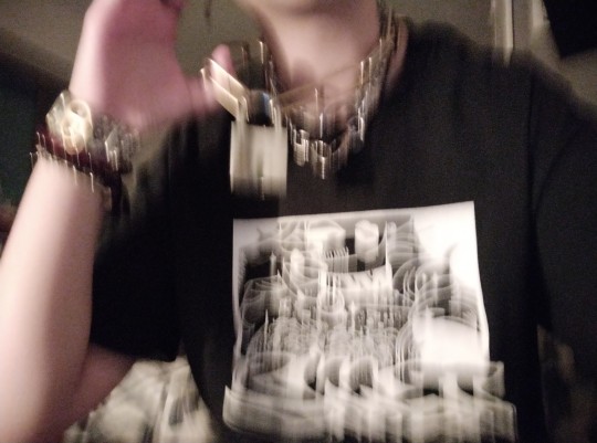
I bought this t-shirt from @saint-vagrant and @kingfisher-cove's store, and i love it so so much 💖⛓️
#GO READ THEIR COMIC SUPERPOSE#it's an amazing story with beautiful art and incredible characters#stupid bitch
2 notes
·
View notes
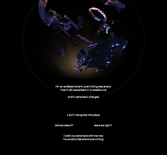
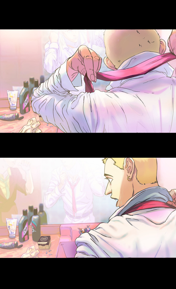
Text
i love these panels sm
0 notes
Text
those fics that weren’t GOOD but your still thinking about them years later for one reason or another
#fanfiction#bad fanfiction#?#there was this one fic that was superposed to be like a plot twist horror but i saw the twist in the first chapter and couldn't be bothered#to read the rest of it#except to check if i was right
1 note
·
View note
Text
comics and animation have a lot in common, but one interesting difference is that arranging pictures in space rather than time means there's a tradeoff between the amount of drawings you use to show an action, the amount of space each drawing is given, and the amount of pages you cover which determines the 'pacing' of the comic.
if you slice the page up into a lot of tiny boxes to show many stages of a motion like an animation, then each panel has correspondingly less space for background details, and it may affect the aspect ratio of panels. if you give yourself space for a large splash panel, then the pace will slow.
one solution to this problem is to break the convention that a panel is a single 'frame' of action and show multiple images of a character in the same background. Kentaro Miura did this sometimes, and Tradd Moore (on here - @traddmoore) is an expert who uses it frequently (I'll reblog his spiderman comic in a minute). Kamome Shirahama, a genius at creative paneling, also uses it in a couple of places.

a similar trick will have a single background continuous across multiple panels, showing a static 'camera shot' at different times.
the limitation of these methods is that breaking convention makes the panel a little harder to process - you need to make absolutely sure you cue the reader clearly about where to enter the panel. and it requires action that involves a large movement so the drawings don't overlap. so most authors use it as a 'once in a while' thing.
an opposite approach, used in early parts of Superpose by Seosamh and Anka and Goodbye, Eri by Tatsuki Fujimoto, is to go even harder with the cinematic convention and give each panel the aspect ratio and detailed backgrounds of a film camera, taking all the space you need - Superpose opens with about two panels per page which may be very similar to each other, creating a very deliberate sense of pacing. to pull this off you need to be either extremely fast at drawing like Fujimoto, or accept your comic taking a long time to get anywhere - and you also need to be very good at placing the camera in space. you're basically drawing fully rendered storyboards at that point.
one of the interesting difficulties of comic-making is controlling pacing. if you draw many very similar panels it will convey a sense of high concentration and intensity, or a heavy atmosphere, like a long take in a film. much like in prose, if you spend a lot of pictures on something it draws attention to it. so you want to use the 'slow down' sparingly for effect.
as in animation, you're also limited by your own capacity to draw all those pictures, and moreover the space to put them. this is one reason why comics in magazines tend to be sharply limited in page count, and webcomics tend to be very slow compared to other forms of serial fiction. (perhaps manga can make heavier use of pacing tricks by virtue of cheaper printing and endemic overwork. i don't think that's the full story though.) meanwhile, when Transmetropolitan started to experiment with manga-style pacing, apparently it upset fans who felt the story progression was being diluted. when reading Transmet in one go, though, you don't even notice. what works well in an anthology of hundreds of pages may work poorly in a serial.
i think the pace of the reader is often controlled primarily by the text - at least for me I find I sometimes have a tendency to jump very quickly over panels to get to the next bit of the story and have to consciously slow myself down to make sure I don't fail to appreciate the art. so while a series of text-less panels is effective artistically, you might want some words to act as speed bumps. but too much text per picture and your comic becomes exhausting to read, like Subnormality. and you don't want to over-explain what's conveyed perfectly well by the pictures, as many older comics do.
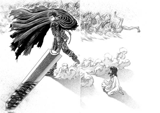
ideally, you use your text, small panels and large panels to create a sense of rhythm. a big splash panel can act as the full stop in a sentence, or a longer take after a series of rapid cuts. negative space is an especially powerful device in the right hands: when you hit a page of Chainsaw Man or Berserk that is almost entirely white after several pages of dense illustration, a character bursting into the void, there's an immediate 'wow' effect before you even process what's happening in the illustration. (i can't seem to find the chainsaw man example i had in mind, so here's one from berserk.)
and on that note, the other thing that comics have that animation doesn't is the impact of being confronted with the whole gestalt page. in the manga I was helping Fall translate when she died, We Are Magical Boys (Bokura wa Mahou Shounen), Fukushima Teppei frequently puts one panel much larger than the others so it dominates the page, usually a close-up or full length character portrait, allowing the cuteness of their unique art style to treasure centre stage. Sandman, which I'm currently rereading, is full of elaborate page compositions, where a drawing might not even be a panel per se, but a visual element. Witch Hat Atelier is full of elaborate borders and clever compositions. just look at this...

how did she come up with that! the absolute madwoman! the right side is relatively standard Atelier (establishing shots, the main cast eagerly stepping out of their panel) but on the left, we have a set of panels falling down from above onto a large splash panel. even though this image is concurrent, the panels invite us to appreciate it in chunks, and the page as a whole has this great visual of the pages of a book, continuing the image of the previous page. (more of this on upcoming post on Atelier)
a character emerging from their panel to overlap others, breaking up the monotony of the grid and adding a sense of depth to the page as a whole, is a reliably appealing motif. also, drawing one panel borderless, so it implicitly continues behind the other panels. large areas of black and white and choices of colour saturation can convey a mood to the page as a whole.
the danger you run is always the loss of clarity. the reader must be able to tell what panels to read in what order without thinking about it. Sandman will sometimes do a double page spread where you're supposed to read across both pages, and this consistently trips me up. Dresden Codak is by an adhd author and her drive to give every page an elaborate layout is very familiar to me, but especially in Hob, it messes with the flow of the comic overall.
so every comic page, every comic, is a fascinating balance of all these factors. how to create a strong, visually interesting composition, control the pacing appropriate to tone, create a thrilling sense of rhythm... all without sacrificing clarity.
not much more to say about this as yet, it's just something I'm thinking about while trying to lay out a page of Ghost Barrier. my tendency is to generally use larger panels, and try to be creative with layouts, but you have to consider not just each page in isolation but how they relate to other pages. so to make the splash panel land, I need to contrast with a denser page immediately beforehand.
the more I make comics the more of a feel I'll get. cool medium!
900 notes
·
View notes
Note
"too deliberately, like a button has been pressed, his face morphs into a cartoonishly remorseful expression" since reading this line in ur fic, the image of fuyuhiko with junko's "cutesy cartoon" sprite's face superposed on his pops up in my mind too often. it's cursed as hell
yess I think wearing someone else's expression is creepy as hell nevermind when that original expression in the original person was a mockery too
#not an art#To this day people suddenly making a face that is wildly inappropriate for the situation is a fear of mine#Idk if there's a name for it lol but I had it real strong as a kid too#Next time you're in an enclosed space w someone think 'what would I do if they suddenly made a face that is Not Theirs'
82 notes
·
View notes
Text
plot heavy codywan fic rec
I have so many words to say about this fic so let’s start by getting to the main points ;
https://archiveofourown.org/works/38064841
Rasphody in Blue by @kckenobi (88k words) is one hell of a fic that I will recommend until the day I wither and die. If you’re looking for a modern setting au with investigations, crime, orchestras, jazz, a very well-paced story, betrayal, angst, themes of loneliness and grief, found-family, look no further!! No really! Gods, go read it, right now, I BEG YOU. I cannot fathom how it doesn’t have more kudos than it already has.
Now onto a more chaotic review of me dumping my thoughts on it in a random order directed at the author. I should’ve left it as a comment really, but now I’ve written it here it’s too late, oh well. Read, don’t read, it doesn’t contain any major spoilers, but if you’d rather have less information of the fic and go into it blind, then maybe don’t read it haha
- Firstly, GODS, the plot hooks. From the first chapter I was on the edge of my metaphorical seat. (I was in my bed.) Seriously, the plot hooks are so well placed I could not put it down. (I finished it at 2am. I didn’t even go to my class this morning I was too tired. But that’s on me. It is as much a demonstration of how captivating the story is as it is of my poor decision making.) The pace was so wonderful, seriously. I always picture a movie in my head when I read something, and with your writing it was so easy to do so, the perfect balance of dialogue, introspection, descriptions! Argh!
- How you wrote loneliness. (’you’ meaning the author, if you’re reading this.) Okay to be fair those themes get to me, they always have, but let me tell you, I was bawling. I had to put down the fic because my eyes were too blurry to read. You bastard. I hate you but I love you. Arghdvjfd. The part that went
“The thing about loneliness is that in the end, it is a more loyal companion than anyone else has ever been. It becomes a shell you settle into, something familiar. Not a home, no longer a prison either. But a skin, something you reside within without really thinking about it, a barricade that walls off your heart from the rest of the world”
Do you live in my head??!!! You got it exactly right. You little shit I had to sit out the fic for two minutes it stole the breath outta me!! I cried!! Again!! Are you okay?? Because I sure am not!!
From the first few sentences I was in love with the whole orchestra setting. Oh my gods. All of it is so perfectly woven with the characters. (Cellist Obi-wan is now one of my all time favorite Obi-wans. It’s just so perfect.) I can just imagine all of the scene translated into a movie/tv show with one of those scenes where the classical music, shots of the character playing their instrument and shots of the dramatic action are superposed. So wonderful. I am also weak for the whole ‘your passion is there for you no matter how bad things get’. And how music was always there no matter all the GUT WRENCHING TERRIBLE ANGSTY SHIT Obi-wan goes through. Can relate to that.
#fic rec#star wars fic rec#star wars#fanfic#codywan#codywan fic#please read it#i'm begging you#i need to know i'm not the only one being emotionally destroyed by this fic#i will drag all of you with me in the angst spiral
69 notes
·
View notes
Text
Max Ernst's "One Week of Kindness"
Which could also be called "A Week of Benevolence" - the original French being "Une semaine de bonté".
This post is a follow-up to a reblog I made, right here. Please go read this reblog first, because this post continues from all the info I placed there. If you don't go check it out first, you'll be slightly or massively confused.
I wanted to expand a bit on this fascinating piece of art, and to do so I'll use the info the Musée d'Orsay shared and put on their website when they organized an exposition of Une semaine de bonté.
An expo that deserves its own mention due to how exceptional it was. It was a 2008-2009 exposition of the original collages of Max Ernst the booklets were reproductions of. It was a grand world-tour that started in the Albertina palace of Vienna and ended in the Musée d'Orsay of Paris, passing by Brühl, Hamburg and Madrid. Why was it such a big deal? Because this was the second exposition of Ernst' work - the only other exposition of Une semaine de bonté's collages was in 1936, in the Museo de Arte Moderno of Madrid, just before the Spanish Civil War. It had been organized by Paul Eluard, who loved Ernst' work, but five of the illustrations couldn't be part of the exposition - due to being deemed too "indecent" or "blasphemous". And since this date, the works had never seen the light of day anymore, being preserved in private collections... It explains why the second exposition was such a big deal.
A few more sources for this collage-work I forgot to talk about: Beyond the general category of covers and illustrations of investigation stories/crime novels/polar tales, we also know that Ernst used illustrations of Sade's novels, the caricatures of Grandville, and the illustrations of Fantomas.

As with typical surrealist work, Une semaine de bonté offers a work of onirism that transcends the limits and categorizations imposed by society, by science, by our very conception of reality, and rather offers nonsensical visions and extraordinary wonders. It was the third "roman-collage" of Ernst, after "La femme 100 têtes" of 1929 and "Rêve d'une petite fille qui voulut entrer au Carmel" (1930). Throughout the illustrations, we find many references to the Bible, to famed legends, to fairy tales, to Greco-Roman mythology, but mixed with Ernst' recurring and favorite themes. More precisely, his strong rejections and dislikes: his rejection of the Church, his hatred of the bourgeoisie, his dislike of the traditional family, his refusal of patriotism...
Because Une semaine de bonté is actually a denunciation work, a great critique, a satirical caricature of the French society of the 1930s. Ernst superposes, subverts and reverses all sorts of stereotypical and cliches depictions, of either the "good society", or of the evil, the crime, the monster. Now, of course, there is no actual "real" or "good" story for this work. It is open to interpretation and everybody has to and must find their own meaning in it - as with all proper surrealist work... But there is still strong themes that form recurring motifs, and a message Ernst wasn't so subtle about.
The satirical, ironical, cynical, biting nature of the work can be read in the very title, which plays on two levels. One, on a Christian level: "Seven capital elements" is, as I said, a parody of the "seven deadly sins/seven capital sins" ; the motif of a work centered around a week alerts that there will be numerous references to the Biblical genesis, but most importantly "One week of kindness" is a reference to "La semaine de bonté", The Week of Kindness, a 1927 association creating for social help. Tied to this subversion of typical Christan morals, ideas and values, is the second level of irony in the title: this collage-novel is called "One week of kindness"... And yet it depicts all sorts of violences and abuses. Its pages are filled with murders, tortures and natural disasters - and Ernst doesn't hesitate to subtly denounce the sensationalism of a society obsessed with depictions and illustrations of the most horrible and criminal sides of humanity.
It also is no wonder that this work was created during the 1930s. The ghosts of the World Wars are haunting this piece. On one side, Ernst was seeing with an anxious and angry eye the rise of violent nationalist movements and of brutal, discriminatory dictatorships - the very ones that would cause World War II. On the other side, Ernst was of this generation that inherited the trauma and memories of World War I, had to live with the broken and disfigured survivors of the "Great War". Ernst himself had served in the German army during the Great War (if you don't know, while Ernst was born and raised in Germany, he ended up having a triple-nationality, German, American and French). One can almost read in this book Ernst' vitriolic take on a society that distracts itself with materialism, excessive pleasures and sensationalism, in an attempt to bury the wraiths of its past, and to stay blind to the dangers ahead...
It is only by the last day of the week that the atrocities fade away, and that we return to pure oniric poetry, in a set of illustrations focusing on voluptuousness and fantasy, inviting to or glorifying freedom and dreams... Now let's take a look at the structure of the Week in more details.
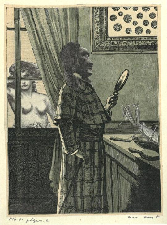
Day 1: Sunday. Element: Mud. Example: The Lion of Belfort

(The Lion of Belfort is a commemorative statue of the Alsacian town of Belfort in France, in homage to how the city had been assieged by the Prussians during the Franco-Prussian war of 1870)
Another Christian subversion: the week doesn't begin here on a Monday, but on a Sunday. We also see some of the games Ernst has with the Biblical Genesis not just by waking the "last" day of Genesis the first day of the week, but also by associating to Sunday (the day of rest for a God that created everything already) the day of the "mud" (understand, the primordial mud from before the world was created, the "chaos", the "primordial soup" from which the universe had to be sculpted). Not only that, but Sunday, the holiest day of the week for Christians, is filled with brutal deaths, sadistic violence and blasphemous imagery.
More precisely, this booklet/day explores the relationships between men and women, male and females. And... let's just say Ernst has a bad view of it, since all the interactions between male and female characters in this booklet can be summarized by: persecution, seduction, theft, punishment, torture, death. Since the Lion of Belfort is the recurring theme, there is a recurring character throughout the illustrations of a lion-faced man. He is always in a position of power and domination, and it is no surprise: we often see him wear military decorations, political medals or even religious symbols such as the Sacred Heart. As a result, the lion-man clearly embodies all the dominating, oppressive and violent male-dominated organizations of the time: the political world, the military and the Church.
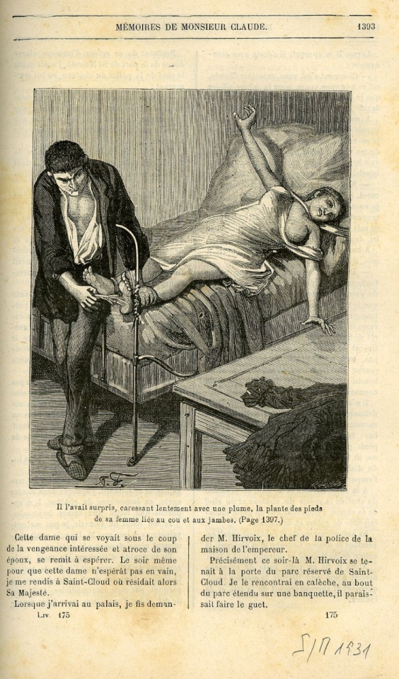
(If you are curious, the Musée d'Orsay offered the original picture on which the one above was based. It was taken from the Mémoire de Monsieur Claude:
Day two: Monday. Element: Water. Example: Water.
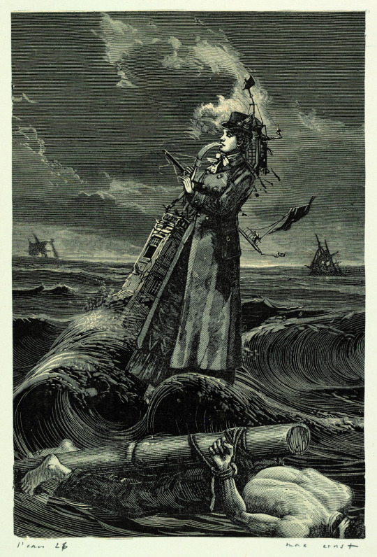
Unlike the male-dominated first booklet, this one is filled with female figures, making it the most "feminine" of all the days. There is still a lot of violence in it - but it is not a man-made violence anymore. Rather Ernst presents the violence of nature, the brutality of natural disasters - through water, a water that is seen flooding bedrooms, destroying bridges, or drowning entire streets of Paris.
Day three: Tuesday. Element: Fire. Example: The dragon's courtyard/The court of the dragon.

La Cour du Dragon, The Dragon's Courtyard is actually - or rather was - a famous street of Paris. It doesn't exist anymore, but it was in the 6th arrondissement, between today's Rue du Dragon and Rue de Rennes. This street was called as such because of a famous dragon-sculpture located at the top of one of its entrances - the dragon can still be seen at the Louvres I believe. And it is within illustrations of this "Dragon's courtyard" that the booklet begins.
The dragon is one of the recurring symbols of the booklet, with variations: dragons and snakes of all shapes and size that follow the characters around ; humans with various dragon or snake-like features ; or simply the presence of bat wings reminding of demons, sometimes counterbalanced by angelic characters with bird wings. Here, the caricature, in terms of setting and characters, clearly is of the bourgeoisie. Not only is Ernst making the world of the bourgeoisie "Hellish" by filling it with snakes, dragons, demons and flames, but he also seems to use the symbolism of the fire as a way to denote the cliche of the "passion bourgeoisie", the violence of passions, emotions and desires within the bourgeois world, leading to tragedies. (Opposing the "natural forces" of the water, here fire seems to be the human forces) It is no wonder that this booklet has a great emphasis on walls and doors, often decorated by surrealist symbols: they are here to evoke a cloistered, walled-up, compartimented world where walls and doors hide and try to restrain things such as fears, desires or dreams...
Day four: Wednesday. Element: Blood. Example: Oedipus.
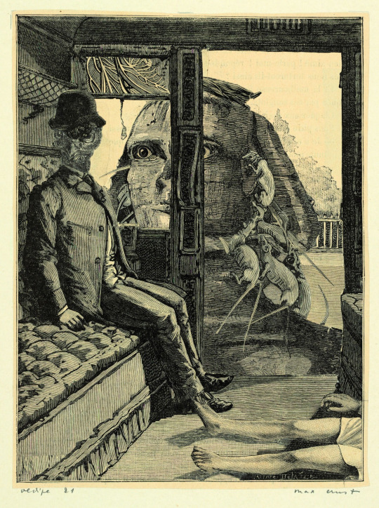
This booklet is entirely driven by the myth of Oedipus (that we know to have been one of the surrealists' favorite Greek myth). All the illustrations have one element or another of the legend, and keep retelling specific episodes of Oedipus' adventures. Oedipus killing his own father, the riddle of the Sphinx, or baby-Oedipus being abandoned at birth... Oedipus himself is symbolized in the collages as a bird-headed man.
One of the most famous collages of this booklet is the one that retranscribes the part of the legend that gave Oedipus his name, "swollen feet" or "swollen ankles", due to receiving a wound there as a baby. In Ernst's work, the bird-headed man (Oedipus) rather stabs in the foot a woman:

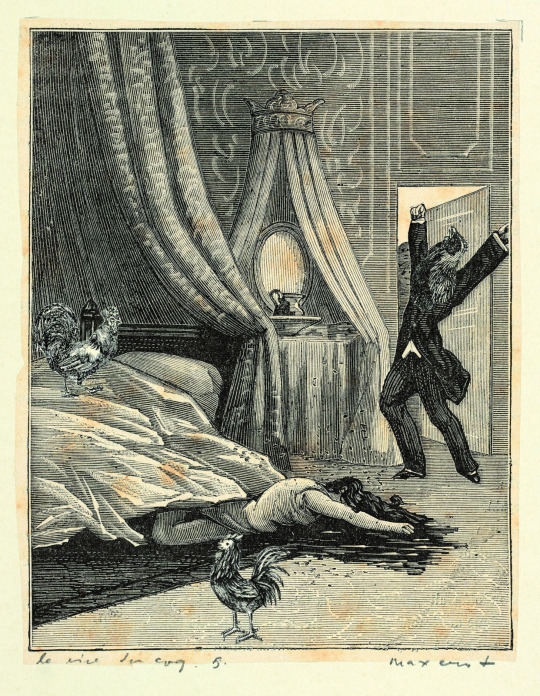
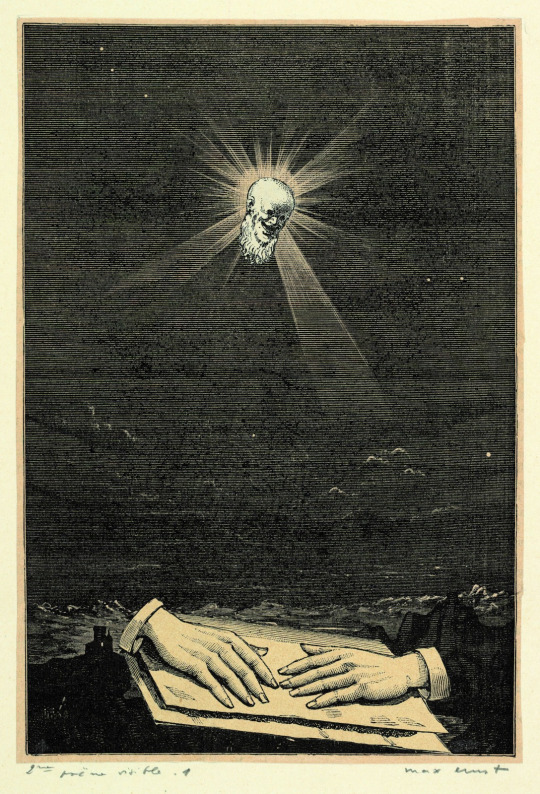
Day five: Thursday. Element: Black. Example: The laughter of the rooster ; followed by "Easter Island".
This is where we reach the last three days placed in one same booklet. It is also only in this last booklet that Ernst placed text, in the form of quotes or poems from other authors. This day has three quotes. In the "Laughter of the Rooster" segment, two. One from Marcel Shwob's L'Anarchie: "Those of them that are joyful sometimes rise their behind up to the sky and thow their feces at the face of other men ; than they lightly hit their bellies." Another from Schwob's Le Rire: "Laughter is probably fated to disappear." The third quote comes from the Easter Island segment, and is from Arp: "Stones are filled with entrails. Bravo. Bravo."
Here the symbols seem to again represent men or organizations of power. On one side, you have the recurring rooster - which is of course the symbol of France, and thus can be seen as a representation of the French government or French state. On the other side you have cruel and brutal men with the head or faces of the Easter Island statues, reflecting them not just being humans made of stone - but being literal "stones idols" (in the religious sense of the term, the sin of idolatry, again a Christian subversion).
Day 6: Friday. Element: Sight. Example: The inside of the sight / The interior of the view.
Again, three quotes here. One from Professors O. Decroly and R. Buyse's "Les tests mentaux": "If three is greater than six, make a circle around the cross, and if water extinguishes fire, draw a line from the sceal to the candle, passing above the knife, then make a cross on the ladder." One from Paul Eluard's "Comme deux gouttes d'eau": "And to love I oppose / Already-made images / Instead of images to be made" (The text is much more poetic and punny in the original French). The final quote is from André Breton's "Le revolver aux cheveux blancs": "A man and a woman absolutely white."
Unlike the previous booklets which presented dynamic, violent, active, interactive scenes, here we are in more still, contemplative images. Symbols, visions and settings to be looked at and gazed at, as the title of the section indicates.
Final day: Saturday. Element: Unknown. Example: The key of songs (again, a pun on "The key of fields", a French expression)
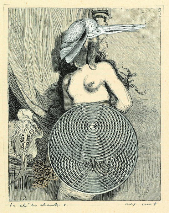
Only one quote: "........ / ........ / ........ / ......" from Pétrus Borel's "Was-ist-das".
For this part, the Musée d'Orsay used a quote by André Breton to explain Ernst's intentions: from the Surrealism Manifesto, "Glory to hysteria and its cohort of young, naked women sliding down the roofs. The problem of womankind is, to the world, everything there is of wonderful and troubled/murky." In this final day, we see women, always leaving a bed or bedroom or resting place, and either flying away or entering landscapes where gravity does not work. There is clearly here a work on the "clinal hysteria", and Ernst' own take on the surealists great obsession with hysteria, that they deemed to be disease, yes, but an illness that brought both freedom and inspiration. This idea of being set free is within the section's very title: "Prendre la clé des champs", "To take the key of the fields" is an expression meaning to go away (especially to go away from an oppressing or suffocating, unpleasant situation), to flee, escape, disappear (with the connotation of the fields as a vast, open space of great possibilities and endless horizon).
#max ernst#surrealism#surrealist#art#french things#french history#french art#une semaine de bonté#a week of kindness#one week of kindness#days of the week
12 notes
·
View notes
Text

i've been accepted into 2024's Shortbox comic fair so, in addition to my work for SUPERPOSE, i've begun a brand new gay adult scifi comic for the event ⚪ it'll be kept under wraps until far off in the fall, but for our supporters i've shared my early developments and thought process.
i'm very happy with it... it's so invigorating to create stories that're at once totally separate and in conversation with one other, digging further into what i love in new ways, sharpening on it like a whetstone. i've heard from some people with taste and class that it even seems "good" so far. and gun to my head, brother, i'd have to say i agree!
(working title; i've gotta call it something.)
#comics#now just pray for me#queer comics#queer#trans#butch#he/him#in the meantime go read SUPERPOSE and i'll meet you back here later#my oeuvre...
94 notes
·
View notes
Text
The importance of Yan Zhengming’s femininity
I don’t intend to try to guess what priest was thinking when writing yzm, but since taoism is a big part of liu yao and yzm is such a powerful cultivator, i thought it’d be fun to do a short analysis of the way femininity is perceived in taoism and how he embodies that
If you read the Tao Te Ching, you’ll notice that it describes comparisons between a lot of dualities or two sides of the same coin that complement each other, the yin and yang concepts represent those opposite natures that, despite seeming so contradictory and different, exist in balance and can even alternate or superpose each other in nature, among the different things that are considered yin and yang (like dark and light, moon and sun, passive and active, etc.) there is femininity (yin) and masculinity (yang)
In many chapters, Lao Tzu describes Tao as something inherently feminine and maternal, since it’s considered the mother (母) of all things, it’s continuously referred as “woman” or “female”, Lao Tzu creates comparisons between femininity and masculinity, but keeping femininity as the dominant one or as having the main role in the comparison. Lao Tzu prefers and suggests that one should be more feminine, because, at least in the way it was perceived at the time, it is closer to Tao and represents one of the most important concepts in taoism, the concept of wu-wei (inaction or effortless action) better (i’m not going to explain wu-wei so i don’t divert too much from the topic but as someone who’s passionate about it i invite you to look it up!)
some examples of this in the Tao Te Ching:
“Knowing the manly, but clinging to the womanly,
You become the valley of the world.” (Ch. 28)
“A great country is like the lower outlet of a river.
It is the world's meeting ground, the world's female.
The female always surpasses the male with stillness.
In her stillness she is yielding.” (Ch. 61)
“Can you open and close the gate of Heaven
And act like a woman?” (Ch.10)
(i could go on about how revolutionary it was for femininity and women to have such an important role in taoism in contrast to a male-dominated confucian society but that’s for another time) so, in general, femininity is highly valued in taoism, it represents the origin of life, water and movement, it’s something both active and passive, because it’s tied to wu-wei, as Stefan Stennud explains in his interpretation:
“You should have no wish to rule, or to make use of the powers you have at hand. Then you understand when to do nothing, which is usually the best. To Lao Tzu, this attitude is the female one, and he definitely prefers it – for men as well. Traditionally, men have sought power and were eager to use it in abundance, while women preferred to leave things be, in order to do the least damage. That's the wisdom of doing nothing”
So now that we know femininity’s role in taoism, how does this relate to Yan Zhengming?
because i believe he represents that perception of femininity very well, he’s a man that’s constantly described as feminine, both praised and mocked for it at times, he’s someone that takes great care of his appearance and values things that are commonly associated with femininity, but not only that, i think a lot of fans can agree that he also behaves like a mother to his siblings, not really like a gentle and patient mother, more like the mother that scolds you and calls you ungrateful (but still works hard to protect you and give you a good life…-sob-), Yan Zhengming is powerful but chooses not to use it to dominate or be aggressive against others, his ambitions aren’t centered around becoming even more powerful, but to ensure a peaceful life for him and his family. his kindness acts indirectly and passively, so even though he’s more reserved with his affection towards his family, it’s always present, he doesn’t need to boast about it, it’s simply shown through his actions, he will effortlessly do everything for them because that is his nature
and yet these contrasts still exist within him, he’s both the gong and feminine, he’s strong but doesn’t exert senseless violence, he possesses both qualities associated with femininity and masculinity, but with a predominance of femininity, i think it’s interesting considering how he’s pretty much one of the most powerful cultivators of his world, han muchun could be associated with it since his personality is full of gentleness and nurturing
anyways i couldn’t help noticing this while reading taoist texts, i hope you found it interesting too!
#liu yao#yan zhengming#六爻priest#taoism#btw i love talking about liu yao w a taoist perspective so...lemme know if i should write more of these lol#i know it's my blog and i can do what i want but ;;;;;;;;; i also think will who cares#bla bla bla self consciousness
42 notes
·
View notes
Text
Bringing back my comic recommendation series on a new blog, and I'm yelling about @superposeblog this time around.
If I wasn't high off just writing this article, I would explain to you how hard I've fallen for this comic. I need you to read this comic more than I need you to read my review, even if you're not a fan of sci-fi. In fact, especially if you aren't a fan of sci-fi.
This comic has the beauty of worldbuilding, the depth of character, the artistry of its story down fucking pat, and by the time the sci-fi themes really get started, you're already hooked.
SUPERPOSE is the essence of good story telling that it can appeal to people outside of its demographic while wholeheartedly committing to the story it wants to tell. I want it to keep telling its story; there just need to be more people listening to what it has to say.
Check out SUPERPOSE—the comic, the tumblr, all of it—and enjoy. I promise it'll be worth it.
22 notes
·
View notes
Text
9 people I'd like to get to know better
tagged by @dujour13 , thank you so much!! this was fun hehe 💜
three ships: OH MAN this is a tough one... I'm gonna make things easier on myself and say that, in honour of Femslash February coming up relatively soon, I'll only pick F/F ships, because otherwise I'll be here for an eternity:
Yunia (my Tarnished)/Ranni, if only because I have been rotating them in my mind a LOT recently, especially since @takers-flames helped me figure out a bit of Yunia's backstory
Gideon/Harrow
Kaija (my Knight-Commander)/Camellia. let's go, toxic yuri, let's goooo
last song: Halcyon by Spiritbox! I am normal about Spiritbox I can stop listening to Spiritbox whenever I want
last film: uhh. okay so I am not much of a film-watcher at all. I really should be watching more films because the major I'm going to be starting this year has an entire module regarding film, but IDK I just always have trouble with them. so my answer is the very boring "I legit can't remember, which means either it's been ages since I watched a movie or the last movie I watched did not leave a strong impression on me and I Forgor 💀"
currently reading: alternating between Tesis sobre una domesticación, by Camila Sosa Villada, and Buddha's Little Finger—or Chapayev and the Void, depending on the edition?—by Victor Pelevin (the latter being a recommendation by my bestie, @hate-not-wanting-a-name). I'm, unfortunately, a very slow reader, because being an editor means I spend most of my time reading anything but what I would actually like to be reading, which also kind of limits my reading energy
currently craving: so I actually am craving two things, kind of like superposed cravings? on one hand—so the other day I went out for some coffee with my aunt & I had a slice of key lime pie and a pistachio-flavoured frappé, both of which were absolutely heavenly and I could really, really, really go for that exact combo right now. aside from that? sushi. I'm in a perpetual state of Craving Sushi. no matter the hour, if I've already eaten, if I'm hungry or not, how I'm feeling, I always want sushi. it's a curse 😔
since I've already mentioned Joy and Walkeri on this post, let's just say that counts as a tag lol (only if you want though! no pressure), & as for the remaining 7 tags... uuhh no idea who's done it and who hasn't so I'm open tagging!
7 notes
·
View notes
Photo
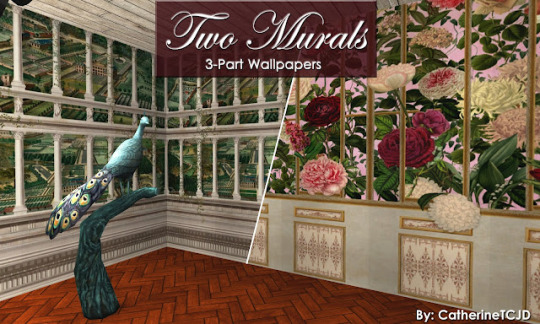
Two Murals ~ 3-part Wallpaper Scenes
Fairyland and ImperialFlora
Both of these wallpaper-mural patterns come from: MindTheGap.com and were modified for TS2 by CatherineTCJD of Sims Virtual Realty and MTS.
Fairyland = "An impressive mural style wallpaper depicting an illustrated fairyland view with a large scale wall made with superposed architectural columns and in the background a stunning countryside scenery. A depiction of what we imagined to be the landscape around the Transylvanian Manor. The design is printed over 3 rolls."
Imperial Flora = "Inspired by vintage royal gardens, ...is a spectacular mural wallpaper showing large scale peonies in a variety of colours. The wooden gilded panel is ornate with beautiful decorative elements being placed in front of the flower bush to create the impression of a realistic manor garden. The design is printed over 3 panels."
These wallpapers are best for 1-story rooms, but may be 2-story-able? And, they are found in the 'misc/other' wall category for $12 each.
Read more »
DOWNLOAD "Fairyland" @ SFS
DOWNLOAD "ImperialFlora" @ SFS
Or MTS
PSST: Add your own moulding to the plain paper walls with my Wallpaper Overlays - These overlays let you add whatever moulding you want to your walls.
30 notes
·
View notes
Last Seen Blogs
artoatsblog
soldier has my autism in his hands
phantastus
Underground Dawn III

mellowcandypizza10
Looking For Good Girls
apyrisol
SOL!!!
