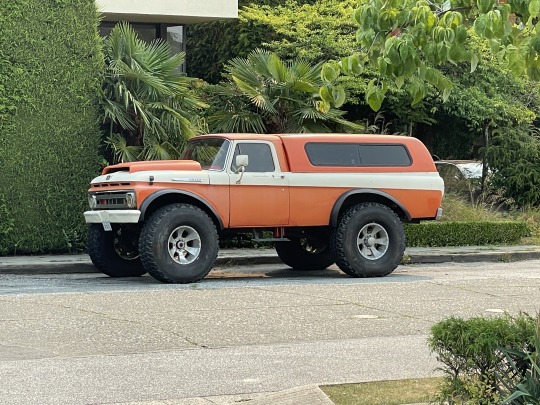
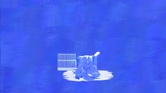
#orange and green are a nice colour combo
Text
she thicc
#if anyone know what kind of truck this is#lemme know#mhalachai goes outside#orange and green are a nice colour combo#automobiles#classic cars
271 notes
·
View notes
Text
#mARTch 2024

text version (with more info!) under the readmore! please check it out if you're confused about anything <3
F.A.Q
do i have to draw every day?
no!!!! there are skippable days built into the event, please use them whenever you need them! i really don't want anyone getting a wrist injury!
can you share my art?
yep! i try to share entries to @bweirdevents daily during the event!! the tags can get busy tho so i might miss some posts OTL sorry
what are the tags?
#mARTch is the main tag, but this year you might find posts in #mARTch2024 too!
wait, i'm confused about a prompt...
full breakdown of all the prompts below ↓ with helpful hints if you're stuck!
_____
INTRO WEEK
this week is all about your artistic identity ... technically, you don't have to draw anything new this week if you have some art that already fits. the starter days are:
1 ⭐ self portrait
who are you? it doesn't have to be you IRL .. if you feel more comfortable drawing a fursona or mascot, that's fine too!
if you don't wanna draw, you can also just share old self portraits today and talk about why you drew yourself that way!
2 🤍 inspirations
see how this day doesn't have a star? that means it's optional and you don't have to do it at all!
but if you really wanna- tell us all about what inspires you to create art!
this could be anything from the people that inspire you, the shows you like, the pins on your big messy pinterest board, or concepts that you're drawn to! you can draw something about it, talk about it, or just post your inspirations! anything is fine
3 ⭐ fav thing to draw
what do you like drawing most? backgrounds? animals? one specific animal? bust of your oc facing left? cars? the same anime boy over and over and over? no judgement!! show us :)
_____
STUDY WEEK
this is the week we actually start drawing from reference!
polished art is not required at all, quick sketch studies are fine! please don't burn yourself out
4 🤍 plant
5 🤍 body
6 ⭐ animal
7 🤍 object
8 🤍 food
9 🤍 face
10 ⭐ hand
these ones are pretty self explanatory!
you can do them as realistic studies, or adapt them into your own art style, it's all fine! you can reference from your own photos or from resources on the web.. have fun!
_____
COLOUR WEEK
this is the week for playing with palettes and working on your colour theory skills!
if you're really struggling with these ones, don't worry about drawing scenes or characters, you can just have fun splashing colours around on an abstract canvas!
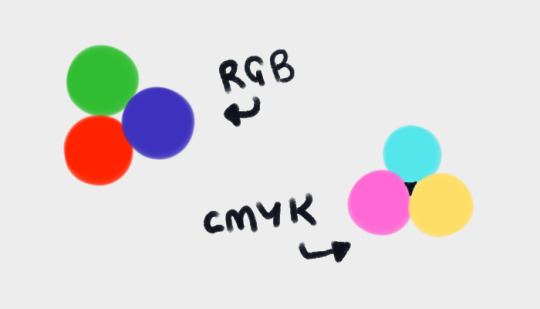
11 🤍 RGB
a set or primary colours typically used in digital/screen art - red, green and blue!
12 🤍 CMYK
a set of primary colours typically used in traditional/print art - cyan, magenta, yellow ... and key (black!)
for both of these days ↑ you can add in black and white.
and feel free to combine the two days into one, if you're struggling with a three-colour palette! use all six!
13 ⭐ WARM COLOURS
the warm side of the colour wheel, reds oranges and yellows!
14 🤍 MONOCHROME
monochrome doesn't mean black and white ... it means one colour! that can be any colour at all- shades of red, shades of purple, shades of green .. or yeah, grey if you really want!
15 🤍 COMPLIMENTARY
complimentary colours are the ones opposite each other on the colour wheel! they're kinda married

16 🤍 YOUR FAV COLOURS
pick any palette that works for you! where's your comfort zone? what looks nice to you? what colour combos do you always go back to?
17 ⭐ COOL COLOURS
the cool side of the colour wheel, purples, blues and greens!
_____
CREATIVITY WEEK
this week is all about vibes! try to create something that matches the mood of the prompt .. they're vague on purpose! don't overthink it, just draw from the heart!
18 🤍 SMALL
you could draw something that's really small, like an ant .. or draw on a canvas that's really small .. or use a really small brush .. get creative with it!
19 🤍 DANGER
try to capture the adrenaline .. the rush .. the fear that you associate with the word danger!
20 ⭐ SOFT
soft colours, soft textures, soft vibes ... whatever makes you comfy!
21 🤍 MIDNIGHT
darkness and secrecy .. spooky witchy vibes .. the tranquility of a forest at night .. the fun of a late-night party .. there's lots of ways you can take this!
22 🤍 POWER
what does this word make you think about? superpowers? control and oppression? literal electrical power? something else?
23 🤍 CHILL
chill as in calm? or chill as in cold? who knows .. it's up to YOU!
24 ⭐ LOUD
try to draw something that feels LOUD! BRASH! IN YOUR FACE! how can you convey sound through art?
_____
FUN + GAMES WEEK
this week is just for enjoying yourself! take it easy and have fun!
also .. another reminder! there are skippable prompts! if you're tired and struggling to get to the finish line, please don't hesitate to skip a day!!! or multiple days!! as many as you need!!!
25 🤍 TRY A NEW ART STYLE
copy the art style of a show you like, ask a friend if you can try their style, draw the eyes a new way, develop a totally new style on the spot... whatever you want!
26 🤍 DRAW WITH YOUR NON-DOMINANT HAND
righties, draw with your left!
lefties, draw with your right!
ambidextrous nation ... our time to show off!
27 ⭐ DRAW WITH YOUR EYES CLOSED
don't peek! try to draw something without looking!
if you really want, you can colour it with your eyes open after you draw the lines/sketch with your eyes closed... but please try not to cheat with the actual drawing part!
28 🤍 RE-DRAW SOMETHING OLD
find some old artwork you like, or something you feel like you can do better on now, and give it another go!
29 🤍 RE-DRAW A MEME
find a silly picture on the internet to redraw .. do you have any in-jokes with your besties?
30 🤍 DRAW A GIFT FOR A FRIEND
create something for someone you love <3
31 ⭐ FREE CHOICE
final day! you can draw anything you want today! show off your skills! draw something you've been meaning to draw! whatever!
_____
please refrain from reblogging this post after march ends - next year's prompts will be different, thank you!
if you have any additional questions, don't hesitate to shoot me an ask!
#🎨#mARTch#mARTch2024#events#art meme#art prompt#art prompts#art challenge#drawing prompt#drawing prompts#drawing challenge#march
872 notes
·
View notes
Text
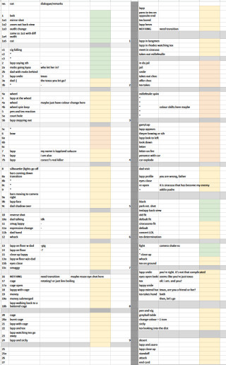
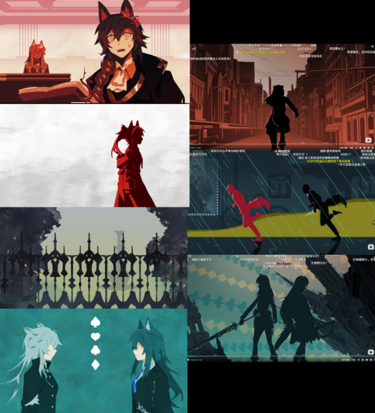
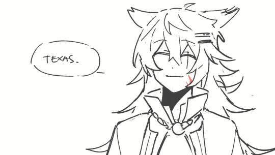
Lappy fancam animatic blogging/production notes
now that wolfgirlyaoi is out on global its rambling time about my powerpoint presentation
Concept
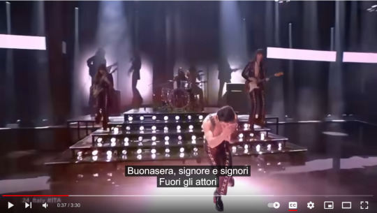
Originally I wanted to do an (Tex & Lapp) animatic with the boss theme (broken wall/Signore dei Lupi .mp3) ever since the event dropped but I thought
1) by the time I finished anything someone else would have probably already done it first (lol, lmao even)
2) I remembered the song exists and how much i looped it then while listening to the group's new album drop and thought the lyrics fit Lapp a little too well and also doesn't end abruptly like the boss theme + was shorter so yea
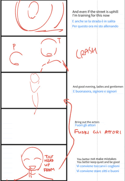
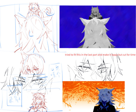
initial stickman storyboard where i put down the lyrics with event dialogue/happenings that i felt would fit nicely together > hastily scribble the images that form in my head
storyboards were basically what i wanted to see (same rule as my comics) lol especially if they weren't shown in the event CGs, eg. there's a CG of the truck crashing into the courtroom so I didn't do that but they didn't mention her physical acting in that scene + the song I used has a bow/salute at that exact part in their live choreo with the very similar line so I wanted to do a homage even though-
-I was like it's going to be such a pain to figure out an economical hand twirl and bow but I have to do this I need to transplant the image in my brain onto the screen because official media did not do a—
Honestly still don't know if its a common phrase and action combo because I was having so much trouble finding external references that wasn't just scrubbing the live video over and over anyway
part of the storyboards were 'recycled' from comic drafts I did (of the chocolate scene because ofc) when the event was running on CN
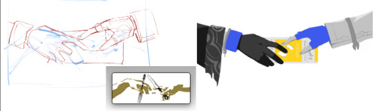
Originally I wanted to draw Lapp feeding Texas for The Girlyaoi Funny but I wanted to reference the plaque you get which is a Creation of Adam reference right but I also saw people saying it's referencing the scene from Silence of the Lambs lol so...peel the layers to your liking!!
(The chocolate flavour choice was from asking my Columbian friends what the worst chocolate flavour they ever tried which was white coconut)
my sorry attempt at colour keys > final spreadsheet to keep track of progress and paste all the dialogue i put in
Art Direction
A bunch of shots/colour schemes are references to Måneskin's stuff or other media tehepero I'll just put a few here
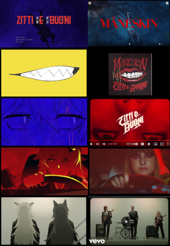
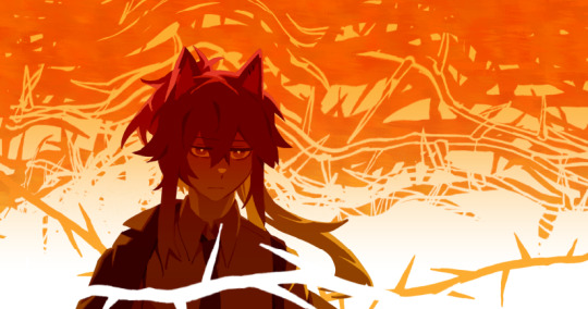
At first I was going to limit red/blue to tex/lapp respectively but since Omertosa is blue I just did away with that rule and lapp gets to have both (and more!) these two colours have pretty obvious emotional readings I think but also
red = self
blue = society Siracusa
or: red = yaoi & blue = yuri
for the others:
Purple = Alberto/Saluzzo, its not orange like the fruit he keeps holding because see below; I needed the colour for something else LOL Also the Saluzzos are iirc nobility or whatever and they have purple hints in their clothes so I think it was a good fit anyway
Yellow/Orange = Its supposed to be representing the last word in the story which apparently, yostar went with 'Savagery' which is Correct I guess but (laments again about how nuance is lost in localisation because imo savagery has a more derogatory kind of connotation while I think 蛮荒 in context of the story also has a 'nature/untouched by civilisation' side to it) which is why Texas setting the house on fire was not (entirely) red but orange (and it complements the blues both visually and thematically) and it's yellow at the end when they're frolicking(?) in the wilderness lol
(these colour rules don't apply to the penglog shot and technically a few frames like the shot with shocked penance, the one right after and 'im just lappy' because...i forgor my own rules lol)
The greens/teals were just a reference to the shades in the 3DPV I think
The silhouette/general style was inspired from the 3D teaser thing they had at the beginning of the 3.5 anniversary stream and the card suits that I..forgot to move to the other layers which is why only the green one had them (supposed to be 1 per set 💀)
The clash bit is basically the same as the event CG but with a flipped camera/POV sorry for world's worst screenshot lmao. Couldn't imagine the poses in my head so I ended up posing 3d models in CSP pretty good posing practice
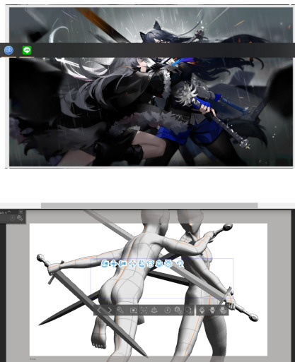
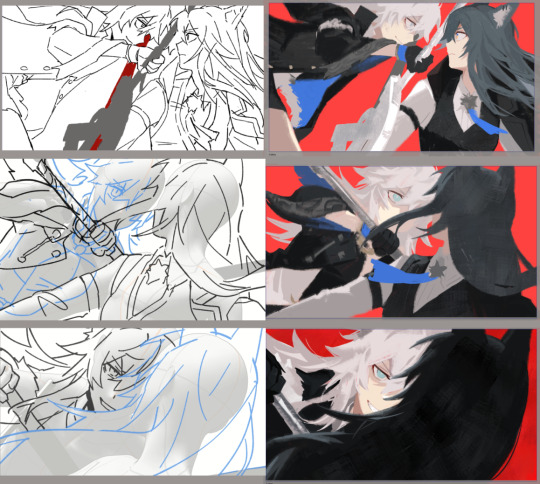
These shots got rendered extra because..they were the first frames I started on and I was still figuring out how much to simplify lol
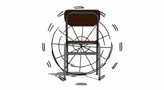
I also posed the chairs shot for some inexplicable reason…my file was lagging so bad
Headcanon part (kind of)
The childhood flashback scene is probably the part I took the most liberties (headcanon) on since it's not explicitly canon like the rest...the sequence/how I connected the scenes itself to fabricate a timeline of her childhood was kind of inspired by some weibo post musing about how (iirc) texas's sweet tooth maybe came from when she was being fostered at casa Saluzzo and Lapp treating her like a pet essentially and giving her a lot of treats since...you know what happened to her actual pet hehe except maybe texas offered her a stick first and then Lappy just reciprocated endlessly because its one of the few 'acts' she knew that wasn't violence haha yeah this section was basically a stealth doujin sorry
It's mentioned that she was brought up as the ideal Siracusan or whatever and she does the cute doodle in the 3DPV so I thought she probably had the Forced Music Lessons as a kid (The music sheets are Bella Ciao and of course)
The bow choreo was the one thing i really wanted to animate but the music sheet segment (based on that one split second shot above) ended up being my favourite part even though compositing the motion was a mini hell on it's own (ended up compiling a long png to scroll by with the red doodles layered over)
Other things
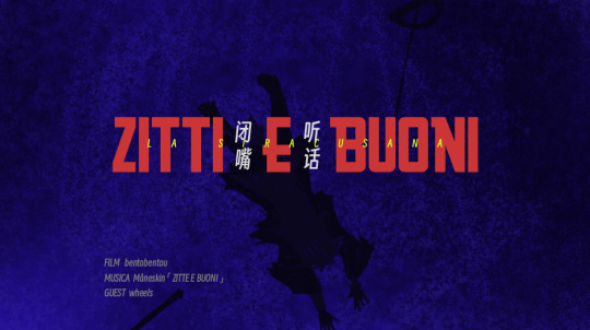
I will never live down my (self-imposed) shame of misspelling the title (I fixed the title on youtube but its why the ending shot in the upload says ZittE e Buoni instead of ZittI e Buoni) don't rush your fancam in 10 days 😔
I didn't look through the entirety of the EN loc but Idk why they had Lappy say 'Then go.' to Texas when it's supposed to be more like 'Let's go.' as in, 'let's go together' as opposed to 'alright off you go to the greyhall alone' lmfao also her saying goodbye forever padre when addio is right there
I don't think I'm insane enough to do another ppt soon but man this pair really makes the 'imagines a whole music video while listening to music' part of my brain go wheee like first it was Starset's Manifest then Signore de Lupi then this and while working on this one i was thinking how Måneskin's Torna A Casa would be another good track
ok ty for reading #GIRLYAOIREAL
#arknights#Il siracusano#bentodraws#bentotexto#I was going to have this post as a reblog but tumblr broke my copypaste so here's a completely separate post#feel free to ask me about anything else i didn't cover in here
151 notes
·
View notes
Text
Helmet Watch 2024
*cracks knuckles* I'm back to yell about driver helmets.
Like talking about and rating all the liveries last year, I had a lot of fun doing the same for the drivers helmets, so helmet watch has returned for 2024! (Under a read more as to not clog up everyone's dashes, with the drivers listed in alphabetical order by surname.)
NB - I'm just doing the "core" helmet designs, as if the drivers come out with one-off helmets at the rate they did last year I wouldn't have any free time.
Alex Albon (Williams)

Like the 2024 Williams livery, it's an evolution of last year's design. Though with less sharp angles and using something much more bubble font-esque.
We still have the double As which is neat and I also loooooooove the baby pink and navy blue combo, especially with how much pink is on the helmet. It will really pop against the dark blue livery of the car.
8/10
Fernando Alonso (Aston Martin)

Pretty much a copy and paste from last year's helmet with a couple of minor tweaks. But in saying that I do feel that the minor adjustments make the design look a lot less busy. Like last year the colour scheme is great and it'll look great with the car, and I love the Aston Martin wings by the visor, it's one of my favourite details.
7/10
Valtteri Bottas (Sauber)
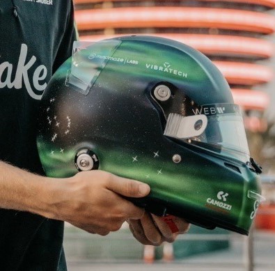
Any feelings I had about Valtteri taking forever to drop his 2024 helmet design have been immediately forgiven. I absolutely love this Northern Lights inspired design so so much. Both because of how unique a design it is but also the execution of it is just gorgeous. I love all the inclusion of the North star and all the different constellations, and that the number 77 has also been written like waves from the aurora. I would genuinely buy a mini-helmet of this I love it that much.
10/10
Pierre Gasly (Alpine)

I absolutely LOVE this one. The splashes of white and the subtle gradient shading adds so much dimension to the whole design (proof that if done right monochromatic designs can absolutely work!). I also just love the shade of pale blue as well, it's going to look really nice with both liveries Alpine are running this year.
10/10
Lewis Hamilton (Mercedes)
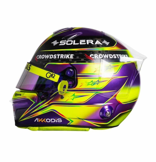
Misty eyes aside about this being the last core helmet design from Lewis as a Mercedes driver, I do absolutely love this. It's pretty much another copy and paste from last year, minus the rainbow band on the top. I'm glad that Lewis kept the rainbow lines otherwise the contrast between the neon yellow and purple would look quite jarring. But like last year I absolutely love it (apart from the exposed carbon at the top)
9/10
Nico Hulkenberg (Haas)
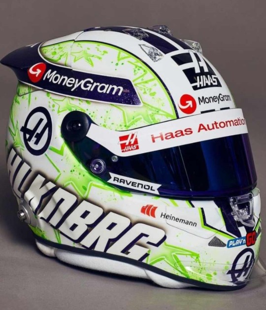
JMD Helmets really do never miss. Like his helmet from last year I love the paint splatter effect and I really like the choice to change it from orange and purple to acid green. I'm unsure on what to make of the purple and green combo as it def plays into the whole Hulk nickname, but the shades chosen do look good together.
9/10
Charles Leclerc (Ferrari)
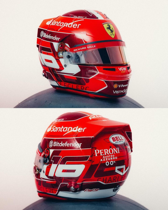
Currently kissing Charles on his pretty little head for the addition of the dark metallic red accents. It's so pretty and adds a lot of dimension to his helmet design (while I did like his '23 helmet, it did feel a bit plain). I also really like the pattern on the base of the number 16 going round the helmet, it's been done in just the right font size and colour that again adds some more dimension instead of looking busy.
8/10
Kevin Magnussen (Haas)
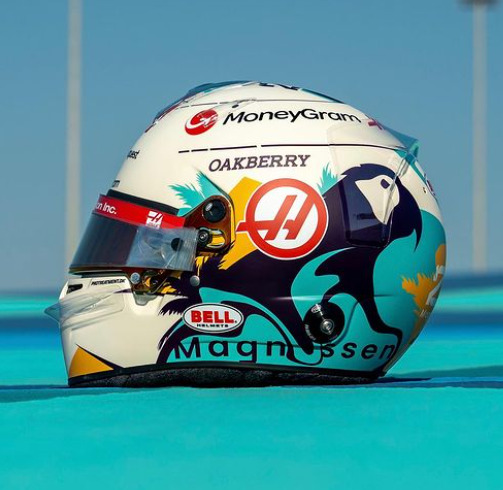
This is a complete 180 from his previous helmet designs, and while I have zero idea what the inspiration is I really like it!
The bright splash of turquoise is really nice (I will always love fun colours on helmets) and it complements the parrot design really well. (Again, I don't know why Kevin has put a parrot on his helmet, but it's fun so I'm allowing it). I would never have thought to pair turquoise and marigold together, but somehow it works, and both looks really nice on the off-white base.
8/10
Lando Norris (McLaren)

I genuinely cannot fault this. I love that it's glossy, I love the neon yellow, I love the abstract black detailing. My new favourite helmet design of Lando's
10/10
Esteban Ocon (Alpine)

I am so happy to see Esteban carrying on the red and black colour scheme from last year. While I don't love this design as much as last year's (the big carbon fibre E is a tad off putting) it's still a really solid design that will not only stand out against the Alpine livery, but against the rest of the grid's helmets too.
He also gets a kiss on the head for keeping his helmet glossy instead of matte
8/10
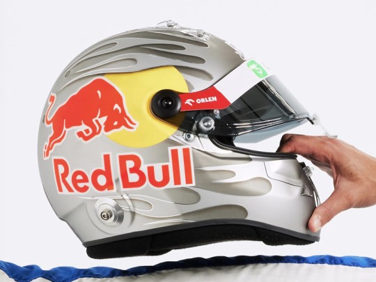
Sergio Perez (Red Bull)
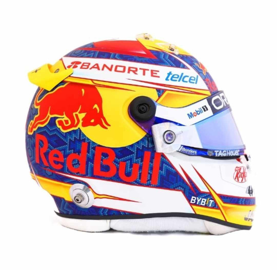
I'm unsure how I feel about Checo's helmet this year. On the one hand it does have a more cohesive colour palette than last year (and I LOVE the traditional Mexican inspired patten on the blue base), on the other it does feel a bit simple. I also wish the Red Bull logo with the white outline had been used instead, the text is a bit hard to read against the blue. But I do enjoy the splashes of yellow that do well to set his helmet apart from Verstappen's
6.5/10
Oscar Piastri (McLaren)
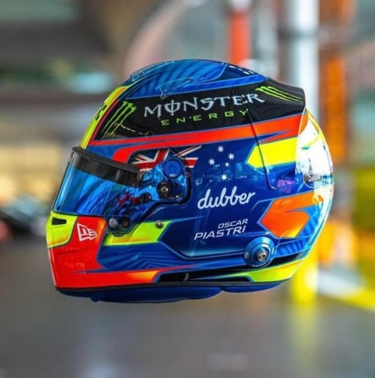
Another evolution of last year's design and I love the version for 2024! For me Oscar's helmet was too busy last year and I feel like it's been streamlined. My favourite part, the colour palette, has remained unchanged and like last year I just love how bright it is. I also really like the pattern on the medium blue base, it adds a really nice dimension to the overall design. However I do miss the silver holographic detailing from last year's helmet, it's a shame it didn't make the cut.
9/10
Daniel Ricciardo (Racing Bulls)
This is a colossal upgrade on last year's helmet (the tan and blue colourway was not it). And while the grey and silver colour scheme is plain, it definitely helps the flame design look a lot better than on last year's helmet and will look really good against the bright blue RB livery.
As with Gasly's helmet I also like the gradient shading, and the chrome (!!!) silver outline going around the flames.
7.5/10
George Russell (Mercedes)
I am so glad George stuck with a blue design instead of the acid green he trialled at some race last year. It's a really gorgeous shade of blue that looks stunning with the Mercedes W15 livery, and I really like the little bits of darker blue shading and the blue visor (again I don't talk about matching visors much but I do appreciate them!!).
He also gets a bonus point for having the black parts painted instead of carbon fibre.
8/10
Carlos Sainz Jr (Ferrari)

Again another copy and paste from last year, but thankfully with less black. It looks so much brighter with just having the black on the top. I like that the design is a even more abstract than his design last year, it definitely makes it look different. And of course the red and yellow colour scheme means that it will look really good with the Ferrari livery
7/10
Logan Sargeant (Williams)

I really, really want to like this design but the American flag just completely takes me out of it. If it wasn't there this helmet would be gorgeous because imho it's not needed as the white and blue with the red accents already does a great job in showcasing Logan's home country colours.
Apart of that, the design is really nice and it will look so stunning with the car, it just has an echo of a Haas US GP livery 😭
5/10
Lance Stroll (Aston Martin)

A moment of silence for the fallen Aston Martin wins, they were very pretty 😔
Lance's helmet design for 2024 is a throwback to the design he ran in his championship winning European F3 season, but refreshed in Aston Martin colours. I did have a somewhat negative reaction upon seeing the exposed carbon but the more I look at it the more I'm on board with it. It definitely helps that it's all over glossy. Also shoutout to Lance's continued commitment to the Aston brand by having the flashes of neon lime to match the car's livery, I will always appreciate a proper commitment to the bit.
7/10
Yuki Tsunoda (Racing Bulls)

The Japanese maple leaves are baaaaaaaack!!!!!
I'm not so sure on the navy base... but then I also don't know what colour base I would switch it out for that would look good and also complement the Racing Bulls livery. But Yuki's helmet was one of my favourites last year so I'm really happy to see a version of it back for 2024.
7/10
Max Verstappen (Red Bull)
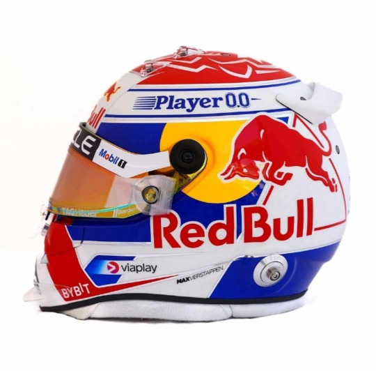
ngl I do like this a lot more than his design from last year. I love the cobalt blue (oh how I wish the RBR would be as bright as this) and I especially love the silver chrome accents, if they were a little bit thicker and more prominent I'd like them even more.
I also want to shoutout the red/orange duo-chrome visor, I never talk about them enough but I love it when the colour of the visors complement the rest of the helmet design (in this case the red and yellow in the Red Bull logo)
8/10
Zhou Guanyu (Sauber)
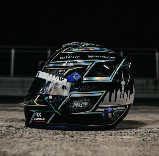
No notes. And dare I say, best helmet on the grid. I just love the pairing of all over black with the hints of the porcelain pattern and silver holographic accents. It's sexy as hell.
10/10
#Formula 1#Helmet Watch#2024#Helmet Watch 2024#Helmet#this took forever to put together bc the drivers took their sweet time in putting their HQ helmet pics out#but spoiler alert the drivers once again out designed their teams
4 notes
·
View notes
Note
Youre super cool and sending in non anonymous asks makes me anxious but hereee we go!!
This is probably dumb but what's your favorite colour combo? Mines Orange and purple cuz Halloween (and i think the pastels look nice together)
(I totally didn't spend 10 minutes spell checking this lol ^^")
oof i relate to the spell checking thing! you have no idea how often i need to redo my tags because i made a mistake. i am haunted by asjd (asks)
as for fav colour combo... ooh thats a tough one! i havent had to think about this before...
i use a lot of blues and oranges in some of my art, because when you get them just right they always turn out amazing! but on the other hand blues and purples can be very striking or very melancholic depending on the shade.
oh this is a very good question!
OKAY! final answer!! Greens and yellows! mostly because that what most of my outfits turn out to be :]
13 notes
·
View notes
Note
love your art style and in particular your use of color!! would love to hear how u approach choosing a palette when u start a new piece
omg thank u mr styles! ok i'm going to be completely honest . i don't really know how colour theory works or how to create nice palettes :(
i think when it comes to referenced pictures i try and bring out interesting tones hiding in shadows or the environment, but for original pieces it's more about the mood! i generally choose whether it's gonna be a cool (blue, green, grey) or warm (red, orange, brown) piece, but i end up using a lot of pinks and yellows throughout for romantic hues. my go-to combo is blue/orange/yellow; i think that's as close a coherent palette i have!
#i also think my perception/use of colour is a little off because my laptop is always on 0 brightness and has a severe blue light filter..#thank you for the ask!#ask!
6 notes
·
View notes
Note
Both of the colours look really nice did you ended up going for the orange ones. Also Hunters have some greats boots so good choice
yeah, I had Hunters before. They are of good quality. I wanted something this length though, so I am gonna get a pair today. I will probably buy the orange/taupe one. The taupe helps it to be used in a more neutral way and the orange gives it a pop of color. I like that particular color combo. And also I have too many green shoes already.
2 notes
·
View notes
Note
pardon, but could you say what pigments you used for the teal/orange Jim painting? i'm new to dabbling in watercolor and not very familiar with what's what, but those are some of the dreamiest colors i've seen
Hey there, thanks so much! Absolutely!! This got very long, so here's the short answer if you don't want to read the breakdown:
Winsor & Newton Turquoise #643
W&N Intense Green/Pthalo Green (#329)
W&N Indigo (#322)
W&N Hooker's Green Dark #312
W&N Sap Green #599
Koi watercolours Jaune Brilliant
Holbein Artist's Watercolour Quinacridone Gold (#W142)
The long answer:
So, the majority of Jim's face was a self-mixed combo of two Winsor & Newton Cotman watercolours - Turquoise (#654) and Intense Green/Pthalo Green (#329). For the lines and places like the shadow on their hat, I also used a combo of Indigo (#322) and two other leftover deeper greens on my palette (likely Hooker's Green Dark #312 and Sap Green #599, but I am not 100% sure as I re-use leftover paint a lot XD)
For the orange, it was primarily an orange I have from a Koi Watercolours Pocket Field Sketch kit I bought literally over 15 years ago and no longer have the guide for - however, I am fairly certain that it's Jaune Brilliant. It is one of my favourite oranges, tbh! Very soft. There's also a bit of Holbein Artist's Watercolour Quinacridone Gold (#W142) to brighten it.
All that to say - it's mainly Turquoise, Pthalo Green, and Jaune Brilliant for the orange. I think the dilemma of something like this is that while this is a duochrome painting - orange and teal, essentially - it's got a lot of different paints involved to make it so rich! I really love the W&N Turquoise though, it's got a lovely vibrancy. Most of the watercolour tubes I buy are Winsor & Newton, they're affordable and last a very long time. I pick up a tube or two every time I'm in the art store and have a good stock built up!
You might not be looking for paint shopping opinions, but if you are, my recommendation for new to watercolour folks is something like the Koi Pocket Field Sketch kit I have. It's a bit pricy at the get-go ($40-$50 CAD, about $30-38 USD) but it has a 24-30 colours depending on which version you get/where you buy it (Amazon looks cheapest, but Michaels has the 30% off codes, so who knows lol). That's enough that you either have the colour you want on hand, or can mix something up easily. It's a really nice beginner's paint set, and designed so you can take it travelling. And lasts really well, even if you don't use it often - I basically didn't use mine for 10+ years and the colours have lasted well. And price wise, a single tube costs between $8-20 depending on brand and paint grade! So it's cheaper than buying a whole palette.
Anyway - thanks so much for the ask, this was fun to talk about! Good luck with your forays into watercolour!!
4 notes
·
View notes
Text
Tag People You Want to Get to Know Better!
Tagged by @saltygirafe
Favorite color: Uhhhhhhhhhhh.... I don't have a single favourite colour but I love these colour combos: Dark desaturated Blue & sunset orange, Green & red orange, green black & red. To name a few.
Currently reading: I am not really currently reading outside of fanfiction (Saltygirafe's fic I Will Lay Me Down has a vicious vice grip on me in the meantime) My catalogue of unread fantasy, sci-fi, fiction and history books grow ever longer and I really should start reading them.... 😔
Last song: Currently ping ponging between "Another Love Tom Ordell" and "Let Go The Irrepressible" (Loreen's Tattoo is pretty cool as well and when the mood fancies lots of 21 pilots, The neighbourhood & lots of other stuff. I am not good at picking one thing...)
Last series: Damn, you're making me realise I have not been watching much and only hyperfixating on like 5 different things. Gundam Witch from Mercury was most recent. I need to watch Fionna and cake an my backlog of shows. (The hyperfixations are Gundam, DND, Vampire the Masquerade, Critical Role, BG3, Armoured core 6, the new Castlevania show when it comes out and being able to draw again. It's the feeling of meeting an old friend. :'))
Last movie: The Matrix. I watched it for the first time. Mmmm, cinematography.
Sweet/savory/spicy: Spicy > Sweet > Savoury. I love me some spicy food, moved recently and miss being able to get Laksa. Honestly I'd put bitter after Spicy if I could. I may have a problematic caffeine addiction. I love having a some small sweet thing with it.
Currently working on: Currently working on my fundamental art skills from the ground up. Been through a lot and haven't drawn for ages and I've finally feel good in a place to start prepping myself for uni. It's been really nice to feel the creative itch again.
@pinguinosentado (I rise from the grave, hope you've been doing well) @romans-art (Ur seen very cool and awesome and ur art is beatiful and makes me feel things and I love ur art don't feel the need to reply I just wanted to let u know)
Feel free to @ me with responses to anyone I didn't tag. Open call to ya'll if you want.
2 notes
·
View notes
Note
What are the humans favorite colours?
Seth: red and black is a nice combo for him, but he also just likes warm colors.
Cesar: he also likes red, but also orange and occasionally blue
Sarah: green
Gabriel: blue, white, and gold.
Evelyn: purple
14 notes
·
View notes
Note
i assume that you like the color orange but find it difficult to incorporate into your artwork and wardrobe.
True! Ish..
I Do love orange! It fits nicely into my ~colour scheme~ just As a Person and Orange/blue is my favourite colour combo!
You're Kinda right in the other regards? My closet does have some orange pieces and peices the feature orange Heavily, but I am in the process of expanding my closet to be much More colourful than it currently is cause i spent the last few years having to wear All Black. And so i'm lacking like... All colours in some ways...
and my art lacks Orange due to Opportunity more than anything else vjdjjgkg so much about FaHI in particular is focused on putrid yellows/greens, hot reds and icey midnight blues... Orange has its place but hasn't made much of an appearance Yet >~<
and many of my other characters/stories are all.. cooler colours, orange is a feature in a lot of place but not centre stage! So i end up not using it much..
#monster noises#FaHI as it exsists in my head has a huge emphasis on colour-as-narrative-element#that i'm excited to explore and challenge myself with#and there Will Be Orange#i just don't use it a lot Right Now lmaooo
4 notes
·
View notes
Note
top 5 colors? (feel free to be specific as possible)
OH BOY.
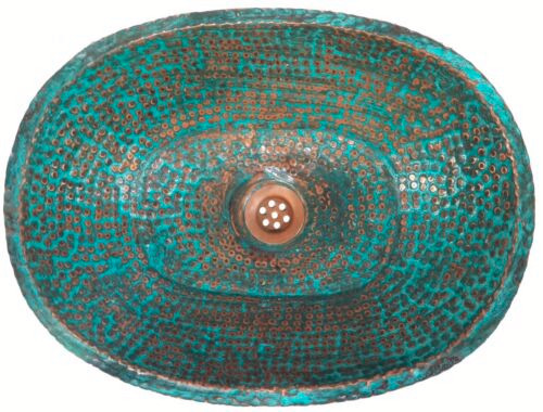
TECHNICALLY it is a colour combo, but just the oxidised bit if that isnt allowed: oxidised copper!! i love the texture difference as well, but mmmmm what great turquoises!!
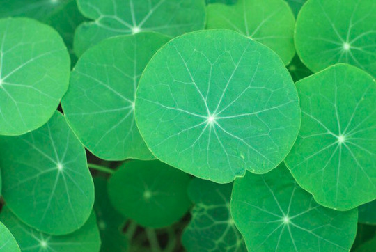
2) the leaves of nasturtiums!! love these particular cool greens
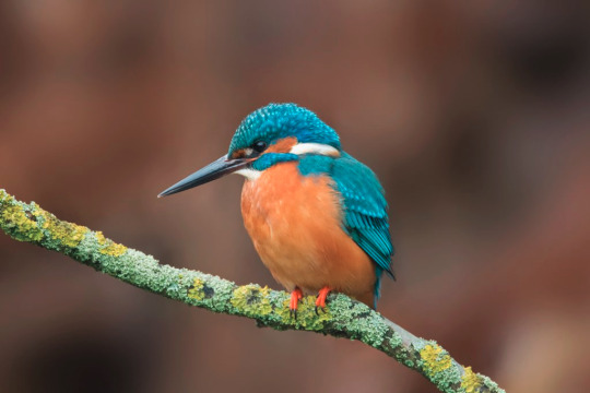
3) kingfisher blue. again with the orange contrast but it's such a lovely colour, mostly blue w just a hint of green
4) viridian, specifically as a watercolour pigment

5) just so this isnt my favourite greens lol: i love tyrian purple!
im sure none of this is a surprise. i love peacock feathers, basically (they also have some nice browns but i couldn't name them)
thank youuu :D this was fun to think about
3 notes
·
View notes
Note
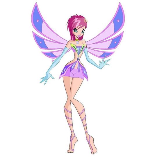
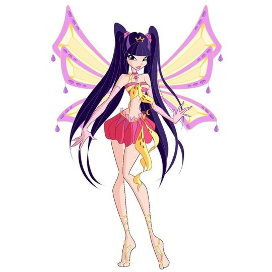
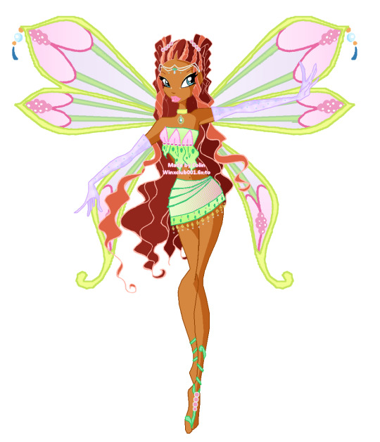
Can you rate the girls enchantix from beat to worst?
I'm assuming by best to worst enchantix you're talking about aesthetics? Although if you mean how they earnt it as well, do let me know.
It's a shame because her Enchantix is one of my fave Tecna transformations but compared to the rest of the girls, it's probably one of the worst for me. It's just kind of bland? Like her wings are painfully simple and missing the bottom part half the time. The colour scheme is nice and consistent across the entire design, I love purple on Tecna, and the blue is nice, I probably just wish there was a little more green as I prefer that as Tecna's secondary colour. Her hair is godawful though. The design of the top and bottom with the crossover is nice but that's it, just nice, there's not a whole lot interesting going on.

Stella's enchantix isn't bad but it's not great either imo. My favourite parts are definitely her feet ribbon things and her hairstyle but the rest is meh to straight up bad. Her top is fine and I'm always here for the orange and the blue combo, but I do not understand her skirt at all. Why does it look like petals? Like it's very much not her aesthetic and it bugs me. Also why the pink? I hate the pink shoved in there. Same with the wings, great but the pink is unnecessary. If this outfit was her original scheme of just orange and blue with no pink, and the skirt was a little different it would rank so much higher.
Musa's is solidly middle for me. It's really nice and I like it but there's nothing spectacular about it. Even though I'm a tom-boy Musa truther and this era officially said goodbye to her short hair, I do like the silhouette of her skirt. Her hairstyle is a little plain but nice, as are her wings. Not a massive fan of her feet ribbons are they feel disconnected from the rest of her outfit. Probably my one big criticism is I wish that dark pink was actually red because I love the red from her MW.

I almost had Bloom in first but I thought that might be my Bloom bias talking so I've moved her down to third. I just really love Bloom's. Her dress is goals, a perfect amount of ruffles without being too much, I usually don't love the heart motif but it's cute on her ribbons, and her wings are perfect. The colour scheme is perfect with majority blue and just a few touches of pink and yellow. The only things I don't really love are her hair (and specifically the blue heart clips) and the bowtie thing around her neck. It's just not it.
Listen, Layla's pink and green version of Enxhantix is gorgeous. Like I could wax philosophical about this look. The wings are amazing, her hair and crown are absolutely iconic, the top and skirt are so cute, and I love her ribbons so much. I am obsessed with this soft pink and green colour scheme, so much that I used it for Layla in my rewrite-verse. Literally my only criticism are her gloves because the purple looks so out of place? Make them pink and the look is perfect. (to be clear, Laylar's alternate version with the blue and yellow would be dead last I hate that version so fucking much).

Look, I tried to pick apart Flora's enchantix but I just cannot because it's just so pretty. The dress is gorgeous with that skirt and the tri colour detail on the bodice, her hairstyle is possibly my fave of hers, and those wings are iconic. The blue of her ribbons is maybe slightly out of place but that's genuinely my only criticism and even that blue ties into the blue on her bodice so it's a really minimal complaint.
4 notes
·
View notes
Note
Hi Kate!! I’m your lgbtqcreators anon. It’s nice to meet you. How are you doing? To start, what are your favorite color combinations? Any music or lyrics you’ve been into lately? Have a great day!!!
hey!!! can't wait to officially meet you 💓
fave colour combos - blue and orange, or blue/green/purple (cool colours)
music - my on repeat playlist currently includes Michael Bublé (his 2022 album Higher), the Beetlejuice OBC album, most of Queen's A Night at the Opera album, and 5SOS5. Top track this week has been Out Of My System (Louis Tomlinson)!
hope you're having a great day!!
1 note
·
View note
Text
Livery Watch 2023
As we head into F1 car launches tomorrow (woo), I have decided to (completely unprompted) share my wishlist for the liveries for the 2023 grid. For no other reason that I am way more interested in colour schemes than I should be. (And because I keep going on about liveries in my 2022 re-watch posts, so I might as well go off about it properly)
Red Bull: Please get rid of the matte finish I am BEGGING. The soft metallic blue livery from the early 2010s was literally top tier, I’d also like it if they went back to having the Bull part of the logo have a white outline, the yellow one just looks off to me idk why.
Mercedes: Silver Chrome. That’s it that’s all I want. (Silver chrome with the Petronas turquoise accents would be so sexy let’s be real)
Ferrari: Again, ditch the matte. Glossy Ferrari red is where it’s at, though I did love the one off burgundy livery so I would allow that.
McLaren: Less exposed black, more papaya please and thanks (and again, make it glossy). I do like the blue accents, but keep them accents pls I want orange
Alpine: No notes. The pink and blue combo is so pretty, keep up the good work.
Aston Martin: If it isn’t British Racing Green I will be suing Lawrence Stroll for emotional damages.
Alpha Tauri: Also no notes, I actually really love the navy and white combo it looks so nice
Alfa Romeo: Again, no notes. Glossy white with the deep metallic red is v sexy.
Haas: Now here is where I think a matte livery would work. Maybe a white and charcoal with glossy neon red accents.
Williams: Maybe like a royal blue to white ombre? They did something like that in 2019 with the Rokit sponsorship and I really liked it. Some glossy black accents (thin stripes going from front to back maybe??) would look really nice.
I will definitely update this post when the actual liveries get launched and see how they compare!
#there's a theme here I don't know if you can tell#it's not that I have beef with matte finishes; bc if done RIGHT it looks great#but with some of the liveries it's just... bland#I want the cars to be SHINY#(mainly bc they look v pretty at night races)#Formula 1#2023#F1 Thoughts
23 notes
·
View notes
Note
top 5 colour combos (like 2 colours you think look nice together)
Purple & Green
Black & Purple
Black & Red
Yellow & Pink
Blue & Orange
2 notes
·
View notes
Last Seen Blogs
marvin-avae
Marvin Et Le Mmi
s7-evermore
Seven’s Fangirl Central

bertrias-blog
Wim Hof Teaches How To F*ck Fear at A-Fest

greatcommercialpaintersbr-blog
Great Commercial Painters

motoresdelpensamiento
Motoresdelpensamiento