#ngatu design
Photo

Kupesi Rubbing Tablet, Tonga
Used in the production of ngatu tapa, the barkcloth is laid over the tablet and pigments are rubbed into the barkcloth to create the designs. Made with a coconut husk base with coconut midrib stitched into patterns. Frame 575 x 370mm
15 notes
·
View notes
Text
Tongan Design
Kupesi design tablets in Tonga are constructed by sewing coconut midribs onto a pandanus or coconut leaf sheath. This style of kupesi, which is still used today, is believed to have spread from Tonga to Fiji and Samoa, and beyond to other islands (tongabarkcloth.com).
The designs on Tongan ngatu are known for commemorating historical events in their motifs. Such memorable things in the life of Tongans as the introduction of bicycles, electric poles, and other historical events have been recorded in ngatu designs to document these occasions. Abstract and natural motifs are used. Ngatu ʻuli is black and used only for funerals, whereas ngatu tahina was lighter and used commonly.
Although ngatu is not worn as clothing anymore it is still highly valued. It continues to be a very important traditional koloa (treasure of women) and given as a gift item at ceremonies such as births, weddings, and funerals. It is given in amounts that make a statement about rank and social standing. This is an important facet of Tongan culture and has been recognized by scholars as part of the Tongan cultural system of gift exchange in a ceremonial economy.
2 notes
·
View notes
Text


Throughout my time of being involved in different spaces of Talanoa, I found the Ngatu a beautiful element of the space. The traditional kupesi designs and geometric shapes, lines on a bark cloth brought a certain boundary for people and kind of acknowledged the space of Talanoa and where to sit. For Pasifika cultures, where you sit on the fala and ngatu is important (my observation) like we don't actually acknowledge it, it is in our nature to just come sit around it, not in the middle, not in front of anyone, we gather around it. Now from that observation, the placement sitting around the ngatu and fala actually is symbolic. symbolic because it recognises the art of Talanoa being equal and no restrictions. I think I want to explore this concept even further ....
0 notes
Text
4 Artist Examples
Tatiana Tavares:

Originally from Brazil and living in Aotearoa New Zealand, Dr. Tatiana Tavares has won numerous awards for her illustration and design across Australia, New Zealand, the UK and the US. From a fifteen-year career in advertising and graphic design, Tatiana received her MA (2011) and PhD (2019) in Art and Design from AUT – Auckland University of Technology, New Zealand. She is now a Senior Lecturer in Communication Design at AUT University, where she teaches at the undergraduate and postgraduate in the subjects of graphic design, illustration, narrative studies and contextual theory.
She is a practicing artist and a scholar that examines the intersection between decolonial storytelling and media language. Her artistic doctoral thesis is concerned with the potentials of polyvocality and interactive digital narrative. Her subjects involve practice-led research methodologies, Latin American syncretism in artistic and literary form, magical realism, and emergent technology. Her design practices cross graphic design, creative writing, illustration, prop making, film, sound design, AR technology and animation. Tatiana is a research associate for Cultural Spaces and Design in partnership with HyperWerk Institute – Basel, Switzerland. She has been recently appointed as a researcher collaborator in a number of research projects with the Te Arai research group (Palliative Care & End of Life Research) — School of Nursing (University of Auckland).
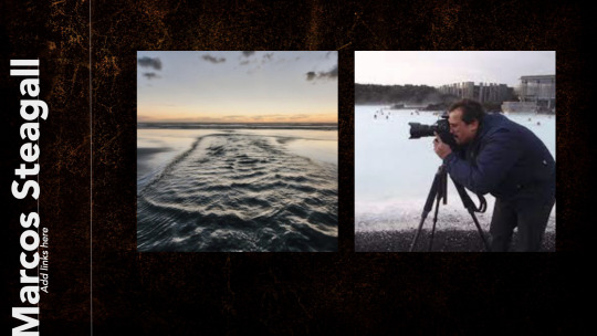
Marco Steagall:

Marcos Mortensen Steagall is an Associate Professor in the Communication Design department at the Auckland University of Technology - AUT, where he started in February 2016. He is the Communication Design Postgraduate Strand Leader and Programme Leader for Communication Design and Interaction Design for Year 3. He holds a Master's (2000) and PhD (2006) in Communication & Semiotics acquired from The Pontifical Catholic University of Sao Paulo, Brazil, and a PhD in Art & Design from Auckland University of Technology in 2019. My research interests are connected to visual semiotics; practice-oriented research methodologies in Art, Design and Technology; Lens-based image-making and indigenous epistemology. I Supervise both Master's and PhD students and have supervised both to completion.
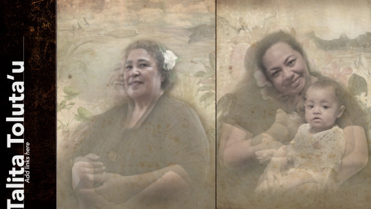
Talita Toluta'u:

Talita Tolutau PhD thesis project Veitalatala: Matala ‘o e Talanoa is concerned with representation, considering the nature of a culturally located narrative form called Veitalatala and its creative translation into film and Ngatu prints. The designed outcome of this project considers the memories of Tongan women who left their homeland to settle abroad.
The work is a creative synthesis of those women’s talanoa, into a new form of documentary and Ngatu prints that is designed to capture the cultural and emotional resonance of their stories. Veitalatala: Matala ‘o e Talanoa orchestrates photography, animation, sound design, filmed footage, and extensive post-production research into a unique text that seeks to move the parameters of documentary beyond the visual interview. In doing so, the research draws heavily on Tongan paradigms of narrative and representation
David Sinfield:

Dr David Sinfield has been a Lecturer, Academic Leader and Creative Director in the Graphic Communications Design field for over 30+ years nationally and internationally. As a practicing Graphic Designer and Art Director David's practice is located in the field of designing and making printed artworks, moving image graphics, documentary film making and shorts such as the poem film. Structured around practice led research it considers artistic works such as Graphic Design, Communication Design, Typography, Photography, Documentary Film Making, AR & VR, Mobile Technology, New and Emerging Technology and Moving Image (film poetry, short film). His research underpins a series of poetic typographical projections such as the short films, film poem, documentary film making, typographical publications and typeface designs. It extends the concept of the portrait beyond a purely visual representation of identity by fusing typography, narrative, location imagery, sound and paralinguistics. In so doing, it demonstrates how certain concerns of graphic design might be employed to draw attention to the human condition. Furthermore it creatively expands on discourse surrounding typography as emotive by considering the erosion and decay of letterforms as generative of meaning. Further studies has led to the animated exploration in typography to capture the human condition, whether as film titles, or animated monologues, or as political commentaries on urban decay.
0 notes
Text
Missing part: WK04 all the rest of 4 artists
For more than 30 years, Dr. David Sinfield has worked as a lecturer, academic leader, and creative director in the field of graphic communications design, both in the UK and other countries.
Because David is a graphic designer and art director, he designs and makes printed works of art, moving image graphics, documentary films, and short films like the poem film.
This study is based on practice-led research, and it looks at artistic works like photography, graphic design, communication design, typography, AR/VR, mobile technology, new and emerging technology, and moving images (film poems and short films). Many of his poetic typographical projects, like short films, film poems, documentary films, typographical books, and typeface designs, are based on his research. It goes beyond the idea of a portrait as just a picture of a person by combining typography, narrative, location images, sound, and paralinguistics. By doing this, it shows how some aspects of graphic design can be used to bring attention to the human situation. In a creative way, it goes beyond the idea of typography as emotional by looking at how the wear and tear on letterforms can create new meaning. After doing more research, people are now exploring animated typography to show how people live, whether it's in the form of film titles, animated monologues, or political comments on the decline of cities.
Talita Tolutau
Talita Tolutau's project for her PhD thesis, Veitalatala: Matala 'o e Talanoa, is about representation. It looks at Veitalatala, a culturally situated form of storytelling, and how it has been creatively translated into film and Ngatu prints. The project's goal is to look at the stories of Tongan women who left their home country to live in other countries.
The piece is a creative combination of those women's talanoa into a new type of documentary and Ngatu prints that are meant to show how their stories have cultural and emotional meaning for people. Matala 'o e Talanoa combines photography, animation, sound design, filmed footage, and a lot of study done after the fact to create a one-of-a-kind text that tries to expand the definition of documentary beyond the visual interview. To do this, the study uses Tongan ways of telling stories and showing things a lot.
Associate Professor Marcos Mortensen Steagall works in the Communication Design department at the Auckland University of Technology (AUT). He has been there since February 2016 and is an associate professor. In Year 3, he is in charge of communication design and interaction design as the programme leader for communication design and interaction sign. He got his Master's and PhD in Communication and Semiotics from the Pontifical Catholic University of Sao Paulo, Brazil, in 2000 and 2006, respectively. In 2019, he will get his PhD in art and design from Auckland University of Technology. I'm interested in visual semiotics, practice-oriented research methods in art, design, and technology, making images with lenses, and indigenous ways of knowing. I've seen both Master's and PhD students through to the finish as a supervisor.
0 notes
Text
Batik Bali: Introducing the Beauty of Culture and Art

Introduction
Batik is a textile art rich in cultural and historical value. One of the famous variants of batik is Batik Bali. Batik Bali combines the beauty of unique motifs, colors, and symbolism, creating mesmerizing works of art. In this article, we will explore the uniqueness of Batik Bali, its differences from Batik Solo, its rich history, and how Batik Bali plays a role in the fashion industry today.
Distinctive Features of Batik Bali
Batik Bali has easily recognizable characteristics. The motifs in Batik Bali are generally inspired by nature, mythology, and everyday life in Bali. Motifs such as leaves, flowers, birds, butterflies, fish, and Balinese deities are often used in Batik Bali. Bright and contrasting colors like red, yellow, green, and blue are frequently used to adorn this batik fabric. The process of creating Batik Bali also involves complex dyeing techniques and meticulous craftsmanship, resulting in high-quality and beautifully detailed artwork.
Batik Bali vs. Batik Solo
It is worth noting that Batik Bali differs from Batik Solo, a variant of batik originating from another region in Indonesia. Batik Bali has different styles and motifs, depicting the unique culture and identity of Bali. On the other hand, Batik Solo, especially Batik Parang or Batik Kawung, features simpler and symmetrical geometric motifs. The differences in dyeing techniques, motifs, and designs make Batik Bali and Batik Solo each possess their own uniqueness and reflect the cultural richness of their respective regions.
History of Batik Bali
The history of Batik Bali is closely intertwined with the culture and life of the Balinese people. Batik Bali has existed since ancient times and has developed into a cherished cultural heritage. Initially, Batik Bali was used by the royal class as a symbol of status and nobility. This beautiful batik fabric was also used in religious ceremonies and rituals in Bali.
The process of creating Batik Bali involves a special technique called "ngatu" or "making batik". This process involves drawing motifs on the fabric using wax and natural dyes. Subsequently, the fabric is immersed in water to remove the wax, revealing the beautiful motifs.
Throughout its history, Batik Bali has undergone significant development. Influences from foreign cultures such as India, China, and Europe have affected the motifs and styles of Batik Bali. However, there have been strong efforts to preserve the authenticity and uniqueness of Batik Bali as an authentic cultural heritage of Bali.
Batik Bali and Fashion Today
Batik Bali has become an integral part of the fashion world today. Local and international designers often incorporate Batik Bali into their collections, adding an exotic and traditional touch to modern clothing. Batik Bali is used in various types of garments such as dresses, blouses, pants, and accessories like scarves or shawls. The use of Batik Bali in fashion appreciates Balinese culture to a greater extent and encourages its preservation.
Furthermore, Batik Bali also attracts tourists visiting Bali. Many shops and boutiques in Bali offer a diverse selection of Batik Bali for visitors who want to bring home beautiful souvenirs from the island.
Conclusion
Batik Bali is a captivating cultural heritage from the island of the gods. Identifiable by its beautiful motifs, vibrant colors, and distinctive Balinese style, Batik Bali continues to be a source of inspiration in the fashion industry. The uniqueness of Batik Bali and its role in embodying the beauty of Balinese culture are undeniable. Whether as a tourist or a fashion enthusiast, wearing Batik Bali is a beautiful way to honor
1 note
·
View note
Text
Type Specimen Book - Rationale
Making and Media has broadened my understanding around typography and design, helping me to think deeper and more critically when making design choices for this type specimen book. Through making this type specimen I have been able to use the tools and strategies I have been learning in real time.
Pepeha was a big part of this paper which I found surprising but made sense when the assignment was explained. The purpose of Pepeha is to make connections with others and see what similarities you have, so using Pepeha I made connections to the typeface that I have displayed in this type specimen. I chose to find a typeface that I thought connected to the art from Ngatu (tapa) which is a taonga from my Tongan culture. It is the way we share stories and remember moments by hand drawing motifs that represent this on large tapa cloths. I found these motifs and the style of drawing very similar to the and the overall visual look of Copal Std and patterns found in the 'Decorated' style.
One of the big learnings I had was the importance of typographic Hierarchy and the different elements I can use to achieve this successfully. Using things like contrast, spacing, rhythm, drop caps, scaling, captions were ways I could make content easily readable but still interesting enough for the reader to be engaged. Since I chose a poster typeface, I couldn't use that for my body text and captions as I don't think it would have good readability and would not have any interesting hierarchy. I had to choose a secondary font that would pair well with Copal but also a effective typeface for body text. I experimented with a few different typefaces, some serif and some san serif, but finally landed on using American Typewriter as it is very readable being a serif font but still has a similar feel to Copal.
Some challenges that I faced were finding the right typeface that connected to my Pepeha and keeping up with my tumblr blog. I do feel if I had been more active with my blog it would have helped me retain information and also work through my ideas faster. This is something I will definitely be working on for the second half of the semester. Overall, I have enjoyed what I have been learning in Making and Media and look forward to learning more over the next 6 weeks.
0 notes
Text
TAPA - google definitions
Tapa, a general term used to describe Polynesian bark cloth, is made from the inner bark of the Broussonetia tree that has been hand beaten, scraped, pressed, and patterned to create printed cloth. In Samoa, two methods are used to produce large pieces of printed bark cloth. - Posted by Kyla I. Katigbak on December 30, 2015 https://www.cooperhewitt.org/2015/12/30/samoan-tapa/
Siapo is the Samoan word for a fine cloth made from the bark of the Paper Mulberry tree. In Fiji, this linen-like barkcloth is called Masi, in Tonga it's Ngatu. Wherever it's made in the Pacific, siapo is regarded as one of the region's finest and most distinctive art forms.
A modern yet traditional take on the Elei, which are the block printing designs in Samoa. Elei is a traditional art of the islands considered one of the most prized possessions often seen in screen printing, fabric and art, this was the inspiration behind this piece. - https://www.whisperliving.com/products/lei
0 notes
Text
Week 3- Task 3
In class we watched 2 documentaries about Tapa making in Tonga which they call Ngatu and in Samoa which they call Siapo. The process of making the Tapa was very similar in both cultures and evidently very different at the same time. For example in the Samoan process of making Tapa or Siapo there were more steps made from the variety of tools used to beat the mulberry bark to dipping the bark in water and even the way and tools that were used.
From the knowledge that we gained from watching the 2 documentaries, as a class we were asked to make our own tapa with our our own patterns and designs on it. We had to come up with what materials we were going to use, what substrate, the colour scheme, and then had to decide how we were going to start. In the end we decided that the substrate or base paper we were going to use was A3 colour paper with the base colours brown and red. One of the techniques that we used was to scrunch up the paper and this made the texture of the paper look as if we beat it, just like the bark. It was up to us to choose what kind of patterns we could paint or draw on our substrate.
0 notes
Text
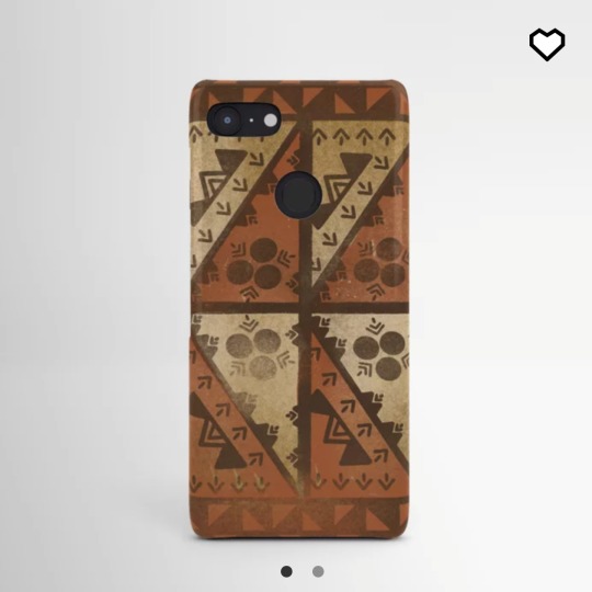
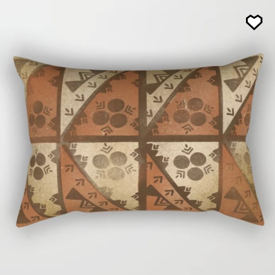
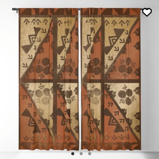
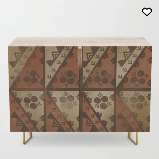
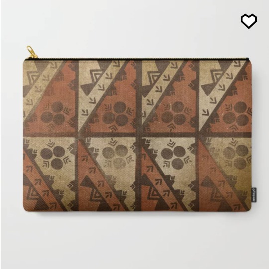
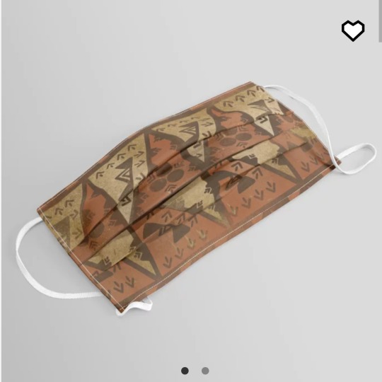
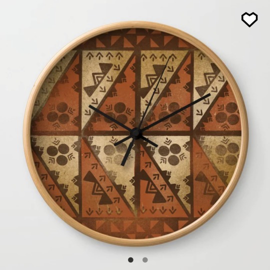
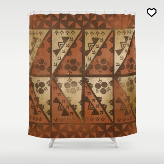
Get this UrbanNesian Tongatapu Ngatu design on various goodies at ShopUrbanNesian.com
#UrbanNesian #Tongan #Tonga #Ngatu #Tongantapu #pasifika #polynesian #siapo #tapa #tongantapa #ngatupattern #ngatudesign #ngatuart #ngatuartwork #ngatuprint #ngatudecor #ngatumotif
#samoan#samoa#urbannesian#polynesian#art#poly#samoan art#pasifika#siapo#tapa#tongan#tongan design#tonga#kingdom of tonga#ngatu#urban nesian#ngatu art#ngatu pattern#ngatu design
6 notes
·
View notes
Text
Making and Print Process(es) Moodboard (1x board)

Nothing is mass-produced; everything is made by hand from local materials. Local women produce and sell bark cloth (tapa), woven mats, woven bags, baskets, mats (ta'ovala), waist girdles (kiekie), and other items. Men's crafts have traditionally included wooden carvings of war clubs and spears, as well as food bowls, but they now include carved pendants for jewelry and ornaments portraying warriors or whales.
The tapa cloth, created from the beaten bark of a mulberry tree, is one of the most important Tongan handicrafts. Women's groups collaborate to manufacture large pieces of tapa to give as gifts at weddings and funerals.
Natural materials are used to create things that are manufactured with great care and attention to detail. They mostly employ traditional Tongan materials like fine mats and tapa fabric, which is made from the dried, soaked, and pounded bark of the paper mulberry tree.
A successful village, according to an old Tongan proverb, lives together, works together, and assists one another. This is especially true with Tongan handicrafts, which are an important element of the culture.
Reference Links:
Book Arts in Tonga part 2: Learning Tongan Design and Making Books | Lili's Bookbinding Blog (wordpress.com)
Case-study-02_2014-Talita-Tolutau2.pdf (aut.ac.nz)
Ngatu, Cultural Wealth of the Kingdom of Tonga — Google Arts & Culture
Barkcloth in Tonga, 1773-1900: presenting the past in the present on JSTOR
'Ngatu, Barkcloth in the Kingdom of Tonga' - YouTube (Making Process of Ngatu)
Ngatu Tonga - YouTube Explanation
Tongan Arts and Crafts: Tapa Cloth Making - YouTube
Tapa cloth(1) Variety and History of tapa - YouTube (History)
2 notes
·
View notes
Photo


Concepts done during semester: Taking the advice given to me from feedback, I decided to formalise my concept which is a monthly homework group for pacific designers. I quickly came up with the name “Pacific Grid”, as it’s design focused, so grids, but also how Tapa/Ngatu patterns are derived from modular patterns that form grids.
I’d watched a talk from David Rudnick where he said something along the lines of taking peoples associations with a logo, or an image, and repurposing that feeling for something else. So I played around with the Digicel logo and that lead into the next idea. Taking existing pacific expressions of graphic design that you’d see on facebook for instance, and using this as a design system. Like maybe I could maybe I could have a contrast between “bad” design where it’s bad design but it’s put in 3d space. So, I spent a few days in blender, made some flowers and a donut render, then decided it wasn’t time effective. Also, “bad” good design is just hard to make.
I also explored the use of the grid. By combining, mirroring and distorting letter forms, you can create grids to create new forms. In my case, I was specifically looking at the 45 degree angle as it pertains to Pacific art and design. Visually, I was/ am struggling to come up with Visual assets. I’ve designed a typeface based on the 45 degree, but haven’t come up with a composition or system that I’m happy with yet.
Moving forward, I’ve changed the name of the homework club, from “Pacific grid” to “Katanga ‘e tau fohe”. Based on the Tongan proverb of people coming together from different angles to work towards the future. I think this can be shortened to TTF or TETF as a wordmark.
Another issue I haven’t resolved during this time is the tone. I’m constantly thinking about the appeal to Gen Z, but I don’t think that necessarily translates into using colloquialisms in my copy. But I don’t want to be over intellectualising something that doesn’t need to be. Ultimately, I think the kids just want stuff they can be proudly be into.
David Rudnick. Lecture "Crisis of Graphic Practices: Challenges of the Next Decades"
https://www.youtube.com/watch?v=-ejp4AvetSA
Period7
https://www.instagram.com/period7even/
5 notes
·
View notes
Photo


Artefact: Ngatu
Ngatu is the Tongan name given to tapa cloth or decorated bark cloth. It is made from the inner bark of Hiapo (paper mulberry tree). The pieces of bark are beaten with a mallet, widened and joined together to make larger pieces of cloth. Groups of women work together to decorate the cloth with natural dyes and pigments. I think this is a good design because it is culturally important with many aspects. For example, in the Tongan culture it is used for gifts, clothing, and decoration. It is also aesthetically meaningful with the beautiful patterns and designs that the Tongan women have put time and effort into.
Reference:
Bloomfield, M. (2009). Ngatu, Cultural Wealth of The Kingdom of Tonga. Google Arts & Culture. https://artsandculture.google.com/exhibit/ngatu-cultural-wealth-of-the-kingdom-of-tonga-ichcap/NAKi_qPipunBKA?hl=en
Bowers Museum. (2018, November 29). Fibers of History: Tongan Tapa Cloths. https://www.bowers.org/index.php/collection/collection-blog/threads-of-history-the-production-and-cultural-significance-of-tongan-tapa-cloths
Marcellin College. (n.d.). Tapa, A Tongan Treasure. Living Heritage, Tikanga Tuku Iho. http://www.livingheritage.org.nz/schools/secondary/marcellin/tonga/stories/storyReader$41.html
Museum of New Zealand, Te Papa Tongarewa. (n.d.). Tongan ngatu - marking moments in time. https://collections.tepapa.govt.nz/topic/2295
3 notes
·
View notes
Photo

[1] Vaimaila Urale, Aniva, 2019. Black card and sand. Courtesy of Sanderson Contemporary, Auckland, Aotearoa/NZ. [2] Mixed design Tongan kupesi, prior to 1930s. Courtesy the Lady Dowager Fielakepa. [3] Ngatu with spitfire plane motifs, c. 1940s. Photo: Eddie Lam, 2019. [4] Tanya Edwards, Queen Salōte, 2018. Digital print. Courtesy of the artist. [5] Nikau Hindin, Te Tīpare o Hinetakurua, The Crown of the Winter Goddess. (Winter Solstice, 21.06.2020), 2019 (detail). Kōkōwai (red ochre), ngārahu (soot pigment) on aute (paper mulberry). Courtesy of the artist.
2 notes
·
View notes
Text
Week 11
This week has been pretty quick. I am trying to find more time to work on my project and am not sure of which design im thinking of, but I will pick one soon. I am putting together possibly a ngatu, coconut shell or mix kind of kiekie, still in the works. I am enjoying doing this project so much in comparison to any other assignments lol. I always wanted to do crafts and now i can really get to because literally i must for a grade, hahaha. I hope it all comes together and soon! til then x ty
1 note
·
View note
Text
Week 8-12+13
Final Pattern Design

My final animation tells a story of my journey in life and how things are changing in my perspective as i view moving to overseas. The first pattern shows the movement of the zigzag lines and the wave lines, indicating my life journey through experience, learning, and the waves indicating the flow of living in every journey so far. Moving on, i used the colour transformation from white to brown as it pictures the colour of the ngatu. Because of this, a ngatu contains patterns that tells a story in the Tongan culture. I used this as a way of showing my pattern or telling my story through a ngatu. The larger waves indicates the movement towards another life. Notice that i would only show movements that are horizontal, this indicates moving forward. I added the Manulua kupesi to still portray my Tongan culture and the square like lines at the bottom represents the tall buildings found or have seen in New Zealand. This is ideal for me because there aren’t any tall buildings in Tonga. A change of culture and lifestyle occurs. The zigzag lines appears in black and white, the colour transformations shows the black ink used to draw patterns on the ngatu and the white is also used in modern days as an inverted colour to black.
0 notes
Last Seen Blogs

natalitaro
Магия Таро
robocops-a-christ-allegory
SELF-MADE NEUROTIC

one16core
cai

windel14
Unbetitelt
windel14
Unbetitelt