#motherstone tutorial
Note
Hi! What’s your process for creating lineart? Your art is INCREDIBLE and it’d be amazing to see how you do it! I’m trying to learn how to draw poses and anatomy, but it never works out too well…
Could not recommend this enough. Prior to this, I actually bought a couple of morpho books, and it improved my anatomy greatly.
Honestly, I'm no teacher, I can't really teach you, only give you tips. In my opinion, good lineart depends on your a.) muscle memory, b.) strokes, c.) the brush itself, d.) your lineweight, e.) the stabilization (if you're on digital)
MUSCLE MEMORY
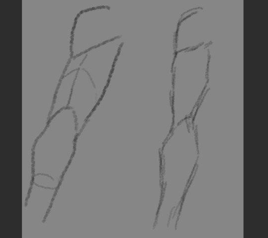
Preferably, you'd do practice on traditional paper, with a pen. This forces you to avoid erasing and instead makes you think before you make the stroke. Draw straight lines, circles, but don't use your wrist to make the stroke, but your arm. You can search this online. If you've built up your muscle memory over the years, you'd quickly create 3d shapes using lines.
STROKES
You've definitely heard of a sketchy art style. But that's different from an amateurish chicken scratch. Preferably, you'd make clean, singular strokes - which shows confidence and clarity. It's common for beginners to use several smaller strokes to create a line, instead, practice to do it in one:
BRUSH
finding a good brush that works for you helps with the process. Because I'm gonna be honest, a LOT of the digital pens I have difficulty with. The greater the stabilization means the stroke is smoother, but most brushes will have you struggling against pushing it, because the stabilization at any lower will have your lines pick up the slight tremor of your hands. This is up to research, discovery, luck, and preference.
Me, personally, I use these:
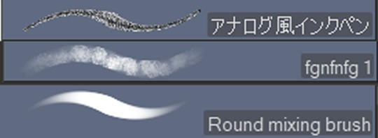
One is from the CSP assets store, the other is from greg rutowski free brush pack, and the last is one of the default CSP brushes, under thick paint.
LINEWEIGHT
Lineweight is the thinness and thickness of lines. You'd have better understanding if you searched this online, but typically, the closer an object is to light, its lineweight is thinner, while the farther away it is, it'd be thicker:
STABILIZATION

aka this guy. The higher it is, the smoother the line, and depending on the brush, the more difficult it is to move the brush. But yeah, when I use the ink pen, I have it around 45-60, if it's the fgnfnfg I have it around 0 or 15, the round mixing brush I have around 15-30.
11 notes
·
View notes
Note
Your comic is awesome, feast for the eyes. How did you develop your skills for it? Did you have certain references and resources that helped you make it?
Ohh hmm umm it’s a bit of a long answer, but to give you a sum, it’s a combination of all the media I’ve consumed throughout the years, be it something I’ve invested in or just heard in passing.
Some of inspirations for me:
Comic composition:
Mp100 – yeah, be surprised but this goes on the list! ONE may draw crudely sometimes, but his panel composition is quite good in clarity and not very difficult to follow the flow. In fact, you probably won’t realize how smoothly it flows until you encounter a comic where it doesn’t. Therefore, the emphasis on CLARITY , PACING, and FLOW as a priority on panel composition, instead of shoving too many events in one page at once (Kazu actually suffers from this)
@sandflakedraws – They used to draw mp100 comics, and there was a boatload of symbolism in well, everything, I wouldn’t have noticed if he hasn’t made a post that explains all of it. It’s amazing!
@/stil_lindigo – (IG) the artist and writer of Pulse, which is a marvel fancomic I used to follow faithfully back when it was updating. They usually post a scene breakdown after they post a chapter, and tbh I was most inspired by that. Like the prev one, they also put a lot of work into panel composition and symbolism.
Webtoon – I was invested in a couple of Webtoon comics back then, and when I tried to upload a comic of mine, I was dismayed it looked janky. It made me realize that Webtoon composition is wildly different from Book composition, and it made me wonder if I could challenge myself into drawing a comic that seamlessly scrolls down.
Witch Hat Atelier – Check the link. It’s a damn good video, very informative. In fact, this was the cincher to me and opened my eyes to the possibilities of storytelling through drawing. You’ll learn a lot!
The content:
Watership Down – I haven’t really read or watch it (although I’d love to if I could!), I did see some fanart and a few excerpts here and there. This, especially, if you see it is the crux of why it intrigues me so much. There’s a lot of connection between what I want with the comic and what Watership Down is about (emphasis on El-ahrairah), so I had to incorporate it somehow.
Journey – Been obsessed with this game, but especially with the architecture and environment design. It is also about a fallen civilization, and a Hero’s Journey, except I put a bit of a twist on it.
So those were the inspirations. I had a very concrete idea before I started, but even then, it underwent three drafts, various research before I could fully finalize it. The first one was one paper, which I had to put down before I forget, and these were the two digitized drafts:
A Bride’s Story – Like Journey, I also based the cultural design here somewhat, especially in terms of architecture.

Before I start a page, I had to think while I draw. Drawing this def wasn’t effortless, and a lot of brainstorming and redrawing occurred, hence why it took months to finish in comparison to my other comic, which took less than a week 😭
I hope this helped you out anon! Yeah, admittedly my thought process is extremely unhinged and not connected with one another. That’s the ADHD for ya
8 notes
·
View notes
Note
How do you do the glowy lighting on your digital art :0)
I use firealpaca, so it may be different on other art programs. I'll use one of my art as tutorial how. You can also check on other sources, but these are what I typically default to as the easiest way, although occasionally I modify them to how I want the glow to look like:
1. Lighting on a different layer, change Blending to Add
2. a.) Duplicate it, click on the bottom half of the duplicated layer, go to Filter >> Gaussian Blur >> Adjust the intensity you want. (I use this if I want a soft glow or uniformed distribution of glow).
b.) new layer below the lighting, use the Airbrush to color in the glow (I use this if I want the glow to be bigger)
7 notes
·
View notes
Note
I hope you don’t mind me asking, but how did you improve at anatomy? Did you just follow a lot of references or something? A lot of studies?


But yes anon... Study a lot, draw a lot! Don't be shy using references because I use them too! Observe everything :)
9 notes
·
View notes
Note
I’m loving your art so much! It’s really pleasing to the eye! But I have a question, if you don’t mind, how do you know where to add shadows in clothes/hair?? I have such a hard time trying to figure that out, anyway, keep up with your art, it’s so pretty! 💓

Ok, I'll do my best.
The most first and most important thing to figure out how to do your shadows is to figure out the light source.
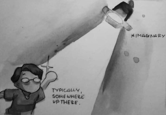
Typically, I put mine above the subjects, but the light source can come around from different areas too. It's positioning trajectory sort of that of a sphere.
But you can also have light from multiple sources, and they do not necessarily have to be equidistant from the subject.
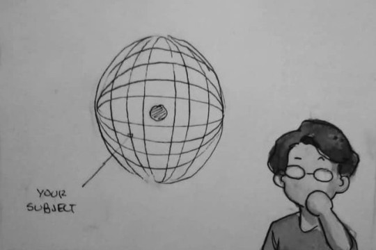
But let's stick to the basics. So you've decided to put the light source on top. Where'd you put the shadows?

If you're going to observe other people, the shadows usually go here:

This is the simplest breakdown I've got from observation of real and from references.
On clothing:
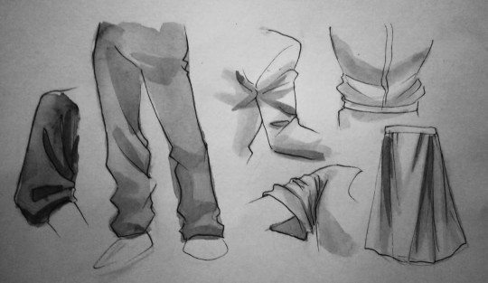
It usually follows the folds. There can be a variety of shapes when it depends on the clothing, but it would more or less stick to the creases. Sometimes, using references would help.
On face:
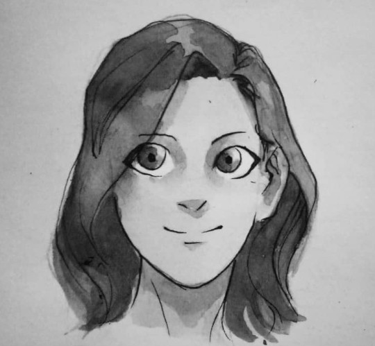
Typically, there's supposed to be shadows under the bangs, but I'm too lazy for such a detail. The shadows usually go between the eyebrow and the eyes, a lil bit under the mouth, on the eyes if you feel like it, and under the chin.
On hair:
I typically paint the hairs like this:

Of course, there are other factors to consider when it comes to shading, such as how strong the light is (affecting the contrast of the shadows), reflected light (almost all objects have this, but it's too complex for me yet and I haven't figured out how to do it in paintings), on how anatomy affects how the shading looks....

But that's a bunch of different discussions entirely. Good luck on your endeavors! This is my first tutorial, so I hope you learned something :)
#ask#tutorial#motherstone tutorial#me: *has been winging everything since the dawn of man* here's a tutorial!#OK NOTHING I SAID MADE SENSE#but yeah. light source dude. also nothing wrong using references#usually i take pics of myself to serve as a guide but I'm too shy to post pics of myself#shading is a whole lot more of a complicated skill#but this is the breakdown of how it works#kinda#I hope#I dunno man I just fuckin.. uhh put it there#think of things as 3d. You gotta observe a lot#and follow it as you go
28 notes
·
View notes
Note
Do you use special brushes for geometric designs like the Art Nouveau & Algerian background in one of your recent pieces? The details are so pretty. I hope you’re well. 🌻
Yep! Firealpaca (art program that I use) has a Symmetry tool and a symmetry rotate ^_^ it took a bit of work, but it's possible. Also thank you anon :)
1 note
·
View note
Last Seen Blogs

xu-miao-blog
Miao Xu

leigh7park-blog
Fascinating Beliefs

yeakelviolet
无标题
wildfirekate
Wild Fire Kate

desyrealist19-blog
DesyRealist19