#medium: india ink
Text

look at this little bird i drew for a xmas card :3
13 notes
·
View notes
Text
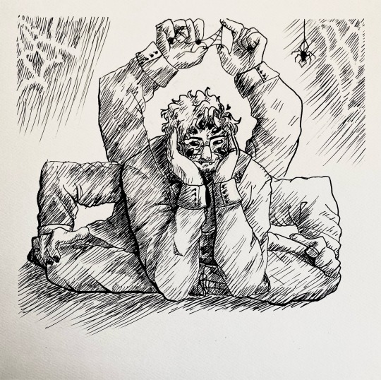
won’t you indulge him?
#this piece convinced me that india ink is like#the only traditional medium ever#like im never going back#web!martin#this was hatching practice for inktober#so i guess#inktober#martin blackwood#the magnus archives#tma#mag pod#martin tma#web martin
170 notes
·
View notes
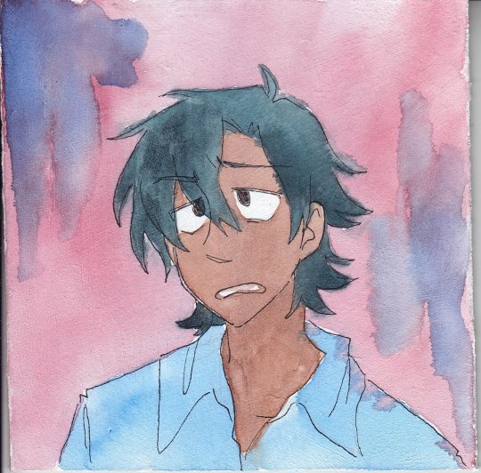
Text
I HATE PAINTING 🤬🤬🤬❌❌❌❌👎👎👎👎

#how do some ppl do so much gouache shit#its sooooo annoying paint is MESSY and u gotta CLEAN everything and MIX EVERY COLOUR#and its HARD#CANT STAND THIS SHIT#i need to find a less laborious medium for doing pet portraits than pencil crayons#but . i fucking hate paint always have#cant sell digital shit the same as physical ones even if u print it#maybe. india ink#havent tried it yet but at least that removes the colour mixing part#😑😑😑😑#x
10 notes
·
View notes
Text
contreversial art supply opinion but i genuinly hate how popular fineliners are as inking tools when there are so many options out there. also. i think micron is a vastly overated brand. theyre ok? but the ink quality always gets me its so. faded and kind of shiny? the colored ones r ok but the black ones… once u compare them to jet black ink fineliners like the neopiko ones theres rlly no going back
#neopiko also has the perfect tip range imo#i will say. i love the micron graphic ones bc its sometimes hard to find decent chisel nib inkers#but yeah. i use fineliners occasionally? but i just think theyre overused when other inking tools arent any more expensive#a bottle of india ink and a brush will last you a looooong time and you will learn so much abt control and variation that the ultracontroled#line of a fineliner just cant do. i use them occasionally for details but i prefer not too bc i just think monolines look. a little boring#tbh….#i HAVE seen good inking with fineliners and i envy it always but i just think you really need to lean into the tool if u use it and i dont#see that being done always. dont ever take ur mediums for granted- learn their strengths!#the ultracontrol of a fineliner can be really excellent but that same preciseness can sometimes backfire
11 notes
·
View notes
Photo
I GOT a hold of some watercolour ground stuff and i was mostly planning on trying out gouaches and stuff on it to see how it felt but FOR posterity’s sake i did wanna try doing a quick watercolour painting AND LIKE i wouldnt consider it a Good surface to paint on neccessarily BUT.... its not Bad...... you can’t layer for shit and everything lifts off super easy and it takes forever to dry BUT i kinda dig it a little....kinda digging the effect
ALSO maddy has become my medium and art supply testing subject if u havent noticed hfjdslkajfds
#art#traditional art#watercolour#oc art#ocs#oc group: tbai#oc: maddy#also the medium takes india ink like no PROBLEM#kinda wonder about putting ink washes on it too
2 notes
·
View notes
Text


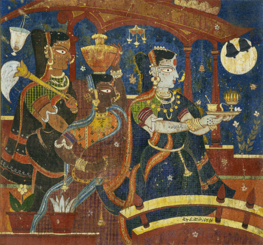
(left) "a night-time gathering", ca. 1664–65, muhammad zaman & (right) "two old men in discussion outside a hut", ca. 1674–75, 'ali quli jabbadar
0 notes
Text
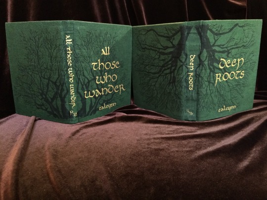


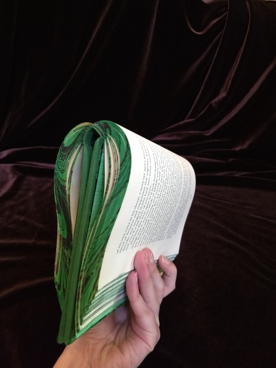
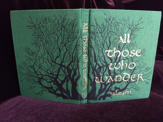
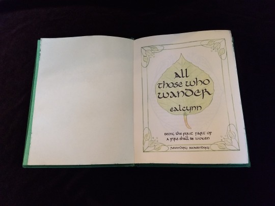
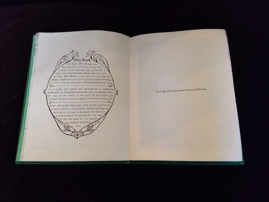

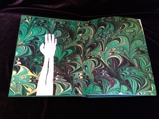
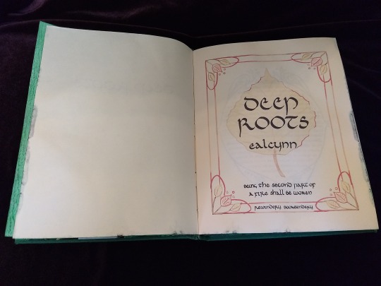
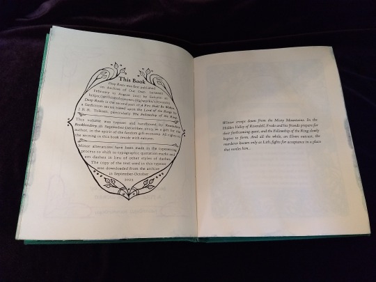
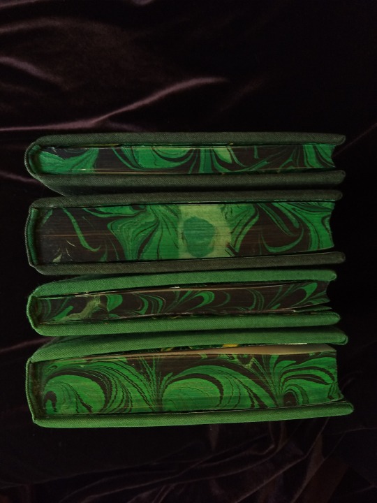


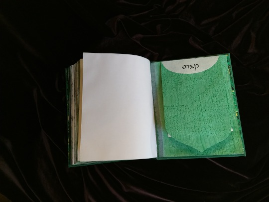

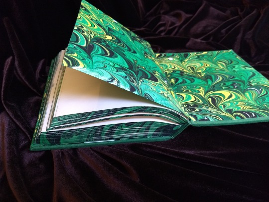

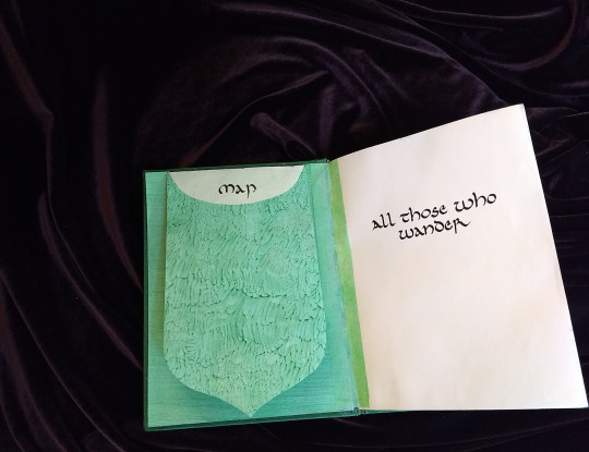

A Fire Shall Be Woken, by Ealcynn. A pair of bindings using the K118 structure, one as a gift for the author and one to keep.
Chapter page illustrations are by Alphonse Mucha, all other illustrations are hand-drawn.
I hope to make a long post later explaining the process in more depth & another to document all my mistakes, but here's the basics.
New techniques learned: Paper marbling, edge marbling, uncial calligraphy, making paste papers, drawing on bookcloth, making paste-filled cloth, fold-out maps
I began work on this project in early September and am completing the finishing touches this week.
Structures:
Binding: K118 tightback
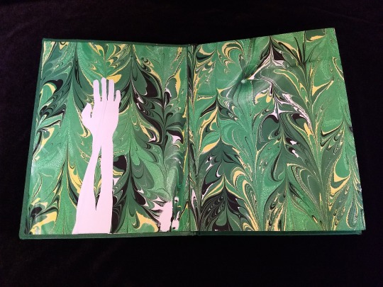
Endpapers: Simple cloth-joined endpapers
Map fold: Turkish map fold
Materials:
Sewing supports: linen tapes
Thread: 30/3 linen thread
Spine lining: Medium weight kozo tissue bonded to linen fabric
Interior paper: Hammermill Ivory, 11x17, hand-cut to 8.5x11
Endpapers: Blick sulphite paper hand-marbled, with masked stenciled silhouettes created with freezer paper
Adhesives: Jade PVA, wheat starch paste, wheat flour paste
Covers: Davey board, laminated full thickness to half thickness
Cover fabric: Studio E shot cottons in Jungle and Emerald; filled with wheat starch paste
Cover decorations: Speedball india ink and Dr. Ph. Martin's calligraphy ink in Copperplate Gold
Inks for maps and illustrations: Speedball black india ink and a selection of watercolors thickened with gum arabic
Dip pens used for calligraphy: Combination of Brause calligraphy nibs and Leonardt tape nibs
Dip pens used for illustration: Nikko G pointed pen nib
Typesetting:
Typesetting program: Scribus 1.5.5
Body font: Coelacanth in 10 pt caption weight
Headings, titles, chapter titles, drop caps: Hand lettered uncial calligraphy, scanned
Illustrations and References:
Frames on colophon, copyright, author's notes and title page: Hand drawn, with inspiration taken from the vellucent bindings of Cedric Chivers
Frames that illustrate each chapter start: Alphonse Mucha from Cloches de Noël et de Pâques
Cover illustrations: Referenced from a photograph of an European beech tree found on iNaturalist.org
Maps of Imladris: Hand drafted with inspiration from the maps of Barbara Strachey, and Daniel Reeve
Map of Eriador: Traced from a map by Karen Wynn Fonstad, with edits made to coordinate with the geography of the fic
Frames on maps: Referenced from a drawing by Alphonse Mucha that @zhalfirin found for me
Special Thank Yous:
To the tightback council of problem-solvers in the Renegade server: Zhalfirin, Eka, @spockandawe who helped figure out many issues with the structure and technique
To the marbling experts in the Renegade server: Marissa, Aether, AGlance, Jenny, Catz, Badgertide, Rhi, and everyone else who helped me figure out beginnner marbling
To Spock for finding the K118 structure and introducing it to the server!
And to Bruce Levy, who discovered the method and shared his discoveries freely with the bookbinding and conservation world.
#bookbinding#Fanbinding#mine#bookbinding adventures#thank you to everyone i consider this a group effort#it has been 10000 years and I have loved every step#except for sanding. nasty nasty sanding. ew.#fic recs
223 notes
·
View notes
Note
I think you’re cool what art program do you use and do you recommend it?*
*I personally already have an art program I love to bits but I’m curious
lol I grew up poor, never really had computer access until I was about.... fifteen, seventeen? And it was a second-hand laptop, no mouse, no software.
Still haven't gotten a handle on any digital mediums, but I can do pretty much anything at all in physical media.
Favourite mediums are India ink, clay, linen, and Acrylic ♡♡♡
And I know pretty much every artist is expected to just know digital art these days, but like... I dunno, something just doesn't feel right when I can't see the tools I'm working with, you know? I can't touch the materials, or the textures, or smell or feel or build my own equipment and it's... unsettling, I think? Like..... Like losing all feeling in your fingers
Idk
158 notes
·
View notes
Note
do you ever do non-digital work?
I no longer make finished artworks non-digitally. It's too expensive.
I've been trying to keep a sketchbook again, but it never ends well. Here's some of my traditional work from my college years... (click for full image)

^^These are from mid 2017... artist loft watercolor base, then I went in with a fine line sharpie. The one with the map was done with these markers that where meant to color stamps, I think..
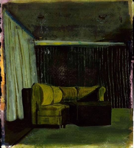
Late 2018(?)^^ Acrylic!
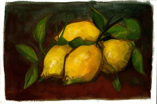


^^ 2019. The fruit where done with watered down acrylic and gouache. The portraits are done with an ink brush pen. The frogs were painted with india ink on shrinky ink paper. (I was able to make the ink opaque by mixing it with a little bit of white ink)
I have a long history of traditional art and lots of different mediums, but it's expensive and takes up space. Wish I could draw and paint like that again, but I think it's something that's going to stay in my past.
144 notes
·
View notes
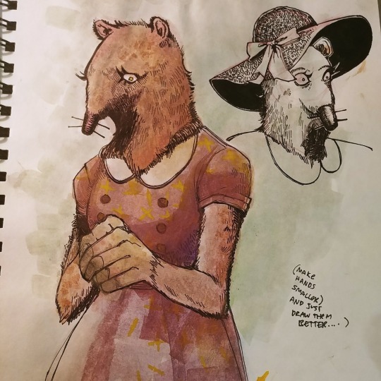
Text
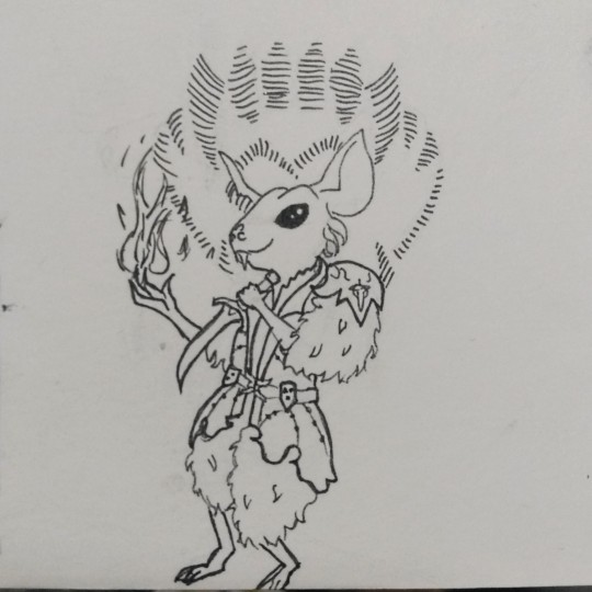
horrible rat man. idk if he's recognizable. took me two days to figure out his pose and face. don't look at his claws. look at his smug little face
#my art#bg3#astarion#rats rats rats#if i manage to draw all the companions i might color them he he#medium: india ink#size: 4 cm × 7 cm#stock reference: jookpubstock#jookpubstock
2 notes
·
View notes
Text

Design for the Angel Window in the Otto Wagner Church at Steinhof. Dated 1905, artist is Koloman Moser (Vienna, 1868–1918), medium is gouache and black india ink on paper. From the Leopold Museum, Vienna, Inv. 5270
(Source: onlinecollection.leopoldmuseum.org)
#stained glass#window#design drawing#graphic art#decorative arts#religious art#early 1900s#koloman moser#otto wagner#jugendstil#vienna secession#human figures#angels#paper#yellow#blue#orange
46 notes
·
View notes
Text

As far as I'm aware, this match-up has never officially occurred in the comics. Tell me this wouldn't make for a badass showdown!
Medium: India Ink on bristol board and colours in PS
23 notes
·
View notes
Note
as an aspiring comic artist looking to move from graphite and oil painting to more ink/inkwash/watercolor like you- could you explain your process a bit? any tips for beginners? i love your art and you're at the top of my inspiration list right now :,)
Thank you! I've been using ink and watercolour for a long time, and ink/inkwash is definitely my favourite medium. A key tip for getting started would be to know the different kinds of ink available because they all work differently. The three main ones are:
Dye-based ink - these have their uses, but they are not lightfast at all (fade quickly) and they act kinda weird. The colours are very vibrant, but they tend to dry very fast, not be waterproof (tricky for layering), and stain the paper. I use very few dye-based inks. Some ink brands look like they have a big colour range, but when you look at the boxes half of them say "dye based" - don't buy Higgins those.
Acrylic ink - think of this as very liquid acrylic paint. There are a lot of fancy options, many specialty kinds (metallics, pearls, neons), but they aren't going to give you the transparent inkwash look. It's good for drawing opaque lines over colour, and you can dilute it with water for a wash, but it gets chalky. Waterproof may vary (test it first), and it usually has a matte finish. White acrylic ink is well worth having as you can detail over solid black or tint it with coloured pigmented inks, and god knows I love using neons, but I treat acrylic ink like "effects" ink. It’s not my main drawing ink. Daler Rowney is good and widely available (pigment-based is not the same as pigmented ink, this is still acrylic ink), they have a few lines at different prices. Liquitex is decent.
Pigmented/India ink - this is my favourite kind of ink and probably what you want! Pigmented ink dilutes well (it’s a transparent medium like watercolour) and often has a glossier finish depending on shellac content, and it will say on the bottle if it’s waterproof (test that first). It’s good for brush or nib, good for layering, works nicely with watercolour and other types of ink, can be mixed to make new colours/tints...she’s got it all. If you’re in Australia, Art Spectrum is great, I stock up every time I’m back there. If you’re elsewhere, I recommend Speedball for black ink (Blick Black Cat in the US is good). Dr Martins Bombay India Ink has great colours and they’re usually affordable.
There are many brands and everyone has their preferences, and over time you will find your own. I have a mix of different types and brands, though probably fewer than you’d think. Get a small bottle in one or two colours and play around, see if you like it before investing in a set. Don’t buy fountain pen ink or Rapidograph ink for nib/brush, those are best suited to being used in specific types of pens.
The nibs I use are Hunt #512s. #102s (called crow quills) are popular and I like them too, but they are very sharp and will rip up your paper, and can be a little too flexible and hard to control. The #512 is a good all-rounder with a smooth line capable of variation, and I think they’re a solid choice for a beginner. These nibs and holders are cheap and widely available. I don’t buy expensive watercolour brushes because ink will wreck them a lot faster than watercolour will. What you want to look for is the fibers holding a point - the brush should not have bedhead.
My only real advice to someone looking to try watercolours is to not buy the cheapest shittiest kind. You know from oil painting that all paints are not created equal and bad paint is going to frustrate you, especially when you’re starting out. I started with one of these twelve years ago and I still use it in conjunction with other sets I’ve built myself, I just refill the pans from (better quality) tubes when they get low. They last a long time. So do bottles of ink.
I’d like to do a process post, but I’m not sure what would be interesting or helpful to you, and I use ink/watercolour/gouache in a lot of different ways. If there’s a specific piece you liked the look of, I’m happy to demonstrate that method, or I can just go through my favourite approach.
As for comics...the best advice I can give you is pretty general.
Anatomy is a rewarding life-long study, but what really counts for narrative art, over technical accuracy, is GESTURE, EXPRESSION, and BODY LANGUAGE. Look at people. Look at how they move, look at their faces, look at their hands, listen to how they talk. In comics, you are the director and the actors.
Environments are a bonus character in your story and can add a lot of depth and atmosphere! Understanding perspective will make using them a lot easier.
Do not start with your graphic novel idea, start with a short story (under eight pages) and finish it. Finish it. Fucking finish it. Then do some more, getting longer over time. The best idea you never do is worth less to your progress than the worst finished piece.
There aren’t a lot of books that dig into the nuts and bolts of sequential storytelling for artists in a way I like. Filmmaking books are handy, but they’re dealing in moving images and don’t have to worry about page design. There are some good “how to make comics” books (the two Will Esiner did are my favourites), but as a genre it can be very hit or miss. I always look at what the writer/artist has made to see if I want to listen to their instructions - if you hate their art and think the graphic novel they made sucks, don’t buy their how-to book.
Bob McLeod, one of my teachers, gave us all this list:

These rules aren’t inflexible, but they cover the big issues.
For actual storytelling advice, the best one I have read was Directing The Story by Francis Glebas. It’s aimed at storyboard artists, which I was, but it discusses visual storytelling and explains how to approach it and the reasoning behind choices in a way that is useful for anyone making sequential art.
233 notes
·
View notes
Text


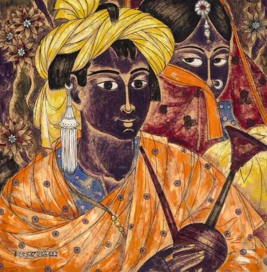

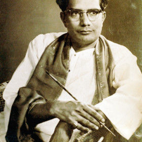
A. A. Almelkar (1920 - 1982, India)
Abdul Rahim Almelkar was born in Sholapur (Maharashtra). He began to paint at a tender age of 7. He completed his schooling at a local school after which he pursued his formal art education at the J.J. School of Art, Bombay. He won several awards at shows organized by the Art Society of India and the Bombay Art Society. Unlike his contemporaries, he branched out into the field of art at an exceptionally early age and evolved in his own pre- eminent style. Almelkar believed his mother’s embroidering during her pregnancy had enriched his creativity from her womb and he believed to inherit the skill of art from that age. He considered Khatri, a painter from Gujarat to be his true teacher. Khatri instilled into the young aspirant a pursuit for perfect draftsmanship. His style of painting was more traditional than his contemporaries with a lot of detailing and elements from miniature art tradition that were at its peak when he was still studying at the art college. His main interests were directed to figurative and naturalistic landscapes. Almelkar often travelled in the jungles of Vidharbha, (a district in Maharashtra) sketching birds, trees and what nature had to offer in sanctuaries and the colourful tribal people inhabiting those localities. He finger painted as well as a drew detailed outlines to his artwork using ink and other mediums. He later joined as a lecturer at the Sir J.J School of Arts in 1968. (AstaGuru - Modern Indian Art)
20 notes
·
View notes
Text
The anthropophagous Mlekragg
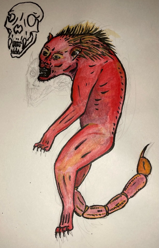
My response to this week’s BestiaryPosting challenge, from @maniculum (thank you again for running these!)
Pencil sketch, then lines in Pentel brush pen, and colours with Derwent inktense paint.
As ever, reasoning under the cut...
"In India there is a beast called the Mlekragg. It has a triple row of teeth, the face of a man, and grey eyes; it it blood-red in color and has a lion’s body, a pointed tail with a sting like that of a scorpion, and a hissing voice. It delights in eating human flesh. Its feet are very powerful and it can jump so well that neither the largest of ditches nor the broadest of obstacles can keep it in."
Now, I'm 90% sure I know what this is, and if it is the case, it's interesting to read the original descrption… With that in mind, I figured I'd go with exactly what the authors wrote...
The first thing I wanted to work out was how the face worked; I looked at lion skulls, cat skulls and human skulls, and tried to combine the three - that's the drawing in the top left of the image. The rearmost (and longest) set of teeth are those of a lion, the middle set are those of a human (with the squared-off incisors), and the front (and smallest) teeth are those of a domestic cat. I used this as a reference when drawing the face of the creature. The ears were a little tricky to work out, but I figured I'd just stick with a lion's ears here, since they's almost part-way between a domestic cat and a humans's ears.
The eyes, I didn't have a grey paint, but I wanted to make them shaped more like a human. It felt like it needed a bit more going on, so I added some thick fur (almost a mane) on the back of the head and the neck; I really want to look at some other brush pen art, to get a better idea of what it's possible to do with this medium (I was hoping to get more of a flowing look to the hair actually like a lion's mane, which didn't pull off, but I feel this works with the general vibe of the creature…)
To reflect it's jumping prowess, I have the Mlekragg leaping straight up in the air. I really liked the idea of the image flowing like an 'S' shape, so that heavily informed a lot about the image. I did look up some reference from leaping cats (particularly snow leopards), but the size of the page and the decisions I'd already made meant the pose was kind of stuck - I feel like if I were to revisit this type of thing, I'd have it making a horizontal leap, arms outstretched.
A lot of the proportions were taken directly from lions, but the unusual pose makes it look a little weird.
@sweetlyfez made the very valid point that at this point, its a running joke that we can't trust bestiary authors to know remotely what a scorpion looks like, so as long as there is some kind of 'stinger' we could go in any direction with the tail. However, I really wanted to draw a scorpion tail, so that's what we ended up with (scopions are rad). Did you know that in some lions, the tuft on the end of their tail conceals a sharp bone spur? (Lions are also rad)
It's red, it's got a very clear colour guide, what encouraged me to pull out the inktense paint blocks, and which was a nice change of pace too. I also think that next time, I need to draw the outline in pencil, ink with the brush pen, then colour - I painted the colour on before inking the lines, which meant it was really hard to see the pencil lines…!
11 notes
·
View notes
Note
Hey i think your art is amazing! How long have you been drawing? And do you partake in any other mediums?
thank you so much!!
two different answers about how long ive been drawing . i probably started drawing at 2 and drew a LOT like i still wish i had the capacity to just think of whatthefuckever and draw it. my favorite thing to use was markers until i got "ooo i dont think youre allowed to use those"'d in first grade. idk where to fit it on the timeline but i started figuring out digital art via mspaint at 6
except in a way idk if that counts when people ask about """serious""" work. i started trying to mimic speedpaints at 9 and actually wanted to make illustrations so thats where i took my starting point as; that would be almost a decade ago now
nowadays the only other mediums ive drawn in are pencil for time-passing doodles and colored pencils for other illustrations but i don't do much traditionally anymore? ive done paintings for assignments (acrylic, watercolor, india ink) which were really fun but i fear i'd make a mess or something doing it at home (i also just don't have the space to do it period)
i kind of wish i could perceive the "non-artist mindset" again? how different would my art look if i wasn't even worried about pursuing fully-complete illustrations. what would i draw if i was not conscious of an audience. what would it look like now if there was nothing to compare to. would i even consider myself an artist at all or would i be creating something more unique on its own. now im thinking about it!!!
8 notes
·
View notes
Last Seen Blogs

wrenrogue
bisexuals for kuroo tetsurou (feat. kozume kenma)

vldfggls75208
핸드폰결제현금
cladonly-inbubblewrap-blog
No Day But Today
qrowpilled
pool boy at the vampire mansion
dkvpost
DKVpost