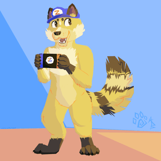
#lineless art?? from me?? it's more likely than you think
Text
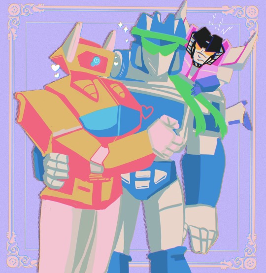
More SG foolishness 💙💛
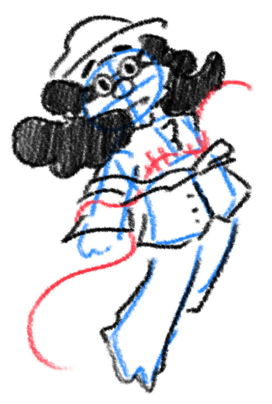
#lineless art?? from me?? it's more likely than you think#soundwave#shockwave#starscream#shattered glass#transformers g1#maccadam#Soundwave is the leader of the decepticons at the beginning of the story#while shockwave is his loyal second in command/CMO/main scientist#they're both under a lot of pressure but they try their best#Soundwave became determined to save as many strays as he could#he's the faction's cool dad#starscream can't tolerate not being the center of attention#my art
288 notes
·
View notes
Note
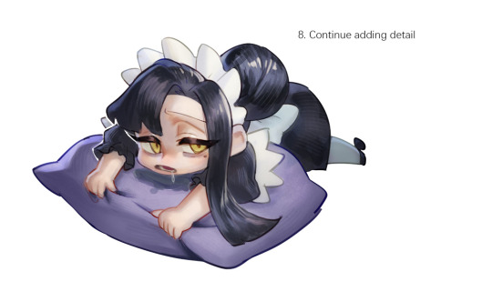
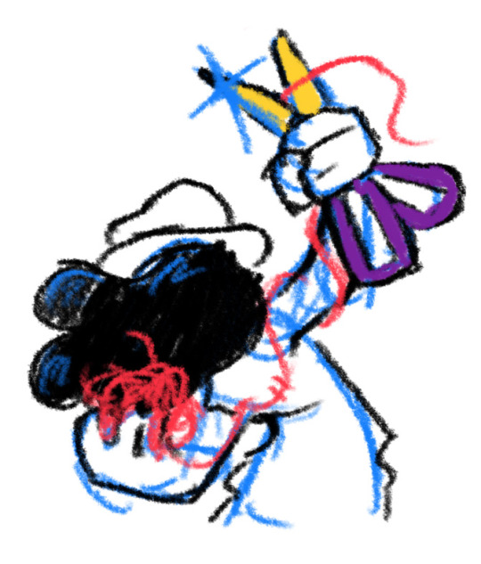
please may I request some tango tek? I love your tango design <3
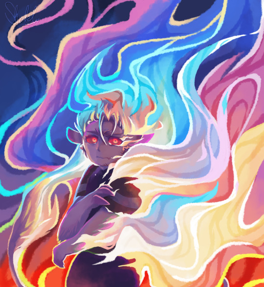
No harm in letting a netherborn burn right
I'm sorry this is wildly different from what you probably wanted sdfhgfdg I'VE WANTED TO DRAW JUST!! ENFLAMED TANGO!!!! for so long!! THANK YOU!!! I saw you going through my blog awhile back and it absolutely brightened my day, and I'm so glad you like my Tango design.. <3. In any case more normal Tango art will come dont you fret!!
He's a little upset too but shh I just. I just love the idea of flames of misery. Love the idea of him bursting into a little bit of a wildfire as a treat (thinking about Last Life Tango cough) he deserves it. The idea of "let him burn, he will calm down eventually, if we approach we'll just get hurt, he won't" (cough how Team BEST largely kept distance from him during his outburst, even Skizz) vs DL Jimmy who approached anyway, because he saw that Tango would end up more hurt than him if he didn't. Love the idea of Tango containing his flames and refusing to ever use them to hurt someone, and that he's gotten so good at it, so when he bursts into flame its just that much more.... arggg sorry what were we talking about
The sketch too because his expression looks way better here imo AGH its hard for me to convey expression well in lineless art, let alone in color when tango's eyes are fuckin full red. But whatever!!

#tangotek#tango tek#go fire boy go. my son I love him#I really didnt expect to finish this so quickly but hm#I was just fucking around with the colors endlessly I dont know color theory or anything I dont know what Im doing#mild eyestrain#?#slight eyestrain#tubby art
704 notes
·
View notes
Text
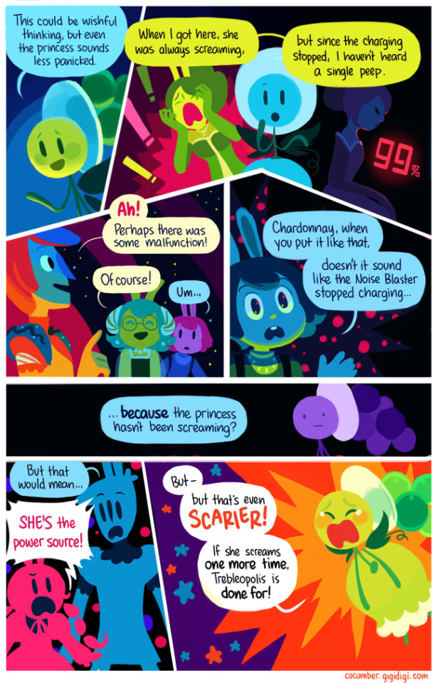
HERMIT A DAY MAY - DAY 10
Stressmonster x Cucumber Quest
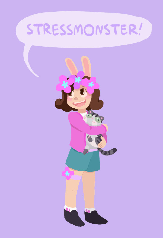
For Stressmonster I chose the wonderful webcomic Cucumber Quest!
I chose this design for her because I thought her colors and aesthetic would work wonderfully with the art style. I also think she would probably appreciate how cute the comic is if she were familiar with it.
This one was very difficult for me and I'm still not entirely satisfied with how it turned out. The rendering for this comic uses a very different style than what I'm used to, and I had some trouble reverse-engineering how the visuals are created, so it didn't turn out as on model as I would have liked. But, that being said, I think she looks adorable anyway.
I also totally made up how the kitty would look, since as far as I can remember there aren't any kitties in Cucumber Quest, so I came up with her design from scratch.
To learn more about Cucumber Quest and see my style references, adventure below the cut!
(The funds are still raising for Gamers Outreach!)
Cucumber Quest is sweet, beautiful webcomic by the artist Gigi D.G. It follows the adventures of a young rabbit boy named Cucumber and his sister, Almond, as they go on a quest to defeat the Nightmare Knight.
Unfortunately Cucumber Quest will not be finished as a comic, due to changing circumstances in the authors personal life, but the story will eventually be concluded as an illustrated script and every one of the over 800 pages of the comic is more than worth reading.
I cannot say enough good things about Cucumber Quest. It has a charming, engaging story, beautiful art, and fun, memorable characters. Please give it a read if you have the chance, you will not regret it.
Style references:
The comic uses a lineless style and soft color palettes. The shading changes drastically with the lighting, but I tried to mimic the style as it looks with flat lighting (such as in most panels of the above example).
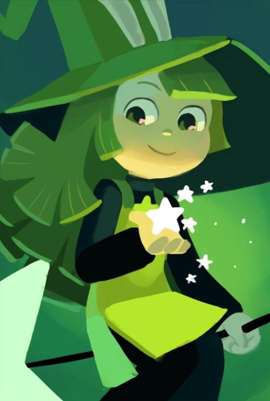
Here's an example of a character rendered with more dynamic lighting (this is Peridot, she is a witch)
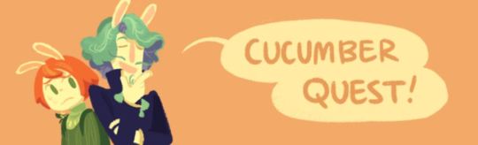
Cucumber Quest title banner
#I think one of the issues here is that I do not know the best brushes for this style#but I am still glad I attempted it since I love the art in this comic so much#I also think the original artist might block the characters in with shapes then add detail over top#which I am not very good at and do not have much experience in#since I am a big sketching and lineart guy lol#And yes the kitty is a Jellie cat#hermitaday#stressmonster#stressmonster101#hermitcraft
92 notes
·
View notes
Note
Hello hi I just found out you're the artist of my favorite pic of Jamil from all time 🥹 I absolutely LOVE LOVE LOVE LOVE LOVE LOVE LOVE LOVE LOVE LOVEEEEEEEEEEEEE SO MUUUUCH his bday art from 2020!! It's my favorite one from every art and he looks so pretty and hot and cool and like he's in a music clip and about to drop a fire verse!! I LOVE your painting style so much, as a baby artist, would you one day show us how you color? I'm sure you put so much blood, sweat and tears into your hard work and it would great to get a little bit of that wisdom. Please keep drawing, keep doing what you love because it makes the world a better place to live!
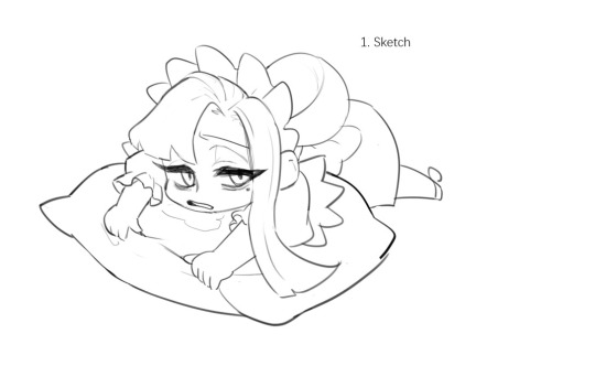
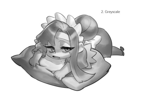
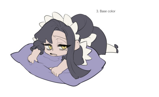

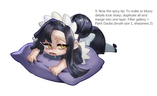
Sketched my sleepy and tired oc to do a very quick demonstration but it covers how I color when i render things:
Start with rough greyscale first, it's a good start to roughly decide light direction and value of your overall work. Especially if you have no idea on your shading.
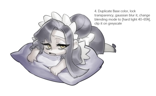
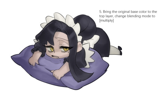
Next, apply base color to greyscale. I'll use gradient map if I want to keep the details of my greyscale. But if not, I'll just start with a flat base color, and try whatever I can to apply color.
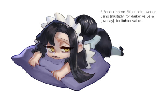
Rendering phase. Add layers and just paint on top to refine it.
Merge all layers if it's too messy. Then add layers again.
My rendering really depends on how much time taken because it's just a loop of paint over and refining. Thats why i do more simple fanart cuz I sometimes get bored of rendering
Also at this stage when doing lineless style, I merge lineart with layers and cover up the lines.
Final touch. Merge all layers and use [filter gallery > paint daubs (brush size 1, sharpness 2)]. It will sharpen your work and look detailed.
Or add some very fine noise texture, it will look detailed too.
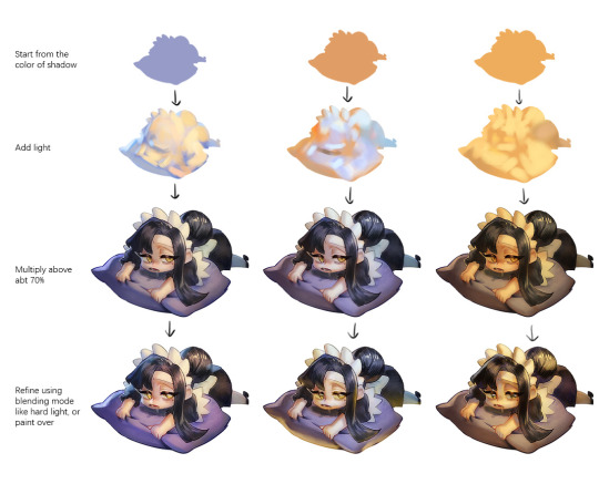
Another very rough demonstration on how i apply color mood. This will be after step 2. And same will be more refining and even paint over to ensure the colors look ok.
Other tips:
Add warm and cool colors especially on skin.
Use pinterest. Always find more than one reference for a subject if you want to draw better than yesterday. Pure ref is a nice tool to gather reference on your pc. When i draw a single hand I had a lot of ref. (pose, color temperature, lighting, photos, artwork, all diff ref)
Color theory is so important I still struggle a lot. I highly recommend beginners start from practicing Marco Bucci's ball practice. After that slowly change to adding character into movie scene and photographs, the purpose is to adapt different color moods and learn the lighting from the image. Learn more from famous movie and cinematic. They did their best to nail the colors.
Anyway,
this is a long answer about how I color. My previous job influenced me so much on coloring so there's a lot of thinking and struggle on my colors.
So, I suggest you be more experimental and try new ways, at the end what remains is what fits you.
46 notes
·
View notes
Text
CONCEPTS AND RAMBLINGS | "animal" cult pmv extras
thank you everyone for liking my pmv (and on yt and twitter) !! i got more attention than i thought it would and that means the world to me! <33
here’s some of my concept art + rambles for it!

the first thing i made up, the character designs!
i didn’t think to refine them because they were good enough to use LMAO... so i scribbled colours down, threw a filter and called it a night
i wanted a sharp change from the verses and chorus (since the song goes from calm to... louder) so i made it greyscale (with a red filter) that changed to brighter colours!
also changed the text font/colour for ignacio hmm. the font was hard to read, in my opinion.
ignacio's design
ignacio loses his bandage colours because that was too many colours for my liking… i completely forgot his hair highlights tho
ah and he doesn’t get a mouth until the fire scene too…
it was only meant to be done for a few frames but i thought it be cooler if it was consistent.
the missing mouth represents his repressed feelings/silence, or something like that.
skidad's design
i got a few questions on whether skidad was a goat. despite looks, skidad’s design is actually based on the herbiadean/jacob sheep! four horns!
i have drawn skidad as a jacob sheep before as well!

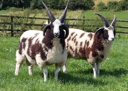
look at them ominous friends.
the resemblance to goats is something i considered as well (links with cult/sacrifice) so i think of it as a fun bonus
i gave him wolf teeth because the whole “wolf in sheep’s clothing” but also because i like it when prey animals are given predator features
i left the body as "human" because i only wanted the face to be censored… i considered clawed/darkened hands too but nah
skidad was originally going to be lined like ignacio, but i liked the lineless look for him so voila! makes it feel like he’s “not bound by anything”... actually, this is the same reasoning for the match to be “out” of the border, even though it’s ignacio’s hand
storyboards
i rarely storyboard (most are locked in my mind) but i figured it'd be fun to try!
halfway, i got bored of drawing digitally so i moved onto my notebook. i think it was a good decision; since i drew with my ink pen, it forced me to move on with my mistakes instead of clicking "clear canvas" lol
i had a pretty solid idea of what i wanted after weeks of listening to the song over and over again. the only thing that really changed was the mirror, which was replaced with a shadowy ignacio
the coloured thumbnails i actually did first, just to figure out out what i’m doing for the chorus part… limited palette my beloved
i didn't know where to put the text so i was scribbling everywhere lol

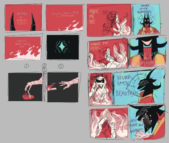
ratio changes
in the chorus, the ratio of ignacio and skidad’s frames changes! it’s more obvious if i combined them together, like this
less for ignacio, more for skidad


did you notice that the fire in this shot look like the cult ?!!! why did i do that, you ask? well:
the fire is the same “red”as the robe
too lazy to draw fire without abusing motion blur
mmm symbolism idk. it's somewhere there
it wasn’t in my plans but i’m happy i made the choice in the last minute. this was the last thing i needed to finish before syncing it up with the music

also this… i just wanted to point it out… make sure everyone knows... did you notice this? did you? did you did you? well now you do!!!
that's it !!! that's your trip into my mind!! okay byeeeee !!
#even though i gave my own reasons; i welcome any other interpretations!#/gen !! i'm very interested to hear! throw an ask or in the reblogs!#[ mourn's mourns ]#[ mourning pmvs ]#[ the art of mourning ]#spooky month ignacio#spooky month skidad#not apologising for the absolute chaos of my writing... its rambling for a reason........ /J LOL#i won't be free from skidad videos ough#but now im starting university so i guess they won't be out anytime soon HAHAHA#hope you enjoy reading this!
49 notes
·
View notes
Note
HEYO it's a self-love game I just made up <3
Answer this ask with your FAVORITE fanart work you've ever done, what your favorite aspect of it is, and how long it took. Then, if you feel like it, tag 5 other creators! If you really can't decide on one work then pick three of your faves 🫶🏽💖
gonna go with top three for this one!
1.

drew this for carmen week this year! i love the way i managed to render this, esp the face! i went with ivy's sketch to screen outfit for this one! the shading and the lighting is my favourite part of it!! it was really fun to draw!!
I think it took around, mm 4-5 hours? my time blindness really sucks if i had to say how much time i felt it took i'd say 30 minutes lol
2.

this was a dtiys!! i like the overall effect this one produces!! the colours go really well with each other esp in my lineless style, and i love how shiny her eye and hair looks
this one probably took... a while lmao i kept getting distracted so im gonna be generous and say 5 or a bit more than 5 hours
3.
no words only desi distress. this was from cwc 2023 lmao
took me <5 minutes
tagging (no pressure to do this + no need to reblog this post specifically): @itsdappleagain @suzie-snail @ivnscribbles @m1ntphae @mmaricarmen23 aand anyone else who i may have forgotten/didn't know does art and wants to do this <3
16 notes
·
View notes
Note
How do u pick your colors?? I'm always in awe of how pretty they are
this is so sweet. i really like getting comments about my coloring bc i do feel like i have a fairly good sense of color, but its also frustrating bc i really dont know how to explain it

heres a small demonstration abt my instinctual color choices; left is twilights actual colors, right is me coloring her from memory (trying to stay as faithful as possible to her actual colors as i could lol) and disclaimer i LIKE twilights actual colors. theres no right or wrong way to color. this is just how i do it
i think the first and most obvious thing i notice is that my version is more saturated than the original, and thats easy to replicate, just stay closer to the highly saturated colors in a palette. i think if i was to color with lower saturation though, it would be All less saturated colors, and not mostly saturated with a pop of hot pink yknow?
the second thing i notice is that my palette is much more monochromatic than the original (idk if thats the right word— basically i generally choose colors close to each other on the color wheel). her mane base is indigo rather than navy blue, and her highlights are a cooler purplish pink. also generally for me, lighter colors are warmer and darker colors are cooler. this is also shown in my shadows in highlights; the original uses darker or lighter shades of the same hue for its shadows and highlights, but i make the shadows bluer and the highlights yellower. thats basic color theory stuff though i think
finally i try to keep a good amount of contrast between all the colors, which i think comes from me making a lot of lineless art. the blue and purple in twilights hair are a little hard to distinguish when you take the lines away. idk what the technique for this is, i guess maybe just turn off your linework layer to see how your contrast is or smthn
so yeah! as always i dont really know what im talking about. everything here is just trial and error through drawing a LOT of ponies lol
233 notes
·
View notes
Text
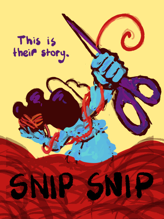
I thought I'd share the sketch of this poster/book cover as well as my initial concepts! You can click the "Read More" button for more in-depth explanations on my design process.
Thhis is all for my latest fanfiction, Snip Snip, so if you'd like to check that out, then...
Now let's crack in!
For the release of "Snip Snip", I actually had several different directions in mind! One was a comic of one of the scenes from the fanfic—specifically the one where the Professor breaks down in front of Kate and Joyce with the line "I don't like being a woman"—and the other was a series of doodles showing the Professor's transition. Unfortunately, both directions met dead ends as I couldn't find the motivation to do either. The most progress I made were these sketches.
If you're wondering, "The first one looks familiar..." that's because I reused that pose for my first promo art! It was too good of a pose. I couldn't waste it :P
But anyways, after a period of getting extremely frustrated over the lack of progress, I realized my main problem: I was biting off more than I could chew. I didn't know this at the time, but I was dealing with burnout from school assignments that made drawing more ambitious ideas like the ones I had very difficult. Hence, I had to scale it down. It made me think, "Why not do something like a movie poster or a book cover?"
That's how the sketches at the top of the post came to be! I consulted a friend of mine over which pose to choose, and he picked the third one which I understand why so. The obscuring of the Professor's face not only made it cool, but it adds symbolism in how we don't really see his true identity—the real him—until his transition. Here's the first sketch!
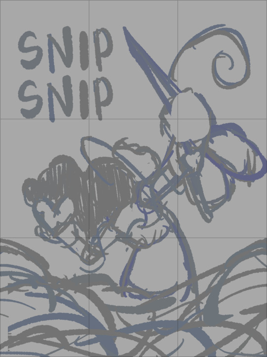
As you can see, the title is on the top left corner! However, I moved it to the bottom for two reasons
It's advice I learnt while looking up how to make movie posters since moving the title to the bottom tends to bring more focus to the illustration above.
I couldn't find a font that fits! And the idea of doing typography again (especially after the Keep Yourself Safe poster...) was really not what I signed up for.
But then it left the problem of the top corner looking empty. It was too distracting! So what did I fill it in with? The subtitle: This is their story. The composition is now more balanced, and also the subtitle tickles me.
As I said before, I looked up movie posters for this! Special thanks to the Nashville Film Institute and Muse by Clio for their articles that guided me during this poster making process. I will say though I got really sidetracked watching Filmmaker IQ's The History of the Hollywood Movie Poster 😭 It's really interesting, I'd recommend watching it!
One thing I learnt is that movie posters limit their colour palettes. Of course, this is good advice for art in general, but movie posters emphasize on its colour usage to attract the audience with their simple yet bold schemes. It is a piece of advertisement after all! Following their footsteps, I limited my colours to the primary colours (red, yellow, blue) and purple to make the scissors pop and allude to the nonbinary flag colour scheme.
And from there, it was just a matter of experimenting with rendering! I wanted a mix of pop art and storybook illustrations, so I mixed lineart with lineless, and I wanted to retain the energy of the sketch while still polishing it, so I cleaned the sketch, merged it with the colours, and painted on top of it rather than make a separate lineart layer.
Overall, I'm extremly proud of the end result! The struggle of figuring out the promo art for this fic has been tormenting me since the beginning of the year, so I'm glad to bring it to an end. Thank you for reading my ramblings! I hope you learnt something or at least had fun? Either way, have a good day!!
#this truly has been a rambles moment#i really really recommend watching that video by the way it is FASCINATING#the professor#shane madej#puppet history#poster design#art process#design process#art#artists on tumblr#sketches#concept art#chris p fried rambles#chris p fried art
10 notes
·
View notes
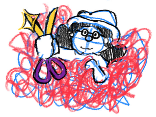
Text
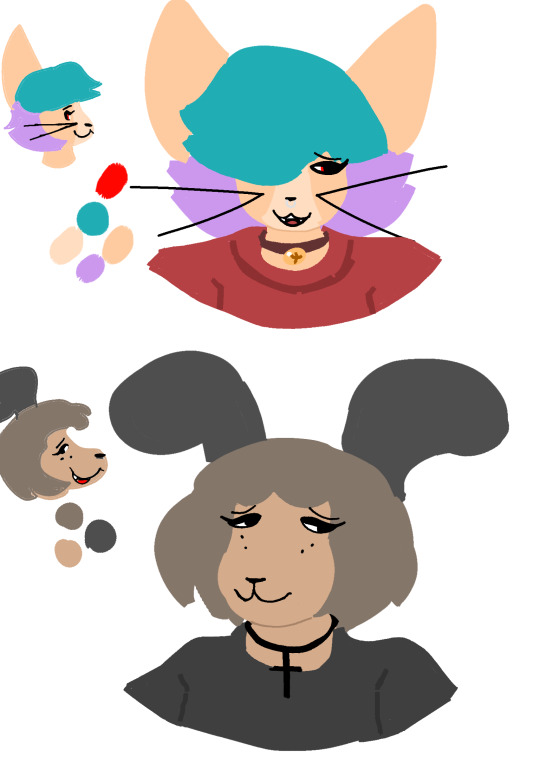
Main artist for comic here, just gonna be talking about where I am mentally, where the comic is, where the comic will be going. All of this pertains to the random stop in posting, I know there really isn't enough of an audience for my absence to even be noticed, but as this is something I'm really passionate about I kinda need to do this just to lift some weight off my conscience. If you don't care about that just enjoy the little reference doodle that I'm attaching, I don't mind, I know I can be a bit much when I get to talking.
My mental health has not been doing great, I've mostly been sleeping in for the past month, I've been suffering from major art burnout to the point where I don't even have the will to plug my mouse in to try most of the time. My usual process is just having an idea, sitting down with it, doodling it in Krita's comic template and adjusting until I'm satisfied with the rough vision in front of me, and then finally cleaning it up into what eventually becomes the final post, this takes me about an hour and a half, on really good days I could have a backlog set up for a couple weeks. As of late I'm having trouble getting clear enough ideas to even feel confident sitting down with them.
The comic, as it is now, is literally just the passion of one woman with a mouse and a vision, just little silly doodles in a style simpler than my usual one that are designed to make you smile and then move on with your day. This works, but lately I've been thinking that maybe this isn't the best I can do.
First of all, I'm just collaborative in nature, I like making things with people, bouncing ideas with them, seeing the kinds of things they make, it takes some organization to get here, but once I get it all sorted out I instantly find myself having a better time overall. I've pitched the idea of making this comic a collaboration with @illustraintions @yaboidax, and @mogdoodles (by the way please check them all out, their work is awesome), they all seemed to be on board, so maybe at some point expect to see some contributions from them as well!
Second, I'm considering making the comic have a more coherent story, I don't plan on making this a really deep thing, but just making sure there's a bit more of a continuity from comic to comic instead of them being totally isolated from each-other, I think this will make for a more engaging read overall without compromising its simplistic charm.
Finally, I'm thinking of transitioning the comic to be a bit closer to my usual lineless style (you can see what that'd look like below). It's a lot easier to make adjustments to, I think it just is a lot more dynamic to work with. I'll see how it works in execution.
That's all I have to say for now, thank you for your patience. Hopefully I'll be back on track soon.
4 notes
·
View notes
Note
Just wanted to chime in on what I've been seeing just now about those AI accusations to try and help put your mind and heart at ease as a fellow artist who's been accused of essentially art theft in the past because of moderate style variations(someone I considered one of my best friends accused me of tracing a piece they'd done of one of their characters because the nose on the sketch I did of him (while having their piece up to the side so I knew what he looked like) looked too similar in their opinion to the one they'd done, along with another piece I used photo reference for).
Don't let that person get to you - they obviously have nothing better to do with their time than target random people with accusations they have no proof of, acting like some divine authority on what human-driven art is supposed to look like. Like, demanding proof that someone made a piece is so borderline-dystopian to me, and to claim that your motivation is like, protecting artists from being hurt then go and... accuse an artist of theft/lying for no good reason to the point where they consider leaving the fandom space you claim you're trying to keep 'safe'?
Wild.
Them saying it must be AI because it's 'soooo different from your usual style' is also insane to me. Styles can literally change on a day-to-day basis depending on a variety of factors. Artists try new things and end up with wildly different results sometimes. I sometimes use really thick lines while other times I push myself to go as thin as possible. Sometimes I go freehand and other times if my tablet's acting up or I just don't feel like plugging it in, I've used vector lines on a premade sketch before using just my mouse to gain ultimate control over line weight, transparency, curves and angles, etc. I've also tried out lineless, going rounder or more angular with my shape language, used 3D models as reference for anatomy in some pieces and freehanded others, etc.
Also, it like... costs nothing to mind your own business, am I right? LMAO
Keep up the good work and I hope you keep creating and improving even more from here. Stay safe and well and protect your creative spirit against those who would doubt you!
Ikr? I might have understood it if every single thing I post looks completely different from the other but making those claims for one piece that is meant to be different is just wild lol, like I don't know, am I supposed to submit a request first before trying to experiment with new things?
Anyway, thank you so much for all of your kind words, I was really upset yesterday and was thinking what's the point of trying anymore if that's what I will get in the end but I feel much better today thanks to all the wonderful support everyone has shown me 🥺❤️ you guys have no idea how happy and lucky I am to have such a supportive and wholesome community 😭❤️❤️
8 notes
·
View notes
Text
Update: I've got a fair amount of posts tagged and sitting in my queue, they're scheduled to post once a day until the backlog is cleared. (If you just want my art and not other posts, check out @colorstormxart )
in the meantime, I'm gonna start organizing a new commissions post. I think I'll be offering a few kinds of slots for now: blob chibis, more detailed chibis, regular and artistic freedom fullbodies, and basic looping lineless animations.
that being said, I'm probably gonna want more up-to-date examples for all of these, so! if you want to be a guinea pig and get a comm at a discount, now's the chance.
discounted prices, rough examples, and ordering instructions under the cut:
Blob Chibis: $5 (regular price $10) - A simple, cutesy version of your character. Highly textured, rough color, shading available upon request. Works best with feral type characters.
Detailed Chibis: $15 (regular price TBD, will likely be around $25) - A small and cute drawing of your character, usually stylized. Some details may be simplified. Shading and alternate styles available upon request. Image size will be smaller than "regular" fullbodies, usually around 1000x1000px.

Artistic Freedom Fullbody: $35 (regularly $50+) - A fullbody of your character drawn in a more experimental style. Typically shaded unless you request otherwise. Cheaper than a "regular" fullbody because the commissioner has less control over the outcome. Small revisions will still be available upon completion.
Regular Fullbody: $45 (regularly $60+) - A fullbody of your character, drawn to your specifications. You get to pick the style, pose, and other details. WIPs will be sent to you for approval at every major step. Shading is included unless you request otherwise.

Lineless Animations: $60 (regular price TBD, will likely be over $80) - A looping fullbody animation of your character, done in a blocky lineless style. Minimalist shading included, more detailed shading upon request. Detailed shading and complex movement will add to the price.
Prices are subject to change depending on demand and my availability. I reserve the right to decline any commission. If you are interested in commissioning me, fill out this google form and I will send you an email confirming the details of your commission.
Thank you for your interest in my art! I hope to hear from you soon!
8 notes
·
View notes
Note
biggest art inspos?
@lycheestew sorry it took me three and a half months to answer this you sent it to me right around the time i finished my composition writeup and i was like 'good god i can not spend another two seconds thinking about art right now ill answer this later' and then well i just kept not doing it
but anyway. heres uhhh some stuff that was formative/that i am presently into.

Ever since I was in middle school I have been OBSESSED with tracy j. butler's work, she does the webcomic lackadaisy cats and everything she draws is just masterful. Her fully polished paintings are beautiful but I'm choosing to show some of her pencil sketches here because... well... just look at them. like holy shit. I think you could probably trace my love of drawing more stylized proportions with a disproportionate amount of detail on the clothing to her stuff. she also just does magnificent character work and i have a print of her expression tutorial that i kept hanging right by my bed to look at for years.
i was also, as you all know, incredibly incredibly deep into homestuck fandom for the majority of my Learning to Draw years so there were a few artists who were big during peak homestuck posting era that were very formative for me.

in particular i was really into @xamag-homestuck's stuff because i just found the way she stylized characters super pleasing. i spent a bunch of time trying to emulate that.
there was also someone who went by putoshop, i don't know what their current socials are if any but the old blog's gone, and i can specifically site their art as being the thing that got me to start trying lineless stuff

i also have loved loved loved everything @ggdgart has ever done and in particular their use of color in cucumber quest imprinted on me a ton and is something i have drawn a lot of inspiration from over the years. on top of that they have a wonderful sense of fashion and their character designs are just great. cucumber quest rules.
i also was a kid who was really into western cartoons and didn't start watching anime with any regularity until i was in college so a lot of those meant a lot to me. a lot of my early drawing was done trying to copy/trace avatar the last airbender screenshots and while i think it definitely got me started i honestly feel like it had less of a long-lasting impact on the way my art looks than other stuff that i didn't even watch a ton of. i was never super deep into either show as media but i always absolutely loved the aesthetics happening in samurai jack and my life as a teenage robot. they both had that excellent geometric midcentury vibe. more recently in comparison to those two, i also feel in love with the background style in gravity falls and would say that was pretty influential.
right now as for present inspiration i'm absolutely obsessed with everything that deb jj lee does because, well. once again i find really the only adequate thing to say is 'holy shit'
their stuff rules soooooooo hard
i'm also extremely in love with angela sung's art.

the textures! the colors! the shapes! no misses here
im sure theres more stuff i could bring up but this is what's coming to me at the time so ill leave it here
105 notes
·
View notes
Note
hi lizz!
11 and 15 for the ask game please :)
hi luca!!! 👋✨
11. artist(s) that influenced/inspired your art style
i am so glad you asked this question but i am also quaking in my boots because there are so many 💦 here are some that come to mind first, people are welcome to ask this question again if they want me to namedrop more people... (I LOVE ARTISTS!!!)
chuwenjie
coricaroo / takawbird
lunarelles
bigskycastle
tokkibada / badawaves (splatoon!!!)
baoxie_ / jiiandui
kinigoni
all of the handles above r for twitter, but some of them are on tumblr as well ^.^
honestly any artist who do lineless or stylized bg work is pretty eyeballs to me... as for media inspirations, splatoon (ty seita inoue) and ghost trick :3
and my friends too! they influence me to keep going and they are so swag for that. beams hearts at them (you included ofc 💙)
15. any upcoming planned drawings
my plan for 2024 is to finish some old wips that never made it past the sketch stage! there are... so many p3 ones (you bet its all ryoji and minato!!! some aigis and femc too...) 🤧
i think it's a given that i'll be drawing something for march 5th (a concept has been laying around since late march 2023)... but i'd also like to make something for january 31st and december 31st. perhaps an animatic... but i will need to PRACTICE!!!
other than the important dates of persona 3, i'm very looking forward to regularly shedding my art style. i want to draw minato and ryoji in the styles of diffrent media (or artists) because i'm a little silly and enjoy taking that kind of approach. i will also do this with my ocs i think.
oh and i hope to draw some other characters from different things too :D im filled with so much silly and love for many things and art is my vessel to express that.
TL;DR: 2024 will be the year of experimentation and going ambitious! i want to draw compositions. i need ryoji and minato to be drawn like they're going to be a mural in a church or i'm going to dissolve into teeny little pieces.
#lizzy askbox#LIZZY TRIED TO KEEP THIS SHORT. LIZZY DID NOT#i really loved the questions you chose though ;w; thank you for stopping by!!#i'm glad to know you and that you're part of my life. may 2024 be prosperous for you and that you can be in good health :D#i'm also very interested in seeing how reload inspires my art too... it would be fun to draw some happenings from it#onto answering the next question in my inbox!! :3#i am WAKING up for 2024 this is not a drill. i will go back to my composition bs. and other memes. because im sillie.
6 notes
·
View notes
Note
Hey, I adore your artstyle mate, I loveeee all the vivid colors and the fact that most of it lacks lines?? You doing the hard stuff, but it paying off 💜
can I ask, as I’d like to get into comic making, how long does it take you to finish a a single panel?
Hi!! thank you very much!!
drawing lineart is incredibly frustrating to me so im very glad i was able to make the jump to mostly lineless artwork, tho im very much still at the beginning to learn how to do it xD
to answer your question, i .. cant say really, it depends on what is on the panel, and i always jump around when working on a page, i draw half of the very last panel, then jump to another, maybe i see something i want to change right away and work on the third
besides i ... dont know anything about panel composition, i think in movies so i play it and try to pause it on a frame that could work as a panel, whichs is probably why it goes alot slower than normal comics, idk how much to skip gndfjknvgfdjk
im by no means an expert in making comics, you kinda have to find your own way of what works for you, i have done many in the past but all failed, i gave up before getting even one chapter done many times
general advice i can give you is, most importantly, dont wait, i know its daunting to start, but you have to start, even if you dont think you are good enough, you will always change and improve anyway, better start now or you might do it never, and remember, when a page is done its done, i know how tempting it is to go back and redo it, but if you start with that it will only lead to an endless cycle of remaking it over and over
a cause that made me abandon my old projects, was partly lack of support/recognition, but mostly that i was forcing myself to things that werent fun, like one i made in black and white bc i thought you had to do it bc color takes too long, but i live for colors, so it drained the fun out of it immediately
the only "rules" i have set for myself is that its understandable, the flow of the action doesnt flip around too much, speech bubbles are aligned in a way that guides you (of course im not perfect at that either and always learn);
i dont jump between pages, i jump between working on panels, but i dont start another page before the previous is at least acceptable, otherwise id get ahead of myself and get impatient, just wanting to skip ahead and neglect older pages;
and that i only work on a panel/page as long as it has acceptable quality and is fun to draw, when i notice im getting bored or frustrated i finish it quickly as best as i can and move on, otherwise it might drag the entire project down, which is why each panel or page in 'Destiny' varies alot in quality
i can barely look at the first pages .. or even at the last one i made for that matter, but its also fascinating, how much my art changes within even one update which takes me about a month for 4 pages, since i have set my 'fun' rules at least, it used to take much longer
(i wish i was faster, and i could be, but i have a job, and have to look out for my health, both physically and mentally, so i take whatever time i need and draw however much i feel like drawing, no rushing)
my progress so far is that i write a rough script, what happens, what dialog, where it ends, and so on, it doesnt have to sound good, god knows mine are shitty xD but its a good guideline, even if rough!
then i make a rough draft, basic panel layout, dialog (it always changes fro mthe script, again its more liek a guideline than a rule ;) )
then i start with actually drawing the first page, my art and way of .. art and writing changes incredibly fast (idk if its for the better lol) so .. by that point i redraw the rough draft version of the page if i see how it works better, rewrite dialog too, and even cut stuff from the rough draft
im not done with the first chapter (im slow af lol), but wrote the script for the second one when my hand was injured and i couldnt draw for a month, once im done with this chapter i will draw the rough draft for ch2, then write the script for ch3 then go and draw ch2 fully, at least thats the plan
the more time passes the more i know what the next chapters are gonna be, tho i know the important points long before; right now i have the entirety of the first arc sepeareted into chapters, and the end of it all too, but between there its still a lil blurry and im adjusting everytime i think of soemthing better
anyway, sorry for that long ass ramble, its late and i thoguht about this ask bc im trying to get my want to draw back (not feeling well rn nkfdnkd) so i randomly decided to answer it .. probably in the most unhelpful way possible, alot of stuff noone aksed for lol
anyway, sorry, and goodnight uwu
#ganondoodles answers#i hope i didnt sound too preachy#or soemthing#idk im not good at giving advice#..and my way of drawing changes so fast#whenever i explain sth it usualyl changes right afterwards#and man that feels shitty#like im lying to people#:(
34 notes
·
View notes
Text
October wrap-up
So! October is at an end! And I have not finished Spocktober/Trektober. Let's see how I did!
My goals for the month were:
To have fun :3
To get used to finishing drawings
To get used to posting them, too!
To have fun :3
To improve my sketching and lineart skills
To end up with a bunch of finished drawings (of Spock!!!) :3
To let go of a bit of my perfectionism
TO HAVE FUN :3
So how do I think I did?
Having fun:
I had a lot of fun with it this year! In previous years, I've pretty much immediately devolved into an anxious mess because there were too many options and I bit off more than I could chew. This time around, thanks to my guidelines (only inking, not spending too much time on each day, sketching and thumbnailing in advance), it was a lot easier to let loose and have fun thinking up ideas and enjoying the process. Plus, I let my friends know I was doing it this time around and got encouragement and support, which was lovely.
Getting used to finishing drawings:
I did better at this than I thought I would! There are several drawings I've finished this month that I would have given up on if not for this goal. Do I think they were all my best work? No. Did I learn from the process? Yes! And some of the ones that have gotten the most notes were ones I thought no-one would like and struggled to finish. So! I also figured out new ways of motivating myself to finish things, which is also very helpful.
Getting used to posting things:
Also went better than I thought! Although I didn't manage to maintain a cushion of queued posts like I wanted to, the response I've gotten from actually posting my art has been amazing! I've gained several new followers (hello!!) and gotten so many nice comments, and went from being afraid of posting anything to tentatively looking forward to people's reactions, which is a huge improvement for me. Getting that accountability of posting publicly also helped keep me going when I felt like giving up - seeing my friends laugh when I showed them my silly comics or getting nice comments really made me feel like sharing my art is worthwhile. So thank you to everyone who reblogged my art, commented, liked, etc. I'm glad you did!
Improving sketching and lineart:
I definitely think I improved my art skills. Getting into the habit of thumbnailing really helped take the pressure off the sketching phase, and trying so many different ideas pushed me out of my comfort zone and forced me to try drawing things I wasn't so confident on - look how many hands I drew!!!! As for the lineart, I think I've gained a bit more experience in using pens, although I did buy a whole new set of them halfway through the month which put me on a new learning curve. Lineart's never been a huge favourite of mine, and I do miss using my tablet to do lineless art, but the nature of the challenge did help me to loosen up and experiment to keep my mind engaged the whole time.
To end up with a bunch of finished drawings of Spock:
Check! I have 14 finished drawings, with another four sketched and needing inking, plus a whole load of thumbnails to work from in future. I may go back and add colour to some of the days for funsies, but there's several that I can just put on my wall as-is and be proud :)
To let go of a bit of my perfectionism:
I definitely did! Like I said, there's a few of the ones I've posted that I'm not too proud of and know I could do better on, but I've spent all month purposely smacking my hand away from perfectionism, and I know I've tried my best given my limitations. I'm still proud of myself for getting this far, and for posting when I was anxious, and for improving my skills, and now I get to stick up my art on my wall and be proud of it! I'm not magically cured by any means, but I do have a bit more evidence that perfection is not a good goal to pursue, so I'm going to keep this experience in mind for the future.
So what now?
I do have thumbnails for almost all of the rest of the prompts. I am doing NaNoWriMo this month, and I have a digital piece that I want to finish for the 5th (holy shit. three years.) So I think I'll take a little pause on these prompts, but I don't want to stop. I'll keep coming back to them, and keep posting them, until I run out of prompts or motivation, whichever comes first. I've really enjoyed seeing people's reactions to my Star Trek art, especially the comics! I also have a backlog of SPN fanart I want to post, so I'll probably queue some of that to come out soon.
TL;DR: Watch this space!
And if you've been following along/commenting on/reblogging my art this month (or anytime), thank you so much! It's folks like you that make sharing art worthwhile!
#original poast#artie talks#i am feeling so much more positive than any of my previous attempts at an inktober style challenge!#this has genuinely been so much fun and it's so nice to feel like part of a community#i'm sad I didn't get to any of the suptober prompts#cause I had some ideas for those too#but given various life stuff and also my very last minute decision to even attempt it this year i think i did excellently#and I am going to record the fact that I am proud of myself for future-me to look back on#also. uh. the askbox is open if anyone would like to send prompts. i can't make any promises but if something catches my imagination#i may doodle a little thing for you!#chatting is also encouraged! i like making new friends :)
2 notes
·
View notes
Note
I just found your art through your CR animatic and absolutely fell in love with your style,, what/who are some of your biggest artistic inspirations?
Hi! I received this ask ages ago, idk if you're even still here or alive anon, but I'm going to respond to it!
I don't have a very fixed style, so i guess this is a hard question for me to answer, but here are a few artsists that are always in the back of my mind!
First, Stupidoomdoodles. She did a lot of cool DBZ Vegebul comics a few years ago. Her style was quite "simple", but i've yet to find an artist whose expressions made me laugh more that hers. Sadly she has deleted most of her art/blogs so you can only find her art reposted. Whenever you see me drawing big round stupid eyes... that's her legacy.
In the same ballpark, @kebabcito recently is killing me with their expressive and sketchy comics, with top-notch character designs. And that texture mmmmh... I REALLY have an itch to do more comics (the problem being: having time and ideas).
Animation-wise, I obviously am influenced a lot by Ghibli (who isn't), but people like Felix Colgrave (bc I love how disturbing yet coherent and colorful his world is) or Louis Zong (bc this man's content is so funny and i love how much he blends techniques, music, animation, everything together...I WISH I KNEW HOW TO DO THAT DAMN) are also big inspirations.
@ameliecausse is a very dear friend of mine (coucou si tu lis ça :D ). She influenced a lot the way i think about backgrounds, and her digital paintings were so good they pushed me to do more lineless art, and to incorporate already existing textures into some of my drawings. Also I stole a bunch of photoshop brushes from her shhh.
I need to mention FMA: not only is it my favorite manga, i use to copy pages from it, a lot. I think it KIND OFs hows in the way i draw heads??... idk. (i know i never draw anything FMA-related, but you don't "need" to do fanart for a piece of media that is already perfect imo. At least for me, fanart is always born of a mix of excitement and frustration).
Recently I've learned to love very colorful art more than ever, like Moebius, or Dominique Ramsey's art. Anyone who draw weird creatures/animals already has my love, but her!!! Wow... What can I say. Just go see her stuff please.
Speaking of colorful art, my lastest illustration shows i think how much @cy-lindric's work had an impact on me.
There are hundreds of other artists I would to love to talk about, but this post is already too long. So here is a recent art mindblow of mine to finish this post:
The COMPOSITION! The MEANING... the COLORS...
Thank you for that very interesting question!
20 notes
·
View notes
Last Seen Blogs
qooolo
Kclo3

satinroselounge
The Satin Rose Lounge
billythesimp
Billy's Starlight

veeraflavours
Untitled

cuisinedenine
CUISINE DE NINE