#its really important to capture their vibes via colors
Text
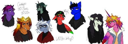
check this shit out
horses your awful fictional serial killing men
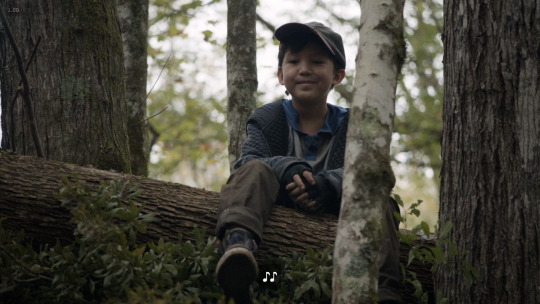
mars (purple), warren (orange), cody (green), jay (blue), elliot (red), derek (blue), quinn (pale), vini (pink)
#my little pony#mlp#mlp fim#mlp ocs#theyre all really terrible horrible people fyi#when peeps ponify their ocs they usually make them skin toned n im like noooo ponies r jewel tones n shit!#its really important to capture their vibes via colors#i dont wanna tag all these men#but i must#mars.png#warren.png#cody.png#jay.png#elliot.png#derek.png#quinn.png#vini.png#coz of those last two my friend will ignore this image 😌
2 notes
·
View notes
Text
TWD 10x17: Home Sweet Home - First Thoughts
All right, I can finally post my analysis. Actually, there will be several. So there’s a LOT to go over for this episode. As I usually do for episodes, I’ll just talk about broad themes I’m seeing today, and then I’ll do a details post tomorrow.
***As always, spoilers for 10x17 abound below. Don’t read until you’ve watched. You’ve been warned!***
It was all fabulous! It was a really great episode even independent of the TD stuff. Raises lots of questions about these new villains that has me super intrigued.
But let’s talk about the important stuff first!
So, there were the four mentions I talked about based on spoilers, and I was pleasantly surprised to find another that kind of trumped them all.

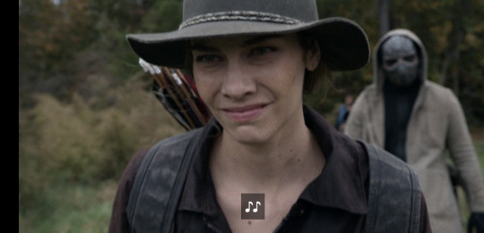
The two by-name mentions came in Daryl and Maggie’s conversation. I have no idea why the screener said Beth wasn’t mentioned by name. She totally was. Twice. Maggie first calls her “Bethie.” It’s when she says, “After Bethie died, Glenn and I talked about going there [to the ocean].” Then a minute later she talks about telling Hershel stories about his family. She says “Beth and Shaun and his granddaddy.” So yeah, two times.
Then there are mentions that we picked up from the spoilers, when Daryl says people are just gone and when Maggie and Kelly talk about their sisters. In the Maggie/Kelly convo, there’s not a huge smoking gun or anything. The thing that stood out to me was Kelly saying, “you had a sister too, right?” I feel like that’s a very blatant example of the writers reminding us of Beth. That Maggie once had a sister. But beyond that, they didn’t talk about Beth specifically.
The other one I noticed that trumped them all was during Maggie and Daryl’s convo about Connie. Maggie asks if Kelly’s sister is still out there and he says his “some people are just gone” line. (Which is obviously an exact callback to him saying this same line about Beth in 4x16).

And then Maggie says something that can really only be about Beth. She says, “even if you find them, you don’t always get them back.” Which is a reference to finding someone but they “die” anyway. And originally, I was thinking that this could point to more than one person. Glenn, Merle for Daryl, and the main reason to connect it to Beth is that they’re talking about Connie’s sister.
But the more I think about it, it can really ONLY apply to Beth. Because while plenty of people have died, they were never really missing, either. Merle left, and Daryl went to find him, but just before his death, he wasn’t missing or separated from Daryl for a long period of time. Same with Glenn and everyone else they’ve lost. Maggie wasn’t with Glenn before he died, but she didn’t think he was missing, either. She didn’t even know he’d been captured until she saw him in the clearing. The ONLY person who was missing, found, and then lost again, was Beth.
So, we literally have Daryl and Maggie talk about Beth the night before, and then again the next morning with this convo. And then Maggie and Kelly reference her near the end. So great!
But that’s not by far all the great stuff in this episode. Lydia doing the voice-over recap at the beginning was super interesting. Most of it is just recapping the Whisper War, Alpha and Beta’s deaths, etc. But then at the end, she says, “But we were on the verge of something else. A bigger world.” And as it says that, it shows first Michonne on the boat, heading to look for Rick, followed by Eugene’s group being captured. So, both those storylines, in other words, are leading to this “bigger world.” We might have figured that with Rick, given the CRM and all that. But it kinda proves Eugene’s group is about to stumble onto some part of it, too. So bigger world for Michonne is Rick/CRM. Bigger world for Eugene’s group is Beth? Here’s hoping.

There were some minor changes to the opening credits, as we might expect. There is a burning ship in the background at once point. And at the end, when we see the walkers that have Whisperer masks on, there are a lot more walkers around them. Not all Whisperers or anything, but just a much bigger group of walkers. But I noticed the one that is a Whisperer was still there, which is interesting. And given that the Whisperers left a hole in the Alexandria wall when they left, we might have to deal with some stragglers at some point. Everything suggests they aren’t completely gone, even if the war is over.
Lots of great dialogue, most of which we’ve already mentioned from spoilers, but I’ll go over that more in my details post tomorrow.
So, obviously my TD brain was working overtime and I noticed a lot of sequential callbacks to earlier seasons. For one thing, when Maggie and Daryl’s group is walking through the woods, it started showing them each walking in slow motion as they traveled.
Remember in S5, when we got the slow motion walking from each member of TF throughout the episode? I think it was in 5x02. It reminded me of that. Like they might be calling back to that. So once again, it would just make sense if they’re doing this at the beginning and Beth shows up at the end.

There was a green preying mantis that was an obviously-placed symbol. I had to look that one up. Yes, we saw a preying mantis in Still. Or was it Inmates? It was around Beth either way. And check out this post on praying mantis symbolism.

They actually use the term “stillness.” And of course it’s bright green. Yeah, I’d call that a purposeful symbol.

The cargo containers they stayed in overnight were very reminiscent of Terminus. Oh, but this is interesting. I’m seriously probably the only person in the fandom who would even notice this. There’s a sequence where a bunch of walkers are trying to come out of the container, but there’s tons of them and it would be bad for them to break out.

So Maggie tries to hold the door shut. Daryl runs up to help her but here’s too many in there for just the two of them to overpower them. Finally, Elijah comes to help and there’s a super-gnarly moment where one of the walkers is pushing its head through the door and they squish it. But the point is they work together and actually do get the door shut and lock the walkers inside, so they aren’t overwhelmed.
Two things I think this calls back to. The first, perhaps most obvious one is 5x10, Them, when the entire group held the barn doors shut against the walkers. And once again, the music box woke up RIGHT after that. So it could be a harbinger of Beth.
The second thing it reminded me of was in 4b with the school bus. Remember Sasha and Bob tried to hold the back door to the bus closed but couldn’t and all the walkers got out? There’s a blond walker that falls at Maggie’s feet in that sequence and Maggie stabs her in the forehead. I always thought it was a Beth foreshadow. This almost feels like the opposite of that. In this case, they were able to get the door shut and didn’t have to kill all the walkers. So, if that sequence foreshadowed Grady, maybe this foreshadows the opposite? Things going better this time around? Just a thought.
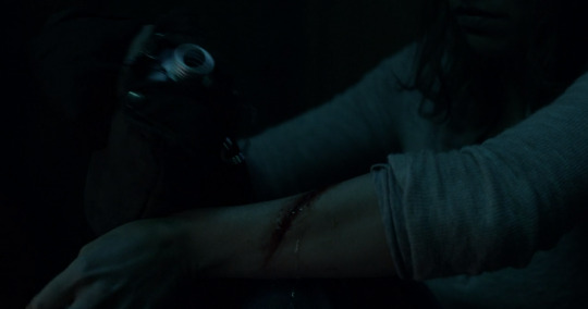
Oh, Maggie hurts her forearm, though. I won’t say much about this except that we’ve seen other characters with this same injury and I’m sure it’s significant. I just haven’t entirely figured out what it means, yet. It’s not exactly the same as Beth’s because it’s on the wrong arm. But just keep it in mind. I’ll probably mention it again in the future.
When talking to Daryl, what she says about Georgie is interesting. I think we got most of it via spoilers and the Q&A. But she says Georgie went out west. I can’t help but wonder if she’ll be part of the New Mexico symbolism.

One thing the spoilers really didn’t do justice to is how upset Maggie is about what happened to the community she and Hershel were living in before. She’s REALLY upset about it and you can tell she’s barely holding it together. Daryl asks her what happened, but she says she can’t talk about it, yet. She told him the other stuff about Georgie, and says it’s nice to voice some of it, but she can’t voice all of it just yet. So whatever happened must have been pretty bad, because she’s really messed up about it.

I got the same vibe from Elijah. When he takes off his mask and him and Kelly bond, it’s because the Reaper sniper is hunting them. And it’s obvious that he’s terrified of these people (the Reapers). And that’s surprising because this is gray ninja guy who throws knives and had no trouble killing walkers and Whisperers, but he’s super afraid of the Reapers. We also know he lost his sister to them, so it may have a lot to do with that.
But still, I definitely want to know more about these Reapers. The sniper really is pretty creepy.

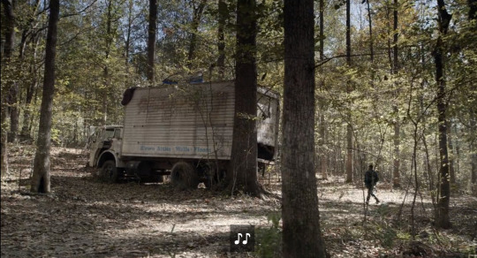
We see a lot of sunlight filtering through the trees. We had a small dark tunnel moment. Looking for Connie, Kelly is looking into the back of a truck and we see her from the inside, like someone looking out from the inside. Nothing really comes of it. She doesn’t find anything or crawl into it or anything. She’s just looking in as if to see if Connie is in there, but she isn’t.
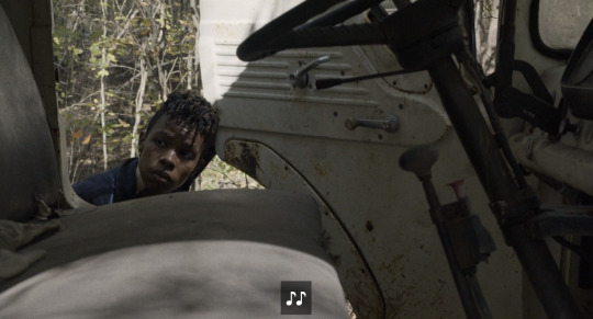
In this same scene, she opens the cab of the trunk and looks into the front seat, which is empty. And then she sees a coat on top of the truck. That’s when Maggie and Daryl find her, and Elijah jumps up on top and throws some stuff down. The only other interesting thing is a little notebook (the one mentioned in the Q&A, I think). It’s not really a journal and there’s not much color to it. They don’t show us what’s actually in the notebook, but it’s obviously not Connie’s. I’m assuming it’s blank.
But think about all the callbacks there. This truck looks a lot like the one Bob slept on in 4x13, which was obviously a Beth parallel. We have an empty front seat. Now, we’ve mostly seen representations of a walker being in the front seat, right? And this is the opposite of that. So, much like Maggie managing to hold the door shut against walkers, I feel like they’re purposely showing us the opposite of what we’ve seen before, which just tells me Beth is about to appear.
There’s the notebook, which calls back to Connie, Beth, and the wolf trap in 5x16. The coat they threw down wasn’t a huge thing, but it looked vaguely blue. But the fact that it was on top of the truck (which was white) shows that someone slept up there. Also, when Judith and Maggie talked about looking at the stars, they specifically talked about going up on the roof to do it.
Oh, another interesting line that I’m wondering about. It’s back when Daryl and Maggie are talking about Connie. Maggie says the thing about how even when you find them you sometimes don’t get them back. Daryl says maybe it’s better that she doesn’t know that yet. (He means Kelly. Maybe it’s better if Kelly doesn’t realize that’s often the case.) And Maggie says no, Kelly should know. She says her daddy always said a wound couldn’t heal until air hits it. And Daryl says, “You know that’s not true, right? Medicine-wise?” And Maggie just kind of laughs and said her dad made it sound like it was.
So, I’m not sure what to make of that, but it’s obviously a purposeful line. And a medical reference.
Okay, so when Maggie gets back to her group, they’ve been attacked and scattered and two of them are dead, burnt to death in the fire. We had lots of X shapes in the burnt beams of the shack where they were staying.

The two burnt bodies reminded me of the burnt walkers in 6x06. And as the episode went on, it occurred to me it was kind of a replay of the prison. This place burnt down and her entire group scattered. They were all out looking for each other in the woods. Also, the reason they knew it was burning is that when they got close, they could see smoke rising into the sky. It looked EXACTLY like the smoke from the moonshine shack in S4.

They eventually face off with the sniper guy. At one point, we see his one eye staring at them from where he’s hiding. Creepy, but also maybe a Sirius thing?

Maggie steps in a rope trap (one of those things that pulls you upward by one foot. The guy almost kills her while she’s trying to get lose. Daryl shoots him with his crossbow but drops it after that and goes after him with a knife. (This is why Kelly gets the crossbow. We don’t really see him drop it but I assume he did because the guy was really close to killing Maggie and he knew he didn’t have time to reload.) This guy is huge and throws Daryl against the tree like a rag doll.
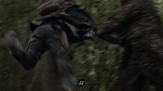
Then we get this really interesting thing where we see the camera looking up at the sniper from Daryl’s point of view. We even seem the camera sort of “blink” which is supposed to be his eyes. And it’s interesting because 1) the guy is taking off his disguise. Yeah, this sniper kinda looks like a swamp thing when we see him. He’s covered in camouflage and that brown netting special ops guys wear to blend in with their surroundings. But at this point, he takes it off. I felt like it was him taking off his mask, as it were. 2) It’s blurry and in slow motion. That’s because Daryl is hurt from being thrown against the tree, but it just struck me as a foreshadow of something. We’ve always said that when he first sees Beth he’ll probably think he’s hallucinating. I have no idea if that’s what this is about, but it really jumped out at me as an intentional thing.

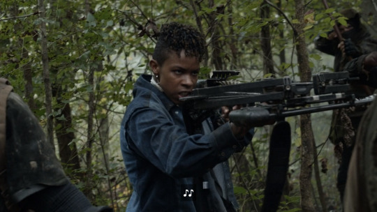
And about the Kelly/bow thing, it’s nothing. People were really freaking out about the picture of her with Daryl’s bow, but it was seriously small potatoes. Daryl recovers and Maggie gets free and they both attack the sniper at the same time, but then the rest of Maggie’s group shows up with Kelly. One of them shoots the sniper with an arrow before Maggie or Daryl can, and Kelly shows up holding the crossbow. I think she just picked it up from where he dropped it, but she doesn’t even shoot it or anything.
So then Maggie asks the sniper who he is and why his group bulldozed their community. He won’t answer her and then pulls out the grenade.
And this is another thing that’s really interesting. I almost want to connect this group to the Wolves. Not literally but symbolically. Because from what they said, this group didn’t just attack them to take their supplies or because they were bad guys who wanted to take over their community. After their community went down, they’re actually hunting them. Trying to pick them all off. Why? That’s weird. And the Wolves are the only other group I can think of that actually hunted people just to kill them.
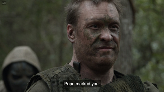
The sniper does say, “Pope marked you.” I don’t know if that’s a name or a title, but it has religious implications. So, someone has marked Maggie’s group for death, but we have no idea why, and neither does she. See why I say this was a great episode even aside from TD stuff? It’s just very intriguing and raises lots of questions moving forward.
Then there’s little Hershel. Not only does he look like Glenn, but he’s practically wearing Glenn’s S1 outfit. Complete with blue and white shirt and baseball cap. So. Stinking. Cute.
Not tons to add about Maggie and Kelly’s convo aside from what was in the spoilers. But I will say that there’s a huge “coming home” theme in this episode. Maggie says she almost came home after Knoxville. Daryl asks her to come home. At the end, he asks if this means she’s coming home. (She says yes.) They just say it like half a dozen times through out the episode.
So, let me just mention my biggest takeaway from this episode. Hershel Jr. is a type of Beth or Beth proxy. It took me watching a couple of times to put this together, but here’s the short version. The building Maggie’s people were in that burnt down is a lot like the prison going down. Her group scatters into the woods into several small groups, much like TF did after the prison. And little Hershel goes missing. Now, Maggie doesn’t really think he’s dead or anything, but she just doesn’t know where he is or if he’s okay. Then, at the end, she finds him. It’s kind of a return, you know?

And once I realized that, I started seeing all kinds of parallels and callbacks. For one thing, when Daryl was tracking him, he recognized Hershel’s tracks because they were kid tracks, rather than adult. That’s a parallel to Beth and Daryl tracking Lizzie and Mica’s kid tracks in Inmates.
Maggie had a “we don’t know that” line, which is exact Beth dialogue. For Maggie, it was about whether or not any of their people were still alive in the wake of the attack. Beth said it about whether anyone from the prison survived in the wake of the Governor’s attack. And there are tons of those. But I’ll go over more of them tomorrow.
And finally, they find Hershel sitting in the tree. Tree/trunk is a Beth symbol, as @frangipanilove has show us. But the tree is also in the shape of a giant cross. So this isn’t just a return. It’s a Christ, resurrection symbol. See why it parallels to Beth?
So yeah, I’ll go over more template details tomorrow and later in the week. But there was SO much good stuff in this episode!
#beth greene#beth greene lives#beth is alive#beth is coming#td theory#td theories#team delusional#team defiance#beth is almost here#bethyl
18 notes
·
View notes
Photo

Touching the Void.
Searching for cinema that soothes? Ella Kemp suggests it could be as simple as looking for a film poster with a white background.
How many weeks has it been? When did any of us last go blindly into a cinema and take a chance on something new? Film-watching in the time of Covid-19 has changed. The immediate and never-ending news of the world is frightening. Is it still, and more than ever, okay for me to sink into movies to alleviate my mood, just for a bit? How is that even possible when the world has come to a standstill?
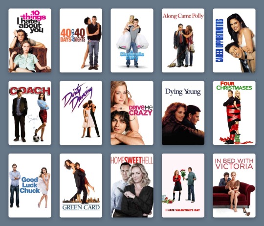
We are forced to adapt, and it has taken some time for my attention span and emotional capacity to adjust. But I think I might have found a solution, and I have the meticulous list-makers of Letterboxd to thank. It was Izzy’s list of comfort movies that first lit the fuse. Specifically, the second, third and fourth row; films including Billy Elliot, Clueless, School of Rock.
Fifteen stark posters, speaking one truth: We are vulnerable and nervous. What we need is a film poster with a white background to assure us the movie exists entirely to serve and soothe us.

Part of Izzy’s ‘comfort movies’ list.
List-making on Letterboxd has never been more prolific. Pandemic movies, overdue filmography catch-ups, comfort movies galore. Everyone categorizes and logs their watches differently, but Izzy’s pattern speaks to me with an epiphanic answer. I’ve always admired successful color-coding, but now I see its crucial function.
As I scroll for distraction, for something guaranteed to be good (because I cannot and will not be subject to any uncertainty I can avoid), I see the rainbow. The pale blues of Studio Ghibli, Wong Kar-wai’s passionate reds, the pastels of Netflix Original breezy romances. Like some kind of cinematic ikebana, countless Letterboxd members have mastered the art of arranging film posters. There are standouts: the staggering oeuvre that is Gordon’s chromatic roundup of favorite posters; the comprehensive color-graded history of women directors via their best posters, courtesy of Vanessa; and the penchant for beige in the year 2015, as spotted by Letterboxd co-founder Matthew Buchanan.
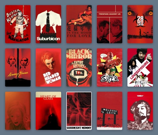
A selection of Gordon’s favorite movie posters.
But when I see these 300 examples, color-coded by typography and accents by Sera Ash, I recognize that white movie posters are the ones most likely, in this very strange time, to take care of me. I see it in three distinct filmmaking periods: Disney animations from the 1940s and 50s, the video marketing for cult comedies of the 1980s and 90s, and the alternative marketing materials of my favorite films of the 2010s. Each poster is straightforward and inoffensive. It captures the story, but never dares to impress or intimidate beyond basic description.
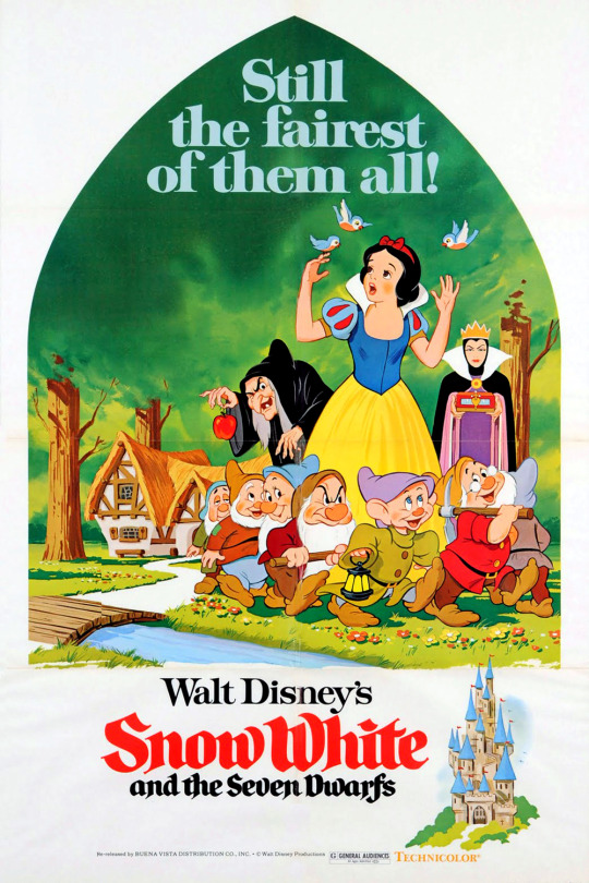
A 1975 re-release poster for ‘Snow White and the Seven Dwarfs’ (1937).
In 1937, Snow White and the Seven Dwarfs announced the birth of Walt Disney’s feature-length empire. While its original theatrical poster is also mostly white, it is represented on Letterboxd by a 1975 re-release poster depicting a peek through the keyhole: a curved triangle framing Snow White, the dwarves, and the two sides of the jealous queen, against a vivid green forest. In the bottom corner, a castle. To the left, the title—her name in red cursive, theirs in black. These simple images come together to present an elementary summary of the ingredients within. The white frame showcases the seminal animation craft without suggesting the viewer diverts their eye anywhere else.
This technique was common across other animated titles, collected in lists like dantebk’s Disney animated classics. Pinocchio toys with the hyperreal relationships between characters alive and wooden, human and animal—but does so on a plain canvas, so that the magic remains within reach. Dumbo, Bambi, Cinderella, Peter Pan—each follows suit. Whether with the mustard yellow of a circus tent, the faint sketches of grass tufts, the gold dust of an enchanted fairy godmother or the ink blue of a midnight starry sky, these colors (indicative of each defining scene-setter or mood-maker) only pepper a blank background, and so make their significance ever greater with the most sporadic touches.

A selection from dantebk’s list of Disney animated classics.
Live-action knockouts from these decades—films like The Shop Around The Corner and The Red Shoes—embrace painted recreations of their protagonists (Margaret Sullivan and James Stewart as festive lovers in the former, Moira Shearer as a tortured ballerina in the latter) and use the color red as a signifier of romance, against a plain white page, to set the mood. Slashes and splashes of red have been used to create a vibe in genre cinema for many decades—a trend deftly chronicled in this list by Rocks.
As far as we know, the underpinnings of digital photography began in the 1950s, and the first published color digital photograph dates back to 1972, when Michael Francis Tompsett shot a photo of his wife Margaret for the cover of Electronics magazine. Consumers got their hands on the gear in the late 1990s, but movie studios really started to make the most of sharp digital photography and stark white backgrounds for their striking posters from the late 1980s onwards. Because, never mind the multiplex, the video store is where you wanted your comfort fare to stand out in the 1980s and 90s.
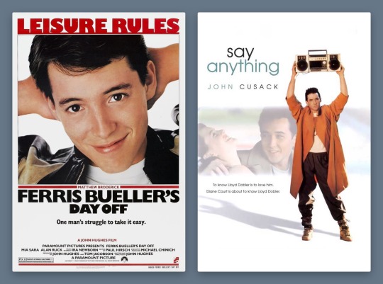
Ferris Bueller’s Day Off (1986) and Say Anything… (1989) form a handsome, trend-setting 1980s pair. While the theatrical poster for Cameron Crowe’s Say Anything… deigned to include John Cusack’s co-star, Ione Skye, by the time of the film’s video release, the focus is clearly on pre-High Fidelity Cusack, as proud underachiever Lloyd Dobler, smouldering lopsidedly under the weight of a boombox. It’s the singular image of the film to this day.
Meanwhile, Matthew Broderick as Ferris-slacking-Bueller is making the most of his title activity, arms behind his head, a proud smirk on his face. Nothing else matters except that these charismatic young stars are stepping up to leading-man status. The white background accentuates the star power of these new boys in town, embracing the limelight in one fell swoop.
Star power is everything: beautiful people doing simple things against empty backdrops, because what could be more important than the regularity of symmetrical bone structure, of familiar charm? The trend boomed in the 1990s and 2000s, in films widely embraced by casual moviegoers. The sort who list “watching Netflix” as a Sunday activity on dating profiles and use the Christmas holidays to rewatch comedies they have memorized over dozens of half-attentive viewings (absolutely zero judgement here!).
The vast majority of these films have white posters. Who is your soothing cup of charm: Tom Hanks on a bench, nothing more nothing less, from 1994’s Forrest Gump? Or Heath Ledger, effortlessly cool, leaning on the brown corduroy armchair Julia Stiles sits in for the 10 Things I Hate About You poster from 1999? (The 90s harnessed the increased appeal of having two lookers just sitting and posing against a plain background, as demonstrated in this chilling list by Ashley.)
Ashley’s list of couples posing in front of a white background.
Will Ferrell had been earning his stripes as an actor for years, but he changed the movie comedy game as Buddy the Elf in 2003. There’s plenty of visual humour in Elf, but Ferrell’s coat-stand posture bedecked in festive green velvet and those tights is… enough. A white background lets the ridicule slide, just.
How many Disney series really deserve a whole movie—and one that stands the test of time? Lizzie McGuire, resting on her tiptoes with a swinging suitcase in hand, sells The Lizzie McGuire Movie like no idyllic views of Rome ever could. It’s reaching out to an audience loyal to the character, one who will follow her to the ends of the Earth, or at least to another continent. Hilary Duff could be doing almost anything on this poster and it would achieve the same effect—so long as the white background remains plain enough to keep eagle-eyed fans on the main event at all times.
It’s surprising that the star-making system only let Meryl Streep appear in a tiny box, one of four character tiles, on the poster for The Devil Wears Prada in 2006. But the design here taps into 1940s animated sensibilities, giving prominence to a devilish red Macguffin larger than the humans. It still achieves the same function—a glossy, glamorous design with the accessible sell of a quotable, star-fuelled comedy.

Red may be the color of romance and the devil; it’s also the color of comedy. Exhibit A: the 2007 gross-out comedy Superbad, whose star power—marking the emergence of Jonah Hill and Michael Cera—is used to an opposite and impressive effect on its poster. The awkwardness of these teen boys—lanky, unkempt, insecure—is what cinches the comedy. The simplicity of the poster design, with their uncomfortable posture against, well, nothing at all, further anchors their incapability of facing the world in any confident way, shape or form.
There are countless more examples, like Marley & Me, Bridesmaids, 27 Dresses (notice how the red type is replaced by pink when the film’s plot veers toward the altar). But to understand the curious and timeless appeal of the white movie poster, what happened to it in the 2010s cements its adaptable strength.
As the art of graphic design has continued to bloom, the aesthetic argument for the colorless color-block movie poster has shifted to embrace a film’s context. Consider Danny Boyle’s Steve Jobs, the enjoyable 2015 drama that provided Michael Fassbender one of the most under-celebrated roles of his career, playing the late Apple co-founder. The poster turns the canvas into a blank screen: the title is typed, the text insertion point poised, waiting for the next key press. As Jobs, Fassbender occupies the bottom right corner, in profile, thinking.
This starkness makes sense: what’s next, Steve? It offers a rare example of a poster from the past decade that fully leans into the monochrome aesthetic entirely on purpose—to serve the restrained and unequivocal need for white. (And it’s interesting to compare with the marketing narrative for an earlier film about another tech leader: observe how Jesse Eisenberg’s Mark Zuckerberg eyeballs us from The Social Network’s dark-mode poster.)

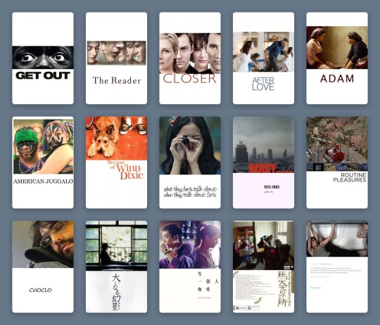
Comfort movies don’t own the white poster, of course. Jordan Peele’s Get Out toys, both in its marketing and its delivery, with the binaries of black and white. It’s deployed on-screen with sophisticated horror, and this extends to its two most graphic poster variants.
While one poster sees Daniel Kaluuya’s character, Chris, sat on a chair split vertically between black and white, the all-white poster allows only a center-frame letterbox to reveal Chris’s enormous eyes, accompanied by an all-caps type treatment. The vast expanse of white only makes the image more menacing, framing the claustrophobia so effectively. The landscape crop is a device that defines stern dramas as much as arthouse comedies, as documented by Haji Abdul Karim in their expansive list.
Haji Abdul Karim’s list of white-with-landscape-image posters.
But back in the ‘comfort’ realm, we’re seeing more and more that the marketing wants to have it both ways—the negative with the positive; the art house audience and the multiplex crowd. As genres blend, demographics collapse and audiences become more fluid, a film’s advertising needs to speak more languages.
Two ultra-comfort films from last year demonstrate this idea well. The poster for Judy sees a backlit Renée Zellweger finding her light, receiving her applause. Black is the key color, right down to the classic little black dress; the eye is drawn to the title, spelled out in red sequins. It’s showbiz, it’s drama. Though the film itself fudges a few of the more uncomfortable facts of the star’s story, it’s still honest about her addictions.
In the white-background version, which was more widely distributed, Zellweger, in a floral dress, turns away from the light. The name still sparkles, but in softened gold. There’s no less glamor, the stakes in the film are just as high, but she’s perhaps more accessible like this. The focus, as it was in the 90s, 80s, 40s, returns to the main event.
Greta Gerwig’s Little Women, too, played with dark and light. The indie queen released her previous film, Lady Bird, via design-conscious distributor A24, and Gerwig’s singular aesthetics promised that her Little Women remake would be worlds away from all the others. But when the first images for the film were released, the marketing campaign was questioned by die-hard Gerwig fans.

Both of the group posters are curiously stripped back, freezing Louisa May Alcott’s beloved March sisters in a moment. In the darker image, they gaze out a window, secure in their festive domestic bubble, but set on what’s beyond. There’s more to life, and the film, than this room. It feels more lush, painterly, certainly more dramatic.
Whereas the white poster, at first, seemed like a mistake. It took one of the first images teased from the film and just... dropped it onto a poster. The March sisters look as if solidified by clay, entirely undynamic and at odds with the fluidity and warm soul Gerwig had made herself known for in her filmmaking.
And yet, nothing matters more than these characters. Beth, Jo, Meg and Amy are holding each other, happy, each in their own favourite color, and there is nothing more to fight over. The white-poster alternative lets the 2010s viewer stay attached to the most important part of the film.
The lessons here? A white poster is a vital sign that you’re safe here. You’ve made the correct choice. Attention spans are dwindling, options are expanding, focus is difficult. The promise of a white frame tells me what matters, what is good, where I should place my time and my value. For now.
#movie poster art#poster design#film poster#film poster design#movie marketing#movie design#white posters#comfort movies#comfort films#letterboxd lists#Letterboxd#little women#judy#ferris bueller#disney#graphic design
12 notes
·
View notes
Text
MeTV Music
This can be a 'checklist of electronic music genres', consisting of genres of electronic music , primarily created with electronic musical instruments or electronic music technology A distinction has been made between sound produced utilizing electromechanical means and that produced using digital technology. If you are still having hassle figuring out the style, the arrangement of the tune might give you some clues. For instance in genres like chill-out and ambient there's a distinct lack of any structure, as the tune doesn't progress radically over its period. 7. Hennion A. The production of success: an anti-musicology of the pop song. Common Music. 1983 Jan 1;three:159-ninety three. A controversial term in hip-hop, many "conscious rappers" do not wish to be labeled as such. Nevertheless, www.Audio-transcoder.com there is no denying the importance of this subgenre, which promotes ideas such as information of self and consciousness of large-ranging social points. Many different subgenres accomplish the identical, however various rap (a better phrase) is labeled as such as a consequence of its smoother, extra laid-back production type.
Indian classical music is the only music that makes such an extensive use of, and offers such an importance to musical modes. In contrast to Western, Chinese language, South Asian and Japanese music, Indian music locations emphasis on the artist's interpretation of a particular mode and his personal model of singing, moderately than a flawless facsimile of a composition written by another person. Because of this, ensembles are very uncommon in North Indian music, though it is a crucial part of the South Indian Carnatic college of music.
Album sales have lengthy been a key measure of the recognition of particular person genres, and yr after yr jazz album gross sales continue to fall. Favourite among kids everywhere in the world, hip hop is likely one of the most popular modern genres of music. Hip hop music emerged as an offshoot of the hip hop movement within the Seventies. Centered in Bronx, the motion quickly spread to the remainder of the US, and hip hop music benefited from the growth, changing into one of the adopted genres of the Nineteen Seventies-1980s.
Other H-topics had been much more dynamic. Between 1960 and 2009, the imply frequency of H1 declined by about 75%. H1 captures the usage of dominant-seventh chords. Inherently dissonant (because of the tritone interval between the third and the minor-seventh), these chords are generally used in Jazz to create tensions which might be eventually resolved to consonant chords; in Blues music, the dissonances are sometimes not resolved and thus add to the characteristic ‘dirty' color. Accordingly, we find that songs tagged blues or jazz have a excessive frequency of H1; it is particularly widespread in the songs of Blues artists similar to B.B. King and Jazz artists similar to Nat ‘King' Cole. The decline of this subject, then, represents the lingering death of Jazz and Blues within the Hot a hundred.
Only a few classical musicians I've labored with have even heard of this idea of really feel, and even those with good rhythm do not obsess over it to the purpose that jazz musicians have to in order to obtain an anticipated stage of competence. So to a jazz musician, the classical musician's sense of rhythm can seem bafflingly substandard. The group had gathered to listen to the latest in digital dance music, so when a handful of bluegrass musicians shuffled onto the stage last March, they may as well have been astronauts-and virtually immediately, the blogosphere was abuzz with confusion.
The study contributors were recruited via notices put up in Marienhospital Herne and in the MA building on the Medical College at Ruhr College Bochum. We focused healthy volunteers, not sufferers. All subjects had been examined in response to a strictly outlined research protocol consisting of six phases ( eTable 1 ). The music sequences had been randomized before the beginning of the research by means of computerized random number generation. 60 subjects (30 males and 30 ladies) had been included within the intervention group, of whom half were youthful than 50 and the opposite half older than 50 years of age. The age and sex distribution of the management group was identical. Random allocation was undertaken before the beginning of the study by the principal investigator (HJT); the study physician (GV) admitted individuals into the examine and, on the study day, allotted them to the respective interventions (musical genres).
Just like the Gqom style aesthetic , Afrobeat has been round for some time. A mix of hip-hop, funky house, and native African music from London (through Africa diaspora), Ghana, and Nigeria, Afrobeat had originally been fairly restricted to elements of the African continent and the UK, but it's catching fireplace internationally. British-Ghanian artist Mista Silva's Murda" is a great instance of the Afrobeats vibe, which sounds nearly like a extra rhythmically and sonically various musical cousin of Reggaeton.

Hokum blues is basically blues music with sexual overtones. The genre was fashionable within the US in the Nineteen Twenties and '30s, particularly throughout Prohibition. On the time, there was a general belief that only people who engaged in sex, playing, or other questionable actions stored late nights. We began with our record of 1369 genres of music (and rising), sorted by popularity to deliver up the extra obscure ones at the bottom of the record. And then we plowed by means of in that order, plucking out those that sounded, nicely, strange to our ears, in terms of the music they had been describing in English.
1971 song Hocus Pocus was high within the charts in numerous nations. It was performed by Dutch progressive rock band Focus, made up of performers from the pit band for the Dutch production of the rock musical Hair. three) non-musical sound consists of unstructured noises (we call it noise). When was the final time Brittney Spears or Madonna gave you a free album on-line? 50 Cent helped to revolutionize the music biz by dropping free mixtapes, and ever since, hip-hop followers have gotten some actual classics and never needed to pay a dime. Tasks like Drake' s So Far Gone and Wiz Khalifa's Kush and Orange Juice have been literal presents.
Finally all songs that music style was both missing or unknown had been eliminated. Also all songs with invalid year enter (less than 1970) have been removed. HILBRUNER, M. (2015). "It Ain't No Cake Stroll": The Influence of African American Music and Dance on the American Cultural Landscape. Virginia Social Science Journal, 50 73-eighty. Common music in Kenya. The electric bass guitar imitates the melodies of the standard Kenyan eight-string lyre called Nyatiti. All things, good or bad, should come an finish, and music trends are no exception. Welcome to , and in the present day we'll be counting down the High 10 Music Genres That Died Out.

1 note
·
View note
Text
Seasonal Email Marketing Campaigns: How to Make Your Halloween Campaign Stand Out

The time of the year when marketers discuss the design of the first of the most important seasonal email marketing campaigns is approaching fast.
I am talking about Halloween, of course, the time when lovers of all things spooky rejoice. No brand or marketer in their right mind would pass up on the opportunity to capitalize on this time of the year - or any time that would allow them to utilize the seer power that is a seasonal campaign.

According to the graph above, Halloween is one of the most fruitful commercial holidays. 8.8 billion dollars was spent on this holiday in 2019 alone. So why not take a slice of those earnings by creating a fantastic Halloween campaign?
Let's see how you're going to use seasonal email marketing to achieve the ROI of your dreams.
Start Early
Create a strategy or campaign that will make your prospects engage and use all arrows in your quiver to do so.
Create an engagement scheme and start writing content that will serve as a little "treat" for the "tricks" you're going to pull, marketing-wise. Start early, around the beginning of October, and keep them hooked and waiting for your next move.
1. Create Halloween Contests
Start by treating your prospects to a spooky and fun Halloween contest on social media. A Halloween giveaway would be ideal. You could go about it the way Dunkin' Donuts did.

Dunkin' Donuts held a competition on its social media platforms and created a branded hashtag for it: #DDCostumeContest. Now, not many people would go as a donut for Halloween; however, this contest was a huge success. And the prize - a feature on the Dunkin' billboard on Times Square, a year's supply of coffee, and $2,500 to boot - really did help!
The point here is that the competition generated tons of exposure for the brand, a lot of user engagement, and made the act go viral, all by utilizing User Generated Content (UGC).
Your brand can follow this tactic and pair it nicely with an optimized landing page, created solely for the needs of the competition. If your prospects want to be updated on the winner, they may enter their email. And there you have a Halloween contest that generates leads that are already interested and engaging with your Halloween content!
2. Create Extended Offers
Starting early and extending your Halloween contest, offer, or "treat" is essential. For the following reasons:
Prospects have all the time they need to decide on what they want. Of course, you can use a countdown timer to instill some FOMO in them.
Halloween could be on any day. A busy Monday or a slow Thursday will rob you of the traffic that your offer could generate on the weekend.
It shows just how much you care and will make prospects remember you.
Again, you can build up the anticipation with some great social media marketing. Phrases like "Subscribe to our newsletter for more info" will create a curated, interested email list in no time!
Oh, and do not forget the themed code for the offer:

It shows your whimsical side and will help people connect with you and your content.
3. Build Halloween Campaign Suspense!
Is it a trick? Is it a treat? Is it a deal? Your prospects' only way to know the answer to those questions is if they interact with your emails.
Create a cryptic message you could share on your social media that will be leaving hints at an offer. And then, create an email sequence that will keep your prospects hooked and make them interact with your email:

Get users to interact with your Halloween campaigns with a game or an interactive quiz that will capture their attention.
Starting early with an email that doesn't say much and building up to the big reveal right in time for Halloween is something that will help your click-through rate skyrocket, as well as your traffic.
Create Content To-Die-For
The tips above are all fine and well, but you need one key element to make them work, and that would be wonderful email copy and great social media content that can match that copy.
And I've got some tricks that will help you reach the "treat" of conversion. Now a high-converting seasonal email marketing campaign consists of excellent email copy - from the subject line to the CTAs-, content that is highly relevant and appealing, and, of course, visuals that will stay in a prospect's mind for a long, long time.
1. A Themed Subject Line
Your brand won't be the first or the last one to send your prospects a seasonal email marketing campaign, which can only mean one thing for you.
You need to dazzle them with some great email subject lines:

This one is an example out of my inbox, and let me tell you, I was very curious about what "all treat" and "no tricks" really meant.
In that case, I opened the email and saw a seasonal offer that I rushed to grab. So, the example above shows a clever seasonal wordplay that is equal parts playful and intriguing.
Use that tactic to make your recipients feel a little interested and curious about your offer. And if it's a limited time offer, use a timer or highlight the fact right off the bat.
Super Pro Tip: It should be a given, of course, but never take a step forward before consulting your data and A/B testing everything. This practice will give you insight into the type of content prospects want to receive and help you make educated decisions, backed by data.
2. Halloweeny Look
Wondering how to write content for your Halloween email marketing campaign is one thing that you need to get out of the way, sure. But what about the campaign's "looks"?
Just because your campaign is seasonal doesn't mean that you need to change your email layout completely. On the contrary, you can use the design your prospects love, but with a little twist.
Change the standard colors for something more "spooky". Like this:
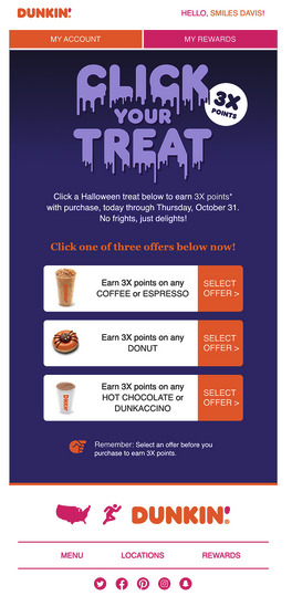
Dunkin's email is the perfect example, as the original font is right there, as well as the colors. However, there's some Halloween decor on this email: notice the dripping effect on the letters and the mix of Dunkin's original colors - pink and orange - with the more seasonal purple.
You can also create a different color scheme, depending on your target audience and the vibe you'd like your email to have: Be fun and classic with oranges, purples, and bats or creepy and horrific with greens, cauldrons, and zombies.
3. Fear Is Your Friend
You know how Halloween is all about fear and spooky things. Your Halloween email marketing campaign might be the only one you can build around fear, without making it unpleasant.
Of course, I'm talking about Fear Of Missing Out - or FOMO, if you will.
Use words that have to do with fear and being wicked and scary. Here's an email subject line to help set the mood:

No brand would use such language outside of Halloween, but at this specific time, it's appropriate and fitting. Not to mention that it brilliantly leads to the email body copy:

Offer's good "until midnight this Halloween," which is a pretty good reason to be scared, especially as a gamer. You see, creative copy for little offers like the one above keep customers happy and keep your CTR, traffic, and customer churn at the rates you want them to be. For more help here are 6 actionable steps to reduce customer churn on your ecommerce site.
4. Create a CTA That Takes the Cake
...Or the candy bar, whatever you prefer. The whole point is that your CTA needs to stand out and be as spooky and fun as the rest of your email.
Does this mean that it needs to be cryptic and overly creative? No. CTAs show prospects what their next action should be and lead them straight to your goals.
Don't swarm your email with copy, no matter your creative knack. Customers won't read all of your emails, but they will bother with three things: our subject line, email design, and CTA.
Go straight to the point when letting your readers know what you want from them. Of course, this doesn't mean that you have to be bland or boring. Check this CTA copy, and you'll see what I mean:

Also, don't forget to have one CTA button. Just the one. Otherwise, prospects will get a little confused about what your seasonal email marketing campaign is trying to do.
Honorable Mentions
Before I go, I'd like to remind you of some email marketing staples you need to implement on any campaign - apart from selecting the right email service, of course.
Keep a clean, well-curated email list. Unsubscribers can get you penalized, and the last thing you want is for your emails to end up in the dark corners of a spam folder.
Always segment your audience and create buyer personas and always consult your data before doing so.
Create responsive emails that will work correctly for any device. Mobile opens are taking over, and you don't want to miss out on that revenue.
Bonus: enjoy some best halloween ad campaigns and get some spooky inspiration!
Summing Up
Halloween is the holiday that marks the spending season, as Thanksgiving and Christmas follow soon after.
Don't be afraid to get creative and send out playful emails that can have a "magical" or "spooky" twist.
Just remember to adjust your tone of voice and copy, create a unique message, and save the prospect's time by not babbling too much in your email's body copy.
After all, the festive time of the year calls for presents and a little spending. Use the tips above, and you'll see that you can benefit from this.
About the Author

Téa Liarokapi is a content writer working for email marketing software company Moosend and an obsessive writer in general. In her free time, she tries to find new ways to stuff more books in her bookcase and content ideas-and cats-to play with.
from RSSMix.com Mix ID 8230801 https://ift.tt/3l00PXB
via IFTTT
0 notes
Text
Hands-On: Accutron Spaceview DNA Electrostatic Watch
For about 10 years in the 1960s, Bulova’s Accutron tuning fork-based watch collection was a star of the timepiece industry. Its popularity and impact on the timepiece market then remains something that collectors and industry folks still talk about today. The “open-view” dial that allowed viewers to see the movement of the original Accutron Spaceview watches was never initially meant to go into production. The open-dial versions of the watch were sales samples intended to help dealers understand that these were not traditional mechanical watches. This marketing exercise turned into a consumer success, and Bulova ended up mostly producing the open-dial Accutron Spaceview watches that collectors think of today.
Bulova re-released a limited-edition Accutron Spaceview a few years ago, which sold out and was very cool given that they needed to both reverse-engineer a tuning fork movement and hand-wrap each copper coil. Nowadays, Accutron is back again but in a slightly different way. The Citizen Group, which owns Bulova, decided to make Accutron its own new brand, officially launching in August 2020. The new Accutron brand will produce a series of traditional and modern-looking watches with an emphasis on the $1,000-plus price point for the “Accutron Legacy” models. More high-end at Accutron are the new Spaceview watches that all have a retail price of over $3,000. What’s the story there?
The most important thing to say is that Accutron will not be focusing on tuning fork electronic watch movements. Rather, the contemporary Accutron Spaceview watches (such as the Spaceview 2020 and the Spaceview DNA models) will have a new movement that is visually reminiscent of the old tuning fork watches but is actually a novel “electrostatic” system that I’ll talk a bit more about below. The Spaceview 2020 watches are meant to look a bit more classic, while these Accutron Spaceview DNA watches have more of a futuristic vibe, the idea being that whereas the original Accutron Spaceview watch was very modern in 1960, the Spaceview 2020 and Spaceview DNA watches are intended to similarly capture the hearts of enthusiasts today.
Bulova’s Accutron Spaceview watch had an amazing run until the late 1960s when quartz-based electronic watches debuted. While both tuning fork and quartz movements use batteries, their regulation systems are distinctive. Tuning fork movements are best known for their sweeping seconds hands and slight buzzing hum that comes from the movements themselves. Quartz watches ended up offering both better battery life and timing performance.
According to Accutron, the new electrostatic motor movements in the Spaceview 2020 and Spaceview DNA movements required about a decade of research and development to make, probably via engineers in Japan (which is exactly who I want designing my electronics hardware, to be honest). So what is an electrostatic movement, anyway? This is gonna take a bit of explaining… OK, so let’s begin with the premise that the movements are quartz-based in terms of the regulation system and are powered by a battery. Only the battery doesn’t need to be replaced because it is recharged kinetic energy. In principle, this is similar to Seiko’s rotor-charged Kinetic quartz movements. This is something a bit different.
The Spaceview electrostatic movements have two small turbine-style rotors that move with the motion of your wrist to create energy. They do this not via a directly connected gear that turns a traditional generator. Rather, they create electrostatic energy which is then captured via dual electrodes and sent to an accumulator, which is where the electricity to power the timing system comes from. I’ve not worn the watch, so I really don’t understand how it performs in terms of battery life (Accutron isn’t really talking about that right now). Accutron does, however, promise accuracy of within five seconds per month — which is about two to three times more accurate than standard quartz movements, though it is not as accurate as the Citizen Caliber 0100 (more high-end) and the Bulova Precisionist (more affordable), which are both part of the same company.
So, why Accutron Spaceview Electrostatic versus other quartz watch movements? It looks cool… Citizen Group is going for an emotional play with the Accutron Spaceview DNA collection. The brand must agree with me that high-end quartz is about to have its heyday among timepiece enthusiasts. What collectors will seek in a high-end quartz movement is visual and intellectual splendor. Just look at the complex and animated dial of the Accutron Spaceview 2020 and DNA watches, and you’ll agree they are nifty. I just also wish the movements came with a more “and Accutron has now solved this problem” engineering story. I’m saying that I want to enjoy the Accutron Spaceview 2020 as a tool as much as a piece of art — just as consumers were able to do with the Accutron Spaceview 1960.
Accutron isn’t under any illusions — the new brand and its flagship movement are going to take a few years to really sink into the watch consumer market. These days, the watch industry is a mixture of products intended to make snappy sales with short-lived appeal and those with a more long-term approach where a new product requires a few years to truly gain momentum with enthusiasts. Accutron has no short-term play here outside of common watch collector novelty value. The Spaceview 2020 and DNA watches, while imminently cool, are also unfamiliar technically and don’t currently fill any particular market gaps. That translates into a lot of effort needed to first reach and then educate consumers. None of that happens quickly under normal circumstances, and in a world where physical interaction with other watch lovers is on hold for a while, Accutron will be deprived of seeing these interesting watches in action.
Seeing the Accutron Spaceview DNA in person is important because the dial really comes to life when you see it in operation. Bulova wanted to maintain the emotion of tuning fork movements given the sweeping seconds hand. There is also one of the spinning dial turbines that spins as the seconds elapse. Seeing the dial in operation is probably the best part of the Spaceview for 2020 watches, in my opinion.
Detailing for the dials themselves is pretty good. Then again it should be for this price range. The green colors of the Spaceview 2020 watches are reminiscent of the popular originals, while the Spaceview DNA watches use a similar dial design but with a slightly expanded color palette. The rear of the watch is a bit less spectacular. It doesn’t lack design, but rather is a simple solid caseback with a couple of turbine-style ring motifs.
In the future, I’d like to see Accutron engineer a more symmetrical version of the Spaceview dial. I feel this request is acceptable to make at the outset since one of my favorite things about the original Accutron Spaceview watches was, indeed, their dial symmetry. Here, Accutron goes more modern and masculine-rebellious with the style — a look certainly right for some but one that will leave other timepiece traditionalists waiting to see something in the future from Accutron that is intended to match their particular sensibilities.
My primary concern with both the Accutron Spaceview 2020 and DNA watches is the relatively large size of the cases. It isn’t that they are too big, but the proportions are sort of funny on them. My understanding is that this has to do with the size of the movement itself (known as the caliber NS30-Y8A), which case and dial design need to work around. The Spaceview 2020 is going for a more oversized retro case look and is 43.5mm-wide. The Spaceview DNA is even larger at 45.1mm-wide and 15.41mm-thick. Normally, that would not be an issue — but the lugs with integrated strap assembly jut out quite a bit, making the Spaceview DNA watches wear visually quite larger on small- to medium-sized wrists. Those with larger watch tastes and a penchant for quirky and cool electronic toys will certainly get a big kick out of the Accutron Spaceview DNA.
The cases are all steel and offered with various coatings. The various-toned movement dials are topped with a unique domed sapphire crystal, which, despite being AR-coated still has some unavoidable-with-this-crystal-shape glare. At launch, Accutron offers the Spaceview DNA watches as the reference 2ES8A001 (natural steel case with green dial periphery), 2ES8A002 (rose gold-toned case with black dial), 2ES8A003 (mostly black case and dial), and the 2ES8A004 (natural steel case with blue dial).
Accutron is a promising concept that has a ripe market to enter when it comes to interesting watches like this within this price range. It will be up to Accutron to painstakingly explain to consumers why they should care about electrostatic-powered movements and that their design ethos and history is cool. Accutron of today loves showing off the segment from the AMC network television series Mad Men, for which the show’s writers created an actual ad concept for the Accutron of yesterday. A key phrase from the ad is “Accutron: It isn’t just a timepiece, it is a conversation piece,” and this seems to be what drove the creation of the new brand concept and how to position it. It will certainly require a lot of conversation to explain what the Citizen Group has done here, but it should be worth consumers’ time to stick around and give Accutron a chance to demonstrate what it is all about. Price for the Accutron Spaceview DNA watches is $3,300 USD each. Learn more at the Accutron website here.
The post Hands-On: Accutron Spaceview DNA Electrostatic Watch appeared first on Wristwatch Journal.
from WordPress https://ift.tt/3jbtV5s
via IFTTT
0 notes
Text
The Best Drinkware For Sipping By The Pool
As far as we’re concerned, it’s not really summer if you’re not constantly sipping your favorite beverage by a pool or next to a body of water. It’s the dream, the epitome of easy summer living.
But, like so many other dreams, reality can all too quickly set in. Glass near the pool or on the boat is a major no-no, so your drinkware should be shatter or break-resistant. Plus, our favorite summer drinks warm-up before we’re done, with the ice melting so rapidly that that perfectly-crafted cocktail is now just the fleeting memory of a Negroni. You deserve better.
Here is the drinkware you need to live the summer dream of enjoying an IPA or Pinot Grigio, without millions of glass shards covering the ground when someone gets a little too excited.
Cooler than Cool Chilled Pint Glass
While the optimal serving temperature for most beers is probably a little warmer than most of us drink them, the pleasure of a frosty beer on a hot day can’t be beaten.
That’s why we drink all our summer beers out of the Cooler than Cool Chilled Pint Glass, which keeps all 16 oz of whatever’s in your glass at the proper chilly temperature. Simply throw it in the freezer ahead of time, then when you take it out, the proprietary gel inside the BPA-free plastic glass will do the rest of the work. The silicone band makes for comfortable holding without letting your hand warm up the glass. Warm beer, begone!
See The Pints Now!
Cactus Drink Tumbler
If you’re plotting your pool cocktail TikTok or Instagram post, you’ll obviously need a fun, colorful vessel from which to drink like the pool celebrity that you are. This Cactus Drink Tumbler, made from BPA free plastic, is it. Fill it with 16 oz of your favorite liquid and take it wherever your presence is requested. Sip from that cute pink reusable straw and let the cameras capture your magnificence.
See The Tumbler Now!
Cooler than Cool Chilled Wine Glass
When you bring your white wine or gluggable reds outside, it’s important that they stay chilly. That’s why we’re obsessed with these Cooler than Cool Chilled Wine Glasses. Keep them in the freezer so they’re ready when the moment strikes, then the proprietary gel inside the BPA-free glass will keep your Sauvignon Blanc or Beaujolais cold for as long as you’re enjoying them. Just hold onto the insulating silicone band and enjoy your wine on your timeline.
See The Glasses Now!
Pineapple Drink Tumbler
Every body is a beach body, but not every tumbler is a beach tumbler. This Pineapple Drink Tumbler, though, gives off the perfect “vacation from my vacation” vibes as you’re sipping your cocktail by the beach or pool. It holds 16 oz, is made from BPA-free plastic, and is simply delightful. Perfect for on-the-go drinking or to keep around for when tiki time hits.
See The Tumbler Now!
Cooler than Cool Chilled Smoked Whiskey Glass
Maybe you’re the kind of pro drinker who likes a cold glass of whiskey by the pool. Well done, friend. You’ve got some real Ron Swanson vibes and we like it.
May we suggest this Cooler Than Cool Chilled Whiskey Glass to keep your dram properly chilled without diluting the magic within? After throwing the glass in the freezer for a few hours, the proprietary gel inside the walls of the BPA-free plastic glass will keep your Suntory, Laphroaig, or Bulleit frosty all day or all night long. Take a hold of the cushioned, insulating silicone band, and enjoy your evening.
See The Glasses Now!
Disco Ball Drink Tumbler
Make sure everyone knows that you’re dance floor royalty with this Disco Ball Drink Tumbler. It holds 16 oz of your favorite beverage in its shimmering BPA-free plastic walls, comes with a reusable straw, and brings the party wherever you go.
See The Tumbler Now!
The article The Best Drinkware For Sipping By The Pool appeared first on VinePair.
Via https://vinepair.com/picks/best-drinkware-for-pool-2020/
source https://vinology1.weebly.com/blog/the-best-drinkware-for-sipping-by-the-pool
0 notes
Text
Tyler Adams believes New York Red Bulls building mentality to win MLS Cup
USA Today Sports
September 20, 20184:14PM EDT
HANOVER, N.J. – Before he left for RB Leipzig this past summer, former New York Red Bulls head coach Jesse Marsch said that he believed this was the best team he had coached since taking over in 2015, a team that he believed had the goods to make a run at MLS Cup.
And in the eyes of the team’s brightest young star, this Red Bulls team has that certain moxie to go after the league’s biggest trophy.
MLS Cup has evaded the Red Bulls since they began play as the MetroStars during the nascent year of MLS in 1996, with only one trip to the championship match in the club’s history. Tyler Adams thinks that this group can make it happen, that this Red Bulls team can defy the weight of history and bring elusive silverware to Red Bull Arena.
Linked by reports to a move to Europe, possibly as soon as the winter, Adams has been a vital part of this year’s successful Red Bulls team. An MLS All-Star, Adams has also entrenched himself in recent months with the US men’s national team.
He looks at this team, its depth and experience and feels that this could be the time an MLS Cup is captured to go alongside the two Supporters’ Shields lifted in recent years.
“I think there is pressure every year, you want to win MLS Cup if you’re a team that you know, develops into a team that has an opportunity to win one and the games go up to that – a lot of pressure comes,” Adams said following training on Thursday.
“I think that we have to find a way to deal with that. Obviously not having an MLS Cup here quite yet puts pressure on us to bring one to the city. I think the club deserves one, obviously we’ve tried to get a team that deserves to go all the way. We just haven’t had that the past years. I think this year is definitely a team that is young, hungry. Just really a refreshing vibe to the team that we the players and the collective group attitude to go out there and win one.”
Earlier this year, Adams was a key part of the Red Bulls’ run to the semifinals of the Concacaf Champions League. That run, including a big win at Tijuana in the quarterfinals, helped give this young Red Bulls team confidence for the season ahead.
Saturday’s opponent at Red Bull Arena (5 pm ET | TSN — Full TV & Streaming Info), Toronto FC, advanced to the tournament’s final. But since then, they’ve faced a downward trajectory and could be eliminated from playoff contention in the coming weeks.
Where Toronto’s Champions League run ended in not just misery but seemed to carry over into their MLS regular season, the Red Bulls instead were lifted by the results and took confidence into the season.
There is a feeling that the Shield triumphs, the CCL run and an appearance in the U.S. Open Cup final last year means the Red Bulls are building to something truly special in their quest for MLS Cup.
“I think you look at the U.S. Open Cup…last year now. Win all those games to make it to the final, we just haven’t been able to get over that last hurdle now. I think in big games, we’ve definitely been able to grow lately,” Adams said.
“The past couple of games obviously haven’t shown that but we’re a team that thinks, collectively that we’re a team that wins when you need to. And I think that is the most important thing come playoff time.”
<!–
Stay connected: Get access to breaking news, videos, and analysis from North America’s best soccer reporters via “This Week in MLS” newsletter or using our FREE mobile app.
–>
Stay connected: The all-new, completely redesigned, FREE official MLS app is your best mobile source for scores, news, analysis and highlights. Download: App Store | Google Play
#block-block-188 {padding:0;} #stay-connected {border-top:1px solid #ebebeb;margin:20px 0;} #stay-connected p {margin:0;color:#4d4d4d;line-height:1.5em;} @media screen and (max-width: 730px) { #stay-connected {padding:8px 6px 0 6px;width:100%;} } @media screen and (min-width: 731px) and (max-width: 1120px) { #stay-connected {padding:8px 6px 0 6px;width:100%;} } @media screen and (min-width: 1121px) { #stay-connected {padding:8px 6px 0 6px;width:708px;} }
MLSsoccer.com News
Tyler Adams believes New York Red Bulls building mentality to win MLS Cup was originally published on 365 Football
0 notes
Text
10 Of The Absolute Best Songs From U-KISS

August 28th marks the anniversary of idol group U-KISS! In fact, this talented group is celebrating their 10th anniversary since debut.
U-KISS is a special group to me. They were one of the "first" idol groups for me in many ways. They were the first Kpop group I ever saw in concert. They were one of the first groups I ever stanned. Their press conference was the first one I ever attended as a reporter. They were the first group whose fandom I ever officially joined. They were the first group I ever bought merchandise from, and they were also one of the first groups that taught me exactly what it feels like to have a bias (Hello, precious Kevin!) and a bias wrecker (Still looking great, Eli!).
As such, U-KISS was an important part of my life and a group that I will always think about with great fondness. Although more groups have entered my life since I first began to love U-KISS, there is no doubt I will always have a special place in my heart for all the wonderful members and their countless, amazing songs.
To celebrate 10 years with this influential and talented group, let's look back at ten of their very best title tracks. Since they have so many Japanese releases as well, we will focus on Korean title tracks instead. They are listed in no particular order.
1) "Believe" - 2012
Want a great song that seems to capture the very sound that drew so many people into Kpop around this time? Look no further than U-KISS's "Believe." Mixed with a bright, electronic sound on the beat, their strong vocals and rap lines will still have you singing your heart out all these years later.
https://www.youtube.com/watch?v=P_E0J2WIfw0
2) "0330" - 2011
This is an iconic U-KISS song that will bring a rush of sentimentality to fans as they listen. In fact, I may or may not have teared up watching this MV as I put together this list. For fans, this song will never get old and will forever remind them of one of U-KISS's best eras.
https://youtu.be/h1zOhQQpw6U
3) "Neverland" - 2011
"Tell the DJ turn it up up up and da-da-dance a little more." If you can listen to this song without dancing, then I seriously wonder if you're even a Kpop fan at all. The perfect visuals! The dramatic makeup! The difficult dance! The fun beat! The catchy English lyrics thrown in so international fans can sing along too! This, ladies and gentlemen, was the golden era of Kpop at its finest.
https://youtu.be/n3dF0Y7deb0
4) "Stop Girl" - 2011
Although "Neverland" may arguably be U-KISS's most famous song, "Stop Girl" is still one of their best! A sexy, hard beat balances out their smooth, clear vocals and gave birth to a new, mature sound for the amazing group. In fact, that strong beat still has such a modern sound that it is still relevant and perfect for Kpop fans today. Add in the crisp music video and you have one of U-KISS's best projects! Fun fact? They also released this song in English!
https://www.youtube.com/watch?v=d_AwyTp9qb0
5) "Man Man Ha Ni" - 2009
Ah, 2009... what a year! Back in this classic era, Kpop music videos might not have had the technology to be super high quality like the videos of today, but they made up for it with amazingly outrageous hair, outfits, and terrific dance songs that were made to get stuck in your head for days. Listen to this song and you will instantly be transported back in time.
https://www.youtube.com/watch?v=04v7dRrHvbg
6) "Bingeul Bingeul" - 2010
Since U-KISS is primarily active in Japan these days, many newer Kpop fans might not be that familiar with them. If someone were to ask me what their sound was like in early days, I'd tell them that it was a mixture of a young G-Dragon, classic 2NE1, and Brown Eyed Girls. As with most older Kpop videos, it can be hard to find the MVs in HD quality, but this is still such a fun video to watch. This was also one of their first songs to get really popular in Korea, with many other idols doing the dance on variety shows.
https://www.youtube.com/watch?v=CtLWGX5yHFs
7) "DORADORA" - 2012
In 2012, U-KISS came for me hard with this deliciously sexy song. Six years later, this song is still a bop and the dance still makes me go crazy! If you don't believe me, check out the choreography for the chorus (thank me later!). "DORADORA" is probably the most quintessential U-KISS song out there and still a fan favorite. Watch it below!
https://www.youtube.com/watch?v=8vfiaNtF9B4
8) "Standing Still" - 2013
"Standing Still" is and forever will be my all-time favorite song from U-KISS! The music video is also a lot of fun and still keeps my attention today, even after seeing it too many times to count. From maknae Dongho's cool, man bun hairstyle and dramatic makeup (still squeal-worthy!) to Kevin's sexy moves front and center for the choreo, from Eli's stunning visuals and gorgeous hair color to AJ's deep, throaty rap, I will never get tired of this MV or song.
https://www.youtube.com/watch?v=bOPHIx81bQE
9) "She's Mine" - 2013
U-KISS has always been known for their great, smooth vocals. As such, it made sense that they focused on vocals and just added in rap features for most of their tracks. With "She's Mine" in 2013, however, they changed things up completely! Leading off with fierce raps, they later transitioned to simpler vocals in the second part of the verse before adding in layered harmonies on the chorus. The sound was fresh, unique, and very sexy, and the result was a song that could easily be played on radios today. In fact, the layered and close harmonies style is something you still hear a lot of medium-tempo tracks from groups like BTS and GOT7.
https://www.youtube.com/watch?v=lL2Gasb6QTg
10) "Quit Playing" - 2014
"Quit Playing" (also known as "Don't Flirt" or "끼부리지마") was something of a shocker for fans when the video was released. The slower track had a very sensuous vibe— something that was further emphasized with the seriously sexy music video. With this video that pushed the limits in Korean music (they even featured a threesome!), U-KISS was making sure everyone knew they were now grown men and more mature, but they were still one of the most relevant groups in Kpop at the time.
https://youtu.be/r0pJ-mBHiV0
BONUS: "Stalker" - 2016
With such amazing vocals and great talent, why not show them off? That's exactly what U-KISS did in 2016 with their song "Stalker." The song had another great beat and dance to hook fans, but the special part of the song came via the vocal chops of members Hoon and Soohyun. While Kevin was almost always the most recognized vocalist of the group, Soohyun showed everyone he was a power to be reckoned with when he hit those clear, strong high notes towards the climax of the song. In addition, this was teir last Korean music video to be released and the last video to feature Kevin. As of yet, they have not made a comeback with the remaining members.
https://www.youtube.com/watch?v=3pN7REpLn3I
The years have brought many changes, but U-KISS currently has five active members. However, Jun is currently promoting as a member of the temporary unit UNB, and Soohyun is now serving in the military (with others soon to follow). With various other things happening in the members' lives, we don't know when we will next see a release from U-KISS. However, we do know that fans continue to wait for them and the great music they will undoubtedly provide.
To continue the celebration, click here to watch a special V Live broadcast from the members!
To all the current members (Soohyun, Hoon, Kiseop, Eli, and Jun) and the past members (Alexander, Kibum, AJ, Kevin, and Dongho), I want to say a personal thank you for being such a huge part of my own Kpop journey!
Congratulations to U-KISS for 10 amazing years since their debut! We wish you all continued success on your own music journeys!
lee1086 is the co-founder and director of What The Kpop. When not writing or editing articles, she is watching Kpop music videos or Korean variety shows. She is a huge fan of Super Junior and the perfection known as Eunsihae. She also loves EXO, SHINee, BIGBANG, and many more. When not obsessing over the flawlessness of Donghae or trying to decide if her SHINee bias is Taemin or Key, she is playing the piano, loving on her dog, and hanging out with her family and friends
Media: As Credited
Read the full article
0 notes
Text
A look inside 3D design: what goes into it and where its headed
When you’re looking at a photo that just looks a little bit too perfect, or a little bit beyond the range of normal—an object or a landscape that’s in uncanny valley—there’s a chance you’re not looking at a photo at all. You could be looking at a hyper-realistic 3D design like the ones Willem Stapel creates. That’s not to say 3D designers can’t create images that are indistinguishable from photographs, they can, but the magic of 3D design is the ability to push images beyond the realistic and onto a new, magical plane.
Via Willem Stapel.
To say we’re impressed with Stapel’s work would be an understatement. We’re huge fans, and when we recently got the chance to pick his brain about 3D design and his creative process, we ran with it.
Stapel got his start in 3D design while he was a graphic design student at Hogeschool voor de Kunsten in Utrecht, Netherlands. He began by playing around with 3D modeling software and says that’s all anybody with an interest in 3D design has to do to get started. It’s not the only way to learn 3D design, though. Colleges and universities all over the world offer courses in this type of design and for the less matriculation-minded, there are countless online tutorials that explain beginner and advanced techniques.
So what is 3D design all about and where is it headed? Keep reading to find out.
3D design explained
—
Via Willem Stapel.
So we’re on the same page, here’s the quick and dirty on 3D design:
You’ve seen Toy Story and other Pixar films. Those were made with 3D modeling software. 3D modeling software is the type of program that makes it possible for a designer to craft complex, detailed three-dimensional digital objects and worlds for them to inhabit. Images created with this type of software can be as realistic or as cartoony as the designer desires. For a more realistic film example of 3D modeling in action, think of Avatar.
The software provides a simulated 3D space where the designer can create objects by plugging coordinates into the program and then manipulating the shapes their coordinates create. If this sounds like geometry class to you, that’s because it kinda is—3D modeling is a blend of geometry and design visually represent the images specific coordinates map out. Often, designs start as basic polygons that designers refine into complex shapes using the tools available in their chosen software, like tools that create spline curves and tools for crafting non-rational b-splines (NURBS).
Different 3D modeling programs offer different tools, and some are better suited to designers with specific styles and design applications than others. According to Stapel, “CAD is usually used for things that are more industrial, like architectural or industrial designs. 3D meshes are usually a bit more free form, but can also be something very technical.”
A few popular 3D modeling programs include:
AutoCad
Blender
SketchUp
Zbrush
Stapel’s program of choice is Cinema 4D supplemented with a few plug-ins and side programs.
“3D design is still in an experimental space”
—
Via Willem Stapel.
Which means anything is possible. In his work, Stapel plays with bold colors and lighting choices while incorporating inspiration he finds in classical compositions and ancient art themes.
Right now, 3D design is more popular in commercial art than you probably realize. Car companies use 3D modeling in commercials regularly because it’s cheaper, easier, and when a commercial calls for extreme driving, safer than having an actual driver model the car’s capabilities.
“It could eventually replace a lot of photography, which it is already starting to do,” Stapel says. “If you look around in commercial and artistic fields there’s loads of 3D work cropping up.”
You’ll notice a lot of Stapel’s work involves furniture designs. Functionality is one of the hallmarks of 3D design: you can use it to render models of products in development and hash out ideas to see how a piece can work in a space. Also, one common practical use for 3D modeling is studying car accidents by recreating them in digital worlds.
Where is 3D design headed?
—
Via Willem Stapel.
People want to realize hyperrealistic aesthetics. To create impossible sceneries and make them reality.
- Willem Stapel
Stapel predicts a big change coming as more and more people discover what you can do with 3D design. “The first tendency of everyone in the art space seemed to be gimmicky ‘post-internet’ imagery but now you see that people want to realize hyperrealistic aesthetics. To create impossible sceneries and make them reality. Trends I personally really enjoy are photorealism in extreme ways, more complex implementation of 3D scanning techniques, and applying these innovative techniques in new ways and contexts,” he says.
There’s a huge element of functionality that transcends the ‘design’ appeal. 3D design can be used to actually make things, to create things efficiently that in the past might have been difficult to create.
Probably one of the coolest ways people are using 3D design is using it to make things, like how designer and inventor Markus Kayser created a solar-powered 3D printer that can turn desert sand into glass objects. Functional 3D design has applications in many different fields, and as Stapel says, “beyond having a place in the arts, there’s application to the health sector, industrially, and hopefully for environmental purposes eventually.” Exciting things lie ahead in the world of 3D design.
Finding inspiration for 3D design
—
Via Willem Stapel.
Although having formal design training never hurts, Stapel explains that he doesn’t think it’s a necessity for a successful 3D designer. What matters is to follow inspiration and to develop a vision. “Some people focus intensely on the technique and are extremely talented in that aspect, while others specialize in the making of a picture as expression of their artistry. I have a graphic design background and was interested in the history of the arts, which I wanted to combine and translate through contemporary techniques,” he says.
Personally, Stapel looks to classical designs for inspiration for his work. “I enjoy the themes being used since they’re always ancient stories, narratives, and themes which really lend themselves to contemporary reimagination. On a granular level, there’s something to the color schemes, the classical compositions, lighting, the materials”.
I enjoy making sceneries that look like someone has just been there.
- Willem Stapel
“I started with 3D by making imagery inspired by themes in ancient art, all reinvisioned with the help of 3D scans and 3D objects. This is still a big influence on my work. I enjoy making sceneries that look like someone has just been there. To also add the things that makes something real, the stains on a glass or a little rust on metal.”
Lately, Stapel’s been riffing on a post-human vibe in his work. By combining modernistic buildings with more classic designs and robotic objects, he creates surrealistic images.
Professionally, he aims for simplicity. You’ll see this in his website—the images define his brand and make it easy to know immediately what the viewer’s in for. As he sums it up, “let the aesthetic of the work speak for itself and translate into a visual identity.”
Via ManvsMachine for Squarespace.
Even a successful designer like Stapel has industry heroes they look toward and aspire to be more like. When we asked him who he looks up to, he responded, “there’s a couple of established companies and agencies who create beautiful commercial stuff like ManvsMachine (London & Los Angeles), Builder’s Club (London), and CATK (Berlin). I’m quite a big fan of the work of Frederik Heyman, whose work is a sort of post-apocalyptic renaissance by animating stills captures from 3D scanning.”
Stapel strives to strike a balance between his commercial work and his personal art. “I have more ideas than I have time to execute,” he says, “but it’s important to me to continue developing as an artist.”
How designers can get started in this field
—
Like Stapel said, all you really have to do to get started with 3D design is get on a computer and start playing around with rendering software. But playing around will only take you so far. 3D design has a bit of a steep learning curve, and to those who are serious about becoming 3D designers, Stapel recommends the following:
Learn how to do this and much more via GreyscaleGorilla.
“There’s a lot to be found on Youtube, or if you have a certain problem there’s always Google, as obvious as that seems. I think I started out with the tutorials from greyscalegorilla, who teach a lot about the basics of the program. There’s also amazing tutorials from the ENTAGMA, but those are all for Houdini, which is a more advanced 3D software.”
Achieving professional success as a 3D designer
—
Getting good at design is only one part of becoming a professional success. The other half is finding clients who’ll pay a fair price for your work and maintaining a steady workflow.
According to Stapel, a designer’s portfolio is key to landing and securing work: “In art school you learn not only to discover but also to develop your own style into something that works commercially and artistically. It’s subtle things like color palettes, lighting and mood, use of material, et cetera. It takes work to get work, and I’m lucky to have people approach me because of the portfolio I’ve built for myself. It’s a huge advantage to work with clients who are drawn to your established style, so emphasis on the portfolio is key.”
Technique is part, but not all, of building a strong portfolio. “I think figuring out what technique works best for you without being a slave to the technique. Let the technique work for you. But that’s true outside of design: painting with perfect technique doesn’t necessarily make you a good artist.”
Whether it’s worthwhile to do unpaid work for exposure is a controversial topic among creatives. For Stapel, it paid off. “I started to get commercial jobs because of the unpaid or autonomous work I already did. The commercial work gave me more insight on techniques and certain new-to-me aspects on how to create something beautiful, really broadening my horizon.”
Living and working as a 3D designer
—
Becoming a freelance 3D designer may be a challenge, but it offers amazing opportunities. “I love working with a broad variety of people, being able to create things that I love, and being my own boss,” Stapel says, reflecting on the freedom he has to travel and work from anywhere as a freelancer and the variety of clients he’s exposed to in this position. “It’s a wonderful life, to be honest.”
3D design is everywhere, and as a 3D designer, Stapel works primarily with photographers. As for the industries he’s designed for, everything goes. 3D design can be as technical or as freeform as a designer needs it to be.
Discover the magic of 3D design
—
What Stapel wishes more people understood about 3D design is how satisfying it can be for a creator. “It’s honestly pretty magical,” he says. “Every time I push the render button it’s a bit of a surprise what will come out. It’s extremely satisfying to create something that looks really realistic but is completely fabricated.”
The world of 3D design holds vast potential for designers and brands alike. Whether it’s hyperrealistic objects or surreal landscapes, anything is possible. What will you do with it?
Want to see more amazing 3D designs by professional designers?
Right this way.
Let's go!
The post A look inside 3D design: what goes into it and where it’s headed appeared first on 99designs.
via 99designs https://99designs.co.uk/blog/design-history-movements-en-gb/a-look-inside-3d-design-what-goes-into-it-and-where-its-headed/
0 notes
Text
Receding Shores by OrcaWolfy
Story link.
Title (3.5/5)
I really, really like this title. The moment I saw your title on the form, I was so excited to read the story. It sounds sophisticated and elegant, yet mystifying and captivating. I have a thing for titles that have an allure of sophistication without revealing anything and I find that your title is exactly that. I think it has potential for a lot of different plots. I would definitely give the story a try if I were to browse around and find it by accident. However, even though it’s a good title to me, as of now, I feel like it has yet to relate to the plot of your story (other than the fact that the setting is mainly at a beach hence the word “shores”). I’m sure if the story was completed and if I knew exactly what the plot was going to be about, I could go more in depth about it. Since there are only five chapters published, I can’t say much about the relevance of the title to the story. A thought that the story will be giving some slices of angst in between romance came to my mind when I first looked at your title, although I’m still uncertain whether or not I was completely right since your story is still on-going and the tags only hint it to be a romance and friendship story that is fluffy and smutty. I believe that you have everything planned and organized, therefore I hope to see how you will develop the plot and relate it to the title.
Anyway, I also would like to mention that I LOVE your chapter titles. They are simple yet lovely and invoking to me. The titles are perfectly tied and connected to your chapters so I just had to give an extra point for that even though they aren’t really a ‘title’.
Description & Foreword (7/15)
First and foremost, this section will mainly be focused on the description as there isn’t much more than pictures of your characters and credits in the foreword. To be quite honest, the description is not something that would grip my interest. The reason for that is because, to me, the description is too plain and it didn’t spark my curiosity like how a description should when I first read it. I have to be honest that the one thing I like from your description is the simplicity of it. You phrased the whole sentence with the proper length and wording. Its short and blunt content reveals the main idea of the story without spoiling anything; that’s what I think you did a good job of. However, like I said earlier, the description is not entirely captivating. The impression that it first gave me failed to grip my interest or spark my curiosity to read your story. First impressions are really important. Your title gave me a good first impression but your description didn’t. Also, the description says, “Together, no competitions, just friends. Maybe lovers even.” From here we can assume that the story is going to be about the friendship and eventual romance between the members of BLACKPINK and 2NE1. I can see the relation between the description and your tags. However, even when the story seems to be about friendship and romance, I feel like the latter is more emphasized. There are already five chapters published but I barely see that friendship you meant in both your tags and description. I wish we could see more of the friendship stuff before jumping into the romance part. This might also have to do with the fact that your story is still in its early stages, so I hope there’s an improvement as the story progresses.
Then there’s the foreword where there isn’t anything else but pictures and some credits. I don’t mind them but I don’t think it is sufficient to not include something else in the foreword, like maybe, an excerpt from your story that can lure the readers in more. A description is supposed to attract readers, and the foreword is supposed to support the description. Both descriptions and forewords are there to capture people’s interest to read the story. When your foreword only consists of what you have right now, it doesn’t really reach its purpose of supporting your description. Please use the advantage of forewords to support your descriptions. Either an excerpt or a short preview. Even a simple quote that is relevant to the plot would be great.
Overall appearance (3/5)
I think the overall appearance of your story is nice. The font and size are just right, and the poster and background are really pretty. However, I have to admit that the poster and background lack some spark to them. They don’t really set off the mood and tone of the story well. From what I’ve gathered, the story is quite light and romantic with some depiction of drama in the plot. Unfortunately the poster and background do not portray that dramatic and liveliness ambience of your story. The colors are too gloomy for a story like yours. I did say that your title gave me an angsty vibe but after reading your story I don't think angst is part of your genre, yet both the poster and background appear angsty, which is why I find that they don’t fit your story at all. You did mention in the form that your story is slight angst but the colors of the poster are still a bit too dark even for a slight angst fic. Besides that, I’m also annoyed that the poster fails to portray your character personalities. Maybe because it’s hard to make a poster of eight characters and it’s easier to use pictures from official pictorials for a poster like this. However, I feel like it’d be a lot nicer if the character personalities are properly conveyed in the poster. In your story, the BLACKPINK members are mostly cheery and childlike while the 2NE1 members are mostly mature and sophisticated. I wish these traits could be seen in the poster because that’s what posters are for. In fact, the character layout portrays your characters and story better than the poster does (kudos to the designer). I know that you didn’t make your own poster so it’s really not your fault. If you’re willing to request for a new graphic, I suggest one that is mixed with a whole lot more light romance/drama qualities. The poster and background are nice to look at and very aesthetically pleasing but they don’t do your story justice so I’m really sorry if I’m being too critical right now.
I would also like to talk about the way you organized your foreword. I’m sorry but the way you put the pictures and credits look a bit chaotic. It’s not a problem if you view the story on computer but it looks crowded when you view the story via phone. I can see your effort in making your foreword look pretty, and it is, but try to make it look neat. Also, try to separate the character layout from the credits, maybe make a bigger spacing in between or just insert a horizontal line. Whatever that can make your foreword look cleaner and more legible.
Plot / Flow (10/20)
I think because the story only has five chapters right now, so obviously there isn’t much development to the plot yet. It’s nice that each of the chapter has something going on so that readers can actually have something to look forward to when they read your story. However, despite that factor, I have to say that from the beginning until the latest chapter, the plot idea has been extremely simple and isn’t quite engaging. I said this before but the story is quite light, and I meant that in a way that there isn’t anything exciting about the whole plot so far but at the same time nothing boring about it either. Maybe the reason why I find the story quite on the plain side is because the story itself is not the most realistic. I have a hard time understanding the characters and plotline. The situation in the story is very odd. Realistically, popular idols who are nationally known like BLACKPINK and 2NE1 have packed schedules and rarely have time to do other things regardless of whether they are promoting or not. If as described in the story, all the characters should be way too busy to have so much free time to go vacationing in Busan, and it also won’t be easy for them to go somewhere without the media not knowing about it. I’m not saying it’s entirely impossible for idols to go on a vacation freely but it’s highly unlikely. Plus, where are the managers? It doesn’t make sense that their managers are not with them even if they are on a break. It also makes no sense when none of the managers contacted the girls. This is one of the reasons why I prefer AUs because when it is the opposite, it’s hard to write realistic and believable situations unless you have worked in the industry or have done a lot of research to actually have knowledge about it.
Besides that, the flow of the story is pretty choppy. It's good that your story is starting to have a conflict because all stories require some kind of conflict, no matter whether it is a major conflict or a minor one. Conflict is arguably the most important element in making a story because without it your story will have no movement and no narrative drive. I can see that you know the importance of a conflict so you managed to create one that I believe happened in chapter 4. The conflict is fine but the problem I have with it is how unnatural and awkward it is included in the story. The conflict seems to be randomly thrown just for the sake of having one rather than part of an ulterior plan. It’s hard to grasp how quickly it went from Dara and CL to Dara and Jennie. The transition is just not natural. It is too abrupt and quite hard for me to digest what’s really going on. My main problem with it all is how it doesn’t flow well together. It lacks coherence. In my opinion, the plot is already enjoyable and satisfactory, but the structure and organization need some improvement. What you can do is elaborate and develop your plot in a cleaner and more orderly way before starting the conflict so that everything can actually flow well together. Consequently the overall flow and plot of your story will be better.
Writing style (11/15)
Your writing style is not complicated. It’s easy enough for readers to understand what is happening in your story. You keep your diction and syntax pretty simple and straight to the point. I love the simplicity and delicate tone of your writing because it suits well with the story. However, I just wish that you could be more descriptive in your writing. Different authors have different kinds of writing styles and I’m not asking you to change yours because it’s already fine and it has its good points, but I do hope that you can try to describe more about the things in your story. More often, your descriptions seem more factual and clear-cut, focusing more on the actions rather than the characters’ thoughts, settings, etc which sometimes can be hard for readers to connect to the story. I just think that it would be much more interesting if there were more details about the plot, settings and characters.
Anyway, I wouldn’t say I struggled reading your story but I certainly had a few difficulties. The reason for that is because I really hate the inclusion of romanized Korean words. I know that the story is revolving around Korean idols and of course we picture them to be speaking in Korean, but I find that if the story is written in English, it is best to keep all phrases and expressions in English (this does not include honorifics so -hyung, -unnie, -sunbaenim, etc are fine). Maybe it’s a pet peeve of mine but it makes the story feel awkward to read because you’re just randomly interjecting a Korean word into an English sentence and it just doesn’t fit there. Try saying something in English out loud and then add an “aigoo!” or "nae~" to the end or beginning of it; it seems so...weird. I also think that these romanized Korean words in an English story make everything look childish.
Other than that, this only happened in one chapter which is the first one but I still need point it out anyway because it’s a flaw that every author should avoid doing. Please do not change POVs like the way you did in chapter 1. When you want to write a story, one of the most important things to consider is the type of POV you’re going to use. I think you know that there are three types of POVs; first person, second person, and third person (omniscient & limited). These POVs are what going to narrate your story. Covering different POVs in a single story is always a poor decision. You must always stick to one POV. In chapter 1, you switched from third person (Jennie) to first person (Minzy), and I’m sorry but that’s just wrong. That’s not how narration works in a story. If you have so many characters that need to be covered, then it’s best to just stay in 3rd person like you have mostly done in the other chapters. This change of POV only happened in the first chapter so I hope you can quickly fix it and not repeat it in your future chapters.
Character development (8/20)
Before I go more in depth on this section I would like to applaud you for having the ability to write a story with eight characters. Characters play very important and essential roles in a story. When the story develops, the characters need to develop and grow as well. It’s really hard to develop so many characters at the same time especially when all your characters seem to be the major and central characters in your story. It takes a lot of work and effort to establish a good character development with more than one important characters, and in your case you’re working to establish character development with eight important characters. That’s really amazing. Not a lot of people can do that, even I do not dare to try it because it’s a big challenge in writing. I really admire your skill and courage to do so because it shows that you like writing and want to grow as a writer.
Alright. Now let’s talk about the characters. I have to be honest that the characterization is pretty weak. Your characters are not well-developed and that’s probably because you have only written five chapters, so the development of both BLACKPINK and 2NE1 are not yet well-constructed. Personally, I really have no emotional connection to any of the characters whatsoever. I cannot relate, connect to, or understand them. What you lack in your characterization is depth. There are obvious traits of your characters that I can spot like how I said earlier that BLACKPINK are mostly cheery and childlike while 2NE1 are mostly mature and sophisticated. Unfortunately, that’s just it. There aren’t any sides or layers to the characters besides what I just mentioned. These girls are all very important characters to your story since the plot itself revolves around them, but there isn’t much to the them as characters which makes them all two-dimensional. You don’t delve enough into their characteristics. They are also not all that realistic, like their reactions to things in their lives and their thought processes are not reasonable. Here is one example:
- Jennie and Dara. I can’t for the life of me understand how could they possibly sleep with each other. It’s true that Jennie’s relationship with Jisoo is still vague (although they do like each other), but Dara is obviously in an established relationship with CL. Also, despite the fact that Jennie and Jisoo’s relationship is still vague, they seem to share the understanding that if they are ever going to start a relationship, it’s definitely going to be with each other. Infidelity can happen but here’s the thing: before the smut happened, there was no indication that there was an attraction between Jennie and Dara. There was also no solid interaction between the two but suddenly they were both in their own private lodge having sex. It’s not realistic and it’s really an odd and abrupt characterization. I know that there’s an implication that Jennie and Dara were under the influence of alcohol but they didn’t seem to be intoxicated when they were doing it, thus it’s hard to think of what happened and their respective responses to it as believable.
There are other instances where your characters need more depth. This mostly has to do with the fact they are not fully developed yet so everything feels awkward to read, but it also has to do with how choppy your flow is. I’d suggest slowing the pace down a bit so you have time to develop your characters.
Language / Grammar (11/15)
Honestly I’m not going to dwell on grammar. I am no grammar Nazi. I wish I was at least an active reader for tenses and spelling but I’m not. I write instinctively, more so in reading, so truthfully I can’t really be as much as a grammar critic as I would like to be. I’m not sure if English is your first language, but you mentioned in the form that you’re fluent in English. I don’t see a problem with your grammar. Your tenses are consistent and there aren’t really any major grammatical errors that are worth mentioning.
The only thing I’d love to see more in this section is the use of imagery. I mentioned before that your diction and syntax are simple and straight to the point. Nothing wrong with that. Your vocabulary is also easy to understand. The language that you used suits your overall story really well. I do appreciate the simplicity of it. However, I also mentioned that it’d be great if you could write more details in your story, and the use of imagery can be really helpful in adding depth to your plot, settings and characters.
Personal enjoyment (3/5)
As a reader, I kind of enjoyed this story. I don’t know how many times I’ve said it but I loved the simplicity of the story. I thought it was nice and satisfying which makes it pleasant to read. I thought it was a decent read. Your plot and character development need a lot more work, but then again, the story is still on-going and there are so many possibilities that could happen in the future chapters. I’m pretty sure you have everything planned. I tried my best to focus on the things that you wanted me to. If you take into consideration of the things that I pointed out and suggested, your story could seriously be good. Judging by the comments, I can see that a lot of people love reading your story and honestly, that’s what really matters. This is quite a long review and I apologize. I tend to ramble sometimes and it’s something that I can’t help but doing when I’m reviewing or commenting. If you got any questions, feel free to ask. Thank you so much for requesting from me and sorry again for being so terribly slow.
Total score (56.5/100)
reviewed on 8/8/2017
0 notes
Text
Hyperallergic: A Glossy Photo Book Captures a Beautiful But Sanitized Detroit
Interior spread from Detroit: The Dream Is Now by Michel Arnaud (all images courtesy of the artist)
A photographer friend once told me the secret to her mystifyingly good home interior shots: “The trick is that you have to go through and clear away everything that’s a part of daily living,” she said. “Tissue boxes, cat toys, magazines — all the signs of life. That’s how you get a polished-looking interior.” Once you’re aware of that, those Dwell magazine spreads become less impressive: The people on display are not truly evolved humans with no need for clutter; they’ve just pushed the standard chaos of life on Earth outside of the frame.
I feel a similar sensation paging through Detroit: The Dream Is Now, a glossy compendium of the city’s places and people by photographer Michel Arnaud. It’s not not Detroit, but from the perspective of someone who lives here, it’s also not quite the Detroit that I’m familiar with. The everyday mess of the place has been cleared away.
Interior spread featuring image of the Museum of Contemporary Art Detroit (MOCAD)
That’s not a bad thing, per se. Arnaud does a great job of capturing some of Detroit’s architectural treasures, like the Pewabic-tile interiors and Tiffany glasswork of the Guardian Building lobby; New Center One, with its copper-green crown; and the regal, historic homes of Boston Edison and Brush Park. The book is divided into four sections that seek to overview the buildings (and places of special interest to Arnaud, personally), art scene, design scene, and food scene of a city that is in the throes of rampant new development. Due to the accessibility of Detroit spaces compared with those in other major metropolitan centers, the city has become an attractive destination for artists, designers, restaurateurs, property developers, and social practitioners seeking to set their dreams into motion, and Arnaud captures a relatively diverse cross-section of both old-school citizens and come-latelys.
“There are people in the book, either in portraits or as part of a scene or present in interviews or essays if not in pictures,” said Arnaud, in an email interview with Hyperallergic. “I am interested in the design ideas in the interior spaces but also the people and the stories of how they came to be.”
Detroit: The Dream is Now by Michel Arnaud
It’s true that the book is peppered with interviews and portraits, as well as essays anchoring each section by local heavyweights, including writer Lynn Crawford reflecting on the art scene that she holds dear and tirelessly champions. But there’s also an essay by Jennifer Conlin, whose 2015 piece for the New York Times, “Last Stop on the L Train: Detroit” raised hackles and eyebrows all over the city for its myopic view of development. (Conlin, it’s worth noting, is one of the NYT’s go-to writers about Detroit, despite being based in Ann Arbor.) But it seems to me that these photographs have a dearth of people, nonetheless. Over time, in Detroit, one comes to realize that this is not a place of standalone personalities, but one of communities. That any event sees a gathering of some 50+ people represents a real triumph of the human spirit in a place that went empty and forgotten by all but a determined core of old-school guardians — stubborn and no-frills in the best sense. Paging through this book, I feel their absence.
For example, Arnaud’s image of Belle Isle features a interracial trio of Millennials rowing a canoe on a pond, but it captures none of the raucous family cookouts and reunions that are the reason the place has long been known as “Detroit’s backyard.” There is, of course, no obligation to showcase this aspect of the island — and avoiding it may represent a respect for people’s privacy — but at a moment when the new type of Belle Isle recreationist threatens to replace the old, it is perhaps a problematic omission. Similarly, the four-page spread on Detroit’s historic Eastern Market somehow avoids capturing any hint of the close-pressed crowd of thousands that flock to the market every weekend. Despite Arnaud’s claims that there are people all over the book, there is a kind of mismatch that is undeniable to someone familiar with these environments.
The classic neon of the Fox Theater, captured in an interior spread
“The audience for this book is anybody interested in resurgence of postindustrial cities,” said Arnaud. “People who love Detroit, Detroiters who left the city and are fed up with a negative vibe that the city still inspires, people who might be interested in moving there, and of course, those who might enjoy a good-looking book! And, yes, of course, my hope was to raise Detroit’s profile in a positive way.”
For this, credit is due: Arnaud almost entirely eschews any hint of the ruin porn that is an irresistible temptation to photographers at first exposure. In a city that has had to exhort people to “Say nice things about Detroit,” Arnaud’s book is overwhelmingly complementary, which is a lovely thing. His conscientiousness on this point is likely due to the length of his engagement with the project, which unfolded over three years and 10 roughly week-long trips at different times of the year to illustrate the book. But in spite of this all-seasons approach, there is a kind of uniformity to the imagery — the pictures with snow on the ground do little to capture the deep dreariness of a Michigan winter, and the book’s subject matter almost entirely misses the explosion of planned and unplanned agriculture that breaks loose every spring and summer.
There is nothing wrong, really, with a desire to put a best foot forward for the camera. It is patently unfair to impose my personal love of Detroit’s scrappiness and informality as the governing aesthetic of all materials showcasing the city. And yet, there is something complicated in promoting a cleared-away aesthetic that results in literally clearing away the people who have been here, doing the best they can, with little help, for such a long time. A smooth finish is a luxury of people who have made it past barely hanging on — and a lot of Detroiters are still barely hanging on. The book has a vibe that suggests an appeal to more heavily resourced investors in the design and development community, not the people who already know and enjoy Detroit’s environs as they are.
The art scene, as showcased by Michel Arnaud
Arnaud’s book makes an inarguably fine addition to any Detroit-lover’s library, and it is not my intention to make it the sacrificial lamb in the ongoing battleground around gentrification in the city. But is also serves as a timely reminder that, in removing the chaos of everyday life to make a nice picture for the camera, it is crucial not to take away the elements that make Detroit real, vital, and colorful — with no assistance from high-end design firms or generational wealth. As Arnaud’s title suggests, the dream is now, but it’s important to remember that Detroit is not only a dream — for those who live here, it’s a reality.
Detroit: The Dream Is Now is now available from Abrams Books.
The post A Glossy Photo Book Captures a Beautiful But Sanitized Detroit appeared first on Hyperallergic.
from Hyperallergic http://ift.tt/2tRBDKU
via IFTTT
0 notes
Text
Tuesday, June 6th, 2017 – It’s a ‘No Bumma’ Tuesday in Dallas Thanks to a Blistering Set from Hell or Highwater

All photos by Jordan Buford Photography
This Tuesday night saw the Hearts in Hell Tour rolling through Dallas, Hell or Highwater and Stitched Up Heart joining forces for a month-long tour, the former of those having a strong showing of fans out.
It probably didn’t hurt that they had been in Dallas barely over a month prior for a show, and clearly, one way or another, they had made an impression on those who ventured out to The Curtain Club this night. In a bit of a repeat from that April gig, Idler was opening for them, fellow D-FW acts Awaiting Daylight and Solice joining them in warming up the crowd, all setting a high bar for the two headliners.
Furthering the excitement about Hell or Highwater’s set was the fact that they had released Vista (out via Spinefarm Records) since their last trip through, fans having now had time to indulge in the new material from their sophomore LP.
I was looking forward to seeing them as well, having enjoyed what I caught of them while at the Aftershock Festival in 2015. They were good then, but within mere moments of taking the stage this night it was evident they had become a totally different band in the time since.

They only had 37-minutes to work with, Kyle Rosa launching them into their opening number with some pulsating percussion, frontman Brandon Saller jumping around some as they took the place by storm with “Colors”. The lead track from their new album was a stupendous way to kick it off, having a bit of an anthem-esque feel to it, its assertive vibe pulling everyone into the rock ‘n’ roll spectacle they were preparing to deliver, the room feeling electric.
“Let me see those hands!! Clap those hands!!” the singer instructed, most of the patrons throwing their hands up in the air and helping out with the beat, feeling compelled to participate as they made a direct segue into “Don't Stop. Get Up”. They continued throwing down, bassist Nick Maldonado and Saller standing back to back as the cut got underway, while Joey Bradford attacked his guitar and belted out the backing vocals that serve to make it (and all of their stuff) that much more dynamic. Saller even climbed atop the kick drum at one point, singing a few lines from up there; the rest of the stage being adorned by some faux palm trees with lights strung from them.
“Thank you, thank you, thank you. How are you doing tonight?” asked the frontman, soon mentioning they did have a new album out and asking who had Vista in their collection. A good bit of people did, and they seemed rather familiar with one of the singles released prior to the album coming out, “Don't Hate Me”. No sooner had it begun and Saller hopped off the stage, spending the entirety of it roaming around the Curtain and mingling with spectators. The simple gesture made it that much cooler, that he would go the extra mile into establishing a connection with everyone; and Jon Hoover made use of the extra space now available on the backlined stage, moving more towards the center and shredding on his axe.

The rapid-fire pace continued with “Another Good Time”, Bradford having a chance to demonstrate his musical prowess as he wailed on his guitar, the solo packing a punch as they put everyone in a deeper state of awe.
Upon finishing that one Saller commented on their décor along with their attire (they were sporting some Hawaiian shirts), stating they had brought the beach with them, essentially wanting to capture that carefree attitude that is often associated with California living, wearing their “party shirts” to boot. I don’t know how much of a legitimate beach vibe it created, though it did make the environment fell all the more fun, so, mission accomplished.

Patrons were encouraged to pull their phones out for “Lighter Than Air”, the slightly more melodic track seeing most everyone waving their phones about, lights on bright, capturing one of those classic concert moments, albeit with a modern twist. That was welcomed, but someone buried in their phone wasn’t what they were hoping for, Saller playfully calling out a person who he had noticed had been on their phone since they started. “…Don’t text and show…” he remarked, stressing that was almost as important as not texting and driving.
That earned some hearty laughs, and as he continued addressing the crowd, Saller noted they would do one old song, which delighted fans and showed just what a solid fan base they had out this night.

It was the lead track from Begin Again that they had planned, the high-energy “Gimmie Love” fitting perfectly with everything else they had been doing this night, and I dare say it wound up being the most electrifying song of their set. They were confident and comfortable throughout their performance, though were even more in the zone on that one. Perhaps it was due to the extra familiarity and assurance with that one, being one they’ve played for years now that made it so enthralling, but regardless as to what it was they knocked it out of the park.
As they took a breather, Saller formally introduced themselves to the crowd, then asking if they had it in them for some singing along. It was simple, and he led everyone through “whoa oh” a few times, making sure people had it down.
That brought them to the most inspiring song in their arsenal, “Walk Out in the Rain” carrying a message of perseverance and weathering whatever life throws at you. “…You can break me, stab me in the back but I'll still leave with my soul intact… Life's a walk out in the rain,” goes part of the chorus; Saller thrusting the microphone out towards everyone each time their part came around, the crowd singing it back at them, all of that cultivating a magical moment as their set approached the end.

Before their final song, they mentioned the way of life they were out pushing on the road. “No bumma summa!” Saller declared, the audience going above and beyond his request of shouting it and instead making it into a chant as they wished everyone an unforgettable summer.
And helping them make this an unforgettable set was “I Want it All”, the striking song bringing things to a mighty finish, even drawing it out, turning over the refrain of “I want it all!” to the onlookers before wrapping it up, the quintet leaving the stage having blown at least a few minds this night.
What the five of them did on the stage this night transcended being just a show and instead was an absolute experience. No words could adequately describe it, it was just one of those things you needed to witness to be able to truly understand and appreciate.

The energy they exuded was infectious, their music being specifically geared towards energizing the listener, the near non-stop pace they maintained ensuring they were nothing short of riveting. Said energy Hell or Highwater managed to harness was overwhelming, wielding it perfectly and exceeding everything their fans were hoping for while enthralling all of the new listeners.
A completely different band from when I saw them upwards of two years ago, they really seem to have come into their own. The live performance is definitely where they excel the most and if you get the chance you need to see them. Their music is just as impressive, though. The lyrics of their new stuff are uplifting and encouraging, sure to resonate deeply with many who hear it, and that’s what music is all about. It’s about connecting with someone and making them feel something, and everything off Vista will certainly achieve that.
The Hearts in Hell Tour will run on through July 9th when it wraps up at Whisky A Go Go in Los Angeles, CA. Other stops include June 15th at The Basement in Columbus, OH; June 23rd at The Riot Room in Kansas City, MO; and July 1st at Knitting Factory in Spokane, WA. A few days after the tour is over they’ll be in Chicago for Chicago Open Air on July 14th, and in late September you can catch them at High Elevation Fest in Denver.
A full list of their upcoming shows can be found HERE; and go buy Vista in iTUNES or GOOGLE PLAY.


#Hell or Highwater#Hell or Highwater 2017#Hell or Highwater Dallas#Hell or Highwater Review#Hell or Highwater Live Review#Hell or Highwater Show Review#Hell or Highwater The Music Enthusiast#Hell or Highwater Hearts in Hell Tour#Hell or Highwater Concert Review#The Music Enthusiast#2017#Dallas#Texas#DFW#Deep Ellum#Music#Rock#Review#Concert Review#Dallas Music Blog#Texas Music Blog#Jordan Buford Photography#Brandon Saller#Kyle Rosa#Joey Bradford#Jon Hoover#Nick Maldonado#Music Enthusiast#Curtain Club#The Curtain Club
0 notes
Text
Seasonal Email Marketing Campaigns: How to Make Your Halloween Campaign Stand Out

The time of the year when marketers discuss the design of the first of the most important seasonal email marketing campaigns is approaching fast.
I am talking about Halloween, of course, the time when lovers of all things spooky rejoice. No brand or marketer in their right mind would pass up on the opportunity to capitalize on this time of the year - or any time that would allow them to utilize the seer power that is a seasonal campaign.

According to the graph above, Halloween is one of the most fruitful commercial holidays. 8.8 billion dollars was spent on this holiday in 2019 alone. So why not take a slice of those earnings by creating a fantastic Halloween campaign?
Let's see how you're going to use seasonal email marketing to achieve the ROI of your dreams.
Start Early
Create a strategy or campaign that will make your prospects engage and use all arrows in your quiver to do so.
Create an engagement scheme and start writing content that will serve as a little "treat" for the "tricks" you're going to pull, marketing-wise. Start early, around the beginning of October, and keep them hooked and waiting for your next move.
1. Create Halloween Contests
Start by treating your prospects to a spooky and fun Halloween contest on social media. A Halloween giveaway would be ideal. You could go about it the way Dunkin' Donuts did.

Dunkin' Donuts held a competition on its social media platforms and created a branded hashtag for it: #DDCostumeContest. Now, not many people would go as a donut for Halloween; however, this contest was a huge success. And the prize - a feature on the Dunkin' billboard on Times Square, a year's supply of coffee, and $2,500 to boot - really did help!
The point here is that the competition generated tons of exposure for the brand, a lot of user engagement, and made the act go viral, all by utilizing User Generated Content (UGC).
Your brand can follow this tactic and pair it nicely with an optimized landing page, created solely for the needs of the competition. If your prospects want to be updated on the winner, they may enter their email. And there you have a Halloween contest that generates leads that are already interested and engaging with your Halloween content!
2. Create Extended Offers
Starting early and extending your Halloween contest, offer, or "treat" is essential. For the following reasons:
Prospects have all the time they need to decide on what they want. Of course, you can use a countdown timer to instill some FOMO in them.
Halloween could be on any day. A busy Monday or a slow Thursday will rob you of the traffic that your offer could generate on the weekend.
It shows just how much you care and will make prospects remember you.
Again, you can build up the anticipation with some great social media marketing. Phrases like "Subscribe to our newsletter for more info" will create a curated, interested email list in no time!
Oh, and do not forget the themed code for the offer:

It shows your whimsical side and will help people connect with you and your content.
3. Build Halloween Campaign Suspense!
Is it a trick? Is it a treat? Is it a deal? Your prospects' only way to know the answer to those questions is if they interact with your emails.
Create a cryptic message you could share on your social media that will be leaving hints at an offer. And then, create an email sequence that will keep your prospects hooked and make them interact with your email:
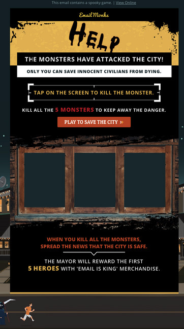
Get users to interact with your Halloween campaigns with a game or an interactive quiz that will capture their attention.
Starting early with an email that doesn't say much and building up to the big reveal right in time for Halloween is something that will help your click-through rate skyrocket, as well as your traffic.
Create Content To-Die-For
The tips above are all fine and well, but you need one key element to make them work, and that would be wonderful email copy and great social media content that can match that copy.
And I've got some tricks that will help you reach the "treat" of conversion. Now a high-converting seasonal email marketing campaign consists of excellent email copy - from the subject line to the CTAs-, content that is highly relevant and appealing, and, of course, visuals that will stay in a prospect's mind for a long, long time.
1. A Themed Subject Line
Your brand won't be the first or the last one to send your prospects a seasonal email marketing campaign, which can only mean one thing for you.
You need to dazzle them with some great email subject lines:
This one is an example out of my inbox, and let me tell you, I was very curious about what "all treat" and "no tricks" really meant.
In that case, I opened the email and saw a seasonal offer that I rushed to grab. So, the example above shows a clever seasonal wordplay that is equal parts playful and intriguing.
Use that tactic to make your recipients feel a little interested and curious about your offer. And if it's a limited time offer, use a timer or highlight the fact right off the bat.
Super Pro Tip: It should be a given, of course, but never take a step forward before consulting your data and A/B testing everything. This practice will give you insight into the type of content prospects want to receive and help you make educated decisions, backed by data.
2. Halloweeny Look
Wondering how to write content for your Halloween email marketing campaign is one thing that you need to get out of the way, sure. But what about the campaign's "looks"?
Just because your campaign is seasonal doesn't mean that you need to change your email layout completely. On the contrary, you can use the design your prospects love, but with a little twist.
Change the standard colors for something more "spooky". Like this:

Dunkin's email is the perfect example, as the original font is right there, as well as the colors. However, there's some Halloween decor on this email: notice the dripping effect on the letters and the mix of Dunkin's original colors - pink and orange - with the more seasonal purple.
You can also create a different color scheme, depending on your target audience and the vibe you'd like your email to have: Be fun and classic with oranges, purples, and bats or creepy and horrific with greens, cauldrons, and zombies.
3. Fear Is Your Friend
You know how Halloween is all about fear and spooky things. Your Halloween email marketing campaign might be the only one you can build around fear, without making it unpleasant.
Of course, I'm talking about Fear Of Missing Out - or FOMO, if you will.
Use words that have to do with fear and being wicked and scary. Here's an email subject line to help set the mood:

No brand would use such language outside of Halloween, but at this specific time, it's appropriate and fitting. Not to mention that it brilliantly leads to the email body copy:
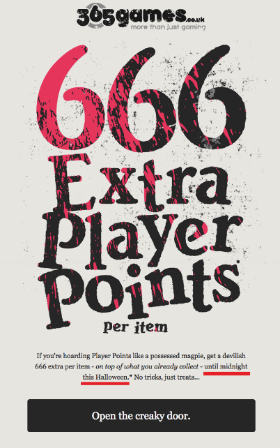
Offer's good "until midnight this Halloween," which is a pretty good reason to be scared, especially as a gamer. You see, creative copy for little offers like the one above keep customers happy and keep your CTR, traffic, and customer churn at the rates you want them to be. For more help here are 6 actionable steps to reduce customer churn on your ecommerce site.
4. Create a CTA That Takes the Cake
...Or the candy bar, whatever you prefer. The whole point is that your CTA needs to stand out and be as spooky and fun as the rest of your email.
Does this mean that it needs to be cryptic and overly creative? No. CTAs show prospects what their next action should be and lead them straight to your goals.
Don't swarm your email with copy, no matter your creative knack. Customers won't read all of your emails, but they will bother with three things: our subject line, email design, and CTA.
Go straight to the point when letting your readers know what you want from them. Of course, this doesn't mean that you have to be bland or boring. Check this CTA copy, and you'll see what I mean:

Also, don't forget to have one CTA button. Just the one. Otherwise, prospects will get a little confused about what your seasonal email marketing campaign is trying to do.
Honorable Mentions
Before I go, I'd like to remind you of some email marketing staples you need to implement on any campaign - apart from selecting the right email service, of course.
Keep a clean, well-curated email list. Unsubscribers can get you penalized, and the last thing you want is for your emails to end up in the dark corners of a spam folder.
Always segment your audience and create buyer personas and always consult your data before doing so.
Create responsive emails that will work correctly for any device. Mobile opens are taking over, and you don't want to miss out on that revenue.
Bonus: enjoy some best halloween ad campaigns and get some spooky inspiration!
Summing Up
Halloween is the holiday that marks the spending season, as Thanksgiving and Christmas follow soon after.
Don't be afraid to get creative and send out playful emails that can have a "magical" or "spooky" twist.
Just remember to adjust your tone of voice and copy, create a unique message, and save the prospect's time by not babbling too much in your email's body copy.
After all, the festive time of the year calls for presents and a little spending. Use the tips above, and you'll see that you can benefit from this.
About the Author

Téa Liarokapi is a content writer working for email marketing software company Moosend and an obsessive writer in general. In her free time, she tries to find new ways to stuff more books in her bookcase and content ideas-and cats-to play with.
from RSSMix.com Mix ID 8230801 https://ift.tt/3l00PXB
via IFTTT
0 notes
Text
Ethnography Travelogue: Hip Hop Dance Community + Social Media
this post was originally created for my New Media Research Studio class, taken in Spring 2016 under the guidance of Professor Carlin Wing.
ENVIRONMENT/GROUP OF INTEREST:
Dancers in the New York hip hop community. The boundaries are not clearly defined, but we consider it to be people who attend regular classes/workshops in the New York metropolitan area, and/or members of various dance teams that exist throughout the 5 boroughs. After polling 19 members of dance community, I understand that the distinction between the “community” and the “industry” is much more fluid than I previously believed it to be; people are coming and going between the two categories very often. I took an emic approach to surveying the “Community” of dancers since I am currently on two different competing teams in New York. Participants in the Community are training without desire to monetize their dancing & often part of a competitive or exhibition dance team with other “Community” dancers. Industry dancers are those who seek to monetize their dancing through paid gigs, and they tend to train under a different subset of choreographers and instructors (for example, a majority of hip-hop teachers at Broadway Dance Center would be considered “industry” teachers due to their connections & influence in the New York dance scene. As a participant in the “Community,” I found it impossible to prevent my own experiences from coloring my opinions and research.
QUESTIONS:
How do we define the hip hop dance community: how my definition changed after reading others’ responses
Sharing information on classes & opportunities on Facebook (in particular)
Sharing choreography & competitions on YouTube
METHOD:
1. Observing behaviors & interactions on NYC Dance CommUNITY & NYC Dance Family Facebook groups (link here and here)
2. Survey posted to both groups (19 responses received), questions found here
Why am I asking these questions?
Dancers engage with new media platforms in a pretty unique way—the production and dissemination of new art (choreography, freestyle, etc.) has been expedited and empowered by the sharing of online video. The way that dance companies & teams use Facebook to announce auditions or organize their team meetings is similar to other student groups or interest groups, but the hip-hop dance community occupies a unique space in its ability to transcend geography. I’m curious to reflect upon my own place in the dance community by asking others questions that I am seldom thinking about during my own time within the community.
BACKGROUND + HISTORY:
New media influences the dance community by growing exposure and allowing viewers and participants to share their work. Since the birth of YouTube, dancers have been posting their choreography and freestyles to YouTube or other video-sharing platforms, allowing for widespread dissemination without regard to geographic limitations. From my personal experience, YouTube kicked off my hip hop dance career because I watched Ellen Kim and Kyle Hanagami's choreography videos in early 2007. These videos were super cutting-edge in the day, even though they weren't professionally filmed and they were certainly not the level of production that we are accustomed to seeing today. The evolution of the hip-hop new media scene has been most drastic in the last five years. We can see the changes in media coverage from competitions in 2010 like Vibe and Body Rock, to the full-fledged production companies covering these same competitions today. The shift towards professionally-edited and produced videos has caused some conflict within the dance community; some people say that it causes the class environment to become more of a show-off contest than a learning experience because of the constant presence of the camera. In particular classes at Millenium Dance Complex in Los Angeles are covered by a variety of videographers and the backlash has been swift on Facebook. Prominent dancers such as Antoine Troupe or Brian Friedman have spoken their opinions on the current dance class environment in LA; most people agree that taking 10-15 minutes at the end of class to record a video is not detrimental, but it is very biased in favor of those already successful in the industry, because those are the people who will be featured front and center in a famous choreographer’s class video.
Facebook also allows a lot of varying opinions to be shared far and wide—there has been an age-old debate about "old school" vs. "new school" hip hop. Hip hop history begins in the 70s and 80s, with gangs wanting to make peace with each other, they invented these new dance forms like breaking, popping, and locking. They used these dance forms to settle conflict peacefully, and soon spawned hip-hop culture with a variety of disciplines like DJing, MCing and graffiti. Nowadays, hip hop dance choreography has been co-opted, or some may say appropriated, by the popular & dominant culture, without respect to the origins of the art form. Some of the forums (unfortunately, I couldn’t find a screenshot of this post) will have civilized discussion on how they can respect the origins of hip hop while still moving forward with the art form, whether through better teaching & training of fundamentals or respecting the predecessors who created foundational styles of breaking, popping, locking, etc. There will always be firm advocates for the traditions disliking those on the forefront, but from my personal experience I understand that I may never be able to truly understand the origins and necessity of hip hop, but I can certainly educate and appreciate the historical importance of hip hop and let that carry my art forward. New media (the internet, Facebook, Youtube) allows us to educate ourselves swiftly and easily, so I hope that the two worlds can be bridged.
SURVEY + ANALYSIS:
All my survey participants were members on one or more competitive teams in the community; some were directors of teams like Neighbors Dance Team or Synchronic Dance Team, others were members on multiple teams, but this was the common thread.
They all defined the NYC dance community as a supportive and inclusive place, especially in comparison to other dance forms (ballet is the one most often scrutinized & stereotyped as a highly competitive, breakneck place). One participant argued that there wasn’t really a demarcation between the hip hop community and other dance communities in New York—to quote from this person:
“I like our community because it's a strange fusion of hip-hop, contemporary, ballet, modern, street jazz, and foundational styles. I like it because it doesn't TRY to put a name on the style of dance we do. It's more celebratory in the joy of movement, and sharing it with friends/teams. Everyone dances so differently, but we still come together to appreciate each other in a semi-structured workshop/competition/exhibition circuit.” Many people mentioned that the hip-hop dance community’s history was more recent and young; ballet & contemporary companies have much longer traditions and legacies that caused them to become establishments while this community is still developing its identity and its own traditions. There was also a common thread of community inclusion because there is no clear hierarchy of organization in the community; there are some teams that have placed more often at competitions than others, but these teams were subject to change every season and so there are no established “best companies” like there are with ballet or modern (American Ballet Theater, NYC Ballet, etc.). There’s a sense of open communication, especially via Facebook; this presents its own set of implications which I will address later.
Another common thread was competitions – the friendly nature of competitions that take place a few times per year for teams to showcase their hard work. There is a lot of emphasis on the group aspect of the community, whether it is promoting their class or bonding with other teams in the community; there are opportunities for community dancers to enter the industry by connecting with choreographers who work with both groups. The industry is very technique and “look” based—there is a certain body type and movement style expected by those in the industry, and it creates great pressures on the dancers who are trying to monetize their dancing, so the community is a place for many to be free of those pressures and explore their own movement styles.
The “glue” of the community was dance competitions and workshops, open classes for people of all levels to mingle with other members of the community and take classes from choreographers from a variety of teams. I take this information with a grain of salt because all respondents of my survey were active members of a dance team, making them already connected within the community because they have a “home base” from which they can explore. I think, from my own understanding, that it is very difficult to first enter the community without a little assistance from teammates, but once you’ve entered the community the connections and friendships are easily and quickly forged. These opportunities for networking allow everyone to familiarize with each other and everyone said that they felt they could make friends easily within the community because there was less “cliqueyness” than in the industry or other dance spaces.
Social Media + Dancers:
19/19 people on the survey indicated that they engaged with the community at classes, workshops, and competitions. 14/19 people said that they engaged with the community online via Facebook, YouTube, Instagram, or Twitter.
Facebook is the primary means of sharing—most people will share videos of their friends and fellow teammates or their team’s competition video. CAPTURING VIDEO IS IMPERATIVE TO THE COMMUNITY NOW—it has been since the advent of YouTube. There is a whole business being built around video recording and production for dancers in the community (see Community Artistry for some of the best work). Some people indicated that they were unsatisfied with video projects that had been overhyped or choreographers that were placed on a pedestal because they produced a couple “unique” works but their choreography was inconsistent. There are new trends that have spread quickly from coast to coast via YouTube (an example would be a choreographer by the name of Franklin Yu on ACA Hip Hop in Los Angeles, CA).
Some people were dissatisfied by videos made purely for likes or “hits,” placing too much emphasis on views with no regard to the quality of the dancing itself. From one participant:
“A big negative these platforms have is that it makes the experience of dance seem very "bite-sized" people think that you just have to make cool moves and put them on Youtube to become famous, and forget that dance is about dancING and training your mind and body to be better.”
Others were dissatisfied by the necessity and expectation to be constantly available to members of their team, to be “constantly on” because their directors sent important information via Facebook almost daily.
Most people were glad that Facebook was a place for events like classes, workshops, and jam sessions to be shared widely with a larger audience. However, one important backlash in the NYC Dance Family Facebook page (see screenshot):
There were too many people using the Facebook page just to plug their own classes without supporting others’ classes or participating in the dialogue of the community, and Hendrick Ramos (one notable member of the New York/New Jersey dance community and an admin of the page) created a post asking people how they could create more of “family vibe” within the page.
I often question the use of the word “family”—almost every team describes themselves as a family, with the long-standing team members being called “parents” or “grandparents” and the new members the “babies.” As a participant of this community, I would like to believe that the family aspect is indeed true—teammates are often closely bonded, each others’ best friends, and we fight and give each other honest feedback as well as support and love just like a family would. However, sometimes I feel this label is forced upon members of the community, when those who don’t wish to devote their entire social lives to a team, they will be left out of the “family” aspect and they feel a greater disconnect with their teammates simply because they prioritize other aspects of their life over the team. I’ve seen this phenomenon quite often during my directorship of Synchronic Dance Team, but I also received responses describing this disconnect from participants in the survey.
AFTERTHOUGHTS:
I wish I had more time to conduct thorough interviews with people who had been in this community for several years. I also wish I had asked more specific and thorough questions in my survey (in particular about the future of new media and dancers, as well as the way YouTube/Facebook has reshaped the competition scene). I really would have liked to redo the survey.
I’m glad I focused on the geography of New York’s community alone—the reach of new media is far too vast to do a successful coverage and ethnography of communities around the US (in particular in my home state of California + here in NY/NJ).
The forefront of new media & dance, I believe, is in immersive capture. Hip hop competitions are a wildly magical environment, full of energy and screams and enthusiasm, and I think it'd be incredible to see how immersive technologies like 360 video and virtual reality can capture the magic of that environment and bring the viewer right into the room. The media/production companies that currently exist (Vibrancy, Community Artistry, GN, etc.) are definitely raising the bar for video production and event coverage, often releasing competition videos in brilliant 4k and with a turnaround time of less than 48 hours. I think they're doing an amazing job of bringing the joy of dancing to the general public, allowing hip hop to reach audiences internationally, and I would like to see new media being utilized even more by hip hop dancers to further their craft and career. (I should mention that I didn’t ask any questions about the future of new media in the dance community; I wish that I had).
I can see the rift growing between those who dislike new media’s influence on the next generation of dancers, who might think that the quick path to success is a viral YouTube video with novel moves and no foundation, and those younger dancers who don’t train in the traditional studio setting in foundational styles like breaking, popping, locking, etc. How can we use new media to bridge this gap? There’s a way for the foundations to persist in the new generation of dancers, and a way to appreciate the deep and complex history of hip hop rather than appropriate it for commercialization.
Overall, I'm proud to be part of this community that brings so much joy to us all through dance. I enjoyed deeply exploring the implications and effects of social media on an environment that I interact with daily, as well as questioning my relationships and preconceived notions of the dance community that I previously had.
0 notes
Quote
nicreations
shared this story
from Latest Articles:
Shared for the Cormac McCarthy anecdote.
When I made my way through European hostels a decade ago, I remember dreaming of a future in which I could pay for something fancy. Back then, fancy meant privacy, pools, mosaic-floor lobbies, and coffee drinks with foam. It meant anything more upscale than the bare, bleak, and decrepit hostels that would later inspire a horror film franchise.But today’s thrifty traveler has the option of bypassing the linoleum floors and soggy muesli at the communal breakfast table. Now, they have their pick of chic, cool hostels complete with award-winning bars, luxe bath products, and even personal reading lamps.There are so many slick new options, it’s almost unfair.Communal LivingThe newly opened Hollander in Wicker Park, Chicago, is a self-described "high-end hostel" ($45 a night) with 66 beds in a renovated historic warehouse with modern industrial interiors designed by French design studios Ciguë and Delordinaire. It offers a "social stay" program, where guests—via social media—can see who will be sleeping alongside them before booking a room. Perks like that reduce the anxiety of sharing rooms with strangers."You can curate your stay," said Carlos Couturier, founder of Grupo Habita small hotel properties, which includes The Hollander. That property blends together the lively bar and public spaces you’d expect of a hostel with design touches—such as exposed brick and lots of natural wood—reminiscent of a boutique hotel. These details make it easy to forget The Hollander is a hostel."It’s a very fine line in hospitality industry of what to call what," Couturier says.Unlike hotel chains, however, The Hollander resembles more of a hostel in that its chief concern is a social one: catering to travelers’ desire to connect with one another. The travel industry does not assume these tourists are logging off on vacation, according to Douglas Quinby, vice president of research of industry analyst firm Phocuswright. Connecting with like-minded travelers is still a big reason why people choose hostels."Today, most hostels focus on enabling that social dynamic through lobby designs, events, and activities to foster interaction among the guests," Quinby says. Social travel networks like Gogobot and HelloTel have tried to hook up travelers in advance, but very few have succeeded. Socializing face-to-face is still chief. The Hollander hopes its social stay program will help accelerate that.Hostels are big business, and overhauling their very concept certainly helps reach new audiences. According to a Phocuswright study, there are 18,000 hostel properties worldwide, for which travelers spent $5.2 billion in the last year, predominantly in Europe and Asia, which account for nearly two thirds of global hostel revenue. The market is expected to grow 7% to 8% per year through 2018, reaching roughly $7 billion in revenue.Most hostel travelers are millennials, with three out of four travelers under the age of 35, according to a joint study by Phocuswright and booking engine Hostelworld. Roughly 60% of these travelers are solo. Many have below-average incomes but "their unrivaled passion for travel drives more trips, longer stays, and much higher overall spend on travel."The amenities reflect this demographic. The Hollander has an on-site bike repair shop. Other new hostels around the world offer heated swimming pools, pop-up shops, tattoo parlors, even screening rooms. Hospitality operators understand that travelers don’t want the cookie-cutter experience. They want unique, interesting, thoughtful. They want their stays like their beer: Crafted."[Hostels] are coming at it from an angle of what makes a great guest experience, as opposed to, ‘We want to sell this property to consumers,’" says Jason Clampet, editor-in-chief and cofounder of the travel news siteSkift. "It’s thinking about how travelers really live and travel now." These brands are primarily focusing on public spaces, improving ways for guests to interact.A Room Of One's OwnThe Freehand in Miami, owned by the Sydell Group, is one standout among new hostels. The three-year-old, 75-room property, which starts at $27 a bed, offers art classes and bocce as a way to redefine summer camp from a South Beach perspective. The hostel’s courtyard bar, the Broken Shaker, has a cocktail menu that changes weekly and features ingredients grown on the property. The Broken Shaker has been nominated for two James Beard Awards and named one of the "The World’s 50 Best Bars" for the past three years.Nurturing a top-notch food and beverage program as well as solid design elements were top priorities for the Sydell Group. As CEO and founder Andrew Zobler explained, the idea was that even if people are sharing rooms, once they go downstairs, they’re treated to the same swank dining experience as boutique hotels. The challenge of combining a luxe feel with hostel culture is what Zobler sought to address."What really fascinated me about hostels was this idea of how social they were, that people who went there really wanted to interact with each other," he says. "We thought there was an empty place in the U.S. market: No one was really doing hostels in a way that we would really like to experience it." The Freehand experience includes game nights, pop-up activations, and other one-off experiences to, Zobler says, "bring people together."The social opportunities attract more than just peregrinating millennials. Over the last year, the Freehand experienced a significant increase in families with kids and schmoozy startup folks. In fact, Hostelworld findings report that 9.3% of bookings are made by travelers age 41 and up, while another 20% are between 31 and 40 years old.To meet those demands, Freehand invested in upscale shared accommodations that include amenities like TVs and phones, and set aside more private rooms for people who can afford to book their own rooms, but wants the lively, friendly surroundings of a hostel. Currently, 9 out of 10 hostels worldwide offer private rooms, cracking the stronghold of dormitory-style rooms.Sydell Group expanded to Chicago last year, and will soon set up hostels in New York City and downtown Los Angeles. The L.A. property will be its largest, with 167 private accommodations in addition to 59 shared rooms. There will be a rooftop pool and lounge as well as "a tea-inspired cocktail bar."The New York location will have its own distinct flavor. The restaurant will be overseen by the acclaimed restaurateur Gabriel Stulman's Happy Cooking Hospitality (of Joseph Leonard and Jeffrey’s Grocery fame). As for entertainment, Freehand New York will partner with Bard College’s Live Arts on an artist-in-residence program where selected artists will have the opportunity to live, work, and exhibit at the hotel.The Sydell Group hired the design firm Roman & Williams for each Freehand property. Miami’s eclectic camp scheme features faded coastal colors and tropical furniture mixed with vintage pieces. In Chicago, knitted wall hangings create a cozy, Midwestern vibe. And in Los Angeles, wood-covered walls, colorful artwork, and terrariums capture the state���s bohemian and desert cultures.Roman & Williams tried to strike a balance between inventive and homey. When describing the process, designer Stephen Alesch calls to mind a Wes Anderson of interior design."We had a different spirit animal for each location that reflects the surroundings, which is hidden in the décor," he says via email. "For Miami, that was an alligator; for Chicago, an octopus; for Los Angeles, an owl. We love these hidden aspects that fans of the brand can discover as they stay at the various locations."(Side note: I’m pretty sure that the bare accommodations I endured in Vienna 10 years ago failed to provide hand soap, let alone a spirit animal. If it did, it might have been a dead, stuffed pigeon.)The Boom Is Just BeginningOne other brand focused on bars and shared public spaces is Generator, whose portfolio includes 11 properties in such major European cities as Amsterdam, Stockholm, and Rome. While most hostels average fewer than 100 beds, Generator boasts a whopping 500. But as CEO Fredrik Korallus says, "The least important thing we sell is the bed."What's crucial, he insists, is "experience." The emphasis is on dining, with the recently appointed celebrity chef Luke Thomas spearheading menus across their collections. Lobbies are host to exhibitions of local emerging artists’ work, comedy shows, guest DJs, and poetry readings. Rooms are functional, clean, and efficient, but people primarily "come to enjoy the social vibe," according to Korallus.In the '80s, boutique hotels disrupted the hotel industry by taking the high design elements of big chains and placing them in smaller, more intimate settings. Generator sees the same revolution coming for the thrifty traveler."Historically, hostels have not been about exciting, innovative, retail-oriented, food, restaurants, and bars," Korallus says. "It’s been more about a highly affordable stay for the night and breakfast, and that’s it… We've been focused on design and experience, in that order."In 2017, Generator will expand into Miami, then the East Coast cities of Boston, Philadelphia, and eventually New York City (once some legal issues are resolved), before heading West.And until there are more high-end hostels to crowd the market, expansion is likely to continue. None of the brands I spoke with express concern over direct competition just yet, but they do acknowledge the importance of making a place for themselves on the greater hospitality landscape. Depending on travelers’ chief preferences, these new hostels compete with boutique design hotels, lifestyle travel brands (like the trendy Ace hotel in Manhattan), and lower-priced inns or traditional hostels.Then there's Airbnb. "Everyone in the hotel space is competing to some extent with Airbnb," Freehand’s Zobler says. "That's kind of the reality of the age."But can you find a chic Airbnb bed for under $100 in a major city? That’s still a tall order that might be best fulfilled by these new hostels. "Airbnb being a budget option is a myth," says Clampet, who sees hostels continuing to dominate the lowest end of travel price points.As more stylish hostels emerge and mature hotels—both chain and boutique—might start to feel the heat.As Freehand’s Zobler explains, modern day hospitality must think beyond setting up a standard dining room. He plans to further expand his vision for a "place that has really good food and beverage and good design. Those are the things we think you need to have a good hospitality experience," he says. "It doesn't necessarily mean you have to pay a lot for it."Slideshow Credits:
01 /
Photo: Nikolas Koenig, courtesy of Generator Paris;
03 /
Photo: Nikolas Koenig, courtesy of Generator Paris;
04 /
Photo: Nikolas Koenig, courtesy of Generator Paris;
13 /
Photo: Måns Berg, courtesy of Generator Stockholm;
14 /
Photo: Måns Berg, courtesy of Generator Stockholm;
15 /
Photo: Måns Berg, courtesy of Generator Stockholm;
16 /
Photo: Måns Berg, courtesy of Generator Stockholm;
17 /
Photo: Måns Berg, courtesy of Generator Stockholm;
18 /
Photo: Måns Berg, courtesy of Generator Stockholm;
19 /
Photo: Måns Berg, courtesy of Generator Stockholm;
https://www.fastcompany.com/3064681/most-creative-people/most-important-economic-theory-in-technology-brian-arthur
0 notes
Last Seen Blogs

trashtums
Welcome to my trash pit!

thehenachoko
♯♫♪ぼく の ブログ ♥

leapenterprisesllc-blog
LEAP Enterprises LLC

aguadestrellas
fértil

itsmekuyins-blog
Tuğçe.