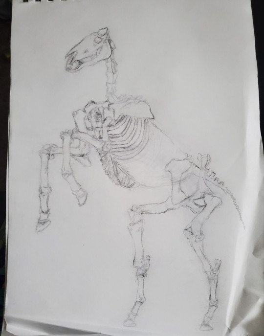
#is actually i made this sketch to figure out something in a different wip
Text

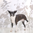
Leon from @thebrandywine ‘s [broken machine]
#my fanart#broken machine fanart#look… look one day i’ll be normal again#is what I have been saying since april#ughuguuuu leon’s mantra hit me like a truck tho#anyway the origin story for this piece#is actually i made this sketch to figure out something in a different wip#but i kind of liked it#and i did tell 🔪 i was going to try more watercolors#so i just painted it#monochrome tho — baby steps#anyway as for what happened to that other thing#well it’s in wip hell#but you never know#anyway ty for breaking my heart over and over
21 notes
·
View notes
Photo


u guys wanna see more WIPs... similar to the last post, here are Some WIPs
all of these were started in sai before going on to procreate. before going back to sai again in the case of the strength card
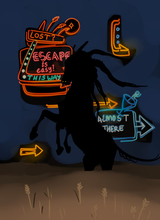
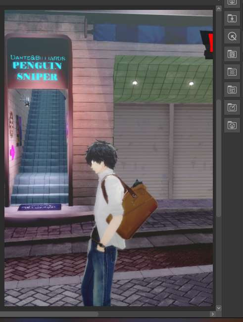
so Blue Sky/Out Of Time... yeah it’s extremely self-explanatory, it’s very obvious what this scene depicts and i’m sure everyone gets it (this is a joke i’ve had multiple people dm me asking wtf this even is). the one element that absolutely NEEDED to be there was the LED digital clock with a bullshit time on it, and i decided to replace it with an AIRE warning sign instead and put the LED readouts in the bg. the warning sign in this setting serves the purpose of informing ppl when there are hostile faeries around. i knew what the colours would be from the beginning, but it took a bit for me to realise what sort of shading style i wanted (it took forever). but i did know i wanted to contrast the very sketchy black void against the cleaner and almost cartoony/comic book style rest of the drawing, to emphasise the fact that the foreground sky and background void are made of two very different things. again i used a colour shifting brush to quickly make all the shards of sky different colours, but originally i planned to have some of the shards be dark or night time (with stars or the moon etc). unfortunately it didn’t work, it was too dark and pascal got lost against it.
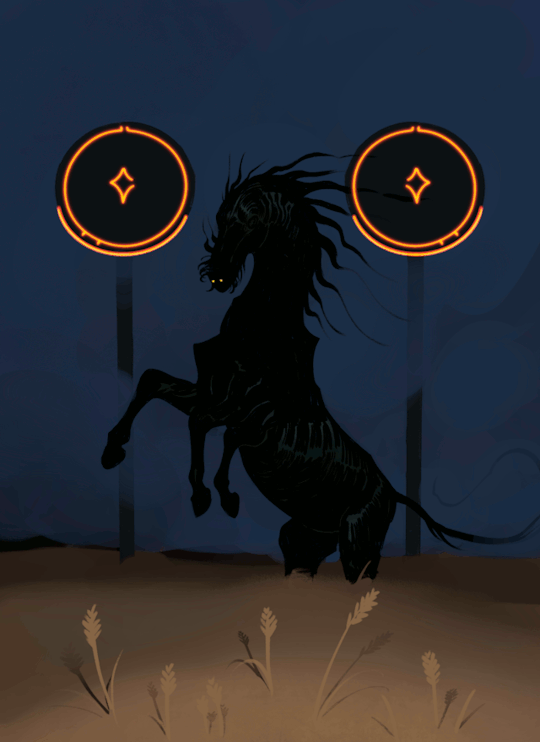
My Eyes Are Up Here is pretty obviously the exact same scene with the same character, in the same field, but with a different sort of atmosphere. i sketched this in sai then did the final in procreate. originally it was going to have a black background

i really like this version tbh but the blue works better. i think he looks good against dark backgrounds where it’s kind of hard to see wtf is even happening there
so about the neon signs..... i’m well aware that the sketch has way more promise than what the final ultimately was, and that’s because i found that i didn’t have the technical or artistic ability to pull off the complex neon signs like i wanted to. i couldn’t get it looking good enough so i had to scrap them. but these signs will be back, i want to draw them properly and do them justice. the gif was unplanned too but i thought it would be fun to have the flicker be very intermittent so that if you scrolled past it you might not even realise, or you’d have to stick with it just to catch it looping. i used GIMP to make the gif and change the frame rate, and this actually took a very long time because i had to preview it over and over. anyway if you WERE to get lost in the púca’s field, in this story, you would see neon signs like this encouraging you to follow them.
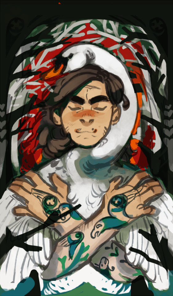
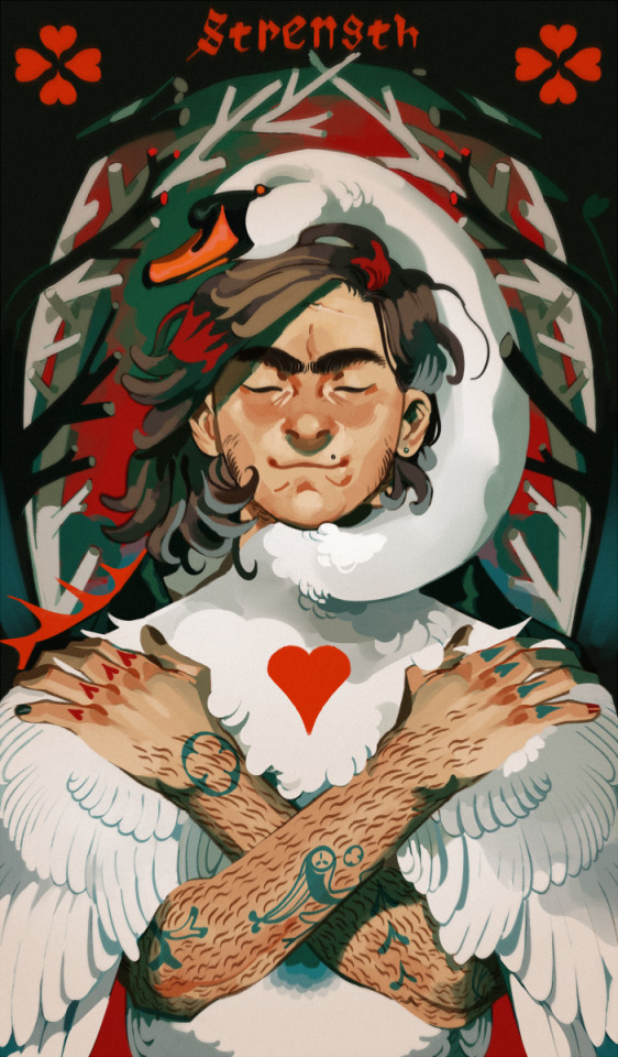
Strength is actually the last drawing i ever made that ended with a paint-over in sai, and the oldest drawing here. as such i actually don’t think it’s representative of my current ability but i do have a soft spot for it for sentimental reasons lol. the reason for the paint-over in sai was because i drew this at a time when i still did not trust procreate to be able to place the level of finish on it that i wanted
the background took me a thousand years to figure out. literally it was so annoying that i considered scrapping it for something simpler. but the idea was for it to be a kind of fairytale-ish lost in the woods sort of look while also appearing like the blood vessels around the human heart. the branches were also supposed to be heart-shaped in cross-section but i spent so long zoomed in painting them that i forgot to zoom out to see if all those fine details were actually visible, and it turned out they weren’t. i was disappointed that i couldn’t get félix’s tattoos to look right but that’s what i get for making a character with shit tons of both tattoos and body hair. i also got rid of the foreground branches really soon because they weren’t adding anything and muddied up the readability of his pose
the swan is from a daemon au and bears no relation to my other swan characters. i just like swans a lot
2K notes
·
View notes
Text
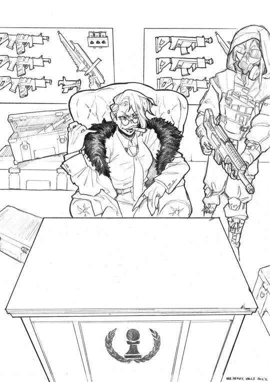
TIME FOR A PROCESS POST let's talk abt getting from this (client sketch - which, btw, i know other artists have talked about this plenty, but i LOOOOOOVE a client sketch as early direction on a commission. LOVE it)
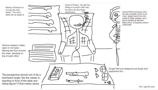
to this!
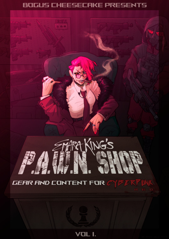
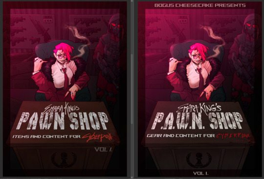
at first we didn't know if the title was going to go across the desk, or over the central figure (emara's) head against the back wall. so there was a 1st version where we were favoring a higher title, then we started favoring the desk so we scrapped the clutter + centered it more

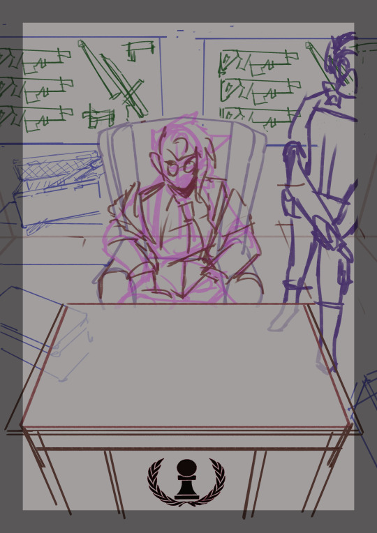
i used clip studio's 3D models (particularly for the chair, guard, + weapon crates) and perspective rulers to help with laying everything out at this stage, tho i abandoned the 3D pretty early on bc it's a bit too clunky for me. maybe i'll find it quicker to use w more practice!
(the rest under the cut!)
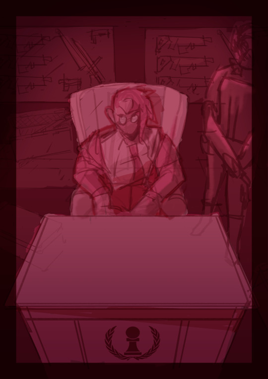
once the basic layout was approved, i threw together a value study to explain how in the final image all the clutter of the bg detail would be unified and pushed back. lately i find myself thinking abt value earlier + earlier in the process; planning ahead saves me a lot of time!
i fiddled with starting to refine things digitally, but then i got A BRAND NEW LIGHTBOX delivered in the mail with perfect timing (lmao) so i just ended up printing off the digital sketch, finalizing in pencil, + scanning back in

then comes five billion different steps of locking in values, again. i did everything greyscale first, but i didn't worry abt getting things super polished at this stage bc i knew color would factor in a lot to later decisions
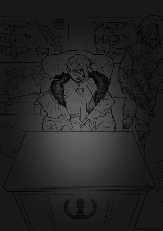

this is the point at which presenting these wips "step by step" is kind of misleading; i didn't do these stages one at a time, but rather had a BUNCH of different lighting/shading layers that i kept toggling on and off as i worked to make sure everything was coming along well.
(to get some of these caps i actually went into the main file again and turned a bunch of stuff on/off just for the sake of getting specific examples, because actually when i was actively working on it there was rarely a point where i was actually working on something with "all lighting turned off and just the shading on," or anything like that; but i AM interested in showing what effects different lighting/shading changes had on the base colors, even if i wasn't really making these changes in a rigid order.)
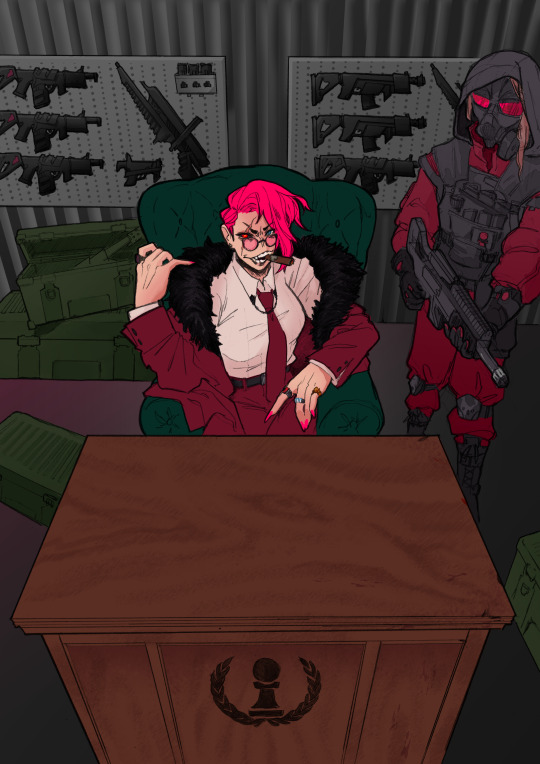
i.e., just for the sake of interest, here's how the flat colors look without those adjustments!! but i honestly never looked at it like this on its own for long...i had all the shading/lighting turned off so i could see what i was doing while flatting, but i was constantly checking back and forth.
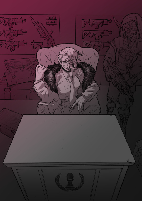
then tones added on top (which were actually just two copies of the tone folders in the above posts, set to linear burn and overlay) -
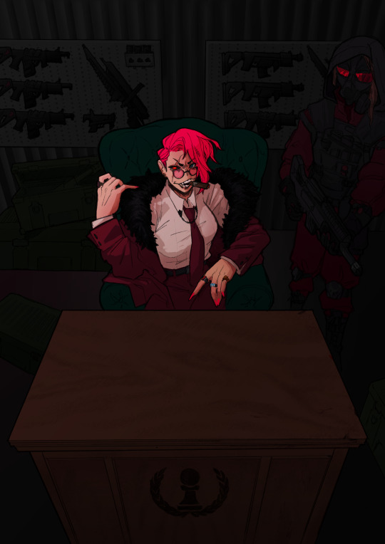
which makes it get HORRIFYINGLY dark, but that's when we go in and add a bunch of lighting adjustments.

the most obvious lighting change above is the big burst of hot pink light from the corner, but there was also some masked overlay + burn layers to pop out the guard + emara and make sure they were pulled out from the bg. if this were a standalone illustration, i maybe would have let the bg (and all that painstakingly drawn detail..........) stand out a little more, but a cover functions differently, and i wanted to make sure the eye goes to the title first. that means sacrificing bg detail even if it looks sick lol
then final touches! a lot of my very last touches are things that are close to invisible; gradient maps on very low opacity, noise, a little bit of scribbling on upper layers. the typesetting was all by the client, except for the lettering for "emara king's," which i did myself!
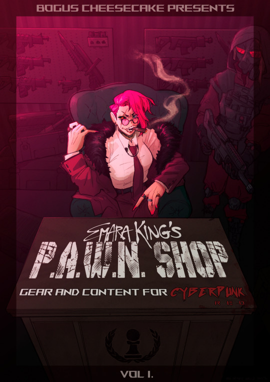
finally, here's a comparison of ⬅where i left off one night close to the deadline thinking "it's probably done, but i'll sleep on it just in case," then all the adjustments i made the next day with fresh eyes.➡ and that's it!!! phew!!! that's how i make a cover!
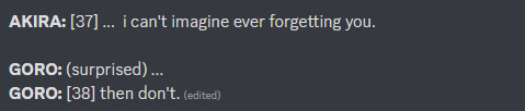
#my art#process#wip#tutorials#<- not really but. i just figure someone browsing my tutorials tag might be into this#i am so so so so so fucking mad that i didnt think to turn timelapse recording on for this#bc a timelapse wouldve been so fucking sick. but i can at least share this
596 notes
·
View notes
Text
A different kind of WIP Wednesday
Not a fic this time, but after a wonderful post about making bad art from @unspuncreature and a little encouragement from @lilredghost (thank you 🧡), I wanted to share something else I have in progress: my drawing abilities.
I wouldn't necessarily say I'm good. In fact, sometimes my drawings are downright bad. But considering there have been times in the last year where I haven't even been able to hold a pencil due to health issues, I'm happy to be where I am and just keep improving little by little each time.
I've never shared any of these with anyone before so I'm quite nervous, but there's no time like the present.
Many photos from my sketchbooks ahead!
So, for starters, I've been drawing sporadically since I was about 11 (about 18 years). I've never seriously made a habit out of it, and I've never attempted any formal instruction or classes. One day, I'll post images from my sketchbooks from over the years, because yes, I have kept all of them for posterity's sake
Last year, 2023, I made a New Years Resolution to draw something every day.

I actually made a decent go of it and drew more than I have in years.
But then I suddenly had some health problems pop up that made my goal impossible. I struggled to hold a pencil and even write a sentence legibly. I won't go into details here, but after a few months and going through occupational therapy, I was able to write and draw again(My other symptoms, however, haven't been resolved).
I did some drawing here and there, but nothing consistent. And it felt like some of the progress I made earlier in the year had vanished. I was utterly demotivated, and could only see the bad in everything I drew.

In December, I finally decided: screw it. If I'm going to draw badly, I'll just draw badly. And its done wonders for my confidence.
But for every drawing I'm proud of, there are far more that all I can do is laugh at because of how terrible they are.

And each time I draw something I'm not happy with, I take it as an excuse to practice more, practice often, and practice everything.
I don't really have a system or a plan in place. I start out with a warmup of stick figures based on soccer, figure skating, or something similar, and then it's whatever I feel like. Sometimes it's figure sketches, sometimes it's working on hair, sometimes it's just whatever the hell I feel like.

But above all, I'm having fun doing it. Even when it doesn't turn out like I want to, even when it's not perfect, I enjoy just putting pencil to paper with zero expectations beyond doing my best and enjoying the process.
#wip wednesday#from my sketchbook#no i haven't been working on coloring or shading yet#one thing at a time#one day at a time
29 notes
·
View notes
Note
Would love to hear your Zevran thoughts <3
original and ultimate babygirl 🥺
first impression: so i actually knew he was gay romanceable before starting origins and went in with the intention of gay romancing him pretty much solely bc i thought it was cool you could be gay in a video game. i didn't really know much else about him going into it, so his intro was like, holy shit i'm in love with him 😂😂 and i only liked him more and more as the game went on, I’ll admit I took a lot of his humor and bravado at face value at first and the depth of character that unfolded was unexpected and really cool
impression now: it might seem like i love him a normal and reasonable amount given that i don't draw or post about him that often but that's just bc the more i like something the less and less i talk about it out of embarrassment 😅
favorite moment: so so so hard to choose 😭😭 maybe the dialogue after you kill taliesin if you push him to make the decision of what he'll do next himself:
cautiously testing unfamiliar agency.... the look for validation... 🥺
idea for a story: gestures vaguely at the complete origins novelization and chronicle of whatever weird thing he and ailill have going on that exists perfectly in my mind and materially in unconnected 500-word scraps of dialogue that don't even amount to anything you could call a wip 🤦♂️i think the last thing i worked on was a bit about how on the morning after zev's recruited he has another chance to finish the assassination and kind of commits to the idea of staying instead

unpopular opinion: i think understandably and naturally people tend to focus on positives when making fan material (i do it too like 90% of my sketches are cutesy shipping art lol) but i'd also like to see more of him being flawed? like i feel like a big part of the appeal of him as a character is the 'healing from trauma and starting anew' theme, and healing is so difficult and messy and nonlinear, not something that gets resolved by falling in love over the course of like nine months, you know? but i don't really fault people for not exploring that, it's just something i'd be interested to see more of (':
favorite relationship: zevwarden naturally😌 especially in the context of wardens with a similar desire to die, where they can sort of figure out how to want to live again together
favorite headcanon: i've been poking around in the toolset and looking at the differences between the m and f romances and i think there's a case to be made for a reading where there's an element of internalized homophobia and/or trauma impacting how he looks at relationships with men that goes beyond generally preferring women. his gendered dialog with men tends to be more physical than emotional, there are instances where suggestive gendered dialog alludes to violence with m wardens and not f, he makes some skeptical comments abt the idea of being in a relationship with a man. i don't have evidence at hand and i certainly don't think everyone Should think this way or anything, i just find it interesting to think about preferences and how they can be impacted by experience in the context of being bi, and how it could both complicate and enrich an mwarden relationship
#this is quite long just as a warning to the less interested#HOW is there not a crow emoji. devastating.#talkin#dragon age#dao#zevran arainai#my writing#......? i guess we'll see if that tag ever gets used again
38 notes
·
View notes
Text

WIPs from February 3rd and 4th, 2024
I'm used to feeling relatively aimless in February in general, but today was a particularly strong day for that and the ennui set in pretty fast, so i opted for equally aimless art for today (aimless as in lacking a direction, not aimless as in lacking worth, to be clear)
both of these are from even more things rolling around in my brain that I've barely posted about (if at all), but I'm slowly clawing back my ability to just draw and post whatever without having to justify it as much, even if it has nothing to do with my active projects. I do want to dedicate some time to make some portfolio-ready stuff (as in, stuff that is specifically cleaned up and assembled for that purpose) so maybe it's a good thing I'm coming up with more stuff with a different conceptual basis to them
idk there's something cool about being able to put a logo I just made up and put it next to characters that I also just made up relatively recently (for me anyway) Makes it look so much more legit, or like I put a stamp or stencil on it
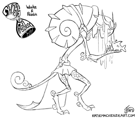
Wake and Pebble had a rough sketch that I cleaned up here, whereas the Timekeeper has existed for longer (I think? I actually can't remember now lol) but this is the first time I've tried to put the image of him in my head onto digital paper. This wasn't the first attempt, but this is the first sketch I cleaned up in an attempt to feel out his design a bit more. It's the closest to where I want it to be so far at least, even as a crouched action pose. Don't really know what his staff is doing but that's for future me to figure out I guess. I've been working on something else that uses my more angular art style so I guess that was still in my system for him too aha
#i'm fine btw i just feel like i wasted a day again#this is how i am on executive dysfunction days#but posting these helps me feel a little less bad about it#she says. coping.#i like these a lot so yay :)#little victories#art#artists on tumblr#sketch#wip#oc#character design#Timekeeper#Wake#Pebble#That's Life Ricki G!#Ghosts of Fireblood
11 notes
·
View notes
Text
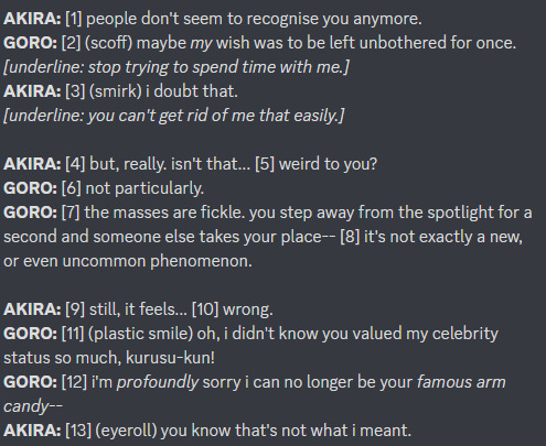
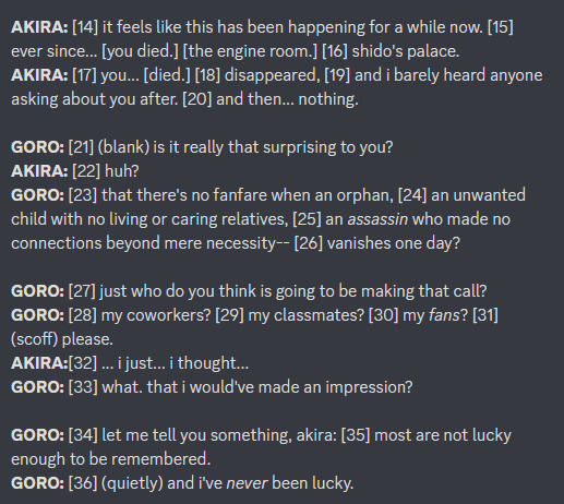
some "behind the scenes" stuff from this comic (read as: wips and assorted thoughts)
SOME BACKSTORY: i was halfheartedly playing through strikers after finishing p5r. the fact that akechi's not even mentioned in that whole game made me sad. the fact that akechi stops being mentioned basically the moment he dies in p5 vanilla makes me sad. i had thoughts. so i decided to make a comic about it
i wrote down the entirety of the script for this while in a complete haze listening to third eye by florence + the machine on repeat for an hour straight. that song has nothing to do with anything the comic is about. or with either of the characters involved. i can't explain my thought process there.
(the 'official' title of the comic is "a ghost amongst the living (consequences of a cognitive death.)" as a sort of tribute to that song, even though it has, again, nothing to do with what the comic is about)

THE SCRIPT: the numbers correlate to text bubbles on my thumbnails (see next). i also put it on discord so i could more easily see it/edit from either my phone or computer, which i don't think is the MOST efficient or professional way to go about doing this, but
you may notice this is a little bit different from the text on the final product. this is because. i changed some things while typing it out for the final thing. i don't know what else to tell you.
i did reach a point where i had read these same words over and over so much that i started questioning if anything i wrote made sense and if i even knew how to speak english correctly. i'd like to thank my friends for reassuring me that some of my wording was ok, and also google because every time i asked "is that even a thing people say" i would just plug it on there to try to figure it out (because i was too embarrassed to ask anyone to read over it)
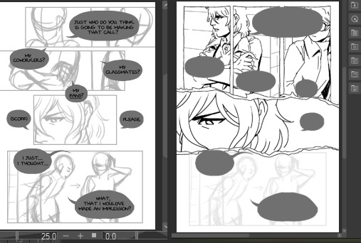
THE THUMBNAILS: just a rough idea of panelling and where to put text bubbles and such. this took fucking forever. comics are hard. nobody ever tells you this (<- something i said about like 10 times to the same people while making this)

THE SKETCHES: basically grabbing the thumbnails and making them into an actual thing i can draw onto. also getting all the text laid out-- i don't think that's entirely necessary at this point but i was just excited to see it all laid out and being able to read it
(shoutout to my friend sophie for making the font i used for this/use for all my longer comics. she's an icon and a legend and has really nice handwriting)

you may notice that page 9 is completely different from the thumbnails. this is because i was tired by the time i got to that part in planning and i paid for it. brainstorming & reworking that page took me an entire day. comics are HARD. I AM TELLING YOU THIS
page 6 also changed by the time i got around to lining it because i decided that it sucked and i hated it. reworking that into something more acceptable also took me about half a day. i'm happy with how it turned out though, and glad that i no longer have the issue of having a flop ass page in the middle of this
THE PROCESS: was actually quite straightforward after that, just doing the lines and the like. but i wanted to share how i did the backgrounds. i grabbed a bunch of in-game screenshots i took for reference and just plugged them through csp's "artistic > lines only" filter and just traced over that

i love you art shortcuts that make my life & ability to make yaoi comics easier
(if you're curious too here's all the screenshots i took & was keeping on the side for reference)

ETC: some miscellaneous thoughts, because if you've made it all the way through this then you probably don't have anything better to do anyway:
all in all this took two weeks. script was written on the 11th, thumbnails were done on the 14th, sketches were done on the 17th, lining on the 24th, aaand colouring took me just one day. comics are HARD and TAKE TIME. NOBODY TELLS YOU THIS!!!!!
i actually started getting wrist pain somewhere along the 2nd day of lining/3rd page. that step of the process probably took longer than it otherwise would because i had to keep taking breaks 2 ensure i wouldn't break my hand completely -_-
my sanity throughout the lining process was only ensured by listening to a frankly stupid amount of jpop. thank you wednesday campanella and mrs. green apple
i think my favourite page is page 3. i like how the panels get crooked when akechi puts the detective prince persona on, i like how akira deadpans (in a straightened panel) to cut him off. also in order to get the hand right in the first panel i did the hair twirling motion myself and ended up hitting myself in the eye with my own hair. it was worth it though
IN CONCLUSION: i think they went a bit too hard with the yaoi fanservice in persona 5 royal
#misc#this is so long lmfao sorry i'm proud of what i made & i have a lot 2 say#i hope at least someone finds it interesting. if not. well this was entirely self indulgent so it's no biggie
47 notes
·
View notes
Text
I got tagged by @the-lastcall and @darkfire1177 for WIP Whenever so here are a few different things...
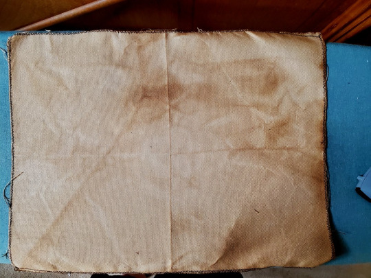
Another pic of the coffee-dyed fabric, because it's there and if I'd known you guys were going to tag me, I would've saved it :P The moire effect is unfortunate, it's not in the actual fabric (which is hardanger 22ct)
Then the OCKiss art which is coming along pretty well...

This part is fun because it started as the sketch and then I changed the eye and the meaning of the whole thing changed :D
Writing: a bit from 3E Plague, which is back to its horror/apocalypse storyline. (In this universe it's currently 1951)
"I don't know," Frank said. "We won't know until we hear something on the radio." Because would newspapers still be printed and delivered, when it was dangerous to talk to people? (Did the farm even get a newspaper?) "But they've got hospitals and doctors and scientists there. And when we left, the alarm was already being sounded, remember? They were already telling people to stay home." And how would those people survive, when the food in their homes ran out? When all the money was spent on food, and more was needed, and the only way to get money was to go back to work? What if the jobs weren't there anymore, because too many people had died?
Frank said none of this to Gerry, who didn't need any more worries, if he hadn't already thought of them. "We've got great scientists in this country," he went on. "They're figuring out a cure or a vaccine right now, I bet. And you sent the letter to your aunt and uncle before the alarm even went out, right? I bet it got to them within a couple of days. So they knew ahead of time, and made themselves safe. And they're waiting for us right now." And if he was wrong...
If he was wrong, then there was no safe place for them. Nowhere they could go. They’d die along a street or in a field somewhere, whether of the 'flu or because there was no way for them to get food.
4 notes
·
View notes
Text

Winged Matoro Inika WIP sketch! Using base by lanshappycorner.
So with @sumi-sprite and I RPing frequently and headcanoning all sorts of textile/clothing stuff for Kos and even a big festival they might have, I really wanted to actually draw my favorite Ko-Toa and possibly even his frequent hunting garb or his festival garb. For that, I had to start figuring out what he’d look like *under* warm clothes.
I plan to eventually have a front view also drawn up, with one of a set of ice-themed wings I commissioned from scribbly-blue-hearts spread out behind him to show at least half his wingspan.
Designing his “built in” armor was a tricky balancing of the territory given to feathered areas, bulky removable armor, non-removable dermal armor, lighter armor addons, and vulnerable exposed areas. The crosshatched areas you see are addons made from Rahi hide that Matoro tanned and trimmed himself for the best fit.
I’m going to eventually have a diagram highlighting feathers and different types of armor and exposed areas in different “color zones”.
He may be incomplete, but I still wanted to show that I’m at least doing SOMETHING.
12 notes
·
View notes
Note
💫 🤲 💌 !
💫what is your favorite kind of comment/feedback?
Like all other people, I'm sure, my favourite kind of comment/feedback is when people give details of what it was in the story that particularly appealed to them, how it made them feel, or what they thought was going to happen. But honestly, any kind of comment/feedback is good :)
💌share something with us about an up-and-coming work (WIP) that has you excited!
So I've written the first scene of the grand epic that I've been trying to sketch out with my disjointed 'A Moth-Eaten Scarf' series on AO3. And I think it really works. I have been trying to figure out for months, years? what the first scene should be, because I like a first scene for each character that introduces their main story arc and foreshadows what is going to happen in some way. Finally figured it out for my main protag, and it was in some ways because of a discussion about the different Hawke personalities and I realised that I needed to shift my Hawke from a diplomatic personality type to more of the direct type - and suddenly, boom, it all became clear to me. Really loving it, but it isn't going to see the light of day for a good long while yet - probably not until I have enough of the story written to actually decide what it should be bloody called, which is still eluding me.
2 notes
·
View notes
Text
Christmas DimiLuna WIP
I tried to do something new for this one: figuring out a sketch thumbnail by drawing the colors in before doing any sketching.
I've seen a lot of artists do something similar, where they kind of arrange the colors first to get the general composition of the illustration before properly drawing the sketch?
I figure it must be good for getting a feel for the final illustration, especially if you don't really have a clear idea as to what you want to do with it right off the bat. Plus, doing it that way probably avoids the headache of trying to get the details correct right away instead of just going with the flow of what works with the illustration better.
So, did it go well, or did it go badly? It, uh...it went. 😂
What is this mess of colors and lines? LMAO
For a first try, it's not too bad! But I had to use many different layers to get each of them colored and sketched.
I'm not quite sure if it helped to do things this way? Since I had most of the colors already filled in, I could generally follow the shapes each color made, so it was less guesswork to put lines to it. But from what I'm seeing here (and I didn't move the sketch/colors), I clearly need more practice to set the colors at the actual place I'd like them to be LOL
#✏️┋art wips#🦁┋Dimitri#🐭┋Luna#🦁🐭┋DimiLuna#fe3h dimitri#dimitri alexandre blaiddyd#fe3h oc#I couldn't quite decide on the background until I had already made this but I'll probably go for snowy with trees#blurred edges and all#I'm kind of divided as to whether I should make it in a more 'modern' style to reference the style of the game#or if I should go for the kind of art style I want to practice and become better at which is more like...early 2000s anime?#I do like this halfway style but sometimes I want to be more stylistic
0 notes
Note
writer ask game for my darling!! 4, 5, and 17
Mwah, thank you darling 🥰
4. Do you write everyday / if so, dot you have goals?
I don’t tend to write Everyday, but I do write often 4-5/7 days a weeks. I often think about or plot my piece even if I’m not writing, though. I also generally don’t try to set goals because they sense of a marker sends me straight back to college and makes me stressed, still shsjdjdj. Maybe someday.
5. If you plan, what does you planning process look like?
So, yes but also no. I tend to be a fuck around and find out person, particularly on the first draft, but I like to plan more on the second. I’ll sketch out a overarching sense of it and try to figure out what should stay/is working, and what could change, and if there’s anything else that can fit that overarching plot/theme. But the first draft is starting with an initial concept/image/scene I either want to start from or want to get through and muddling around til I get there.
17. What piece of writing are you most proud of?
Tbh, I think my current wip? I have some pieces in the past that I like, but this one is the one that makes me proud, I think, because it’s got a lot of firsts in it. First one to have gone through this many drafts to refine it, first one to break sixty, seventy, eighty, ninety thousand words, first story I’d actually consider publishing. I’ve refined the characters a lot and built the plot up draft by draft, and I’m Still Tinkering but I got feedback the other day saying a scene made @something-wild-cat physically feel the emotions in her chest and that just hits differently. So, my current, big boy wip.
1 note
·
View note
Text
the long awaited wip graveyard post
i thought the title was fitting for halloween :p
this post is an assorted collection of all my old thaw wips that i deemed not good enough to post, but didn't want to just rot away in my folder, so now they're here.
enjoy !
-
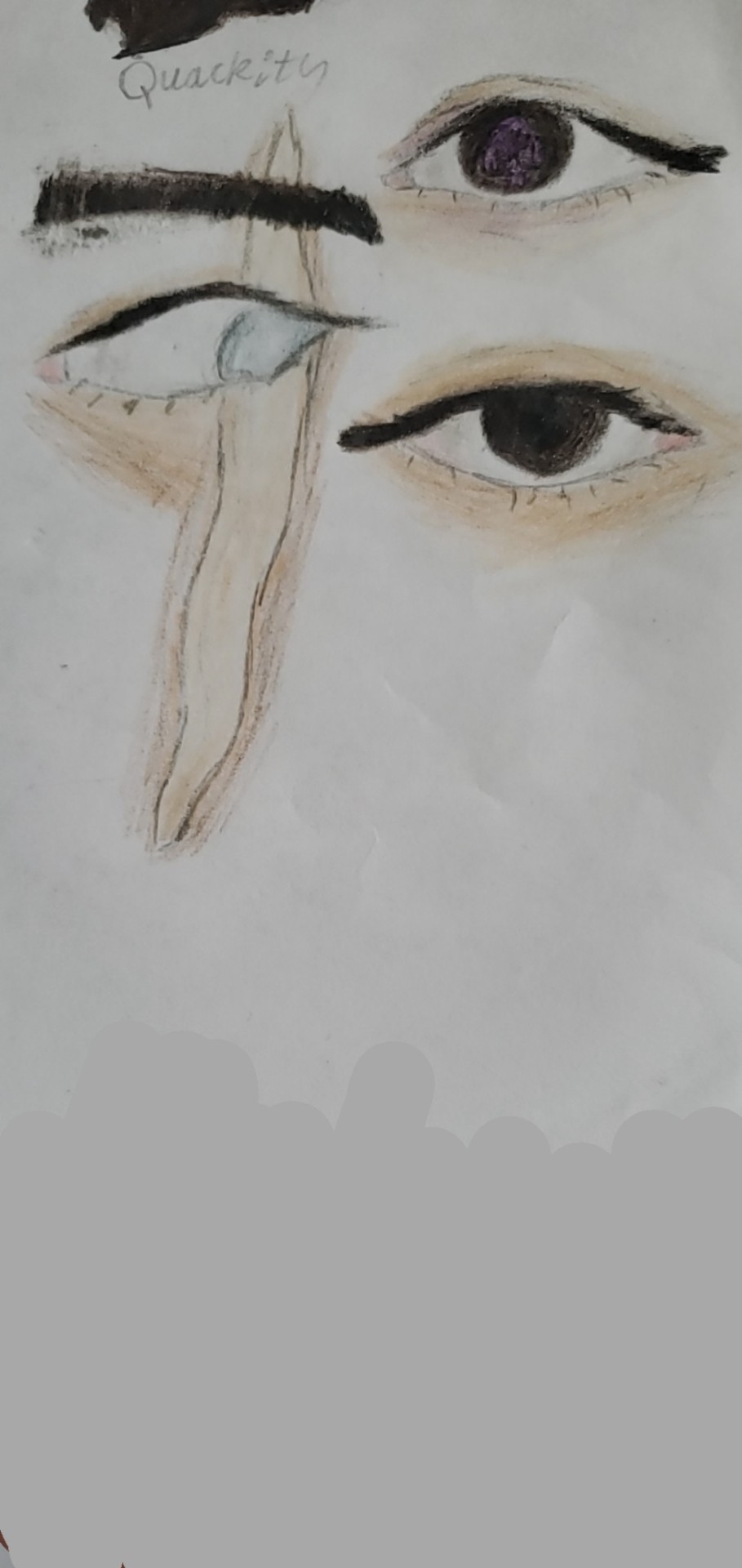
the Eye post

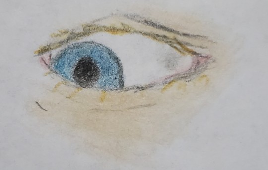
fun fact: i used the same seven colored pencils for both the thes eye and the tommy one, i just made the grayer shades more emphasized for the latter. thought that was a neat little detail.
q's eye here makes his skin look a lil more purple
i impulsively gave quackity an eyebrow when i didn't sketch it before, and the way it turned out bothered me >:((
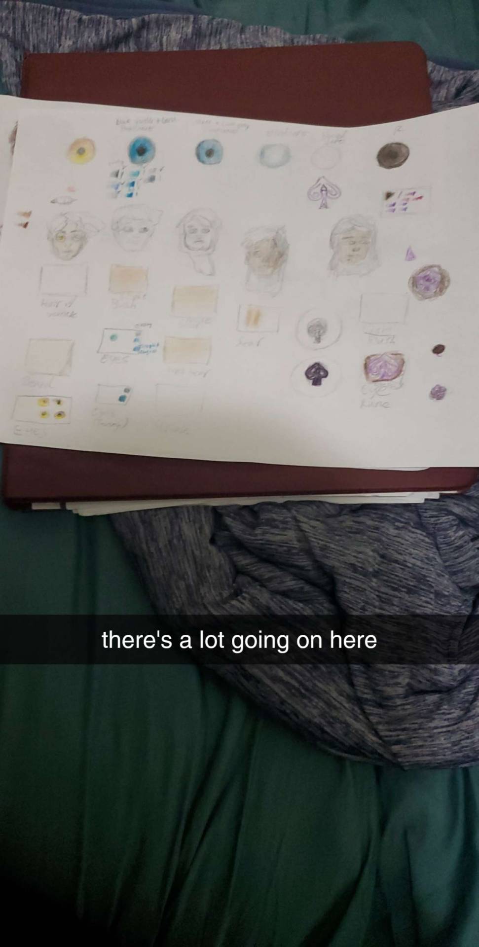
not a wip because i absolutely would never give this abomination its own post, but this is basically what my scratch paper sheet looks like when i want to test out how different colors look with each other, and also get a really, Really rough idea of what the final product will look like. this is the process i go through Every time i draw something serious. 😭
peep all 7 colors of the chaosduo's eyes under the thes eye practice
LMAO AND THE THES FACE 8 SECOND SKETCH LOOKS LIKE HE'S ON DRUGS IT'S SO SILLY
can you see me struggling to figure out how to wrap the rune around q's pupil? and also how to make the rune not just Completely disappear bc of how dark his eye is? yeah. traditional art is a pain is the ass sometimes, but i'm still wayy better at it.
also shoutout to @alexanderwesker for giving me an idea of what the rune on q's eye looks like, because i like being as accurate as i can when i draw stuff, so that was very much appreciated!
the part 2 to the hero's journey comic
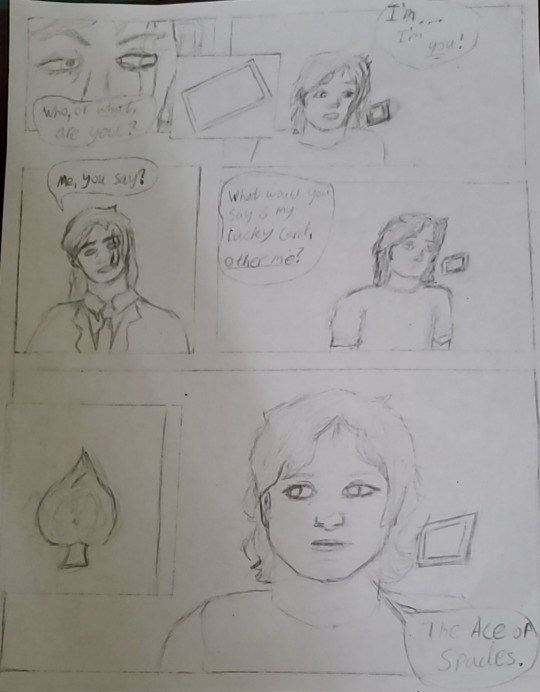
i went fucking Ham during the hero's journey assignment, so much so that i literally planned like 19 more panels than what you saw in the original post (27 panels planned in total). but then i realized that i had like Four Whole Days to do that assignment, and would definitely not be able to do that many, especially not without burning out.
so i instead settled for the very first 8 panels that i planned (though even then, i had to abridge a lot of it, and also cut slime entirely from it, bc otherwise those 8 would have been 14 whole panels, and i think i would actually die-), since that was just enough to show two different steps of the hero's journey (crossing the threshold and meeting the mentor btw. i could probably do a whole analysis on how wesker's stories fit into the hero's journey if i wanted to, but i'm lazy rn and this post is already pretty long), and that was the big grading requirement. (i got 100% on that assignment btw 💪and my english teacher still has no clue that he graded minecraft fanfiction fanart LMAO) but this one is what i would have included if i had more time on the project, and could include more of the story, but as it stands, i made this one in my own leisure, because comics are fun to do.
anyways, with that little rant aside, i tried my best to make q look younger than quackity, and really accentuate the difference between them. idk how i feel about how q turned out though.
i'm really proud of the paneling, and i'm also kinda proud of the first frame with quackity's face in particular bc i thought it looked cool, like an actual comic book or something. but i couldn't figure out the card physics or perspective and that's what ultimately made me choose to abandon it 💔 maybe i'll try attempting this page again when i'm feeling more daring (as well as the other panels that i still haven't even drawn yet), but this wip has been collecting dust for a couple of months now so i figured i'd share it here anyway.
Palido
i drew palido a bit ago, but bro got somehow managed to get crinkled in my bag, even while literally being Inside of my sketchbook 🤨
it's not Too awfully noticeable though, especially bc the fold isn't On the drawing itself, so i might be able to salvage him and post a finished version someday... but i kinda halted progress on him for the time being bc of it, so here he is. </3
"Am I Still Even Me?"
i 1000% want to redraw this someday, just because i think the idea behind it is so fucking neat.
honestly, this one wasn't too bad at all, especially since i did all of it (besides the bones bc i think my health professions teacher would be disappointed if i got them wrong, and also the rune bc i care way too much about accuracy) without any reference, which is a pretty impressive feat for me and my aphantasia. but yeahh i think it could definitely be better, and really, this drawing was ultimately something that i just drew in class to keep myself busy for a bit bc i had way too much freetime that day. it wasn't intended to be post-worthy or anything.
but i think that the idea behind it is definitely post-worthy. maybe i'll even add a thes and/or youngerbur addition once i get more information about them and just how they've changed yk.
i had no clue how to draw the bones in that position, i probably could've done more research but. yeah no i don't have an excuse, i just couldn't be bothered that day lmao.
i was also gonna bloody q's hands a bit if i ever got to the coloring stage. like a little nod to when he lost himself to Madness. is the blood actually there? who knows, we're seeing it from his eyes, so for all we know, the rune isn't even lit up either, and he's just remembering it being so. remembering the moment he acted so unlike how he used to be.
the bones are definitely there for charlie though, poor guy...
also can y'all tell that i drew the rune in like. 5 seconds. bc yeah.
i had way more wips to share but i have literally no clue where they went, and also the tumblr picture limit is getitng close so ig that's all for now </3
like for a part 2 (whenever i accumulate enough wips to warrant a post, that is)
#i reserve the right to resurrect these wips at any time#so don't be surprised if one day you see a finished/redrawn version of any of these#thaw#the house always wins#fanart for a fanfic#my art#thaw fanart#wips#the house always wins fic#thaw!charlie#thaw!quackity#thaw!q#traditional art
1 note
·
View note
Note
how about 17 and 24? what inspires you and how do you deal with art block?
Long post warning.
Art block...
I don't actually get art block, which is probably a combination of neurodivergence and drawing every day for the last 3 years
I wrote an entire tutorial about how to do that, but didn't feel like illustrating it. Would people want to read it even without visuals?
Maybe... I'll just start rambling.
There's a couple different types of art block, and it's really just a philosophy puzzle to get past them. I'm going to assume that the things I think of slow days, or art mud, is a milder form of art block and work through that.
Art block is a symptom, not a disease. You probably have something deep inside that you don't want to face, or don't know how. Sometimes you need to discover the cause, sometimes just power through.
Method 1: Rest
Let yourself just Exist. The act of consuming art is part of the process. Watching shows and playing games, taking a break and going gardening or focus on school. This is what you need for burnout-induced art block.
Method 2: Action
I always choose action, sometimes it means a tiny 2 min sketch per day. Ugly or super simplified. As long as I don't stop moving.
Toss everything. Start every piece thinking you will throw it away.
The act of drawing moves you forward; pinning it to the fridge does not. Don't work things until they are perfect. Work them until they are there.
Art block causes and solutions:
- No Inspiration
Not sure what to draw, nothing seems appealing. Art won't come out like it used to.
Do studies from life or photos. Sketch, paint, digital, traditional, doesn't matter. Rocks, fruit, figure drawing, landscapes, buildings, anything.
Study and copy professional's work. Old masters are best, like rubens, michalangelo (only his men tho) etc because they will teach you anatomy while you work. If you copy someone with a lot of flaws, you will repeat those flaws.
Trace to learn, not to earn. Trace photography and art from anyone you want. Don't post it unless you have the artist's permission or they are dead, whichever comes first. This is strictly work for yourself, on yourself. It's not about the finished drawing.
Find an artist with a fun style and try converting stuff into their style. Don't make that your new style though and especially don't start selling it. Your style is a chimera of everyone you love, not a clone of one person.
Take blurry photos. You don't need a fancy camera or good skills or beautiful subjects. Doing studies from your own photos can spark life into your workflow.
Make challenges for yourself. Randomly generate things to combine. Try fusing characters! Don't try to make it look good, just be fun.
Doodle patterns, swirls, lines, random stuff. Try looking up art warmups and doing some of those.
- Everything Sucks
You finally see how bad you are. Or somehow you got worse. Every piece is a fight and you spend hours trying to get something right only for it to be stiff and disgusting and STILL wrong.
Why are you trying to draw good? It's enough just to draw.
Accept that your art is bad. Every artist can see flaws in their work. Your problem is that those flaws outweigh anything remotely worthwhile and hurt to look at.
So what? You're in a period of growth, not a period of production. Keep that wonky second eye. Let them have hot dog fingers.
Show everyone! Show no one! No piece of art can ever be a reflection of the artist. Not their worth, not their skill. The only thing your art says about you is "Held and moved a pen for a bit."
Make bad art. It's ok. Most of the time, the pressure to perform and get things Right is what made them wrong in the first place. Relax.
- No Motivation
The #1 killer of artists everywhere. On some level you think you should draw, on every other level you think you should stay in bed.
You are not lazy. You wouldn't have read this far in a post about art block if you were lazy. You wouldn't CALL it art block if you were lazy. Laziness is wishing you didn't have to do anything. A block is wishing you were doing something. If you think you can namecall Yourself into productivity again, you're wrong and You need to unionize so that you don't treat You like that anymore.
Consider Mental Illness. Losing interest in something that brought you joy can be a symptom of depression. I know it seems obvious, but if you're waiting for a sign that it's "bad enough," it's bad enough. Seek care if you have the means. Forgive yourself if you already know this.
Selfcare. Examine yourself for neglect. Nutrition, exercise, enrichment, social need, and sleep are all part of the art process. Eat three meals and sleep 8 hours. That's your gaymer fuel. You deserve it, I promise. Depriving yourself of your needs will make your blocks worse, not kick you into making them better.
Identify potholes. Sketchbook falling apart? Tablet cord frayed? Half your pencils missing? Chair uncomfortable? Desk hard to reach? There's a lot of things that you tell yourself to work around and get over. Just because you CAN workaround something, doesn't mean you SHOULD. A difficult work environment can cause secret dread deep inside that you don't recognize and just think you're lazy. What you think of as "no motivation" might actually be "I don't want to deal with my tablet disconnecting every time I move it wrong and I have to wiggle it for a few seconds to make it work again." These little things are like potholes in the road. Sure you CAN still drive through them, but eventually you're going to look up and realize you haven't voluntarily left the house in weeks.
Repair potholes and roadblocks. You might feel bad about buying a new pencil, headphones, tablet, car, etc because technically the old one works if you hustle. But if you're running into so many potholes you've ground to a halt, it doesn't Actually work anymore, does it? Invest, save up, request, and require working equipment and suitable conditions. This stuff isn't just cushy privilege, it's an investment in yourself and your art. You are worth the effort it takes to clear the way.
If you can't afford reliable (reliable! not perfect or luxurious) equipment, then say it. If cardboard is all you can afford, draw on cardboard. But know that you deserve canvas, and one day you might be able to make the jump. Acknowledge that sometimes, if you don't have it in you to smear burned twigs on wet cardboard, the problem isn't motivation, but opportunity.
- Haven't Drawn in So Long
A unique type of art block that self perpetuates. The thought of starting again is so stressful you can't do it. Or maybe you'll do it tomorrow. Yeah. Tomorrow for sure.
Face your fears. Are you ashamed of your lack of drawing? Are you anthropomorphizing your paper and thinking it's going to judge you, like "oh NOW you come back >:/" I internalize voices I hear and project them onto other people, concepts, locations, and inanimate objects. Your paper, computer, WIPs folder.... none of that is judging you.
Reframe your WIPs. Do you feel shame when you see "unfinished" projects? Why? Who says you MUST bring everything you start to Finish? You don't have to. A sketch is a finished art piece; it's called a sketch! If a sketch is a fully realized creation, pages that are half colored, 75% lined, or partially rendered are all fully realized creations too. Unless paid otherwise, art is done when you're done working on it.
Lower the stakes. Draw a chibi or grab some crayons. Get messy and slowly ease yourself back into the flow over the course of a couple days. It's fine.
Get a buddy! Find an art meme, do an art trade, get a study subject, or just wing it. Drawing art alongside someone can help you get past that block.
Pretend you never stopped. Don't think about the gap, how long it's been, or rustiness. As far as anyone knows, you drew the mona lisa yesterday and didn't break a sweat. Today, you drew a starfish on your hand with a gel pen. Keep up that streak, good job!
Just keep drawing. Make a goal to do one sucky drawing per day on the back of a napkin. Don't make up for missed days, just pretend they didn't happen. Who's going to judge you? The calendar? That's pieces of paper; it doesn't have an opinion. Draw a cat on it. Done. Keeping up the momentum is a great way to prevent art blocks in the future.
TLDR: Draw imperfectly and toss it. Selfcare is king. Draw often and don't judge yourself.
Art is a process, not a product.
487 notes
·
View notes
Photo
All righty, let’s watch some sausage get made!
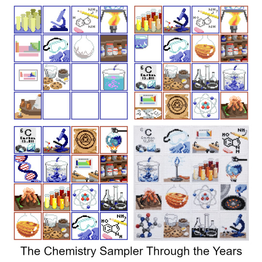
I managed to dig up all four of the WIP pixel art files for the Chemistry Sampler, with the oldest dating back to Dec 2018-- three years ago, now!-- and with them, loads and loads of old sketches, rejected ideas, and half-finished panels. So if you’d like to come with on a lengthy-- lengthy!-- dive into the process of making a 16-part sampler, click below!
(I’m not kidding, though! This got long as hell!)
I’m going to go through the sampler panel-by-panel, in the order they were first conceived, but that is not at all how the actual design process went. One doesn’t work on a single panel, finish it, and then move on to the next-- instead, it’s all working on every panel all at once, jumping from here to there, trying to make each piece look good on its own and also look good as part of a whole. I also started and stopped working on the sampler at least three different times over the years, which meant even more changes as my style and abilities altered over time. But for ease of organization, I’ll be taking things one panel at a time. So, from the top-! 🎬💥

The Test Tubes were the first panel sketched, with no specific color in mind, and the original composition didn’t change a pixel all the way to the end! The colors, however, changed constantly: I remember for a while they were mostly neutrals, but once I knew I wanted to have a yellow pencil, orange bottle, and some brown cookies in the other panels the colors of the test tubes changed to match.
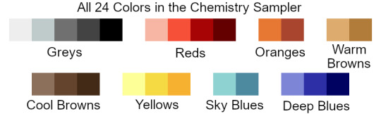
When I went to stitch the sampler, this was the panel I started with: since it uses thread from every single color family in the sampler (except for the two blues), I figured if I could find threads that worked well together here, they’d look good everywhere else, too.

The Microscope was the second panel sketched, and it didn’t change too much, either. The very first sketch was wicked flat, and imho flat = boring, so I rotated it around to put it at an angle and give it some more depth. I later decided to put a little molecule model (ethanol-- looks like a cute little puppy) next to it to help fill out the space. There is also a full-panel picture of another molecule model elsewhere in the sampler, but by the time I decided to include that panel this one was both already completely designed *and* completely stitched, so it was a little late to change the molecule to something else. And anyway, I like the little guy! So I’m glad he stuck around. :)

The Periodic Table was the no. 1 absolute must-have for a chemistry sampler, but it also posed a unique challenge in that it was the only part where the size was out of my control: if I made each element 2x2 squares they wouldn’t all fit in the panel, so they had to be 1x1-- but that left a huge amount of empty space around them. My solution: placing the table inside a classroom, as a poster.
The first classroom draft doesn’t read well (is that a kitchen sink??) and the second one was even worse. I liked the idea of including larger squares for the elements, but drawing them that small and at odd angles made them hard to identify even as pixel art, and as a general rule of thumb fine details are always *less* distinct in the stitched version than in the digital pattern. Version three is much better: you can see multiple workstations and stools, making it clear that it’s a classroom space, and the repeated diagonal lines give it a nice sense of dimension. That’s always a good thing.
(Confession: on its own, I like the rainbow color palette better than the final one, but aside from a tiny bit in the volcano panel this was the only part that had any green at all. Next to all the blue and orange panels the green looked out of place, so for the sake of the larger, cohesive whole it had to change.)
The PPE was the reason this sampler ended up so blue! I liked the first sketch, and the first colors, so I started using the same two sorts of blues to sketch out other panels. Made a few small changes to this one later-- added another glove-- but nothing major.
The Molecule Sketch also didn’t change much, except that it started off *really* messy and was constantly tweaked to be a little cleaner each time I came back to the sampler after a break. Turns out it’s hard to draw a pentagon on a square grid! In the first sketch younger me tried to use antialiasing to smooth out the corners-- see the pale grey parts along all the diagonals-- but nowadays I would consider that extremely bad pattern design. Yeah, it’d make the lines look better when stitched on white fabric, but on dark fabric the pale parts would stick out like a lightbulb and the whole effect would be ruined.
I also eventually added a little backstitching detail, since somewhere between 2018 and 2020ish I finally got over my irrational fear of designing with backstitch. Baby steps! 🙏

The Boiling Flask started life as a closeup shot of a bunsen burner flame + some tiny bubbles, but after a little while I figured that the water was more interesting than the flame. Plus the silhouette is clearer!

We’ve already seen where all the blues came from, which means it’s time to bring in the oranges!
Jupiter in a Bottle is, along with the PPE, one of the two panels that set the tone for all the others. There were about three seconds where I thought I’d try for a pale, crystalline effect for it, but I quickly switched to something brighter and rounder. At that point the chem sampler looked roughly like this:

…so, ah, not very promising, but I remember thinking ‘well, if nothing else, at least I’d have fun stitching the goggles and the orange one”. So since I was sure I wanted to keep those two, all of the other squares ended up being designed around them and borrowed a lot of their colors.. In the end I decided to go all-in on the oranges and blues, and, well, I think it worked out nicely! :)

This little bastard was The Reagent Cabinet, and it’s one of the panels that eventually got cut! It was a very early introduction, and stuck around almost all the way to the finish. I didn’t ever like it, though: it’s not very interesting, not very beautiful, and if I had stitched it it would have been the *only* full-coverage panel in the entire sampler, and so would have looked very out-of-place and heavy compared to the rest of the design.
Still, it technically fit the color scheme, and technically the theme, too, so I didn’t actually have the guts to chop it until I went to export the image and start stitching. At that point, dreading the idea of laboring over an entire full-coverage panel of a design I hated, I finally deleted it and started stitching everything else anyway, just with a giant empty hole in the corner of the pattern. I figured “well, I may be burnt out on designing for now... but once I’ve been stitching a while I’m sure the spark will come back, and I’ll think of something to fill the space”. And so it did, eventually!
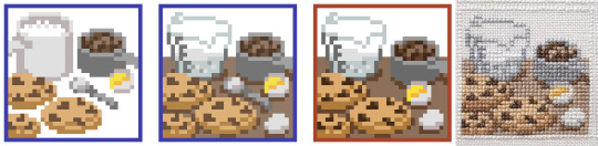
The Cookies, however, are a panel that I’ve loved from the beginning 🤎 I wanted to include a nod to ‘everyday chemistry’ alongside the more ‘serious’ designs; a carryover from the math sampler, in a sense, with its bees and shells.
These particular cookies are based off of my Mom’s chocolate chip cookies, which are kind of sort of like this recipe, but better somehow, and made out of old Y2K surplus that she bought off a disenchanted ex-prepper. Somehow the 20-year-old powdered peanut butter just hits different...
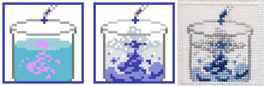
The Billowing Liquid was a effect that was, at least at the beginning, too far above my pay grade: I knew I wanted ‘some kinda sick-looking swooshy liquid effect, like in VFX reels or something?’, but that’s, uh, not a very concrete concept. I ended up realizing I was thinking of an ink-in-water effect, so from that I was able to look up reference vids and start sketching out some actual shapes. I added a little fizz on top, too, for extra effect-- and I think it did end up looking the way I originally envisioned it, even if I didn’t have the words or the skills to capture it back then!

Another cut panel! This one’s the Alchemical Equipment: the idea was that hey, the modern science of chemistry is descended from the mystical practice of alchemy, so wouldn’t be cool to put a nod to alchemy into the sampler? Also alchemical symbolism is wicked cool. ⁽ᴬˡˢᵒ ᵃˡˢᵒ ᵐʸ ᶠʳᶦᵉⁿᵈ ʰᵃᵈ ʲᵘˢᵗ ᵍᵒᵗᵗᵉⁿ ᵐᵉ ᵗᵒ ᵖˡᵃʸ ᴺᵃⁿᶜʸ ᴰʳᵉʷ: ᶜᵘʳˢᵉ ᵒᶠ ᴮˡᵃᶜᵏᵐᵒᵒʳ ᴹᵃⁿᵒʳ ᵃⁿᵈ ᶦᵗ ʷᵃˢ ʳᵉᵃˡˡʸ ᵍᵒᵒᵈ⁾
I tried a couple different takes on this panel, and I still like both of the last two a lot, but in the end they didn’t fit at all with the rest of the sampler, so! For the good of the whole ✂

The Atom is one of the few where I still had my very, very first sketch saved! 😆 Normally I don’t save these-- I’ll either start cleaning up the sketch on that same layer, or will delete the sketch once I’ve got a first draft started-- but not for this one, or for the next two with it!
After the jump from sketch to first draft, this panel didn’t change much: I just added in the nucleus and made some of the curves less jerky and more smooth.

The Glassware Collection was sketched at the same time as the atom, so you can see its original iteration too! The biggest challenge here was to figure out how I wanted to handle the transparency of the glass: all the other glassware in the sampler was filled with something or other, and I debated whether or not to fill in these beakers and bottles too, with either plain white stitches, or grey, or both. In the end I stitched a bit of white shine on each bottle as a highlight, and left the rest of the space empty. Straight up, on my fabric it’s hardly visible at all, but I made some mockups and found that if someone were to stitch this same panel on black or dark fabric, then this version would look way better than one with the bottles filled completely with stitching. So it may not make my version look any better, but hey, for somebody else someday it will. :)

The Volcano is a kid’s chemistry classic! I toyed briefly with the idea of doing one of the other classic childhood experiments: red cabbage pH tests, or the rubber egg, but none of them are as instantly recognizable as the vinegar-and-baking-soda volcano, I think.
The Element of Carbon is a spinoff from that one rejected periodic table idea! This panel was one I made right after returning to the project after a long, long break. To get back into the swing of things I went through a bunch of my old discarded prototypes, and discovered that there were some good ideas hidden in there: they just needed to be fleshed out more, and given their own space to breathe.
Also, in the time since I started this design I finally learned how to do a french knot! At long last, I’m a real cross-stitcher 🏅

The Bunsen Burner was made right before I started stitching the sampler: at that point I had the color scheme just about figured out, and most of the panels most of the way done, and there were only two or three spaces left with no design or a soon-to-be-cut filler design. At that point I reached out to a friend of mine who had studied chemistry in college and asked them for some feedback, and they helped me tighten up the design a lot! This is when the alchemy panel finally got the chop, and in its place the bunsen burner came back: now zoomed all the way out, for easy visibility, and with a pretty new shine effect up top.

The Centrifuge was the other panel my friend recommended-- and Evan, if you’re reading this, thanks a million! This one was an easy breezy design to make: pleasant shapes, an interesting subject, and lots of ovals. I do love a good oval.
This panel and the one before it came together *fast*: I was trying very hard to lock down final designs so I could lock in final colors so I could lock in a final arrangement so I could finally, finally, start stitching. I figured if I could get the sampler to the stitching phase then the ball would at last be rolling fast enough that I wouldn’t be in danger of abandoning the project again-- a pretty bold hope, given that I was more than two years and several abandonments in, but hey, I was still hoping!
One problem: this is the point when I finally cut the reagent cabinet, so, while I *had* finally gotten to the stitching phase, I was still only stitching 15/16ths of a pattern. Enter:

The Molecule Model
The final panel! I had hoped to come up with a suitable final idea in the process of stitching the sampler, and it took a hell of a long time to get there: I believe I had all the panels started, and a few of them finished, even, by the time the idea for this one rolled around. I was working, then, with a fixed position for the panel, along with a fixed color palette, but if anything those constraints made designing it easier. I just picked an interestingly-shaped molecule (theobromine, found in chocolate and tea), built it in MolView, spun it around until I got a cool angle, sketched it, and bam! Final panel complete!
…minus a mountain of tweaking, of course. All the other panels had had months to get their rough edges ironed out, but for this one I just kept the file open as I stitched, fixing problems as I found them. I would not recommend it-- you have to unpick a lot of stitches anytime you decide ‘actually, it looks better one square to the left’!
~~~~~~~~~~~~
So, did it work? Did it all come together in the end? God, I hope so!
But you know, I think it did. :)
Thanks for reading! ✌
-Geri
P.S. it’s not about any specific panel, but you see how the early drafts have colored borders, while the final version has white ones? At one point I was using a draft of the sampler to mess around with GIMP’s content aware fill, trying to make some glitch art, y’know? And the results were pretty cool, but also overwhelmingly line-y:

…and I was hoping to try and make glitched-out versions of the individual panels, instead. So I took the version I was experimenting with and deleted the borders from it, and from that discovered two things:
One, that it was a huge improvement to the composition and should absolutely be carried over to the official version of the file, and
Two, that it did not make the content aware fill work any better, and in fact made the results look worse.
This postscript has a happy ending though: turns out if you take any individual panel and use it to tile a plane then you can select a chunk of it, use the content-aware fill, and then pick out the best bits to make your own glitchy sampler :)

✌!
#cross stitch#embroidery#chemistry sampler#progress pics#long post#damn! someone remind me that I specced into math for a reason#and the reason was that writing is hard#but I do like reading abt other people's artistic process#so if you too enjoy that then#this is for you!#enjoy!
60 notes
·
View notes
Text
End of Year Questions for Writers and Artists
Was tagged by @eredins-a-king-aint-he thank you for that! ❤️ (and I'll finally answer in a timely manner XD)
Tagging @traumschwinge @dazedandinked @do-androids-dream-ao3acc and @rawrkinjd if you want to that is :) Or anyone who wants to look back on their 2021 projects (tag me in that case pls!)
Questions:
1. What project are you most proud of and why?
2. Which project did you have the most fun making?
3. Which project was the most unexpected and/or challenging and why?
4. Which project would you like to receive more attention?
5. Is there a project you intended to work on but couldn’t find the time? If so, what is it?
6. Have you noticed an improvement in your skill this year? Did a specific project help?
7. If you could remake any project you’ve created this year, which one would it be and why?
8. What project would you like to make next year?
Answers under the cut:
And again with the answers:
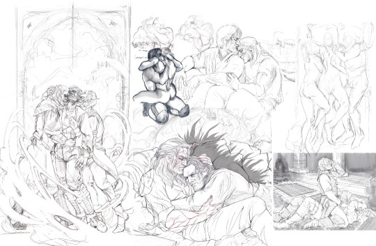
1. What project are you most proud of and why?
That's difficult to say because there are so many pieces where I'm very proud of certain details or aspects of the creation process. But the one I'm proudest of for carrying through the entire project was the 5+1 collection of Geralt being picked up and carried around. It had so many pieces that I wasn't sure I was going to finish all of them, especially considering how legs are very hard for me ^^;
2. Which project did you have the most fun making?
The one above. I generally suffer and whine a lot during the process of working on a project, because I try to force myself to use colours (and I regularly forget my brush and colour palette settings orz) so technically that's less fun. But the poses were fun to try and figure out and alter for armor and the different body type of the characters (even Geralt went through some changes, especially with Letho lol), and it was ultimately funny to keep squinting at my figures and wonder "when did your legs grow that extra mile, my dude?"
3. Which project was the most unexpected and/or challenging and why?
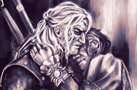
The Geralt and Duny chilling in the cave by firelight I made for the Witcher BB. I'll be honest, even with my fascination for Emhyr and his curse I did not actually expect that I would end up drawing a hedgehog. Ever. But here I am. I pushed myself on textures and mood and lighting and background, and it was a lot of panicked scrambling in the beginning, but it turned out unexpectedly cool, and I'm real proud of it. Especially for the 3 hours I'd spent on all the furs on Duny's shoulder and in the bg. (and the rock texture, god that was fun!)
4. Which project would you like to receive more attention?
All of my big bang pieces tbh, because I do try to really push myself on them and they get little attention compared to that, I think?, but if I'm being very honest it's this one. I mean, it did one of the best amongst my Geralt/Emhyr pieces, but I love this one so much, I really would have liked if it got a little more attention. We all have our darlings, you know?
5. Is there a project you intended to work on but couldn’t find the time? If so, what is it?
Yeah, plenty. A lot of them are fic illustrations where I have a very rough sketch outline, but something just refuses to work and I just didn't have the time or energy to figure it out (there are 3 of those in the below compilation of wips I really wanted to work on this year). (It's mostly patience that I lack tho.) There is the one with Geralt and Eskel - which I plan to figure out in January, as I'm planning to dedicate that month to him; and further prompt fills for the Witcher Rareship Summer Bingo that I didn't have time for. That includes Geralt and Regis and Dettlaff sharing only one bed (there are so many limbs and pointy elbows there omg); Eskel, Lambert and Geralt howling at the moon for the 'Serenading' prompt that I imagined would have been best in a little comic strip kind of format and would end up a little sappy (I don't have a single line laid out for that one); Geralt and Emhyr cuddling after a nightmare and Geralt still having his toxicity lines showing.... I really had big plans this year. Way too big.
6. Have you noticed an improvement in your skill this year? Did a specific project help?
Yeah, definitely. I've improved a lot this year in many, many aspects. I've learnt a lot of anatomy (it's a big jump from zero to some but it still felt like a lot, even though I only just noticed how little I actually know lol); and while I forgot how portraits work, I think I can finally put the eyes in their right place and right-ish size. Most of the time. It's been a huge issue that still haunts me from previous years. Umm... I did a lot of drawings for the drawer (and Traum), because I'm not willing to go to twitter to post them (so you might guess what those drawings are), and they helped a lot. Lots of limbs and muscles in action, that's all I'm saying. They are very helpful.
7. If you could remake any project you’ve created this year, which one would it be and why?
It would be this one, with Geralt and Emhyr. I still very much like the accidental texture of the armour and cloth folds, and there is a charm to how rough it is, but I'd really love to see it a little more smoothed out (now that I'm familiar with the brush as well) and fix some anatomy issues with Emhyr. His arm is bugging me.
8. What project would you like to make next year?
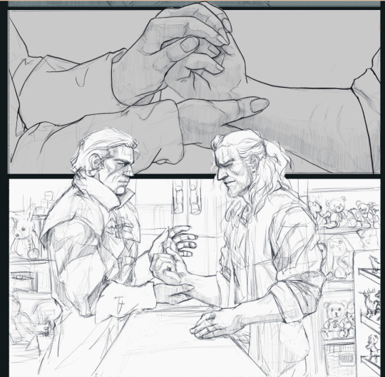
As I've mentioned above, I would like to draw a lot of Eskel in January. I'll never forgive how TWN did so dirty by him in season 2, and I feel very bad for having pushed him back in this year's project line-up. (I'm open to ideas and proddings ;)) I would also like to work on the rarepair bingo prompts and see where they take me. As well as finally finishing this piece I started back in January for Anomalous Elixirs. It's almost done, only missing the lines and colours for the last panel with Geralt and Dettlaff.... and my courage to look at the other panels to rework some details, because hoo boy, is it obvious that I've been working on it on and off throughout the whole year.
Aside from those, I'd probably set the same goals for myself as I did for 2021. Push my working process so that a piece wouldn't take weeks to complete; learn how to do backgrounds (that's not just a bed); work on simplifying my style into something more illustrative and less semi-realistic, if that makes sense? I feel like that's trapping me a lot. Also I want to do some cute sticker designs, i'm really looking forward to those ^^
#my art#tag games#thanks a lot for tagging me into this!#I'm very proud of the second half of my year#emralt#because that's what I have most of here tbh#I always feel like i didn't draw anything...#alex rambles
19 notes
·
View notes
Last Seen Blogs

cardamon-tea
Untitled

lydiasamcong379as
Untitled
futureman-outofcontext
Out of context future man
thetripawedproject
The Tripawed Project
flipping-phan-tastic
look at that face