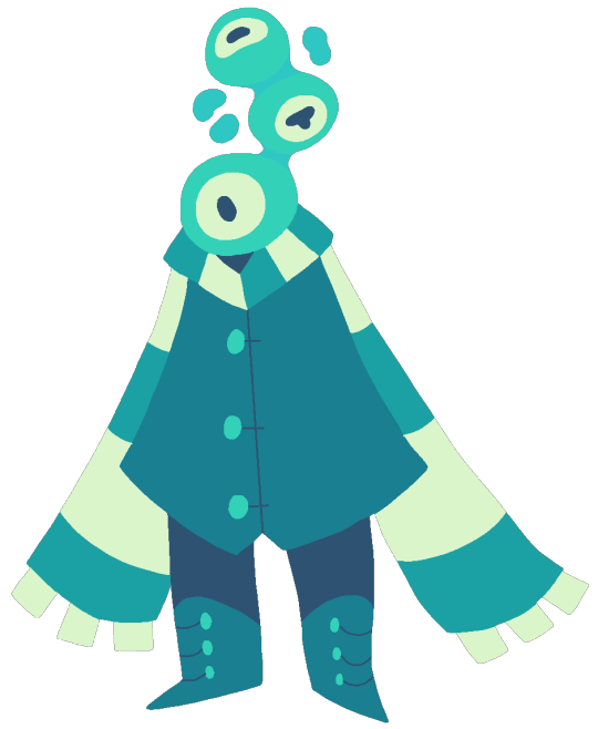
#irregular shape
Text
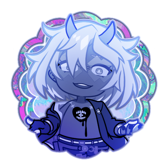

Icon of Happy Chaos from Guilty Gear Strive
○ 600x600 px
● Free to use
○ Please like / reblog if using or saving.
#Guilty Gear#Guilty Gear Strive#Happy Chaos#guilty gear icons#anime icons#video game icons#chibi icons#happy chaos icons#icons#free to use#mod jay#jay's edit#icon#irregular shape#queued#trying a slightly different style what yall think??#still gotta keep the bright colors and lowkey glitchcore aesthetic ofc tho lol
8 notes
·
View notes
Text
足下の化石
270×295㎜ 合板にアクリルガッシュ 2006年 個人蔵
1 note
·
View note
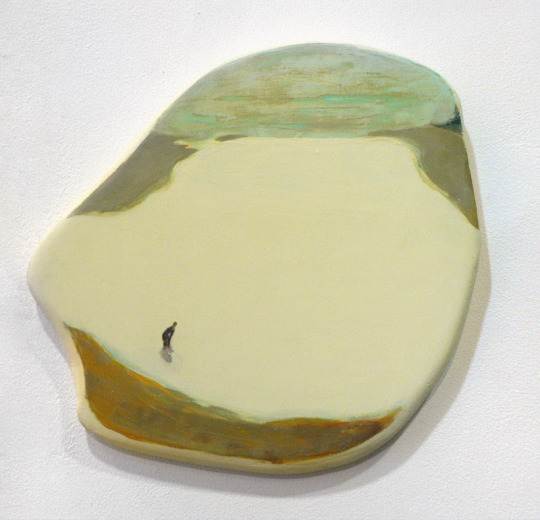
Photo
Pool Pool House in Austin
Idea for a pool house: a sizable traditional backyard stone structure with a custom-shaped lap pool.
0 notes
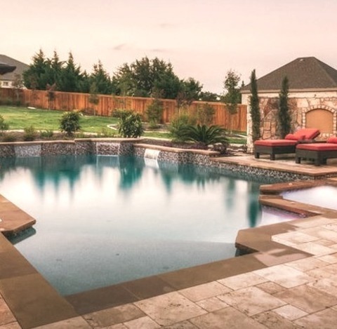
Photo
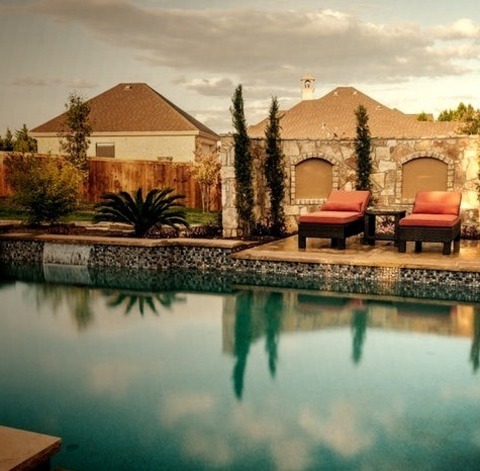
Austin Traditional Pool
An illustration of a sizable, traditional backyard with a stone lap pool house in a custom shape.
0 notes
Text
Breast cancer lumps can vary in size, shape, and texture, and their characteristics may differ among individuals. Typically, breast cancer lumps feel different from normal breast tissue. They are often firm, irregularly shaped, and may have an uneven surface. These lumps may not be painful initially, but in some cases, they can cause tenderness or discomfort. It's important to note that not all breast lumps indicate cancer, as benign conditions can also cause similar changes in the breast. Any unusual or persistent changes in the breast should be promptly examined by a healthcare professional to determine the cause and receive appropriate medical attention.
#Breast cancer#Breast tissue#Irregular shape#Benign conditions#Breast examination#Healthcare professional
0 notes
Text

never, EVER, underestimate the power of putting this shape in a piece of art
#it's so cool every time...#in this house we love irregular star shaped burst of light#put it anywhere and it works#art
7K notes
·
View notes
Text


so god forbid i’m seen just as an average human being
#bill cipher#andrew kryptos#gravity falls#not gonna tag flatland because it seems too tangentially related but you guys get why i draw their mortal designs grayscale and victorian#for anyone going 'what's going on with baby bill's chest???' that's a victorian scoliosis brace#they're mostly covered by clothes usually but with a low collar you would be able to see parts of it#i usually translate his mild irregularity to scoliosis#just realized there's no full drawing of canon era bill in his stupid used car salesman suit. ah well#just know the jacket has a smilar triangle shape to the jacket he wears in the last flatland era drawing and has triangle buttons#you guys have seen it i posted that design before#a good portion of these drawings is just me going 'hee hee victorian fashion fun.' loved drawing andy's stupid big coat#also-- if you notice there's a jump in bill's clothing quality from the pictures where he's around 8 to the one where he's a teen#that's chuck's doing. he was like 'well if you're going to work in a tailor shop you should look the part >:('#and bought bill a 'uniform' so he had some nicer clothes. bill's folks don't really bother getting him nicer clothes most of the time#but if someone else is paying they won't turn it down and he picked up on that
144 notes
·
View notes
Text

nearshore
#all in-camera!!#no freaky editing tricks involved#the city lights look like the waves lapping up against the shoreline#the squiggly box is the front of a passing car; the big irregular shape within it is a headlight smeared across the frame#I knew I had something neat when it first came up in the preview window lol#original photography#my art#glitch art#aesthetic#art#artwork#webcore#internetcore#glitchcore#abstract#artists on tumblr
116 notes
·
View notes
Text

Okay I don't usually post my art (like, ever) but I tried my hand at drawing one of the most iconic hilson photos ever and it??? Actually turned out well???
Wilson doesn't look as annoyed as he does in the original but I managed to get House's thousand yard stare so props to me for that ig
Close ups and reference photo under the cut ⬇️⬇️


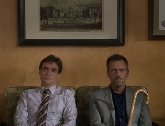
Also DO NOT repost my art or I'll find you and commit medical malpractices against you /hj
#i did NOT mean for houses head to end up looking that small but by the time i realized my mistake i was in too deep to fix it#bro looks like a reverse bobblehead im cackling at how stupid he looks#hardest part to draw? the cane tbh#i hate drawing irregular shapes like that#house md#hate crimes md#hatecrimes md#hilson#hilson art#house x wilson#greg house#james wilson#house md fanart#aerons art#no background because i suck at them and didnt want to mess up this gorgeous masterpiece sorry not sorry#mosses random thoughts
25 notes
·
View notes
Text
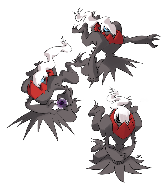
A free emma is an emma who can draw again!! Have a nice collection of my favorite spooky boi!
#darkrai#pokemon#pokemon fanart#emma draws#love drawing this dude--the irregular shapes and slightly sharp corners of the flowy bits are key to getting the design just right#iwant......to learn backgrounds so im not just drawing characters on a blank canvas anymore LOL
210 notes
·
View notes
Note
When did they change artists? I had no idea that happened :0 is there any noticeable difference in the drawings since then to you, like how some people can tell apart different Pokemon artists?
Fool! You activated my art style nerd trap card!
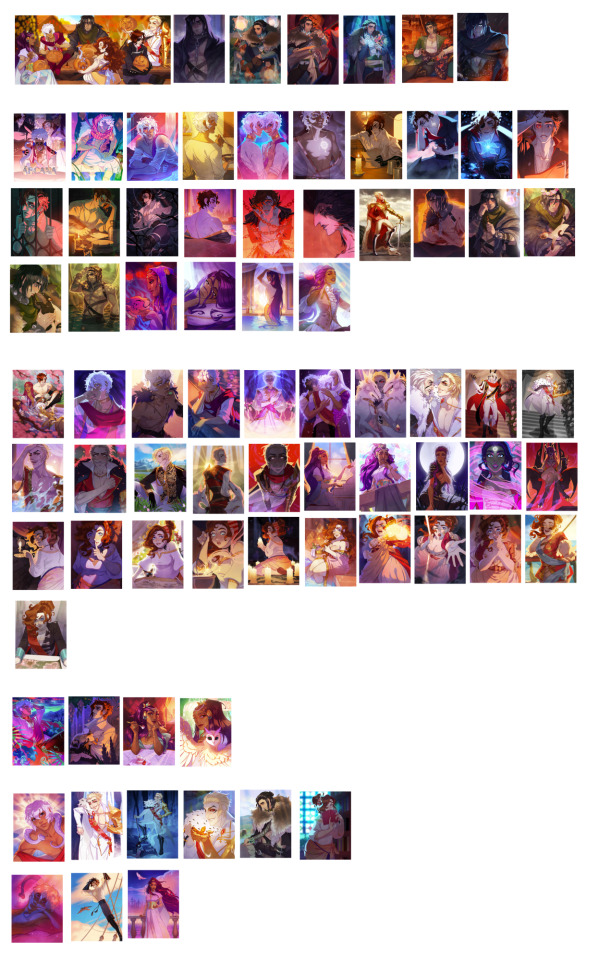
TL;DR: The main stylistic difference between the two main artists, Dana Rune and Gabriella Rosetti, is that Dana Rune's style is very angled and asymmetric. She uses a lot of sharp, varied shapes, while Gabriella Rosetti's style is slightly more rounded and even. Veronica Liwski is most similar to Dana Rune's, but with more detailed and shiny rendering
Detailed thoughts on each artist and my attempt to sort the CGs
Top Group: Unsure artist. The way Muriel is drawn leans more towards how Gabriella Rosetti draws him, with slightly more texture and less defined rendering in the hair. However, there's a slight discomfort in drawing Muriel's squarish face and nose (I relate) and a change in rendering style that suggests a separate artist was involved.
2nd Group: Dana Rune, the original artist and art director for most of the game. She designed all the main LIs, Morga, Vlastomil, etc. She mostly drew Julian and Asra's CGs, along with some of Nadia's and a few of Muriel's. She draw characters with sharp features and loose, detailed hair. Her rendering focuses on bright colours and stark lighting, and her lineart has a lot of weight variation. As art director and creator of the style, she still had a lot of influence on the other illustrations, presumably redlining and giving advice on how to draw her characters.
(Note: Dana Rune designed a lot of the characters alongside another original creator, Nikolai Ladizinsky. Their art style is very distinct from Dana's so I'm pretty sure they didn't do any in-game art, but they still had an influence on the style and aesthetic)
3rd Group: Gabriella Rosetti, the current main artist and art director. They designed most of the courtiers, the Satrinava and Alnzar families, Arcana, and many of the later outfits and characters. They drew all of Portia and Lucio's CGs, along with some of Nadia and Asra's. Their art style is softer, with a more natural edge than Dana's, primarily seen in how they draw hair. Their lighting is less saturated, featuring more daylight scenes with neutral tones.
4th Group: Veronica Liwski, an additional artist who designed Natiqa, assisted with Nasmira, as well as some CGs for Asra, Julian, and Nadia. They also drew some backgrounds. Their art is incredibly detailed and focused on rendering. There's a lot of shine to textures and a focus on detailed hair and clothing. Their lighting is a bit more complex and painted than the other artists. Their art is angular, similar to Dana Rune's, though with a bit more natural weight to the figures.
5th Group: Also unsure, but with even less of a guess. These don't appear in portfolios or have a lot of the distinct traits of specific artists. The original ending CGs for Asra, and the Upright CGs for Nadia and Julian have a more painted texture to the rendering style. Asra's Reversed especially has very different colouring to create its atmosphere. I'd guess they were Gabriella Rosetti's, but the Portia CG has a change in rendering more similar to the sprite style. Gabriella Rosetti tends to draw the faces with more detail.
#the arcana#not art#but art thoughts#personally i'm most similar to gabriella rosetti's art style#as my lineart and shapes are naturally rounded and i struggle with angular irregular drawing#however I think i'm more comfortable drawing muriel and julian than they are#while i'm less comfortable with asra
362 notes
·
View notes
Text
Artists jumping on the "design a tennogen Entrati-style" train and I'm just thinking how it's a shame tennogen cannot deviate much from the base forms, since Entrati style is specifically described as clunky, boxy and archaic, but all the Warframes are very organic and fluid.
Then again, Corpus style is also boxy, but it's high-tech and a lot of Corpus tennogen looks really neat. I'm just not a designer at all so I can't even wrap my head around such stuff.
#wf tag#(sighs) Citrine Otak inspired tennogen would be neat#honestly i wonder how much youre allowed to get creative with her gem parts#you could convert them into obols and then carve them out like otak#but i have no idea how any of the works#also i feel like the irregular shape of her gem body wouldnt fit with the geometric shapes of the obols#hue hue#that said ONE artist is working on a citrine tennogen#so there is hope for me#in terms of customization
7 notes
·
View notes
Text
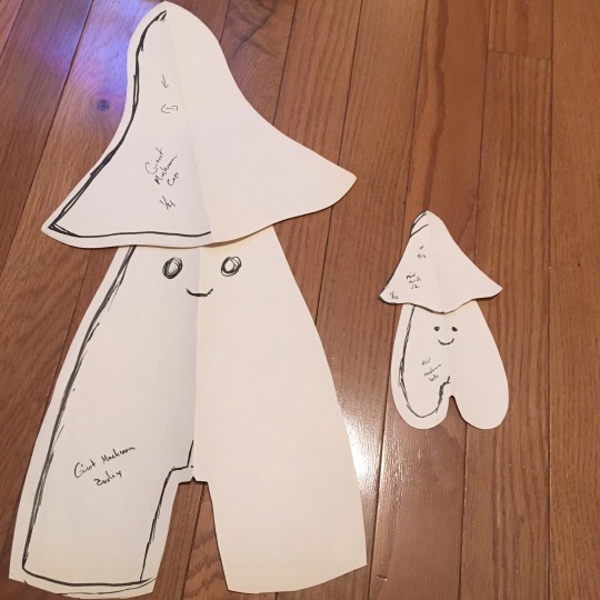
Giant mushroom creature pattern progress, with the mini mushroom pattern for scale!
#the pattern making process#Idk if any of y’all are interested in behind the scenes pattern making stuff like this#like that the big version has a separate piece for the bottom of the feet and a dart in the middle#that the little version doesn’t have#to make it more 3D. the little version relies on the stretch of the fabric and the stuffing for shaping#the big mushroom miiiight be a bit too tapered#but we’ll see lol#and it’s a mushroom so some irregularity of shape is expected
40 notes
·
View notes
Text
HELLO?
#i guess in this house we really DO like the irregular star shaped burst of light#i posted that this morning what's going on
32 notes
·
View notes
Text
for anyone curious-- kryptos, esp. post dimension burning, defines his gender as Square and Shape but not really Male or Guy, like that part's whatever to him, that's not the important part of his identity to him. getting to freely call himself a Square and Shape with no pushback is exciting to him because, as his status as a square-born-to-a-square, he was consistently ignored, told he should have been something else-- namely a pentagon, very rarely an equilateral because as tragic as a descent in caste would have been, it would have been more Normal Than This-- and forced into weird arbitrary roles and rotating schools and castes in early childhood before it was finally decided that fine, he was a square, they guessed... but also barely and because he was Barely A Square by the stupid laws of configuration and because the circumstances of his birth were so Strange and his Abnormality was so Apparent, he had to go to school with equilaterals so that only the lower middle class kids were put at risk by his Weirdness, and not the other Much More Valuable Real Squares. so getting to the point where he was one of the only members of his species left and he gets to just go "yeah, i am a square, i'm the only square left, and i get to decide whatever the hell that means now" was meaningful to him, and the guy part is like. whatever. but he is a square
#his assigned role was always v. arbitrary and shaky. his dad even asks if it's possible that he's a line when he hears he's not a pentagon#because a line is a parallelogram and he was being described as a parallelogram and the barrier between a line and irregular square#would very likely be arbitrary tbh! and it was determined he Was a shape because of his regularity in terms of angles and sides#but of course the fact that by laws of configuration he Should Have Been a pentagon or whatever also was a point of contention#and even him being equilateral would have been Tragic But Sensible by stupid second dimension standards#there was probalby some Unaccounted For irregularity in the family line (definitely the mother's side because if you notice in my fic)#(they almost ALWAYS blame the side of the mother. even oliver cipher did. because well! the seocnd dimension is a misogynistic hellhole!)#but a square having a square son? especially a square with the social clout of his father? that's just unheard of!#so there was a lot of squabble of Where He Should Go and what his caste role should be anyway#so him being a square was always something that felt very arbitrary and like an identity that could be taken from him at any moment#and he doesn't give a shit about his Caste Role anymore but he personally just likes being able to go 'actually i am a square'#'i am a square and i always was a square and i'm the one who gets to decide whatever that label means now'#he feels similarly about being gay. like 'no i actually understand this about myself now and i LIKE this about myself now'#'so i get to say this word as much as i want to now :)'
20 notes
·
View notes
Text
Turbo & Flicker
// art by @bootleggreely !!
Two outskirt fellas! A beat and shape, respectively
Turbos a pretty outgoing and daring beat who often doesn't really think before they act . not scared of the jungle nor the rest of the outskirt areas just by their sheer oblivious nature
Flickers a nervous shape who loves to take notes on everything they see and hear, skittish and untrusting of most folks- except Turbo, who they've been best friends with for decades now!
#jsab#just shapes and beats#just shapes & beats#jsab oc#ROA#Turbo#Flicker#outskirt shapes and beats are a bit weirder looking than their mainland counterparts! theyre often irregular shapes#there's also outskirt flowers but thats for a diff post!!! the general rule of thumb though is that outskirt flowers tend to run the roost#while the shapes/beats of the area are often regarded as weaker. in a sense#so just the opposite of the mainland basically!#flicker and turbo are in a queerplatonic relationship :]
34 notes
·
View notes
Last Seen Blogs
yungblud-universe
🖤 YUNGBLUD 🖤
ranfengfeng
Ranfeng染风
yungblud-universe
🖤 YUNGBLUD 🖤
writtenonbone
We’re At The Mercy Of Gravity
natsuyuu
ღ