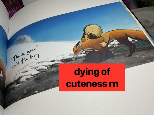
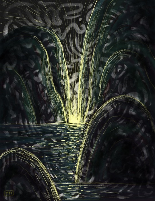
#i tried out the watercolour feature for the background of this one
Text
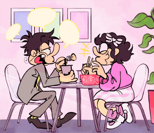
REQUIRED READING for any noisecouple enjoyers: @manicplank 's "the colour pink" fic ITS SOOOO GOOD and i just had to do a little animation of their date.... so so so so cute i love them forever
gif version under the cut:
idk why it loses so much quality . kind of annoying but oh well
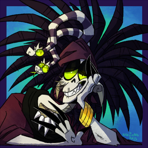
#pizza tower#my art#animation#noisecouple#noise x noisette#the noise pizza tower#noisette pizza tower#theodore noise#noisette#ok a couple of rambly things#number one i prommy their hair started off as black but i kept adding layers and it kinda turned brown and now its too late.#just pretend their hair is darker lol#secondly im genuinely so bad at understanding . words#so i may have interpreted the scene / outfits wrong but i tried my darndest#third of all i love them so much#and i loved every second of drawing this#FOURTH OF ALL sorry i have lots to say#i tried out the watercolour feature for the background of this one#so if it looks a little weeiiird thats cuz idk what im doing :)#ok thats all enjoy mwah
575 notes
·
View notes
Text
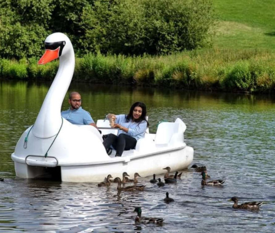
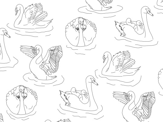
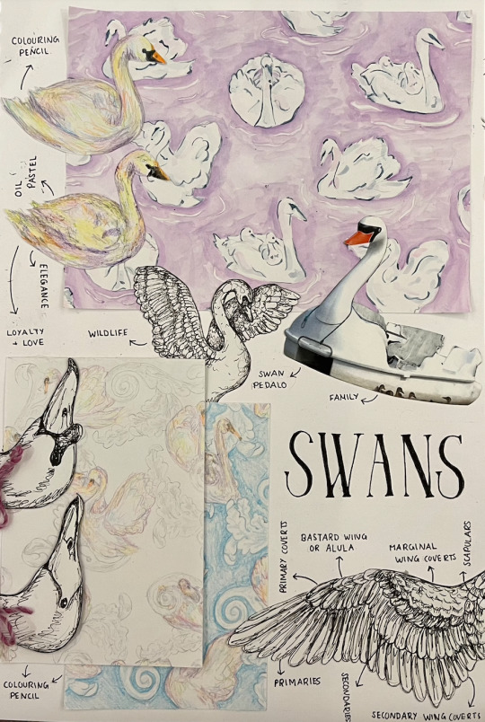
Print Ideas - Swans
One of the many attractions at Cannon Hall are their Swan pedalo's as shown below. I really liked the family and fun concept of this and is the main inspiration for this print.
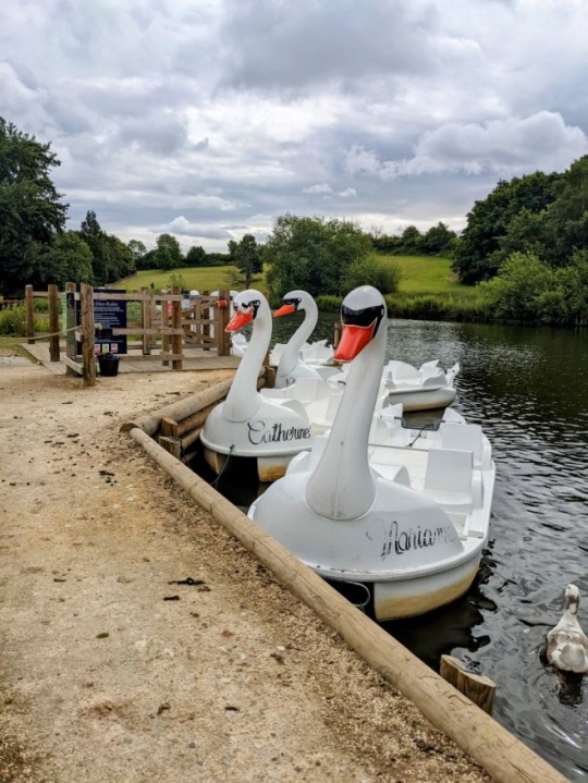
In addition to this a variety of nature and wildlife are seen at Cannon Hall including Swans further forming a reliable print idea for my final design.


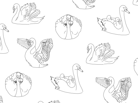
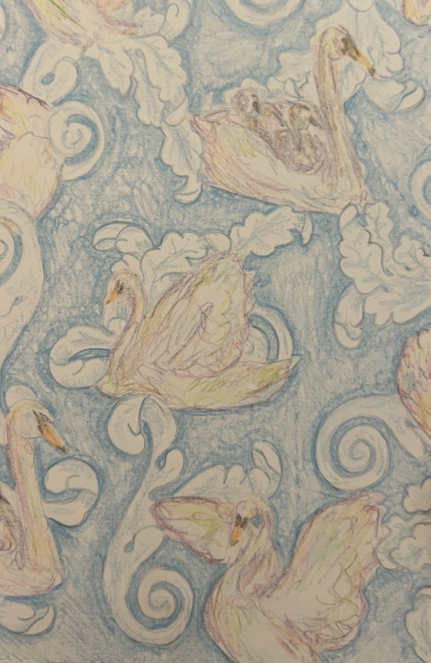
Here I wanted to create a repeating pattern featuring 4 different swans. As shown below I made these digital designs, one featuring a plain background and the other, simplistic ripples in the water were the swans are to try and add a bit of texture and depth to the design.
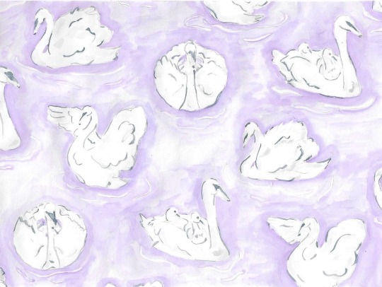
By applying watercolour, I tried to add some colour and depth to the design featuring a purple background with navy highlights on the swans. I like the colour combination however I feel it looks a bit muted and flat but in contrast I know for my final print, I want it to not be so overpowering yet still have the distinctive features so you can see what it is.
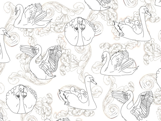
For this next piece I wanted to merge together the swans print above with the ribbon and leaves from the plate. Therefore I layered these on top of each other digitally as shown below.
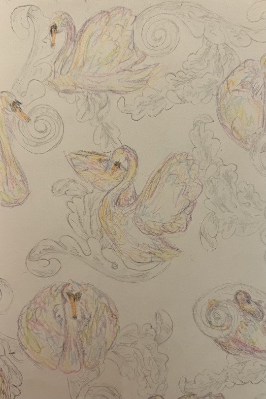
Here I transferred the pattern on to paper and created the designs below. I started with making the swans this pastel rainbow using colouring pencil which I think looks really cool however it’s a bit muted and you can’t really see the details of the swan very much. Once again I couldn’t decide on a colour for the background so for the design on the left I decided to keep it pretty simple and do a white background with grey swirls which I think fits nicely with the pastel colours of the swans. For the design on the right I created a blue background with white swirls featuring blue shading. I like how this turned out as it kind of looks like the sky and clouds as well as the water and waves both linking with the nature of swans.
In conclusion I think these designs turned out quite well and I like the layered effect as it adds a bit of depth and detail to the design not seen in my others.
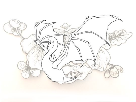
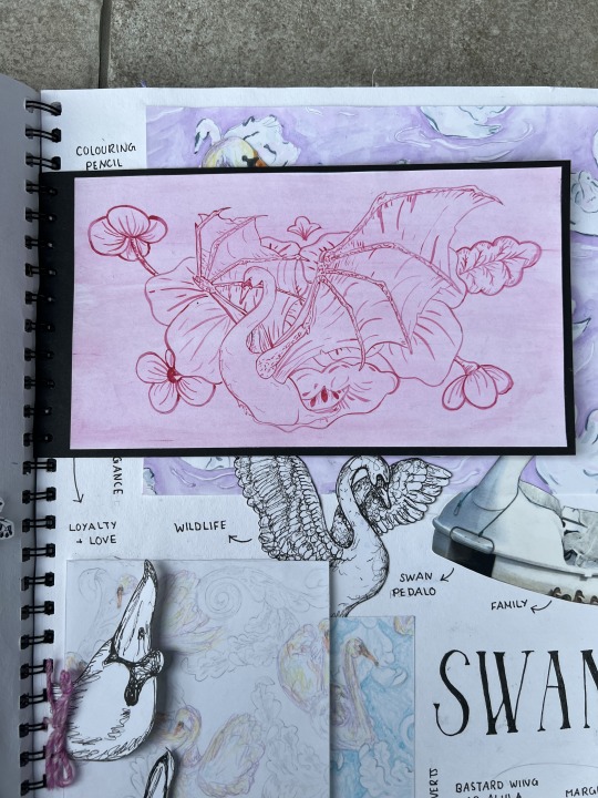
Here I wanted to merge three of my print ideas together, the plate, seams and the dragon glove box. Below is my digital sketch I created to get an idea of the composition.
I placed a swan in the centre of the design however without its feathered wings creating this unique creature.
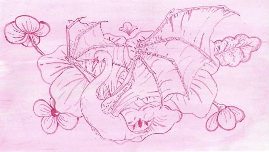
I then created this drawing below using pink watercolour. I wanted to create a more simplistic design by featuring this very simplistic monochromatic colour scheme.
Although I made a few mistakes with the watercolour I still think it turned out pretty good however I think it would look better with some shading.
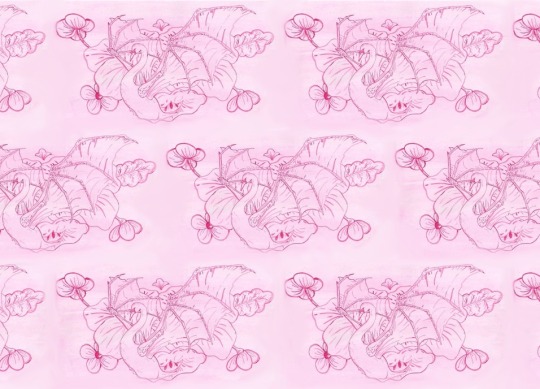
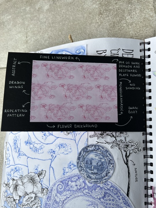
Furthermore, I wanted to see what the design would look like repeated so here I created this digital repeating pattern of the print.
Sketchbook Page:
0 notes
Text
the Boy, the Mole, the Fox and the Horse // review
minor spoilers are ahead, by the way, but I don’t want to cramp this review up with spoilers.
clips of a certain animated short film have been popping up in my mom’s Instagram reel feed, revolving around multiple life lessons as a group of a Boy, Mole, Fox, and Horse trek through the snow. this immediately piqued my interest: what was the short? I asked my mom, and she looked in the description of one of the videos:
“The Boy, the Mole, the Fox and the Horse”.
it was a short on Apple TV+, a subscription I got my hands on via my recent iPad purchase. mom and I decided to watch it on one January night, and we were astonished. well, I wasn’t, at first. after I watched the film for a second time, THAT’s when I started picking up the marvelous dedication, visual details, and touches of hard work that have been presented in front of me.
“The Boy, the Mole, the Fox and the Horse” revolves around the titular characters helping the Boy find a “home”, taking on multiple perilous adventures and learning life lessons from them. this film has an outstanding voice cast, visual quality, storyline, and soundtrack. when I was reading the book that comprised of this film, I squealed restlessly over how simplistic, vibrant, and wholesome the visuals were. one word to describe the character designs: CUTE. THEY’RE SO CUTE.
more on visuals: the visual team manages to distinguish the characters and the background by using dark and bold outlines on the characters and soft, light watercolour strokes on backgrounds. as the background gets farther away, the strokes become more simplistic instead of being blurred out by depth of field: a technique I’ve seen recently in The Mitchells vs. the Machines and Puss in Boots: The Last Wish.
the film incorporates aspects of parallax to provide a feeling of depth. the foreground moves faster than the background on some segments, like the “how fast can you go?” and storm scene. it even features vertical parallax at one point, which I find to be absolutely MESMERIZING. the storm scene is something I want to talk about. the dark colour palette compared to the bright and saturated colours the viewers are used to show how menacing, frightening, and worrying this situation is. the lightning, rain, and camera movement make this sequence stand out from the ones shown before.
to lighten things up, I’d like to talk about the morals presented in this film, as the characters go through a sense of belonging and acceptance. they relate directly to change, moving on, and growth. one of my favourite ones was when the Boy asked the Horse about the “bravest thing he’s said”, to which he responds, “‘Help’. Asking for help isn’t giving up, it’s refusing to give up.”.
I also want to comment on the characters: the Boy is looking for a home, the Mole is obsessed with cake (which brings a lot of comedic aspects to the story) tries to help the Boy, the Fox tries to go out of his comfort zone and help people, and the Horse finds a group where he could be himself without being mocked by his differences. these character traits provide good chemistry and hardly brings tension.
the pacing throughout the short film isn’t something I would change. the natural pauses between lines give time for the viewers to process the moment, but don’t give too much time for the viewers to lose interest in boredom. the pacing affects the soundtrack as well, which is something I’ll touch on.
the soundtrack from Isobel Waller-Bridge matches the tone of the story; soft, playful and wholesome, and fast, depending on the scene. the soft pianos, percussion, and strings played by the BBC Concert Orchestra add a lot to the nature of this film. “Doing Nothing With Friends” from the tracklist is a great example of this.
overall, “The Boy, the Mole, the Fox and the Horse” has easily become one of my favourite animated projects, and has won my heart by its unique visual style and heartwarming morals. I recommend giving it a watch, or reading the book it was adapted from or the book that came out of the film.
0 notes
Text
Weekly Update 28/02/2022
Good evening!
It's the end of February, coming into March, and I'm so excited for what I want to work on the next little while. Happy St David's Day for the 1st of March, if you celebrate, Cymru am byth!
The past week I've been playing Samurai Warriors 4, and to my delight it's even more homoerotic than Samurai Warriors 2 which I grew up with, with a lot more complexity to the characters and a lot of new characters and character angles too, so I'm really enjoying it. If you like that sort of hack-and-slash game, I definitely do recommend it, and I shall almost certainly be playing SW5 at some point.
I'm currently watching Halston, which is on Netflix and is a miniseries about the gay fashion designer, played by Ewan McGregor, which I definitely recommend if you want something a bit mindless to put on - it's trashy and it's fun, and while it's not very deep and doesn't do anything interesting with any of its characters, I've really been enjoying having it on in the background. Some other gems I've enjoyed this week are:
SHUDŌ (2015, dir. To-Anh Bach, Charles Badiller, and Hugo Weiss) - This is a short film, it's literally only a couple of minutes long, and it's about two samurai, once lovers, fighting to the death. Such a lot of emotion and heart packed into such a tiny little piece, and I can't recommend it enough.
The Wretched (2019, dir. Brett Pierce & Drew T. Pierce) - This is a teen horror flick that does some fun stuff with the conventions of monstrous witches, mind control, and some interesting character stuff. I really enjoyed the twist, and I really liked how real a lot of the characters feel - the protagonist in particular is flawed in ways I appreciated, and I liked that a lot.
They Live In The Grey (2022, dir. Abel Vang & Burlee Vang) - This is a new Shudder release, and I really liked it. It's quite slow-paced, so definitely put some time aside to really watch and digest it if you give it a go, but it did so much interesting work with trauma and the isolation of not being able to voice or verbalise that trauma, especially because you feel insecure about communicating it or don't know how to word it. I love what it does with ghosts and haunting, and all the dialogue and character interaction feels so real, to the point of being really quite painful.
The Silenced (2011, dir. Hwang Dong-hyuk) - This one is fucking heavy, but it's a drama based on real life, starring Gong Yoo as a teacher who comes to a school for Deaf children and uncovers several cases of CSA. It's primarily about the court case and the ways in which the process is unjust and corrupt, on top of being in various ways retraumatising for the victims - it's so well done, and Gong Yoo really does just. Nail the role, as is his wont.
Some other stuff from this week that I enjoyed were The Ice King, Nobody Knows I'm Here, District 9, Splinter, and The Hole.
New Works Published
Slice-of-life/Romance Short: Whisper to the Bees
A journalist goes out to do a small piece on everyday farmlife, and ends up meeting an old acquaintance from school.
4.3k, M/M, rated T. Just a light-hearted little window into two men’s lives, introducing Melodious King and Calumellus Renn. Please note warnings for self-harm, references to attempted suicide, mental illness including chronophobia, and bullying and homophobia.
On Patreon / / On Medium
Erotic Short: Warm Welcome Home
Jude comes home to his boyfriend, and is welcomed back with open legs.
2k, rated E, M/M. More Jude Jupp and Richard Chastain — featuring anal, dirty talk, teasing, kissing, and some mild D/s and fantasy around the housewife power dynamic.
Rich and Jude first appeared in Saint Jude's Kitchen.
On Patreon / / On Medium
Erotic Short: Two Artists
A watercolour artist who lives in a country village is faced with the young man who tried and failed at seducing him a decade back.
Just under 3k, cis M/M, rated E. Age difference, anal, orgasm denial, D/s, some pinning and manhandling, a lot of dirty talk, some begging. References made throughout to past fantasies as a teenager.
On Patreon / / On Medium
Serial Update: Rescue Dogs
Cecil and Valorous talk about their childhoods, and then they go on a hike.
Content warnings in this chapter include obsessive tendencies, paedophilia, child abuse, reference to CSA and sexual abuse, alcoholism, manipulation, self-harm, panic attacks, self-esteem issues, identity issues, some emotional numbness from Valorous’ POV, references to dog bites and infection, as well as references to child death.
On Medium / / On WorldAnvil
4 notes
·
View notes
Text
'the space in between' zine


Lockdown has often felt heavy and dark, but for me, it was also a time for reflection and nostalgia for more exciting times. I also had lots of time to watch movies, I watched one in particular about two people who meet on a train and get off in Vienna. One character says, “I believe if there's any kind of God it wouldn't be in any of us, not you or me but just this little space in between. If there's any kind of magic in this world it must be in the attempt of understanding someone sharing something.” It stood out to me and I took it with me the rest of Lockdown. I began to think about how we share things, and how we love when we aren’t able to see one another—hence the title of the zine, ‘the space in between’.
I’ve tried to explore love and our minds in a few ways. We cleaned our house during isolation and I came across a bag of love letters that belong to my mother. For the first page, I scanned in all the postage stamps that were still attached to the envelopes. I then created a simple watercolour painting of hands not quite being able to reach each other, and layered this over the background of stamps. I turned down the transparency to evoke a feeling of wistfulness, as we read some of the letters and found that most contained the feeling of yearning for another. Moreover, one of my mother’s friend’s had doodled all over the back before sending it to her. He created a small cartoon of a funny-looking man whom he called the ‘Potty Panty Man’, I thought it was sweet and wanted to expand on the character. I created a story that he was yearning for love, as my mother friend may have been, and was in search of his ‘Panty Woman’. I scanned in parts of the letter and drew the character digitally into a photo that I had taken of a draped white sheet. I tweaked the hue of the picture to better fit the colour scheme of the character and the zine, and copied in my mother’s friend’s writing (as seen in the third page).
The fourth page is a scan of a painting I had done for the GCSE art course in acrylic. It was a copy of an edited photo of Frida Kahlo, with her head and arm cut out and removed. I wanted to improve my abilities to notice tone, and felt that using an achromatic colour scheme would be useful. I also like the message of ‘loosing your head’, although it may be a bit blatant, it seemed to relate to the darker feelings that Lockdown has brought and perhaps also the much tougher side of missing someone. Page 5-7 focuses on this. However, I interspersed the two black-and-white pages with a short animation I created. I thought about where my mind goes when I think about love, and what my ‘dreamscape’ might look like. I’ve included my original notes on this at the end. I think if I were to do this page again, I might have wanted to create an actual landscape using clay and other sculptural mediums as to emphasise this. Furthermore, I wanted these three pages to be relatively coherent, so for page 7, I edited a photo using Procreate. Since my painting of Frida had no head, the photo is only of a head.
I laced song lyrics throughout as I spent lots of time listening to my favourite albums. I pulled ones that felt relevant to the photos I had taken. For example, pages 8-9, I used cut outs of eyes and mouths with magazine style text that read the lyrics of Frank Ocean’s ‘Thinkin Bout You’. The song reminisces on a past love, and the lyrics explore the need to rekindle that love, and if it is even possible for the speaker. Personally, I think that our eyes and mouths are the most emotive areas of our face, and it is widely known that ‘eyes are the window to the soul’. I wanted to create a simple two page spread with this as the focus. I took photos of myself making faces I thought correlated to that of feeling in love, then edited them into black and white to fit with the other photographs I had included in the zine.
For page 10, I found an artist named Sophie Bryant-Funnell, who uploaded a series of her sketchbook pages to an online archive. For each page she chose a collection of items that reminded me of being a child, Blackberry phones, old perfume and rollerskates. I really enjoyed her use of sweet, bright colours and wanted to replicate that same feeling of child-like excitement. Over 2020, I kept in contact with friends by sending small gifts and letters. I was sent many things also, I arranged them on a piece of paper and painted them in watercolour. The last page again, features lyrics and a photo also from my original GCSE portfolio. It was apart of an exploration of Henry Moore’s work, however I think it didn’t really suit his style—which is much more morose.
Overall, I tried to be conscious of the textures I wanted to use throughout the zine also, much like the transparency of the easier watercolour. I used mostly fluffy and soft fabrics, which also feature of the front and back covers and avoided too many harsh lines which is why I opted for watercolour for most of the drawings I did.
2 notes
·
View notes
Text
things i forgot to tell you (ch. 10: that we shift like water *interlude*)
Every painting on Eliott’s wall represents something that is his.
It is mostly abstract and something only he can decode, but he likes it that way. It’s an out-in-the-open secret. Right there on his living room wall, where people can look at it and wonder but get no real answers to their question. Privacy of thought is not something Eliott is used to, not when he has to say it all to doctors and therapists and parents and strangers. This is his go at it.
So there it is — his mind, a white sheet of paper with violent slashes of colour on it and the muted, normal-like hue of the good days in the background. The memory of his childhood to-go place, a lake that was never really calm, even on the windless days. Dark, starry nights Eliott likes to revel in when he gets too caught up in his work in the studio and gets out when it’s already dark outside and is greeted, then, by the vast expanse of constellations right there above his head, feeling like he’s the only person in the whole city to witness them. Grey, quick sketches of how his mom’s hair curls around her ears, or how his father smiles. That’s all his.
All this, and more.
*
In the afternoon, after everyone has left the studio, after the classes have ended and the lecture halls have gotten silent, Eliott stays behind and paints.
Or tries to, anyway. That’s a better way to put it, he guesses, when everything he makes comes out either mediocre or just simply awful, flat, empty, and that’s fitting, a part of him thinks, before another fraction of his mind rushes it away. The studio feels big and too still. He sets up a canvas right next to the window, dips his brush in grey and in pink and in purple and in white, tries to make something of it, but it doesn’t work. The slashes of colour all look out of place. The specs of paint mix with one another and just make nothing.
Eliott paints anyway. These days, he does that a lot. It’s not like he has anything else to do, and there’s no-one here to see the way he keeps biting on his lower lip and how his hand trembles a little, fingers gripping the brush a shy of too tight, so he keeps painting, and when he’s done, he just leaves the canvas where it is, doesn’t care if it fades in the sunlight.
He goes to the sink, washes the brushes, sets them out to dry, catches his reflection in the paint-splattered mirror in the corner, bites down on his lip again.
His face looks like the painting, he thinks. Seems without purpose, doesn’t make sense, made up of the same colours, pale in the sun. The grey under his eyes, the pink of his skin, the purple of a bruise on his neck all melt together. Eliott looks and looks and sees the same mess, the same kind of aimless disorder. His mouth is a pale, twisted line.
He runs a hand over his face to not have to look at it anymore, then goes, because it’s already dark outside.
*
Yvonne gestures at him to come over when the class ends, so Eliott does. He watches her smile at other students as they leave, and then she smiles up at him, so he smiles back.
”Eliott,” she tells him, fiddles a little with the papers on her desk, then pushes them away so that she can prop her hip on the edge of it,”there’s something I’ve been meaning to talk to you about.”
Eliott nods. Then he watches as Yvonne takes a breath, pushes her red-rimmed glasses up on the bridge of her nose. She follows the last students with her gaze as they leave the room, and then they’re left alone, Eliott and her. Eliott shifts his weight.
”It is quite a delicate subject, so,” she says, as if in lieu of a preamble, turning back to him. Eliott watches as something crosses her face. Then, she goes on, ”I should have mentioned this earlier, I know. I wanted to apologise, you see. For what I said back at the exhibition.”
Eliott looks at her. Then, very inelegantly, he says, "What?”
Yvonne shifts her shoulders in something that’s not quite a shrug.”I shouldn’t have made that comment. I realise now that is was sort of tactless. I let myself go, maybe, just a little, and it just slipped out, and I’m sorry. That’s what I wanted to say. I think I made you uncomfortable, which was never my intention.”
Something in the centre of Eliott’s chest stings, suddenly. ”No, that’ s—that’s no problem.”
”I really hope you had a nice time, regardless," Yvonne continues. Eliott looks at how her features seem to soften, how effortlessly she brings the memory of that evening back to life when Eliott has been avoiding it for weeks. He takes a breath. It’s shallow, all of a sudden. ”Did your friend have fun? Lucas, right?”
”Yeah, Lucas. Yes,” Eliott says in response, and the name burns on his tongue. He swallows. His throat is tight. ”I think he liked it, yes. The exhibition.”
And just like that, it’s all suddenly there. Eliott has been fighting the memory with everything he had left, and he’s managed to push it somewhere far and away where it would be less wonderful and less hurting, but now it’s here again. All of it, there and gone — the taste of wine, the music in the air, how warm Lucas’s skin felt against Eliott’s own, how his eyes shone, how wide his smile was. Eliott had that, for a short while. For a while, it was his.
The thing is this — he wishes he didn’t say what he said, back then, to Yvonne. Those were words that slipped out in an onset of panic. He let them tumble past his lips because he could hold Lucas is his arms and press his lips to his skin and think all sorts of incredible things about him, wish for all sorts of wonders to happen, but the truth was that they were not together. Not officially. Eliott used to think they could be, when he let himself get too hopeful and too naive, when Lucas would kiss him all of a sudden or fall asleep in his bed, but.
But then he remembers how Lucas looked when Yvonne said it all, when Eliott risked a glance to see if he was, maybe, looking back, if he had in his eyes the same thing that Eliott had been seeing in his own for weeks. But Lucas didn’t. Eliott thinks, now, about how Lucas curled into himself and suddenly just seemed—uncomfortable, or nervous, or disturbed. Like the thought of being with Eliott made him. Upset, almost.
It stings. He tries to breathe through it.
Across from him, Yvonne claps her hands, now smiling.
”Ah, that’s wonderful,” she says, her voice brighter. Eliott blinks, once and then again and then lifts his eyes to her. ”It’s such a relief you’re not mad about that! There’s something else I wanted to ask you about, actually, you see—” and then Eliott stands and listens to her talk about another exhibition she’ll be setting up next month, and if he would like to be a proper part of it this time.
Eliott hasn’t managed to paint anything good in weeks, even though he spends thrice as much time in the studio as he used to. He still says, ”I’ll think about it.”
”Great!” she tells him and then lets him go with a broad smile and wishes of good luck.
As he leaves, he doesn’t quite manage to smile back.
*
Time doesn’t pass like it usually does, now. Eliott feels his days from start to finish, all the way, tries to fill them with something.
It’s a pattern he’s familiar with, but reinterpreted — too much or too little, never really the stage in-between, not quite. It feels like floating in water. One moment, he’s at the shore, the world languid and molasses-slow, and then he blinks, and he’s in the middle of the ocean, doesn’t know how he got there, with the horizon level and lacking. That’s what he feels like. Time moves slow, then too-fast, then slow again.
But he gets through it. His head has been too full, overly so, but he gets through it. See — Lucas has always helped with taking the strings of Eliott’s jumbled thoughts and smoothing them out, but he’s not really around to quiet the noise of his mind down anymore, so. It is what it is.
Time passes, then. Eliott sees his friends from time to time. He sticks a smile to his face and doesn’t let it fall until he’s sure he’s alone. He does the things he’s supposed to, locks himself in the studio until he’s forced to go home, works on his projects, walks to and from the bus stop, in the morning and at night.
He sees Yann, there, once, hands in his pockets, jacket zipped all the way up. Their eyes meet. Something flits across Yann’s features at first and sharpens up as if in a camera lens, takes form, water to ice. But then, well — maybe it’s the trick of a streetlamp light, or maybe Yann sees something in Eliott’s face that he is not quick enough to cover, or maybe he knows something, because his eyes go kind again, a blurry, soft watercolour.
But it’s not like it matters. Eliott doesn’t feel like talking, and Yann turns his eyes away from his face and doesn’t say anything, either. They stand in silence. Whatever that could mean, this shift, it doesn’t change much. This much, Eliott is aware of.
They get on different busses. Eliott goes home and, like every other night, doesn’t fall asleep for a long time.
*
The thing with Lucille is this — they’re not friends, not quite, but they are not not friends, either. Eliott doesn’t know what to call it anymore. Maybe that’s okay.
”Hi!” she greets him happily on Tuesday when Eliott meets her for lunch in the on-campus Starbucks. It’s a terrible place — it’s loud and crowded, and the music is awful, but Lucille suggested it, and Eliott just agreed. Now, she leans across the table to press a friendly kiss to his cheek and slides back into her seat. The perfume she’s wearing is something sweet and unfamiliar. Suits her, Eliott thinks idly and manages a smile.
It’s weird, navigating these waters. Eliott isn’t sure how to do it, still, especially with how things are now, with Lucas and with Eliott himself, and with everything else. The precarious structure of whatever it is that he and Lucille have now has started out as a glimpse of each other at a party, then an ominous text message, ”eliott i think i need your help”, then an hour of talking about something he’d never think he’d talk about with Lucille, of all people, something that pulled at his heartstrings in a way he didn’t expect. And now, it’s this. They have too much history and not enough affection between them for it to be anything substantial, or not enough animosity, but that’s fine. Eliott doesn’t think it’s unpleasant; he feels only slightly uncomfortable. It’s strange, more than anything else, when Lucille takes his hand or presses her lips to his cheek in a greeting, and he feels nothing, except for budding friendliness at best, for a girl he once used to love. But, well. That ended a long time ago.
Someone else took Lucille’s place when it comes to that. Eliott leans back in his chair and pushes the thought away.
Across from him, Lucille’s expression is open, but her eyes are calculating, too-curious. Old habits die hard, they say.
”How have you been?” she asks him. Eliott shrugs.
”Busy,” he says because she’d known if he lied. So he doesn’t. The proof is all over him — his paint-splattered clothes and smudges of charcoal on his cheek that he doesn’t care enough about to wipe away, his fingertips stained with ink. He’s been working a lot. It doesn’t matter if it’s all shit, whatever he comes up with. It doesn’t matter if he’s only in the studio because he can barely stand being at home, now, or because he has so much time on his hands, without Lucas to make his days make sense, that he doesn’t know what else to do with it. ”An exhibition’s coming up.”
Lucille wraps her hands around her coffee cup but doesn’t raise it to her lips. ”Something big?”
Another shrug. He says, ”not really,” and the truth is, he tried to listen when Yvonne was explaining the concept to him, but now remembers none of it. That’s fine. He drums his fingers on the table. ”What about you, huh?”
It gets him what he was aiming at — Lucille smiles and tucks a strand of hair behind her ear and launches into a story, sounding pleased that she gets to tell it to someone. She talks about the internship she’s been doing for a while now, and about this new museum she went to last week. The tickets were a gift, and she didn’t go alone, she says. Her phone is laying on the table screen-up, and as she talks, it lights up briefly, with some sort of notification, and Eliott catches a glimpse of Lucille’s background photo — a girl, red-haired and dark-eyed, her mouth a wide, charming curve, a smattering of freckles on the bridge of her nose. Eliott feels something in his chest uncoil.
”I see you’re doing well, then,” he says and gestures idly at the screen. When Lucille glances at it, too, and notices what he means, she bites her lip. Something around her eyes goes soft. The look on her face is one Eliott recognises; she used to look like that at him, once. In a different life.
”I guess,” she says, and really only means, I am. Eliott knows her well enough for that. She might not say it, but still. Her expression is all fondness, warm and open.
Eliott wonders fleetingly if he looked like that, too, around Lucas, or if he still does, but then pushes it away because it stings. Instead, he smiles.
”I’m glad,” he only says and for the next thirty minutes focuses on something else.
*
He is in the middle of rearranging the books on the shelf above his desk when he hears a knock on the front door, and then someone stepping inside the apartment. For two very long, head-spinning seconds, his mind backs itself into a corner and shudders with hope.
But then he turns around, and it is only Idriss in the doorway, shrugging off his jacket, kicking off his shoes, and whatever it was that has risen in Eliott’s chest simply sinks down again.
He doesn’t know why Idriss is here, but it hardly matters. He might have an inkling, anyway, if the unanswered texts piled up on his phone are anything to go by, and the number of turned down invitations to hang out, or flimsy excuses. But Idriss sends him a smile, and Eliott smiles back. It feels stretched thin on his face. That’s okay.
”I was nearby,” Idriss tells him, unprompted, before Eliott can ask the question they’re both thinking now. "Wanted to see if you’re alright.”
Eliott shuffles into the hallway, then follows Idriss as he moves to the kitchen. He says, ”I’m fine.”
This time, too, it’s not a lie. Much like Lucille, Idriss would catch that, if that’s what it was, and Eliott is tired of lying anyway, either to other people or just to himself. He’s okay. He’s been going to class and doing all his projects and talking to his professors, and they’ve asked him, are you sure you’re alright, Eliott, and he’s told them the same thing. That he’s fine. Just tired, a little. Of many things.
They spend a perfectly fine afternoon with each other, Idriss and him. Idriss makes himself coffee and rambles on about his day and doesn’t point it out when Eliott’s responses sound forced or are a second late, like he’s distracted. Eliott isn’t, you see. He’s not. He’s okay. He finds a movie on one of the channels he likes, and they sit on the couch and watch. Eliott thinks about commenting on things, from time to time, on the soundtrack, on the shots, the camera work, but then doesn’t. Idriss doesn’t point that out, either.
The sun is coming in through the window. The weather has been nice. Eliott has caught himself thinking about it, these last few days, in the mornings when he wakes up to rays of sunlight making a pattern on his floor, on the bed that somehow feels too big now, in the apartment that somehow feels too empty. He tries not to think about the reason too much but usually ends up doing just that anyway.
Now, though, Idriss is here. Eliott focuses on that. When the movie ends, Eliott just changes the channel, keeps going until he finds another one and pretends he doesn’t notice the looks Idriss keeps giving him when he thinks Eliott is not paying attention.
The movie is an old one. Something black and white. Something Lucas would hate, a part of Eliott’s mind says. Something he would complain about until Eliott either changed the channel or kissed him silent.
Eliott turns his eyes away from the screen, keeps looking at the floor until the sudden grip of sadness around his throat loosens.
And then Idriss, as if he knows exactly what Eliott’s been thinking about, says, hesitant like he’s not sure if he should, ”I talked to him today, you know. We run into each other.”
Eliott’s heart does something weird. He thinks, oh.
It’s not that they’ve been avoiding each other, he and Lucas. Not quite. Eliott doesn’t think he’d be able to just go from seeing Lucas every day to suddenly not seeing him at all. So. They hang out, sometimes. It’s nothing like it used to be, but it’s something. Ten-minute long meet-ups filled with awkward silences, squished in-between Eliott’s classes or before Lucas’s shifts at work, ill-fitted and foreign and leaving Eliott aching for the rest of the day. But it’s better than nothing, so Eliott tries. Even when he has to pretend not to see the awkwardness in the lull in their conversations, the strain in Lucas’s smile, sometimes, or when he has to swallow down, every other sentence, i miss you, or i’m sorry, or so many other, bigger, more misplaced things.
And, again — Eliott is tired of lying to himself. When an ache rises in his chest, he doesn’t try to cover it up.
”How is he,” he just asks, and it comes out flat and quiet. Something around Idriss’s eyes goes soft, and the line of his mouth smooths out.
”He looks even worse than you do,” he says. It pulls at some kind of string inside of Eliott, pulls until something stings. And then Idriss adds, ”Eliott, I know you don’t want to hear this, but I’m sure that if you two just talked—”
”You’re right,” Eliott cuts in before Idriss can say anything more, ”you’re right, I don’t want to hear this.”
He turns the volume of the TV up, like a child.
The thing is — there is nothing to talk about. Nothing to say. Lucas was clear enough, Eliott thinks, when he left that morning, clear when he declined the call, when Eliott decided to give him space and secretly hoped for Lucas to reach out and all he got was silence.
And because Idriss knows all this, because Eliott told him, he doesn’t push.
They finish the movie. Before Idriss leaves, he hugs him tight.
*
Eliott is familiar with sadness, you see. With different kinds of it. It is written down in his medical files, wired into his brain. He knows the bitter taste of it when someone says something rude to him, the chemical, artificial-like onset of a depressive state, the burning of a fight or an argument. He also recognises heartbreak. And heartbreak is this — seeing the sunlight in his room and only feeling dull. Falling asleep to the sound of his own breathing and only that.
The thing is this — for a very short, breathtaking moment, he really thought it could all work out. That Lucas might feel the same. It was here when he burrowed under the covers with Eliott already there, smelling like Eliott’s shampoo and wearing his clothes. When he looked at Eliott like he did, when he thanked him for the night, when he said, you make me happy. Back then, Eliott wanted to tell him, I love you, and was almost certain that he’d hear it back. He thought that that’s what it was, there in the scant light, painted in bold strokes on Lucas’s face where it was unguarded for once, beautiful as always.
He wanted to tell him. But he thought, in the morning, in the morning, I’ll say it all. When Lucas wouldn’t struggle to keep his eyes open, when they would not be so tired, when they both would be fresh-faced and awake and when Eliott could take his feelings and arrange them into something pretty, into something Lucas would be willing to accept. So he just kissed him instead, shuddering with it, wondered if Lucas could sense it, all the overwhelming emotions threatening to almost crack Eliott’s chest open.
And. Now, he thinks, Lucas must have. He must have seen. And it wasn’t something he wanted, it wasn’t something they agreed on, so. So in the morning, he left.
For Eliott, that was enough of an answer, even when he never got to ask the question.
He’s always known he’s a lot to handle, to be honest. It’s never been a secret. Eliott has been told that by kids at school, and by doctors and nurses, by his parents, only once, but it stuck anyway. By Lucille. He knows. He is always too much. Too much life and colour and brightness, too much sorrow and misery and void. He’s never just enough. He’s just stuck in his mind, no matter what he does, keeps imagining things that could never happen, hoping for things that would never take place, always on one end or another, flickering like a mirage, never in the middle, struggling to feel real. That’s him.
With Lucas, he thought. He thought it might be different. When he didn’t frown at the word “bipolar”, said, thank you for telling me, kept telling him, that’s okay. Eliott believed, for a moment, that at last, he might not be too much to handle for someone. Just this once.
But then Lucas did not argue when Eliott said, let’s end things, and he didn’t fight, and he didn’t say, wait, like a sliver of Eliott’s foolish heart hoped, and he agreed. Said, I was going to suggest that, too.
And this is a kind of heartbreak, too, he thinks. Being wrong about things, again. Having to take his own feelings and keep them in his chest, where they won’t bother Lucas anymore, where they won’t hurt anyone, where only Eliott has to handle the mess.
*
So. Every painting on Eliott’s wall represents something that is his.
And, here goes — his mind, the lake, the landscapes that make him calm. His parents. His friends, the way Idriss’s eyes flash when he’s happy, how Sofiane looks when he dances.
And then, other things. Things closer to heart. The way the sun seems to shine brighter when Lucas is around. This one afternoon when it painted the sky blue and orange and pink, and it reminded Eliott of warmth, of something starting to bloom in his chest at the sight of Lucas’s smile. La Petite Ceinture, this one time when Eliott took him there and held his hand, and suddenly the whole place took on a whole new layer of meaning. The one he paints after Lucas sings to him, full of muted colours, everything Eliott felt. The grey-blue silhouettes of the two of them kissing in the light of a streetlamp, how Lucas gathered him in his arms back then, how his kisses were sweet and lingering and warm against the night.
That’s all there, too. Pieces of a love letter, out there for everyone to see.
That was all his, too, once. All those things. Lucas in the sunlight coming in through Eliott’s windows, Lucas humming melodies to him when the world was too heavy to handle, Lucas in the dark of the night, real and pliant in his arms.
But. That’s not Eliott’s to have anymore. Not really.
He takes the paintings off of the wall, one by one.
my ko-fi
#elu#elu fic#skam france#skamfr#things i forgot to tell you#elu fanfic#my writing#this chapter was written solely out of my won need for pain /and/ fun!#next one coming i have no idea when lmao
82 notes
·
View notes
Text
Animated
Now we are moving onto our animated starting point. Here I will be able to go ahead and look at things such as animated films,tv shows,companies and games.
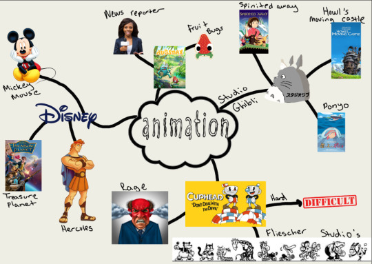
Cuphead:
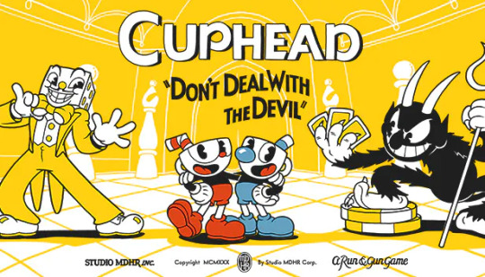
Cuphead is a game which was made in 2017. The game is an animated run and gun styled game.As you can see the game was inspired by the old styled animation used in the 1930′s, this includes the works of people such as Fleischer Studios and Walt Disney. The visuals and audio of the game were made the same painstakingly way they did in the 1930′s era. By using traditional hand drawn cell animation as well as watercolour backgrounds and original jazz recordings.
Informations taken from:
https://store.steampowered.com/app/268910/Cuphead/
When it comes to Cuphead it must of taken ages to develop and put together the game as everything is drawn and animated through drawings meaning it would of taken a lot more time to animate than it would to animate 3d models. Here is a video I have found which talks about the creators of the game making the game:
youtube
In the video it not until you get about 5 minutes in until they are talking about the actual development of the game. For starters they planned for the game to only be a small game.However after all the feedback they got at events such as E3 in 2015 they then went forwards and decided to take the game further and get more serious with it.Secondly they then start to talk about how they had originally joked at the beginning of making the game about doing the 1930′s style. This was mainly due to one of the creators being the only animator they had at the time. However they went forward and decided to try something else as they felt that they could not efficiently pull of the 1930′s style animation. They talk about how they had thought of having the game art being like going through elementary school, Meaning each level would be arts and crafts.For example a kindergarten level would have a turkey that was made like a painted hand print as well as having cotton balls attached to it. Then they planned about doing stop frame animation with them. However they eventually decided to go back to the 1930′s style animation. WHen it came to animations they talk about how most stuff was done classically so it was all hand drawn on paper instead of digitally drawn as well as the backgrounds being watercolor painted.Even the music is live recorded and wasn't digitally made.They talk about once the character is drawn and animated they would then scan it into the computer which is where they would then go ahead and add the colours to the characters.
Fleischer Studios:
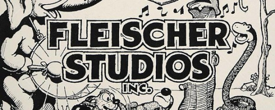
Fleischer Studios are famous for there creation of popular characters such as Koko the clown,Betty boop and Popeye the Sailor. Unlike other studios which mainly focused on making there characters anthropomorphic animals, Fleischer studios most famous characters were actually humans. Compared to their competitor company Walt disney, Fleischer studios went for a different cartoon style. Unlike Walt Disney, there animations were more rough than defined as well as more artistic than commercial.However in a unique way there art was expressed through a culmination of arts and sciences. There approach focused more on surrealism, dark humor, adult psychological elements and sexuality. Another thing was that the environments were grittier and more urban compared to Walt Disney. They would often be set in squalid surroundings to reflect the great depression as well as the German Expressionism.
Why do they wear gloves:
One big question that came to surface is why do the cartoon characters in the Fleischer and Disney animations wear gloves.Here is a video where they ask an animation historian this same question and here are the reasons he gives for the characters wearing gloves.
youtube
One of the most basic theories as to why the characters wear gloves is in order to save time. Drawing detailed intricate hands aren't very easy and take up a lot more time. By having the characters where basic gloves which are a basic shape saves a lot of time when it comes to drawing and animating the characters.As animations went on they tried to make characters with more basic a circular shapes in order to make them easier to draw as well as more child friendly. This was called the Rubber hose and circle design where characters main features such as there head,stomach and palms of there hands would be circles.The all other parts such as arms,fingers and legs would be more of a rubber hose design which made them more spaghetti looking.Here is an example of this process:
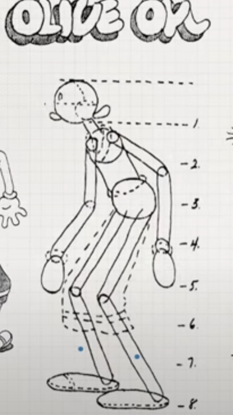
The rubber hose and circle process made it so animators could draw arms,legs and heads without having to spend loads of time on them.Here come the piece where the gloves came into play. Now its a good idea to use the rubber hose and circle method however characters hand were black as well as the rest of their body. This meant it was very hard to distinguish where there hands were and what they were doing.It was only until 1929 for the white gloves to come into play on characters.
One other reason given for the gloves was actually written inside of Walt Disney's 1968 biography “The Disney Version” when he talks about mickey mouse having the gloves , it says:
“We didn't want him to have mouse hands,because he was supposed to be more human like.So we gave him gloves”
Unfortunately there is one more reason about why they wear gloves which isn't as nice.The film the Opry House is where Mickey mouse put on a vaudeville show.This film as well a many of the other animations that came before it were closely linked to vaudeville performances and the blackface minstrel shows of the time. A man called Nicholas Sammonds writes in “Birth of an Industry” that many early animated characters such as felix the cat, Bimbo and mickey mouse “weren't just like minstrels, they were minstrels”. Which by the way the definition of a minstrel is someone who has dressed up in black face for a performance on a show for example the Minstrel show. Characters in the Minstrel show would wear white gloves as well. However even as the Minstrel show started to disappear the gloves on the cartoon characters stayed due to it being part of there animation design.
Cuphead and the Racist Spectre of Fleischer animation:

While doing my research I managed to go ahead and find an online article which I decided to go ahead and look into:
https://unwinnable.com/2017/11/10/cuphead-and-the-racist-spectre-of-fleischer-animation/
In the article it talks about how the creators of cuphead also dredge up the bigotry and prejudice which had a strong influence on early animation.When asked in an interview about how cuphead had an unfortunate associations with the 1930′s era.
Maja Moldenhauer replies:”Its just visuals and that's about it. Anything else happening in that era we are not versed in it”
It talks about how Studio MDHR goes and ignores the context and history behind the aesthetic in which they tried so hard to recreate.I also think that people aren't happy that they sort of idolise this sort of animation style due to its racist context and history behind it and feel like the studios should of took into consideration the history behind it before choosing it as there art style. They then talk about how in many early cartoons, characters were often tricksters,layabouts and thieves. These archetypes were born from the depiction of the lazy slave minstrel shows specialised in. This is brought up due to the fact that at the start of the cuphead game you meet 2 tricksters (cuphead and mugman) who make a deal with the devil ( another trickster) over a gambling debt, an activity often linked in the 1930s cartoons to implied sinfulness and savagery.
Studio Ghibli:

Now we are moving onto studio ghibli which is an animation company for anime films such as spirited away, Howl's moving castle and my neighbour totoro.Studio ghibli is a japanese animation company which was founded in 1985. Like Fleischer studios Studio Ghibli's animation techniques are all very traditional. All there frames are hand drawn before being put together to create movement.Even Though CGI is very popular now the creator Miyazaki prefers to stay away from this and believes that hand drawing is the fundamental of animation. However he doesn't sometimes make small exceptions and allows small bits of CGI in his art in order to help animations with tricky scenes and to speed up the process.
The process:
Everything Begins With an Idea
From script to screen, the idea is developed into a story.
Then, characters and costumes are designed and created. In doing so, also creates the atmosphere and settings the film is
The story is then turned into a storyboard and is used to illustrate the key frames to produce movements.
After the scenes are drawn out, color is added and painted. Note: the backgrounds and characters are drawn separately.
The characters are placed onto the background, which creates a frame. Each frame is shot individually.
Dialogue & audio is added and then the director ensures that everything syncs together naturally.
After the film is developed, it is ready to debut!
All this information was taken from:
https://commons.marymount.edu/leetopic/creation-process/
Animation types:
Now of course when it comes to animation inside of tv, film and video games there are multiple different types of animation people can choose from. The different types are cel animation,2D animation,3D animation and Stop animation.
Cel animation:
Cel animations is the animation style we have already talked about in this post. Cel animations is when you animate on sheets of transparent plastic called cels.The cels are then placed over a background and photographed in sequence. When the photos are played back at either 12 or 24 frames they create the illusion of movement.When it comes to making a drawing on a cel. The inker will transfer a drawing done on paper onto a cel using black ink. Once dried the colourist will the use cel paint onto the artwork. All informations was gotten from:
https://conceptartempire.com/cel-animation/
2D animation:
2d animation is basically the same as cel animation. However it expands more out into the world of digital art where artists and colourists can do all there work on a computer instead of having to do it on cel sheets.
3D animation:
Now unlike 2d animation 3d animation is far more advanced. Instead of drawing out there models. 3d animation is the art of using motion to bring characters as well as vehicles to life inside tv shows,films and video games. 3d animations uses 3d models instead of 2d drawings. When it comes to animating the models you can either rig the model and do it that way or in some cases map them to a person's body and have them act out the motions they wish the character to do.Here is a nice video I found which shows how the process of it somewhat works when it comes to putting scenes together:
youtube
Stop Animation:
Stop motion animation has been around for a very long time and has been used in films such as Coraline,Wallace and gromit and Missing link. The process of stop animation is where they have real life 3d models of their characters, props and vehicles. These models are made out of clay. However although fun to make stop motion is a time staking process. To do stop motion animation the models are moved in small increments frame by frame. Every time the model is moved a picture is taken. Then the film is put together when it goes through the flames at a fast speed in order to make it look like it is moving.Here is a video which talks about how they did the stop motion animation in a film called the missing link.
youtube
The video talks us through the process of how they use rigs for scenes where characters are in the air as well as how for some scenes such as underwater scenes they do need to go ahead and use CGI for those parts of the film. It is not only till you see the sets until you realise how much space is needed to create some of these scenes as well and how much time and effort goes into making some characters in the films.
Bugsnax:
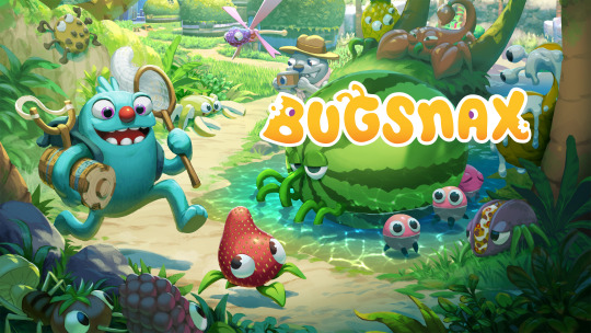
Bugsnax is an animated video games which due to the animation style looks like it is targeted towards kids.With a pegi 7 rating you would be surprised to know what the contents of the game really contain.Here is a video which talks about eh lore that someone has theorized about the game.
youtube
After watching the video all I can say is that I am quite surprised at what some of the hidden context of the game can be. I believe there are hidden messages about drugs in the game and about how addicted someone can be, as well as the fact that it changes a person's body just like how drugs can affect people.
However there is one thing that I think was creative and its the fact that this game really goes off of the phrase we are what we eat.
In summary what I have learnt through my research is that there are of course many different ways to animate in which people can choose from, however each type of animation does come with its pros and cons so depending on how long you have to create a project as well as what sort of scenes you are wanting will affect what sort of animation style will be best to use. other things I have learnt is that animation can have some disturbing history and backstory to them and sometimes aren't always what they seem.
6 notes
·
View notes
Photo
Another sketchbook/art dump where I talk about things yay.
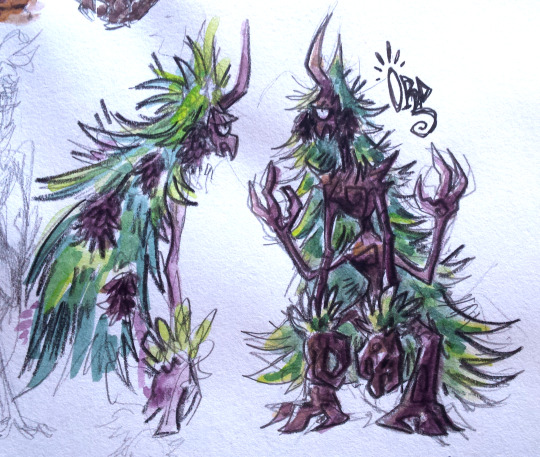
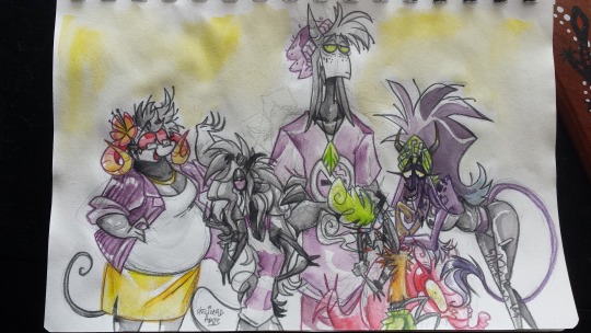
1. Character design concept for Ord, an old character of mine (if you followed me from deviantart days you may vaguely recognise them aha). I thought they’d be great as a treant! I like to have at least one character of all the races in my fantasy world ‘cuz I then use them as a base to develop that race, what they look like, their culture, ect. Ord’s based on pine trees. They’re part of a short comic that I was planning to be working on now, but then I redesigned the tengu race and the second main character is a tengu and I’m still figuring out their new design lol. So this project’s getting pushed back.
2. These are the trio of an underground desert city in one of my main comic projects. (most of my projects exist in the same world, just in different regions of it). From left-right, Naga, Thorne and Kalvah. Thorne is an arachne who basically despises everything, and his friends Naga and Kalvah are gorgons who are like the only characters I have that are in love wowee (excluding the parents of characters ofc). This was me loosely figuring out their heights and liked the sketch enough to slap some quick colours on it.
3. The main cast of a comic project called Impz that I’m doin’ loose work on in the background while I work on other projects and things. I recently made the decision of giving the imp race horns and removing them from the scavengers (a race closely related to imps), so I fiddled around with what kind of horns the characters would have. Left-right we have Maria, Kevin, Mal, Zig, and Flick. All of them are imps while Flick is an imp x scavenger hybrid. I tried using the water brush that came with my watercolour travel set with this in which I went to the local park to draw and paint this. It was difficult to control the amount of water I wanted out of the brush (too much water!!), but it’s definitely great for when you’re out n about with a travel pan set! Also idk what the red thing is lol I just put it there so that Flick’s pose made sense ‘cuz I didn’t wanna change it. :’)
4. This is a group photo type thing of Kalvah’s band, who probably will only show up as background characters for the project Kalvah’s in, but it was fun to design them all. Apart from Kalvah, and 13 (the dude on the left), none of them have names. I spent way too much time on this but I really love the result!
5. Expression sheet of Murray, a muldjewangk character that’s in a planned short animated film I wanna do, but that’s a project for when I get myself a computer upgrade. I am currently animating him though in a short 20s animation to a song I like with a koala I designed for it. Animation takes 50 years but I’m really liking how it’s turning out!
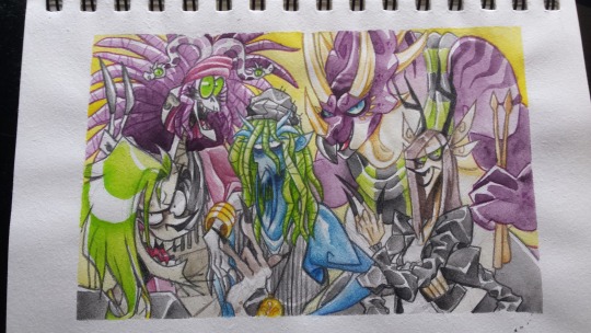
6. Just a digital portrait of Kalvah, used it as a test for how I wanna do the art for the comic. (drawn so much of her lately! I love her).
7. The same thing I but this time with Phanes and Quetz. Dew this after the multi-animator project I was a part of that featured them went live. Phanes is a druid, which are a race of tree goat nature people, and Quetz is their pet amphithere. They’re one of the main characters in the same project Kalvah’s in. I’ll probably upload both of these to my main art blog at some point.
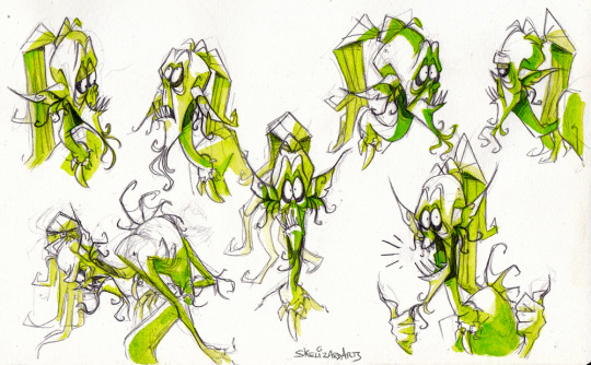
8. And finally, one of the final concept sketches finalising the design of Void, a character who is the shadow & imaginary friend of a kid. ‘Cuz they’re a shadow they are strictly 2D, and so I was inspired by paper shadow puppets for their design, as well as skeletons (because ofc I have to be on-brand) and axolotls lol (axolotls are very much on the brain lately). I wanted them to be flexible but also strict in movement. Took about 7 pages of concept work in my sketchbook to get to this design, it was a struggle but I really like the outcome! Void is part of a short 20/30page comic I’m currently working on! So expect that in a few months maybe?
#sketchdump#skeleart#characters#really should talk bout my characters more but everythings still in development and i worry im gonna share potential spoilers#hence why i talk bout them here and not on my main lol#there's also a smaller project I wanna do that's like a beastiary where it's like a lil fact file of all the different races#all the races are either original or based on a mythological being that I then put my own spin on#so idk maybe that could be a side blog project who knows
4 notes
·
View notes
Text
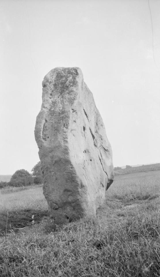
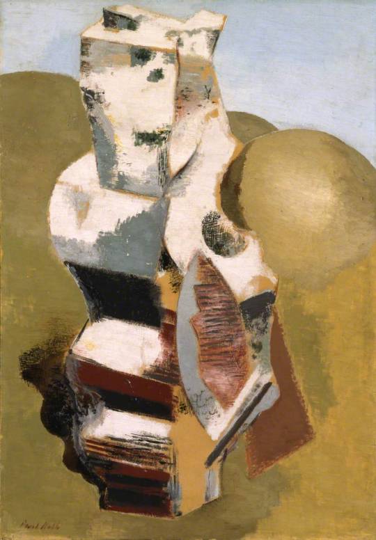
Paul Nash at Avebury
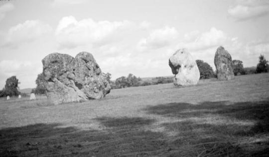
Avebury is a Neolithic henge monument containing three stone circles. The Village of Avebury in Wiltshire was built around them and now bisect the circle with a High Street. Avebury contains the largest megalithic stone circle in the world. Constructed over several hundred years in the Third Millennium BC, during the Neolithic, or New Stone Age, the monument comprises a large henge (a bank and a ditch) with a large outer stone circle and two separate smaller stone circles situated inside the centre of the monument.
Paul Nash - Avebury, 1936
When England was converted to Christianity, Avebury was considered a non-Christian monument. At some point in the early 14th century, villagers began to demolish the monument by pulling down the large standing stones and burying them in ready-dug pits at the side. During the toppling of the stones, one of them (which was 3 metres tall and weighed 13 tons), collapsed on top of one of the men pulling it down, fracturing his pelvis and breaking his neck, crushing him to death. Trapped in the hole that had been dug for the falling stone he was found by archaeologists in 1938. They found that he had been carrying a leather pouch, in which was found three silver coins dated to around 1320–25, as well as a pair of iron scissors and a lancet.
In the latter part of the 17th and then the 18th centuries, destruction at Avebury reached its peak. The majority of the standing stones that had been a part of the monument for thousands of years were smashed up to be used as building material for the local area. This was achieved in a method that involved lighting a fire to heat the sarsen, then pouring cold water on it to create weaknesses in the rock, and finally smashing at these weak points with a sledgehammer.
In the 1920s Marconi wanted to build a radio station on the hills above Avebury and the Air Ministry wanted to close Wayland Smithy area with standing stones as a bombing range in the 1930s . †
Paul Nash - Avebury, Personage, 1933
In July 1933 the ailing Nash went on holiday to Marlborough with his friend Ruth Clark. From there they made a day trip to nearby Avebury. ‡

Paul Nash - Avebury Stone (Double Exposure), 1933
The epiphany that Paul Nash had to use he standing stones artistically, seems to have come with an interest in the Neolithic period in publishing with the British Public. It is an era where Paganism has become popular, as many alternative religions did after the First World War. In trying to make sense of the carnage and brutality of the War the public looked for ancient wisdom and this maybe why we have to tolerate people smothering themselves over Stonehenge every solstice.
In these paintings and photographs Nash was also documenting an interest that other artists such as Henry Moore had in the primitive. Moore looked towards early Peruvian pottery and flints for organic shapes and old works made by early man. These monuments are the few examples of art that survive. Even in the medieval period the only arts to survive in Britain of the common man would be the carvings of bench-ends in churches, pottery or other folk art.
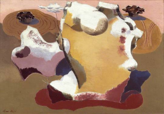
Paul Nash - Landscape of the Megaliths, 1934
Margaret Nash said this was Paul’s first painting of the Avebury stones, which he saw in August 1933. Nash himself gave the following description of Avebury in ‘Picture History’ The preoccupation of the stones has always been a separate pursuit and interest aside from that of object personages. My interest began with the discovery of Avebury megaliths when I was staying at Marlborough in the Summer of 1933. The great stones were then in their wild state, so to speak. Some were half covered by the grass, others stood up in the cornfields were entangled and overgrown in the copses, some were buried under the turf. But they were always wonderful and disquieting, and, as I saw them then, I shall always remember them . . .
Their colouring and pattern, their patina of golden lichen, all enhanced their strange forms and mystical significance. Thereafter, I hunted stones, by the seashore, on the downs, in the furrows. ♣
Paul Nash - The Nest of Wild Stones, 1937
I found my first nest of wild stones on looking closely into a drawing I had made of some bleached objects on the Swanage Downs. It lay just below the level of my consciousness, slightly out of focus. But there was no mistaking its lineaments a moment later when I moved the dry thoughts to one side. ♠
Below Paul Nash writes of the effect of Avebury on his work. That he wasn’t only painting the stones themselves but placing ordinary stones he found in a picture as if they were large monuments.
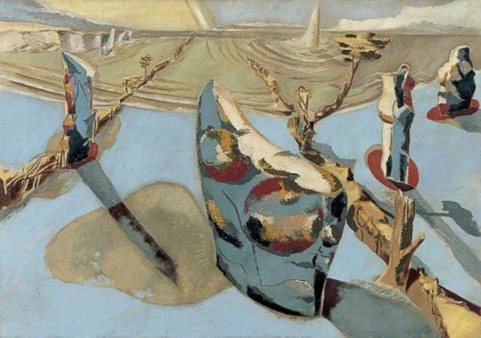
In most instances, the pictures coming out of this preoccupation were concerned with stones seen solely as objects in relation to the landscape. But later certain stone personages evolved, such as the stone birds in the ‘Nest of Wild Stones’ and the more ‘abstract’ forms in ‘Encounter in the Afternoon’. ♣
Many of these works may be down to another external influence, Eileen Agar. Nash had met and fallen in love with Agar, who was a surrealist artist and using stones and found objects in her works around the same time.

Paul Nash - Photograph of Stones in his Studio, 1936

Paul Nash - Encounter in the Afternoon, 1936
Paul Nash - Landscape of Bleached Objects, 1934

Paul Nash - Circle Of The Monoliths, 1937-8
In the painting above (Circle of the Monoliths) is the stepped hill what is likely Silbury Hill. The construction of the hill in the Late Neolithic period was originally stepped, then filled in. Silbury Hill is very close to Avebury.
When the artist Paul Nash first visited Avebury in 1933 he was amazed by the scale of Silbury Hill and by the ancient circle of megaliths, the great glacial boulders that had been dragged from the Downs in prehistoric times. ♥

Paul Nash - Silbury Hill, 1938
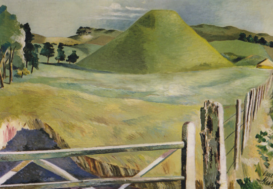
Paul Nash - Silbury Hill, c1937
All Nash’s other statements about Avebury and stones are much more direct, it is almost as if he contrived to intellectualise his ideas simply to be provocative, but in face the Landscape of the Megaliths Nash does resolve the equation. The picture shows the adventure of stones receding away from the spectator, in the foreground in the convolvulus curls round a snake which rises upwards. ♦

Paul Nash - Avebury Stone, 1933
The stones at Avebury come up again when Nash was asked to illustrate a cover to the magazine Countrygoing. Though I think it was commissioned in 1938 it was published in 1945.
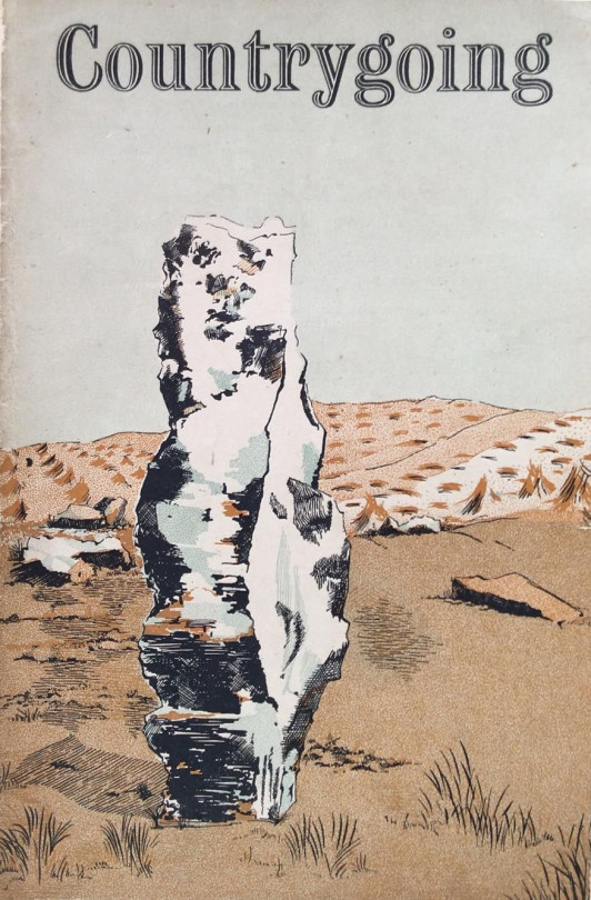
A Paul Nash Cover to Countrygoing, 1945
Paul Nash - Circle Of The Monoliths, 1937-8
Above is the finished painting of Circle Of The Monoliths. Below is the study for the work that was found painted on the back of The Two Serpents c 1937.
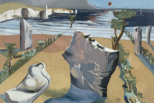
Paul Nash - Circle of the Monoliths, 1937-1938
Nash’s abstraction of stones in the 1930s went on with his distortions of landscapes, found stones and the real Neolithic stones. In we see Mên-an-Tol and the stone ring there placed in the top right corner in front of more found stones. To the right is a grid that can only be echoing Encounter in the Afternoon and Circle Of The Monoliths.

Paul Nash - Nocturnal Landscape, 1938
Below we see the same Avebury stone used on the cover to Countrygoing with the wedge shaped cut in the side.
Paul Nash - Druid Landscape, 1938
Initially, using a No.1A pocket Kodak series 2 camera, Nash captured images so that he could refer to them in the creation of his paintings. Increasingly, however, he saw his photographs, not as aids or sketches, but as artworks in their own right.
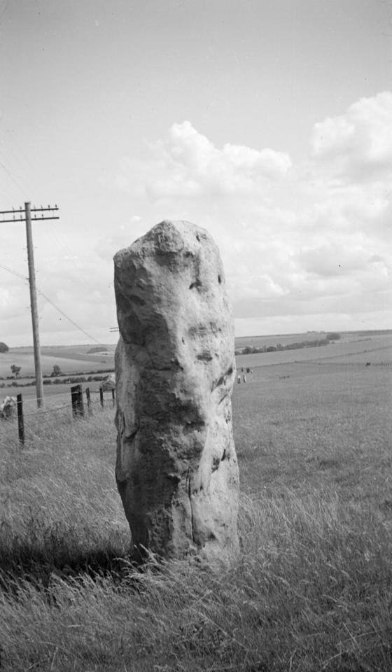
Here Nash depicts one of the Avebury Sentinels, and his choice of subject matter is characteristic. Nash was always interested in landscapes and aspects of the natural world, not for their historical or aesthetic interest per se, but more because he thought that certain places as he called them (see Biography) had about them a mystical importance, a genius loci; which lent the place, the stone, the tree, an importance which transcended its apparent properties. As he wrote there are places whose relationship of parts creates a mystery, an enchantment. It is this mystery, this enchantment, which Nash tries to capture in his photographs. ◊

Paul Nash - Avebury, Sentinel, 1933
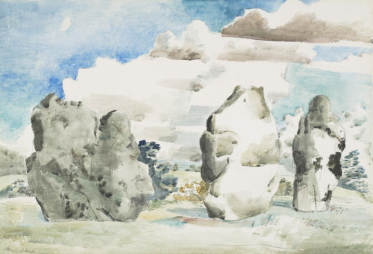
Some of the quote below may be a repeat of what has been read about Nash, but I featured it for the Convolvulus park that features in Landscape of the Megaliths. In the background of the watercolour and lithograph below are two hills, both likely to be a Neolithic Sidbury Hill and how it looks today.
Last summer I walked in a field near Avebury where two rough monoliths stand up … miraculously patterned with black and orange lichen, remnants of the avenue of stones which led to the Great Circle. In the hedge, at hand, the white trumpet of a convolvulus turns from its spiral stem, following the sun. In my art I would solve such an equation
Paul Nash, “Contribution to Unit One”, in Andrew Causey (ed.), Paul Nash: Writings on Art (Oxford: Oxford University Press, 2000), 107–110.
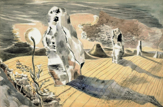
Paul Nash - Landscape of the Megaliths - Watercolour, 1937
Some time ago I made a blog post on Paul Nash and the process of colour layers used to make the lithograph below.

Paul Nash - Landscape of the Megaliths - Lithograph, 1937
The photographs below are dated 1942 by the Tate. I don’t know is Nash went back to Avebury or if they are catalogued wrongly. But I thought it was worth including them with the car by the roadside.

Paul Nash - Avebury, 1942
Paul Nash - Avebury, Sentinel, 1942
Paul Nash - Avebury, Sentinel, 1942

Paul Nash - Avebury, Sentinel, 1944

Paul Nash - Avebury, Sentinel, 1944
Paul Nash - Avebury, Sentinel, 1944
Paul Nash - Avebury, 1944
† Joanne Parker - Written on Stone: The Cultural Reception of British Prehistoric, 2009
‡ David Boyd Haycock - Paul Nash, p54, 2002
♠ Andrew Causey - Paul Nash: Writings on Art - Page 142
♣ Paul Nash - Paintings and Watercolours Exhibition Catalogue, Tate, 1975
♥ Julius Bryant - The English Grand Tour, p16, 2005
♦ Paul Nash, Places, South Bank Centre, 1989
◊ Art Republic
4 notes
·
View notes
Photo
Weekly Illustration #3
This was a busy week!
Spectres: Painting ominously vague blobs overtop of a photograph has been an idea I’ve been thinking about for a while and this week sounded like a good idea to try it out. The execution of this illustration was fairly easy and quick. It was fun to lightly mess around with lightly manipulating an image in Procreate. To me, it doesn’t feel quite like I was hoping it would though. I think I need to play around with this concept more in the future.
Texture: This started off as a random scribble on a canvas to test out a new brush. I was about to delete it when I noticed how interesting it looked and decided to continue building on it. If you read the VIU school newspaper you’ll notice that a lot of textures are used to liven it up. This one will be used on the bio and horoscopes pages of The Nav and potentially elsewhere as well.
Sea Scene from Imagination: Whenever I start off a new document I have a habit of starting off my drawing on a white background. I don’t like this since it helps perpetuate my fear of colour as well as hindering my ability to add a balanced spectrum of values. For this illustration, I finally forced myself to work with colour from the beginning of the drawing. I was mainly messing around with a new combination of brushes to lightly imitate a watercolour/wet acrylic look. At the same time I casually tried applying some principles of light that I learned about in Colour and Light and thinking about how it could change the colour tones. I didn’t do a very good job but I feel confident if I take some active notes on the subject and do some light studies I can improve my technique.
A Happy Accident: Typically when I work in Procreate I put a lot of little sketches or projects on one file if it’s really simple. If I start a project I’ll dedicate a proper file to it but in this case, I had the last two illustrations on one file. I was working with my Procreate file to extract the texture layer from it and create a PNG from it. During the process of that, she turned on both illustrations at once and it made this happy accident. I really love it! It’s a much more interesting piece than either illustration on its own and it encourages me to try laying textures into future illustrations.
The Nav Cover Illustration: This month’s issue for The Nav is centralized around marijuana. I was in charge of the cover illustration. It’s an interesting project to work on the cover because it has strict brand guidelines. The layout is set into the style pictured above, and each cover is a solid colour with black outline drawings overlaid over the white magazine name. (pictured story tiles and descriptions are filler text) I wanted the cover illustration to be moody and carry some movement in the piece to create interest. Some of our stories inside also feature a more serious tone so I felt having an introspective illustration would pair well with that. It was a challenge to balance the line thicknesses with the strong green/white colour contrast. I ended up shrinking down the image a bit to make it more conceivable since I found that at first I had to struggle to focus on it. I centred the eyes over the top of the “H” to attract your attention first.
1 note
·
View note
Text
The Cornish Way (Chapter 4)
Rating: G
Pairing: George x Elizabeth, Francis x Demelza (background), Caroline x Dwight (background), Verity x Blamey (background)
Summary: The fourth chapter of my coffee shop AU, in which in which Elizabeth takes George to the beach, cream teas are bought and their relationship progresses.
Previous chapter
“Oh very well, you win” Elizabeth sighed at the large oncoming tractor that had been sitting defiantly in the middle of the little lane leading up to Rowantree Farm, waiting for her and the two other cars behind her to give in and back up into the closest passing place so that it could continue on its journey. Though she loved her home county with all her heart, the one thing she had never much liked about it was the inevitable standoffs one always found oneself in should they need to drive along any of the narrow roads that made up a large part of the countryside. She had grown used to it over the years, of course—she had once got stuck behind a fifteen-minute standoff between two overly stubborn tractor drivers, which had been frustrating to say the least—but it didn’t mean that she enjoyed the prospect any more than she had as a nervous young girl learning to drive for the first time. Just that she was better at dealing with it.
She backed carefully into the passing place that she had driven by a little way back, much to the chagrin of the people behind her, who then had to follow suit, and allowed the tractor to trundle slowly past. Even with her own car pressed almost right into the high hedge at the side of the road, it was a tight squeeze, and Elizabeth couldn’t help but wince as it passed by far too close for comfort. Once it was gone, she gingerly manoeuvred the car out of the passing place and back out into the road, hoping that she wouldn’t have to do that again for some time, though she realised all too well that she was being optimistic to the point of wishful thinking on that score.
She and George had spent a fair amount of the first week of his holiday in each other’s company, having now shared several lunches and pleasant afternoons together. The day before, however, she had suggested that they do something a little different. Now that the summer was here, she was keen to take advantage of the good weather in the time before the kids broke up from school to go down to the beach and paint a few seascapes, and she had asked George if he would like to come with her for the day. He had agreed, and so they had made arrangements for her to pick him up from the farm the next morning.
Well, made arrangements was perhaps not the right phrase, she considered as she turned left into the drive leading up to the farmhouse and cottage, watching in amusement as one of the farm’s sheepdogs came bounding up to the car to greet it. George had protested, not wanting to feel as if he were imposing on her by making her go out of her way to pick him up, but Elizabeth’s greater experience with driving along the narrow lanes of rural Cornwall had effectively settled the matter.
The dog followed her as she pulled into the drive of the holiday cottage beside George’s sleek black car, and as soon as she had stepped out of the door, she was beset by an excitedly barking whirl of hair. She laughed in delight, stroking the collie’s thick, soft fur as its tail wagged frantically and it strained to lick her face.
“Oh I’m sorry, miss! Bessie, down!”
The dog barked in consternation but complied nevertheless, tail still wagging furiously, and Elizabeth glanced up to see a young man who she knew by sight as Jim Carter rushing towards her with an apologetic look on his kind face. He bent down and took hold of the dog, apparently named Bessie, patting her gently on the head.
“Sorry about that, miss,” he said again. “Bessie’s super friendly but she wants to say hello to everyone she meets. She can give some people a bit of a fright.”
“Oh it’s alright—I don’t mind,” laughed Elizabeth. She adored all animals but she loved dogs especially—she had always wanted a dog as a child but her mother hadn’t wanted a puppy messing up her nice clean house. “Can I?”
“Oh, of course” said Jim, and Elizabeth reached out to scratch Bessie behind the ear. She was a lovely dog—all bright blue eyes and fine, soft fur patched with black and white.
“Aren’t you beautiful? Yes, yes you are!”
“Having fun there?”
Elizabeth jumped at the sound of the voice and turned around to see George standing in the open doorway of the cottage, leaning casually against the frame with a soft, affectionate smile on his face. He was looking very handsome, she noticed, dressed in a pair of thin, dark jeans, a crisp white shirt and a tan jacket which nicely complemented his neat blond hair. Her eyes couldn’t help but travel up and down his form, coming to rest on the long line of his throat where it was exposed by the open collar of his shirt, and she blushed slightly.
“Oh yes,” she replied with a teasing grin. “I think I’ll just take Bessie to the beach instead.”
Both George and Jim chuckled at that.
“Usurped by a dog—oof!”
Elizabeth burst out laughing. Bessie, having just spotted George, had chosen that exact moment to turn her enthusiasm on him, and had practically tried to leap into his arms.
They set of awhile afterwards, the car followed all the way down the drive by a disappointed Bessie and a slightly harassed-looking Jim, who managed to catch her just before she left the farm entirely. Luckily, no more tractors appeared to force them back into any passing places, and from there on the journey went fairly smoothly.
“Where exactly did you have in mind?” George asked curiously as thy turned onto a main road, heading south, and it occurred to Elizabeth that, though she had suggested a trip to the beach, she hadn’t specified which one.
“I was thinking Nampara Cove,” she said, tapping out a soft rhythm on the steering wheel as she drove. “Not a lot of people go there since it’s not too easy to get to compared to some of the larger beaches, so it’s always pretty quiet. I thought we could have a picnic.”
“You can go to Nampara Cove now?,” replied George with a slight frown. “I thought it was Poldark land.”
“Oh it was. Ross sold it all when he moved to America so it’s all public access now. People tend to go to Hendrawna for their days out though since it’s bigger.”
“And because it’s easier to get to?,” said George, and she noticed there was a hint of apprehension in his tone as he spoke. “How difficult is Nampara Cove to get down to?”
“Oh not very difficult really,” replied Elizabeth airily, keen to put his worries at rest. “The path down from the cliffs is just a bit steep and rough in some places. It’s not a problem unless you’ve got a pushchair or a wheelchair, but a lot of people don’t want the bother of getting down there and then back up again when they could go to somewhere that’s a bit quicker to get to. And besides, Hendrawna’s closer to the teashop so people tend to gather there in hordes.”
“There’s a teashop?”
“Oh yes. They do cream teas there, and earl grey as well, so that should keep you happy!”
George chuckled. He had confessed to her after lunch in the coffee shop in Truro that he had always been more of a tea drinker himself, at which point she had correctly guessed his favourite blend on the first attempt. She had been insisting that she’d make sure he’d get his cup of earl grey at some point in the holiday ever since.
“I’m sure I shan’t need tea for that” he said with a gentle, sincere smile, and Elizabeth ducked her head slightly to disguise the shy grin that was beginning to creep over her features.
A short while later, they pulled into the little carpark beside the viewing point on the clifftops above Nampara Cove. It was a glorious day, the sun bright, the sky cloudless and the sea below a deep, rich blue. As Elizabeth stepped out of the car, she took in a deep breath of fresh, salty air, the wind whipping through her curls, carrying the calls of seabirds up from the rocks beneath them to the cliff path. George followed suit, glancing around him, eyes squinted against the glare of the sun.
“Could you carry the picnic stuff?,” she called to him, moving to open the boot of her car. “I need to get my equipment.”
“Your equipment?”
“Yes, my climbing equipment,” Elizabeth couldn’t quite resist teasing him as he followed her to the back of the car. “I lied about the path. We’re going to have to abseil down.”
George let out a soft huff of laughter as she pulled the boot open, handing him the hamper and blankets.
“No, I meant my easel and stuff,” she said, taking out the item in question and tucking it under her arm. “It’s not a very big one but it’s a bit awkward to carry when I’ve got a lot of other stuff.”
They headed carefully down the cliff path, Elizabeth leading at the front and George cautiously picking his way over the gritty, rocky ground behind her. Eventually, they reached the beach itself—a long, curved, sheltered strip of land which was, to her surprise, completely abandoned save for themselves. Elizabeth smiled as she stepped onto the soft yellow sand at the beach’s edge, turning back to watch as George joined her. His usually neat hair had been ruffled by the wind on the way down and was sticking up in all directions. His cheeks flushed with a soft pink and his blue eyes bright, she thought the look suited him very well.
At Elizabeth’s direction, he laid out the picnic blanket on a dry patch of sand in the middle of the beach and they both sat down, enjoying the gentle, cool breeze now that they were sheltered by the cliffs and the soft lull of the waves lapping gently against wet sand. Once they were settled, they dived straight into the picnic, enjoying the food that Elizabeth had prepared, laughing and chatting about nothing in particular. Then, once that was finished, Elizabeth set up her easel and paints, taking out a sheet of watercolour paper and sticking it methodically to the board with masking tape, and began to sketch out a rough outline of the view before her.
“You’re very quiet” she commented after a while, just as she was beginning to mix up a soft, light blue for the sky on her palette.
“Oh, I thought you’d want to concentrate on the painting,” she heard George reply from beside her, and she turned to look at him where he was laying on his side, head propped up on his hand and watching her mix her colours with interest. “Do you…?”
“Oh, I do these all the time,” Elizabeth replied with a nonchalant shrug, moving to apply the colour to the paper she had coated with water just moments beforehand. With a long, broad stroke, she watched in satisfaction as the colour bled freely from the brush and across the page. “They’re just quick little things so I’m fine talking and painting at the same time.”
Her practised hand filled in the sky quickly and easily, and she mixed a newer, darker shade on the palette, replacing her large, square-headed brush with a small, thin, pointed one to add some darker highlights to the edges.
“So, do you sell all of these?” George asked, his eyes following the process as she dabbed off some of the excess water with a tissue to create a slight mottling effect.
“Yes, usually,” she replied. “You can actually make a fair bit of money on things like this if you’re smart enough about it. I’ve got an online shop where I sell all my prints so I get money from them there, but there’s a big market for art cards and postcards and all those sorts of things, especially in somewhere like Cornwall during the big tourist seasons, so I can often get them sold in those forms in visitor centres and places like that as souvenirs. Tourists like that—Cornish places painted by Cornish artists and all that. And of course that helps promote my art as well, so it becomes more visible for anyone who might want to request a big commission.”
George nodded thoughtfully, his eyes following her brushstrokes as she moved onto the beach at the bottom of the picture, filling in the space with a soft ochre.
“And do you always use these kinds of paints for them or…?”
“Oh, yes I tend to use watercolours when I’m out and about,” Elizabeth replied, blending in a soft blue grey into the point where the sand met the sea. “You don’t really need a lot of extra stuff like you do with oils and they’re easier to get off than acrylics so they’re quite easy to bring with me to places like this—and they dry pretty quickly as well so that’s a bonus. They’re my favourite medium to take about with me if I want a colour picture. I mean, I suppose you can get stuff like watercolour pencils and markers and everything now and they’re very easy to carry around with you but I’ve tried them and they’re just not the same.”
“Really? How come?”
She paused to think about how to word her answer, her brush now picking out patterns as she drew long, undulating strokes along the paper, filling in the shimmering blue of the waves. The paint bled, leaving feathery little lines in the white of the blank spaces, but she did nothing to stop them, allowing them to create the effect of the frothing white heads of the waves as they rolled in over the sand.
“I think it’s to do with how you apply them on the canvas,” she said pensively, adding a darker blue to the edges of the shapes created by the larger brush, highlighting the white. “You usually add the water afterwards with pencils or markers, but even if you put the water on first and then draw over it, you’ve still got more control over the shapes you’re making. When you paint with watercolours rather than draw with them, you need a lot of water to get the right colours and consistency so they really flow and spread and blend on the page, and because of that they sort of create patterns and shapes on their own. You really have to work alongside the paints rather than just using them, if you see what I mean, and, well, I guess that some artists don’t like that so much but it’s always been something that appeals to me.”
She cut herself off, her cheeks reddening slightly as she realised just how much she was yammering on about something he probably wasn’t very interested in. When she turned to look at him, however, he was wearing an expression of open fascination on his face, his bright blue eyes alert and curious. All of a sudden, her attention was pulled away from the painting entirely, and all she could focus on was him—the soft look in his eyes, the way the light played across his skin, the stray lock of hair that had fallen across his brow, unsettled by the wind. Before she could stop herself, she had reached out and brushed it away from his face, fingertips ghosting over the soft strands and trailing down over the arch of his cheekbone. He stilled at the touch, his eyes wide, but he did not pull away.
“Your painting will dry out” he said, his voice suddenly hoarse.
“It’s nothing I can’t fix” murmured Elizabeth, and with that, she leaned down and kissed him.
His lips were soft as they parted underneath her own in a quiet gasp. It didn’t take long for him to respond, however, the hand that wasn’t propping himself up coming up to cup the back of her neck. A shiver ran down her spine as she felt his fingertips stroke gently along the sensitive skin below her hairline, and she shifted closer to him, eyelids fluttering closed. Her own hand moved to cradle his cheek, her thumb stroking a soothing rhythm over the smooth skin, and he sighed into her mouth as she slipped her fingers into his soft hair, titling his head back and pressing herself flush against him.
Eventually, they both had to come up for air, and they broke apart, breathing heavily. George glanced up at her through his long lashes, lips parted, suddenly shy. His cheeks were dusted with pink, gaze soft and a little dazed and, with an affectionate smile creeping over her face, she couldn’t help but lean down and kiss him again, all else forgotten in favour of the feel of his silky hair and soft skin and his lips moving gently against hers.
As it turned out, George had been quite correct in predicting that her painting would dry out—not that that surprised her. It was hardly a disaster, however, and she managed to complete it well enough, filling in the highlights and shadows and details, and finally painting in two little dark blue figures along the shoreline in the distance once the rest of it had finished drying. Turning back to George as she peeled the masking tape from the edges of the paper and pulled it away from the easel, she noticed that she noticed that the fascination on his face had returned, coupled by a look which could only be described as admiration.
“I don’t understand how you can do that,” he confessed upon seeing her questioning look. “How you can go from nothing to something like that in such a short space of time.”
Elizabeth couldn’t help but beam at the praise. It was always nice to hear her work complimented, of course, but coming from him it just sounded so sincere and genuine that she couldn’t be anything but delighted by it.
“Would you like to have a go?”
George huffed in amusement, raising an incredulous eyebrow at her.
“Well, if you want me to waste your paper,” he said wryly. “I’m afraid I’ve never had much of an artistic touch.”
Elizabeth tutted.
“I’m sure you underestimate yourself,” she replied, moving over to allow him to sit in front of the easel. “And besides, it’s never too late to learn. Here, I’ll show you.”
It turned out that, though it was clear that fine art didn’t come particularly naturally to him, George was not nearly as bad as artist as he thought himself to be. He had a good eye for detail and colour, even if he lacked the knowledge and experience to express them on paper. He did struggle a little with the blending and the larger, broader strokes, although she suspected tat had something to do with the arm she had wound around his waist, pressing close against his back as she reached over to gently guide his hand over the page. Both their efforts began to deteriorate from there, distracted from the painting in favour of pressing soft little kisses to each other’s lips, nestled close against one another, and were abandoned entirely when, with Elizabeth laughing into the skin of his neck, George threw up his hands and painted two large stickmen over the half-finished image.
“Well I’m not sure how successful that was” he chuckled, leaning back against her as she tightened her arms around him.
“Oh I don’t know,” said Elizabeth with a grin, pressing a soft, whispering kiss to his temple. “I thought it worked out quite well for both of us.”
“Well now for the moment of truth. Will it be jam first or cream?”
“I would never commit such Devonian heresy.”
Elizabeth laughed into her teacup at George’s wry reply, watching as he very pointedly spread a neat layer of jam over each half of his scone, followed by the cream. After a little while spent curled up on the beach, enjoying the sun and the sand and the feel of their bodies pressed against one another, they had decided to walk up to the teashop along from Hendrawna Beach and buy some cream teas. George had insisted that he pay, pointing out that it was only fair as she had both driven them there and provided the picnic and, unable to come up with a suitable argument to contradict him, she had given in and let him. Now they were sat at one of the small wooden tables in the outside seating area, under the shade of a large parasol, with two large, fruity scones each and a pot of earl grey shared between them, a cool breeze from the sea carrying the chatter of sunbathers up from the beach.
“Well that’s a good job,” she said with a soft chuckle. “You might have been dragged right back over the Tamar if you’d been spotted doing things the Devon way.”
“Heaven forbid.”
Elizabeth grinned at him, applying the jam and cream to her own scones in suitably Cornish fashion and watching as he poured himself some tea, adding a dash of milk to the cup and swirling it into the mix with his spoon. He suddenly looked a little shy, she couldn’t help but notice, and she wondered why.
“Thank you for today,” he said quietly. “I had a lovely time and…well…I don’t think I would have enjoyed this holiday nearly so much if we hadn’t met.”
Elizabeth felt a pleasant warmth in her chest at his words, her smile soft and gentle as she reached out and took his hand in hers, her thumb stroking rhythmically over his knuckles.
“I’m glad that we met too.”
He ducked his head shyly, a smile of his own curving on his lips. She couldn’t help but find the action rather endearing, and she squeezed his hand affectionately before she withdrew, picking up her teacup and lifting it into the air.
“To the Cornish way” she said with a glint of mischief in her eye.
George laughed lightly, lifting up his own cup so that its rim touched hers with a soft clink.
“The Cornish way.”
Next chapter: Elizabeth visits the holiday cottage for dinner, and she and George take the next stage in their relationship.
#poldark#elizabeth chynoweth#elizabeth warleggan#george warleggan#george x elizabeth#elizabeth x george#georgibeth#jim carter#poldark au#coffee shop au#modern au#mine#fic#my fic
3 notes
·
View notes
Text
The Process of painting my ‘Concept Art’ backgrounds - 9th November
Here technically marks the start of the final version of my Nik Nak sting and it’s production, and the first thing I decided to do was complete each and every background. By doing this, I considered the fact that the only thing I would have to do following that, would be to animate the characters, and of course all of the post-production; knocking out the backgrounds now would give me a huge head start in my project.
For my particular sting, approximately 5 seconds of the video is taken up by dynamic still frames, which upon close inspection and consideration, practically resemble concept art, hence the name of this post. I knew these frames would take a while to produce and finalise, so getting a head start on these would be my best shot.
I’m not a background person, and I’ve always found difficulty in creating quality backgrounds for my characters to lie on, so this would be a fun experiment.
I utilised the basic shots from my animatic as a base, to build on top of. Taking these into Clip Studio Paint, I began to create the final backgrounds. Below are my two results:
Process
-----------------------
1.
The first step I took in painting my first background was to create a new layer of line art, outlining the key features from the original layout, and adding a few more. From here, I painted into the lining on separate layers, hiding it so that by the end, I had a lineless, seamless piece.
Beginning with foliage like the trees and the grass, I made the most of presets for these, utilising my usual watercolour style as a base, but adding a distinctly leaf-like texture on top, in layers of colour, to create the gradient.
The rest of the background was forged using watercolour brushes and dark browns and purples, to keep the fantasy style vibe. The yellow-green accents of the centre make the entire piece pop I feel, and after approximately 6 hours, this piece had been finalised, details and all.
This piece additionally, will be used as the base mark for another, less detailed background, and so the features had to stand out enough that I COULD make fairly solid lines on them at one point later on, and I feel like I have achieved that so far.
-----------------------
2.
For the second piece, I was slightly more hesitant to begin because of the nature of it, being a close up of a face. Whereas I’m used to drawing faces, close ups, and digital realistic are two categories I have never really ventured into. As a result, I chose to take a few creative liberties with the style and painting of this one.
For one, I decided to use scratchier lines, so that the quality, if it became lower than I expected, would look almost intentional. Then, when colouring, I made sure the shading and blending of colour was patchy and layered, so that the entire image got more dimension, and wasn’t as flat.
I once again referenced the original basic drawing, and tried to keep to the same dimensions so that the angle looked the same. After about 3 hours or so of work (mostly dedicated to keeping the accuracy of the wizard’s appearance), I had finished the second piece.
-----------------------
After finishing the two of these backgrounds, I felt significantly better about achieving the deadline, being less than a month away, because a large chunk of work was finally over with. Any other assets for the sting now could be massively simplified, and would take me a lot less time, meaning that I could spend more time looking at the quality and meaning behind them, as well as spending more time on the accuracy of the animation.
My next thing to do is to finish the rest of the backgrounds, and with this new background experience, I’m ready to begin.
0 notes
Text
Week 6 Onsite Learning
Wednesday session with Rachel:
This week we were planed to do our etching workshop but unfortunately Rachel was not in so instead we had a cover lesson and was set to create number and typography experimentation. I based mine featured on my theme for the project which is saving the theatres. I tried to to include patterns and illustrative background to each one to fill in the empty blank space and make it more visually interesting. My favourite piece is my watercolour featured background as it one of my favourite techniques to use.
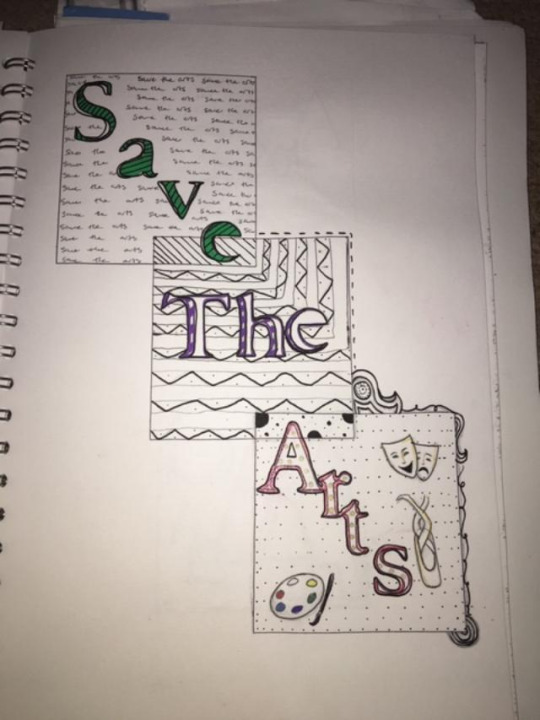
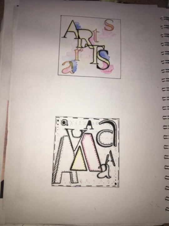
Thursday session with Sophie:
During todays session we firstly looked at some artists Sophie showed us during her presentation - Laura Slater, Tom Abbiss Smith: to give us some inspiration and open our eyes to different pieces of work. For the remainder of the session we created screen prints using a design stencil I created a couple of days before. We needed to copy our design on some photocopier paper ready to make the stencil which I done by using a craft matt & knife to cut out section of the designs where I desired the ink to be. From my design, I chose to do the world as it symbolises that my topic is something that is effecting the whole world not just the UK. From previous years, I'm used to creating screen prints so it was just a case of getting my station set up - tape around the screen edges to stop the ink from bleeding around the edges, paper underneath equipment to stop ink transferring onto the table surface and of course lastly my design, the ink and medium mixed together and the squeegee to pull the ink down on the screen. I am happy how they turned out but I think id use darker ink colours for a more bold effect if I was to do the workshop again.
My original design.
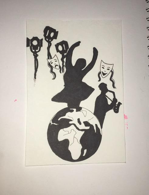
Screen print results
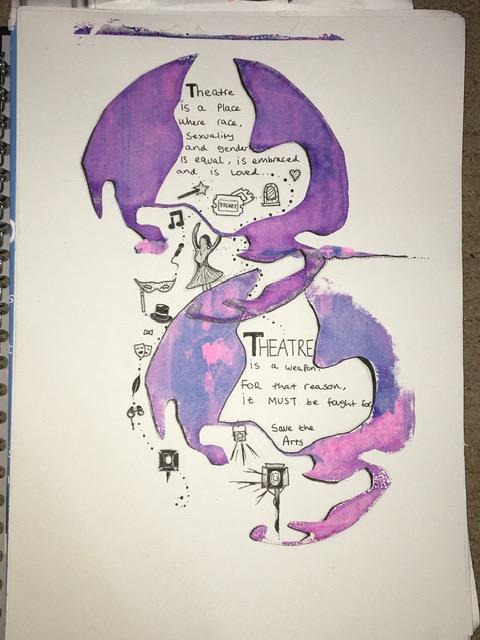
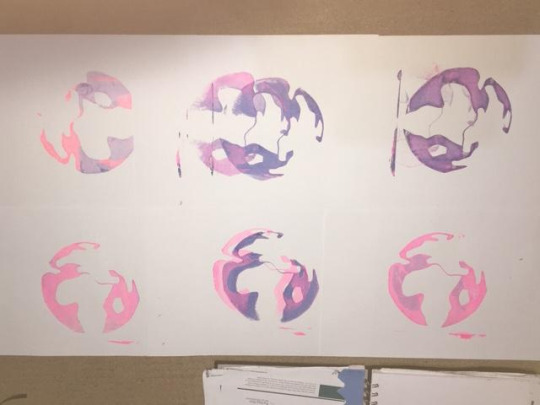
Fridays Session with Craig:
During todays session we created 3 large A2 collage pieces created with magazine photographs/ imagery, red and blue inks, paper, pens, posca pens and inverted imagery for backgrounds. I am pleased with the outcomes and enjoyed the task, although it does not relate to my theatre theme, it is still good work to bulk out my sketchbook and showcase my different skills.
0 notes
Text
Exercise 3.4 Collage Studies
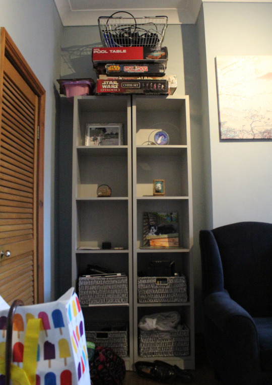
Fig 1 Photograph of messy corner for reference
Fig 2 Collage 1 - simple colour combination - A4
Although I did not particularly enjoy using the watercolour when creating my stripe designs in the previous exercise, I did think that creating a stripe design to represent a colour palette was interesting. So for the simple collage I decided to go with a stripe design and explore the technique using paper rather than watercolour this time. Although a simple design, I tried to be thoughtful of the composition of the piece and how each colour would sit on the page and the I feel that the fact I used a wide range of colours from my reference image keeps the design looking interesting whilst still fitting in the category of simple.
Fig 3 Simple colour combination swatches - 3x3cm each
Fig 4 Collage 2 - unusual colour combination - A4
Moving on from the simplicity of my previous collage design, I decided to go with an abstract appearance for this design. The stripe collage only featured straight lines so I wanted to come away from that and use a lot of curves - I think the end result is a far more expressive looking piece compared the first design. Regarding the colour of the design, I found it a little difficult to decide on which colours to use within the piece. As I used such a wide range of colours in the first collage I referred back to the colour palette (see fig 3) I produced for it and tried to select colours I felt wouldn’t usually be used together. I selected silver and gold. This isn’t something I personally would pair together as I feel they clash and less is more with metallic as well in my opinion. The next four colours in the palette are definitely not a grouping I recall seeing in any designs, possibly if you split the colours into smaller pairings but certainly not together. I also included grey tones are I felt they were a particularly unusual pairing with the brown tone.
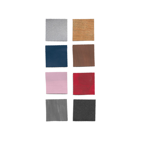
Fig 5 Unusual colour combination swatches - 3x3cm each
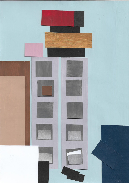
Fig 6 Collage 3 - complex colour combination - A4
I am pleased with the outcome of the unusual colour collage but working in such an abstract way was particularly challenging so for this collage I decided to create a far more literal representation of my reference photograph. Deciding what a complex colour combination meant was a little difficult but I referred back to the palettes I have made throughout this exercise and the previous exercises. The palette I created for the stripe design collage included a wide range of colours and was far more complex than the one I used to create my second collage and possibly even any other piece I have created throughout this part of the course. This palette features each colour I could extract from my reference photograph and pairing that with my idea to create a very literal looking collage seemed like a good match to me. I feel that as this palette includes both a range of light and dark tones in a variety of colours as well as two difference metallic colours, it can definitely be defined as complex.
Fig 7 Complex colour combination swatches - 3x3cm each
I decided to use collage 2 (see fig 4) to develop further in the next part of this exercise. I felt that this design was more imaginative than the other two and would allow me to create more visually appealing collages for my developments.
Fig 8 Collage 4 - monochromatic study - A4
I kept the overall design for this collage the same as the original version - the composition, sizes and shapes are roughly the same but I of course changed the different samples of paper that I used. I used a variety of patterned papers as I felt just using black and white card was too limiting and would have made a boring collage. I tried to choose patterned papers that were different enough so the viewer can easily see the difference between each one, ensuring that each shape does not blend into the next. I tried out using a patterned background rather than a flat colour as this isn’t something I would usually do, I feel that this brought another interesting element to the collage especially compared to if I had just used some white or black card.
Fig 9 Monochromatic study swatches - 3x3cm each
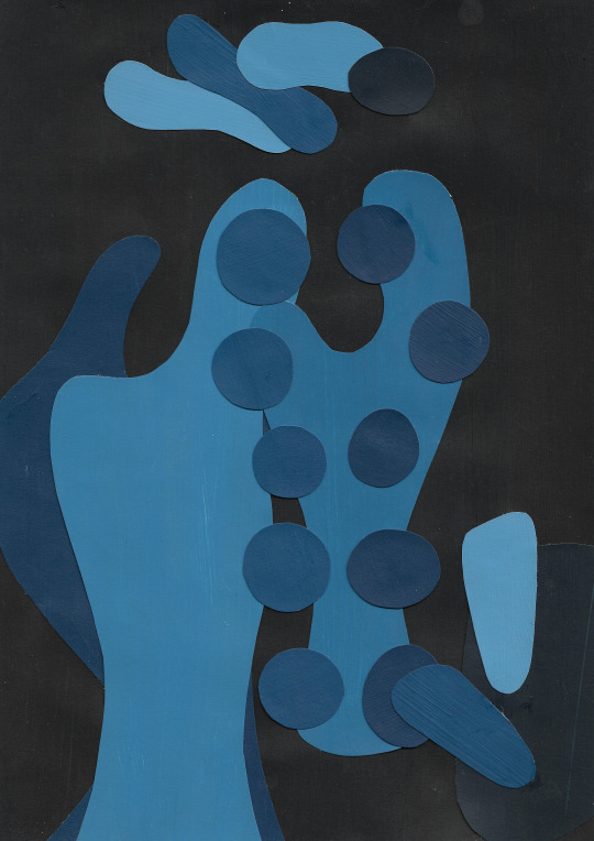
Fig 10 Collage 5 - single colour study - A4
I decided to try mixing a variety of blue tones for this single colour study as blue isn’t a colour I tend to work with usually, I started with the 5th colour in the palette below, increasing the amount of white I added for the lighter tones and black for the darker tones. I used the darkest tone from the selection to use as the background as the collage I was using as a reference used a black background originally but I wanted to use a palette entirely made up of the blue tones. I do think I did well to include a range of tones in this collage but it was difficult to make the different shades entirely accurate to the original photograph as I chose to make my referenced collage with a very abstract appearance.
Fig 11 Single colour study swatches - 3x3cm each
Fig 12 Collage 6 - Multi-coloured study - A4
I found this multi-coloured collage a little harder to create as I had a hard time picking out which papers I would use. I put a lot of emphasis on mixing a wide range of different papers and I think that I successfully produced a collage including a multi-coloured palette. However, I think I may have added too many different papers to the palette, I would have liked to have used a smaller selection of these papers - I feel that the collage would have looked better as a whole had I limited my paper selection. From producing my fourth collage I realised I quite liked the look of using a patterned paper as the background rather than a plain colour so I tried this again and this is one aspect of this collage that I find visually appealing and striking. It also looks great against the bright coloured papers that I used alongside it. I added a couple of extra elements to this collage compared to the original one and the previous two, but only to exaggerate the different elements more. I tried to use borders of colour to my advantage and exaggerate a few of the elements, I’m glad that I did this. I think it really makes this collage and the different shapes pop.
Fig 13 Multi-coloured study swatches - 3x3cm each
#textiles 1 a textiles vocabulary#part three colour studies#project 2 materials and composition#exercise 3.4 collage studies
0 notes
Text
Target Image Process
Final Version of the Target Image
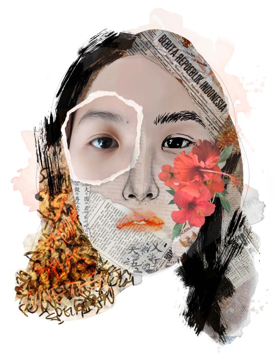
I tried my best to bring about the materiality of the papers by bringing out the edges of the paper instead of blurring them out. Moreover, I didn’t set the opacity and the overlay into something that is too soft, avoiding the texts from being overpowered and/overshadowed by the other elements.
Target Image’s Rationale
The target image I have is a self-portrait in the form of a collage of images and drawings made out of different (mix) media. This relates to the concept of my AR Experience where different "stories" influenced by various topics such as ethnicity, age, passion and others are written on the cube. The different drawings and images on the Target Image portray how there are more sides and faces to a person yet all these varied elements construct an identity.
For instance, the brush strokes effect on the image is intended to point at my cultural and ethnic background, reflecting the traditional Chinese culture of writing with ink and a brush. I also included type in Indonesian and Mandarin to let people know of my ethnicity (Indonesian-Chinese). The texts in Indonesia ranges from the news about Indonesia’s democracy, the Pancasila -which is the official, foundational philosophical theory of Indonesia-, texts of a sophisticated subject and scribbles of writings of numbers in Indonesian (I wrote down one to nineteen to depict my age). As for the Mandarin, I included very very simple and basic Han Zi that I know. I had more text in the Indonesian language rather than in Mandarin as I speak fluent Indonesian but very little Mandarin.
I also add hibiscus flowers because it means youth in the flower language to obviously symbolise my age and the fact that I am a youngster. I also decided to have a flower to depict my gender since flowers are widely associated with females (does not mean anything sexist). I also used watercolour splashes to point out my love and passion in art (esp. drawing and painting).
Project Statement
(This is possible by the help of Karen!! Forever grateful to Karen!)
This AR Experience showcases one individual’s confession, or a ‘manifesto’.
Just as there are two sides to a coin, there is more than one side or face to a person as humans are complex and intricate beings. This is evident in the way that they look or present themselves differently according to the situations and conditions they are in. These different sides and faces as perceived by others are affected by variables such as age, gender, cultural and ethnic backgrounds, occupation and more. Essentially, they are ‘performed’ to feature only the best side despite how an individual truly is or feels. Nonetheless, all those seemingly random and scattered ‘sides’ and ‘faces’ (be it shown or hidden from the public) ultimately coalesce in one embodiment of an individual. In other words, they make up a person’s identity.
The idea of collating and compiling various kinds of images in different media and techniques into an image demonstrates how all those varied elements and variables construct an identity.
This project aims to introduce a fresh perspective of what makes a person. Moreover, it is created in the hope that more people will come to an understanding that there is always more to a person, than simply their ‘face’.
Behind the Scenes
I tried my best to draw my own nose and it really is awkward and weird for me as I have never done a self portrait ever before. Additionally, it has been forever since I last draw! Brings about the joy of drawing back in me!
To create the lips, I decided to be experimental about it. I put on my red liptint and started kissing on my book.... It took me a while before I can find the form and look that I want and I am starting to run out of liptint. Thankfully, I found a decent one and decided to go with it! This was fun but nasty at the same time... I’ll look for an alternative next time (if by any chance I need to do this again).
0 notes
Photo
Cover Development 2
Concepts Of Visual Language - Year 2 - Unit 3
(6 May 2020)
Edit: I apologise for the bad quality of the pictures. I honestly don’t know why they came out this bad on tumblr.
After considering what Sally suggested about starting from a blank page for the cover I tried out a few different approaches without thinking too much about it. While I still liked the idea of not having the characters on the cover (as it has been like this on all the previous covers) I figured that the only way I could make my cover unique was by showcasing the characters I had illustrated - they were unique and they were the one thing that could make my cover look different from others.
Instead of showing Mister Tom I tried out a version where Will and Zach are shown, mainly because I had this illustration and wanted to try it out and partly because I thought it could be nice having the two boys on the cover.
For the first two covers I thought of having a cover that would go from front to back. You see the front, which is one part of the image, then you turn it and the other half gets revealed. It did not turn out very convincing, I did not like it too much and neither did my parents. There would not have been any place for the text. I would have had to shrink the image but then it wouldn’t look any good anymore. I dropped this approach after the two trials.
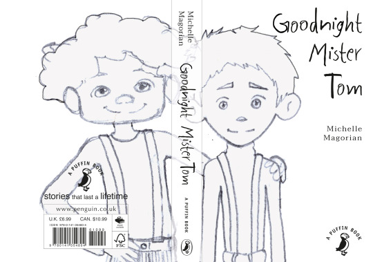
---
The second approach also included the illustration of Will and Zach. The thing was that at this point I did not have much time to come up with a completely new illustration, or a few different ones to try them out, so I had to work with what I had in order to get this cover done. I thought of using a background scene like the village or the sea (which then would have represented one of the chapters) and to visualise my idea I used the acrylic sea scene I painted earlier on when trying out different techniques.
There was also space for the cover copy and I did a few different versions with different sizes of the characters, varied positioning of the title and different alignments for the cover copy.
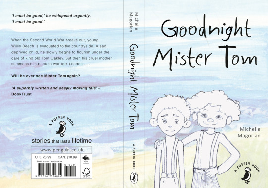
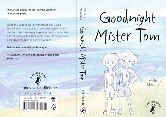
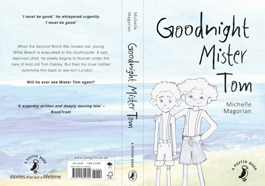
---
After three trials of the previous one I did another approach using the other version of Will, in which he is wearing the coat from the beginning of the story (as I said, I had to work with what I had for the different approaches) and this related back to my original idea of showing the name tag. In a way I really liked this cover and maybe I should have continued working on it but after asking for my parents’ opinion I dropped this approach as well as the sad face did not seem to be appealing. I could have changed that of course... But it didn’t feel like the one to go for at that point. (It would have been coloured if I had continued this further)
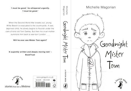
---
Getting annoyed by the characters I tried two more abstract versions for the cover. The first one was basically only text and the dot/filled out circle, which referred to the circle Will should draw for Mister Tom to install a peg to hang up the coat. Really dull, not much meaning behind it, and if anything, suited for adults but not even that really. Also dropped this idea.
---
For the second abstract version I used one of my WHY? illustrations as background and added the name tag (in a horrible quality because of it just being a concept/idea and nothing seriously executed. This one seemed to appeal to my parents to some extent by creating curiosity about the name tag. It also related back to my initial name tag idea. If this was a cover for adults I would have taken this approach further but I felt like it would have ended up too boring for children to pick up the book.
---
Going back to the name tag idea and the cover approach I did with Will in his coat I tried to do a slightly different trial. It came to my mind after seeing a cover from my mum’s book:
I liked the position of the character and the scenery in the back and that gave me inspiration to do a side/half-side perspective of Will with (kinda going back to the second trial with Will and Zach and the beach) a scenery in the background. i only did a pencil sketch that I scanned and filled in with some colour to try out my idea.
I liked it and my parents, well, they weren’t entirely convinced because it looked empty, but they could imagine this one looking nice. My dad said that the character looked a bit like an anima character which made me more cautious of the style as I did not want it to look like a manga/anime character as that would not have suited the story and the book at all.
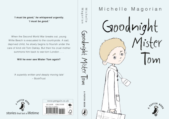
---
I started doing a watercolour version of this version of Will. It wasn’t finished at this point but I had to check how it would look before wasting too much time on it. I really liked how the watercolour looked but I wasn’t happy with the boy. He did not look like my original character anymore so I did a new illustration.
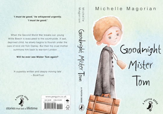
---
This time I used the new, improved illustration of Will (I like it so much more than the other one and he actually looks like my character design again) but it obviously wasn’t finished. The black type suddenly felt too harsh so I picked a dark brown from the illustration which suited the cover a lot more in my opinion.
I presented this approach as one of two possible versions in my final crit as I didn’t want to focus on this one cover too much before getting another opinion on it.
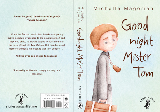
---
The other approach I presented was this one, featuring Will and Zach from earlier on but also in their watercolour state (not finished as can be seen on the eyes). For this one I chose a dark blue as colour for the type as black did not look good anymore.
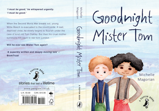
0 notes
Last Seen Blogs

reiayanami2-blog
robot rocker

videogiochisp
Videogiochi SP
riteshsingh71-blog
Untitled

gallifrey1sburning
Excelling at Nerdery; Failing at Humaning
creative-princy
Creative_Princy