#i think this looks vaporwave
Text

#oh you know… i think about their potential sometimes#totally normal behaviour#he wont log on ever again#but still#i think this looks vaporwave#very much improved from the last version#sometimes too much rendering kills the whole thing#qsmp#qsmp tntduo#tntduo#my art
575 notes
·
View notes
Text
did these surplus aesthetic frutiger aero mix maker gurus forget the term ambient existed? or muzak (non-intrusive background music meant to soothe)? making ambient music in mid 2000's is no different than making it in the 80's so it doesn't need its own cool social media exclusive term. there's nothing groundbreaking about lumping pseudo similar things together slapped with a new name just to get people to pay attention to your youtube page / blog more. also so many people bashed the Wii for longest time til just recently after this net fascination with mid 2000's which if you ask me was a very dull time period for me that I never look back on. weirdly though looking up the FA tag on here has more 'Y2K' vibes than the actual Y2K tag people pass around here which is so chaotic bad that I never even look it up anymore (even after all those video essays it has never helped alleviate that problem 😔). guess I have nothing else to say on this subject other than I wish I wasn't so stuck on the internet where everyone thinks they invented the god damn wheel or can base their entire lifestyle on an aesthetics wiki page. as long as my claim to fame is being the NoPlay person or the Toonami-pilled page I don't give af what anyone thinks about me or my sites 👍
#last rant#wasted enough hours reading about this stuff#just look up the term on youtube and you'll see exactly what I mean#at least with vaporwave people mixed tracks up with various levels of effort#but now i'm starting to hate the micro genre trend since the start of seapunk and witch house#just do shit you wanna do without thinking of the present norms#text
109 notes
·
View notes
Text
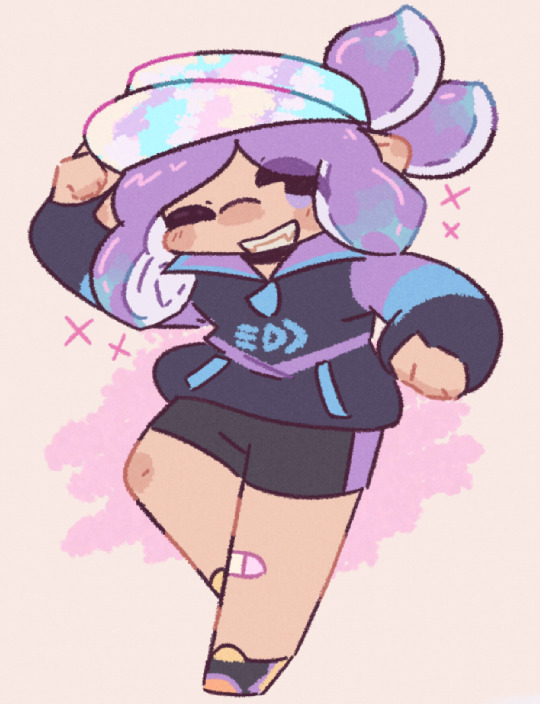
#doodle that i was kind of eeehhhh about but i think it looks alright now that its been a few days#||lost kin doodles#splatoon#//vaporwave
93 notes
·
View notes
Text
Antiquated Glow 🏹📼
#oc#artists on tumblr#retro inspired#experimental art#anhydros#achilles#I was listening to lots of vaporwave stuff recently and I was inspired to try this#I always liked the looks of the 80s and 90s aesthetics#I think it came out pretty nice for the first attempt but that’s just me#The lounge-centric ones in particular#I even made a playlist of my favorite select ‘plundered’ songs
15 notes
·
View notes
Text
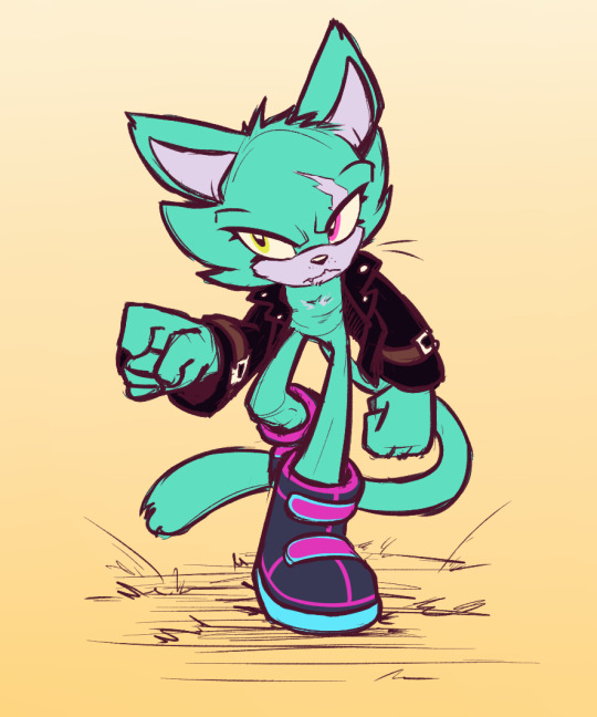
new guy just dropped, here's seafoam
got her eye mauled by infinite, now they match :)
wispon? nah we use our fists here (she carries an asteroid wispon)
we also act before we think and then hope shit works out
only really part of the resistance because she wants revenge for almost losing an eye
wants one of those yakuza tattoos that cover her entire back but there's fur in the way of this dream unfortunately
forces would be T rated if she was truly canon
would probably carry a knife post-forces tbh
#purp doot#seafoam the cat#bullshitted half of that but i think i have her deal down#funny thing is i originally wanted her to be vaporwave inspired#but i looked up outfit parts and saw the leather jacket and knew what i had to do#sonic#my characters
68 notes
·
View notes
Text
ngl every time I see this old image of misraaks I go feral
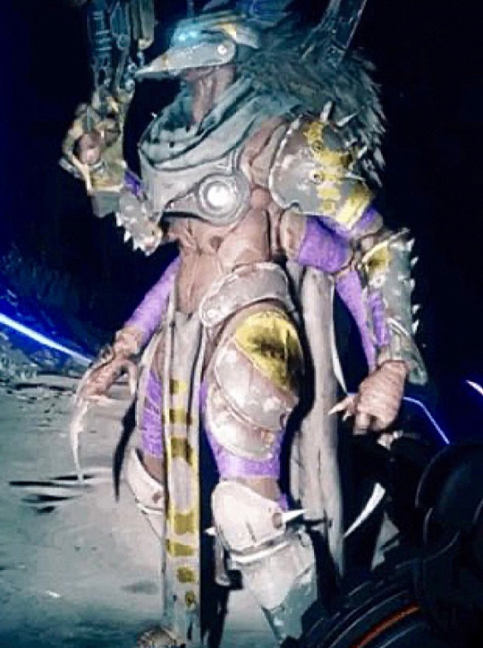
#vaporwave dad#I think we all know what the focal point of this picture is#also it looks like their secondary arms sprout from their backs rather than their sides :o very neat detail#very sorry it's still so blurry btw i tried to fix it but it did not work sdfgbgfd
21 notes
·
View notes
Text


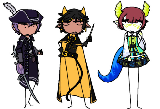
A bunch of character redesigns! These all badly needed redesigns for various reasons and I'm now so much happier with these!
First image to bottom left to right: Rain May Fall (she/they), Salem Raazel (he/him), Delta (they/them), Alastair (he/him), Earlene (she/her), Bell Taurus (she/her), Elmo (he/him), Belat (he/him), and Esteem (they/them).
#my art#original#oc#artists on tumblr#rain may fall#salem raazel#delta#alastair#earlene#bell taurus#elmo#belat#esteem#i think delta took me the longest for the simple fact that they have 6 arms so i had to like figure out how to design each sleeve#to not look too busy cause their design is based on circus (cause theyre a tightrope walker) and vaporwave#also the umbrella made me put my head in my hands they are so hard to draw#rain may falls redesign is partly inspired by the works of meyoco btw#particularly the palette i think it worked really well for them#belat and esteem also gave me some difficulty but in the end i really like how they came out
12 notes
·
View notes
Text
taking a nap in your friend’s bed and lucid dreaming that you are at the store and thinking “you’re dreaming why are you at the fucking store. leave” then your alarm rings
#blogging#but the ocean was sparkling more clearly than it ever has...#like some proper vaporwave and dolphins visuals.#lucid dreaming is really funny to me because i had a phase as a teenager where i became obsessed with making it happen#studying my palms so i would hopefully carry the habit into a dream and realize my hand looked wrong#the full Sober Teen Psychonaut effort#then i finally had a lucid dream and it was lame as hell and the mystique had gone away so i didn't care as much#now whenever it happens i'm like alright cool. that was mildly entertaining at best#ppl on teh interwebz advised looking at clocks so you could see if the time was wrong in your dream and i don't think i did that#but sometimes i look at a clock in a dream because i'm anxious about sleeping too late then i wake up and check the time like an hour later#and it'll be earlier than it was in my dream#and that is simultaneously reassuring and disorienting because i thought the dream time was the real time n_n#i got covid 🅱oosted the other night and i am largely no longer suffering debuffs but i still have a wicked headache :(#i've had like two glasses of water. fucka you for not healing me immediately.#I think it was a hardware store.
6 notes
·
View notes
Text
nabbed this baby for 4g and want him to go to a good home, pwyw
#flight rising#flight rising g1#fr#fr g1#flight rising sales#please someone take him hes a good vaporwave baby#im not looking for profit i just think hes neat and i have too many projects already#more scries in his bio
3 notes
·
View notes
Text
and then. regrettably. I bought a bunch of yarn.
in my defense I intend to make two sweaters out of it. one will be a mint chocolate chip kind of look and the other is a purpley Halloween-themed yarn, and I know I'll make a hexagon cardigan out of one, but I'm not sure about the other yet. or even which one.
#my mistake was in looking at r/crochet#i also had the idea for a sort of vaporwave colored sun moon and star motif blanket#but so far am stymied by not being able to find a single yarn with the colors i want#if it has that eye searing purple it doesn't have a matching cyan and magenta#or vice versa#I'm thinking probably those three colors plus a navy blue
1 note
·
View note
Text
when i first started drawing vosim jink, the way i used to draw him was really weird... like. i had to change my entire art style to draw him. i attempted to replicate that style i had for him during may/june 2022 for funsies but it's not 100% accurate lol

also. this was the first thing i drew with him. i drew this as i knew a hyperfixation was coming (and was i absolutely right):

#okay im gonna ramble on now!!!#i get nostalgic looking at my old vosim jink art. especially the ones from april - june 2022#that was when the hyperfix was at its peak!!! 1 year ago... and that really doesn't feel long ago at all TIME FLIES!!!!!#and the fact i literally had to show everyone vosim jink. like my brain said that was the law.#i was like a cat bringing a mouse it was really really proud of to its owner but the mouse was lil guy. lol#the first thing i thought when i first saw him was that vaporwave simpsons sunday school vid. vosim vibing to vaporwave on his walkman....#the nicknames too!!! i called my one onglydoople and i called heb's one skrunkly... now it's lil guy the 2st lol#he's also comforting and fun to draw and in a way he's helped my art style a lot!!#lil guy doesn't seem to be in my mind as much and i wonder if that's because i'm too fucking depressed to think about him lmao#okay ramble over i think lol#val's older art#vosimposting
1 note
·
View note
Note
how good is Hypnospace Outlaw at the 90s aesthetics?
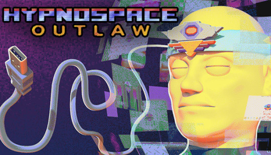
I haven't played Hypnospace! It looks fun!
But looking at the trailer and some gameplay videos... well, don't get mad, but this is exactly the kind of stuff I wrote my article in faux protest about.
It's not wrong, it's not bad, not saying that. There's truths in there about 90s design. But if you're asking me, the game has a thick layer of Vaporwave over everything. It just comes across as fake 90s to my tastes, personally.
But I think that was the point. I think that's what Tendershoot was going for. It's a surreal game about surfing the web in your sleep, right? So the design isn't going for accuracy, it's more that dreamy fantastical look people remember (or misremember.) It works for them!
Like, I like the key art! That's pretty good. CGI head in space would have been right at home on a Trapper Keeper. That USB cord should have totally have been a serial port instead tho.
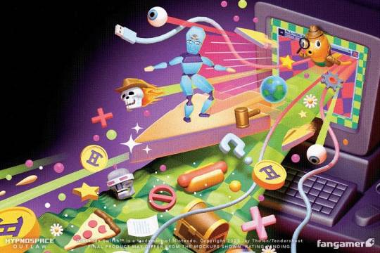
And this box art is chef's kiss. I feel like I'd see this on a textbook in computer class.

What I've seen of the actual game though? Hmmmm. You're asking a web designer here for an opinion, and this is a game all about web design. Like they get some stuff right. UI is a lot of fun, down to the Winamp-style skeuomorphic buttons in some of the screenshots.
But for something that's supposed to be set in '99, that's a huge overuse of pastel pink and purple gradients. It's like an Instagram filter over the whole thing. That's Vaporwave, and while it looked cool in 2018 that's not really what was going on at the time.

The MS-DOS sized pixel text bugs me when they should have gone with Windows 98-style higher resolution. They seem to run all their images through an aggressive dithering filter when in reality, JPGs existed too. But it's funnier to have all those crusty GIFs in there, that ages the art more. And is that a poop emoji button? An emoji in a 90s game?

Sorry, that sounds like I'm picking on a game I haven't played. Not trying to knock down any Hypnospace fans. The game looks fun! I'm just being a design nerd and taking a magnifying glass to something I've never seen before today. If you love the look of the game, that's valid! I like Vaporwave too. But Vaporwave is its own separate thing.

So, real quick, let's talk Vaporwave. It's important to understand Vaporwave is evocative of the 1990s, but wasn't an actual thing in the 1990s. The point of Vaporwave is it's meant to be a surreal parody version of the decade, as seen through the lens of the 2010s. I think what happened over the past decade was everyone forgot it was a parody and took it at face value. Vaporwave and 90s just became equals.
And that's how we got this:

What I wanted to share with you all was Vaporwave and Memphis style graphics are starting to be like THE ONLY representation of the decade. I wanted to share that there's more out there to pick apart and use for retro throwbacks.
Maybe further into Hypnospace they get into that other stuff? Thanks for tipping me off about the game! I'll add it to my Steam list.
;-)
348 notes
·
View notes
Text
About me I guess

This blog is something I use to post/reblog images I think look nice/cool. It also exists for me to post original weirdcore art and other stuff.
I'll also use it to promote lesser known aesthetics and maybe coin new ones.
Favorite aesthetics: weirdcore, dreamcore, liminal spaces, frutiger aero, y2k, webcore, xpiritualism, and vaporwave
Don't reblog my posts as traumacore because that's not what my account is for.
Keep in mind I'm a minor so I don't want NSFW accounts to interact with me
DNI: pedos, zoophiles, and bigots
UPDATE: new youtube channel!
78 notes
·
View notes
Text
doodles of the favourite outfits i use in game
#i never realised why arrow toesies blu was called that until i looked up to check i was thinking of the right shoes#anyway my explosh set is my howdy hat one i hope people who see it and go ''yeehaw lookin mfer on the team''#//vaporwave#splatoon#||lost kin doodles
15 notes
·
View notes
Text
Goncharov, Star Wars, Stonewall, and Disco, and the 1970s: an epiphany.
ETA: This is a discussion of Goncharov as a meme and how it relates to Queer culture, therefore I am not tagging it with the “unreality” tag. Goncharov is not a real film, but that doesn’t mean it isn’t important; for reasons I will now explain.
I may be going crazy, but I think I am on to something regarding the true meaning of the whole Goncharov phenomenon, and it's kind of related to Vaporwave and the image that people who didn't grow up in the 1980s or early 1990s (or who have hazy memories of it from their earliest childhood) have enshrined it in the "aesthetic" of vaporwave. But while the themes of Vaporwave are tied to capitalism and consumerism, the "aesthetic" of the 1970s has very different associations.
The whole 70s-to-80s transitional vibe is a favorite topic of mine: right before the Muskrat bought twitter, I tweeted a whole thread about how Panos Cosmatos channels that whole vibe better than nearly any director I've ever seen. (Yes, even Quentin Tarantino - fight me.)
People are watching the new Star Wars media, which are all based around the Original Trilogy and therefore have sort of the same 70s "aesthetic look" of the time in which those movies were made. George Lucas was incorporating and repurposing as much regular stuff that existed in the 1970s that he could, and it contributed to his "used, lived in future" vibe that I think people really glommed onto when they saw the films.
For example: Aunt Beru's outfit from the first film looks like something the actress could have worn on the street in 1977 without anyone giving her a second glance.
People all over the film (but particularly in the scenes on Tatooine) were wearing regular clothes and then making them over or putting accessories over them to make them look futuristic and alien; "Star Wars Bounding" before that was really even a thing. Their regular 1970s street clothes.
This is related to Goncharov because: people are watching Andor and The Mandalorian, and they're starting to ask "what happened to the 1970s aesthetic? Why don't we bring that back?"
Even more than the 60s and the 80s were at various points, the 70s have for a long time been a punchline for bad taste, but there's something more sinister to it beyond merely sneering at the outdated fashion of a previous decade. And it hit me while I was watching this video about the rise of Disco and how Disco's origins were connected with the Stonewall Riots.
The joke about the Goncharov film hoax is how it's a "forgotten film" and about "analyzing the themes of Goncharov." About themes of homoeroticism, about two men (one of them a Discotheque owner on the run from a repressive regime) and two women who are in love, all of whom are unable to consummate that love, because of toxic masculinity and cultural expectations. About clocks being a frequent and repeating symbol - about the characters’ time running out. And the film basically disappearing from public knowledge and being forgotten for decades because these themes were "ahead of their time." (All of this originating from a post about a pair of knockoff boots.)
Because this is a metaphor for the LGBTIQ experience in the 1970s if ever there was one. About a time when an intersection of Queer-BIPOC culture proudly asserted itself for a single shining moment in time - then was eventually subject to both a bigoted, racist backlash and a horrific epidemic so damaging and deadly that we're still analyzing the human cost and the effect it had on society as a whole. Queer culture exploded onto the scene in the 1970s - and then its time suddenly ran out. Or was cut short.
Goncharov - or rather, the spirit and the moment in time that it represents - wasn't "forgotten." It was buried. First under a racist, homophobic/transphobic backlash, then by the malignancy of Reaganism and the AIDS virus that Reagan and his policies enabled to spread and kill thousands. Under the sneering condescension and bigotry of the people who want this spirit to stay buried.
But this spirit is unkillable. Tumblr just gave this spirit a name: Goncharov.
This same spirit is in Andor, to a point - because Queer culture is being actively repressed by the usual bigots and fascists, and Star Wars in general has a running theme of resisting oppression, and it is firmly anchored to its 1970s roots despite taking place "a long time ago, in a galaxy far, far away." Spoiler warning for the Andor season finale: but it was impossible for me to see the scenes of rebellion and not flash back on this recent tweet from Dan Savage in the wake of the Club Q shooting:

("Out of the bars, into the streets!")
One of the things I think about all the time is what would have been if the right wing bigoted backlash had been turned back, and how things might be different if Reaganism and the AIDS crisis had never happened. What our culture might have become. How much further ahead we might be than we are now.
We're still facing that same toxic right wing backlash right now, but it's our duty to resist and survive however we can, hoping that this time we might turn the tide.
Stonewall lives. Disco lives. Goncharov lives. Long live the Rebellion.
#Goncharov#Star Wars#Andor#Queer Culture#Disco#lgbtiq+ rights#Goncharov Lives#Discussion of Goncharov as a meme
439 notes
·
View notes
Text
Investing in T-shirts! The biggest beneficiaries of Gear Adjustments!

For fashion aficionados like myself, Gear Adjustment is the most exciting part of the upcoming Season. Being able to make small changes to the way your gear is worn is something that opens up a ton of customization while requiring less new stuff (though I'm sure it required a lot of work to add). With that said, for the moment, it is looking like they are limiting the feature to caps and t-shirts. I don't personally think caps are changed very much by the ability to flip them, they're all pretty good as they are, after all. But for t-shirts, being able to oversize them is actually really big. Pun unintended.
T-shirts have the tendency to be modeled in a way that makes them cling really tightly to your character's body, and it is has never looked right to me. Looking at the clothing choices I see in my multiplayer games, I get the impression that is the general sentiment, as well. Oversizing shirts solves their central problem, loosening them up and giving you a less constrained silhouette. In this post, I wanna highlight what I think are the biggest winners of this change are. Shirts I think you should pay attention to once the patch hits.
That said, I should highlight that since we don't have the patch yet I am only assuming these will be Adjustable. We cannot know for sure until the we get the update.
I've picked out ten T-shirts I think are the standouts, split into a couple of different categories, starting with the ones I think you all expected to see here:
Annaki Accessories!
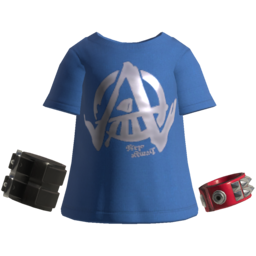
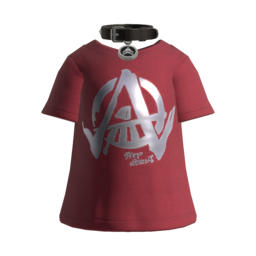
I have to imagine that the Annaki Bracelet Tee and Annaki Choker Tee were some of the first shirts that came to mind when you think of noteworthy T-shirts in this game. They've got nice, dusty colors, the big Annaki A in slick silver, and of course their signature accessories. Oversizing these I think will amplify their punk aesthetic even more, because there's nothing punk about tight-fitting clothing.
Unless it's leather.
And leather these are not.
High-fives for Tie-Dyes!

Tie-Dyes are really fun with their bright, trippy patterns, so it's no surprise that the Takoroka Rainbow Tie Dye and the Takoroka Galactic Tie Dye are some of the better T-shirts in the game. We did see the Rainbow Tie Dye get Adjusted in the reveal trailer, and is it just me or does that just seem right for these kinds of shirts? Something about them screams "wear me at one size larger."
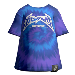
Ride the Wave!
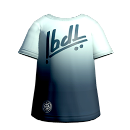

Next up, we've got the Firewave Tee, Icewave Tee, and the Vaporwave Tee. There is also a Duskwave Tee, but I am personally not a big fan of the shade of orange they use for the bottom half of that shirt. That said, I think the gradient on these shirts them really make them stand out from the rest, and their color palettes are just very nice and evocative.
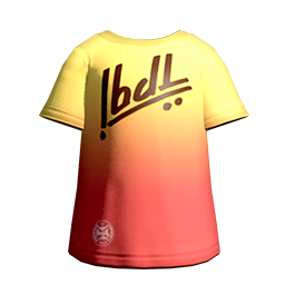
Assorted Graphic Tees!
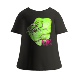
These three don't have a common throughline aside from all being graphic tees, but I think they all have something to recommend them by. The Eelzebub Tee has a really gnarly, radiation-green design that is just really cool, giving an outfit something really eye-catching while still staying nice and simple.
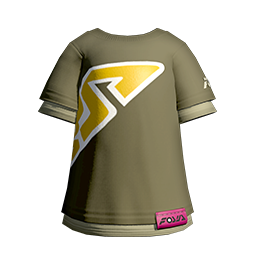
The Green Tee is interesting because its big bold graphic lettering actually extend across the side and even a bit onto the back of your character, which gives it a really unique look I don't think any other clothes can replicate.
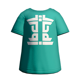
Finally, I just think the Mint Tee looks nice. Its color is pretty unique amongst shirts, and the white print design is decorative without being overbearing.
And these were my picks for the T-shirts to keep in mind come Drizzle Season 2023. Were there any others you feel I missed? If so, please tell me in the notes!
105 notes
·
View notes
Last Seen Blogs

by1tuning
Untitled
ashley-reguindin
Untitled
super-mario-bros-fim-2023-sub-it
Dove Vedere Super Mario Bros. Il film 【2023】𝗦treaming-ITA

your-luna-love
Lunali
wellfedfemme
lillian