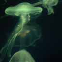
#i think the og edit was the first time i had used photoshop to make a gif asdhask
Photo
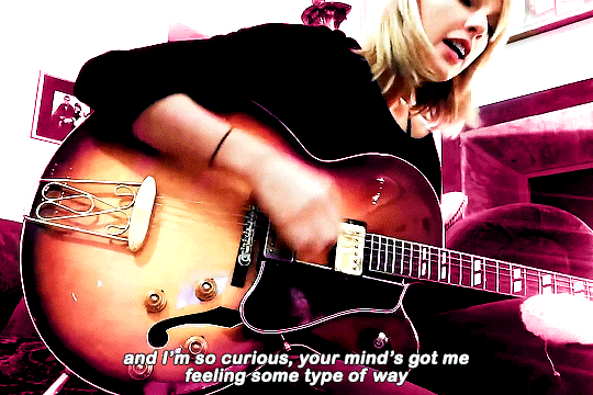


edit redo series [7/?] {og edit}
I go through phases when it comes to love, I’m nothing you want
#editredoseries#tswiftedit#taylor swift#taylorswiftedit#tswiftgif#candy swift#dailytayloredits#networkthirteen#tsuserclaire#edit#sarahsedits#i think the og edit was the first time i had used photoshop to make a gif asdhask
788 notes
·
View notes
Note
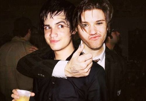
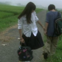
you remember this image, right? so I 1. couldn't find the og post about it and 2. went back on the hunt for it's origins.
i still haven't found much, other than an Amino which edited the pic without sourcing where they got it and the og Pinterest post, which says that Ryan said "You can't put your arms around a memory" about it. that's actually a song by Johnny Thunders which Ryan covered in 2012, and also tweeted "Can't put your arms around a memory", but I can't seem to connect that to the image.
and then by the time I got there. Google was no longer letting me image search. so I tried again.
AND ANSWERS WERE FOUND! but only partially
Tinsley Mortimer (from Real Housewives) hosted a New Year's Eve Party At Japonais Presented by SKY New York.
Panic! At The Disco and Pete Wentz were both in attendance to this event, and although I could not find the specific picture, the hair styles match, so you'd think it's this event, or at least circa 2006, right?
well. only maybe. because after looking through the pics, the outfits are completely different!
so now I'm stuck between the picture possibly being taken in late 2005/06 and Ryan having said something in 2012. i still have no idea.
First of all. Pop off Sherlock Holmes! Genuinely idk if this is just you (and honestly me cause I'm way too invested in this) just having extreme brainrot + internet sleuthing or you're cut out to be a detective but I'm so glad to be your John Watson that you just bounce ideas off of.
Now it's currently 1 a.m. and I've just had a mental beak over an art project but my brain is whirling.
Now that I'm looking again this Ryan in the picture looks a lot older than Brendon in the picture (idk maybe it's the scruff) so I'll just play devil's advocate for a second and say this could possibly point to this being a photoshop. Also the the proportions of Ryan's hand to his head feels horribly wrong and the lighting is odd but that could just be attributed to the flash. Maybe the photo was taken and then only slightly edited for quality for publishing or something?
Side note: is there a mark on the back of Ryan's hand there? Is it a tattoo do we know if he has one? I can't believe I'm about to ask this but do we have claer photos of his hands?
Also the glass in the lower left corner that Brendon is holding looks like a stock photo due to the white hue of the unfilled part of the glass but again, that could just be the flash.
These areas specifically:
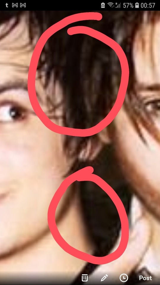
Bother me.
Because the top one has a weird defined like between the hair where clearly they should have smushed together. This could be attributed to the shitty quality or Brendon's hair being gelled or sweaty but idk i don't think so.
Also the bottom part, Brendon's feels too... smooth? Too blended? Could be pixles. Could not.
Also the song lyric? Hear me out, could be something from a fic. Like you often see tumblr posts or memes on Pinterest and under it you'll see quotes from like a Wattpad story or something. If Ryan supposedly said it once and covered the song then there's no reason why a fan wouldn't use the song for a Ryden songfic. Our hypothetical writer here could have taken those pics from the New year's eve party and photoshoped them for their fic.
Or there could have been an outfit change at the party perhaps?
Also I looked at the years you mentioned and I looked them up. Specifically Brendon in 2006 and Ryan is 2012.
This is Brendon in 2006:

makes sense
And this is Ryan in 2012 (at least according to Google):


Notice the scruff the volume in the haircut/sytle.
Idk this all only 10 mins worth of thinking and I think the Google search of Ryan 2012 shouldn't be completely trusted cause Ryan had kinda stepped out of the lime light so he wasn't taking as many photos and they certainly weren't time stamped as thoroughly. Maybe we could ask bandom tumblr for 2012 Ryan pics? Ya know, for science? The case?
Also through what did you find out about panic!'s + Pete's attendance to the party? An article? Could you share the link? I could read through it for clues or try and find similar articles.
Also this if this American Housewife has a twitter we could check it. See if she posted an photos of it in 2006. Or check Brendon's socials (though I doubt we'll find anything remotely Ryan related there). Also if that fails there's always MySpace (tho that's a limited source since we'll only has archived screenshots) or Livejournal (after all it's proven usefull to the petekey girlies).
Also if you check my tag lexi's cursed ryden pictures and scroll you'll find the original ask you send to me
5 notes
·
View notes
Photo
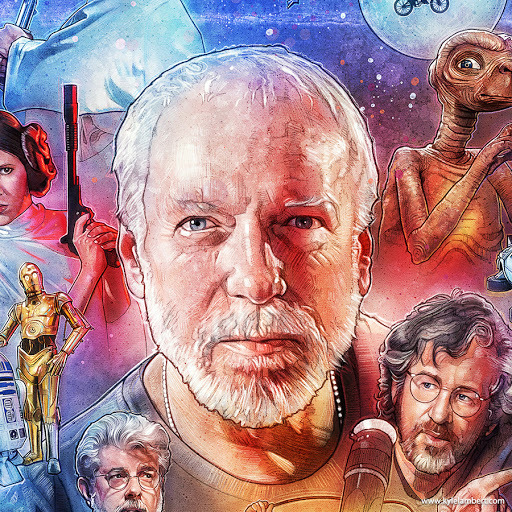
I mean….you all knew this was coming ¯\_(ツ)_/¯ : the Star Wars Art of one Mr. Drew Struzan.
And look, the man has done so much and has such a diverse portfolio that Star Wars is only one very small part of his career. If you want to explore some of his other works, then might I suggest that you check out his website.
As for me here, we’ll be sticking strictly to his SW art. Now, with that out of the way, here we go…
*cracks knuckles*
I have to admit that before I really started to dig into this, I didn’t realize just how many Bantam Era (and beyond) Star Wars books this man has illustrated. Nearly 50 titles, ranging from novels to comics, short stories & even an RPG supplement. 🤯
And so, after much consideration, I decided to just pull all the titles that feature his art off my bookshelf and take a few pics for you guys:
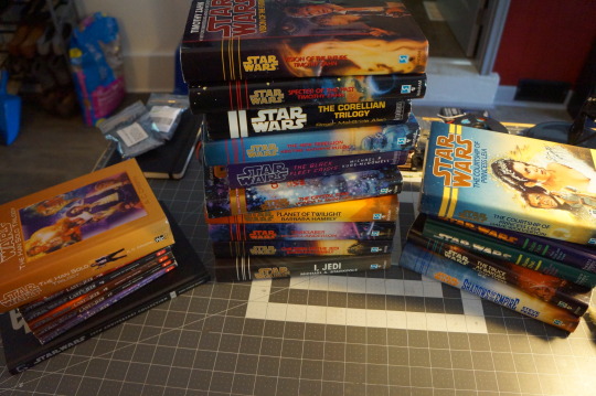
First off, I just want to point out that I don’t have every book he’s ever illustrated. Some of them are just harder than hard to find, are hilariously expensive, or I just don’t have an edition that features his art prominently - you’ll see what I mean. Right off the bat though, you can see that he was really hitting his stride in the mid-90′s, with all but a handful of these coming out between ‘94 & ‘99. One of the highlights from this time for me, is The Callista Trilogy.
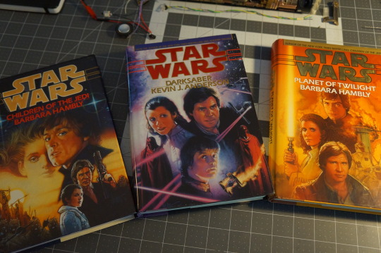
I just want to stress that The Callista Trilogy is a highlight for me only because of its gorgeous cover art. 🤣 Other than that, this book series needs to go lay down.
Anyway, the designs are all really striking and even after all these years, absolutely iconic. And you can really see Struzan’s distinct visual style at play here; not a painting in the same vein as something from Dave Doorman, and not a simple trace. Rather, something that is stylized in a very particular, very subtle way, almost to the point where it appears photo-realistic at first glance. Beautiful.
Next up is this trio of trilogies (good use of words, me), collected in these Science Fiction Book Club (SFBC) hardcovers:
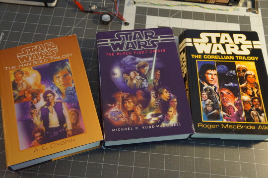
Once again, these covers are just striking, particularly The Black Fleet Crisis. This is actually what I was referring to when I said that I don’t always have the best editions for a Drew Struzan appreciation post. 😅
Because these are hardcover collections of paperback books, we actually miss out on a good bit of the art. For these SFBC special editions, the publisher just took all three and basically photoshopped the best bits of each one together. The one that suffers the most here is obviously The Corellian Trilogy, where they didn’t even try to blend everything together, and instead just separated everything into columns. I don’t personally mind it (and I do love having the hardcover editions of these books) but if you want to see the covers as they were originally intended, just pickup those mass market paperbacks. 🙂
There’s a lot more to get through, so I’ll just hit the highlights here; even though he didn’t illustrate The Thrawn Trilogy (that was Tom Jung, who I personally think did an okay-ish job at best), he did an absolutely amazing job with the follow-up, The Hand of Thrawn Duology in ‘98 & ‘99:
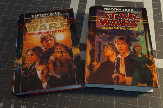
I’ve always loved these covers. And narratively speaking, they really do serve as one last hurrah on the Bantam Era. Oh, and also please note, Mara Jade on the cover of Vision of the Future, just as Zahn originally described her. ❤❤❤
If you step back and look at Struzan’s work as a whole, it’s all incredibly unified. I bring this up here because even though some of these are books relatively ‘meh’ worthy, Struzan maintained a level of quality that belied the mediocrity contained within. And also to say that he was definitely busy, particularly in 1994:
That’s right - all of these released in ‘94, within a few months of one another. These covers man… *chef’s kiss*
And look I’m sorry, I just can’t help myself: The Crystal Star was a hilarious joke until we all realized they were serious about it. 😳
Alright, that’s a little on the harsh side; it’s not nearly as bad as most make it out to be, and Waru as a source for unlimited power (citation needed 👀😉) isn’t any more ridiculous than the 50 other post-Palpy, hair-brained Imperial schemes that everybody else cooked up, so I guess it fits. And besides, I really wanna be nice to Vonda McIntyre here, but this book was just so so boring. 😴
*clears throat* Moving on, here we have a couple Barnes & Noble hardcover collections of The Jedi Prince Series:
The same thing applies here; cover art photoshopped from across 6 different YA novels to get these. They don’t look bad, far from it. But rather this series has some things that people would rather forget about, namely a supposed son of Palpatine (spoiler: he wasn’t) named Triclops who had - wait for it - 3 eyes.
Like Tien. From DBZ. Yep. 🤦♂️
Moving further down the list, we have yet another pair of iconic cover designs, being I, Jedi (the only Star Wars novel written in the first person, and an appropriate riff on Isaac Asimov’s I, Robot - yes ladies & gentlemen, that is as clever as Star Wars gets) and The New Rebellion.
Classics, no doubt….but for reals, did anybody else ever wonder why the X-Wing on the cover of I, Jedi is missing an S-Foil? Or how that one slipped through??? 👀
Ah, at last we arrive at what is arguably Struzan’s most famous work; the covers for Shadows of the Empire & The Star Wars Trilogy: Special Edition.

It’s hard to overstate just how important Shadows of the Empire really was for Star Wars as a brand. In an era where SW books were already extremely popular, the Shadows of the Empire Multimedia Project basically served as a breakout hit and reignited interest in SW media across the board. This was in no small part due to the striking imagery captured on its cover - are you seeing a pattern here?
This success actually renewed Lucas’ interest in a theatrical re-release of the OT in 1997….which of course, feature more beautiful art from Drew Struzan:
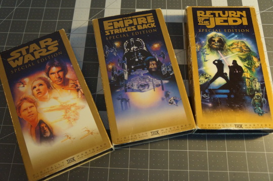
These are my OG Special Edition VHS tapes from back in the day. I watched these so damn much as a kid. In fact, they’re basically the whole reason that I’m here, annoying the shit out of everybody today. 😁
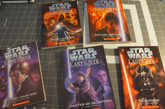
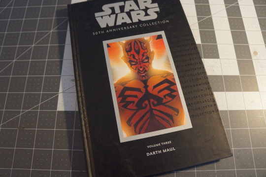
After the Bantam Era concluded & the Star Wars publishing license went to Del Rey, Struzan did progressively fewer pieces for SW media. Here we see his contribution for the latter half of the Last of the Jedi YA series, and his kick-ass cover art for the Darth Maul comic:
And when I say that Struzan did progressively fewer pieces for Star Wars, I am of course omitting his turn as the poster artist for the freaking Prequel Trilogy:
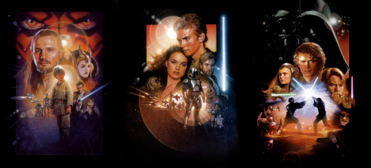
Say what you will about the films, but these poster designs are nothing short of genius.
Look guys, it would be pretty easy for me to downplay Struzan’s Star Wars portfolio as just one small part of his incredible career. But my dudes, this is literally just the tip of the iceberg. The man has been a professional illustrator for over 50 years, and his art has delighted and inspired generations. From Star Wars to Indian Jones, and from Back to the Future to Blade Runner - Drew Struzan has played an integral part in shaping popular culture.
Here’s to you, sir. 🍻
#star wars#drew struzan#art#the callista trilogy#the han solo trilogy#the black fleet crisis#the corellian trilogy#the hand of thrawn duology#the crystal star#the truce at bakura#the courtship of princess leia#the jedi prince series#i jedi#the new rebellion#shadows of the empire#the star wars trilogy#special edition#the last of the jedi#darth maul#comic#star wars prequel trilogy#the phantom menace#attack of the clones#revenge of the sith
124 notes
·
View notes
Text
#showyourprocess
From planning to posting, share your process for making creative content!
To continue supporting content makers, this tag game is meant to show the entire process of making creative content: this can be for any creation.
RULES — When your work is tagged, show the process of its creation from planning to posting, then tag up to 5 people with a specific link to one of their creative works you’d like to see the process of. Use the tag #showyourprocess so we can find yours!
sabrina @lanwangiji, my love, tagged me to share my process of making this typography edit! check out her explanation of her the untamed edit and her edit tag.
1. PLANNING
i once opened lyrics edit requests so i can learn and practice typography. this edit was a request as well. i asked them which lyrics they wanted to have and the colors they’d like. since i got several requests and it was hard to keep tabs on them, i made a trello board so i could organize everything. i’m still using the trello board for every edit idea i have, the board makes my life easier.
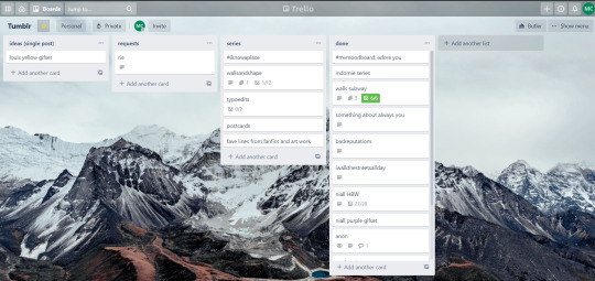

above is what i filled the card in the board with. basically just information of the requests.
1.1 INSPIRATION
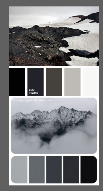
once i got the request, my first thought was to find the vibe the song/lyrics exude. “it’s an old curse” screamed witchy vibes to me, so i went to pinterest to find some inspirations. at first i was looking for witchy poster designs and i came across this. i liked how it has smoke-ish graphic and i thought the smoke suited the “old curse” lyrics. and tbh pinterest is a rabbit hole, they gave me suggestions after suggestions, like this and this which became my inspiration for the color palette (i added the gold from those pics) and the sun moon design gave me the idea to incorporate space stuffs too. i somehow landed on this too, and because i wanted to include space theme, i made a simple phases of the moon. ultimately the hero of this edit was the lyrics, i didnt want the graphics took the center stage. i was inspired to make a crystal ball and do this kind of typography but after several trials i couldnt get the the typography right, so i scratched that idea and went with the space theme instead.
1.2 PICKING COLORS
after i was feeling inspired enough, i went looking for the right colors. i usually just type “color name” and “palette” on pinterest. example “dark grey color palette” and i chose the one i liked best. when the request only asked for 1 color, i always searched for either a complimentary or contrasting color to give it a jushz, to add sprinkles. that’s why i added gold on top of the dark grey.
1.3 FINDING FONTS
this is the hardest part. the fonts play important role to the design. they need to convey the vibes of the lyrics, in this case witchy/magic vibe. i needed to find fonts or font just as magical and a bit whimsical. tho i hoard fonts... i like to use new font for every typography edit lmao sue me.
i highly recommend going to creativemarket free goods site, pixelsurplus font freebies and behance to search for fonts. i always use 100% free fonts, that means i can use it personally as well as commercially. creativemarket gives me desktop license for the fonts, which means i can use it for commercial as well. the reason i do this because i want to open an etsy shop someday, and i want to have the right license when i sell my stuffs. i almost never buy fonts bc they are expensive lmao.
the fonts in used are “Vintage” for the main typograpy (i think i was a freebie from creativemarket) and “Morganite” for the title of the lyrics and the name of artist.
2. CREATING
once i have my materials and ideas, i open my illustrator and hope it doesnt crash every 5 min.
for this kind of typography edits, i use 600x700 px. tbh i dont like using 540px, the suggested tumblr size, as the width bc to me it doesn’t look as good in quality, so i up the px. but more on this sizing later. i utilize the artboards function in illustrator, and i use 2 artboards.
i use illustrator (ai) bc i’m working with vectors. when i work with vectors, the graphics/texts or whatever im making in ai wont become blurry or lose its quality when i enlarge or shrink it. in compare to photoshop, i need to make for example the moon graphic very big, so i wont lose the quality when i reduce and enlarge it again. with vector, i can start small and when i expand it, it’s still as good as when it’s tiny.
2.1 GRADIENTS
i started with the gradients first. i created a rectangle as big as 600x700px and with the “freeform gradient” tool in ai, i played with the colors. below is the color palettes i used
2.2 LYRICS AND GRAPHICS
once the gradients are done, i worked with the lyrics and graphics right away. when i first doing this edits, i made typos a lot lmaooooooo. so i copy and pasted the lyrics on top of my artboard, so i wouldnt have any typos.
i had 3 layers in my ai. one for the inspo pics and the OG lyrics. the rest for the edits themselves. i broke up “It's an old curse/dreamers diving headfirst” into to parts, hence the 2 more layers
i almost always started with the lyrics first then the graphics. but for this edit, i made the smoke first so i can layout where my text would be.
tbh the process of making the lyrics is a trial and error. i tried bunch of different stuffs and i chose whatever the best. but i worked like methodically, i made sure i finished the first part of the lyrics first then i could move on.
i was lucky with this font “vintage”. the font offers me several glyphs like these
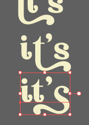
and i chose the one at the bottom. you’re very lucky if you find a font and they have glyphs.
excursion: glyphs vs fonts
glyph is an individual character. It might be a letter, an accented letter, a ligature, a punctuation mark, a dingbat, etc.
A font is a digital file which is used to display a typeface, which contains the entire upper- and lowercase alphabet as well as punctuation, numbers, and other special characters.
after i was finished with all the lyrics i added some graphics to make the edit pretty like small stars or dots. i added the song title and the artist too, sometimes at the bottom sometimes at the top. and i added my watermark put it as small as i could and made it a bit invisible but still can be seen.
2.3 EXPORTING
exporting! this is where i’m going to go deeper with the dimension of my work. in ai, i always choose to save with “export as screens” function. it automatically divides the artboards i have and save them separately. i always save as png, bc the size is smaller than jpg but can maintain the quality.
now the export tab looks like this
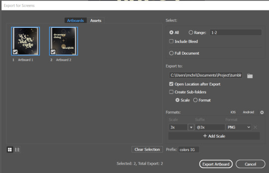
see the formats? i always scale up my edits, 2-3 times the original artboard size. reason is, to maintain the quality. i have tried to save it as original, 600x700 px, but it turned out a bit blurry. bc everything in ai is vector, when i scale up it doesnt lose the quality. BUT once i save it as png, it’s not a vector anymore, and when you zoom in until a certain degree it’ll be pixelated. that’s why i always scale up, to avoid it becoming pixelated when it’s just zoomed 1 or 2 times.
2.4 FINAL TOUCH
i opened my photoshop and also pray it won’t crash. import the png of my edits, add some grains/noise. the reason i use photoshop is, the noise filter is way better than in ai. it’s smoother somehow. and then i export my edits.
(i have a timelapse of how i made one of my edits, it’s not this one, but it’ll give you a better visualization. find it HERE
3. POSTING
now the hardest parts are done, we go to posting!
i uploaded the 2 posters on tumblr as photos then i wrote the captions. for this typography edit, i always chose another lyrics that i like from the same song for the caption. i bolded the lyrics, add link to all of my typography gradient edits.
i always use this link to color my caption. i usually choose 3-4 colors, and i took the colors from my edit. but this was not until recently lmao. before i just took a guess and looked for similar colors that match the edit, but then i thought “why didnt i just use the color in the posters lmao”
ok after i have my html code for the caption, i go to this site to replace the “;” with “ “ so tumblr can read the code.
i’m not one who puts their edits in draft, bc i just cant wait to post it. i have to option here, either i post it immediately when the time is right (i usually post between 4-8) or i schedule it, if im finished before 4.
i put all the necessary tags and click post! i am done finally!
i’m tagging:
@thetriangletattoo for this amazing series
@deludedandlostcause for this impressive gif
@half-lightl for this spectacular edit
@gayndrew for this stunning drawing
@thechampagnelovers for this cool collage
@cloudslou for this incredible edit
@heyangels for this incredible edit
35 notes
·
View notes
Text
tag game
Thanks for tagging me @tinnike
It’s been a while since I’ve done one of these posts. I’m also in the middle work, bored to death so this is a good distraction.
1. Why did you choose your URL? My URL is a part of a lyric from the song Panic Station by Muse. I adore Muse and this particular lyric always sounded like it could be a good name for a blog.
2. Any side blogs? Nope, none.
3. How long have you been on tumblr? Oh man! I had to go through my archive to see how long I’ve been on this hellsite and I’ve been here since January 2012. Does that make me one of the OG tumblr users? I’ve been on and off though, there was long period of time when I was completely off tumblr. I usually pop back when I’m obsessing over something in particular.
4. Do you have a queue tag? Nope, and I don’t know how it works despite having been here for so long. Never bothered to check.
5. Why did you start your blog in the first place? I don’t quite remember. At that time, I was part of a Muse community on LiveJournal and some folks there had tumblr. I was curious and wanted to check it out. That was the time I was properly introduced to what being in a fandom was all about.
6. Why did you choose your icon? Cos I’m in love with the man in my icon 🖤 My icon is a good way to tell what is ruining my life right now (in the best way possible). I adore Richard and Rammstein so it seemed fitting that I use his picture. He looks like a silver prince.
7. Why did you choose your header? Same reason as above, I guess. But I’ve been thinking about changing it to a more aesthetic shot of Rammstein or maybe something else entirely.
8. What's your post with the most notes? I have no idea. I used to post a lot of photo edits of people, musicians and movies that I like along with quotes. I used to be a graphic designer (UX designer now) so I loved playing around on Photoshop, editing photos and such. I remember one with Muse getting a lot of notes. So, maybe it’s that one.
9. How many mutuals do you have? I don’t know what this means. I guess this means how many I follow follow me? I don’t know that number.
10. How many followers do you have? 135
11. How many people do you follow? 103
12. Have you ever made a shitpost? Oh yes, I think I might’ve.
13. How often do you use tumblr each day? A lot! I’ve been coming back to tumblr a lot. Maybe it’s because I’ve gotten bored with Instagram. I’m on explore or even searching for a specific tag quite often. The content on tumblr is so unique and nothing can match its level of insanity 😆
14. Have you ever had a fight/argument with another blog. Who won? Nope. I barely interact with other users. Just reblog and enjoy the posts. Off late, however, I’ve been interacting with some lovely folks in the Rammstein fandom.
15. How do you feel about 'you need to reblog this' posts? There are times when I get influenced by those. Mostly because I don’t want any bad mojo because of my own subconscious.
16. Do you like tag games? Yes, I do! Please keep tagging me 😄
17. Do you like ask games? I feel like I might. But I’ve never tried it or never had enough followers to try it I suppose.
18. Which of your mutuals do you think is tumblr famous? I think each fandom has a few accounts who are popular, either for creating amazing gifsets or for the wikipedia of info they seem to have. Not really an answer but I don’t know what else to say.
19. Do you have a crush on a mutual? I guess the equivalent of a crush on tumblr is to feel seen or included in a group that likes the same things you do. At least that’s how I see it. So yeah, I guess I do have favourites and I like it when I can be part of their little circle.
Tagging some mutuals I guess 😛
@witchmoon @notafraidofredyellowandblue @creepycaro @myvirtuallove @acertaindragoncollection @butterfliesandresistance
8 notes
·
View notes
Text
Interview with Caitlin Alexander
Well folks, we're nearly at the end of our Square Carousel journey, and there are just two interviews left – both with two of our longest-standing members! Today, we reconnect with Caitlin Alexander, who has been with the Square Carousel Collective from its very beginning almost 10 years ago. Although we've featured an interview with her here in the past, it's been so long that we are due for an update!
When she's not freelancing or performing her duties as an SC admin extraordinaire, Caitlin works tirelessly on her craft, creating prints, products, hand lettered posters, and artwork that embrace the earthy beauty of nature. With a strong focus on environmentalism and a sense of community, her artwork exudes a warmth and complexity that draws the viewer in and invites them to stay a while. Read on for her gems of wisdom!
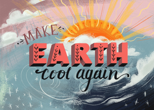
Make Earth Cool Again
Q: Comparing your early work from your first few years after college to your most recent pieces, you've kept a lot of the textural, playful essence of your style while refining certain elements. Has your process changed much since those early days, and if so, what do you now do differently?
A: Such a great question straight out of the gate! My process has changed quite a bit since I graduated in 2011 (almost a decade ago... yikes!). In college, part of my crafted identity as a brand-new illustrator was my traditional use of gouache paint. I actually, in all honestly, was kind of a snob about it, because so many people in our department worked solely digitally. I felt that digital painting was a crutch, which I suppose can be true in some cases, and possibly even more-so when you're applying that to college students, but I certainly had no ground to stand on. In reality, my snobbery kept me from learning critical tools, as I never took Photoshop or Illustrator classes, aside from the one that was required for graduation. This hindered my work a great deal outside of college, given that illustration is so often paired with graphic design, and editing work for clients was so much more difficult traditionally. In 2013, I got a job designing t-shirts, and lied to the company, saying I knew how to use Illustrator. Luckily it was remote, so I was able to teach myself without anyone hovering over me, but that was so foolish, looking back, given the expensive education I got at SCAD should have been my opportunity to learn those things. I introduced digital work more and more over the years, and by 2016 or so, I was primarily a digital artist. Gouache will always have a place in my heart, and I will still break out the tubes occasionally, but working digitally has allowed me to grow so much more as an illustrator, with the ability to edit, paint with more detail, and having more control over color and layering.
Q: Of all the projects you've done in your professional career, which would you say is closest to your heart?
A: Probably the picture book I worked on a couple of years ago, titled "Cool For You." I had a lot of creative freedom for that project, and the subject matter of climate change is personally very important to me. Working with the author, Marianna, was really wonderful, as well.
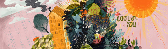
Cool For You book cover
Q: The Southwest influence on your work is pretty significant, and I think it's safe to assume you appreciate the majesty of the landscape in your region of the country. However, if you had to live in another state, which would you choose and why?
A: Funny you ask that, because I've actually considered moving from Texas to Colorado lately! The culture there is still very western, but I appreciate the liberal point of view (Texas has been grating on me lately, even living in Austin), and the landscape is even more stunning out there! I'd be close to so many inspiring National Parks. Plus, summers wouldn't be 8 months of the year and over 100 degrees for half of it!
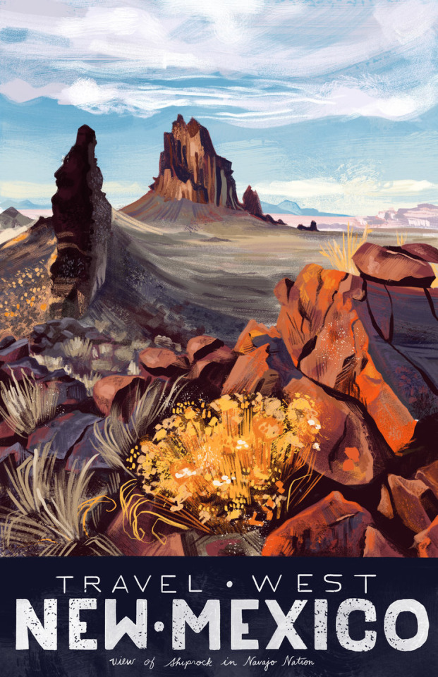
Travel West postcard (1 of 6)
Q: TV shows or movies?
A: Lately, Jordan and I have been watching New Girl on repeat. I'm not usually one to watch a show or movie over and over again, but I think we really just needed something light and fun, since life has been so very stressful over the last year.
Q: What's your favorite subject to draw?
A: This one is hard! I'm torn between people and landscapes. People are more fun and comfortable for me, and I could knock out a bunch of them quickly. Landscapes are always intimidating, and I'm nervous the whole time, feeling like I can't remember how I did it the time before. It's so strange, because it always ends up fine! But since I feel that way, the payoff is so much greater when I feel satisfied with the final result.
Q: What would a perfect day look like for you?
A: I probably would have answered this totally differently pre-COVID, but in this current world we live in, I would absolutely love to have what used to be a normal, uneventful weekend day for me: Jordan and I would sleep in a little, see an early afternoon movie at the Alamo Drafthouse where we'd eat lunch, then spend the rest of the afternoon browsing used book stores and estate sales, and then meet our friends at the neighborhood coffeehouse for dinner and Trivia Night. I will be so happy to have that again.

Cover art for East Side Magazine
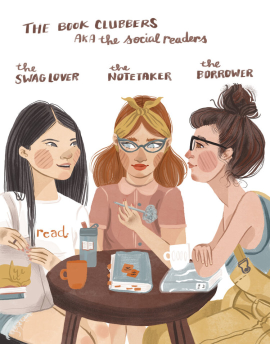
Book Lover Ladies series- The Book Clubbers
Q: What have you learned from your years at Square Carousel, whether organizing behind the scenes or as a contributor?
A: Oooof!! So SO many things! Wow... well, I'll go with the most obvious first: as a member, I learned how to continue to make portfolio-worthy work, even without jobs coming in. That was definitely the most valuable thing about Square Carousel, in my opinion, and hopefully what everyone else got out of it, as well. It can be so hard for fresh graduates to keep up that momentum, and the group saved many of us from becoming stagnant. In terms of running the group... it's been rewarding, but honestly very difficult throughout the years. There have been many ups and downs, and finding the right balance between structure and patience can be extremely challenging. I'm super proud of Elizabeth and myself (OG members!) for keeping it running through the messes-- we've been through some shit together! My major takeaway is the importance of diligence. Projects, businesses, organizations-- they all need at least a couple of people who just keep chugging along, always maintaining the structure (schedule and accountability) and balance (rules and lighthearted encouragement).
Moth magnets
Q: As the readers are aware, Square Carousel drawing to a close soon. Do you have any plans for what you'll do with the extra time you'll have after our tri-weekly challenges end?
A: You know, I actually haven't thought about this too much yet. It's probably because I'll just fill it with more self-imposed projects and deadlines, since I was able to bring that skill I learned in Square Carousel into the rest of my career a while ago. (Or more real jobs! That would be ideal!) I'll miss the community though, and hope to find a way to keep that aspect of freelance life alive. Instagram friends, anyone?
Q: What's your quirkiest habit?
A: Jordan told me recently that he found it weird and endearing that I joke-sing to my cats in the kitchen about really stupid stuff... so probably that! Official Cat Lady© status achieved.

Caitlin and Buster Keaton the Kitten
Q: What advice would you give to a newbie illustrator just starting out today?
A: I'd give them the hard advice that our professors didn't really give us in school: there is no way this is going to work out for you if you're not incredibly committed to pursuing it. Now, don't get me wrong-- I'm not telling anyone to have an unhealthy work/life balance because I think that's a toxic sentiment. But you have to keep illustrating and illustrating and illustrating, and arguably more importantly, keep networking and networking and networking. You're going to be rejected or ghosted more often than not, but if you really want it to work out, you're going to keep doing it anyway. And taking critiques if industry folks offer them, to grow and become better. Don't become stagnant in those critical building years.
Caitlin’s studio
Q: Anything else you would like the readers to know?
A: Yes – thank you so much for supporting Square Carousel through our amazing ten years of challenges! We really appreciate everyone who has kept up with us, checking out the illustrations for each prompt and reading our posts and interviews. Y'all are wonderful, and we hope you'll continue to find us, wherever each of us fly from here!
And on that sweet note, we say goodbye for now! Check out Caitlin’s website for more, and follow her on Instagram for new art when it drops.
Join us next time for our final interview!
#interview#caitlin alexander#illustrator#interviews#square Carousel#gouache#digital artist#artists on tumblr#artist interview#cba illustration
3 notes
·
View notes
Text
Random Ask Dump - Anniversary Edition (50+ REALLY OLD ASKS!)
Going through OLD AND CRUSTY ASKS to try and chip away at the inbox. HERE WE GOOOO...

That’s an interesting idea, and I could run it by Cake, but I think it would honestly be a LOT to track from a programming perspective.
Especially ‘cause killing Sans is gonna result in a “bad ending,” so to speak.

An attempt was made by Undyne to have all three hang out at the same time. Papyrus was SUPER EAGER.
...but one thing led to another and there were many messy explosions of chemicals and lots of smoke.
Alphys had to step in before things got out of hand.
It was all very daunting for her. Pap and Undyne are VERY LOUD, VERY AMBITIOUS PEOPLE.
I actually have some ideas of some side comics I may do at some point! :o It’s just that right now there’s a lot going on.

I need to poke Carni about that at some point. He’s just been very busy with other projects!

Clearly he’s standing on the “out to lunch” sign.

I wanna say that it’s very possible in theory. :o It probably affects them differently since monsters’ emotional state affects their magic and their physical state.
I do like little easter eggs like that, though I’m not sure where I’d fit it in atm just ‘cause I already showed Pap’s room, haha.
I made the chase theme for Mad Dummy as well as Mad Mew Mew’s battle theme. @pinewsun made the battle theme for Mad Dummy, and @thomasthepencil made the Season Dude battle theme and MD’s overworld theme. :o
That’s a really fascinating conundrum! You’re absolutely right- if IF was a standalone game, then from a writing standpoint, having more subtle implications would make sense! The reason I chose a different approach for IF is because it’s set after Flowey’s already known to be evil and I like to give different POVs rather than stick to just Frisk’s.
That’s an interesting thing, actually- both fights lean heavily on the fourth wall. Both are treated as climaxes for their given routes.
It’s funny because Asriel’s fight is a lot more straightforward and less meta by comparison.

I agree! The thing with Papyrus is that he’s extremely powerful- he just doesn’t want to kill. But it’s a deliberate choice not to kill- he’s able to force his attacks to do next to no damage. He’s also pretty darn crafty, as he made the Gauntlet himself. It really is just a case of Undyne’s personal biases and concern for him.

That was a deliberate choice. :O Papyrus is very influential toward Frisk. He is best skeleboi.

Papybot loves you, anon! He just wants to feed you WHOLESOME SPAGHETTI!!!
It is possible to whistle through teeth. ...alternatively, magic.
As for the music, Undertale implies that the music is heard! Maybe it’s just... a thing that exists in this world. Or it’s just meant to be a silly meta joke. I try to keep it somewhat ambiguous other than occasional nods to it. Chara’s pants are lighter because I just... felt like it, I guess? Haha. I wanted their feet and pants to stand out more from each other, so they have khaki pants.
As for the Undyne fight being animated, well, this ask is old by now, but Sparks was the one who was down for it.

Well, the teaser’s been out for a long time now, but that’s the idea! It’s also why this has been in production for so long. The Determinator has some really over the top attacks (that weren’t even shown in the teaser), and Sparks animated in Photoshop. That’s how hardcore he is.
Shhhhh. Don’t give me ideas. I’m already slacking on Tem Village. :P

Sometimes I do have slumps and burnouts (see Antipode’s lengthy hiatus), but breaks lead to me being refreshed and coming back with even more enthusiasm than before!
Oh, there are a lot of these throughout the comic. For instance...
Flowey appears in a few background shots in the Ruins!


When Sans says “or maybe...” he looks at the empty flower pot. This was one of the earliest bits of foreshadowing about who created Flowey, and nobody noticed it at the time!

The MTT vending machines initially look like this but have helpful items.
And then they look like this, with an angry face and pose- Mad Dummy has possessed them!
As of Part 38, it’s been revealed that he did first meet Asgore as “Santa.” As for whether or not he knows the truth, time will tell. :o
Oh, these are excellent suggestions for calls! I’ll try to keep these in mind.

So, I believe Glyde uses the Mysterious Door motif. Jerry uses the motif in its battle theme- I believe it’s a mix of original motif and Wrong Number song?
Sans is a master of power napping. He probably gets a decent amount of sleep, though.
There are a lot of ways to interpret Pap’s lack of sleep! In IF, he can get by without it, but he also has a lot of reasons to avoid sleeping. Some reasons include productivity but also due to a looooot of heavy baggage. More on that later.
I think sleep can definitely make monsters healthier. Rest = better mental health as well as physical health, and with how important mental and emotional help is for monsters, that’s very important!
They just really like socks. Socks are warm. Socks are slinky. And googly eyes are the best. So they took on the form of a really eccentric sock puppet and sock collector. Scandalous.
It also has Alphys’ motif, as the two are the leaders of the royal guard!

I would say the lack of Asgore as an influence has left Undyne slightly less grounded? Like, she had Toriel and Gerson in her life, but her relationship with Toriel is... definitely not quite as close? Like, Toriel by that point kept people at an arm’s length due to losing multiple children (including one from old age). So, while they were on friendly terms until the aftermath of the DT experiments and the tapes’ release, it was more like mutual respect and a sorta professional relationship with Undyne admiring Toriel and wanting to spare her from more heartache.
That is a really interesting idea. While that didn’t happen, I do need to maybe revisit the grumpy dog at some point or another. He’s still a lil’ salty.

I think in terms of layout it won’t change much, but there will be new/different content for sure. :O

Mad Dummy’s base design is mostly original, but she has a wig + headband from DIO from Jojo Part 3!
Fun fact: While MTT has Kamina shades, Papyrus’ goggles are loosely based on Simon from Tengen Toppa Gurren Lagann in terms of color. :O

So basically, when Asriel defeated Frisk, he had the power over the timeline to reset it as he pleased- in theory. However, that power was overwhelming for him, and due his lack of understanding OF said power and one last ditch attempt at resisting from Chara, things went wrong.
There is a track that takes some inspiration from Rage Awakened. It’s not released, and it’s not exact, but it won’t be released for a WHILE. Like until the part comes out.

I think it’s just the fact that tacos are so random. Like, my biggest beef in that regard was that OG Underswap had a lot of arbitrary replacements for things in UT and not all of them made sense. Like, if Sans was to make a foreign food, ramen would’ve made more sense due to Alphys being weeb trash, haha.

Okay, so the rough timeline iiiis...
Falling:
- Cyan
- Green
- Orange
- Blue
- Purple
- Yellow
Dying:
- Cyan
- Orange
- Blue
- Purple
- Yellow
- Green
You know, it’s funny because this ask is super old, but that’s basically sorta what happened. :O It became a beach-themed resort.
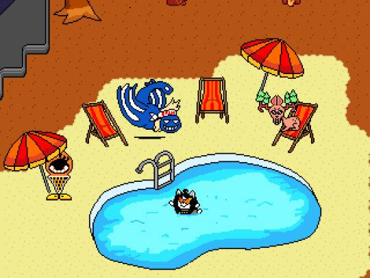
Never forget MTT fangirl Temmie’s pool escapades.

I think Forgespring for me because I had to make the tileset myself (it took a few months, I think?), but Aquarius was definitely in the works for a while. But once I had the tileset from Fours, the rooms were very easy to design!

That woulda been pretty rad! Maybe I can find another spot for it one day, haha.
I think for Dohj, I’d have to check with Fours, but I’m certainly not opposed at some point?
Right now, the following chars can take questions:
- Frisk
- Papyrus
- Sans
- Undyne
- Alphys
- Napstablook
- Mettaton
- Asgore
- Chara
- Flowey
Cyan appears in Part 45! :O No answer about orange for now, tho.
I do have vague ideas for Tem village. I just haven’t had time to go back and do it.

Stay tuned and you may find out! :O

Hmmmm... I had a lot of fun with MTT SPIRAL and the Determinator, tbh. They were both very time consuming, but I love how they came out!
Also, buff Jerry.

Turnabout Storm. :)
youtube
It’s a really awesome fan crossover that works way better than it should. :P

None taken! We know that with headcanons, everyone is gonna have their own interpretations. These are just the voices we liked for Fireglobe Production, but everyone has their right to their favored interpretations!
Yeah, Knight Knight is one of the coolest CORE mercs in the original game. It was fun to repurpose them for Inverted Fate as royal guards. :o It made room for unique encounters in the CORE in the form of them robots- as Undyne would rather use machines than other monsters to do her work.

Personally, I see it as an Asriel motif, but I also acknowledge that at one point it WAS gonna be an Asgore motif. Toby has a habit of just using whatever music works for a scene (see sans. at the snail farm.)
I do have a few ideas, though I won’t say for what yet. :o

He’s likely made blueprints for that train. :P
It probably would just have different flavor text/progression!
So basically, I treat the starting motif for BAaTH/Power of NEO is just a “true hero” motif.
MTT is definitely major in IF! As for whether or not he’ll have a hangout, time will tell. There’s definitely more to resolve with him, though.

I’m gonna remake at least a few of the older tracks, including Regret. My goal is just to bring the OST to a similar standard of quality.
So, animated parts coming up: Part 47, Part 49, Part 50. There may be some other parts, but we’re gonna wanna scale things back for a little bit for the sake of all our sanities.
I go with both. ;)

Honestly, probably fairly similar to the bully fight in the Ruins- which is why I ultimately decided not to do one. Both fill similar archetypes, though I think if I did do a battle, I woulda still had Flowey interrupt at the end and scare them off.

It’s a very emotional scene. Far more tragic than her geno death, IMO.
Well, the main goal in that regard is the remasters (Part 9 is in progress). Otherwise, I do think these hiatuses are good for working ahead. I’ve still gotta do more work, though, because my buffer this time around is a lot smaller from the trial-hiatus buffer. Alas!

Honestly, the website is the best thing to happen to IF. It’s allowed us to do so much with the comic’s presentation that would be impossible with imgur. NORIX IS THE BEST...
#inverted fate#ask dump#asks#undertale au#behind the scenes#undyne#frisk#papyrus#asgore#sans#alphys#lore#toriel#fallen humans
33 notes
·
View notes
Photo

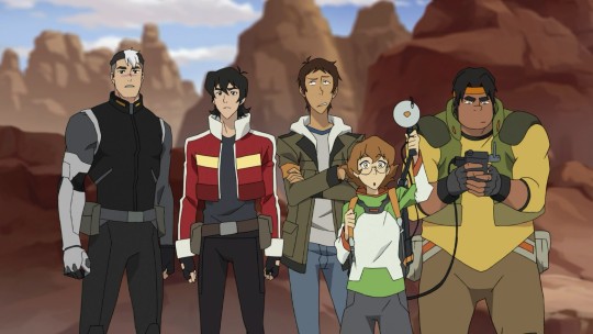
Here i will be telling you the very detailed minutiae as well as every thought that ever crossed my mind while doing the first installement of the twinganes au edits !
I’m going to begin with the 3rd improved screencap, cause it’s my favourite. See you guys under the read more =>
This one is my favourite for two reasons : one, it’s the screencap i use everytime i want to color pick the pal’s clothes or skin, and they’re all together, under the sun, and it’s the Beginning. And i like that very much.
Secondly, this was the “easiest” one, the one who made me feel like i was making progress and giving me back a little of motivation when i felt blocked with the others. I only save as a pic when i stop working on a piece for the day - that way i can see the advancement and it makes me feel happy cause it’s not static !
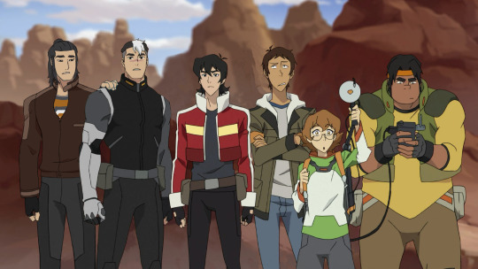
finding Ryou’s base wasn’t too difficult, as in i plopped a few of them in the pic until i tried this one and saw that it was working really well indeed. I at first thought it would be more interesting to put him at Hunk’s side - Ryou falling back in the habit of working with his brother to herd young cadets. But then i thought about it for .32 seconds more and thought ‘yeah, as if Ryou would get more than a meter away from Shiro after getting him back’.
i had to move all the pals to make place for Ryou, and while they’re originally mostly in a single line, the way i replaced them makes them a bit more on three different levels (ryou’s on the farthest one, he’s not directly flushed to shiro. i hope it’s kinda visible)
idk about you guys but the most time i spend on a piece the more chance i end up Loving the most inconsequential detail. ryou ? yeah, he’s cute, he’s good. but have you seen that ridge ??? (last time it was clouds.) the one where Lance’s head used to be. i should have blurred it a bit to go with the blur background, but i found it just so well done i didn’t have the heart to change it.
GODDAMN. FUCKING. JACKET !!!!!!
(that’s all you need to know if you don’t want more details on how i spend two literal hours on the opening of shiro’s ryou’s jacket)
Hand ? hand. but hand ?? or hAnD??? in the end i actually used one of hunk’s hand in another screencap. Thanks hunk for giving me a hand :)
you can see the multiverse where ryou’s haircut nearly looked another way, but i had already commited in another fanart and i just LIKE IT ok even if i draw it in a way that could be more attractive.
Before and After :
If you’re thinking ryou looks like he’s thinking ‘goddamnit shiro please chill i just got u back can you wait five MINUTES before getting into an Adventure :tm:’ well you’d be very right. Alternatively, you can hear ryou’s cat activation noise about him seeing shiro all tensed up.
And now let’s go to... the First One.
(i mean, if i remember well ? guys, i began this like, nine months ago. i have done nothing else but like, two sketchs since then. talk about a slow drawer)

Fun fact, i have a list of like, twenty folders with different “scenes”. screencaps. Scenescaps ? I decided to use those four cause they felt both like the most emblematic of “finding shiro” to me and the most recognisable.
While fishing for good screencaps to use in general, i found this one of shiro in ep 1 and it was just absolutely perfect. I didn’t need to even search for another one. Hurray ! (in hindsight im still a bith :/ about the perspective/lenght of his arm and hand but like... u learn to pic your battles)
i only photoshopped ryou’s butt by like, three pixels (so the bottom of the jacket would look ok). otherwise, let’s thanks the OG artists
lightning ? shadows ? what ever do you mean ??
can you see on the jacket where i was a total dumbass and used the reference i FLIPPED to the details... until i saw a version non-flipped and had to redraw the back tan line. those moment your brain is in total balance between ‘haha funny drawing thing !’ and ‘FCK’
i had planned to keep og shiro’s pants but then in the 3rd edit i gave him kuron’s pants and it was good and i was already so far gone, ok, i just wanted the pics to look REAL. devil’s in the details and all that stuff
u know that ‘artist things’ post going around with the one going like “68% opacity ?? or 69% ???” it is so me. soooo me.
lbh this one is the boring one. But also very important cause it introduce the character !
Before and After :

Now onto the Second One, also named “Operation : make Ryou pretty” :

This is not very visible because i did not include the screencaps i took of the different possibilities i tried, but there are quite a few of them. Ryou’s hair was quite hard to get down, but mostly his face - i needed him to be pretty here (for no other reason that i wanted to). And while the og screencap of shiro i used had an actual head on a body, it just wasn’t how i wanted ryou to look like. More than a few times i thought ‘what if i stopped trying and just settled on the original face, aren’t i just losing time ?’ but im glad i forged forward like the stubborn mule i am cause i’m very pleased with the end result !
Look, like i said, you have to pick your battles, and you have a quota of squirmishes and full out war for each piece, and by this i mean i spent so long finding a cap with the right angle for ryou that you better believe when he needed a hand i just took the first one available - yes, shiro’s hand. (ok, i DID try another thing but in the right angle the fingers were the wrong way around so i just copied pasted fingers after fingers to recreate a hand with the thumb on the GOOD side and then it just didn’t look as simple&true as shiro’s one so i used shiro.
i think the funnier part of this one was actually filling the holes in some sort of “connect the dots” !
Fryoukenstein ! at one point in my search of the Most Prettiest Face i superimposed three different caps of face trying to get the good bits together. you can see it a bit quickly in frame 3 above but believe me, it was a riot (until i scratched all of it and used another cap).
can you believe shiro’s is supported by the two people who loves him most ?? makes me emotional
ryou is squatting/bending to get shiro’s arm over him, as shiro he has quite a bit of height on keith. but the hair was already so close to cutting it out of the frame, so :/
i made ryou’s temple strands very flat and ridiculous, but BATTLE. PICK’EM. (better finished than perfect !!) (say i, after m o n t h s)
Before and After :


And last but not the least, the Fourth One !
I did it after all the others were nearly done/on the finishing touches, so it’s quite recent (three weeks ?) and by this time i knew my process more and it was easier to be a bit uuuh more productive on it. mostly i went at it a bit like, ‘fuck it it’s the last one i just want to post’ with enough of love for the journey that i was happy. Again,hesitated a lot for the caps : here you can see the first batch of possibilities. Heavily hesitated between a very pretty kuron and CUTE BABY garrison shiro, but the “which one is more dorky” won out in the end.
i did not try much for the overall perspective/imbrication of ryou in the existing cap. the mood of the fourth one is ‘good enough’. it could have been cool to add one of his hand on hunk’s back, or something like that. but nope !
i’m still very happy about how the hair turned out : i didn’t agonise about it for hours, and i think it does look good and contextual ! (i just... need to decide one and for all about the size and length and placement of the temple strands)
i hesitated between taking the one where kuron has the same scrunched up face as shiro for a “they’re brothers !! with in this case same response to the same stimuli cause they’re so close !”, but it was a bit too the same, and did not merge too well with the og cap. and in the end, shiro is still using his responses from the arena in case of surprise-danger, not his childhood ones
(keith is squinting cause he took ryou’s scrunchie in the eye when it flew out of ryou’s hair with all the movements)
Before and After :

Tadaa ! now i go to sleep. if you have questions or wondering please ask i would be delighted to exteriorise !!
Credits : i used the help of this post for how to do screencaps especially for Voltron, and it was a very big help, i recommend it if you wanna give it a go !
And as always, all screencaps used thanks to the incredible work of Bentfire !
#ryou shirogane#takashi shirogane#shiro (vld)#twinganes#kuron (vld)#machdraws#twinganes au#gif warning#let's hope the post show up in the tags#not like it's original !! >:(#man i missed doing those rambly things#used to do them for the spn bangs i was part of#memories memories#process gifs#mach's process gifs#i love process gifs !!!! love love them#incredible to see something being created
111 notes
·
View notes
Note
your gif editing skills were so good in that older post??!? They look so crisp and clean I could neverrrr. I also wanted to ask if u had any tips on how to edit gifs, like what programmes you use and some common adjustments you make? If you’re too busy, that’s totally fine, no worries. Thanks lovely! ⭐️
thank u 🥺🥺💕 I geuss people constantly tagging that post with "yeah but op's gifs are ugly" & the occasional mean anon I've gotten about this post has gotten to me 😓
anyways, I use photoshop cc2017 for all of my gifs! here's a very basic gifmaking tutorial I made a while ago ☺️
common adjustments I practically always make are below the cut!
concerning sharpening, I changed my process so it's no longer the same as in my basic gifmaking tutorial! it now looks like this:
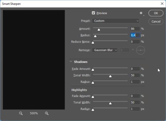
first I smart sharpen my gifs using 86% for amount and 0,4 for radius
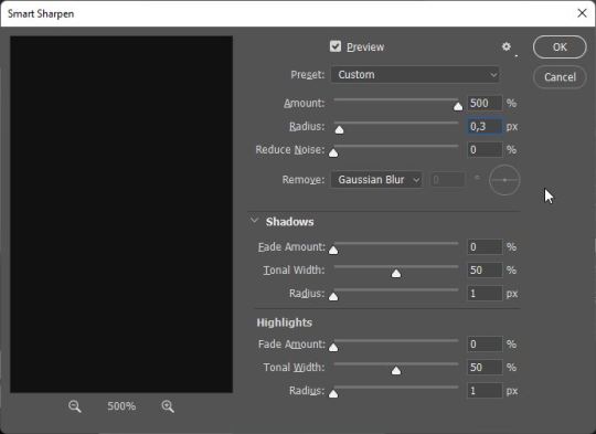
then I smart sharpen them again, this time with 500% for amount and 0,3 for radius

and then I add a Gaussian Blur with these settings!
concerning coloring, I also made a coloring tutorial a while ago, you can find it here!
A couple things that have changed since then:
I always always add a color balance layer after my exposure layer nowadays! you'd think it doesn't make a difference but imo it makes or breaks the coloring. Especially changing the highlights panel! I nowadays always make the highlights more cyan (and by that I mean usually at least +10 if not more) - I feel like gifs look far more "neutral" that way
in my old tutorial, I explained how I always do two curves layers first: one for making the shadows black using the black eyedropper tool, and one for making the highlights white using the white eyedropper tool. While the black eyedropper tool practically always works, I find that sometimes it is very useful to adjust the highlights curves layer myself! especially in Taylor's recent music videos, see e.g. this gif I made of the I Bet You Think About Me music video, which imo is painful to color & for which my previous colorings alway looked not that good:
the way I go about it is hard to explain (I actually learned it through a turoial which, for some reason, I cannot find anymore rip), but basically you want to neutralize the tints in the og videos.

I usually just click on the individual colors (under RGB) and slide the upper point of the curve to the left for each color until I'm satisfied. It's honestly mostly trial and error! and also some basic color theory stuff that
is explained in this tutorial for using the channel mixer adjustment layer, which I nowadays also use if doing the whole scheme with the shadows and highlights curves adjustment layers doesn't work out and the gif is still heavily tinted. I usually add the channel mixer layer after these two curves layers then. This tutorial explains it better than I ever could, so I would check that one out ☺️ I would definitely recommend reading through it as it is very useful for grasping the basics of how coloring works.
and, as I said in my previous coloring tutorial, these are just the adjustment layers I use! depending on your own taste, you can vary these, use different ones, use a different order of adjustment layers etc etc. find what works for you! ☺️
hope this helps!
1 note
·
View note
Last Seen Blogs

michel-dude
🍕Michel_Dude🍕
bimafe
I'm alive but I'm dead.
vigorouspotato
Rotgut Nerd

morgan-ingland-limited
Morgan Ingland Limited