#i made the mistake of painting this traditionally and painting with acrylics on paper that absolutely can not handle acrylics
Text
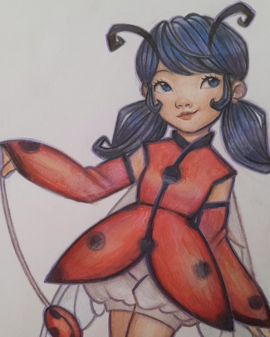
ladybug redesign? i just wanted to make her a costume that had more ladybug aspects than just the spots lol, and more magical girl inspired
#miraculous#miraculous ladybug#ladybug#marinette dupain cheng#miraculous fanart#my art#i made the mistake of painting this traditionally and painting with acrylics on paper that absolutely can not handle acrylics#but you know what it's not that bad i still kinda like how it turned out#also i just think it's kind of tragic she doesn't have wings 😭 i love bugs and you can do so much when designing characters based on them
1K notes
·
View notes
Text
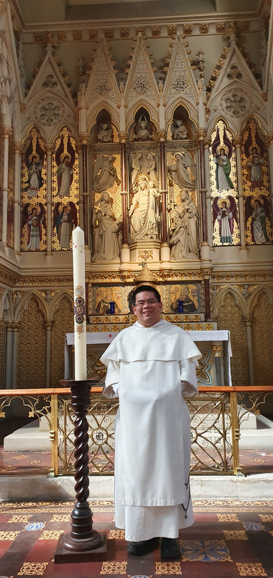
Painting the Paschal Candle

Why paint my own candle?
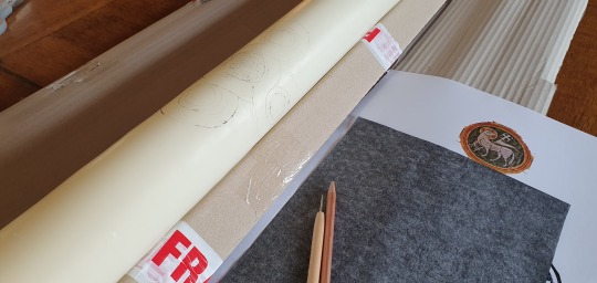
The thought of painting the Paschal Candle for the Rosary Shrine in London, where I currenly am based, first came to me at the beginning of the year. I wanted to have a candle with the Rosary Shrine coat-of-arms, and I thought at first that I should commission a professional painter to do it; looking at the designs in the religious goods catalogues only convinced me that only a custom-designed candle would satisfy me. However, I knew a few friends who had painted their own, and I enjoyed the idea of coming up with my own design. The only problem was that I hadn’t picked up a brush to paint anything since I left secondary school, almost three decades ago! So, I ordered two Paschal candles so that if I made a mistake with one, I had an alternative candle with a ready made design!
Materials I needed
A little research online, and a few discussions with Facebook friends ascertained that I needed acrylic paints including gold and silver acrylic paints and some wax pens. To these, I would need to add an acrylic paint binder which helps the water-based acrylic paint to bond with the wax surface of the candle. And finally I needed to trace a pattern onto the candle. For this I bought carbon paper and an embossing tool.

Design: Cosmati and the Cosmos
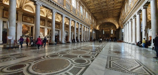
From the outset, I knew I wanted a candle with designs inspired by the artwork of the great Christian basilicas of Rome. I gave some consideration to a design inspired by the Lindisfarne Gospels, but thought this was too complex and ambitious. At another point, I thought of an icon of Christ emerging from the tomb and trampling the coronavirus underfoot! But I thought that it unwise for a beginner like me to try any figural work lest my depiction of the Lord become like the ‘Monkey Christ’ of Borja! So, I returned to the medieval designs that have long inspired me: Cosmatesque patterns.
Named after the Cosmati family, Cosmatesque patterns are sometimes called ‘opus alexandrinum’, perhaps because they originated in Alexandria. The geometric designs are certainly of Greek and Byzantine origins, and they’re first seen in the Western Church in the 11th century. According to Leo of Ostia, the abbot of Monte Cassino (the influential abbey founded St Benedict) “sent envoys to Constantinople to hire men who were experts in the art of laying mosaics and pavements”, and thus the transfer of knowledge about these Eastern patterns and designs came to the West. Cosmati work flourished in the 12th and 13th-centuries predominantly in Rome, but examples of Cosmatesque work are found throughout Italy, and even in Westminster Abbey in London. Its ‘Great Pavement’ was installed in 1268 on the sacred site where the monarch is crowned. Indeed, Cosmati work is costly, precious, and thus restricted to the most important of churches, often those associated with royalty or the papacy.

The stones used for laying the mosaic designs are almost always recycled from classical Roman sources, and two precious stones, coloured green and purple, feature in their design. Green porphyry was called Lapis Lacedaemonius by the Romans, and it came from quarries near Sparta in the Greek Peloponnese and was quarried from the Bronze Age until around the 5th century AD. The even rarer purple ‘Imperial Porphyry’, which was reserved to the Roman and Byzantine Emperors, comes from quarries at Mons Porphyrites in the Gebel Dokhan of Egypt’s Eastern Desert, quarried from the 1st century AD until the 5th century. Hence, by the time the Cormati family were active in Italy, green and purple porphyry were antiques that were no longer being quarried. The Cosmati pavements, therefore, accentuate and set off roundels of this legendary stone recycled from Roman spolia.
Cosmati designs generally have two geometric patterns: interlaced circular bands called guilloche, and which are said to represent the Resurrection, perhaps because they form a series of infinity loops; and secondly, the quincunx, which is a central circle surrounded by four circles. The quincunx is an ancient symbol, reminiscent of the Greek cross, which stands for the cosmos or an ordered universe. The Cosmatesque quincunx, moreover, with its triangular mosaics inlaid into the whirling circular pattern stands for the created world. As Galileo wrote: “The book of nature is written in the language of mathematics, and its letters are triangles, circles and other geometrical figures.” Hence, at Westminster Abbey, the Great Pavement uniquely had an inscription around the central quincunx design that referred to it as representing “the eternal pattern of the universe”.

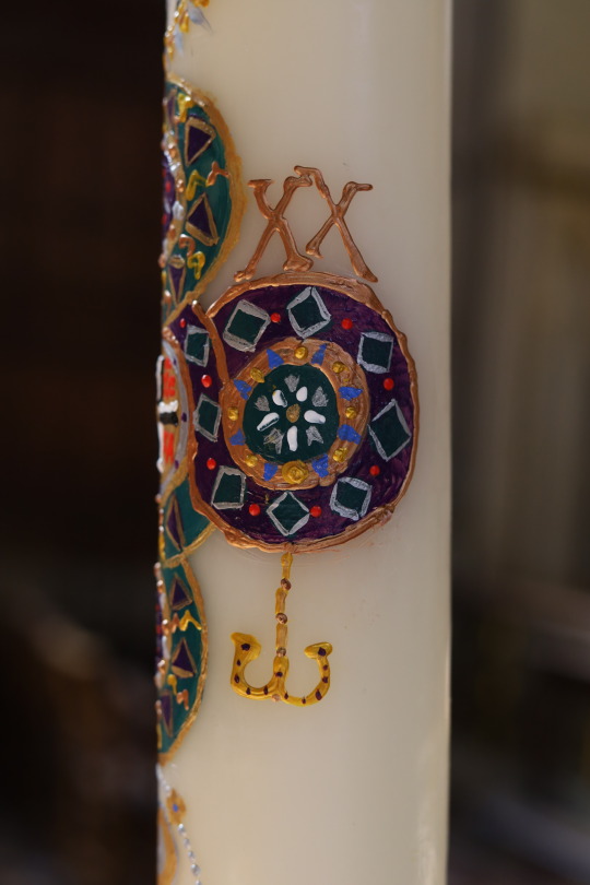
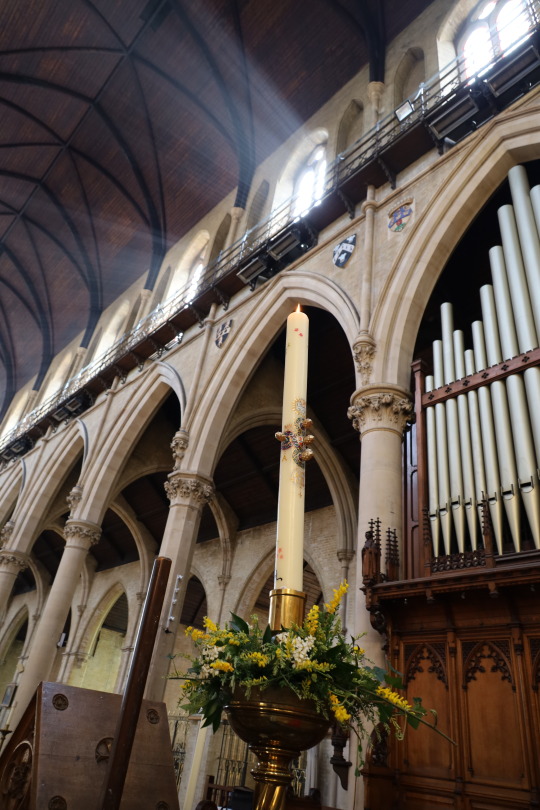
At the centre of the Paschal candle, therefore, I placed a Cosmatesque quincunx, with triangles of green and purple around roundels of green and purple, evocative of imperial porphyry. I looked online for a design that could be easily traced, and printed this out, put the carbon paper on the candle, and then traced over this design with the embossing tool.
At first, I had intended to draw a cross in the central circle, and then, on the other four circles, I wanted to draw the ‘Alpha’ and ‘Omega’, and the year in Arabic numerals: ‘20′ - ‘20′. However, it was only after I had painted the quincunx that I recalled that the five incense grains would have to pierce these five circles, thus obscuring these symbols. So, an alternative solution had to be found! Incidentally, the five incense grains stand for the wounds of Christ, or the nails that pierced his body. I bought these golden pine-cones of wax from Italy, where they’re commonly used to pierce the Paschal candle – rather different from the brass pins we’re accustomed to in England, but they seem to work very well with this candle, and they add to the Romanitas of the design.

It was fitting, then, that this quincunx at the centre of the Paschal candle stand for the Cross of Christ, and for his Five Wounds – an observation made by James Joyce concerning the quincunx symbol. However, the quincunx is a rich symbol: as we’ve seen it also stands for the whole created order, which is now redeemed and transformed by the Risen Christ; or it stands for Christ in majesty surrounded by his four evangelists; or for the four Platonic elements of creation (fire, water, earth, and air) with the fifth element in the centre being aether, the Aristotelian quintessence. This design, therefore, signifies that all of creation is raised up and renewed by Christ rising from the dead; the whole cosmos is subjected to the imperial Christ, and resounds with the joy of his Gospel.
Our Lady’s Rosary and the Paschal Lamb

Having decided on the central cross-shaped quincunx, I knew I needed two more roundels that I wanted to add to lenghten the overall design. At the bottom would go the emblem of the Rosary Shrine, which is the monogram of the Blessed Virgin Mary surrounded by the Rosary.
I needed another emblem that would balance this at the top, and I chose the Lamb of God, a symbol of the Risen Lord. As St Paul says: “Christ, our Passover Lamb, has been sacrificed for us” (1 Cor 5:7), and this text is used in the Communion chant of Easter Sunday.
I searched for a medieval design of the Paschal lamb, and found this beautiful example on the ‘Cruz de Bagergue’ that dates from 1200. The Paschal lamb carries a flag featuring a red-cross on a white field, which is traditionally used as an emblem of the Resurrection, but it also conveniently looks like the flag of St George, i.e., the flag of England, which is the land now rededicated as Our Lady’s Dowry!

Alpha & Omega
However, what about the requisite signs on a Paschal candle? we needed a cross, and an Alpha, an Omega, and the numerals for this current calendar year. First, I painted a Greek cross in the central circle of the quincunx, using the alternating black and white Cross of the Dominican Order. But I fashioned it as a Greek cross, and around this I wrote the Greek letters IC XC NIKA. This emblem, called the Greek Christogram, has been in use since the 8th century, and it was found throughout Byzantium, notably on imperial coinage. It is a reference to the victory of Constantine at the Milvian Bridge in 312, and the Greek letters spell out: “Jesus Christ Conquers” i.e. through his Cross. By the 9th-century this emblem was believed to be apotropaic, that is to say, it is believed to have the power to drive away evil.
Continuing to be inspired by Byzantine art, I looked to examples of Crosses which had an Alpha and an Omega, the Greek letters for the Beginning and the End (cf Rev 22:13) hanging from them. The Altar Cross in Westminster Cathedral notably has these letters of the Greek alphabet hanging from its arms, and I researched and found medieval engravings and medallions with the same device. However, in all the old Byzantine images, the Omega was drawn not with the uppercase Ω but rather the lowercase ω. So, on the Paschal candle, I drew two jewelled Greek letters, the uppercase A and the lowercase ω suspended from the Cross-shaped quincunx. Following on from this, it seemed best to put the date above these, but rather than to write the date in Arabic numerals (2020), I opted to stay with the Roman-Byzantine theme, and so I chose the neat Roman numerals (MMXX), inscriped above the horizontal roundels of the quincunx.


Flora and Beasts
Finally, I decided to add a few small elements to the candle so that not everything was centred around the middle portion of the candle. Near the top, I painted some bees, and then I added some to the bottom as well. Why bees? This is again a classical reference: Virgil, too, praised the industry and society of bees, and the Exsultet, which dates to at least the 4th century, says this concerning the Paschal candle:
“On this, your night of grace, O holy Father,
accept this candle, a solemn offering,
the work of bees and of your servants’ hands,
an evening sacrifice of praise, this gift from your most holy Church.
But now we know the praises of this pillar,
which glowing fire ignites for God’s honour,
a fire into many flames divided,
yet never dimmed by sharing of its light,
for it is fed by melting wax,
drawn out by mother bees to build a torch so precious.”
Where there are bees, there ought to be flowers, so I added a few pink flowers, a reference to the cherry blossom (sakura 桜) which appear at this time, and which the Japanese enjoying viewing in the Spring (called hanami 花見), as a meditation on transience and impermanence, and the fleetingness of beauty. The exercise of painting the candle, I realised, is an exercise in detachment and impermanence because I would also come to sit in church, watching the candle burn down over the course of the year, and so consume and destroy that which I had painted. Sic transit gloria mundi!

Finally, I added a skep, the medieval bell-shaped hive made from coiled straw developed by apiculturists, and the hive is dripping with golden honey. It seemed fitting that the bees should have a place to live, and that their hive should be of the kind commonplace in Europe during the time that the Cosmati family engaged in their particular golden industry.
And then, as a little personal indulgence, I added a portrait of my beloved priory cat Felix. First consulting a book of ‘Cats in Medieval Manuscripts’, I adapted an illustration from the ‘Luttrell Psalter’, c.1325-35, and gave the cat the same colouring and pattern as Felix, who has a fine coat that looks like a Dominican habit. Felix has quite a penchant for sweet things – even though he’s not allowed them – and I am sure he’d love some honey, towards which he’s shown extending his paw.
Technique
I wanted to avoid seeing brush stokes in the quincunx, so I learnt to dab my brush rather than just paint it in broad strokes. I realised that I didn’t need a lot of paint - often a pea-sized blob would suffice, with an equal sized blob of the acrylic binder: mix these well, and then, let it dry a little; the less wet the paint, the easier it was to paint on the wax. I learnt that, with acrylics, if one made a mistake, one could easily run over it with a wet brush, and the water washed away the paint like an eraser. As time went on, I rather enjoyed painting the candle, and it took me about 2 hours a day for 5 days, which is far quicker than I had expected.
Final Reflections
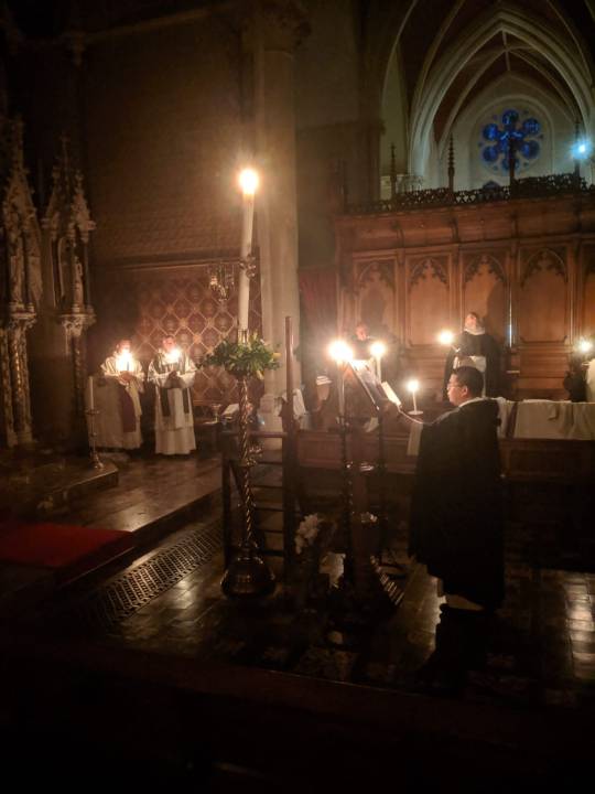
As Providence would have it, I began work on the Paschal candle on the Monday of Passiontide. By that time, public Masses had ceased because of the coronavirus pandemic, and then, having more time on my hands, this project became a Godsend because it gave me something to focus on; it took my mind off the worries of the present moment. Painting the candle became an act of love, something beautiful and devotional that I could do for God and for the sacred Liturgy; it became a prayer, and indeed, I would pray as I painted the Rosary, or the Paschal Lamb. Finally, on Easter night, I pierced the quincunx with the wax pine-cones of encased incense, and then I saw it lit and raised high on the Paschal candle stand. And then, I was privileged to be the first to incense the candle, and then, to sing the Exsultet that praised God for it, asking that its
“flame be found still burning
by the Morning Star:
the one Morning Star who never sets,
Christ your Son,
who, coming back from death's domain,
has shed his peaceful light on humanity,
and lives and reigns for ever and ever.”
Amen.


#Paschal Candle#Byzantine#Roman#Cosmati#Cosmatesque#imperial porphyry#Alpha#Omega#cat#bees#hive#acrylic#painting#crafts#FUN!#2020#Easter#Rosary Shrine#London#St Dominic's#Dominican
59 notes
·
View notes
Note
Hi do you have maybe some tips for someone who is learning how to use water colour? What brand of water colors to use etc. ??
Hi! Sure i guess.♡ Keep in mind that while i wouldn't say i'm a beginner i'm definitely still learning too.
I will uh.. i'll edit this post this afternoon with some tips lol (note to self to not use the tumblr app in the morning lest your thumb slip and post an unfinished post XD)
((Or maybe i am still a beginner, idk. Okay yeah i'm a beginner but i can give some tips.))
Okay so, i'm home. Been a long day. Here are some tips.
Honestly though, i'm Definitely not an expert when it comes to watercolour specifically. I've used it since i was a kid but i only really got the hang of it resently and i'm definitely still learning.
1. So honestly my first advise is to just look at a lot of different tutorials and ask a lot of different people. This goes for most mediums, but there are a lot of different ways to use water colour to achieve the look that you want and a lot of people do it differently bc it's so versitile.
2. This is a given, but honestly, there's no better teacher than experience. The more you try something out and try doing it in different ways, the more you'll be able to find what works for you. That's really important i think.
This is a tangent, but I took a water colour summer course once and i learn a lot of cool stuff, but i also learnt through a lot of trial and error that my style of water colour was very different from how it's traditionally taught here. Partially because i'm impatient and can barely wait for the layers to dry (this, btw, is honestly a must in water colour tho so that's really gotten better on my end with practice) and partially because a lot of the techniques i learnt were good for landscape painting but dificult when drawing more complicated pieces in my opinion. They're still great techniques but i also learnt to take inspiration from other sources that more closely match what i like to paint.
And the more i learn the more i find that i am also able to incorporate traditional techniques that before seemed very dificult for me.
3. As for art supplies, i honestly wouldn't worry too much about it. Especially as a beginner. I always say that the tool doesn't make the artist, the artist makes the artist. In the end, the most important tool you will ever need is your mind.
I'm also not very good with what brands are high quality and which aren't so there's that frankly.
I'd say ask around and look into what brands are available to you. Most standard water colour sets are good and last a long time. Then you can of course expand your tool arsenal. I'd recomend a bigger pallet just because i'm the kinda person who really enjoys mixing and trying out a lot of different colours and therefore need a lot of space to mix colours.
Also i'd say look into what type of brushes you prefer, and pay attention which brushes are water colour brushes and which are acrylic brushes bc they're pretty different.
Really high quality brushes are usually made with animal hair, which makes it able to hold a lot of water and pigment. I don't like them much personally bc i don't use a lot of water for my drawings as a general rule (mostly because they're doodles and the paper in my sketch book doesn't hold water all that well). (And also sometimes the hairs fall off from the brush and get stuck in my drawing 😬... they're worth checking out though.)
But try out different types of brushes and see what you like. It might be tempting to get a very tiny brush for tiny details but honestly, a medium size does the same work just fine with a light hand in my opinion. And depending on wether you want to paint big or small, what size brush you need will vary. I know that art supplies can be expensive though, so don't feel like you Have to get the most expensive thing when you're just starting out.
4. Speaking of just staring out... honestly, don't even worry about using up your supplies and feeling like every single thing you make has to be perfect. It's not going to be perfect. And not only is that okay but it's nessesary. Not to mention that perfection is wholy a myth and can't be achieved so don't even worry. Quantity over quality i always say. The quality will come with time and work. Which is why i always recomend cheaper brands anyway because you will be painting A Lot to git gud, as they say, but that might just be me.
5. Back to brands
Honestly Please invest in a good paper at least once. It doesn't have to be Fantastic, it just needs to hold water. I'm not even joking, the quality of your paper does wonders for the quality of your drawing. Can you make water colour look good on normal paper? Sure. Case in point, all of the things i paint. But honestly, if not for the sake of a result, then try it out for the sake of experience. Try different things. See what works for you. I honestly do recomend starting out with a good water colour paper since the result will be miles better and you'll feel way more encurraged to continue. That's the one supply i'm adamant about trying honestly. But again, budget wisely young padawan. And if you ever feel scared to use your supplies bc they were expensive and you don't want to waste it.. again nothing is a waste, everything you draw is stored as knowlege in your brain that you'll use to make better art in the future. Nothing is a waste. But if you're like me and the anxiety really hinders you, just get a cheaper paper. I like to paint in my sketch book bc it feels like a diary to me and it doesn't have to be perfect and if i screw up it's still fine. I'll tape it over and start again.
Okay so.. i realise that this is rambly and maybe a bit preachy and not very specific. Starting out can be scary and you want all the things in the right place and you want things to go well every time you paint even though you know it's not going to at first. But you just have to start somewhere and keep going from there. Bc if you never start, where will you be?
So honestly, if you don't have any supplies on hand, just go to the nearest place that sells art supplies and get yourself some good paper and a water colour set and just go ham trying out the colours.
Here are some of the water colour things i've watched over the years to help me in geting started.
youtube
youtube
youtube
youtube
This last guy i only found the other week. He does a more trafitional style, more in line with how i was taught at that one summer class thing. So it's always nice to look at different ways to do the thing you want to do.
6. Water colour to me has always been tricky. It's water so it flows, and for a while, that was frustrating because i wasn't able to control it i thought. I prefered using markers but honestly, markers are way more expencive than water colours and you can't mix them and get as much if a clean finish, so now i only use water colour to colour my drawings.
But for a while i avoided water colour and instead opted to use guache. Guache is mostly used in illustrations bc they're easy to layer since the paint is opaque. It's much more forgiving than water colours, so if you want, buy a couple tubes of guache and try that. You don t need that many. I use cyan magenta and two types of yellow as well as white. Any art teacher will tell you that with practice you can mix almost every colour from those colours. I almost never use blacj anymore. Unless i'm lazy, in which case i'll jusr add a layer of black water colour on top of the guache. (GUACHE CAN BE EXPENSIVE THOUGH, DON'T FORGET TO BUDGET)
There are opaque water colours but most aren't i believe. That's where the main difference between guache and water colour comes in. See, in water colour, traditionally, you aren't supposed to use white to lighten a colour. Instead you use water to dilude the pigment. This gives a much more clean and crisp finish. You can do this with guache also, but since quache is already opaque it will still have that same grainy look wether you dilude it with water or mix it with white or both. I mean... i personally love the grainy look so... it's very story book-ish.
With guache bring opaque that also means you can paint over mistakes and start over pretty much, so again, guache is much more forgiving. Once the white of the page is gone when you use water colour, you can't get that back without adding white guache on top, which honwstly just looks messy imo. So be aware of that.
7. Let layers dry before adding another one or the colours will bleed together. Learning to be patient is key. But if you're like me you can just use a hair dryer tbh.
8. If you're using a good paper, you can experiment with a lot more water. Taping down the paper helps bc the paper will swell a lot and buckle when you add a lot of water. (Press it between a butt load of books to get it somewhat flat again).
You can try taking a spunge or a wide brush and add a layer of water before adding the pigment. It can have some interesting results.
You can also leave the paper dry and just paint layers like you would with markers. Both work. Water bleeds more but that's really cool in landscape painting so if that's something you want to try, def experiment with letting the colours bleed together.
9. Oh and don't forget to swatch out your colours when you get them. Water colour dry lighter than it looks when you put down the colour, so swatching helps with determining what colours you want where.
There are So Many videos on the subject honestly. I like to watch videos while i paint. It's fun.
Okay so this is long enough i think. I barely grazed the tip of the proverbial iceberg but i hope it helped.
I really encurrage anyone who knows their stuff abt water colour to add on to this. I really don't want to spread false info. These are just my two cents on the top of my head.
Which basically just boils down to
JUST DO IT

I honestly tell myself this every day. And if i can do parkour then you can paint.
Good luck and have fun! 👍👍👍
#water colour#watercolor#guache#tips#muffin rambles#ask a muffin#sorry this took so long#i'm never on here lmao#check out my instagram lol#i post every month there#..... it has new kl art lmao#shameless promo#but seriously#live your dream#water colour away
14 notes
·
View notes
Photo
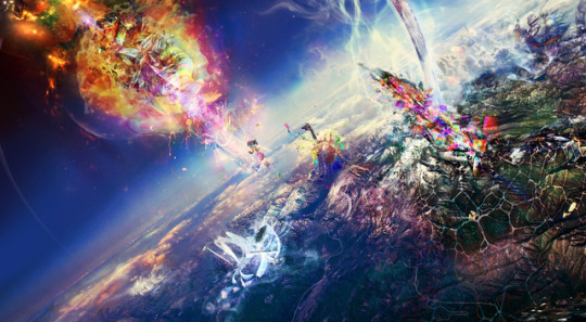
I started this piece over four years ago:
It's Here, mixed media.
This is FOUR BY TEN FEET on canvas
Originally this started as a gift to Cera but I ended up scrapping the project and making something else for her. Within this piece there are countless photographs I've taken in the past 4 years(specifically what I took at sfai, from literally the happiest days to the night where Alex killed him self and quit. Cera saved my body, consciousness, and my life. That story is written into the work.
Just for clarification purposes: Alex jumped off the roof of 630 Geary Street and died after He made honestly the biggest mistake of his life. I am not Alex. Who or whatever I am Is not Alex, but a human being who truly knows who he is, not what label to put on himself. More on that in a bit. So the materials I used will fill up their own special "portfolio", for archivability as well as to trace the roots of my piece.
The materials I used are varied but here is a small list that doesn't do the work justice: I scanned in my oil paintings as well as acrylic/medium for texture, prints of etchings and linoleum cuts, colored pencil drawings, grade A Marky x2 foire, backwood leaves, Newport tobacco, Hennessy(don't ask), Seagrams gin, pieces of paper, broken glass, digital photography, abstract 3D models created in Cinema 4 D and then rendered and imported into Photoshop. Everything has been integrated cohesively in a digital and tactile manner, meaning that I combined mediums in both Photoshop as well as traditionally(a painting, collage, etc).
The Nivia, the world pictured in the piece, is the world inside of my head that I have always(since I was 2)gone to when life was too much to handle. As someone who desperately wanted to be accepted more than anyone else, and as someone who lived with a visible illness, I was shunned constantly so books and The Nivia became my world. I see things(visually, with my eyes, no metaphors here)VERY differently than most people I know. Almost all of the perspective seen through this lens is rooted in the trauma of growing up in a household where we all suffered from severe mental health issues that are still untreated.The brain surgery, the hallucinations I get when I change the settings on my machine(Aka literally change my brain chemistry and physiology), and the waves of madness, sadness, and radness I go through, coupled with the experiences I’ve had in my life as it relates to the places I’ve been, people I’ve seen, and events that have occurred around me.
I am THRILLED to have finished this
0 notes
Last Seen Blogs
pachiboi
Pachi Boy

visiont83
Live Relentless
occasional-owl
Dylan

the-intern-archives
The intern_archives

laurenicons
lauren jauregui icons