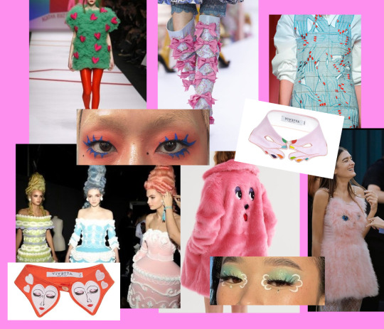
#i love monochromatic esque designs
Text
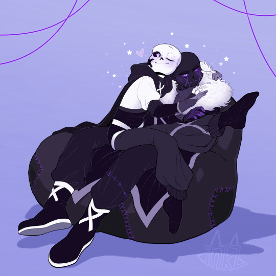
Drawing for @BiittyBones (twitter) of their X Ink and Error, thannk u!💕
#commissions#my commissions#fanart#not my oc#flat colors#error sans#ink sans#i love their designssss#ig u can tag this as#errink#i love monochromatic esque designs
777 notes
·
View notes
Text
Helmet Watch 2024
*cracks knuckles* I'm back to yell about driver helmets.
Like talking about and rating all the liveries last year, I had a lot of fun doing the same for the drivers helmets, so helmet watch has returned for 2024! (Under a read more as to not clog up everyone's dashes, with the drivers listed in alphabetical order by surname.)
NB - I'm just doing the "core" helmet designs, as if the drivers come out with one-off helmets at the rate they did last year I wouldn't have any free time.
Alex Albon (Williams)

Like the 2024 Williams livery, it's an evolution of last year's design. Though with less sharp angles and using something much more bubble font-esque.
We still have the double As which is neat and I also loooooooove the baby pink and navy blue combo, especially with how much pink is on the helmet. It will really pop against the dark blue livery of the car.
8/10
Fernando Alonso (Aston Martin)

Pretty much a copy and paste from last year's helmet with a couple of minor tweaks. But in saying that I do feel that the minor adjustments make the design look a lot less busy. Like last year the colour scheme is great and it'll look great with the car, and I love the Aston Martin wings by the visor, it's one of my favourite details.
7/10
Valtteri Bottas (Sauber)
Any feelings I had about Valtteri taking forever to drop his 2024 helmet design have been immediately forgiven. I absolutely love this Northern Lights inspired design so so much. Both because of how unique a design it is but also the execution of it is just gorgeous. I love all the inclusion of the North star and all the different constellations, and that the number 77 has also been written like waves from the aurora. I would genuinely buy a mini-helmet of this I love it that much.
10/10
Pierre Gasly (Alpine)

I absolutely LOVE this one. The splashes of white and the subtle gradient shading adds so much dimension to the whole design (proof that if done right monochromatic designs can absolutely work!). I also just love the shade of pale blue as well, it's going to look really nice with both liveries Alpine are running this year.
10/10
Lewis Hamilton (Mercedes)
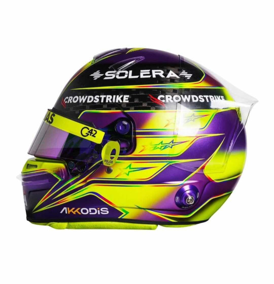
Misty eyes aside about this being the last core helmet design from Lewis as a Mercedes driver, I do absolutely love this. It's pretty much another copy and paste from last year, minus the rainbow band on the top. I'm glad that Lewis kept the rainbow lines otherwise the contrast between the neon yellow and purple would look quite jarring. But like last year I absolutely love it (apart from the exposed carbon at the top)
9/10
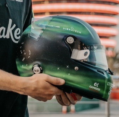
Nico Hulkenberg (Haas)
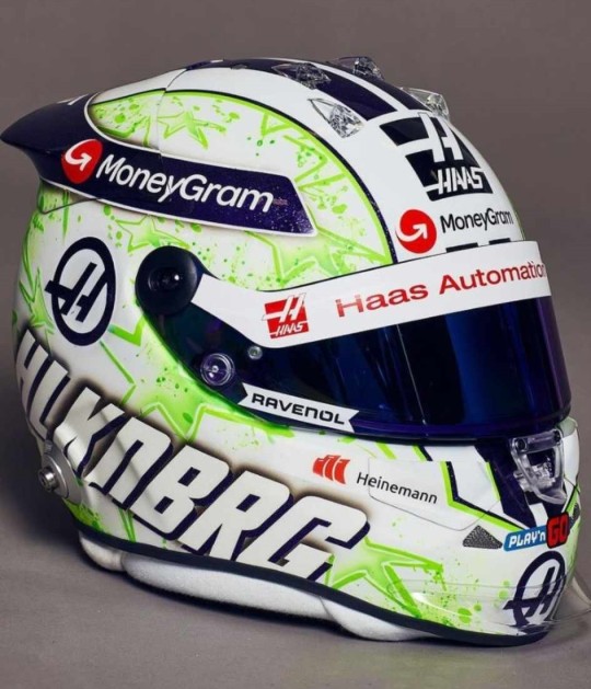
JMD Helmets really do never miss. Like his helmet from last year I love the paint splatter effect and I really like the choice to change it from orange and purple to acid green. I'm unsure on what to make of the purple and green combo as it def plays into the whole Hulk nickname, but the shades chosen do look good together.
9/10
Charles Leclerc (Ferrari)
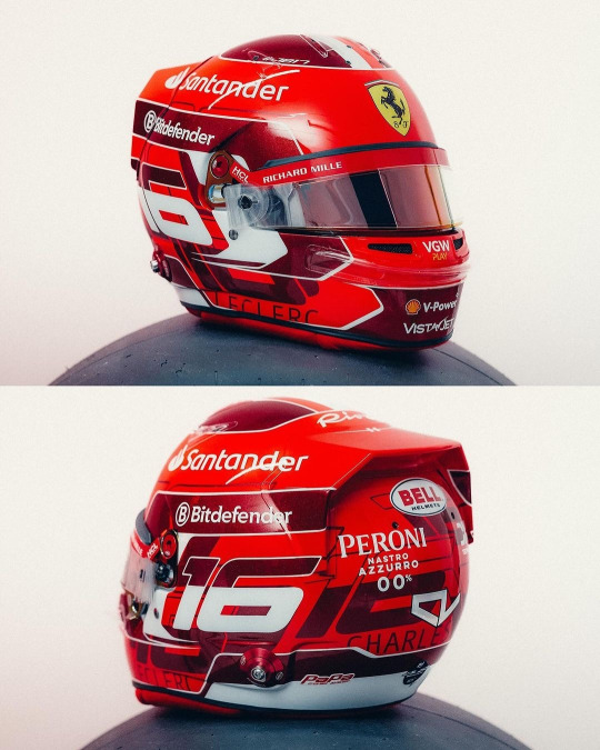
Currently kissing Charles on his pretty little head for the addition of the dark metallic red accents. It's so pretty and adds a lot of dimension to his helmet design (while I did like his '23 helmet, it did feel a bit plain). I also really like the pattern on the base of the number 16 going round the helmet, it's been done in just the right font size and colour that again adds some more dimension instead of looking busy.
8/10
Kevin Magnussen (Haas)
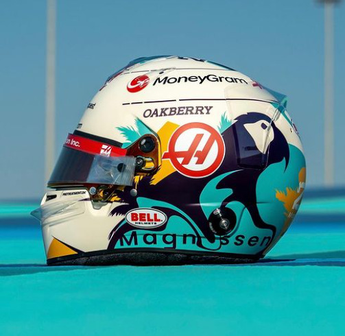
This is a complete 180 from his previous helmet designs, and while I have zero idea what the inspiration is I really like it!
The bright splash of turquoise is really nice (I will always love fun colours on helmets) and it complements the parrot design really well. (Again, I don't know why Kevin has put a parrot on his helmet, but it's fun so I'm allowing it). I would never have thought to pair turquoise and marigold together, but somehow it works, and both looks really nice on the off-white base.
8/10
Lando Norris (McLaren)

I genuinely cannot fault this. I love that it's glossy, I love the neon yellow, I love the abstract black detailing. My new favourite helmet design of Lando's
10/10
Esteban Ocon (Alpine)

I am so happy to see Esteban carrying on the red and black colour scheme from last year. While I don't love this design as much as last year's (the big carbon fibre E is a tad off putting) it's still a really solid design that will not only stand out against the Alpine livery, but against the rest of the grid's helmets too.
He also gets a kiss on the head for keeping his helmet glossy instead of matte
8/10
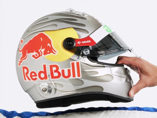
Sergio Perez (Red Bull)
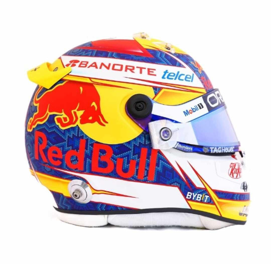
I'm unsure how I feel about Checo's helmet this year. On the one hand it does have a more cohesive colour palette than last year (and I LOVE the traditional Mexican inspired patten on the blue base), on the other it does feel a bit simple. I also wish the Red Bull logo with the white outline had been used instead, the text is a bit hard to read against the blue. But I do enjoy the splashes of yellow that do well to set his helmet apart from Verstappen's
6.5/10
Oscar Piastri (McLaren)
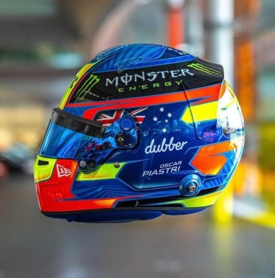
Another evolution of last year's design and I love the version for 2024! For me Oscar's helmet was too busy last year and I feel like it's been streamlined. My favourite part, the colour palette, has remained unchanged and like last year I just love how bright it is. I also really like the pattern on the medium blue base, it adds a really nice dimension to the overall design. However I do miss the silver holographic detailing from last year's helmet, it's a shame it didn't make the cut.
9/10
Daniel Ricciardo (Racing Bulls)
This is a colossal upgrade on last year's helmet (the tan and blue colourway was not it). And while the grey and silver colour scheme is plain, it definitely helps the flame design look a lot better than on last year's helmet and will look really good against the bright blue RB livery.
As with Gasly's helmet I also like the gradient shading, and the chrome (!!!) silver outline going around the flames.
7.5/10
George Russell (Mercedes)
I am so glad George stuck with a blue design instead of the acid green he trialled at some races last year. It's a really gorgeous shade of blue that looks stunning with the Mercedes W15 livery, and I really like the little bits of darker blue shading and the blue visor (again I don't talk much about matching visors much but I do appreciate them!!).
He also gets a bonus point for having the black parts painted instead of carbon fibre.
8/10
Carlos Sainz Jr (Ferrari)

Again another copy and paste from last year, but thankfully with less black. It looks so much brighter with just having the black on the top. I like that the design is a even more abstract than his design last year, it definitely makes it look different. And of course the red and yellow colour scheme means that it will look really good with the Ferrari livery
7/10
Logan Sargeant (Williams)

I really, really want to like this design but the American flag just completely takes me out of it. If it wasn't there this helmet would be gorgeous because imho it's not needed as the white and blue with the red accents already does a great job in showcasing Logan's home country colours.
Apart of that, the design is really nice and it will look so stunning with the car, it just has an echo of a Haas US GP livery 😭
5/10
Lance Stroll (Aston Martin)

A moment of silence for the fallen Aston Martin wings, they were very pretty 😔
Lance's helmet design for 2024 is a throwback to the design he ran in his championship winning European F3 season, but refreshed in Aston Martin colours. I did have a somewhat negative reaction upon seeing the exposed carbon but the more I look at it the more I'm on board with it. It definitely helps that it's all over glossy. Also shoutout to Lance's continued commitment to the Aston brand by having the flashes of neon lime to match the car's livery, I will always appreciate a proper commitment to the bit.
7/10
Yuki Tsunoda (Racing Bulls)

The Japanese maple leaves are baaaaaaaack!!!!!
I'm not so sure on the navy base... but then I also don't know what colour base I would switch it out for that would look good and also complement the Racing Bulls livery. But Yuki's helmet was one of my favourites last year so I'm really happy to see a version of it back for 2024.
7/10
Max Verstappen (Red Bull)
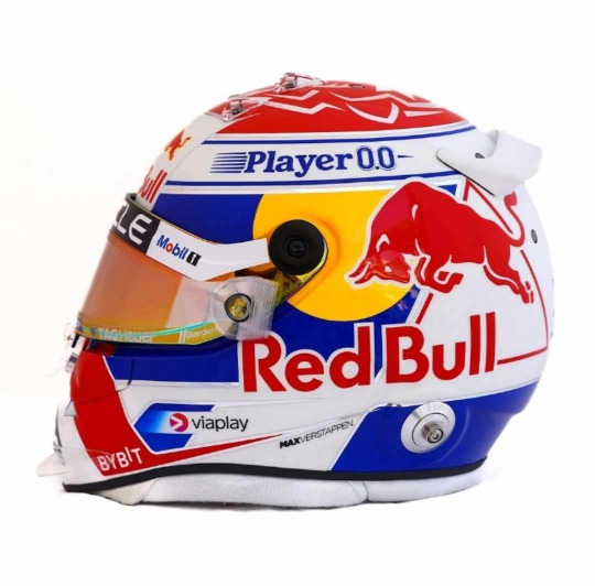
ngl I do like this a lot more than his design from last year. I love the cobalt blue (oh how I wish the RBR would be as bright as this) and I especially love the silver chrome accents, if they were a little bit thicker and more prominent I'd like them even more.
I also want to shoutout the red/orange duo-chrome visor, I never talk about them enough but I love it when the colour of the visors complement the rest of the helmet design (in this case the red and yellow in the Red Bull logo)
8/10
Zhou Guanyu (Sauber)
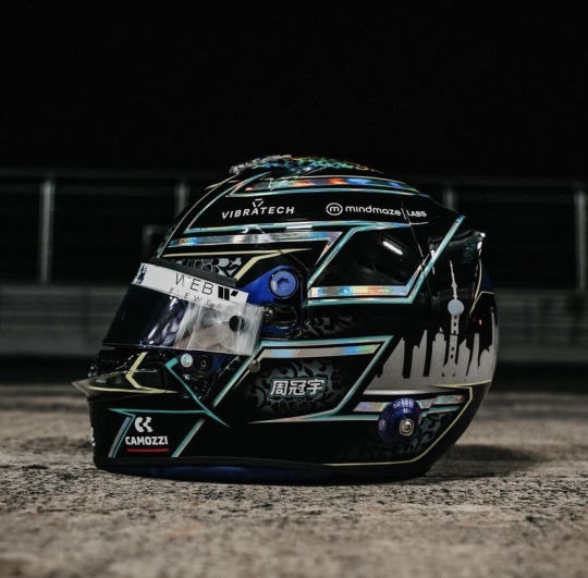
No notes. And dare I say, best helmet on the grid. I just love the pairing of all over black with the hints of the porcelain pattern and silver holographic accents. It's sexy as hell.
10/10
#Formula 1#Helmet Watch#2024#Helmet Watch 2024#Helmet#this took forever to put together bc the drivers took their sweet time in putting their HQ helmet pics out#but spoiler alert the drivers once again out designed their teams
4 notes
·
View notes
Text
"Fixing" Red Velvet's Birthday Music Video because I'm an unsatisfied snob 🎂
1. Styling👗
The fact the girls wore very basic and casual outfits, especially when the MV is so campy, felt timid. Yeah it's trendy and palatable but it's boring. Birthday was ripe for Zimzalabim-esque fashion but actually getting it right.
Not a one-to-one but a general gist of what I'd like. When the girls are interacting with zany characters and environments, it'd make sense they'd match it. Furs, frills, bows, patterns, and a lot of colour! Make them look like walking birthday presents 😫
2. Staging🎭
I seriously have a bone to pick with how so many of the shots made the story hard to follow. The MV generally suffered from terrible lighting, bad framing, and fast cuts.


It sounds nitpicky but the "red light green light" clip was so easy to have filmed more clearly and dynamically by putting the camera over Yeri's shoulder. Also, Yeri turns her head away from the camera that makes her action hard to read. If anything, why didn't the director just do another take and asked Yeri to turn her head the other way???
The other 2 shots are so dark. I didn't even notice Joy's enemy in the corner until I took the screenshot and a lot of people missed Wendy's because he's way off at the side in the dark.
The fourth pic is... Everything wrong. It's dark, it's poorly framed, and I didn't even notice the girls' summoning circle until the third watch. These were just the glaring shots but these issues were littered throughout the MV.
3. Set Design 🛋️
Honestly, a lot of it looks good! But since I'm nitpicking and reimagining the MV, I would still change it a bit. Because the story is Red Velvet going through this building to crash the Gingerbread Man's party, I would've made the sets look like rooms. It'd visually be more cohesive and interesting. The girls are picking up keys too so it'd make sense to see them unlock some doors.

Again, this is the gist of what I'd like. I think it'd be cool to see each themed room be cluttered and claustrophobic and as if you just entered a wormhole. The blue room with the fluffy enemy only had a tree but it'd have personality with some blue, monochromatic furry furniture. Something like the sets from "But I'm a Cheerleader".

I liked the knock-off Edward Scissorhands set, all it needed were walls, either grass walls or a red. And as for Seulgi's enemy, I would've put them in a room with props like a giant dog bowl and dog house and make the room look like a playpen. Just a few examples that I think would help enrich the world building and showcase these characters' quirks better!
In conclusion...
I love the concept and idea for Birthday and we'll probably never see another concept like it which is why I'm so devastated it fell flat. It was the zany, campy, maximalist music video that was too good to be true. Red Velvet music videos have honestly been lukewarm as of late and I'm hoping for when they can return to their iconic era.
2 notes
·
View notes
Text
hi so naturally i want to talk about the met gala cuz there are amazing things to be said about this and i wanna analyse some aspects of it because my blog and not yours. we saw a lot of avant-garde outfits on the runway as well as some more toned down ones. we saw a lot of people simply copy KL's style by dressing up as him or calling a black slip or suit with sharp white lining an adequate decision. it isn't. so i don't know who most of these people are, i just wanna talk about the looks because im passionate about it.
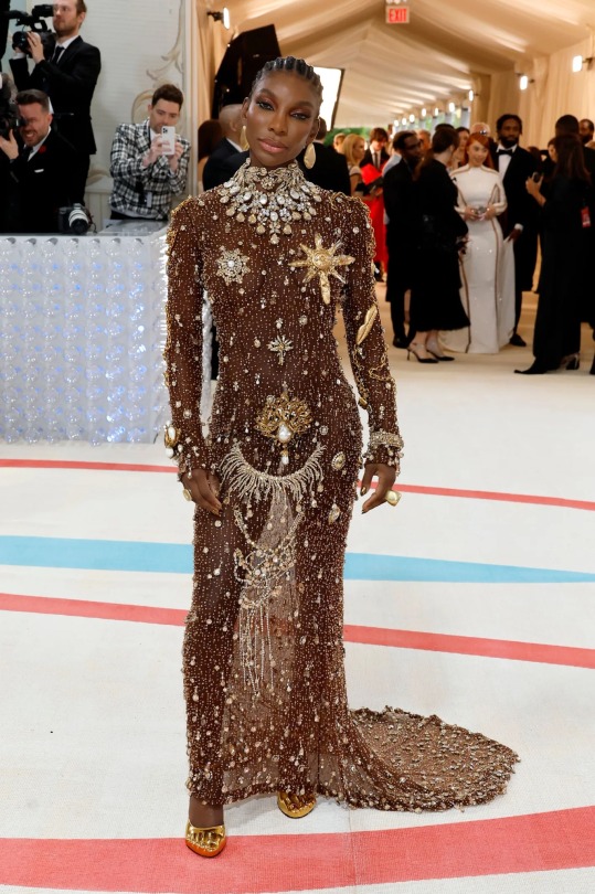
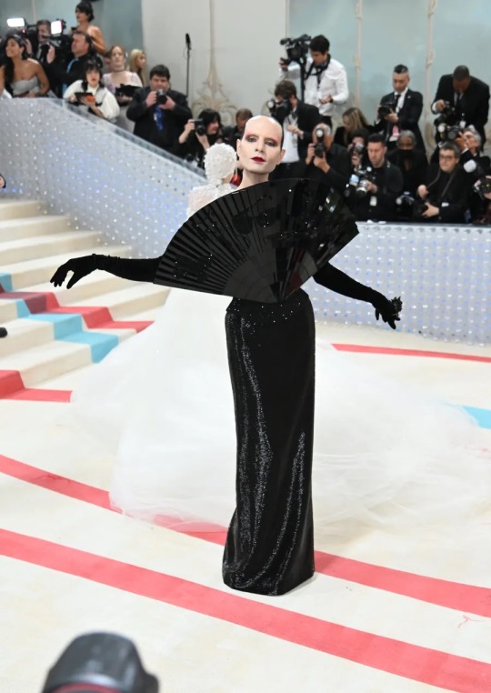
so these are some of my favourites, if not my favourites altogether. both of these people are wearing schiaparelli, a fashion house i am more than pleased to see revived and on runaways now. surrealist as always in style, true to the creator of the house but still modern and shocking, these two fits are to die for. the one to the right is a nude body suit which drips stylishly and methodically in pearls --- seemingly astray with no direction but when you spend more time examining the outfit you see that there are specific motifs to KL's love of pearls and jewels -- a reverse, upside down version of the neck piece near the crotch and thoughtful placement of gems. to the left is a klaus nomi-esque facial structure and look with a front-facing, toned down monochromatic fan which reminds me of the iconic mugler shell dress. [see below] this fan also has subtle vinyl décor which are nods to KL's recurring accessories. style.
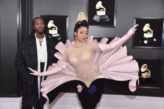
[mugler dress worn by cardi b, corresponding to left image]
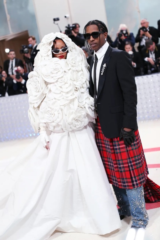
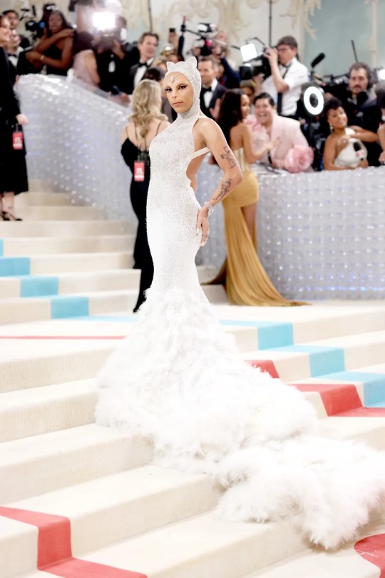
we saw two white gowns with different forms of exaggeration, rihanna adorning a crowded hood of sorts with the white flowers so often seen in KL's designs. here with her husband, asap rocky, who pays tribute in his suit n tie which KL wore like a uniform as well as beaded jeans. their both wearing sunglasses can be interpreted as another motif. rocky has become more adventerous with his style when it comes to not just the met gala but to his day-to-day as well. truly the dream couple. the eyelashes on top of riri's sunglasses is an amazingly camp concept which adds the cherry on top. doja cat wore a nod to choupette, KL's cat which he carried around with him and whatnot but she did it in a much better was than he-who-shall-not-be-named did [he wore a fucking fursuit.] doja wore a oscar de la renta gown with prosthetic cat features and that flowing gown mimicking the fur of choupette. its very charming, with a little bit of a splash of camp, and i loved it. i wanna hug her.
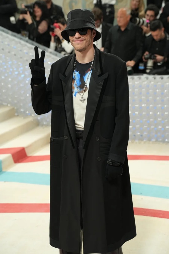
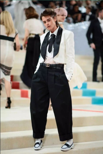
say whatever the fuck you want. say whatever the fuck you want. call me dick hungry. a faggot, a dyke, a freak, a leper. whatever you want. they're so fucking hot. i love pete davidson's long trench coat with that dumb patented bucket hat??? his stupid fucking smile and gloves and peace? maybe im just down bad. he didn't understand the assignment whatsoever. k stew bringing butch realness with a more loose, inverted approach to KL's typical attire. white with black, these wide legged pants with a snatched waist of sorts.... she is so hot stfu.
1 note
·
View note
Text
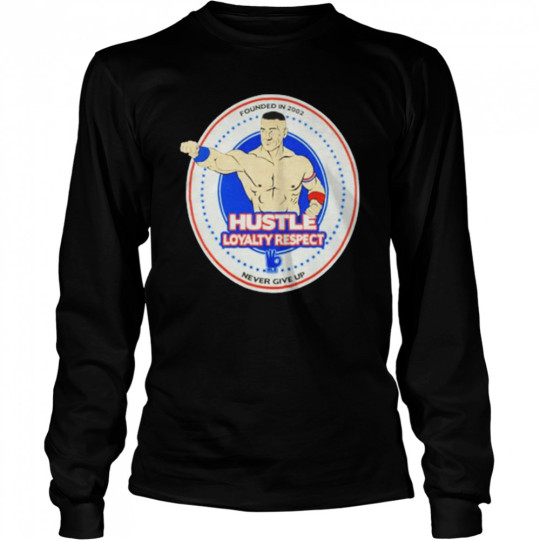
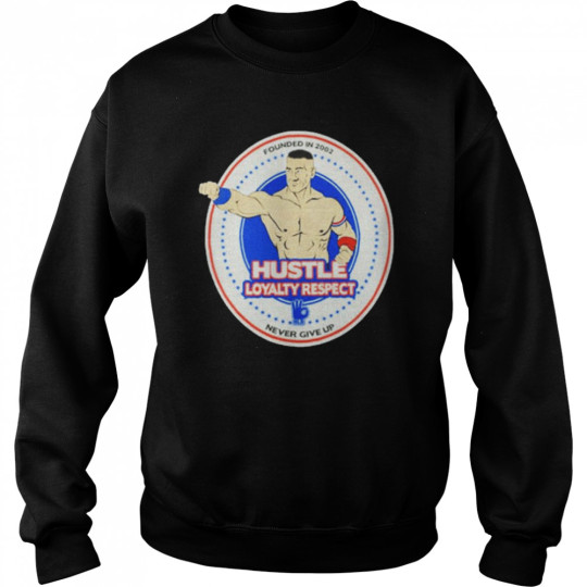
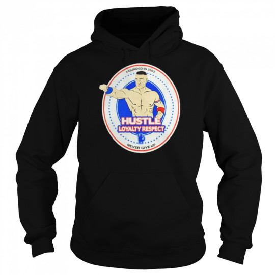
WWE John Cena Hustle Loyalty Respect Shirt
We all love a Canadian tuxedo WWE John Cena Hustle Loyalty Respect Shirt . While head-to-toe denim was a hit last season, this time around it was all about I will love this remix. Casablanca went Western with a cowboy shirt and chaps, while Glenn Martens deconstructed his at Y/Project and Hed Mayner blew his up. Ever been on a road trip, stopped at a gas station for snacks, and found yourself trying on the kitschy shades from the rotating sunglasses rack? We sure have—you can find some real fun (and cheap!) gems there. Perhaps it’s the sporty Oakley-esque silhouettes, or the neon aviators with tinted lenses that are so irresistible. And this summer, it so happens that stylish stars are taking this exact approach as well.WWE John Cena Hustle Loyalty Respect Shirt, hoodie, sweater, longsleeve and ladies t-shirt
Classic Women's
Long Sleeved
Unisex Sweatshirt
Unisex Hoodie
Classic Men's
Over the WWE John Cena Hustle Loyalty Respect Shirt . I will love this past few weeks, a handful of stars have stepped out in shades that you could find at your local gas station—only theirs are, naturally, designer. Kim Kardashian was spotted enjoying a Diet Coke last month (very gas station-chic) in a pair of sporty pink Balenciaga shades, with the monochromatic look to match. Balenciaga has been pushing the wrap-around style on the runways, and while Kardashian has been wearing them all summer long, she’s not the only fan. In one of her many epic maternity Instagram looks, Rihanna sported turquoise bug-eyed style (hers by Gucci) that wrap around, too. We all love a Canadian tuxedo. While head-to-toe denim was a hit last season, this time around it was all about I will love this remix. Casablanca went Western with a cowboy shirt and chaps, while Glenn Martens deconstructed his at Y/Project and Hed Mayner blew his up. Ever been on a road trip, stopped at a gas station for snacks, and found yourself trying on the kitschy shades from the rotating sunglasses rack? We sure have—you can find some real fun (and cheap!) gems there. Perhaps it’s the sporty Oakley-esque silhouettes, or the neon aviators with tinted lenses that are so irresistible. And this summer, it so happens that stylish stars are taking this exact approach as well.
You Can See More Product: https://newshirtonline.com/product-category/trending/
Read the full article
0 notes
Text
Gun 5 things You don’t mess with Family Faith Friends Flag Firearms 2022 shirt
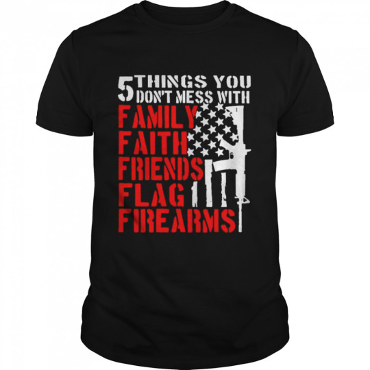
We all love a Canadian tuxedo Gun 5 things You don’t mess with Family Faith Friends Flag Firearms 2022 shirt . While head-to-toe denim was a hit last season, this time around it was all about I will love this remix. Casablanca went Western with a cowboy shirt and chaps, while Glenn Martens deconstructed his at Y/Project and Hed Mayner blew his up. Ever been on a road trip, stopped at a gas station for snacks, and found yourself trying on the kitschy shades from the rotating sunglasses rack? We sure have—you can find some real fun (and cheap!) gems there. Perhaps it’s the sporty Oakley-esque silhouettes, or the neon aviators with tinted lenses that are so irresistible. And this summer, it so happens that stylish stars are taking this exact approach as well.Gun 5 things You don’t mess with Family Faith Friends Flag Firearms 2022 shirt, hoodie, sweater, longsleeve and ladies t-shirtOver the Gun 5 things You don’t mess with Family Faith Friends Flag Firearms 2022 shirt . I will love this past few weeks, a handful of stars have stepped out in shades that you could find at your local gas station—only theirs are, naturally, designer. Kim Kardashian was spotted enjoying a Diet Coke last month (very gas station-chic) in a pair of sporty pink Balenciaga shades, with the monochromatic look to match. Balenciaga has been pushing the wrap-around style on the runways, and while Kardashian has been wearing them all summer long, she’s not the only fan.
Read the full article
0 notes
Text
Persephone in Disney’s “Hercules”
After doing my write-up on “Jasper in Deadland”, which doesn’t actually have the myth of Persephone in it but does have her and Hades as characters, I found myself thinking, ‘why don’t I do more write-ups about media that has Persephone in it even if her myth isn’t directly addressed?’ And once I had that thought, I decided I should talk about Disney’s “Hercules,” which is probably just as famous for its portrayal of Hades as it is for literally anything else about it.
I think anyone’s automatic thought when I say Persephone in Disney’s “Hercules” is that she’s not actually in the movie at all and that’s not actually correct.
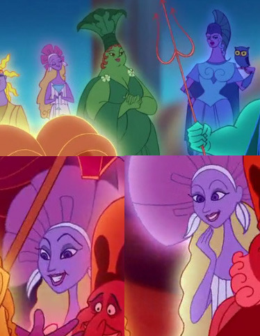
I’m not crazy about her design but it’s not the worst thing. Why is she so blonde when most of the other gods seem to be more monochromatic (and as I’ve said before I’m not into blonde Persephone)? In fact, her lack of monochrome makes me wonder if they might have intended other things for her since the gods who aren’t mostly one color in general have more importance in the narrative. Also her earrings are probably supposed to be leaves but they look more like feathers to me.
Persephone is only in the background of the pantheon scenes with her standing next to her mother in the opening scene and being one of the gods to crowd around Hercules at the end. So what is there to talk about? That. The fact that she is there and the fact that she is only in the background. This is important. In some stories this would be a minor detail that just shows that someone did their homework, but in this story where Hades is the main villain and easily the most memorable character, there’s a discussion to be had.
Before I get into depth about the villain aspect, I want to point out the fact that villains of the Disney Renaissance era are some of the most often cited when someone wants to have a discussion about queer coding in media and Hades’ name comes up basically every time. To me, he reads more like a sleazy used car salesman than a queer-coded villain (I think Radcliffe from “Pocahontas” or Ursula from “Little Mermaid” are more straight forward examples to point out for a straight audience) but there are definitely moments in the film where you can see this; his gay best friend-esque dialogues with Meg are pretty notable. That being said, this Hades being into ladies would not feel incorrect to me, a queer. Isn’t every Hades at least a touch bisexual (and everyone in Greek mythology for that matter)? Happy Pride!
So moving past the queer-coding discussion, we get to the villain issue. Giving a villain someone to love is going to change the dynamic of the villain and the story and is a really complicated choice for most writers. There’s a reason why every live action movie with the Joker in it has either had no Harley Quinn or Harley was the main character and the Joker was secondary. And they happen to be a couple with a bad relationship where you could easily have one of them throw the other under a bus if needed! Including Persephone in this story as Hades’ wife would mean that it would be really hard to make Hades the villain. In almost every medium where Hades has a Persephone, he isn’t presented as a villain but instead strictly lawful neutral, and you could still have a funny Hades who’s lawful neutral (look at “Hercules: The Legendary Journeys” or “Jasper In Deadland” for example).
Sure, there’s the option of making Persephone a villain too, but while there’s no real precedence to make Hades a villain outside of a lot of conflating him with the devil through incorrect translations and confusion, there is absolutely no precedence to make Persephone a villain. Hades’ villainy already only works in this story because they have set it up that Zeus single-handedly won the Titanomachy and assigned the Underworld to Hades, leaving him bitter about it. In some versions of the myth of Persephone, Hades’ bitterness at his lot in the Underworld is actually the driving force behind him wanting a wife in the first place. Persephone would likely be a placating force for Hades, causing the more straightforward hero-villain narrative to not work and Disney’s shtick at this time was very much about straightforward hero-villain narratives.
There’s also the general problem that Persephone’s presence would make Hades WAY too powerful as this amazing Tumblr post discusses.
So Persephone as a villain is bizarre and she would likely be a positive thing for Hades. What if they had a relationship that was bad i.e. Joker/Harley? It would be a complete Greek God couple inversion since this movie shows Zeus and Hera as a happy couple (again, the goal was to simplify; this is also why Hercules is their child isn’t of Zeus and Alcmene). Well, then you basically have the horrible “Lightning Thief” movie (which I should maybe write about some time) and honestly, I think it would read really badly. If you don’t get why, go watch that film (but don’t, it’s terrible). Hades is unique is the Disney villain pantheon because he’s so likable and while he does bad things, his motives make a bit more sense than a lot of Disney villains. I think giving him a wife who he’s mean to would not only decrease his likability substantially but I think it would also be kind of controversial. Hades certainly wouldn’t be the iconic character that he is. It would also likely distract from the amount of time he spends interacting with Meg, who is not just a love interest to Hercules but a hugely important factor in the plot. Even if Persephone is equally mean to him, I think you’d still end up in this problem of having to address how two people who hate each other ended up married and then you’re into having to pose Hades as a kidnapper who regrets his choices. Also, I think in 1997 the married-couple-who-hate-each-other trope was mercifully on its way out.
So what if Hades and Persephone are married and it’s a decent marriage but Persephone just doesn’t know about any of his evil plans? That’s workable. Hades’ original plan to kill Hercules is pretty quietly done, and his all out war plan could have involved her being cooped up in Elysium and oblivious. Heck, you could even have the movie play out entirely as is until the scene where he’s enslaving the gods and then suddenly they see each other and he’s like, “Good news, honey! Soon everywhere will be my domain and you won’t have to be cooped up underground half the year!” and she’s like, “Is this what you were planning in your office every night?! You complete idiot!” That would kind of even give Hades more motive without having to mess with Persephone’s character.
I haven’t really touched on what might actually be the most obvious answer of why Persephone is in this movie but not as Hades’ wife: that just hasn’t happened yet. I’m sure this is the argument anyone who worked on the film would make. Okay, sure, there are no winter scenes in the film, but that whole thing is implied to happen long before any of the famous demigods are born. Perhaps this is just the answer. Although I think he’d have a much harder time winning her over now after he, you know, tried to take over the world.
The life of Disney’s “Hercules” Hades didn’t actually end with the film by the way. In the television show, which would have been the perfect place to tell the myth of Persephone, Hades actually has a crush on Aphrodite instead. While it’s kind of cute to give him a crush in general, why did they give up on this prime myth real estate to make this up out of nowhere? And it did in fact make him more sympathetic, but he’s also just far less villainous in the show. Disney just can’t stop with this Hades redemption and romance arc thing either. In the third “Descendants” movie, Hades is there as Mal’s father meaning that he canonically had sex with Maleficent from “Sleeping Beauty.” I had to lie down after that one. But it’s worth noting that while he’s a totally absent father until the point that this film happens, he has his reasons, his characterization in that movie is 100% sympathetic, and he’s not a villain at all.
Gosh, Disney. Just give the man his wife already!
(And in case you were wondering, there is some really cute fan art out there of these two if you have a burning need.)
20 notes
·
View notes
Text
Okay, Let’s Actually Talk About Snom and Frosmoth


872: Snom
It's taken us a while, but we've finally got our first Bug/Ice type! Though I also suppose it was only a matter of time before the Jewel Caterpillar got a rep in Pokemon, with how much it's shown up in internet articles as “neat bugs to look at.” Never mind ALL bugs are neat to look at... but yes... Jewel Caterpillars are nice too. Snom is about as perfect of a stylization as you can get. I love its pudgy little body and how friggin squishy it is in its animations. It even has secret adorable feeties!
It also has a neat way to not just make the icicles on its back just a cheap visual gimmick. Snom evidently loves to eat snow, which it then turns its eaten snow into the ice crystals on its back. Neat!

873: Frosmoth
Oddly electing to skip a pupae stage, we evolve straight into a moth Pokemon and... HMMM I expected just a little bit better. The base body is perfect, with its fuzzy antennae and how it has fuzzy arms that it folds around itself to make it look like it's engulfed in a very warm coat. As well as the fluffy eyelashes. It's overall the first moth Pokemon to really incorporate moth's reputation for being one of the fluffiest bugs out there.
I just wish its wings didn't feel so weak. The snowflake-esque pattern is a good start but it once again feels like they cut things short before the design was entirely done. I was half expecting a more elaborate pattern to light up during attack animations or something but no such thing occurred. Which is disappointing, since the pretty patters are part of what makes moths so pretty.
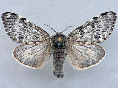
I get that the Woolly Bear Moth, the moth Frosmoth here is mostly likely taking inspiration from, is not too colorful, but it still has a neat monochromatic pattern on its wings.
That said though, it is neat enough to translate a moth's powdery scales as “snowflakes.” Shedding scales seems to be a go-to power when it comes to granting fictional moths superpowers, but the snow scales are definitely a neat idea!

Personal Score: 8.5/10

Though that said... I have some concerns.
Remember earlier at the end of Centiskorch's review where I said it'd be really disheartening if there was only one other Bug type this Gen, let alone only one more arthropod? Frosmoth is it. Most generations are pretty good about showing off a pretty good variety in arthropod Pokemon. The only other time we only got three lines was Gen 6... but it was somewhat fine because despite having one of them being taken up by the obligatory butterfly, one was a pistol shrimp and the other a goose barnacle! And of course this isn't to mention how much Alola absolutely SPOILED us with perhaps a handful of repeat animals like a stag beetle and a hornet... but it was made up for because we wound up getting so many long-awaited Bugs like mosquitoes, cockroaches, and even an isopod.
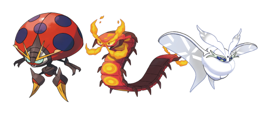
Unfortunately, this is all Galar has to show, at least unless they were holding out on us and all the new arthropods are behind the DLC or something. A second ladybird, a second centipede, and now our bajillionth lepidoptera. One of the biggest appeals of a new generation is seeing which of your favorite animals will get represented next. And of course, as an avid lover of bugs, I am not at all picky what new bugs turn up in Pokemon. I have my preferences, but anything new is good for me. So... yeah. Imagine my heartbreak upon learning my favorite phylum was getting benched for an entire generation. I'm all for repeating animals but this is silly, given how arthropods make up the majority of the known animal kingdom. So many of my dream Pokemon are things along the lines of Mantis Shrimps or Treehoppers or Grasshoppers or Pelican spiders. In fact, as far as “dream animals I want made into Pokemon” goes, the only Pokemon that's really come from any of my “dream animals” is Applin and the later Dreepy line. Compared to the previous generation which delivered me an isopod, diving bell spider, a mosquito, a bee fly, a coconut crab, and something properly mantoid. At least solely from a standpoint of new animal representation, Gen 8 is easily the worst Gen yet.
All this to say that these are reasons why I'm gonna start a small little “finale” for the Pokemon reviews after I do the Gen 8 wrap-up. Exactly what I'll keep hush on for now, but I'll be working on it.
Of course, “finale” as in “for now.” Still got the DLC to talk about later this year and I'll probably review Pokemon designs until either me or Pokemon dies, whichever happens first.
[Archive]
16 notes
·
View notes
Photo
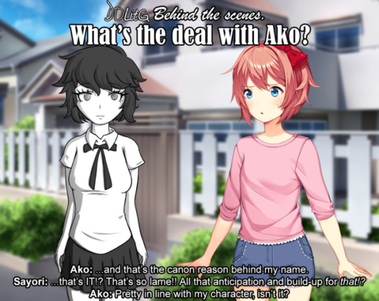
Hello everyone! Yui here, with today’s special feature, DDLitG Behind the Scenes: What’s the deal with Ako?
In this special update we’ll talk about her character in general, design, her place in the story, and more! So get comfortable in your seat, get yourself some good snacks, and let’s delve into the background of DDLitG’s 1st-ish original character~
Who is Ako?
Ako, formerly known as “female student”, was originally one of the many NPCs used by the game’s engine to fill its world with nondescript background characters, so as to make it feel less empty. However, Sayori took a special interest in her, and decided to befriend her, following the steps of a young MC who befriended Sayori in a similar situation and ended up saving her life. This would in turn allow Ako to grow as a character beyond her 1 line of coding and get her own sprites, as well as being able to interact with the world. She would later go on to fall in love with Sayori and shenanigans ensue.
Ako was created with the purpose of telling the story of the Friendship arc.
Designing Ako.
Let me make one thing clear: I’m not a character designer. I don’t know jack about it besides the very basics. But I did try to make someone who looked mildly original and, most importantly, different from the other girls.
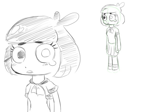
Originally, she was going to be the image of a shy, fragile girl who Sayori befriended out of pity, more than anything. Based on this initial idea, I made this beta Ako design on one of my copybooks when I should’ve been working:

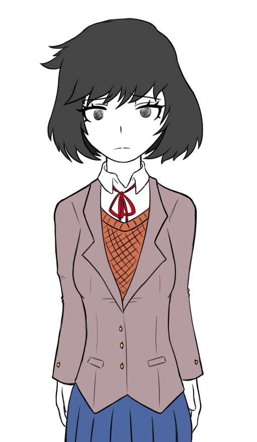
As you can see, her very first sprite was the one where she’s shyly looking away to avoid eye contact (and to seem annoying, but more on that later). I was happy with the pose but not with her face, as it looked super unoriginal. She resembled Ochako Uraraka from My Hero Academia a bit too much, so I tried to change her hair to make her stand out more. Here is her second iteration:
This time, I felt like I cranked it up too much to the other side. Now she stood out TOO much. Her hair felt like it came more from a protagonist than someone who’s supposed to be a background character. I adopted a new philosophy after seeing this result: she had to look as bland as possible. She had to be the kind of character you see all the time in the background of an anime - those simple, unassuming designs you’d never look twice at because you’re too focused on the protagonists with candy-coloured hair. In DDLitG’s canon she’s a filler NPC brought to the forefront, and her design had to reflect that more than my desire to make her look “cool”.
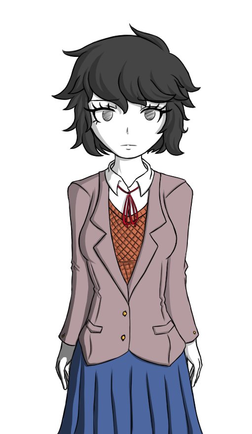
With this in mind, we come to Ako v0.3
As you can see, this is much closer to her current design. But this was still a sketch (even the drawing above is very much unfinished). As you can see, I got closer to her 0.1 version with the hair, but changed the eyes to make them look more unique, giving her that more neutral, “nothing” expression. Having finally found some ground I was comfortable with, I redefined her design a little further, gave her some more details around the hair and clothes, adjusted the proportions of her body (because apparently I draw heads huge), and made her finalized design.
I was happy.
What’s with this sassy... monochrome child?
If there’s one constant to be found in the pictures above, is that she was always meant to be black and white. There are plenty of reasons, which I’ll list because, honestly, there are a lot.
1. I didn’t want to look her like the rest of the cast at fucking all. She is an OC introduced in a story with already established characters made by a much more talented writer. She’s an outsider, someone who doesn’t belong with this cast of colorful characters, and I wanted readers to be able to tell that at first glance. No, she’s not like the other girls. They don’t belong in the same place. She is not a member of the original DDLC cast, and it shows.
2. I know I can’t draw as well as Satchely, so trying to copy DDLC’s art style would just end up looking awkward and wrong. I had no choice but to do my own thing. And if I’m doing my own thing, why not take it all the way? I already gave myself artistic freedom, I might as well go crazy with it~
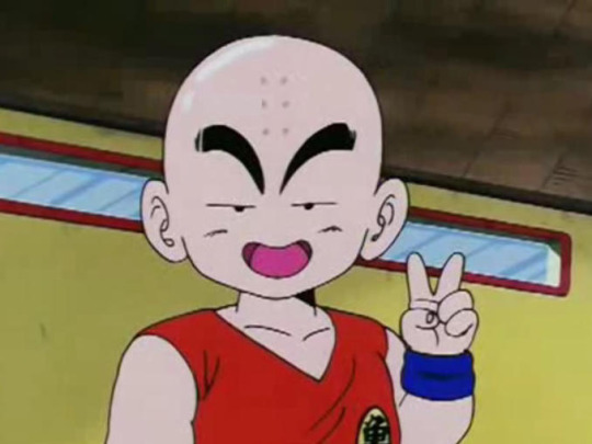
3. I just adore characters in a fictional universe that look different from the rest of the cast or have some strange design choice for literally no reason. Like Krillin from Dragonball, with his eyes that make him look like he belongs in an entirely different manga...
...or even Jotaro Kujo, whose hat merges with his hair because why not!

I live for dumb crap like that.
4. A huuuuuge inspiration for me while writing (besides my own uninteresting life) is music. Many times I listen to a specific track or imagine situations with specific background music to make them seem more real, and be able to better portray the feelings of a scene when writing [For example, I listened to My Chemical Romance’s Welcome to the Black Parade a lot while writing Monika’s Death].
Ako’s creation was no exception. Her appearance was partially based on the cover for not only one of my favorite Vocaloid albums of all time, but one of my favorite albums period: Wowaka’s glorious Unhappy Refrain.
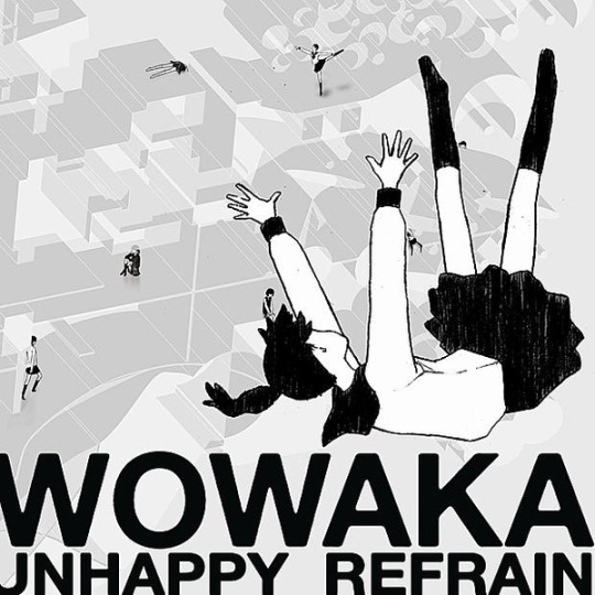
I’ve been writing stuff based on this album alone for years because it’s just so damn striking to me. The picture of the faceless schoolgirl falling into the unseen abyss, the background uninterested characters that imply they are used to seeing fellow girls suffer, the distorted world they live in, the album’s way to explore teenage depression, the freaking name of the album, EVERYTHING! IT’S SUCH A GOOD EXPLORATION OF THE DIFFICULT LIFE TEENS FACE THAT OFTEN GOES UNNOTICED!! AAAAAAHHHH IT’S SO GOOD.
5. Ako was also based on a previous design I made for another character meant for an original visual novel I was writing and I’m probably never going to finish, who was also going to be monochromatic to reference this album (in that context it made more sense though cuz every character was a musical reference).
This character, in turn, was based on Monoko from Yume Nikki, which is more obvious because of her crying eye and extra arm.

So basically at this point it would’ve been weird if I hadn’t made her monochromatic.
Naming Ako
This was one of the most difficult parts, ngl.
As I mentioned, Ako was originally going to be a fragile, shy girl. Based on this, her original name during the design face was Moromi, which is one more letter than “Moroi”, which Google translate promises me means “Brittle” or “Fragile” in Japanese.

However, after the philosophy change that happened during her conceptual stage, “Fragility” was no longer at the core of her character, as it was now “Nothingness/Blandness”. Because of this, I changed her name to “Ako”.
Many people have submitted their interpretations of the name, ranging from its meaning “To teach/to learn”, and “To yearn for”, which all fit better than the original tbh.
The intended meaning is for “Ako” to be read as “A-Ko”, which is a way by which Japenese media often refers to filler characters, as it translates to “Girl A”.
Examples of this can be seen in Super Danganronpa 2, where a character in a videogame is called “A-Ko” to hide their identity...

...and in a movie called “Project A-ko”, which was a parody of the anime tropes from the time, so they gave the protagonist the most generic name ever. The antagonist and side character, by the way, are called “B-Ko” and “C-Ko” respectively. This movie is fucking awesome.
This name also made sense in the context of the story, because we already had a character named “Student A”, so this goes to show that the game just gave Ako the default name it had stored for female NPCs.
Blinded Ako, or How I Learned to Convey Emotion Through Ahegao
When I came up with Ako, she was meant to have most of her character revolving around her infatuation with Sayori. She was, after all, written in the story with the purpose of falling in love with her, and nothing else. Her character, personality, likes/dislikes, and hobbies came afterwards. As the story progressed, however, I decided that she should have a personality separate from just being in love with another character. So to separate the actions she committed under the influence of her passion, I did a little design change in the middle of the arc: Blinded Ako.

In this version, Ako has been literally blinded by love and stops being rational. This is represented by the hearts covering her eyes, and clouding her judgement. This was done not only with the purpose of representing she was past her breaking point, but also to differentiate the Ako that makes mistakes with the Ako that was introduced in the beginning of the arc. Almost so as to make them two different characters, so when she is reintroduced as a regular character after Friendship, readers could think “oh, she’s not going to do dumb stuff again, she’s not blinded by love anymore.”
Many people compared the above panel with “ahegao”, a trope in hentai manga where a character does a silly face to represent them breaking from enjoying themselves so much. This was done partially on purpose. The main idea was to represent Ako being blinded by her infatuation for Sayori, not to equate her sate of being with anything sexual. It DID end up looking more hentai-esque than I expected though, as, well, Ako is in black and white, and the heart eyes are also a trope in ahegao. And she’s sweating. And she’s saying that she’s about to break....
.....
....well at least I drove my point home.
Ako’s musical influences
Above I mentioned how music was a big part of my inspiration, and how I listened to Welcome to the Black Parade while writing Monika’s Death, so the question in no one’s mind is: what music did Yui use as inspiration for Ako’s character and the arc? 🤔
Well, hypothetical reader, the answer is that since Ako was meant to be bland and flavour-free, her original depiction is not based on a song or anything. Her desperation towards Sayori and Blinded Ako, though, are based on TRONICBOX’s 80′s style remix of Ariana Grande’s Into You. And yes, this 80′s remix in specific. Not the original song. I highly encourage you to give it a listen and pay attention to the lyrics if you want an insight into how Ako was feeling during her breaking point.
youtube
Also, as a side note, no one has asked me this, but I imagine Ako’s voice to sound like the vocals of Panty and Stocking’s ending, Fallen Angel. It’s a truly beautiful song, and once again, I highly encourage you to give it a listen and pay attention tot he lyrics if you want an insight in Ako’s current feelings towards Sayori.
youtube
Ako’s reception
This is more something personal than an explanation of the character, but it’s something I want to share nonetheless.
Remember when I said Ako was meant to be annoying? Yeah... xD
When I decided to add a new character I did so under the idea that everyone was going to hate her, because it’s a purposefully boring OC made by some insane person with the sole purpose of being added to an already interesting and loved cast of characters just to fuck everything up.
The first scene I ever wrote for Ako was the part where Monika asked if she had hurt Sayori, and she said “Not intentionally...” while looking away, which is why her first sprite ever was in that position. She was meant to make people feel frustrated over this girl just looking away from her problems and avoiding responsibility, while also telling Monika to her face that she had done something bad to Sayori. Readers were expected to hate her. That’s why in the beginning she says she doesn’t like literature, to assure you that she’s not joining the literature club. That’s why there’s a scene where she gets punched in the face. That’s why she looks so extremely out of place.
YOU WERE SUPPOSED TO DISLIKE HER!! omg I’m still surprised at how warm the reception was, you guys are just too nice for me~ ❤️
Because of the unexpected reception I had to change some parts of the arc, which were originally going to be much crueler towards her [I even questioned adding the punch at all, but it was an important part of Monika’s development so I felt it]. I also established her as a recurring character in spite of her dislike of literature, and did my best to make her less hate-able than she was originally going to be, even cutting some planned lines of dialogue that made her pretty irredeemable. Looking back, I am glad I did those changes, we ended up with a well-liked and pretty nice girl because of it~
Final thoughts
The introduction of Ako and writing Friendship in general was a very intense experience for me. It was very difficult to balance Ako as being both relevant to the story and moving the plot forward, but not make her the sole focus of everything and have her obscure everyone else, because OCs in established pieces of media tend to do that.
This arc also got a LOT of mixed reviews, some people liking it, some hating everything I did. This made me really question what I was doing and at many points even regret I was writing Friendship at all. At a certain point I lost almost 50 followers in a single update.
I also had trouble writing some parts because they were too sad. And that’s not my style! I like writing happy people being good friends, damn it, not everyone crying and hating each other.
But when all is said and done, I’m happy I wrote both Friendship and Ako into the story. I’ve received many wonderful, supportive messages telling me how much readers enjoyed it. Even some people saying they had been in a similar situation to the one depicted in the story, and were glad to see a story that showed a positive outcome.
Will I write more OCs into DDLitG?
Meh, who knows. I love writing more original stuff and expanding the world of DDLitG, but I also feel like if I introduce yet another OC, people will crucify me and hate me for flooding the story with too much stuff that’s irrelevant to the DDLC they’re used to. That being said, writing this blog is my first, and very possibly last chance to expose my stories to such a large audience. And seeing people like what you do not only because you’re riding the coattails of a recognizable brand, but because they like what you do with it, makes me pretty darn happy. Being completely honest, I’d like to add another character. But just one. And only if it’s something that will push both the story and the girls’ character arcs forward. Not just adding OCs for the sake of it.
Thanks for sticking until the end of this BTS, and I hope you found it an enjoyable read, or at the very least I made you a little bit less bored~ ❤️
Next time, in DDLitG Behind the scenes: What’s the deal with The Perfect Yuri?
186 notes
·
View notes
Text
Study Habits
NOTE TAKING
I found out that writing a draft copy on school, then making a digital copy, then transferring it to physical notes is one of the best methods of studying for me. Writing physical notes also serves as my therapeutic time and a time where I can be creative as much as I can. I color code lessons, usually monochromatic so I know which lesson on that particular subject did an information come from, the colors are typically associated with the topic, I usually think of what color would a certain topic would remind me of, even the tiny designs I put would still be related to it.
I usually make a digital copy of my draft or initial notes first so connecting concepts are made easier, I could easily rearrange it to a flow that makes sense and less overwhelming for myself. It would seem inefficient for others but that way it integrates the lesson in my brain. Organizing similar and related concepts makes me understand the lesson more as it helps me make connections regarding it.
Materials I usually use:
Highlighters – used for subheadings and important words
Fine liners -used for details, underlining important terms related to headings and subheadings, also used for creating bullets
Brush Pens – used for writing titles, typically on headings
Regular pen – used for the body of your notes
Washi tape – used for creating tabs as dividers for each lesson
Sticky notes – used for additional information, typically on what does each symbol or variable meant in formulas
WHAT TO DO WHEN OVERWHLEMED OR WILL HAVE A BREAKDOWN
When feeling overwhelmed, I suggest that one must declutter their workspace, it helps in clearing the mind, have a sense of control and makes the environment you will work on more inviting. Turn it into a workspace that you will feel excited to work through, even small pictures of things you love or inspires you help. After that, break the tasks into smaller tasks and try to do it little by little. I usually give myself breathers when I get overwhelmed, I stand up and pace around and declutter so my mind would still productive but would not strain myself from thinking.
I found out that having playlists for certain vibes help, I usually put on chill or café esque music when starting out, then ukulele covers in the middle of the work, and theater music when my work is almost done . What I am doing is creating a schedule and an ambiance in which affects how my productivity is, I use chill and calm songs first since I still have a burst of will to do it, while having upbeat theater music on the last serves as my hype song, where it signifies that I should be refreshed or hyped up again. There are other times where I would listen to audio books, video essays, and podcasts to keep myself sane from doing tasks.
MAKE FRIENDS THAT WOULD NOT BRING YOU DOWN
I am not a sociable person, but I have made few friends that would help me when needed and I would help them too. Mutualism is key in which we help each other learn and expound our knowledge, clarify things we do not understand, we would usually quiz ourselves or write notes together which makes studying feel less tedious and make it more engaging.
0 notes
Link
Katie Holmes's Short Hairstyles and Haircuts - 25+ - https://shorthaircutsmodels.com/katie-holmess-short-hairstyles-and-haircuts/ - Katie Holmes's Short Hairstyles and Haircuts, Over the years Katie has enjoyed experimenting with both her hair for. Film roles and during red carpet appearances with styles ranging. From blunt fringe to honey-tipped layers. Katie is also famous for her effortless. Sense of style and recently turned heads during. Katie Holmes's Short Hairstyles and Haircuts Katie Holmes's Short Hairstyles and Haircuts, is flaunting a classic pageboy bob here with serrated ends. Katie's face has a square face blended with a heart-shaped face meaning it is predominantly wide but has a pointed chin area. Because it is too angular for full-square faces, it can get away with this â € do because of its chin. Katiea take away any blunt edges that have textured bangs and an angular. Katie Holmes's Short Hairstyles Katie Holmes's Short Hairstyles and Haircuts, jawline at the ends is a must for anyone. Katie€ just wonderful "uncovers his eyes and tanned his skin a rich chocolate brown shadow matches her monochromatic Yesil" this golden hair color/dark to light ideal for skin tones with warm tones,” especially Yesil eyes blue or it is better to bring. Katie Holmes's Short Haircuts Katie Holmes's Short Hairstyles and Haircuts, Katie's lighter-skinned ladies will benefit from some lighter brown babylights along the lengths and ends to break some colour. She has been in high fitness and swept side ponytails as these styles go well in both formal and casual wear making them hot favourite and handy styles. If you're looking for some exquisitely unique and cute look, these are styles you should definitely go for. Katie Holmes's Hairstyles Katie Holmes's Short Hairstyles and Haircuts, Katie has been on the mark with hair styling options. We love their cute and clean looks, which can be used as a reference by many women. History says Holmes was fearless when it came to trying out new styles cuts and lengths. But her willingness to play with her hair is only half of what she actually takes the plunge from being the longtime hairdresser to her other half DJ Quintero. Katie Holmes's Haircuts Katie Holmes's Short Hairstyles and Haircuts, In honor of the star's birthday, Quintero and I talked about why the Holmes low key look had become a BFF with America's sweetheart, and exactly why Kris Jenner copied the iconic pixie. last year. Katie Holmes's Short Hair His answers are ahead. This hairstyle is perfect on any day or night occasion and is easy to manage with regular fixes every 4 to 6 weeks. Celebrity hairstyles have always been the apple of the public's eyes. Film actors and actresses become style icons and are inspired by them as people choose their own personal style. Katie Holmes's Hair Women talking actresses are their first source of deciding what is and what is out of fashion. Katie Holmes is one such actress who is acclaimed among fairer sex for her hairstyles. Her hair was cut very short into a very nicely cut fairy cut. Pixie cuts are short cute cropped hairstyles that look best on people with strong facial features. Katie Holmes haircut 2020 - 2021 Katie Holmes appears to have brought back her pixie haircut for the first time since the 80s and 90s, according to new photos from New York. The Katie Holmes pixie cut stands out even by high standards of Fame. With a Katie Holmes pixie haircut, pixie is now either back in style or at least has new life on stage. Katie Holmes hair styles This brunette bob cut the edges rough, then rocked the blow straight to achieve this smooth and sexy hairstyle. You'll find two types of celebrities on the red carpet. she is wearing a rainbow-striped wig and grazing the. Katie Holmes hairstyles photos There are a few stars who can subtly try both extra and mundane looks, but one name in particular comes to mind. Katie Holmes. OK, at least not as we know it, he never wore his technicolor hair, but Holmes is the. Katie Holmes curly hair Hollywood risk-taker we have never appreciated so far. Most of the time you'll find the new bob that we don't have these days is crazy. But sometimes at the Grammys, we'll look back, starting with an unexpected. What color is Katie Holmes hair Pixie cut in the middle of the airport, or the recent photos of the 40-year-old actress, Katie Holmes, and back to 2020 - 2021. Here, Katie shows off a furry new do in July 2020-2021. She grew her hair last year. Katie Holmes was adored for her beautiful short hair. This beautiful actress certainly looks perfect with any hairstyle. Katie Holmes haircuts pictures Whether it's long hair or a stylish fairy, you can't just take your eyes off it. Katie has several professional hair stylists who care for her locks. We decided that even if Katie Holmes was as gorgeous, all this work shouldn't be wasted on just one person. We think copying Katie's hairstyle is a great idea for women of all ages and all kinds of hair. Katie Holmes haircut short He would have been happy to know he actually had so many followers. If you are one of those girls who don't have the fortune to spend on professional stylists and designers you can take advantage of everything that starts with Katie Holmes in the movie short hair is a great thing to start with exactly. For Katie Holmes, we've collected 5 stunning short hairstyles to help you enjoy your new look at minimal expense. Katie Holmes Pixie Cuts In the meantime you can find something new to try for yourself. This work-comfortable bob is a great choice for women with medium-length bob who want to make it shorter. You need thick light wavy or curly hair to achieve this style. The messy look is priceless. Layered feminine short hairstyle for women. Katie Holmes hair cut The Katie Holmes pixie hairstyle is packed with texture and volume as there is virtually no product or additional weight with longer locks. With the exception of blasts, the upper lengths are only a few inches long, graduating to the nape of the neck. Katie Holmes long hair The front and bangs are given plenty of tissue with longer layers so they can still be tucked behind the ears. The eruptions are angular, starting at a slightly longer period at the edge of the face at. Katie Holmes blonde hair Mid-eye level. Don't baby bang on the streets of New York. In other words, he will try everything once. If 2020 has taught us anything, the fact that lob is one of the proudest hair lengths for everyone explains why the running list of celebrities who choose to change things with a collar bone grazing cut continues to grow. Katie Holmes hair extensions While Lob is a prominent hair trend on the red carpet, there's a bolder cut that takes some time. fairy. And the latest celeb to try this short length. Katie Holmes. The actress was spotted catching a flight at. Katie Holmes hair color Holmes turned his wavy lobe into a fairy. Instead it is separated from the centre by long curtains as the actress's style bursts in sticking with short wavy layers for a Mia Farrow-esque look. He has been sporting short medium and long styles over the years. Katie Holmes hairstyle She has been sporting some down dos and other hair. Hair styles are known as fashionable and elegant and constantly evolving hair styles. She loves sports ponytails because they have some easy and comfortable hair that has. Katie Holmes haircut Dominated the fashion world with all the variations over the years. Here are some eye-catching Katie Holmes Pixie cuts. Control and inspiration. Katie Holmes, 38, looked unrecognisable when she stepped out at. Katie Holmes new haircut LAX airport on Friday showcasing her all-new do. Known for her shoulder length hairdo, the Dawson Creek actress looked different with a pixie cut hairdo. Katie sported her chic new hair with a large hat and aviator. Sunglasses and looked cool in a black and white striped T-shirt with red moccasins in. Stone wash jeans and an oversized black handbag. Katie Holmes hair colour Katie Holmes hair colourEvery time we see Katie Holmes it feels like she's rocking a completely different hairstyle. Over the years he has gone from short and blunt to long and curly and every style in between. Katie Holmes hair products View yourself with Katie Holmes hairstyles. We also provide easy "how to style" by reporting tips on which hair facial shape can match hair texture and hair density. Actresses are basically professional chameleons. Katie Holmes hair now Meaning changing their appearance is only part of the job. Katie Holmes has been America's favorite girl since her Dawson Creek days but she has also changed her appearance over the years. Katie Holmes hair care Here's a look at Katie Holmes hair evolution, which has its most iconic look from the 90s to the present. A comfortable short bob haircut with a side part will pick you up from the cocktail office with friends. That's a cute hairstyle for Katie Holmes. Katie Holmes haircut bob Bob cut straight but on the furry side. The actress, 38, just made her most dramatic hair transformation in more than a decade by chopping her brunette waves into a fierce fairy. She got a new look at an event in New York this week pairing the cut with a romantic floral dress. Holmes may look like. Katie Holmes brown hair Audrey Hepburn with her stylish crop taking a cue but she actually cut her hair for her upcoming role in the action thriller "janitor."In the film, Holmes will play a former Marine who struggles to adjust to civilian life until.
0 notes
Text
Billie Eilish's Style Is on a Whole Other Level, So Let's Give It Up For the Queen of Cool Comfort
Billie Eilish's affinity for vastly oversize sweatshirts, rare high-end sneakers, and stacks of shiny jewelry is something I could only dream of pulling off the way the 17-year-old does. To an outsider, Billie's look is jarring. I mean, at that age, I was wearing the tightest pair of leggings I could find and some ill-fitting graphic tee featuring a band I'd never listened to before. But her out-there style is the ultimate combination of swag and comfort, and she manages to rock these looks without the sloppiness sometimes associated with sweats.
I guess we should backtrack - you don't know Billie? You haven't listened to music in the last two or three years? Well, please allow us to introduce you to the powerhouse that she is. The Los Angeles native is young, but you could never tell from her lyrics and the range of vocal skills, plus her style is freaking cool and her 15 million Instagram followers probably agree. She mixes designer prints with no hesitation, brings depth to monochromatic outfits, and doesn't think twice about it.
In 2017, she told Harper's Bazaar that she's fully aware of how her style may appear, but that's why she loves it. "I just like dressing out of my comfort zone. I want to dress in a way that if I was in a room full of people wearing regular clothes, I would be like, 'Oh, I bet everyone's looking at me.' I want to feel that way. That's my casual," she explained. "I am not comfortable when I'm wearing just some jeans and a shirt. I just feel wrong and I feel like very not me and out of my place and just weird . . . I love being judged. I'm here for it."
There are few people who could pull off a Sailor Moon-inspired outfit on the red carpet for the iHeartRadio Music Awards, and even fewer who could rock a custom Louis Vuitton boot to recover from a foot injury. But let it be known that her outfits are not XXXL sweatsuits from the corner store; these are mostly custom designer pieces that she pulls off gracefully. Billie has a sense of style and a level of coolness that at 10 years her senior, I'm genuinely jealous of. Feast your eyes on some of Billie's most Billie-esque outfits ahead, and get inspired to add a little swag to your sweats.
Related:
The Musical Style of Billie Eilish: 11 Songs That Tap Into Heavy Emotions and Dark Fantasies
Billie Eilish's Style Is on a Whole Other Level, So Let's Give It Up For the Queen of Cool Comfort published first on https://mariakistler.tumblr.com/
0 notes
Text
When Selling Your Home, Are Neutral Colors like Builder Beige Too Boring?
Although black is the most stylish color of every year, it’s conventional wisdom to use neutral colors like builder beige, gray and taupe when putting your home on the market. However, some people (myself included) actually like these colors apart from resale factors. We believe that these neutral color palettes have gotten a bad rap. Is builder beige really boring? And is gray really too gloomy? What do realtors really think about these color choices when putting your home on the market?
Below are examples of these color palettes that might change your mind regarding neutral colors – along with advice from a handful of experts.
Today’s beige isn’t boring

A neutral background allows the crisp white hues to stand out. Image: Svet_Feo/Shutterstock
Perhaps the issue with builder beige is related to the color choices of the past. “Today’s more taupe-based beiges have a wonderful quality of warmth but don’t have a yellowish cast,” according to Carol Marcotte, lead designer at Form & Function in Raleigh, NC. “For example, WhiteTail by Sherwin Williams provides a warm backdrop for just about anything, and it’s definitely not boring,” she says.

These light colors don’t compete with the view. Image: Erik Isakson/Getty Images
She also likes Benjamin Moore’s Maritime White, especially in the foyer. “It is beige-esque, but has a lovely reflective quality and allows the artwork and other elements to standout.”
As another alternative to the usual builder beige, Marcotte says she also likes Creamy by Sherwin Williams. It is a more flesh-based white. “Again, it has the warmth of a beige but with a decidedly different cast, and in strong light, it pairs down the flesh or potential peachiness.”
When your home is on the market

This sophisticated color scheme is sure to appeal to buyers. Image: Esin tellioglu/Shutterstock
So, is the builder beige adage still true when selling your home? “Beige is certainly a good color choice for the majority of a home’s rooms when it’s on the market – although I personally prefer white,” says Sandra Miller, principal broker and licensed partner at Engel & Völkers in Santa Monica, CA.
“Regardless of the neutral shade you choose, I have also found that having subtle walls of color can be effective in driving a faster sale,” she says. But Miller says it’s important to know which color palettes are in style at any given moment. “Right now, these trendy colors include any shade of gray, and mossy light green or blue,” Miller explains. “Subtle color can help potential home buyers connect to a home on an emotional level, resulting in a faster sale.”
Beige or gray can serve a purpose

This elegant room is warm and inviting. Image: phototropic/Getty Images
According to John Manning, manager broker at RE/MAX On Market in Seattle, WA, whether you love or hate builder beige and similar colors, they’re used for a reason. “These colors create a neutral backdrop that allows prospective buyers to envision their own furniture, design and color scheme,” Manning says.

The neutral colors add to the formality of this dining room. Image: dit26978/Getty Image
“Color preferences are highly individualistic — one buyer may feel strongly about monochromatic grey, while another plans on using every jewel tone of the rainbow.” Manning says he wouldn’t advise a homeowner to paint their home beige to get an advantage – and if you do, learn how to paint over bold colors using fewer coats. “However, if you have the choice, keep the beige and dress up the home’s best features with bright and interesting staging,” he advises.

Another elegant color palette. Image: dit26978/Getty Images
This sentiment is echoed by Rick Gehrke, a real estate agent with RE/MAX Executives in Boise, ID. “I think that for the most part builder beige is the way to go because it appeals to a broader range of buyers.”
However, he’s noticing that trends can vary. “Baby boomers are still very much attracted to muted colors and beige really is the safe way to go.” However, Gehrke says millennials tend to like statement walls with bright colors. Location can also make a difference. “In a suburban area, I recommend beige, but if you are in an upcoming and urban environment, a pop of color can be a selling point.”
Adding color accents can help your home sell

Dark wood elements complement these light paint colors. Image: David Henderson85/Shutterstock
Some realtors are noticing a trend away from builder beige and other neutral colors throughout the home. “Last spring, I had a listing in which every room was a different color: the living-room was crimson, the kitchen was black and white, and the four bed-rooms were all different colors — gold, green, brown and yellow,” explains Angela Williams, a Birmingham, AL, based realtor at Extreme Agent Realty. She says she wanted to suggest that the homeowner paint over these colors, but refrained from making that suggestion. Williams was surprised that this home ended up being the hottest listing that she has marketed in a long time.

Some buyers prefer more vivid colors. Image: Alexey Kashin/Shutterstock
“We set at least ten appointments a week — and I thought we would have to replace the door hinges,” she jokes. The eventual buyer loved the color scheme and said she had no plans to change it. “We learn something new every day,” Williams says. “Trends are so much more fluid and diverse these days, and I believe that it is OK to let your personality shine through because there’s probably a buyer out there who shares the same taste.”
Matt Van Winkle, founder and CEO of RE/MAX Northwest, shares her theory. He flatly declares that building beige is boring. “Consumers don’t want things that are boring,” he says. “Now that doesn’t mean to go too bold, but some well curated, professionally selected colors will go a long way to make the home more appealing.”
What are your thoughts on builder beige and other neutral colors? Let us know in the comments!
The post When Selling Your Home, Are Neutral Colors like Builder Beige Too Boring? appeared first on Freshome.com.
0 notes
Text
Ohio State Buckeyes sugar bowl champions shirt
We all love a Canadian tuxedo Ohio State Buckeyes sugar bowl champions shirt . While head-to-toe denim was a hit last season, this time around it was all about I will love this remix. Casablanca went Western with a cowboy shirt and chaps, while Glenn Martens deconstructed his at Y/Project and Hed Mayner blew his up. Ever been on a road trip, stopped at a gas station for snacks, and found yourself trying on the kitschy shades from the rotating sunglasses rack? We sure have—you can find some real fun (and cheap!) gems there. Perhaps it’s the sporty Oakley-esque silhouettes, or the neon aviators with tinted lenses that are so irresistible. And this summer, it so happens that stylish stars are taking this exact approach as well.Ohio State Buckeyes sugar bowl champions shirt, hoodie, sweater, longsleeve and ladies t-shirt
Classic Women's

Long Sleeved
Unisex Sweatshirt

Unisex Hoodie
Classic Men's
Over the Ohio State Buckeyes sugar bowl champions shirt . I will love this past few weeks, a handful of stars have stepped out in shades that you could find at your local gas station—only theirs are, naturally, designer. Kim Kardashian was spotted enjoying a Diet Coke last month (very gas station-chic) in a pair of sporty pink Balenciaga shades, with the monochromatic look to match. Balenciaga has been pushing the wrap-around style on the runways, and while Kardashian has been wearing them all summer long, she’s not the only fan. In one of her many epic maternity Instagram looks, Rihanna sported turquoise bug-eyed style (hers by Gucci) that wrap around, too. We all love a Canadian tuxedo. While head-to-toe denim was a hit last season, this time around it was all about I will love this remix. Casablanca went Western with a cowboy shirt and chaps, while Glenn Martens deconstructed his at Y/Project and Hed Mayner blew his up. Ever been on a road trip, stopped at a gas station for snacks, and found yourself trying on the kitschy shades from the rotating sunglasses rack? We sure have—you can find some real fun (and cheap!) gems there. Perhaps it’s the sporty Oakley-esque silhouettes, or the neon aviators with tinted lenses that are so irresistible. And this summer, it so happens that stylish stars are taking this exact approach as well.
You Can See More Product: https://newshirtonline.com/product-category/trending/
Read the full article
0 notes
Text
Here’s What We Can Learn from 7 of Recent History’s Biggest Company Rebrands
When I watched the remake of The Jungle Book for the first time in theater, I was blown away.
It took a movie I already loved and made me fall in love with the Disney brand all over again.
Disney seems to have found a winning formula in remaking classic animated films into live-action formats (because the success of its Pixar movies, Marvel franchise, and recent Lucasfilms purchase weren’t enough).
Re-creating these classics using the voices of today's biggest stars and modern day technology has given new life to these movies.
It marks an evolution in the right direction for the company’s brand that can be supported by new generations and older fans who grew up with it. That excitement and increased brand loyalty spurred from these films is similar to that when a company you love successfully rebrands.
When done right, a rebrand can inspire new prospects and increase sales. It’s praised.
However, when a rebrand misses the mark it can do more harm than good, having people talk about your company for the wrong reasons.
Over the past few years, I’ve seen a lot of rebrands that have fallen into both categories.
These rebrands have come in many different shapes and sizes.
Sometimes it’s in the form of a small refresh where a company tweaked their current logo or changed fonts. Other times it was a major overhaul where a company created an entirely new personality or established themselves in a different market.
Here are seven of my favorite rebrand stories (both big and small) and the biggest takeaways I learned from them.
1. Uber
In 2017, Uber found themselves in the midst of many scandals including claims of sexual harassment, a “macho” office culture, and multiple senior executives resigning from the company.
But they’ve since focused on taking the proper steps to rebuild their reputation.
They hired new CEO Dara Khosrowshahi, put a major focus on passenger safety, and more recently, went through a major rebrand to show the world this is a new and improved Uber.
Ready for a fresh start, Uber teamed up with global brand consultancy Wolff Olins to create a logo and brand that aligned with the company’s new direction and core values.
They wanted to show people they weren’t just a tech startup anymore, but a global mobility platform.
The rebrand began by spending over a 1000 hours interviewing people all over the globe to see how their brand was perceived in different markets.
These interviews helped shine a light on where the disconnect was between users and the brand.
They used this information to build a brand that would be able to scale globally and communicate Uber’s new core value of safety for passengers. The rebrand included a new simplified logo, an updated color palette, new custom typeface, and an improved in-app experience.
My Takeaway:
I love this rebrand because it shows us the importance of having a brand that connects with your users and embodies who you are as a company.
Take a page out of Uber’s playbook by collecting user feedback on how your company is perceived and then use that information to build a visual brand and a brand messaging strategy.
2. Mail Chimp
Ever since Mailchimp was founded in 2001, it's been a pioneer of the quirky, friendly, and humorous design style we see in so many tech startups nowadays.
I’ve always loved their brand and connected with their laid back and user-friendly vibe that was a perfect reflection of the product itself.
I remember listening to the “Serial” podcast and hearing the now infamous Mailchimp commercials where they poked fun at their own name.
Their humor and quirkiness was something that separated them from other tech giants. You’d never see a company like Apple or Google mock its own name like that.
When I heard Mailchimp went through a full rebrand, I feared they had gone in the “Apple-esque” direction that many other startups have tended to as they grow and mature.
Fortunately, I quickly went to their site and found the complete opposite. They were doubling down on their quirk.
Freddie, the Mailchimp mascot, received a slight update, but more noticeable was the newly implemented serif typeface from the 1920s and a whole new series of illustrations that appeared almost childlike.
Initially I thought these were just weird for the sake of being weird, but I soon noticed that every illustration symbolized a piece of Mailchimp’s business; they just chose to portray it in their own quirky way.
They wanted their brand to send a message to growing companies that “success doesn’t mean erasing your peculiarities and idiosyncrasies. It’s about amplifying them. That’s how you stand out and connect with everyone.”
My Takeaway:
The Mailchimp redesign took me a little while to warm up to. The illustrations and typography were like something I had never seen before, but that’s what I think makes this brand so special.
Mailchimp teaches us to not be scared to be different from the other companies in our industry and their new imagery reflects that.
We should never make marketing decisions solely based on what other companies are doing, we should instead stay true to your own brand and focus on what our prospects and customers need. MailChimp leaned into that idea with its rebrand.
3. Zendesk
If you’re familiar with Zendesk, one of the first things that comes to mind is the Buddha character known as “The Mentor” that used to be the face of the customer service software’s brand.
Image Credit
In the earlier years, the Buddha worked perfectly for what the company was trying to communicate. Toke Nygaard, chief creative officer at ZenDesk, says “he represented a breath of fresh air in an otherwise stale, corporate, and sad on-premise customer service industry.”
However, as time went on and Zendesk began to compete with bigger companies, such as Oracle and Salesforce, it became more clear that it was time for a rebrand.
They realized their brand wasn’t scalable. Their “zen” theme led to them getting confused with spa and wellness brands and concerns of cultural appropriation were raised.
So, in 2015, Zendesk finally made the tough decision to rebrand and move away from the beloved Buddha.
The final product included an entirely new brand that included new messaging, a fresh logo, a new color palette, and most importantly allowed for the addition of new product sub-brands.
The redesign marks a new chapter for the company and its future growth.
Video Link
My Takeaway:
While I love the cheekiness and fun appearance of The Mentor, I’m more of a fan of the new direction Zendesk is going in.
They’re a company that recognizes the importance of stepping back and evaluating evolution of your brand and company goals.
As your company grows and changes, it’s vital that you take the time to stop, reassess your companies goals, and make sure your brand aligns with those goals.
While reflecting on the Zendesk rebrand Toke Nygaard says “A redesign is not cosmetic: it’s a culture revolution from within. It resets and rebuilds. It’s a rallying cry. It galvanizes.”
4. Dropbox
When Dropbox rebranded in 2017, it was a hot topic for debate amongst designers.
Dropbox has one of the most talented design teams in the world and their previous branding was a constant source of inspiration for many designers, myself included.
Their previous visual brand was the definition of “doing more with less.”
Their site utilized a ton of whitespace, but it never felt empty. They made use of clean monochromatic illustrations and short, punchy blocks of text that made the site easy to navigate and digest information.
Over the years, Dropbox would make subtle changes to their products and find new ways to simplify their brand, however, when their new rebrand was announced, it was a huge step away from what the one we all loved.
The new brand included a number of new color combinations, different fonts, and complex juxtaposed images and it was clear the company was heading in a new direction.
Dropbox released the following comment on the rebrand:
“As our mission has evolved from keeping files in sync to helping keep teams in sync, we realized our brand needs to change, too. Our new brand system shows that Dropbox isn’t just a place to store your files—it’s a living workspace that brings teams and ideas together.”
One of the most interesting insights to come out of the rebrand was the story of their newly redesigned pricing page shared by former Dropbox designer Arlen McCluskey.
McCluskey says they noticed a dip in their key metrics on their pricing pages following the launch.
The Dropbox team immediately reverted the page back to its previous state and got to work on studying the numbers to find a cause for the dip.
Once they came up with a few hypotheses, they redesigned and relaunched the page using a combination of the previous and new branding. The new page outperformed both the pre-branded and rebranded pricing pages.
My Takeaway
I’m not in love with the new direction of Dropbox’s brand. I don’t think colors showcase them as the well-organized and easy-to-use software they are.
However, I respect their decision to take a chance and try something out of the norm.
Making major changes to your brand can be scary, especially if it’s a brand your customers love. You’re never sure how people are going to react, but sometimes those changes are necessary in order to grow.
I also think they went about their rebrand in the right way by making changes and testing them. They showed how crucial it is to measure and track your website statistics so you can iterate when needed.
5. Dunkin Donuts
I’ve been on a casual first name basis with Dunkin’ Donuts for a while now so it didn’t come as a surprise when the chain decided to drop the “Donuts” from their name and go with just Dunkin’.
The name change not only aligns the company with their timeless slogan of “America Runs on Dunkin’,” it also comes as a part of a bigger rebrand to bigger to position themselves of being the go-to “beverage-led, on-the-go brand,” rather than a donut destination.
However, Dunkin’ understood that building towards this vision would require more than just a simple name change.
They needed to create an entire experience around the idea.
That’s why they’ve also invested $100 million in a newly redesigned store concept and new equipment to aid the on-the-go beverage strategy as well.
My Takeaway
Dunkin’ shows that rebrand isn’t something to be taken lightly.
A rebrand is about more than just choosing a new name or changing the colors you use; If you’re rebranding, you need to make sure you’re doing it with purpose, and the final product is something that builds towards your future goals and vision.
6. Slack
You probably haven’t heard, but Slack recently released a new logo.
Yes, that was a bit of sarcasm.
Slack’s new logo has been a hot topic of debate amongst its users over the last couple months.
In case you’re out of the loop, in January, Slack unveiled a new logo that moved away from the fun and vibrant “octothorpe” we’ve all grown to love to a more professional toned down logo.
This new logo was a major piece in a bigger rebrand effort for the collaboration platform. They set out to create a brand that was built for longevity, established brand consistency all while maintaining its original brand identity.
While they had good intentions, many people were less than thrilled.
Tweet Link
Slack posted a press release explaining the reasoning behind the rebrand, stating that while they loved their original logo and brand, it was time to evolve.
One of the main issues with the old logo was the complicated visual guidelines.
The hashtag was distinctive but its intricate color palette made it easy to get wrong. Placed anywhere other than a white background led to it looking terrible.
Image Credit
According to Slack, the new logo “uses a simpler color palette and, we believe, is more refined, but still contains the spirit of the original. It’s an evolution, and one that can scale easily, and work better, in many more places.”
Despite its logical motivations, Slack’s new logo was met with a lot of disapproval and even social controversy.
My Takeaway
Deciding whether not I like Slack’s new logos a tough question. I do miss the hashtag and bright playful color palette. I always thought the use of it was a powerful way to connect the brand with the product, however, I also understand the reasoning behind the change.
They had a set of requirements that their old logo wasn’t fulfilling so they needed to make a change in order to help grow their brand.
Love it or hate it, there's some valuable lessons to be learned from the Slack redesign.
Always have a reason for a redesign. Slack had very clear reasons for why the redesign was needed.
Always keep your audience in mind. While rebranding is project focused around you as a company, try to consider how certain colors and imagery will be perceived by the people using your product.
7. Toys ‘R’ Us
In June of 2018 we had to say goodbye to one of favorite childhood places -- Toys ‘R’ Us.
The company filed for bankruptcy in late 2017 due to fierce competition from online retailers and left thousands of former employees facing uncertain futures after hundreds of stores closed.
However, in a last ditch effort to save the company, Toys ‘R’ Us decided to cancel its auction and wanted to bring the company back with a major rebrand that included a whole new look and direction.
Image Credit: Lippincott
They announced the rebrand by having Geoffrey the Giraffe make a surprise appearance the company's Twitter account.
Image Credit
Paired with an image of Geoffrey holding a suitcase, the company tweeted that Geoffrey was simply on a vacation but was back and ready to play.
The messaging comparing going bankrupt to a vacation left former employees outraged. One former employee said “They’re saying Geoffrey went on vacation. We certainly did not go on vacation.”
Others felt like Geoffrey’s reemergence was a PR stunt meant to just boost the brand name in case Toys ‘R’ Us wanted to reopen their stores as the holiday season got underway.
Unfortunately, it became clear that the business’ outlook wasn’t going to give them enough time and rebrand was scrapped.
My Takeaway
While Toys ‘R’ Us may not have officially rebranded, I think there’s still an important lesson to be learned from this story.
When it’s time to unveil a rebrand, consider how you’re going to announce it to your audience. You need to clearly voice your reasons for the rebrand and think about how your audience will perceive the announcement.
For Toys ‘R’ Us, their tweet announcing the rebrand was a case of “too soon.”
Taking a humorous approach to announce their rebrand during a time that was difficult for the many employees who were laid off led to a huge backlash that really took the excitement out of the company’s announcement.
Perhaps if they had waited some time or taken a more sensitive approach, this could have been avoided.
Think Before You Rebrand
Rebranding isn’t a simple task, and can’t be done on a whim.
Making the decision to do it requires you to deep dive into your company and really assess what your goals are and what’s not working currently.
These companies may not have all hit the mark on their rebrands but they all have one thing in common - They saw something stopping them from growing, so they decided to make a change.
Take some of the lessons from these companies stories and apply them to your next rebrand.
from Web Developers World https://www.impactbnd.com/blog/learn-from-recent-big-company-rebrands
0 notes
Last Seen Blogs

takahide65
題名未設定

mega-magolor
Mega Magolor

unplezinggradie
Unplez
jack-ink-tattoo-blog
Jack Ink - Tattoo & Body Piercing

delectablyhappyninja
Alvin Fernandez