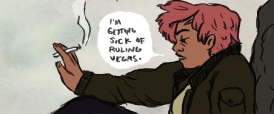
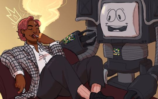
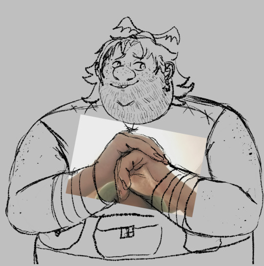
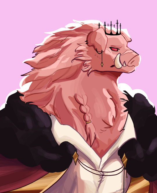
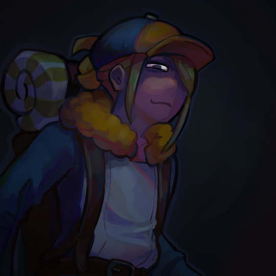
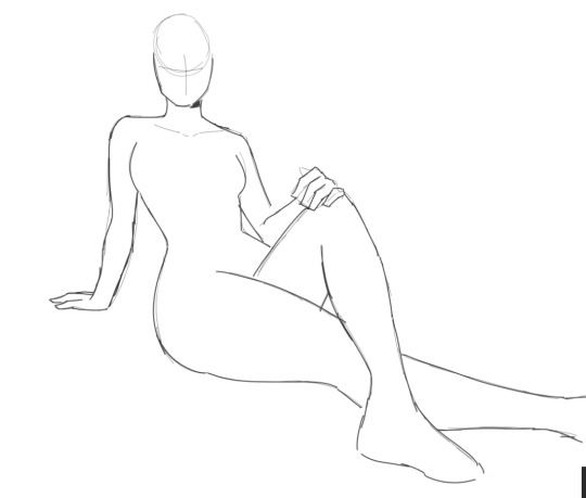
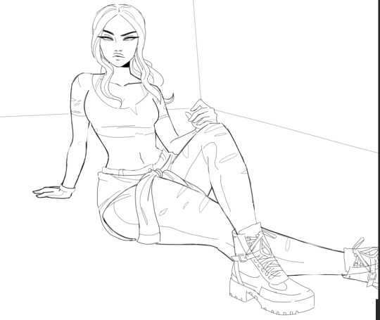
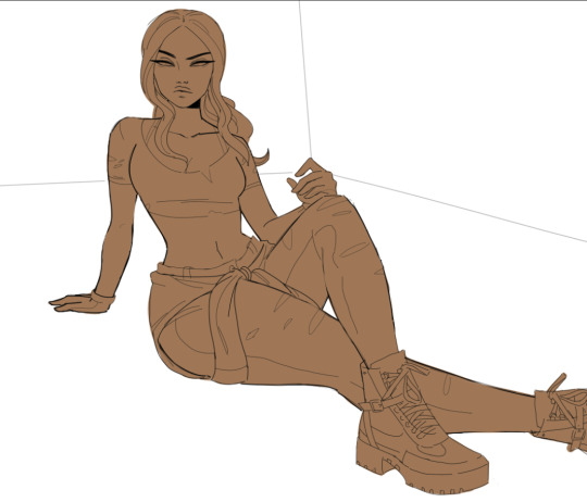
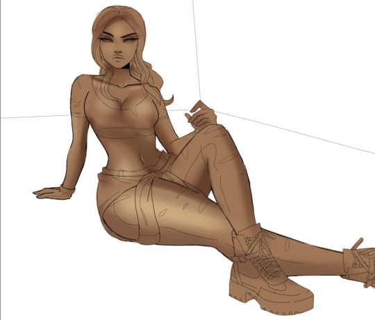
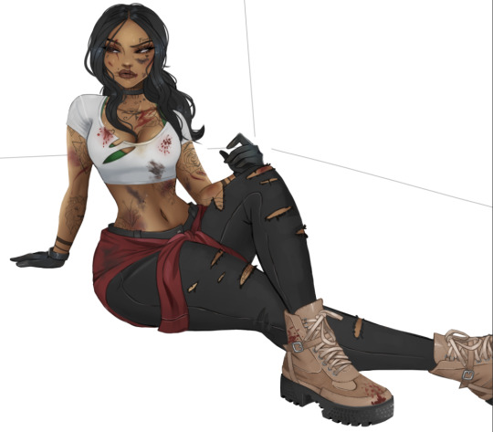
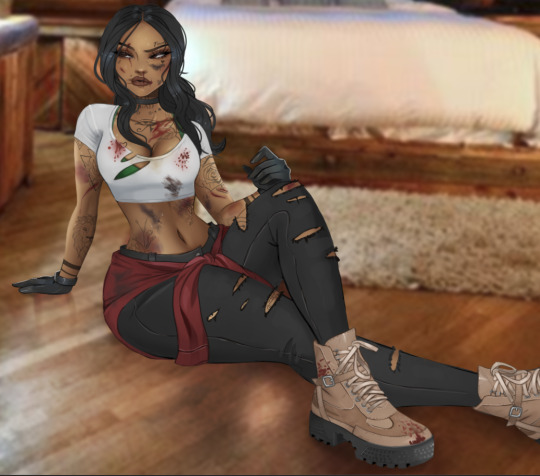
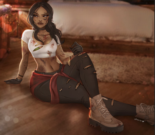
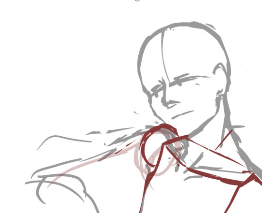
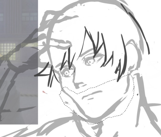
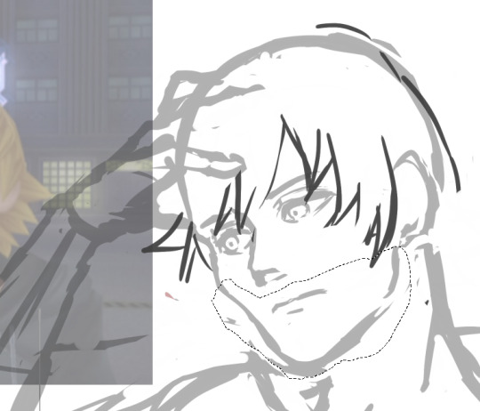
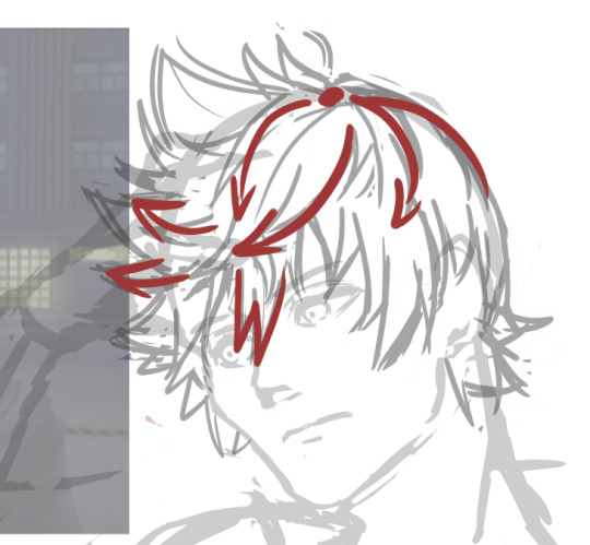
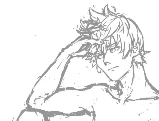
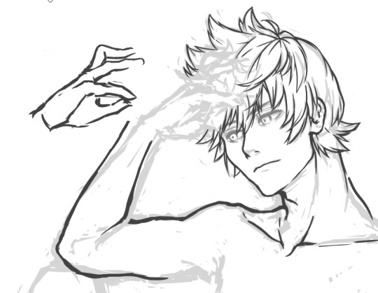
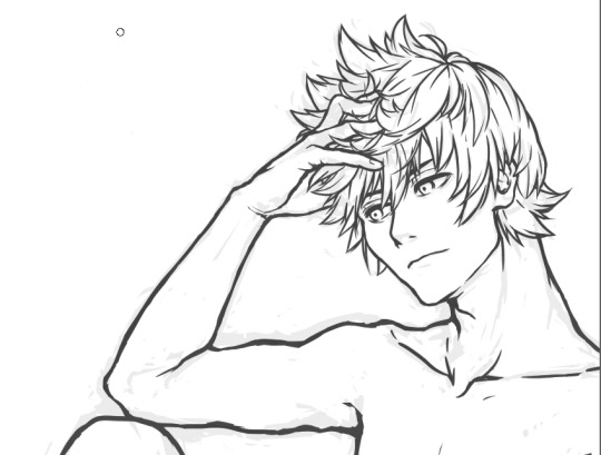
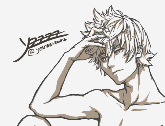
#i ended up shading with the same sketch brush i drew the lineart with and i lowkey love it??? i think im go na use it more often
Text
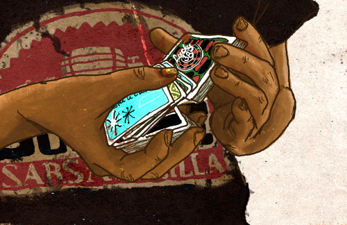
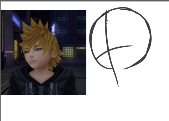
lineart and rendering process for my last post
#ra speaks#art#i ended up shading with the same sketch brush i drew the lineart with and i lowkey love it??? i think im go na use it more often
61 notes
·
View notes
Text
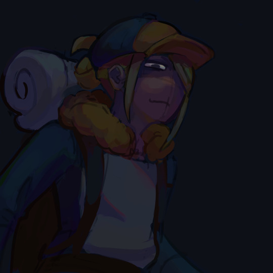
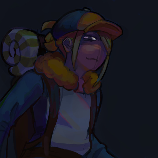
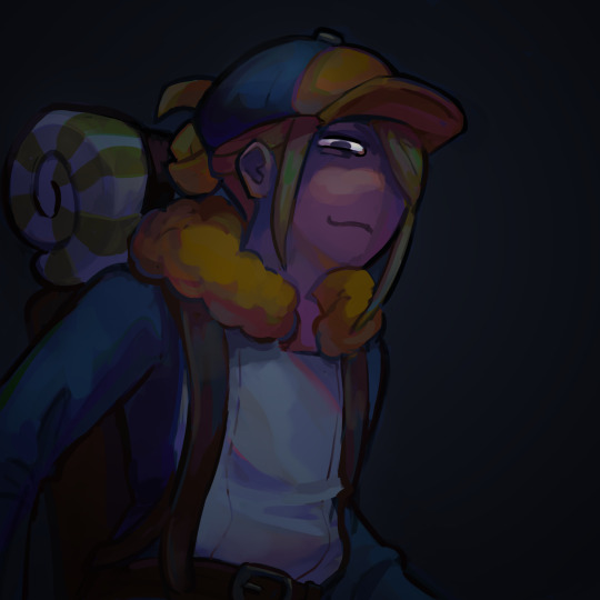
holy shit this year marks 10 years of this blog and moz!! i can't remember the exact date i started posting here - my archive says i have one post from november 2013 but let's disregard that - but i do remember it was around late 2014/early 2015 :)
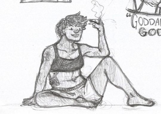
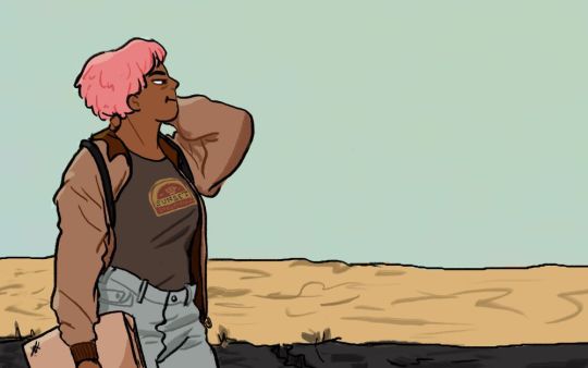
^ one of the very first moz art pieces i ever drew, for fallout week 2015!!
memories and art through the years under a read more bc it got long
2014 → baby's first rpg!! i started playing fnv on my cousin's jailbroken xbox late 2013 and finished mid 2014 and i loved every minute of it. i remember waking up at 8am and playing almost nonstop until 2am the next day haha!
i didn't play moz on my first playthrough - but i did start creating a character that would eventually become her: a shorthaired ex-boxer who punched her way through obstacles when diplomacy failed. i remember she spent a lot of time with boone. i liked him then, because he saved my ass more times than i can count. but i digress. this is draft 1 moz essentially
2015 → this is the year that i was doing my thesis so i could graduate but i was so depressed and stressed about it that i distracted myself by replaying fnv on pc, where i played through the dlcs for the first time. i fell in love with the dlcs' oversarching story; particularly ulysses, who i became obssessed with, especially since i couldn't find any content of him at the time. in the game, i played as moz; i had most of her personality and choices down, but her backstory was still up in the air.
fun fact: this was an existing sideblog that i remade to be a fallout blog so i could look for ulysses content, and when i couldn't find any, i made some myself, featuring moz as my main courier six. originally, i didn't ship them, but eventually i ended the year as a courier/ulysses otp shipper.
this was the year i started drawing digitally - my uncle let me borrow a drawing tablet and i used an old copy of photoshop i pirated hehe
2016 → i graduated this year!! and promptly fell deeper into my depression. this was the year that it got so bad that i had to be medicated. through it all, this blog and moz and ulysses and my fandom friends were with me. and for that i am truly grateful :) this was the year i figured out how to lock transparent pixels so that i could color my lineart lol
2017 → i started hammering out moz's backstory this year i think. there's a lot of sketches of her and her family in my files. i experimented with shading and backgrounds here but that experimentation was pretty short-lived
2018 → i started using references seriously!!!! i did a lot of oc on oc kissing this year, featuring mostly moz and many friend ocs haha

2019 → didn't draw much this year. actually this year was a blur and i can't remember much from it except from it being the year of my terrible no good bad copywriting jobs... anyway i did manage to continue my courier/ulysses brainrot and make this piece, which i'm still proud of
2020 → pandemic time. i spent a lot of time asleep at home and i think this was also the year i started doing commissions?? shoutout to anyone who has ever commissioned me - thank you so much, i truly appreciate it!!

2021 → i switched from my old-ass pirated photoshop to clip studio paint and never looked back. also i did a bunch of commissions for my grandmother's surgery, which failed, and i distracted myself from the sadness by drawing my ocs over and over and playing disco elysium

2022 → by this year, i've got moz down pat and have started vaguely developing other ocs instead. but she's still always at the back of my mind

2023 → i bought new brushes from true grit texture supply and immediately found new favorites that i started using for everything. i tentatively started incorporating background elements in some pieces!
2024 → while it's still too early to say where this year will lead me art-wise, i will say that i started experimenting in realistic paint studio (which i bought in 2021, the same time as clip studio paint) a few days ago and i'm liking the results so far. we'll see!

all in all, these last 10 years have been quite a ride, but i'm glad i stuck around and i'm glad you guys stuck around too!! much much love 💖💖💖
#shh peri shhh#god. look at that old art... i took the ones that i still kinda liked but the rest...#well i don't hate them. but they're old and of their time and i wish i could redo them lmao#my art#moz
83 notes
·
View notes
Note
Hi! I love your art and I’m so curious to know what your art process is like!
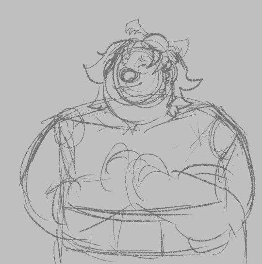
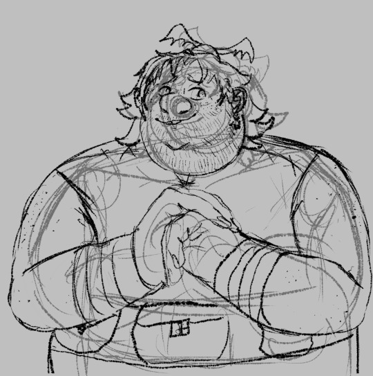
i've been trying to figure out how to answer this & i've honestly realized that my process is a mess LOLOL i did record myself!!! drawing fishlegs bc he is the fave & easiest for me to draw! i hope everything i explain under the read more makes sense!!
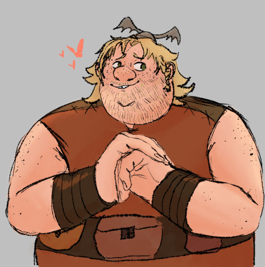
it took me over 44 minutes to draw & the screen recording in the art program i use (autodesk sketchbook) brought it down to about 7 minutes and 25 seconds. i didn't wanna speed it up even more bc it'd be way too fast & jarring i think but!! i've uploaded the video to youtube (with some animal crossing music <3)!! i will still try to explain what i did here tho!!
my initial sketches are EXTREMELY loose! i start with the head by drawing a circle & extending past it for the chin of the character & proceed to do the nose, eyes, & mouth!! hair is next, but if there's a helmet i need to draw, i'll do that before the hair!! then i'll do the body starting from the shoulders & going down!! for the hands i just do circles/a general shape! no details!!
the sketch layer is a layer of black for the brush color with with lower opacity
i immediately do lines on top with the same brush but with black at full opacity on the kayer above!! this time i actually take my time to be more careful with details BUT i am still very sketchy & if smth isn't 100% accurate after i try a few times, i leave it be! hands however...
i almost always end up taking a photo of my hands using the front facing camera set to a 5 second timer on my phone! i also draw using my phone so it's literally having everything i need all in one place lol!! i do trace my own hands but obv i adjust based on what i'm drawing!! fish's hands are def gonna be wider than mine!!
NOW for color i color pick directly from screenshots!! however i use it mostly for flats & then pick my own for shading!! let's focus on the flats for now!! i start with the skin always!! the skin is going to have color layers above and below it, so it's easier for me to see where everything else will go if i've got the skin all settled. here you can see my color layers!! these are ALL flats!!

shading & lighting i don't rlly... focus on being accurate 100% but i try to do it based on where a shadow would absolutely be/to give the appearance of some type of depth (my art is very flat either way tho!) like where his lower hand is cupping i'll shade but leave the top of the upper hand unshaded for the most part! i lay out everything in a multiply layer first (can be any color u want based on the vibe u want!!) & then use a smudge tool to blend it out!! same goes for the lighting layer!!!

my art overall is a lot of scribbling big lines & curves then using the lineart to do the same but slowly make adjustments until it looks acceptable to me. it's SO much erasing & reshaping & i always have sketch lines everywhere but i like how it looks. it looks like i drew it, u know? plus the httyd books art style is a HUGE inspiration to me, at my core. i didn't even realize it was until ppl on here pointed it out :') i also enjoy drawing fast & moving on!! which is just smth i've trained myself to do since my star fox days (the reason i draw in the first place!!)
thank u!!!! i hope this made sense!!
#rose answers#evilwriter37#httyd#fishlegs ingerman#httyd fanart#🌹 art#i hope this makes sense!!!!!!!#this was rlly fun to do!!!#i'm so unaware of my own process that i feel like it's a lil painful to watch the screenrecording of me#BUT u know what it works!!!!#also: i love drawing freckles LOLOL
25 notes
·
View notes
Text

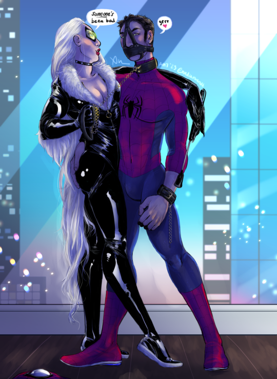
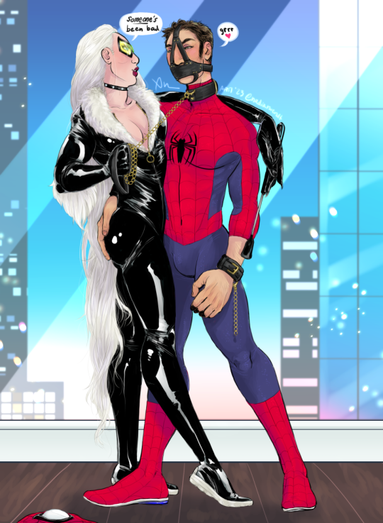
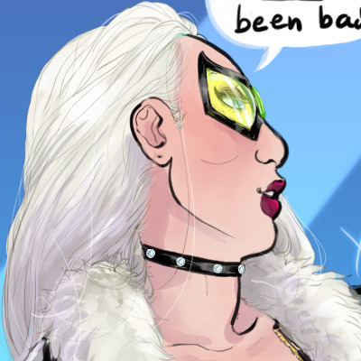
He's a biter, you know.
details and un-shaded version (and also lineart version) under the cut:
I meant to draw this for peterfel week and made the sketch in like, literally February but didn't get around to finally finishing it until now… lol… well it's done now!!!
i dunno if i love how the dark shaded version turned out...
These are my base colors, but I guess I just felt like spending a couple hours with color overlays and fucking around to make the final moody blue version lol
as an aside the bokeh is a brush by Bunabi/Eriart which you can find as a freebie on her patreon - i saw it and was like omg wait i could use that
...the buildings are also brushes (well the windows are)
anyway here's the lineart
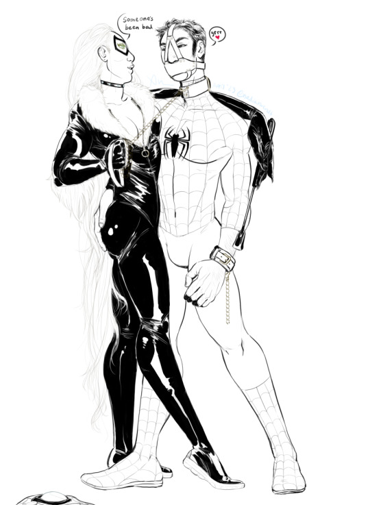
I also used a chain brush of course cause I ain't fuckin drawin all of that lmao —I used a brush from this set, they're pretty nice
😻 there she is oh i also used a diamond stamp 😂 the lesson to learn about me is if i can use a brush for something that would otherwise be tedious and it looks decent i will because i am lazy. unless i only have like a Single instance then I'll usually just draw it but when I have more than one it's either brushes or copy pasting lol
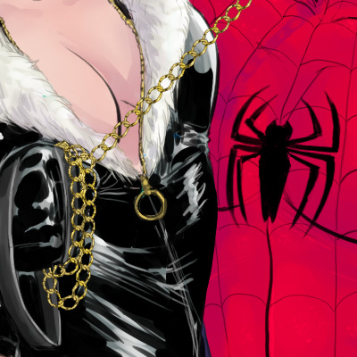
Felicia's outfit is a mix of sources, inspired by both her original costume, with the furry chest (in this case unzippable) as well as obviously more modern sexy latex outfits and so on... but i did NOT give her cleavage to her bellybutton cause I think that's dumb. though. to be fair in this case it would be more justifiable 😂
i love drawing her long long hair (angel medina's fault tbh) (sensational spider-man my beloved...)
rawr 😼
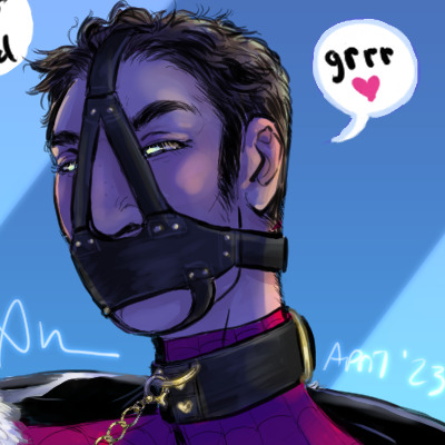
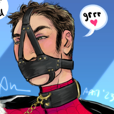
he's trying very hard not to laugh 😂 but he's into it, he's having fun
the muzzle ended up being like multiple designs from photo refs mashed into one so idk... how realistic it is other than the nose-forehead piece which was the same on both my refs. admittedly it looks a little loose but 🤷 still looks nice 😏

claws 😏
I also drew Peter in the classic suit, which I don't normally do, but I was doing more of the comic book look here instead of my own AUs and so on lol

he broke the cuffs so he could touch her butt 🙄 god peter don't you know how much real leather BDSM gear costs (don't tell him)
this new pen tablet is a lot of fun, it's way more comfortable to draw on and the increased pressure sensitivity makes it a lot easier to draw my favorite thing to draw: peter's arm hair 😂😂
the only weird thing is if I press down medium or harder while I'm drawing it... creaks? which is very funny, my old pen did not do that. it really is weirdly like using a felt tip pen or a very fine point marker. except it's plastic.

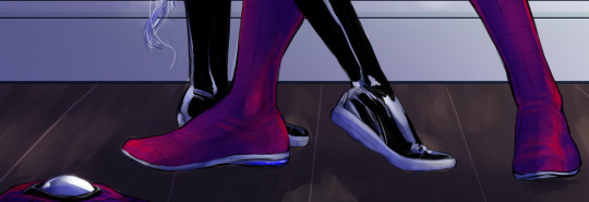
shoes. it may be classic style but I can never resist giving Peter sporty soles lol I know some people hate that but I just think it looks nice and I can handwave the sticking away as electrostatic forces or something. negative charge. electron transfer. blah blah blah. (in my AU i decided Peter has both electrostatic sticking that encompasses his whole body and ALSO adhesive secretions so if he gets his hands and feet bare i guess he has double the sticking power lol)
shaded versions just cause
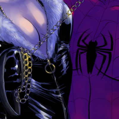
tits
i really like drawing latex lol


also if you're wondering why i didn't give peter a boner to match his red face well i have an out and it's that long ago i decided he wears a dance belt under the costume so as not to inflict the outline of his dick and balls on the people of NYC on a daily basis, and dance belts are first of all designed as mentioned to smooth out and hide that outline but also you wear them with everything pointing north and the waistband is like 5 inches wide so i don't think he has to worry about his little buddy escaping LOL (though I'm sure it's possible it would be more visible... i didn't bother trying to google it lol)
really i just didn't feel like trying to draw a boner 😂
19 notes
·
View notes
Text
Notes to self in terms of art practice. (Reposted from NewGrounds)
Don't delete old drawings and scribbles.
Use reference.
Sometimes use your arm when your wrist isn't enough in some areas.
Depending on character color palletes, make the lineart/sketches at first have an "outlier" color (Example: When drawing Bonka, i used some green sketchy lines underneath because it's not a color part of her main design).
When i can't use real numbers or better measurements for characters, might as well get creative even when measuring stuff by heads isn't enough (Like using some object like a Mario question mark block as reference and use it to measure a full character or head because why not).
Maybe use some transparency for your brush, specially for sketchy lines underneath the character; Nearly every artists does this, digitally and traditionally.
Dynamic brushes in general matter, even if your real life tablet/pen are limited and prevent you to explore Krita's potential in this area.
More scribbles and lines is probably a good thing if it helps me to choose the main lineart or at least add more details
Maybe portray lighting as "tubes" as the same size as an object, along with shading to add dimension and a "back wall" to recieve a shadow or something.
Use shading/lightning in general, even if it's basic, to make drawings less flat.
A good way to add shading is to imagine "prespective" from light: If light cannot see a thing/if it's behind something else, there's a shadow.
A way to add dynamism is to imagine/draw arrows pointing the "direction" of the shapes.
A shading technique i could take from some comics is have black lines tied to line art COMBINED with color value/saturation changing, to include 2 types of shading at once.
If certain characters have BLACK/WHITE as colors in their designs, use specific shades to differentiate from lineart and parts of shading.
In some occasions, remove lines from the main lineart layer, in case certain things look better without lines and are just 2 colors complementing each other.
Rotate the canvas and mainly use a horizontal one.
Try using a bigger canvas and stop worrying about scale or else that's how you end up with drawings too small for their own goods; It's why you had that face/body seperation idea in the first place and your faces look off because they don't have enough space to be "fixed".
Look up tutorials, both video and images, because i realized some Twitter accounts started deleting previous tweets so thank God i saved up some images myself.
Try to nail a balance between pratical and analytical.
Just draw more in general, even for small practice.
Use thinner lines.
When it comes to hair or pipes, maybe i could use thick strokes/lines in a specific layer then trace thinner lives above it.
If you have trouble with curvy lines, maybe go for straight/blocky lines at times.
Speaking of drawing squares/lines before circles/curves, how about drawing 3d shapes like cubes or prisms (hexagonal, heptagonal, octagonal etc) instead of cylinders? Specially if i twist these shapes.
Maybe make the pencil transparent and keep drawing the same shape before it gets more solid.
Close ups too.
Look up what the programs you use can do, can't believe it took me so long to learn about Krita's measurement tool, the freehand selection stuff and the quick clipping group thingy.
Also, mirror/simetry stuff and maybe the multibrush tool.
Use more "construction" methods because "building blocks" are an essential art thing.
Tracing is bad but at least use it to "deconstruct" certain images by drawing shapes over them, just to try and guess how other artists drew certain images; Basically, just to explore an image and not trace it for an actual piece because that's just thievery, will impare actual learning and anyone will catch me for it (In general, maybe go with photos of real objects and people instead of other people's art? I dunno, getting kinda desperate here).
Consider a gravity/mass/weight line and lines of action/movement to make poses less stiff.
Pose thing: Add circles to mark someone's feet for both ankles and toes.
When drawing circles for heads, i could draw a cross and turn it around and then add circles around the cross' lines to inspire prespective/angle stuff (Inspired by Akihito Yoshitomi).
When it comes to head shapes, maybe do the Bruce Timm thing where most males have a flat/linear chin while girls have a pointy one; Meanwhile, smaller/kid characters could be more chibi/anime-like in comparison.
Add more detail and shapes to "models" and anatomy before drawing the character in above layers.
Layer order could be: Lines/basic shapes > volumetric forms > maybe some grid map thing > sketches > colors > shading > main lineart
Maybe use better references like 3D models, i mean i got MakeHuman so better make use of it.
While at it, practice Blender.
Might as well draw as the first thing done when turning on the computer because i've been slacking.
Ask for some help.
Maybe try and setting up smaller goals, so opposites can happen and you end up doing bigger stuff (Because overpromising and ambitious goals can lead to little or nothing, so be better at selecting steps at least)
Maybe a way to do character concept art is to draw a "full body" piece where the face isn't there and then the "full head" with the actual face details.
I guess listening to music helps.
Need traditional drawing too, but i need to buy a sketch book and other assets first.
For the above, i could use a scanner or at least a phone app to digitize traditional drawings,
Maybe open up more to people about your ideas, if you want help in general instead of waiting for a big surprise that may not come.
Might as well lie to people and say "I'm gonna draw this" and make that manipulate me enough that i end up drawing "that" and it's no longer a lie (Something to do with how writing goals and telling them to others affects the probability of it being done or how you communicate the stuff)
"Why do i don't draw as often?"
It can be other reasons besides just lazyness, distraction, procrastiation etc:
I have to put my HUION tablet on top of my keyboard (And sometimes, i borrow it to other people if they need it).
My house was always a mess that my current room was built as a kitchen first.
I live in a small village where the electricity can be out sometimes due to construction outside.
Outside noises like church bells and animals (Ear plugs aren't enough).
My internet can be pretty bad, specially because of the USB thing my PC is connected to.
Most of my internet activities are private and i just don't feel like explaining people some of the things i do.
Speaking of real life, i could also be busy with jobs/work too, since i always expected that for better or worse, i'd have a second job for money reasons.
There's a lot of reasons why i not only want more money but to even move to a better house and place.
I just hope most of my ambitious and goals don't turn out to be regrettable and i become much more less like people who make "relatable artist memes" about how they don't draw and how quirky that is.
Better not let myself caught up by small inconveniences.
Any help about overcoming art blocks is appreciated.
1 note
·
View note
Text
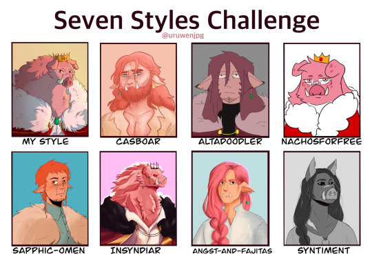
I challenged myself to try and mimic the style and designs of seven different artists. And what better subject to draw than technoblade who has some of the most varied designs.
Each artist's style proved to have its own challenges and I've learned a lot of new techniques while I studied them, some which I might even start incorporating into my own art moving forward.
This was very fun to do, thank you to the artists who volunteered (and to those who got selected out of the blue). Please go check out everyone here, they are all extremely skilled and cool people.
Artists featured:
@casboar
@altadoodler
@nachosforfree
@sapphic-omen
@insyndiar
@angst-and-fajitas
@syntiment
↓ Close ups of each and added commentary below the cut ↓

Casboar was the first one I tackled and I may or may not have had a mild breakdown having to remember how to digitally paint people. But being able to keep in some of my construction lines helped in figuring stuff out. Their Techno design is very fun to draw, big fan of the dad bod.
Alta's style intimated me a lot going in due to the more stylized 'cartoonish' feel and the fact that I had to use a brush I'm not as familiar with. But after I finished the sketch I knocked out the lineart in a few minutes and it was easy sailing from there. His stye was actually really fun to draw in once I got comfortable, good shapes there.

Going into this I was the most anxious to draw in this style, I was extremely worried I'd butcher the lineart. But similar to Alta, after I doodled for a bit I was able to get into a good flow and knock this one out pretty quickly. I also had to improvise on the brush since I don't actually have any pixely brushes.

This was the first style to be really challenging. I couldn't find a brush that fit right and all of my sketches were too similar to how I normally draw. So I ended up sitting on their blog and staring at their art for a few hours until I finally pushed myself to start. I probably stayed a little too close to the original sketch since there's definitely some messy parts.
This is the one I procrastinated on. Syn's way of shading/lighting is so cool looking but also terrifying when I remembered I had to do it. I had to alter the sketch several times and marked out where the highlights and shades were going to go. I definitely could have pushed the colors more for better contrast but I got to the point where I was too scared to keep working on it in fear of messing something up.
Realism has never been my strong suit and this is the one I'm the least happy with. Emma's art style kind of reminds me of d&d art and I tried to channel that when drawing but the sketch was too close to how I normally draw and the lineart got messy as a result of that. I should have pushed the value in the shading too but same with Syn's it just got to a point where I was too scared to keep messing with it.

I decided to go monochrome for Syntiment. It looked better that the colored version I did and also I think it just makes stand out more there were also a lot more references to work with. Unfortunately long hair is my enemy, I struggle a lot in drawing it and I had like three layers of sketches just for the hair. I also drew this and Emma's back to back so if they look similar no they don't
407 notes
·
View notes
Text
gonna post progress pics from my volo painting and write a bit about my process since some1 asked for them!
excluding adjustment layers this has 20 layers in all. i wont show all of them bc some of them just have minor differences but ill show my general progress
sketch. just super loose but has enough visual clarity to be able to work off of and not have to fix issues caused by poor anatomy etc later
background color + painting under sketch. to choose colors, i go on the color wheel and just kinda choose colors freely and almost randomly & paint w them by very lightly pressing with a hard round elliptical opacity brush set to a large size, blending other colors on top of them this way. i dont use this brush the whole way through but honestly i couldve and it still wouldve turned out good
a lot of trial and error but because were doing it so loosely its pretty easy to find something that works quickly (also sorry the painting is so dark at this point oops)
developed painting a bit more and upped saturation in some places using an adjustment layer.
to get a lot of the color variations im getting here, i colorpick from other areas of the piece, ie colorpicking from the face and using it as subtle lighting for the hair, seeing i like how those colors look, and using that as a jumping off point and using a more intense pink for the hair shading. you can also see i got some of the yellowish on the sleeping bag or whatever tf he has on his back from the hair/hat/etc, just brushed it on there really lightly and it looks cool. another place i like to colorpick from is where the sketch overlaps with the colors underneath, it creates some interesting desaturated colors.
you can also see im developing linework a tiny bit here, its pretty early on and a lot of it will be painted over later anyways but i start being like, okay the 3d forms i've been making are working, let's draw on top of the sketch a bit to encapsulate those areas
but yeah uhh definitely a lot of this is just testing stuff out when i'm this early in the painting, i am aaaalways in motion, never stopping and just working off of instinct and what looks cool. and if i mess something up, i can just erase it and i'll have the layer underneath to fall back on.
also im just straight up not thinking about anything at this point unless im trying to closely replicate a reference image, which i didnt do very much. i use reference for eeeeeeverything i make. i took a pic of myself at a similar angle to this and then loosely based the sketch off of it, looked at pics of volo, later on looked at some reference of how ppl paint fabric, grabbed some pics of how i drew one of my ocs who makes a similar expression w his eyes, grabbed images of other digital paintings i'd made! because i wanted to work in a certain style i'd done maybe only twice before. for reference images, i use pureref, which i would highly recommend to any artist, especially ones without dual monitors (like me). basically just allows you to make a reference board and pin it on the very top of your screen
just developed more in the same fashion, then threw a couple adjustment layers over it. i toned back some of these adjustments later but yeah. you can see the lineart really starting to come together, a lot of the color variation on it colorpicked from accidental overlapping colors that ended up looking cool. btw i need to make it clear i do lineart and rendering on the same layers. also i did the stripes on the pack just by using a multiply layer, then giving it more love on the layer immediately above it so it doesnt look cheap
more rendering, got a vignette going w a multiply layer. actually started using reference for fabric folds. theyre really simply done honestly and dont look like. amazing. but they work
painted over the vignette in the background to make it a bit more interesting & not just a gradient, more rendering as usual, threw in some subtle highlights to make it a little more interesting! i probably couldve gone further with them honestly. also decided to do a really subtle outline around him cuz it looks cool. lineart is basically done at this point and this is where i started to think i was just about done

desaturated it a little bit, re-added some details i forgot about, generally fiddled with stuff and corrected some mistakes, added signature. and its DONE. i think this took me about four-four and a half hours? yeah something like that
other general notes:
-probably favorite part of this is the sleeping bag or whatever the hell that thing is on his backpack
-not entirely happy with how i did the fluffy part, it has some really cool color shifts but it doesnt feel like a proper 3d form all the way through to me. definitely pretty 2 dimensional in spots, but i was like eh i dont care enough to fix it
-although i think the pose works well enough, its definitely another example of me using pretty static poses and basic composition in my art. which isnt too terrible but i really need to start getting outside of my comfort zone on that stuff. this definitely couldve looked cooler if i developed the pose more and did better foreshortening but i didnt cuz that shiht is hard to me. im really awful at foreshortening
-on that same note, i worked off of the first sketch i made and didnt warm up beforehand which you do NOT want to do. thumbnail stuff out and make multiple sketches. 80% of the time the sketches following the first one will be better
-IM NOT AN EXPERT lots of stuff i still need to learn dont follow this 1:1
OVERALL im really satisfied with this though especially for how quickly it took me to make it. & i hope this was interesting, lmk if you have any more questions on my process !
12 notes
·
View notes
Note
Hi, I've got a few questions for you if you don't mind answering them
1. How long does it take you to draw a drawing digitally? Do you have any tips on drawing digitally faster?
2. How do you shade? It looks SO good and I'm in love with your artstyle and shading 🥺
3. Are you ever gonna make a webtoon?
Sorry for bothering you, hope you're healthy, and have a nice day/night 🥰💜
sorry for taking so long to answer these!! i really had to think abt the answer so it took a while! sorry if the first one ended up being an essay
1. it tends to vary depending on how well i have the artwork planned out! the thing that tends to take the longest for me is the decision-making parts (sketch and composition, base colors, and colors again once im almost done but going “ok but...what if..”) and the rest(lineart, shading, details) is basically stuff that i can go on autopilot for. so if i already know what im gonna do and somehow stick to that, an artwork can take 3-6 hours depending on size! but most of the time it can take several days of having multiple artworks up at the same time, and making small changes in each at a time until im happy enough to move on lol. so its really hard to measure the time on those since i don’t really know if going back and forth between “lime green” and “turquoise green” for 2 days counts as me actually drawing. i also have a habit of always letting the artwork “rest” for a day inbetween steps where i dont look at it to make sure im not missing any obvious mistakes. (especially at the sketch and linework stage, if they look off the entire artwork will) looking at your art with a fresh eye is really important!
when it comes to speeding up the process i think simply drawing things often enough really is the way to go. its boring but to me the fast parts are only that bc ive done it so many times i dont have to think too much when doing it! (unless im trying something new, which i have been doing lately and oh wow we sure are Thinking in this house) also i see all my artworks as a very “step by step” routine, so i try to never go back once ive completed a step. it makes just moving forward easier. since i also have several artworks up at a time; theyre almost always at different steps in the process, so if i get stuck at or bored with say, lineart, i just go to another artwork where im doing final details and just have fun with that! it makes me feel like im always making progress somwhere. also dont be afraid to just redo something entirely if it looks off. save ur canvas and open a new one and start over, its usually way faster the second time and u keep ur previous mistakes in mind so overall? its faster than to keep adjusting the same parts of the artwork over and over and never really being happy with it, at least thats how it is for me! also also also; make your own brushes for things u already know how to draw but dont wanna do by hand 50 times over. like say, the diamonds in some of my works? theyre just a confetti esque brush with a bunch of diamonds i drew the outline of. then i color them in manually and do shinies and shades but i wont have to do linework for that at least, and its still in my “style” bc i drew them! (it also lessens the feeling of “cheating” that, i at least, tend to have at not doing everything manually) ....also get over the feeling that ur cheating when ur taking shortcuts. in this house we are Professionals who know what we are doing and there should be NO shame for achieving the same results more efficiently
2. ill post some images of my coloring process soon, i dont know if it explains things too well but it is an attempt hdhsbs
3. i cant write to save my life!! all i do is pretty drawings, which i love doing, but it would rule to someday work with others to create some form of comic or webtoon or just general story that i can illustrate!
#notmyart#anyway sorry for being long and late!!!#have a great day or night as well i appreciate ur ask!!#long post#i think thats how u tag those? for all the epic babes who dont read ily#process
21 notes
·
View notes
Text
some goofball’s attempt at a step-by-step tutorial
ok so i was requested to do a tutorial starting from a blank page. please keep in mind that i draw purely for fun & there are likely a lot of inaccuracies in my anatomy, lighting, etc.
anyway, onto the step-by-step! i use photoshop CS6. i mainly use round brushes (with adjusted hardness depending on what im using it for) and occasionally special brushes like a glitter or dirt brush or whatnot.
VERY long post so it’ll be here under the cut.
step 1 (pose sketch):
i start on a big 4100x3500 px canvas and find a pose that i like (this one was from amanda khamkaew’s insta, since i use her as chickie’s face claim) and i redraw it. i edit things that i dont like about the pose, so for example this pose was a selfie so her other hand was taking the picture - i decided to just have the hand resting on the knee instead.
it also doesn’t matter if your sketch looks like dogshit at this point, MOST of the corrections happen later.
i normally draw in a dark grey, but i really can’t see that as being an important step.
step 2 (detailing the sketch):
here i put more effort into the sketch. i add the clothes, hair, face, and fix up things to make them more realistic (like her hand, which was previously just a bunch of blocks)
i use reference for all of these things. with the eyes, because im lazy, i copy and paste the one i draw first onto the other side and fix it up. same with the shoes. i drew one, then copy and pasted it to the other foot.
i clean up the linework a bit, change the colour to black, and add a little dark triangle underneath the chin (i dont know why i do this, i just like how it looks) and added lines in the back just for a general idea of the angle of the picture and ta-da! sketch done.
step 3 (base colouring):
on a new layer i colour the entire sketch using a hard brush with one colour that’s easy to see against the background, most times the skintone of the character i’m drawing. if their skintone is too white, i’ll just colour in a random, darker colour and once i’m sure there’s no gaps or spaces that aren’t properly filled in, i lock the layer and change it to their skintone.
step 4 (skin details):
here i lock the layer and use a soft brush (0-30% hardness) to add the shading of the body. even if something isn’t going to be exposed much, like the skin in the ripped jeans, i still shade it anyway just to remind myself of where the shading is going to go. use a big brush at first, then decrease the size for details.
don’t mind mistakes here, especially not if they’re in areas you’re going to cover up later. i don’t do TOO much shading on the face at this point because i like to leave that for when i’m focusing on the face later on in the drawing.
step 5 (uh.... everything else):
on separate layers clipped to the skin layer below, i add the colours of the clothing as well as the hair and makeup. i do basic shading and once i’m satisfied with how it all looks, i merge it into one layer.
i also merge the colour layer with the lineart layer, so EVERYTHING at this point should be on one single layer. if you notice a mistake, just undo it, fix it, then merge it all again. if you decide later on that you don’t like the colour of something, create a new layer, clip it, colour over the area in question (using a layer effect like overlay or multiply), adjust the colours to what you want, then merge it again.
step 6 (the bulk of the work):
once the layers are merged i use the liquify tool to adjust anything i don’t like about the silhouette. for example, i wanted to extend and thin out her torso and increase the size of her butt (a common step for me tbh...)
i draw over everything with better details. i focus on one thing at a time like shoes, pants, shirt, gloves, etc. and use references for all of them. if you’re unsure about a change you’re making, you can always draw on a new layer and then merge it down once you’re happy with it. i aim to either erase or draw over all the lineart by the end of the piece - which is why you shouldn’t spend TOO much time on the initial sketch.
i ended up not liking how the shirt was ripped before, so i coloured over it then added different tears where i wanted them.
NOTE that this is the most LENGTHY PROCESS of the entire drawing. while i can have the base sketch and colouring down in an hour or two, the adding of details can take TRIPLE that amount of time. maybe there’s a faster way to do it all, but honestly i don’t mind, because (again) i draw purely for my own entertainment.
step 7 (yes we’re still fucking detailing, folks):
by this point you want to kill yourself because of how finicky you’re being with the details, but you keep going anyway even though you know you’re only two-thirds finished with it.
i’ve finished the details of the clothing - once again looking at references for ALL of them - and can move onto my favourite parts. namely the skin, face, and hair.
also, i utilise the layer effects (mostly overlay for lighting and multiply for shading, although it can vary) to easily add depth to what i’m drawing. i clip the layer, change the layer mode, and colour away. it’s MUCH easier than colouring the shade in initially especially on more complicated parts like the shoes.
when i shade the face (not done here) i add more detail to it. i add the shading and lighting via multiply/overlay, and i also add a blush to the cheeks just to give the face some more colour.
step 8 (the hardest part is now DONEZO):
the skin is shaded, the face is perfected, the hair edited, and the gory details like blood and bruises and dirt are now added. fantastic!
i use SHAPE DYNAMICS on the brush when i add the strands of hair, it essentially makes the brush taper off rather than be one shape the whole time. on a separate layer, i add the gore. for the blood/cuts/bruises, i use multiply underneath the actual wound to add redness. again, USE REFERENCES for everything you do, it’ll make it look so much better trust me.
i DONT MERGE the initial drawing layer and the layer with gore and dirt on it. you can if you like, but i like to keep them separate JUST IN CASE.
for chickie’s tattoos, i create a new layer and CLIP IT then copy and paste all of the tattoos i have in a separate file onto her skin. i erase all the parts that wouldn’t be showing, put the layer on multiply, and adjust the opacity or the colour depending on how faced i want it to look.
step 9 (the background):
unless its a simple background i can easily knock out myself, I DONT DO MY OWN BACKGROUNDS. i normally have an image in mind (for example, since this is chickie in far cry 5 i was envisioning her inside a cabin, so i looked up cabin interiors) then i find one i like, add it to the background and adjust it. i use gaussian blur on it, edit the lighting and shading with overlay/multiply once again, and mess around with the shaping tool until it at least somewhat matches the perspective it should be in.
step 10 (filters!):
i make a group of all the layers involving chickie and duplicate it. on the second copy, i go into blending options and remove the R channel, so it’s got a bit of a chromatic aberration effect going on. i move the layer around for a subtle effect. this isn’t a necessary step it’s just something i’ve done for ages.
i also play around with layer effects like colour dodge, multiply, overlay, hard light, etc. and add in extra lighting and shading to the image. i use colour dodge for the harsher lighting on chickie’s left side where the light is coming from the window, and i also use a WHITE colour with outer glow on to add even more lighting to her. i trace over the outline of her hair and body, and draw over the little shinies in her eyes for a subtle glow on her silhouette.
i normally end up with like.... 4 or more layers of filter so i tend to group them all together in a separate group.
also i add my tag “eshos.ian” which is my instagram account and THEN, finally, after roughly 8-12 (don’t know, didn’t time it) hours of drawing it is complete. sometimes i add further filters on it with apps like insta but this is the gist. isn’t she beautiful? waw.... i sure do love me some chickie.
i hope this has been a useful step-by-step and that you’ve learned something new! if not, sorry lol i tried.
21 notes
·
View notes
Note
i really love your art style. like holy crap i aspire to draw with such clean lines, nice angles and tastey cross hatching. idk if you can share a tip or what inspired your style but wow i love it 👍💜
AWH thank you!!!! That means a lot to me ;o;o;o;o;o;o;o; Nice angles and tastey cross hatching is exactly what I strive to have in my art because those are the most satisfying to me in art!!! As for tips or inspirations, I can try my best to share as to what I do to achieve my style :’D!!
Here’s to how I draw:
I don’t know if I have any tips but I generally just sketch with barely any pen pressure (or just none at all) and on full opacity. I make sure to finish a line in one stroke, though I generally also do a lot of them in two strokes and clean up after. Actually, with lines that are long, I sometimes leave two strokes if the initial one I did looks wrong in some way! To me, it looks much more satisfying that way XDD Though I don’t do that in actual lineart. I just really like thick lines djfhjdf I use a lot of triangle shapes :”D
When I’m using a brush with no pen pressure or opacity, I usually draw with 3 sizes of a brush. Usually just 3, 4, and 5. 3 for the small details, 4 for generally everything, and 5 for an outline of what I want to be emphasized! When I’m sketching this way, it’s really easy to just clean up and turn it to something that looks like actual lineart djfhdjksf. If I’m doing lineart for real though, I make my drawing at least be larger than 1000x1000 pixels and use a brush that’s either 12 pixels or higher depending on how large the image turns out to be >:D!
I use a LOT of references when I draw something, I barely draw anything without a reference and it really helps!! Don’t be ashamed of using references since, as artists, we’re all taking from reality in some way after all! I even have a folder in my laptop full of body references ready to go XDD
With stabilizers, I either use none at all or just never exceed ‘6′ unless I’m doing really long straight lines or a perfect circle. Line confidence really changes the game man djhfjkdhs All the hatching I’ve done over the years has helped me become less anxious about my strokes. If I can get away with it, I also turn most curves into straight lines! (I really like the look of blocky things though at the same time I strive for it to look soft as well djfhdjsfh)
Layers, layers, la y e r s. When I draw ANYTHING, I always have so many layers jdfhjf The first layer is the base/general shape, second is the first pass, (if I still don't like it there’s the second pass or even third;;;), next is additional details, and next next is even more additional details djshfjh I just merge all of them in the end and even then some parts I keep a copy of as a ‘just in case’ sorta thing djfhjs
If you’re having trouble with a drawing, its generally a good idea to redraw it (or at least a part of it)! Learning when to abandon a drawing and instead redraw/start anew has helped me improve a lot!!
Here’s the inspirations for my art:
My main inspiration that’s stayed consistent over the years is Zukich! Their lines and the aesthetic of how they draw is what I hope to hit one day though I still have absolutely no idea how they line or color their pieces djfhjf. Just looking at any piece of their art is re al ly satisfying and if you look at any of my drawings that are vaguely cartoonish/chibi-like, you can kinda see it XD
Another is @/princeofmints! I used to take inspiration from him with how I drew bodies and I still do! But I usually just want to draw bodies like those in shounen anime XDDDD
For my hatching, it was tamaytka that initially inspired me :D! I initially just used it to block in black colors when I didn’t have a tablet but I started using cross-hatching to shade traditionally as well so that turned into something else XDD I’m generally a bit too lazy to do it now though dsfghdjksgf
These people have all been inspirations to me, their art has helped me in shaping how I want my art to look like and I hope that in some way I’ve succeeded in deviating and not just outright copying :’)
Please feel free to ask me anything or tell me if you’d like me to expand on anything here :”D!! I’d like to help anyone struggling with art since I’ve been through those pains as well djhfjs I’m not exactly an expert but still :’DD
#this is a long one but i hope i helped in some way!!!#because i personally remember being hella frustrated with my own art style :((#fio text#laragigi075
13 notes
·
View notes
Text
why is digital art hard?? like
when i'm drawing traditionally i have almost full control of my strokes, they are always smooth whether i draw them slowly or fast with just one motion, and like - i'm not a master at it but at least i feel like i understand what i'm doing
and then there's digital. where literally no matter what brush i have (and picking brushes is such a problem for me for some reason? i literally can't make any clear sketches because of that and i have to draw lineart just based on a simple sketch with only basic shapes which is fine if i'm drawing a full piece, but when i actually want to just stay sketchy and make some fast doodles it just,,, doesn't work,,,,,,), no matter what settings i have for the quality/speed ratio and no matter what size and resolution of canvases i use (which is also a giant problem for me :)) i always end up drawing either super wobbly or super sharp lines, nothing in between and i just get so discouraged by that
like literally- when i want to draw traditionally i can just take a piece of paper and,,, draw? i don't really need any warm up sketches for most of the time either, but when i want to draw digitally and actually make something pleasant to look at i have wait untill i rhavr a "special day" for it, because otherwise it will turn shitty no matter how many shitty warm up sketches i make
it's just makes me sad... like i want to learn how to draw digitally, i really like how the drawings can turn out and i'm even quite okay at coloring, heck, sometimes when i actually have these "special days" i can actually make something pretty, but overall the process of trying to draw anything that is on at least average level for most of the time is extremely tiring and frustrating, because in traditional it would take me a few minutes and look quite good, and in digital it takes me so much fucking time and eventually ends up looking maybe alright, but way worse than if i just drew it with a pencil
i have my tablet for like, four years now? and yea i did some progress in coloring and shading for example but my lines are usually still as shitty as when i just unpacked it
i don't know. again, i really really really want to be at least on the same level as i am in the traditional art because i love what you can do with this medium, but at the same time i don't even know what i'm doing wrong...
if you're still here, sorry for complaining so much, but also thank you for actually reading my thoughts and emotions, i kinda needed that
3 notes
·
View notes
Note
Heya just wanted to say I love your work, it’s so crisp and satisfying 👌🏻👌🏻 I do have one question and I’m really struggling on colour and linework... any tips? I’m on clip art paint but ahhh!?
@cookie-kagehina
Hello, thank you so much! I always see my work as kind of messy so it’s a surprise to hear you find it crisp!
I don’t know if my methods will be much use as I just kinda wing a lot of things, but here are some things and hopefully you find something useful. I use Clip Studio Pro Paint, which I think is what you mean?
First, I draw on a large canvas so from ‘far away’ things looks cleaner I think? I always start with a 11inchx17inch 300 dpi (3300x5100 pixels) although my recent piece was cropped to 2700x3900 px. Below is an idea of what you might see on mobile vs the original size. And boy you can see my messy paint-strokes especially on areas I don’t really care too much about (like Shiro’s hem+pants vs their fingernails) So this is probably the secret?

As for color and lineart, I kind of go the “oil paint” method? So I don’t really do much lineart. Sometimes I do, but my lineart = clean sketch
(1) After I get a decent sketch done (I usually do multiple clean-ups until it becomes coherent). (2)Then I create a lineart layer only for the face/eyes or things I’m likely to repaint repeatedly because I don’t want to draw it over and over again.On a new layer I usually paintbucket the whole thing white, or whatever overall color I’m using (this helps the paintbrush stay consistent?). (3) On the same layer I draw the lines…like another sketch (sorry it’s hard to see it). Then block colors in right on the same layer with a translucent brush so I can still see what I drew… (4)THEN PAINT. I color, shade, redraw lines and repeat. I also HEAVILY rely on the eye-drop tool to pick up appropriate shades and colors.By the end of it, I may or may not have got rid of the ‘lineart’ of the eyes/face. Depends on how much I had to change it.

This is generally my method…may not be the most efficient and I will often create new layers to redraw parts or try out different colors/clothes/positions in case I end up liking the original better since if you paint over it, it’s gone. If the file is getting to layer-heavy I will create different copies of the file/drawing.
Wow, this turned out long…I hope this helps a little?
74 notes
·
View notes
Note
Yo yenrz, I love your work and I was curious if you could show like a step by step process for what you do?
I really need to stop answering asks so quickly I have a LIFe tO LivE
So here’s a step by step blog about how I draw stuffs
Keep in mind that the end piece is still a WIP however. I’ll post it in full later.
Also if you’re asking about how I construct my text blogs I’m sorry I misconstrued the meaning of your message
So let’s start with what kind of brush I use:
I use the default pen brush on a little program called Krita. It’s free if you want to try it out.
Here’s said brush in action:
I always start with a rather huge brush size, since It’s easier to make larger, longer, broader strokes. Also that way I don’t have to constantly change my brush strokes to erase large areas (which happens a lot when you sketch) The main detractor for this method is that you get really messy sketches however >.>
And like most pansies, I don’t go full on black. We artists have too much anxiety to deal with that.

TIME TO DRA-
wait I forgot to put on some music

youtube
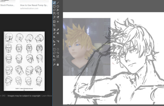
K, so I’m going to be drawing our boy Roxas today because I made a screenshot for the previous text blog I did and I thought he looked really freaking fine in that shot. So I wanted to make a quick body study with facial expressions giving that same kind of edgy mood.
So I first start out with a circle, mapping out the direction that circle is pointing towards.
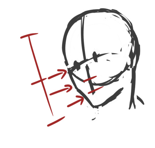
An important thing to keep in mind when drawing ANYTHING, especially if you’re a beginner, always remember to map out where the parts of your face are going to be. That way you don’t get trapped in a rabbit hole getting sucked into drawing your perfect eyes/nose/whatever facial feature and then realize when you zoom out that it looks like your person underwent a botched plastic surgery.
Rules of thumb to keep in mind about faces:
Eyes are at the midway point of your head
Distance between eyes should be about an eye wide
Ears are around the same level of your eyes
CHEEKBONES EXIST and Jawlines are square
So moving on, I go on and start sketching out the pose. Keep in mind that during the process, I usually don’t really know what I’m going for, so I test out different angles and positions and etc.
So while I settle in, I finish deciding how I want the shoulders to look.
But-

I notice something looks…off.
If you’re a beginner, it can be hard to tell when something is wrong with your drawing. Or even worse, you’re an early intermediate and you know something’s wrong but you have no idea how to fix it. And then you start going down a very, very deep rabbit hole trying to fix it and no matter how you fiddle with it…it never quite looks right. Yes I know the struggle.
So here’s the solution:
Break down the figure into simple forms. The key to making this work is that you must have ample knowledge of proportions of body parts respective to one another.
So here are rules of thumb for drawing most bodies (teenage or older and your figure isn’t larger or shorter than average)
Each half of the arm is about the length of a single head
The arm should reach to the halfway point between the hip bone and the knee
The torso(from the base of the neck to the pubic bone) is about two heads
Each half of the leg is about the length of the torso starting from the hipbone(not the end of the torso)
Boobs don’t jut out the sides unless you’re drawing really big boobs
Also, in this case, i’m utilizing a bit of foreshortening because the shoulders are in perspective, as in they’re facing away from the viewer a little.
So now it’s time to add the arms and hands. And like any other body part, I break it down to basic forms first (when you become an uber drawing deity, something I’m clearly not, you’ll be used to this and can skip over this step )
Hands are one of the things you see beginner (and even advanced) artists cry about for days. For good reason.
So the basic forms are like this:
Draw out your fingers as lines first. Also reminder that fingers are three segments long. Not two, which was evil propaganda that I was fed when I only drew anime.
Also and size should be about the length from the chin to a little above the eyebrows
Also I forgot to mention…
ALWAYS CHECK YOUR PROPORTIONS THROUGHOUT DRAWING. ALWAYS.
And once I decided on the placement, I start mapping out the actual shapes.
Also I wanted Roxas to look more manly and such so I looked a reference image to make his jawline/cheekbones more manly so yeah
So now that I’ve decided on the overall pose, I start on the details.
Also another rule to draw by that I’ll shove down your throat
DETAILS SHOULD BE YOUR LOWEST PRIORITY WHEN STARTING OUT. Start simple and get the whole form first, then start adding details. This ups your productivity and prevents you from getting lost in rabbit holes
It’s called rendering for a reason.
So I start adding the eyes and such and I’m overall satisfied with the face. And now I get started on the hair on a new layer. I don’t want the face lines to interrupt with drawing the hair, so I lower the opacity of the face layer.
I check how it looks by zooming out to see if everything looks alright. Oh noes he looks a bit too manly
Shrink that seme crap
Much better I know I didn’t follow the meme format shoot me
K now time for the fun part: the hair.
….
I just want to give a moment of silence for all of the times people have suffered from drawing Roxas’s hair.
….
because by golly his hair is the one I see beginners dun goof up the most out of all kh characters.
K moving on, the keyword for Rucksack’s hair is WINDSWEPT. And funny enough, there’s actual logic to how his hair works. Everyone’s hair has a center line/point where said hair flows from, whether it be a part in the hair or a eye of a hurricane thing because I don’t know what the name for that is.
Roxas’s is the latter. Demonstrated below:
See what I mean? It’s like an upside down wave going like whooooosh
Come to think of it, all hair should follow this rule. It should either be flowy or whooshy
Unless you’re Tetsuya Nomura, then you get to break all the rules
like seriously what the fu-
So now that’s done, I go and check for the gazillionth time, mirroring the image to see what I screwed up this time.
Oh noes something’s wrong with that shoulde-
Also I forgot here’s how I draw ears
-r it looks off.
That super spidey sense of knowing something’s wrong with your drawing is there for a reason. Heed its call.
Also if you think there’s nothing wrong with that neck, draw naked people for a couple of months and you’ll see why.
So when something’s wrong you do the usual. Break it down to simple fo-
Or just use a reference.
Looks acceptable now. Time to start the lineart.
Out of personal preference, I like to lower the opacity to
Even as I do the lineart, nothing is set in stone. The sketch, at times, isn’t enough to go off of. So in that case, let’s go back to the reference.
Also I hit a roadblock when drawing the hand so move it out in the open so I can get a clearer look at it.
Also I use my own hand as reference a lot so I accidentally make make my manly men have delicate pansy hands.
This hand pose isn’t natural at all but I’m okay enough at this that I’m able to make it look okay
Study hands kids. They’ll do you good.
….
I forgot to draw him clothes daMMIT
Whatever i’ll just slap some cel-shade lighting on it and call it a day. This is still a WIP so expect a not-naked-Roxas later this week
Thank you for reading! Here’s a link to my twitter, And if you would be so kind, please consider supporting my patreon.
127 notes
·
View notes
Text
Portfolio Breakdown: Recycling
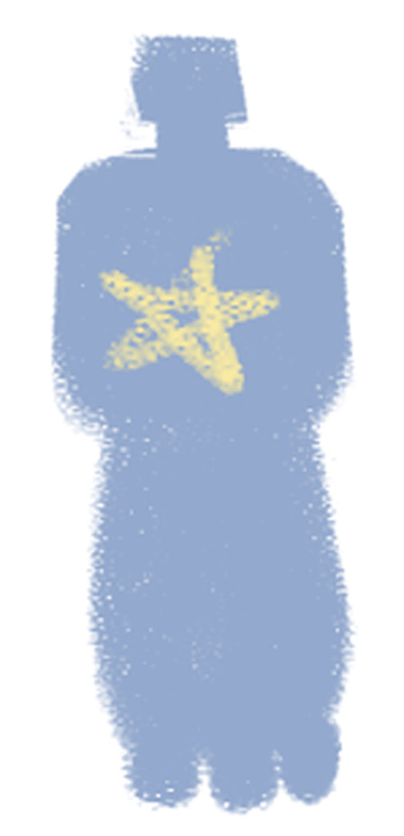
Water Bottle:
Original version:
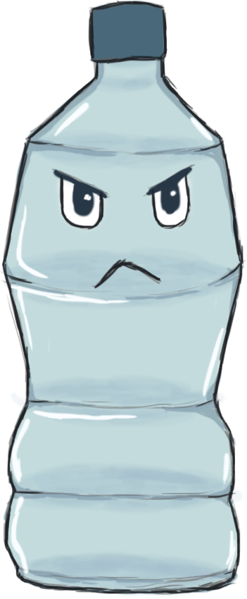
This was my original first rough design for the water bottle. I wasn’t super pleased with it as it was a bit rushed. We felt that an empty water bottle fit well with the recycling theme.
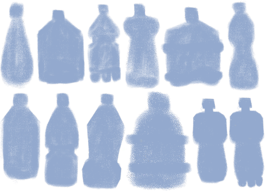
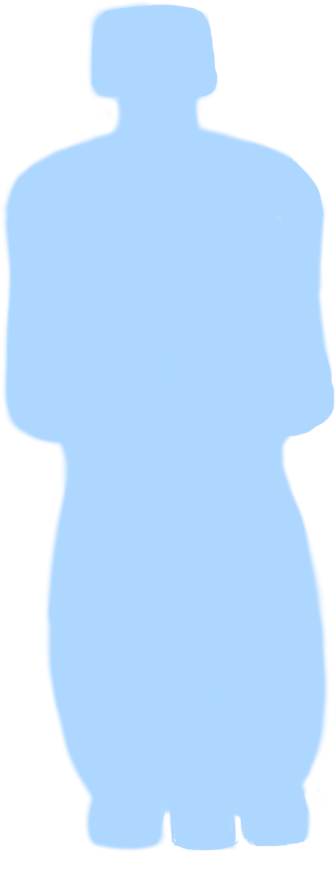
To redesign the original, I made a bunch of silhouette shapes of bottles to see which people liked the most.
I especially liked the bottom right one, as it is shaped in a somewhat human-like way, with a neck, large shoulders and the bits on the bottom look like feet (albeit three of them, so not so human). This one became my initial base for the final designs.
Final Variations:

Blue bottle, angular eyes.

Pink bottle, large angry eyes.
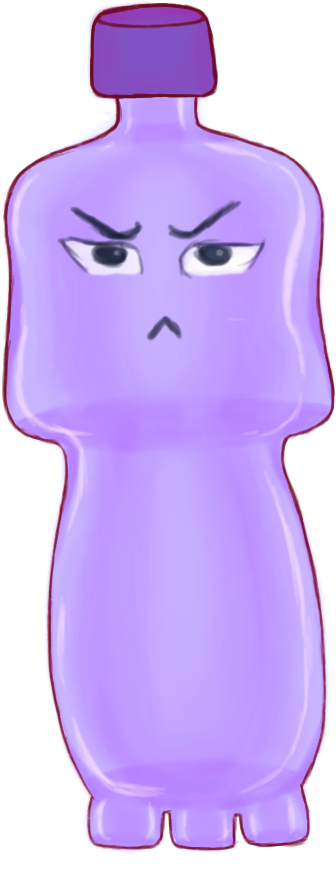
Purple bottle, smaller squinty eyes.
Out of these, the blue version was my favourite. I provided a variety of eyes for the character here to vary their personality through their expression a little, but different eyes could be combined with a different from colour from that which I gave.
I am fairly happy with how the design came out, although I would now redesign it to be more symmetrical and use a proper reference for the ‘feet’ on the bottom as I improvised those, although they are supposed to be exaggerated anyway. I would also clean up the outline a bit.
Progress:
I used Hue/Saturation layers to provide the different colour options and set the eye sets all on their different layers in groups.
When I sent over silhouette bases to the modellers, those they liked they sent back to me with stars marked on them, as seen above, so we all agreed on the design. I took the base above into Photoshop and used it to set the general shape of the bottle.
I cleaned up the shape in another layer. This was one of my very first designs for the game so I had not set the outline very cleanly like I learned to with my later designs. The outline I added later disguised the mess of it.

I added another layer and used a Soft Brush with a lavender shade. I wanted to give the bottle depth, to show it was transparent.
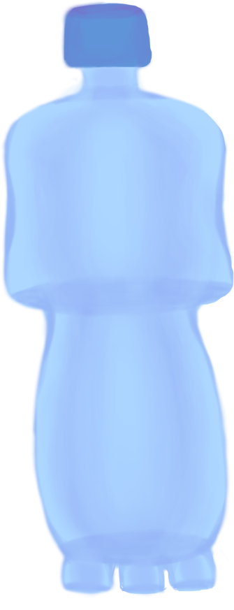
I added some soft shading in the middle sections.
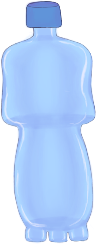
I added some lighting on another layer to show the bottle is shiny.

I added the first light outline and the first set of eyes in another layer.

I duplicated the outline layers to darken them, and then later used the Hue/Sat layers and eye sets for the other versions of the bottle.
References:

(Staples, N/A)
It was a while back, but I believe I took my reference for the bottle shape from a bottle similar to this and squared it out myself to look more human-like.
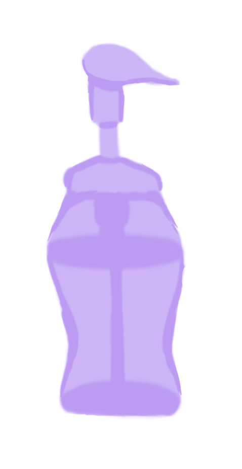
Soap Bottle:

This was another early design which only has one version, as the modellers had not considered adding it to the game after viewing it. If they had, I would have created alternatives and a better design.
This type of object was chosen as a character as it was not super clear what kind of things we would be having for the recycling level early on. It turned out to be mostly food related, with bottles, drink cups, wrappers etc. However, I still feel something like this could have added some variety into that theme.
I shaped it to appear a little like a bird, with the top of the bottle being like a ‘beak’ with where I positioned the eyes. If I were to redesign it, I wouldn’t set the eyes on the ‘top’ of the bottle as I have here, it is incorrect. I would thicken the top section and put them on the side just below, so that the top isn’t pointed downward as if it were bent. However, I am pleased with the vibe the character has.
Progress:

I started off with a roughly shaped out bottle. As with the water bottle, it was an early concept and so wasn’t blocked out as neatly as later concepts.

I added some basic shading to show the depth of the bottle and transparency with a soft brush in a new layer.
I added more shaded in the centre to show the centre pump.

I added some violet shade to add some colour depth in a new layer. I also added in the eye in its own set of layers for the pupil, iris, shade and outline.
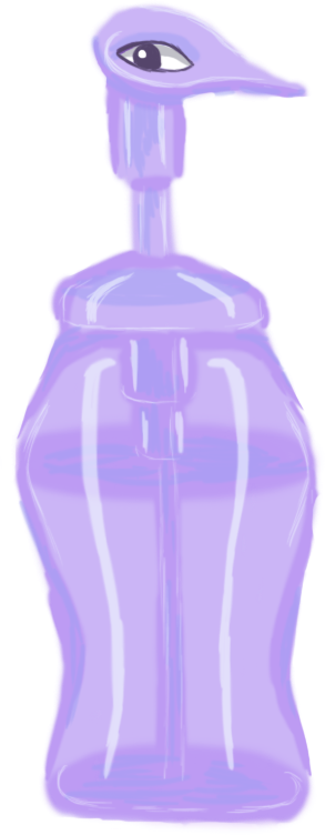
I added a new layer for shine, also adding some shine to the eye it.

I lastly added an outline, which helped to disguise the rough outline.
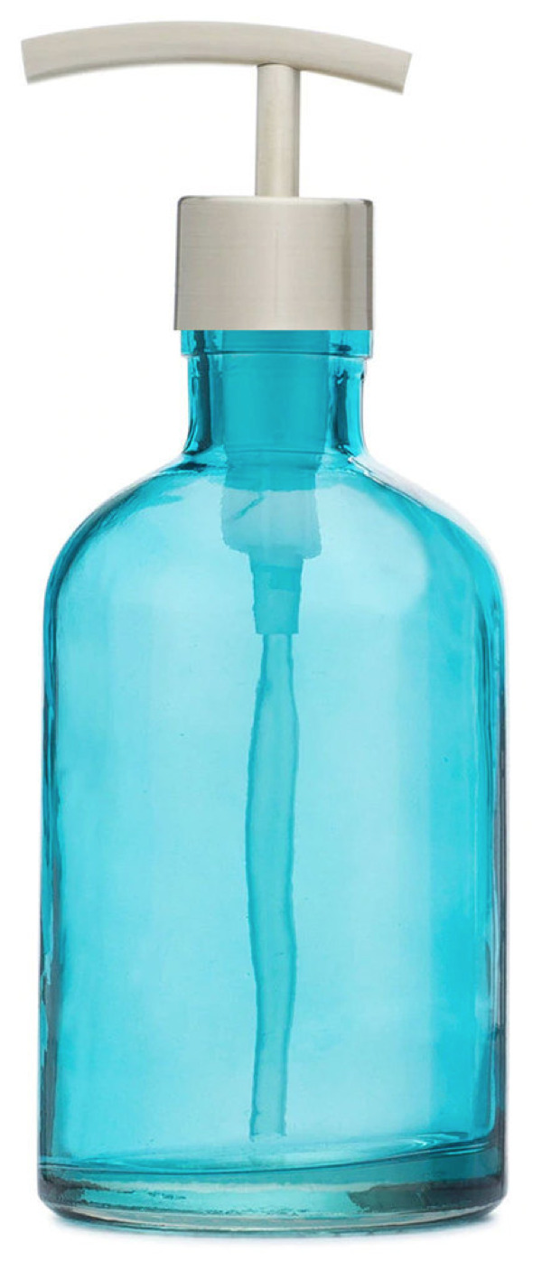
(Rail19, N/A)
I did not use many references for the bottle design, but it was such as the above which gave me the reference for how to draw the pump down the centre and the cap. I gave the bottle a curvier body as a design choice.
Candy Wrapper:

Being made of plastic and food-related, this was chosen as a good idea for the recycling level. This was another of my first designs, as I designed the majority of the Recycling designs before the Deforestation ones, as we had not yet set which level we would have first.
I only designed one version of this, but had plans to design it in different ‘flavours’ as this is meant to be raspberry - as seen by the bottom left berry - and I wanted to create orange and blueberry, perhaps grape.
This was my favourite design out of those I created, as I like how the candy rip appears like a scar across the left eye. However, I had plans to change the shape from less square to more rectangular, because it may only be my view, but the way the rip goes with the shape also reminds me a bit too much of a condom. This is the main reason I added a berry in the bottom left, to make it clear it is food packaging. I would also clean up the outline a bit if I redesigned it.
Progress:

Originally, I had blocked out the outline of the wrapper in one uniform block but I later in the same layer added on the jaggedy bits on the top and bottom and the erased parts for eye hole and scar slashes.

In here, I added a new layer in a lighter colour to add some shine depth.

I added another layer of shine and some lines on the top and bottom, as many food packages have this detail. I also added lines to show the plumpness of the package and a red iris to the eye.

I added a flat colour layer for the berry design.
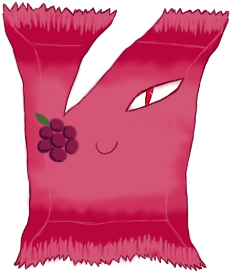
I added shading and a green leaf to the berry and outlines to the package.
References:

(Birdman, 2017)
It was actually difficult to find any good references for a ripped/used candy wrapper which looked aesthetic enough. This is why the rip in my design is pretty stylised.
With the above, I used it as a reference for the spiky bits on either end of the wrapper and the little lines there also.
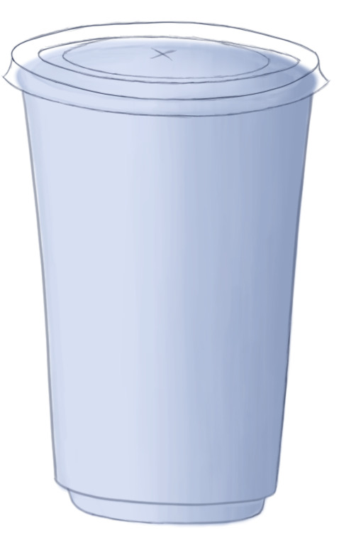
Plastic Cup:
This idea was another very early enemy concept idea, back before I was set as the concept artist.

The above was the initial sketch done by Carolina.
This was a little later design which she made of it also, where the logo in the centre turned into a mouth and the straw turned into a type of sword.
Although it was not super necessary for me to do so, I designed a couple of alternative cup lids for this design below, as the facial features/straw/limbs were already something set in stone. So this is more of a shared concept where I offered small alternative tweaks.
I believe this is one of, if not the first concepts which were modelled, which was why I was behind in doing the full design all by myself. It was very early on and Carolina was already attached to her initial design.
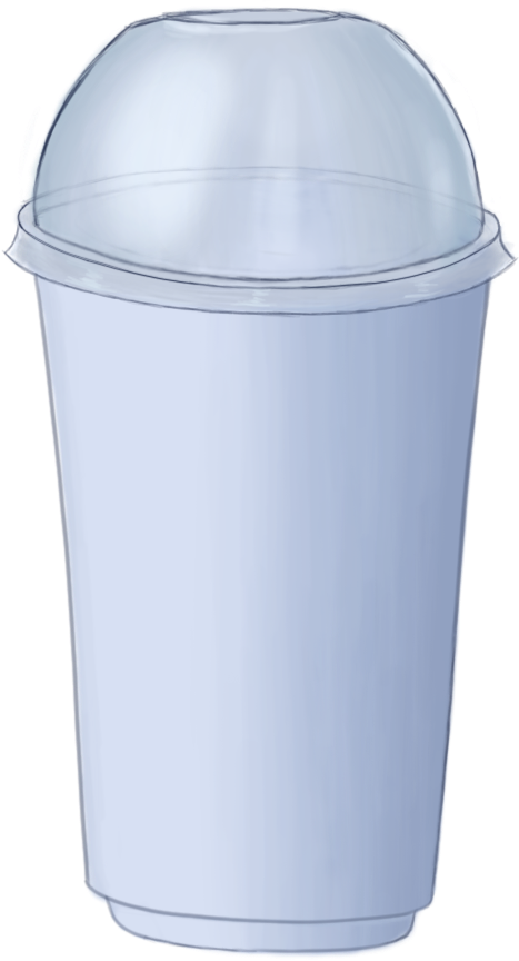
This was an alternative lid design, where it could be more like a bubble tea type of cup, rather than a coffee cup. I also added the little ‘platform’ detail at the bottom which it could have instead of just a straight bottom.
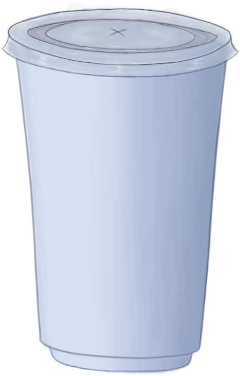
This is very similar to what you may find on a Starbucks cup, which was what she was modelling hers after initially, but the very top is more akin to a McDonald's cup in a sense, such as with the little x in the centre and the very centre circle pops up a little, rather than laying flat. It is transparent, rather than white, which makes it more akin to a fast food drinks cup.
I am quite happy with how the design turned out. The outline could be neater, but I am pleased how the shading came out, particularly on the plastic bubble lid. If I were to redesign it, I would add slightly more blue hues in the lid as it is too grey and flat.
Progress:

I initially started out by blocking out the silhouette in one layer with a soft brush.

I used layer constraints in a second layer to shade over the cup with a soft brush and add in some base lines around the lid and bottom to draw over later. I shaded this section as an open cup, as the lids would be transparent and placed over them, so that the transparency would be more accurate.
I drew in the outline of the cup and the first flatter lid in more layers.

I used layer constraints in another layer to shade the plastic colouration of the lid and add lighting with a soft brush.
Lid #2:

I used the first flat lid as a base when drawing in the bubble lid, as you can see from the outer rim. To do this, I duplicated the first lid layers and erased the centre colouration and lineart.
In here, I partly erased the lineart on the other side of the bubble lid, so that they are still slightly visible but only to give a transparency effect. I also added the base colour for the lid in another layer.
I created another layer and used a soft white brush to add a shine effect.
References:
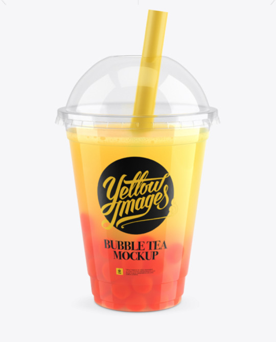
(Lukianov, N/A)
This was one of the main references I had for the bubble tea lid. As seen, it has the top gap for the straw and basically the same bubble shape.
(Glowe997, N/A)
This was a reference I used for the flatter lid. As seen, it has an inner section which pops up a little and, although not seen, the entrance for the straw is the same. The rest of the lid arrangement was improvised.
Batteries:
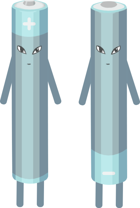
These were another design based off of an initial sketch by Carolina before I was set as the enemy concept artist.
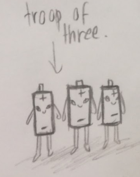
This was the sketch which Carolina created. My updated version of the design was the final design I created for the Envirovaders project.
There was some conflict within the group over creating this design. As the 3D modellers are supposed to create the designs I give them as the concept artist, and I had given them a bunch of finalised concepts which had not been created yet, Carolina decided to ignore that fact and go back and create her own, this design, instead.
I felt this was incredibly rude, as she had not told me to update the sketch to a final concept, as is my job, she merely told me she would be modelling her own design here, ignoring all the concepts which I had designed which she had not made yet and removing my input from my own role. There were several designs for her to work on. I felt she was stepping out of her place here as the concepts are my job and we already had this issue at the beginning, back when solidifying my role as the concept artist.
I decided that if we were to be using this design, that is fine, but I would be turning it into a finalised concept, as I am meant to do, and so I did.
I only got around to creating the one colour version, but I changed the set of batteries from a troupe of three into two, as this made more sense, as batteries tend to work in pairs. I also made one positive and one negative, so their designs are opposites, rather than all one of the same.
I did not have time to create more versions, as I had already been running around creating my original concepts when Carolina threw this at me. I had to create a finalised design before she finished the modelling she had already begun. This is also why the shading is blocky, as I used shape layers instead of painting the shading, so that I could complete the design faster. If I were to redo it, I would soften the shading, paint it organically, and give more colour options. However, I am happy with the plus/negative flip to the design.
Progress:

I created the basic shape by creating a rectangle using the preset Photoshop shapes and then using the Warp tool on both ends to get the rounded shape.
I made the legs and arms in duplicates from one rounded rectangle shape. I made the base for the top of the battery from a warped oval shape.

I added some shade to the battery top using layer constraints and added detail.

I added a middle stripe section to the battery by duplicating the body layer, changing its colour and warping the top of it down into the opposite curve. I created the plus sign from rounded rectangle shapes.
I added blocky shading to the sides using rectangle shapes. I constrained these shapes to the main body layer, so that the sides of them would constrain to the main shape and not go over the lines. I warped the top end of them to fit around the top rim.
I duplicated the battery layers and flipped its design for a negative battery twin, changing its sign to minus by turning off the layer for the horizontal plus sign in the duplicate layer.

Lastly, I added the same set of eyes to each, as I wanted them to be twins.
References:

(Petovarga, N/A)
This was my main reference for the batteries, in particular for I shaded them in blocks.

(Schututman, 2014)
This was a reference for the colours I used. I felt that the blue/grey colouration looked pretty, although mine is not precisely the same. I did of course plan on providing different versions if I had had the time, such as orange/black similar to Duracell batteries. The top part was also a reference for me on how to set the top of the negative battery, as their tops tend to be flatter than positives.
Works Cited:
Birdman, 2017. Sustainability. [Online]
Available at: https://sustainability.stackexchange.com/questions/6320/what-is-this-candy-wrapper-made-of-solely-plastic-or-mixed-with-something-else
[Accessed 5 May 2019].
Lukianov, A., N/A. [Online]
Available at: https://yellowimages.com/stock/orange-bubble-tea-cup-mockup-high-angle-view-13821/
[Accessed 5 May 2019].
Petovarga, N/A. [Online]
Available at: https://www.123rf.com/photo_50386389_stock-vector-vector-illustration-of-isolated-cylinder-batteries-in-cartoon-style-.html
[Accessed 5 May 2019].
Rail19, N/A. Rail19. [Online]
Available at: https://rail19.com/beach-blue-glass-lotion-soap-dispenser-with-metal-pump/
[Accessed 5 May 2019].
Schututman, D., 2014. Alamy. [Online]
Available at: https://www.alamy.com/stock-photo-cartoon-illustration-of-two-batteries-fighting-for-energy-111634524.html
[Accessed 5 May 2019].
Staples, N/A. Staples. [Online]
Available at: https://www.staples.co.uk/water/cbs/223326415.html
[Accessed 5 May 2019].
0 notes
Text
Some art tips!
That I wish people told me because it would have saved me soooo much time. I mentioned these to someone yesterday who kind of proceeded to insult me then post about me on their dA but... I hope this will be useful to someone out there!;;;
Undertale edition because I’ve been drawing a lot of undertale lately.
1. When shading, use both hard and soft edged brushes! A mistake a see with a lot of starting artists is they use only a soft edged brush and it gives the picture a very strange feel.
Hard vs. soft
Shadows work in an interesting way, when I’m shading I think about how things curve, if it’s a more sharp curve I will use a harder brush.
On the trousers here, the creases have a harder brush setting, which creates convincing folds in the fabric.
2. Don’t be afraid to experiment with colours when shading!! I see so often, people will just pick a darker shade of the same colour when shading, but this creates a dull picture visually.
Don’t be afraid to pick another colour of a darker or lighter tone to create contrast!
Here I used a purple instead of a dark grey for the shadows, and a light blue for the highlights!
I still play somewhat safe compared to others, so don’t be afraid to push how far you can take this, it can have dramatic effects on the entire feeling of the image!
3. Use differences in line thickness to your advantage. This is something I didn’t know for so long but a very good method to create more depth in your picture.
When lining something, think carefully about how thick a line should be. My general rule is if it’s just a crease or perhaps a strand of hair, something that isn’t really important to the picture as a whole, it’s still good to line them in, and to use a small pen size when doing so.
For example here, I drew creases, and hair with a small line, and as a stylistic choice, I chose to create a lot of shadows in my lineart. This created even more depth and a sense of the character not entirely being 2D. This image also brings me onto my next point.
4. It’s not the end of the world if a sketch doesn’t turn out right! Don’t!! Even!! Worry!! About it!!! Take a breathe, and make another one. With the progression image I posted in my last tip, I was so unhappy with that initial sketch. It looks super wonky right? I tried again and got closer to what I wanted to draw, and tried again until I got what I wanted exactly, I went through about 5 iterations of the image all up actually;;;
Did you know, some of the great artists like Van Gogh would paint the same picture up to 100 times before they were even remotely happy with the final product, or at least decided the quality was at a high enough standard. It’s good advice to take on board.
5. Don’t draw stick figures. Or at least, don’t rely on line tools when drawing. The human body isn’t a mix of incredibly sharp corners and straight lines, it curves a lot.If for say, when you’re drawing a pair of trousers and they just go straight down in a perfect line, it’s unrealistic or at least, very boring to look at. It can really depend on your style but even the straightest of trouser legs still have creases in them.
Look at these legs, note they’re at the widest at the thighs, become thinner around the knees, then bump outwards below the knees at the calves and finally are thin again at the ankles.
Getting anatomy correct can take years of practice, but don’t be afraid to look up reference pictures! These can be so helpful especially with hands and feet. Plus, the more you draw these sorts of things, it’s easier to remember the intricacies of the human body.
6. Watch other people drawing. WATCH OTHER PEOPLE DRAWING. Go into live streams, watch speedpaints, whatever! Look at how they go through creating a picture. Look at what techniques they use and even their brushes. I’ve picked up so many ideas from watching others and it’s really helped me improved my own art.
One of my favourite things to do lately, which is something I picked up from @wilyart was using white lines on intense highlights over the line art.
So here for example Iook at the sides of the heads towards the light source, the line art is completely white here.
7. No one can draw. Not even your favourites can draw. We all have a lot of failures before we come across even one good picture.
8. Don’t use bases. Please just don’t do it, if you want to be taken seriously at least. Even if it’s just practice, don’t do it. You will not learn anything. you are literally tracing over lines, not taking in any information. Just. don’t do it. Okay? For me?
9. Finally, push yourself as far as you can go. Do things you’re not normally comfortable with.
I summoned the courage to attempt drawing a picture that focused more on the background rather than the characters in it. I didn’t do great, but I learnt a lot while doing it.
I think number 6 is what I want to stress the most, I’ve learnt so much just by looking at how other people draw and paint. There’s only so much art tips and tutorials like this can teach you. Take inspiration from others!
Don’t worry if you’re bad it now, you’ll improve! If you don’t believe me here’s something I drew probably about 5 years ago now.
8 notes
·
View notes
Note
heya, it's the anon from the other day!! thank you so much for replying and i must say, your answer was so fucking interesting and i must've read it like 5 times or so by now. everything you explained about your creative process and personal history with drawing was fascinating and i think i can say that you truly inspired me to try and perseverate, so thanks again! i have another question i forgot to ask, about colors, and again it's about how you visualize them. i find it pretty hard -(1)
-(2) when i look around me to differenciate which color is what; by that, i mean that i can’t really put a name on colors, especially if it’s sort of gray, to me it will look gray even though it’s actually dark blue if you were to pick it out with the eyedropper tool. and i just can’t imagine how you color and shadow things without a reference, like how do you figure out the exact hue you should put there ? i’m kinda rambling here but it just blows my mind how you can make realistic looking -
-(3) drawings and get the textures and shadows and tones all great?? like, for instance, your mermen malec piece; the tails are so beautiful? how do you manage to get the darkest and the lightest parts right, it’s so hard to imagine the scene and reproduce it?? i’m just in love with what you do at this point. about drawing from pictures, i feel like i can do it alright but i can’t help but feel like i’m not a “real artist” because of that, because i don’t exactly “create” something from scratch-
-(4) i’ve even been told by people that if i wasn’t drawing things without ref, it was because i wasn’t confident enough (love it when people think they know how you work and who you are and feel free to pass judgement upon it!). i’ve seen that you useddifferent papers for the rough sketches and the lineart pieces that come after, so i was also wondering what kind of paper you used for the first sketches? does the paper quality matter for them since they’re not final product? and i think that’s-
-(5? or 6) that’s it ! again, i hope you’re having a great day and i wish you the best ! love ya
Hey there :D
I’m glad I managed a answer of some quality :3 and reading, that it made you want to keep going totally made my morning.
You do create things from scratch, my friend. You start with a blank page and have a drawing in end, right? There you go. Wether or not you have a reference, you still have to draw the picture yourself, it’s not that with having a picture to copy from, the lines suddenly start appearing on the page. ;3
And when people say, you lack confidence because you draw from reference, I would say, that you simply find beauty in the things, that exist in the world around you and you want to capture that. And I would say, in terms of bravery, it is pretty brave to draw something people can compare to the original. Taking on reality is brave. Also, on that same note, I personally decided, that you will always be the only one to completely understand your art. You create art for yourself, it’s a part of you and a form of expression, that will never be completely open to others, and is surprisingly intimate in certain aspects, I think. So, who cares? (If they offer constructive criticism, great, if their comments are harmful to you, don’t listen.)
Sidenote: Classmates used to mock me for drawing non-realistically, with the big eyes and the non-natural colored hair and my mother was always like ‘do they have to have this pointed chins?’. Somebody is always going to be ‘Oh, that’s not real art’. But at some point, I decided, that there are so many different kinds of art and art forms, why shouldn’t what I create not be found somewhere on that spectrum?
About the colors … it’s a learning curve. xD One of the reasons I started working with grey tones is, that this way, I only have to look for the shading and not the color combination, because I am not good at that. I have like a few color combinations, that I know will work and I tend to use them whenever I use colors at all. I have a few cheating strategies, like combining colors with black or grey, or only using grey tones and then you can put in a pop of any color you want to create a certain ‘dramatic effect’. In general, I would say, just try it out. Like, I have papers filled with random patches of colors, where I drew one marker over another and just looked at what happened. So yeah, there’s a lot of experimenting in it on my part. And I think, being able to see colors is a question of training, too.
By now i have a collection of all different kinds of paper, I just like paper and trying out different kinds of paper. The yellowish one I usually make my sketches on is a bit thinner (90g or 61 lb) than the white one I use for the clean linearts (185 g) and the difference is just that. Both are labeled as sketch paper and I can use markers on both of them, but on the sketch-paper, I feel less pressured to make a perfect drawing and I just don’t like pencil marks from erased lines on the white one. I did some lineart on the yellowish paper, too, and if i needed thinner paper for tracing of a sketch via lightbox, I wouldn’t have an issue with taking the yellowish one. :)
Specifically about that mermaid-drawing I have to add, that I have no real experience with water colors at this point. Whatever you see turned out good on the picture in the end is often a case of me going ‘Let’s see, what happens when I do this’ and stuff turning out semi-successful. For the tails I had references at the start. I mean, not for that particular picture, but in general. They are based on the tails of tropical fish. So, when talking about the shading, It’s a lot about looking at pictures of fish and adapting the shades from there. Where fins overlap, there are shadows, etc. (Pinterest is awesome for that, btw)And I also usually wet the area I want to paint first and then dip the brush in paint and put it at a point in a corner, where I know will be a shadow and due to the formerly applied water, the color spreads out itself and I just help a bit with the brush, I think. I mostly follow the form of whatever I’m coloring; going from one side of the tail to the other with a slight curve and the farther I get, the more the brush will run out of color and there’s the effect. I usually put shadows at the edges and where fins overlap the tail to add depth, but there’s really not any kind of detailed plan behind it, especially with water colors.
When it’s with skin, there are just some general areas where I like adding shadows, which is around the eyes, under the eyebrows, wherever the hair falls, underneath the chin and on the lips and nose. I saw that kind of shading in a lot of other drawings, and kind of just adapted it. If you would look closer, I’m pretty sure, that most of them would not be as they are if you’d be going for natural lighting. But I like it and therefore I will keep putting them there. :3Shadows with water colors for me work the way of using more or less of the same color and with copics I have the advantage of them being numbered according to their hue of a certain color. So, light grey is C-1 and it goes darker through C-2, C-3, C-5, and so on, and this way, when I use C-2 as a base color, I will use C-3 for the shadows and C-5 for the darkest parts of those shadows.
But all in all it’s a process. When you draw a lot fishes, for example from reference you start learning where shadows will most likely be and this way, you don’t need the reference material that close by if you’re not interested in copying it in detail. I think, you subconsciously learn how shadows work on a certain object at some point. It’s like learning a new form of math and in the beginning you will have to write down every little step you take, but when you’re secure enough in the method, you will start to skip them. Just give yourself time.
As for textures it’s again about looking at reference material. To learn about how shadows work on different kinds of material, working on how to translate that with whatever material you’re using. Also, youtube tutorials are great as well. Just keep in mind, that you don’t have to do things exactly as shown on the video, just look if you can learn something new from it, that feels like it could work for you.
And I tell you, copying from nature and life is one the most useful things you can do. Writers work with research material and rerference material is the research of artists. Never let yourself get talked down for doing that. You wouldn’t call a writer ‘not a real writer’ just because they wrote something about a real story, right? :) It’s simply another genre. And they don’t write about things, that really happened beacuse they aren’t confident enough, it’s just, that they like what they write about and they also have to start with a blank page and therefore from scratch. Just the same way, you are a real artist. :)
Creating art is constant work and practice. Something will always be a challenge and somebody will always be better than you. The most important thing is, that you don’t give up if you really want to do it and that at some point you reach that feeling of ‘I like my art’. That should be your goal :)
I hope this helped, feel free to ask if anything was left unclear. :) Have a great day!
0 notes
Last Seen Blogs
terrapix
head empty only mushroom biome.
yellingfellow
everything works itself out in the end

misfauxpas
your favourite faux