#graphicdeisgn
Text
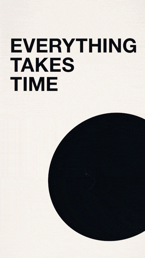
Time Takes Everything
346 notes
·
View notes
Text
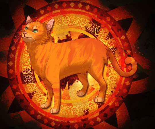
"Fire alone can save our Clan."
I wanted to see how my art would look like if I took advantage of my own design to create my background. I'm satisfied with the result!
#warriorcatsart#warriorcats#firestar#cat#fanart#graphicdeisgn#digitaldrawing#furry#feral#furryart#myart#artists on tumblr#wc
25 notes
·
View notes
Text
A volta dos que não foram!
Oi, pessoal! Tudo bem com vocês? Espero que sim, porque aqui, comigo, tá tudo ótimo!
O post de hoje é bastante interessante, acho que vocês vão gostar tanto quanto eu curti fazer esse projeto em parceria com uma amiga e colega de comunidade fictícia.
Os logos apresentados aqui são resultados de um desafio proposto pela querida Ruiza (@ruyyoshida é o arroba dela no Twitter; sigam ela por lá) que tinha a seguinte premissa: recriar o HDR - ou, sem usar uma linguagem tão técnica, podemos dar o nome de "textura reflexiva", nesse caso em específico - do logo da TV Globo no ano de 2005, um dos mais marcantes da emissora (e favorito de muitos por aí, inclusive é o meu predileto).
Ah! Mas a coisa não para por aí! Tem um detalhe bastante importante nesse desafio. Sabe qual é? Ela me propôs uma recriação completa dessa textura 100% em PowerPoint! Pois é, foi um teste diferente, algo completamente novo pra mim. Além do mais nós nem tínhamos tanta certeza se isso ia ou não dar certo.
E querem saber da maior? Deu muito mais certo do que o esperado! Claro, as primeiras tentativas de aplicação da textura em um logo montado (usei o da Lodo como exemplo) nos causaram um certo estranhamento, pois parecia que algo estava faltando.
O que faltava mesmo era acertar a coloração desse tal HDR. Uma hora ficava muito azulado, outra acinzentado demais... mas não pensem que foi tão difícil encontrar o equilíbrio mais agradável entre as nuances tonais das cores que formam essa textura, pelo contrário. Com um pouquinho de pós-produção, tudo se resolveu!
Tá, acho que já enrolei vocês demais por hoje, não enrolei? Kkkkkk. Vamos aos tão aguardados resultados desse desafio!
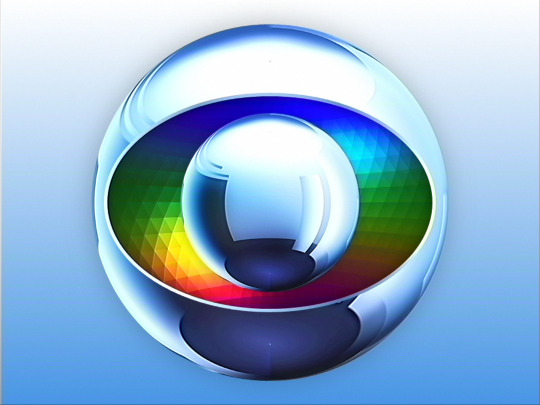
Essa aí é a primeira versão! Confesso que, olhando agora, não me causa tanto estranhamento quanto da primeira vez, mas dá só uma olhada como ficou a segunda versão depois de aprimorarmos a textura:
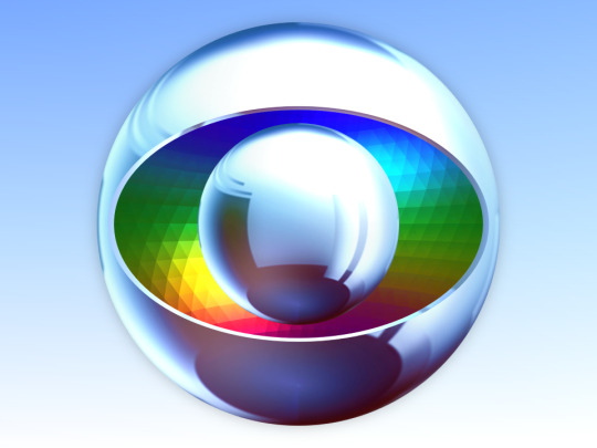
Bem mais realista, não é? Deu até vontade de fazer um encerramento de programação dessa época, não vou mentir não, kkkkkk.
Quem sabe essa ideia não acabe até entrando na lista dos próximos vídeos a serem produzidos, hein!? Fica no ar...
Bom, e por hoje era isso aí, minha galera! Eu, particularmente, curti bastante o desafio, bem como o que obtivemos como logos finais. Valeu, Ruiza, minha amiga, por ter me feito essa proposta! Fizemos um ótimo trabalho em equipe (dupla, nesse caso, kkkkk).
Volto em breve com mais conteúdos sobre o mundo das paródias e do Design Gráfico aqui, pra vocês, nesse mesmo endereço, tá certo?
Até mais! =)
6 notes
·
View notes
Photo
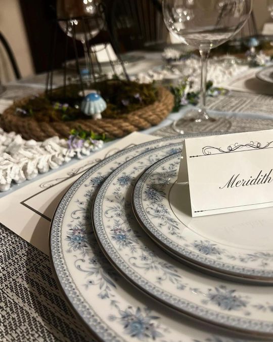
// a little change of pace with a dinner party graphic design commission, 🖤🍽️ // #Illustrator #GraphicDeisgn #Filigree #Papercraft #Nametags #Menu #DinnerParty #Home #Dining https://www.instagram.com/p/CpdxIxDp47N/?igshid=NGJjMDIxMWI=
2 notes
·
View notes
Photo
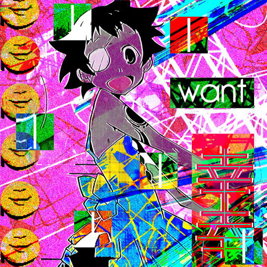
I made more Breakcore Album Artwork! Making the topic about capturing the feeling of elation with the side dish feeling of being creeped out. If only I knew how or someone how to make this kind of music.
3 notes
·
View notes
Video
@parkerdotstudio 👀 A preview of our work and logo for Habits – a supplement brand seeking to encourage a better daily rhythm. #brand #branding #brandidentity #animation #3D #supplement #healthbrand #wellnessbrand #vitamins #vitamin #brandsymbol #logo #icon #design #graphicdeisgn
4 notes
·
View notes
Text
Outcome Of Thank You Card
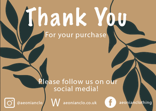
This is the final outcome of the quick and simple thank you card I have made, I believe that it's a very strong outcome in a very small amount of time, it took me less than 20 minutes to create this thank you card by using the same leaf drawing from my tshirt design and I just copied and pasted it through the document and changed the bsckground in a soothing organic colour. I then simply added some small information about my social medias at the bottom to promote my brand. I also did the small logos in Illustrator very quickly. It's a very cute and aesthetic thank you card that will go within the brand and it's very simplistic. The only change or issue I have with the outcome itself was the logo of the website because it just looks quite confusing and last minute made which it was.
500 notes
·
View notes
Text
A Century of Book Covers
Taking a look at the tends of book covers throughout the decades
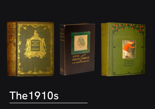
The 1910s saw books still commonly covered in cloth, with delicate monograms. Interestingly enough these examples all seem to follow similar styles in the type choice, and an intricate pattern surrounding it a central image.
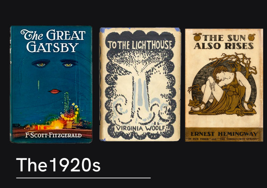
Artist designed covers were becoming quite regular now on book shelves. Books would now regularly have dust covers made of paper, meaning they could have much more interesting designs mass printed. Francis Cugat and Vanessa Bell were both painters come designers who provided artworks for The Great Gatsby and To The Lighthouse respectively.
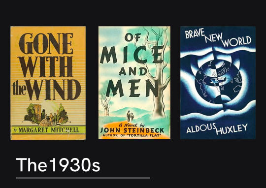
1930 trends appeared to have a lot of illustrated artwork, paired with a bold type. The illustration style was very traditional and mirrored that of the traditionally animated films that were growing in popularity.
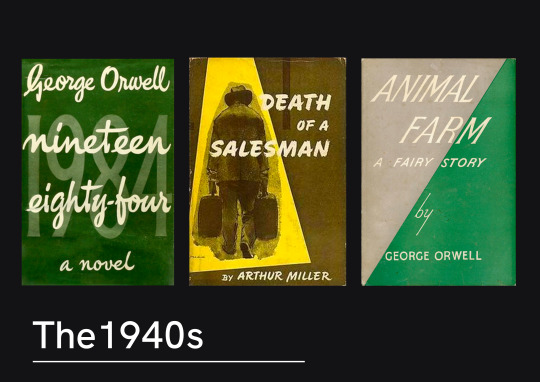
Something noticeable about the 1940s covers was the exploration of type-only, or type-centred novels. There was a lot more exploration of typography and it’s integration into a design, rather than just a superimposed title.
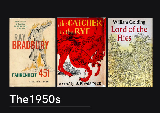
The 1950s seemed to have a lot more abstract artwork. Some really bold illustrations were used, but following on from the exploration into type - there seems to be a lot more thought about the placement of the type and how it works alongside the illustration.
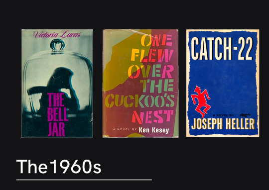
The 60s seemed to be a turning point for book covers. There’s a lot more design creativity in these images. The type and images being much more playful together. These examples show the move away from illustration work.

In the 70s book covers you can see a clear shift towards photography being used. The composition of the photography plays with the type creating layers.
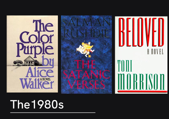
The 80s seemed to have a lot of books that had large, bold text on the front. This seemed to be the theme where there would be little to no imagery on the cover with it. There seems to be quite a stripped back approach.
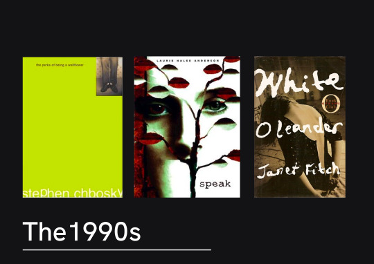
Speaking of stripped back, the 90s appear to be more minimalist and edgy looking. There’s a lot more negative space used between the text and there’s a lot of duller colours. Albeit the most popular books of the 90s were childrens books, so it’s possible there was an attempt to create a clear divide between the illustrated colourful images you might see on Harry Potter and these young adult and adult fictions.
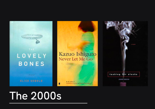
The 2000s we can see that this stripped back approach is still popular. Often the books seem to have a central image and neutral background. The fonts in these examples are even quite simple.
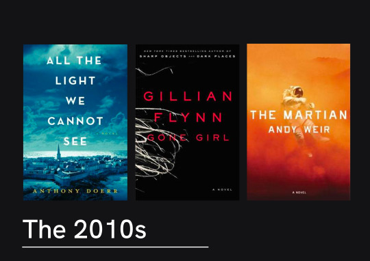
The last decade didn’t stretch much further in design trends. There was a lot of sans serif, centre-aligned titles over layered on top of a dramatic photograph. These are visually quite striking, and certainly wouldn’t be out of place hung on a wall as well as on the front of a novel.
It does seem that there title of the novel throughout the last few decades has become part of the artwork. As the years have gone on, titles have gone from being place below or above the imagery of the to become much more heavily integrated, and even becoming the artwork itself. Much bolder choices in type have been made and creative composition has been much more common place. These last few decades have seen stripped back covers being popular, perhaps because they offer a much more dramatic effect. It’s definitely clear that type can be used throughout these
12 notes
·
View notes
Photo
1 note
·
View note
Photo

Dax Logo
1 note
·
View note
Photo
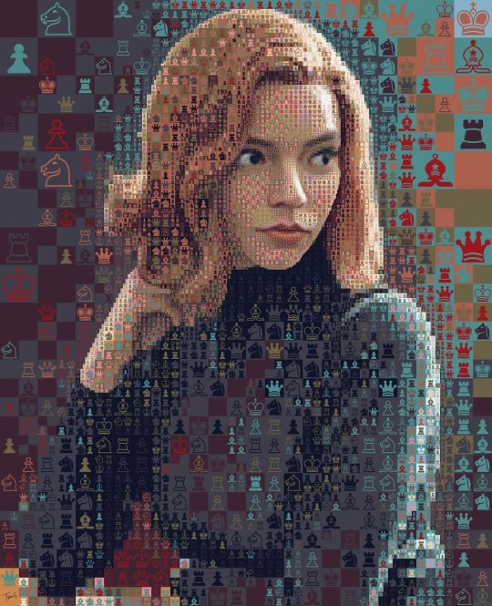
New Perspectives Photo Manipulation Of Queens Gambit by Charis Tsevis
See More: New Perspectives Photo Manipulation Of Queens Gambit by Charis Tsevis
Visit For More: Graphic Design | Dezart Inspire
0 notes
Photo
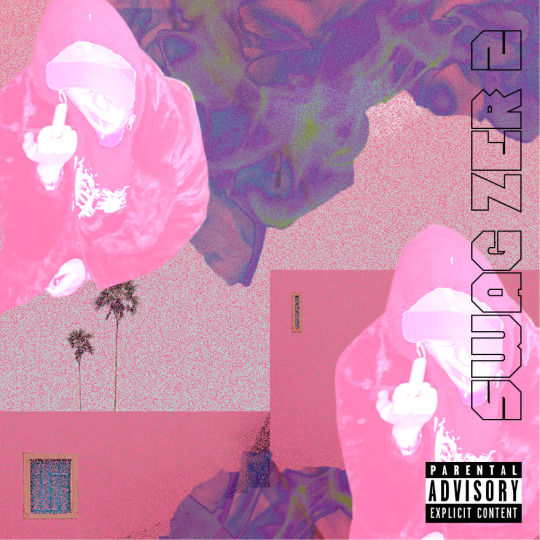
SWAG ZER 2.0 💕
0 notes
Photo
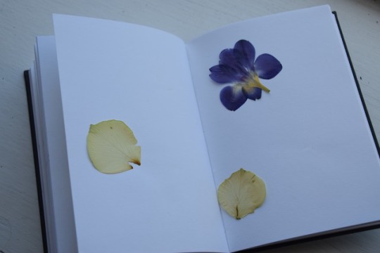
I tried pressing flowers to see if I could use the detail of the veins in the petals in any of my designs. They made a very delicate patters when used with paints however, I ended up deciding on my design before the flowers were fully dried.
1 note
·
View note
Photo
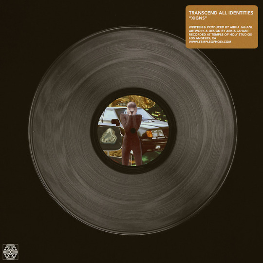
LINK: https://youtu.be/92sEAcyIF2Y
Written & produced by Arkia Jahani
Artwork & design by Arkia Jahani
Recorded at Temple of Holy Studios
Los Angeles, CA
www.templeofholy.com
2 notes
·
View notes
Text
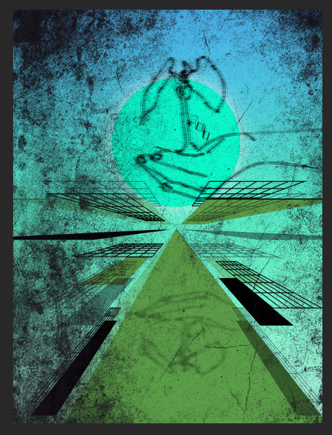
Wire Grid Illustration outcome (1)
This is the final outcome of my first wire grid Illustration using Illustrator and Photoshop, I fixed some issues and added a grunge texture to the end and fixed some gradients and the outer glow from the sun because it wasn’t appealing. I overall like the outcome but I’m not 100% pleased with the outcome, although it was a good first experiment. I did not like it 100% because of the grid and the drawing illustration, it looks out of placed and not well designed, I can possibly improve this by creating another Illustration and experimenting a lot more with different tools and improving the style.
268 notes
·
View notes
Last Seen Blogs

eblano4-ka
eblano4_ka
itsnickclette
Untitled

acibesh
ace

fuckyeahpipesofpan
Pipes of Pan

verumcordibus
May your Heart be your Guiding Key