#PBC_HNCGD1
Photo
Some Books I Read as a Kid and Their Evolving Styles
Since the book cover I am designing is primarily aimed at kids, I thought I should look at some of the books I read as a child. I have to admit, I have never been a big reader, most of the books I read were influenced by what my sister read as a kid too. However every now and then I will be engrossed by a novel, it just is quite rare.
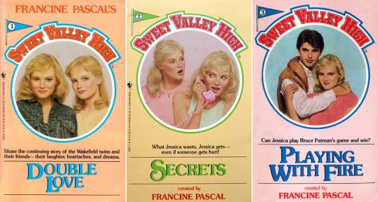
One big one was The Sweet Valley books, a long running series of books that followed the lives of identical twin sisters Jessica and Elizabeth, spanning from their young life to university age. I always loved the illustrated covers and pastel tones of the 80′s versions. The covers were painted by James Mathewuse, a book cover artist known for his work on the Nancy Drew and Hardy Boys series.
The covers themselves went through many changes from the 80′s - 2000′s, reflecting the changing times. Below shows the evolution of one of the novels.
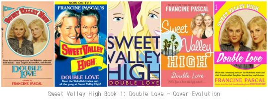
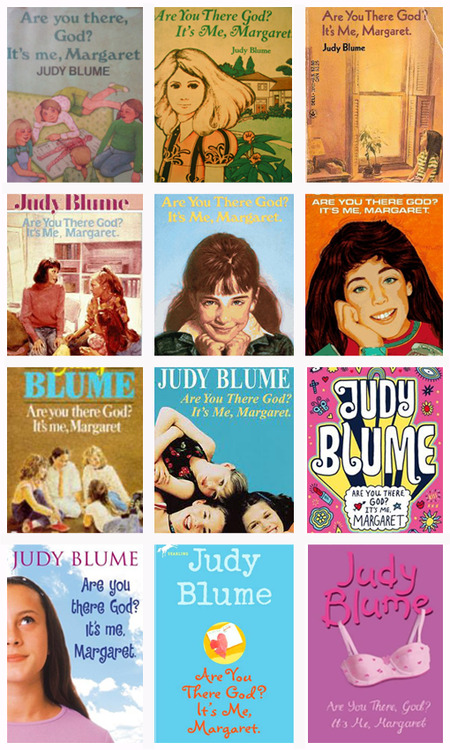
There was also the infamous Judy Blume books. I recall reading ‘Are you there God, it’s me Margaret’ (which recently turned 50 years old!) as a kid. Below is a variety of variations of its book cover. What I find interesting looking at both the Sweet Valley books and Judy Blume, is the noticeable move from illustrative designs to real life model photography use in the 2000′s, and a more prominent use of the authors name.
A book I have always had a love for is the classic, Alice in Wonderland. I have several versions of it as I adore collecting the variations of book covers and flicking through to look at the illustrations. There have been 100′s of cover designs created for Alice since its first publishing. In fact, you can learn a lot about the evolution of book cover design purely from just looking at one book throughout the years. Alice goes through many changes, from her fashion and appearance to being omitted altogether and replaced by floral patterns. The typography used goes from elaborate gold foil script use to bold 70′s serif use. We even see other popular children’s author, Tove Jansson (author of the Moomin books) create a very recognisable cover design in her iconic style.
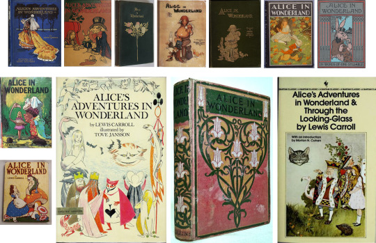
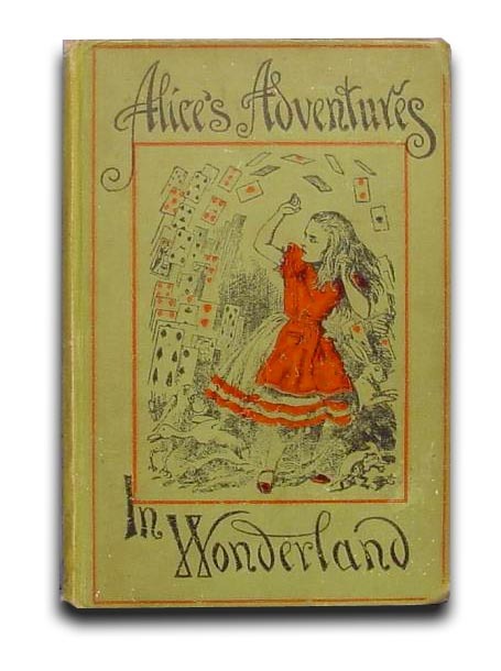
Above: the original 1898 Alice in Wonderland Book Cover, which featured a beautiful and illustrative font.
References
sites.utexas.edu. (n.d.). Thoroughly Modern Alice: Incarnations of Lewis Carroll’s heroine through the years. [online] Available at: https://sites.utexas.edu/ransomcentermagazine/2015/03/17/carrolls-heroine-through-the-years/ [Accessed 16 Feb. 2021].
#pbc_hncgd1#alice in wonderland#childrens book#graphic design#book cover design#children's classics#sweet valley high
36 notes
·
View notes
Text
A Century of Book Covers
Taking a look at the tends of book covers throughout the decades
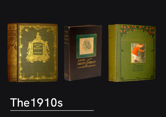
The 1910s saw books still commonly covered in cloth, with delicate monograms. Interestingly enough these examples all seem to follow similar styles in the type choice, and an intricate pattern surrounding it a central image.
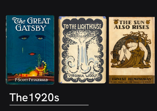
Artist designed covers were becoming quite regular now on book shelves. Books would now regularly have dust covers made of paper, meaning they could have much more interesting designs mass printed. Francis Cugat and Vanessa Bell were both painters come designers who provided artworks for The Great Gatsby and To The Lighthouse respectively.
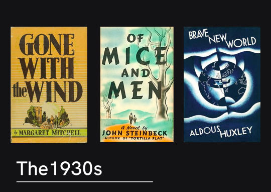
1930 trends appeared to have a lot of illustrated artwork, paired with a bold type. The illustration style was very traditional and mirrored that of the traditionally animated films that were growing in popularity.
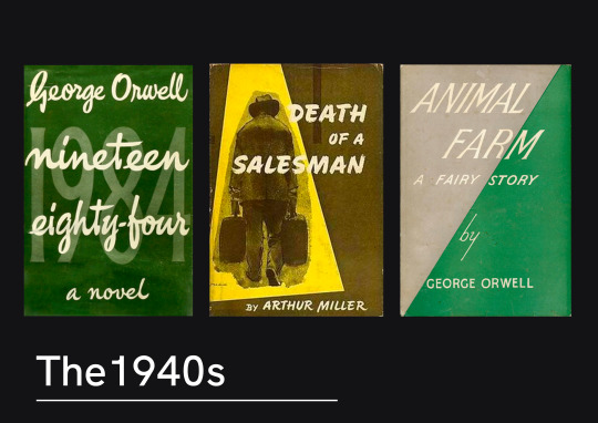
Something noticeable about the 1940s covers was the exploration of type-only, or type-centred novels. There was a lot more exploration of typography and it’s integration into a design, rather than just a superimposed title.
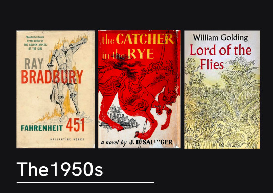
The 1950s seemed to have a lot more abstract artwork. Some really bold illustrations were used, but following on from the exploration into type - there seems to be a lot more thought about the placement of the type and how it works alongside the illustration.
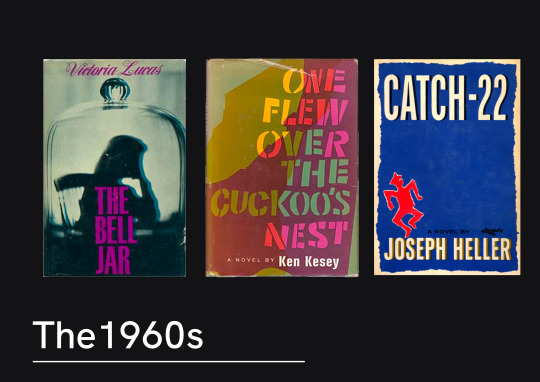
The 60s seemed to be a turning point for book covers. There’s a lot more design creativity in these images. The type and images being much more playful together. These examples show the move away from illustration work.

In the 70s book covers you can see a clear shift towards photography being used. The composition of the photography plays with the type creating layers.
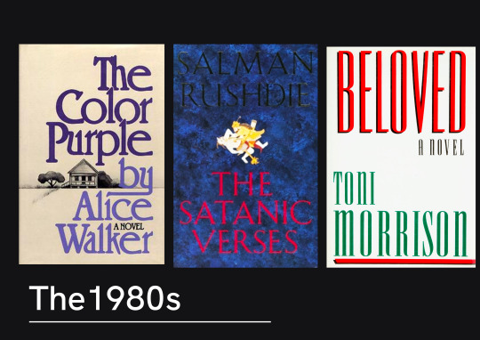
The 80s seemed to have a lot of books that had large, bold text on the front. This seemed to be the theme where there would be little to no imagery on the cover with it. There seems to be quite a stripped back approach.
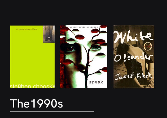
Speaking of stripped back, the 90s appear to be more minimalist and edgy looking. There’s a lot more negative space used between the text and there’s a lot of duller colours. Albeit the most popular books of the 90s were childrens books, so it’s possible there was an attempt to create a clear divide between the illustrated colourful images you might see on Harry Potter and these young adult and adult fictions.
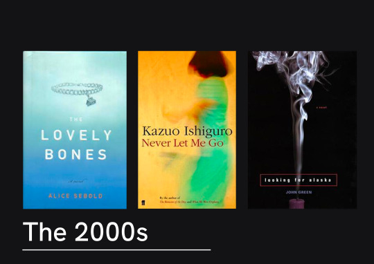
The 2000s we can see that this stripped back approach is still popular. Often the books seem to have a central image and neutral background. The fonts in these examples are even quite simple.
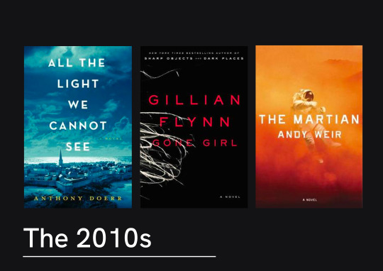
The last decade didn’t stretch much further in design trends. There was a lot of sans serif, centre-aligned titles over layered on top of a dramatic photograph. These are visually quite striking, and certainly wouldn’t be out of place hung on a wall as well as on the front of a novel.
It does seem that there title of the novel throughout the last few decades has become part of the artwork. As the years have gone on, titles have gone from being place below or above the imagery of the to become much more heavily integrated, and even becoming the artwork itself. Much bolder choices in type have been made and creative composition has been much more common place. These last few decades have seen stripped back covers being popular, perhaps because they offer a much more dramatic effect. It’s definitely clear that type can be used throughout these
12 notes
·
View notes
Text
Concept 1 [PBC Brief]
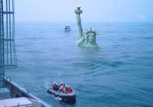
For my first book cover concept of this project, I wanted to focused on quite possibly, the most commonly known aspect of climate change - sea level rising which ultimately creates flooding. Flooding is heavily featured throughout the book as one of the many natural disasters that lie ahead.
INSPIRATION
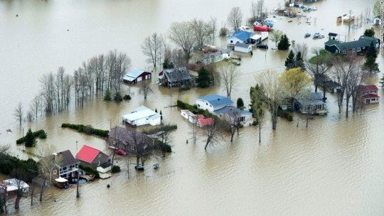
Throughout the book, ‘An Uninhabited Earth’ by David Wallace-Wells, we find many pieces of information and quotes on the subject:
“likely flooding”
“thanks to flooding and literal sinking, it [Jakarta; one of the worlds fastest growing cities] could be entirely underwater as soon as 2050″
“Damages from river flooding would grow thirty fold”
“flood damage would increase by between 160 and 240%”
“even empires of agribusinesses slipping underwater”
EXPERIMENT
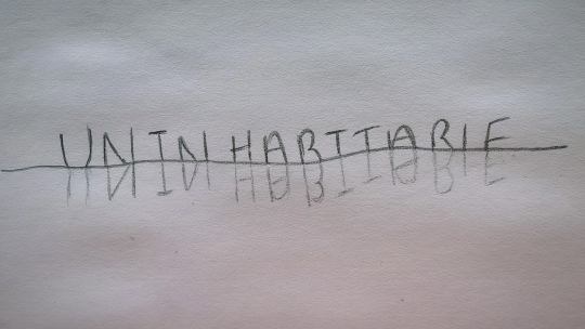
Taking inspiration from this, I thought about how I could engulf my typography in water to show a them of drowning/flooding. I experimented with some thick display text and water.
I really wanted to recreate the reflected lettering in this experiment as I felt this was the clearest way to show the letters were underwater.
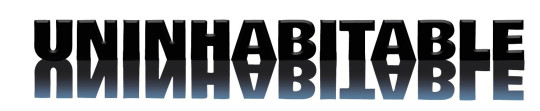
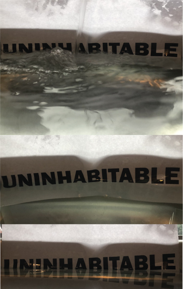
I also played around with photographing this myself however found it really difficult to capture the image I wanted with the tools I had. I eventually used a stock image to recreate the lettering sliding underwater and this became the cover for my first concept.
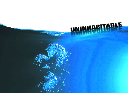
I used a thick display font and gave it a 3D look in photoshop as I wanted it to look as thought it was light enough to be floating but heavy enough to be sinking, into the deep water below. I also wanted this text to appear clean, shiny and industrial, like the many cities of the modern world who will unexpectedly be engulfed in water in the future. I chose a relatively clean image of clear water as I wanted give a feeling of depth and unknown to create some fear.
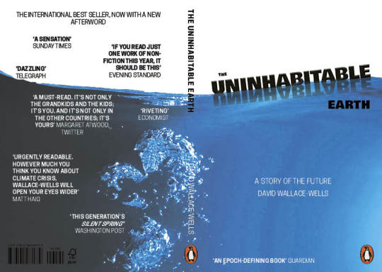
I think took the design into InDesign to add the template and the additional text. I think this cover captures the bleakness of the future of the earth well and I am happy with the overall finished product. I wish I could have captured the image of the water myself however my underwater camera skills leave a lot to be desired.
REFLECT
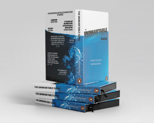
Having put my work into a mock up file is PS (a rather difficult job to align with the wrap around cover and less than ideal PSD file), I am glad I chose on large singular image to wrap around the book. It carries the message of drowning on in a cohesive manner.
If I were feeling fancy and designing to my own brief, I would have the image of the water on the book as a dust jacket that could be removed to reveal the rest of the text below. I would emboss it slightly so it had a shiny feel and a soft matte cover underneath.
#pbc_hncgd1#PRHDesignAward#student#graphicdesign#bookdesign#bookcover#graphicdesignstudent#climatechange#penguinbooks
7 notes
·
View notes
Text
Book Brief. Literalism
As I travel through along my Graphic Design journey, my new focus is pulling away from the literal. One of my last creations was a brick wall that I was trying to turn into a logo, and my tutor showed me the multitude of ways I could adapt the shapes I had to start giving “the idea of bricks” without being so blatant as to draw a wall.

I can’t deny that my hand was held through a lot of this process, but I’m amazed the lessons I’ve apparently learned. When breaking down elements of Syal’s book, I have focused on the three protagonists: Chila, Sunita and Tania. One is a happy-go-lucky newlywed, settling into life with the man of her dreams. One a tired mother, begrudgingly running a household and feeling like she’s doing all the legwork for her husband. The third, a breakaway from the Punjabi community, having transferred successfully into The City Lifestyle, she begins to long for a home that she’s left behind. It’s the third of these that struck me last night as I was breaking the title into three sections and applying each section to a character. With broad brushstrokes I simplified the personalities: happy, tense and lonely, and as I began to consider why they felt that way (e.g. Chila newlywed - happy wedding traditions, or Sunita cross-cultural relationship - lonely commuter isolation) I sketched out either life, isn’t all or haha heehee using expressive typography – picturing how those parts of these women’s lives could represent the title words. My next post will delve into this exercise in more detail (I probably should have saved my wordy explanation for then), but it was while drawing out lettering on the advertisements that follow you down the London Underground escalators that a thought proudly hit me: “Obviously I won’t put this in, it’s far too literal – but I could go somewhere with these rectangles in this formation.”
Revelations don’t have to make you shout with proud surprise, as long as they make you learn something.
7 notes
·
View notes
Text
Brief// Penguin Book Cover Design
Experiment & Reflect
CONCEPT 1
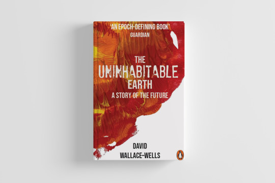

Inspiration
‘.... it began when carbon dioxide warmed the planet by five degrees Celsius, accelerated when that warming triggered the release of methane, another greenhouse gas, and ended with all but a sliver of life on Earth dead.’
One of the things I read in the book that really struck me was that Earth has already experienced five mass extinctions and four of those involved climate change. At the very heart of climate change is the rising temperature of the planet and everything else from rising sea levels, drought, famine etc are a knock on effect due to global warming. I think from the beginning of this project I was keen to represent the elements of climate change within the designs of my covers and this was the starting point for my first concept.
For this concept I wanted to focus on the warming of the planet and ways I could replicate fire.
The first technique I tried was using acrylic paint to create a print. This was something I had done in an earlier project and was really pleased with the texture it had created.
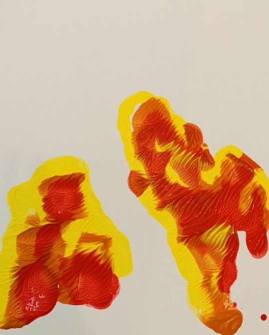
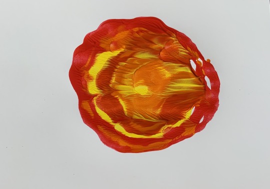
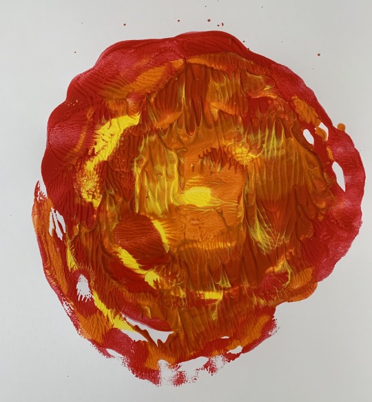
I loved how these experiments turned out, I feel that they really capture the idea of the earth on fire.
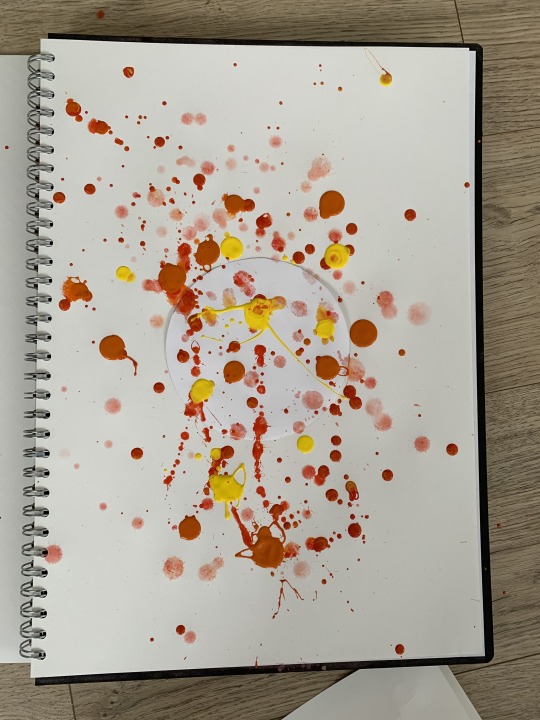
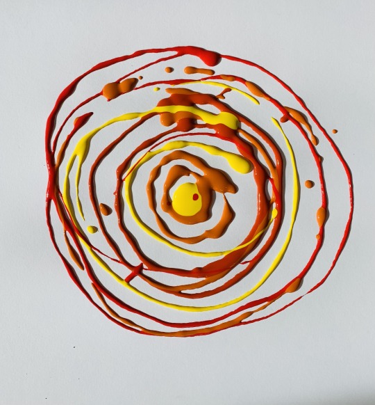
Initially I wanted the above experiment to look like fire was exploding from the earth and had planned to leave the shape of the earth white so I could place my type within it. It wasn't as dramatic as I had hoped and instead I decided to swirl the paint as below:
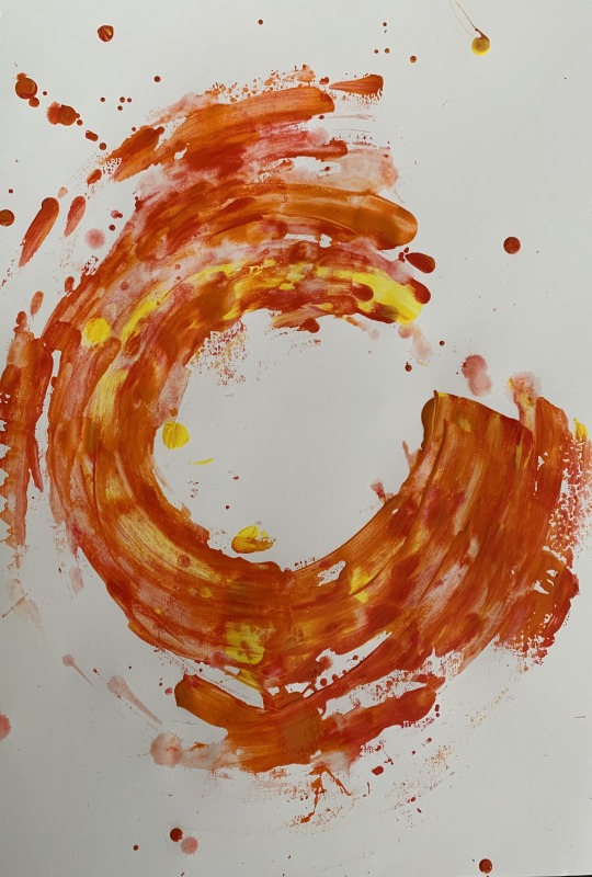
Again I quite liked this effect and it looks quite chaotic.
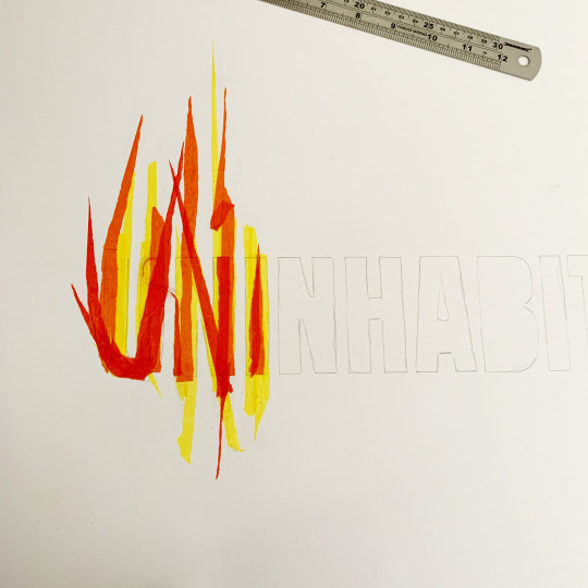
At this point I decided to try and work on possible type faces that might work with my fire idea. I was keen to use/create a font that was distressed, again to represent the burning and disintegration of the planet.
Here i began layering tissue paper to create burning letters, initially i loved this but felt the finished piece was too messy.
I also had a look at existing fonts and these stood out:
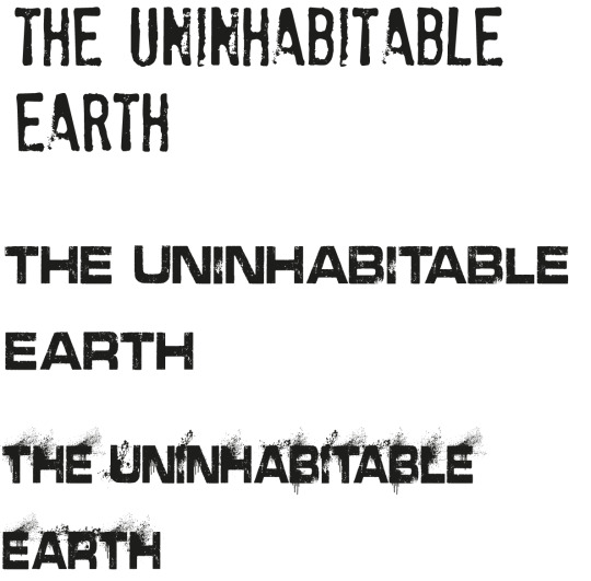
In the end I decided to go for the top font to overlay on my fire artwork, I feel it gave the effect I was looking for and didn't get lost within my main image.
Overall, I am really please with how this turned out. I think it creates drama and represents the consequences of global warming in a really simple way. On reflection I could have developed more type inspired by heat and fire.
4 notes
·
View notes
Text
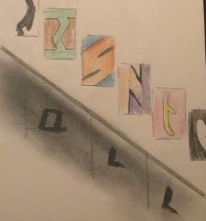
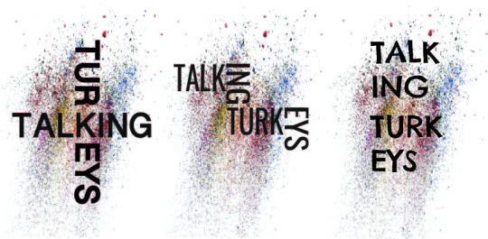
Taking my background into illustrator I then began to play around with different fonts and layouts for my design. I wanted to explore the idea of integrating the words but also in keeping with it looking like graffiti. talking the cross talking turkeys into the different backgrounds the light of the two really worked best. the stair effect talking turkeys looked really effective but I was insure if it suited the outcome I was looking for.

Wanted to create a coloured background I then wanted to push to see it I could create something less busy so took some cuttings from my pastels to create a mesh to colour. I was really pleased with the outcome so started to add the same typography as before. Still not sure if it would connect with the target audience I used a more playful typography and I was a lot more happy with the outcome.
4 notes
·
View notes
Text
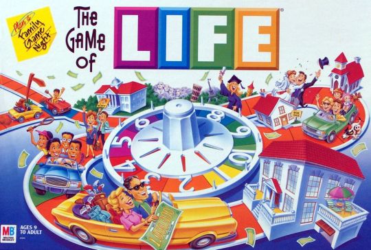
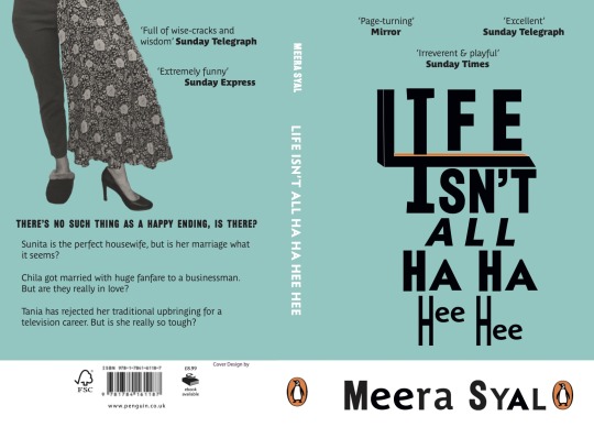
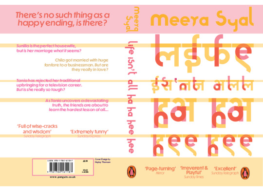
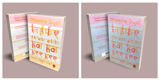
Book Cover One
For this design, I began by looking at typefaces that I felt expressed the title. I imagined a mom saying “Life Isn’t All Ha Ha Hee Hee” in a rather serious manner and wanted to bring in the decisiveness of the statement, yet also the playfulness of the phrase “ha ha hee hee.”
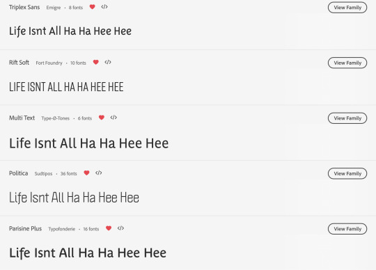
When I thought of the word “Life,” it reminded of the board game LIFE and also arrows intersecting to show the unexpectedness. Although, these visuals don’t come through on the final book design, they were an inspiration.
I made the title by combining different typefaces and editing them as needed to be of a similar size. I particularly liked the open “e,” as it looks like it’s laughing. I used the same process for the author’s name and was able to borrow letters from the title itself.

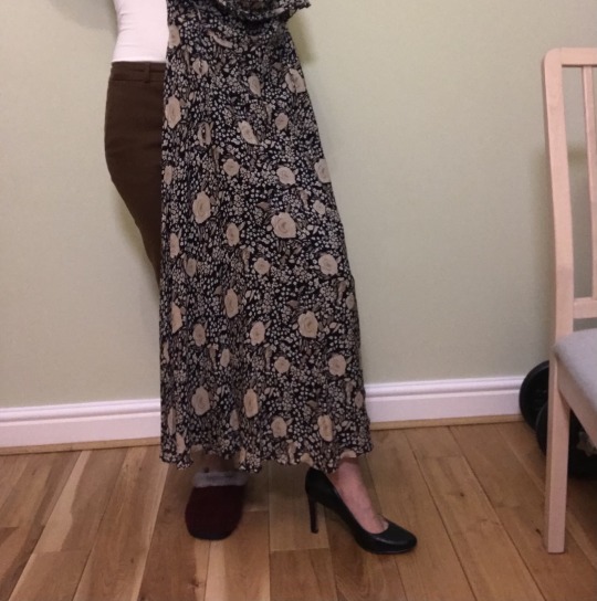
I wanted to express the different roles women play in life and specifically in Punjab culture. The book includes some good detail about their clothing. Sometimes the women are out in their saris and other days they’re wearing miniskirts. I wanted to show this meshing of identities through an illustration originally.

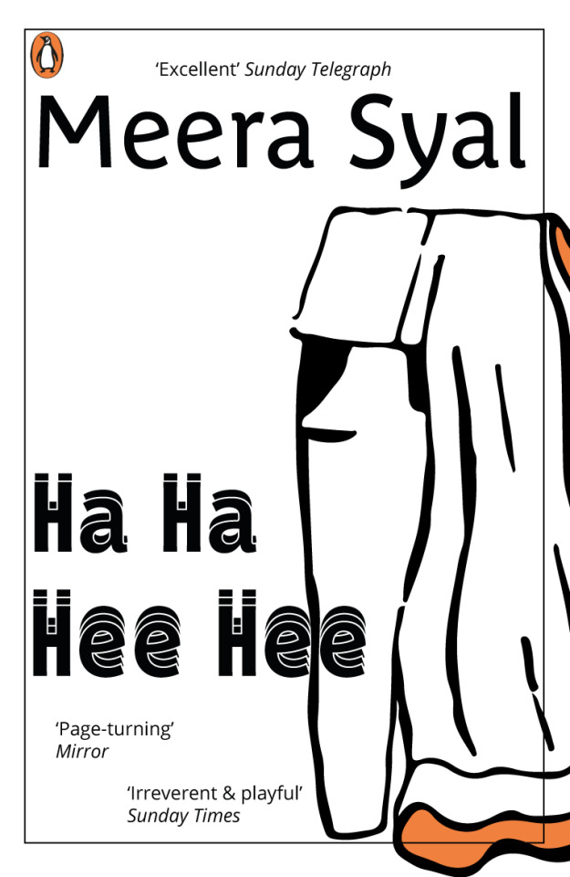
I later chose to use photography, as I think it fit better stylistically with the type. I was able to composite some photos to showcase businesswoman, mother, Punjabi woman, and rebel. I would prefer if the picture were of a Punjabi women and the wardrobe pieces were more authentic, but I made do.
I decided to keep this design straightforward, so typesetting was not overly involved in InDesign. Here’s my final book cover!
4 notes
·
View notes
Text
Penguin Book Cover - Design A Final
The results of my riso printing experiment
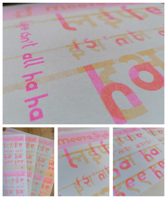
Positives
The vibrancy of the fluorescent pink ink
The effect where the inks are layered on top of one another
The texture and physicality of the print
Learning Points
The bitmapping experiment didn’t really work, I think the scale was too small for this
The colours of ink that I chose are quite pale and given the transparency of the soya based ink the prints on the stronger colours of paper didn’t work
Taking the riso prints back into digital was difficult, time consuming, beyond my current capabilities and resources and ultimately disappointing. I think going from digital > physical print > back into digital to ultimately represent > a physical print was too many steps for me.
Digital version
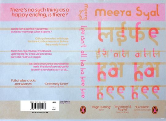
Riso print version with additional copy added digitally
4 notes
·
View notes
Text
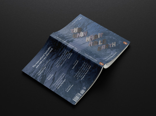
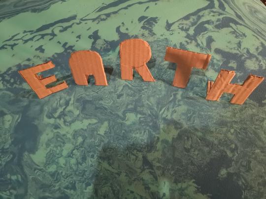
Concept 2: Cities Flooded
Inspiration
‘The scariest variable is how quickly that flood will come. Perhaps it will be a thousand years, but perhaps much sooner. More than a billion people live within thirty feet of sea level today’
Throughout the book, there are a lot of references to rising sea levels. This is both in factual data, as a result from rising global temperatures, but also in the context of what this means for human life. The book reminds us that the rising sea-levels, that have already resulted in climate refugees whose homes have been engulfed by water, will cause devastation on our doorstep if we let it.
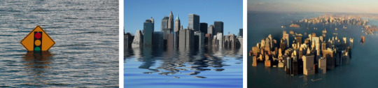
I wanted to create a cover that referred to these rising sea levels - but relate them to the reality of life as we know it. Often we think of climate disasters being far away and someone else’s problem. I wanted my cover concept to show a city flooded, surrounded by water. I think it’s very easy to assume that the devastation of climate change is only happening abroad, but it’s happening to so many people everyday.
‘What would be submerged by these floods are not just the homes of those who flee - hundreds of millions of new climate refugees onto a world incapable, at this point, of accommodating the needs of just a few million - but communities, schools, shopping districts, office buildings and high rises, regional cultures so sprawling that just a few centuries ago we might have remembered them as empires unto themselves, now suddenly underwater museums.’
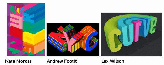
For this concept, I wanted the title of the cover to be the image. I wanted to create a 3D look, of text that was itself being submerged in water. Therefore for this cover - the type itself would be the imagery. I was inspired by isometric styles of 3D text - such as the work by Kate Moross, Andrew Footit and Lex Wilson.
I wanted to try and created this in my own version, especially giving the text some texture as it would bring some reality to the image.
Experiments
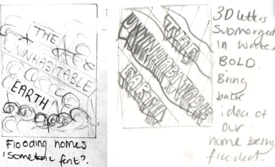
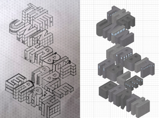
Initially for this idea I had planned to create 3D letters by hand and submerged these in water - using photography to capture my concept. I began by create flat letters propped up by stands. This was relatively time consuming and didn’t give me the effect I wanted, the letters still looked flat although standing upright.
I went on to try creating box-type letters which fitted more to the idea I had in my head. I was really happy with the outcome, but it was really time-consuming. It took me about 3 hours just to three T’s and 2 H’s - which I knew were going to be the easiest letters.

I decided that even though this looked how I wanted it to, it wasn’t going to work for the finished product. So I tabled the hand-made 3D idea and decided to look into other techniques.
Looking at the references, and how they created their lettering, I decided to draw my letters out instead. I started by using the dotted paper in my typography notebook, and starting to get the effects I wanted (in a much quicker time-frame).

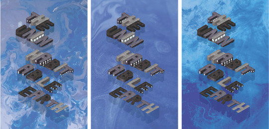
I decided I would instead go down this route and work on creating the letters with an isometric grid. I printed paper out and started designing my cover. I was really happy with how this turned out and I was able to quickly produce what was in my head. I took this design into illustrator and created a digital version - and voila!
For the backdrop - I experimented with some previous techniques of paint pouring and ink droplets to create water for the letters to sit in. I really liked visually how each of these looked but I felt they didn’t match the lettering or the feel of the book. The colours and playfulness of the lines created in the ones I created were too happy looking for the book I felt. I decided to replace it with a photo of actual water This made it much more realistic and therefore linked better to the idea of this being a reality of our future.

Reflection
I was really happy with my final design in the end and I was thrilled that I was able to produce the original concept I had in my mind from the beginning. I would have liked to create more texture on the letters perhaps by using photography of actual concrete buildings, which may have brought a bit of a grittiness to the cover.

I had thought about using isometric type for the supplementary copy as well, but I felt this took away from the title. I decided it was better to add these using indesign.
Using a stock image instead of a making was a tricky decision but I think it was the right one. By using an aerial view of the sea. I was able to communicate what was happening in the image better than if I had gone for a more abstract approach. I felt the style of the letters as well as the tone of the book was quite direct, so needed something a little less open to interpretation.
Had I been able to create the 3D letters by hand, I think I would have gotten some really interesting effects. That way I would have had more control over the lighting and realistic nature of the submerging in water. However, I’m still really please with how it turned out. I think the cover is able to convey many of the sentiments mentioned in the book around rising sea levels, coastal cities at risk and the idea of this being our problem, not someone else’s. I think the cartoony style of the letters may be slightly less serious than I was looking for initially, and perhaps working in more realistic textures may have helped that.
Overall I’m really happy with the final design and happy to have learned some new techniques on isometric design on the way!
7 notes
·
View notes
Text
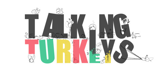
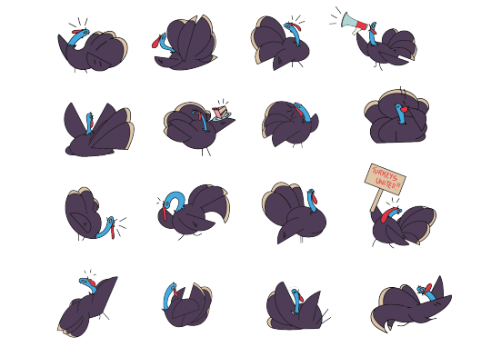
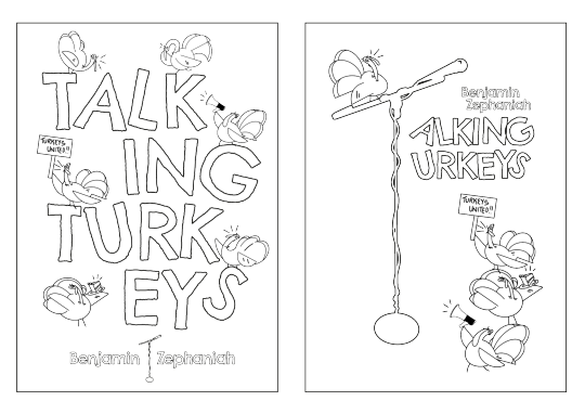
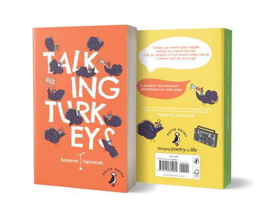
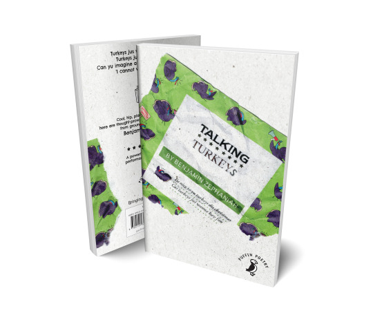
Talking Turkeys Wreaking Havoc
With this concept I wanted to incorporate some illustrative components to the design. From looking at Children’s Book covers almost all involve some form of visual to accompany the Typography. I decided to try out having the Turkeys physically playing with the lettering as if they are wreaking havoc, protesting changing the letters, making a mess etc. Really playing to that theme within the poems about personification of animals, breaking traditions and rules within the written language and life.
above: initial sketch idea
I experimented with different placements for this cover. In the end I feel there are at least 2 solid ideas within this concept. One idea also creatively uses a microphone stand as a stand in for the letter ‘T’ to emphasis the performance element that Zephaniah uses for his dub poetry. The microphone is also there (and is out of reach) to the turkeys who are trying to have their voice heard and fight for their rights.
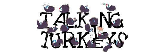
above : Illustrated Turkeys that I placed inside the letters
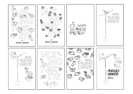
above : Trying out different layouts
I decided to use a typeface called Chelsea Market from Google Fonts which has a nice handwritten & kid friendly quality to it. I decided to mess the font a up a little and tilted and moved letters to appear as if the turkeys have pushed them around whilst running around and protesting.
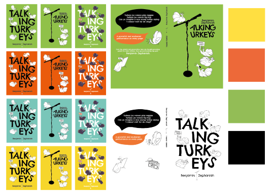
For colour I settled on something that evoked that Reggae feeling and chose a palette with greens, oranges, yellow and black, but brightened and softened it a little to appeal to a young audience. (I discarded the blue) I initially had a solid colour over the full book cover design, but felt it didn’t capture the Reggae theme the way I intended, and so went back and added a colourful spine and different back colour to ensure that the full palette was used across the design.
I’m still unsure which version I prefer, but at present I am leaning towards the microphone stand as it feels a little more creative and may allow a young audience to ask questions and feel intrigued to what it means without being totally oblivious to the idea. My main concern was over legibility, but after asking several people, it seems it may just be my concern and not others.
Above : I also have sent these designs as line art to my wee niece and nephew to see if they could colour it in for me. Might be nice to consider another option and have some kids input to the design. It also got me thinking that by leaving line art on the cover, kids could just colour in their own book cover? Maybe this would be a nice idea to have under or as a book jacket so their is 2 versions. One to colour in and one as below.
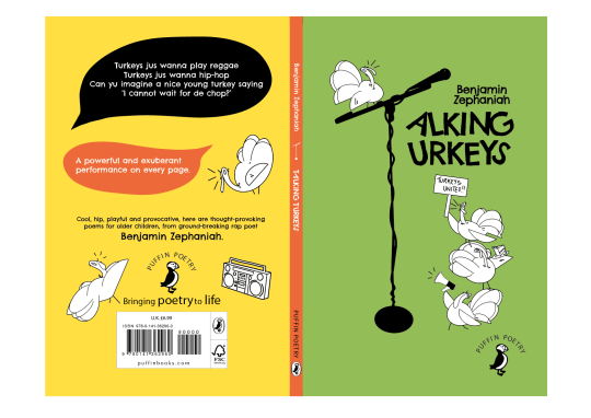
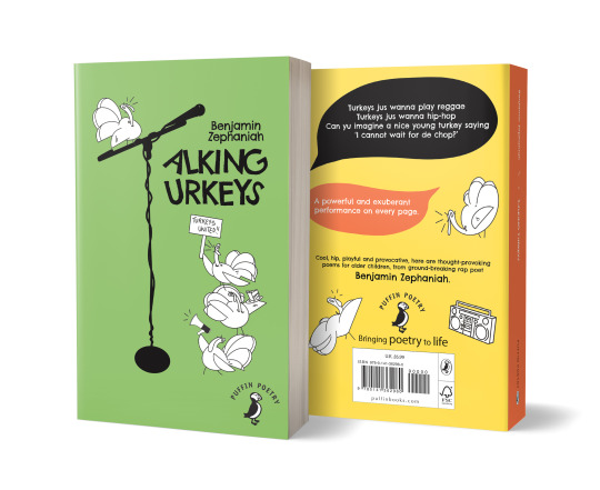
Note : for my final submission I decided on the above, but chose to include the coloured in Turkeys as opposed to black and white as I felt they looked a little incomplete
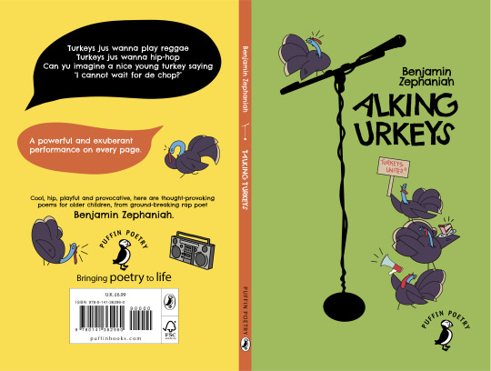
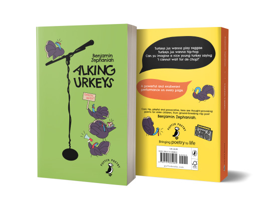
Below : Alternate design I was torn between these two. But in the end settled on above as I think the design is stronger overall.

#PBC_HNCGD1#talking turkeys#penguin book cover#book cover design#graphic design#childrens book#Benjamin Zephaniah#prhdesignawards#penguinstudentawards
8 notes
·
View notes
Text
| Talking Turkeys at the Supermarket |
For one of my 3 concepts I wanted to look at veganism, packaging and the thoughts on consumerism in Zephaniah’s poem. He talks about people’s greed, how Christmas is very commercial. My idea was to create a supermarket meat packet label, but make it vegan! It makes you think, you look at it and your brain instantly thinks of meat packaging, but when you look closer its actually asking you not eat meat and to be nice to turkeys. It is humanising them, as Zephaniah does in his poem
I said "I am not too sure turkey
But it's nothing to do wid Christ Mass
Humans get greedy an waste more dan need be
An business men mek loadsa cash
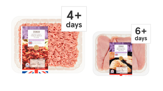
I used a Turkey mince label from Tesco to get some inspiration and mock up ideas for my fake label. I wanted to imitate it as closely as I could, but decided to change elements as to not make it too obvious it is a ‘Tesco’ inspired label. The font I used ‘Newtext ITC, is very close to TESCO’s custom own font and echoes the idea of a supermarket mass produced meat product.

I swapped the iconic lines under a Tesco label for some generic stars and added a very hand drawn looking ‘s’ to the word ‘Turkey’ to make it feel like its been altered. Initially i was going to keep the crossed out words that say ‘thigh mince’ but as it is aimed at kids, I wanted to keep it more light hearted, and I think it made the title hard to pick out.
I also inserted a quote from the poem under the authors name to mimic the area where it talks about items being carefully selected, fresh, organic, 100% fresh etc.
I used the illustrations created for the previous concept, but altered them into a pattern that might be seen on some packaging or even wrapping paper to echo that Christmas theme within the poem. Initially I had thought to use some photography and mimic the Tesco packaging almost perfectly, I even applied a half tone effect to the image but I felt that cartoon images would be more appealing to 8-12yr olds.
Lastly, I printed my design out, I thought about sticking it on some turkey meat, but my photos just didn’t look very good. So I instead decided to distress the label and scan it into the computer, to make it look like its from a used packet, litter, discarded etc.
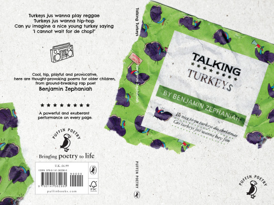
Composition wise, I decided to go with the above, It looks more organic, like the label has been peeled off and dropped on the floor, or that it is litter in the street. I think the crumple effect works super well for making it look a little like wrapping paper too. I like ‘wrapping’ around to the back cover, as it again adds to the wrapping paper effect.
Overall I enjoy the concept behind this cover, but I think the idea could be lost to the young audience I am supposed to be appealing towards. Perhaps adults would find this cover more intriguing? So currently, I am not sure if this will be my final decision of the 3.
#PBC_HNCGD1#talking turkeys#book cover design#Benjamin Zephaniah#turkeys#vegan#graphic design#penguin book cover
7 notes
·
View notes
Text
Concept 2 [PBC Brief]
For my second book cover for this project, I really wanted to focus on one of the really silent killers of climate change - landslides. The land, the land we are destroying, the future of the land and the ever changing landscape is naturally, one of the biggest themes throughout the book.
INSPIRATION

Throughout the book, David Wallace-Wells discusses what would happen to the land:
“Some of those watching from afar wondered, incredulously, how a mud slide could kill so many [...] by weaponizing the environment.”
“And the kill slowly, too, by cutting off food delivery and medical supplies, making roads impassible”
“and mudslides are amongst the clearest illustrations of what new horrors lie ahead”
““low-lying homes pounded by the mountains’ detritus cascading down the hill side in an endless brown river”
EXPERIMENT
It was from here I knew I wanted to create a cover that paid homage to the mud and the land. I started looking at the ground and navigation and map systems. I started playing around with words on maps to see if I could find a direction to go with this.
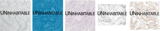
It was at this point, I tore into a big bag of old materials I store for future work - scraps of paper and packaging kept behind with a view to recycle and use again. Rummaging around I found this incredible paper that had come in a parcel, one I cannot recollect but I thought it was beautiful.

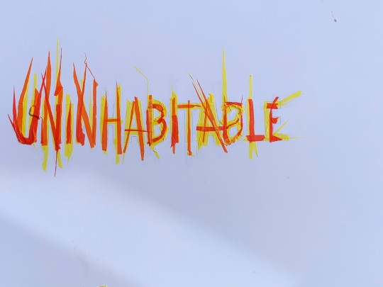
I knew instantly that I had to use this pattern and show how uninhabitable the land could become. Being a typography project, I started writing the words on the landlines over and over again in a bid to show the land that was uninhabitable.

I really felt I was on to something so I went into AI and worked directly onto the paper, working the words along each line however, bearing in mind this was a book cover, I did not want the words to be too imposing.
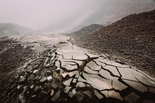
I also wanted the title to stand out - I wanted to feel the word breaking and falling apart exactly like the land on the Uninhabitable Earth. Taking a picture of some fresh mud I had taken in my street for inspiration:
I took a bold thick display font and used it to turn the title into the following:

Applying this to map front became the cover I wanted - words smashed apart, words slipping and sliding through the mud and of course, the lines of the land shown clearly. I used quite a generic font here, giving off an over-used ‘Times New Roman’ feel that would demonstrate the modern day life intertwining with the lay of the land - something the modern man believes it has control over but is most definitely mistaken. I tweaked the map ever so slightly and drew my colour scheme from this - muted browns and sandy colours with a simple light grey as a neutral tone to tie it together.
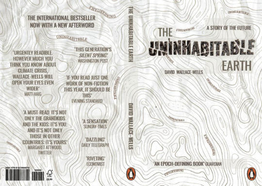
I think this has created an attractive book cover, again, with a wrap around effect to show a cohesive design.
REFLECT
I found this to be my most enjoyable cover to create - I enjoyed the recycling aspect of the cover, this tying into the theme of climate change, greenhouse gases, modern destruction of trees to create paper and of course, the pollution created by industrialization. I also like the natural and soft flow of the book that is a nod to how sinister this seemingly natural flow can be - landslides are just one of a long list natural disasters that are brought on by climate change.
I love the soft tones of the book too - the colour scheme really appeals to me and the theme I picked out from the mood boards.
6 notes
·
View notes
Photo

Concepting a Mood Board
Initially I’ve been struggling to pull a solid idea together for this cover design, but I sorta had an ‘ah HA!’ moment earlier. So I quickly pulled together a mood board to visualise my concept.
Zephaniah uses his poem Talking Turkeys to talk about consumerism, human greed and heavily promotes veganism and animal welfare towards kids. It uses funny imagery and situations to speak on serious matters. The book itself needs to appeal to children, what do children always want...Fast Food! What is fast food focused on...meat and sales! My idea is to turn this on its head, make you think one thing, but it says another. Using similar look, colour and feel of fast food restaurants and diner signs to create the typography and look of the cover. Time to start sketching ideas.
7 notes
·
View notes
Photo
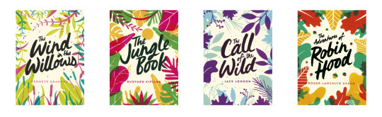
Researching Typography Use in Children’s Books | Book Cover Design
It is really difficult to find book covers aimed at Children that focuses almost entirely on the typography. I know the answer for this, it is because children are very visual, they like their pretty pictures to associate images with themes and ideas within the text. However I did stumble upon these new 2020 covers for what is called the ‘Green Puffin Classics’. A collection of four Puffin Classics designed to raise awareness of world environmental issues. I couldn’t see who the designer is behind the covers, but if you know please do link me!
I like the idea behind these as they are subtly echoing the themes and settings of the books and rely heavily on the typography and colour use. Something to consider for my book design.
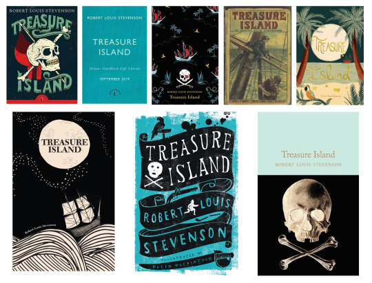
I also picked a classic children’s book, Treasure Island to look at the typography use in different covers. Most use some form of imagery to associate with the novel, from skulls, ships, islands etc. But the second from left top image approaches the design in a more minimal style (is this to appeal to adults?). It uses purely text and a sky blue colour to evoke that feeling of the sea and sky from a deserted island. But I noted that the middle bottom image is rather similar in which it uses a heavy typography based cover and again, a sky blue. The bottom image does however incorporate illustrative elements within the text to convey the themes of the story. I enjoy how the designer has made the black ribbon that envelopes the text like a pirate flag.
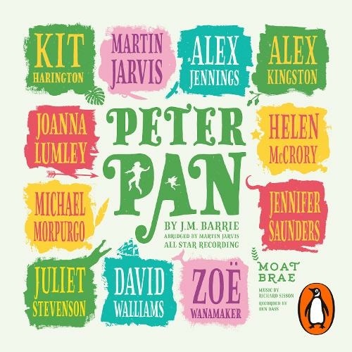
I enjoy this audio book cover for Peter Pan immensely which incorporates illustrative elements into the whitespace of the type and plays with the shapes around the names. Note the crocodile in ‘Juliet Stevenson’ and the ‘left star from the right’ in Helen McCrory...also what a cast! I’d like to listen, Jennifer Saunders is one of my fav people.
7 notes
·
View notes
Text
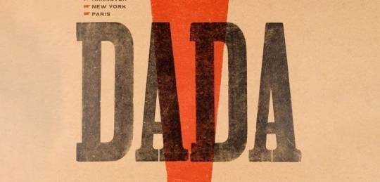
The Dada Movement | An absurd Art Form?
The Dada movement was founded in 1916 in Zurich by Hugo Ball, and was a reaction to World War I. It consisted of artists who
“rejected the logic, reason, and aestheticism of modern capitalist society, instead expressing nonsense, irrationality, and anti-bourgeois protest in their works.”
This movement interests me a lot as the book cover I am designing is by Benjamin Zephaniah whose work I feel is a performance on its own, it breaks tradition and rules and seeks to attract a young generation to poetry through his use of ‘dub poetry’. His poetry book ‘Talking Turkeys’ looks to bring subjects such as animal cruelty, racism and political issues to kids and doesn’t sugar coat his opinions to ensure children get a view on the realities of the world. Whilst reading his poems, many go against the use of proper vocabulary, grammar and sentence use and are broken up on purpose.
youtube
The Dada erratic poetry celebrated the irrationality of language and the use of sound, visuals and typography was used to convey the feeling of the poems by breaking up words and syllables and helped to generate difficult questions about society and the purpose of art.
“By destroying everyday language, sound poems offered both a metaphor for the destruction caused by war and a commentary on the deceitfulness of language”
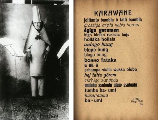
Above : Hugo Ball at Cabaret Voltaire, Photograph by Marcel Janco, 1916, and Proof sheet for the projected anthology Dadaco, edited by George Grosz, John Heartfield,1919, with Ball's 1917 text "Karawane"
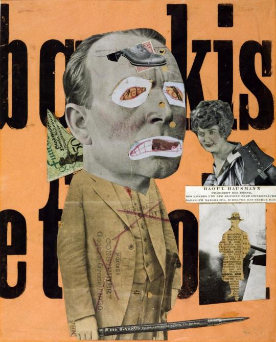
Above: Raoul Hausmann, The Art Critic 1919–20
The sound poems are quite bizarre to listen to, but visually, the typography and placement of words really plays to that rule breaking and performance feel I would like to capture in my book cover design for ‘Talking Turkeys’.
youtube
7 notes
·
View notes
Text
A whistle-stop tour of book cover design
The practical leather-bound books of the middle ages
Book covers historically were only required to do one thing - protect the book. Although this didn’t stop them from being works of art in themselves. Leather-bound books with gold and silver clasps, lined with gems and detailed with embroidery were not an uncommon sight on a 13th Century Book-Shelf (Domestika, 2020). These books were mostly if not all handwritten and therefore needed something sturdy to ensure they were not damaged.
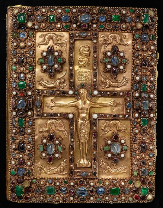
Lindau Gospels. Court School of Charles the Bald Lindau Gospels, in Latin, Switzerland, Abbey of St. Gall, late ninth centuryAvailable at: The Morgan Library & Museum https://www.themorgan.org/exhibitions/magnificent-gems
In 1450, the invention of type printing by Johannes Gutenberg changed the world of books, but leather binding of books continued to be the normal. However, in the 16th century, we began to see title pages appear at the beginning of books. Information about the author and printing information of the book were traditionally placed at the end of the book - the colophon - but this gradually made it’s way to the beginning go the book. These would not only have information present but would often have illustrations as well.
Victorian adventures into new mediums
Not until the 1800s did we begin to see books that resemble what we know today. Books were now mass produced, and material like paper and cloth were used over leather. For a period of time in the 1830s, books would have an illustrated tissue paper cover that would protect the book during trade - an early version of the modern books dust cover. By 1840, new techniques allowed for coloured printing and illustration to be used on the book covers themselves. Chromolithography and halftone printing allowed for designs featuring text and images to appear right on the cover. This created a whole new avenue for designers - book cover design (Graphieine, 2017)
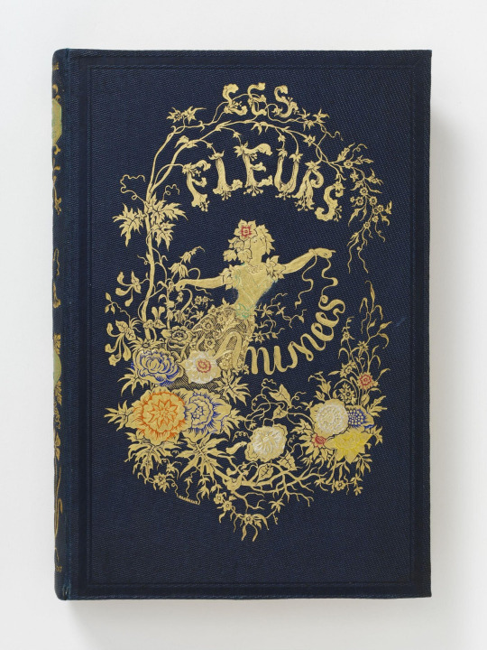
Les Fleurs Animées - J. J. Grandville. Published in Paris - Available at: https://collections.vam.ac.uk/item/O1317967/les-fleurs-animees-par-book-grandville-jean-jacques/les-fleurs-anim%C3%A9es--par-book-grandville-jean-jacques/
Due to these new techniques meaning printing designs was much more manageable on a large scale, books started to dawn intricate drawings. Yellowback books were on the rise - lightweight, lower cost books that could be read on the now more accessible trains. Yellowbacks were named after their yellow tinge - due to them being made from low quality wood pulp. These were the early examples of what we think of as paperbacks.
Speaking of yellow, the 1890s saw introduction of the British magazine The Yellow Book. The covers were designed by Aubrey Beardsley, who laughed at the idea of Victorian prudishness. This saw a shift in book covers being the of a Victorian style - with intricate art nouveau designs - to becoming much more abstract and contrasting illustrations of people and creatures. Design in general began to become much more modern, and as the 1900s began, book covers were becoming even more creative (Collie, 2017).
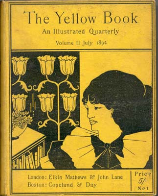
The Yellow Book - 1894 Elkin Matthews and John Lane, Illustrator Aubrey Beardsley. Available at: https://en.wikipedia.org/wiki/The_Yellow_Book#/media/File:Yellow_book_cover.jpg
20th century - graphic design lives
After the world war at the beginning of the 20th Century, a new era of design was afoot. Book covers began looking to cubist and abstract designs inspired by Soviet and German artists. There was also a move to paper covers on books - as was the end of illustrated bindings. Paper coverings were now much more convenient as fabric printing became too expensive. To have a paper cover meant more intricate and beautiful designs could be created.
In 1935 - the first paperback books were born. Much like their predecessors the yellow backs, these were much more lightweight and accessible, as they had shedded their heavy cardboard cover. Unlike the yellow backs, these books were of higher quality.
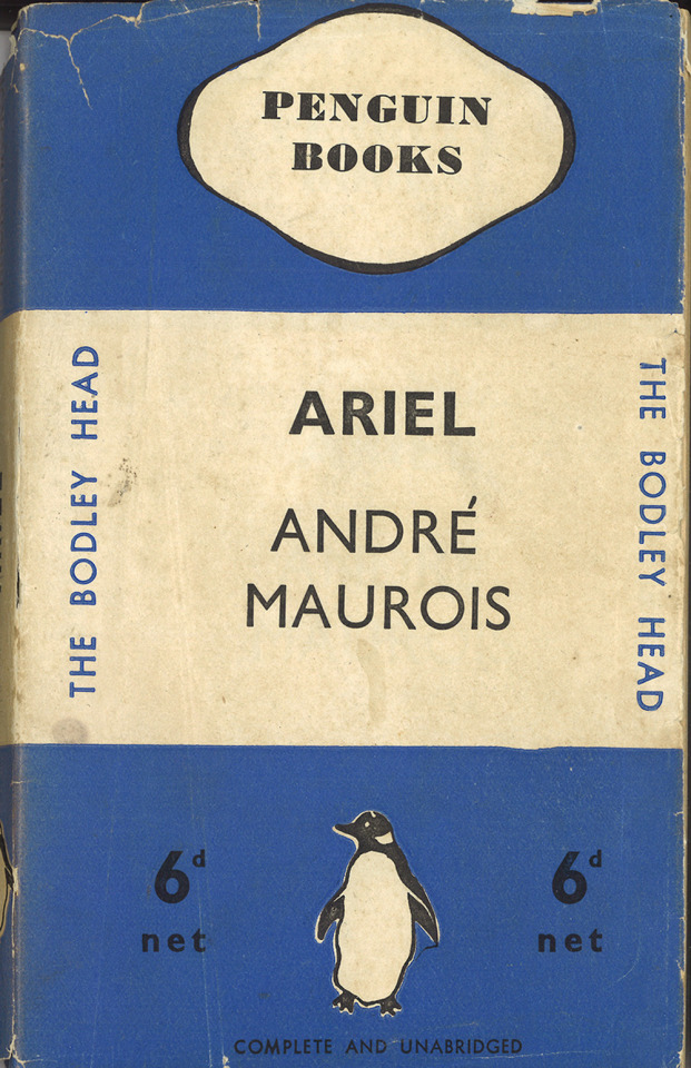
The first penguin book published - Ariel by Andre Maurois. Available at Penguin - https://www.penguin.co.uk/company/about-us/company-history/company-timeline.html
With a move towards illustration in television, film and advertising, graphic design became much more defined as a profession, and book cover design began to adopt influences - and become the main medium for many in the modern graphic design world.
References:
Collie, F., 2017. Graphic Design — ‘The Yellow Book’ — Aubrey Beardsley 1872–1898. [online] Medium. Available at: <https://medium.com/fgd1-the-archive/the-yellow-book-aubrey-beardsley-1872-1898-9bae4e9ca78d> [Accessed 21 February 2021].
Domestika. 2020. A Brief History of Book Covers | Blog | Domestika. [online] Available at: <https://www.domestika.org/en/blog/5484-a-brief-history-of-book-covers> [Accessed 21 February 2021].
Graphéine - Agence de communication Paris Lyon. 2017. A short history of book covers - 1/4. [online] Available at: <https://www.grapheine.com/en/history-of-graphic-design/history-of-book-covers-1> [Accessed 21 February 2021].
Graphéine - Agence de communication Paris Lyon. 2017. A short history of book covers - 2/4. [online] Available at: <https://www.grapheine.com/en/history-of-graphic-design/history-of-book-covers-2> [Accessed 21 February 2021].
6 notes
·
View notes
Last Seen Blogs

melennui
ennui melon

mariiegravel
yin☯yang

bookobsessedfreak
CookieCreates

harolddetective
Harold Detective

devilstheory
XANDER XANDIRT EVIL CLONE