
Design student account for a mock florist company called Blooming Gorgeous
15 posts
Don't wanna be here? Send us removal request.
Last Seen Blogs

cuachicqxeh-blog
bastard son.

c-countly
C.COUNTLY

tofuless
💮☆°*o.×.o*°☆💮

socialistspacepimp
Azz,Musik, Politik, Blaqness

allisonwilliamsdaily
•— allison williams daily —•
Photo
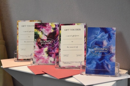
Blooming Gorgeous gift cards made up and presented.
3 notes
·
View notes
Photo
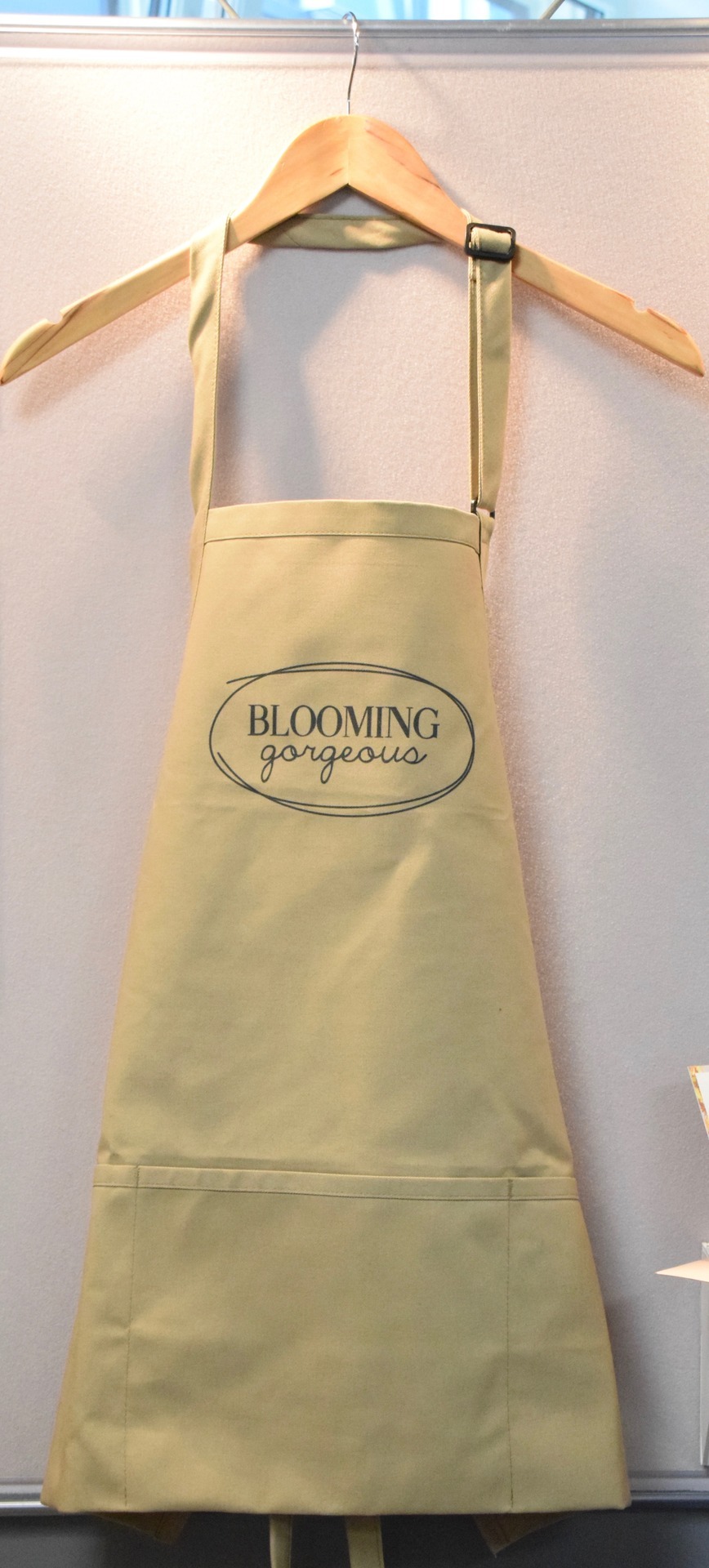
I got an apron made up with the logo printed on it. It’s wipe and washable so every practical for a florist getting dirty.
0 notes
Photo
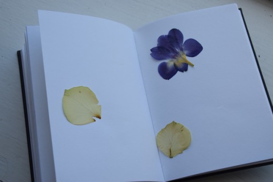
I tried pressing flowers to see if I could use the detail of the veins in the petals in any of my designs. They made a very delicate patters when used with paints however, I ended up deciding on my design before the flowers were fully dried.
1 note
·
View note
Photo
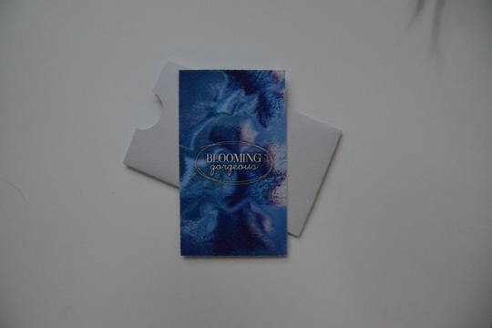
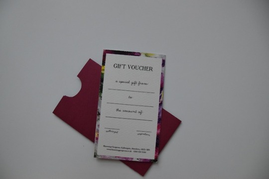
Gift voucher. Third gift voucher. Since the voucher is very dark I used a very light violet carder the sleeve. Again printed on thick, textured, white card. I left the layout very simple, including space to write who the voucher was for, from and the value it contains as well as space for a staff initial and date.
0 notes
Photo
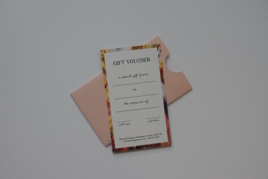
Gift voucher. This one I used a darker shade for the sleeve of the voucher meaning the voucher itself stands out when taken out. Again printed on thick, textured, white card. I left the layout very simple, including space to write who the voucher was for, from and the value it contains as well as space for a staff initial and date.
0 notes
Photo
Gift voucher. Again printed on thick, textured, white card. I left the layout very simple, including space to write who the voucher was for, from and the value it contains as well as space for a staff initial and date.
0 notes
Photo
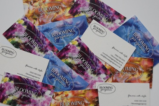
Final printed business cards, I used thick textured white card and a simple reverse side just including the logo and contact details of the florist. The logo showed up much better on the blue background than the others.
1 note
·
View note
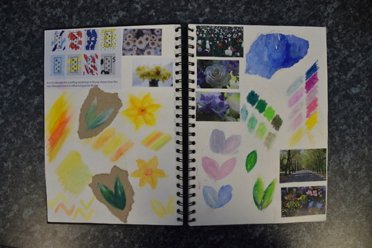
Photo
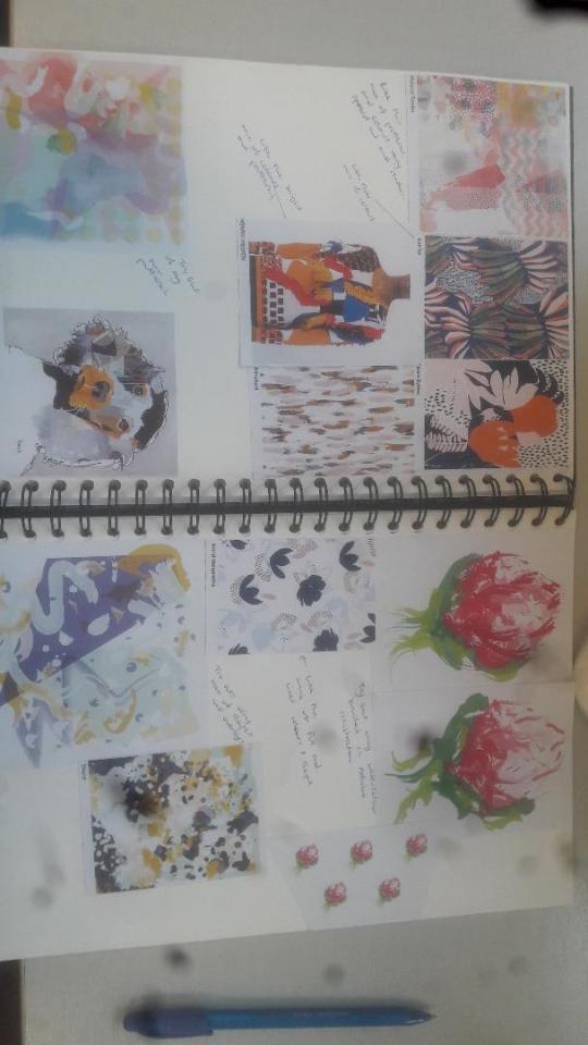
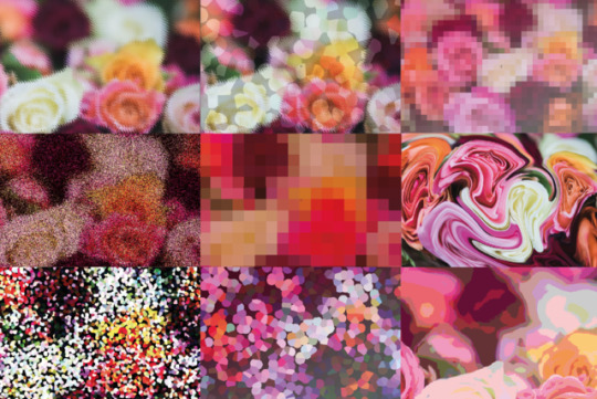
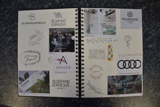
Some research and experiment work. Trying to find and take inspiration form different patters, colour styles and layouts to see what would work for my florist branding
1 note
·
View note
Photo
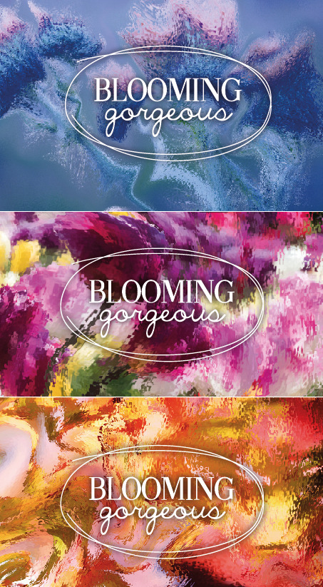
I made this three background to be used for business cards and gift vouchers. I choose three different colours all using the same techniques to create them to give a more colourful range to my branding. They can also my associated with different functions and occasions.
0 notes
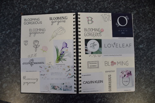
Photo
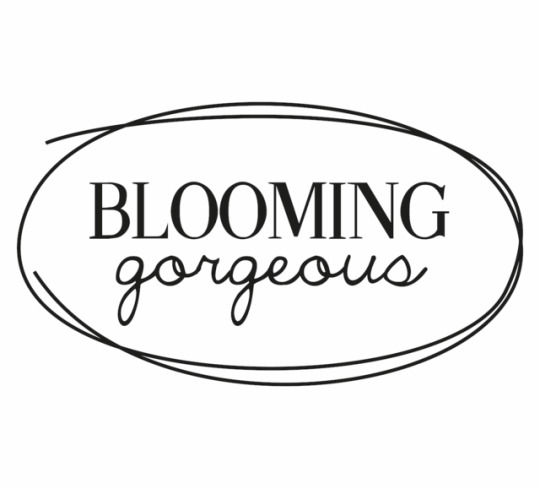
My final logo for Blooming Gorgeous mock florists. I choose this as its simple and can be read easily. My target market for my florists is higher end functions and gifts. The two typefaces I used Fine Style and The Only Exception are very different, Fine style being much more sophisiticated for high class target market and The Only Exception being softer relating to the flow of flowers and petals.
0 notes
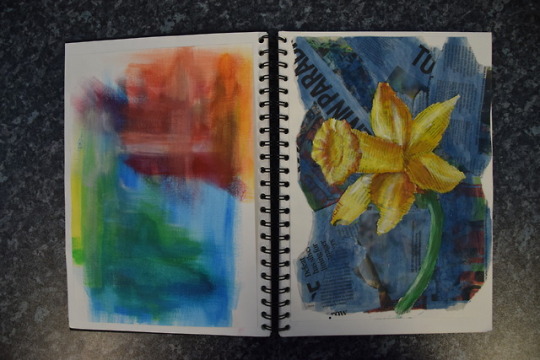
Photo
I played around in photoshop to distort a photograph of a bouquet of flowers. Some of the editing tools worked much more effectively than others.
0 notes
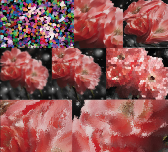
Photo

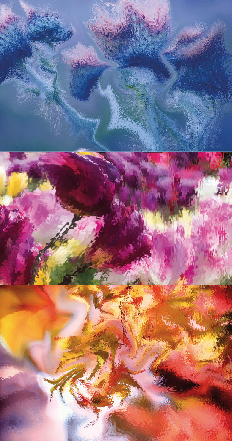
Experimenting with colours, texture and medias using my own photographs as inspiration. I then scanned some of my experiments in and played around with them on photoshop.
0 notes
Photo
My first roughs for making my logo. I wanted to make a logo that was sophisticated and simple without colour so it wouldn't get lost in front of flowers and I could make the backgrounds very bright.
0 notes
Photo

My rough time plan for florist brief
0 notes
Photo
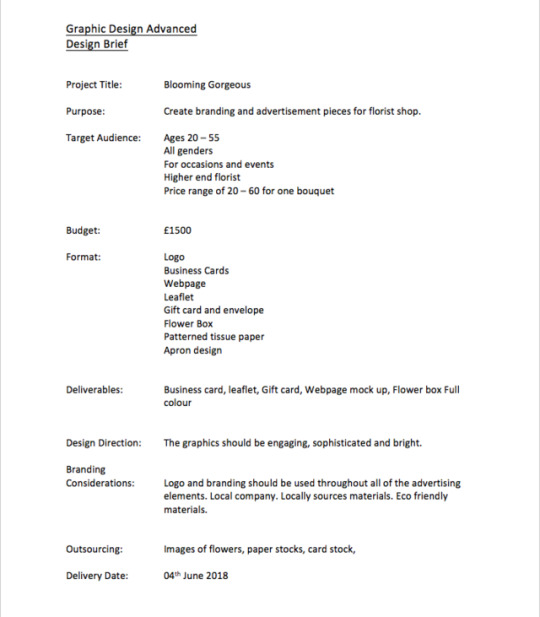
For my final HND Visual Communications project I have made my own brief to design the branding for a florist. I choose a florist as there is a number of target market directions you can go and I wanted to create a bright and colourful final project. I am keen to create a webpage for the business and the business card and gift card so I can explore some different materials.
3 notes
·
View notes