#cmyk detrimental
Text

au
#tsurumaki maki#synthv#synthesizer v#big al#vocaloid#vocaloid big al#circus-p#vocacmyk#cmyk detrimental#circus-p detrimental#august 2023
93 notes
·
View notes
Text

cmyk a day 8: detrimental big al! twitter ver.
big al synthv ai when tbh.
sketch and prompt list under the cut!


#everyone do me a favor and pretend i uploaded this yesterday. thanks#vocaloid#cmyk#circusp#big al#big al vocaloid#treat me so right luka is coming btw she'll be up some time tonight
20 notes
·
View notes
Text
Vocaloid - CMYK (Circus-p) RP starters :
“It'll be alright “
“Hey, do you remember last summer when we visited the beach?”
“Have we gone too far?”
“I’m falling out of love again.”
“Take me back to summer.”
“May you have the strength to make it safe.”
“ Right here I'll stay, my dear.”
“I’d rather be the quiet one.”
“No, I don’t wanna steer the ship.”
“I'm the girl to ask you just one little question.”
"With any luck, we're alone at last"
“You are my downfall.”
“You're detrimental, you'll always be.”
“I don't want to be temporary.”
“No brand or designer can match your stature.”
“I should just trash all that self improvement bullshit.”
“Thought that our fates were intertwined.”
“Don't wanna burst your bubble but I've been there, done the rounds.”
“What should I say first?”
“Think of me as you face the crowd.”
“I won't cry another tear for you.”
“ I'll grab a coffee.”
“I can't tell who I am anymore.”
“Maybe I've said all that needs to be said.”
“What goes around comes around.”
“I must confess that I’m in distress.”
“I've got a bad habit for sabotage.”
“I won't tell you how to live.”
“Misery loves company, baby.”
“What's wrong and right?”
“I can't expect you to save me.”
“ Y'know there's this guy who won't just shut up about me.”
“I am breaking away.”
“Watch me bring the fire.”
“They're coming to find me.”
“I know your craving for a brand new low.”
“You listen when it hurts too much to bear.”
“My happiness is never cared for.”
“I'm better off worse.”
#VOCALOID STARTERS#vocaloid rp starters#sentence starters#roleplay starters#rp starters#music#music starters#circus-P#roleplay memes#roleplay sentence starters#rp memes#rp
33 notes
·
View notes
Photo

CMYK June Day 6
Detrimental
#please listen to cmyk by circus-p#i redrew the details 5 times because i was using the ref sheet at first#but it doesn't add up with the final thing#so woop#vocacmyk#vocaloid big al#synthv#tsurumaki maki#cmyk magenta#cmyk magenta ep#not ec
15 notes
·
View notes
Text
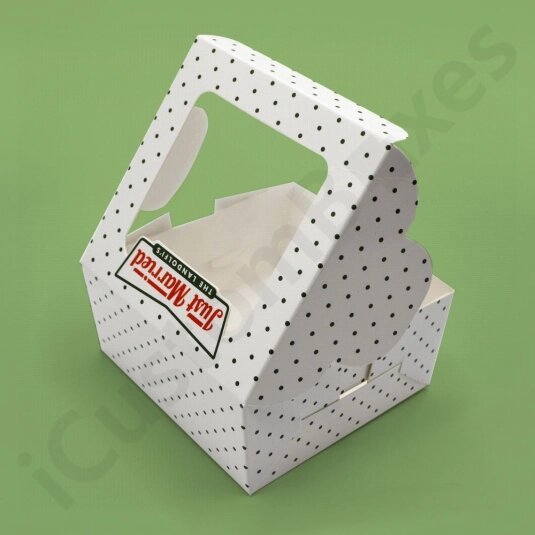
Accurate Size Packaging in Creative Designs:
The first step of creating a perfect package is determining the box size. Customization allows you to craft custom chocolate boxes that follow the product's dimensions in the required designs. You can opt for handy and stylish box's designs such as: tray and sleeve packaging, two-piece boxes, tuck front, gable shape boxes etc. An elegant design packaging comes to the client's notice immediately and has the potential to allure the buyer's attention immediately.
Go for Creative Shape Custom Chocolate Boxes:
Bars of chocolates come in unique shapes like hearts, round, oval, and square. So brands can design the shape of packaging accordingly. The packaging looks appealing when it is created in exciting shapes. Examples include hexagons, octagons, pyramids, rectangles, circular, and pyramid shapes. You can opt for the desired packaging according to the product's demands.
Ultimate Source of Protection:
The yummiest delights of the bakery are highly vulnerable. They are at the risk of spoilage or depriving of their actual flavor because of improper packaging. Standard packaging can cause damage to products. That's why chocolate boxes wholesale are the most recommendable choice of manufacturers and brands. Proper packaging gives air-tight packaging to delicate chocolates by preventing harmful factors like germs, dust, pests, bacteria, moisturization, etc. entering the package. In this way, the actual taste of chocolates is retained for longer, and they stay fresh and tasteful for an extended period. Buyers are likely to purchase a product with trustworthy packaging.

Promote Bakery Brand with Chocolate Boxes Logo:
Customization is a limitless procedure. It offers endless customized solutions. Brands have the freedom to design packaging as they desire.
They can give an individualized look to printed chocolate boxes by adding branding details like logo, tag lines, promotional slogans, etc. The company's name and symbol imprinted on the package offer a special feel to the packaging. Packaging built with an eye-captivating logo creates brand awareness and helps in the company's marketing. The audience can make an immediate purchase when they see packaging labeled with the company's name.
Manufactured with Food-Grade and Sturdy Materials:
Chocolates are perishable baked goods. They can get soggy or moist. That's why they demand premium packaging. Another good feature of chocolate box packaging is its durability. It is manufactured with substrates like kraft, cardboard, and corrugated. All these listed materials are food-friendly and certified by FSC. They do not have any detrimental impact on the health of baked items. It can withstand harsh weather conditions, pollutants, and so on. The customer's trust builds when they see freshly baked items delivered to their homes.
100% Sustainable and Eco-Friendly Packaging Solution:
Nowadays, green packaging has become the need of the hour. Brands can create a positive image by endorsing the green revolution. Brown kraft paper is suitable for producing 100% environmentally friendly packaging. Brown kraft paper is made with wooden chips. It can be recycled or reused completely. Unlike cardboard, kraft paper offers limited room for customization. However, you can give the finest touch to packaging with minimal printed designs.
Grab Customer's Attention with Colorful Packaging:
Clients no longer accept plain packaging. Vibrant color packaging looks highly appealing. It has the magical power to capture a buyer's glance at first sight. You can opt for a full-color CMYK or a one-color PMS scheme. The decision of an adequate color scheme is highly challenging. However, brands can decide the color of prints that aligns with their theme.
Choose Parchment Paper for Wrapping of Chocolates:
Those days have been in the past when people valued products over their packaging. Today, people even notice wrapping paper as well. Parchment paper is ideal for wrapping chocolates. It offers odour, heat, and moisture-proof packaging for chocolates. Printed paper is best for giving a luxurious feel to chocolate packaging wholesale. Brands can imprint artwork or illustrations to create an alluring paper.

Enhance Chocolate's Visibility with Window Boxes:
Chocolate box packaging designed with a transparent window plays a pivotal part in boosting sales. A window patch in packaging offers audiences a pathway to evaluate the shelf life of chocolates without unboxing. The buyer's loyalty and interest develop towards products. They do not take a second but decide to make an instant purchase. However, a window decorated with thick plastic PVC sheets is the ultimate way to prevent germs, dust, dirt, etc. On the other hand, a clear sheet provides clear visuals of the yummiest chocolates.
Give An Elegant Feel to Packaging with Inserts:
Usually, different kinds of chocolate bars are packed in a single box. Designing a box interior with dividers gives a promising look to chocolate box packaging wholesale. Chocolates stay organized and undamaged. It leaves a good impression on buyers when a product is unboxed. Custom-made inserts are available in various sizes, shapes, and colors. Paper and foam inserts are suitable choices. However, foam holders are favored because of their appealing nature.
Choose Custom Boxes Zone to Order Personalized Chocolate Boxes:
Are you seeking a trustworthy packaging supplier to buy top-notch custom chocolate boxes in the USA? There is no better option for you than CustomBoxesZone. Our company is an ideal destination to order custom made boxes at affordable prices. You can count on us for boxes in preferred shapes, sizes, colors, and materials. Above all, our design support is free. Our experts can assist brands in tailoring personalized boxes to their demands. Then what are you waiting for? Join hands with us to get an error-free package with the quickest turnaround. Our company follows standards as well as rush delivery time. We ensure free and on-time delivery worldwide. The best thing is that we offer massive discounts on bulk orders. Please call us to reserve your order right now!
0 notes
Text
favorite song from cmyk is probably wrong + right or sabotage, or maybe falling out of love :D adore them
Also really like Enough and Misery Loves Company and Better Off Worse
OH OH AND DETRIMENTAL !!!! AND PUZZLE
So sad i never got my hands on a cmyk cd :(( couldn't afford it and almost cried lol
Cmyk is probably one of my favorite albums of all time aside from Freshman Year by hop along and Ok Goodnight's albums
1 note
·
View note
Text
Looking for Innovative Ideas to Beat Your Competitors with Custom Bakery Boxes?
Nowadays, there is enormous competition among the brands. Either you are in a small bakery business or large. You must have the urge to get famous and have been searching for out-of-the-box strategies to upgrade your business. We at iCustomBoxes are present to render all your needs. You can order our custom boxes to pack delicious bakery items like cakes, pies, donuts, buns, etc. We customize custom bakery boxes according to your demands. So, you must be wondering how our services are exceptional and what are our specific methods to create an exclusive packaging box. Our company offers plenty of personalized options to create unique packaging. All of these solutions are listed below step by step:
Decide on the Box's Styles for Customized Bakery Boxes:
Selecting an innovative box's style is the first step toward your brand's success. You must be aware of the fact that the package is the first thing to get noticed by the onlookers. If a box fascinates them, there is a higher chance of your item's sale. Bakery items come in multiple sizes, shapes, and layouts. So, it would be best if you chose bakery boxes wholesale following the product's capacity. If you do not know the types of packages, you can share your product's dimensions with us and get your perfect box.
However, mostly used box styles to pack bakery products are:
tuck front box
gable box
box with windows
two-piece box
We give priority to these types of packages due to their beautiful appearance. They look unique and appealing in appearance and keep your products safe.
Manufacturing of Boxes with Finest Quality Material:

When the box selection is made, we go towards the production of the box. Brands face difficulty in choosing the stock. Various companies are utilizing different types of material. Custom boxes make your packaging appealing and give a secure haven to your scrumptious items. We make use of premium quality stock that is affordable and sturdy as well. Our packaging manufacturers make sure not to make use of detrimental substances in the manufacturing of custom cake boxes. Cakes are delicate and need sustainable packaging. We employ kraft and cardboard. Both of these material choices are eco-friendly and 100% biodegradable. Cardboard is a study in nature that keeps bakery items fresh and retains their taste.
Use of Advanced and Innovative Printing Methods:
Printing a box has a long-lasting impact on the audience's minds. So, it must be captivating. The digital printing method is an advanced procedure that prepares your quality prints in a short time. Moreover, we also employ offset printing methods in the production of custom bakery boxes. Our printing tools are eco-friendly and do not emit carbons while manufacturing. If you wish to make packaging more vibrant and dazzling, we have CMYK and PMS printing color models to produce stunning color prints. We give complete freedom to our clients in the selection of printing choices. We also do not bound you for printing. You can go with no printing option as well.
Adornment of Bakery Boxes with Impressive Finishings:
The use of finishings gives a concluding touch to your packaging. We have various embellishing options. We use embossing and debossing to highlight the logo and printed text of the custom cake box. While foil stamping in silver and gold foiling enriches the appearance of the packaging and intensifies the colors.
Need Help? Take Benefit of Our Free Design Support:
Are you a newcomer to the bakery brand and unaware of customized solutions? We got your back. Our experts offer free-of-cost design assistance and guidance at each step of customization.
A One-Shop for All Your Packaging Needs: iCustomBoxes
Going through the above write-up, you must have been the idea why we must be your first choice. Additionally, for the comfort and easiness of our clients, we do not charge for plates and die-cuts and provide 3D physical mock-ups. Afterward, our shipping services are of no cost in the USA and Canada.
Reference: https://customizeboxeswholesale.blogspot.com/2022/10/looking-for-innovative-ideas-to-beat.html
0 notes
Text
Blog 1- Image Types and Tools
1, What is vector art and why is it used widely in both screen and print?
Vector art or a vector image is a piece of illustrated work that follows a pattern of mathematical formulas that utilise shapes, lines and curves. Because of the flexibility of vector art we can easily resize or modify an image without any detriment to its quality, therefore it is widely used in both screen and print works.
2, What are the benefits of using Adobe Illustrator to create digital images?
To create a vector image an easy and useful program to use is Adobe Illustrator. It has a range of layouts to choose from, each with helpful tips and examples which make it easy for beginners to learn. The user can make print-ready graphics and web graphics using the adaptability of CMYK-colours. Adobe Illustrator also has multiple tools under its belt that are specifically helpful when making vector art:
3, Briefly explain the purpose of the Pen tool, the Brush tool and the Pencil tool when creating digital
The pen tool is used to create paths and anchors. Easily seen as the most useful tool in the program, this is widely used when making digital images. The pen tool gives the most creative freedom to the user, having the options to make any shape or line by simply moving anchor points. You're able to delete and colour malleable shapes whichever way you choose, allowing them to be dynamic or three dimensional.
The pencil tool allows the user to draw freehand, this tool is better for people who draw regularly. The width of the stroke can change to suit the art style and the artist can utilise the many stroke patterns and stroke shapes. This tool also allows for lines of organic strokes, therefore giving more dynamic freedom.
Finally, the paintbrush tool lets you draw strokes that have anchor points similar to the pen tool. The stroke then can be stabilised and changed to different strokes with a range of different sizes and shapes.
4, Find three (3) examples of vector art that you like. Upload each image and specify what tools you think were used to draw each of the artwork and why you think these images work well.
These three images make use of the pen and pencil tool judging by the separations of colours using different shapes to outline the highlights from the shadows. The pencil tool is used for smaller details whilst the pen and brush tools are used for larger and heavier details. This style works well because of the solid monochrome coloured lines and shapes made by the pen tool in the foreground, whilst using the gradient feature for needed blending of certain light sources in the background, add unique atmospheric depth.
Two of the images are also great examples of ready to print posters.
In conclusion, vector artists can create both simple, like Tom Whalen’s designs, or complex, like Grzegorz Domaradzki’s designs, that result in a unique set of visually stunning artworks ready for both print and screen.
(438 words)
References:
Walujo, Adrianne; CreativeandDesign; Adobe.https://www.adobe.com/au/creativecloud/illustration/discover/vector-art.html
Gaille, Brandon (2018); BrandonGaille small business and marketing advice. https://brandongaille.com/12-adobe-illustrator-advantages-and-disadvantages/
Anderson, Andy (2007); Informit; Perspection Inc https://www.informit.com/articles/article.aspx?p=728085&seqNum=24#:~:text=The%20Pen%20tool%20utilizes%20anchor,delete%2C%20or%20convert%20anchor%20points.
W3schools; tutorials
Image References:
Moss, Olly; Ollymoss.com; Firewatch.
Whalen, Tom; Strongstuff; FourHoursemanStudios.
Domaradzki, Grzegorz (2013); Iamgabz https://iamgabz.com/


1 note
·
View note
Text
Physics...Done right

The name of Gojou’s Limitless’ form “Reversal: Red“ has actual, solid foundation, connected to the Doppler Shift.
Specifically, the “Red-shift”.
The easy ways of explaining it are two: a star or an ambulance’s siren.
Yeah, I know, pretty different objects, but it’s gonna make sense, I promise.
First of all, we have to talk about the involvment of light (and sound) and its wavelenght
Star
If a star moves away from us, we’ll see its ‘color’ (light) shift. This is because the light frequency lowers to a wider wavelenght, so towards red, and less energy (light) is able to reach us, distance-wise and void-wise; as much as empty space might seem, there’s still a shtickton of stuff we can’t see nor detect into what we consider ‘void’.
Could it be a subtle input on the nature of Unlimited Void? I wouldn’t be surprised.
Ambulance’s siren
When you hear the ambulance approacing you, the siren has a higher pitch, but strangely enough, when it surpasses you and moves away from you, you quickly realize the sound becomes deeper the more distant the ambulance goes. That is exactly the same thing that happens, but with sound, which is another physical unit running on wavelenght. The wavelenght dilates while the ambulance is distancing us, thus producing a progressively lower tone.
Long story short, this is why Reversal: Red might be a name given to a techinque that pushes stuff away from you. It’s not connected to the objects/people themselves more than the concept of their action, their straying, resulting from Gojou’s space and cursed energy manipulation.
The rest of the rant lays down below, don’t continue if you don’t wanna be spoiled.
If you do, welp, not my fault.
As a star move towards us, its light will shift on the spectrum closer to the blue, because its frequency will get higher and the wavelenght will compress. Thus, the energy level is increasing the nearer it gets to us.
I can hear y’all thinking “Oh, THAT’s why the other one is called Forward: Blue.”
Yep, precisely :D
Same as before - and on the contrary at the same time - the form might be named after the “Blue-shift”, the other effect of the Doppler shift.
With the ambulance: as it approaces, you can hear the pitch getting higher and higher; the sound’s frequency hightens, getting to its “blue” peak when it is front of you.
Following the concept of something getting NEARER to you, “Forward: Blue” works pulling in, towards Gojou.
Now, we reached Hollow: Purple. This is were the speculations and the fun begin.
You might ask me: but, Moody, you used an image where blue is not the end of the line, there’s violet (purple) right there. So why not call it ‘Forward: Purple’?
Hollow: Purple then doesn’t seems to make sense. Also, purple is still the mix of blue and red, right?
Well....yes (Hollow: Purple seems to not make sense using the Doppler Shift), yes (purple is still the result of mixing red and blue) and no (it’s shouldn’t be called Forward: Purple).
I think Hollow: Purple mixes the color wheel scheme theory, the ‘spectral’ violet light, and how we are able to perceive violet.
First, let’s talk about how the human eye “sees” this color, ‘cause it’s a trick :P
I’m explaining:
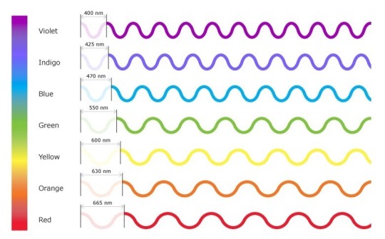
Our eyes have nice little cells to differentiate colors, named photoreceptors: cones and rods.
Usually we have 3 types of cones, each of those reacting to 3 main wavelenghts: blue (high frequency) green (medium frequency) and red (low frequency). Rods are all the same and they’re sensitive to the amount of light (or brightness) in the environment. They’re also the ones who permits us to see during nightime (in a grayscale, ‘cause the cones turn off during the night).
Our eyes’ lenses shields us from the high-energy radiations coming from Sun and space, which are detrimental and dangerous (but some of them are very useful) on a variety of level (UVA [black light], UVB, UVC [germicide], X-rays, ϒ-rays...the nasty stuff, :D). Thus, violet and/or ultraviolet cones don’t have a reason to exsist, since those wavelenghts are not supposed to reach the retina.
Following this idea, we cannot see the wavelenght of violet.
But we see violet.
As the frequencies of the colors stimulates one or more cones and a certain amount of rods, we are able to distinguish more tints, like cyan, magenta, yellow (CMYK...yes, those very one), brown, pink, ochre, gray and all the other shades in between...and yes, purple as well, as a mix of blue and red cones’ activation. Now this makes sense, right?
Here’s a nice and easy list of how colors come up.
We can see purple, but at the same time, we are not.
We can see it as a ‘cone-mix’ color, but not as a ‘spectral’ color.
There’s an anatomical condition called aphakia (greek - “without lens”) in which a person doesn’t have (naturally or because of surgery/incident) one or both lenses, so the radiation is able to enter the eye and they can “see” the ultraviolet light. Still, it’s not the bright purple we might imagine; some of them define it as a blueish-purpleish white (if someone who’s reading this is aphakic, please don’t be afraid and share your version with us!).
Complicated? Yeah, I feel you.
In my opinion, “Hollow: Purple” extrapolates both this concepts: it is the combination of Red and Blue as cones’ stimulation (color wheel) = Gojou’s techinques of pushing and pulling, which escalates from a ideological nonesense into a consequent annihilation, and something that seems real, feels real, really isn’t, but still happens.
Like "Violet Light”, indeed :)
Same as UV spectrum energy, Hollow: Purple destruction capacity is bordeline-armageddon.
Funny last detail: red is supposed to carry the less amount of energy, while blue has the highest, but in the story it’s the opposite. Reversal: Red is said to be twice the strenght of Forward: Blue, because Gojou is actually manipulating Blue (the original form) into Red, converting negative energy into positive, thus increasing the devastation scale.
#best boi gojou#gojou satoru#satoru gojou#gojo satoru#jjk#jujutsu kaisen#sorcery fight#jjk theories#jujutsu kaisen theories#jjk theory#jujutsu kaisen theory#gojou theories#best sensei gojou#he's gonna be alright guys#cursed techniques#limitless#reversal red#forward blue
234 notes
·
View notes
Text
Brand Guidelines -What are they?
Brand guidelines are essential for every company. They are a set of terms that detail how the company should be portrayed and are especially useful for future designers of the brand to know what they can and cannot do when designing for that company.
Brand guidelines create consistency and help in making a brand appear reliable. They offer rules for how your logo, wordmark and visual marque should/shouldn’t be displayed. They detail what colours are allowed to be used and in what way.
Tone of Voice
Tone of Voice is a very important part when it comes to creating a brand. They way you communicate to you consumer is detrimental to how they perceive you. In order to define your tone/voice you must know what why you want your brand to be perceived. If you want a formal brand you should use formal language etc. Another important aspect to consider is wether you want to talk about yourself in first or third person.
Virign media have a very good guideline for how their tone and voice should be portrayed.
https://www.virginmobile.com.au/Global/virgin-mobile/static/images/style-guide/pdf/ViginMobileTone-of-Voice.pdft
It is very detailed and leaves nothing up to chance. I noticed they also keep their tone of voice is consistent through out the guidelines as well.

You should include the following in your brand guidelines:
Primary and secondary colour palette including the CMYK, HEX, and RGB. Remember to include what colours should and shouldn't go together.
How the wordmark, monogram and visual marque should/shouldn’t be displayed
Typography - a list of the main fonts including if or when you use all caps or only lowercase for each.
Logo space requirements - how it should be displayed on packaging.
Think about anywhere your logo and branding could be including your website, social media, stationery, advertising, and how it should be displayed.
Brand tone as mentioned above.
Examples of use - business cards, advertising, packaging etc.
Unacceptable uses - ie. never stack the logo and name, don’t make it transparent, minimum size requirements for use, etc.
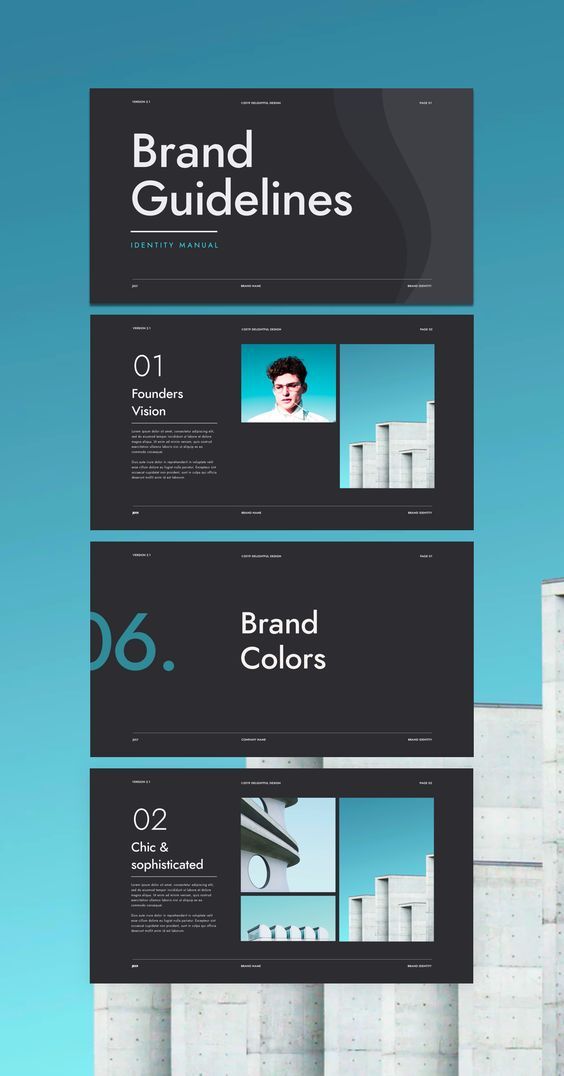
Above is an example of how brand guidelines should be displayed. Found on Pinterest.
When it comes to the actual layout and presentation of your own brand guidelines it is important that they are visually appealing as it can be a lot of information to take it. They should also visually represent the guidelines you are setting out for your brand.
0 notes
Text
Playing Dumb with ‘Assume Form’: A Word on Pitchfork’s Pettiness
What is it about James Blake’s latest album that’s forced music journalists to forget what song-writing is?
The pervasive criticism of Assume Form seems not to be of any technical shortcomings in the album or non-delivery in any discernible musical terms, but instead a criticism which derides Blake for writing songs with apparent confessional themes that are within easy-reach of his personal life and recent circumstances. Pitchfork pronounces a decidedly ambiguous verdict on Assume Form with little technical justification, calling it ‘aggressively pastel’. This lazy critical response has nothing to do with the substance of the album. The reviewers’ problem lies not in their ability to interpret the developed confessional nature of Blake’s song-writing, but rather in Blake’s public-facing persona which has challenged music journalism’s ‘toxic masculinity’ in relation to his music.
Pitchfork justifies its 5.8/10 rating for Assume Form by describing: ‘a suffocating seriousness that runs through the singer and producer’s fourth album, one that bogs down genuine moments of levity and love.’ (Note here: the description of Blake as ‘singer and producer’, rather than songwriter.) This seriousness, they seem to suggest, is at odds with ‘an album ostensibly all about the freedom to be oneself that love bestows’ – their criticism is one of perceived mood and emotion, failing even to notice that ‘freedom’ has to come from a constriction – from being ‘bogged down’ in some way in the first place. That Assume Form might in fact be the journey of the very transition they are describing seems to have escaped them. In any case, Blake doesn’t owe it to himself, the Industry, or the art of expression through music to focus wholly on ‘levity and love’.
Elsewhere, Crack Magazine supplies this justification for its 6/10 ruling: an ‘aesthetic tangle is the undoing of Assume Form, an album of gorgeous moments going nowhere in particular.’ (Though, exactly which elements are caught up in this aesthetic tangle is unclear from the article, and an outline of where the gorgeous moments are expected to go is explained nowhere.) Both critical opinions do pick up on a tension in Blake’s sound which has historically been critically celebrated; but now these two facets have suddenly become problematic for the review-sites. The two facets are Blake’s electronic dance-music heritage and 808 drum-palette, alongside his soulful lyric moments, and often delicate harmonics and chord progressions. Pitchfork goes on to suggest that Blake ‘sounds hamstrung by old habits’, supposedly ‘trapped in a musical cage of his own making’; though these habits are not described anywhere in the article.
But if Pitchfork, Crack, and other outlets are having problems reconciling the two aspects of Blake’s sound on Assume Form – the tender, lyrically lucid and confessional, and the ‘heavier’, club-friendly 808 dance-music styles – then such journalists should remind themselves of how they celebrated the union of these supposedly disparate aspects on Blake’s first album. On Limit To Your Love low-frequency dubstep-style oscillations rumbled below Blake’s soulful lyrical delivery: ‘There’s a limit to your love / like a map with no ocean.’ There were no complaints here surrounding the same dual-influence of Blake’s song-writing style. And Assume Form with all its guest features, Spanish-language singing, and rap verses is hardly recycling the same material or composition habits. So, what’s changed?
Stepping back a few months into May 2018: Pitchfork journalist Kevin Lozano calls Blake’s Don’t Miss It ‘sumptuous sad boy music’ – suggesting ‘maybe he [Blake] needs a night out’. This prompted Blake to issue a social-media response where he expressed his frustration with such ignorant and intolerant labels being attached to creative work which attempts to deal with issues of mental health, male suicide and expression.
As industry leaders, we should be safe to assume that Pitchfork employ highly-skilled writers who are attuned to all the resonances of the terms they apply to artists’ work. These journalists serve as first-response commentators on so many significant album releases. As such, they have a serious responsibility for which they are – presumably? – paid. So when these writers use an oxymoronic term like ‘aggressively pastel’ as an overall summation of Assume Form, we must assume that they are doing so knowing their words’ full resonances, and are intentionally invoking a tension which is fair to the album at hand. ‘Pastel’: a sense of soft, subtlety within the music (perhaps also referencing back to Blake’s previous album The Colour in Anything), but which is also a tenderness that, in their opinion, is ‘aggressive’ – suggestive of an excess, an overworked or forceful wishy-washy nonchalance in the music.
The intended tension in their ‘aggressively pastel’ labelling is indicative of what they deem to be problematic: an unsatisfactorily-resolved (5.8/10-worthy) tension in the album. That is to say: the tension between ‘aggressive’ (as in a kind of angry and direct forward force) and ‘pastel’ (as in a refusal to commit to anything solid) exemplifies these journalists’ problem with the album. More distressingly, it demonstrates a really reductive preschool-level preoccupation with two aspects of Blake’s sound that the same journalists have hitherto celebrated in previous releases. They suddenly find it banal or unsuccessful that a lyrical or harmonic tenderness can be combined with harder, club-music sensibilities; that, suddenly, the music must commit to a unified mood or uncomplicated emotional discourse. But the reason the dual-aspects of Blake’s sound have now become problematic for these journalists is not because of any technical, musical shortcomings in Assume Form – it’s problematic because Blake has addressed these journalists head-on for labelling him a ‘sad boy’. Shortly after its publication, Blake sent a tweet about Pitchfork’s review: ‘I think they’re still angry that I called them out for their toxic masculinity [kissing-face emoji]’. Something we can now see – to the detriment of both the industry and its supporting journalistic craft – is beyond doubt.
Perhaps Lozano could have had a point in one sense: Blake’s musical versatility has had a slightly preferentially divisive effect among fans; some preferring the softer side to his sound, others his weightier dance-music heritage on his earliest EPs. And we might sympathize with new, first-time, or late-coming listeners who have to reconcile the James Blake of early 140-bpm productions such as CMYK with the more lucid present-day song-writing of Don’t Miss It. But, any journalist worth their Pitchfork page-space would surely recognize (if they could not praise) this development as part of Blake’s song-writing growth – not least in the ambitious lyrical departures and achievements he makes on Assume Form.
While for the first time to such an extent on a James Blake album, the reviews are quoting and dissecting Blake’s lyrics (indicating a transition to newfound significance and lucidity in Blake’s lyric-writing), none of the recent reviews make mention of Assume Form’s comment on the effects of technology and its influences on the contemporary mind and emotions. It’s one of the album’s most important successes, especially when considered in relation to (but not necessarily as a representation of) Blake’s openness about his mental health. ‘Drop the pin on the mood that you’re in’ sings Blake in Power On. ‘Power on’ as in continue, keep going, but also turn on your device; become connected – a kind of semantic neighbour to switch off. The role of technology in relation to its user is constantly reinforced on the album, especially in Don’t Miss It. The video for the track is a real-time scrolling iPhone-note transcription of Blake’s lyrics as he sings them: bringing both the lyrical content and technology’s role in intimate thought-transcription to the foreground of the audience’s mind.
Furthermore, the long list of ‘When you…’ clauses in Don’t Miss It seems to have escaped the reviewers’ attention so far. These ‘when-you’ clauses resonate with a contemporary format for internet memes that the modern listener (and music journalist) instantly recognizes: e.g. When you … ‘do X,Y,Z’ + image. Blake uses and repeats this familiar internet idiom from everyday meme frameworks to make a serious, accumulating, and accessible commentary about issues of mental health – ‘When you stop being a ghost in the shell / And everyone keeps saying you look well’. By using the language construction of an exclusively technological medium (the meme) in Don’t Miss It, the album enters into contemporary dialectic (through a contemporary idiom and sound palette) with contemporary issues surrounding mental health – interrogating how technology can be used to variously exacerbate and assuage our concerns of self-worth (‘if there’s no need for the perfect image’). The Pitchfork journalists owe it to their readers and to anyone who’s ever acknowledged (or has yet still to acknowledge) difficulties with their mental health to properly confront these crucial themes on the album. And whilst Blake’s frank responses and interview comments to Pitchfork, Dazed, and other outlets may indicate a personal struggle in this area, we do not necessarily have to equate a song’s experience of mental health with Blake’s own.
This is because Assume Form will inevitably be more than a ‘loved-up’ confessional outpouring of Blake’s feelings – ‘peeling off the layers to bare all his innermost thoughts’ as Pitchfork will have us believe. As its title suggests, Assume Form also allows Blake (the artist and songwriter, rather than the LA-dwelling Londoner) to assume the form of a number of variously afflicted, contented, and obsessive personas. These personas might closely align with Blake’s own at times, but they are not wholly or necessarily Blake himself. A confessional song-writing mode does not necessarily represent the artist directly. Surely Pitchfork’s journalists are aware by now that a songwriter’s physical singing voice is distinct from the possible persona or character established by the lyrical content of a song. In fact, the Pitchfork reviewer almost comes close to completing this distinction – but his adverb (‘off-puttingly’) betrays the whole problem. The reviewer ‘can’t help but find something off-puttingly performative and voyeuristic in its [the track Can’t Believe The Way We Flow’s] romantic rapture’. But the romantic rapture isn’t Blake’s – it’s a character, or derivative persona of Blake’s creation and articulation. If the track and its refrain is sickening or off-putting then it is deliberately so, in order to embody an excess of a particular romantic emotion. If the journalist is ‘off-put’ it’s because of the ‘voyeuristic’ position the song establishes; it’s because Blake is being deliberately ‘performative’ –articulating excess and astonishment through a separate character.
A similar thing happens on I’ll Come Too – what could be a kind of modern-day poolside crooning is transformed into something yet more severe and sinister through the obsessive persona’s asides, making him even stalker-like at times. Blake sings ‘Oh you’re going to New York, I’m going there / Why don’t I come with you? / Oh, you’ve changed to LA / I’m going there, I could go there too’. Any tenderness or romance in the song’s mood which is established by the rich chords and vocal hums as Blake sings ‘I don’t wanna go home / Shall we drive from zone to zone’ is quickly undercut by the sinister suggestions of finality: ‘if it’s the last thing I do’; ‘I’ve got nothing to lose.’ Even if she’s ‘the reason this album exists’, Blake isn’t describing his courting process with Jameela Jamil here – he’s embodying a persona to explore an obsessive kind of love.
It’s worth saying that elsewhere, in cruder musical instances, Pitchfork seem capable of grasping this distinction. They can identify an artist inhabiting a different persona for a certain rhetorical effect. They don’t really think Tyler, the Creator is writing a song to consolidate his first-hand experience of murder when he delivers the lines on Garbage: ‘I got violent, long story short he's not breathing / For some reason I liked it and it was really exciting’. These journalists do not take it to be an autobiographical statement from Tyler himself; in fact, they are able to define it as: ‘a rap persona pitched between shock-riddled misanthropy and confessional reflection’. So why are they taking all of James Blake’s ‘confessional’ lyrics to be entirely autobiographical – and failing both their readers and their own appreciations in the process? The answer is simple: they just don’t want to make the effort. Blake has called them out and now they’re playing dumb with his album.
The world of music journalism moves fast. But saying something quickly is far less important than saying something accurate and considered. It’s why Assume Form will survive to be an important album and the quick-fire clickbait labels of Kevin Lozano & Co. will be proved careless, petty, and ill-conceived. More importantly, such comments will be quickly forgotten when listeners witness for themselves the stunning tensions and resolutions of an album that can be both ‘aggressive’ and ‘pastel’ simultaneously.
With that in mind, Lozano, I’ve got tickets for James Blake’s Assume Form live show. I’m going to stand in the front row – maybe I’ll dance, maybe I’ll cry. Maybe I’ll do both at once.
0 notes
Text
How InkJet Printers Work
The printers using inkjet innovation were first presented in the late 1980s and from that point forward have increased much prominence while developing in execution and dropping in cost. They are the most well-known sort of PC printers for the general customer because of their minimal effort, high caliber of yield, ability of printing in striking shading, and usability. Every printer which takes a shot at inkjet innovation puts amazingly little beads of ink onto paper to make a content or a picture. In the individual and independent venture PC showcase, inkjet printers at present prevail. Inkjets are typically modest, calm, sensibly quick, and numerous models can deliver superb yield. Like most current advancements, the present-day inkjet is based on the advancement made by numerous before variants. Among numerous supporters, Epson, Hewlett-Packard and Canon can guarantee a considerable offer of credit for the improvement of the cutting edge inkjet innovation.
In the overall purchaser advertise, four producers represent most of inkjet printer deals: Canon, Hewlett-Packard, Epson, and Lexmark. The normal inkjet printer more often than excludes inkjet printhead get together, paper feed get together, control supply, control hardware and interface ports. The inkjet printhead get together contains a few parts. One of them is the printhead which is the center of the inkjet printer and contains a progression of spouts that are utilized to splash drops of ink. Another printhead part is the inkjet cartridge or inkjet tank. Contingent upon the maker and model of the printer, ink cartridges come in different blends, for example, separate dark and shading cartridges, shading and dark in a solitary cartridge or even a cartridge for each ink shading. The cartridges of some inkjet printers incorporate the print head itself. The printhead alongside the inkjet cartridge/s are moved forward and backward over the paper by gadget called a stepper engine utilizing an uncommon belt.
As the air pocket extends, a portion of the ink is pushed out of a spout onto the paper. At the point when the air pocket crumples, a vacuum is made. This maneuvers more ink into the print head from the cartridge. An ordinary air pocket fly print head has 300 or 600 minor spouts, and every one of them can fire a bead all the while. Warm inkjet innovation is utilized only in the purchaser inkjet printer advertise. The ink utilized is generally water-based, shade based or color based yet the print head is created for the most part at less expense than other ink fly innovations. As opposed to the air pocket fly innovation, the piezoelectric innovation, licensed by Epson, utilizes piezo gems. A precious stone is situated at the back of the ink store of every spout. The precious stone gets a small electric charge that makes it vibrate. At the point when the precious stone vibrates internal, it powers a little measure of ink out of the spout. When it vibrates out, it maneuvers some more ink into the store to supplant the ink splashed out.
The consistent inkjet strategy is utilized economically to check and coding of items and bundles. The primary patent on the thought is from 1867, by William Thomson. The main business show was presented in 1951 by Siemens. In constant inkjet innovation, a high-weight siphon coordinates fluid ink from a supply through a tiny spout, making a consistent stream of ink beads. A piezoelectric precious stone makes the surge of fluid break into beads at ordinary interims. The ink beads are exposed to an electrostatic field made by a charging cathode as they structure. The field is fluctuated by the level of drop avoidance wanted. This outcomes in a controlled, variable electrostatic charge on every bead. Charged beads are isolated by at least one uncharged "protect drops" to limit electrostatic repugnance between neighboring beads. The charged beads are then coordinated (avoided) to the receptor material to be printed by electrostatic diversion plates, or are permitted to proceed on undeflected to a gathering canal for reuse.
Consistent inkjet is one of the most seasoned inkjet innovations being used and is genuinely develop. One of its points of interest is the extremely high speed (~50 m/s) of the ink beads, which permits the ink drops to be tossed a long separation to the objective. Another favorable position is opportunity from spout obstructing as the stream is dependably being used When printing is begun, the product application sends the information to be printed to the printer driver which makes an interpretation of the information into an organization that the printer can comprehend and verifies that the printer is on the web and accessible to print. The information is sent by the driver from the PC to the printer by means of the association interface. The printer gets the information from the PC. It stores a specific measure of information in a support. The cradle can extend from 512 KB arbitrary access memory (RAM) to 16 MB RAM, contingent upon the printer show. Supports are valuable since they enable the PC to complete with the printing procedure rapidly, rather than trusting that the genuine page will print. On the off chance that the inkjet printer has been inert for a timeframe, it will typically experience a short cleaning cycle to ensure that the print heads are spotless. When the cleaning cycle is finished, the inkjet printer is prepared to start printing. The control hardware actuates the paper feed stepper engine.
This draws in the rollers, which feed a sheet of paper from the paper plate/feeder into the printer. A little trigger component in the plate/feeder is discouraged when there is paper in the plate or feeder. In the event that the trigger isn't discouraged, the inkjet printer illuminates the "Out of Paper" LED and sends an alarm to the PC. When the paper is nourished into the inkjet printer and situated toward the beginning of the page, the print head stepper engine utilizes the belt to move the print head gathering over the page. The engine delays for the merest division of a second each time that the print head splashes dabs of ink on the page and afterward moves a small piece before halting once more. This venturing happens so quick that it appears to be a constant movement. Different dabs are made at each stop. It showers the CMYK (cyan/fuchsia/yellow/dark) hues in exact adds up to make some other shading possible. Toward the finish of each total pass, the paper feed stepper engine propels the paper a small amount of an inch. Contingent upon the inkjet printer display, the print head is reset to the starting side of the page, or, as a rule, just turns around bearing and starts to move back over the page as it prints. This procedure proceeds until the page is printed. The time it takes to print a page can differ broadly from printer to printer. It will likewise change dependent on the intricacy of the page and size of any pictures on the page. When the printing is finished, the print heads are stopped. The paper feed stepper engine turns the rollers to wrap up the finished page into the yield plate.
Most inkjet printers today use inkjet inks that are exceptionally quick drying, so you can promptly get the sheet without smearing it. Contrasted with before customer situated printers, inkjet printers have various focal points. They are calmer in activity than effect speck network printers or daisywheel printers. They can print better, smoother subtleties through higher printhead goals, and numerous inkjet printers with photorealistic-quality shading printing are broadly accessible. In contrast with progressively costly advances like warm wax, color sublimations, and laser printers, the inkjet printers have the upside of for all intents and purposes no warm-up time and lower cost per page (aside from when contrasted with laser printers).
The detriments of the inkjet printers incorporate shaky print heads (inclined to obstructing) and costly inkjet cartridges. This normally drives esteem disapproved of shoppers to consider laser printers for medium-to-high volume printer applications. Different detriments incorporate ink dying, where ink is diverted sideways from the ideal area by the narrow impact; the outcome is a sloppy appearance on certain kinds of paper. Most inkjet printer producers additionally offer unique dirt treated paper intended to diminish dying. Since the ink utilized in most inkjet cartridges and ink tanks is water-solvent, care must be taken with inkjet-printed archives to dodge even the littlest drop of water, which can cause extreme "obscuring" or "running."
Other than the notable little inkjet printers for home and office, there is a business opportunity for expert inkjet printers; some being for page-width design printing, and most being for wide organization printing. "Page-width position" implies that the print width ranges from about 8.5" to 37". "Wide organization" implies that these are inkjet printers going in print width from 24" up to 15'. The utilization of the page-width inkjet printers is for printing high-volume business correspondences that have a lesser requirement for garish format and shading. Especially with the expansion of variable information advancements, the page-width inkjet printers are critical in charging, labeling, and individualized lists and papers. The use of the vast majority of the wide configuration inkjet printers is for printing publicizing illustrations; a minor application is printing of plans by planners or architects
0 notes
Text

cmyk a day 7: detrimental maki twitter ver.
only one more day till everyone gets big al'd...
sketch and prompt list under the cut!

#synthv#tsurumaki maki#synthesizer v#cmyk#circusp#i lowkey hate this one but. i'm currently out of town with my family and do not have time to fix it so whatever#that's also why i'm posting at like. 8 am lmao i woke up early to finish this
11 notes
·
View notes
Text
Unraveling The Complexities Of Sticker Printing In Singapore
To someone who’s a complete stranger to the process, sticker printing in singapore seems like an overtly pricy and complicated procedure but that can’t be further from the truth. Here’s where the price of your sticker printing orders are going into when you delegate your printing task to printing companies:
Planning
Before everything else, the designated printer will first process your order and begin planning on how to cut the stickers you want after sticker printing. This is also the stage where they determine if extra cutting services are needed- simple shapes like squares and such usually can be processed with normal cutters whereas intricate details are usually done with equipment like Cricut machines.
Tweaking Templates
They will then assess and tweak your design according to their template so that they have a bleed area to work with. Most printing solution companies that provide sticker printing in singapore allow their customers to submit the designs they already have to use for their stickers. But this also means that these designs usually have to be transferred or converted into formats that they are able to use.
To minimise the likelihood of there being any discrepancies, there are some things you can do to cut down on potential troubles. For one: Colour matching. Most printers, both at home and professional, make use of CMYK colour printing to get printing tasks done. This is because this way of processing sticker printing tasks will offer more colour accurate results.
You’ll want to check that your editing files are already in CMYK settings before you go ahead with designing your sticker printing template.
Test Printing
Once your design is certified ready, most printing services that offer sticker printing in singapore will go the extra mile by first producing a test print. This is also yet another way to check and ensure that all of your designs translate well on to the sticker paper and gauge the overall quality. Only when they’re certain of the results and you’ve given the go ahead, will they carry on printing the amount you need. As an added tip: do let your printing service provider know if you need water-resistant sticker paper. Most will suggest making use of matte sticker paper and pigment ink.
Die Cutting
Most printing service providers also offer die cutting so that you can get your stickers and immediately use them. If your stickers require custom cutting, then this is the most affordable and safest option to consider. After your stickers are cleanly cut, your printing service provider will then inform you to collect them or package them for delivery.
When you make an order for custom sticker printing in singapore, this is where all of your payments are going to. With this in mind, you’ll be able to better gauge if the prices you’re forking out are well worth the results and added manpower that goes into fulfilling it. Finding the most compatible sticker printing service provider might take a while of searching but when you’re able to find the right solution you need, the pros of outsourcing often brings you more benefits than detriments.
For more details on sticker printing, visit the URL https://www.kiasuprint.com/cheap-sticker-label-printing-service-in-singapore/products
Reference:
Kiasuprint.com - *Hot* Stickers & Cheap Sticker Printing Service in Singapore
0 notes
Text
Should i work in RGB or CMYK
As i am working digitally i feel it is important to understand colour modes. Obviously RGB is for Web and CMYK is for print, however i have been working in RGB. This is because there are more colours available for painting. However i will be printing these pieces so should i be working in RGB? or CMYK? Some people say CMYK while others say to use CMYK Preview which can be turned on in Photoshop by pressing CTRL+Y However there may still be colour shifting. So what i think will do is work in this mode, however when i am next at uni i will do some colour tests and figure out if using RGB is too detrimental to the printing process.
Links to research
https://www.etsy.com/uk/teams/7718/questions/discuss/12633282/
http://patternobserver.com/2014/12/15/work-cmyk-rgb/
http://cruxcreative.com/rgb-vs-cmyk-when-to-use-which-and-why/
http://digital-coloring.deviantart.com/journal/RGB-or-CMYK-Color-Mode-223697279
https://99designs.co.uk/blog/tips-en-gb/correct-file-formats-rgb-and-cmyk/
0 notes
Last Seen Blogs

writersquotein
WritersQuote.in

khylekhylintz
Khyle Khylintz Diaz

haezelle09
Arzelle

chaosvelvox
vel

redvioletz-art
Yippee Ki-yay Gonna Draw Today