#but splatoon 3 also has extremely flat shading and that still puts it below S1 in my books
Text
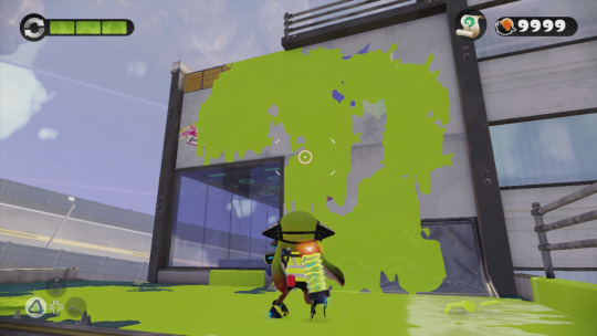
probably an unpopular opinion but i still think Splatoon 1 has the best graphics style in the series
the graphics were so much moodier and darker, shadows were really prominent giving it a much more gritty and realistic feel
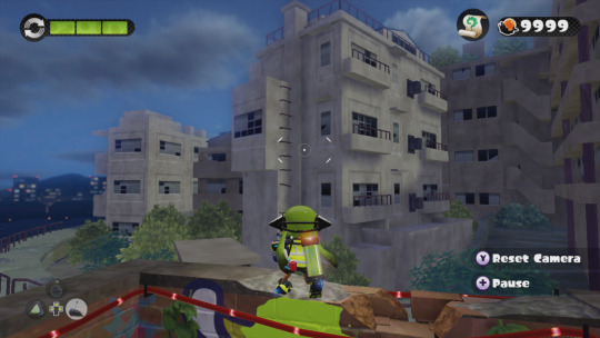
The far-off environmental elements had a nice blur that gives them a bit of a dreamlike quality IMO.

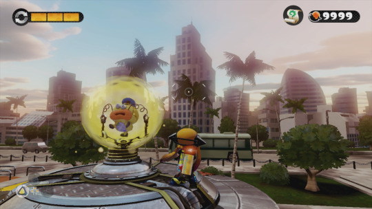
I know the top picture is a sunset level, but; seriously is it just me? Why is everything in Splatoon 2 SO CRISP AND BRIGHT AND NEON? I talked about (probably 2 years ago at this point) how Splatoon 2 feels like it's an evolution and commercialization of Turf Wars into a product and a brand rather than how in Splatoon 1 they had a much more backstreet, discreet, shady feeling. And I feel like the graphics carry that over weirdly enough.
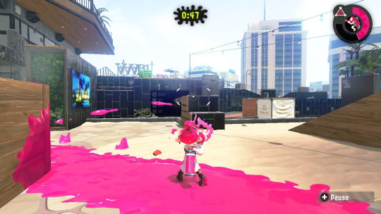
But most importantly, the ink and the Inklings themselves; ever since Splatoon 2 came out and people started going "omg the ink looks so good now!" i. literally never agreed with that. even with Splatoon 3 i STILL THINK the ink looks the best in Splatoon 1. In Splatoon 2 and 3, they have really been leaning into making the ink extremely neon and super saturated, and I don't think it looks great. I can't really even pinpoint the difference here (especially not with the Inklings themselves, but).

(Splatoon 1 above, Splatoon 2 under)
The Inklings in humanoid form don't stray away from having dull or dark colored tentacles in different lighting conditions, and even the ink itself is nowhere near as saturated as it is, leaning more into quieter or pastel tones. Again, it makes it look nice paired with the darker graphics of the game, and somehow it feels really at home and pretty natural? The difference in the model of the Inkling itself is also a mystery of me, it might be a case of less shading or less specular making it look flatter and that's more pleasing to the eye than how shiny they are nowadays, ESPECIALLY in Splatoon 2. The ink is notably flatter than it is in newer games, and if it wasn't obvious I definitely think it still just, looks the best? Don't ask me how. (The squids also look amazing. Like gummy.)


just thought about putting that out there. Anyone else's thoughts on the games' graphics?
#rambles#i definitely think splatoon 3 has nicer graphics compared to 2 because i didnt like how glossy and shiny everything was in 2 AT ALL#but splatoon 3 also has extremely flat shading and that still puts it below S1 in my books#i think splatoon works REALLY WELL with duller darker graphics paired with colorful but not over the top ink
321 notes
·
View notes
Last Seen Blogs

chaoticsublimegoatee
Efilnikufecin

fauxkisu
faxukoryoshi

capetowntocanada
Cape Town to Canada

all-out-emotion-blog
Little damned wretch

aetherith
Eth Has Opinions