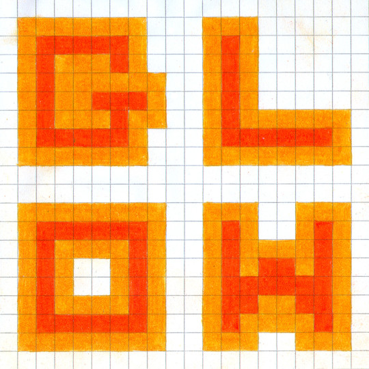
#backcover zine
Text
#backcover zine#fan art#kingdom hearts#fanzine#KHUx#KHUx mom#master of masters#kh chirithy#chirithy#my art ✨
168 notes
·
View notes
Photo

Peter De Potter - Straight Edge Variations, erotic zine, issue one, published June 2023, limited edition. Backcover image.
exclusively at www.peterdepotterindex.com
93 notes
·
View notes
Text

TvT im tired, but ahh… i finished the cover and backcover for my zine.
#persephone#hades#hades and persephone#greek mythology#watercolor#ancient greece#polychromy#my artwork
67 notes
·
View notes
Photo
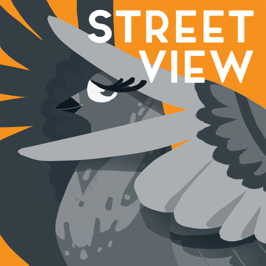
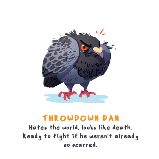
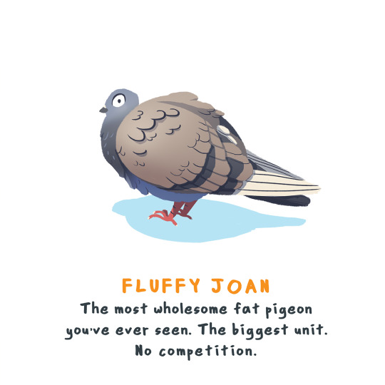

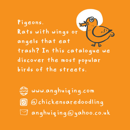
I made a small zine about street pigeons! They're very special birds each with their own characters and behaviours. They're amusing and regularly brightened my day when I could watch them going about their's. Anyone seen any memorable pigeons before?
Pigeons were first domesticated over 5,000 years ago. Feral pigeons are just descendants of escaped domestic pigeons (or escaped domestic pigeons themselves), similar to feral cats and dogs on the street.
This zine is currently only available at fairs (haha) but perhaps I'll open an online store for zines one day!
EDIT: Now available at our store till 14th December!
[image description: in captions]
#pigeon#pigeons#illustration#zine#art#rock pigeon#rock pigeons#nature#urban life#bird art#animals#bird#birds#seagull#herring gull#Fun fact: seagulls are actually herring gulls! There's no such species called the seagull.#No ornithologist or bird watcher would identify a gull (a whole family of seabird species) as a seagull.#I still call them seagulls tho#so much work to catch up on!
13 notes
·
View notes
Photo
#zine #memoir #comics #photography #backcover
1 note
·
View note
Photo


Hardship of the Covers !!!Megapost!!!
Alright y’all, all the hardship of the covers in one post. I want your feedback! I’ve no clue if any of them covers are any good, or which one is best.
So far the best liked here on tumblr is V.3, so this might be the one. Another idea came from a friend of mine (thx Erik), he said maybe all of them could be the cover. But that would mean I would have to design 8 backcovers. Sounds like more hardship... Also this would clearly pose a real problem for an eventual publication as a zine.
So, what do you think? Comment, DM me, write me an email, I would really appreciate it :)
12 notes
·
View notes
Photo

My third piece for @sarchengseyzine (I said I was insatiable and did 2 many)
This one is my favorite tbh!!! I think this is the backcover?
Anyway, I have a few 4x6 prints I’ll be selling for $5 (+shipping) if anyone’s interested! \o/
(Digital zines still available! Proceeds go to the Transgender Law Center. See zine blog for deets!)
#sarchengsey#trc#henry cheng#blue sargent#gansey#richard campbell gansey iii#donut draws#fanart#trc fanart#zine stuff#THEYRE DATING#the raven cycle
430 notes
·
View notes
Photo


Assignment 4: Summary and self-reflection. Page by page.
Idea
The idea of the zine came to me as I was walking around Bromley, where I live. I wanted to create a journey of being here. In the moment. Looking for beauty in the small details as a walk every day. I want to bring them to life by themselves. No to be overpowered by other houses, other windows, other details, or the bigger picture.
You are here also was a celebration of being a British citizen. A lifetime event that I could not celebrate because we were in quarantine, so the zine is a celebration of that.
The other element in this process has been meditation. I have had chronic pain for the last three years and it has been debilitating but meditation has helped with it and this project has done something quite interesting. Being present, at the moment has allowed me to look for the details in my walks, I have noticed a doll in a window or a mailbox in a house from the 18th century, that I have never noticed before.
I wanted to bring all this into this project.
Aesthetic for the project
As I started to work with the mock zine, I started to form an idea of how I wanted it to look. The beginning was much complicated and rich in detail project. With popup windows and pockets (this is where the cover fit better) after I couple of weeks, I realise that I should simplify it. Most of the zine I research had an extraordinarily rich aesthetics with full pages and tones of details. I loved that but I realise that is not me and I did not want to force it.
I develop a small print or drawing on the left and a big one on the right with only one colour for each illustration. On the small illustration will be the text.
I wanted to have this handmade or not perfect feeling that riso printing have so I also play with this idea but the project was going to be expensive, so I move to lino printing.
Cover: Open for business
The idea for the cover came later in the project when the store started to reopen, and I wanted to create a neon effect. That was quite difficult to create with staps or even in photoshop but in the end, I was happy with the result in photoshop. The stamps were another story.
These stamps were created with a photopolymer template so they were as precise as possible, but I need more time to develop the stamps properly, so I used the photoshop version of the cover. It is nice but I do not think to go well with the general feeling of the zine.
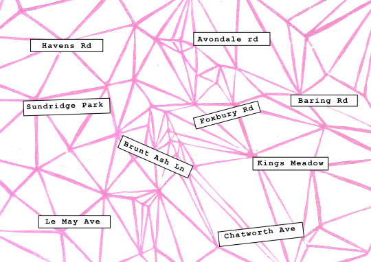
Backcover
This is the result of the Voronoi and the names of the streets where all the illustrations were base. I did an A4 lino and printed it in a neon colour. I do not think it captures the way it looks in real life so for the submission I will fix this but in general, was a very lovely way to let people know where things are without a map.
You are here: the first page
I wrote this over a couple of days. This is the first draft and I know it needs more work. I will be sent it to be proofread and I will work on a more interesting poem.
The background is a map of Bromley.
I like the page, but I think is too rich compering with the rest of the zine. Perhaps a clear page
The text on the next pages is three lines reflections that try to unite the zine in a solid piece. This also needs more work.

The Green Clouds and the hand.
The hand is the result of a Chinese belief that every one that is meant to meet is united by a red threat. I was listening to a podcast will walking and I thought that was a great metaphor for the moment we live in. The final piece was going to be a reduction linocut, but I did not have time, so I used the final artwork on adobe fresco. The sky is a repetitive theme in this zine, it summarizes the idea that what happened to one happens to all. The final artwork was a reduction linocut printed on watercolour paper. I love the way it looks.
The royal mail and the flower
The royal mail post is a stamp made with a photopolymer plate. This and the logo were the only ones that work. I love the way it looks but it did not have the detail I wanted. It was difficult to print and ink. I might need to glue into the wood and used an ink pad in other to get more richness in the stamp. The second is a reduction lino print. It is base on a series of drawings and pictures while walking. It was created to fit the medium. I like it because it transmits a lot of movement that was similar to what I wanted.
Flower at the window and clouds
Flowers at the window is a very lovely piece. It is quite small but the final print is nice. I am not so sure if the back was the best option for the piece. Clouds were meant to be a linocut and also met to be done in layers to create different weathers but the computer, clean drawing also give you the idea of the storm coming and the sun is getting up. I like it.
The house light and the building.
The building was inspired by the idea of beauty everywhere. This is a running down building closer to my house and I want to highlight how lovely it was with its simplicity. I also wanted to add other tall buildings, but I did not have time so for the final piece. The building was also a reduction lino print with red and dark blue. In real things to be very lovely and rich in details. The house light is the light at a house.
The light on the street and the house door
These are two small illustrations. Done in fresco.
The boat at the window
This is a small print. It was done in reduction linocut and it was difficult. I also used two colours to create the background. I love the way it looks but I also do not think that black was the best colour for the lines, and I have problems knowing where to cut. This was my second linocut and it was difficult, but I like the way it looks.
0 notes
Photo
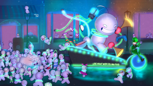
PREORDER WILL OPEN TODAY 4PM EST
You can buy the physical of the Welcome to the Leppy Zine Vol.2 during the next weeks.
It containts the art of +40 artists!
Meanwhile, have a look to the Cover and backcover of the Zine.
98 notes
·
View notes
Photo


Designed the cover and backcover for Visions Issue 5, from Scotland. Nice little zine done during the pandemic, released of course after the lockdown was lifted.
0 notes
Photo

Couple versions of a back cover #mulletturtlecomics #zine #backcover #autobio #street
0 notes
Photo
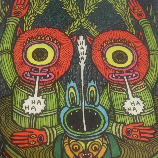
Backcover to my art zine, Antidote. Still have some copies available in my shop: www.etsy.com/shop/theoellsworth
7 notes
·
View notes
Note
would you be needing someone to design the cover/backcover of the zine or is that part of the mods job?
For the cover I am planning on doing the same thing I did for the other zine im working on, @bat-famzine . Basically we had all the contributors fill out a form before joining our discord and a select few volunteered to do the cover. Then during the first check in they all turned in a concept sketch and the mods selected the one we liked the best and that person was in charge of the cover!
0 notes
Photo

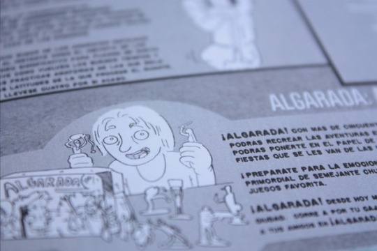
Eng/ I'm so glad to make the backcover of El Huevo Eterno zine. It's nice to do your best in incredible teamwork projects 😃
Check our new zine on FB and Instagram!
Esp/ Estoy muy contenta de haber hecho la contraportada del fanzine El Huevo Eterno.Me encanta dar lo mejor de mí en este proyecto grupal 😊.
¡Puedes saber más sobre el Fanzine en FB y Instagram!
#Illustration#art#fanzine#zine#elhuevoeterno#jososabadell#escolajoso#digitalart#photoshop#cover#colors#artwork#drawing
0 notes
Photo


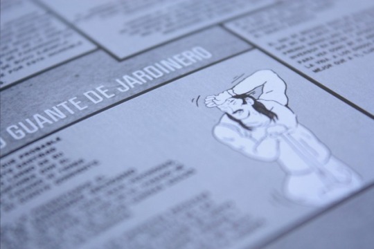
Here you can see the backcover and the interior covers that i made for the issue five of this zine from Madrid, Dramáticas Aventuras. Pure love for pulp magazines.
Aquí podéis ver las contracubiertas y los interiores que realicé para el número cinco del Dramáticas Aventuras, un zine de Madrid que rebosa amor por los cuatro costados a las revistas pulps y de duro del siglo pasado.
#Illustration#Collaborations#contra cubiertas#zines#madrid#dramáticas aventuras#Álvaro Samaniego#Sama#2013
0 notes
Last Seen Blogs
justme-free
✨Neruodivergent Angsty✨
Fan And OC Designer

coolemyasi
Heal Thy Burgers

littleragondin
~ Le French Obsessed with To Sir With Love ~

makephpads
Nimble Classified Ads Script – PHP And Laravel Geo Classified
kks-photography
kam