#art exhibit review
Text
if escape rooms as team building exercises became popular im not sure if id be more excited or terrified
#if it isnt already anyway.. i can see it happening as a school frosh thing. idk if it would catch on as a workplace thing#i kind of find the concept of being locked in with strangers and working to find a way out weirdly exhilarating though#at least compared to icebreakers cause i dont have to spend 10 minutes racking my brain for something to blurt out abt myself#as a bonus u could like. put people into groups and give prizes to whoever escapes first second third etc. apparently they also do themed#escape rooms.. maybe let people pick a theme? or voluntary sign up? actually this would be really fun for smth like a blind friend date#although if i found out i was locked in a room with an online friend id be too excited to actually escape LOL#ive never done an escape room before so sadly i cant speak from experience. its like up there on things i want to try next to rug tufting#workshop and visiting new art exhibits or conventions. i seriously need to get out more if it wasnt for the horrors <- school and anxiety#i was planning to invite cass to a drop-in art workshop in town but neither of us could go bc typography is making us go thru hell and back#AND THEY HAD A BUTTON MACHINE TOO#im nostalgic bc i miss working in groups and not being awkward abt it or worrying abt schedule conflicts#i realized that i learn best in groups and its a little corny but i like sharing ideas and talking through a problem#in elementary i could just sit down with friends for review and come out of it energized *and* more familiar with the material#and i could technically still do it now. but as adults we're more picky abt who we work with on top of being way more busy outside school#maybe im lonely. im shy and grew up not talking to ppl unless i absolutely have to so its hard to make friends on my own i guess#only thing getting me thru it is telling myself that humans like helping and that my cringe is overblown in my head. but its hard#hence the escape rooms. i have been able to talk to 2(!!) people though!! mostly abt school stuff but im glad to be on friendly terms#i dont really know how to be happy these days cause im constantly scaring myself abt my portfolio and finding places to work#not being ambitious is part of not wanting to put energy into something that wont work out while also not having the passion to do literall#anything else.. i should probably talk to my counsellor ugh#yapping
56 notes
·
View notes
Text
robert motherwell - pure painting
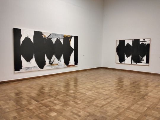
so back in december last year, while visiting my friend in vienna, austria (obviously), i noticed a poster for the robert motherwell exhibition “pure painting” from a moving tram, managed to make out where it took place, and went the next day. i was welcomed by a building that i mistook for a bank (though later i found out that the gallery actually is sponsored by a bank, go figure), but then when we went inside, i was pleasantly surprised by the atmosphere. the spaciousness of the gallery allowed one to view such large canvases from a far enough distance and added perspective to the exhibition.
its a good job i saw the poster though, the post-war painter hadn’t had a major exhibition since 1977 and now i had the opportunity to see the art of a defining character in the history of abstract expressionism. the last image in my post is archetypal for motherwell, whose work is easily recognizable by the large black blotches, lines, shapes and spots, key elements of gestural painting that motherwell used to mold and help define the format back in the 40s. living in new york, he was part of the group around peggy guggenheim that formed the authentically american art-style, of course influenced by european surrealists <3
im kidding, i love me some action painting


if i had to use one word to describe the exhibition, it’d be ‘impressive’. i was genuinely surprised by the monumentality and power that the works radiated. like i mentioned, the space of the gallery was huge, which only helped enhance the impact of the large pieces. i learned that in the case of some of the paintings, motherwell would actually go back and add more black paint after they’ve been exhibited, adding meaning, narrative and dynamicity to his work

the spanish civil war is one of the main motifs repeated in the work and it is most present in his series ‘an elegy to the spanish republic’, which contains some of his most iconic paintings, those big canvases slathered with muted colors contrasting with large black areas of geometric and abstract shapes combined in a (then) unique way that makes the atmosphere of the work and gives it the ability to evoke feeling
#art#robert motherwell#vienna#expressionism#art history#gallery#modern art#abstract expressionism#exhibition#art review
15 notes
·
View notes
Photo

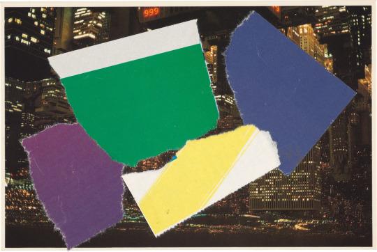
Ellsworth Kelly, Brooklyn Bridge II, (postcard collage), 1985 [Matthew Marks Gallery, New York, NY. © Ellsworth Kelly Foundation, Spencertown, NY]. From: Rebecca Bengal, Postcards from Ellsworth, The «Paris Review», May 19, 2022
#art#collage#geometry#postcard#exhibition#magazine#ellsworth kelly#rebecca bengal#matthew marks gallery#ellsworth kelly foundation#paris review#1980s#2020s
66 notes
·
View notes
Text
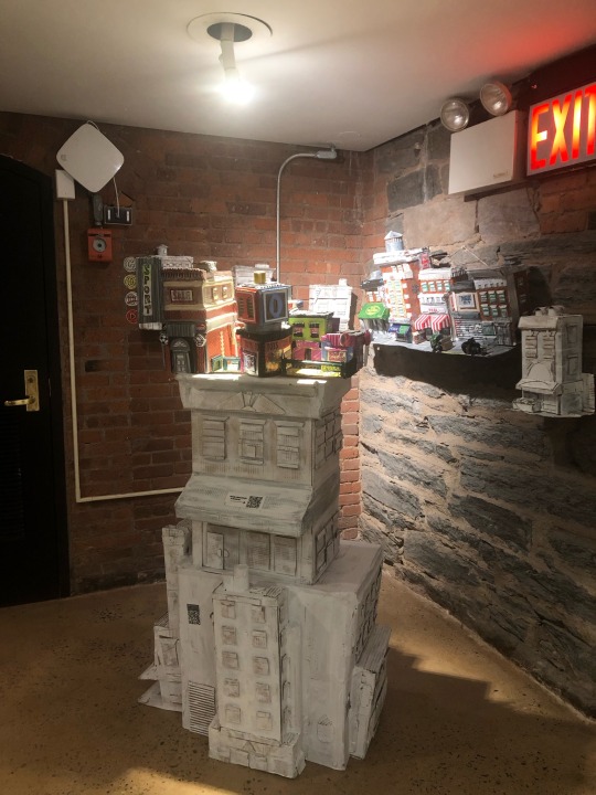
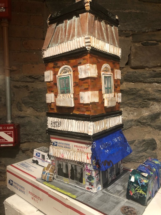
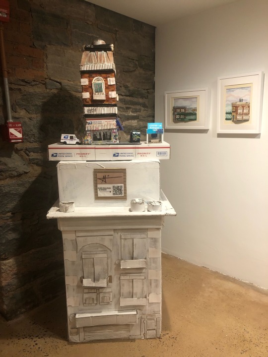
If you guys (unlike me) have instagram you should go follow this guy @mancostudio
His name is Tom Manco and he does cityscapes from scavenged cardboard—I just saw such a cool exhibit of his work at one of the public libraries and im in love 💜
#sorry for the extremely bad photos i don’t know how to use my phone#I know he does like… pop up stuff around thompson but I’ve never actually come across his work before#I love when libraries do local art and history exhibits#this library always has super cool stuff#library reviews#<- I guess? would be my tag for this haha#oh hey I should do some more library reviews this month somebody remind me
11 notes
·
View notes
Photo
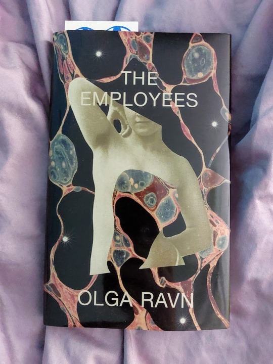
Books of 2023. THE EMPLOYEES by Olga Ravn. This was a very weird, very poetic, reasonably fucked up little book that I’ve had my eye on since it was released in English, and I enjoyed it! It’s one of those hugely ambiguous, “good luck sorting this shit out” type books, told in statements by the human and humanoid coworkers on a space ship (and there are alien artifacts involved).
#books of 2023#books#book photography#the employees#olga ravn#i found a review that linked to a lot of background stuff#(on goodreads i mean)#apparently this was inspired by an art installation/exhibit#i didn't look into it Much but i definitely scrolled through some gallery pictures (without reading the placards or anything) and that uh..#clarified some shit lol#anyway definitely a trip i enjoyed it and it went very fast!!#the hardback edition has teeny tiny pages and text though#(that's the edition i read)#i'm not sure if paperback is much better
16 notes
·
View notes
Text
Body Poetics Review
Writing about art is difficult. Especially when you live in a town that doesn't have much art, you work full time and you also can't drive. It makes me feel as though I am restricted to the amount of inspiration around me I can find, unfortunately Bournemouth pier just really isn't doing it for me anymore. I love to be on the move, I love to see new places, but I feel as though I am never going to find the place that I want to be settled into forever. Or the place I want to go to is going to be too expensive and that I may as well just flush that dream down the toilet. And did I mention that the cost of living crisis is also making it even harder to be able to go out and explore anymore, that is on the odd occasion that the trains are even running at the moment.
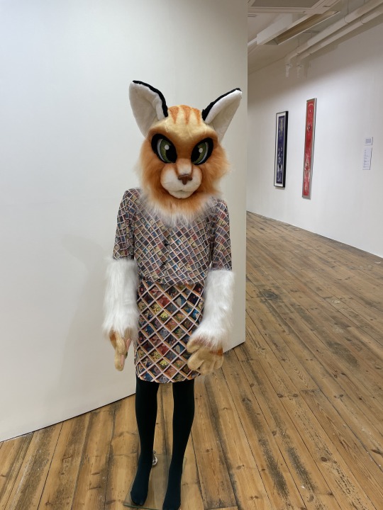
It feels as though I wait for the one gallery to open up their new exhibition before I wander in and end up reviewing every show that they do, except for Martin Parr. I really don't think there was much to say about his work other than it's pretty and they're of beaches. This show, also presented by the wonderful Giant gallery, is called Body Poetics. I was reluctant to go to this show at first, and you want to know the real reason why I wasn't sure if I wanted to see it? It was because I hated the main piece that is advertised on all of the posters of the show, at first glance it essentially just looks like a furry wearing a winter outfit, I hate it. I'm not judging people who say it's their thing, but it really just isn't for me. I decided to give the show a chance anyway, though I had no idea what I was going to ultimately end up saying about it.
The show has been curated by a group of 9 different female artists from across the world. Most of the deeper meaning behind these works is feminist theory from the 70s and 80s and all of these works available to feast your eyes on are made from the 70s and onwards. The works also feature many contemporary values to what it means to be a feminist.
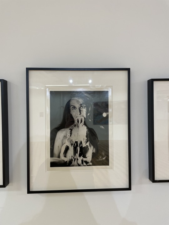
Upon general entry into the gallery, one of the first things I saw was Carolee Schneemann's Eye Body works. It features the idea of the social construction of the female / femme or queer body. The selection of works on the wall all featured different positionings of the body surrounded by materials; all of which discussed pain, suffering, political protest as well as joy and sexual expression. I for one was a huge fan of the collection of images on the wall, there are 4 different images. This one in particular is my favourite because it reminds me of a still you would see from a horror movie in the 60s. The way in which to see an image like this in the 60s would be terrifying, enough to make the film only available for an adult audience. I think it's visually fantastic and perhaps one of the stronger pieces from the show in my eyes, this is purely based around the fact there is little to no photography featured in the show and although I love art from every medium, I still feel as though I am drawn to photography the most.
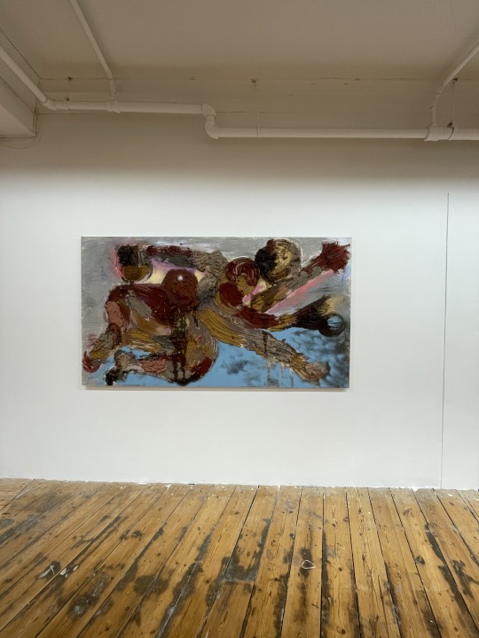

This piece is Rite of Spring by Florence Peake. Her collection of works also feature the same themes as Schneemann when it comes to female / femme and queer attitudes of representation. I loved this piece from all of the colours it contained as well as the texture of it. I am obsessed with textures that have been edited as the piece has been curated overtime and think it really adds an extra depth of field to it. However, and this is not down to the artist, but rather the gallery. When I posted an image of this on my Instagram story a few days ago, I actually managed to tag the wrong artist in the post. This is due to the signs of the works being very unclear in the work. The list talks about two artists body of works, one being hers, but the sign simply named the work and wrote (opposite) on it while also displaying another list of works near the piece itself. It made the show very difficult to navigate and I apologise to Peake for giving another artist credit for the work.
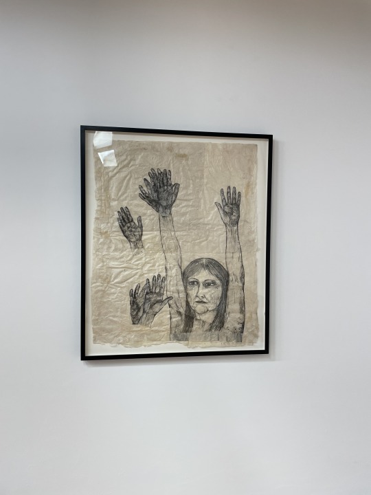
The work above is Untitled (Hands Waving) by Kiki Smith. I feel like this work stuck out to me in the gallery space because it feels very simple in comparison to a lot of the complex works I saw in there; and sometimes it makes me feel bad because I don't look at everything in the space and immediately know what the deeper meaning behind the work is. This is a piece that I feel like I could stand there and look at for quite some time, it stuck out on the back wall full of eccentric colours and deep meanings, but this piece made me just want to wave back at her. I want to feel what she feels here. I love the focus on the hands, I think people can forget how expressive hands can be. How important they are, I don't want to sound fake deep and be like we take them for granted, but I do feel as though we forget how much we actually can do with them.
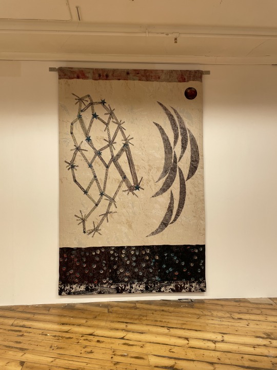
I think that Kiki Smith's work was some of my favourite pieces on show in the gallery. The other piece is a ceiling to floor length tapestry with star constellations and crescent moons titled Visitor (Stars, multiple crescent moons). In a way, I feel as though both pieces of work she displayed in the gallery really interlink with each other in opposing ways. The pieces all feel simple, with their matching colour schemes and dainty details all visible to the eye from afar. This piece in particular feels very feminine, the glitter, the stars in general, and like I said before the dainty details. It adds a whole new level of feminism to a piece of work without being an in your face piece of 'this is feminism'

TW: the pieces I hated the most in the gallery.
I was complaining on my story when I saw the show that I was so upset that they chose to use this model as the poster image for the show because every piece of work I saw in the gallery was so much better than this. Perhaps it's harsh to say this, but I feel as though this set of work felt like a whole waste of space, but I just hate it. I really hate it. The work is by Ad Minoliti who is all about the use of abstract forms of art to explore social aspects of the body and gendered experience. I see it I really do, I just hate that they chose to display a full blown furry. Perhaps that was the point, for it to hold a discussion, to use something so bold on the poster to advertise the show that it made people feel something. Enough to come to the show to see what it looked like up close. Maybe I'm being closed minded when I look at this, but I will simply just be walking straight past it next time I come to the show. On the other hand, some of the canvas works submitted by the artists were bright, bold and super eye catching. These were works I enjoyed to look at a lot more.
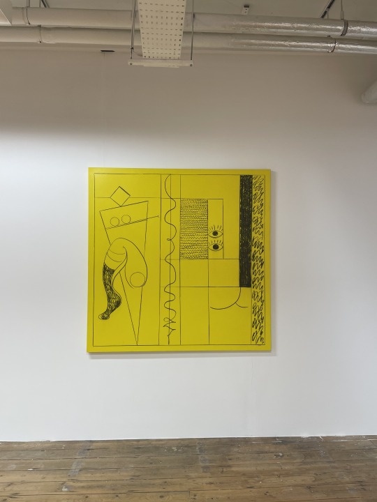
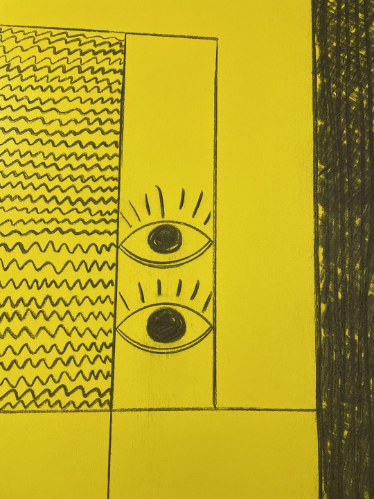
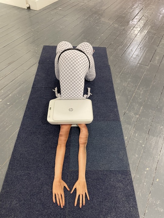
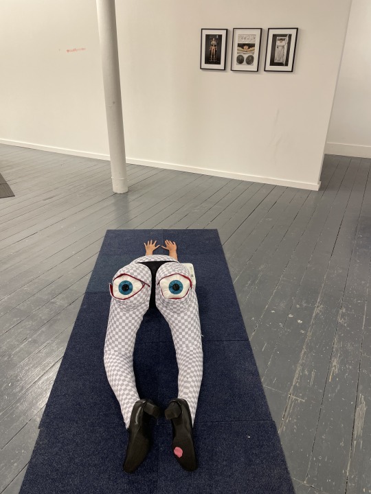
This piece was the one I enjoyed the most by the artist. This is Queer Modulor and it slayed.
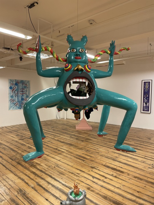
I gotta say though, this is the bad boy that stole the entire show for me. This sculpture slowly rotates in circles and is literally full of surprises. Not only do we get the sculpture, but there's also a fun accompanying drawing of it in the gallery (I'm really sorry I don't want to post every detail of this show, but I urge everyone to go to this). This piece is by Rae-Yen Song and is called happy little leaf.
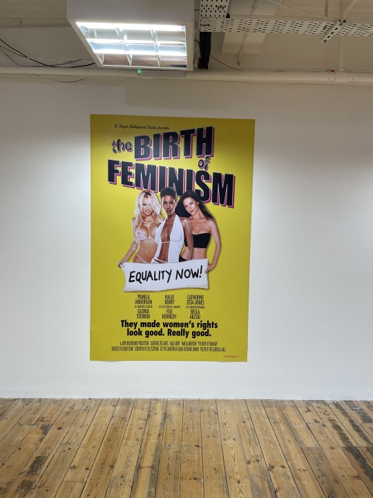
Next up is Guerilla Girls with Birth of Feminism. The group are very well known for their loud and outspoken media to discuss issues with being a woman and so it only made sense for them to be apart of the show. The poster adds an extra level of overall comedy to the end project.
Holly Steveson
Overall, I think the show is really fun. There's a bunch of outstanding forms of media and installation works and it's so nice to see a big artist collaboration in the space, a space that works really well for the works they are exhibiting. The only thing is I feel there is not much discussion to have with all of the works, rather they are good pieces by good artists and that is all that is left to say on the matter.
Body Poetics is on at Giant Gallery until 8 May 2023.
7 notes
·
View notes
Text
love is making your best friend an interactive table/spreadsheet of every single place you want to take her when she comes to your city and then creating a yelp page with the 47 corresponding locations for an easily viewable map + reviews + pics so she can choose. <3
#can u tell that i'm excited??? because i am#she's coming to see taylor swift w me and we're going to have so much fun ;w;#i need to figure out how to fill up our days but#ngl most of it will probably be us eating and then going back to our hotel to read together lmfaooooo#we met on wattpad and we video call to talk about our book reviews while she graphic designs her client's book covers#like what do u expect#the last time i visited her in new york - she took me to two bookstores where we walked around and judged books and read blurbs for hours#but i have a lot of backup places in case she wants to do museum tours or art exhibits or historic things#but we'll figure it out obviously#i love her <3#sandy rambling
5 notes
·
View notes
Text
Featured Artist | Geoff Bent
Geoff Bent
Brooklyn, NY
geoffbent.com
@geoffbent_art
MANIFESTATIONS OF DEATH, a thematically united series of 27 oil paintings, is grounded on a simple visual dilemma: how does one physically portray nothingness? The incomprehensible can only be grasped obliquely, so I have constructed a crescendo of metaphors leading up to the bleakest embodiment of this disembodied concept. The continuity of…

View On WordPress
#art exhibit#art exhibition#Art Gallery#art magazine#Art Review#Artist#Artist Portfolio Magazine#artists#arts#artwork#Color#color theory#contemporary art#figure#international artist#mixed media#oil#oil on canvas#oil painting#online art exhibit#opportunities for artists#Painting#portrait#visual art#watercolor
2 notes
·
View notes
Text

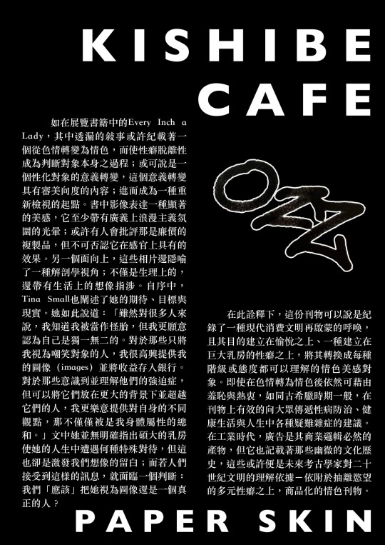
OZZ Paper Skin 刊物特展 — 《抽離慾望的性癖與情色:現代再啟蒙的線索》
文/黃動物 (岸畔咖啡)
@ozz.books
自人類吃下善惡果後,第一個面對的緊張來自於羞恥感;這個羞恥又與性相關聯(而非單純是道德)。就聖經的說法,人類第一個二元判斷便是揭示了自身對與裸露與色情的問題,那甚至在她們擁有名字之前。直到今日,我們依舊為了色情與性所煩惱著,一方面人們因羞恥而排拒它,但一方面又受其誘惑;於是乎色情成了一種普遍卻幽隱的資料,一種夾雜在流行與次文化間的文化殼層(Culture-shell)。在慾望抽離之後,它顯露一道道刻印著具有張力的真實記錄,並連結著核心與邊陲,人類永恆的的歷史橋梁。
我們或許能夠從本次OZZ於岸畔咖啡所展出的刊物發掘上述觀點在現代西方社會��短暫停留於大眾視野下的線索。如果將這次展覽視為一種「知識考古」,策展人管梅芬便是展演其視野下慾望體系的歷史證據;透過「特定時空的色情書刊」為載體,它表達了某種「陳述」(statement)。內容透過書籍以及展覽,指向觀者/策展人今日理解的共同世界系譜;包含「色情/情色」與它的關係物;也因此它包含了其中一種人類判斷的根源:性癖。
如在展覽書籍中的Every Inch a Lady,其中透漏的敘事或許紀載著一個從色情轉變為情色,而使性癖脫離性成為判斷對象本身之過程;或可說是一個性化對象的意義轉變,這個意義轉變具有審美向度的內容;進而成為一種重新檢視的起點。書中影像表達一種顯著的美感,它至少帶有廣義上浪漫主義氛圍的光暈;或許有人會批評那是廉價的複製品,但不可否認它在感官上具有的效果。另一個面向上,這些相片還隱喻了一種解剖學視角;不僅是生理上的,還帶有生活上的想像指涉。自序中,Tina Small也闡述了她的期待、目標與現實。她如此說道:「雖然對很多人來說,我知道我被當作怪胎,但我更願意認為自己是獨一無二的。對於那些只將我視為嘲笑對象的人,我很高興提供我的圖像(images)並將收益存入銀行。對於那些意識到並理解他們的強迫症,但可以將它們放在更大的背景下並超越它們的人,我更樂意提供對自身的不同觀點,那不僅僅被是我身體屬性的總和。」文中她並無明確指出碩大的乳房使她的人生中遭遇何種特殊對待,但這也卻是激發我們想像的留白;而若人們接受到這樣的訊息,就面臨一個判斷:我們「應該」把她視為圖像還是一個真正的人?
在此詮釋下,這份刊物可以說是紀錄了一種現代消費文明再啟蒙的呼喚,且其目的建立在愉悅之上、一種建立在巨大乳房的性癖之上,將其轉換成每種階級或態度都可以理解的情色美感對象。即使在色情轉為情色後依然可藉由羞恥與熱衷,如同古希臘時期一般,在刊物上有效的向大眾傳遞性病防治、健康生活與人生中各種疑難雜症的建議。在工業時代,廣告是其商業邏輯必然的產物,但它也記載著那些幽微的文化歷史,這些或許便是未來考古學家對二十世紀文明的理解依據-依附於抽離慾望的多元性癖之上,商品化的情色刊物。
2 notes
·
View notes
Text
Wed. July 19, 2023: Why, Yes I am Ranting Because I. Am. Done
image courtesy of Gerd Altmann via pixabay.com
Wednesday, July 19, 2023
Waxing Moon
Pluto, Saturn, Neptune Retrograde
Foggy, a little cooler, wildfire haze, sun trying to burn through
This is a ranty, burn-it-all down post, so you might want to skip it.
I keep thinking we’re much closer to August than we actually are.
And hey, I’m out of ink again, because of course I am. And I’m having…

View On WordPress
#ANGEL HUNT#art exhibit#book review#bullying#Cannes Film Festival#cats#Deadly Dramatics#email#grant#LOI#outline#pitches#Process Muse#Small Business Expo#social media burnout#Substack#WGA Strike#wildfire haze#write every day#Yoga
1 note
·
View note
Text
Artist Review by Eamon Colman
Artist Review by Eamon Colman
Titled A Place Like Home, here is a rievew written by artist Eamon Colman about my me as an astist, my work and my current solo exhibition at the Easter Snow Gallery,
‘These are landscapes of the mind, or they could be landscapes, not as she sees them, but as she feels them. Rather unsurprisingly, Derval inhabits the same space, these paintings are paintings using the same imaginative space…
View On WordPress
#abstract art#abstract landscape#artist review#contemporary art#derval freeman artist#eamon colman artist#essay#irish art#Irish artist#new collection#oil on canvas#painting#solo exhibition
5 notes
·
View notes
Text
The Getty Museum
#some of my favorite pictures that i took#i did an exhibition review on the dutch drawings exhibit and yet none of these are from there aldndndmd#art#museums#art history#sculpture#painting#mine
3 notes
·
View notes
Photo
Ellsworth Kelly, Manhattan Skyline at Night, (postcard collage), 1985 [Matthew Marks Gallery, New York, NY. © Ellsworth Kelly Foundation, Spencertown, NY]. From: Rebecca Bengal, Postcards from Ellsworth, The «Paris Review», May 19, 2022
#art#collage#geometry#postcard#exhibition#magazine#ellsworth kelly#rebecca bengal#matthew marks gallery#paris review#ellsworth kelly foundation#1980s#2020s
34 notes
·
View notes
Text
Voices of Veterans
Photography Exhibition Review
VOICES OF VETERANS | MICHAEL ARMSTRONG
National Press Club Building, | Until 19 June 2022 – by appointment only – bookings to view the exhibition or to experience insights with the artist can be made at https://voicesofveterans.com.au/events
Molasses! A viscous substance primarily used to sweeten and flavour foods. A major constituent of fine commercial brown…
View On WordPress
#exhibition#Exhibitions#Michael Armstrong#Molasses#People#photography#Photography review#Portraiture#PTSD#Veterans#Visual art#Voices of Veterans
2 notes
·
View notes
Text
Cairo's Art History - Inji Afflatoun
Saferkhan Gallery in Zamalek is showing a collection of work by the 20thC artist
What made a young francophone girl from Egypt’s elite, privileged class decide to turn her back on all of that and become an artist? To spend her family wealth on supporting Cairo’s Surrealist Group? To become an active Communist and spend years in prison? All the while painting and drawing evocative works that…
View On WordPress
#16th century#arabic art#art#art collection#art gallery#art history#art travel#cairo#Cairo art#drawing#EGYPT#exhibition#latest#painting#review
0 notes
Text
Gallery visit
(The work cannot be recorded, but it can be taken as non-commercial used photos)
I went to AGNSW to see part of the Biennale of Sydney exhibition and I accidentally found Len Lye's work, but I found that it was not as good as the effect I saw on Youtube.
I think this is the influence of the exhibition medium, which made me decide that I will not put the work too small but to show a more macro world.
But the sound design is absolutely beautiful…
0 notes
Last Seen Blogs
bootlegpals
It's a wild wild web

al-omega
Creature Features

enamukomistake
i can't believe i'm back here again

hasbeenhazbin
Has been Hazbin

myshowerbuddy-blog
ShowerBuddy