#and now here we are doing a- what?? somewhat analysis of his outfit as phantom?
Text
Ugh im writing this on mobile but i’ve been thinking about it nonstop for an hour and I’m just- mmmmm thinking about Clone Danny and his wardrobe choice as Phantom. Cuz like, he doesn’t have any powers, right? He has no built-in secret identity and suit that he can change into in a flash of blinding circular light. If a ghost shows up he’s just got what he’s got on, and whatever he has in his bag.
And I’m just. I have a lot of thoughts about him and his canon self, thoughts that i dont think i can all fit on my phone and im. Thinking about the dichotomy between him and his canon counterpart. From an in-universe perspective, the halfa Danny Phantom looks remarkably human-like. Especially compared to the ghosts he fights, all of whom are unnatural colors, shapes, and sizes. From flaming hair to glowing eyes and pointed claws, there’s nothing about them that doesn’t scream “ghost!” “Inhuman!” “Unnatural!”
And then you look at Danny Phantom, the ghost boy fighting them. And he just… looks like a glowing human boy. The only unnatural thing about him is his white hair and green eyes - and green eyes is a natural human color. Maybe not the shade it’s in, but it occurs in human genetics. He’s about as close to human as he can get.
Think about that from an in-universe perspective, and then think about it with the idea that ghosts take pride in their ‘ghostly’ look. They pride themselves on looking scary; unnatural; inhuman. It’s a showcase of being unique, of their own individuality, of their interests and wants. Looking ‘scary’ is part of ghost culture, and if not scary, then unique and ‘inhuman’. They don’t want to fit in, they want to stand out.
And you look at Danny Phantom, as his canon self without any of the fanon customizations, and he’s none of that. He’s about as human-looking as a ghost can get. He’s got human-like skin, hell he’s even tanner than he is as a human! His hair is normal, his eyes are green but normal, his hands? Soft and round, not a claw in sight, and his teeth are blunt and ears are round.
His suit is all black, it doesn’t even tell you anything about him other than he probably died in a lab accident, and he looks like he’s straight out of a b-rate comic book. There’s no story to tell about him, he’s a book with the pages all blacked out in ink.
His name, if you take it as him only calling himself “Phantom” isn’t even all that unique. It’s a generic ghost term that you can find by googling ‘ghost’ and looking at its synonyms.
And then look at his behavior: yeah he fights ghosts, and fighting is all about ghost behavior. Its one of their social activities- but its clear from Phantom that he’s not being social. He’s being aggressive, he’s doing it for the sake of the living (which while fair, doesn’t make him look good in the context of everything else). Then he comes into the ghost zone, he doesn’t do much to integrate himself into the culture, and yeah he makes allies but it still doesn’t feel enough. He’s not participating in anything, he’s alienating himself.
All in all, Phantom looks like a ghost trying to pretend he’s human, that he’s still alive. And for a ghost culture that prides itself on not being alive? It’s insulting.
And then let’s circle back around to that human thing, but from a different angle. Probably one that’s more mindset than outside looking in. But Danny’s alienated by the rest of the town for ages despite helping them. And while him looking human likely has to do with his own mindset of viewing himself as “living, but with ghost powers” and thus reflects back as a ghost, it also makes it look like he’s trying to fit in with the humans.
“I am not a ghost” he says, with his human skin and blunt teeth. “I am human like you, see? See? I look like you.”
He’s making himself look approachable, friendly. ‘You can trust me, I’m not a ghost. I’m not like them. I’m not scary. I look just like you. I’m different.’ He looks about as harmless as a human child could be. He’s trying to be relatable. And in turn he’s giving his fellow ghosts a cold shoulder - i’m not like you, i’m better. I’m different. I’m not ghost. I may be dead, but I’m no ghost.
Danny is trying to tie his ghost self in with the living as much as possible - he wants them to think he’s almost human. The same way he wants to think that himself. He’s distancing himself from his ghost half and the ghostly qualities the others have. Whether intentional or not, he’s doing it.
He shows his face and goes ‘see? See? I’m just like you.’
And then lets look at clone Danny, mister not-a-halfa. Who doesn’t have his canon offensive capabilities, who only has his ghost sense and the ability to hit ghosts without gear, his scary eyes and pointed ears, and the ability to see weaker ghosts not visible to the mortal eye.
He has no ghost form, no powers. And yet the first time he goes out as Phantom, he wears a mask that looks like a skull. Instead of distancing himself from ghosts, he’s distancing himself from humans. And at first it stems from the need to be unrecognizable, the last thing he wants is for his parents to find out that he’s ghost hunting. To do that, he needs to hide his face. That’s the first step.
The next step is to act in such a way that people couldn’t possibly tie him back to Danny Fenton. He’s not distancing himself from ghosts, he’s distancing himself from humans. To do that, he acts inhuman. He wears his mask and wears baggy, shapeless clothes - his hoodie and his pants - and he learns how to act unsettling. His eyes glow green, unnatural and shining through his sunken-in, skull-like mask. But it’s not enough on its own. He must do more.
He wants to be the thing someone sees at night and turns the other way. See me and run, he says, crouched on all fours and crawling across a beam like a monster you see in a movie. Twisting his body in unnatural, fluid ways, like he’s not quite sure how having only four limbs work.
Run. He says, dead green eyes glowing through his mask, piercing through black night from the rooftop. I am wild thing. Come no closer, look no closer. I am not like you. I am not your friend. I bite. Run.
You cannot see my face. This is my face, I am not alive. I am not like you. I am an animal about to pounce.
He doesn’t want people to think he’s human, he doesn’t want them to think he’s anywhere close to it. Anything to prevent his parents from figuring out its him.
And the thing is, he doesn’t have to. He doesn’t have to appear ghost-like or inhuman to keep his identity safe, wearing a mask and wearing unidentifiable clothes is enough. But he’s choosing to act ghost-like; unsettling; scary.
And in doing so, he unintentionally participates in ghost culture. And while his clothes are not anything unique, or outstanding, his mask is. His clothes don’t tell anything about him, but that’s okay.
Imagine meeting this boy from a ghost perspective. This annoying, fleshy human boy who jumps into fights to stop you and catch you. You’ve heard stories of human ghost hunters, you know there are hunters on the other side. You have heard the horror stories, you have seen the scars.
And then this boy catches you. This human, fleshy boy who yells quips at you, who puns and insults you, who wears an unsettling mask and acts ghosty. He catches you, and you think you will be the next one on the chopping board.
And then you end up in the ghost zone, untouched. Unharmed. And you tell someone about it. You were caught and released by a human child who feels touched by death. And then you hear that the ones who’d been caught were freed by a fleshy human boy who was touched by death, and a boy who they call “Phantom”.
And, isn’t that the name of the child you fought?
And he talks to you, but then he’s in the daytime. There are living around. He doesn’t speak to them - he ignores them outright. He keeps his distance, he stays away. If he talks, it’s with his hands. They will not hear his voice.
I may be alive but I am no human.
And its just — ????? So good to think about. I’ll reblog later with more thoughts when I have my laptop, but god i just needed to get that out there.
#dpxdc#dp x dc#dp x dc crossover#dpxdc crossover#dpdc#clone^2#danny fenton is not the ghost king#danny fenton is a clone#like i wasnt thinking much about it when i made danny have no powers. like that was purely just for fun#and for a fun little parallel between him and bruce. and i thought the mask was cool#and now here we are doing a- what?? somewhat analysis of his outfit as phantom?#and his choice to appear as unhuman as possible?? as ghostly as possible???#its just so good. i love creepy phantom. he’s the thing you see crouched in the corner of the room#from the corner of your eye. you see him. and you jump but hes not there when you look#he’s the creature you see lurking in the alleyway. crouched like an animal about to jump.#‘come no closer. look no closer. i am not like you. i may be alive but i am no human’#i have teeth. and i will wrap them sround your throat and *pull*
236 notes
·
View notes
Text
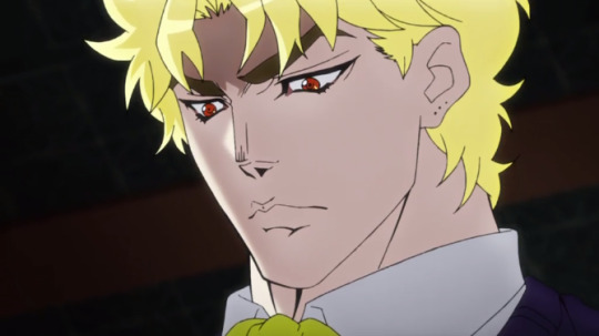
An analysis of DIO’s fashion choices.
We may occasionally laugh at DIO’s obscene fashion choices, but for a while now I really wanted to delve into a more in-depth analysis of them. I believe that what he wears actually presents a really good reflection of DIO’s current position in life and his state of mind, so I want to write an analysis of all the outfits that he appears in throughout the series. (Note that this will only cover canon outfits that appear within the story itself, not the ones on the covers or other external artwork.)
In Phantom Blood, after being taken in by the Joestars, DIO immediately started dressing extremely properly for his new rank and the time period - interestingly, even more so than Jonathan, who was born into this life.
An example of this, a brief scene of DIO and Jonathan studying, was actually changed in the anime, making DIO dressed more like a commoner. In the manga, it was Jonathan who looked less appropriate, while DIO wore a tie and a neat white shirt - befitting of a man of Joestar family.

This gives us the impression that Dio was quick to embrace his new social class and felt at home with it.
In his adult life as a member of the Joestar family, we see Dio wearing regular and appropriate attire closely resembling Jonathan's. A notable difference between the two is that Dio is constantly seen wearing a frilly ascot, while Jonathan wears a more formal tie. This is an initial subtle clue to Dio's preferences.

I believe that Dio's later actions show us that the proper Victorian attire wasn’t what he actually enjoyed wearing.
The first sign of this is when he has a minor breakdown and gets drunk after Jonathan caught him trying to poison his father. Dio letting himself become angry and drunk makes his mask slip and shows a glimpse of the true feelings he's held all these years.
To reflect that, his clothing style becomes somewhat more flamboyant, as he's now wearing a feather-collared coat and a top hat. While the hat is era-appropriate, decoration such as feathers was not a part of common style at the time. This outfit is by no means as obscene as his later attires, but it once again subtly implies his preference for tackier outfits.

Of course, the big and obvious change occurs next, as he rejects his humanity.
The moment he was free of societal chains and norms by becoming a vampire and not needing to care about fitting into the masquerade anymore, he IMMEDIATELY started dressing exceedingly flamboyant, putting on whatever he pleased, even when it was beyond unconventional.
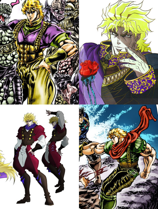
We now see him wearing gaudy outfits that look very outdated for the late 19th century, with elements such as puff sleeves and baggy pants - both of which were popular during the Renaissance several centuries ago. This is an important detail to keep in mind.
His most prominent outfit we see throughout the Phantom Blood finale seems to include some kind of a corset as an outer layer, which is very unusual, seeing as corsets are undergarments.
It's also worth noting is that he doesn’t do his hair anymore, letting it be wild and messy, unlike before when it was kept neat and short.

Before I go on to DIO in the 80s, I want to make a slight detour to Jonathan and his choice of clothing as well.
The significance of DIO’s weird outfits could be brushed off by saying that Jonathan dressed weird as well and this was just Araki creating fashion disasters for the hell of it, but I don’t think that’s quite right.
Fashion crimes were definitely committed, but not without a purpose.
Let’s take a look at Jonathan’s most bizarre outfit in Phantom Blood;

From the looks of it he’s wearing about four shirts and a vest, as well as gloves.
Many a joke has been made about this outfit, but here is my proposition:
This is a makeshift armour.
Phantom Blood happens during the late 19th century, and getting a proper armour wouldn’t be an easy task. This was an urgent mission and Jonathan had to act fast and smart - and he did.
He wore multiple layers of clothing in an attempt to add padding in hopes to shield his body from the upcoming attacks.
Aside from this outfit, the only other strange one he wears is his final battle one, a crop top, which is really just remnants of this one, as it was mostly destroyed in the battle with Tarkus. Aside from this, he wears normal and era-appropriate clothes. (Not counting the various cover outfits that never appear in canon)
Now, on to DIO in Stardust Crusaders.
Of course, we most famously know him for the yellow outfit he wears in the 80s, and the alluring visage of the so-called Shadow DIO, but there are a few other outfits that appear briefly, which I wish to address. It's important to take note that many of DIO's outfits in this era have a connecting aesthetic to them; most of them have a Middle Eastern appearance to them - or at the very least what we stereotypically view as Middle Eastern.
I am not very familiar with Middle Eastern fashion terminology and can therefore only use very broad layman's terms. I also think that the outfits in question are pretty vague and are probably not sourced from any specific culture, but the overall aesthetic in general, as many cultures in the area have very similar aspects to their fashion. Seeing as Araki is a big fan of Antonio Lopez and has notably sought inspiration in his 1985 book Tales from the 1001 Nights, it's very likely that a lot of the outfit design for DIO has been sourced from the said book.
This is not something I've ever seen people mention, as DIO's fashion sense is often simply written off as sultry and I very rarely see anyone acknowledge his style preferences when designing outfits for him. The reason I wanted to write this analysis is because I think what DIO wears during Stardust Crusaders is a very interesting perspective on his openness to other cultures.
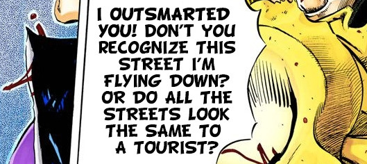
DIO is not just constantly hiding within his mansion in Egypt, plotting and scheming. He embraces Egypt. He knows the streets of Cairo, which implies that he goes outside often, either to find prey or for leisure. We know this for a fact, as he mocks Jotaro for thinking all streets look the same, while DIO himself skilfully navigates the fight - implying that he is, in fact, very familiar with the city.
Remember when I mentioned Renaissance earlier?
While I can't be sure if this was Araki's intention or not, I find it very interesting that DIO first sought to imitate Renaissance, and then Egypt - a time and place that are both associated with great advances in knowledge, which is something DIO is known to value.
Now to bring this back to outfits, let’s start with his most iconic one.

The baggy pants clearly hold inspiration in something like the "harem" style pants, or şalvar in the Arabian world, and a cropped jacket is far from unheard of in several cultures of the Middle East, including Egypt. For decoration, DIO wears ring bracelets, a common jewellery associated with the location.
It's likely that the opening in front of the pants was inspired by cowboy chaps, as Araki has drawn DIO wearing them in several illustrations.
His shoes are another big clue to the Arabian root of his outfit, as the Moorish shoes with a curled tip can be found throughout many cultures in the Middle East, and DIO is shown wearing several different pairs of such shoes;

DIO also briefly wears two more outfits that appear to have roots in these cultures;

The one on the left is a simple outfit similar to what Araki draws often draws background characters wearing. It's somewhat surprising to see DIO in such a casual outfit, and it once again implies that he genuinely enjoys this type of fashion and feels comfortable in it.
The one on the right looks to be a modified tunic more than anything, which is, again, not an uncommon garment in that area.
DIO also wears an outfit that seems to hold more of a British/American aesthetic;
It seems to be some kind of a leather or potentially quilted jacket, similar to what Joseph is seen wearing during his initial appearance in Battle Tendency;

We know thanks to Stone Ocean flashbacks that DIO has been to modern America several times, so him picking up something like a sick leather jacket over there is not a stretch to assume.
Speaking of Stone Ocean - the outfits he’s drawn in there are just variations of the iconic yellow outfit, so I’m not going into those specifically.
Lastly, we can't conclude this analysis without talking about Shadow DIO, whose outfit makes one wonder whether he has a horse somewhere in Egypt, because everything we see of this outfit seems to be inspired by equestrian clothing.

He’s wearing cowboy chaps over what could be leather pants, while his shoes are very reminiscent of the tall British horse riding boots;

And that's the conclusion of the fashion analysis. It's very interesting to see how what he wears directly reflects his state of mind.
When he was still human, aiming to win the Joestar inheritance, he successfully and flawlessly played the role of the perfect son. Once he freed himself of his humanity and set his aims higher, he embraced his decadent whims by dressing as unconventionally as he pleased. But to me, the most curious part of this fashion saga is the showing of his deeper cultural appreciation of Egypt once he matures and regains focus on what he finds important.
And also he looks really hot.
#jjba#jojo's bizarre adventure#dio brando#jjba meta#jojo meta#phantom blood#stardust crusaders#jonathan joestar#long post#dio fashion analysis
996 notes
·
View notes
Text
I Got Rhythm: Costuming “An American In Paris,” Part I
Hello, dear readers, and welcome back to Broadway by Design! After taking a look at some unorthodox costumes in my Tanz der Vampire/Le Bal des Vampires, I’m shifting gears back towards traditional Broadway, this time with a still-Parisian twist. By request from an Anon (and with encouragement from my dear friend @annbradleys ), I’m moving up my review of Bob Crowley’s couture-inspired designs from An American in Paris, and I can’t wait to get started!
For those not familiar with this production, it takes its lead from the 1951 movie of the same name. Stunningly for an Oscar-winning production in this era, the costumes for the movie were not Edith Head, but were a team effort by Orry-Kelly, Walter Plunkett, and Irene Sharaff. For the stage production, Bob Crowley definitely took some inspiration from the original movie, but moved in a new direction that was inspired by the high fashion (couture) of post-war France, which means his costumes are elegant, simple, and visually appealing. Let’s dive in, this time with images courtesy of Vanity Fair, which spent quite a bit of time promoting the production:

I’m starting with a group shot for a reason: it gives us an idea of where the costumes start before we begin to look at some of the more unique designs that were given to individual actors and ensemble members. The production is set in post-war Paris, so it makes sense that (especially on the female members of the cast) the costumes are somewhat demure. The style on the women’s dresses are similar, but with an air of refinement in each of them. I like how, despite similar fabrics and patterns, the cut on the green and red-orange dresses on the righthand side are quite different, with the latter sporting a doubled look and the one on the right looking a bit more timeless and classical. The dress in the center and on the left both share that timelessness, but in shades of color that are simply ravishing. I’m not as much of an expert on male costuming, but the mens’ suits are visually appealing and fit the era (late 1940s) extremely well. It’s difficult to get a suit wrong but believe it or not, I have seen it done.
The same Vanity Fair coverage gave us insight into Bob Crowley’s design processes for well, especially for the more elaborate costumes. Below, I’ve included a couple of his design sketches so I can comment a little on that process before proceeding to look at some of the more visually appealing dresses that appear in this production:
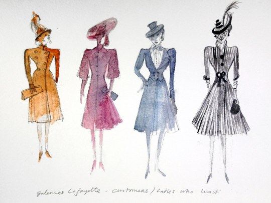
(Caption: Galeries Lafayette - Customers/Ladies who lunch)

(Caption: Milo Davenport | Ritz | Chaldet AAIP Ballet, with side notation indicating there is a fur wrap)
Color sketches are how a costume designer first lays out his or her vision for the wardrobe department. A designer, while intimately involved in every aspect of producing a costume, is not a single force and works with an extensive team in the costume shop of the theatre. This includes any number of tailors and seamstresses who will do the actual work of assembling the outfits to the people who add jewel or beadwork, all to the designer’s exacting specifications. But these sketches, often done in pencil and watercolor for intensity of color, are where it all begins. Notice how not every detail is outlined at this early stage; even if these are what the public envisions when they think of designer sketches, they aren’t the finished product. This, however, is how the work gets started and it can take an enormous amount of back-and-forth consultation between the costume designer, the costume shop, the set designer (can’t have color clashes or competition for the audience’s attention!), and even the actor or actress who will wear the finished product. The idea is to give a rough expectation of the finished product while allowing the flexibility to make changes for later. It’s the same process used by fashion designers making regular clothing or runway dresses, but with a different set of people consulted at each step.
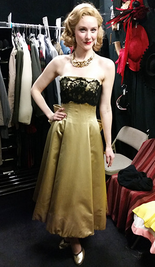
Bob Crowley’s designs, as the sketches show, reflect a classic look, something a bit more sophisticated than many of the dresses I have reviewed recently. That’s intentional given the time setting of An American in Paris; as I noted in my reviews of War Paint, the post-war era is where couture really started to come into its own. The designs reflect that while making sense in the context of the musical. There’s a tremendous use of color in the sketches, and that later gets transformed into some beautiful costume designs for the Milo character in particular. With thanks to BroadwayBox, I want to look at a few outfits Milo wears in particular:

I started with this outfit for Milo (as played ably by Jill Paice) because, lo and behold, it matches one of Bob Crowley’s design sketches above! What was once simply pencil and watercolor has now become a far more complex and complete costume from head to toe. We can see that he kept the same red for the dress as in the sketch, as well as the bow-like adornment that lies on the character’s waist. The coat has changed dramatically (remember what I said about sketches changing often?) and is now a black-and-red checked pattern rather than white-and-red, which I think makes it seem much more dramatic. The fabrics are rich and hang well, and there is simple accenting in the form of black suede gloves (according to Ms Paice herself), wide-brimmed hat that accentuates her blonde hair, and a relatively simple gold chain. It’s a visually impressive piece, and I love the way it just looks classical!

Second, we have this green, silky number that goes down to Ms Paice’s ankle. For the most part, it’s a simple dress with a traditional off-the-shoulder look that would have fit in at any swanky 1940s cocktail party (and indeed this costume makes an appearance in a scene set in the Ritz Hotel in Paris), especially on the figure of a wealthy woman like Milo. The lines are very classic and the fabric just looks so rich; having worked mostly in college productions, I can only dream of working with something this fine. But there is an additional element that I absolutely love about this one: the extra flare of silk on the left portion of the bust (viewer’s left, wearer’s right). It takes this dress from simply something that could appear in a Macy’s or Neiman Marcus window and elevates it to couture, a custom fashion made specifically for the wearer.
And one more thing about this dress: it flows, oh does it flow:

It floats outward and immediately comes back into place without looking wrinkled or shabby, and that is the sign of some truly quality work in any production, let alone one by Bob Crowley.

Next, we have an amazing skirtsuit that really shouts out for some analysis. A black A-line skirt is complemented and popped by the leopard-print blouse that imbues the character with two things: a sense of power and a sense of fun. During my review of Christine Ebersole’s wardrobe, I talked about the idea of power suits, and this definitely falls into that category. The cut of the dress (an A-Line) coupled with the color make clear that this is a serious person with serious business and ideas, while the blouse makes it clear that lurking underneath (literally!) there is a fun and vivacious character to be found. With very simple jewelry, the simple nature of the dress is allowed to carry the day, with the blouse itself acting as the accessory. Very clever mixture of techniques that I like!

This gown made its appearance in the Broadway debut of An American in Paris, appearing in the Bal des Beaux-Arts scene where everyone (or almost everyone) is enjoying a masquerade ball. For those who are fans of Phantom of the Opera, the concept of a masquerade ball is not alien; everyone wears their fanciest, most memorable couture and everyone carries or wears a simple mask that is adorned with beads, jewels, and/or feathers in order to conceal their identity.
Milo’s masquerade gown harkens back to the red-and-black checked coat at least in color scheme, and that’s something that I like--but the similarities end there. The skirt is ruffled with layers of what seems to be chiffon, while the black covering is a much smoother, more satiny fabric. Jill Paice said it was her favorite gown of the Broadway production because of the way it allowed her to move and breathe; because the dress is puffed out and because the black is fit to her figure, there’s no need for a corset or other structure underneath. That’s why it looks a little bit smoother in some regards on her upper body.
This dress appears at the beginning of Act II and is another entry in the couture-inspired designs. There’s some classic French and Hollywood glamor on display here, from the bodice that has an almost sensual black lace to the way the dress hangs elegantly without flowing too much; it’s definitely the kind of dress you expect to be seen in, rather than, say, go dancing intensely. While it’s not apparent in this shot, you can just see the hints of a large bow fixed at the back of the dress, a mark of custom design that once again reinforces that we are dealing with a character of means. The accessories are once again relatively simple; Milo Davenport is a character whose wealth and elegance speak for themselves. She doesn’t need fancy jewelry, though the necklace adorning her neck is a beautiful gold number that matches the tones of the dress well.
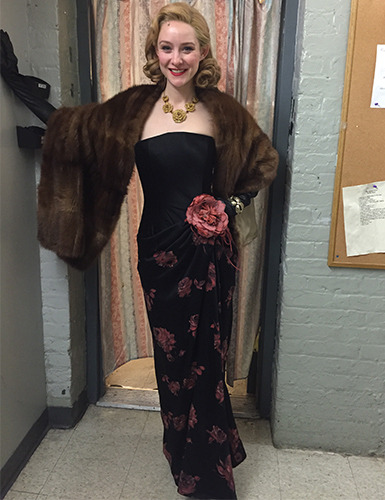
The last outfit of Milo’s I’ll cover is this number from the finale of Act II. Here, I must confess, I am not as avid a fan of Bob Crowley’s design as I am for some of the other pieces. I like the way the large floral adornment acts as a bridge between the patterned skirt and the un-patterned top of the dress, but the pattern itself strikes me as dated--even in the context of a 1940s-set musical. To be clear, I don’t object to floral patterns in general; indeed, I think Paloma Young did a beautiful job with them in Bandstand. But this one falls a little flat to me. Compared to the other costumes prepared for the character of Milo, this one just feels a bit more low-market. I freely admit that this may be a matter of personal taste, and I won’t criticize the work that went into it, but it just feels like it would have been better with either a different, more subtle pattern, or even as a black dress with some kind of accessories. One positive I will give it, however, is that it does hang well on Ms Paice and the fur stole/wrap really does do it justice.
And here’s the biggest reason I’m not as huge a fan: this dress started out as the dress on the far right of the Milo sketches that I posted earlier. There, it had a subtle pink skirt with the rose adornment. It was sleek and classical without being overly dramatic, and it avoided the somewhat dull pattern work that the final number had. But remember what I said: sketches are just the starting point. Clearly, someone (perhaps Mr Crowley himself!) decided that the final number needed to have Milo in a patterned skirt. It was a judgment call, and while I didn’t love it, I am sure there are many fans of the musical who did.
Overall, I really am in love with the classic, clean, couture look of the musical’s costuming, especially the majority of the dresses prepared for the Milo character. Bob Crowley is a master of the costuming arts and created some truly elegant and beautiful designs, even if I didn’t always agree with his choices. What makes them work is not only that they fit the era of the musical, but that they fit the personality of the character and the actress portraying her as well. On the whole, I can’t really find much to do but celebrate the way this turned out.
Next, I’ll take a look at some of the other costumes in this utterly lavish production, including those of the leading lady in An American in Paris. Bob Crowley put so much work into this musical that it’s only fair to give his costumes the full attention that they deserve.
Stay tuned!
100 notes
·
View notes
Last Seen Blogs

sharktistic
★ JOEY★
theholeyness
Holeyness

rreais
Kuchiki
undertalecomic-surfacetale-au
[Promises Kept, But Forgotten] Official comic blog
whollyjoly
🌼better than fake mouth static🌼