#You should try out FireAlpaca
Text
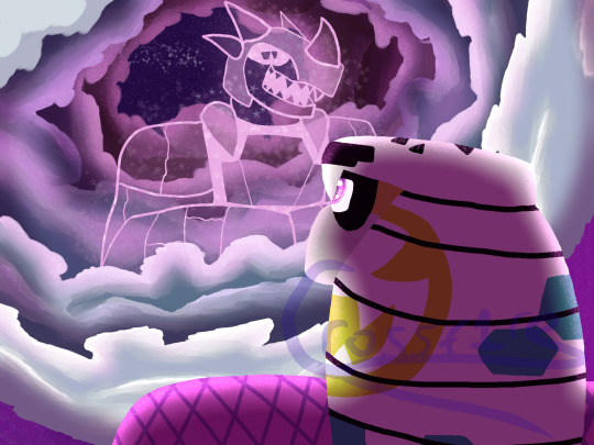
"While we may not co-exist anymore, we still remain in our hearts and in our spirits."
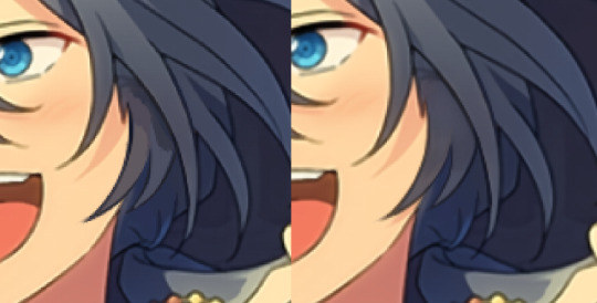
Just watched The Lion King earlier today and thought of Kid Cobra looking up to the sky and seeing his desceased father (or at least what looks like him).
I actually drew this in FireAlpaca for PC. Normally I use Ibis Paint for Mobile, but I also use FireAlpaca occasionally.
#arms#arms game#digital art#kid cobra#crossfire drawings#art#You should try out FireAlpaca#I personally think it’s the easiest to use#No I am not sponsored by FireAlpaca ;-;#Also both of Kid Cobra’s parents are dead#KC’s dead father’s name is Fangsmith btw#Don’t ask why I give my ocs the stupidest names
7 notes
·
View notes
Note
Hello!
Sorry to bother but do you have any digital art tips? I’m quite new to it and any tips, tricks or advice would be helpful! Your coloring style is very beautiful and I love it a lot!
thank you! 💚💚💚 sorry this is a bit late, hopefully there's still something helpful in it!
(also, it got pretty long, sorry!)
I think the biggest thing is to just take things slow -- digital art feels different than drawing traditionally, and it's SUPER easy to get overwhelmed by the billions of cool features that the digital world offers. (I say, as someone who spends a lot of time downloading cool brushes and textures...and then never using them ever.) there is a ton of really cool stuff you can do digitally, but because there's so much, I think it's really important to take time to figure out what is and isn't working for you. spend some time doodling without any intent to do a finished piece, figure out how you like to hold (or not hold) your tablet, what keyboard shortcuts you end up using a lot (and therefore might want to map to your pen/tablet buttons for quicker use)...that kind of thing!
everyone's workflow and preferred program and style are different, so it's hard to give hard-and-fast general advice. but the things that I think of as the essentials for learning digital art programs, and what I think of as a good order to focus on learning them in (although YMMV, especially depending on what kind of art you're doing):
brush customization (e.g. flow, opacity, softness)
layers and layer masks
selections and transformations (e.g. scale, rotate, flip horizontal/vertical, skew) (skew is underrated and I will die on that hill)
blending modes (e.g. multiply, screen)
adjustments/adjustment layers (e.g. hue/saturation, curves)
and I think most stuff after that is gravy! often very good gravy though! but yeah, as overall advice I recommend just taking things one little bit at a time, spending some time just drawing and messing around with each feature and what you can do with it. whether or not you end up incorporating any of it into your workflow, it's always good to try things out and just see how they feel! :D
and just so there is at least a little more concrete helpfulness in here, here's a few more specific things that I think are super important to keep in mind!
use! your! tablet/pen buttons! I mentioned this earlier, but they are extremely useful for keyboard shortcuts that you use often! most programs will also let you create new shortcuts for other things -- personally, I use the magic wand tool to fill in big color blocks a lot, so I made shortcuts for 'expand selection' and 'fill' and then mapped them to my tablet buttons.
flop your work horizontally often! when you're working on something, you get used to the way it looks, so seeing it mirrored is a quick way to see it with fresh eyes! in my experience, it often feels like this:
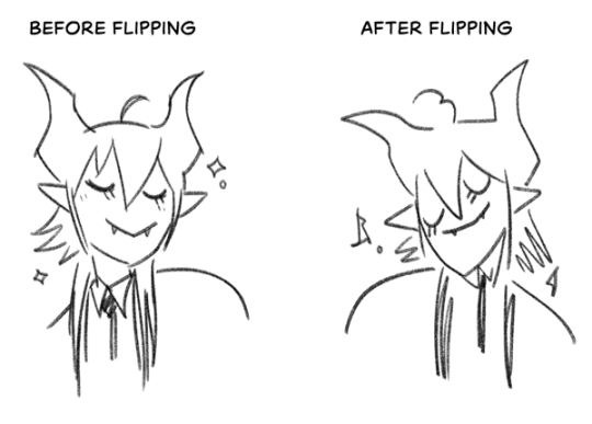
(a common thing is to find that everything is sort of 'leaning' too much one way, which is where skew really comes in handy!) (seriously, I love skew, it is my savior)

if you're working with color, keep a hue/saturation adjustment layer (or a layer filled with black or white and set to Color) on top and toggle it on occasionally to check your values! a lot of people who know a lot more about color than me (and are better at putting it into words) have written about why values are so important, so all I'll say is that the rule of thumb is that your image should still be readable in greyscale:

there are some exceptions and grey areas (do ho ho), but it's a good general rule to keep in mind! (some programs also have a colorblind mode, so you can check to see how your work will look to someone with colorblindness!)
and finally, here's some digital art programs I recommend, if you're still looking for a good one!
free: krita, FireAlpaca
paid: ClipStudio, Procreate (iOS/iPad only)
#art#...sort of#horizontally flipped mal isn't my favorite drawing i've ever done of him#but it's up there#anyway i do personally use photoshop#but i absolutely do not recommend it when there are better and free-er art programs out there#it is the equivalent of texting with a giant 90s-block phone that has been jury-rigged to somehow install whatsapp#because i don't NEED a new phone i KNOW how to use this one it's FINE#(oh god i've become my dad)#someday i will have to actually switch to clipstudio and learn new keyboard shortcuts :(
393 notes
·
View notes
Text
24 asksss :}}} ⭐⭐⭐

@ardent-38

You are my favorite person

@wolfie-777
Cassie does not exist in my AU. But hypothetically-
If Roxanne found this lost child she would report it to Vanessa and have her help Cassie. As is the protocol for children that are found on the premises after hours.
If Roxy found her while she had the "bug" in her system? She would have attacked and maybe even killed Cassie :x

Had to google what that was, <XD It looks beautiful! And I image that he has seen it before yeah :)
As for their favorite songs, I'm not sure :0

That's.. actually a really good idea.
For a long time I never went back to the comic because the writing I did was awful. Everyone was acting out of character, it was SUPER dramatic. I wrote Peso's character all wrong. Uhg, awful awful awful.
And then I was kept away from going back because people would not stop asking me to finish it. "Why did you abandon this comic?" "Are you gonna finish it?" "Why did you stop drawing it" "Go back and finish the crab comic" Like, it was so frustrating.
...Buuuuutt,, rewriting it? Hmmm... I'm way too wrapped up with projects to start this anytime soon. But I wont lie this ask really got me thinking about it-
Also thank you so much! I'm glad you like my art!! :DDD
@smilegirl64 (Post in question)
Thank you! I'm so glad you noticed! That was my favorite detail to add XDDDD

@elegysonnet
I dug into the series a bit and took a look around the fanbase. And I decided that it just wasn't really my thing.
Although I did love the character designs and I think they'd be really fun to draw, I didn't think I'd get along with the fandom. I can see myself huddled in my own little corner with all my headcannons and stuff, and I wouldn't really want to interact with anyone else. :/
Also my favorite character is probably Julie or Howdy XDD
I use an XPPen Artist 13.3 Pro. Its a tablet with a screen! :))

As for my drawing program I use FireAlpaca. Its free and really good for beginners and pros! Highly recommend if you're just getting into digital art. Also thank you!! :D
@baokim80


@burningmusicfunnygiant
I disagree actually. The "bug" aside, they are in no way programed to hurt anyone. They are programmed to have full obedience to staff and Managers.
They could try to stop them, and they could physically stand in their way. But you wouldn't see Freddy straight up punching an employee to keep him away from Bonnie.
Now with the bug in their systems? mmm.. Okay yeah they would. BUT ONLY WHEN THEY'RE NOT IN THEIR RIGHT MINDS-

@cudlycorncornsworthcoberson
XDD Offended Bibi noises can be heard in the background
@curiousskelekitty
<XD I'll do my best!
I feel that my responsibility as an artist on this platform is to tag my art appropriately. Tag it for blood, gore, injuries, things like that. So that people who are disturbed by those subjects don't have to stumble upon it and have their day ruined. :(
What is NOT my responsibly is to prevent little kids from seeing my bloody Octonauts artwork. That's the parents job. XD THEY should be keeping an eye on their kids and making sure they're not browsing sites like Tumblr XDD

Tangle and Lolbit are not a part of my AU actually.
But Mangle? Just because she hasn't made an appearance of any kind yet, doesn't mean she wont in the future.. 👀


Thank you! :DD
Thank you! I'll try to not rush through my projects so much <XD

Thank you for respecting that! :D
Also uhg. I hate pinterest. I would rather people just never found out about me then find me through a pinterest post with my stolen artwork.

@whereismycupofcoffee
YEESSS!!! I always love it when people decide to give Octonauts a try :))) Its a really neat show!

THANK YOU SO MUCH!! :DDDD
XD My first thought was Peso or Shellington for some reason. They're just too polite to make a fuss XDDD

@kymbird
Wanna know a good place to start if you genuinely struggle with that? Make 1 character that is based off of you. And then make a second character that is based off of someone in your life that you have 0 romantic interest in what so ever. Like your Mom, or your Dad, siblings, Uncle, dog literally anyone. It should be impossible to twist those 2 characters together because they are modeled after you and ur mom. You should look at them and say "thats me and my mom" or "thats me and my brother" Those 2 should then be characters that are 100% protected from becoming a ship. :0
This actually reminded me of my transformer ocs. I modeled the characters after the drivers/owners. And people wanted to ship them together and I was like "for 1 they are my OCs so thats kind'a odd but 2 those two characters are based off of siblings. They absolutely should not- in ANY universe, be paired together"
Personally not a huge fan of the bright blue color he has. Seeing his Bonnie Bowl artwork everywhere I expected him to be his usual purple..
As for my Bonnie I think he'd get along pretty well with his Glamrock counterpart! But when it comes to the Bowling ally they'd be rivals. >:)
Also thank you! :DD
@trains-of-thought
aaaa thank you so much!! :DD I'm so glad to hear that you've liked my Mario artwork!! And that you read the info aaaa!! I spent a lot of time writing all that so I'm glad to hear that you read it! As for your questions,
1: Yes! My Peach, Daisy, Wario and Waluigi are all the same species, which is not human. They are this incredibly tall elf like species that closely resembles humans and has many biological similarities.. but ultimately they are very different species.
2: Its hard to say.. I've been known to change my mind a lot so maybe? Honestly I hope that someday these feelings towards fanart will vanish and I will be able to engage with my fans more. But for now,, noooo fanworks :(
OH MY GOSH I LOVE THAT FNAF VIDEO XDD Very well animated and funny! Here's the link in case anyone is interested!

I drew it myself! :)
#my response#fnaf security breach#fnaf security breach dlc#fnaf security breach dlc spoilers#octonauts#super mario bros
360 notes
·
View notes
Note
(If you're comfortable with this) could you make a tutorial on how you make your creations??? It'd okay if not, thank you for making them :D
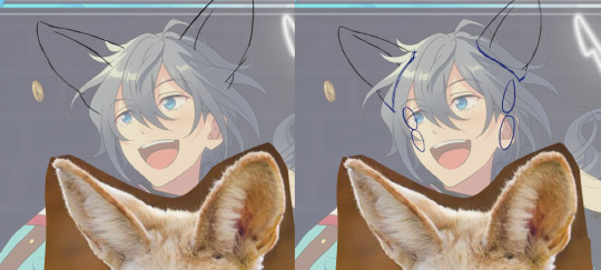
WAA i can try!! baby's first tutorial ft. this guy

🐾 first, a picture of your blorbo
i use waifu2x to up the quality, not always neccessary but it makes everything a bit easier and prettier. i use firealpaca to edit but you can use whatever you like, im not your mom
🐾 probably get a reference
yeah i dont always do this. but you should! i should! so google whatever creature you want to turn blorbo into and maybe scroll for a bit to get a feel for what they look like :3
try to find one at a similar angle to your blorbo picture and paste it/open as a layer. look this is close enough ↓
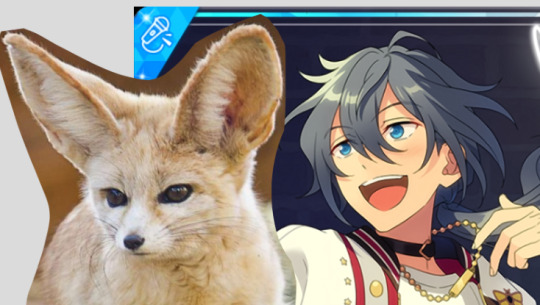
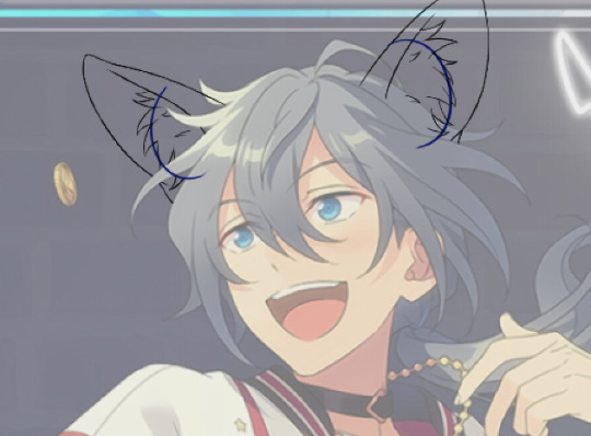
🐾 onto the actual editing! human ear surgery
in case you prefer just one pair of ears. you have to understand the style so you can imitate it.... so look at their hair, maybe theres more colors or gradients than you can see at a glance or something ! i colorpick a bunch of them and put them over their ears, then blend them together with a low opacity watercolor brush
ALSO, notice the.. lighter glowy aura thing around his ear in the og? i try to imitate details like that too, used watercolor for this again
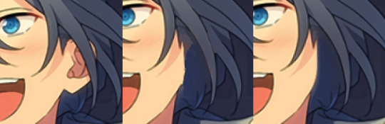
now maybe you wanna make it look like theres something covering that spot, since theres kinda nothing there now. soo if that looks weird to you, (open a new layer and) put some hair over it. i cant tell u how to imitate Any style so just. study it and keep trying
with enstars here the lines are pretty soft, so i go over it with watercolor brush after doing the general shape. with a higher opacity you could probably just use a softer brush from the start, i just like starting with the basic pen
🐾 the lines!!!
nowww i lower the blorbos opacity to around 50%, bring the reference somewhere i can see and just kinda... start sketching. lot of redrawing and transform tooling here sometimes
TIPS 1. you can clean the lines up at the end so dont stress
2. think of your blorbos new ears as a real tangible part of their body and how they fit on their head since you dont wanna make it look too flat !
3. and for the placement i always end up at roughly one human ear length above their og ears if that makes sense. tried to visualize it
as for inner ear fluffs phew i dont know either. draw a circle and start from there? maybe there are actual animal ears in blorbo artstyle out there you could reference
🐾 coloring 🏳️🌈
finally some progress huh. i color the lines in a contrasting color first so i see the lines properly and dont miss anything, then fill it in with the actual color :3 OH and for gradients i just use the airbrush at the ear tips or sides
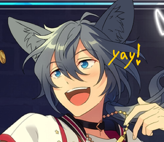
noww shading! new layer, basic pen brush and try to follow the shapes in the og art. it's best if you pick the colors from the actual picture!!! take notes mentally and just do your best i dont know how to explain this more
taking this as an example, the shading is mostly in pretty simple wider areas, so not a lot of seperate strands in there. and its again pretty soft around the edges of shades and highlights, so i'll go over it with my beloved watercolor. keep things like that in mind so the creaturing blends in well :3
if you like more detail better you can still go with that. or less detail on a complex artstyle. the world is your oyster
🐾 and the rest
what else could there be???? making the lineart more cohesive for example ★ oftentimes it's not one solid color, thicker or thinner than yours, things like that.
for things like piercings or fangs you can just draw them on top i believe in you <3 if its like an intricate earring use the lasso? magic wand? the one that lets you select an area to copy and move on top of your ear layers
+ remember details like shadows, if you put a tail on top of say blorbos leg there's gonna be a shadow under it! put a layer under the tail ones and freehand draw the shadow, OR copy the tail layer, put the copy under the og one and change color/opacity until it fits
30 notes
·
View notes
Note
how do you make your oc screencap edits?? i also have a td oc and i dont really know where to start 😭
ok so!!! i use firealpaca which is just my usual drawing program. so i'll keep using it as a reference for my steps but of course im sure whatever similar program u use should have similar features
i'll be long winded for funsies as usual 💕
FINDING YOUR SCREENSHOTS
the key to decent td edits is to flat out trace screenshots whenever possible. stock pics will do, but of course itll be a lot more fun and less obvious if u use a screenshot from the show and put it into your new context
in terms of making your ocs, you will likely have to do what someone once called "frankensteining" your pics. this is where you use pics of other characters for their specific features and put them together since your oc doesnt have official screenshots to trace. this also absolutely comes in handy w canon characters! maybe you have a pose but u need them to be sitting. so try to stitch together two different pics to get what u need
it will look very scary but just trust the process. here is a random example i made using a dawn screenshot (where i removed the background), gwens eyes and eyebrows, and kittys hair

the sketching part is semi-optional. if you think you can freehand the lineart then go ahead but i assume your oc wont be a complete copy of something found in canon and therefore you will have to draw the newer/different features (such as the hair or the outfit) at least a little bit. and sometimes when i frankenstein the pics, my brain gets all overwhelmed so sketching makes me feel better jfbdjdnd
(in terms of my own oc, i screwed myself over bc his body type is so unique i gotta freehand it like all the time 😭
you can see i traced his head from his render (ALWAYS DO THIS BTW!!! TRACE CONSTANTLY), but then the body was freehanded using a canon pic as reference because tracing the pic wouldve been inaccurate)
THE LINEART
yes the iconic td thick, sharp, flat lineart. i achieve this by using a normal pen tool, turning off the pen pressure, and then turning up my pen stability to 40-60 (very high). you could use a curve tool if that works for you! but i would suggest against that for ALL of it bc the tool just wont respond well to rly drastic curves and such
the pen size varies on the pic. if the characters are close-up, itll likely be a bigger one. and then the characters' little details and facial features are usually a slightly but definitely noticeable smaller size. for the most part, ive had the bigger pen size at 13 while the details are around 9. or big size 10 and smaller size 7.
heres my technique:
as u can see, all of my lines go a bit too far. this is so that when im done drawing them, i can go back in and slowly erase where they meet and get them all sharp and pointy. this is just how i personally do it lmao. when it comes to facial features and other stuff that doesnt connect to anything, just get a close look at your reference to see how thick or how thin the edges get and do ur best to erase the edges to the point where they should be
THE COLORING
not much to it! the bucket tool is the best way to go. again just get a good look at your references just in case any parts have the lineart also colored in
THE BACKGROUND
you can find some generic td background pics on google or u could get them from the show and try to erase any character in the way lmao. if ur recreating something like, say, a dunc/ney scene w a different ship, then its very tedious but youll have to do your best to erase the canon characters and piece the background back together.
i like using the smudge tool a lot for this!!! just kinda pulling whats already there towards the characters. to save time, put your drawing visible on a top layer as you do this so that you dont have to edit the ENTIRE background, just what you need
THE RENDERING
ok so heres a big one imo. after youre done, youre gonna have to fuck up the quality at least a little. well not that u HAVE to but like..... to match the standard quality of a td screenshot? ive never seen a td screenshot in perfect hd quality outside of stock art. so u could blur ur drawing just a little bit. maybe add in the teeniest bit of chromatic aberration (just set it to 1 or -1). not ALL of them together but u do whatever u gotta do
my personal favorite is blurring just a little and then saving it as a jpeg (around 65-80%) so that its pretty crunchy and looks all the more real
obviously not a NECESSARY step but just something to point out. especially if ur background isnt the best quality so the characters have to match it
this one from yesterday i didnt even redraw topher bc i was lazy and he looks fine enough. i just put danny onto the pic to cover the other character. so i blurred danny a little bit and then saved it in a pretty low quality so that they match one another. look at those pixels. that crunch.
SO THE TLDR IS just trace and copy your references as close as possible. if you cant find a reference for your character, try finding another character w something close enough
26 notes
·
View notes
Note
Hi! Thanks for your page, it's hard finding resources for Firealpaca online.
Do you know how to make roller brushes? I'm trying to make my own roller brushes to help speed up my drawing workflow, but I just can't understand how they work.
Hello! Roller brushes don't really have an official tutorial as far as I know, but I've only been looking through google search, and following the official accounts, so maybe there is something out there. So I'll do a little explainer on roller brushes, based on my own experience.
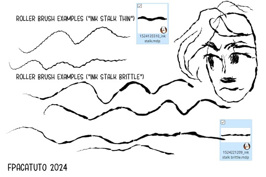
Basically, when you look at official roller brushes, you'll notice the image can be quite long. The image used can be distorted by the roller brush engine, even if the image itself is straight. The brushes also always go from left to right, horizontal, so the brush can "roll" properly:
If you want your stroke to be continuous and always connected, you should make sure that the left and right edges connect. These vine brushes for example, because they're connected at the edges, these stalks look like the can be never-ending.
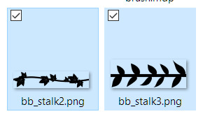
However, when using roller brushes, if you do more loopy, shorter or quicker lines, instead of continuous and long ones, you can start to notice that the brush cuts off a bit in some sections (bottom right corner of this green example image)

When making something more natural looking, it can also often start to look a bit obvious where the canvas cut-off of the brush is, so my tip based on my own an official brushes, is to make the cutoff very exact, but also ideally, avoid realistic brushes (with a preference more to "template" style brushes like the vine stalk examples here), or to make the cutoff intentional (like I've done with these "ink roller" brushes here), so it doesn't look too strange when the brush is not used for smoother/straighter lines. Hope those tips help a bit!
also, so sorry for getting to your ask so late! tumblr has not been showing me notifications anymore (unless it's bots) and yours seems to have gotten lost in all that.

13 notes
·
View notes
Note
Hey- out of curiosity, have you ever made any guides on how you make edits? I honestly wanna try making icons in a similar style as the ones you have been posting for past days but have been sort of struggling with achieving desired quality
guide time!
i use firealpaca for my icons, any square canvas will do but i use 400x400 or 300x300 most often.

for my normal, clean circle ones; i use the ellipse shape tool & constrain proportions.

after making your circle, center the layer like this. now i have a few different ways to do icons depending on what kind of images i have to use for it!

for transparent images, i simply upload the flag as a clipping layer. you can copy and paste it or insert as new layer.


insert the desired image, and mess aroudn with it until it's cropped how you want it. now, paimon here covers up a lot of this flag, so let's fix it so we can see a little bit more.


the best way to get the smaller circle in the middle, i find, is by duplicatign the original circle and making it smaller with the "fix center" setting. dulplicate the flag layer as well, so all the stripes line up.

it should end up something like this. this is fine on it's own, but i'll show how i do some filters and other touches.


i usually do gradients, but sometimes solid colours too. you get this colour layer and set it to "soft light"

now for a border. there are defintiely easier ways to do this, but this is how i do it because i like to make my life difficult. use the wand tool to select the background circle, and make sure it's set to "active layer" and "expland: 3 pixels"

after that, add a new layer and put it under the circle. the new layer will automatically be a clipping layer so make sure to set it as a normal layer before doing the next step.


either with the gradient tool or with the pen/shape tool to make a solid colour, set it how you want, then it should look something like this.
now as an extra touch, you can add an outline to the blorbo if the image is transparent. go back to the wand tool, and select your blorbo.

the expand 3 is a bit thick so i'll use the expand 1.

so put your outline layer under the blorbo, fill it in, and now they have an outline.


and there you go!
resources used
paimon's portrait
kiruliom's genderfluid flag
41 notes
·
View notes
Text
(if you’re like “hey, haven’t I seen this post before?--yeah, sorry about that. I deleted the original post because there were a couple things in the drawing that were just really bugging me and I figured only four people saw it anyway so I could change it. I’m honestly still not totally satisfied with it but *shrugs*).
for @silver-goggles-guild prompt #7, “1980s flashback”!
here’s the 80s-Jason-Bateman-photoshoot inspired drawing of Peter I mentioned a while back. I don't know why but the random "WOW!" was just really funny to me when I first found the original photoshoot, so I thought it'd be fun to draw Peter with it xD
Also, I'm planning to sell stuff on Redbubble soon and I'll probably have this as a sticker!

(I'm not sure if this will get blurry when I post it, so if it's blurry try clicking on it and I think that should fix it? Also, the colors will be off if you have a blue light filter on)
notes:
I drew this with warmer/more saturated colors but when I saved the drawing the colors washed out a ton--apparently it happens sometimes with firealpaca (the drawing program I use). RIP. So I'm not super happy with that. Just pretend the colors are more intense I guess xD
Peter's wearing the shirt he wears as Ralph in the wandavision finale! Well, kind of. I wanted to reference that just cuz' but when I drew the sun graphic on the front it made the drawing feel too cluttered, so I just kept it as plain ole tie-dye.
ignore the hand. we do not speak of the hand. thank goodness his other hand is in his pocket so I didn't have to draw TWO hands.
I included his nose freckle! I know sometimes the makeup dept. covers it but I think it's a fun feature, and “is this fun?” was basically my criteria while drawing this for figuring out what stays and what goes xD
Peter's hair is too fun to draw. I honestly probably should have left it more plain like how the rest of the drawing doesn't have much shading but I just felt like it. His hair in this lowkey reminds me of LEGO hair and I found that funny so I was like "what the heck, just keep it in"
#SGG-June23#peter maximoff#quicksilver#xmen#evan peters#fanart#drawing#fietro's art#ralph bohner#Ralph wandavision#wandavision
22 notes
·
View notes
Photo
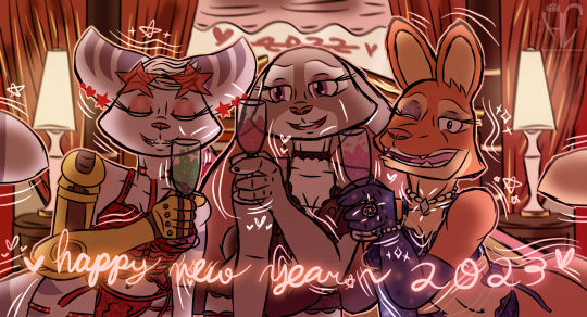
🥂🎊💋can we stay up all night~
Fuck a jetlag~
So, um… there’s so much that I have to say regarding what I’ve been through throughout this entire year - as I’ve said before, and making fun art aside, 2022 was a shitshow for me. What was it that made me back out with fulfilling my expectations and projects that never happened this year? I’ve had my fair share of speaking about focusing on my college classes and personal life, and trying to do better before, and I know you guys have been appreciative of me in putting that first before art, but where I had to step away from everything and being myself for a bit was taking and retaking intermediate calculus to the point I’ve never felt the same ever since the first attempt in taking it and failed. (Instead of having the post filled with a lot of text and overwhelm everybody, I encourage you to click on the “Keep reading” tab - tl;dr: there’s a happy ending, I’m my happy and normal self again (...at least for now-), and I did this drawing for the sake of my self-indulgence~)
Let the tangent begin - at that point during the pandemic and with taking online classes before going back on campus in late 2021, I was an absolute perfectionist in making sure that I can be able to pass my classes - taking a calculus I class back in spring 2021 was my first math class after taking precalculus/trigonometry back in spring 2020, and there was stress building up on me whether I would fail or succeed at it. I got a B in that class, and I would take calc II over the summer for 8 weeks afterwards; that class was even stressful with me doing classwork nonstop and no free time for me whatsoever, and as I thought that I did pretty badly with the performance I had in that class, I passed with a C! And then calc III came around that fall, and my first attempt was bad; some stuff in my personal life was eating me up and I’ve been too focused on getting things done for other classes. And when I had my second attempt in that class back in spring of this year, I made sure that I wouldn’t fail again but oh was I wrong - stress and focusing on other classes were eating me up again, and I failed again. Leading to my third and final attempt, I took everything steadily for this year’s fall semester and I truly made it clear that I will pass calc III; there were a few bumpy roads, but in the end… once my final exam for the class got graded, and went to go on Canvas to see that my overall grade for the class was a D, I was iffy for a few seconds and then I check my grades in my student services for the college I go to just to see that my final grade for calc III for that semester was a C! I’m happy that I finally passed, and I’m beyond fortunate to at least get a happy ending after a shitty year! So yeah, if you’re wondering why I haven’t been my happy and usual self, I kept retaking calc III to the point it drained me and made me question how to move forward with me majoring in mathematics (I really don't know how much I would talk about this kind of stuff, but I do need to take it easy and limit myself)! And for the time being, I’m going to celebrate passing the class with some R&R after carrying the bs on my back and self-indulgence! 😌💅🏼
Alrighty moving on from all of that, onto the drawing! Well, self-indulgence aside, I may or may not have been contemplating drawing this for a while now, and I just want to try capturing the happiness and celebration of what I’ve been feeling lately - and given the fact that last year’s New Years drawing was done on FireAlpaca and you guys enjoyed it, I figured that I should do it again, and it’s for the best anyway as I need to get end-of-the-year projects done instead of getting this (…and another drawing 👀) finalized! One thing’s for sure, I’ve at least fulfilled my promise in getting out of my comfort zone by sharing drawings done in FireAlpaca instead of doing full rendering on SAI this year - thank you for that! 💖
And most importantly, and maybe I should try getting out of my comfort zone to say ‘thank you’ more, despite everything I’ve been through, with love and gratitude I’m forever grateful for the support and appreciation you’ve given me and my content; thank you for taking your time and day in acknowledging and appreciating with what I can do - to my followers, friends, and mutuals, this one’s for you!
And that’s all I have to say - so so long 2022, you nasty fuck! Hoping that 2023 will come with and give us all greater things and happiness! Here’s to 2023, thank you so much for everything~ ♡♡♡

#My Art#Judy Hopps#Rivet#Diane Foxington#Zootopia#The Bad Guys#Ratchet And Clank#Disney#Insomniac Games#DreamWorks#Crossover#Cute#Kawaii#Lingerie#Yellow#Gold#Red#2023#Happy New Year#Happy New Year 2023#Zootopia FanArt#Ratchet And Clank FanArt#The Bad Guys FanArt#Also shut up I understand if I'm posting this early#Especially w the fact that I'm going out tomorrow- I need to get this out of my system
16 notes
·
View notes
Text

🌟I'M OPEN FOR COMMISSIONS!🌟
(Rd1: 9-29/11-29)
Greetings to everyone who is and everyone who isn't. As content as I'd be to reblog things forever, I do draw and I do need things… soooo, drawing instead of ebegging because crushing guilt either way and using my one chosen defining skill to feel useful? To be honest and fair, I just need at least $25-30 to get past instafart's bs, but I could also do so much more if my chronically ill butt just… tried? I have self-trust issues, don't @ me… Also, I'm not starving; I need sundries. 🤷🏾
✅ will draw: fanart, ocs, nudity, light gore, suggestive/light n-s-f-w. Furry, animals, therian, toon, and light kink all welcome
⛔ probably won't draw: heavy gore and n-s-f-w, mecha (not because I don't like it, I just doubt my skills in it. Ask at your own risk, I guess…)


🌟PRICES🌟
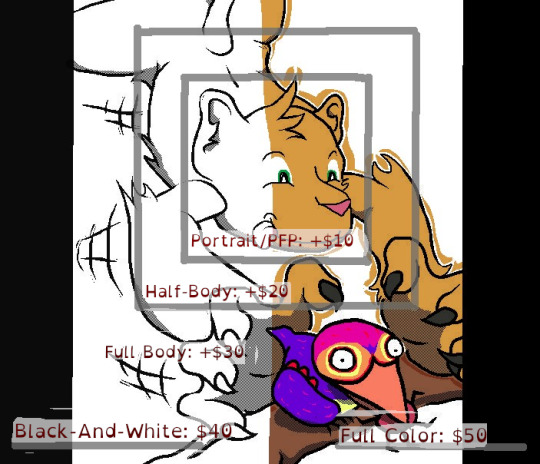
🌟NOTES🌟
The color type is the base price, the size adds as advertised
Detailed backgrounds, extra characters, and/or designs will cost extra; about +10-15 each depending on my spoons at the moment.
One-page comics are... doable, but not a thing I plan to do often, at BnW or Full Color price + $40. Comics are hard, even short ones.
One of observant mind will notice that one of the examples is traditional. DO please specify if you'd prefer traditional or digital. If not, I'm gonna randomly do one, the other, or a mixture (It's the same effort for me, either way.)
There will be times where I will NOT be able to sit up and work. I will either edit this message, or make another one with said announcement on it and pin it. An then subsequently edit or make another message again to announce that I'm well again. So goes the conditions of having a corporal body; sometimes you get stuck with a shitty one.
I plan on taking breaks. They will be announced similarly. Because breaks are good for you.
The ability to say 'no' is always at my discretion. I'm willing to try things; I am NOT willing to be uncomfortable.
I have more examples if you're curious, just nothing recent or that I personally feel represents me as an artist at the moment... It's complicated...
Reading is hard, so I made the different bullet points different colors. Um... yw?
🌟CHECKLIST🌟
Email me at angelicdirt0 (at) gmail.com. Say hi, say hey, and include "commission" somewhere in your subject line, please! OR dm me if you need to ask something real quick - but full requests with references, descriptions etc. should be exchanged via email. :v
Please include:
What type of commission you'd like - b&w/color, portrait/half body/full body, how many characters, etc. references of the character(s) - if you don't have an image of them drawn out in their entirety, please provide picture references of all their parts (hair, face, clothes, colors, etc.)... You have a reference sheet? Even better!
What you want to see - what pose do you want your character(s) to be in? what expressions? what is the vibe you want conveyed? is there something you want to focus on in particular (e.g. a character's ring, a scar, a limb, etc.)
Are you okay with your commission being public? - you will get a higher-res, un-watermarked version of your commission and the project files (Krita, FireAlpaca, or GIMP... I tend to jump around). I do intend to put lower-res, watermarked versions of my commissions up on my blog / portfolio, so please let me know if you would like it to be a private commission.
You'll receive a reply within 3-4 days, at which point we can talk a little bit more about your commission if needed!
Full payment will be required upfront through a P@yp@l or c@sh@pp. The invoice will be sent to the email you used unless specified otherwise.
Thank you so much for the look, and hope to talk to you soon! <3
#commission#commissions#art commisions#art commissions open#ebeg#ebegging#ebegging but not#this takes off I might throw in animations well...
3 notes
·
View notes
Note
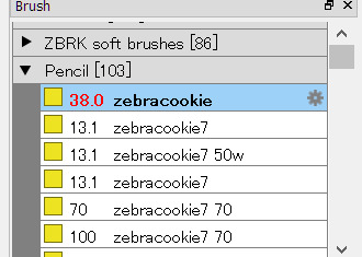
hii! what brush settings do you use for art?
hello ! :D i use a custom brush i downloaded years ago , so to my knowledge it'll only work on medibang/firealpaca , but i can try to help you out !!!

^ this is the original image , you want to open it up in a canvas !
then create a new brush & mimic these settings:

& it should draw as how my lines do ! of course you can shift it to your liking ^u^
for painting -> i use the default "watercolor" brush (not the wet one) !
historically i've used the default "pencil" tool for lineart , but around a year ago i switched to the more textured brush :]
13 notes
·
View notes
Text
My advice for doing digital collage like I do is
Hoard all the pngs you can, save usernames and such for crediting if the person you're grabbing them from requests it
Hoard all the pretty backgrounds you can too
Any sort of interesting visual texture also
Just hoard a lot of images. You're always going to need more material to work with.
You should probably sort your various image assets in some manner. I do not because I'm a dumb bitch who just dumps a bunch of folders in another folder, but it might be a good idea for you
Internet Archive is a treasure trove if you have the patience for it. Take some time to look through old magazines and books and save images and take screenshots to clip them out later.
Layer types are your friend. My main tool for making the assets I use my own is taking a png, making a layer set to masking, dumping color/a cool texture image onto that layer and messing with the layer types until I like what it did to the image below, then merge. Sometimes this happens several times until I get something I like
I get the chromatic aberrations by making a sandwich consisting of five duplicates of the almost complete image: the "bread" is two that are completely unaltered color and layer type-wise, then I crack open color balance and take one color to an extreme end of one of the sliders on each of the "filling" layers, each one a different slider. I then flip the filling layers to exclusion and shove them in random directions. Lower the opacity on the top layer until you're happy with what you see. Merge them all together. You might have to try merging them in different orders or trying different ends of the sliders to get colors you like, it takes patience but it rarely looks bad.
Scan lines are a bucket fill pattern applied after I finish the chromatic aberrations. The pattern made by making a tiny tiny canvas and filling one half all on with black. You'll want to have these in a bunch of sizes for various purposes. Playing with layer types is good for these too, a lot of subtle differences but they matter.
Everyone will tell you that GIMP isn't a good art program. That's only true if you're drawing. GIMP is the dream for making digital collage images.
I tend to use FireAlpaca for clipping out images I get from Internet Archive though, the selection tool is a lot more Agreeable and easy to work with IMO
I find trying to plan ahead isn't much of a help, maybe even a hindrance. Having a vibe in mind is great though, put a song on loop and just run with your whims.
Digital collage is a very free artform, you're not locked into anything until you merge your layers, and even then if you save a backup before merging that's not a problem.
Just shuffle pieces around until you like it, go on a hunt for new bits to use that you think would fit if you feel stuck.
Don't worry about anything too much.
You're going to make something thick with meaning to you and you won't be able to explain it to anyone. I think all artistic mediums are like this though.
You're also gonna make a lot of stuff you just think is pretty. That's also part of every artistic medium I think
2 notes
·
View notes
Note
this might be something with pretty obvious answers, but i wanted to start doing digital art
any tips? thank you
hello anon and congrats on being my 2nd ever ask!!
I'm the absolute worst person to ask about this, but I'll try my best.
Disclaimer: Actually blending and painting digitally is a whole other topic. If you wanted me to talk about painting: I'm sorry!! But, I can make a post about that specifically if you want. For this post though I'll be talking about more easy basic stuffs since you said you were just starting out (I still do mention shading tho).
This post ended up being lengthier than I thought, so I'll leave my thoughts under the cut.
In terms of getting started hardware wise, I've only ever had one drawing tablet (its a huion, but I can't recall what specific model) so I'm not sure I can make any good recommendations but I know there are many ppl on yt who have more experience with various tablets than I do if you don't have one yet!
However, in terms of software, I currently use medibang paint simply because it's free and suits my (very) simple needs. That being said I think it's pretty decent and is definitely more than enough for just starting out. There's also firealpaca, which is essentially the same program but with a focus on animation and comics at the cost of less brushes. Both can be used for basic illustration and have pretty much the same basic brushes and functionality, so either are good starting programs imo.
Besides all that, I'm guessing you're asking more about the actual art side. I don't know if you're transferring to digital from traditional art or just starting to draw in general, but hopefully I can help regardless. There's a lot of beginner digital art tip videos by people way more qualified than me out there so I'm gonna try to give tips I feel like aren't talked about as much.
1. Canvas size is important
When setting up your canvas size, it should definitely be at least 1920x1080 pixels (standard HD size). my canvas is usually 3000x3000 or just a large square. This is mostly because I'm indecisive, draw small, and don't know exactly how I want my canvas oriented until I start drawing; however, I find it to be a good starting point in general as it's big enough to be cropped and preserve quality. Basically, just don't accidentally make your art too small (which sounds obvious but it is something I have done before and haven't really seen artists talk about for beginners. It's a really easy thing to overlook).
2. Save ALL of the time
This isn't really an art tip as much as it is a PSA to prevent disaster. I don't think I've seen an artist that HASN'T lost drawings or parts of drawings from their software crashing or forgetting to save. A lot of if not all art programs do have an autosave feature but it's definitely not meant to be relied on. Especially when you're starting out and are likely spending a LOT of time learning and experimenting with your drawings, just make sure to hit CTRL+S often and make it a habit.
And as a side note, save your art in dated folders of each year/month. It makes the process of backing up your art or uploading it to a drive a lot easier. Safe art is good :]
3. Take advantage of EVERYTHING
Okay, moving on from that sort of off topic PSA, If you're used to traditional art, or just not familiar with your art program, it's easy to forget how many tools you actually have at your disposal to make the drawing process easier and/or faster. So I have compiled a list of essential tools that are in every art program that you might want to experiment and become familiar with before just diving into the deep end and making a drawing (which is fine too, but it can be a little overwhelming).
Layers and clipping
Generally, you want a layer for each unique element of the drawing, such as:
Sketch
Lineart
Color
Shadows
Lighting
I typically divide the color layer into a layer for each color so I can shade them individually (not doing so makes your colors susceptible to getting in each other's way and is just kind of a pain). For example, I'd probably split the color layer of a portrait of a person into a skin, hair, and eye layer. I know when it comes to painting specifically having 39178319 layers is usually criticized, but I think it provides good organization and a bit of a safety net, especially if you're new to digital art and will likely be indecisive in the beginning about things like color.
Speaking of being indecisive about color, one of the most important features of an art program is clipping.
Essentially, whatever you draw on a clipping layer will only show up within the layer that's below it (which as I'm typing this I've realized makes way more sense when you see it than through words). There's usually a checkbox to enable clipping on a layer in the layer window, and its usually called just clipping or clipping mask across software I've seen.

(Clipping off)

(Clipping on)
One of the main things you can use this for is quickly changing the color of a layer without having to be decisive about it and permanently change it. You can have multiple clipping layers over one layer and simply hide the ones you aren't using.
The more prominent thing clipping is used for, however, is shading. Basically, you add a clipping layer to your base color and color in your shadows without having to worry about "going outside the lines". I really wouldn't recommend doing shading any other way unless you're just freehand painting. Clipping is definitely the easiest approach.
Blend modes
I don't really know how to define what a blend mode exactly is, but I can tell you what the two most useful ones are. There's a lot of them depending on what program you use, but the most important (imo) and universal ones are called multiply and add.
What multiply does is intensifies the darks and completely gets rid of the lights on whatever layer you apply it to. In simpler terms, it casts itself as a shadow on the layer below it, hence it is used most often for basic shading.
Because of the nature of the blend mode it is common to choose colors like dark purple or dark red as the tone for the shadows. I honestly really love purple/cool shading, but you can experiment with various tones of shadows and find which fits the vibe of your piece. A general rule of thumb is to not just use a darker version of the color you are shading (unless that's the look you're going for), but also shift the hue on the color wheel a bit to add more v i b e s. For example, shading red with maroon/purple-toned red or green with a slightly blue-green.
Add is the opposite of multiply. It intensifies the lights and completely gets rid of the darks on whatever layer you apply it to. It casts a glowy looking highlight on whatever is below it, and is used for intense lighting or making stuff look cool and glowy (my favorite thing).
As somewhat of a side note, each layer also has an opacity (how opaque/transparent the layer is) setting. Lowering the opacity from 100% will make the layer more transparent (very useful for adjusting the intensity of the shadow or highlight layer, and to draw over your sketch).
Conclusion
There is a LOT more I can talk about regarding this but I think most of it has already been said by much more qualified artists. Also this post is hellishly long and I think any more advice would be overwhelming (if it wasn't already). Hopefully everything I mentioned above can help you start your digital art journey. I'm down to make a part 2 of more obscure tips if I can think of enough.
Best of luck anon and sorry for making you read all of this!
8 notes
·
View notes
Note
Hi! I've tried looking it up but haven't found anything on what I'm looking for, and I've seen this blog come up when looking for other general Firealpaca things, so I figure I'll try asking here.
Do you know if there's any kind of setting to make my Firealpaca brush settings default when I close the program? It used to do that before I updated it and I liked it resetting the opacity and size of the brushes I used every time I closed the program, do you know if it's a setting or something or if it was just a thing removed from the newer versions?
Hello! It seems that this could be a bug after newer updates. If you don't mind, you can try downgrading this more recent version and see if that works.
If you have the newest version installed, they actually changed it a bit in a recent bigger update, so that if you change your brush temporarily e.g. change the size, it will keep that change, indicated by the brush number being red the next time you open it. Now, it would make sense, that if you go to the brush settings (double-click the brush or click the gear icon), you should be able to reset the brush. But it seems that over the more recent updates, this does not work anymore the way it was intended. I remember when the update with this change came out, it kinda worked as you'd imagine it, but had some weird behaviour then too.
When you go into settings, it now simply saves the new size over as if you clicked ok. The only thing for now I can reccommend for now, is that you remember the original size of the brush and re-type it in again. Then it should be back to normal. Unfortunately, it does not seem like many have noticed yet, but I just tested it on my own Firealpaca and it doesn't seem to work properly at all. All we can do for now is write a bug report at the official site.
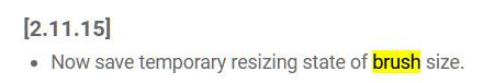
In general, I suppose this was a feature that was requested by other users. That's the only thing I see as possible as in the update log, it seems that it was a long-awaited feature.
6 notes
·
View notes
Note
I really love your animation! I was wondering what program you use and if you have any tips?
Hey! Thank you and also thank you for your question!
I use Firealpaca for making the art for the animations and then I cut it together with the sound in a video editor. Next to a video editor I sometimes also use flipaclip to check if the animation is going smooth enough or should I fix something.
Planning is a big part for doing an animation, first of all do a little animatic kind of thing so you can play around with the idea you have in mind. The frames you drew for this kind of animatic can be good for keyframes for your animation too (keyframes are basicaly the main poses of how your character will move from A to B), and then you start to draw little movements between the key frames.
It's also important to know if you want your animation to move a little bit slower like when your character just starts moving to draw more and more frames/little movements so your animation will go smoother and if you want something to move faster you draw less frames (It's also really useful if you draw the frames with different colors, so you can better see what's going on and you won't get crazy by not knowing what is what)
Also when I do the face mimics I usually try to do the same with my own face, so I can imagine how would that look like on the actual animation xd So using references is also important when you're doing an animation! (Especially when you animate a difficult movement and real life references are really useful)
Since I'm mostly working in a simple drawing program lip syncing would be really hard to do without actually seeing how the movements matches with the sound so I also use flipaclip for that to see how the lip sync works so I can plant it into the actual animation, and check it later if everything looks fine (I just wanted to mention this part because if you do an animation for a sound where there's talking in it and you don't have any actual animation programs it can be really useful to see how other ways you can make your characters talk which also matches to the sound)
I could talk about animation a lot more and all day, but I don't want this answer to be too long to read xd There are lots of great tutorials on youtube where people can explain better how to animate, and also seeing a visual explanation through a video can help understand the things a lot better too! And also if you study how other animators do their animations! I also kind of learned how to animate by studying other people's animation styles (like in warriors cats maps, or in animation memes)
But someone can learn the most when they try it out themselves, so don't be afraid to experience and play around by doing small animations (Flipaclip is a really great app for that if you want to animate on phone/tablet) and you're gonna be better and better by practising and studying it more and more just like when you do simple artworks!
If you want any drawing programs where you can also animate in I can mention: Krita, Photoshop, Clipstudio Paint and I also want to mention TV Paint too. (I only tried Photoshop and TV Paint to animate and they're both really good for animations - I actually tried Krita too, but I didn't really like it so I didn't really get into using that)
2 notes
·
View notes
Note
Hey, I really like your art and your style! It's very dynamic! I especially like the smooth lines as you draw them. I was wondering what program do you use and especially what brush you use to draw? I like drawing on FireAlpaca and Krita but sometimes I feel like my art is a little pixelated and jagged so it would really help me if I could get some advice or recommendations on what to use.
Howdy! first off, thank you for the kind words Dear Anon and I use Krita because I'm a cheapskate, secondly here's some tips
I usually draw like I'm always running out of time
kidding but actually yeah, most people who ask me about raggedy lines draw slowly to try and perfect the line. Perfect is no such thing anywhere ever lmao so no one should stress over something that doesn't exist but there's always close enough. Draw singular direction lines as a stroke and if you don't get it right the first time, you can always undo and stroke, undo and stroke, undo and stroke, undo and stroke, undo and stroke over and over. no shame in taking your time. The brush I use in Krita is Ink Tilt 10 usually. If I'm feeling humble and robust, I go for any pencil brush, they leave lines that feels like eating potato crisps
for pixelly, it's usually cuz the canvas is too small or you need a new go-to brush. Play around with brushes and make your canvas bigger than 1500x1500 pixels
#while the way I draw does end up being more expressive. the downside of it is I could never clean my art as fast as a normal person can lol#win some lose some but that's just my two cents#Jella answers
5 notes
·
View notes
Last Seen Blogs

tales-from-the-darkfairy
Tales from the Darkfairy

funkyrandomfandoms
Random Fandoms

stary-spice
Anis

lvl10gojocoper
myo
funkyrandomfandoms
Random Fandoms