#This is What It Means To Battle A Dragon
Photo

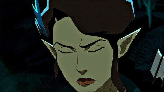
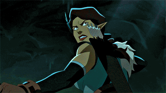

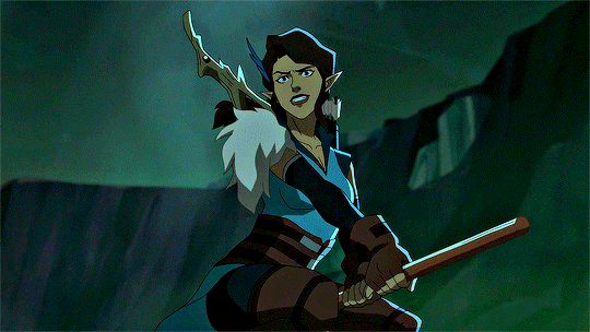
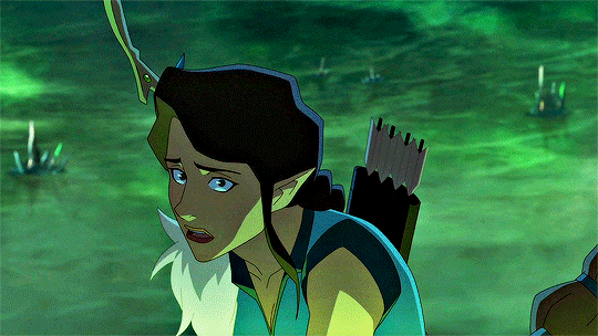
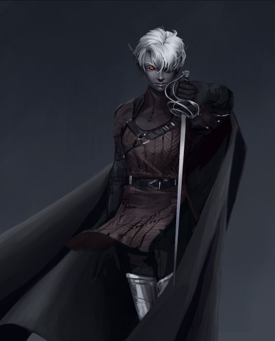
the legend of vox machina | the hope devourer: vex'ahlia vs. umbrasyl
#the legend of vox machina#ygifs#vexahlia#umbrasyl#the volleying of each turn is so beyond awesome and incredible and kickass I literally could pick So many insane moments#her arrow matching his acid breath?? her cuteass little ears twitching as she listenin?? his mouth being the Only visible before the blast??#holding up vax between them and the way he just fucking chases her and it's like that harrowing heart sinking moment of#This is What It Means To Battle A Dragon#all of her expressions all of her fervor and then all of her fear I just... vexahlia you will never not be number one actually#dragon hating dragon hunting dragon specialist vexahlia battling a dragon will never not be the hottest fights actually
640 notes
·
View notes
Text
The opposite of the Mercer Effect (where people listen to critical role and have unrealistically high expectations for the immersiveness of a campaign and expect Matt Mercer's energy and skill) is what I experienced, the Mcelroy effect, where you listen to TAZ and expect there to be way less rules and a lot more fucking around
#what do you mean i cant cast zone of truth in the middle of a battle#its FUNNY#matt mercer#critical role#mcelroys#taz#the adventure zone#dnd#dungeons and dragons#toby talks
6K notes
·
View notes
Text

...So Crocodile could beat Akainu
Good to know
Sidenote but that did make me realize how when we see the Impel Down prisoners in Level 4, Oda does semi-consistently draw everyone sweating their asses off, which makes sense, since they're in the Inferno Hell. It is focken hot in there.
But then there's Crocodile and dude never breaks a sweat

Like to be fair there are a few characters who don't seem to be bothered by the heat of Level 4 either (Iva-chan, Sadi-chan etc)
But when you considder the sheer amount of fucking layers this man is wearing, like. You know what. Crocodile being completely heat-resistant up to 1700 Celcius makes perfect sense to me, I'll add that to my worldview, it's canon to me now.
#Moon posting#OP Meta#Sir Crocodile#''How is Luffy going to get revenge for Ace when Akainu's made of magma'' He doesn't have to. Daddy's got it covered#Sabo? I mean I'm sure he hates Akainu too but those two have never met so Sabo vs Akainu doesn't have the same emotional weight#Dragon and Akainu at least have seemingly personal beef and that could make for a good emotionally heavy battle#(Depending on the beef) (Like if there's a good tragic backstory then sure let's go)#But considder this: if all Akainu wants is to erase Dragon and his son from the world in the name of Absolute Justice#Crocodile getting in the way and not letting Akainu even LOOK at those two would be quite fun. In a petty way.#But then there could be the Added Juice of Crocodile wanting to protect his baby boy and his idiot ex while Akainu has no idea#Also Crocodile gets to have revenge on Akainu for hurting his son and breaking his heart by killing his precious brother#Ohhhhhhhhhhhh this is the match-up I want arrite this is all I want from The Final War when the time comes#Also we don't even know what ability Dragon has for 100% certain but like. Like it could be a bad match-up on Dragon's side
89 notes
·
View notes
Text

ok i totally get if like, a massive area that's too much work needs to be cut but boy it went from this to tadpole information dump speedrun which is ahahaha a choice (x)
#larian critical#you have my condolences wyll stans#don't get me wrong although big battles with armies is always a lot of fun personally i get it like ok if it was too much work it ok#but maybe they could've done a bit more to make up for it. more than tadpole infodump speedrun i mean.#bc i think with war college as a staging ground it would've been way more drawn out than it was with it being the iron throne#which is a point of no return type of decision and axes the alliance with gortash#but also now my wish fuilfilment ass can complain the war college and fighting the absolute's armies sounds metal af#HE NEEDS TO STOP TELLING US WHAT WAS CUT I AM LITERALLY SO DISAPPOINTED WITH EVERY NEW THING I LEARN#see i was gonna shut up but the war college sounded cool so now i have to complain#i love big battles and strategizing at war councils /sob#AND DRAGON I WANT THE DRAGON
27 notes
·
View notes
Text
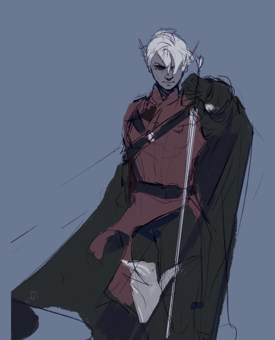
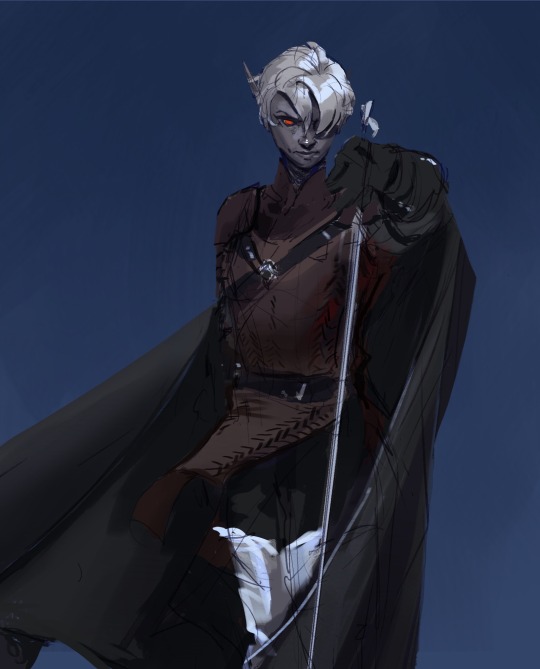
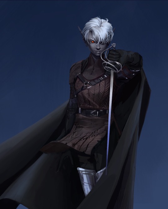
Hey y’all, here are some process stages for one of the more recent illustrations I did!
My sketches have never been very detailed. I remember being inspired for a pose while scrolling through pintrest and just threw some lines down on a page. I think more about the general pose and feeling I want more than the worry of anatomical correctness because I know I’ll fix it as I go.
In the next stage I establish stronger more contrasting colors and start to define the form of some shapes. The anatomy is still bad so at this point I’ll start to use the warp tool to move things around and adjust proportions. I also end up using the selection tool to cut various parts of the figure apart in order to put them back together in a way I like (I do not recommend doing this lol the sooner you can establish a solid foundation the better because it’ll save you a lot of work as you go. I just have a really hard time seeing my mistakes until I have something visual to work off of.) I alternate using the warp tool and selection tool and painting again and again until I get something relatively presentable like what I have at stage 3!
At this point all I have left are color adjustments and tweaking some small details. I usually don’t make such drastic color changes at the end of my work because I’ll have found my desired pallet through rendering. However with this one I wasn’t yet sure if I wanted a strong blue bg to contrast the orange of Lucéena’s eye or if I wanted the eye itself to be the main point of color. I knew I wanted the eye to stand out so I thought it was worth trying some things. That’s also why I decided to leave some parts messy in the final piece. I wanted the most well-rendered area to be Lucéena’s face to bring attention to that new shines eye she has.
I hope this was interesting and insightful!
With every illustration, I start off with a loose sketch. At this stage I’m not worried about perfection, my lines are more to serves as composition guides so I know where things will roughly go. If there are parts of the illustration that I know I want to put a lot of detail into (such as the face) I will often give that part more time. Then, I jump into colors by laying down flats behind the lineart and then beginning the process of refinement with a new layer on top. At this stage I would have 4 layers, 1 as the bg color (the blue expanse), 2 as the flats of the character, 3 as the line sketch, and 4 as the rough detailing. After this the number of layers I uses depends on how much of the illustration I want to preserve from itself or how many layer filters I end up using (to tweak color and lighting). Still, my illustrations always start with these 4. Once I get to a rendering point similar to stage 2 I start worrying more about the “correctness” of my structure and how I can make the anatomy more realistic. To do this, I like to duplicate then merge all of my layers, excluding the bg layer. Now I have my character one one whole layer and the expanse of blue on another. I have the individual layers still on hand if I want to refer to my og sketch but at this point having them all as one is easier to work with because to tweak the anatomy of a character I usually cut them up into parts and move/warp them to be more precise. Is this the most effective method? Probably not, but I rely a lot on the warp tool to get the exact shapes that I want. And seeing shapes for me is a lot easier when I have some color and value to work with. (I’m not a very “line visual” person if that makes sense XD) The rest of my process is a combination of rendering and adjusting details with the warp tool. At the very end I did some color adjustments (seen between stages 3 and 4) to see if I could get them closer to the initial feel that I wanted. Because I drew this to showcase Luceena’s new magic eye I wanted that to be the focal point of the illustration. So not only is that the place I put the most detail into, it’s also where I wanted the most color to be. I thought that having a blue bg would contrast nicely with the orange of her eye, but I ended up desaturating the whole piece and let that one note of color stand by itself. Lucéena also received her eye in the Shadowfell so the grey, drab vibes ended up fitting perfectly!
#art#digital art#wip#art process#dnd#dungeons and dragons#I was asking some friends for their thoughts on the desaturated version (never be afraid to ask for a second opinion!)#and we joked that this was Lucéena’s villain look because I don’t usually make her quite so angry#she has a resting bitch face tho so I mean this is prob what she loks like all the time lolo#I think her hair is kinda growing out since I first established her design#it didn’t always cover her face so much I think??#what is consistency let me draw my self-indulgent character traits#which means that all of my characters have to have long hair or at least long bangs so that it can be sexily flung over their face#in the heat of battle#and i love givig luceena in particular messy hair because thats a Vibe
69 notes
·
View notes
Text
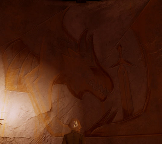
Okay so while everyone's making killer theories and observations about the teasers we have for Dreadwolf on top of piecing together more and more of the lore and imagery from Inquisition and 2 and even Origins, I just needed to put this observation of my own down as well.
So, the final, incomplete, Solas mural in the rotunda, right?
Clearly, the dragon slayed with the sword, and a.... beast, of some sort. I've seen it referred to as a wolf, a dragon in and of itself, and just some representation of the Inquisition itself.... maybe.
But that's always not quite fit for me. It seems odd that Solas, who is beyond skilled at painting and iconography/symbology, would make something so…. hard to parse. And granted- this was clearly roughed out in a rush, to put it lightly. He's left at this point, the mural forever unfinished.
But in Tevinter Nights, it's described specifically (as written by Lukas Kristjanson):
"The eighth and final panel of the fresco, meant to commemorate the battle against the blighted magister Corypheus, was unfinished. It showed only rough shapes, outlines...."
"... The story was well known- the Elder One, the false god Corypheus, had torn a hole in the sky to steal power from the heavens. He couldn't be killed until his blighted dragon was dead, and the Herald, the Inquisitor, had somehow countered with a dragon of their own. And there was a dragon on the panel, with an Inquisition blade in its neck. But according to the story, both creatures had fallen first, leaving the final victory to the Inquisitor.
But here, unfinished, was the outline of a beast that stood over both dragon and sword. This was not the battle, or the victory. This was after. And the beast was not a dragon. The outline alone might have allowed that assumption, but now, filling with black and red, it was something other. The creature was reptilian, but also canine. The snout was blunted and toothy, but edges came to a point in houndlike ears. [.....] revealing scales and tail, and paws with talons. It looked like two figures painted on either side of a pane of glass, then viewed together, their forms confused. A wolf that had absorbed a dragon, and now stood crooked over all."
Now, without getting too deep into spoilers for that short story (I really recommend it, and the rest of Tevinter Nights!), the depiction could be warped by what happens in the story (and is unfolding in that scene). But due to the reason it's warped, what 'colors' it, I think that the depiction is still accurate (it just becomes a bit more Spicy, let's say). I think that what Solas was starting was a creature like that - a wolf, that absorbed a dragon.
Of course, the question then is what that means.
As lore's revealed over the series, dragons aren't just associated with Archdemons, or even with the potential legends of qunari 'origins' (as dragonkin). Dragons are also specifically associated with the Evanuris - from the fact that only those as powerful as might-as-well-be-god mages could shapeshift into dragons, to their personal symbolism, to hints that different archdemons might be connected to each one (their numbers match, for one...)
Was it Solas leaving some hint as to who, what he was, then? The Dreadwolf, but also the Trickster God? Perhaps how despite simply attempting to free/help his people (he speaks of the loyal, steadfast wolf in the game more than once, wise and wonderful), he was elevated to the status of legend and god (dragonhood)? Was it symbolizing the blended might of the Inquisition, both protector Wolf and godlike Dragon? Some blend thereof, or extrapolation beyond?
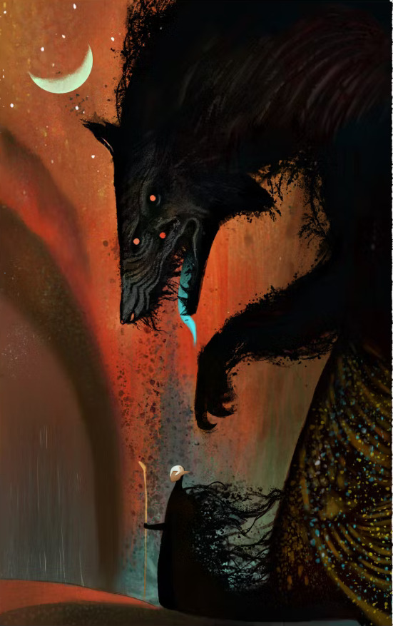
Fuel for thought, for sure. But beyond that... the silhouette kept reminding me of something.
It took me a little too long to realize - it wasn't until I was idly staring at the Steam startup image for it while waiting for Origin to hurry up and connect that it hit me.
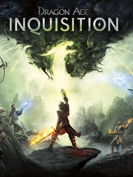
It's.... it's right there on the box/start screen.

It's... way, way closer to the creature Solas had begun to depict than what we've seen in dragon silhouettes in the past. And I get it- even as I write this, I hesitate, because I mean, the whole silhouette included has wings, right?

(sidenote, but major props to whoever designed this piece, the details are so good, including the fade/fireball/comets shooting off the 'wings' to look like support bones for wing webbing)
That's why I hadn't really thought about it before. But when that hit me, I went back to look at dragon silhouettes in previous games, and I mean-
That's the usual Origin one - and yeah, that's.... way more narrow a snout, though of course you're still getting that dragon spine spike along the neck. The neck itself is far more narrow, too, and its teeth more needlelike.
Okay, what about DA2?

Alright, now we've got some framing that is like DAI. (also, more props for the designers, and the silhouettes of Kirkwall friends/foes, hot damn).
But that face - the dragon's face. I keep catching on it. DA has a really great track record of being pretty specific about its silhouettes, symbols, and general representations, at least where it matters.
The dragon-made-by-silhouette in the Inquisition cover art is significantly blunted in its snout, the neck much broader, shortened in horn (or ear), and even the angle of horn (ear??) is different from past dragon iconography.
I dunno. I definitely don't think it's unreasonable to leave it at artistic representation/liberty, it just ended up a bit rounded, whatever. But where I get less inclined to leave it at that is when coming back to this final incomplete mural panel.
... It's all of it. The down-rounded snout, the way the teeth are depicted, the horn-ears, the spikes-that-could-be-fur, the obviously shorter and wider neck, the over-exaggerated sternum bone that strikes as dragon (/reptilian) before you think it could also be wolf rib cage-
It's.... close. Awfully, curiously close. At the very least, the Inquisition splash art feels like it could be the middle step between dragon and this. The splash is dragon, but wolflike - this is wolf, but dragonlike.
........... now, why the heck does this matter? Well, maybe it doesn't to most people, haha. But I'm an imagery and lore-reference obsessed nerd, and Dragon Age really does go hard with it's laid lore and hints of the future. So I can't help but ask-
Is the mural really depicting the Inquisition Defeating Corypheus?
... even the Tevinter Nights story, the way it's phrased casts some murkiness.
"The story was well known...." ".... This was not the battle, or the victory. This was after."
.... With dragons representing the Evanuris, perhaps.... is this instead a note, a hint, left depicting Solas' intent? To slay the dragon, the true dragons, what remains of the Evanuris after he tears down the Veil - because it would not only cause chaos, but also release them from the prison he'd made via the creation of the Veil?
Is the dragon-wolf not the Inquisition, but Solas, or rather - more importantly - Fen'Harel?
The shape of the maw, the way the ears point back, the trailing scruff/magic along the neck 'spine'....
Even the way the rips are traced, and the paw is drawn-
Hmmm.
Hmmmmmmmmm.
... I think it's depicting more than Corypheus' defeat.
But too, there's two other elements that keep rolling around in my mind with all this-
) "... On the mural, all Messere would say is, 'Skyhold is [their] fortress' (meaning of course the Inquisitor). 'These are [their] actions.' "
If these are their actions........ how does the potential for this image to be depicting the downfall of elven gods play into the picture (literally)...?
And thus, the second thought:
2. ) On that very same splash image for Inquisition, the silhouette of the dragon (with hints of wolf) is made via the energy of the Mark coming off the Inquisitor's hand. The dragon-ish creature is of the Inquisitor's making.
The creature is what the Inquisitor has made. Their actions. The mural, a depiction thereof; their choices, their efforts, their impact.
Their impact - a changed Solas... or, perhaps, one all the more committed to his cause. Fen'Harel, or a wolf-dragon hybrid, roaring at a slain dragon, sword of the Inquisition buried deep.
Trespasser, revealing just how much further Solas' network of spies and agents has expanded through the Inquisition. And whether through friendship/love or rivalry/antagonism, Solas coming away from it with his determination redoubled, his mission certain.
Whether it was intended to depict the effect of the Inquisitor on things they don't yet grasp, or their affect on him and his intent to bear out his mission........... I think this mural's about a lot, lot more than just the defeat of Corypheus.
#dragon age#dragon age theories#solas#dragon age inquisition#solas murals#long post#i spent way too long on this but i can't get it out of my head so here it is#a whole essay just to say HEY GUYS I DONT THINK THE MURAL MEANS JUST ONE THING#(i say 8 years fuckin late to the party)#buuuuuut i haven't seen anyone pointing out the dragon-wolf transition exactly so who knows maybe this#is interesting to someone else#and before anyone tries to say that the creature on the splash isn't anything BUT a dragon pls reread what i wrote#i just mean to point out the similarities and the curious transition in how its all depicted#it doesn't feel coincidental is all i mean#i know im reading too far into it lol don't worry#we're all just having fun in the sandbox#i should add - solas absorbed mythal (possibly w ogb essence added depending on your world state) as a direct result of all this so!#wolf absorbed a dragon indeed. and likely he had to make that choice as a direct result of his orb being broken in the final battle…#again- the actions of the inquisitor for better and worse alike
84 notes
·
View notes
Text
presumably the climax of rhyme anima➕ is that underground rap tournament mentioned in the trailer so i hope we get more focus on hypnosis abilities this time around now that they’re more fleshed out lol
#this is vee speaking#i cannot express enough how funny it is hypmic has gotten this far with its development hell lmao#waaaay in the beginning only jakurai’s ability was revealed and based off s1 they knew what the og leaders’ were#but it’s so funny those early notes seemed to have included that abilities needed to be unlocked and what doppo’s was lol#but now!!!!!!! n o w!!!!!!!!!!!!!!!!!!!!! surely we can see all their abilities in action!!!!!!!#hifumi’s melty roses!!!!!! rio’s shield!!!!! jakurai’s rap had all the tentacles but lets get kuukou’s dragon on that LOL!!!!!!!#i’m so curious how this all comes together lol like tbh is beefing specifically with the og groups?????#but if the tbh truck is what’s causing the civilians to start acting up then that means it’s driven thru osaka and nagoya#so what’s their plans there?????#pls be battle anthem order pls be battle anthem order idc if it makes more sense for fp to be next pls let bat star next episode lol 🙏#and even chuuoku has ‘stakes’ as in they don’t know wtf is going on either#but one of their ranks likely caused the trigger which means they need to be involved in some way too 🤔🤔🤔#what does it all mean lmao where is it all going lol
10 notes
·
View notes
Text
Hate trying to figure out coordinators' battle styles in AG. Save for May, who has some specific patterns, the others' styles are just 'random bullshit and also petal dance 46 times'
#at least by sinnoh they got actual battle styles that were more unique to each trainer#arguably Harley had something of a style#but drew solidad robert etc? random stuff. solidad made an ice rink. drew made up 'dragon formation'. i don't even know what robert did#like. at all. other than teach snorunt ice beam and win the grand festival I guess#solidad should have come in earlier instead of robert tbh. just make that solidad's debut#but i am a solidad stan so that's also just a me opinion lmao#but like. are there ANY robert stans??? /genuinely curious and not mean#with his wack-ass hoenn color combination outfit. i love ag#pokeani#taylor's tag
5 notes
·
View notes
Text
i am and always will be a brown eyes N truther but i was just thinking of hero of truth N having super bright almost glowing blue eyes to match reshiram

maybe for some kinda final fight where he's super duper connected to his truth/ideals or sumthin
#quick doodle to show ya what im talking bout!!#and idk if this implies some kida fusion with whichever dragon or just some super deep connection#but i think a bond with reshiram/zekrom involves some sort of physical manifestation or marker of some sort#i mean the heroes get scars obv but glowy eyes? very cool. the scars glow too of course#and like they wouldn't glow all the time just like in the heat of battle#am i making sense? anyways.#pokemon#pokemon black and white#n harmonia#pokemon bw#pokemon n#reshiram#zekrom
13 notes
·
View notes
Text
Oh the new pokemon episode was interesting... And by interesting I mean my fave character was there and finished with a cliffhanger
#vi rambling#pokemon#IM JOKING it was a good episode i need to wait for subs. but seeing friede be protective and the adult conversation was interesting .#amethio battling next ep... i am looking intently. what are they cooking with you i need to Know.#sounded heartbroken when ceruledge got hit with those what. 3 dragon pulses in succession? augh...#I HATE ANIME ORIGINALS I NEED TO KNOW WHAT THEYRE PLANNING the suspense is killing me. please make him good and by good i mean well written#anyways interested in seeing whats up next episode for everyone
4 notes
·
View notes
Note
Alright everyone STOP sending prompts so that she can work through the ones she has already 🙄
(this is a joke)

#no writing#I have dropped into a deep depression. very serious stuff. watching the first got seasons make me sad. this tv show couldve been the best.#it couldve changed the world and in certain aspects it did#but no. d&d wanted to work on their star wars show or whatever and the long fucking night was reduced to one episode#i watch people talk about the long night in s1 and then I think oh yeah this plot actually had value. the characters were actually scared#and then i watch dany being assulted and i think how she was betrayed by her lover in a moment of intimacy and i am like#oh yeah thats what a great comment a vicitm of abuse dies because she trusts the man she loves#also her transformation into super hitler is ridiculous. tHe BeLls made her mad? what the actual fuck? the bells? seriously?#so targaryans are seriously just a flip of a coin huh? I am the dumb one huh??? thats what youre showing me. you point at the screen and say#HA Cat youre a fool! you rooted for her! you thought she was good!#you thought plot lines and character development actually means something? HA how foolish Cat how dumb you are!#Jamie Lannister? learning about how to care for others? WRONG back to cercei!!!#you think tyrion is smart? WRONG lets put the kids and women in the crypts full of dead people when the bad guy creates zombies#you think dany is actually going to stick to the values shes gotten through her character arc? CAT DONT YOU GET IT? YOURE DUMB YOURE STUPID#JONS HERITAGE DOESNT MATTER#DONT YOU GET IT CAT? EDDARD STARK DIED FOR NOTHING!#ISNT THAT WHAT YOU WANTED? ISNT THAT CINEMA? THE LONG NIGHT? HM? BATTLE OF WINTERFELL? HM? ISNT THAT WHAT YOU WANTED?#no. d&d. this is not what i wanted. in fact. i hate you for ruining a clever show. perhaps the cleverest show on this planet.#i love house of the dragon. but its simply not the same.#this makes me want to quit consuming media#and then i watch chernobyl and i am like. hm. maybe there is hope for cinema and tv#just maybe there is hope for writing. maybe quality is more important than quantity
33 notes
·
View notes
Text
the silver dragon is by far the most badass of the three main dragons. charlock stole some money. winterra... existed??? i forgot her lore. but the silver dragon? literally tried bursting a hole through the interdimensional rift to destroy and consume all of the realm's power.
you defeat charlock by hurling arrows of pure ice magic at her.
you defeat winterra by setting her alight and casting flurries of magical flaming arrows.
and how, you may ask, do you defeat such an unstoppable force of destruction as the silver dragon, plunderer of realms, consumer of power, holding domain over interdimensional travel?
✨ Crystals ✨
#magiquest#silver dragon magiquest#silver dragon#portal adventures#there's a reason why we at downer's grove nicknamed him simon#but his battle is really hard tbf i hate that last round#3 seconds for 8 buttons on a laggy screen?!? no thanks#UPDATE IT TURNS OUT YOU JUST BEAT WINTERRA UP FOR NO REASON???#WHY ARE MAGI SO MEAN TO HER#WHAT DID SHE DO
7 notes
·
View notes
Text
Within the first few hours of a rebalancing patch for a game, even if the game itself is well over a hundred hours long normally, you should be able to figure out a few things.
For example, I can tell that the spell lists in the DQIX patch I’m playing with has heavily frontloaded the spell lists, because even if Minstrels did get Acceleratle in vanilla, it wouldn’t be at level twelve.
Also Swoosh at around the same level, which is arguably more noticeable, because that actually is part of the Minstrel vanilla spell list, but at level thirty.
#video games#dragon quest#dragon quest ix#dragon quest 9#dqix#dq9#the mage also got crackle three levels early#which only really affected the ragin contagion battle#i hope this means i get all the wind spells without needing luminary#the patch notes only detail the most recent version#so who knows what changed before that
6 notes
·
View notes
Text
oooorgh
#matthew you have got to stop ending episodes like this it's Fucking Mean#I am not filled with confidence when you do things like this#the last time you ended an episode like this LAUDNA DIED#and she's STILL DEAD#listen. I know it's ''probably fine.'' it's ''probably just the demiplane collapsing when they killed delilah'' or something#but it makes me nervous that they did not CONFIRM that they had achieved the actual mission that they were on#also laudna could have been there for that whole battle!!!#let your wife play dungeons and dragons!!!#I'm a conspiracy theorist at this point they're dragging it out purposely so that the res happens in silly halloween costumes#if we even GET THE RES NEXT EPISODE BECAUSE I KEEP SAYING THAT AND IT KEEPS NOT HAPPENING#guys. why are you doing this. you're all going to cry and ruin your stupid costume makeup#god. we're going to get marisha's costume for announcements and then she's going to leave : (#what if she just comes in normal clothes and is like ''what. I'm not playing today''#(and then hopefully comes back in a costume if they revive her)#again. if.#I'm inconsolable I just want her back I miss her so bad : (#how is everyone else doing#okay I'm done#Critical Role#CR spoilers
6 notes
·
View notes
Text
Fantasy adventure stories are inherently anti-war, and if something that looks like fantasy adventure glorifies and promotes war, it should be examined very carefully. in this genre corpus I will
#i did in fact write a genre corpus that’s not a joke#i care about this genre a lot okay#btw telling a fantasy adventure story thats a war story is not what I mean by ‘promotes war’#most fantasy adventures are war stories in some capacity. Tolkien. narnia. atla. pans Labyrinth. dragon prince. she ra.#hell you can have POV CHARACTERS who are pro war within the narrative. but there should be authorial intent when this is done#I’m talking about stories that are meant to influence the consumer into believing that war (not battles. war) is good and cool#ramblimgs
3 notes
·
View notes
Note
( from @exagides ! )
Drayton of Blueberry Academy's Elite Four —
From one elite four to another — should you ever find yourself in Kalos, I do hope you will visit the league and take up the challenge here. If not, then still I offer a friendly bout for the sport of it, or some time at the castle grounds! For now, my letter comes with some Kalosian wares for you and your Elite Four companions to share. Do let them know I wish all of you the very best and hope to see you all truly shine as bright as aegislash's blade!
— Sir Wikstrom of the Kalos Elite Four
Packed in a rather sizable box is a collection of store-bought Kalosian snacks — it seems they've been picked with the intent to have a large variety, both savory and sweet. The only handmade item seems to be a set of five honedge shaped hard candies on sticks — likely too fragile to sword fight with, but still rather cute.


Drayton read over the card. Then read over it a second time.
What the hell...
A formal challenge from a professional Elite Four League? That's crazy to him. But even crazier was the snack box he received. He'd never really had snacks from Kalos before. The labeling was in their native language so he couldn't make heads or tails of the ingredients list. But it all looked tasty.
"Oh man... Am I gonna have to send a thank you box back?"
That seemed like a lot of work. But he was sure his grandpa would give him so much shit if he ignored this very thoughtful gift.
"Man... I didn't even realize that the BB League was well-known enough to warrant this..."
#exagides#{ ☆ Drayton ; Dragon Tamer }#{ Valentines }#drayton sitting here like the surprised pikachu meme#''what do you mean the kalos league knows who I am and wants to battle me???''#thank you!!
1 note
·
View note
Last Seen Blogs

absurdditties
Lollo-hehe

fighterxjack
Jackson Mccartney

run-lift-stretch
run.lift.stretch

theodorevg923
Theodore