#I ALSO DISCOVERED THE NEUTRALS TAB IN SELECTIVE COLORS
Text

#LITERALLY GNAWING ON MY ENCLOSURE (my keyboard)#I WAITED TO SHOW THIS TO EVERYONE BC THE QUEUE BUT OMG EVERY FIBER OF MY BEING WANTED TO POST IT AS SOON AS I FINISHED EDITING IT#I ALSO DISCOVERED THE NEUTRALS TAB IN SELECTIVE COLORS#WHY THE FUCK HAVE I NOT BEEN USING THAT TAB OMFG I#ANYWAYS LOOK AT DEMB#2/3 members of Valentina#UGH#gum did gabriels makeup and picked his clothes for him she was like “it's for the vibe 🤌🏿”#oc: gum#oc: gabriel#show us your sims#show your sims#ts4#simblr#sims 4#my sims#Spotify
87 notes
·
View notes
Text
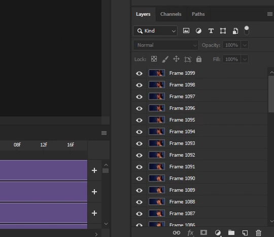
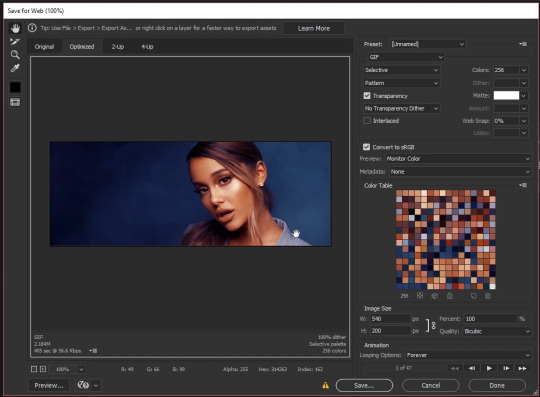
.gif tutorial - editing video directly in PSCC
Here's a tutorial for my method of making .gifs by dropping a .mp4 video clip directly into photoshop.
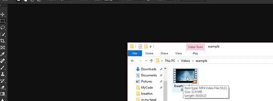
This technique doesn't require previous screen capping or importing. All you need is an .mp4 video clip and photoshop. Here's the .gif I'll be making:


Now with a Video version of this tutorial!
While you can drop whole movies into PS, I find it easier to work with shorter clips. VLC player is capable of recording smaller clips of larger videos, so try recording the scene(s) you want into clips a few minutes long. Videos just have to be a compatible codec, of which .mp4 is one. Since that's the only filetype I've used, I'm not sure of the others. I know .mkv and .webm won't work. Try a conversion program to turn an incompatible filetype into mp4.
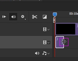
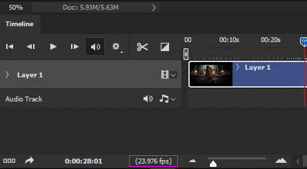
As with any .gif you're making, you'll need your Timeline window open. You can find it under Window >> Timeline. Here's a quick rundown of the relevant parts:
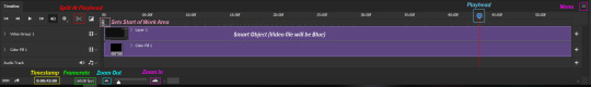
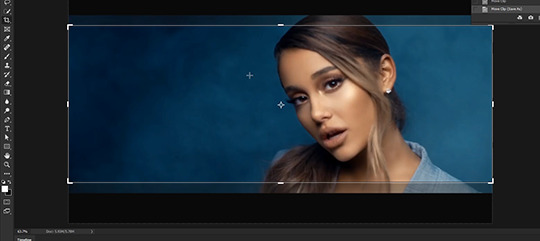
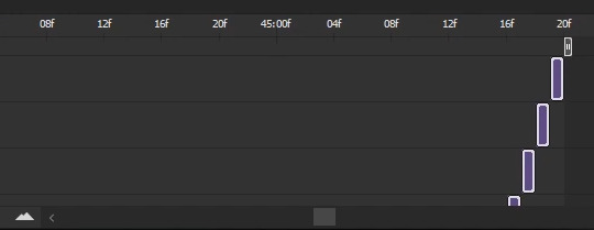
Once you've dragged your video clip into photoshop (see above gif), a blue box will appear in your timeline, along with an arrow pointing to a redline called the playhead. You navigate through a video's frames by clicking the arrow portion of the playhead and holding as you drag it back and forth across the blue box representing your video.
This process is called scrubbing (don't ask me why).
The first thing you'll want to do is turn the video in your timeline into a Smart Object. You can either click on it in the timeline or in the layers palette to select it. Once it's highlighted, use the standard method to turn it to a smart object (Layer >> Smart Objects >> Convert to Smart Object). I like to do a Save As... (File >> Save As...) at this point to create a new .psd file. DON'T SAVE OVER YOUR ORIGINAL VIDEO FILE. Make sure to do Save As....
It's important to note that the .psd you save won't contain the video itself. Instead, a symlink is created, which is basically an embedded link to the original video file. What this means is that if the video you dropped into photoshop is ever moved or deleted, it'll break your .psd file. Make sure not to muck about with the video file as long as you want to be able to work on your .psd
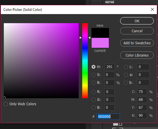
Because resizing/cropping/transforming can make some odd transparency issues on the borders of gifs, I like to place a Solid Color layer of pure black (#000000) at the bottom of the layer palette. So, in the Layers palette, select Create new fill or adjustment layer and select Solid Color at the top of the pop up menu:
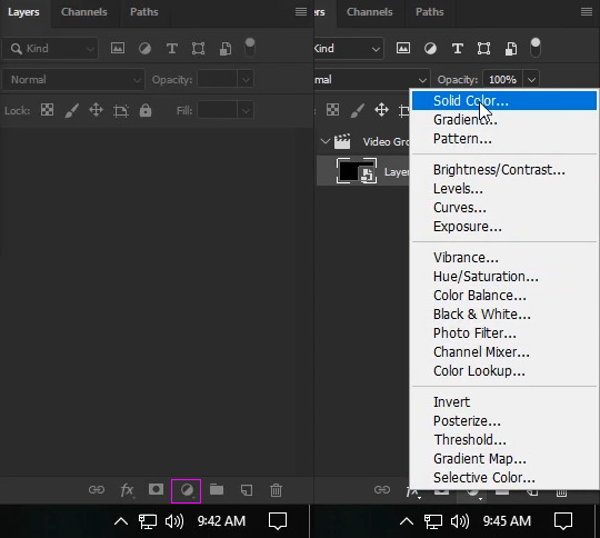
Choose solid black either by entering 000000 in the # field or by using the color picker to pick black from the bottom.
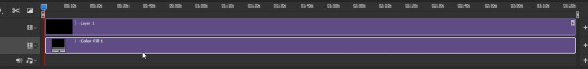
Drag this new fill layer to the bottom of your layers.
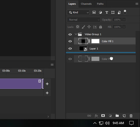
Now the Color Fill object has to be moved in the Timeline so that it stretches across the entire area taken up by the video clip. Your playhead should be at the beginning of the timeline:
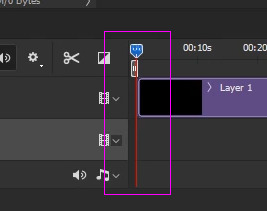
If it's not, click on the arrow and drag it there. Make sure your Color Fill layer is selected in the Layers Palette. Then, click on the Timeline's menu and choose Move & Trim >> Move Start to Playhead:
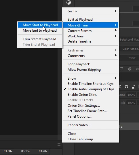
Your Color Fill object should now be at the start of your timeline. Hover over the object's right edge until the mouse turns into a double arrow icon:
Holding down the mouse, drag the Color Fill object to the end of the work area (the whole of the video object's length). It should snap to the end when you reach it automatically.
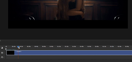
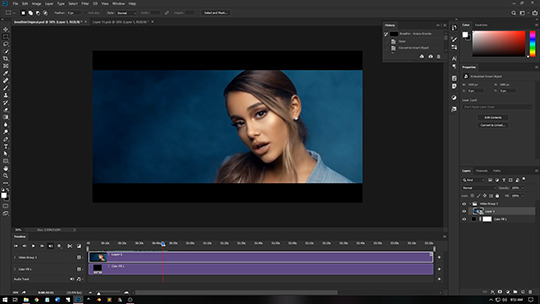
Next, scrub to a still image that represents your gif for you to look at as you work on cropping/coloring.
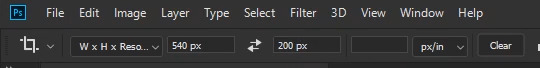
Next you'll want to resize your smart object to gif size. For this .gif, it'll be 540 x 200, so I've set the crop tool's settings to W x H x Resolution: 540px and 200px.
I liked to keep Delete Cropped Pixels unselected so I can move the image around after the cropping. Go ahead and adjust the crop to where you're happy and press enter to crop the image.
You can now start applying filters, masks, color adjustments, text as you normally would. For me, I like to begin by sharpening my resized image. I find Smart Sharpen works best for videos/gifs, because it applies as a filter to the smart object, meaning you can access and adjust the controls at anytime. To use Smart Sharpen, go to Filter >> Sharpen >> Smart Sharpen... In the control panel, apply the following settings:
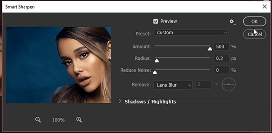
Amount: 500
Radius: 0.2
Reduce Noise: 0
Remove: Lens Blur
Don't worry about the extreme sharpening that takes place from the high amount, because we'll adjust that in the next step. For now, just click Okay.
In the Layers Palette, you'll see the Smart Sharpen filter has been applied to the Smart Object. Right click on the new filter listing and click on Edit Smart Filter Blending Options...
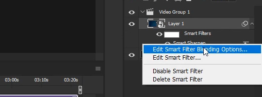
In the new control panel that pops up, turn down the opacity to something that suits your taste. Something between 15% to 30% usually works fairly well. For this video, I've chosen 25%.
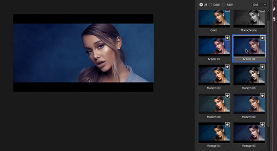
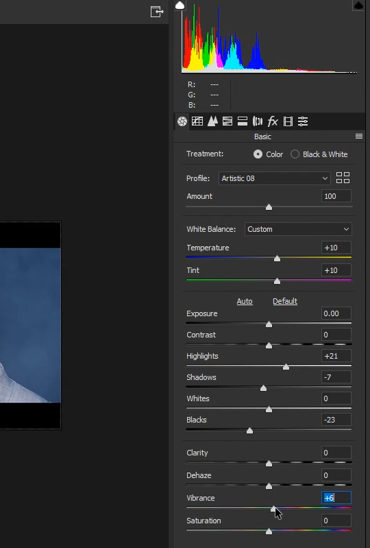
Now to move on to color adjustments and my favorite filter, the Camera Raw filter (Filter >> Camera Raw Filter... or Shift + Ctrl + A). In the Camera Raw control window, I start out by going through Adobe's preset profiles to see if I like the look of any of them. For this video, Artistic 8 deepened the blues and brought out a lovely bronze, so I've selected it and closed the profile section.
Still in the Camera Raw window, you can further adjust the color temperature and tint.
Temperature: +10
Tint: +10
Change the image's constrast by adjusting the highlights, shadows, whites, blacks sliders directly:
Highlights: +21
Shadows: -7
Blacks: -23
Finally, kick up the Vibrance.
Vibrance: +6
I also went to the Calibration tab (looks like a film strip) and added more magenta to the Shadows' Tint.
Tint: +95
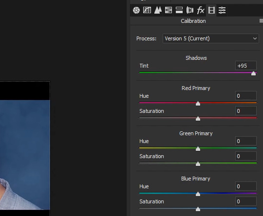
I'm happy with these setting so I won't be using any more camera raw settings, but play around and see what you come up with!
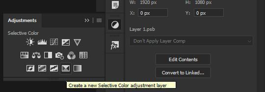
Now, if you want to apply more color adjustments outside Camera Raw, you certainly can. I've chosen to apply a Selective Color Layer to the video to make the bronze pop a bit more. Go to your Adjustments window and apply a new Selective Color Layer.
.
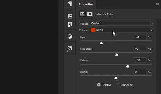
With Reds selected in the Colors dropdown menu, I've applied the following settings:
Cyan: -41
Magenta: +3
Yellow: +33
Black: 0
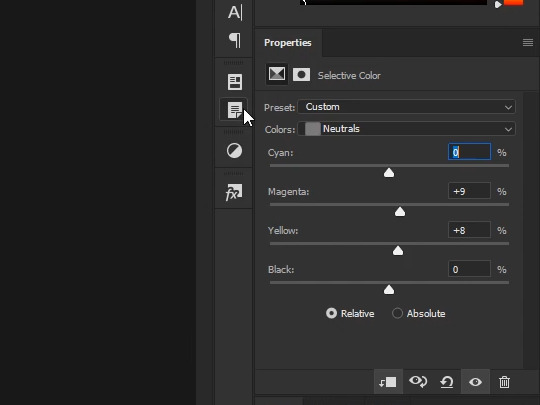
Switching to Neutrals in the Colors dropdown menu, I've made the following slight adjustments:
Cyan: 0
Magenta: +9
Yellow: +8
Black: 0
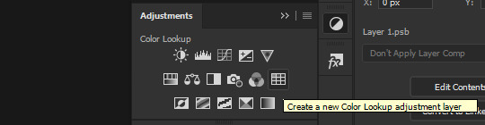
Next I opened up the Adjustments palette again and applied a Color Lookup layer:
Previewing several layers from the 3DLUT File dropdown menu, I selected Fuji REALA 500D Kodak 2393 (by Adobe).cube color table for the kick in contrast.
I found it much too strong an effect, however, so in the Layers pallette I turned down the Opacity to 23%.
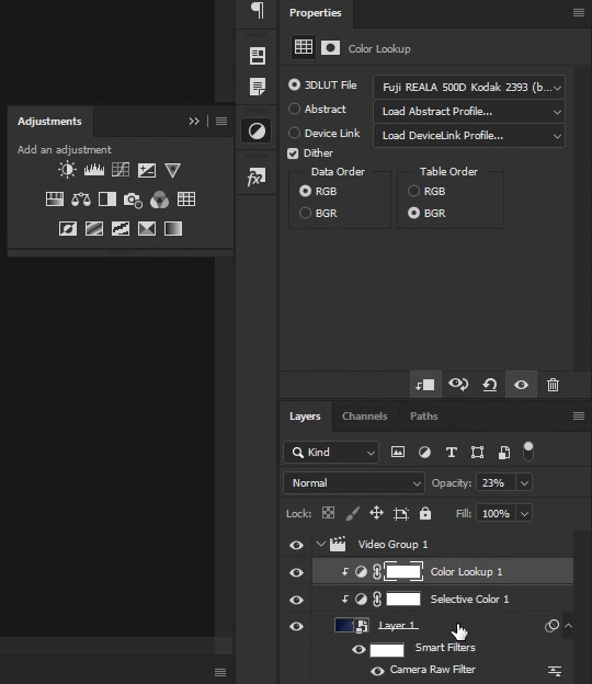
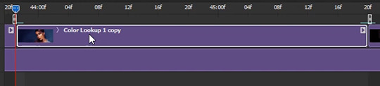
The next steps are easiest to do with a single Smart Object for your video. Since I was done with my color adjustments, from the Layers Window I selected the original Smart Object, held down the Shift key and selected the Color Lookup Layer (which layed above the Selective Color adjustment layer). This selected all three layers. Next, I turned them into a new Smart Object (Layer >> Smart Objects >> Convert to Smart Object...). Now everything is contained in a single object both in the Timeline and the Layers window.
Now, if you've tried scrubbing through the video, you've probably discovered that the once smooth and quick back and forth you were able to achieve with your original video file is now choppy and slow. The reason for this is that photoshop has to recalculate every frame of the video and apply your color filters. This is a pain, and really slows down the gif making process. What you need to do is get back to the original video that doesn't have any adjustment layers or filters applied to it. To do that, return to your layers window and double click on your Smart Object's thumbnail. This will open up your original Smart Object and the two color Adjustment Layers you just applied in a new window. However, if you try scrubbing, you'll have the same choppy loading effect as before, because the color adjustments are still being calculate for each frame. What you have to do is go to your original Smart Object in the Layers Window and double click on it one more time. In the new window that pops up, you'll see your original video file, at it's original size. When you scrub through this timeline, you'll be able to do so at the smooth, quick pace you were before all your color adjustments. This and the tabbed window containing your single Smart Object resized video will be the two windows you click between, so go ahead and close the middle tab window with the color adjustment layers. You won't be needing that one open any longer.
As an aside note, make sure the FPS (framerate) listed in the small info section in your timeline is the same for each smart object window as it is on your original video.
If the framerates don't match, you won't be scrubbing through the same frames. Meaning that when you stop at a certain time on both timelines, they won't be stopping at the same place. This usually happens when you create a new window and drop your video file wrapped in a Smart Object into it, instead of just cropping your Smart Object. (Why do this? Sometimes it's easier to resize it via the transform controls with the image size already set, i've done this moving from full size to a 268px width before.) Anyhow, the good news is that the fix is very simple! Just make a note of the fps in your original video file (the one with the blue box, not the purple!) and in every mismatched Smart Object window, go to your Timeline's menu, select Set Timeline Frame Rate..., and enter in the original video's fps in the custom field (or select it from the dropdown menu if it's available). Voila! Problem fixed. But, like I said, this is only a problem if you drag and drop the Smart Object into a new window. If you want to avoid the hassel all together, just crop or do an Image Resize in your original window, as I've done in this tutorial.
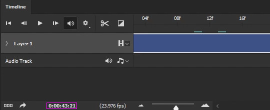
Now for turning your Smart Object into a gif! In your Original Video window, scrub through the Timeline and find the point you want your gif to start at. For this gif, I've chosen to start my gif at timestamp 0:00:43:21.
Go ahead and double click on the timestamp highlighted in the image above (careful not to "slide" the time ahead or behind with the mouse) and in the Set Current Time control window that pops up, highlight and copy (Ctrl + C) the time.

Exit the window by pressing Cancel or Esc. Return to your Smart Object's window (with the color adjustments) and double click on the timestamp here and in the control window, highlight the time and paste (Ctrl + V) the time into it and click OK. Your playhead should then jump to the same frame (after a moment to load) you stopped at in your original video.
Now you want to mark this spot for yourself to easily return to. In the timeline, you'll see there are gray "brackets" that encompass the whole of your Smart Object/Video. These "brackets" are the work area.
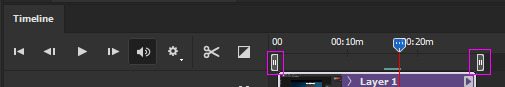
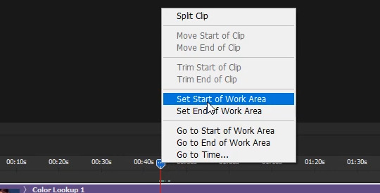
These brackets can be moved and repositioned to shorten your work area. This is an excellent way to mark the area of your gif. There are two ways to move the brackets. First, you can grab the left bracket, hold down the mouse, and slide it over to the playhead (it'll snap to it once you're close enough). However, the easier way is to right-click on the blue arrow part of the playhead and choose Set Start of Work Area.
The left bracket will then automatically move to your playhead.

Repeat this process to find your ending point, but picking Set End of Work Area instead of Start. NOTE: If you look very closely at the red line beneath the playhead when you're zoomed in to your timeline, you'll notice a light grey box to it's right:
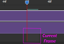
This is highlighting the current frame. You'll want to make sure the highlighted image is the frame AFTER your final frame!. The end of the work area and the playhead snap just to the left of the highlighted frame. The actual frame will be left out out of the work area/split. So if you want your gif to end on the image before, you need to highlight the next image. I know it sounds wonky, but once you've made a few gifs using this method, you'll see what I'm talking about.
Next step is to split the object so you can select Just the section you want to turn into the gif. Having already set your work area makes this easy. Right click on you playhead's blue arrow and select Go to Start of Work Area
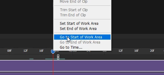
And your playhead will jump to the start of your work area, and where you want your gif to start:
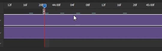
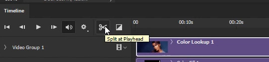
Once you have the playhead positioned where you want your gif to start, select the Split at Playhead button (the scissors) to split the object at the playhead (red line):
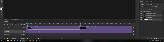
You'll notice your object has split into two objects:
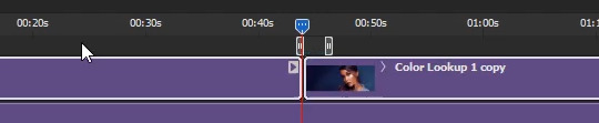
Note: This is why you want all your color adjustments made before you start splitting your gif(s), because your color adjustment layers are still applied to both objects. You don't have to copy/paste any filters/adjustment layers.
Repeat the previous steps, except this time, for the End. (Go to End of Work Area) Note: Sometimes the playhead stops a frame before the End of your Work Area. I don't know why (bug?), so zoom in on your timeline and make sure that read line is bunched up to the End of Work Area "bracket" before you slice. When you're done, you should have the section you want to turn into a gif seperated out from the rest of the object:
Your prepwork is done! Now to make the actual gif!
It's always a good idea to make a Snapshot at this point! That way you'll have a prepped state ready to revert to if you mess up going forward.
You can find the snapshot button in the History window (Window >> History):
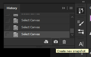
If you ever mess up, just scroll up to the thumbnail at the top section of the list and click it.
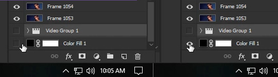
Either from your Timeline or your Layer Palette, select the Object you just sliced out (the one you want to turn into a gif), then press and hold Ctrl and select the black color fill layer beneath it, so that both objects are selected.
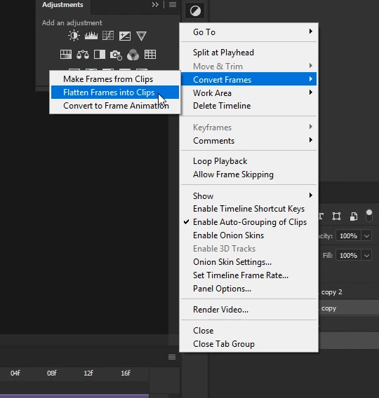
With both objects selected, go to the Timeline's menu and select Convert Frames >> Flatten Frames into Clips:
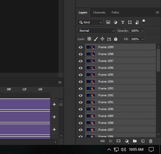
Depending on your graphic card and how big your selection and image sizes are, this will take some time. The faster your card/narrower your selection/smaller your image, the faster it will render. Photoshop is taking every flame and placing it onto it's own layer. When it's finished, your Layer Palette will be filled with new layers... and you might notice it looks similar to how it looks when you're working in a frame timeline. This is no accident.
Scroll all the way to the bottom of your Layer Palette and make sure your black Colorfill layer is visible (click on the visibility area until the eye shows up).
Then, click on the first new layer and select it. Holding down Shift, scroll allll the way to the top, and select the topmost layer. All the new layers should now be highlighted in both your Layers Palette and your Timeline.
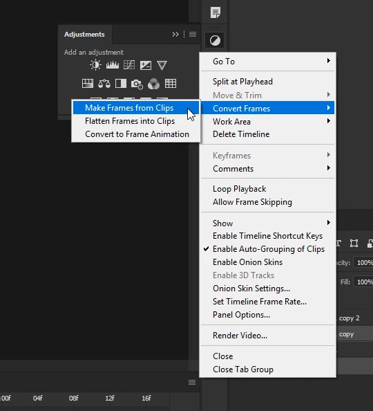
With all the new layers selected and the Colorfill layer visible, go back to the Timeline's menu and select Convert Frames >> Make Frames from Clips:
This shortens the layers into milisecond clips.
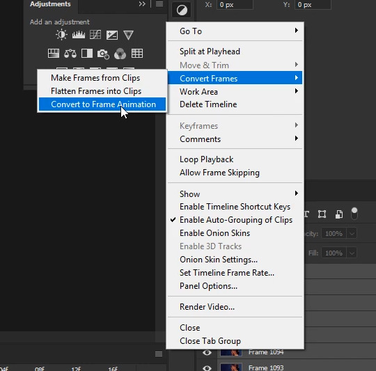
Now, with the layers still selected, go back to the Timeline menu one more time and select Convert Frames >> Convert to Frame Animation:
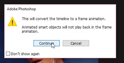
A new warning window will pop up saying "This will convert the timeline to a frame animation". Go ahead and click continue:
At this point, things should look very familiar.
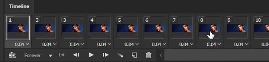
You'll do all the usual steps for saving a gif at this point, EXCEPT you don't have to worry about duplicate/skipped frames. Photoshop hasn't skipped or doubled any frames that weren't recorded that way in the video. Your gif may still be too long to fall under 3mb, but how you trim it down is up to you. In my case, this gif is at the right length, so I go ahead and optimize all the frames by going to the Timeline's menu and selecting Select All Frames. Then from the Timeline Menu again selecting Optimize Animation...:
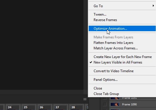
In the control window that pops up, I've left everything selected and just clicked on OK.
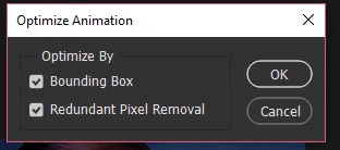
Next, with all the frames still selected, click on the pop up menu of one of the frames (the little down arrow in the lower right corner) and choose Other...:
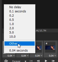
In the pop up window I changed the Delay of 0.04 to 0.05
Now it's just a matter of saving the gif. Pressing Ctrl + Shift + Alt + S or you can go File >> Export >> Save for Web (Legacy) to bring up the Save for Web dialogue box. From there, I make sure the memory comes under 3mb. I like to save with the Selective and Pattern profiles with as high a Colors setting as I can manage, which is the full 256 for this gif. From there, it's just a matter previewing the animation to make sure it looks alright and then saving.
And that's it! That's how I make all my gifs. You'll notice I can go to my history window, undo all the frame conversions or click on my snapshot, and still go to any point in the video to make another gif. Which is usually how I make my gif sets in one go.
I hope this long tutorial was helpful! Please reblog or give a like if it was. If you're interested in how I add text, or use keyframes to manipulate positions/sizes/"camera"/styles/etc, let me know you'd like tutorials on all that too! If there's enough interest I'll be sure to do more.
Happy giffing!
112 notes
·
View notes
Text
Whispered Quartz Countertop Marble Secrets
Get the Scoop on Quartz Countertop Marble Before You're Too Late
This way you can be totally sure that you love your choice before taking the plunge. Sooner or later, it's a question of personal preference. If you would like something with a bold and striking look at first, this might be the route you want to take.
The Good, the Bad and Quartz Countertop Marble
Some styles have a more conventional marble look, while some are somewhat more innovative. I discovered this image that I thought was interesting. Quartz countertops are offered in a broad range of color alternatives, from neutral to bright blues.
Remove it when you are aware that you've got the proper size. The main point in appearance is that in the event that you want natural stone, quartzite is your pick. Strong surface countertops can be found in a great range of color and design alternatives.
What the In-Crowd Won't Tell You About Quartz Countertop Marble
The 2 prices are so different since they are rough estimates of the typical price tag of a quartz countertop. On the flip side, the installation cost usually is contingent on the grade of the granite. When it comes to pricing, it is but one of the priciest manufacturers.
While taking a look at cabinets, it is worth it to keep tabs on the subsequent telltale indications of quality (or lack thereof). Lowe's carries this item line. Some brands provide lifetime warranties, which you might find suitable. Prices for wooden counters can fluctuate. Stone installation should be achieved by a specialist. Utilize ImproveNet to locate the ideal countertop installation contractors.
If you're in the Chicagoland area, Granite Selection is just one of the greatest regions to get started. They have become very popular among homeowners who are looking for a change in their kitchens. It is more porous, so it's best used in places that it's less likely to get scratched or stained.
The 30-Second Trick for Quartz Countertop Marble
Oak cabinets and granite counters can be paired with each other to create the high-end kitchen that you dream about, so long as you select an ideal granite for oak cabinets. The countertops are appropriate for residential or business use. Finally, a quartz kitchen countertop supplies you with complete control over how you opt to design every surface of your kitchen.
Finer granules are going to result in a more consistent look. It's made into slabs of your preferred thickness, like the 2 cm and 3 cm varieties which have been a huge hit the past several decades. Due to this, a quartz countertop will be harder and stronger than a pure stone surface like granite.
Granite is a wildly common countertop material, especially in high-end homes. Granite or marble counter tops or any pure stone isn't manufactured by any 1 company. It is not a natural stone that has been linked to radon emissions. Some installers can do the job independently, others are going to request that you receive an accredited plumber for the job. Not positive if they just deal with actual construction contractors or they simply have sufficient organization. If you are searching for a new countertop, and you're contemplating quartz, Arch City Granite would like you to get the information that you need to make an educated choice.
What You Don't Know About Quartz Countertop Marble
If you're searching for general information regarding quartz counters including their advantages and disadvantages, our Quartz Countertops guide is going to be of assistance. All these specifications sounded perfect for our family members! Another advantage of quartz is customization.
The more options that you have, the more difficult it's to decide. Many of their options are intended to have the appearance of marble. Color options and total cost are the best considerations.
Ok, I Think I Understand Quartz Countertop Marble, Now Tell Me About Quartz Countertop Marble!
After installing a quartz countertop in your house, you will be in a position to delight in the durable, beautiful stone for a long time to come. For instance, older homes are more inclined to wear and tear, which is the reason why it is not recommended to install too much thicker quartz countertops throughout the place. Quartz countertops will supply you with maintenance advantages that nature itself is unable to, whilst granite requires higher maintenance.
Quartz countertops are created by man, but aren't synthetic as they are chiefly particles of pure quartz aggregate held together and colored with seven percent or less of different substances. They come in a seemingly endless variety of colors and patterns. They also will not develop dips or depressions over time, which means that they will continue to look great for years to come.
Sometimes known as Halcyon White, this specific style of quartz is a lovely alternative for kitchens. It is not naturally stain-resistant. If, on the flip side, you're not concerned about developing a small-feeling' space or taming the standard character of oak countertops, darker hues are your best choice. Get as much all-natural light as possible Installing a skylight or maximizing the quantity of pure light coming into the kitchen can drastically enhance the feel of a little space. Now it's certainly feasible to install any countertop material in any room of your house, but some varieties of counter tops will perform better than others for any particular location and way of life.
All About Quartz Countertop Marble
Also, the purchase price of failure (breakage) is too significant. Inside this scenario, when deciding on the very best grade of thickness, you will rely on how you mean to utilize your countertop. Furthermore, it uses waste materials in place of quarrying new materials. If you would like a all-natural stone, granite is the best way to go, but it's high maintenance. As a consequence, some homeowners believe that this is not the same sort of material. There are lots of benefits you will get from installing quartz in your property.
Read the full article
0 notes
Text
Copers Cope Region Homeowners’ Association.
The Giornate del Movie house Muto honours the 50 years existence of The March's Gone By. British movie historian Kevin Brownlow's traditional oral history study was actually initial published in 1968. I make sure numerous wonder how the brand excerciseswithjacob.info new graphic sensor incorporated along with the brand new Truepic 8 handling motor assisted in taking care of high ISO sound and keeping information in the tries done through E-M1 Score II. Depends on what sort of photography you carry out, but if you wish an upgrade (I still feel E-M5 Mark I is actually a superb cam by itself) E-M1 Sign II is a good jump.
The electric battery energies the potato chip if the time clock is actually unplugged, so it don't forgets the time when you turn it back on. I discovered all these little bits on ebay.com packed as a package for $10. The true option of course coloring vs strong vs incline is brought in under Options-General-Indicators-Health Bar, but the function method has to be actually set to neutral so as for that choice to function effectively.
Before you start definitely messing with this, I encourage you take a simple detour to the "Relocate" Button and also click the 25 switch instead of the existing, by doing this Vuhdo will pack the panel with duplicates of your self which will certainly assist you determine dimensions as well as such.
It is actually through nonpayment shown under Panels- > Warm Images- > select Collection Finder coming from the dropdown menu of any one of the warm placement ports. Yes I had the much older models of the panel initially and also was the code I made use of.
The motion picture offers footage of the girl's exorcism as simple fact, which triggered a talk concerning the dependability of docudrama filmmaking, the task misery plays on the planet, Friedkin's sights on the state of films today, and the more socially aware lifestyle we right now. stay in.
In Nov 2013, The The big apple Times published Dependence Treatment With A Pessimism," a part that linked hundreds of deaths in the USA to buprenorphine and Suboxone. This is a current part that allows some limited modifications of target and also aim at of aim at structure tinting in order to far better match their color scheme to the rest of the raidframes.
Nevertheless, in the quick life he lived, almost fifty percent of his time 21 years was actually invested taking action and also occupying our team well in each and every single task he participated in. If you then click on the board tab in the alternatives, this bust agreement along with duplicated health and wellness pubs are going to be preserved.
You can easily readjust all these colors directly from the health and wellness club bouquets as well if you click the last flag, wellness % one and also consider its residential properties on the left. When clicking on the player bar, here you may establish a number of spells to smartcast while out of combat.
The following Area Rail Walks' Program should be offered at places and various other outlets not long. You can easily prepare both the irrelevancy restriction above which benches are actually faded out and also maximum number of gamers that are actually to be thought about appropriate at any sort of given opportunity.
Hitler's Eager Death squads: Ordinary Germans as well as the Holocaust (1996) is a publication through Daniel Goldhagen providing the thesis that the German country hence was actually made up of eager executioners of the Jews because of a special eliminationist antisemitism" in the German folks, along with long historic roots.
0 notes
Text
Our Duplex Paint, Cabinetry, & Tile Choices (Let’s Just Say They’re Not “Safe”)
I’m not gonna lie. Simultaneously choosing a bunch of finishes – like paint colors for walls and ceilings and trim and doors, cabinets for two kitchens, and tile for six bathrooms (plus two mudroom/laundry rooms along with two kitchen backsplashes) has felt overwhelming at times. Heck, planning just one room, like a bathroom renovation on its own, can feel overwhelming… and here we are planning six different bathrooms, two different kitchens, and 10 other rooms simultaneously! But we’ve managed to keep our heads on straight (so far) and even have some advice to offer through it all.
So whether you’re working on a new construction and have to make a lot of decisions like this all at once, or just trying to systematically renovate your home while keeping each room in mind so it all ends up feeling cohesive without being boring or too repetitive, this post is for you. We actually talked a little bit in this week’s podcast about how we chose each side of the duplex’s (not white!) kitchen cabinets and tile, but we knew that collectively showing you a bunch of our selections all in one post – and breaking down our process for picking them – might help other people out there who have burning questions like these ringing in their ears:
“Is this tile/paint color/cabinetry the right choice?”
“Am I going to regret this?!”
“How is this all going to look together?”
“Am I being too safe and boring? Too out there and crazy?”
“I keep going round and round – how can I actually make a decision?!”
Basically, this is the stage where you’re past all of your inspiration gathering and general planning (we shared our duplex style planning with you here) and you’re trying to take those images you saw on Pinterest or in a magazine (or just that dream room that lives in your head) and make it a real room in your real home. How do you do that? You have to find actual products that you can buy and paint colors that will tie it all together (and did I mention there’s a budget that you have to work with too)?
So here’s what we do to keep things feeling organized and to help focus ourselves and visualize things a lot better – you know so it feels less like throwing darts at a board while blindfolded – and more like following a streamlined process of steps to narrow things down and picture them before you make any final decisions.
First, Make A List
Before you start attempting to making finish selections, you need to know what decisions need to be made. And what helps us to to keep things feel more manageable is to arrange that in the order that each selection needs to be made (with the most urgent ones up top). For example, with so many decisions ahead of us – rugs, furniture, art, bedding, the list goes on and on – we’ve chosen to focus on just the most urgent things that we need to select before any of that: paint, tile, cabinetry, plumbing, and lighting. These are the things that will go into each of the duplex’s freshly drywalled rooms to make them feel like actual rooms instead of white boxes (if you haven’t seen the most recent video tour, watch that and then come back to this post since it’ll make a lot more sense).
However you make and organize your list is up to you. For us, what starts off as a paper list often ends up as a spreadsheet once we start ordering. Here’s an example of one we used when ordered lighting for the pink house. Those first two columns (item & quantity) are the list we’re talking about. We took inventory of exactly what each space was wired for (did we need a pendant? a can light? a wall sconce? a chandelier? a fan?). It usually helps to walk through your space in person or look at a floor plan (or both!) to make sure you’re not missing anything.
The chart above is incomplete because at some point we typically move over to a more visual list, like a mood board, so we can better see how everything is coming together. Here’s one we’re in the process of making for the duplex, but more on that – and the actual items in it – in a minute.
Then, Pick Your Star(s)
We learned long ago that a room where too many things scream for your attention can get chaotic. Plus, choosing which pieces will be the focal point relieves the pressure to make every single item in a room “interesting” which can be a tiresome, budget busting, and sometimes impossible goal. So we often break design choices loosely into two categories: stars and supporting players. The stars are the items you want people to notice when they first walk in – like the bold wallpaper, colorful rug, large chandelier, or dramatic paint on the walls.
Some rooms have only one star, others may have several – that’s up to you. But pretty much everything else functions to support those items – like the neutral couch that falls into the background or the white wall that helps your starring artwork or chandelier stand out. For example, readers of our email newsletter know that we’ve been hung up on the idea of colorful doors in the duplex. In fact, we’re using one of the exact colors we saw in this showhouse that we worked on earlier this year (Sherwin William’s Oyster Bay), which is pictured below, for all of the interior doors on one side of the duplex.
We knew if the doors were going to be “stars” then the wall paint around them probably shouldn’t compete for attention. So all of the walls are going to be a very light warm gray (SW Spare White). The interior doors, all of which are solid wood five-paneled doors, are actually going up in the duplex this week and we snapped some in-progress photos over the weekend. They haven’t been painted yet, but I photoshopped the image below to give you an idea of what the other side of the duplex might look like. For that side we picked a muted pink tone (SW White Truffle) which should pair nicely against the same very light warm gray walls on that side (they’ll also be SW Spare White).
We also picked our stars for the bathrooms to help focus our tile shopping. We learned from doing the pink house that we prefer a fun tile floor versus a fun tile shower wall in a bathroom (we can enjoy our cool patterned hex tile floor in the master bath from any vantage point nearby, but the pretty accent tile that we used on the back wall of the hall bathroom’s shower is often hidden by the bathroom door swinging in front of it and the shower curtain itself. Choosing to focus on some playful and beachy floor tile greatly simplified the process of tile shopping because we could focus our efforts on finding interesting things for just that area, knowing that almost anything would work with some incarnation of white subway-esque tile on the walls of the shower.
Next, Give Yourself Limiting Parameters
Having a million ideas and possibilities is exciting at the start of a design project, but at some point you have to face reality and actually order something. So I know limits don’t sound fun, but they ARE YOUR FRIEND at this stage. Some parameters may be out of your control – like your budget, which clearly puts a cap on your tile’s price per square foot. Or your contractor’s requirement that you order lights from certain vendors or something like that. Plus, you may already know that you want only a certain color, or finish, or size.
Whatever parameters you’ve established, it’s helpful to use those to filter results when you’re searching online. Sites like Home Depot, Lowe’s, and Wayfair are becoming better and better about their search filters. USE THEM. This will save you time and keep you from going crazy.
One parameter we set for ourselves when shopping for floor tile was “no super small tiles like the patterned hex we laid in the master bathroom at the beach house.” As much as we love how that floor turned out – it was very, very, VERY time consuming to install compared to the other spaces where we used larger tiles.
Choosing larger tiles with interesting patterns instead of relying on smaller tiles isn’t a parameter that makes sense for everyone or every tile project – but it really helped our decision-making process when we imposed that limit on ourselves. And the good news is that we were still able to have some fun within that guideline. For instance, we discovered that The Tile Shop sells these long 4″ x 24″ porcelain tile planks in several hues (their display shows all one color being used together) but we realized it would be fun to use all three tones together. So we bought an equal amount of pink, white, and taupe tiles to create our own large-scale herringbone for one of the mudroom floors. This was us mocking it up on the store’s floor:
We also wanted extremely durable tile materials – porcelain and ceramic only. They’re both hardworking non-porous surfaces that are typically much easier to maintain than marble and cement tile (both of which are porous, so they can get stained and you need to worry more about sealing them, etc). So that material parameter immediately cut out a ton of higher maintenance (and higher budget) choices for us. So again, it really helped us focus on the best options for this project.
Lastly, Visualize Before You Finalize
By this point we often still have 10 million tabs open in our web browser with potential options. So after a couple of passes of nixing things we don’t feel strongly about, we usually find it helpful to visualize all of the pieces together. Believe me, you can go round and round liking 20 things and not knowing how they’ll fit together or how you’ll narrow it down for hours, clicking from browser screen to browser screen – and then you finally visually group them so you can see things together AND IT MAKES THE DECISION 100% EASIER!
The actual way that you choose to visualize them will vary – it may be a mood board of some sort (we use Photoshop) or you can just pin everything to a Pinterest folder to see them all together as a group. Heck, you can even print things out to make a collage and swap things in and out to see what combos you like most. However you approach it, just the exercise of viewing your top contenders together, and moving one thing in and pulling another thing out will help you see what works well together.
For instance, while we were sifting through tile options we kept a Photoshop file like this open – and we kept dragging different contenders in and out (this isn’t the final version below, btw – it’s what it looked like in the middle of the process). It was a quick way to evaluate what looked good together and what didn’t – and much easier than clicking from tab to tab in our browser, which can make your head spin and leave you feeling like you might never make a decision.
*Note: most of these tile choices will be linked for you later in the post*
As we got clearer and clearer on what we liked together, we moved on to creating the floor plan images that you saw earlier, where we just dragged selections into actual rooms on each side of the duplex. Not only can we see everything in one place, but we can also stay organized as to what is going where.
With two identical-but-mirrored floor plans, sometimes it’s hard to keep things straight, so this definitely helps us stay on top of where each tile or cabinet color (or door color) will go. Plus we have the added benefit of getting to see how everything will look all together on each side of the house.
So now that we’ve shared a little bit about our process for selecting items, we’ll tell you about the items we chose themselves!
Duplex Tile, Cabinetry, & Paint
We didn’t set out to create a “pink side” and a “blue side” but once we chose the two interior door colors, it started to naturally lean that way. But we still plan to inject both colors – along with mint and various neutrals and wood tones – throughout each side as we furnish and decorate. So, in the end, it won’t feel as monochromatic as this mood board suggests.
Here are the product links for you guys, as promised:
Mudroom floor in pink, white, and taupe
Master bathroom floor
Hall bathroom floor
Kitchen backsplash
Kitchen lower cabinets: Ikea Kallarp
Interior doors: SW White Truffle in semi-gloss
Interior walls: SW Spare White in eggshell (both sides)
Interior trim: SW Extra White in semi-gloss (both sides)
Kitchen backsplash
Kitchen lower cabinets: Ikea Askersund
Interior doors: SW Oyster Bay in semi-gloss
Mudroom floor
Master bathroom floor
Hall bathroom floor
The wood tone on both sides is just to represent the wood floors, which are oak hardwoods that we plan to sand down and stain with Minwax Provincial (the same stain we used for our own floors in Richmond).
You can hear more about how we chose the kitchen cabinetry in this week’s podcast, but we knew we wanted to do non-white cabinets on the lowers to keep things a little more unexpected and playful (if you can’t take a few fun risks at a beach house where people will only stay for a week, where can you?!). To stick to our tight kitchen budget, which is around 4-5K for each fully finished kitchen (including appliances), we wanted to work with the stock options at Ikea since we have been really happy with their cabinetry at the pink house. And we were psyched to find both a wood toned cabinet and a painted cabinet option that we loved. In one duplex kitchen we’re pairing this pink tile with these gray-turquoise flat front cabinets. We will probably do a few white uppers on each side too – maybe with some open shelving.
On the other side of the duplex in the other kitchen, instead of colorful cabinets, we’re pairing these beachy wood flat front cabinets with a similar tile, but in a blue colorway. We bought both tile choices from The Tile Bar and they look like cement tile, but they’re porcelain! Three cheers for easier maintenance and added durability.
Here’s a look at some of the other tiles that we purchased. Three of these are from Wayfair (top right, bottom right, and bottom left), since we had such good luck ordering tile from them for the pink house, and the one in the top left is from Home Depot. Both Home Depot and Lowe’s seem to be upping their tile game lately, so it was fun to find an option like this there! And all of this tile is porcelain – again: super durable – and it’s all specifically made for floors, since we don’t want to get anything too slick that’s not meant for that surface.
I know it all looks a little chaotic put together like that, but keep in mind that these are all going in separate rooms with a lot of “supporting players” – like white subway tile, very light gray walls, fluffy white towels, white vanities, and wood/neutral touches. So in the end they should add some fun and interest to each bathroom, but not be too overwhelming since they’re all going to be tempered by everything else in the room. Here’s hoping, anyway!
P.S. If you missed last week’s duplex video tour, go watch that because Sherry talks about a lot of plans we haven’t covered here – like the window we’re adding to each of the hall bathrooms – and the shelves we’re adding to each side of the master bedroom in front of the exposed brick chimneys. And just for comparison’s sake, you can check out how the pink house turned out. It feels a little more old/historic since there was more original stuff that we could save in that house. Sherry keeps saying that she thinks the duplex will feel like its playful younger sister with a beachier and slightly more colorful wardrobe.
*This post contains affiliate links*
The post Our Duplex Paint, Cabinetry, & Tile Choices (Let’s Just Say They’re Not “Safe”) appeared first on Young House Love.
Our Duplex Paint, Cabinetry, & Tile Choices (Let’s Just Say They’re Not “Safe”) published first on https://ssmattress.tumblr.com/
0 notes
Text
Our Duplex Paint, Cabinetry, & Tile Choices (Let’s Just Say They’re Not “Safe”)
I’m not gonna lie. Simultaneously choosing a bunch of finishes – like paint colors for walls and ceilings and trim and doors, cabinets for two kitchens, and tile for six bathrooms (plus two mudroom/laundry rooms along with two kitchen backsplashes) has felt overwhelming at times. Heck, planning just one room, like a bathroom renovation on its own, can feel overwhelming… and here we are planning six different bathrooms, two different kitchens, and 10 other rooms simultaneously! But we’ve managed to keep our heads on straight (so far) and even have some advice to offer through it all.
So whether you’re working on a new construction and have to make a lot of decisions like this all at once, or just trying to systematically renovate your home while keeping each room in mind so it all ends up feeling cohesive without being boring or too repetitive, this post is for you. We actually talked a little bit in this week’s podcast about how we chose each side of the duplex’s (not white!) kitchen cabinets and tile, but we knew that collectively showing you a bunch of our selections all in one post – and breaking down our process for picking them – might help other people out there who have burning questions like these ringing in their ears:
“Is this tile/paint color/cabinetry the right choice?”
“Am I going to regret this?!”
“How is this all going to look together?”
“Am I being too safe and boring? Too out there and crazy?”
“I keep going round and round – how can I actually make a decision?!”
Basically, this is the stage where you’re past all of your inspiration gathering and general planning (we shared our duplex style planning with you here) and you’re trying to take those images you saw on Pinterest or in a magazine (or just that dream room that lives in your head) and make it a real room in your real home. How do you do that? You have to find actual products that you can buy and paint colors that will tie it all together (and did I mention there’s a budget that you have to work with too)?
So here’s what we do to keep things feeling organized and to help focus ourselves and visualize things a lot better – you know so it feels less like throwing darts at a board while blindfolded – and more like following a streamlined process of steps to narrow things down and picture them before you make any final decisions.
First, Make A List
Before you start attempting to making finish selections, you need to know what decisions need to be made. And what helps us to to keep things feel more manageable is to arrange that in the order that each selection needs to be made (with the most urgent ones up top). For example, with so many decisions ahead of us – rugs, furniture, art, bedding, the list goes on and on – we’ve chosen to focus on just the most urgent things that we need to select before any of that: paint, tile, cabinetry, plumbing, and lighting. These are the things that will go into each of the duplex’s freshly drywalled rooms to make them feel like actual rooms instead of white boxes (if you haven’t seen the most recent video tour, watch that and then come back to this post since it’ll make a lot more sense).
However you make and organize your list is up to you. For us, what starts off as a paper list often ends up as a spreadsheet once we start ordering. Here’s an example of one we used when ordered lighting for the pink house. Those first two columns (item & quantity) are the list we’re talking about. We took inventory of exactly what each space was wired for (did we need a pendant? a can light? a wall sconce? a chandelier? a fan?). It usually helps to walk through your space in person or look at a floor plan (or both!) to make sure you’re not missing anything.
The chart above is incomplete because at some point we typically move over to a more visual list, like a mood board, so we can better see how everything is coming together. Here’s one we’re in the process of making for the duplex, but more on that – and the actual items in it – in a minute.
Then, Pick Your Star(s)
We learned long ago that a room where too many things scream for your attention can get chaotic. Plus, choosing which pieces will be the focal point relieves the pressure to make every single item in a room “interesting” which can be a tiresome, budget busting, and sometimes impossible goal. So we often break design choices loosely into two categories: stars and supporting players. The stars are the items you want people to notice when they first walk in – like the bold wallpaper, colorful rug, large chandelier, or dramatic paint on the walls.
Some rooms have only one star, others may have several – that’s up to you. But pretty much everything else functions to support those items – like the neutral couch that falls into the background or the white wall that helps your starring artwork or chandelier stand out. For example, readers of our email newsletter know that we’ve been hung up on the idea of colorful doors in the duplex. In fact, we’re using one of the exact colors we saw in this showhouse that we worked on earlier this year (Sherwin William’s Oyster Bay), which is pictured below, for all of the interior doors on one side of the duplex.
We knew if the doors were going to be “stars” then the wall paint around them probably shouldn’t compete for attention. So all of the walls are going to be a very light warm gray (SW Spare White). The interior doors, all of which are solid wood five-paneled doors, are actually going up in the duplex this week and we snapped some in-progress photos over the weekend. They haven’t been painted yet, but I photoshopped the image below to give you an idea of what the other side of the duplex might look like. For that side we picked a muted pink tone (SW White Truffle) which should pair nicely against the same very light warm gray walls on that side (they’ll also be SW Spare White).
We also picked our stars for the bathrooms to help focus our tile shopping. We learned from doing the pink house that we prefer a fun tile floor versus a fun tile shower wall in a bathroom (we can enjoy our cool patterned hex tile floor in the master bath from any vantage point nearby, but the pretty accent tile that we used on the back wall of the hall bathroom’s shower is often hidden by the bathroom door swinging in front of it and the shower curtain itself. Choosing to focus on some playful and beachy floor tile greatly simplified the process of tile shopping because we could focus our efforts on finding interesting things for just that area, knowing that almost anything would work with some incarnation of white subway-esque tile on the walls of the shower.
Next, Give Yourself Limiting Parameters
Having a million ideas and possibilities is exciting at the start of a design project, but at some point you have to face reality and actually order something. So I know limits don’t sound fun, but they ARE YOUR FRIEND at this stage. Some parameters may be out of your control – like your budget, which clearly puts a cap on your tile’s price per square foot. Or your contractor’s requirement that you order lights from certain vendors or something like that. Plus, you may already know that you want only a certain color, or finish, or size.
Whatever parameters you’ve established, it’s helpful to use those to filter results when you’re searching online. Sites like Home Depot, Lowe’s, and Wayfair are becoming better and better about their search filters. USE THEM. This will save you time and keep you from going crazy.
One parameter we set for ourselves when shopping for floor tile was “no super small tiles like the patterned hex we laid in the master bathroom at the beach house.” As much as we love how that floor turned out – it was very, very, VERY time consuming to install compared to the other spaces where we used larger tiles.
Choosing larger tiles with interesting patterns instead of relying on smaller tiles isn’t a parameter that makes sense for everyone or every tile project – but it really helped our decision-making process when we imposed that limit on ourselves. And the good news is that we were still able to have some fun within that guideline. For instance, we discovered that The Tile Shop sells these long 4″ x 24″ porcelain tile planks in several hues (their display shows all one color being used together) but we realized it would be fun to use all three tones together. So we bought an equal amount of pink, white, and taupe tiles to create our own large-scale herringbone for one of the mudroom floors. This was us mocking it up on the store’s floor:
We also wanted extremely durable tile materials – porcelain and ceramic only. They’re both hardworking non-porous surfaces that are typically much easier to maintain than marble and cement tile (both of which are porous, so they can get stained and you need to worry more about sealing them, etc). So that material parameter immediately cut out a ton of higher maintenance (and higher budget) choices for us. So again, it really helped us focus on the best options for this project.
Lastly, Visualize Before You Finalize
By this point we often still have 10 million tabs open in our web browser with potential options. So after a couple of passes of nixing things we don’t feel strongly about, we usually find it helpful to visualize all of the pieces together. Believe me, you can go round and round liking 20 things and not knowing how they’ll fit together or how you’ll narrow it down for hours, clicking from browser screen to browser screen – and then you finally visually group them so you can see things together AND IT MAKES THE DECISION 100% EASIER!
The actual way that you choose to visualize them will vary – it may be a mood board of some sort (we use Photoshop) or you can just pin everything to a Pinterest folder to see them all together as a group. Heck, you can even print things out to make a collage and swap things in and out to see what combos you like most. However you approach it, just the exercise of viewing your top contenders together, and moving one thing in and pulling another thing out will help you see what works well together.
For instance, while we were sifting through tile options we kept a Photoshop file like this open – and we kept dragging different contenders in and out (this isn’t the final version below, btw – it’s what it looked like in the middle of the process). It was a quick way to evaluate what looked good together and what didn’t – and much easier than clicking from tab to tab in our browser, which can make your head spin and leave you feeling like you might never make a decision.
*Note: most of these tile choices will be linked for you later in the post*
As we got clearer and clearer on what we liked together, we moved on to creating the floor plan images that you saw earlier, where we just dragged selections into actual rooms on each side of the duplex. Not only can we see everything in one place, but we can also stay organized as to what is going where.
With two identical-but-mirrored floor plans, sometimes it’s hard to keep things straight, so this definitely helps us stay on top of where each tile or cabinet color (or door color) will go. Plus we have the added benefit of getting to see how everything will look all together on each side of the house.
So now that we’ve shared a little bit about our process for selecting items, we’ll tell you about the items we chose themselves!
Duplex Tile, Cabinetry, & Paint
We didn’t set out to create a “pink side” and a “blue side” but once we chose the two interior door colors, it started to naturally lean that way. But we still plan to inject both colors – along with mint and various neutrals and wood tones – throughout each side as we furnish and decorate. So, in the end, it won’t feel as monochromatic as this mood board suggests.
Here are the product links for you guys, as promised:
Mudroom floor in pink, white, and taupe
Master bathroom floor
Hall bathroom floor
Kitchen backsplash
Kitchen lower cabinets: Ikea Kallarp
Interior doors: SW White Truffle in semi-gloss
Interior walls: SW Spare White in eggshell (both sides)
Interior trim: SW Extra White in semi-gloss (both sides)
Kitchen backsplash
Kitchen lower cabinets: Ikea Askersund
Interior doors: SW Oyster Bay in semi-gloss
Mudroom floor
Master bathroom floor
Hall bathroom floor
The wood tone on both sides is just to represent the wood floors, which are oak hardwoods that we plan to sand down and stain with Minwax Provincial (the same stain we used for our own floors in Richmond).
You can hear more about how we chose the kitchen cabinetry in this week’s podcast, but we knew we wanted to do non-white cabinets on the lowers to keep things a little more unexpected and playful (if you can’t take a few fun risks at a beach house where people will only stay for a week, where can you?!). To stick to our tight kitchen budget, which is around 4-5K for each fully finished kitchen (including appliances), we wanted to work with the stock options at Ikea since we have been really happy with their cabinetry at the pink house. And we were psyched to find both a wood toned cabinet and a painted cabinet option that we loved. In one duplex kitchen we’re pairing this pink tile with these gray-turquoise flat front cabinets. We will probably do a few white uppers on each side too – maybe with some open shelving.
On the other side of the duplex in the other kitchen, instead of colorful cabinets, we’re pairing these beachy wood flat front cabinets with a similar tile, but in a blue colorway. We bought both tile choices from The Tile Bar and they look like cement tile, but they’re porcelain! Three cheers for easier maintenance and added durability.
Here’s a look at some of the other tiles that we purchased. Three of these are from Wayfair (top right, bottom right, and bottom left), since we had such good luck ordering tile from them for the pink house, and the one in the top left is from Home Depot. Both Home Depot and Lowe’s seem to be upping their tile game lately, so it was fun to find an option like this there! And all of this tile is porcelain – again: super durable – and it’s all specifically made for floors, since we don’t want to get anything too slick that’s not meant for that surface.
I know it all looks a little chaotic put together like that, but keep in mind that these are all going in separate rooms with a lot of “supporting players” – like white subway tile, very light gray walls, fluffy white towels, white vanities, and wood/neutral touches. So in the end they should add some fun and interest to each bathroom, but not be too overwhelming since they’re all going to be tempered by everything else in the room. Here’s hoping, anyway!
P.S. If you missed last week’s duplex video tour, go watch that because Sherry talks about a lot of plans we haven’t covered here – like the window we’re adding to each of the hall bathrooms – and the shelves we’re adding to each side of the master bedroom in front of the exposed brick chimneys. And just for comparison’s sake, you can check out how the pink house turned out. It feels a little more old/historic since there was more original stuff that we could save in that house. Sherry keeps saying that she thinks the duplex will feel like its playful younger sister with a beachier and slightly more colorful wardrobe.
*This post contains affiliate links*
The post Our Duplex Paint, Cabinetry, & Tile Choices (Let’s Just Say They’re Not “Safe”) appeared first on Young House Love.
Our Duplex Paint, Cabinetry, & Tile Choices (Let’s Just Say They’re Not “Safe”) published first on https://novaformmattressreview.tumblr.com/
0 notes
Text
Our Duplex Paint, Cabinetry, & Tile Choices (Let’s Just Say They’re Not “Safe”)
I’m not gonna lie. Simultaneously choosing a bunch of finishes – like paint colors for walls and ceilings and trim and doors, cabinets for two kitchens, and tile for six bathrooms (plus two mudroom/laundry rooms along with two kitchen backsplashes) has felt overwhelming at times. Heck, planning just one room, like a bathroom renovation on its own, can feel overwhelming… and here we are planning six different bathrooms, two different kitchens, and 10 other rooms simultaneously! But we’ve managed to keep our heads on straight (so far) and even have some advice to offer through it all.
So whether you’re working on a new construction and have to make a lot of decisions like this all at once, or just trying to systematically renovate your home while keeping each room in mind so it all ends up feeling cohesive without being boring or too repetitive, this post is for you. We actually talked a little bit in this week’s podcast about how we chose each side of the duplex’s (not white!) kitchen cabinets and tile, but we knew that collectively showing you a bunch of our selections all in one post – and breaking down our process for picking them – might help other people out there who have burning questions like these ringing in their ears:
“Is this tile/paint color/cabinetry the right choice?”
“Am I going to regret this?!”
“How is this all going to look together?”
“Am I being too safe and boring? Too out there and crazy?”
“I keep going round and round – how can I actually make a decision?!”
Basically, this is the stage where you’re past all of your inspiration gathering and general planning (we shared our duplex style planning with you here) and you’re trying to take those images you saw on Pinterest or in a magazine (or just that dream room that lives in your head) and make it a real room in your real home. How do you do that? You have to find actual products that you can buy and paint colors that will tie it all together (and did I mention there’s a budget that you have to work with too)?
So here’s what we do to keep things feeling organized and to help focus ourselves and visualize things a lot better – you know so it feels less like throwing darts at a board while blindfolded – and more like following a streamlined process of steps to narrow things down and picture them before you make any final decisions.
First, Make A List
Before you start attempting to making finish selections, you need to know what decisions need to be made. And what helps us to to keep things feel more manageable is to arrange that in the order that each selection needs to be made (with the most urgent ones up top). For example, with so many decisions ahead of us – rugs, furniture, art, bedding, the list goes on and on – we’ve chosen to focus on just the most urgent things that we need to select before any of that: paint, tile, cabinetry, plumbing, and lighting. These are the things that will go into each of the duplex’s freshly drywalled rooms to make them feel like actual rooms instead of white boxes (if you haven’t seen the most recent video tour, watch that and then come back to this post since it’ll make a lot more sense).
However you make and organize your list is up to you. For us, what starts off as a paper list often ends up as a spreadsheet once we start ordering. Here’s an example of one we used when ordered lighting for the pink house. Those first two columns (item & quantity) are the list we’re talking about. We took inventory of exactly what each space was wired for (did we need a pendant? a can light? a wall sconce? a chandelier? a fan?). It usually helps to walk through your space in person or look at a floor plan (or both!) to make sure you’re not missing anything.
The chart above is incomplete because at some point we typically move over to a more visual list, like a mood board, so we can better see how everything is coming together. Here’s one we’re in the process of making for the duplex, but more on that – and the actual items in it – in a minute.
Then, Pick Your Star(s)
We learned long ago that a room where too many things scream for your attention can get chaotic. Plus, choosing which pieces will be the focal point relieves the pressure to make every single item in a room “interesting” which can be a tiresome, budget busting, and sometimes impossible goal. So we often break design choices loosely into two categories: stars and supporting players. The stars are the items you want people to notice when they first walk in – like the bold wallpaper, colorful rug, large chandelier, or dramatic paint on the walls.
Some rooms have only one star, others may have several – that’s up to you. But pretty much everything else functions to support those items – like the neutral couch that falls into the background or the white wall that helps your starring artwork or chandelier stand out. For example, readers of our email newsletter know that we’ve been hung up on the idea of colorful doors in the duplex. In fact, we’re using one of the exact colors we saw in this showhouse that we worked on earlier this year (Sherwin William’s Oyster Bay), which is pictured below, for all of the interior doors on one side of the duplex.
We knew if the doors were going to be “stars” then the wall paint around them probably shouldn’t compete for attention. So all of the walls are going to be a very light warm gray (SW Spare White). The interior doors, all of which are solid wood five-paneled doors, are actually going up in the duplex this week and we snapped some in-progress photos over the weekend. They haven’t been painted yet, but I photoshopped the image below to give you an idea of what the other side of the duplex might look like. For that side we picked a muted pink tone (SW White Truffle) which should pair nicely against the same very light warm gray walls on that side (they’ll also be SW Spare White).
We also picked our stars for the bathrooms to help focus our tile shopping. We learned from doing the pink house that we prefer a fun tile floor versus a fun tile shower wall in a bathroom (we can enjoy our cool patterned hex tile floor in the master bath from any vantage point nearby, but the pretty accent tile that we used on the back wall of the hall bathroom’s shower is often hidden by the bathroom door swinging in front of it and the shower curtain itself. Choosing to focus on some playful and beachy floor tile greatly simplified the process of tile shopping because we could focus our efforts on finding interesting things for just that area, knowing that almost anything would work with some incarnation of white subway-esque tile on the walls of the shower.
Next, Give Yourself Limiting Parameters
Having a million ideas and possibilities is exciting at the start of a design project, but at some point you have to face reality and actually order something. So I know limits don’t sound fun, but they ARE YOUR FRIEND at this stage. Some parameters may be out of your control – like your budget, which clearly puts a cap on your tile’s price per square foot. Or your contractor’s requirement that you order lights from certain vendors or something like that. Plus, you may already know that you want only a certain color, or finish, or size.
Whatever parameters you’ve established, it’s helpful to use those to filter results when you’re searching online. Sites like Home Depot, Lowe’s, and Wayfair are becoming better and better about their search filters. USE THEM. This will save you time and keep you from going crazy.
One parameter we set for ourselves when shopping for floor tile was “no super small tiles like the patterned hex we laid in the master bathroom at the beach house.” As much as we love how that floor turned out – it was very, very, VERY time consuming to install compared to the other spaces where we used larger tiles.
Choosing larger tiles with interesting patterns instead of relying on smaller tiles isn’t a parameter that makes sense for everyone or every tile project – but it really helped our decision-making process when we imposed that limit on ourselves. And the good news is that we were still able to have some fun within that guideline. For instance, we discovered that The Tile Shop sells these long 4″ x 24″ porcelain tile planks in several hues (their display shows all one color being used together) but we realized it would be fun to use all three tones together. So we bought an equal amount of pink, white, and taupe tiles to create our own large-scale herringbone for one of the mudroom floors. This was us mocking it up on the store’s floor:
We also wanted extremely durable tile materials – porcelain and ceramic only. They’re both hardworking non-porous surfaces that are typically much easier to maintain than marble and cement tile (both of which are porous, so they can get stained and you need to worry more about sealing them, etc). So that material parameter immediately cut out a ton of higher maintenance (and higher budget) choices for us. So again, it really helped us focus on the best options for this project.
Lastly, Visualize Before You Finalize
By this point we often still have 10 million tabs open in our web browser with potential options. So after a couple of passes of nixing things we don’t feel strongly about, we usually find it helpful to visualize all of the pieces together. Believe me, you can go round and round liking 20 things and not knowing how they’ll fit together or how you’ll narrow it down for hours, clicking from browser screen to browser screen – and then you finally visually group them so you can see things together AND IT MAKES THE DECISION 100% EASIER!
The actual way that you choose to visualize them will vary – it may be a mood board of some sort (we use Photoshop) or you can just pin everything to a Pinterest folder to see them all together as a group. Heck, you can even print things out to make a collage and swap things in and out to see what combos you like most. However you approach it, just the exercise of viewing your top contenders together, and moving one thing in and pulling another thing out will help you see what works well together.
For instance, while we were sifting through tile options we kept a Photoshop file like this open – and we kept dragging different contenders in and out (this isn’t the final version below, btw – it’s what it looked like in the middle of the process). It was a quick way to evaluate what looked good together and what didn’t – and much easier than clicking from tab to tab in our browser, which can make your head spin and leave you feeling like you might never make a decision.
*Note: most of these tile choices will be linked for you later in the post*
As we got clearer and clearer on what we liked together, we moved on to creating the floor plan images that you saw earlier, where we just dragged selections into actual rooms on each side of the duplex. Not only can we see everything in one place, but we can also stay organized as to what is going where.
With two identical-but-mirrored floor plans, sometimes it’s hard to keep things straight, so this definitely helps us stay on top of where each tile or cabinet color (or door color) will go. Plus we have the added benefit of getting to see how everything will look all together on each side of the house.
So now that we’ve shared a little bit about our process for selecting items, we’ll tell you about the items we chose themselves!
Duplex Tile, Cabinetry, & Paint
We didn’t set out to create a “pink side” and a “blue side” but once we chose the two interior door colors, it started to naturally lean that way. But we still plan to inject both colors – along with mint and various neutrals and wood tones – throughout each side as we furnish and decorate. So, in the end, it won’t feel as monochromatic as this mood board suggests.
Here are the product links for you guys, as promised:
Mudroom floor in pink, white, and taupe
Master bathroom floor
Hall bathroom floor
Kitchen backsplash
Kitchen lower cabinets: Ikea Kallarp
Interior doors: SW White Truffle in semi-gloss
Interior walls: SW Spare White in eggshell (both sides)
Interior trim: SW Extra White in semi-gloss (both sides)
Kitchen backsplash
Kitchen lower cabinets: Ikea Askersund
Interior doors: SW Oyster Bay in semi-gloss
Mudroom floor
Master bathroom floor
Hall bathroom floor
The wood tone on both sides is just to represent the wood floors, which are oak hardwoods that we plan to sand down and stain with Minwax Provincial (the same stain we used for our own floors in Richmond).
You can hear more about how we chose the kitchen cabinetry in this week’s podcast, but we knew we wanted to do non-white cabinets on the lowers to keep things a little more unexpected and playful (if you can’t take a few fun risks at a beach house where people will only stay for a week, where can you?!). To stick to our tight kitchen budget, which is around 4-5K for each fully finished kitchen (including appliances), we wanted to work with the stock options at Ikea since we have been really happy with their cabinetry at the pink house. And we were psyched to find both a wood toned cabinet and a painted cabinet option that we loved. In one duplex kitchen we’re pairing this pink tile with these gray-turquoise flat front cabinets. We will probably do a few white uppers on each side too – maybe with some open shelving.
On the other side of the duplex in the other kitchen, instead of colorful cabinets, we’re pairing these beachy wood flat front cabinets with a similar tile, but in a blue colorway. We bought both tile choices from The Tile Bar and they look like cement tile, but they’re porcelain! Three cheers for easier maintenance and added durability.
Here’s a look at some of the other tiles that we purchased. Three of these are from Wayfair (top right, bottom right, and bottom left), since we had such good luck ordering tile from them for the pink house, and the one in the top left is from Home Depot. Both Home Depot and Lowe’s seem to be upping their tile game lately, so it was fun to find an option like this there! And all of this tile is porcelain – again: super durable – and it’s all specifically made for floors, since we don’t want to get anything too slick that’s not meant for that surface.
I know it all looks a little chaotic put together like that, but keep in mind that these are all going in separate rooms with a lot of “supporting players” – like white subway tile, very light gray walls, fluffy white towels, white vanities, and wood/neutral touches. So in the end they should add some fun and interest to each bathroom, but not be too overwhelming since they’re all going to be tempered by everything else in the room. Here’s hoping, anyway!
P.S. If you missed last week’s duplex video tour, go watch that because Sherry talks about a lot of plans we haven’t covered here – like the window we’re adding to each of the hall bathrooms – and the shelves we’re adding to each side of the master bedroom in front of the exposed brick chimneys. And just for comparison’s sake, you can check out how the pink house turned out. It feels a little more old/historic since there was more original stuff that we could save in that house. Sherry keeps saying that she thinks the duplex will feel like its playful younger sister with a beachier and slightly more colorful wardrobe.
*This post contains affiliate links*
The post Our Duplex Paint, Cabinetry, & Tile Choices (Let’s Just Say They’re Not “Safe”) appeared first on Young House Love.
Our Duplex Paint, Cabinetry, & Tile Choices (Let’s Just Say They’re Not “Safe”) published first on https://landscapingmates.blogspot.com
0 notes
Text
Our Duplex Paint, Cabinetry, & Tile Choices (Let’s Just Say They’re Not “Safe”)
I’m not gonna lie. Simultaneously choosing a bunch of finishes – like paint colors for walls and ceilings and trim and doors, cabinets for two kitchens, and tile for six bathrooms (plus two mudroom/laundry rooms along with two kitchen backsplashes) has felt overwhelming at times. Heck, planning just one room, like a bathroom renovation on its own, can feel overwhelming… and here we are planning six different bathrooms, two different kitchens, and 10 other rooms simultaneously! But we’ve managed to keep our heads on straight (so far) and even have some advice to offer through it all.
So whether you’re working on a new construction and have to make a lot of decisions like this all at once, or just trying to systematically renovate your home while keeping each room in mind so it all ends up feeling cohesive without being boring or too repetitive, this post is for you. We actually talked a little bit in this week’s podcast about how we chose each side of the duplex’s (not white!) kitchen cabinets and tile, but we knew that collectively showing you a bunch of our selections all in one post – and breaking down our process for picking them – might help other people out there who have burning questions like these ringing in their ears:
“Is this tile/paint color/cabinetry the right choice?”
“Am I going to regret this?!”
“How is this all going to look together?”
“Am I being too safe and boring? Too out there and crazy?”
“I keep going round and round – how can I actually make a decision?!”
Basically, this is the stage where you’re past all of your inspiration gathering and general planning (we shared our duplex style planning with you here) and you’re trying to take those images you saw on Pinterest or in a magazine (or just that dream room that lives in your head) and make it a real room in your real home. How do you do that? You have to find actual products that you can buy and paint colors that will tie it all together (and did I mention there’s a budget that you have to work with too)?
So here’s what we do to keep things feeling organized and to help focus ourselves and visualize things a lot better – you know so it feels less like throwing darts at a board while blindfolded – and more like following a streamlined process of steps to narrow things down and picture them before you make any final decisions.
First, Make A List
Before you start attempting to making finish selections, you need to know what decisions need to be made. And what helps us to to keep things feel more manageable is to arrange that in the order that each selection needs to be made (with the most urgent ones up top). For example, with so many decisions ahead of us – rugs, furniture, art, bedding, the list goes on and on – we’ve chosen to focus on just the most urgent things that we need to select before any of that: paint, tile, cabinetry, plumbing, and lighting. These are the things that will go into each of the duplex’s freshly drywalled rooms to make them feel like actual rooms instead of white boxes (if you haven’t seen the most recent video tour, watch that and then come back to this post since it’ll make a lot more sense).
However you make and organize your list is up to you. For us, what starts off as a paper list often ends up as a spreadsheet once we start ordering. Here’s an example of one we used when ordered lighting for the pink house. Those first two columns (item & quantity) are the list we’re talking about. We took inventory of exactly what each space was wired for (did we need a pendant? a can light? a wall sconce? a chandelier? a fan?). It usually helps to walk through your space in person or look at a floor plan (or both!) to make sure you’re not missing anything.
The chart above is incomplete because at some point we typically move over to a more visual list, like a mood board, so we can better see how everything is coming together. Here’s one we’re in the process of making for the duplex, but more on that – and the actual items in it – in a minute.
Then, Pick Your Star(s)
We learned long ago that a room where too many things scream for your attention can get chaotic. Plus, choosing which pieces will be the focal point relieves the pressure to make every single item in a room “interesting” which can be a tiresome, budget busting, and sometimes impossible goal. So we often break design choices loosely into two categories: stars and supporting players. The stars are the items you want people to notice when they first walk in – like the bold wallpaper, colorful rug, large chandelier, or dramatic paint on the walls.
Some rooms have only one star, others may have several – that’s up to you. But pretty much everything else functions to support those items – like the neutral couch that falls into the background or the white wall that helps your starring artwork or chandelier stand out. For example, readers of our email newsletter know that we’ve been hung up on the idea of colorful doors in the duplex. In fact, we’re using one of the exact colors we saw in this showhouse that we worked on earlier this year (Sherwin William’s Oyster Bay), which is pictured below, for all of the interior doors on one side of the duplex.
We knew if the doors were going to be “stars” then the wall paint around them probably shouldn’t compete for attention. So all of the walls are going to be a very light warm gray (SW Spare White). The interior doors, all of which are solid wood five-paneled doors, are actually going up in the duplex this week and we snapped some in-progress photos over the weekend. They haven’t been painted yet, but I photoshopped the image below to give you an idea of what the other side of the duplex might look like. For that side we picked a muted pink tone (SW White Truffle) which should pair nicely against the same very light warm gray walls on that side (they’ll also be SW Spare White).
We also picked our stars for the bathrooms to help focus our tile shopping. We learned from doing the pink house that we prefer a fun tile floor versus a fun tile shower wall in a bathroom (we can enjoy our cool patterned hex tile floor in the master bath from any vantage point nearby, but the pretty accent tile that we used on the back wall of the hall bathroom’s shower is often hidden by the bathroom door swinging in front of it and the shower curtain itself. Choosing to focus on some playful and beachy floor tile greatly simplified the process of tile shopping because we could focus our efforts on finding interesting things for just that area, knowing that almost anything would work with some incarnation of white subway-esque tile on the walls of the shower.
Next, Give Yourself Limiting Parameters
Having a million ideas and possibilities is exciting at the start of a design project, but at some point you have to face reality and actually order something. So I know limits don’t sound fun, but they ARE YOUR FRIEND at this stage. Some parameters may be out of your control – like your budget, which clearly puts a cap on your tile’s price per square foot. Or your contractor’s requirement that you order lights from certain vendors or something like that. Plus, you may already know that you want only a certain color, or finish, or size.
Whatever parameters you’ve established, it’s helpful to use those to filter results when you’re searching online. Sites like Home Depot, Lowe’s, and Wayfair are becoming better and better about their search filters. USE THEM. This will save you time and keep you from going crazy.
One parameter we set for ourselves when shopping for floor tile was “no super small tiles like the patterned hex we laid in the master bathroom at the beach house.” As much as we love how that floor turned out – it was very, very, VERY time consuming to install compared to the other spaces where we used larger tiles.
Choosing larger tiles with interesting patterns instead of relying on smaller tiles isn’t a parameter that makes sense for everyone or every tile project – but it really helped our decision-making process when we imposed that limit on ourselves. And the good news is that we were still able to have some fun within that guideline. For instance, we discovered that The Tile Shop sells these long 4″ x 24″ porcelain tile planks in several hues (their display shows all one color being used together) but we realized it would be fun to use all three tones together. So we bought an equal amount of pink, white, and taupe tiles to create our own large-scale herringbone for one of the mudroom floors. This was us mocking it up on the store’s floor:
We also wanted extremely durable tile materials – porcelain and ceramic only. They’re both hardworking non-porous surfaces that are typically much easier to maintain than marble and cement tile (both of which are porous, so they can get stained and you need to worry more about sealing them, etc). So that material parameter immediately cut out a ton of higher maintenance (and higher budget) choices for us. So again, it really helped us focus on the best options for this project.
Lastly, Visualize Before You Finalize
By this point we often still have 10 million tabs open in our web browser with potential options. So after a couple of passes of nixing things we don’t feel strongly about, we usually find it helpful to visualize all of the pieces together. Believe me, you can go round and round liking 20 things and not knowing how they’ll fit together or how you’ll narrow it down for hours, clicking from browser screen to browser screen – and then you finally visually group them so you can see things together AND IT MAKES THE DECISION 100% EASIER!
The actual way that you choose to visualize them will vary – it may be a mood board of some sort (we use Photoshop) or you can just pin everything to a Pinterest folder to see them all together as a group. Heck, you can even print things out to make a collage and swap things in and out to see what combos you like most. However you approach it, just the exercise of viewing your top contenders together, and moving one thing in and pulling another thing out will help you see what works well together.
For instance, while we were sifting through tile options we kept a Photoshop file like this open – and we kept dragging different contenders in and out (this isn’t the final version below, btw – it’s what it looked like in the middle of the process). It was a quick way to evaluate what looked good together and what didn’t – and much easier than clicking from tab to tab in our browser, which can make your head spin and leave you feeling like you might never make a decision.
*Note: most of these tile choices will be linked for you later in the post*
As we got clearer and clearer on what we liked together, we moved on to creating the floor plan images that you saw earlier, where we just dragged selections into actual rooms on each side of the duplex. Not only can we see everything in one place, but we can also stay organized as to what is going where.
With two identical-but-mirrored floor plans, sometimes it’s hard to keep things straight, so this definitely helps us stay on top of where each tile or cabinet color (or door color) will go. Plus we have the added benefit of getting to see how everything will look all together on each side of the house.
So now that we’ve shared a little bit about our process for selecting items, we’ll tell you about the items we chose themselves!
Duplex Tile, Cabinetry, & Paint
We didn’t set out to create a “pink side” and a “blue side” but once we chose the two interior door colors, it started to naturally lean that way. But we still plan to inject both colors – along with mint and various neutrals and wood tones – throughout each side as we furnish and decorate. So, in the end, it won’t feel as monochromatic as this mood board suggests.
Here are the product links for you guys, as promised:
Mudroom floor in pink, white, and taupe
Master bathroom floor
Hall bathroom floor
Kitchen backsplash
Kitchen lower cabinets: Ikea Kallarp
Interior doors: SW White Truffle in semi-gloss
Interior walls: SW Spare White in eggshell (both sides)
Interior trim: SW Extra White in semi-gloss (both sides)
Kitchen backsplash
Kitchen lower cabinets: Ikea Askersund
Interior doors: SW Oyster Bay in semi-gloss
Mudroom floor
Master bathroom floor
Hall bathroom floor
The wood tone on both sides is just to represent the wood floors, which are oak hardwoods that we plan to sand down and stain with Minwax Provincial (the same stain we used for our own floors in Richmond).
You can hear more about how we chose the kitchen cabinetry in this week’s podcast, but we knew we wanted to do non-white cabinets on the lowers to keep things a little more unexpected and playful (if you can’t take a few fun risks at a beach house where people will only stay for a week, where can you?!). To stick to our tight kitchen budget, which is around 4-5K for each fully finished kitchen (including appliances), we wanted to work with the stock options at Ikea since we have been really happy with their cabinetry at the pink house. And we were psyched to find both a wood toned cabinet and a painted cabinet option that we loved. In one duplex kitchen we’re pairing this pink tile with these gray-turquoise flat front cabinets. We will probably do a few white uppers on each side too – maybe with some open shelving.
On the other side of the duplex in the other kitchen, instead of colorful cabinets, we’re pairing these beachy wood flat front cabinets with a similar tile, but in a blue colorway. We bought both tile choices from The Tile Bar and they look like cement tile, but they’re porcelain! Three cheers for easier maintenance and added durability.
Here’s a look at some of the other tiles that we purchased. Three of these are from Wayfair (top right, bottom right, and bottom left), since we had such good luck ordering tile from them for the pink house, and the one in the top left is from Home Depot. Both Home Depot and Lowe’s seem to be upping their tile game lately, so it was fun to find an option like this there! And all of this tile is porcelain – again: super durable – and it’s all specifically made for floors, since we don’t want to get anything too slick that’s not meant for that surface.
I know it all looks a little chaotic put together like that, but keep in mind that these are all going in separate rooms with a lot of “supporting players” – like white subway tile, very light gray walls, fluffy white towels, white vanities, and wood/neutral touches. So in the end they should add some fun and interest to each bathroom, but not be too overwhelming since they’re all going to be tempered by everything else in the room. Here’s hoping, anyway!
P.S. If you missed last week’s duplex video tour, go watch that because Sherry talks about a lot of plans we haven’t covered here – like the window we’re adding to each of the hall bathrooms – and the shelves we’re adding to each side of the master bedroom in front of the exposed brick chimneys. And just for comparison’s sake, you can check out how the pink house turned out. It feels a little more old/historic since there was more original stuff that we could save in that house. Sherry keeps saying that she thinks the duplex will feel like its playful younger sister with a beachier and slightly more colorful wardrobe.
*This post contains affiliate links*
The post Our Duplex Paint, Cabinetry, & Tile Choices (Let’s Just Say They’re Not “Safe”) appeared first on Young House Love.
Our Duplex Paint, Cabinetry, & Tile Choices (Let’s Just Say They’re Not “Safe”) published first on https://bakerskitchenslimited.tumblr.com/
0 notes
Text
Our Duplex Paint, Cabinetry, & Tile Choices (Let’s Just Say They’re Not “Safe”)
I’m not gonna lie. Simultaneously choosing a bunch of finishes – like paint colors for walls and ceilings and trim and doors, cabinets for two kitchens, and tile for six bathrooms (plus two mudroom/laundry rooms along with two kitchen backsplashes) has felt overwhelming at times. Heck, planning just one room, like a bathroom renovation on its own, can feel overwhelming… and here we are planning six different bathrooms, two different kitchens, and 10 other rooms simultaneously! But we’ve managed to keep our heads on straight (so far) and even have some advice to offer through it all.
So whether you’re working on a new construction and have to make a lot of decisions like this all at once, or just trying to systematically renovate your home while keeping each room in mind so it all ends up feeling cohesive without being boring or too repetitive, this post is for you. We actually talked a little bit in this week’s podcast about how we chose each side of the duplex’s (not white!) kitchen cabinets and tile, but we knew that collectively showing you a bunch of our selections all in one post – and breaking down our process for picking them – might help other people out there who have burning questions like these ringing in their ears:
“Is this tile/paint color/cabinetry the right choice?”
“Am I going to regret this?!”
“How is this all going to look together?”
“Am I being too safe and boring? Too out there and crazy?”
“I keep going round and round – how can I actually make a decision?!”
Basically, this is the stage where you’re past all of your inspiration gathering and general planning (we shared our duplex style planning with you here) and you’re trying to take those images you saw on Pinterest or in a magazine (or just that dream room that lives in your head) and make it a real room in your real home. How do you do that? You have to find actual products that you can buy and paint colors that will tie it all together (and did I mention there’s a budget that you have to work with too)?
So here’s what we do to keep things feeling organized and to help focus ourselves and visualize things a lot better – you know so it feels less like throwing darts at a board while blindfolded – and more like following a streamlined process of steps to narrow things down and picture them before you make any final decisions.
First, Make A List
Before you start attempting to making finish selections, you need to know what decisions need to be made. And what helps us to to keep things feel more manageable is to arrange that in the order that each selection needs to be made (with the most urgent ones up top). For example, with so many decisions ahead of us – rugs, furniture, art, bedding, the list goes on and on – we’ve chosen to focus on just the most urgent things that we need to select before any of that: paint, tile, cabinetry, plumbing, and lighting. These are the things that will go into each of the duplex’s freshly drywalled rooms to make them feel like actual rooms instead of white boxes (if you haven’t seen the most recent video tour, watch that and then come back to this post since it’ll make a lot more sense).
However you make and organize your list is up to you. For us, what starts off as a paper list often ends up as a spreadsheet once we start ordering. Here’s an example of one we used when ordered lighting for the pink house. Those first two columns (item & quantity) are the list we’re talking about. We took inventory of exactly what each space was wired for (did we need a pendant? a can light? a wall sconce? a chandelier? a fan?). It usually helps to walk through your space in person or look at a floor plan (or both!) to make sure you’re not missing anything.
The chart above is incomplete because at some point we typically move over to a more visual list, like a mood board, so we can better see how everything is coming together. Here’s one we’re in the process of making for the duplex, but more on that – and the actual items in it – in a minute.
Then, Pick Your Star(s)
We learned long ago that a room where too many things scream for your attention can get chaotic. Plus, choosing which pieces will be the focal point relieves the pressure to make every single item in a room “interesting” which can be a tiresome, budget busting, and sometimes impossible goal. So we often break design choices loosely into two categories: stars and supporting players. The stars are the items you want people to notice when they first walk in – like the bold wallpaper, colorful rug, large chandelier, or dramatic paint on the walls.
Some rooms have only one star, others may have several – that’s up to you. But pretty much everything else functions to support those items – like the neutral couch that falls into the background or the white wall that helps your starring artwork or chandelier stand out. For example, readers of our email newsletter know that we’ve been hung up on the idea of colorful doors in the duplex. In fact, we’re using one of the exact colors we saw in this showhouse that we worked on earlier this year (Sherwin William’s Oyster Bay), which is pictured below, for all of the interior doors on one side of the duplex.
We knew if the doors were going to be “stars” then the wall paint around them probably shouldn’t compete for attention. So all of the walls are going to be a very light warm gray (SW Spare White). The interior doors, all of which are solid wood five-paneled doors, are actually going up in the duplex this week and we snapped some in-progress photos over the weekend. They haven’t been painted yet, but I photoshopped the image below to give you an idea of what the other side of the duplex might look like. For that side we picked a muted pink tone (SW White Truffle) which should pair nicely against the same very light warm gray walls on that side (they’ll also be SW Spare White).
We also picked our stars for the bathrooms to help focus our tile shopping. We learned from doing the pink house that we prefer a fun tile floor versus a fun tile shower wall in a bathroom (we can enjoy our cool patterned hex tile floor in the master bath from any vantage point nearby, but the pretty accent tile that we used on the back wall of the hall bathroom’s shower is often hidden by the bathroom door swinging in front of it and the shower curtain itself. Choosing to focus on some playful and beachy floor tile greatly simplified the process of tile shopping because we could focus our efforts on finding interesting things for just that area, knowing that almost anything would work with some incarnation of white subway-esque tile on the walls of the shower.
Next, Give Yourself Limiting Parameters
Having a million ideas and possibilities is exciting at the start of a design project, but at some point you have to face reality and actually order something. So I know limits don’t sound fun, but they ARE YOUR FRIEND at this stage. Some parameters may be out of your control – like your budget, which clearly puts a cap on your tile’s price per square foot. Or your contractor’s requirement that you order lights from certain vendors or something like that. Plus, you may already know that you want only a certain color, or finish, or size.
Whatever parameters you’ve established, it’s helpful to use those to filter results when you’re searching online. Sites like Home Depot, Lowe’s, and Wayfair are becoming better and better about their search filters. USE THEM. This will save you time and keep you from going crazy.
One parameter we set for ourselves when shopping for floor tile was “no super small tiles like the patterned hex we laid in the master bathroom at the beach house.” As much as we love how that floor turned out – it was very, very, VERY time consuming to install compared to the other spaces where we used larger tiles.
Choosing larger tiles with interesting patterns instead of relying on smaller tiles isn’t a parameter that makes sense for everyone or every tile project – but it really helped our decision-making process when we imposed that limit on ourselves. And the good news is that we were still able to have some fun within that guideline. For instance, we discovered that The Tile Shop sells these long 4″ x 24″ porcelain tile planks in several hues (their display shows all one color being used together) but we realized it would be fun to use all three tones together. So we bought an equal amount of pink, white, and taupe tiles to create our own large-scale herringbone for one of the mudroom floors. This was us mocking it up on the store’s floor:
We also wanted extremely durable tile materials – porcelain and ceramic only. They’re both hardworking non-porous surfaces that are typically much easier to maintain than marble and cement tile (both of which are porous, so they can get stained and you need to worry more about sealing them, etc). So that material parameter immediately cut out a ton of higher maintenance (and higher budget) choices for us. So again, it really helped us focus on the best options for this project.
Lastly, Visualize Before You Finalize
By this point we often still have 10 million tabs open in our web browser with potential options. So after a couple of passes of nixing things we don’t feel strongly about, we usually find it helpful to visualize all of the pieces together. Believe me, you can go round and round liking 20 things and not knowing how they’ll fit together or how you’ll narrow it down for hours, clicking from browser screen to browser screen – and then you finally visually group them so you can see things together AND IT MAKES THE DECISION 100% EASIER!
The actual way that you choose to visualize them will vary – it may be a mood board of some sort (we use Photoshop) or you can just pin everything to a Pinterest folder to see them all together as a group. Heck, you can even print things out to make a collage and swap things in and out to see what combos you like most. However you approach it, just the exercise of viewing your top contenders together, and moving one thing in and pulling another thing out will help you see what works well together.
For instance, while we were sifting through tile options we kept a Photoshop file like this open – and we kept dragging different contenders in and out (this isn’t the final version below, btw – it’s what it looked like in the middle of the process). It was a quick way to evaluate what looked good together and what didn’t – and much easier than clicking from tab to tab in our browser, which can make your head spin and leave you feeling like you might never make a decision.
*Note: most of these tile choices will be linked for you later in the post*
As we got clearer and clearer on what we liked together, we moved on to creating the floor plan images that you saw earlier, where we just dragged selections into actual rooms on each side of the duplex. Not only can we see everything in one place, but we can also stay organized as to what is going where.
With two identical-but-mirrored floor plans, sometimes it’s hard to keep things straight, so this definitely helps us stay on top of where each tile or cabinet color (or door color) will go. Plus we have the added benefit of getting to see how everything will look all together on each side of the house.
So now that we’ve shared a little bit about our process for selecting items, we’ll tell you about the items we chose themselves!
Duplex Tile, Cabinetry, & Paint
We didn’t set out to create a “pink side” and a “blue side” but once we chose the two interior door colors, it started to naturally lean that way. But we still plan to inject both colors – along with mint and various neutrals and wood tones – throughout each side as we furnish and decorate. So, in the end, it won’t feel as monochromatic as this mood board suggests.
Here are the product links for you guys, as promised:
Mudroom floor in pink, white, and taupe
Master bathroom floor
Hall bathroom floor
Kitchen backsplash
Kitchen lower cabinets: Ikea Kallarp
Interior doors: SW White Truffle in semi-gloss
Interior walls: SW Spare White in eggshell (both sides)
Interior trim: SW Extra White in semi-gloss (both sides)
Kitchen backsplash
Kitchen lower cabinets: Ikea Askersund
Interior doors: SW Oyster Bay in semi-gloss
Mudroom floor
Master bathroom floor
Hall bathroom floor
The wood tone on both sides is just to represent the wood floors, which are oak hardwoods that we plan to sand down and stain with Minwax Provincial (the same stain we used for our own floors in Richmond).
You can hear more about how we chose the kitchen cabinetry in this week’s podcast, but we knew we wanted to do non-white cabinets on the lowers to keep things a little more unexpected and playful (if you can’t take a few fun risks at a beach house where people will only stay for a week, where can you?!). To stick to our tight kitchen budget, which is around 4-5K for each fully finished kitchen (including appliances), we wanted to work with the stock options at Ikea since we have been really happy with their cabinetry at the pink house. And we were psyched to find both a wood toned cabinet and a painted cabinet option that we loved. In one duplex kitchen we’re pairing this pink tile with these gray-turquoise flat front cabinets. We will probably do a few white uppers on each side too – maybe with some open shelving.
On the other side of the duplex in the other kitchen, instead of colorful cabinets, we’re pairing these beachy wood flat front cabinets with a similar tile, but in a blue colorway. We bought both tile choices from The Tile Bar and they look like cement tile, but they’re porcelain! Three cheers for easier maintenance and added durability.
Here’s a look at some of the other tiles that we purchased. Three of these are from Wayfair (top right, bottom right, and bottom left), since we had such good luck ordering tile from them for the pink house, and the one in the top left is from Home Depot. Both Home Depot and Lowe’s seem to be upping their tile game lately, so it was fun to find an option like this there! And all of this tile is porcelain – again: super durable – and it’s all specifically made for floors, since we don’t want to get anything too slick that’s not meant for that surface.
I know it all looks a little chaotic put together like that, but keep in mind that these are all going in separate rooms with a lot of “supporting players” – like white subway tile, very light gray walls, fluffy white towels, white vanities, and wood/neutral touches. So in the end they should add some fun and interest to each bathroom, but not be too overwhelming since they’re all going to be tempered by everything else in the room. Here’s hoping, anyway!
P.S. If you missed last week’s duplex video tour, go watch that because Sherry talks about a lot of plans we haven’t covered here – like the window we’re adding to each of the hall bathrooms – and the shelves we’re adding to each side of the master bedroom in front of the exposed brick chimneys. And just for comparison’s sake, you can check out how the pink house turned out. It feels a little more old/historic since there was more original stuff that we could save in that house. Sherry keeps saying that she thinks the duplex will feel like its playful younger sister with a beachier and slightly more colorful wardrobe.
*This post contains affiliate links*
The post Our Duplex Paint, Cabinetry, & Tile Choices (Let’s Just Say They’re Not “Safe”) appeared first on Young House Love.
Our Duplex Paint, Cabinetry, & Tile Choices (Let’s Just Say They’re Not “Safe”) published first on https://aireloomreview.tumblr.com/
0 notes
Text
7 Little Known Lightroom Tools and Tips to Improve Your Editing Workflow
#1 – Visualize Spots
Has this happened to you? You published online or printed a picture just to find out that you missed some dust or spots (be it from the camera sensor or on the photographed subject)?
Lightroom has a great tool which will help you visualize and find those spots. Make sure you are in the DEVELOP module. Open the Spot Removal Tool (1 below).
Underneath the picture check “Visualize Spots” (2). You can also adjust how detailed this visualization should be (3). Note: if you do not see that toolbar hit T on your keyboard to show it.
Now you can see clearly where those spots are.
Switch Visualize Spots on and off while gradually removing the unwanted spots using the Cloning or Healing tool. You could remove spots with this option always on, but it’s better to make sure that spots are removed properly. When you finish, hit “Done” (4).
#2 – Saturation Quick Develop
After importing your pictures into Lightroom, you will want to select the best ones for editing. In some cases, you need to make some quick adjustments to more easily decide which pictures may look better after your edits. Although most of the basic adjustments are available and visible, there are some hidden ones, which you might need as well. For me, it would be saturation.
Make sure you are in Library module and look at the Quick Develop panel. The last two options are; Clarity and Vibrance (1).
Press and hold the ALT key. Those options will change to Sharpening and Saturation (2).
#3 – Quick Develop More Precise Adjustments
Quick Develop panel (Library module) – again. This time it’s about more accurate adjustments. It may not be used often, but in some cases can be useful.
In Quick Develop panel you have buttons instead of sliders (like in the Basic Panel of the Develop Module).
Let’s take Exposure as an example. There are single and double arrows for increasing and decreasing the exposure. Single arrows change the exposure in 1/3 of a stop increments. Double arrows change it by 1-stop. If the 1/3 of a stop increment is too much, hold down the SHIFT key; the single arrows will become smaller. When you click on them (while holding down the SHIFT key), your changes will be only 1/6th of a stop.
#4 – Graduated Filter Refinements
Sometimes, when you use a Graduated Filter for darkening the sky (for example) it would be nice if it would not affect parts that are above the horizon (trees, hills, etc.). In this case, a cliff on the left side.
When you are just starting out working with Lightroom, your first thought would probably be to pull down the exposure and that’s it. But then you will see that the cliff also becomes darker.
There is a great, quick and easy trick. After applying a Graduated Filter, pull up the shadows, and problem solved.
I also moved the temperature slider a bit more towards blue, the highlights down and added a bit of dehaze, which also darkens the sky, gives more contrast and saturation.
The second method needs a bit more work. It’s not as good when you have a lot of small elements, like the trees on the cliff (in the example above). On the other hand, it gives you more flexibility with adjustments.
Once you have your Graduated Filter applied and you’re still in the Graduated Filter panel (1), click the Brush (2).
Then turn on “Show Selected Mask Overlay” (3).
Hold down the ALT key, so the plus (+) in the center of the brush changes to a minus (-). Now you can paint on those areas which you do not want to be affected by the Graduated Filter.
#5 – Standard Preview Size
When you import your pictures, Lightroom creates previews. In the import window you can select one of these options:
In case you are wondering how big the Standard Preview is (and how much of your hard drive space the previews will consume), you can check that in the Catalog Settings. You can also adjust the size if you want to.
Go to the menu (Edit for PC, File for Mac) > Catalog Settings and click the File Handling tab.
Here you can choose what size you want your Standard Previews to be. Auto – Lightroom will automatically set the preview size to match your monitor resolution. But here is the question, are you using one monitor or maybe 2 or 3? On top of that, what is your monitor resolution? If it is 1920×1080 then maybe it is fine, but what if you have a 6K monitor (5760×3240)? Then your previews will take a lot of space on your hard drive. In such cases, I would suggest that you pick a smaller size, like 1440 pixels for example.
#6 – Camera Profile
For a quick improvement of your picture use the camera profile: landscape, portrait, etc. instead of the default “Adobe Standard” which is neutral, or one could say, washed out.
Note: It will work only with RAW files. For JPEGs, the chosen profile is already “burned” into the image, it’s not separate information anymore.
Make sure you are in the Develop module. Open the Camera Calibration panel, the very last one on the right side.
Change the profile to the one you like.
The left side of the picture (below) shows the effect of the Adobe Standard profile. The right side shows “Camera landscape”. It has better colors, more saturation, and is an easy fix.
#7 – ALT Key for Setting Whites and Blacks
Quickly check the burned out areas of your image while adjusting exposure, highlights, shadows, whites or blacks of your image.
Most of the time we want complete information in our pictures; details in both the highlights and shadows, without any flat, burned out areas. An exception might be, for example, a studio portrait or product pictures, where you want to have a completely white or pitch black background. Otherwise, you want to have details in all areas of your picture.
You can easily check that by holding down the ALT (PC) or Option key (Mac) while moving the adjustment sliders.
When you adjust Whites while holding down Alt/Option key, your image will turn black. If some parts are burned out, you will see them as white areas or with some red/green/blue colors. If there are only a few pixels here and there, then it’s alright. The problem starts when these areas are bigger (or it’s clipping in an important area).
When you hold down Alt/Option key while adjusting Blacks, the picture will turn into white with some black areas (if there is anything burned out, it will be just white overlay).
Using this method is great for checking and adjusting the contrast of your picture. By Adjusting the blacks and highlights (whites) to the point where you see only some spots blown out, you are making sure that your picture gets maximum contrast while preserving all the details. Some people call it, “setting the white and black points of the picture”.
Concluding
Which of those tips did you like the best?
Also, if you have found any Lightroom tools that were not obvious to you, but have recently discovered them, please share with everybody in the comments below.
The post 7 Little Known Lightroom Tools and Tips to Improve Your Editing Workflow by Sebastian Jezierski appeared first on Digital Photography School.
from DIYS http://ift.tt/2kQl1Qi
0 notes
Text
7 Little Known Lightroom Tools and Tips to Improve Your Editing Workflow
#1 – Visualize Spots
Has this happened to you? You published online or printed a picture just to find out that you missed some dust or spots (be it from the camera sensor or on the photographed subject)?
Lightroom has a great tool which will help you visualize and find those spots. Make sure you are in the DEVELOP module. Open the Spot Removal Tool (1 below).
Underneath the picture check “Visualize Spots” (2). You can also adjust how detailed this visualization should be (3). Note: if you do not see that toolbar hit T on your keyboard to show it.
Now you can see clearly where those spots are.
Switch Visualize Spots on and off while gradually removing the unwanted spots using the Cloning or Healing tool. You could remove spots with this option always on, but it’s better to make sure that spots are removed properly. When you finish, hit “Done” (4).
#2 – Saturation Quick Develop
After importing your pictures into Lightroom, you will want to select the best ones for editing. In some cases, you need to make some quick adjustments to more easily decide which pictures may look better after your edits. Although most of the basic adjustments are available and visible, there are some hidden ones, which you might need as well. For me, it would be saturation.
Make sure you are in Library module and look at the Quick Develop panel. The last two options are; Clarity and Vibrance (1).
Press and hold the ALT key. Those options will change to Sharpening and Saturation (2).
#3 – Quick Develop More Precise Adjustments
Quick Develop panel (Library module) – again. This time it’s about more accurate adjustments. It may not be used often, but in some cases can be useful.
In Quick Develop panel you have buttons instead of sliders (like in the Basic Panel of the Develop Module).
Let’s take Exposure as an example. There are single and double arrows for increasing and decreasing the exposure. Single arrows change the exposure in 1/3 of a stop increments. Double arrows change it by 1-stop. If the 1/3 of a stop increment is too much, hold down the SHIFT key; the single arrows will become smaller. When you click on them (while holding down the SHIFT key), your changes will be only 1/6th of a stop.
#4 – Graduated Filter Refinements
Sometimes, when you use a Graduated Filter for darkening the sky (for example) it would be nice if it would not affect parts that are above the horizon (trees, hills, etc.). In this case, a cliff on the left side.
When you are just starting out working with Lightroom, your first thought would probably be to pull down the exposure and that’s it. But then you will see that the cliff also becomes darker.
There is a great, quick and easy trick. After applying a Graduated Filter, pull up the shadows, and problem solved.
I also moved the temperature slider a bit more towards blue, the highlights down and added a bit of dehaze, which also darkens the sky, gives more contrast and saturation.
The second method needs a bit more work. It’s not as good when you have a lot of small elements, like the trees on the cliff (in the example above). On the other hand, it gives you more flexibility with adjustments.
Once you have your Graduated Filter applied and you’re still in the Graduated Filter panel (1), click the Brush (2).
Then turn on “Show Selected Mask Overlay” (3).
Hold down the ALT key, so the plus (+) in the center of the brush changes to a minus (-). Now you can paint on those areas which you do not want to be affected by the Graduated Filter.
#5 – Standard Preview Size
When you import your pictures, Lightroom creates previews. In the import window you can select one of these options:
In case you are wondering how big the Standard Preview is (and how much of your hard drive space the previews will consume), you can check that in the Catalog Settings. You can also adjust the size if you want to.
Go to the menu (Edit for PC, File for Mac) > Catalog Settings and click the File Handling tab.
Here you can choose what size you want your Standard Previews to be. Auto – Lightroom will automatically set the preview size to match your monitor resolution. But here is the question, are you using one monitor or maybe 2 or 3? On top of that, what is your monitor resolution? If it is 1920×1080 then maybe it is fine, but what if you have a 6K monitor (5760×3240)? Then your previews will take a lot of space on your hard drive. In such cases, I would suggest that you pick a smaller size, like 1440 pixels for example.
#6 – Camera Profile
For a quick improvement of your picture use the camera profile: landscape, portrait, etc. instead of the default “Adobe Standard” which is neutral, or one could say, washed out.
Note: It will work only with RAW files. For JPEGs, the chosen profile is already “burned” into the image, it’s not separate information anymore.
Make sure you are in the Develop module. Open the Camera Calibration panel, the very last one on the right side.
Change the profile to the one you like.
The left side of the picture (below) shows the effect of the Adobe Standard profile. The right side shows “Camera landscape”. It has better colors, more saturation, and is an easy fix.
#7 – ALT Key for Setting Whites and Blacks
Quickly check the burned out areas of your image while adjusting exposure, highlights, shadows, whites or blacks of your image.
Most of the time we want complete information in our pictures; details in both the highlights and shadows, without any flat, burned out areas. An exception might be, for example, a studio portrait or product pictures, where you want to have a completely white or pitch black background. Otherwise, you want to have details in all areas of your picture.
You can easily check that by holding down the ALT (PC) or Option key (Mac) while moving the adjustment sliders.
When you adjust Whites while holding down Alt/Option key, your image will turn black. If some parts are burned out, you will see them as white areas or with some red/green/blue colors. If there are only a few pixels here and there, then it’s alright. The problem starts when these areas are bigger (or it’s clipping in an important area).
When you hold down Alt/Option key while adjusting Blacks, the picture will turn into white with some black areas (if there is anything burned out, it will be just white overlay).
Using this method is great for checking and adjusting the contrast of your picture. By Adjusting the blacks and highlights (whites) to the point where you see only some spots blown out, you are making sure that your picture gets maximum contrast while preserving all the details. Some people call it, “setting the white and black points of the picture”.
Concluding
Which of those tips did you like the best?
Also, if you have found any Lightroom tools that were not obvious to you, but have recently discovered them, please share with everybody in the comments below.
googletag.cmd.push(function() {
tablet_slots.push( googletag.defineSlot( “/1005424/_dPSv4_tab-all-article-bottom_(300×250)”, [300, 250], “pb-ad-78623” ).addService( googletag.pubads() ) ); } );
googletag.cmd.push(function() {
mobile_slots.push( googletag.defineSlot( “/1005424/_dPSv4_mob-all-article-bottom_(300×250)”, [300, 250], “pb-ad-78158” ).addService( googletag.pubads() ) ); } );
The post 7 Little Known Lightroom Tools and Tips to Improve Your Editing Workflow by Sebastian Jezierski appeared first on Digital Photography School.
from Digital Photography School http://digital-photography-school.com/7-lightroom-tools-tips-improve-workflow/
0 notes
Text
Our Duplex Paint, Cabinetry, & Tile Choices (Let’s Just Say They’re Not “Safe”)
I’m not gonna lie. Simultaneously choosing a bunch of finishes – like paint colors for walls and ceilings and trim and doors, cabinets for two kitchens, and tile for six bathrooms (plus two mudroom/laundry rooms along with two kitchen backsplashes) has felt overwhelming at times. Heck, planning just one room, like a bathroom renovation on its own, can feel overwhelming… and here we are planning six different bathrooms, two different kitchens, and 10 other rooms simultaneously! But we’ve managed to keep our heads on straight (so far) and even have some advice to offer through it all.
So whether you’re working on a new construction and have to make a lot of decisions like this all at once, or just trying to systematically renovate your home while keeping each room in mind so it all ends up feeling cohesive without being boring or too repetitive, this post is for you. We actually talked a little bit in this week’s podcast about how we chose each side of the duplex’s (not white!) kitchen cabinets and tile, but we knew that collectively showing you a bunch of our selections all in one post – and breaking down our process for picking them – might help other people out there who have burning questions like these ringing in their ears:
“Is this tile/paint color/cabinetry the right choice?”
“Am I going to regret this?!”
“How is this all going to look together?”
“Am I being too safe and boring? Too out there and crazy?”
“I keep going round and round – how can I actually make a decision?!”
Basically, this is the stage where you’re past all of your inspiration gathering and general planning (we shared our duplex style planning with you here) and you’re trying to take those images you saw on Pinterest or in a magazine (or just that dream room that lives in your head) and make it a real room in your real home. How do you do that? You have to find actual products that you can buy and paint colors that will tie it all together (and did I mention there’s a budget that you have to work with too)?
So here’s what we do to keep things feeling organized and to help focus ourselves and visualize things a lot better – you know so it feels less like throwing darts at a board while blindfolded – and more like following a streamlined process of steps to narrow things down and picture them before you make any final decisions.
First, Make A List
Before you start attempting to making finish selections, you need to know what decisions need to be made. And what helps us to to keep things feel more manageable is to arrange that in the order that each selection needs to be made (with the most urgent ones up top). For example, with so many decisions ahead of us – rugs, furniture, art, bedding, the list goes on and on – we’ve chosen to focus on just the most urgent things that we need to select before any of that: paint, tile, cabinetry, plumbing, and lighting. These are the things that will go into each of the duplex’s freshly drywalled rooms to make them feel like actual rooms instead of white boxes (if you haven’t seen the most recent video tour, watch that and then come back to this post since it’ll make a lot more sense).
However you make and organize your list is up to you. For us, what starts off as a paper list often ends up as a spreadsheet once we start ordering. Here’s an example of one we used when ordered lighting for the pink house. Those first two columns (item & quantity) are the list we’re talking about. We took inventory of exactly what each space was wired for (did we need a pendant? a can light? a wall sconce? a chandelier? a fan?). It usually helps to walk through your space in person or look at a floor plan (or both!) to make sure you’re not missing anything.
The chart above is incomplete because at some point we typically move over to a more visual list, like a mood board, so we can better see how everything is coming together. Here’s one we’re in the process of making for the duplex, but more on that – and the actual items in it – in a minute.
Then, Pick Your Star(s)
We learned long ago that a room where too many things scream for your attention can get chaotic. Plus, choosing which pieces will be the focal point relieves the pressure to make every single item in a room “interesting” which can be a tiresome, budget busting, and sometimes impossible goal. So we often break design choices loosely into two categories: stars and supporting players. The stars are the items you want people to notice when they first walk in – like the bold wallpaper, colorful rug, large chandelier, or dramatic paint on the walls.
Some rooms have only one star, others may have several – that’s up to you. But pretty much everything else functions to support those items – like the neutral couch that falls into the background or the white wall that helps your starring artwork or chandelier stand out. For example, readers of our email newsletter know that we’ve been hung up on the idea of colorful doors in the duplex. In fact, we’re using one of the exact colors we saw in this showhouse that we worked on earlier this year (Sherwin William’s Oyster Bay), which is pictured below, for all of the interior doors on one side of the duplex.
We knew if the doors were going to be “stars” then the wall paint around them probably shouldn’t compete for attention. So all of the walls are going to be a very light warm gray (SW Spare White). The interior doors, all of which are solid wood five-paneled doors, are actually going up in the duplex this week and we snapped some in-progress photos over the weekend. They haven’t been painted yet, but I photoshopped the image below to give you an idea of what the other side of the duplex might look like. For that side we picked a muted pink tone (SW White Truffle) which should pair nicely against the same very light warm gray walls on that side (they’ll also be SW Spare White).
We also picked our stars for the bathrooms to help focus our tile shopping. We learned from doing the pink house that we prefer a fun tile floor versus a fun tile shower wall in a bathroom (we can enjoy our cool patterned hex tile floor in the master bath from any vantage point nearby, but the pretty accent tile that we used on the back wall of the hall bathroom’s shower is often hidden by the bathroom door swinging in front of it and the shower curtain itself. Choosing to focus on some playful and beachy floor tile greatly simplified the process of tile shopping because we could focus our efforts on finding interesting things for just that area, knowing that almost anything would work with some incarnation of white subway-esque tile on the walls of the shower.
Next, Give Yourself Limiting Parameters
Having a million ideas and possibilities is exciting at the start of a design project, but at some point you have to face reality and actually order something. So I know limits don’t sound fun, but they ARE YOUR FRIEND at this stage. Some parameters may be out of your control – like your budget, which clearly puts a cap on your tile’s price per square foot. Or your contractor’s requirement that you order lights from certain vendors or something like that. Plus, you may already know that you want only a certain color, or finish, or size.
Whatever parameters you’ve established, it’s helpful to use those to filter results when you’re searching online. Sites like Home Depot, Lowe’s, and Wayfair are becoming better and better about their search filters. USE THEM. This will save you time and keep you from going crazy.
One parameter we set for ourselves when shopping for floor tile was “no super small tiles like the patterned hex we laid in the master bathroom at the beach house.” As much as we love how that floor turned out – it was very, very, VERY time consuming to install compared to the other spaces where we used larger tiles.
Choosing larger tiles with interesting patterns instead of relying on smaller tiles isn’t a parameter that makes sense for everyone or every tile project – but it really helped our decision-making process when we imposed that limit on ourselves. And the good news is that we were still able to have some fun within that guideline. For instance, we discovered that The Tile Shop sells these long 4″ x 24″ porcelain tile planks in several hues (their display shows all one color being used together) but we realized it would be fun to use all three tones together. So we bought an equal amount of pink, white, and taupe tiles to create our own large-scale herringbone for one of the mudroom floors. This was us mocking it up on the store’s floor:
We also wanted extremely durable tile materials – porcelain and ceramic only. They’re both hardworking non-porous surfaces that are typically much easier to maintain than marble and cement tile (both of which are porous, so they can get stained and you need to worry more about sealing them, etc). So that material parameter immediately cut out a ton of higher maintenance (and higher budget) choices for us. So again, it really helped us focus on the best options for this project.
Lastly, Visualize Before You Finalize
By this point we often still have 10 million tabs open in our web browser with potential options. So after a couple of passes of nixing things we don’t feel strongly about, we usually find it helpful to visualize all of the pieces together. Believe me, you can go round and round liking 20 things and not knowing how they’ll fit together or how you’ll narrow it down for hours, clicking from browser screen to browser screen – and then you finally visually group them so you can see things together AND IT MAKES THE DECISION 100% EASIER!
The actual way that you choose to visualize them will vary – it may be a mood board of some sort (we use Photoshop) or you can just pin everything to a Pinterest folder to see them all together as a group. Heck, you can even print things out to make a collage and swap things in and out to see what combos you like most. However you approach it, just the exercise of viewing your top contenders together, and moving one thing in and pulling another thing out will help you see what works well together.
For instance, while we were sifting through tile options we kept a Photoshop file like this open – and we kept dragging different contenders in and out (this isn’t the final version below, btw – it’s what it looked like in the middle of the process). It was a quick way to evaluate what looked good together and what didn’t – and much easier than clicking from tab to tab in our browser, which can make your head spin and leave you feeling like you might never make a decision.
*Note: most of these tile choices will be linked for you later in the post*
As we got clearer and clearer on what we liked together, we moved on to creating the floor plan images that you saw earlier, where we just dragged selections into actual rooms on each side of the duplex. Not only can we see everything in one place, but we can also stay organized as to what is going where.
With two identical-but-mirrored floor plans, sometimes it’s hard to keep things straight, so this definitely helps us stay on top of where each tile or cabinet color (or door color) will go. Plus we have the added benefit of getting to see how everything will look all together on each side of the house.
So now that we’ve shared a little bit about our process for selecting items, we’ll tell you about the items we chose themselves!
Duplex Tile, Cabinetry, & Paint
We didn’t set out to create a “pink side” and a “blue side” but once we chose the two interior door colors, it started to naturally lean that way. But we still plan to inject both colors – along with mint and various neutrals and wood tones – throughout each side as we furnish and decorate. So, in the end, it won’t feel as monochromatic as this mood board suggests.
Here are the product links for you guys, as promised:
Mudroom floor in pink, white, and taupe
Master bathroom floor
Hall bathroom floor
Kitchen backsplash
Kitchen lower cabinets: Ikea Kallarp
Interior doors: SW White Truffle in semi-gloss
Interior walls: SW Spare White in eggshell (both sides)
Interior trim: SW Extra White in semi-gloss (both sides)
Kitchen backsplash
Kitchen lower cabinets: Ikea Askersund
Interior doors: SW Oyster Bay in semi-gloss
Mudroom floor
Master bathroom floor
Hall bathroom floor
The wood tone on both sides is just to represent the wood floors, which are oak hardwoods that we plan to sand down and stain with Minwax Provincial (the same stain we used for our own floors in Richmond).
You can hear more about how we chose the kitchen cabinetry in this week’s podcast, but we knew we wanted to do non-white cabinets on the lowers to keep things a little more unexpected and playful (if you can’t take a few fun risks at a beach house where people will only stay for a week, where can you?!). To stick to our tight kitchen budget, which is around 4-5K for each fully finished kitchen (including appliances), we wanted to work with the stock options at Ikea since we have been really happy with their cabinetry at the pink house. And we were psyched to find both a wood toned cabinet and a painted cabinet option that we loved. In one duplex kitchen we’re pairing this pink tile with these gray-turquoise flat front cabinets. We will probably do a few white uppers on each side too – maybe with some open shelving.
On the other side of the duplex in the other kitchen, instead of colorful cabinets, we’re pairing these beachy wood flat front cabinets with a similar tile, but in a blue colorway. We bought both tile choices from The Tile Bar and they look like cement tile, but they’re porcelain! Three cheers for easier maintenance and added durability.
Here’s a look at some of the other tiles that we purchased. Three of these are from Wayfair (top right, bottom right, and bottom left), since we had such good luck ordering tile from them for the pink house, and the one in the top left is from Home Depot. Both Home Depot and Lowe’s seem to be upping their tile game lately, so it was fun to find an option like this there! And all of this tile is porcelain – again: super durable – and it’s all specifically made for floors, since we don’t want to get anything too slick that’s not meant for that surface.
I know it all looks a little chaotic put together like that, but keep in mind that these are all going in separate rooms with a lot of “supporting players” – like white subway tile, very light gray walls, fluffy white towels, white vanities, and wood/neutral touches. So in the end they should add some fun and interest to each bathroom, but not be too overwhelming since they’re all going to be tempered by everything else in the room. Here’s hoping, anyway!
P.S. If you missed last week’s duplex video tour, go watch that because Sherry talks about a lot of plans we haven’t covered here – like the window we’re adding to each of the hall bathrooms – and the shelves we’re adding to each side of the master bedroom in front of the exposed brick chimneys. And just for comparison’s sake, you can check out how the pink house turned out. It feels a little more old/historic since there was more original stuff that we could save in that house. Sherry keeps saying that she thinks the duplex will feel like its playful younger sister with a beachier and slightly more colorful wardrobe.
*This post contains affiliate links*
The post Our Duplex Paint, Cabinetry, & Tile Choices (Let’s Just Say They’re Not “Safe”) appeared first on Young House Love.
Our Duplex Paint, Cabinetry, & Tile Choices (Let’s Just Say They’re Not “Safe”) published first on https://ssmattress.tumblr.com/
0 notes
Text
Our Duplex Paint, Cabinetry, & Tile Choices (Let’s Just Say They’re Not “Safe”)
I’m not gonna lie. Simultaneously choosing a bunch of finishes – like paint colors for walls and ceilings and trim and doors, cabinets for two kitchens, and tile for six bathrooms (plus two mudroom/laundry rooms along with two kitchen backsplashes) has felt overwhelming at times. Heck, planning just one room, like a bathroom renovation on its own, can feel overwhelming… and here we are planning six different bathrooms, two different kitchens, and 10 other rooms simultaneously! But we’ve managed to keep our heads on straight (so far) and even have some advice to offer through it all.
So whether you’re working on a new construction and have to make a lot of decisions like this all at once, or just trying to systematically renovate your home while keeping each room in mind so it all ends up feeling cohesive without being boring or too repetitive, this post is for you. We actually talked a little bit in this week’s podcast about how we chose each side of the duplex’s (not white!) kitchen cabinets and tile, but we knew that collectively showing you a bunch of our selections all in one post – and breaking down our process for picking them – might help other people out there who have burning questions like these ringing in their ears:
“Is this tile/paint color/cabinetry the right choice?”
“Am I going to regret this?!”
“How is this all going to look together?”
“Am I being too safe and boring? Too out there and crazy?”
“I keep going round and round – how can I actually make a decision?!”
Basically, this is the stage where you’re past all of your inspiration gathering and general planning (we shared our duplex style planning with you here) and you’re trying to take those images you saw on Pinterest or in a magazine (or just that dream room that lives in your head) and make it a real room in your real home. How do you do that? You have to find actual products that you can buy and paint colors that will tie it all together (and did I mention there’s a budget that you have to work with too)?
So here’s what we do to keep things feeling organized and to help focus ourselves and visualize things a lot better – you know so it feels less like throwing darts at a board while blindfolded – and more like following a streamlined process of steps to narrow things down and picture them before you make any final decisions.
First, Make A List
Before you start attempting to making finish selections, you need to know what decisions need to be made. And what helps us to to keep things feel more manageable is to arrange that in the order that each selection needs to be made (with the most urgent ones up top). For example, with so many decisions ahead of us – rugs, furniture, art, bedding, the list goes on and on – we’ve chosen to focus on just the most urgent things that we need to select before any of that: paint, tile, cabinetry, plumbing, and lighting. These are the things that will go into each of the duplex’s freshly drywalled rooms to make them feel like actual rooms instead of white boxes (if you haven’t seen the most recent video tour, watch that and then come back to this post since it’ll make a lot more sense).
However you make and organize your list is up to you. For us, what starts off as a paper list often ends up as a spreadsheet once we start ordering. Here’s an example of one we used when ordered lighting for the pink house. Those first two columns (item & quantity) are the list we’re talking about. We took inventory of exactly what each space was wired for (did we need a pendant? a can light? a wall sconce? a chandelier? a fan?). It usually helps to walk through your space in person or look at a floor plan (or both!) to make sure you’re not missing anything.
The chart above is incomplete because at some point we typically move over to a more visual list, like a mood board, so we can better see how everything is coming together. Here’s one we’re in the process of making for the duplex, but more on that – and the actual items in it – in a minute.
Then, Pick Your Star(s)
We learned long ago that a room where too many things scream for your attention can get chaotic. Plus, choosing which pieces will be the focal point relieves the pressure to make every single item in a room “interesting” which can be a tiresome, budget busting, and sometimes impossible goal. So we often break design choices loosely into two categories: stars and supporting players. The stars are the items you want people to notice when they first walk in – like the bold wallpaper, colorful rug, large chandelier, or dramatic paint on the walls.
Some rooms have only one star, others may have several – that’s up to you. But pretty much everything else functions to support those items – like the neutral couch that falls into the background or the white wall that helps your starring artwork or chandelier stand out. For example, readers of our email newsletter know that we’ve been hung up on the idea of colorful doors in the duplex. In fact, we’re using one of the exact colors we saw in this showhouse that we worked on earlier this year (Sherwin William’s Oyster Bay), which is pictured below, for all of the interior doors on one side of the duplex.
We knew if the doors were going to be “stars” then the wall paint around them probably shouldn’t compete for attention. So all of the walls are going to be a very light warm gray (SW Spare White). The interior doors, all of which are solid wood five-paneled doors, are actually going up in the duplex this week and we snapped some in-progress photos over the weekend. They haven’t been painted yet, but I photoshopped the image below to give you an idea of what the other side of the duplex might look like. For that side we picked a muted pink tone (SW White Truffle) which should pair nicely against the same very light warm gray walls on that side (they’ll also be SW Spare White).
We also picked our stars for the bathrooms to help focus our tile shopping. We learned from doing the pink house that we prefer a fun tile floor versus a fun tile shower wall in a bathroom (we can enjoy our cool patterned hex tile floor in the master bath from any vantage point nearby, but the pretty accent tile that we used on the back wall of the hall bathroom’s shower is often hidden by the bathroom door swinging in front of it and the shower curtain itself. Choosing to focus on some playful and beachy floor tile greatly simplified the process of tile shopping because we could focus our efforts on finding interesting things for just that area, knowing that almost anything would work with some incarnation of white subway-esque tile on the walls of the shower.
Next, Give Yourself Limiting Parameters
Having a million ideas and possibilities is exciting at the start of a design project, but at some point you have to face reality and actually order something. So I know limits don’t sound fun, but they ARE YOUR FRIEND at this stage. Some parameters may be out of your control – like your budget, which clearly puts a cap on your tile’s price per square foot. Or your contractor’s requirement that you order lights from certain vendors or something like that. Plus, you may already know that you want only a certain color, or finish, or size.
Whatever parameters you’ve established, it’s helpful to use those to filter results when you’re searching online. Sites like Home Depot, Lowe’s, and Wayfair are becoming better and better about their search filters. USE THEM. This will save you time and keep you from going crazy.
One parameter we set for ourselves when shopping for floor tile was “no super small tiles like the patterned hex we laid in the master bathroom at the beach house.” As much as we love how that floor turned out – it was very, very, VERY time consuming to install compared to the other spaces where we used larger tiles.
Choosing larger tiles with interesting patterns instead of relying on smaller tiles isn’t a parameter that makes sense for everyone or every tile project – but it really helped our decision-making process when we imposed that limit on ourselves. And the good news is that we were still able to have some fun within that guideline. For instance, we discovered that The Tile Shop sells these long 4″ x 24″ porcelain tile planks in several hues (their display shows all one color being used together) but we realized it would be fun to use all three tones together. So we bought an equal amount of pink, white, and taupe tiles to create our own large-scale herringbone for one of the mudroom floors. This was us mocking it up on the store’s floor:
We also wanted extremely durable tile materials – porcelain and ceramic only. They’re both hardworking non-porous surfaces that are typically much easier to maintain than marble and cement tile (both of which are porous, so they can get stained and you need to worry more about sealing them, etc). So that material parameter immediately cut out a ton of higher maintenance (and higher budget) choices for us. So again, it really helped us focus on the best options for this project.
Lastly, Visualize Before You Finalize
By this point we often still have 10 million tabs open in our web browser with potential options. So after a couple of passes of nixing things we don’t feel strongly about, we usually find it helpful to visualize all of the pieces together. Believe me, you can go round and round liking 20 things and not knowing how they’ll fit together or how you’ll narrow it down for hours, clicking from browser screen to browser screen – and then you finally visually group them so you can see things together AND IT MAKES THE DECISION 100% EASIER!
The actual way that you choose to visualize them will vary – it may be a mood board of some sort (we use Photoshop) or you can just pin everything to a Pinterest folder to see them all together as a group. Heck, you can even print things out to make a collage and swap things in and out to see what combos you like most. However you approach it, just the exercise of viewing your top contenders together, and moving one thing in and pulling another thing out will help you see what works well together.
For instance, while we were sifting through tile options we kept a Photoshop file like this open – and we kept dragging different contenders in and out (this isn’t the final version below, btw – it’s what it looked like in the middle of the process). It was a quick way to evaluate what looked good together and what didn’t – and much easier than clicking from tab to tab in our browser, which can make your head spin and leave you feeling like you might never make a decision.
*Note: most of these tile choices will be linked for you later in the post*
As we got clearer and clearer on what we liked together, we moved on to creating the floor plan images that you saw earlier, where we just dragged selections into actual rooms on each side of the duplex. Not only can we see everything in one place, but we can also stay organized as to what is going where.
With two identical-but-mirrored floor plans, sometimes it’s hard to keep things straight, so this definitely helps us stay on top of where each tile or cabinet color (or door color) will go. Plus we have the added benefit of getting to see how everything will look all together on each side of the house.
So now that we’ve shared a little bit about our process for selecting items, we’ll tell you about the items we chose themselves!
Duplex Tile, Cabinetry, & Paint
We didn’t set out to create a “pink side” and a “blue side” but once we chose the two interior door colors, it started to naturally lean that way. But we still plan to inject both colors – along with mint and various neutrals and wood tones – throughout each side as we furnish and decorate. So, in the end, it won’t feel as monochromatic as this mood board suggests.
Here are the product links for you guys, as promised:
Mudroom floor in pink, white, and taupe
Master bathroom floor
Hall bathroom floor
Kitchen backsplash
Kitchen lower cabinets: Ikea Kallarp
Interior doors: SW White Truffle in semi-gloss
Interior walls: SW Spare White in eggshell (both sides)
Interior trim: SW Extra White in semi-gloss (both sides)
Kitchen backsplash
Kitchen lower cabinets: Ikea Askersund
Interior doors: SW Oyster Bay in semi-gloss
Mudroom floor
Master bathroom floor
Hall bathroom floor
The wood tone on both sides is just to represent the wood floors, which are oak hardwoods that we plan to sand down and stain with Minwax Provincial (the same stain we used for our own floors in Richmond).
You can hear more about how we chose the kitchen cabinetry in this week’s podcast, but we knew we wanted to do non-white cabinets on the lowers to keep things a little more unexpected and playful (if you can’t take a few fun risks at a beach house where people will only stay for a week, where can you?!). To stick to our tight kitchen budget, which is around 4-5K for each fully finished kitchen (including appliances), we wanted to work with the stock options at Ikea since we have been really happy with their cabinetry at the pink house. And we were psyched to find both a wood toned cabinet and a painted cabinet option that we loved. In one duplex kitchen we’re pairing this pink tile with these gray-turquoise flat front cabinets. We will probably do a few white uppers on each side too – maybe with some open shelving.
On the other side of the duplex in the other kitchen, instead of colorful cabinets, we’re pairing these beachy wood flat front cabinets with a similar tile, but in a blue colorway. We bought both tile choices from The Tile Bar and they look like cement tile, but they’re porcelain! Three cheers for easier maintenance and added durability.
Here’s a look at some of the other tiles that we purchased. Three of these are from Wayfair (top right, bottom right, and bottom left), since we had such good luck ordering tile from them for the pink house, and the one in the top left is from Home Depot. Both Home Depot and Lowe’s seem to be upping their tile game lately, so it was fun to find an option like this there! And all of this tile is porcelain – again: super durable – and it’s all specifically made for floors, since we don’t want to get anything too slick that’s not meant for that surface.
I know it all looks a little chaotic put together like that, but keep in mind that these are all going in separate rooms with a lot of “supporting players” – like white subway tile, very light gray walls, fluffy white towels, white vanities, and wood/neutral touches. So in the end they should add some fun and interest to each bathroom, but not be too overwhelming since they’re all going to be tempered by everything else in the room. Here’s hoping, anyway!
P.S. If you missed last week’s duplex video tour, go watch that because Sherry talks about a lot of plans we haven’t covered here – like the window we’re adding to each of the hall bathrooms – and the shelves we’re adding to each side of the master bedroom in front of the exposed brick chimneys. And just for comparison’s sake, you can check out how the pink house turned out. It feels a little more old/historic since there was more original stuff that we could save in that house. Sherry keeps saying that she thinks the duplex will feel like its playful younger sister with a beachier and slightly more colorful wardrobe.
*This post contains affiliate links*
The post Our Duplex Paint, Cabinetry, & Tile Choices (Let’s Just Say They’re Not “Safe”) appeared first on Young House Love.
Our Duplex Paint, Cabinetry, & Tile Choices (Let’s Just Say They’re Not “Safe”) published first on https://ssmattress.tumblr.com/
0 notes
Text
7 Little Known Lightroom Tools and Tips to Improve Your Editing Workflow
#1 – Visualize Spots
Has this happened to you? You published online or printed a picture just to find out that you missed some dust or spots (be it from the camera sensor or on the photographed subject)?
Lightroom has a great tool which will help you visualize and find those spots. Make sure you are in the DEVELOP module. Open the Spot Removal Tool (1 below).
Underneath the picture check “Visualize Spots” (2). You can also adjust how detailed this visualization should be (3). Note: if you do not see that toolbar hit T on your keyboard to show it.
Now you can see clearly where those spots are.
Switch Visualize Spots on and off while gradually removing the unwanted spots using the Cloning or Healing tool. You could remove spots with this option always on, but it’s better to make sure that spots are removed properly. When you finish, hit “Done” (4).
#2 – Saturation Quick Develop
After importing your pictures into Lightroom, you will want to select the best ones for editing. In some cases, you need to make some quick adjustments to more easily decide which pictures may look better after your edits. Although most of the basic adjustments are available and visible, there are some hidden ones, which you might need as well. For me, it would be saturation.
Make sure you are in Library module and look at the Quick Develop panel. The last two options are; Clarity and Vibrance (1).
Press and hold the ALT key. Those options will change to Sharpening and Saturation (2).
#3 – Quick Develop More Precise Adjustments
Quick Develop panel (Library module) – again. This time it’s about more accurate adjustments. It may not be used often, but in some cases can be useful.
In Quick Develop panel you have buttons instead of sliders (like in the Basic Panel of the Develop Module).
Let’s take Exposure as an example. There are single and double arrows for increasing and decreasing the exposure. Single arrows change the exposure in 1/3 of a stop increments. Double arrows change it by 1-stop. If the 1/3 of a stop increment is too much, hold down the SHIFT key; the single arrows will become smaller. When you click on them (while holding down the SHIFT key), your changes will be only 1/6th of a stop.
#4 – Graduated Filter Refinements
Sometimes, when you use a Graduated Filter for darkening the sky (for example) it would be nice if it would not affect parts that are above the horizon (trees, hills, etc.). In this case, a cliff on the left side.
When you are just starting out working with Lightroom, your first thought would probably be to pull down the exposure and that’s it. But then you will see that the cliff also becomes darker.
There is a great, quick and easy trick. After applying a Graduated Filter, pull up the shadows, and problem solved.
I also moved the temperature slider a bit more towards blue, the highlights down and added a bit of dehaze, which also darkens the sky, gives more contrast and saturation.
The second method needs a bit more work. It’s not as good when you have a lot of small elements, like the trees on the cliff (in the example above). On the other hand, it gives you more flexibility with adjustments.
Once you have your Graduated Filter applied and you’re still in the Graduated Filter panel (1), click the Brush (2).
Then turn on “Show Selected Mask Overlay” (3).
Hold down the ALT key, so the plus (+) in the center of the brush changes to a minus (-). Now you can paint on those areas which you do not want to be affected by the Graduated Filter.
#5 – Standard Preview Size
When you import your pictures, Lightroom creates previews. In the import window you can select one of these options:
In case you are wondering how big the Standard Preview is (and how much of your hard drive space the previews will consume), you can check that in the Catalog Settings. You can also adjust the size if you want to.
Go to the menu (Edit for PC, File for Mac) > Catalog Settings and click the File Handling tab.
Here you can choose what size you want your Standard Previews to be. Auto – Lightroom will automatically set the preview size to match your monitor resolution. But here is the question, are you using one monitor or maybe 2 or 3? On top of that, what is your monitor resolution? If it is 1920×1080 then maybe it is fine, but what if you have a 6K monitor (5760×3240)? Then your previews will take a lot of space on your hard drive. In such cases, I would suggest that you pick a smaller size, like 1440 pixels for example.
#6 – Camera Profile
For a quick improvement of your picture use the camera profile: landscape, portrait, etc. instead of the default “Adobe Standard” which is neutral, or one could say, washed out.
Note: It will work only with RAW files. For JPEGs, the chosen profile is already “burned” into the image, it’s not separate information anymore.
Make sure you are in the Develop module. Open the Camera Calibration panel, the very last one on the right side.
Change the profile to the one you like.
The left side of the picture (below) shows the effect of the Adobe Standard profile. The right side shows “Camera landscape”. It has better colors, more saturation, and is an easy fix.
#7 – ALT Key for Setting Whites and Blacks
Quickly check the burned out areas of your image while adjusting exposure, highlights, shadows, whites or blacks of your image.
Most of the time we want complete information in our pictures; details in both the highlights and shadows, without any flat, burned out areas. An exception might be, for example, a studio portrait or product pictures, where you want to have a completely white or pitch black background. Otherwise, you want to have details in all areas of your picture.
You can easily check that by holding down the ALT (PC) or Option key (Mac) while moving the adjustment sliders.
When you adjust Whites while holding down Alt/Option key, your image will turn black. If some parts are burned out, you will see them as white areas or with some red/green/blue colors. If there are only a few pixels here and there, then it’s alright. The problem starts when these areas are bigger (or it’s clipping in an important area).
When you hold down Alt/Option key while adjusting Blacks, the picture will turn into white with some black areas (if there is anything burned out, it will be just white overlay).
Using this method is great for checking and adjusting the contrast of your picture. By Adjusting the blacks and highlights (whites) to the point where you see only some spots blown out, you are making sure that your picture gets maximum contrast while preserving all the details. Some people call it, “setting the white and black points of the picture”.
Concluding
Which of those tips did you like the best?
Also, if you have found any Lightroom tools that were not obvious to you, but have recently discovered them, please share with everybody in the comments below.
The post 7 Little Known Lightroom Tools and Tips to Improve Your Editing Workflow by Sebastian Jezierski appeared first on Digital Photography School.
from DIYS http://ift.tt/2kBsKBt
0 notes
Last Seen Blogs