
interiorstarweb
Interior Star
I love writing on all the topics but prefer to share the experience about those products and services which I have personally tried! Though my niche area is home improvement products but I love to go with the flow and cover many more topics. As a professional, I specialize in online business and helped many to build and market their businesses online.
Whether its my product reviews or online business, I believe in simple systems and no-fail formulas to ensure that you take charge rightly. I have a real passion for keeping up with the latest tools and trends to get you the reviews of trending products and services. I encourage you to discover amazing opportunities and benefits that new product invention can bring.
215 posts
Don't wanna be here? Send us removal request.
Last Seen Blogs

harwey89
MAGIC ✨

cmlltcsndds-blog
cmlltcsndds

sherbertclown
Fuck it. We [honk!]

martyli
Дизайнер, который рисует яой

nyarths3
☺
Text
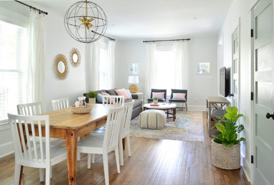
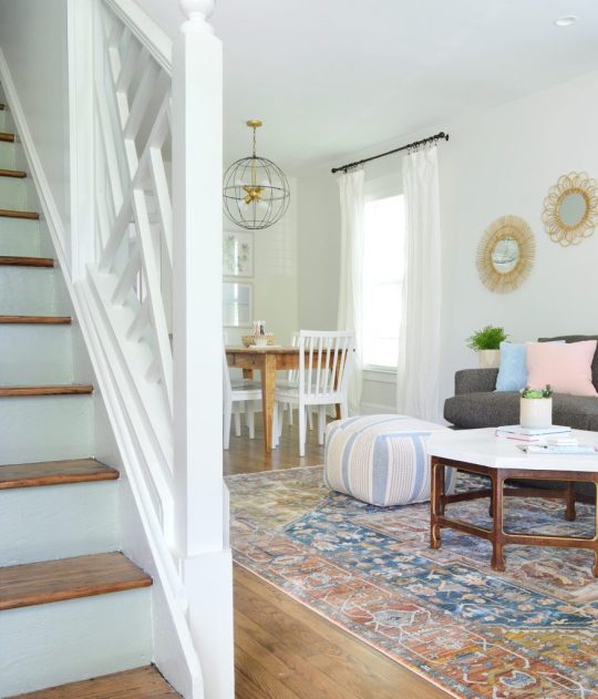
The Finished Living Rooms & Dining Rooms At The Duplex!
We’re THRILLED TO PIECES to be finished with the entire front half of the entire duplex – which means we’re revealing the open living room & dining room on each side at this very moment. Right now. It’s ON.
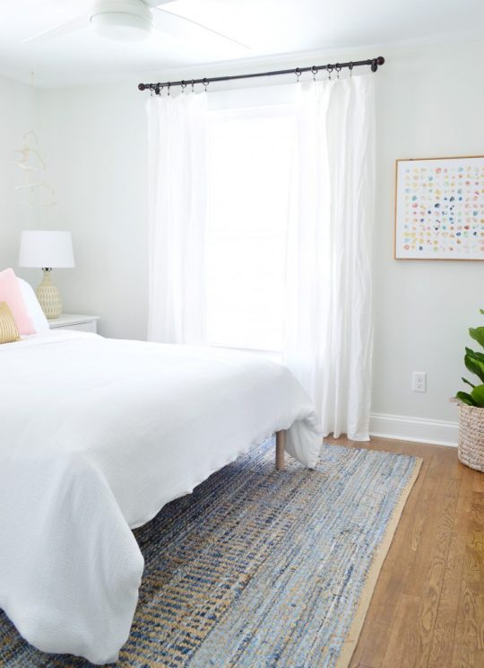
This is what you see when you walk into the left side of the duplex and pivot towards the living area. With the exception of still having to steam and hem the curtains, we are ready to stick a fork in this baby!

sofa | coffee table | similar rug | similar pouf | blue pillows | gray pillow | art | dining chairs | similar dining table| chandelier | mirror | walls: SW Spare White | trim: SW Extra White
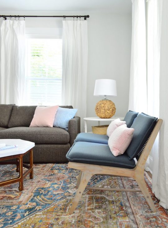
One of our favorite secondhand rugs that I bought ages ago from New England Loom on Instagram found a home in the living area with our favorite Crate & Barrel sofa to add cushy and durable seating. We love this sofa so much that after we bought it around two years ago for our own living room in the Taft Steel color, we decided to buy it again times two for the duplex in the Taft Truffle color (which we think will hopefully stand up to all the use these houses are gonna get). Our kids and pooch have road tested our sofa at home for the past few years and we couldn’t be happier with it. Zero issues. Super comfy. We bought it three times, I feel like that says it all.
It’s hard to see in the shot above, but we also have two armchairs facing the crisp white coffee table (they don’t sell the armchairs in the blue color anymore but they have a deep gray that looks great too). We also added a little pouf ottoman to round things out in the living zone (found at HomeGoods, but here’s a similar one).
Here’s a better shot of the chairs, which we also have at home in our living room in the natural color. Notice a theme here? We are trying to diminish the risk of making bad furniture buys when we know we have a love something that’s durable and functional. So since we’ve been really happy with them at home (they’re going on two years old), we got them in a darker color for the duplex (again, the blue is gone but they have them in dark gray now). Then we just added some cute pink bolsters to the back, which is the key to making them extra comfy since they feel a bit reclined without the added pillows.
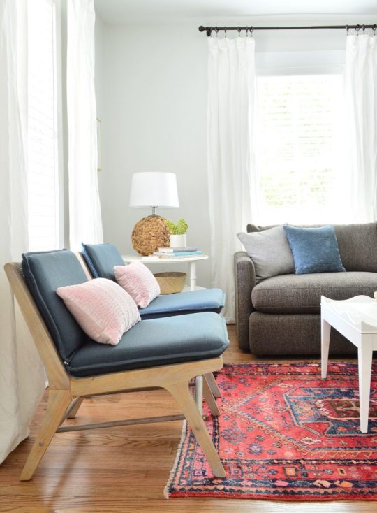
accent chairs | pink pillows| sofa | coffee table | side table | similar lamp | similar rug | blue pillows | gray pillow |curtains | curtain rod | walls: SW Spare White | trim: SW Extra White
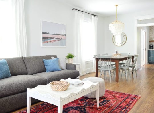
We also brought in one of our favorite quartz-topped tables (it’s over 50% off right now on Amazon!). Hooray for not having to worry about juice or wine stains while getting that shiny marble look. And how perfect is that large art print on the wall behind the sofa? This is the side of the duplex with the blue cabinets and the pink tile and TRUST ME WHEN I SAY THAT ART WAS MADE FOR THIS ROOM.

sofa | end table | faux fern |similar pouf | blue pillow | gray pillow |art | curtains | walls: SW Spare White | trim: SW Extra White
When we finally finish the kitchen and do a video walk-through you’ll see what I mean, but the exact same tones in the kitchen – which is just beyond the dining area – are also in the art. It’s magical. Our good friend Jenny Komenda’s Juniper Print Shop is the best – and we bought two of Sarah Madeira Day’s prints for the beach house a few months ago, so this art feels meant to be on so many levels.
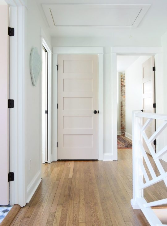
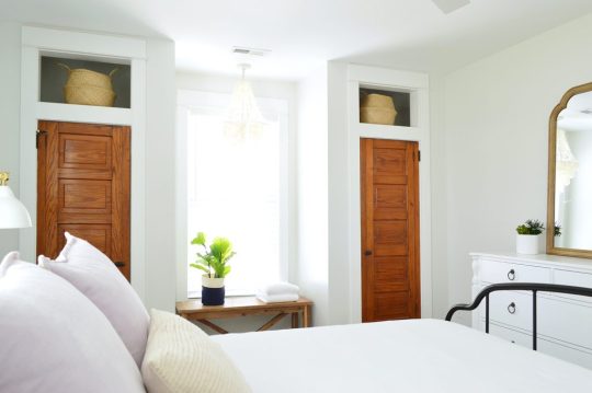
Let’s rewind to really appreciate where we came from in here. This was the room as it looked when we bought it, complete with sections of the ceiling collapsing from water damage to reveal black mold underneath. All of the paneling was fake plastic paneling (again, to cover up damage in the walls) and a rug pad had been removed but the backing was stuck all over the floors. Oh and see that one gorgeous thing in here!? The fan! Just kidding, that five paneled door on the right wall. Remember we rescued it and reused the two of them up in the bedrooms as closet doors? You can see them here – we LOVE how they came out!

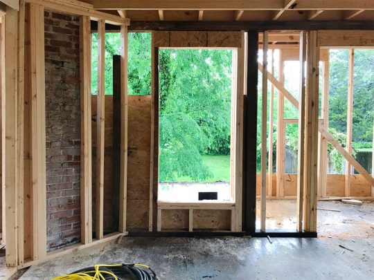
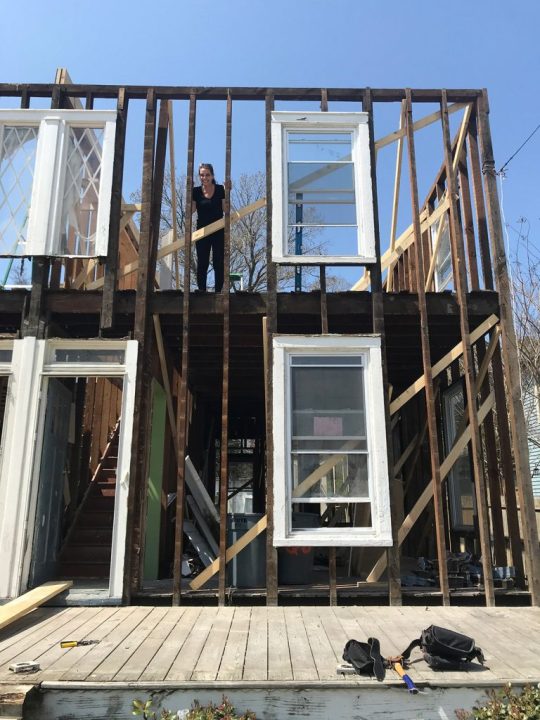
This house reno went all the way down to the studs (literally you could stand in the house and put your arm outside) but here’s a shot when the new plywood was put up along the old studs (a lot of which were reinforced with new framing). I remember standing in there and thinking… someday it’ll come together again. This was easily taken over a year ago.
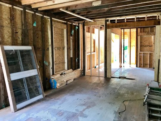
Also, we added that interior transom a little while after framing in the doorway above. See how it originally was lower (see above pic) and then we realized “wait, we can put a long cool transom window in there and it’ll let in more light and feel original and so cool!” So we reframed the doorway opening to be higher, which you can see below:

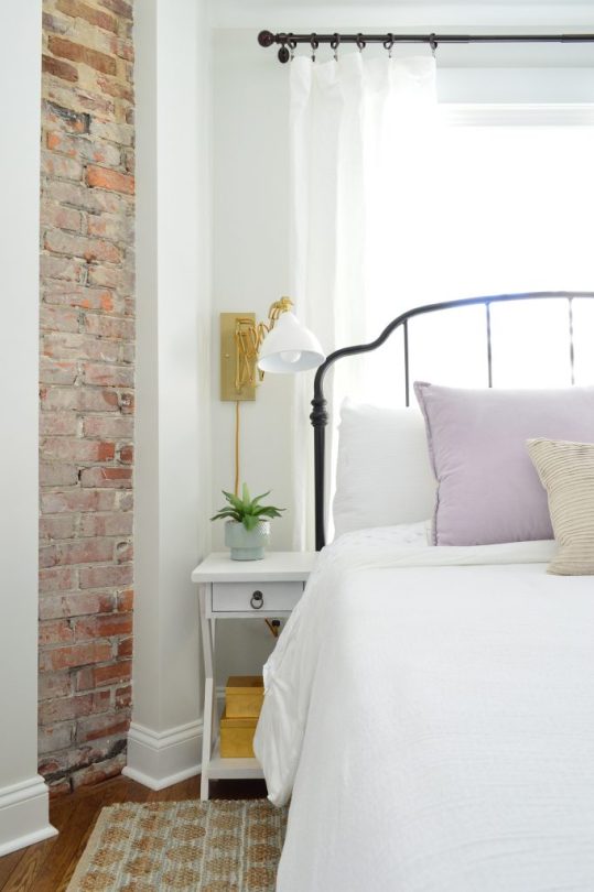
Fast forward a little bit more and… ta-da!! Transom! Isn’t she lovely? All of the solid five panel doors that we added, along with that transom and the pocket doors that we added on the laundry room/mudroom (which you can sort of make out in the photo below) are some of my favorite “inspired-by-original” things that we brought back to this house. Especially since there were only a few original things that we could salvage (like the brick chimneys that we exposed, the hardwoods that we refinished, and the diamond windows & front doors).

And here it is now – although we’ll show you more of the kitchen next week when it’s actually done (along with the mudroom/laundry room if we can get that knocked out and photographed too!). We both felt extremely lucky that the placement for the dining room light on each side of the house was perfect since we had to pick that spot months before drywall & floor refinishing.
sofa | coffee table | similar rug | similar pouf | blue pillows | gray pillow |art | dining chairs | similar dining table| chandelier | mirror | walls: SW Spare White | trim: SW Extra White
The way we planned it was just to tape out the table placement on the floor and figure out what we thought would work with room to pull out all the chairs and then hope for the best. We knew our table measurements because this is a secondhand table that we have had for ages (it used to live in our own dining room!) and we refinished it to look like new!). John’s actually working on a post for you guys with steps for refinishing an old table since we did two of them for the duplex and they came out really well.
Here’s the before from the other side. Look at my lovely beautiful perfect old wood doors (remember you can see them here in the upstairs bedroom).

One other remarkable thing about this room that’s easy to see, even in the before shots, are the size of the windows in here. The downstairs of the duplex has 9′ ceilings and all of the windows start about a foot off the ground and go about 8″ shy of the ceiling. So yes, it means they’re all OVER 6 FEET TALL! These windows are taller than John. Like if he stood on the windowsill, the top of the window frame would still be inches above his head. They let in tons of light, and definitely add presence to this otherwise nondescript rectangular room.
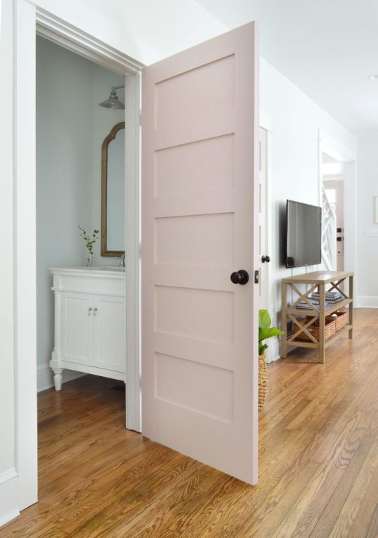
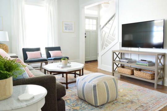
So here we are back in the present. You can see from this angle that it’s all nice and open, but we made sense of the long room by giving it both a living and a dining function. If you have a long open space like this, one tip would be to use area rugs and hanging lights to define different zones so it doesn’t look like one long bowling alley of a space. Floating furniture around the rug to make a living room “zone” at one end, and then hanging a pendant to define the dining area so we could center a table and chairs beneath that chandelier were two good ways to keep the room from feeling like a big amorphous blob.

dining chairs | similar dining table| chandelier |TV cabinet | faux fig | basket | accent chairs | coffee table | similar rug | similar pouf | walls: SW Spare White | trim: SW Extra White | doors: SW White Truffle
Thanks to all of those aforementioned extra tall windows, we didn’t have a lot of empty wall space, so there was literally just one spot that made sense for the TV, which was this wall space across from the sofa. We actually love how the room’s layout panned out because the TV is the very last thing you see when you walk into the room since you enter and see the rug and the sofa and the coffee table. Plus we used a nice thin console table and mounted the television on the wall so it feels clean and easily allows for passage throughout the room.
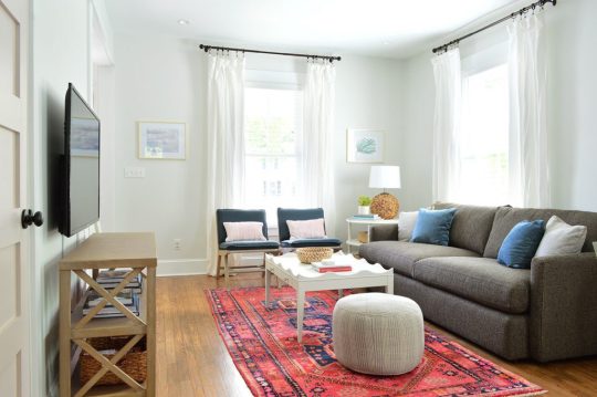
sofa | coffee table | side table | accent chairs | similar rug | similar pouf | similar lamp | blue pillows | gray pillow | pink pillows| gold frames | TV cabinet | TV | walls: SW Spare White | trim: SW Extra White
A deeper more solid looking TV table would definitely have left the room feeling cramped and awkward, so if you have that issue: 1) mount a TV on the wall (we’ve used this awesome $19 mount four times and it’s always great) and 2) add a narrow open feeling table under it (like this), which allows for a much more spacious feeling.
Plus if your TV is a smart one (we bought two of these for the duplex living rooms after loving the one we have in our house so much) you can ditch the cable box and literally just have one wire that runs down the wall to plug the tv in, which we covered with a white cord cover. Just one cord instead of 10 snaking out from the tv?! Without any black boxes and stuff to hide?! We are living in the future!! (Note: if you want to know more about cutting the cord and still getting all your channels without a cable box, which also saves us tons of money – here’s a detailed post with more info).?

TV cabinet | TV | sofa | coffee table |accent chairs| similar rug | similar pouf | blue pillows | gray pillow | pink pillows| gold frames | walls: SW Spare White | trim: SW Extra White
We actually debated running the cord cover along the side of that vent that you see on the right which would have been even more invisible, but because of where the outlet is placed on the wall it would have to cut across a lot at the bottom to snake back to the outlet so we just went straight down with it. I think once we have more board games and puzzles and stuff on each console it’ll be even less noticeable (oh heck yes, our duplex is gonna have GAMES! You know us ;)
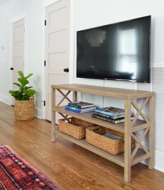
?TV cabinet | TV | baskets | cord cover | faux fig | plant basket | walls: SW Spare White | trim: SW Extra White | doors: SW White Truffle
The door next to the TV will be our locked owners closet, but the one next to that is the powder room. This area was originally just a big closet, so it was a huge functional improvement to create a bathroom downstairs (there wasn’t one down here before!).
vanity | mirror | bath light | bath faucet | TV cabinet | TV | baskets | walls: SW Spare White | trim: SW Extra White | doors: SW White Truffle
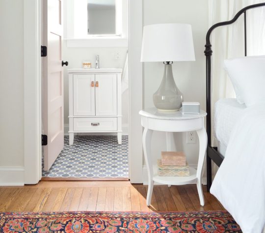
It’s impossible to photograph this space, but here’s a closer peek (this is the other side – it’s identical). It’s a room we’d like to do more to eventually – like add wainscotting with wallpaper running around the top or some fun rich color to make it a little jewel box in there. We’ll most likely get to that in the off-season next year, but for now we’re loving the vanity (it’s so pretty guys! Those legs! That shiny top!) and the mirror above it (it’s my FAVORITE budget mirror that looks so much more expensive than it is). And the toilet on the other side is, well, pretty much just a nice white toilet. And now you can do your business without walking upstairs. Like a boss.

vanity | mirror | bath light | bath faucet | towel hook | walls: SW Spare White | trim: SW Extra White
If we duck back out into the living/dining room, you can see that we went with some brass (in the chandelier and the mirror on the wall behind it) as well as some oil rubbed bronze (in all of the curtain rods, all the door handles and hinges in the entire house, etc). So if you’re wondering how to mix metals, I always just say to make each of them appear a few times in a space and then it looks intentional and layered.
sofa | coffee table | similar rug | similar pouf | blue pillows | gray pillow |art | dining chairs | similar dining table| chandelier | mirror | walls: SW Spare White | trim: SW Extra White
The tone of the the dark TV is basically the same color as the curtain rods and doorknobs, and we hung a few simple gold frames on either side of the front window to bring some of that brass tone over to that area too. You really don’t have to think too hard about mixing metals – just go for it. And if you’re worried about tiring of something that might feel trendy (ex: rose gold or copper for example) you can just add it with smaller items (frames, a table lamp, even a bowl on the coffee table for remotes or odds & ends).

sofa | coffee table | side table | accent chairs | similar rug | similar pouf | similar lamp | blue pillows | gray pillow | pink pillows| gold frames | TV cabinet | TV | walls: SW Spare White | trim: SW Extra White
Ok, so that’s the left side with the pink doors – let’s move over to the right side with the greeny-gray doors. Although the floor plan is a mirror image of the left side, the before looked a little different:

This side had less mold and rot (unfortunately not none – but the walls hadn’t been covered as much, although that is a drop ceiling you see that was added to hide some other water damage). And the two-toned trim that changes mid-wall is pretty… unusual…? But the floors on this side were lovely (we still refinished them all so they match) and we could see the potential even more when we walked in the door.
Here’s that space as it looks today (again, we’ll share all the kitchen details in our next post when it’s done).

sofa | coffee table | rug | similar pouf | blue pillow | pink pillows |mirrors| dining chairs | similar dining table | chandelier | art | walls: SW Spare White | trim: SW Extra White
We kept the same basic elements in this living room (same sofa, same armchairs, a secondhand wood dining table, a light colored coffee table and a simple pouf for bonus seating), but we mixed things up and chose some different items as well, like a different rug, dining chairs, lighting, etc. It’s really fun to have two identical rooms so you can change up a few of the elements and basically see it two totally different ways… (but warning, it’s expensive – furnishing two houses (and filling two kitchens!) pretty much equals that emoji of the money with wings. But at least we had fun while all our benjamins were flying away.
The vibe for this side all started with this rug, which is a bit more chill than the bright pink turkish one on the other side. The same sofa and marble end table are in here, but we reused our coffee table that we topped with concrete (remember that from our beach house living room) and just added some soft pillows and a woven lamp I’ve had for like 6 years in the attic (its mate is on the other side of the duplex, which you probably noticed in the other pics).

sofa | end table | coffee table | side table | accent chairs | rug | similar pouf | similar lamp | blue pillows | pink pillows | lumbar pillows | walls: SW Spare White | trim: SW Extra White
Oh and I should have mentioned that we also tried to keep the furniture pretty low so it wasn’t sticking up and awkwardly blocking too much of our huge windows, so those two dark blue armchairs were nice for that wall for that reason. More light flows in through the glass on the front door and the original transom above that too!
TV cabinet | TV | baskets | end table | faux fern | coffee table |accent chairs | lumbar pillows |rug | similar pouf | walls: SW Spare White | trim: SW Extra White | door: SW Oyster Bay
The un-ironed curtains are killing me, but other than that this room is looking so fresh and finished. Also this rug is great and such a bargain for the size. Extremely well rated, soft, and durable (when I shared some sneak peeks on Instagram, people with lots of kids & dogs told me they’ve had it for years and it’s holding up perfectly – so I have high hopes for it being a good choice for a vacation rental).
accent chairs | rug | sofa | side table | similar lamp | blue pillow | pink pillow | lumbar pillows | |curtains | curtain rod | walls: SW Spare White | trim: SW Extra White
The dining table in here is another secondhand one that we sanded down and refinished – so we’ll share the tutorial soon. It’s such a worthwhile DIY (wait until you see the before shots of them!) and it’s extremely inexpensive to do! We saved hundreds and maybe even a cool grand by not having to buy two new dining tables – and a secondhand table is always nice since dining tables take such a beating (it’s good to know these two have already stood the test of time).
dining chairs | similar dining table | mirrors | chandelier | rug | similar pouf | faux fig | plant basket | TV cabinet | TV | walls: SW Spare White | trim: SW Extra White | doors: SW Oyster Bay
Oh and we’ve had those rattan mirrors that we hung on the left wall for years as well – but they still sell the same set that we got. They’re pretty great for hanging all together on a giant wall, or spreading around in a few places. The texture = so good.
And last but not least, here’s a shot from the front door looking into the living and dining room. The railing opens things up so much, and we love the architecture it adds (it looks crazy tall here but it’s just the angle – we had the camera really low for this shot). And everything from the round rattan mirrors to the big brass & bronze light fixture feels so welcoming and warm. P.S. Another way to mix metals even more easily is to buy a fixture or some other item (like a coffee table) that mixes both – and then just add a few more hits of each one to the room and you’re golden.
Oh and see those cute stair risers that are the same color as the greeny-gray doors on this side? We did each side’s interior steps in their own door color, and when the front doors are thrown open you see these cute pink risers on one side and these soft green ones on the other. I can’t even tell you how charming it is (you can see a peek of them both here in this post).
But enough talking, we have two kitchens and two laundry rooms to finish to hopefully share with you by next week! And the back patio, and landscaping, and about a hundred curtains to iron and hem. Just call me Sheron Petersik, heir to the IRON throne. Get it? No? Is anyone laughing? Hello?
P.S. You can see the entire process of bringing the duplex back to life hereFrom buying it and planning the layout to screaming into a pillow over a sad setback, it’s thorough.
*This post contains affiliate links*
The post The Finished Living Rooms & Dining Rooms At The Duplex! appeared first on Young House Love.
The Finished Living Rooms & Dining Rooms At The Duplex! published first on https://novaformmattressreview.tumblr.com/
0 notes
Text
#139: Our Exterior Makeover Continues…
Painting our brick house white was just the tip of our home’s exterior update iceberg, so this week we’re sharing more of our plans – including one that’s turning out to be much more complex than we expected. We’ve also got an exciting announcement about a color collaboration we’ve been working on and we’re sharing more of everyone’s favorite thing: design norms from around the world, including bomb shelters, frost lines, and… special windows that keep witches out of your house?! Plus we try a strange but awesome subscription box that makes us feel like we’re on Law & Order.
You can download this episode from Apple Podcasts, Google Podcasts, Stitcher, TuneIn Radio, and Spotify – or listen to it below! Note: If you’re reading in a feed reader, you may have to click through to the post to see the player.
What’s New

Spring has sprung, so here’s an updated shot of our house (which we painted white last fall), complete with the white flowering dogwood out front.
And below is a picture of the awning we’re planning to order from the UK. You can see how it has a gentle swoop that we had trouble getting someone to replicate locally – hence all of the legwork it took to get our hands on it.

And if you missed the full details about our masonry paint color collection with Romabio, check out that link for the big post we shared a few days ago on the blog. It has more info on why we love this paint (we paid for it and used it on our own house after lots of research and tons of recommendations from you guys last fall!) and it also covers how we picked the colors, and how you can get your hands on it.
You can also visit a special landing page on Romabio’s website with all of the colors in the collection, and some additional our tips for picking colors that go well with your existing roof and trim (and even some door color ideas).
Updates
If you missed our original discussion of “design norms” from around the world, check it out in Episode #133. It’s one of our favorite eps of all time! We also did a first round of updates in Episode #135 and the original shoes off discussion was in Episode #132.
As for the global design norms we shared in this episode, here’s one of the photos we received, which shows how two twin duvets can be made nicely on one larger bed (this is a hotel in Copenhagen sent by a listener named Adrianne).

And if you couldn’t picture the “Vermont Witch Window” we mentioned, here’s one that was shared as part of a Vermont Public Radio story. That’s also where you can read about the lore behind it.

Lastly, if you want to read more about Singapore’s bomb shelter rule – and see not only lots of pictures, but read interviews with residents who live with them, check out this Vice story.

We’re Digging
Below is a photo of some of what we’ve received so far in our two Hunt A Killer boxes. It’s not everything (and I’ve blurred some things to prevent potential spoilers) but it gives you an idea of how elaborate the story is and the range of evidence & clues you’re sent.

I couldn’t find the coupon code that got our first box delivered for free, but I’ll do you one better. The code FRIEND30 will get you 30% off your entire order. That’s almost like getting two boxes free!
But if you’re looking for something a bit more family-friendly, this is the SET game I was digging this week. I feel like I did a terrible job explaining how to make “sets” in the episode, so I displayed 3 examples of “sets” below:

The top one shows a trio where almost everything is the same (all green, all ovals, all filled in solidly) – just the number of icons differs (3, 2, and 1). Which means it’s a set!
The middle set has the same shape (squiggle) and number (1) but all different colors and shadings. Which also means it’s a set.
The bottom is where everything is different – no cards share the same number, color, shape, or shading. So yes – that’s a set too!
There’s also a SET Junior that says it’s for ages as young as 3 if you’re interested in something a little simpler – but we haven’t played that one yet.
If you’re looking for something we’ve dug in a past episode, but don’t remember which show notes to click into, here’s a master list of everything we’ve been digging from all of our past episodes. You can also see all the books we’ve recommended on our Book Club page.
And lastly, a big thank you to Social Print Studio for sponsoring this episode. You can take 15% off your next order using the code YHL15!

Thanks for listening, guys!
*This post contains affiliate links*
The post #139: Our Exterior Makeover Continues… appeared first on Young House Love.
#139: Our Exterior Makeover Continues… published first on https://novaformmattressreview.tumblr.com/
0 notes
Text
Because You Know We Love A Painted Brick House…
By now you know that we’re nothing short of OBSESSED with the results of painting our brick house white last fall. It has probably been one of our favorite makeovers in our 13 years of homeownership. So for anyone else who might be considering doing something similar, we wanted to share some advice and some exciting news! And also some spring pics of the house, because it’s the first time we’ve gotten to see her with the white flowering dogwoods out front and it makes my heart wanna burst.

Wait but first I should passionately proclaim that we don’t think that all brick should be painted. We still very much love an unpainted brick home or a natural brick accent, especially when it’s beautiful historic brick – like the 100-year-old brick chimneys that we exposed at our beach houses – or the wide reclaimed brick steps that we added to both of them.
But then there was the brick on this house, which wasn’t particularly old or charming (it was from the early eighties and sported a blotchy maroon and dark brown color, with yellow-beige mortar that was applied with little messy triangles in some of the corners). You can see what I mean below:
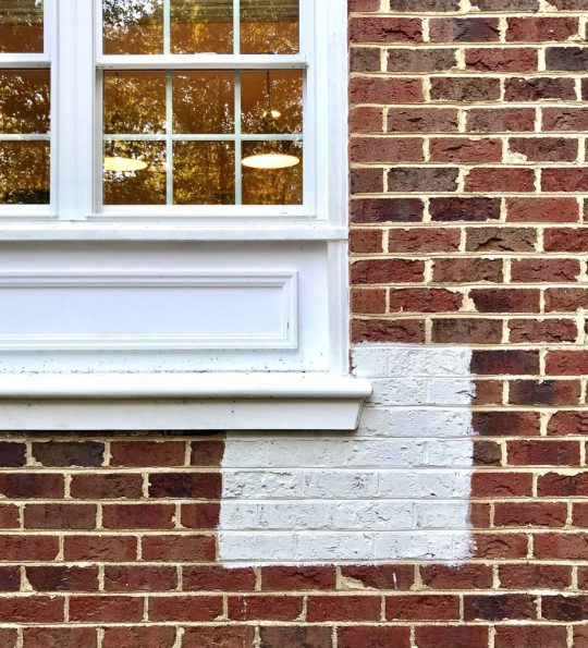
See how the white swatch of paint immediately neutralized all of our issues with it, and basically brought this brick back into that “ahhh, it looks so historic and stately and classic” arena? The point is that there are a ton of different types of brick, and some of it is gorgeous and amazing just as it is, and some of it isn’t even close to what you would have chosen – and you don’t have to live with it that way! If you’ve disliked yours for a while, our first suggestion is just to trust your instincts and think deeply about it. If you’re not quite sure you want the painted look, don’t do it! But if you’re 110% sure like we were when we finally went for it, well, it’s a good indication that you’ll love the result. Whenever we see old pictures we’re like… “yeah, zero regrets… except that we didn’t do it sooner!”

Even if you’re sure you want to go for it, we know it’s not a decision to make lightly. Believe me, we went through a whole smorgasbord of concerns and reasons NOT to do it over the years, like:
What if we regret painting the brick?
What if we don’t like the color?
What will the neighbors think?
What if it’s much harder to maintain?
What if it’s wildly expensive to do?
But again, now that we’re on the other side of the project, we can assure you that NONE of those concerns were founded. In fact, we’re faaaar more in love with the “after” than we ever expected to be (you can see how much it cost & learn more about the process here).

And if you followed along with our decision-making process last summer on the podcast, you know a big reason we finally worked up the confidence to take the plunge was finding the right paint product. It was actually one a bunch of you guys recommended to us, called Romabio Masonry Flat (at the time it was called Boidomus I).
We hadn’t heard of it before, but learning that it’s a breathable mineral paint specially made for brick and other masonry, so it won’t crack or peel like latex paints tend to do overtime (because it doesn’t seal brick at all – it lets it breathe) – well, that really piqued our interest. And the more we learned about it, the better we felt moving forward with the project, like:
it has a 20-year warranty
it’s eco-friendly
it’s naturally mold resistant
it’s what they use to paint historic brick buildings in Europe
it has this BEAUTIFUL matte finish that looks so classic and never too garish or shiny)
As our pro painter later told us: “it’s like painting brick with brick.”
You can read more about why we chose it here.

Romabio didn’t sponsor our makeover (we paid for everything ourselves!) but we did get to know the husband-and-wife duo behind Romabio throughout the process, because I’m a gal who asks 10,000 questions. Ha! And then after we finished our house painting project last fall, and we loved the result so much, they came to us a few months later and asked if we’d ever want to curate a paint color collection to help simplify the decision-making process for other homeowners. Took us about two seconds to say: “Um… YES!”
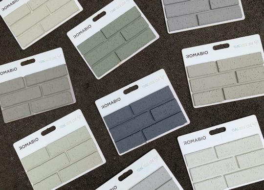
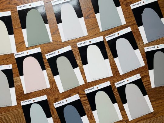
Choosing a paint color can feel agonizing for any space, but we had just experienced firsthand how nerve-wracking it was to pick one for our exterior. So the idea of getting to help other people choose the right one without worrying and second guessing themselves quite so much sounded great. Plus I’m a lady who likes to play with paint swatches and imagine what I’d do to every single house I walk or drive by on the street – so basically it was a dream project to pull together a collection of our fifteen favorite exterior paint colors for brick or stone. Literally the ones we would use if it was our house that we were painting (oh to have 15 houses to try these all out on…).

Note: Mineral paint can only go so dark because it’s made from natural materials – aka: minerals. So that’s why you don’t see anything suuuper dark in the collection. Also, dark colors have a tendency to fade outside and Romabio wants everything they make to be super durable and easy maintenance – remember they have a 20 year warranty ;)
We took a lot of our inspiration for the collection from many of the historic painted brick houses in our hometown of Richmond, Virginia. Specifically a gorgeous neighborhood here called The Fan. There are literally blocks and blocks of painted brick eye-candy to soak in, covering just about every color in the rainbow. We love strolling through that neighborhood just for kicks, so it was pretty fun to take a bunch of trips there with our paint swatches in hand and call it “research.”

Speaking of paint swatches, we used Romabio’s stock color deck as a starting point while we walked around downtown, and we began zeroing in on some classic no-fail neutrals (think greiges, khakis, sand tones, and chocolates) as well as some options for those who want a bit more color (misty blues, mossy greens, even a subtle blush pink). The paint blobs in our collection might look somewhat muted or subdued on your screen, but anything with too much color saturation can quickly read as “too crazy” or “too bright” on an entire house’s exterior, especially when the sun hits it. So things needed enough gray or tan (aka “muddiness”) in the color to keep it classic and stately.

Once we zeroed in on a few dozen favorites, Romabio sent us painted swatches so we could tinker and fine-tune (lightening some, graying others, and eliminating too-similar options). Our goal was to simplify the decision-making process, after all, so offering 10 slightly different blues felt like it would defeat the purpose REAL FAST. So if you want a light warm gray, we gave you one (Instant Chateau). Looking for a deep gray blue? Navy Steel is your guy. We did a couple rounds of narrowing and adjusting (always taking things back to The Fan for a real world gut check) so we could be certain we LOVED EVERY. LAST. COLOR
During some of our paint color reconnaissance missions, we also witnessed some examples of what can happen when you don’t use masonry paint on your brick. Not only can latex paints sometimes give you that extra shiny finish, they can also peel and crack over time since the brick can’t breathe and it traps in moisture which is actually damaging to the brick as well as the paint job.

Before locking in our final color selections, we painted sample brick boards with every option to help us better picture what they’d look like on a brick house (you may have caught a sneak peek of these on Instagram). And, well, WE LOVE THEM ALL SO MUCH I KINDA WANT 14 MORE BRICK HOUSES TO PAINT (#JohnSaidNo).

The final step was naming them all, which was THE MOST FUN (you guys know I’ve always wanted to name nail polish and paint swatches). And since we love an outtake, here are some names that we left on the cutting room floor (but laughed at for a while before we cut them):
Green Day
Villa Rosa (RHOBH anyone?)
Theon Greyjoy (GOT anyone?)
Red Wedding
Rachel Green (Friends anyone?)
Moss Gellar
And probably our favorite: Mossy “Mossdemeaner” Elliott
In the end, we were aiming for names you’d be proud to put on your house (I think “So Succulent” is my favorite) and we also worked in a few nods to the town that inspired us (like River City and Richmond White). Actually, Richmond White is the exact white color that we used on our house. It’s not too stark and blinding or too yellow – it’s just about the perfect tone, even if you mix it with bright white trim (which is what we have on our house thanks to white vinyl wrapped windows that can’t be painted).

You may remember that to land on our final white paint color for the project, we agonized. We took home dozens of swatches, narrowed it down to four colors, and then had Romabio color match the Masonry Flat Paint to a few Sherwin Williams and Benjamin Moore colors, which we then painted onto the house to make our final pick. And then we had Romabio color match that swatch again to make us big buckets to cover the whole house. Whew.

But since color matching isn’t an exact science across different paint brands (the different pigments and bases in each company’s formula make it difficult to get the exact original color – more on that here), we wanted to give you guys a foolproof way to replicate the exact white that’s on our house without worrying about any margin for error due to the color matching process. So now you can just ask for “Richmond White” which is the true color we used (it’s the original formula they created for our house using their own pigments & bases).
You can visit the Romabio website to learn more about our color collection with them and soak up all the info on their masonry paint (why it’s so much more durable than latex paint, and what you can & can’t paint with it). And you can order all 15 colors on Amazon. WOOT! Just be sure to check Romabio’s info about what materials it works on and to see if you need a primer or not (for example, already painted brick needs this primer – and you can always call Romabio with questions at 678-905-3700).
Oh and it works on interior brick too (like your fireplace – and you’d probably only need a 1 or a 2.5 liter bucket!). They can also make any of these colors in their standard interior wall paint if you see one that you’d love indoors (just call them for that and they can ship you interior paint in the exact color).

Over on their website we also shared some tips about how to choose an exterior color that works with your existing trim & roof colors, and even pulled together some fun door color ideas to go with some of the colors in our collection.
And if you have any technical questions about the paint, its application, or how to get a small bucket to test any color before diving in, just ask the folks over at Romabio. We picked the colors, but they’re the actual paint pros ;)

Also, if you guys use any of our colors, PLEASE PLEASE PLEASE SEND US PICS (you can also tag them with #YHLforRomabio so we’ll see them on Instagram). I can promise I won’t cry over them.
Just kidding I totally will.
The post Because You Know We Love A Painted Brick House… appeared first on Young House Love.
Because You Know We Love A Painted Brick House… published first on https://novaformmattressreview.tumblr.com/
0 notes
Text
Four More Finished Spaces At The Duplex!
If you tuned in last week, you saw us very excitedly reveal the before & after photos of the first four rooms that we completed at the duplex. SO MANY EXCLAMATION POINTS! There isn’t much rhyme or reason to the order of the things we’re sharing – we’re just rolling things out as we complete & photograph them… so today we have FOUR MORE SPACES THAT ARE DONE DONE DONE!
Can you tell how thrilling that is for us to proclaim after over a year and a half of working to get this house put back together and ready for renters this summer?! (The listing will go live on Airbnb once we’re done with all the rooms & have ’em photographed. We’ll make a big announcement when we get to that point, so don’t worry, you didn’t miss it!).
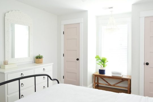
Let’s start with the back bedroom on the left side of the duplex – aka the side with the pink doors.
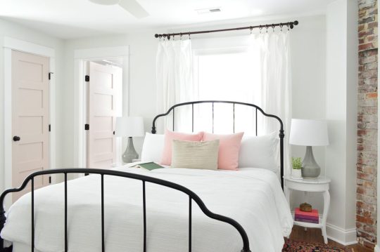
bed | side table | lamps| shades | fan | duvet | pillows | lumbar | wall: SW Spare White | trim: SW Extra White | doors: SW White Truffle
This room’s twin on the other side was in last week’s post and we mentioned that the back bed wall was a little bit narrower on the other side, so we used wall sconces instead of table lamps (every space is slightly different on each side just because 100 year old houses are quirky like that). But over here the bed wall was wider, which allowed for some larger quartz topped side tables (so shiiiiiny – and hooray for a material that won’t stain like marble).
We also got to top them with these sweet gray lamps, and once again we planned the outlet placement so they’re located behind each nightstand, so we can plug in those lights and still have an available outlet for charging phones (we’ve rented more than a few places that led to us crawling around under the bed or pulling out dressers in search of those ever elusive phone charging outlets).
bed | side table | lamp| shade | sound machine | duvet | vanity | faucet | pulls | tile | mirror | bath light | door: SW White Truffle?
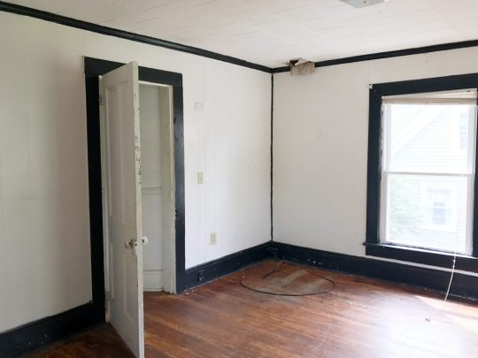
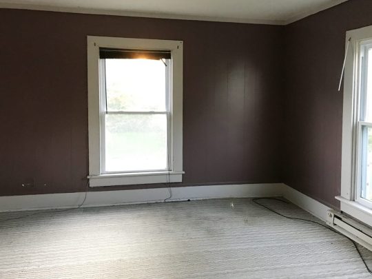
Here’s a before shot of the room as it looked when we bought the duplex, which had drop ceilings to hide some ongoing roof leaks and painted plastic paneling to cover up the mold in the walls. Where that window is below is pretty much where we placed the door to access the full bathroom that we added on, which made this space into a true master bedroom. We also added the double closets to flank the window on the left wall, so if you scroll back up and you look at the window behind the bed, that’s one that we added to the bedroom since this one essentially turned into the door to the bathroom.

The before picture below was taken with our backs to the corner above. I’m including it because guess what was hiding behind that odd black slanted wall in the corner?
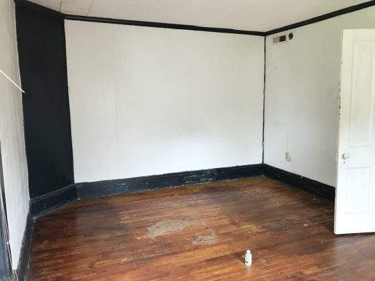
Yup, it was the gorgeous brick chimney that we exposed on both sides! It adds so much charm and history to the space. And yes, that’s a roach fogging can sitting on the floor above. Before our first walk through of the house, someone set off a fogger in every room and then didn’t come back and remove them… so there were foggers on the floor and a whole bunch of dead roaches belly up everywhere. It wouldn’t be on my house staging checklist, but it didn’t scare us, so… maybe it worked?
But back to the after pics. Once again we did an airy and open metal bed in front of the window, to let the light stream in (and feel less like a wall of furniture that’s blocking the pane of glass). Our round quartz tables fit nicely into that angled corner – and they soften the corner in a nice way. Who doesn’t love the mix of polished quartz & weathered old brick? They go together like rama-lama-lama-ka-dinga-da-dinga-dong (that was harder to type than you’d think, btw).

bed | side table | lamps| shades | duvet | pillow | lumbar | curtains | curtain rod | rug | wall: SW Spare White | trim: SW Extra White
This before shot was taken with our backs to the brick chimney, so that window on the right below is where we built out the double closets to flank that lovely view that looks out on some huge all-summer-long flowering trees (giant pink crape myrtles).
Oh and do you see that trap-door looking thing in the corner of the ceiling in the photo above? That’s where a leak got so bad that it eroded the original ceiling and then went through the drop ceiling and collapsed it in that spot. After we removed the drop ceiling it was clear that a LOT of the roof was failing – so we changed the pitch of the roof to be a bit steeper so water would run off of it more efficiently and not cause this issue again down the road. But yeah, rebuilding the whole roof was a doozie (you can see the entire house completely roof-less and wall-less here).
Here’s the after from the exact same corner. You can see that we have those cute pink-doored double closets now that make that window shine (they’re painted White Truffle by Sherwin Williams). And we shifted the doorway over to make sense of the upstairs layout a bit more. You can see our before & after floor plans a little later in this post to picture all of these layout changes more easily.
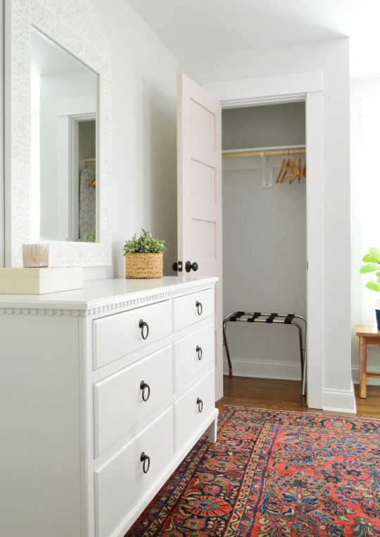
dresser | mirror | bench |bed | faux fig |wall: SW Spare White | trim: SW Extra White | doors: SW White Truffle
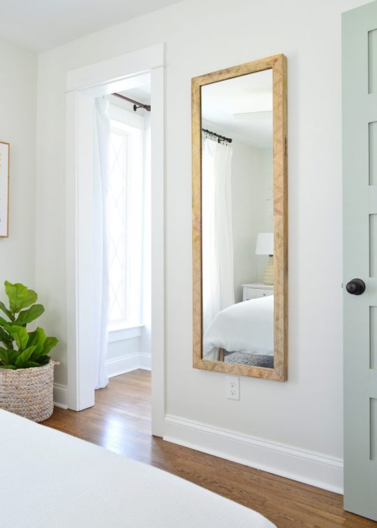
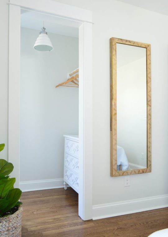
We also added a dresser for addition clothing storage (it’s the same dresser we have in our bedroom, but in the crisp white color instead of the gray one). Then we hung our favorite stenciled mirror over it for that inlay look (we LOVE how big it is, this is a room-making mirror you guys). We love that it basically creates an additional window in the room by reflecting the light of the other one (see the picture above).
This is one of the two closets in the room (remember they flank the window) so they each provide space for hanging clothes, storing suitcases, etc. And our eyes love the symmetry so much of having two in the room – I’m so glad we did it, because it feels like they were meant to be here.
dresser | mirror | rug | luggage rack |wall: SW Spare White | trim: SW Extra White | doors: SW White Truffle
And yes, we are going to add more wooden hangers. There were people who worried the ones that they saw in our previous post weren’t enough, so more are coming. DO NOT WORRY. Buying those = the easiest thing on our list right now. Ha!
This is what you’d see if you stood with your back to the master bathroom, and you can see that we reused the rug that we had in the beach house living room a while back. And it was clearly mean to be in this master bedroom with the pink doors and the dark oil-rubbed bronze accents (in the drawer pulls, curtain rods, bed, and the door hardware). It fits the room perfectly, which makes me so happy – and on a sunny day it takes on a pinker watermelon tone, which is pretty cool (you can see that here). It was a secondhand find, so I can’t link to something identical, but this rug is pretty close (and the price is good!).

dresser | mirror | bed | rug | fan | wall: SW Spare White | trim: SW Extra White | doors: SW White Truffle
If you stand with your back to the dresser above, you see the doorway that leads to the new master bathroom that we added onto this room. So much more functional, and we had fun with that bold floor tile and all white tile and wall paint everywhere else (except for the fun pink door).
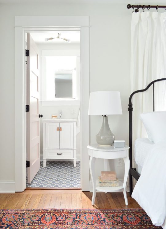
bed | side table | lamp| shade | sound machine | duvet | vanity | faucet | pulls | tile | mirror | bath light | door: SW White Truffle
The bathroom feels surprisingly serene for having such a colorful patterned floor tile, mostly thanks to using other colors sparingly, adding some calming touches like a faux succulent, some muted art (this print and another print by this artist) and some natural touches in the woven cup and the leather vanity pulls (this is the vanity we bought – and we just swapped out the hardware).

vanity | faucet | pulls | tile | mirror | hook | toilet | photo art | wall: SW Spare White | trim: SW Extra White
You can also see above that we mounted a mirror above the sink that’s functional and hinged to fit within the window frame, but still allows a lot of light to stream in. We frosted the glass so nobody feels like there isn’t privacy in here – but it thankfully doesn’t effect how might light floods this space.
Oh and a few people asked in the last post why we didn’t just put the window over the toilet – but from the back of the house it would have looked super odd to have a window right on the edge of the addition instead of in a more centralized placement. The historic review board has to approve things like additions and new window locations, so I doubt they would have gone for such an off centered window since the original back windows were in a central-ish spot too. (You can see more shots of the back of the duplex here – we LOVE how it came out!)

I also have to admit that I love a mirror in a window! We did that in our second house and the make-up-friendly natural light was never better! Ha!
vanity | faucet | pulls | tile | mirror | hook | toilet | photo art | wall: SW Spare White | trim: SW Extra White?
If you stand with your back to the wall to the right of the toilet, here’s what you see: a simple all-white shower (the key to a bold tile on the floor = non-demanding tile everywhere else), a soft extra long shower curtain, and some handy towel hooks on the back of the door. For anyone wondering how we feel about mixed metals – we’re into it! Just have each one occur a few times in each space and you’re golden. For example in here we have chrome on the shower fixtures, the shower curtain rod, and the sink vanity’s faucet while the door’s hinges, knob, and hooks are all oil rubbed bronze. Looks just fine! All metals are sort of like a neutral if you layer them into the room a few times each.

wall tile | shower floor | grout: warm gray | shower fixtures | curtain | rod | door hook | door: SW White Truffle
This is one of my favorite before shots of the bunch. Check out that mauve trim and the leafy wallpaper border. The crazy thing is that we restructured the landing upstairs so much that the after isn’t very parallel at all. We actually moved the access to the bedroom over to the right (where you see that corner of a sconce peeking into the photo below) and that open doorway that you see became a nice big hall linen closet. We also pushed the doorways back, so the landing at the top of the stairs is about twice as big – so you don’t feel nearly as closed in or crowded.

Here’s basically the same angle now. See how the doorway shifted over and the landing is a lot bigger and more breathable? Oh how I wish we had taken a photo of the linen closet open because it’s a work of art. We added chunky white shelves that are so functional for towels and extra bedding, and we even have a tiny ironing board and an iron. It’s gorgeous. Yes, a closet can be gorgeous. We need to share that in a video tour soon I think!
tile | rug |wall: SW Spare White | trim: SW Extra White | doors: SW White Truffle
I mentioned we’d include a before & after floor plan for you guys to better understand the layout changes. Remember that each side of the duplex only had one full bath when we bought it, and a very odd diagonal hallway that was not original to the house (it had been restructured probably in the 70s or 80s). So we enjoyed bringing it back to the more classic and traditional layout without any triangular hallways – it just feels more fitting and less cobbled together. Plus two and a half bathrooms per side feels a lot better than one!

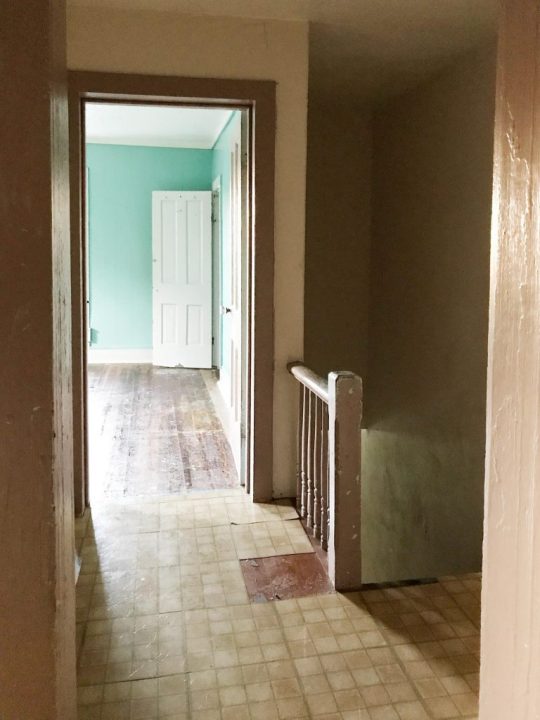
One of the hugest changes we made isn’t something you can see on a floor plan though. The original steps on each side of the duplex were like a dark closed-in tunnel. They were completely drywalled on each side from the very bottom step, all the way up to almost the top step. Yeah… like no light passed through that space at all, as you can see below:
So when we restructured things, we opened a bunch of the bottom stairs up with a railing (more on that in a second) and we moved the bedroom doorway at the top of the stairs back a bit too, which meant instead of just having a short little railing up top, we flood the top 6 stairs or so with light.

rug | faux fig | basket | framed canvas | door: SW Oyster Bay | wall: SW Spare White | trim: SW Extra White
If you don’t remember the story of the railings, they’re the original railings from our front porch at our home in Richmond, and they fit PERFECTLY into the duplex at the top and bottom of the stairs. COMPLETELY MEANT TO BE! We’re so glad they got to live on here (more on The Sisterhood Of The Traveling Railing here & here).
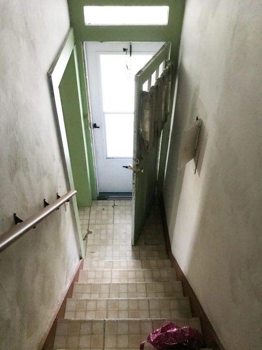
A few seconds ago I said that we opened up the bottom of the stairs, so here are some before & afters of that update. This is what it looked like when we bought the house – all closed in completely by a diagonal hallway of drywall with just a tiny doorway to enter the living room from the front vestibule, which felt VERY CRAMPED.
Now it looks like this, thanks to creating a much wider doorway into the living room, and an open railing that lets in tons of light & adds some great architectural interest. That gold globe light is a space-maker too guys, and the price is so good (it’s huge). The ceilings on the first floor of the duplex are 9′, so it allowed for some fun large-and-in-charge fixtures in a few spots (so if your ceilings are 8′ and you want that light, measure to see if it’s too low, and if so you could place it over a table or a bed – ooh it would be so good in a bedroom.

light | door: SW Oyster Bay | wall: SW Spare White | trim: SW Extra White
But back to the upstairs. This is the view of the front bedroom on the right side from the hallway.
rug | faux fig | basket | framed canvas | door: SW Oyster Bay | wall: SW Spare White | trim: SW Extra White
We revealed the front bedroom on the left side of the house in last week’s post, and a few things are similar in this space (we chose the same wooden bed and the same art for that back wall as well as the same rug ).

rug | faux fig | basket | framed canvas | mirror | curtains | curtain rod | door: SW Oyster Bay | wall: SW Spare White | trim: SW Extra White
But a few things we did differently over here are that we oped for slightly wider nightstands (they fit in here and wouldn’t in the other front bedroom! The slight measurement differences from side to side are so funny). We also did table lamps in here instead of wall mounted sconces, which add some nice texture.

bed | duvet | pillows | nightstands | lamps | shades | curtains | curtain rod | wall: SW Spare White | trim: SW Extra White
We also hung a breezy little mobile above the bed on the right (it’s hard to see in the photo above for some reason, but you can see it a lot better in person and in the picture below. The gold hardware on it with the white wood seagulls are so perfect for the beach. It’s actually a mobile we’ve had in our bonus room at home for years, but we knew it would be perfect at the beach (it’s no longer sold, but here’s another mobile I’m loving).

bed | duvet | pillows | nightstand | lamp | shade | sound machine | curtains | rug | wall: SW Spare White
The bedside tables are SO NICE. They were a bit of a splurge for me (compared to the cheaper mint ones I got for the other side’s front bedroom) but I just loved that there were two drawers and that pretty display space in the middle for books or magazines. They look really well made in person – and the added width (they’re 24″ wide) feels great too. So if you’re looking for some classic white nightstands, these are good. Oh and we put a sound machine in each bedroom because we did that for the beach house and it’s SO NICE. Our kids love a sound machine and we’ve found that when people come to stay with us they appreciate having one too.
Below is a shot of the wall that’s across from the head of the bed, where we mounted a great wood-framed mirror (the price is so good you guys! we have one of these in the beach house too). It’s nice to have a bedroom mirror for people to check themselves out before leaving the room when they don’t have a master bath to use for that. And that doorway you see with the diamond grilled window beyond it (my VERY FAVORITE HOUSE FEATURE!) is the cute little closet for this room.
mirror | faux fig | basket | blackout curtain | curtain rod | lamp | shade |door: SW Oyster Bay | wall: SW Spare White | trim: SW Extra White
The curtain panel that you see next to the diamond window is blackout lined, so it blocks light that would stream into the bedroom when you pull them closed. All the other windows in the duplex have white faux wood blinds to block light and for privacy, but I couldn’t bear to put them on the diamond windows.
And across from that window is a diamond fronted dresser that we designed (can you tell we love diamonds?!) as well as a hanging bar for additional clothing storage. I love the little white honeycomb pendant light that we have in there too. We also used that light in the laundry room downstairs as well as over the kitchen sink. So classic looking. Five stars, would recommend.
diamond dresser | pendant light | faux fig | basket | mirror | wall: SW Spare White | trim: SW Extra White
I gotta say I love that the wood in the mirror and the bed and even the hangers is all that warm medium tone, so it feels really earthy and calming in here. Especially when you compare it to this before shot, which once again has a drop ceiling and plastic paneled walls that were covering various water and mold related issues:

Also this floor. OH THIS FLOOR. I hated it with every fiber of my being, because someone had put peel & stick tile all over half of it and then ripped it up before selling. But all the glue from the sticky tiles STAYED ON THE FLOOR. I am not exaggerating when I say that when I walked in with my flip-flopped feet for the first time, my flip flops came off of my feet and stuck to the floor as I tried to take another step. I literally had to pry them off with my hands in order to move. It was like a human-sized sticky trap.
Thankfully after refinishing the floors, they’re glorious and guaranteed not to steal your flip flops. Still gotta steam the curtains in here (remember we use these Ikea curtains and hack them to look like this) so I guess it’s not 100% done, but it’s very very close, which feels very very good. Also I love this rug. We bought it twice (it’s also on the other side) and it’s casual and beachy.
bed | rug |duvet | pillows | lamp | shade | curtains | curtain rod | framed canvas | faux fig | basket |wall: SW Spare White | trim: SW Extra White
So there you have it. Four more spaces in the duplex that we’re thrilled to have fixed up and filled with as much charm and function as we could muster.
Oh and while we’re on the subject of function, we went with SIX CEILING FANS in here because we know lots of people who love sleeping with a fan on, and although we have central air, that breeze feels beachy and calming. So yeah…. design-wise we love a light fixture, but it just felt right to do crisp white fans for the beach.

We’ve been really happy with them so far (you know we turn them on when we’re working away in each room – ha!). We did these larger ones for the four larger bedrooms (as seen in the back bedroom above). And these smaller versions for the two smaller twin bed rooms (which we have yet to finish & reveal – but soon!).
Speaking of those twin bed rooms, after they’re done we’re switching our focus to finishing up the two living rooms, two dining spaces, two kitchens, and two laundry rooms! AND THE TWO BACK PATIOS! Still plenty to do, but we’re getting closer every day!
P.S. You can see the entire process of bringing the duplex back to life here From a complete “before” video tour, to planning the floor plan & the style vibe, to tiling it all and revealing the before & afters of the front and the back of the house, it’s chock full of info & pics.
*This post contains affiliate links*
The post Four More Finished Spaces At The Duplex! appeared first on Young House Love.
Four More Finished Spaces At The Duplex! published first on https://novaformmattressreview.tumblr.com/
0 notes
Text
#138: Was Ikea Not “Good Enough” For Our Home’s Kitchen?
Installing Ikea cabinets in all three of our beach house kitchens invites the question: why didn’t we use them in our home’s kitchen in Richmond?! So this week we’re diving into the answer, including what gave us pause about using Ikea back then, how it could’ve changed our final result, and what we’d choose if we had to select kitchen cabinets for our home today. Plus, we share how a simple outdoor project turned into a major plumbing issue at the duplex (yes, another one – the water curse lives on!) and why there was also an emergency call to an electrician one evening, you know, for balance.
You can download this episode from Apple Podcasts, Google Podcasts, Stitcher, TuneIn Radio, and Spotify – or listen to it below! Note: If you’re reading in a feed reader, you may have to click through to the post to see the player.
What’s New
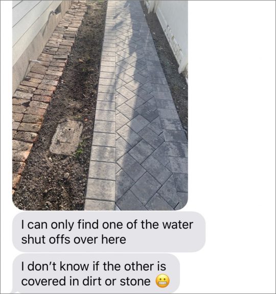
That is literally the text I sent Sherry when I realized one of the water shut off valves had been buried over at the duplex. You can see the exposed one in the foreground, and the other should’ve been about 4 feet in front of it, but I dug around for a while and… nada.
We always knew it was buried a bit deeper than the other, but you can see below how deeply it had been hidden when the guys were installing the pathway along the side of the house (it was around 4″ below the ground level once the path went in). You can also see how it was so close to the path that some of the plastic edging pieces actually prevented someone from removing the cover.

I didn’t take any pictures while I was digging it out because I didn’t expect this to be a moment worth sharing with anyone… and then the water line broke. But the photo below shows some of the aftermath. You can see the box (aka “margarine tub”) removed from the hole in the background. The lid to it is set off to the right side.

And here is a detail of the break itself (at the bottom of the picture). It’s not very big, but it sure did release a lot of water very quickly! The pipe wasn’t visible for hours until the water drained, leaving this lovely mud situation.

It’s all fixed now and when the plumber reconnected it, he set everything a little higher so that one is level with the ground as well. So we won’t have the issue of it getting hidden again – AND it’s further away from the path, which was also an issue.

And if you’ve missed our previous water dramatics out in Cape Charles, you can catch up on it all here:
Episode #59: The Renovation Rollercoaster That Brought Sherry to Tears – When we were told our beach house didn’t have a water line and it’d cost $10,000 (or more!!!) to add one.
Episode #81: …And Then Our Pipes Froze – That one’s pretty self-explanatory. Alternate title: The Duplex Waterfall of 2018.
Episode #97: What We Learned (And Saved) From Our Shopping Ban – This is when our duplex water meter was broken and leaking even though the house was gutted…
Episode #110: And Then The Bathroom Started Flooding – Here’s when we removed the baseboard and uncovered a leak in the beach house master bathroom that had been there since it was rebuilt.
That’s Embarassing
We’re making lots of big progress in the beach house backyard that we can’t wait to properly photograph and write a big ol’ blog post about, but for now, there’s a peek at the lights on the sheds that gave us all that trouble.

We used the 11″ versionss on the sides of the shed (and on the back of the house) but got the larger 15″ ones for this area near the peak.
You can’t even see the dusk-to-dawn sensor in these pictures, but if you look on the website you’ll notice a little nub at the top of the shade on the backside.
Ikea Kitchens
If you want to read more about our kitchen renovation here at our Richmond home, check out these posts:
Kitchen before & afters, including details on the cabinets we used (and a room schematic with measurements)
The renovation process, including a look at the full gut job
Devising a totally new kitchen layout
5 kitchen mistakes we made during the reno

And if you’re looking for details on the projects where we’ve used Ikea cabinetry, here they are in order of completion:
Our laundry room in Richmond (pictured below) – where you can see how we relied on filler pieces to make it look wall-to-wall, as well as a piece on the bottom to disguise the under-cabinet lighting.
You can read specifically about installing those Ikea cabinets here. Like we say in the episode, these were the only 4 Ikea cabinets (3 uppers and 1 lower) we had ever installed before we started planning our kitchen. The door style here is called BODBYN.
Our bonus room built-ins in Richmond were our next Ikea project, using the same BODBYN cabinet fronts. We actually shared this project on the blog before our kitchen remodel, because it came together faster… but the decision to use the local cabinet company for the kitchen was made far before we had this second go at Ikea cabinets for the bonus room. You can see how we created the bonus room built-ins in this post.
Our beach house kitchen in Cape Charles was our first actual kitchen project using Ikea cabinetry. You can see before & afters here, and read more about how we planned it and how we installed it in those posts. The cabinet door style here are called VEDDINGE.
And of course, just this past winter we did both duplex kitchens in Cape Charles with Ikea cabinets again since we have grown to like them so much. The door style below is called ASKERSUND.

And the blue cabinets in the other duplex kitchen below are called KALLARP. You can read all about those in this post we did with all of our tips, tricks, & tools to install an Ikea kitchen yourself.

One last thing on the subject of kitchens. When Sherry mentioned an “appliance garage” as one of the more customized features in our kitchen, she was referring to this area that our cabinet installers were able to put together with stock doors and filler pieces to resemble a cabinet (notice how the cabinet has no back?). We use it to store a lot of our breakfast foods and large/frequently used appliances like the toaster and the crock pot. We just leave it open when they’re in use and close it to hide them the rest of the time.

We’re Digging
If you’re ready to jump back into our unofficial Creepy Murder Book Club, here are the two books I read over Spring Break: Watch Me Disappear by Janelle Brown and The Woman in Cabin 10 by Ruth Ware.

Or if you couldn’t get enough of Sherry’s “sexy fairy” recommendation of the Court of Thorns And Roses series, she’s now DEEP into Sarah Maas’ other series: Throne of Glass. As she mentioned in the episode, there is a prequel (The Assassin’s Blade) but she’s started with book one (“Throne of Glass“) and just a couple of days ago has made it to book five!
If you’re looking for something we’ve dug in a past episode, but don’t remember which show notes to click into, here’s a master list of everything we’ve been digging from all of our past episodes. You can also see all the books we’ve recommended on our Book Club page.
And lastly, a big thank you to Annie Selke for sponsoring this episode. Check it her latest collaboration with artist Laura Park at annieselke.com/YHL. And get 15% off your order with code YHL15.

Thanks for listening, guys!
*This post contains affiliate links*
The post #138: Was Ikea Not “Good Enough” For Our Home’s Kitchen? appeared first on Young House Love.
#138: Was Ikea Not “Good Enough” For Our Home’s Kitchen? published first on https://novaformmattressreview.tumblr.com/
0 notes
Text
Wanna See Some Finished Bedrooms & Bathrooms at The Duplex?
We’re working overtime (so many trips to the beach these days!) to get all of the rooms in the duplex finished and photographed so we can get our rental listing up on Airbnb for weeklong summer bookings. Don’t worry, we’ll make a big announcement when that happens – you won’t miss it! So even though we still have a bunch of rooms that aren’t quite done yet (like 2 kitchens, 2 living rooms, 2 laundry rooms, and 2 more bedrooms and bathrooms), it feels extremely momentous to be 100% finished with the four rooms in this post. *Please imagine every single celebratory emoji here*
So without further ado, I’ll show you around the two bedrooms and two bathrooms at the duplex that are done, done, done! *Imagine that gif of Shaq doing the happy shoulder dance here*

bed | sconces| rug | fan | duvet | pillows | lumbar | wall: SW Spare White | trim: SW Extra White
This is the completed master bedroom on the right side of the duplex. Each side of the house has some slightly different challenges and measurements, and this bed wall was slightly less wide than the one on the other side, which meant that hanging accordion sconces made the most of the space, and they can be flipped on or off from bed. Meticulously planning our outlets so they were placed right by each nightstand (and not behind the bed for example) means there’s a free outlet on each side for people to easily charge their phones right by the bed.
We aimed for as much function as we could, and as for the actual character of the room, we loved exposing that original brick chimney that was hiding behind the wall. And adding a window behind the bed made the room feel so much brighter and more welcoming. We had to appeal to the historic review board and get their permission to add it, so it wasn’t without effort, but it was well worth it! This is a picture we took during the framing stage of that window going in. We really have come a long way, huh?
And we actually love a bed in front of a window (remember we have one in the front bedroom at the beach house!). Our tip is just to choose a bed that allows light to pass through it, like this metal one, so it feels like it layers into the room instead of sitting heavily in front of the window and blocking things off, if that makes sense.
bed | scones| rug |duvet | pillows | lumbar | curtains | curtain rod | wall: SW Spare White | trim: SW Extra White
You probably also remember that we added a small addition in the form of a full bathroom off of this room to make it a true master bedroom (another thing we needed permission from the historic review board to do – more on that process here – and you can see how that addition totally changed the back view of the beach house here). We think it’s one of the best things we did to add value and function to this house!
bed | sconce| rug | sound machine | vanity | faucet | pulls | tile | mirror | bath light | door: SW Oyster Bay ?
We’ll have to snap a few more photos when we can to capture it all (it’s a small room, so a video tour might be the best way to show you everything), but the bathroom feels airy and bright thanks to the tonal tile and the greeny-gray doors (Oyster Bay by Sherwin Williams – this entire side of the duplex has doors that color). They pair so nicely with the crisp bright walls (Spare White by Sherwin Williams, which is the wall color we used throughout the entire duplex).

floor tile | wall tile | shower floor | grout: frost | door: SW Oyster Bay
Bathrooms are some of the hardest rooms for us to tackle because we tiled all the floors ourselves, which takes significantly more time/sweat than just assembling some furniture like you do in a bedroom or a living room. But let me tell you, the final accessorizing is so easy and fun. It’s like they slowly come together for months with heavy plumbing and tile stuff and then bam, finished in a day when you’re at the “decorating” stage since they’re so small. YESSSS! We’ll celebrate that little victory!
We added a mirror, a few towel hooks, a long white shower curtain, our favorite toilet paper holder that we use everywhere, some leather pulls on the vanity, and a few frames for the wall and called it good. Oh and speaking of the mirror, we knew we’d have to find a somewhat unusual solution since there’s a window right over the sink, but we love how this cool hinged chrome one looks! It’s functional, and it still lets tons of light flood in from behind it. Oh and we frosted the glass so you don’t have to worry that someone is peeking in on you or deal with some weird blind-behind-the-mirror scenario.
bed | sconce| rug | sound machine | vanity | faucet | pulls | tile | mirror | bath light | door: SW Oyster Bay
I guess I should have said that all the doors on this side are Oyster Bay except for these, which were quirky old original doors that we saved! Many of the other doors, trim, windows, and light fixtures in this house had been replaced over the years, so we LOVE that we could save these doors and use them to create two built-in closets that flank the large window. The original charm that they add = priceless!
bed | duvet | pillows | lumbar | baskets | faux fig | bench | dresser| mirror
We added the cubbies on top to balance things out since the original doors are shorter than standard ones. And inside each closet there’s tons of nice storage space to hang clothes, put suitcases, etc – with bonus storage space up top in the cubbies. Sidenote: I love a wood hanger and a luggage rack, so we tucked them into each master closet for people to enjoy.

dresser| mirror | baskets | rug | luggage rack
We also added a dresser across from the bed with a nice big mirror (this one that I LOVE!) for even more space to store clothes. The rug is also really cute in here – I love the beachy feeling and the soft color. It’s interesting but not too demanding, which helps the room feel serene (and the price was right!).
When I walk into that room it just feels so surreal to see it all finished! It has been a long road, and we hardly can picture what it used to look like back when we bought it. There was painted plastic paneling to hide the mold in the walls and a drop ceiling to cover rot from a roof leak that had been and issue for years. There was also threadbare wall-to-wall carpeting and baseboard heating that didn’t work (we redid the entire house’s heating and cooling systems, along with new electrical and plumbing to get everything up to code & safe). This is a before shot of the room from one of our first walk throughs (you can see the entire before tour of this house here).
The window you see above is essentially where we placed the door that leads to the new bathroom addition, and then we added a new window further over towards the chimney on that wall, which you see behind the bed below.
fbed | scones| rug |duvet | pillows | lumbar | curtains | curtain rod | wall: SW Spare White | trim: SW Extra White?
Since before & afters are so much fun, let’s switch gears to the front bedroom on the other side of the duplex. This is what that room looked like before. The theme of this house was definitely add-coverings-to-hide-damage-in-the-walls-and-ceilings, so once again there were drop ceilings and plastic faux-paneling on the walls. And that little front closet (with the blue door) was devoid of any natural light. We quickly discovered that they had covered a window with drywall (!!!!!) so we dug it out of the wall and exposed it again – and it was one of the ones with diamond grills!

Ripping out that crazy window-blocking drywall and exposing the beautiful diamond-grilled window allows light to flood into the room from that closet as well – and lighter walls also help things feel airy and fresh. Again, this front bedroom is on the opposite side of the duplex as the master bedroom we just showed you, which is why it has pink doors like all the other doors on the left side (White Truffle by Sherwin Williams). And the old floors look so much better since refinishing them (more on that here).
rug | faux fig | basket | artwork set | curtains | curtain rod | door: SW White Truffle | wall: SW Spare White | trim: SW Extra White
I always feel like before & afters skip a HUGE part if you’re doing a deep renovation because a ton happens between them. You go backwards, sometimes A LOT, before you can go forwards again. This house had so much rot that we had to strip things waaaaay back to get rid of it all and rebuild it. So just for kicks, the window you see above is almost exactly where I’m standing in this picture below. Did I mentioned we had to strip things waaaaaay back?
So that might explain why we’re feeling so good to be in the home stretch! If you walk through the bedroom door and turn to your right, you see this cozy bed that we found at Ikea and two soft greeny-gray nightstands with pretty gold hardware that ties into the wall mounted accordion lights. The hilarious thing is that we only have two sets of these lights in the entire duplex (one set per side, so someone renting one unit won’t even see the other set) but the two bedrooms that happen to be done both have them in there… which is why they’re all over this post. I promise all four of the other bedrooms have different lamps! Ha!

bed | duvet | pillow | nightstands | sconces | curtains | curtain rod | wall: SW Spare White | trim: SW Extra White
How cute are these nightstands though?! And the price is SO GOOD. I love that they’re super functional with three drawers each (yay storage!) and that they bring in some color. It’s actually a subtle nod to the other side of the duplex since they’re almost exactly the same color as the greeny-gray doors on the other side! #MintToBe
bed | duvet | pillow | nightstand | sound machine |sconce | wall: SW Spare White | trim: SW Extra White
There’s also a nice little closet in this bedroom, complete with a dresser for folded clothing. Remember the room with the diamond-grilled window? That’s all redone and it’s such a sweet space. But we haven’t fully finished and snapped photos in there yet. Soon I hope.
Now let’s skip over to the hall bathroom on the right side of the duplex (back to the side with those greeny-gray doors). The tile in here is one of my favorites (even though it was kind of a pain to lay), and we finished the room off with some natural touches, like some leather vanity pulls and a floating wood shelf. We rounded things out with a few other classic items, like an extra long white shower curtain, a round gold mirror, a simple white vanity, and some beachy art.

floor tile | wall tile | vanity | pulls | faucet | mirror | shower fixtures | curtain | rod | shelf | art | toilet
Each side of the duplex originally just had one full bathroom, but the upstairs of each side now has two full baths – along with an additional powder room downstairs, which is so nice. This before shot of the one and only bathroom on the left side is yet another demonstration of the cover-rotting-things approach (don’t try this at home, folks). See how the vinyl floor is bubbled and loose? It’s because there were all sorts of water issues going on under there and they were trying to mask them with sheet vinyl.

And now for the fourth room we’re completely finished with… which is pretty dang similar to the third, ha! It’s the hall bathroom on the left side of the duplex, which has different tile floors but the same vanity and accents.

floor tile | wall tile | vanity | pulls | faucet | mirror | light | curtain | rod | shelf | art
It’s kind of fun to just change one major thing and stare at both of these and try to pick a favorite. Is the bolder blue floor more your speed, or the scrolly pink & green hex? John’s favorite is the blue one and I love the pink one. Maybe when the whole duplex is done we should do a room by room duel and have you guys vote your faves in various polls (I know John’s data-lovin’ mind would enjoy all of those stats).
floor tile | wall tile | vanity | pulls | faucet | mirror | shower fixtures | curtain | rod | shelf | art | toilet
Oh and while we’re on the subject of sides, so many people ask me if I have a favorite side – even close friends lean in and say “whisper it in my ear, I won’t tell anyone” – and I honestly can’t choose! There are so many elements on each side that I love, so I just ping-pong back and forth. For example, I love the kitchen with the pink tile and the blue cabinets on the left side a smidge more than the wood one with the blue backsplash if you super twist my arm (it’s very very close though, you can see them both here), but my favorite twin bedroom by a sliver is the one with the oranges, which is on the right side. DON’T MAKE ME CHOOSE!
P.S. You can see the entire process of bringing the duplex back to life here From buying it and planning the layout to screaming into a pillow over a sad setback, it’s thorough.
*This post contains affiliate links*
The post Wanna See Some Finished Bedrooms & Bathrooms at The Duplex? appeared first on Young House Love.
Wanna See Some Finished Bedrooms & Bathrooms at The Duplex? published first on https://novaformmattressreview.tumblr.com/
0 notes
Text
#137: The Next Home We’re Taking On
We’ve got a really exciting announcement this week about a new design project we’re taking on, including how it came to be, what has us most excited, and why it’s going to challenge us in some new ways (did we mention it’s out-of-state?). We’re also sharing how last week’s spring break trip reinforced our mission to minimize our belongings, even if John did bring home something very strange from vacation. Plus, a new solution we found for wrangling digital photos, a DIY tool that’s brilliantly simple, and… well… nutmeat.
You can download this episode from Apple Podcasts, Google Podcasts, Stitcher, TuneIn Radio, and Spotify – or listen to it below! Note: If you’re reading in a feed reader, you may have to click through to the post to see the player.
What’s New

Like we mentioned in the episode, our Spring Break trip to Fort Lauderdale, Florida was another reminder that all four of us are perfectly happy with less stuff and more time together.
We talked more about that first realization in Episode #45 after our first Florida Spring Break in 2017. That’s also when Sherry talks about reading the book Simplicity Parenting (which she has since reread a bunch of times).

That’s a peek at the house we rented (we found it on HomeAway). It was spacious, clean, pretty well updated, and pet-friendly. But most importantly to us, it had a great backyard pool that we basically stuffed with the floats left by previous guests (we think there was a bachelorette party there at some point, hence not one but TWO engagement ring floats).
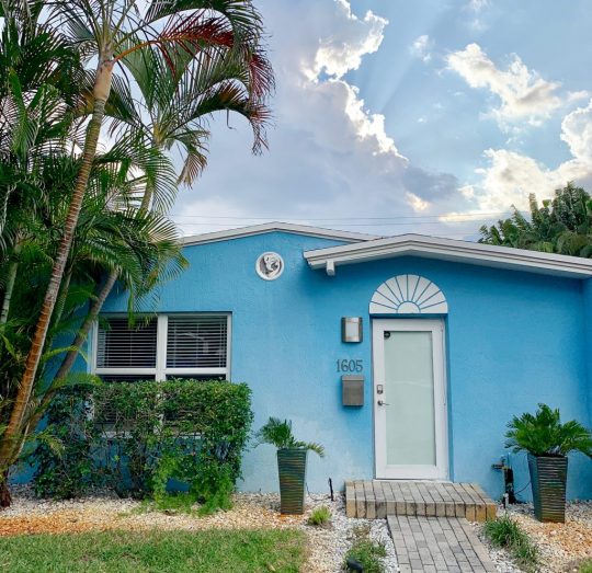
We did a more detailed breakdown of what we did the in the Fort Lauderdale in this post about last year’s trip, but here are some highlights from this year:
Food: Rocco’s Tacos, El Camino, Milk Money, Le Tub Saloon (seen below), To The Moon (candy store), ChillN (nitrogen ice cream)
Activities: Birch State Park (that giant tree shown a few photos up is there), Water Taxi (we went at sunset and it was GREAT), Everglades Holiday Park (probably the most tourist-y thing we did, but it was a lot of fun – a wild alligator swam next to our boat!)

And since we mentioned it, here’s that Tenzi game we played every evening while we were there (you guys have heard us mention it a lot) and of course, we love Uno.
That’s Embarrassing
I wish I had taken a photo of the offending (and aggressive!) closet that “attacked” me in the dark, but maybe it’s best left to your imagination… so that you picture it much more sinister thing than a simple built in dresser. But here are a couple of photos of my unlikely injury:

The photo at left is obviously in Florida, taken the morning after the incident. The other is back in Richmond as the bruising was just past its peak.
And if you’ve picked up the April issue of Real Simple, perhaps you’ve already seen Sherry’s unforgettable quote on page 126. If not, here it is in all its nutty and meaty glory.
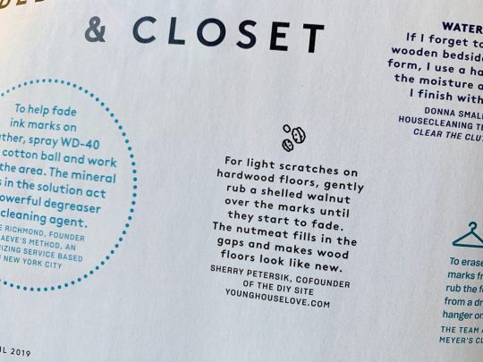
Real Simple Idea House
We’re VERY excited to be designing a room in the Real Simple idea home this summer in Brooklyn, NY. It’ll be happening over the next few months and will be revealed in their October issue. If you follow us on Instagram, Sherry can’t wait to share more over there as we go.
You can see photos of last year’s house on Real Simple’s website (gulp – no pressure or anything!) and I know both Jenny Komenda and Shea McGee did blog posts with more details about their rooms in the house (that’s Jenny’s room below).
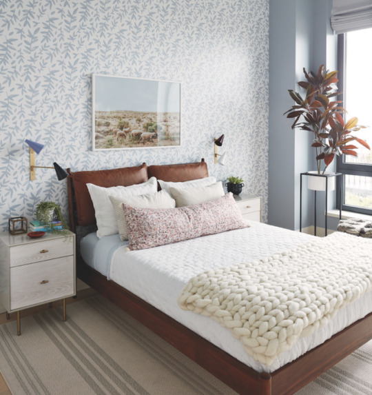
Quick Tip
Here’s a link to the Gemini Photos app I like using for sorting and culling down pictures on my phone. By grouping similar shots and automatically suggesting that you keep only the “best” one (along with any you’ve favorited or edited) and then allowing you to delete the rest of them in one click, the app helps you cull down tons of photos without much stress.
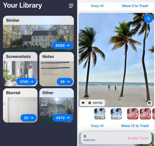
We’re Digging
There’s my new StudBuddy stud finder in action during a recent project at the duplex. I took a video of it as well, so maybe I’ll convince Sherry to post it to IG Stories this week so you can see it in action.

And here’s Sherry new go-to sunscreen for her sensitive skin, Neutrogena Clear Face Liquid-Lotion Sunscreen.

If you’re looking for something we’ve dug in a past episode, but don’t remember which show notes to click into, here’s a master list of everything we’ve been digging from all of our past episodes. You can also see all the books we’ve recommended on our Book Club page.
And lastly, a big thank you to Agility Bed for sponsoring this episode. Use the code YHL at AgilityBed.comto get $200 off any size hybrid mattress.

Thanks for listening, guys!
*This post contains affiliate links*
The post #137: The Next Home We’re Taking On appeared first on Young House Love.
#137: The Next Home We’re Taking On published first on https://novaformmattressreview.tumblr.com/
0 notes
Text
The Duplex Kitchen Backsplashes Are In!
We’re nearing the finish line on both of the duplex kitchens and today we’re psyched to share one HUGE to-do list hurdle we recently cleared: tiling both kitchen backsplashes! Yes, since it’s a two-unit house, we had two kitchens to install at once, and then we had two backsplashes to do, which was pretty daunting going into things, but we managed to knock them both out on a recent 3-day weekend. And it feels great to have them off of our to do list. So today I wanted to share how they turned out, along with 8 things you can do to set yourself up for a speedy and successful tile project.
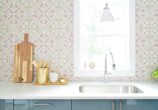
We still have some smaller projects to do before they’re 100% done – like adding shelving to these tiled kitchen walls. But that didn’t stop Sherry from tossing out some styling accessories to make it look a smidge more done than it really is. She’s in charge of morale.
So let’s kick things off with a quick before & not-quite-after… because those shelves are still coming – along with a few other finishing touches. But it’s definitely coming along in here. This was the room after we finished installing the cabinets (more on that here) but before we had started on the backsplash:

And here it is now:

The floor-to-ceiling tile adds exactly the visual impact we were aiming for by bringing in a big dose of color and pattern to each kitchen. It’s even visible from the front door (if the living room hadn’t been a disaster I would’ve taken that further-back photo for you). So it adds a lot to the entire downstairs vibe, not just the kitchens.

As you may remember from this tile selections post, both tiles are from Tile Bar. The pink pattern (with the blue Ikea Kallarp cabinets) is called Bella Tate and the blue pattern (with the wood Ikea Askersund cabinets) is Bella Moma. We also grouted both with our favorite grout, Mapei Flexcolor in Warm Gray (more on why we pretty much only use that for everything here).

They’re both nice durable porcelain tile (even though they look like cement tiles – which would have required more maintenance and could stain), so yay for getting the look without the more finicky material. Both tile styles are about 9 x 9″ in size, and both were $7.99 per square foot. So the tile for each side cost us just under $400 per kitchen! It’s not the cheapest backsplash we’ve ever done (this one is), but it still feels like a pretty sweet deal for such big statement!

They were also both fairly easy to install (again, we tiled, grouted, and photographed both of them in just 2.5 days). But the installation process reminded us that, say it with me, PREP & PLANNING IS KEY TO A SUCCESSFUL TILE JOB. Yes I’m throwing in some bold and some caps lock.
It’s certainly not the most fun or satisfying part of the process, but taking the time upfront to plan your pattern placement and prep your materials will make your life way easier. And more importantly, it’ll make your end result MUCH BETTER. So even though you’ll be antsy to bust open your bucket of mastic and fire up your wet saw, take the hour or so ahead of time to do these and you’ll always be glad you did.
8 Things To Do Before You Start Tiling
Before I get into the list, I’ll say that a lot of these relate to using medium-to-large tiles (and especially those with a design or pattern printed on them). You can ignore some of these if you’re using smaller tiles like a mosaic, penny, or hex tile. Why? Because of lot of this is about avoiding small cuts or slivers of tile. That’s not as much of an issue with small scale tile, but on larger tiles, slivers can be hard to cut and, worse, can cause your pattern to look off-center and even accentuate unlevel or uneven walls. That may sound insignificant, but it can make a big difference in how professional your result looks in the end.
1. Find Your Max & Minimum Measurements
Now, you’ve probably already measured your walls when you calculated how much tile to buy. But it’s always a good idea to get precise measurements (like down to the 1/8th or even 1/16th of an inch) before you start cutting anything. And since walls and ceilings often slope, you’ll want to measure as many sides of your tiling area as possible to figure out your maximum and mimimum distances. For instance, the chimney side in this kitchen was a 1/2″ shorter than the height of the opposite corner.
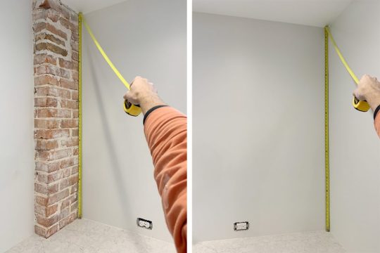
And since walls or ceilings can also bow in or out, your maximum or minimum measurements may occur somewhere in the middle too (as in, the wall can slope up in the middle and back down in the other corner). You can quickly check for bows by holding a long level in the corners and seeing if the entire level makes contact with the wall, or if your wall bends away from it at any points. Minor bows aren’t a big deal (they can be filled with grout or caulk) but significant bows can change your max or minimum. That spot where it bows might actually be the tallest or shortest point on your wall.
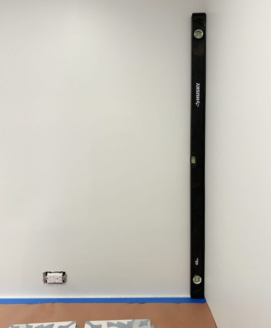
I won’t bore you with the specifics of our measurements, but for the sake of this example, let’s say our max measurement was 63.5″ from counter to ceiling on one side and our minimum was 63″ on the other. Once you know this, you can start figuring out how to best fill that space with your tile.
2. Lay Out & Measure Your Tile
Once you have those measurements you may be tempted to just work things out on paper (“My wall is about 63″ and the box says the tile is 9×9” so I can fit 7 whole tiles – easy peasey!”). But I urge you to make the time and space to physically lay out a row of tiles WITH SPACERS on the floor somewhere to get more precise measurements. Plus, I also find it’s a great way to familiarize yourself with how the pattern should be laid.

In doing this we realized our 9 x 9″ square tiles were actually closer to 8.75 x 8.75″ (yikes!) and with 1/16″ spacers between each, the math got a bit trickier. Suddenly 7 tiles didn’t completely fill the 63″ wall as exactly as we might’ve assumed on paper.
If we had just gone for it, we’d be about an inch short on one side and we might find ourselves having to fill that gap with a 1″ sliver of tile. Which would look so glaringly bad, everyone would see that and say… this was not planned very well. Plus, because of our ceiling slope, it would’ve tapered to be just a half inch sliver of tile at the other end – which is basically impossible to cut and install. It also would have really drawn your eye to the fact that the ceiling isn’t perfectly level. So yeah, don’t do that.

I’ll jump ahead to our strategy for avoiding a sliver in this scenario – which you can see in the progress photo below. Since we basically needed 7 full tiles plus an extra 1″ to fill the wall’s height at the max point, we used 6 full tiles plus 2 slightly-bigger-than-half tiles on top and bottom.
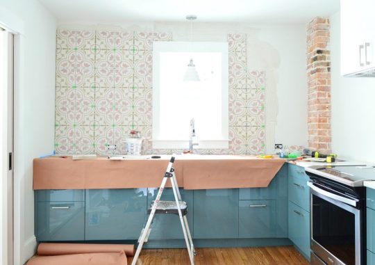
Not only did that help our pattern look centered top-to-bottom, it also helped disguise the slight slope in the ceiling because your eye doesn’t detect that the top tile is 4.5″ on one end and 5″ on the other side. They both read as roughly half a tile.
Starting with a half-tile on the bottom row also helped solve another potential hiccup we identified, thanks to our upfront planning…
3. Plan Ahead For Outlets & Obstacles
You’ll also want to factor in any obstacles that might complicate your cuts. For us, this was just the outlets along the back wall, but it also might include switchplates, cabinets, potfillers, etc. Sidenote: we like to have kitchen outlets installed horizontally and close to the counters. They’re easier to hide that way and it prevents you from having visible cords running halfway up your walls.

But back to the tile: starting with a full tile on the bottom row would’ve meant cutting some holes SMACK DAB in the middle of a tile (a thing that’s hard to do and we’re not particularly good at). Cutting along an edge, however, is much faster and more in our wheelhouse. So that half-tile along the bottom row actually lined up nicely with the outlets and made our cuts much, much simpler.

4. Plan Your Pattern Side-To-Side Too
A lot of what I’ve shown so far is about planning your tiles top-to-bottom, but don’t forget to plan it side-to-side as well. That means measuring your space precisely, using a level to check for slopes or bows, and maybe even laying out your first row in place to plan your cuts, like we did below:

Again, the important things here is to avoid weird slivers anywhere and make sure your pattern will look centered. For ours, we knew we wanted the pattern to look centered on the window/sink. We lucked out because centering a seam between two tiles under the window allowed us to use a half-ish-tile on the chimney side and a full tile on one end (except for where it bowed in slightly further up the wall and we had to shave a bit off – which is much better than adding a sliver – we’ll take cutting something slightly down over a sliver any day since it looks cleaner and doesn’t emphasize the imperfection as much).

Normally it would bother us that it wasn’t full tiles on both sides of the wall but the chimney already makes the room a bit asymmetrical so visually it still feels nice and balanced with the entire pattern centered on the sink and the window.
5. Double-Check That It’s Level
If you plan to use your countertop as a guide for placing your first row, you’ll want to make sure it’s level first. Even if it’s not perfectly level, you may want to use it as your guide anyways because it’s one of the closest things your eye will compare your tile lines to when all is said and done. Just make sure that it also is level to any nearby horizontal surfaces like the bottoms of the cabinets or the window sills.
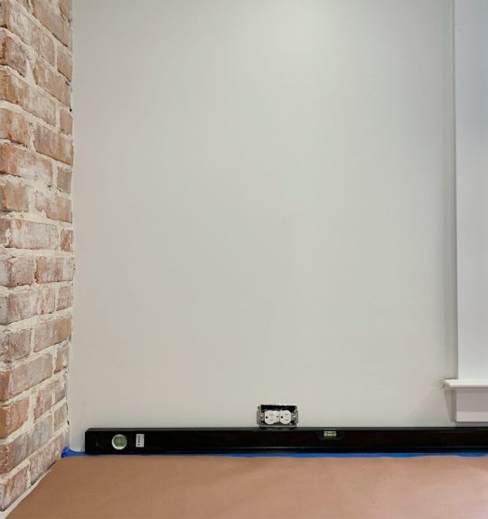
It’s especially important to check that things are level if your tile is going to span across areas without continuous counters to rely on as a guide (like behind your stove or across a doorway). If things are not level or not lining up across those gaps, you may want to draw a level line on your wall to reference as you go – and be sure to check that your first row stays level as you lay it!
6. Cut Your First Row
Our counters were level, so we knew our first row of tiles could all be cut to the same height (again, roughly in half – so that it would line up with the top of the outlets). We like to cut our first row of tiles all at once before we start installing anything, especially while all of this planning and measuring is fresh in our heads. And assuming your tile saw (here’s ours) has a guide that you can lock in place – it’s an efficient way to knock out a lot of cuts that all have to be the same length.
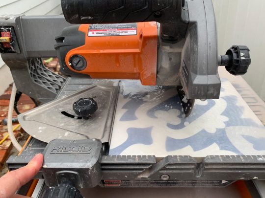
You still may need to come back and make some cuts around your outlets or corners, but this makes setting your first row much faster (which is especially important once you’ve got mastic drying on the wall).

But let’s move away from all of this pattern planning and talk about some other prep to help speed your job along.
7. Protect Your Work Area
As you’ve seen in some of these shots, we like to cover our countertops (and nearby floors) with red rosin paper. It’s like brown craft paper, but it also has a moisture barrier that can keep that big soggy drop of mastic or grout from seeping through to your counters.
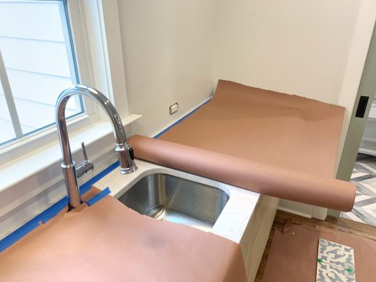
Before we roll it out and tape it down, we actually like to run a line of painter’s tape along the counter first. You want it to be close enough to the back wall to protect your counter – but not so close that your tile will later cover it. We just find that it’s easier to be precise with this tape placement when we’re not simultaneously wrangling a big roll of paper too.

And if some tape does get stuck under your tile, don’t worry. Just get out as much as you can (I sometimes even use the edge of a sharp utility knife to cut bits out) and any small pieces you can’t get out will likely get covered by caulk later.
8. Trim Any Moldings Interferences
Another thing you may consider doing to save yourself a few difficult cuts down the road is this: bust out a Dremel or similar tool and make room for your tile to slide behind any funny moldings – like the sill on the window below.
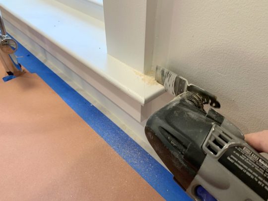
Cutting out that little chunk means that now any straight tile edge can slide neatly behind the sill, rather than having to carve some craggy notch into your tile.
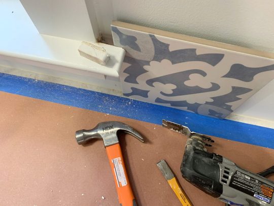
If you don’t want to do this or don’t own a tool to make it easy, it’s not the end of the world to cut the tile around the sill. But I think you’ll find it this method faster/easier, and it will give you a cleaner look in the end.
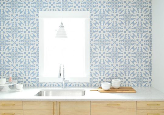
Again, I know all of these tasks may feel like you’re just burning time you could be using to actually tile – but I think you’ll find that it ultimately makes your project got more smoothly and you’ll be happier with the end result. Because believe me, there have been times that I threw caution to the window and just winged it. Sometimes it worked out just fine, but other times I was left cutting small slivers of tile that made my final result feel a little shoddier than I wanted (granted, I may be the only one who notices these things).
Fortunately these backsplashes are not one of those times. Even with a persnickety pattern and a few fun curveballs (hello connecting tile around a window!) we’re beyond happy with the results.

Now we just have to check off a few more things in here, fill the kitchens with actual plates/cookware/etc, and we should be able to officially stick a fork in these babies. That was a kitchen pun if you didn’t notice. The fork part, not the baby part. Okay forget it. Bye!
PS: If you want to see some other tiling projects or get more tiling advice, check out these posts below:
What Makes Some Floor Tiles Easier To Install Than Others
The Only Grout We’ll Ever Use
Installing A Subway Tile Backsplash for $200
How To Paint A Bathroom Floor To Look Like Cement Tile
Adding A Marble Herringbone Backsplash To Our Laundry Room
*This post contains affiliate links*
The post The Duplex Kitchen Backsplashes Are In! appeared first on Young House Love.
The Duplex Kitchen Backsplashes Are In! published first on https://novaformmattressreview.tumblr.com/
0 notes
Text
#136: Maximizing House Joy (For Minimal Money)
This week we’re talking to Joyful author and expert Ingrid Fetell Lee about some simple ways to inject joy into your home without breaking the bank. She also explains why joy is easier to achieve than happiness – and how seeking it at home can actually help you unlock your decor style. Plus Sherry marked her recent birthday by getting a long-awaited tattoo (actually, two of them!) so she’s explaining the meaning behind them, how much it hurt, and what finally convinced her to go for it. We also share our latest escape room attempt, how we’re battling car clutter, and a BIG change to the podcast that you won’t want to miss.
You can download this episode from Apple Podcasts, Google Podcasts, Stitcher, TuneIn Radio, and Spotify – or listen to it below! Note: If you’re reading in a feed reader, you may have to click through to the post to see the player.
What’s New

That’s a little birthday decor the kids and I surprised Sherry when she turned 37 last month (phew, we’re finally the same age again). But while we don’t have pictures to share of our Escape Room escapades (photography isn’t allowed, and you know we’re rule followers), you can hear more about our first experience with one in Episode #43.
If you’re local, the place we go is Escape Room RVA. They also run the VR version where you get “kidnapped” to Warehouse 29 AND the kid-friendly version at Stony Point called Gnome & Raven.
And if you missed the “unveiling” on Instagram, here are the tattoos Sherry got for her birthday (thanks to the talented Amy Black).

As Sherry described in the episode, the 7-leafed laurel is because 7 is a significant number in our relationship and family, and the letter “V” is for two important women in her life, her grandma Victoria and great-grandma Vincenza.
There are more photos and details in these archived Instagram Stories too.
New Intro Song
And now, for the MUCH AWAITED DEBUT of our new podcast intro song in video form. This is a must watch (especially if you’ve followed us for a while):
NOTE: If you’re reading this in a feed reader, you may need to click through the post for the embedded video to show. You can also watch here on YouTube.
And below you can catch some of our previous forays into hip hop stardom. Here’s the original rap from waaaay back in 2013:
NOTE: If you’re reading this in a feed reader, you may need to click through to the post for the embedded video to show. You can also watch here on YouTube.
And this is the follow-up we premiered the following year, under the guise of a “DIY Craft Challenge.” This one was filmed when Sherry was just few weeks away from giving birth to our son in 2014.
NOTE: If you’re reading this in a feed reader, you may need to click through the post for the embedded video to show. You can also watch here on YouTube.
And if you wanna see all of our previous non-musical April Fool’s posts, here are our last ten years (10!) of foolishness.
2018 – Our beach house workout video
2017 – The launch of our novelty sock line
2016 – An app for swapping out decor items
2015 – Alexa for home decorating
2014 – A household crafting challenge (or is it?)
2013 – “Hush” – our debut music video
2012 – A totally reasonable toilet purchase
2011 – Burger’s very own playroom
2010 – A super classy curb appeal upgrade
2009 – The purrfect light fixtures
Ingrid Fetell Lee, Joyful
If you missed our previous discussion of Ingrid’s book, Joyful, you can hear it in Episode #130.

And as we mentioned, you can find a lot more info & tools (worksheets!) on Ingrid’s website: Aesthetics of Joy – including the Resources section, which features videos, worksheets, and more.
Below are some peeks into the cottage she described in the episode, and you can see more (as well as read about how she brought joy into this house) on here on RealSimple.com.

Speaking of colorful books, we talk more about decorating with books (including color coding & facing them backward) in Episode #127 and Episode #85.
You can also hear about Sherry’s closet in this closet tour post and in Episode #115.
We’re Digging
I will not show you a picture of our messy car, but here’s the mini trashcan we got to help us keep the inside a little neater. It’s all about having a system that you can stick to, right? So for under $10 we went for it. We got the all black one (surprise) and we store it in the passenger side door’s cup holder.

And if you’ve got an iPhone, you can find the “Do Not Disturb” options right near the top of your Settings. You can see how we have ours scheduled for nighttime hours, and how it still allows calls from our “Favorite” contacts to break through – and how “Repeated Calls” can help anyone get through if they call twice within three minutes.
If you’re looking for something we’ve dug in a past episode, but don’t remember which show notes to click into, here’s a master list of everything we’ve been digging from all of our past episodes. You can also see all the books we’ve recommended on our Book Club page.
And lastly, a big thank you to Cree LED Light Bulbs for sponsoring this episode. Find out why better lighting matters at CreeBulb.com and learn more about why they’ve become our go-to bulb in our light bulb resource post.

Thanks for listening, guys!
*This post contains affiliate links*
The post #136: Maximizing House Joy (For Minimal Money) appeared first on Young House Love.
#136: Maximizing House Joy (For Minimal Money) published first on https://novaformmattressreview.tumblr.com/
0 notes
Text
Before & After Of The Back Of The Duplex
Earlier this month we showed you the front porch makeover of the duplex, and today we’re taking you around back to show you how the backside has been transformed (hindquarters? rear? rump? let’s just stick with backside). And yes, you can finally see my beloved diamond doors in all of their glory! Along with the little metal awnings we added, our new back steps, and even those outdoor showers (covered by an extra long metal awning for privacy). Ok and also cute-factor because apparently I’m just really into awnings.

There’s actually a lot of work being done to the back yard at the moment (sheds, patios, and fences are in progress as you read this!!!!) but I’m so glad we snagged these photos before it turned into a chaotic work zone again. Otherwise you’d be seeing sawhorses and wheelbarrows everywhere in these photos. Once the backyard landscaping/hardscaping makeover is done we’ll obviously share a big post full of photos – but for today let’s focus on the back of house itself and how far we’ve come. Because baby, it’s almost unrecognizable.
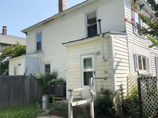
Yes, that picture above was what the back of the duplex looked like when we bought it: rotten siding, rickety railings, cinderblock steps, strange old vents and wires, inoperable HVAC systems where our outdoor showers now reside. And lower-level bump-outs on each side where the old kitchens used to be (one actually had a toilet just sitting right next to the back door without any walls closing it in… about two steps from the kitchen sink).
Besides fixing all of that stuff – one of the biggest changes has been extending those bumped-out areas up to the second story. As you may remember from our floor planning posts, we got approval from the historic review board to add those small second-level additions so each side’s rear bedroom could have an en suite bathroom attached to it (that’s why the window up there isn’t full size).
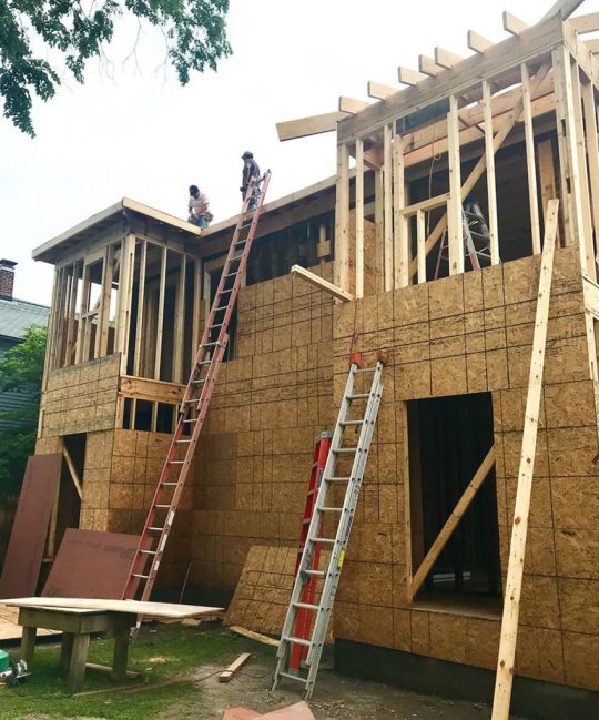
Between those two new master baths and the two powder rooms we added under each staircase, we took each side from having just 1 full bath to 2 1/2 baths each. Well, I guess the left side previous had 1 full bath and 1 random kitchen toilet. Does that count as a bath and a quarter…?
Predictably, all of my favorite features are the ones that add extra architecture and character – like the corbels along the roofline (which also wrap around the front of the house), and my precious diamond doors (remember how I hunted them down secondhand because the diamond windows in the front of the house just made them feel like the perfect touch for the backyard?).
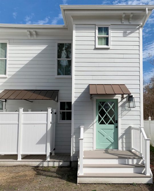
You may recall that we had to keep the original doors on the front, but the back was up to us – and the diamond doors are 100X more fun than the 90’s metal doors someone added at some point. So not only have we carried the diamond pattern from the front windows around back, we also painted the back doors the same mint color as the front shutters (Sherwin William’s Pale Patina).

We also used the same lanterns out back to keep things feeling consistent. And we spent a little more money upfront to have the back porches, stairs, railings, and showers constructed in no-rot materials like vinyl and Azek. After it took several days last summer to stain our wood side stairs and back stairs at the pink house, we regretted adding that sort of maintenance to our to-do lists (over time the stain + time spent on upkeep will surpass the one-time upcharge to have them made from no-rot materials).

So keeping things lower maintenance and more failsafe at the duplex was an easy choice. (*Cut to me loudly wailing “If I Could Turn Back Tahhhhhhm For The Beach House Steps”*). Oh well, at least the front steps on each house are brick.
The awnings are actually just stock metal awnings that we bought online (we went with the bronze color). We originally just bought the two smaller awnings over the doors, but later added the larger one that runs over the showers when we realized you could partially see into the showers from the windows above them. Uh yeah, CREEPY. Fortunately, it turned into a nice accent to carry across the whole back of the house, and the showers + the awning in the middle make that space feel less dented in and more dimensional, so I’m calling it a win.

Since the duplex is two separate vacation rental units, we’re adding a dividing fence that’ll divide the two yards (it will basically follow that central line where the outdoor showers meet). BUT, since we know there will be instances where the same family or a group of friends rent both sides of the house – we’re putting a big six foot gated area so people can throw open the gate if they want to merge the two backyards (or keep them closed for full privacy if they don’t know each other).

The funny thing is that the original duplex backyard was divided by a fence like that, but it didn’t have the flexibility of a large 6′ gate to open if you wanted to share the space, so that should be a nice addition, along with the two paver patios and sheds that we’re adding.

Looking at that old before picture above makes me RIDICULOUSLY excited for the rest of the work back here to be completed and for things to start greening up again. Look how lush the trees and the grass are! Even though it’s a before picture, it’s amazing how much charm flowering trees and green grass can add.
Our entire impending yard makeover (including landscaping, fencing, patios, furniture, sheds, EVERYTHING!!!!!) should be done in the next month or so, and then renters will be able to enjoy it all this summer. And since every time we mention the duplex we get asked when we’ll start booking, our goal is to have it on Airbnb by next month for weekly vacation availability this summer. You’ll definitely know when it’s listed ;)
I should also note that I’m pretty jealous that the duplex outdoor shower stalls have been completed long before ours over at the pink house (we’ve had an open-air outdoor shower since last year, but no stall around it for coverage – so it’s currently a zero privacy experience). But hopefully not for long!
P.S. To see all of our duplex adventures, from buying it and planning the layout to completely updating the inside, adding floor tile and a kitchen, etc – this entire category has you covered. And here’s one for our beach house adventures.
*This post contains affiliate links*
The post Before & After Of The Back Of The Duplex appeared first on Young House Love.
Before & After Of The Back Of The Duplex published first on https://novaformmattressreview.tumblr.com/
0 notes
Text
#135: How Many Dollhouses Is Too Many Dollhouses?
If you think our podcast has tackled this question already, JUST YOU WAIT! The universe recently tested Sherry’s dollhouse fixation and whether she passed or failed it, well, may depend on who you ask. We also share what item Ikea was mysteriously selling in bulk – but only in America (we laughed out loud at the big reveal) and we hear from some listeners about how space makeovers can affect behavior in a fascinating way. Plus some interesting lessons someone learned when they challenged themselves to dress in only one color. And we talk about the always emotional topic of textured walls. Buckle your seatbelts.
You can download this episode from Apple Podcasts, Google Podcasts, Stitcher, TuneIn Radio, and Spotify – or listen to it below! Note: If you’re reading in a feed reader, you may have to click through to the post to see the player.
What’s New
Below is a “before” of the dollhouse that our friend recently offered up to us, despite having already accumulated our fair share of dollhouses over Christmas. You can hear more about those in Episode #124, as well as the little “Sweet Shop” (that basically counts as half a dollhouse) in Episode #130.
Does it remind you of a certain home we know and love? Especially now that our brick is painted white.

Sherry and our daughter have already had a lot of fun fixing it up, so I’m sure she’ll post about how it turned out and detail all of its tiny contents soon. In the meantime, you can read about how they fixed up our son’s dollhouse already.
Updates
You can hear the original mention of Wheel of Goon / Goon of Fortune in Episode #133 where we talked about design norms from around the world. If you wanna see the game in action, just google “Goon of Fortune” and a few videos will pop up for your viewing pleasure.
Also, here are those Ikea articles that listener Jo was kind enough to share with us: this one about how Ikea tweaks its designs for each country (including the anecdote about the vases) and this one about how many of Ikea’s images are now computer generated. Here are some examples from the article below:

You can also hear our original discussion of the book Joyful in Episode #130.
And there’s more info on Sherry’s minimal and mostly black uniform in this closet tour post and in Episode #115. And I believe we also mentioned Sherry’s “salad-dressing” face routine too, which you can read more about here.

Also, speaking of using parameters to your advantage, we talk in Episode #97 about what we learned by creating some major shopping parameters for ourselves as part of a “No Spend Month” and in Episode #131 we share the lessons we learned from creating parameters around our TV watching.
And if you want to listen in on the original debate about shoes off or on in the house, it’s in Episode #132. Below are some charts (charts!) summarizing the nearly 10,000 responses we now have (we got more since we recorded the episode).

The main thing to note is the big difference between the blue slices, which represents those with a strict practice of always removing everyone’s shoes – which jumps dramatically from Americans (21%) to Non-Americans (62%)
It’s also interesting to note that the green slice (“don’t really care”) is nearly three times as large for Americans.
Can We Just Talk About Textured Walls?

The photo above (from our bonus room) is a pretty good demonstration of the smooth walls we have in our home – and have had in all of the homes we’ve owned. Literally never had a textured wall or ceiling anywhere.
By contrast, here’s an example of a space with texture on both the ceiling and wall, which definitely seems to be regional as well as more prevalent in certain home-building eras.

image source
I’m not a pro in all of the taxonomies of texture treatments, but I believe the ceiling above is considered a “swirl” or a “comb swirl” treatment and the walls are “knockdown” texture. Here are a few others with my best take at identifying them:
image sources: orange peel / knockdown / stipple / popcorn
And now on to the important part – the poll!
Loading…
We’re Digging
This is the book I’m SO happy you guys recommended to me: The Immortal Life of Henrietta Lacks. If you want to get a flavor for what it’s about and why it was way more fascinating and engaging than even I expected, here’s a trailer for the movie HBO made based on the book:
And here’s the version of Ticket To Ride that we’ve been playing (it’s the standard, grown-up, American version). There are also lots of other variations like Ticket to Ride: First Journey (for kids), Ticket to Ride Europe, Ticket to Ride New York, and even specific countries in Europe too.
Here are some other games we’ve been playing with our kids (ages 4 and 8) lately too:
Happy Salmon
Clue Jr.
The Game of Life Jr.
Tenzi
If you’re looking for something we’ve dug in a past episode, but don’t remember which show notes to click into, here’s a master list of everything we’ve been digging from all of our past episodes. You can also see all the books we’ve recommended on our Book Club page.
And lastly, a big thank you to Rothy’s for sponsoring this episode. Use code YHL at Rothys.com to get free shipping with no minimum order!

Thanks for listening, guys!
*This post contains affiliate links*
The post #135: How Many Dollhouses Is Too Many Dollhouses? appeared first on Young House Love.
#135: How Many Dollhouses Is Too Many Dollhouses? published first on https://novaformmattressreview.tumblr.com/
0 notes
Text
A Quick & Easy Way To Hang Curtain Rods
Last fall we shared our trick for hanging affordable Ikea curtains so they look a lot more expensive than their $14 price tag per panel would suggest (across an entire house you can save thousands with that trick & these curtains alone!!). But since we were just replacing our old bedroom curtains when we wrote that post, we skipped the crucial step of actually hanging the curtain rods themselves. And since we just installed approximately one million curtains at the duplex (okay, 16 of them, but that’s a pretty notable amount to hang all at once) we wanted to share a new trick that we used to speed things up, keep everything looking level and equally spaced, and make it much easier and less overwhelming in general.

But first, let’s establish some quick curtain basics:
How HIGH Should You Hang Curtain Rods?
Like anything in decorating, there’s not a hard and fast rule for this, but most people agree that curtains look best when they’re hung (say it with me!) HIGH AND WIDE. As in, higher and wider than the window itself. This not only creates the illusion of a bigger, grander window, but it also makes your room feel taller and draws the eye up. This is a 9′ room below, and you can see how nice it is for the window trim to get to breathe a little, and the eye goes from floor to almost-ceiling thanks to those long white curtains and that highly hung rod.
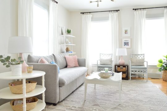
sofa | side table | coffee table | rug | bookcase | lamps | wall: SW White Heron | trim: SW Stone Isle
Speaking of the floor, most experts say that your curtains should usually touch or nearly touch the floor itself. This is all personal preference (some like them to hover slightly above the ground, others love a dramatic pool of fabric at the bottom) but we typically like them to graze the floor ever so slightly – like below in our showhouse’s dining room. We find this helps keep them in place better (when they don’t quite touch they tend to just hang randomly, but when they graze the ground they ground themselves and stay put if that makes sense).
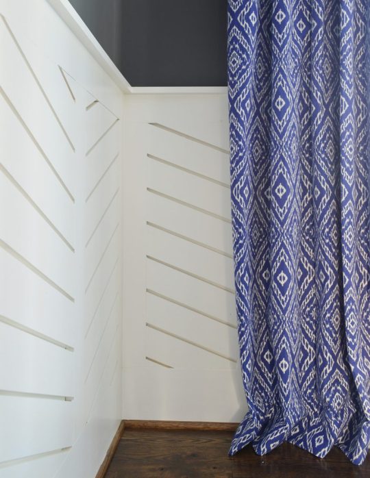
Having them just touch and not be extra long and pooled makes them easier to move for vacuuming and ours don’t get all dragged around and gross on the bottom since they’re not excessively long (bonus: remember these curtains are 100% washable! In fact one of the first steps of getting them is to wash them to preshrink them so whenever you wash them again later, they don’t shrink on ya and the rod is still in the right place – more on that here).

But back to the rod. The precise placement of yours depends on a few factors (ceiling height, curtain length, trim & molding style, etc) so I can’t give you a hard and fast measurement for where your rod should always go… but generally, we like to hang ours about 3-4″ below the ceiling or, if there’s crown molding, 3-4″ below the bottom edge of the crown.
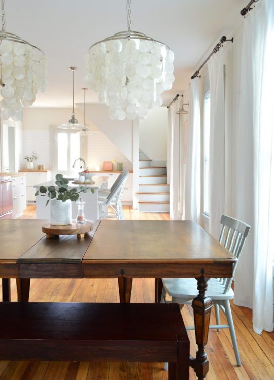
capiz chandeliers | benches | chair | marble vase | stools | pendants | sconces
This allows the curtain rod to “reside” fully (including finials) within the painted area between the window and the ceiling, which always looks SO NICE. But the important thing to note is that we’re hanging them in relation to the ceiling, not the window. It’s the assumption that your curtains need to relate to the window that causes a lot of people to hang their curtains too low. Heck we have seen rods drilled right into the window trim itself, which is just another way to make things feel really squat and cramped.
Remember, trim looks so nice when it’s allowed to breathe without any rods looming over it or being drilled right into it. That being said – sometimes the window trim is really close to the crown, and in that case we like going into the wall above the trim if possible – since the crown or the trim might look tortured with a rod sticking out. This is another picture from the showhouse we designed a few years back to demonstrate what we mean:
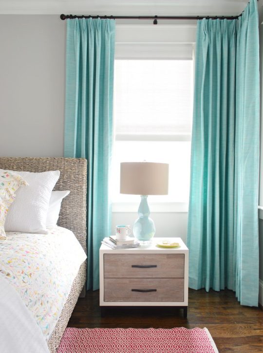
Your best bet is to have someone hold half of the rod up with one curtain panel attached (after you’ve washed, ironed, and done whatever else might change the height of your panel – except for hemming, that should happen once they’re hung so you can get the perfect length). If you step back and view it while someone holds it up for you, you’ll be able to decide what looks best to your eye – and using that 3-4″ below the ceiling or crown molding guideline can help.
Of course there are super tall cathedral ceilings, or rooms where the ceiling height slopes, etc – so this guideline probably works best when the ceilings are 10′ or lower without much of a slope. All super tall rooms or spaces with sloped ceilings are special cases – but again, looking with your eyeballs as someone holds half a rod with a panel on it can really help you visualize what looks best.
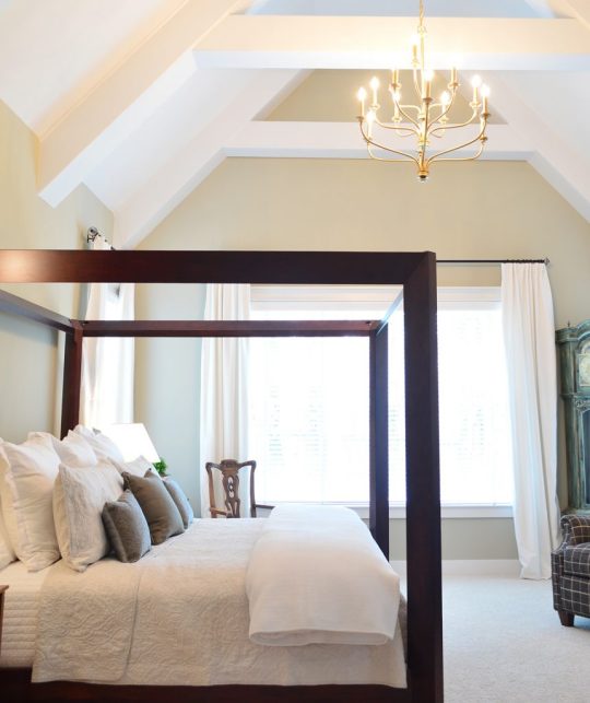
How WIDE Should You Hang Them?
This is another thing that’s influenced by a variety of factors, like the size of the window itself, what else is on the wall (especially if there are OTHER windows nearby), and how tight or loose you want your panels to look. Generally we like to place the rod hooks about 8-11″ from the outer edge of the window trim.
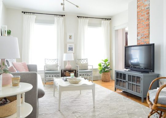
sofa | side table | coffee table | rug | lamps | media cabinet
This gives us the loose, breezy curtains we like, while still allowing us to barely cover the window molding, which is what creates the illusion that the windows are wider than they really are. In other words: THE CURTAIN PANELS ARE HANGING IN FRONT OF THE WALL NEXT TO THE WINDOW – NOT IN FRONT OF THE WINDOW (which makes it look smaller and blocks light). Sorry for shouting, but it makes such an insane difference when people stop hanging their curtain panels right in front of their windows.
We might hang the rods less wide if there are windows that are closer together than usual (like in our bedroom below – where they’re just a few feet apart, plus that one window on the right is very close to the right wall). We don’t want them looking cramped so in the instance below we didn’t go as wide with the rods – but we definitely made it so that as much of the curtain panels as possible could hang in front of the walls around the windows as opposed to blocking the windows themselves.

bed | nightstand | armchair | dresser | floor lamp |chandelier
Conversely, we might hang them even wider than 8-11″ beyond the outer edge of the window trim if we’re trying to fill a large wall space. We might even hang the rod wider on one side than the other if we’re trying to make a window look less off-center (more on that here – it can make all the difference!). So it really is flexible.
Ok, But Now For Our Curtain Rod Trick That’ll Save You Time (On Video)
The reason for all that mumbo jumbo is because knowing the width (your desired distance from the window trim) and height (your desired distance from the ceiling) is what makes this easy trick possible. John demonstrates it all in this video below (also watch for my super cool footwear cameo). There are more photos after the video for those who can’t watch right now, but I’d strongly recommend coming back to view it when you can – things are so much easier to “get” when you see them in action on video – and this skill is handy to have forevermore.
NOTE: If you’re viewing this in a feed reader, you may need to click through to see the video. You can also watch it here on YouTube.
Step 1: Determine Your Measurements
John and I determined that for the duplex we wanted to place our curtain rods 10.5″ from the outside of the window trim (weirdly specific, I know) and 3″ down from the ceiling. I should note that these are our measurements to the screws (the top screw, to be exact) since we find it easiest to work with the measurements of where you’ll actually need to drill. Watch as John models exactly what I mean below:

Step 2: Make Your Template
We used a scrap piece of cardboard to make our template – marking 10.5″ from each side and 3″ down from the top. This was actually the cardboard that came in the curtain package, so you might have something like it on hand already! Once we marked our lines (you’ll see them labeled below), we lined up the curtain rod hook and marked the two screw holes on BOTH 10.5″ marks.

3. Drill Pilot Holes
You can pre-poke holes along these two marks, or you can just do it when you mark your first window. Load up your power drill with a small pilot hole bit (we used a 3/32″ one) and hold your template above your window with the edge lined up with the outside edge of the window trim and the top held flush to the ceiling. Then you can just drill small pilot holes through your two template marks.

Now, a note about keeping things level: CEILINGS AREN’T ALWAYS LEVEL (I’m looking at you, duplex) so using the ceiling as your guide might seem ill-advised. What if your ceiling is sloped and your curtains end up being sloped too?!
Well…. we have actually found that when you’re hanging the rod close to your ceiling, you actually want the rod to follow any slope in the ceiling exactly! It will be your eyes’ closest reference point for a straight line, so it will appear level even if it isn’t!! Meanwhile if you hang the curtain rod level but the ceiling slopes, the rod will actually look wrong! Or emphasize that the ceiling is wrong! So yeah, using the ceiling as your guide actually works well for wonky ceilings (again, the duplex has plenty of those – as does the pink house!).
4. Drill Larger Holes & Add Anchors
Next you’ll want to make your pilot holes on the other side the window using the other half of your template (this is why you marked 10.5″ from BOTH sides of the cardboard) – so you can use it as a template on both sides of each window. Assuming you don’t hit any studs, you’ll need to add anchors after making those pilot holes, so swap out your drill bit for the correct size that works with your anchors (the provided anchors for our rods needed a 3/16″ drill bit) and drill into each premade pilot hole to make larger holes that fit your anchors. Bonus – the template acts as a great way to catch drywall dust. John was very excited when he discovered this. Just look at the joy on his face.
With all of your anchor-ready holes drilled, gently tap in your anchors in with a hammer or mallet. As I passionately interject in the video, your anchor holes shouldn’t be too loose or the entire curtain rod will be rickety and won’t hold up. And you shouldn’t be able to push your anchors into the wall by hand or the holes are way too loose (which can cause your rod to sag or fall out of the wall). So using the correct drill bit size for your anchors is important. It should be indicated in your curtain rod’s instructions or on the box that your anchors came in.
5. Screw Your Hooks To The Wall
The rest is pretty straightforward – hammer in your anchors and secure your curtain rod hooks to the wall using the provided screws. I insisted on filming John as he demonstrated this part too, so if you want to see it in action you can catch it in the video above. Truly I think watching these things get done in real-time is worth a thousand blog pics & words – so check out the video whenever you have a second.

Bonus Tip: Correct Any Rod Sagging
I’m gonna throw in another little hack here. Depending on your rod and how wide it is, you may notice that it appears to sag a little bit in the middle – especially where the smaller rod piece connects into the larger ones. Even if it’s super secure to the wall, it’s just that the skinnier middle rod looks like it’s sloping down to your eye – and I’m Type A to notice this and hate it. Your package may come with a third hook to hang in the center of your window if you reach a certain span with the rod, but often ours aren’t super wide so another support bracket would be overkill – so we rely on this weird little hack instead. Emphasis on WEIRD.
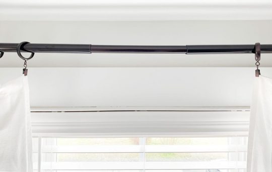
First, I take some of the protective plastic end caps that come on the curtain rods (they’re just packaging) and use a utility knife or scissors to cut off some small slices.

Then we tuck a piece inside the curtain rod at whatever connection point is sagging. It’s important that you put it on the TOP side of the rod and if you can’t slide it all the way in, just rotate your rod slightly so it’s hidden from view because no one is viewing your rod from the top. I know it’s REALLY weird, but it has been an easy way for us to correct a little bit of rod sag which makes my heart very happy. Just trust me – there is a noticeable difference and it no longer looks like it’s sad and droopy. Plus it’s free and I’m scrappy. So yeah. Five stars, would recommend.

That should pretty much do it for hanging the actual rod itself. And again, you can check out the post from last fall with our tips for actually preparing & hanging these inexpensive white curtains themselves. Between this post and that one you should be able to add curtains that are extra affordable (and washable!) along with tackling a whole bunch of windows at once, which might have felt overwhelming or nerve-wracking before. And you’ll definitely be faster with our little template trick too ;)

sofa | coffee table | rug | lamp |bookcase
Oh, and the curtain rods we typically use are either these oil-rubbed bronze ones with these ring clips (ordering them online means you don’t have to run from store to store to find enough that all match) and sometimes we grab these Allen + Roth rods from Lowe’s in person if they have enough (their stock is often spotty).
When NOT To Use Curtains
“Wait, what if I have baseboard heaters or a built-in bench or something under my window?
I get this question a lot so I couldn’t end this post without touching on it. Some spots just aren’t great for a curtain panel. If it can’t hang all the way to the ground, sometimes it can make a room feel awkward to hang a not-quite-full-length curtain panel. There are definitely exceptions where cafe curtains can look really sweet, but we generally just go whole-hog (full curtains from floor to almost-ceiling) or skip curtains entirely in that spot. Take our dining room, for example, which has two heat registers right where curtains would hang, as well as a window that’s super close to the corner – so the panel would cover a lot of the window instead of having a wall to hang in front of:
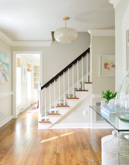
capiz light | stair runner | entry table | glass jug
We just skipped curtains in there and went with woven shades. The room still flows nicely with other rooms nearby, since we kept the woven shades consistent throughout the first floor of our house.
For example, these are the same shades in the kitchen (you can read more on our curtain reno here):

Clearly we couldn’t have long curtains hanging down from those kitchen windows since they’d hit the counter – so we just went with the nice warm texture that shades added.
And here’s the living room, which DID have room for nice long curtains (and we love the softness they add), so we did BOTH in here. The woven shades tie into the other spaces that also have them with or without curtains…
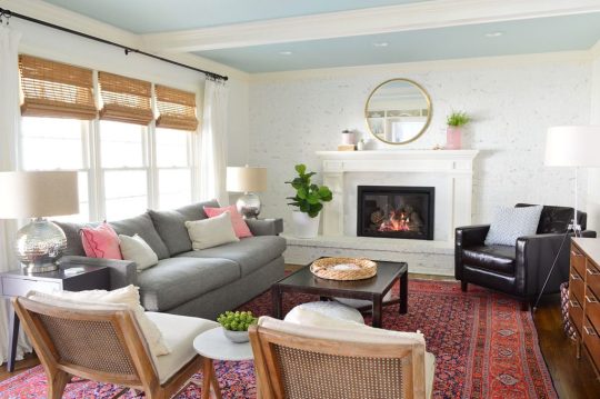
sofa | chairs | side tables | marble table | floor lamp
… like our home office, which also has both.

desk chairs | parson desk | rug | bookcases
Our home office is actually a nice room to use as an example that you don’t have to treat all windows in the same room the exact same way. See how the windows along that right wall wouldn’t have room for curtain panels and the cork board (they’d basically cover the area where the cork board is, if we hung them wide so they didn’t entirely block the window?). So we just skipped them on that wall. Still looks fine having them around the bay window and not around those front windows, which also have heat registers that the curtains would have blocked on both sides. So it worked out just fine. It’s kinda like the bay window is the star, and the front windows are just supporting actors.

My closing lesson would be: general curtain rod guidelines and a trick to hang them more easily & quickly can be handy, but when it comes to the whole “what would look good in here” question, every single person might have a different challenge, layout, etc – so it’s really smart to have someone hold things up and step back and trust your eye. Try different heights. Stare at a picture of a certain window shade on your phone while standing in that room and looking at the window. Really try to picture things before you commit. Heck, you can even try photoshopping different solutions or printing out a photo of your room and drawing right over it (color blinds or curtains right onto the pic – this is the original photoshop – ha!).
And don’t forget to consider woven blinds or even a pretty patterned roman shade (like this) for certain spots where curtains wouldn’t quite work – and remind yourself that it’s ok to just take your time and figure things out as you go. So many of our rooms have had curtains or blind changes while we figure it out – so don’t beat yourself up about it if it takes a second try.
P.S. Wanna know where we got something in our house (or what color’s on the walls)? Click here. And we made the same masterlist of sources & paint colors for the beach house too for ya. And we’re pulling together a source lis for the duplex – it’s not very thorough yet, but a lot of the stuff we have there is on this page for ya – and there’s more to come.
*This post contains affiliate links*
The post A Quick & Easy Way To Hang Curtain Rods appeared first on Young House Love.
A Quick & Easy Way To Hang Curtain Rods published first on https://novaformmattressreview.tumblr.com/
0 notes
Text
#134: Where Have All The Family Photos Gone?
Today we’re sharing how to find the right balance when you’re choosing between artwork or family photos for certain walls – and we’re revealing where we’ve subconsciously gravitated towards putting personal photos in our own home (and why we think that is!). We also have tips for how to personalize your walls beyond the usual smiling-at-the-camera snapshot. And we’ve officially gone shed crazy (like really, really shed crazy), and the silver lining that we discovered after a yearlong delay at the beach house that’s saving us money and getting us excited for the summer. Plus I’m finally jumping on the crystal train. I know, it’s unexpected.
You can download this episode from Apple Podcasts, Google Podcasts, Stitcher, TuneIn Radio, and Spotify – or listen to it below! Note: If you’re reading in a feed reader, you may have to click through to the post to see the player.
What’s New
Here’s a peek at the patio & shed work that’s going on at the beach house. The duplex is a little bit further behind (the sheds are just done being framed) but it’s shaping up to be a very exciting, very productive, and very shed-filled spring!
If you want to hear some of our previous discussions about the small beach house backyard, it first comes up in Episode #84 (aka LAST February) where we outline our disagreement about the shed.
Those shownotes also include a lot of planning photos, including this reminder of what the original metal shed looked like when we bought the house.

We also talked last summer (in Episode #107) about updated plans & background layouts around the time we had our hot tub delivered. Spoiler alert: the plan evolved a few more times between that episode and now…
You can also learn more about our shed here in Richmond in this post, as well as in this post about how we organized it!

Listener Question

That’s an older photo of our bedroom, before we simplified the big family photo gallery wall around the bed (we also mentioned the term “quieting the room” – and there’s more on what that means in Episode #111 about Cozy Minimalism).
You can see that some of those photos landed in our guest room above Sherry’s sewing/craft desk.
In the photo below you can also see an example of the “candid” family photos we have around – it’s our kids playing on some rocks at the beach several years ago. Nobody’s smiling at the camera, but between their accidentally matching striped shirts and the pretty scenery (and the memory of spending that day together) it was a definite keeper.
In our kitchen we also enjoy a new family photo every single day thanks to our annual page-a-day calendar. We tape them up displayed inside our “mini mudroom” cabinets (it’s a nice way to personalize each person’s cubby).

Beyond photos, we talked about hanging actual artwork that’s made to represent your family, whether it’s a shadowbox of little wooden pegs painted to look like your family, an embroidered version of your fam, or even a painting or sketch that someone on Etsy makes of your pet, child, or the whole family. Here’s a post about the portrait of our kids that we got made our children, which hangs in our foyer, below.
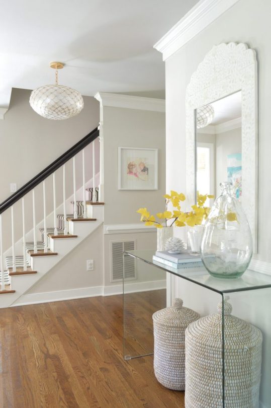
And here’s that kid artwork we blew up and hung in our bonus room to create a large scale piece with a personal touch. You can’t expect to make successful cupcakes following the recipe, but it makes us smile every time we read it.

And we promised a few other leads if you’re looking for ways to celebrate your family with homemade art from Etsy, so here are some cool options for ya (Sherry’s dying over these boots and you know I love the idea of a custom Simpsons-ified family portait).
We’re Digging
Below you can see my crystals in action (yes ME, JOHN PETERSIK). Well, I guess I can just call them my glass window prisms. I ordered 2 sets of these and they have been such a success we’re going to get a few more for the beach house.
We’re still figuring out the best spots for them to get maximum light reflection, but this one in our kitchen window is everyone’s favorite so far because the rainbows splash across the cabinets in the morning (all the way over to the far wall where our shoe cubbies are!) while everyone’s getting ready for the day. It has been such a fun pick-me-up.
As I mentioned in the podcast, it was reading this Joyful book that Sherry talked about in Episode #130 that gave me the idea to buy them.
Lastly, here’s a link to the not-kid-or-work-safe trailer for Russian Doll (warning: the bad language starts right away). It’s the Netflix show – definitely not for kids – that we recently binged and it’s funny, weird, intense, scary, and refreshing all at the same time. Also, each of the 8 episodes is only about 30 minutes, so it was the perfect quick low-commitment binge!
If you’re looking for something we’ve dug in a past episode, but don’t remember which show notes to click into, here’s a master list of everything we’ve been digging from all of our past episodes. You can also see all the books we’ve recommended on our Book Club page.
And lastly, a big thank you to Grove Collaborative for sponsoring this episode. Sign up at Grove.co/YHL and spend your first $20 to receive a FREE gift: a trio of Mrs. Meyers cleaners, a 60-day VIP Membership AND a surprise bonus gift on top of all that.

Thanks for listening, guys!
*This post contains affiliate links*
The post #134: Where Have All The Family Photos Gone? appeared first on Young House Love.
#134: Where Have All The Family Photos Gone? published first on https://novaformmattressreview.tumblr.com/
0 notes
Text
The Tools (And Tricks) You Need To Install An Ikea Kitchen Yourself
Many of you have asked for tips and tricks to make installing an Ikea kitchen go more smoothly and look (and function) the best it possibly can. And the good news is that after installing three of them in a little over a year and a half (!!!), we have learned A TON about how to make things a little easier and help you end up with a better result. So settle in, I’ve got twenty tools & tips that can make all the difference.
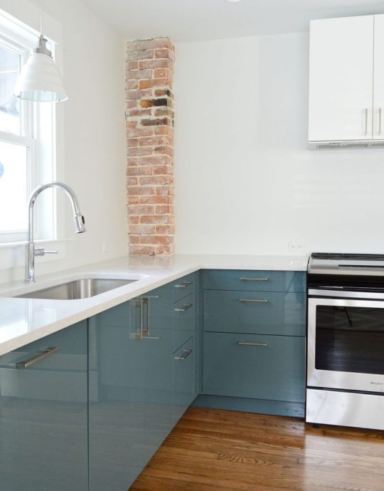
First off, we like Ikea cabinets and have personally installed them in five rooms: our laundry room & bonus room at home, our beach house kitchen, and now these two duplex kitchens. We have lived with the ones in our home for nearly five years and they’re great. Not a single issue. They are smartly made, very durable, and they have a great 25-year warranty and a great price tag (often thousands cheaper than other options). They also come with many thoughtful features like soft close drawers that come standard and tons of customization options. So yeah, some Ikea furniture is known for feeling a little cheap and wobbly, but that has not been our experience with their cabinets AT ALL.
Ok, but back to the point of this post – tips and tools to make your Ikea cabinet install easier. Some of the tools I’m listing here are absolutely necessary and some are optional (they’ll just make the process easier, faster, and less frustrating). And as you read through this list, I think you’ll also get a pretty good sense of the steps (and curveballs) involved too, which I hope will help as well.
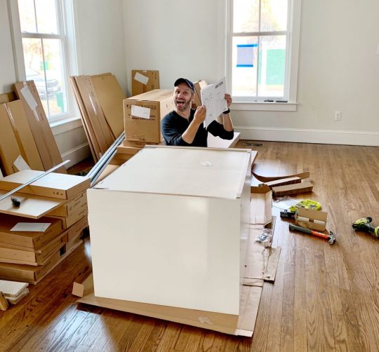
I’ll include a short bulleted list of everything at the end of the post too, that way you can use it as a tool checklist. But let’s just get right into it.
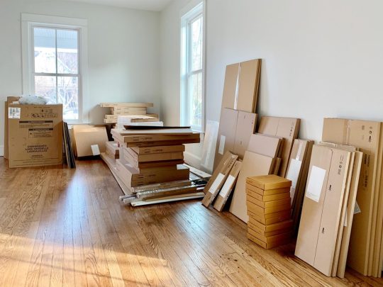
1. Your Itemized Receipt/Order
Before you build anything, you’ll want to take time to inventory and organize all of your boxes. We had over 200 boxes (!!!) delivered for our two duplex kitchens, so it helped to sort everything into piles beforehand.
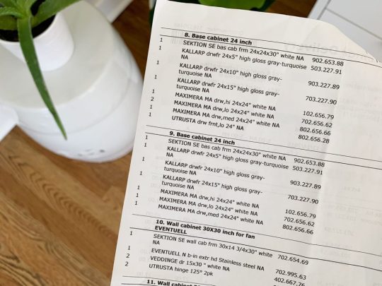
We personally like to sort boxes by item (Sektion boxes over here, Maximera drawers over there, all of our cabinet fronts somewhere else, etc.) but you may find it helpful to sort yours by cabinet instead (ex: the box, drawer, hinges, and front for one cabinet all together in one pile – this is how Ikea breaks them up your order form). Either way you do it, this sorting process will help you identify any missing pieces and also make it faster once you start building.
2. Power driver (with Philips head)
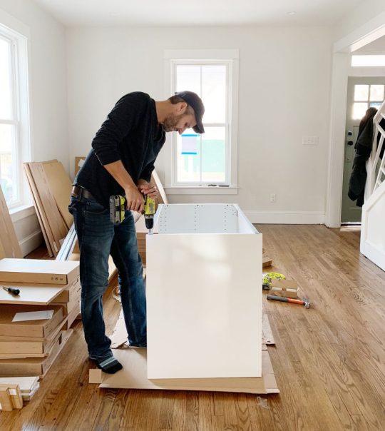
This combo gets a lot of use in this install (especially the power driver/drill) – but they’re needed first to construct your cabinet boxes (Sektion pieces). We love constructing the boxes first because you quickly get to see the shape of your kitchen come to life.
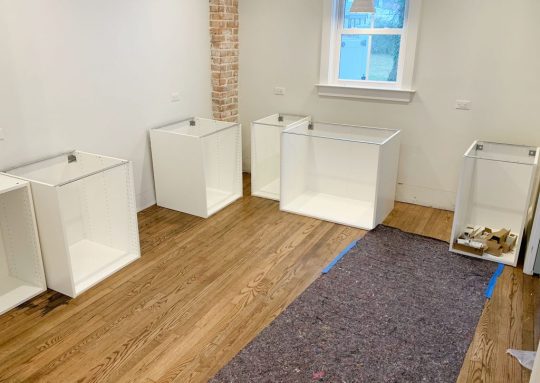
And even though Ikea is known for their allen wrenches, you don’t use them AT ALL during a typical kitchen installation! So don’t worry about having lots of specialty drill bits. You just need a normal Phillips head to screw these puppies together.
3. Hammer
You’ll also need a hammer handy to nail the MDF backings onto the cabinet backs. It may also be useful if you need to tap any anchors into your drywall when it comes time to hang your cabinets.
4. Magnetic Drill Bit Holder
Having one of these on your drill can save you a lot of frustration while building your cabinets and drawers. You can buy one separately for about $2 or it often comes included in drill/driver sets like ours. It’ll magnetize your drill bits, meaning many of the screws that Ikea provides will stick to your drill handsfree (thanks to the magic of magnets). We found this VERY helpful when trying to screw into small spots that were too tight for our fingertips (we couldn’t reach in and hold the screw steady, so having a magnetized drill bit that held it for us was key).
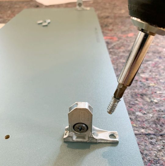
5. Measuring Tape
The next several tools are needed for attaching your cabinets to the wall. Whether you’re doing upper or lower cabinets, Ikea’s system uses a metal track (called the Sektion suspension rail) that you attach to your wall and then the cabinet boxes hang from these. The rail system is extremely handy because if you make sure the rail is level, your cabinets all hang from that and are guaranteed to be level! I know, it’s GREAT. The only time I don’t use their rail is when I don’t have a wall behind my cabinets, like if you’re doing an island. In that case I’ve built my own bases from 2×4″s, but more on that later.
For now, just know the measuring tape will be useful in determining exactly where in your kitchen you’re placing your cabinets – both side-to-side on each wall, and how high the rails need to be hung (Ikea provides guides for this in their instructions). You will probably want to have your kitchen plan/schematic from Ikea handy too.
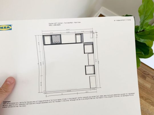
6. Dremel Or Hacksaw
Once you know where each run of cabinets is going, you’ll need to cut your metal suspension rails to size. The rails are sold in 7 foot lengths, but if you only have 4 feet of cabinetry in one area – you only want 4 feet of rail.
You can cut these by hand with a hacksaw, but we find it much faster to use our Dremel Multi-Max with a metal cutting blade.
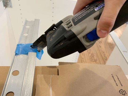
I typically mark my cut on a piece of painters tape and cut across the open top of one of our cabinet boxes (with a piece of cardboard to protect the cabinet underneath).
7. Stud Finder
You want to screw the rail into at least a few studs in your wall for maximum hold. So it’s smart to use a stud finder to locate and mark the studs that fall within the area you’re hanging the rail – that way you can be sure to go into them and get a nice firm hold. Since studs are typically 1.5″ thick, I like to mark the full width that my stud finder indicates, since you may not know exactly where the holes on the Sektion rail will line up.
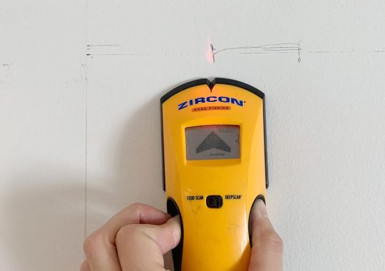
8. Medium-Size Level
Once I know where my studs are, I hold my cut-to-size metal rail and, with a medium sized level (like this 24″ level) held against it, I mark the top line of my rail AND where the holes line up with my studs. I suggest amedium sized level for this just because they’re easier to wrangle during this step.
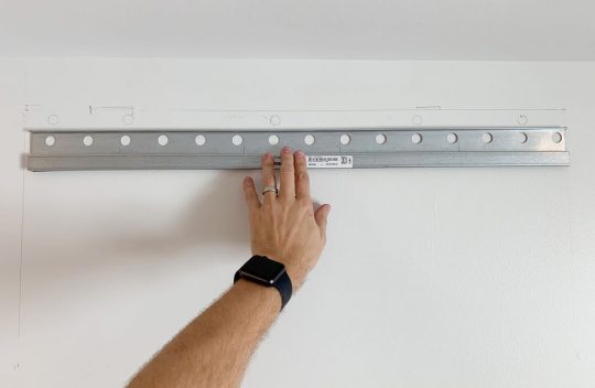
I also mark a few additional holes where I’ll use screws paired with anchors. I believe Ikea suggests at least having a screw every 12″ inches – but for short sections like this, I like to make sure I hit at least 2 studs and then have a screw at either end of the rail that goes into an anchor.
9. Heavy Duty Screws & Anchors
After some trial and error, we found that we like using these GRK Fastener Cabinet Screws to secure our rails into studs. They’re easy to drive, they hold really tight, and they include the star-head bit you need for them. We have tried other, cheaper “cabinet screws” and the heads kept breaking off. It was MADDENING.

We also like to have some anchors on hand too, like these E-Z Ancor packs that come with screws, for those additional support screws that we add.
10. Long Level
One of the biggest challenges we’ve found in this process is getting things level. Just because you’ve hung your rail level on the wall doesn’t prevent things like slopes in your floor or bows in your wall from chucking some additional curveballs in your direction. So your best defenses are a lot of patience and a nice long level, like this 4ft level we bought specifically for this task (after learning that it’s a lot harder to use a smaller level to solve these issues).
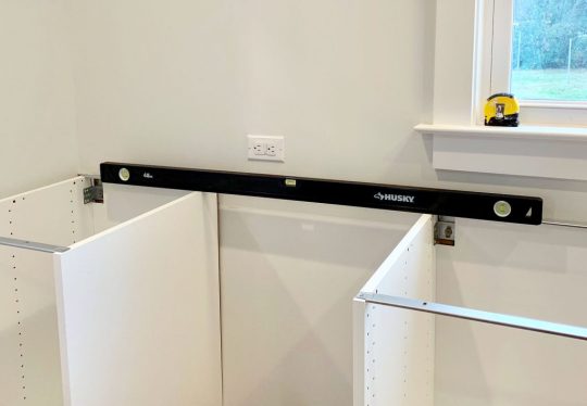
Your medium sized level will help with the process as well (especially in checking that each individual cabinet is level front-to-back) but you’ll want something bigger to check longer spans of cabinets. You could purchase an even longer level if you wanted, but they can start to get pricey, so we found a 4 foot long level to be sufficient, especially for checking across the gaps that you’ll leave for appliances like a 30″ stove or a standard 24″ dishwasher.
11. Shims
A lot of level issues can be corrected by twisting the adjustable plastic feet that come with your base cabinets, or by adjusting the placement of your metal rail. But if you’re dealing with bows in your wall (which you can find by placing your long level against it) you’ll want to have some wood shims on hand to place behind the metal rail. In these old houses, we had to use quite a few in a couple of places!
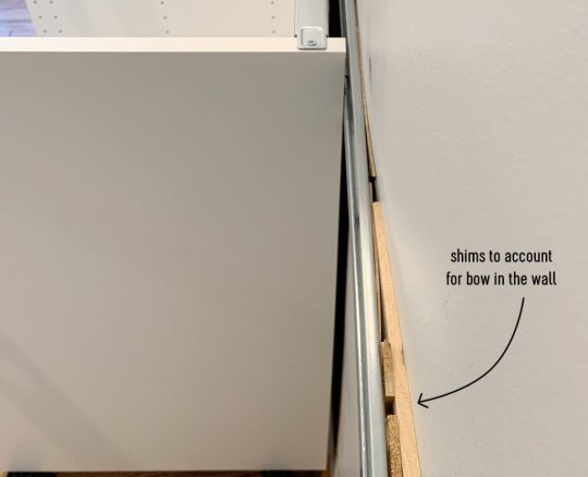
12. Jigsaw
When it comes time to install your sink base cabinet, you’ll need to make some holes for your plumbing. For smaller pipes like your water supply lines, you can just drill holes using a large drill bit (we used the 3/4″ bit in this set). But for things like your large drain pipe, you’ll either need to buy a larger hole bit or break out a jigsaw. Even though we don’t get the cleanest cut with it, the jigsaw gives us a little more wiggle room when placing the cabinet (since the drain pipe isn’t flexible like the supply lines) and we can also use it for other cuts like for exposing the outlets along the wall (the one below powers the garbage disposal under the sink).
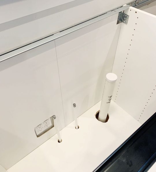
Just be sure to make careful measurements before you cut. We usually put a layer of painters tape around the area we’re cutting. It allows us to mark our cut without marking the cabinet, plus the tape helps keep the white finish from cracking off. Either way, this stuff will all be hidden under the sink so it doesn’t have to look perfect.
13. Clamps
As you start to get your cabinets in place and leveled, you’ll want to secure any adjacent cabinets together. Ikea provides screws for doing this, but you’ll want to use some clamps (we like these 6″ bar clamps) to hold the cabinets tightly together before you begin screwing.
We didn’t get a picture of that process, but the clamps come in handy A LOT as an extra set of hands – like when we were installing this bracket for the exhaust hoods that we hung over the stoves.

14. Circular Saw and/or Table Saw
In addition to screwing cabinets together, you may find yourself attaching cover panels or filler pieces at some point. Cover panels go on exposed ends of cabinets (so you can’t see the metal rail they hang on) or, in our case, we used some large cover panels to create a box around the fridges at the duplex. So you’ll need some sort of larger saw to make long, straight cuts. Our cover panels were a bit too wide, so I used a circular saw to shave a few inches off one side.
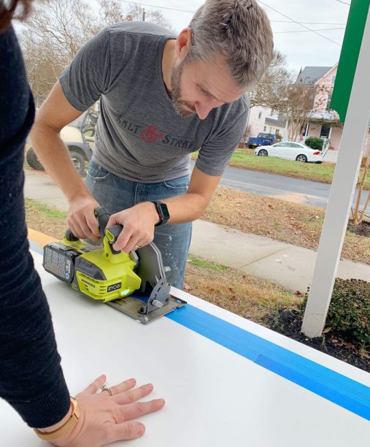
I didn’t use a table saw for that panel because running an 8 foot tall panel that’s this wide across my table saw would’ve been tough. But for smaller pieces (like filler pieces that are only about 3 feet long) a table saw is often easier, especially if you’re only shaving off a little bit. But if that’s too pricey and you’ve got a steady hand, you can get by with the circular saw.
15. 2 x 4″ Boards
Every time we’ve installed an Ikea kitchen we’ve needed some 2×4″s at some point. At the beach house we used them to make some bases for the island cabinets.
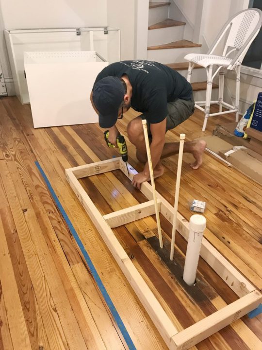
Basically, they were just some boxes we made almost the same size as each cabinet (slightly narrower to account for the toekicks) that we secured to the floor using pocket holes. To drill the pocket holes, you can use something like a…
16. Kreg Jig
Now, a Kreg Jig isn’t absolutely necessary here, but I’ve had one for around nine years now so I’m accustomed to breaking it out for tasks like this. So while I’m a big fan of having one in your arsenal, I understand that you’ve just bought a new kitchen so tacking on another $99 tool to your budget isn’t always practical.
I did use it again for the duplexes to make more 2×4″s into boxes (this time for mounting the above-fridge cabinet away from the wall, so it sat closer to the front of the fridge).
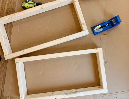
The boxes acted as an extension of the wall. The top one was for mounting the metal rail, and the bottom one gave the base of the cabinet a spot to rest so it didn’t tip back wildly. They also gave us a way to mount that large cover panel to box in the fridge.
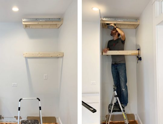
I guess I should add in here that a step ladder is also useful, so let’s officially put that on the list.
17. Manual Screwdriver
Once your cabinets and panels are hung, leveled, and secured to each other, the next part of the process is to add your doors and drawers. The instructions here are pretty self-explanatory and the main tool you need is a power driver to screw everything together. Our main word of warning is to pay close attention to screw placements when you’re assembling drawers! Depending on where each drawer goes in the stack (top, middle, or bottom) there are sliiiiight differences in the instructions. So while we find it most efficient to do multiple drawers at once, we still pay close attention – especially for the first few.
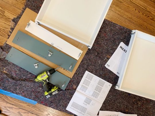
Ok, back to the manual screw drivers. One big part of installing doors and drawers is tweaking and adjusting them for even and level spacing. For this you’ll want to a regular ol‘ manual Philips head screwdriver. It can be kind of tedious and frustrating, but it’s worth taking your time with it. This video shows it in a bit more detail.
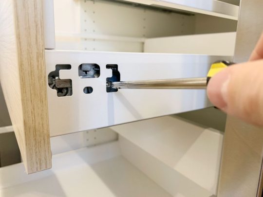
You also will want a flathead screwdriver for twisting the little piece of plastic that locks each cabinet onto the metal rail, which comes up earlier in the process.
18. Miter Saw
Tasks like cutting your 2×4″s or even your filler pieces will be made easier and faster by having a miter saw on hand (we own this miter saw). You’ll also find that it’s helpful when it’s time to cut and install your toekicks. Ikea’s sells toekicks to match your cabinet fronts and they clip on to the plastic feet you will have attached to the bottom of your base cabinets.
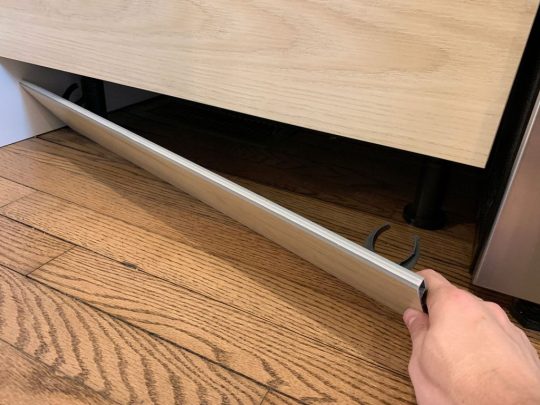
In our beach house kitchen we installed quarter round in front of the Ikea baseboards to help disguise some floor level issues, as well as using quarter round around the island where we built our own base (we used standard wood baseboard trim instead of the Ikea toekicks around the island). Meanwhile, we just used the Ikea toekicks in the duplex kitchens and the floors were more level (and we think the wood and blue cabinets were more forgiving than white ones) so we didn’t need to add quarter round and it looks great.
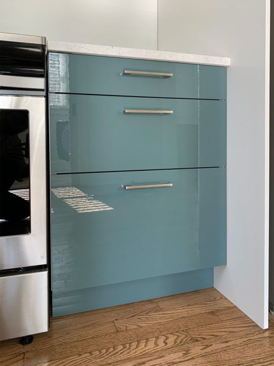
19. Nail Gun
In addition to using a nail gun to attach additional molding like quarter round if you’re adding that (again, the Ikea baseboards just snap on so you won’t need it for that) I also find a nail gun comes in handy sometimes for attaching small filler pieces. Especially in cases where they’re too thin to take a screw.
20. Others Tools
Real quick, here are some other items you may want to have on hand. Some I’ve mentioned or shown already, but haven’t officially listed:
Pen or pencil
Painters tape
Step ladder
Utility knife or scissors (for opening boxes faster!)
Crowbar (if you need to remove any baseboard or molding)
Broom, dustpan, and/or vacuum with a hose (we have this one)
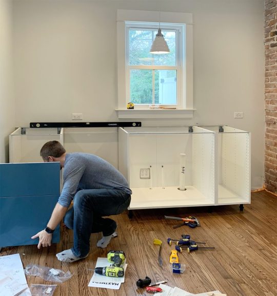
Your Ikea Kitchen Installation Tool Checklist
As promised, here’s all of the items in one place so you can make sure you have everything you need on hand. I’ve organized it a bit differently than above, just to put like items together. You may have special circumstances for your project that require more, less, or other tools – but I’ve found this to be a pretty comprehensive set:
Your itemized receipt / order
Hammer
Manual screwdrivers
Crowbar
Measuring tape
Pen or pencil
Painters tape
Step ladder
Power driver
Drill bit set with magnetic bit holder & 3/4″ bit for plumbing holes
Dremel or Hacksaw
Stud finder
Medium level (24″)
Large level (48″)
Wood shims
Cabinet screws (roughly 4 per cabinet)
Screws with anchors (roughly 2 per cabinet)
Jigsaw
Circular saw and/or table saw
Miter saw
Utility knife or scissors
Nail gun
Clamps
2×4″s (optional)
Kreg Jig (optional)
Broom, dustpan, and/or vacuum with hose
Good luck and happy installing!
P.S. For other posts we’ve written about installing Ikea cabinets, here’s one about installing our laundry room cabinets 5 years ago, and another one about using Ikea cabinets to make a wall of built-ins for our bonus room.
*This post contains affiliate links*
The post The Tools (And Tricks) You Need To Install An Ikea Kitchen Yourself appeared first on Young House Love.
The Tools (And Tricks) You Need To Install An Ikea Kitchen Yourself published first on https://novaformmattressreview.tumblr.com/
0 notes
Text
#133: The Fascinating Ways Homes Differ Around The World
Over 600 people wrote in to tell us about design norms from their specific country or region, and today we’re sharing some of the most popular, interesting, and unique responses. From the different ways we sleep and shower, to how we do laundry and how we do, um, our business – you guys gave us a fascinating window into how and why homes don’t all look alike around the globe. I also issue a public apology for fighting Sherry on a design choice in the duplex kitchen, and we share the Instagram account that’s the perfect pick me up to add to your routine.
You can download this episode from Apple Podcasts, Google Podcasts, Stitcher, TuneIn Radio, and Spotify – or listen to it below! Note: If you’re reading in a feed reader, you may have to click through to the post to see the player.
What’s New
If you missed our original disagreement about the cabinetry in the duplex kitchens, it was in Episode #120 from November. Those show notes also have a lot of renderings to illustrate the options we were considering.
The pertinent one to our discussion now is this one of the mudroom (seen through the doors from the kitchen). It was a rough idea at the time and our final order didn’t include that tall cabinet on the right side of the window since we ultimately concluded it would make the space feel too narrow. So, in the end, we just ordered those 3 base cabinets, each with 3 drawers (times 2 since it’s a duplex!).

Once we decided to nix the closed storage for those big three-tiered shelving units, this is the stack of boxes we got to return (along with some additional toe kicks and hanging hardware). That’s how we ended up getting over $2,000 back!!
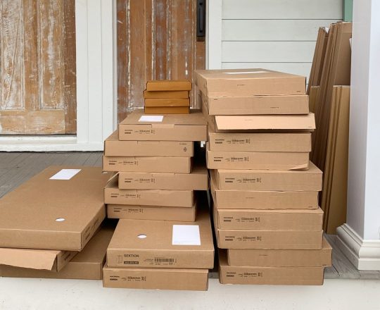
And here’s how things are looking now that we’ve added those Ypperlig open shelving units from Ikea to the tune of $110 each. Not only are they a lot more cost effective, we think the open storage space that people can easily see when they walk in (plus some bins to contain snacks, driks, etc) will be extra useful and obvious for weekly renters – who might not have seen closed drawers and realized they could store snacks, drinks, or coolers in there.

Here’s a view from the top, where you can better see that the shelves are actually lightweight metal slats. So wipeable and durable, we love them already.
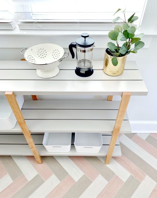
We also really like the blonde wood accent, which complements the kitchen cabinets so nicely on the other side.
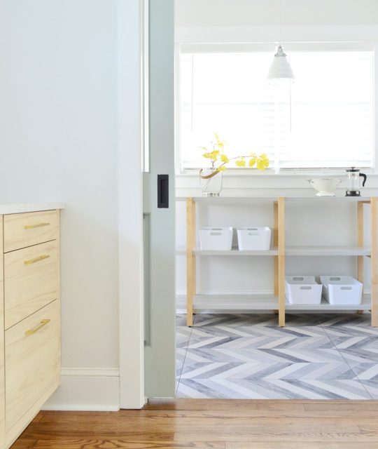
Homes Around The World
Thanks again to UK listener Jo who first suggested this segment back in Episode #125 in response to our previous episode about our preferred laundry room location.
Also, we mentioned our old apartments in New York City. You can actually take video tours of both of them in these old posts: here’s Sherry’s Village apartment and my Upper West Side apartment. It cracks me up that Sherry filmed those way before we were ever bloggers.
But on to the spaces and norms we mentioned! Below is one example I found of one of those Finnish “Kodinhoitohuone” rooms, which upon further investigation seems to be pretty close to an American mudroom, laundry room, or utility room – except that it often has a bathroom or sauna attached.

image source
And here’s an example that I dug up of a South African “Braai,” or indoor barbecue room. The images I found seemed to show them more attached to the main house than I originally pictured, but either way they look pretty awesome!
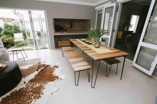
image source
And I know you guys are dying to see examples of a “Pittsburgh Potty.” This news article has lots more (along with more info) if you’re curious about this unusual phenomenon.

image source
Here’s is an example I found of a Japenese “Onsen” which looks right up Sherry’s alley. It also led her down the rabbit hole of Japenese Soaking Tubs. Spoiler alert: now she wants one for our master bath when we tackle that renovation.

image source
We also talked about warmer climates and their decorative metal grates on doors that allow for breezes to come in. Below are some that we spotted during our anniversary trip to Puerto Rico two years ago.

And Apartment Therapy did a great article on Finnish Dish-Drying Cabinets with several photos if you’re looking for how to create one in your own house. They’re SO SMART.
image source
And I learned that that the design podcast 99% Invisible has a few episodes covering some items that we discussed, including the Finnish Dish-Drying Cabinet and the Hills Hoist.
Oh and that Hills Hoist article is where I learned the drinking game is actually more popularly known as “Goon of Fortune,” not “Wheel of Goon.” Either way, it’s fun to say.
We’re Digging
View this post on Instagram
You made it through to a new day!! #keepgoing #keeppushing #yougotthis


#YouAreAStar
A post shared by Donté Colley (@donte.colley) on Jan 8, 2019 at 8:53am PST
Above is an example of the videos you’ll find on Donté Colley’s Instagram feed.
And here’s a peek at the nostalgic children’s book I bought recently called “Oh, Were They Ever Happy!”
I don’t want to give away the final image in the book, but here’s the house before the children decide to help paint it while the parents are gone…

And in related news, here are some other books we’re reading to our kids lately:
Iggy Peck, Architect
Story Pirates: Digging Up Danger
Into The Town All Year ‘Round
Richard Scarry’s Cars And Trucks And Things That Go
If you’re looking for something we’ve dug in a past episode, but don’t remember which show notes to click into, here’s a master list of everything we’ve been digging from all of our past episodes. You can also see all the books we’ve recommended on our Book Club page.
And lastly, a big thank you to Agility Bed for sponsoring this episode. Just enter the code YHL at AgilityBed.com to get $200 off any size mattress.

Thanks for listening, guys!
*This post contains affiliate links*
The post #133: The Fascinating Ways Homes Differ Around The World appeared first on Young House Love.
#133: The Fascinating Ways Homes Differ Around The World published first on https://novaformmattressreview.tumblr.com/
0 notes
Text
A Front Porch Makeover At The Duplex!
It feels like a while since you’ve seen the front of the duplex (I blame winter) but that’s going to change today. And let me tell you… THINGS HAVE TURNED A CORNER!
There’s no landscaping yet, the grass is patchy, and Sean the Contractor’s gigantic sign is still there…

… but boy oh boy is she lookin’ fynnnnnnnneee when we compare her to where we started:

All of the not original details came down – like the weird plastic wagon wheels and strange abacus trim that was added in the 70s, the plastic too-small shutters, the broken vinyl porch railing, all those satellite dishes, and the duct tape along the roofline. And we maintained or added back as much original charm as we could – like the metal porch roof, larger operable shutters, square porch columns, corbels along the roofline, wide brick steps, and those diamond windows that give me cartoon heart eyes.
We’ve already shared a lot of the big exterior decisions that we made as we went, like choosing our siding, roofing, and picking the color for the shutters, so today we’re gonna cover all of our front porch updates.

UGH BUT FIRST LET’S ADRESS THE ELEPHANT IN THE ROOM… or should I say the mouse on the porch?! Those tiny postage stamp doormats are so ridiculous I can’t even explain how I thought they were regular sized and then they turned out to be doormats for ants.
So yes, we’re getting bigger ones (they would DEFINITELY make Marlo cringe – Atlanta Housewives… Anyone? Bueller?). So let’s all try to look past those tiny little rectangles and appreciate some of the other stuff that’s giving me life. We have mailboxes! And house numbers! And lanterns to illuminate said house numbers! And composite decking (no rot! YAY!). We even have potted plants and teak benches! SOMEBODY HELP ME CALM DOWN.

We don’t have great before photos of just the front door area itself, but you can sort of see it (including the mismatched storm doors that we got rid of immediately) in the photo below.

But as artsy as John thought he was being with the “SOLD” sign in the foreground of that picture, it doesn’t really demonstrate how deteriorated the old porch had become.
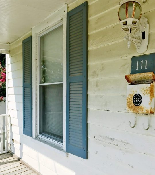
The entire front porch was also so rotten when it came to the actual support beams and structure of it, that we had to tear it off of the house and rebuild it from scratch, being careful to maintain the original transom windows above the door.
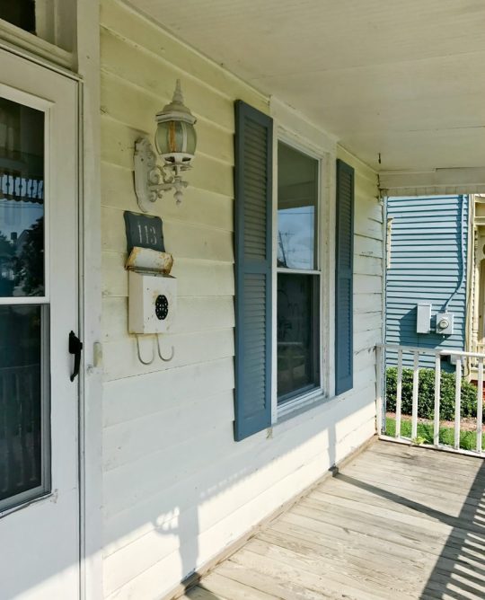
Let’s just say that it feels like we have taken a very significant leap forward in the last year and a half.
After we ditched the mismatched storm doors we decided to embrace the original front doors (figuratively speaking, I didn’t actually hug them, but we LOVE them and wanted to save them). You actually have to get approval from the town’s historic review board to change the style of your doors, so we’re really glad we liked them from the get-go. At one point we considered painting them the same mint color as the shutters, but realized that color got a lot of “stage time” thanks to having so many front windows (and therefore, double the amount of shutters)… so we both thought it would be nice to introduce another tone or color on the doors.
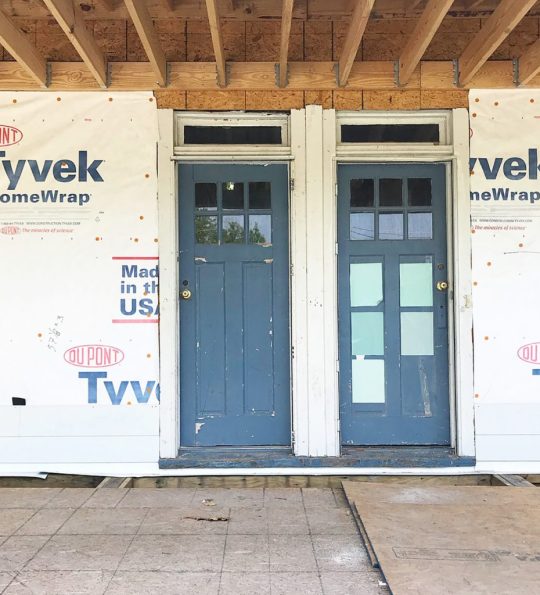
Our next (and longest-standing) idea was to make them some sort of wood tone – just clear sealed or covered with a light stain. You know we LOVE AN ORIGINAL WOOD DOOR (we stripped & waxed all the interior doors at the pink house, and I can’t even tell you how happy we are with them). So we had our contractor strip and sand our duplex front doors to get them as raw looking as possible. Lead paint = we hired them to do it safely in their shop, and they stripped and sanded them as far back as they could without compromising their integrity (they’re thinner than standard doors that are made today, and they had a few cracks and repaired portions they didn’t want to make worse).
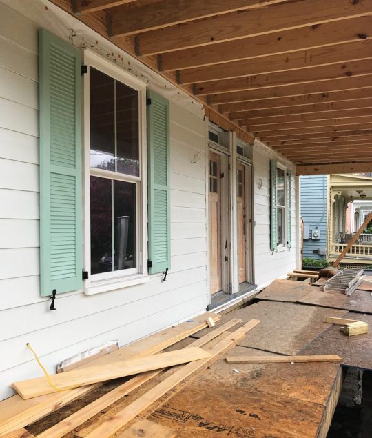
But even after we spent $400 to get the doors professionally stripped back as far as they could take them, we just couldn’t get them where they needed to be. From the street (and in the from-a-distance-photos we shared) they looked pretty cool, but up close you could see a lot of stubborn paint in the cracks and recesses that we just couldn’t remove – even after another pass at sanding.
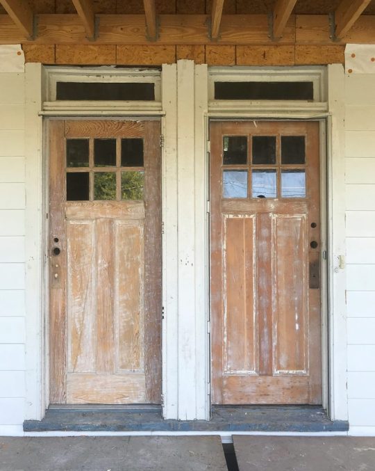
And as you walked closer you could see other general jankiness – like a large crack and some glue bubbles that would be hard to disguise with sealer or stain alone.

We knew that we could still get a wood look using a dark gel stain,like we did over on the pink house. It’s got thicker coverage than a typical stain – almost like a paint – and that certainly would’ve helped hide some of the issues.
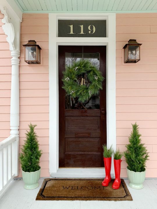
But once we installed the porch lights, mailboxes, house numbers and door handles, we both kept thinking…. what about a rich charcoal-y paint color? One that ties into that gorgeous metal roof above the porch? It just felt like a nice balance to the cheerful green shutters – sort of grounding and adding some nice contrast. It was also slightly comforting to notice that all of our other neighbors who have original doors have painted them too (they’re all 100+ years old so I think that’s the plight of being so worn down and in need of various repairs over the years – raw wood isn’t nearly as forgiving).

We’ve loved Sherwin-Williams Urbane Bronze ever since we used it our garage doors at home. It’s a really rich and layered color and we’ve always loved how it walks the line between a true black and a warm dark bronze-y brown tone – just like the tin roof we chose for the duplex!
Long story long, even though it was our lifelong (ok, yearlong) dream to leave these doors a light wood tone, we’ve mourned the loss of that idea and are IN LOVE with the final result. We both stepped back and thought: THE PAINT DID THESE DOORS A TON OF FAVORS!
Not only does it hide the cracks and glue bubbles along with all of those tricky paint remnants, it also looks great with the dark porch accents we added, like the operable shutters, the oversized porch lights, our wall mounted mailboxes, and our new house numbers. And the nice thing is that we were able to bring that wood tone in with other things, but more on that in a second.

As for installing the address numbers, they’re just simple off-the-shelf house numbers from Home Depot that can be mounted flush (like we did) or floating. They come with a template on the back of the package, so we trimmed the templates a bit so we could space them the way we wanted, and taped them to the siding exactly as we hoped they’d look in the end – being sure to triple check that they all had equal spacing, were all level, and were centered.
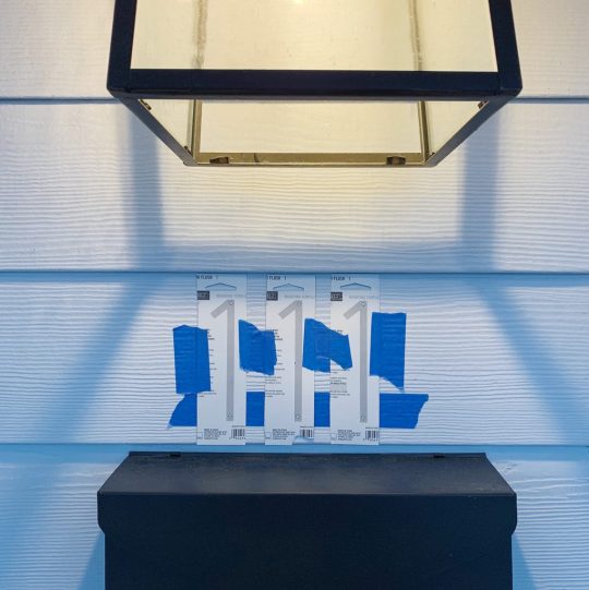
At one point we had planned to just get some subtle number decals to stick on the mailbox, but then we learned it was actually code that they were at least 4″ tall and “visible from the street” for emergency personnel. And by “learned,” I mean that we almost failed our final inspection because we hadn’t installed any yet, so we rushed to get them up and passed by the skin of our teeth (I would like to have a word with the inventor of that gross expression, btw).

Since we lost some of the warm wood tones in the doors, I brought them in with a few other things, like the basket-looking planters (they’re really a ceramic-like material), and the big teak benches on the far ends of the porch. And once we get bigger doormats (maybe a single long one that runs under both doors and up to each planter would be cool?) that’ll add more of that warmer tone to the mix.

Of course I have to shout out our go-to faux outdoor trees. They inject some much needed zero-maintenance greenery to the front porch. We’ve got the same type on the beach house front porch and the taller versions at home in Richmond. They’re awesome, so yes, we are now the proud owners of six of these babies. Please note that I didn’t floof these before the photos (yes, that’s a technical term), so their shape in the picture below bugs me to no end. They’ll be looking 100 when I get my new mats, landscape the front, and share the updated pics though – mark my words.

If you’re subscribed to our newsletter, you got a peek inside with the doors open last week. We painted the stair risers on each side the same color as the interior doors on that side (Sherwin Williams White Truffle on the left, and Sherwin Williams Oyster Bay on the right). I also really love that we didn’t do mint on the front doors because it’s a fun reveal to swing open the dark bronze doors and be greeted with a different happy & beachy color inside each one.

This is the before photo, which I now realize is funny because it’s almost like we switched sides – the greenish risers are now on the right, and the red/pink ones are on the left (we chose the colors for each side based on lighting and where they read the best – the pink tone read a little more gray and less pink on the right, so that’s how it ended up on the left).

So that wraps up the whole duplex porch update… but if you could kindly cross every last appendage that the groundhog was right in his call for an early spring, we’d really appreciate it. Because you know I can’t wait to get the front of the duplex landscaped and mulched and add a path to the back and plant grass and ALL THE THINGS! WITH ALL THE EXCLAMATION POINTS!!

We need to get this thing whipped into shape so we can get it all photographed and listed for rent thing spring (rentals will start this summer and it should hit Airbnb this April or so! AHHHHHH!). Oh yeah and we have to finish the inside. And the backyard. Details, details.
P.S. To see how we have fixed up this house over the past 1.5 years, there’s a whole category dedicated to duplex progress.
*This post contains affiliate links*
The post A Front Porch Makeover At The Duplex! appeared first on Young House Love.
A Front Porch Makeover At The Duplex! published first on https://novaformmattressreview.tumblr.com/
0 notes
Text
#132: Are We Sabotaging Our Sleeping Spaces?
What if there were little changes we could all make to our bedrooms and sleeping habits to sleep better and feel more rested in the morning? Today we’re talking about how a sleep expert thinks we should all be maximizing our bedrooms, including the perfect mattress size, the ideal bedtime, and what items we should banish from our bedsides. Plus, why are there such diverging practices about shoes being on or off inside people’s homes? We’re sharing our shoe rules and why they may be strange to some. Oh and we crank Sherry’s salt lamp obsession up to 11 with a visit to a salt therapy room.
You can download this episode from Apple Podcasts, Google Podcasts, Stitcher, TuneIn Radio, and Spotify – or listen to it below! Note: If you’re reading in a feed reader, you may have to click through to the post to see the player.
What’s New

In hunting for and researching salt therapy rooms before our visit, these images were the ones that got ingrained in my head. That picture above is from a chain in Florida called The Salt Suite.
There was also the one below, that was almost like a sauna.
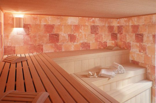
Meanwhile, here’s the one we went to locally:

Granted that’s not the best photo, nor was the experience really about how the room looked (it’s about the salt!). And if I had paid closer attention to the Google Image Search results, I would’ve noticed that these types of chairs are a popular choice for salt rooms!
I want to reiterate that we had a very nice experience, so if you want to give it a try – this was the place we went to (not sponsored – we paid for it) here in the Richmond, VA area. We both would do it again.
And if you want to hear about our float tank experience, it’s was in Episode #33 (we would also do that again).

Can We Just Talk About?
Below is a photo of our “mini mudroom” where we stash our own shoes when we come into the house. It admittedly doesn’t create a lot of room for our guests’ shoes – which usually just get kicked off in front of the cubbies.
Here’s one of the articles I found with data about how many Americans take their shoes off in their homes. Also this survey by Bissell.

But now we want to hear from you guys! PS: I know I said I would split this into a survey for Americans and Non-Americans, but I realized I can parse the data from a single form. So everyone can respond below!
Loading…
Sleep Book
Here’s a link to the book we discussed, Sleep: The Myth of 8 Hours, the Power of Naps, and the New Plan to Recharge Your Body and Mind.
If you missed the previous mention of our new sleep efforts, it was in the We’re Digging section of Episode #128.
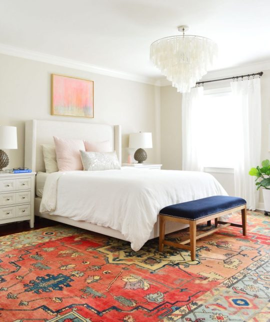
Sherry tracks her sleep using her Fitbit Alta and I use the AutoSleep app on my Apple Watch.
And I didn’t mention this in the episode, but the author points out that sleep tracking devices like those aren’t the most accurate way to understand your cycles. They try to translate your heart rate, body temperature, and movement into sleep cycles, but the only true way to measure what part of the sleep cycle you’re in is through brain wave monitoring. But that’s obviously not something you can easily do at home.
We’re Digging
It’s hard to find a good photo of our white faux wood blinds because they blow out to be white glowing slats in most pictures, but you can sort of see them here in the beach house’s front bedroom:

We have them in all of the upstairs rooms of our Richmond house and on every window at the beach house and the duplex. They even updated the product around the time we put them in the beach house to be cordless – which we love even more!
And this is that Nine Perfect Strangers book by Liane Moriarty that Sherry LOVED. She’s the same author behind Big Little Lies as well as a few others that Sherry highly recommends, like What Alice Forgot and The Husband’s Secret.

If you’re looking for something we’ve dug in a past episode, but don’t remember which show notes to click into, here’s a master list of everything we’ve been digging from all of our past episodes. You can also see all the books we’ve recommended on our Book Club page.
And lastly, a big thank you to You Need A Budget (YNAB) for sponsoring this episode. You can sign up at YNAB.com/YHL to get your first three months free!

Thanks for listening, guys!
*This post contains affiliate links*
The post #132: Are We Sabotaging Our Sleeping Spaces? appeared first on Young House Love.
#132: Are We Sabotaging Our Sleeping Spaces? published first on https://novaformmattressreview.tumblr.com/
0 notes