#'''''the credulity of the vulgar''''''' alRIGHT bud
Text
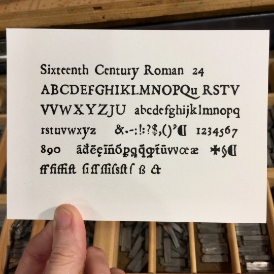
[image description: a proof of a font of handset type for letterpress printing, displaying every letter, symbol, and special character in the font. it's called "Sixteenth Century Roman," 24 pt., and is a rough-edged serif font with a deliberately worn look. end description.]
hello hello i am return from a deep dive into several reference materials that assumed a little bit more knowledge about how Medieval Latin works than i actually have, but, it was all exTREMEly inch resting to me. i am absolutely not a historian but here we are, a speedrun of my pinballing around trying to ensure that I know what the fuck im storing in my type corridor:
so 16th Cent. Roman, i already knew, was a font Paul Duensing designed based on this incomplete set of old Italian punches he acquired (punches, the first step of old school typecasting, where you carve the relief letter shape into the end of a stick of steel, and you uuuh punch that into the copper matrix, which is then the negative mould-shape you use to cast multiple copies of the lead sorts with hot metal; surviving punches are precious artifacts not the least because they are. they’re hand-carved!! often by the type designer themselves. historical and also wildly cool craftsmanship). these punches were all beat up and probably water damaged, fucky and rough-edged, so he re-did and filled in the gaps in the alphabet with similarly styled letters of his own. very cool. an extremely nerdy lil passion project of a typecaster in the 1960s, very typical of type people. we all find a Thing to obsess over, and sometimes it's reviving an incomplete set of punches from the 1500s that you found in, idk, it's usually a bucket in somebody's basement.
anyway it's got a bunch of ligatures and the long s, sure sure sure, but WHAT are all these gibberish characters with tildas and lines thru the stems of ps and qs and such—
Duensing's full font is in Mac McGrew's specimen book, great, i have that, except McGrew's book has complete proofs and a little bit of history for each font but doesn't always cover what each symbol in a unique alphabet is for, and i knew just enough about Latin to guess that they were abbreviations but not what each of them stood for. a little bit of searching got me this far, which is to say, "Abbreviation in Medieval Latin Paleography," a translation of an Italian essay on the subject from 1929. It is prefaced by the translators with gems like: "Take a foreign language, write it in an unfamiliar script, abbreviating every third word, and you have the compound puzzle that is the medieval Latin manuscript." Scribes writing in medieval Latin just tossed out letters they didn't care to deal with, constantly, and had stand-in special characters and abbreviations for syllables/words/particles and there were intuitive rules but way too many variations in time and place and person to make a reasonably-sized, static lexicon. amazing. hope all u paleographers are having fun over there.
the essay has a great big glossary of truncations and abbreviations and so on which clearly cover most of the figures in Duensing's font:
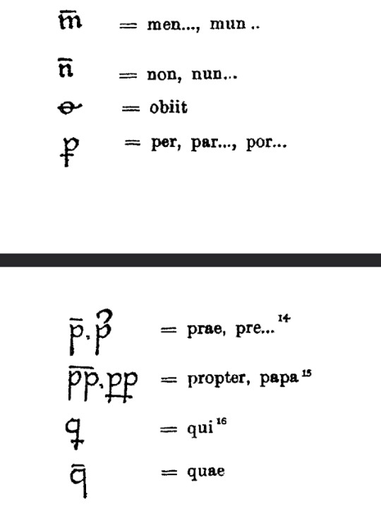
[image description: screenshots of the essay, with various symbols and the Latin syllables they abbreviated. an m with a bar over it, ex., stood in for men or mun. end description.]
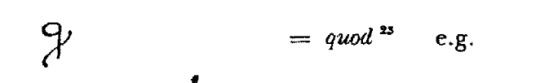
ok! BUT this q with a little swoop off the end kept bugging me!! for all these dead-use symbols this essay is using handwritten samples, obviously, and there's clearly variation in execution and also typographers take liberties, and i just thought, sure my piece of type looks a lot like the quod here but it does link the staff to the swoop where the handwritten sample doesn't, and it could just as well be a fanciful ligature for qn which apparently can stand in for quando, and i have no idea which is a more common-use syllable likely to be cast in the font if you're only going to pick your top 14, and i just like to be sure about things.
SO. i went to double-check with Johnson’s Typographia. Johnson made like a thousand pages of printing manuals set in tiny tiny type in the 1820s which are rad as hell and tell you all sorts of things about how to run a shop and build your own press and cast type and going rates for work and employment and also, the alphabets/type case layout for whatever language or symbol set you might have to set type in, when handsetting type was mostly the only way to get stuff printed—English, Arabic, Chinese, Hebrew, musical notation, astronomical signs, aaaand it’s got a section for "Marks & characters used in the Domesday Book & other ancient records.”
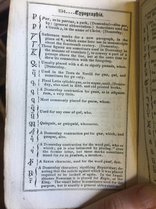
[image description: a photo of a page of the manual, with similar but not always identical symbols for abbreviated use. many of these abbreviations are described as "a Domesday contraction." end description.]
and WHAT is a Domesday contraction, WELL, it's a contraction specifically from/prevalent in the Domesday book, a deeply boring and historically important tome about property distribution in England. It’s literally a survey. who owned what, in 1086. presumably mind-numbing. enormous, handwritten in Medieval Latin, EXTREMELY cool, go look at some images of it at least, very important to historians, economists, linguists, and a complete pain in the ass to set in type when that technology became available, having to cast any significant proportion of these variant characters in an alphabet. Johnson says, (in 1824) “It is an improvement of latter years only*, to have type cast to resemble the abbreviations used in the more ancient manuscripts; they being formerly rudely imitated, either from a common fount, or else were cut in wood for the purposes of any particular work.” wow that sucks. but in 1773 the government really wanted to be able to reproduce the Domesday Book in type, so a couple people tried to cut a set of punches for Domesday abbreviations and Joseph Jackson got it done and it only took 10 years to print an edited version of the manuscript. and then apparently all the type was destroyed in a fire in 1808. WOW that sucks.
but the point is, Johnson has a great big glossary of characters as they were translated into type in the making of the printed Domesday Book, and the Domesday punches were used or refrenced in the printing of other medieval latin works, which consequences a degree of standardization in the abbreviations used in those versions of the text that handwritten manuscripts never had or needed.
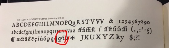
notably the Domesday quod looks even more different from my piece of type here which was pretty annoying, so what are the chances this thing is a quando, and anyway that's when my sister texted me back with better computer skills and a different search engine and found me a perfect match on the first try. it’s a quod. this National Diet Library digital exhibition has several different sample fonts, both black letter and roman, with quite consistent letter forms, if not choices about which abbreviations to bother casting.
*I don’t……exactly know what he means by this, since Gutenberg and contemporaries absolutely did cast many Medieval Latin abbreviations for their fonts nearly 400 years before this. His dismissal of “from a common fount” might be fair, since i think what he means by it is that you’d have a generic set of abbreviation characters which you would have to use in conjunction with whatever font was the main body of your text, and it’s messy to mix things that weren’t designed specifically to match. he may just mean that it’s new for his contemporary foundries to be casting all these expanded alphabets of abbreviations; Gutenberg didn’t have foundries to buy from and made his own type. he could include as many characters as he had the patience for. maybe Johnson is just a guy from the 1800s that didn’t have the internet and i shouldn’t jump down his throat for not knowing something. idk!! i have homework.
anyway that was my Friday!! feel free to correct me and/or suggest further reading if early typecasting is your Thing or. again. you just have better googling than me.
#letterpress#letterpress printing#handset type#lead type#typography#long post#:(( sorry#omitted: Johnson's scathing opinions on Almanacks and the people who read them#and ask you to typeset them#'''''the credulity of the vulgar''''''' alRIGHT bud#i guess if he was willing to set that whole paragraph in 8 pt.#or pay for it#it was at least an opinion he believed in very strongly.
16 notes
·
View notes
Last Seen Blogs

rafaper
gayboy 💕

srenorsomethin9
SrenOrSomethin

top5miglioriblr
Top 5 Migliori

horizonviewfinancial
Horizon View Financial

disgustingcheese
Cheese