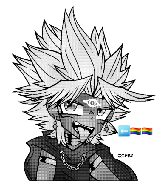
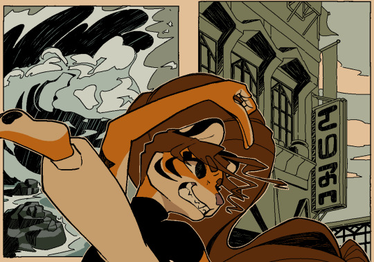
#<- for the screentones mostly
Photo

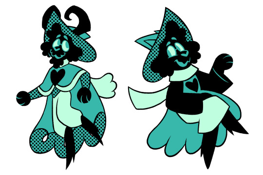

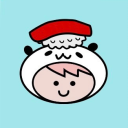
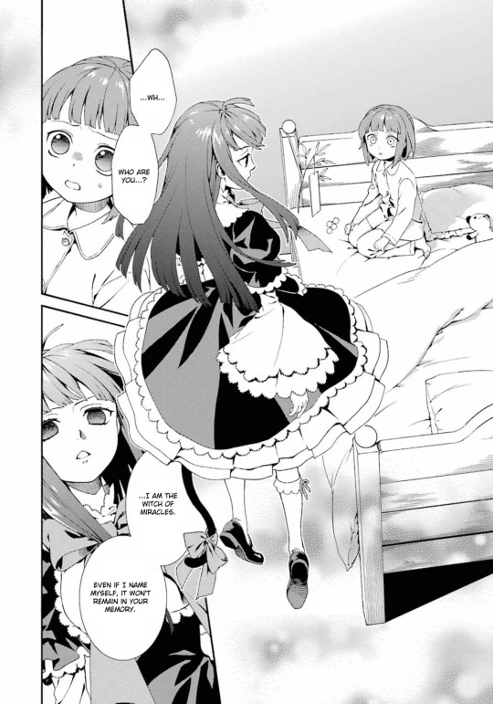
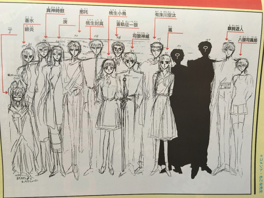
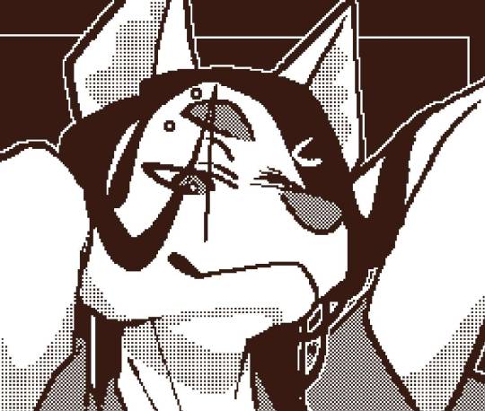
Image ID: A series of 5 images each containing two versions of Deltarune characters. The first image is of Susie, the second one is of Noelle, third is Ralsei, fourth is Kris, and the last image is of Lancer. Each image contains an older (left) and a younger (right) version of the character drawn in the same style. They are drawn in a specific style reminiscent of early 2000′s cartoons with thick lines and streamlined shapes. Each character has a limited monochromatic palette containing a darker color and a lighter color, with areas of black fill and areas filled with halftones or dots. Any weapons drawn are colored in a different palette that compliments their base color. Their hands are rounded and their designs are generally simplified. End ID.
hi its been a minute! finally got a chance to sit down again and draw these guys again (its been months. head in my hands), and for fun I wanted to draw them in the style of my upcoming junior film, Killer Cupid! goobertown USA real
#froxart#deltarune#folly of the fountains#fotf#susie deltarune#noelle deltarune#ralsei deltarune#kris deltarune#lancer deltarune#anyways these were a lot of fun! i desperately wanna work on my comic again but schools got me by the throat for now#cw eyestrain#<- for the screentones mostly#these are also not at all sized correctly to eachother. but. its fine#described#froxposting
4K notes
·
View notes
Photo
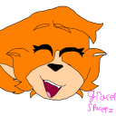
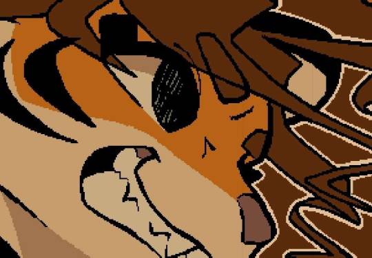
the hyperfixation missiles have collided midair !!!!!! (a bit crazy that i haven’t drawn a spidey au for @chrysanthemumgames yet actually)
#foa#fields of asphodel#the other fun thing about this composition is that the spiders/civillians also match up :)#terrible background as always but who cares. i am procastinating work a little. also i deserve to draw a bit of this#foa and spiderman r currently consuming my life. so...#hermes#seph#spider-man#my art#ALSO i love ps screentone brushes theyre so nice !!#hermes also gets the more typical spideysuit (looking at jessica's suit but its mostly peter's suit with hair showing....)#while seph is almost entirely based on pav's down to the diamond lenses :)
135 notes
·
View notes
Text
every day of my godforsaken life i have to restrain myself from only drawing yami marik and no one else all day every day
[plz reblog]
#i would of done better but . its . 2 am#and everything hurts and im eepy so#also this is mostly just testing how different screentones go with eachother#my art#art#plz reblog#yugioh#ygo#yugioh duel monsters#ygo dm#yugioh dm#yu gi oh#yami marik#yami malik#yugioh fanart
23 notes
·
View notes
Text


Childish memories…
《Funfact: Billy’s Girlfriend was originally named “An Old Friend” in older versions of Billy’s Basic Educational Game》
#corny creations#billy bbeg#billys basic educational game#bbieal#girlfriend bbeg#denied basics#denied cellar#bbau#I figured out how to draw Billy’s pants pattern#I used the tattoo inker brush • I love the tattoo inker brush • tattoo inker brush is my friend#putting the screentone was so satisfying aaaa so prettyy#there’s actually a specific reason as to why I gave Denied green clothes in my design for his younger self#I headcanon that he lives closer to the forest while Billy and Girlfriend live in a yown#oh and the clothes are made from flax since that’s the traditional material used for Latvian clothing#the green is because it’s the most available colour but it also helps in hiding in the forest#Billy’s prosthetic shoes are purple because in the game there’s a poster that says ‘Billy’s favourite colour is purple!’#This is accidental but I realised something#Girlfriend is wearing mostly warm colours in alot of my draft designs for her childhood outfits#Billy wears alot of blue • black • white#Denied wears mostly cool colours I originally gave him red to match his fins but it didn’t fit with the forrest/lake theme#In the adult version though Billy and Denied are wearing the same colours as they did when they were kids#Though Denied has more blue in his palette#Girlfriend however has dropped the warm colour scheme now wearing cool colours similar to Billy and Denied#idk I thought it was cool#it wasn’t intentional • but now that I’ve noticed it I’m gonna keep it in mind for when I make more outfits in the future#sorry for my ramble I hope you enjoyed reading it though
17 notes
·
View notes
Text

Gunbreaker time
#I was so nervous to start gnb because everyone said it was harder#turns out it’s mostly the same as other tanks#not bad at all#gunbreaker#ffxiv#ffxiv wol#ffxiv oc#ff14#au ra wol#au ra raen#ffxiv raen#wol#warrior of light#oc#au ra oc#au ra male#screentone#screentones#halftone#art#character art#original character
12 notes
·
View notes
Text

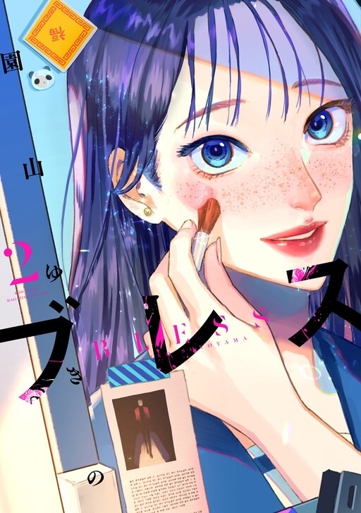
I started reading the manga Bless this morning and its a series about a high school boy, who was previously a model, that wants to become a make up artist.
The first few chapters where he does the make up for his classmate, a girl who gets bullied by her peers for her very tall height and heavily freckled face, really made me feel something.
But with the next volume focusing on him going forward with his dream to be a make up artist and getting more experience… idk if this is the right medium to portray this.
Actually, im not sure if its the art style (which looks FINE!) or the fact that manga is black and white, but its very difficult to discern each make up artist style. This would probably work better as a manhwa or literally anything in color since I cannot tell the different styles apart apart from the description, unless its heavy or bold (sorry but i dont want to look back for examples).

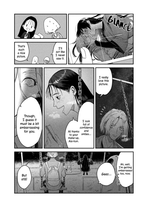

I hope to see more interactions between the MC and the FL bc theyre pretty cute together and I like their (currently platonic) relationship. I’d like to see how they both develop as people.
#desiree talks#desiree reads#manga#like i would probably feel less bored if i could actually see the makeup applied on the models#bc i cant#its mostly just some screentone for blush or more ink used for lipstick#id love to see the choice of eyeshadow colors or literally anything#like after the MC did the FL’s makeup to highlight her freckles i havent really felt much at the makeup parts#(ok excluding the twin girl in the bob cut bc you can she the change to darker makeup)#the other time i felt something was then the MC was out eating with the other makeup artists and him realizing he has a community now
0 notes
Text

❝ no wait — Kon — is my — we’re just PLATONIC BEST FRIENDS . ❞ so red .
#⁽ ⠀ ⚡️ ⠀ ⁾ ⠀ ⠀ / ⠀ * ⠀ ic.#screentones#// mostly about nami’s kon#// but honestly could apply in general
1 note
·
View note
Photo
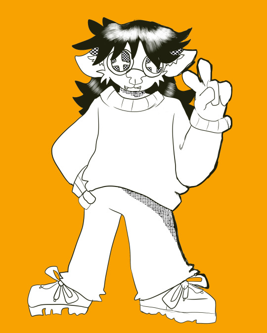
#art#furry art#weirdfur#vaguely based on the gyaru dog#yk the one#mostly just a screentone test lol#ash#buried bones
1 note
·
View note
Text
time for my biyearly promo. read my ace attorney fancomic if you enjoy:
mostly the same stuff that happens in regular ace attorney because it was already really good the first time around so why fix it if it's not broken
screentones
loss.jpg
135 notes
·
View notes
Text
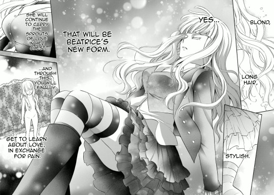
A 'skill' I've ended up honing is a sense of the various art styles of the Umineko manga artists. Generally when I see a panel I can tell what episode it's from based on either context, it being an often-posted panel, or even just... how it's drawn.
Episode 1, 3, and 8 are drawn by Natsumi Kei! Natsumi Kei doesn't draw Battler with his vest. She has a specific way of drawing eyes (for example, drawing Beato's with no/little shading) and Battler's hair is super spiky. She draws Beatrice's dress as entirely black besides the pattern, with some white parts for shading/lighting - a trait which most of the Umineko artists share
She also has a tendency towards some fanservice angles/poses (such as that oft-memed panel that shows off Eva's ass while she's raging at her misogynistic brother/family).
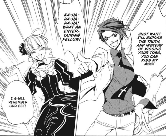
She likes to do these 'close-up' shots to show off detailed expressions.
She also draws Beato's eyes with blonde eyelashes! So pretty... A lot of the Umineko manga artists draw Beatrice with blond eyelashes, which always seem so delicate when they do the detailed close ups.

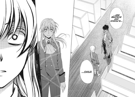
The EP2 mangaka, Jiro Suzuki, contrasts Natsumi Kei a lot. They use heavier shading at times, and their anatomy is also different - I often get the impression that their Beato is more broad-shouldered, while their Battler is more skinny. Like a twig.
From this panel, you can really get the impression of 'glowing' in a way that you can't get from Natsumi Kei's work.
In general, their style has a lot more detail for things like face and hair. Just like Natsumi Kei, they draw Beato with blonde eyelashes, though they interpret Battler's hair differently.
Battler's clothes feel very flowy, which adds to the sense of him being very skinny. Just like Natsumi Kei, Battler is drawn without his vest. I feel as though there's a sharpness to the joints.
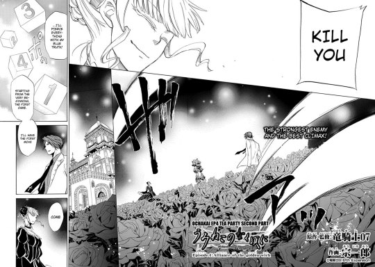
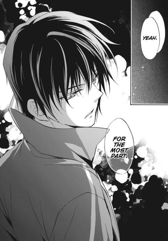
EP4 is drawn by Soichiro! A return to spikier Battler hair. I feel like they tend towards narrower, sharper eyes.

Soichiro has a certain way of paneling... It relies a lot on very similar-looking boxes. They're generally all the same shape, and often the same size. Some examples:
As you may have noticed, Battler is still bereft of his vest. It's probably a choice all of these mangakas made in order to simplify his design.
...I would also like to submit for your consideration the travesty that is the paneling in this page. It's... a bit confusing to follow. This is a tendency in their style - sometimes the emphasis, paneling, etc. isn't quite right. They're a great artist, but I get the feeling that they weren't quite accustomed to this medium at the time of drawing.
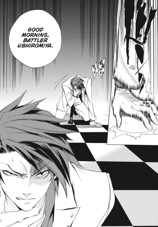
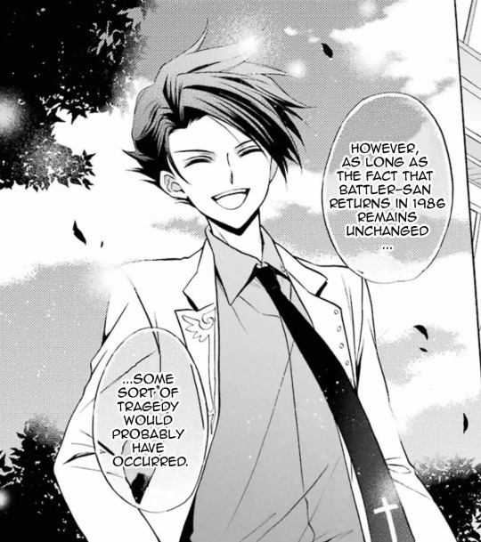
EP5 is drawn by Akitaka.
Akitaka is one of my favorite Umineko manga artists by the sheer virtue of the fact that Akitaka restores Battler's vest to its proper place: on his body. Battler's hair is still spiky, but it's a different, sometime toned-down interpretation. The way they shade his hair feels really unique to me - a mix of the usual screentones with some black sections (depending on the angle and level of detail). In general I feel like Akitaka works a lot with screentones to add a lot of shading to their panels.

Rather than using pure black for Beatrice' dress, it's a mix of black and screentones. Part of this is for lighting, but it also allows Akitaka to show a lot more details for the dress, which the artists who use primarily black for the dress can't do.
Akitaka also has some really detailed expressions. They manage to bring a lot of character to even the 'dead' Beato.
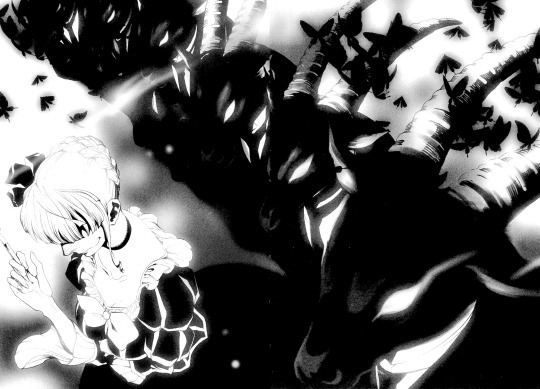
EP6 is drawn by Hinase Momoyama. Battler's vest, the most important character in Umineko, triumphantly remains. However, Battler's hair is less spiky and more slicked-down. Like Akitaka, there are often black sections of it, but these are more often at the front, rather than the back, of the head.
Beatrice's dress varies from "mostly black" to "mostly screentones" in EP6. Elder Beatrice, however, has these very detailed and eye-catching ruffles to her skirt. She is also drawn with sharper eyes and expressions than Chick Beatrice, who is wide-eyed and has very flowy princess sleeves on her dress.

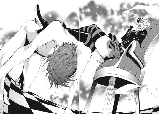
Battler comes off as super cute when he's angry, rather than something more menacing or serious, as he does in Natsumi Kei's art. For comparison: (EP6, then EP8)

This is probably a result of how Natsumi Kei draws 'sharper', while Momoyama uses rounder shapes.
EP7 is drawn by Eita Mizuno, who is a saint for managing to draw beautifully for all NINE volumes. NINE. A saint.
They draw Beatrice's dress primarily with screentones, and have very bright, wide eyes.

They use a lot of texture with their screentones, which gives their art a unique feel amongst the artists for the manga.
I'd also like to have a special shout out to this page. The way the art style shifts in the final panel to reflect Lion's shock and horror is an incredible use of the medium. This artist really seems to like these horizontal spreads, but they use the space well.
More masculine characters like Will have narrower eyes, though the pupils/light isn't that different. While characters with light hair like Lion have no screentones for their hair, Will receives a healthy mix: primarily black, with some screentone highlights. Of course, light-haired characters will have screentoned hair depending on the lighting, but in bright lighting, Lion has entirely white hair.
...Also, Battler has once more lost his vest. At least his hair is spiky again...?
That covers all the main mangaka, but there's also the mangaka for the side manga, Tsubasa: Fumi Ito. Their art is really cute and suits the often-comedic stories well. The small highlights they put in hair feels characteristic of their style. They often draw characters with wide, round, bright eyes.
Battler's hair spikiness is toned down (so fluffy...) and his vest returns for the final time. A true blessing.

This is just a super brief overview of it all - there's a lot of characters whose varying depictions I didn't mention, I didn't really talk about how they do backgrounds, and plenty of other things. But Umineko has a lot of talented artists who worked on it, and many of them still sometimes post fanart (or new official art) for the series!
I feel like we should appreciate the amazing range of artists who have done their best to interpret Umineko's story. They all did a great job!
#umineko#umineko no naku koro ni#manga#umineko spoilers#just in case since I grabbed panels from everywhere
143 notes
·
View notes
Text

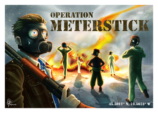
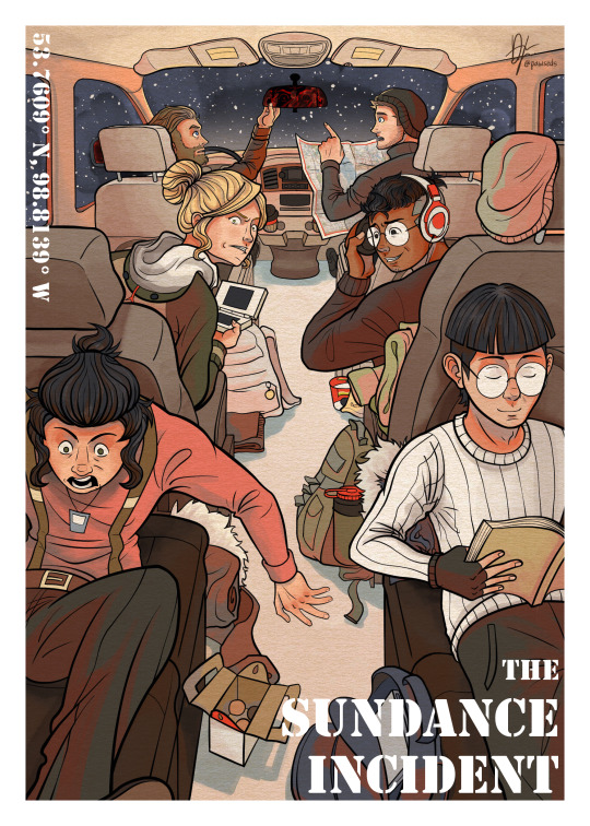
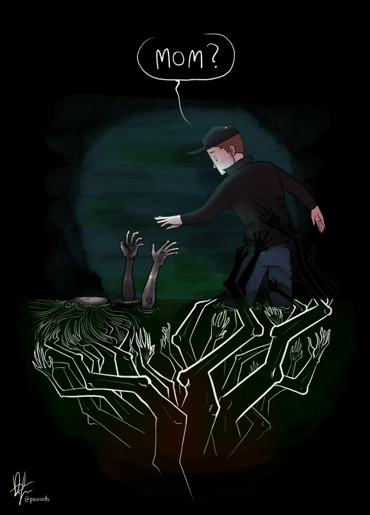


I drew a postcard for each module/operation my 1-year Delta Green TTRPG/M-EPIC group went on along with bonus illustrations, including the last one which was a surprise for the party when our campaign ended. I also drew 170 sticky note comics for this campaign lmao and you can read those + the hook for each operation below! Each postcard (and coincidentally each drawing here) is in a different art style, too.
Operation FELDSPAR: digital, B&W inky screentones with colour accents inspired by Blue Period
Operation METERSTICK: digital, lineless, textured painting (usually I only use the g-pen/default pen brush and call it a day)
The Sundance Incident: digital colouring and rendering inspired by Stand Still, Stay Silent (I seldom focus on colour scheme like this)
Operation AIRBSUH: traditional stencil printing with acrylic paint, touched up with drawing pens with a movie-poster composition
Operation NANARLUK: my usual digital style of cell-shaded characters against a g-pen painted background!. Also, bonus optical illusion! Reality go brr
And here are the art style of the other drawings:
'Mom': my simple art style :D
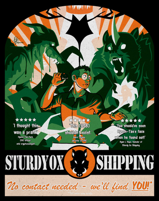
Sturdy Ox Shipping: mostly lineless with a limited colour palette
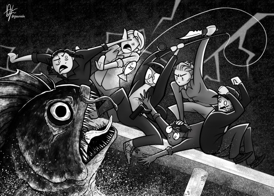
Gone Fishing: also simple art style, but this time it's greyscale! (Never happened in-game, but was planned to)
Thank-you postcard: that western comic-styled airbrush rendering
#m-epic#delta green#call of cthulhu#ttrpg#ttrpg art#ttrpg character#ttrpg community#pawsedsart#original character#original art#oc#oc art#my ocs#my art#drawing#art#character design#character art#cthulhu mythos#ttrpg campaign#artwork#artists on tumblr#digital art#illustration#art tag#ttrpg oc#oc art dump#oc artist#oc artwork#oc story
27 notes
·
View notes
Text
Clamp Art Style Analysis: Part 2: Series styles and Compare and Contrast
Series Styles
Over the years the Clamp art style changes constantly depending on the series, and the art direction always changes depending on the work and magazine. Clamp’s art style always changes to suit the genre of the magazine the work is running in. When I researched I noticed when I look at their earlier works and recently it's in that their art style changed over the years I saw that the art of these series improved due to different works' sterilization and the hiatus this is seen in a few series that I am going to talk about. I am not going to go over all of their works just choose these series and discuss them in this segment, I am going to be heavily biased and choose this series to talk about the art style, lines, and materials used while drawing the series
X1999
I don’t know the art style with x as I did with the other series since there wasn’t much to talk about in the interviews.
Mostly I think this is the beginning of Clamp’s early years when the art style looked this way. The art style Clamps early years as artists. The one in charge of X's art direction is Nekoi, Nekoi is in charge of the art direction of x with Igarashi assisting, The art in X changed with the art shifted to Nekoi’s delicate style.
The art of X changed expeditiously compared to how the art looked in the first chapter,
The art at the beginning of X had thick ink lines and more dramatic shading in the early volumes and is more or less gone. X is drawn in a more ornate style characteristic of shoujo manga, noting that x is a series intended for a female audience. X takes on a shojo style bolder and more intense art for drawing X there is a heavy use of screen tone. While drawing X, they used straight lines they drew with Thick lines in the beginning, X had a lot of colored backgrounds in the illustrations, and manga X is one of the series in that they had trouble applying screentone.
If you compare x it has changed a lot due to Clamp working on other series though mostly it's because it ran the longest in the magazine. X was sterilized during Wish, Card Captor Sakura, Chobits, Magic Knight Rayearth,Suki, Legal Drug, Legend of Chun Hyang and Angelic Layer.
When it came to creating for x it was the original character profile, Clamp drew all the aspects they wanted to include in the final character in a bulletin-type chart they drew it like a New Year's greeting card.
Unlike with other sterilization, they didn’t decide on the materials they would be using so X doesn’t have any specific material for drawings. Nekoi and Mokona did a lot of experimenting with materials in x. Clamp used many different materials and a variety of techniques when drawing X the colors in x they painted with a lot of new materials and a lot of contrasting colors. There was a lot of experimenting with materials with x. You can see it in the illustrations.
The materials that are used for x are color screentone. Colortone is a type of colored screentone called overlay, their usual color ink, gash, and pastel products X has many different kinds of illustration paper used for coloring from wrapping paper and cardboard to tea wrappers.
I am going to go over the materials they used in their color illustrations from 1992-1996 and 1997-2004
1992-1997
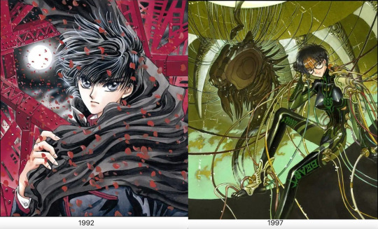
Paper: Kent Block, BB Kent, BB Kent rough surface, Kent paper, sand textured paper, Shinden shi paper, Feather Waltz, Arches, parchment paper, manuscript paper, Watson paper, wood free paper
Lines: Holbein Color Ink (Special black), Photocopied pencil lines, Pigma Graphic pen, Pigma Graphic ink pen, color pencil, pencil, Holbein Color Ink (sepia), poster color, color pencil, Winsor and Newton Drawing Ink (nut brown), Dr. Ph. Martins Sepia Ink
Color: Dr. Ph. Martain’s Color Ink, Acrylic, airbrush, modeling paste, gouache, color tone, poster color, Liquitex, Acrylic gouache, color tone, white out, Copic markers, Lumocolor Ink pen, Lumocolor
1998-2003
Paper: Watson paper, BB Kent, copy paper, Sheet of paper with a light brown color, hotel stationery paper,
Lines: Pigma Graphic ink pen, India ink, Ballpoint pen, Sepia black ink,
Color: Lumocolor ink pen, modeling paste Lumocolor, sepia, copic marker, airbrush, poster, Acrylic gouache, airbrush, color ink, Liquitex, Dr. Ph. Martains Color Ink, Gold brown Ink, Poster color, color ink,
If you looked at the materials and techniques in the comments used for drawing the illustrations of x they
put a lot of work in the color illustrations for x. The materials used in the illustration change the impression.
For the illustrations, There were a few comments about it, A 2002 comment that Fuuma's head looks a little big; this is a drawing habit they had while working on Chobits at the time.
When it came to illustrations sepia ink was used for outlines of characters with pale color profiles since the lines stand out too much in black in illustrations sepia ink was used for characters with pale color profiles. Hinoto, Kakyou, and Kotori have Saphia outlines. Yuto is the only exception. He has a light color profile but looks good with crisp outlines so he is drawn with black ink. When Clamp drew Kotori they always made sure to draw her with a very faint and soft touch when it came to drawing her in illustrations they used Sephia instead of black for her lines.
X is a shoujo manga that ran in Asuka for some time. It has a lot of action scenes that attracted male readers, Asuka gave the team the freedom to create what they saw fit.
There is a difference in colors between the first and subsequent printings as seen in the volumes of X. The volumes up to 4 were a lot tidier but on volume 5. Clamp started to get busier and messier.
Everything in X is written by script, even the details of the collapsing and the destruction of the buildings look like the destruction of the buildings is written from the script from Ohkawa. The backgrounds and destruction of the city were mentioned by Ohkawa. While Clamp is drawing the destruction of the buildings they have reference photos taken beforehand which Igarashi finds tiring and painful.
In Kamui’s character design, Kamui has Tsuri-me-type eyes like Ashura from RG Veda Clamp considered Kamui's hairstyle and uniform average.
The character that Clamp had a hard time drawing appearance-wise is Kotori, Kotori was the character that Clamp found trouble with drawing. When Ohkawa looked at the manuscript copy of chapter one Ohkawa was a little shocked at the drawing of Kotori even considered her like udon. Mokona did her in pencil in the rough draft, Kotori looked soft and sort of limp when she added a pen she looked thicker by thinning down the lines her body became less solid making her float around she became lighter and more impermanent so they used the tip of the pens instead when inking her.
Another one of the difficulties that came with drawing X was drawing all the characters from the dragons of heaven and the dragons of the earth in one picture in the same illustration. They are parts of the character that give you trouble that you confuse with others but individually they are easy.
Clover
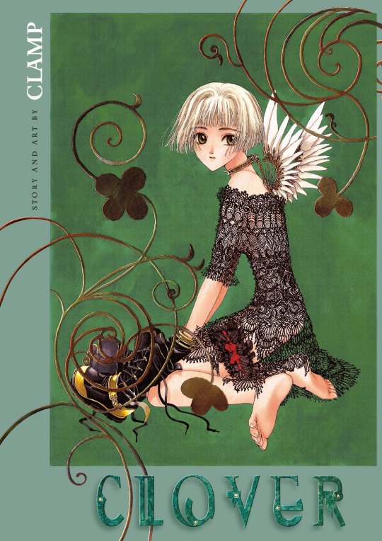
Clover has a different sense of atmosphere and techniques. The art in Clover has a feeling of decadence or nostalgia, the wing design looks like older Mecha Ohkawa was influenced by the movie “1984” she made Mokona watch it to recapture its mood. The buildings in Clover reference old movies made to resemble German and European countries. They also used European photographs as references, like photos of German factories.
Ohkawa made modifications to Clovers' art style since it ran in a magazine for young girls the intended audience for Clovers was older so the art style is made to look prettier since it's for girls.
Mokona is in charge of the art in Clover even the story paneling was planned out by her Both Mokona and Ohkawa planned the panels in the manga Clover. The distinctive layouts and layouts of the panels are created with music videos and movies in mind. The panels in Clover look like frames from a movie. Ohkawa had a hand in it with half having to plan the width of each panel. It wasn't easy and took more time. Clamp found the layout the most challenging and most fun they had in the series, for Clover has dialogue or scenes with big spaces between sentences. Clamp used thinner frames to look pretty.
The art material they used is gayoushi paper which is used to emphasize the bounciness of Sue's hair. Gayoushi paper is a type of cartridge paper in Japanese. They used drawing paper for clover the drawing paper here is contrasted with other, more common media. Clamp used different paper for clover which is cartridge paper or gayoshi paper for drawing the manga but the screentone kept slipping off and was annoying to Clamp. They used the copy machine to give Clover a picture book blurred look they had a hard time getting it right and tried many times.
Card Captor Sakura
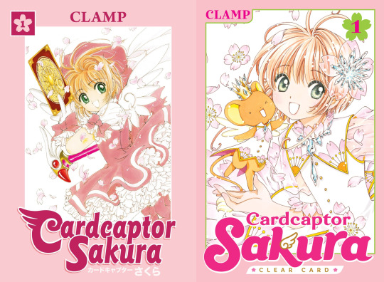
For the art style of Card Captor Sakura, Clamp wanted to create something really cute.
It focuses on the cute factor so the lines and use of ink are to give it a soft and cute feel Card Captor Sakura uses thin, curved lines the manga Mokona the one who makes the lines thin in Sakura and doesn’t use a lot of ink making the pages light and to make it look soft feel. It is a shoujo manga with a magical girl genre so it would make sense that the series would look soft. Card Captor Sakura uses color ink for the illustrations the color ink is used to create a clear image. For materials Card Captor Sakura and clear card Arc used copic markers and modeling paste in the illustrations.
For designing the Clow cards, the design of borders of the cards was created first. Mokona filled in the illustrations, and the rest determined the card name and functions in the story. Clamp didn’t have problems with designing characters but the expressions changed from the plan.
Chobits
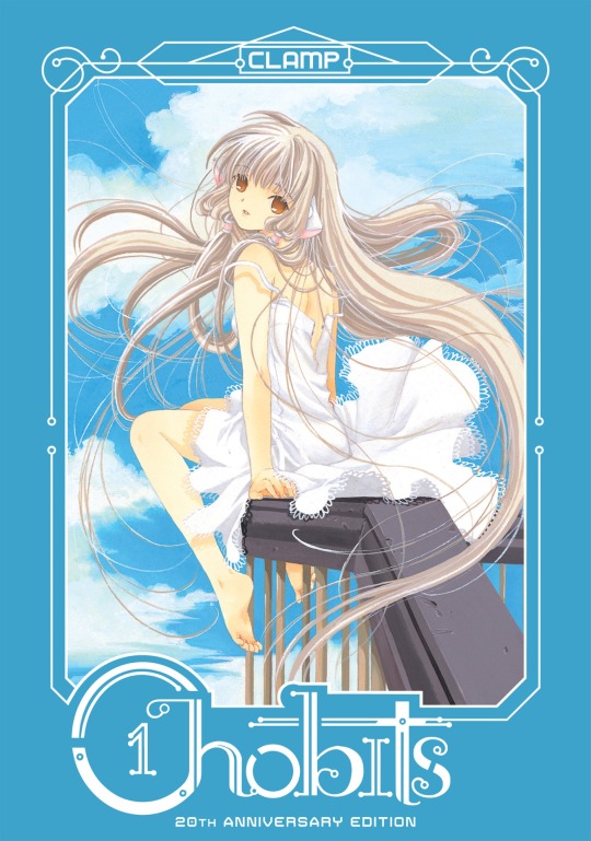
The materials of Chobits are based on Ohkawas decisions for materials. Clamp uses ball pens for drawing. They used ball pens since they wanted something drawn by pencil. The illustrations for Chobits have Clamp use acrylic gouache and more gouache.
In Chobit's art style the character has shorter arms and legs and the shoulders aren't wide. the character designs for chobits for Chi, Chi’s design is the most detailed one.
Legal Drug
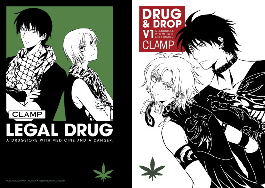
Legal Drug came after Suki, Clamp was into underground crime dramas so the manga has serious and dark tones. The series went on a hiatus so the art style changed compared to when it was first run making the art style similar to XXXHolic.
Clamp used digital computer equipment for Legal Drug, Legal Drug is the first series that Clamp drew colored digital for the first time. Clamp drew all the CG color illustrations for Legal Drug. They wanted to use CG as a tool so they learned how to use CG from Katsuya, Okazaki Takeshi, and Takashi Yamazaki. Clamp struggled using the computer for the first time they ran into problems like the power ran out of the computer before saving.
Tsubasa Reservoir Chronicle
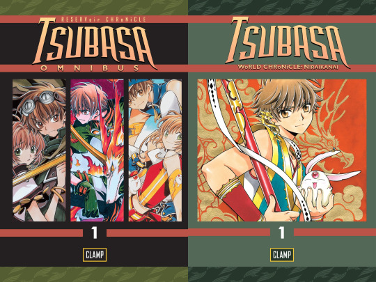
The drawing methods changed with Tsubasa and XXXHolic, two series that worked in tandem; this goes with the drawing style of both series since the art style has been changing. Both scripts of XXXHolic and Tsubasa have a lot of difficulty, Tsubasa was supposed to be for a younger audience which caused it to increase complexity but it gave the team complete creative freedom. Clamp didn’t want to make the pacing too complicated due to being about a young man's journey.
Tsubasa had thicker lines and simple page layouts, Clamp used a marker with thick lines that could be drawn while printing on rough paper since the frames did not work well the fine lines looked blurred Clamp had a problem making the lines too thin, and didn’t have the impact they needed to stand out the lines need to be bold and popped out since it's a weekly manga series said readers tend to forget. The thick lines in Tsubasa are to make the art be seen in the magazine printings since thin lines are too delicate and will make scenes hard to see in the printing of the magazine
Since Tsubasa is running a weekly magazine the thickness of the lines affects the visibility of the magazine printing.
Tsubasa started the trend of drawing thin vertical borders and thick horizontal ones, the difference between the panel borders Clamp separating the panel in the layouts to link it to XXXHolic.
The art style of Tsubasa was based on a suggestion from the editor The editor asked the group to make the drawing style attractive to readers of Shonen magazine Tsubasa is a shone manga drawn to fit that genre Clamp already had design decided and materials prepared.
For materials they are seen using when drawing, Tsubasa is a monograph mechanical pencil used for pencil drafting in their manga. The Clamp uses a marker with which thick lines can be drawn to make it pop out on rough paper in printing the ink markers they use to fill in the large spaces. Clamps have Copic markers for colored illustration in Tsubasa.
Ohkawa directs the art style of Tsubasa, she tells the members to draw the male characters with vigor and take more care of the female characters. Mokona is the artist who crafts the characters and storyboards she draws most of the characters in Tsubasa, female characters have soft fluffy hair and look like they are drawn with soft touches, and male characters are drawn with a rougher touch. Ashura wasn’t easy to draw since they have a feminine beauty and it wasn’t easy to draw those with loose eyelashes. They decided not to draw lower lashes which made the faces stiff, evident with Emeraude they changed her hair and put curls in her hair to make her more graceful. They used their normal style to get the readers to pick up the story. When accustomed to the new style they thought of slowly returning to their art style during the country of Oto.
The script of Tsubasa takes 5 hours, the storyboard 10, and the drawing for the manuscript takes two days for 20 pages. If not going well, it could take three days.
XXXHolic
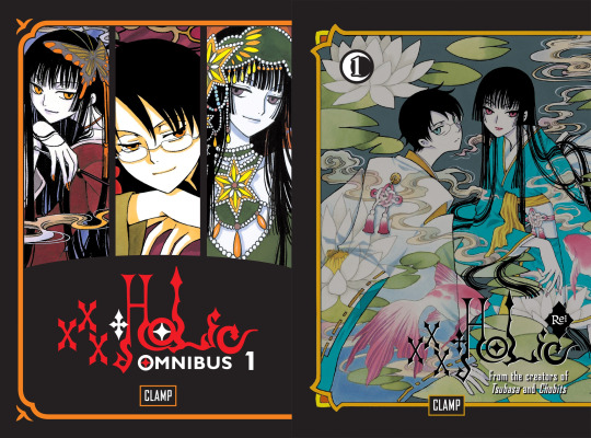
The drawing methods changed with Tsubasa and XXXHolic Two series worked in tandem compared to the two series XXXHolic was the series that Clamp found was easy to draw.
The characters of XXXHolic are drawn to be very tall and have long limbs; they are thinner and longer in the drawing. It makes characters more expressive in the manga. XXXHolic and Tsubasa have similar proportions for characters The reason is that they cross over Tsubasa is linked to XXXHolic the proportions of the characters are similar to be meant to cross over to Tsubasa.
The materials for XXXHolic they use for drawing are felt tip pens since human characters are drawn by 2 people if they used a regular pen the brushstroke strengths would be uneven Clamp members have strong drawing pressure so having the same pen can even it out. Clamp decided not to use screen tones for xxHolic, XXXHolic is drawn without screen tone to give more of an impression of occultism.
They used mechanical pencils for the drafting stage when drawing in xxxHolic and inking markers to fill in large spaces.
There are a lot of Japanese and Chinese in XXXHolic The style Clamp uses for XXXHolic is similar to traditional Japanese Ukiyo-e paintings, a Ukiyo-e art style that dictates longer proportions for the characters. The character looks tall and lean. xxHolic looks more like a wood block painting and has Japanese prints and Alphonse Mucha with an art nouveau in it. The female characters in XXXHolic are drawn by Mokona and the male characters are drawn by Nekoi who are also Yokai and spirits that aren't in human shape and animals.
The covers and color pages are drawn by Nekoi and Mokona together, the base colors of the covers are never white, gold, or silver then color printed over it.
The storyboard for XXXHolic takes 6 to 8 hours done by Saturday.
Kobato
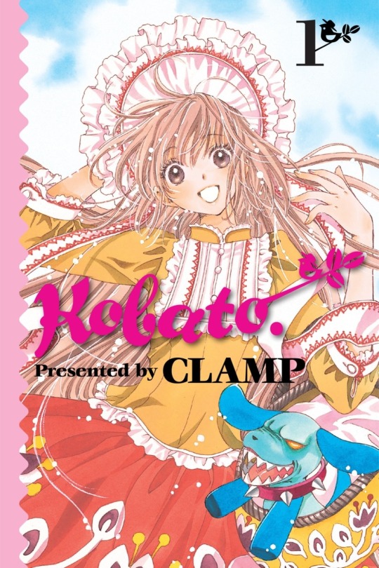
Kobato's art style is similar to Card Captor Sakura’s. The lines used in Kobato are similar to the lines in Card Captor Sakura, and the lines in the manga are thin, like a shoujo manga. The colors of the illustration are pale with a touch of watercolor.
Kobato was made into a brighter series since Tsubasa was heading into a dark development, Kobato's story is loose and not too dark and is meant to be more relaxing.
Comparing and Contrasting the panels of these series
X/1999 & Clover
Clover and X are two old shoujo manga done by Clamp though Clover was drawn during the run of X
making X the longest-running series. Each of the members of Clamp is in charge of the art direction of the manga
with Nekoi in charge of the art direction of x and Mokona in charge of the art direction for Clover.
The lines that are used to ink and the line thickness in the two series are different along with the amount of pen pressure seen in the manga. The members of Clamp have strong drawing pressure. You can see it in the way they drew the lines in the ink and the line weight in the ink in the manga. You can tell the amount of pen pressure used in both the manga series is a testament to how strong the drawing pressure is.
For the line thickness for both series, the lines in X have straight bold thicker lines. The lines in Clover are thin and along with the panels the lines have thin frames.
X uses a heavy amount of screen tone whereas Clover doesn’t use too much screen tone.
They use a different sort of paper for clover that is gayoushi paper which is used to emphasize the bounciness of Sue’s hair.
These are two styles. The art style for Clover is made to look pretty since it's for girls and drawn with an air of decadence to give people old-fashioned feelings when they read it. The style of Clover stands out due to how it's drawn. The frames of Clover are supposed to look more like a movie. The art style of X went through huge changes due to a long year run so its art style changed to be more defined and detailed.
Both manga series have different art styles to suit the atmosphere of the manga X used a heavy atmosphere where Clover has some sort of emptiness that the characters in the manga face to symbolize how bleak their situation is though someone pointed out that a large amount of negative space for clover is drawn to emphasize for the characters loneliness. The atmosphere of X gives a more foreboding sort of feel since it's near the end of the world.
Tsubasa and Card Captor Sakura
These two manga series went through two second series there is major art development compared to how it was first runned here to properly focus on the current art style.
When you put the two together they are radically different.
The art styles for the two series are created to fit the genre with Card Captor Sakura being a shoujo manga and Tsubasa being a shonen manga.
For the lines of the series, Card Captor Sakura is thin curved lines and doesn’t use a lot of ink The lines in Tsubasa are bolder and thicker with simple page line art.
The materials used when drawing Tsubasa for which thick lines can be drawn is a marker with thick lines as stated before the impre.ssion of the series can change depending on the materials used this is true for Tsubasa and Card Captor Sakura
The characters in Tsubasa are drawn differently by different artists the female characters have soft fluffy hair drawn with soft delicate touches and the male characters are drawn with a rougher touch to emphasize masculinity.
The eyes of both series are different. The eyes in both series have different textures in the irises with the upper eyes in Card Captor Sakura being thin and dark. The eyes of Tsubasa are angular and thick there are no lashes in the eyes of Tsubasa
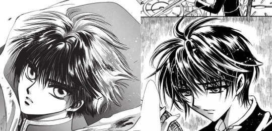
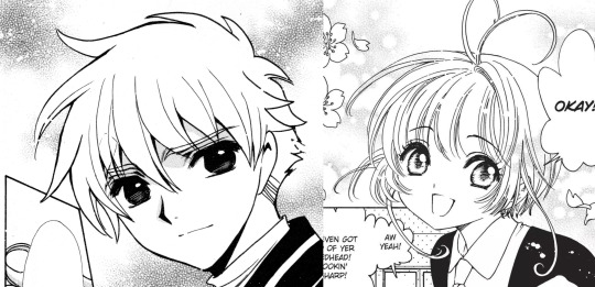
Sakura and Syaoran

If you need to compare the series the styles would be seen best in the designs of the two characters of Sakura and Syaoran. Looking at them together the impressions of these two characters do change depending on the art style of the series they are drawn in. Sakura and Syaoran are drawn differently in Tsubasa than they were in Card Captor Sakura Even though Sakura and Syaoran are drawn the same there are a few differences that set them apart seen in the hair and eyes.
The designs of Sakura and Syaoran are re-used in Tsubasa in designs. I would notice a lot of small details in their designs that make them different and stand out as their hairstyles and eyes differed when you put the two of them together. The new designs of the characters convey the impression of their characters.
There a different impressions of the two characters when you look at the art style how they are drawn with thin lines and how they are drawn with thick lines the impression of the two characters are There different when looking at the different art style and how differences there are in their designs
In the Card Captor Sakura Syaoran looked more like a boy fitting since he is in elementary school so he's drawn to be much younger. The syaoran in Tsubasa gives an image of a young man between boyhood and manhood Tsubasa’s syaoran design highlights maturity in contrast to Card Captor Sakura Syaoran. The height is obvious in the designs drawn with the Tsubasa design.
If I compare the two Syaoran together their expressions are different, Card Captor’s Syaoran looked dour and moody
whereas Tsubasa’s Syaoran spots a determined, serious look. Card Captor’s Syaoran looks like a little kid while Tsubasa’s Syaoran looks like a bright honest, sincere young man. The only difference between the designs of syaorans would be their expressions conveying their overall look and personality in their design. Syaoran is designed based on a shonen protagonist it answered with what would happen if Card Captor Syaoran is the shounen protagonist with Tsubasa Syaoran as the answer.
For Syaoran’s hair: Syaoran’s hair is a crew cut with the end shaved. Both Syaorans have the same hairstyle drawn differently from the series. In Card Captor Sakura there are a lot of lines and details in the hair of Syaoran’s with his bangs being thin lines. Tsubasa’s Syaoran hair is simplified and doesn’t have too many lines his hair and bangs are drawn simply and look blocky and rough he is drawn with rough edges as seen with his hair that emphasizes masculinity.
For Sakura's hair, both the Card CAptor and Tsubasa have short hair. She does have the same short hairstyle; there are a few noticeable differences. Card Captor Sakura’s hair looked straighter in the art, Tsubasa’s Sakura hair has soft fluffy hair and looks bouncy and floofy. her hair moves in different directions to emphasize the bounciness aspect and there are a lot of strands in Sakura's hair.
Card Captor’s sakura is designed based on one of Clamps nieces and Despite them being designed as normal girls, they have this cuteness to them that makes them appealing with Tsubasa sakura designs being reused but still have an image of cuteness like with card captor’s sakura still retains her cheerful and lively personality as she had in Card Captor Sakura.
Card Captor Sakura and Kobato
The two of them are both shoujo mangas but have different audiences with Card Captor Sakura created for a younger audience and Kobato for an older audience in mind.
The two series have different tones Kobato is focused on drama and is more serious but light and loose. Card Captor Sakura is a lighter series than Kobato but is drawn with a soft cute-like feel in mind with Kobato being a focus of reality and the supernatrual in the manga.
The amount of lines when inking at Kobato has a similar style to Card Captor Sakura with the series both using thin lines The lines in Kobato are thin and shojo manga like Card Captor Sakura use curved thin lines and don’t have a lot of of of ink. There are different textures in eyes when inked, Kobato has a lot of lashes in her eyes Sakura has a few lashes
Card Captor Sakura and Chobits

Card Captor Sakura is a shojo manga intended for a younger audience in mind, Chobits is an ecchi manga drawn for an older male audience in mind the art style is appealing to a male audience.
Though the genre of the two series has different art styles they are both drawn with the same thin lines the series are drawn with the use of thin lines and both look soft. Card captor Sakura Doesn’t use a lot of ink and has thin curved lines.
The difference is the materials that are used for the series Chobits uses different materials from Card captor Sakura, for materials for Chobits Clamp use ballpoint pens to make it look to be drawn by pencil The thickness in the eyes of Chobits have a thin line drawn, the ballpoint pen has something to do with it changing the thickness in the eyes.
Tsubasa and xxxHolic

Tsubasa and xxxHolic are both manga series that are drawn in tandem so it wouldn’t be a surprise they have a similar art style. Holic and Tsubasa have similar proportions for the characters this is supposed to show they are both linked. The characters in Holic are drawn tall and have long limbs which are thinner and longer in the manga.
Holic is styled as more of a woodblock painting. Holic art style resembles Japanese ukiyo-e paintings with ukiyo-e longer proportions. Holic is drawn without screentone to give more of an occult feeling.
Clamp uses different materials for the two series, Holic has members draw the characters they use felt tip pens to match Clamps' strong drawing style and use an inking marker to fill large spaces. For Tsubasa the materials they use are a marker with thick lines they used a marker with thick lines to make it pop. Since Tsubasa is more action-oriented since it is a shounen the art needs to pop.
Comparing the thickness of the lines in the series, I would say that Holic has thin lines to contrast with Tsubasa's thick bold lines The eyes of Holic look like there drawn using thin lines and the eyes of Tsubasa have heavy lines in them.
Prev/Next
#clamp#card captor sakura#card captor clear#tsubasa reservoir chronicle#x/1999#clover clamp#kobato#xxxholic#meta#legal drug#drop and drug#chobits#mokona#tsubaki nekoi#nanase ohkawa#Satsuki Igarashi#my meta
30 notes
·
View notes
Text
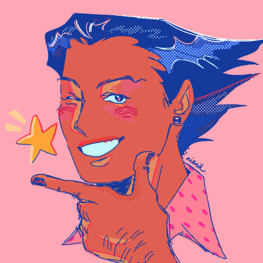
[ID: Digital drawing of Phoenix Wright. He holds up a finger gun to his chin and winks with a bright grin, a shining star next to his face. The colors are vibrant and mostly toned pink, aside from his hair and the lines which are blue. There's various screentones used to color and shade the drawing. The background is pink. /end ID]
drawing from the prev sketches i colored for @kar-krashew my dearly beloved !!! i have an agenda when it comes to phoenix and she gets me like nobody else <3
76 notes
·
View notes
Text
Chapter 110 is shorter than previous chapters have been, but it sure is something.
Mostly Aya and Bram focused, which I'm okay with. My question is: when is Agatha Christie going to step in :(
The sword is a holy sword, I suppose, so maybe only the wielder can take it out of Bram? I don't know if sheer force is enough to remove it. Aya jumps off (ideally she will land on the edge of the table and adding more force to the rope... that rope better not break). And, well. It was forged from an ability user. Ability users aren't exactly known for following the principles of nature.
30 seconds until the world is truly beyond saving. Forget about what Fyodor, Fukuchi, Bram and whoever else have going on, someone needs to stop that warhead.
Atsushi is about to be bitten by Akutagawa. We don't see the fangs penetrate into Atsushi's jugular, but they're grazing close enough to that.
Not too many thoughts this chapter. Aya's reckless ambition to save the world is a sort of callback to BEAST!Dazai, both taking the dive for others. But it also highlights her own character, how loosely she regards the weight of her life against that of the world, in the speed it takes to make her decision. She's 10 years old. No child should feel that way.
Something I want to point out: while her eyes are open, they are always light. Even when the rest of her face is covered with a screentone, her eyes remain bright while they're opened. The only time they're not in this chapter is when her eyes are unseen or closed, like the moment right before she jumps off.
This would also be a great time to awaken an ability. I believe in you, Aya!
20 notes
·
View notes
Note
have you ever done/will you ever do a speedpaint, timelapse, or tutorial on that lovely pixel art style you have there?
First of all, thank you, but also, I don't really have a process that's too different from pretty basic digital sketching/inking/coloring. I'll usually keep my canvases within a 500px to ~2000px range in either dimension in order to keep the aliasing of the pixels visible and meaningful, and focus on solid blocks of color instead of any gradients or blending. Other than that, I mostly just rely on certain tools to do a pixellated look.
Back when I used Paint Tool SAI, I used the binary brush and fill tool for pretty much everything. In order to make screentones, I would draw a pattern by hand, then copy and paste until I'd filled a whole layer, and then manipulate that with a clipping group.
Nowadays, I use Krita, which provides me with multiple tools that I can use for pixel art:
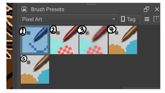
A fixed width brush that I can use for fine details, writing, or certain kinds of lining. I usually keep it anywhere from 1 to 5 px wide. For a short while, I was using it as my primary liner.
A dense dithering brush. Saves me time making those pixel screentones. They don't tend to play nice when people zoom out tho.
A half-as-dense dithering brush.
A pressure sensitive pixel brush. This is what I do a majority of my lining work with. The minimum width is 1px, and I usually keep the max at 8px.
Another fixed width brush that I usually leave on eraser at a super wide weight so I can erase things easily. Alternatively I'll switch off the erase and use it to paint huge areas a solid color.
Honorable mention: The fill tool.
This drawing, I used 4 for all the lining work, and 1 for the rectangle in the background and eyebrow piercing, since that's a really neat and regular shape. I used 2, 3, and the fill tool to create three different value levels.
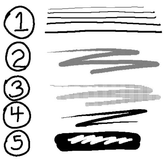
With my latest drawing, I did basically everything on Panne with 4. I used no screentones for this drawing, opting instead to make things either solid black, or very tightly hatched by hand. Part of this decision was because I knew I was going to be coloring it, so I didn't need the screentones to convey value. The other part was that I wanted this drawing to look good regardless of the zoom level.
Meanwhile, everything in the background was done with the 1 brush, 2px wide so that I was working with a fixed width the entire time in order to help create a contrast: the fixed, fine lines of the background vs the wider, more variable and expressive lines on Panne.
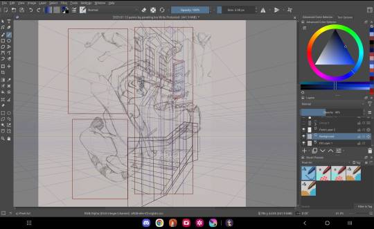
In case it's helpful, here's what the Panne drawing looked like in progress. The point is that the work is pretty simple and straightforward as far as process goes. It's just sketch, ink, and color. It's mostly the tools that get me the distinct look I really like.
#shark rambles#maybe at some point I'll post up a video of my workflow#Aside from that I hope this helps#Thank you for asking#my art#my sketches#panne#amelieverse#pixel art#tutorial
62 notes
·
View notes
Text
Masterpost of all the free downloadable brushes I use
Procreate only, but this list will be updated if I ever download anything more as I use mostly default brushes
- Comic Book Brushes
- Stef’s screentone V1 brush set
- Flipnote DS screentone brush set
- Balloon Brush / Speech bubble
19 notes
·
View notes
Last Seen Blogs