rosalbalizio
Managing Web Communications
By Rosalba Lizio 3057157
16 posts
Don't wanna be here? Send us removal request.
Last Seen Blogs

awesomecopper
Various nonsense

sugarriene
Sugarriene
parcellingtk76k573gbcogmg
Show bigg as well trading newspapers
zoejayw
Zoe Jay

kogiis
ⓉⓄⓊⓀⒺⓃ ⓇⒶⓃⒷⓊ
Text
Top 5 Graphic Design Trends in 2021
1. 3D Design. This trend is not exactly new, but it’s getting cooler, and cooler. This design trend is one that has certainly made the most of more modern technological advances and software capabilities.
2. Flat Icons and Illustrations. Icon can be a very powerful tool in visual communication, with a simple icon you can create a powerful message in less space and you can play more with creativity.
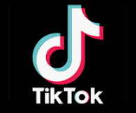
3. Motion Design and Interactions. Many companies have tried to refresh their brand through the re-introduction of patterns and textures to give life and depth to their logos and designs, an example is TikTok.
4. Trending Tool Adobe Aero an augmented reality authoring and publishing tool by Adobe Inc. is an example of 2021 newest trend tool created to help designing experiences by overlaying digital content over a live view of your mobile device's camera. You can easily use 2D and 3D assets stored in cloud platforms.

5. 3D Typography Design. This trend got in 2020, with designers using all sorts of playful ideas and concepts and viewers taking to them in a big way. Geometric or organic, the next trend looks like being development into 3d typography, using the same ideas but adding to rather than moving away from. Some really realistic style effects are gaining popularity. Three-dimensional typography has extra depth and can be a great display option.

We have talked about 2021 Design Trends in our last visual communication lecture and it was interesting to see once again, how important user experience is in digital design.
We have also discussed about fundamental elements for UI and IxD Design:
Mobile Optimisation.
According to Forbes mobile users spend 94% of their time on mobile devices.
A website that is not optimised for mobile is out of the trend for 2021
2. Colours and white designs are fundamental elements for UI and IxD Design.
3. User Interfaces and widgets sizes. They enables users to learn the system quickly and use it efficiently.
4. Animation is a very powerful tool to make a product simple and efficient, enhancing positive user experience.
5. Custom made 3D icons can be more functional than flat icons. They allow much more room for creativity, can help a product stand out from the crowd, and be more useful and understandable to users.
1 note
·
View note
Link
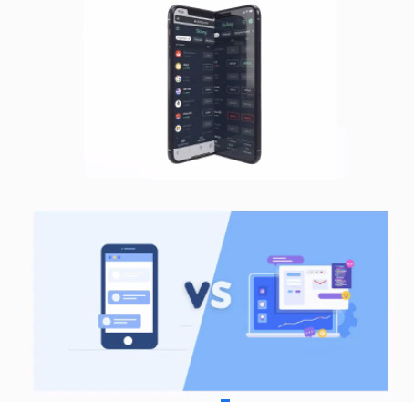
Mobile friendly websites
In one of the lectures we have discussed about the importance of optimising sites for mobile devices.
There is nothing more frustrating than a website navigation bar whose features are hard to find or take you for a joyride around the site until you finally get to what you want!
I tried buying an item online from an e-commerce website on my mobile phone and it was quite infuriating - It was not the easiest to navigate!
The highest impacting web design pitfalls which caused me anxiety were:
Broken links
Slow loading times (photos not loading).
Excessive ads/popups (prioritising revenue generation over user experience).
Auto-playing music.
There's many websites like this out there, and in this day and age where most people access websites on their phones, it's an issue that must be prioritised and addressed.
Companies have to recognise the value and importance of having a mobile friendly website!

6 TIPS TO MAKE A MOBILE FRIENDLY WEBSITE:
Do not make a second website for mobile.
Pay attention to font size and button size.
Make sure your content is available on all mobile devices and platforms.
Use responsive design.
Use high-resolution images.
Ensure your site is well-developed.
My advice is to always build a website thinking of mobile users first!
0 notes
Link
The importance of a logo design for your website.
A Logo creates consistency across tour web presence. It helps to target your audience and represents the soul of a brand. We have learned about logo and how to design one in our visual communication and desktop publishing class.
There are 5 steps that help us in the designing process:
Discover
Explore
Design
Refine
Define
I’m crazy about Guinness brand and logo.
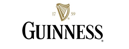
Guinness Logo.
Source: https://www.guinness.com/en-ie/
The harp representing the emblem of Guinness is not just a picture, the elegant golden harp is a symbol, it constitutes the brand philosophy and the business core value.
The very first logo for Guinness was created in 1862 and featured a monochrome badge with a double oval outline where the ornate wordmark in two different styles was placed. The harp was put in the upper part of the emblem, surrounded by cursive lettering.

In 1955 the Guinness logo was simplified to a detailed monochrome harp on a plain white background without any lettering.
In 2005, the color palette was introduced. The golden harp was placed on a black background, above the white inscription. The first letter was enlarged in comparison to others, which adds style to it.
2016 brought a three-dimensional emblem to the Guinness visual personality, making the surface gradient and its texture metallic. A far-sharper looking harp and the white inscription gained a new typeface serifs, which looked a bit old-style yet extremely sophisticated.
Definitely Guinness logo increases the brand recognition and identifies. It says how the company is recognized and remembered among others.
1 note
·
View note
Text
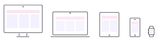
Responsive Architecture Design
We need to take in the near future regarding responsive architecture, now more than ever, we’re designing work meant to be viewed along a variety of different user devices and it’s important to think beyond the desktop and how our design responds to the user requirements, no matter if they’re using a tablet or a phone.
Responsive Web Design finally allows us to do so, and will guide us to learn how to deliver a quality experience.
RWD is is preferred to fluid layouts, it consists of a set of practices that adapt multi-devices layout appearance according to browser width, resolution, screens etc...
There are lots of basics techniques explained out there, the below in my opinion are the best practise.
Set an accessible viewport.
Use breakpoints
Use CSS media queries for responsiveness.
Being consistent regardless of what you’re using to view it.
Size content to the viewport.
Fluid and flexible Layout
Don’t overload with images.
Adjust buttons and click areas
Dropbx is an excellent example of RWD that optimised its website for desktop and mobile users, when browsing you will notice how the quality of photos is maintained when switching from a horizontal layout on to a vertical orientation on mobile and there is consistency through multiple screens.

Whether on a laptop or on your phone or tablets, as a user you want to find the content you are looking for in an efficient and a fast-way. For this reason you might want to prioritise your content. When adopting the mobile-first approach, you should prioritize important content for mobile and add more content as the screen size increases.
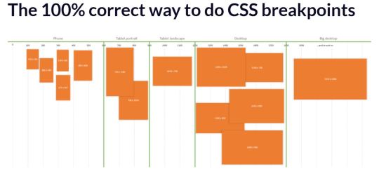
Breakpoints are crucial in RWD development, they are points in the CSS of a website which alter how content appears on different screen resolutions.
According to Interaction Design Foundation, mobile users tend to prefer shorter, simpler interactions so more specific content.
Buttons and clickable areas need to be easy to see and access or you end up frustrating users. You need to make sure your buttons and clickable areas are well adjusted for best usability
If you follow these steps you will have an excellent user experience, promoting a professional perception of your brand and it will contribute to the SEO of your website.
0 notes
Photo

Colours tools and templates
Colours are very important when designing websites or applications and in all areas of visual communication.
I tend to use analogous color combinations when it comes to design or painting -I like assembling colors that sit adjacent to each other on the colour circle, it creates a smooth and relaxing feeling for the eye and for users.
There are lots of tools and books regarding colours - HTML colour picker is largely used along with Webflow Chrome Extension utilised by web designers to easily pick colors from their own project, be it a logo, a photo, a poster, etc..

HTML colour picker.
CSS Color Chart is a website with a neutral colour chart and a general-purpose colour chart. You can use them in palettes with either HTML or CSS. The charts are made in a way that allows you to narrow your browser window with the palette and compare the colours to your design side-by-side.
Canva website with colour combinations is my favorite, I discovered about it in my web authoring class and is brilliant. You can access a wide range of template colour combinations for your websites: complimentary, analogous or tetradic fusions. The website gives you various ideas which can be a great source of inspiration and shows you real examples of how those colours could be used in professional designs.
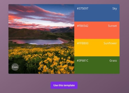
Canva color combinations. Source: https://www.canva.com/learn/100-color-combinations/
It is visually appealing really inspiring!
1 note
·
View note
Link
How to use the Psycology of colour in websites.
Colours express feeling and emotions. When our eyes read a colour, they communicate with a part of our brain known as the hypothalamus, which sends an enormous amount of information and signals to the pituitary gland, and then to the thyroid glands. The thyroid glands then release an hormone which cause fluctuation in mood, emotion, and resulting behavior.
A recent case study showed that adjusting color, among other elements, can increase conversion by as much as 24%.
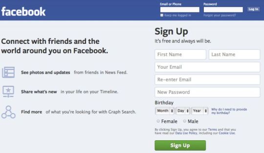
The world’s biggest social network Facebook uses blue. For a company whose core values are transparency and trust, the colour choice is not a coincidence.
What are the 3 best Color Logo Combinations that go well together?:
Beige, Brown, Dark Brown: it’s warm and reliable.
Blue, Yellow, Green: youthful and wise.
Dark Blue, Turquoise, Beige: confident and creative.
Blue, Red, Yellow: funky and radiant.
Light Pink, Hot Pink, Maroon: friendly and innocent.
Navy, Yellow, Beige: professional and optimistic.
2 notes
·
View notes
Photo
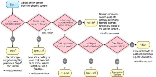
Flow content in HTML
Flow content includes phrasing content, but also elements like <p> and <h1> , <article> and <table>.
Flow content is defined as following: “Elements belonging to the flow content category typically contain text or embedded content”.
Phrasing content is defined as following: “Phrasing content defines the text and the mark-up it contains. Runs of phrasing content make up paragraphs”.
We have discussed this topic during one of our first Web Authoring classes and it’s extremely useful when it comes to web structure. It helps the user to move around a webpage and its sections or blocks contained in it. It makes the whole experience seamless, painless and engaging.
We all have experienced poor website design - poor interface layout, unclear Navigation tabs, broken links or un-clickable Buttons. As a user I don’t have to think too much to understand how an interface works. That’s why flow content and website structure is so important, not to mention for Google’s search Algorithm and Ranking System.
Let’s highlight five magical points that you need to consider when making an awesome flow content:
Plan Out Your Websites Hierarchy.
Create Your Websites URL Structure.
Develop a clear text links that help users move from page to page within your site.
Create a Simple and Logical Navigation.
Avoid overwhelming users with images, links and irrelevant content.
Building a simple webpage example from last relevant lab:
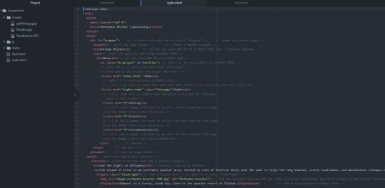
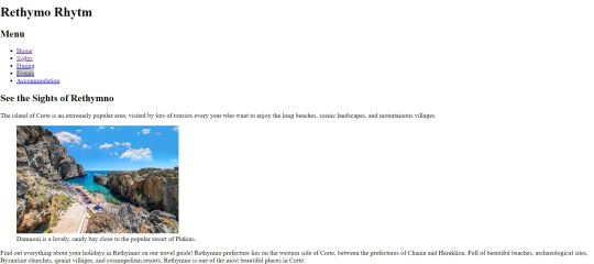
Have fun!
0 notes
Link
While browsing for typeface design inspiration, I came across an interesting article from Canva about the most common typeface used in web designing for advertising.
Typography is very effective and communicative, you can express a feeling or an emotion, a dream, an action, or a music genre like for our Visual Communication assignment.
The type can play a central role within the page and really contributes to the overall feel of an ad. Some fonts can connect you to a past travel experience for example by using a floral pattern in Asian culture. Or you can play with letters and three-dimensional shadowing which allows them to stand out like in this coca cola ad here.

Sunset Road Typeface for example reminds me of the country music.

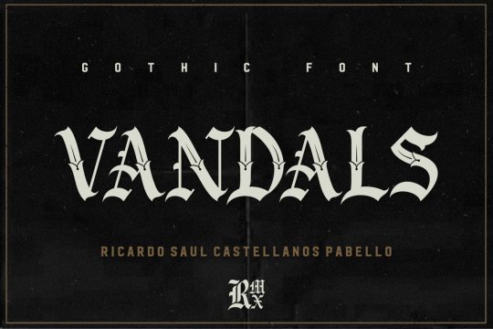
Gothic Font really rocks, I associate it to Heavy Metal music.
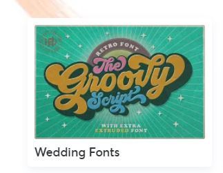
While Wedding font like the one below works really well with 70′s music.
There are some interesting ways to use type to express an ideas or a message, you can play with font and size, adjusting the space between individual letters, capitalization, colour and gradients, shades and contrast, blurring effects.
Surely the most important decision in setting an appropriate tone, is choosing a typeface or font since font same as color affects us emotionally and visually.
0 notes
Link
Styles with CSS
This week we are going to have our first lecture with the exciting CSS to start styling our projects.
I made some practise at home by creating a simple form with HTML
Before CSS:
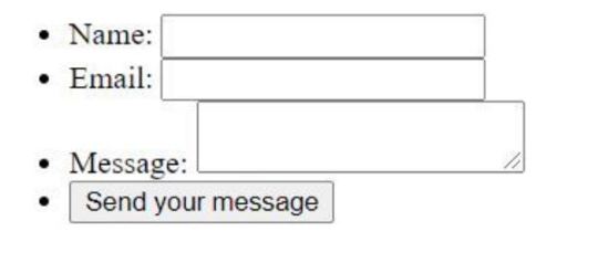
And I’ve applied some basics rules of CSS to style the form afterwards for a better looking.
After CSS:

I also made some readings related to CSS styles.
There are three types of CSS styles: inline, external, and internal.
Inline CSS
Inline CSS styles a specific HTML element by adding the style attribute to each HTML tag, without using selectors. However each HTML tag must be styled individually.
<!DOCTYPE html>
<html>
<body style=“background-color:red;”>
<h1> style=“color:blue;”> </p>
</body>
</html>
Internal CSS
Internal CSS requires the <style> tag in the <head> section of the HTML document in every page of a website.
<style type="text/css">
External CSS
External CSS, links the webpage to an external .css file, that has been created by a text editor, this allows to change the whole website and it’s the most used.
In the <head> section of the HTML document, add a reference to the external .css file just after <title> tag:
<link rel="stylesheet" type="text/css" href="style.css" />
The key for sucess? Practising, Practising, Practsing!
1 note
·
View note
Photo

5 Big Rules of Typography by Bridgette Mabuto
Source: https://we.graphics/blog/5-big-rules-of-typography-and-examples-of-designers-breaking-them/
While doing my research for typography for Visual Communication project I came across to this article about so called good old-fashioned calligraphy.
As I learned more about Typography I decided to use the tool “WhatTheFont” to find out what typeface and font have been used here:
Ahra Hand
Bemol Catch Words
Tinka Babe Bold Shadow
Tinka Babe Shadow Italic
I don’t particularly like the two designs because readability is not a big priority here and it seems messy. You don’t see where the image starts or the text ends. While the message still gets across, you need to pay closer attention to read the message.
The choice of a typeface or their variation (font) in web designing is extremely fundamental, it needs to be readable, attractive and in line with the content and structure of the website. You also need to make sure your viewers read the content following the hierarchy from most important to least important as dictated by font sizes and colour.
From a UX point of view, it's important to remember that the more confusing or uncommon your font, the more you risk frustrating people and losing users.
80% of what you see is retained by the eye.
0 notes
Link
Last week we have analysed in more detail the basic sections of webpage and the semantic elements who represent them. They clearly describe its structure by providing additional information to search engines and screen readers. They also allow them to easily understand the layout and to navigate to all the different parts of a website.
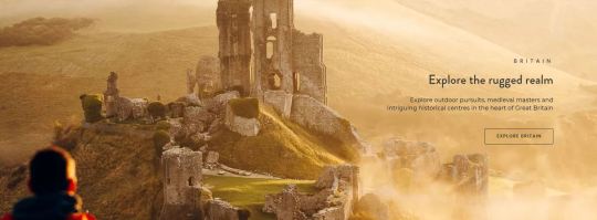
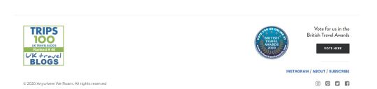
I’m passionate about travel so I’ve chosen to research different travel blogs and decided to share with you my comments on the acclaimed Anywhere we roam website https://anywhereweroam.com, as it provides a great user experience with exceptional quality images and excellent storytelling- it’s not a coincidence that the website was nominated Best Travel Blog UK Blog Awards in 2019.
We can see that the non-semantic <div> element has been largely used here as block containers, oftentimes with a class attribute to identify a specific section or division of the website which has often been used in conjunction with CSS to alter its style and appearance.
To put into practice what we have learnt so far, I have identified the page layout in the comments below:
A header that has a nested <nav> element with navigation bar with a list of links, the logo, social media buttons and a search form. The bar is consistently displayed in all pages of the website. I'd like to highlight the importance of this, since having inconsistency in a website makes the user leave. Nothing important should ever be more than two clicks away.”― Steve Krug, Don’t make me think”.

Different Sections with a thematic grouping of content and a heading like “Explore the rugged realm” or latest news as “Curious Minds” blog posts.
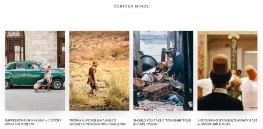
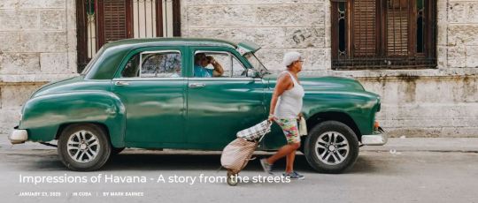
There are numerous articles with self-contained content such as the blog post “Impressions of Havana” which is nested in the Curious minds section.
A footer with copyright information, social buttons, an <input type="button> with value Vote and absolute link to Instagram.
Most of the websites I’ve analysed follow a similar structure, which allows search engines and users to better identify sections of the webpages and makes for a painless browsing experience.
0 notes
Photo
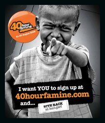
Give up to bring hunger down.
Source:https://www.worldvision.com.au/
This online fundraising image caught my attention while surfing the Internet. Visuals are a great example of how to make a message stand out in many fields from web design to marketing and social media. According to the Institute for Public Relations “a picture is worth a thousand words”.
The absence of colours, specifically the use of black and grey gives a dramatic and powerful tone to the message of this campaign. The use of the monochromatic black with a range of its tints makes the orange logo and the name stand out. It simplifies and gives the user/reader a better chance to see the elements that are at play (famine). I’ve noticed that black is a popular colour choice used by many social campaigns.
In this case, the image of a child pointing his finger at the viewer heightens the sense of urgency of the message while making it seem personal and empathic, making it harder for anyone to remain indifferent. As learned in our visual communication class 40% of users respond better to images than text.
0 notes
Photo
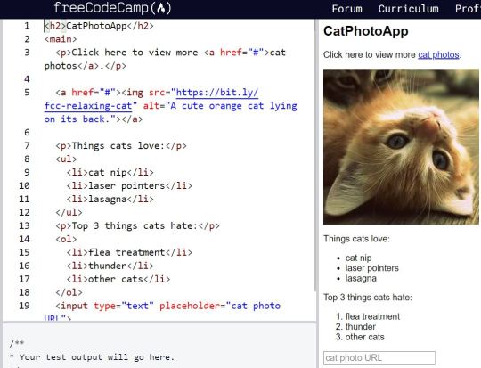
Practising <img src with alt attribute>
Alt text is very important to describe images to visitors who can’t see or identify an image but also to screen readers and browsers.
The source src specifies the path to the image while the alt attribute does provide alternative information for an image when a user for some reason cannot display it properly.
In our last lecture I’ve learned how to insert images in 4 different formats in a webpage, also about unordered and ordered lists, root, absolute and relative links.
It was a challenge since I didn’t understand at first the importance of a well thought and organised folders and files structure. However after a couple of hours of practising with FreeCodeCamp and on Atom it became clearer and logical, why we need to name elements and give clear instruction where to find them, it would be impossible to function correctly otherwise.
Alternate text are fundamental part of image tag as they serve to describe images to visitors who are unable to see images and are specifically important for SEO and user navigation as they allow to better screen and rank a website.
I’ve also checked examples of good and bad alt text and learned 3 important points as per following link: https://blog.hubspot.com/marketing/image-alt-text
-Don't start alt text with "picture of..." or "Image of..."
-Describe the image and be specific
- Use keywords.
0 notes
Link
Digital Art and blockchain is a new opportunity and contribution to the art industry.
Starry night by Van Gogh has always fascinated me for the use of the two predominant colours, blue and yellow. The curving brush strokes evoke a sense of well being, like a dream with a feeling of peaceful isolation and balance. During our past lecture of visual communication we have analysed what colours represent and what they communicate to the user along with evoking emotions and feelings. Blue is stable and trustworthy, associated to the sky bring us back to our origins and creates a sense of calmness and relaxation while yellow is warm and cheerful, it represents the sun which suggests hope and happiness.
0 notes
Link
To someone who's never coded before, the concept of creating a website from scratch -- layout, design, and all -- can seem really intimidating. You might be picturing Harvard students from the movie, The Social Network, sitting at their computers with gigantic headphones on and hammering out code, and think to yourself, 'I could never do that.'
Actually, you can
3 notes
·
View notes
Photo

This week we have learned how to create our first HTLM 5 basic page structure and never thought I could create the above myself or I could have the patience to learn coding and about structure of a webpage but it is happening, and to my surprise I start enjoying it because it seems to be logical and structural.
As a multi-language person I can say that HTML is a language with its own grammar and syntax, it’s structured and tied and as a result is fluent and readable to the user.
It is difficult to start for an entry level like me, I need to get familiar with the terminology and the different components and tools you need to use such as HTML Validator or Atom but I have to admit it is fun!
I was amazed how you can mark up an HTML page which is made of lots of elements such as Heading, subheading, paragraphs, comments all nested to each other to form a beautiful organised and well structured tree, again as a language! I am a new born baby right now but I will be fluent in HTML language someday soon.
It’s indeed a big challenge but a bit of practise will bring results! The key for success? Practise, practise and more practise.
2 notes
·
View notes