Photo
Idea: mariposas, polillas. Media luz. La persona, karakter, imagen, flash

Frontispiece. British butterflies. 1860.
Internet Archive
2K notes
·
View notes
Text
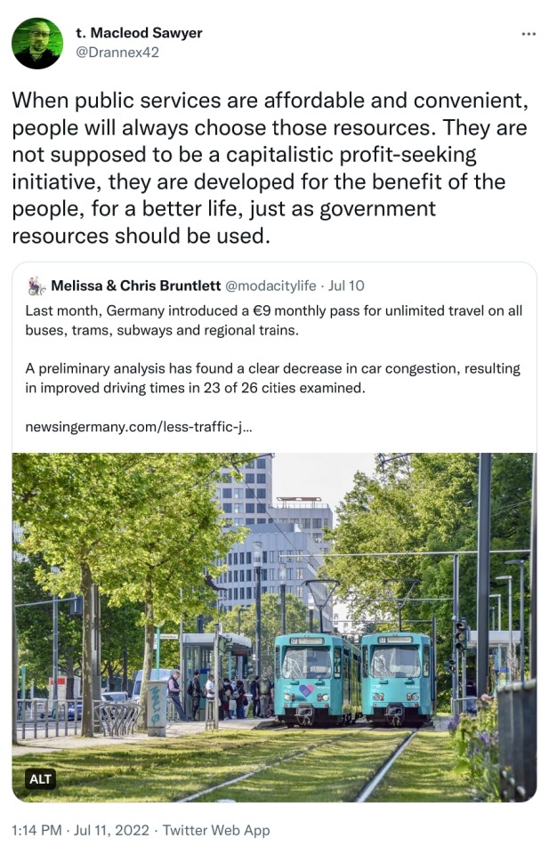
When public services are affordable and convenient, people will always choose those resources. They are not supposed to be a capitalistic profit-seeking initiative, they are developed for the benefit of the people, for a better life, just as government resources should be used. (tweet)
114K notes
·
View notes
Text
got told at lunch "you feel like Tumblr Incarnate" and i had to tell them i've been here for 13 years and counting. i was here three years before dashcon happened. i saw the mishapocalypse. i survived the gigapause. i've been here longer than the shoelaces post. i've been here since it was hipsters versus fandom and i played both sides extensively by overdoing the sepia filters on everything and making my own flashing galaxy gif edits for my fandom posts. i'm every tumblr. it's all in me
134K notes
·
View notes
Text
You should read this article. Honestly. You’ll thank me later.
9K notes
·
View notes
Text
““I was very fond of you, but now I’m so, so tired. I’m not happy to go, but one needn’t be happy to make another start.” Albert Camus , The Plague”
—
144 notes
·
View notes
Text
It is unfair to treat anyone like a finished being. We are always becoming and unbecoming.
10K notes
·
View notes
Photo
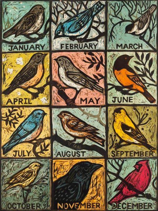
Kent Ambler
#kent ambler#woodcut#bird#birds#birb#cardinal#crow#goldfinch#bluebird#sparrow#chipping sparrow#oriole#robin#american robin#chickadee#blue jay#junco#I don't recognize october or may tbh#printmaking
3K notes
·
View notes
Photo


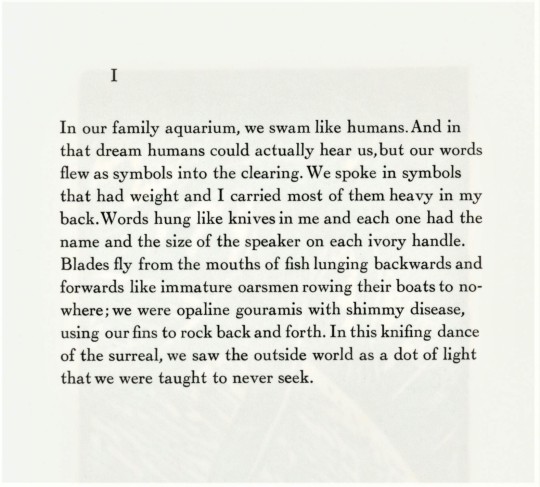


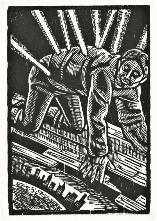
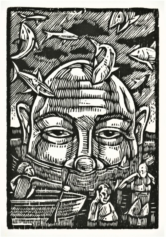

It’s Fine Press Friday!
On this fine #Fine Press Friday we bring you, Evolution: A Prose Poem Sequence by American poet Anthony Butts, with woodcuts by Thomas Huck, published by Sutton Hoo Press in Lacrosse, Wisconsin in 1998.
Sutton Hoo Press was founded in 1989 by the poet C. Mikal Oness. The press printed editions for 24 titles between 1992 and 2009. “The primary mission of the press is to publish contemporary literature in handsomely designed limited editions. Sutton Hoo Press publishes well-known writers such as Philip Levine, Lynne McMahon, Charles Wright, Maurya Simon, Gary Young and Peter Everwine, as well as younger, emerging writers.”
Tom Huck is a printmaker whose work often depicts absurd and satirical scenes. Though these woodcuts are small and well suited to this fine book, Huck often works on a larger scale. His complex compositions and mark-making, which appear to have been made with ease, have caused Tom Huck to be called a modern day Albrecht Dürer.
This book was printed in an edition of 126 with Cochin types on dampened Johannot paper. The design is by C. Mikal Oness, and the edition was printed with help from Andrea Chua, Gerald Cook, Nicole Gauger, Greg Giesking, Lee Hemmersbach, Christine Kieltyka, Charles Pineda, Susan Taubel & Gregg Sharf.
View more posts with works from Sutton Hoo Press.
View more posts with woodcuts.
View more Fine Press Friday posts.
–Teddy, Special Collections Graduate Intern
#Fine Press Friday#Fine Press Fridays#Thomas Huck#Tom Huck#Anthony Butts#C. Mikal Oness#Sutton Hoo Press#Evolution: A Prose Poem Sequence#woodcuts#woodcut#Cochin type#johannot#fine press books#letterpress printing#printmaking#poetry#wisconsin
44 notes
·
View notes
Text
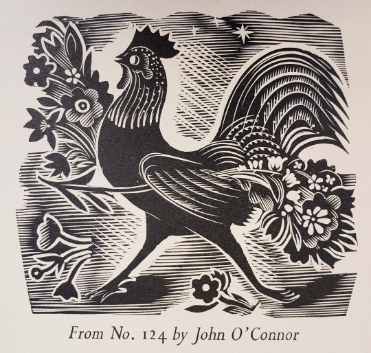
Illustration by John O'Connor for Golden Cockerel Press's Here's Flowers: an Anthology of Flower Poems, 1937
From: Pertelote. London : Golden Cockerel Press, 1943
Z239.2.G6 G612
#chicken#flowers#woodengraving#johnoconnor#english#1930s#early20thcentury#goldencockerelpress#smallpress#privatepress#feathursday#rarebooks#specialcollections#libraryofva
134 notes
·
View notes
Text

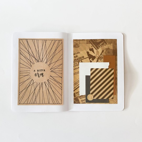


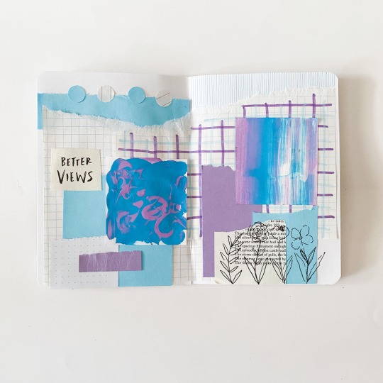
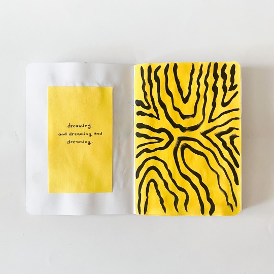
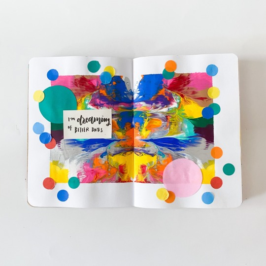
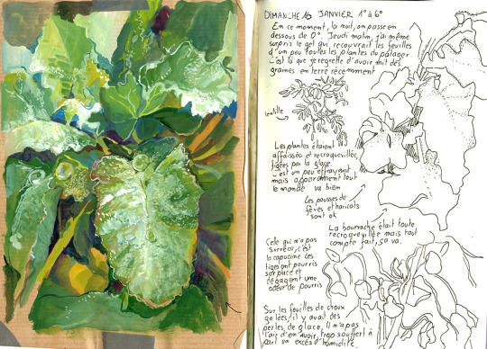
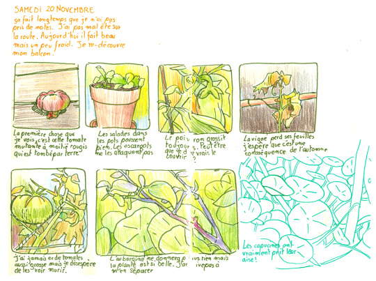
AUG 30 / 21
Pages from my journal that I sent off the Brooklyn Art Library to be part of the Sketchbook Project!
Full flip though: https://youtu.be/1gVjNJCQUXQ
1K notes
·
View notes
Text
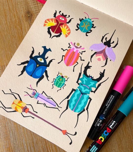
A Clash of Beetles 🪲 Illustrated using Posca acrylic paint pens in my Hahnemuehle watercolour journal ❤️✨
506 notes
·
View notes
Note
Can you make like, a watercolor tutorial? Cause I've been trying to learn watercolor since I was baby and can never figure it out ❤
Hell yeah!! This tutorial might suck so my apologies and since I’m not sure where you’re at I’m just gonna start with everything I can think to say, and in terms of materials I’m just gonna tell ya what I use, but hopefully this’ll work for whatever you’ve got as long as it’s not a crayola set (that’s what I started on so I can say will full authority those are bad)
My deepest apologies to everyone abt the length of this post djdjdj I don’t freakin know how to do the read more thingy
So! To start, these are just the materials I use:
I use this portable set from Amazon, it’s lasted a while and the paints are really quite good for it being $15, It comes with a lot of variance in colors and shades, though I mix most of my colors myself! The white in that palette isn’t too great so for fixing mistakes I use this! It works pretty well for fixing any mistakes watercolors are wont to make.
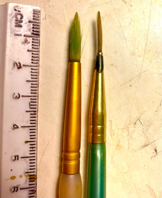
I buy my brushes at Joann Fabrics And Crafts store, though I think most art stores will have a good selection. Joann’s usually has really good thin long brushes which are super useful since I paint small, as well as large and pointed brushes for painting large swaths of paint. I recommend having one or two of each, here’s a picture of the ones I use regularly and a paint covered ruler for reference!
Currently for all of my taz art I’ve been using this Arteza sketchbook (just in general be careful of your finger/hair oils touching the paper, that sketchbook especially will cause the watercolor to not adhere to the page if I touch it too much, so I just put a little scrap of paper under my hand while I paint and sketch and it works great) but for my professional work I use this Canson brand, if you’d like just a visual kind of reference for how I paint, albeit edited (I promise, it’s a lot less of a satisfying and fast process unedited) I do painting videos on tiktok!
Palette
So! Mixing paints. I’ll get to color theory in a second, but mixing your own colors is good to do, and most paint sets will come with a palette to use, but if they don’t any slick white surface will do! I use a big ol piece of glass from a frame and the white backing from it.
Swatching
I always do little test swatches before I lie the actual color down! It helps so ya don’t mess up colors, it’s become kinda muscle memory for me but usually just lil swatches like a couple centimeters wide and an inch long is probably gonna be enough for you to know if the color is how you want it!
Size
Just wanna say: I paint really small! The largest my paintings get is like 5 inches tall, and that’s usually only for my professional stuff, but I dunno if you’d like to do that! If you paint big, just be careful of using too much water or your paper will warp! It’s not the end of the world though, and use of water is something that definitely took me a sec to learn.
Drying
Make sure to let stuff dry! If you’re painting sections, for example like this painting I did, I let the red dry completely before painting the yellow! Or else those bois would’ve bled together, but if you wanna use that to your advantage, go ahead and mess with watercolor textures! Also If you’re using a lot of pigment, it’ll take longer, just don’t make the mistake I’ve made many a time in touching the not dry yet paint! But!! Be wary: watercolors are tricky bastards and if you want a smooth coat of paint, work fast! Or else some parts’ll dry and you’ll get a wonky coat, this isn’t all too worrisome except when you’re painting skin tones!
Pigment
Okay so pigment to water ratio is a tricky thing, and I must admit it probably comes with a bit of practice as dumb as that is to hear, but I’ll try and give ya some tips on how how to implement it!! So for my fanart work on here I don’t use a lot of pigment since I don’t use that many super saturated and flat colors, unlike in my tiktok stuff where I do thick coats of paint for maximum visual asmr stuffs or whatever. It also probably depends on the paints you’re using, but I’d recommend trying to find a consistency that isn’t too thick, or else it’ll be really weird to work with, and always remember to mix enough of a color before you start painting with it!!
Colors and unifying them
Unifying your colors can be a dope trick! Basically like instead of using a bright green and a bright blue and yellow and pink for a color scheme you can change each color depending on if you want like a warm tone or a dark/blue tone! So the bright green would turn into an army green, the yellow would get orangier, the blue would be kinda greyish, and so they’ll all fit nicer with the pink or reds and the piece will be soft and nice on the eyes! Some examples of how if unified colors and stuff in my work below! Also I should say, I use a lot of edits to get it this warm toned! On my iPhone there’s a lil slider for warmth and tints and stuff
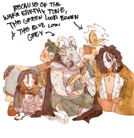
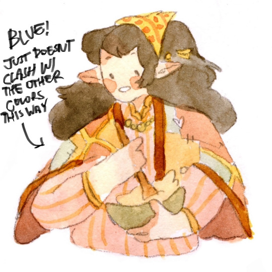
So I’m a big fan of warm and orangey toned stuff so for mixing paint here’s the color you’d add to make one color less bright and more neutral so it doesn’t clash with the other colors! This gets into color theory which there are probably some great YouTube videos on! This mixing also goes vice versa.
Blue: add orange, green: add red, Red: add green to make a nice brown or a skin tone, yellow: add purple.
Also! Watercolors are tricky when mixing, basically you’re not always gonna get a perfectly saturated vibrant color when you mix two colors together like red and blue to make purple, so it’s usually just best to use a purple watercolor if you have it.
painting light:
This is honestly something I’ve just recently been incorporating into my work and I don’t have a great way to explain it so I’ll just give a few references. Painting light and shadow isn’t nescessary but if you wanna do it here’s a kinda easy way to:
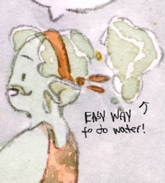

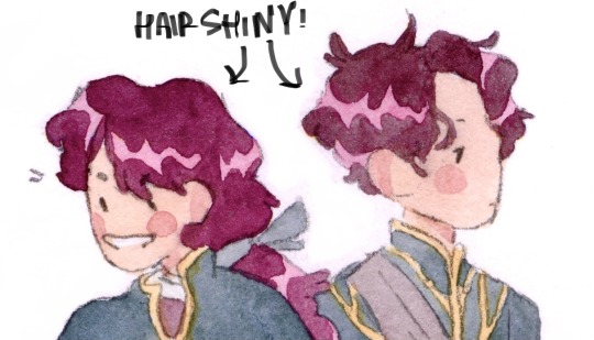
Painting shadow
For shadows don’t just use grey or black! This usually can make a piece desaturated (or so I have been told) so instead you can use a blue or maybe a red or pink depending on if you’re painting skin or not! Also if you wanna add just a bit of dimension to your piece but don’t wanna go overboard on the shadows, i usually just paint a lil half triangle under the chin!


Blush
It’s not nescessary but it’s a way I’ve found fun to make the characters look more human and cute! Just on the ears, fingertips, knuckles, knees, shoulders, nose if you draw noses, elbows, and toes should do the trick!
black paint
Black is an extremely tricky color to paint with! Sometimes if you’re painting like a goth outfit for example and you have a lot of overlapping black shapes, it’s hard to differentiate them and so I usually do these weird lil lines to show distinction between things!

Lastly, I hope you have lots of fun and tons of success in whatever form that may come in! Let me know if you have any more questions or clarifications or details! Sorry this took me so long! <3
2K notes
·
View notes
Photo
#99

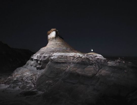


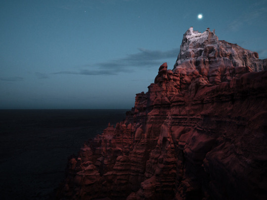
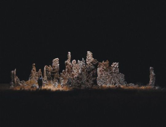

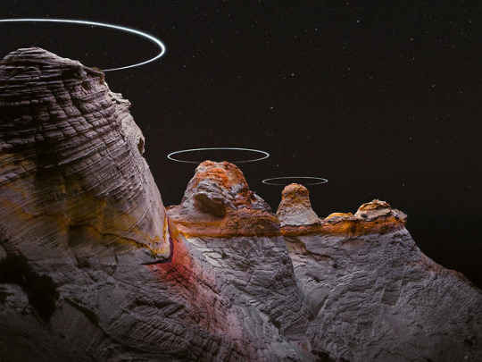
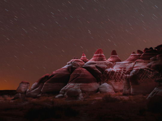
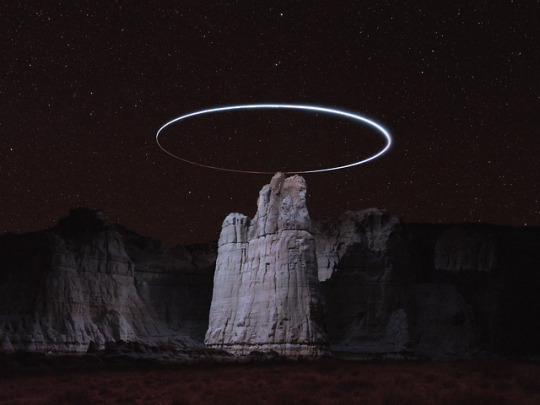
Reuben Wu’s “Lux Noctis.”
Stunning imagery created with long exposures and drones from a series of photographs by artist Reuben Wu entitled “Lux Noctis.”
Don’t miss Supersonic Art on Instagram!
Seguir leyendo
5K notes
·
View notes
