mildredmost
The Roar of the Greasepaint
My fic!
215 posts
Don't wanna be here? Send us removal request.
Last Seen Blogs

russiantoska
Russian Toska

paulina-naruseviciute
cities of colours
unechorn
sweet dreams.

meltlune
light of midnight
bestieyian
yí’ān my weed smoking girlfriend
Text
WIP tag game
Thank you to @renaultphile for the tag!
I've had to redact one because it's an exchange fic, but here are the rest:
M&R melendy
Quincey communicate
Born to trouble
Iddy harem THING
Ben and Simon
tagging @a-whale-bone @ladybrooke @ninetiesnecklace @alleyskywalker
1 note
·
View note
Text
I continue to be blown away by @hms-tardimpala 's skill at book binding! Look how gorgeous this is. I am beyond flattered that one of my stories is between these covers, and it's all so thoughtfully done. I love the size especially, it seems so fitting to the period when the story is set.
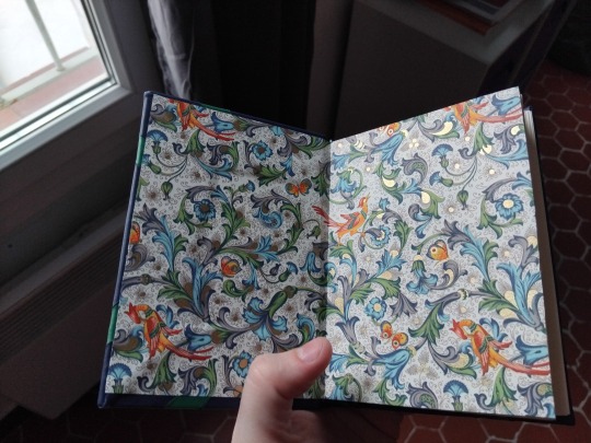
I really love the flamboyant end papers, because YES! George in all his awkward nouveau riche-ness would definitely love this pattern, and probably get a waistcoat in it too :)
@hms-tardimpala I'm so glad you came across my story, and liked the OC (I get it, I am wary of OCs myself!) and then ended up creating this lovely thing <3
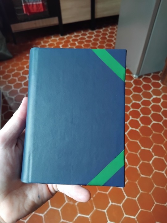
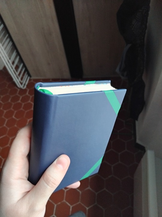
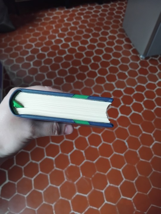
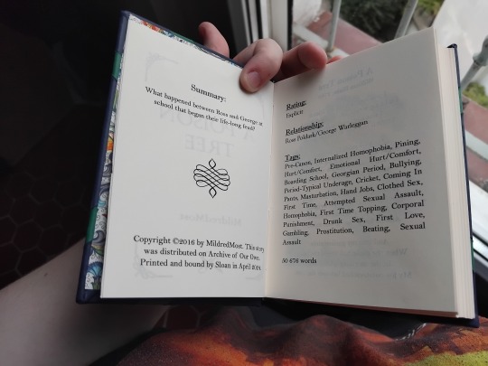
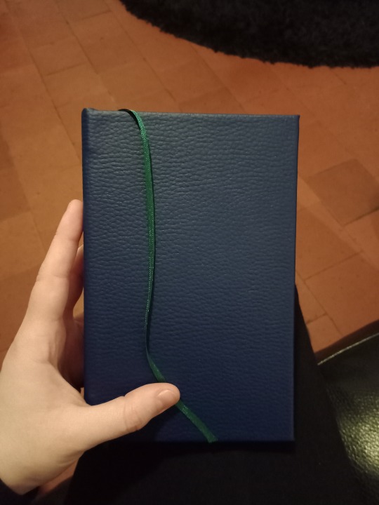
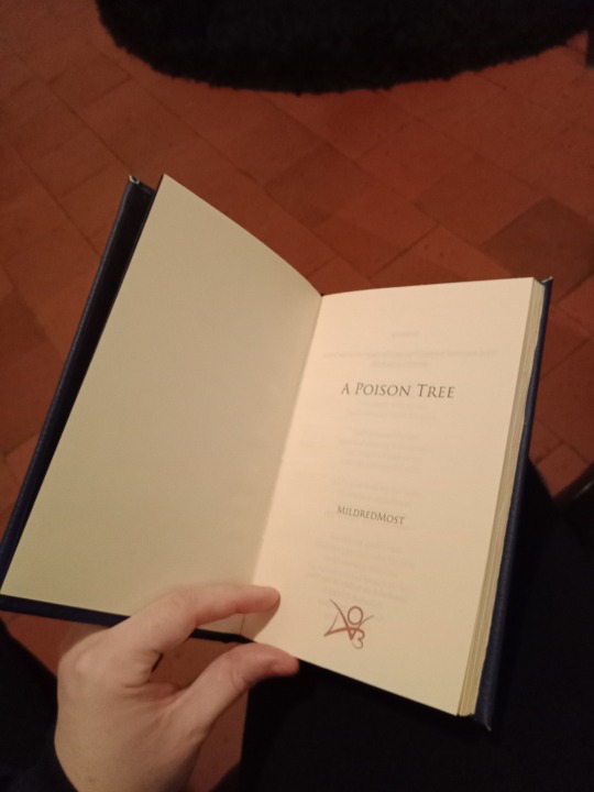
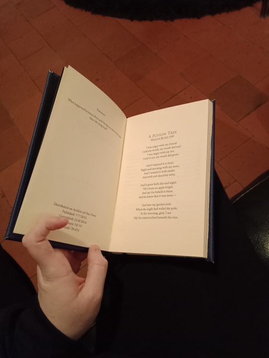
Ficbinding: A Poison Tree by @mildredmost
A year and a half ago (ish), I was getting started in bookbinding and one of my first projects was A Poison Tree, a Poldark fic I loved. I was proud of it at the time, but I've learned a lot since then and thought it was time to have another go at it. (long post ahead)

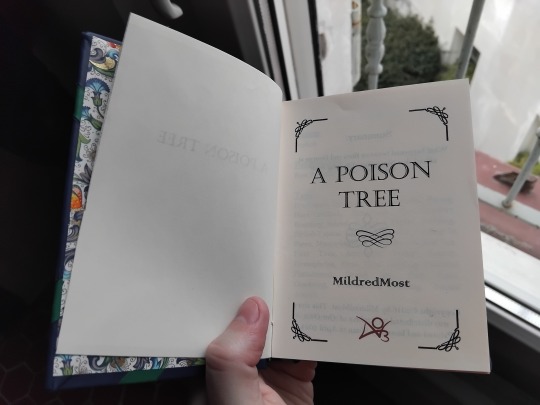
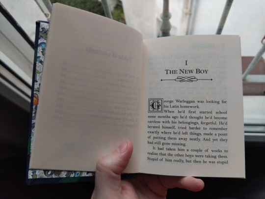
The fic: Poldark, Ross Poldark/George Warleggan, E, 50.6k
What happened between Ross and George at school that began their life-long feud?
The reason I like this fic so much is that it surprised me. I was looking for Ross/George fics and this is one, but not only. George's character is so well-explored here that you can't help but be on his side (while understanding why the things he does offend Ross) and wish him to be happy. I'm not usually into OCs, but the one in this story is so good I loved him as much as the other characters. I went in expecting something specific, the author went another way midway through, and I loved it. The atmosphere is perfect too, it's faithful to the time period and the show/books.
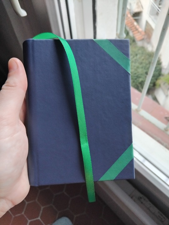
The bind: I kept some ideas from the original bind, such as the color of the cover, headbands and bookmark, and the paper type, but I improved the general quality and added details.
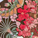
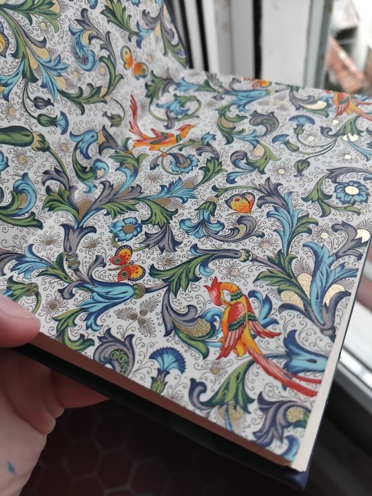
I used blue and green because they're the Warleggans' heraldy's colors in the books. The endpaper is a florentine design with golden touches, the kind of luxurious-looking stuff a 1780s nouveau riche would love.
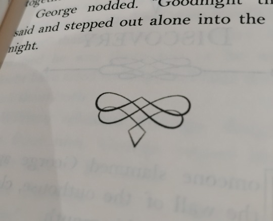
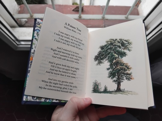
I added the Blake poem the story takes its title from at the beginning because it's one of my favorite poems ever.
New things I tried:
This is the first time I combine several elements for a cover. The green strips scared me because MATHS but they turned out good in the end. I'm still not interested in putting titles on my binds, but I think I'll keep exploring decorations of that kind.
Real endpapers. Up until now, I used paper that wasn't made for bookbinding because the thinness of true endpapers scared me, but it holds up perfectly. The book still feels strudy. And look at it, it's so FANCY.
Free vector images to make decorations. There's a wealth of free resources out there!

Huge positives:
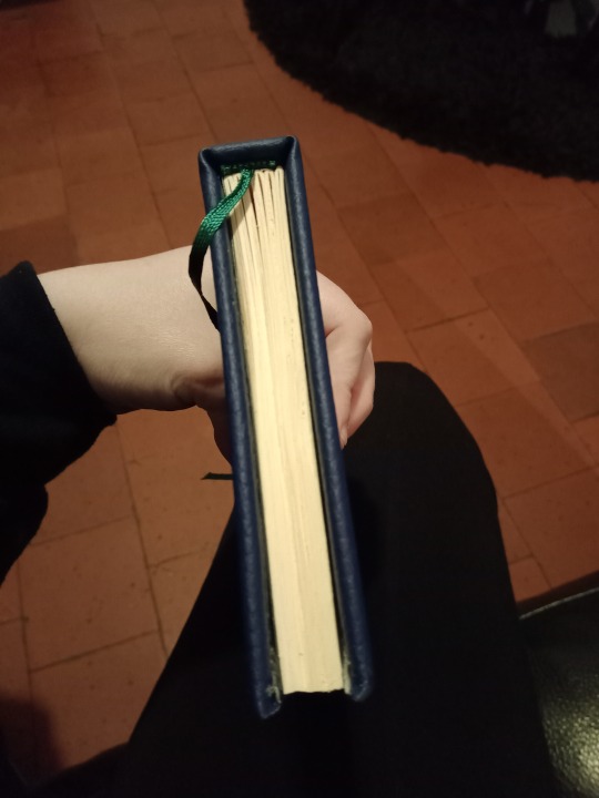
I printed, folded, sewed, glued and trimmed this a first time, but wasn't satisfied with the cut. If you've read more than one of these posts, you know I'm desperately wrangling my guillotine into compliance. The second time, I trimmed the texblock before sewing and gluing, which is scary because the signatures are LOOSE, but it worked perfectly. The result is so fucking neat. I was ready to sandpaper the edges but didn't have to.
Look at this snuggy fat boy. This is the thickest book I've made at the A6 format, and it sits very nicely in the hand. The spine is round, the leather is smooth, and it's still very light. A pretty baby.
Details:
The typesetting: I tried many fonts (what's new) before I landed on the right one. It had to have serifs to fit with the period context. I already mentioned the decorations (I looked up georgian-period books to get inspired and discovered they weren't all that decorated, so I made those up). The drop caps are very nice.
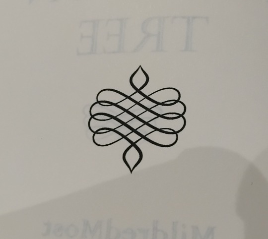
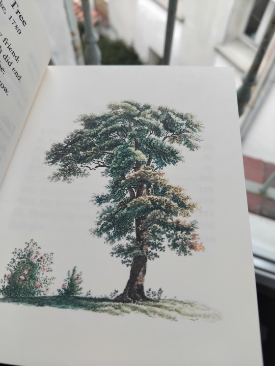
The tree: I decided to get the most out of my printer and, after fiddling with the settings a little, got it to print in color with magnificent quality (which you can't see because of the cold light. It's cloudy today, I'm sorry).
Negatives:
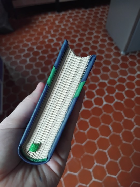
The cover boards should have been wider. The pages are very close to sticking out from the edge of the cover. They're not, but it's a tight fit. I think that from now on, I'll use a 5mm "overhang" (is that the word?) instead of a 3mm one like I've learned. I like my spines too round, 3mm are not enough to compensate.
That's it this time. I don't want to brag, but I'm getting good at this (it's been a year and a half jesus).
Characteristics:
Fonts: Castellar (title), Colonna MT (author name), Bell MT (text), Apex Lake (drop caps)
Materials: blue and green apple leather and endpapers from Schmedt, 80g/m² Clairefontaine ivory paper, pre-made headband and synthetic ribbon.
Feel free to ask me more about materialsand fonts (or whatever), it won’t bother me at all to tell you what I used, but I’m too lazy rn to write it in this post that’s long enough already.
--
Comparison (because why not):
11 notes
·
View notes
Text
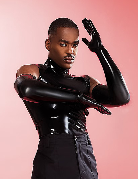

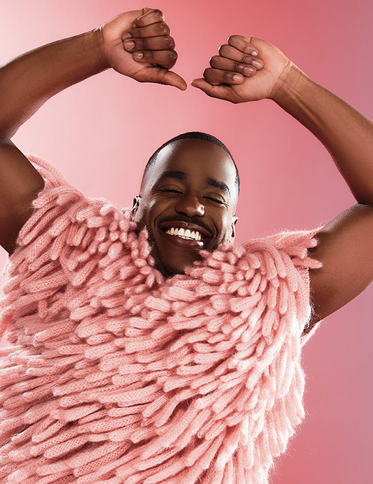


Ncuti Gatwa - Attitude Magazine (May/June 2024)
8K notes
·
View notes
Text

I cannot WAIT to see what dream causes this. 😏
660 notes
·
View notes
Text


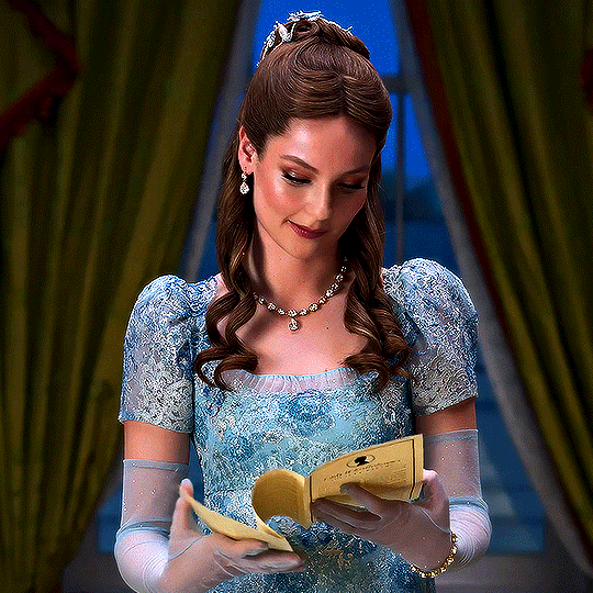


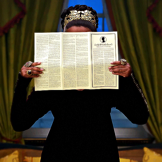
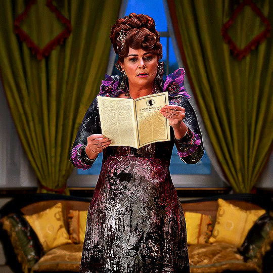


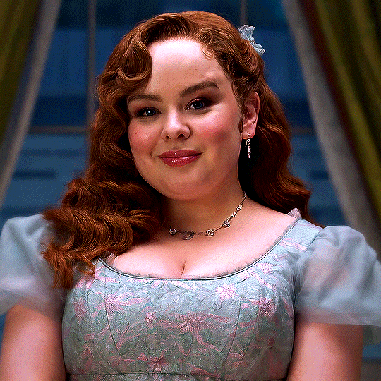
Bridgerton — Season 3 Promo (2024)
2K notes
·
View notes
Text
youtube
Don’t know if I can handle this level of GLOW UP
12 notes
·
View notes
Text


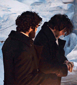
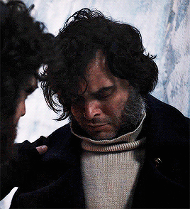
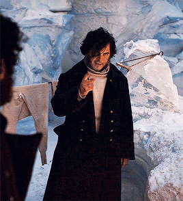
Absolutely losing it at Oskar knowing what Max wants to do, AKA cat-walking it into the cloister as if a 6'1" English "monk" isn't going to be a tad suspicious in an Austrian monastery.
33 notes
·
View notes
Text
I wrote fix-it for this a while back, for poor Collins! There should ALWAYS be a Doctor waiting for Collins when he dives <3


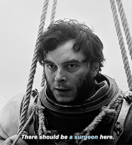
Make me Choose
↳Henry Collins or Harry Goodsir asked by anon
293 notes
·
View notes
Text
Last sentence tag game
RULES: Post the last sentence you wrote (fanfic / original / anything) and tag as many people as there are words in the sentence.
Thanks for the tag @argyleheir!
Arthur stepped back from Jack quickly, straightening himself. A sharp grip of his cock quelled him somewhat, or at least enough for decency.
Seems @argyleheir and I are both writing Dracula fic...
That's a lot of people to tag, so I'll just do this: @phantomato @ninetiesnecklace @alleyskywalker @a-whale-bone @deepdarkwaters @vicivefallen
6 notes
·
View notes
Text

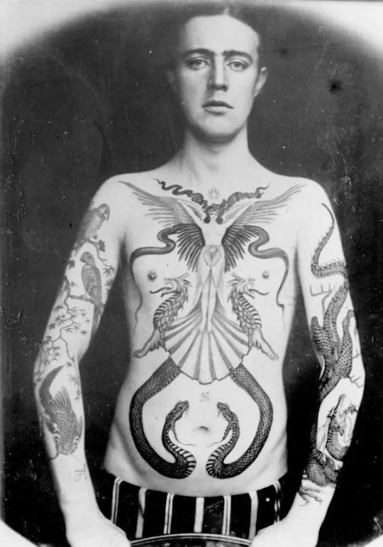
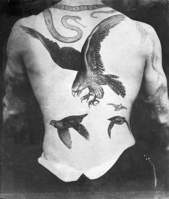
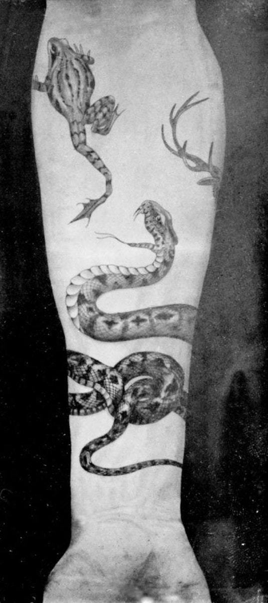
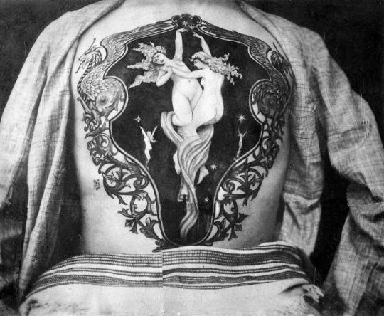


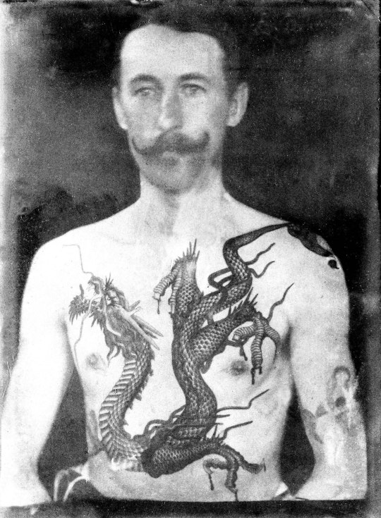
#the magnus protocol#episode 11#sutherland macdonald#the Michaelangelo of tattooing#tmp spoilers#tmagp#tattoo artwork#victorian tattoos
143 notes
·
View notes
Text
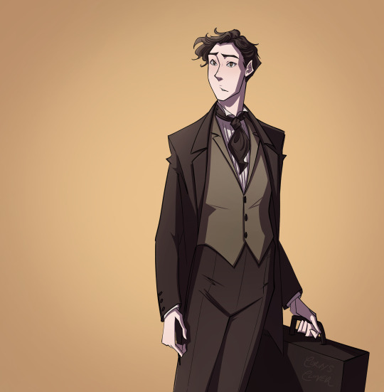

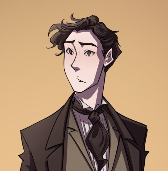
Our good friend, Jonathan
He's a madman, he's a little lawyer boy, his mortal weakness is paprika and anyone that hurts his wife is getting chased down with a very large kukri knife-
Commissions open!
@corvys.clover on Instagram
754 notes
·
View notes
Text
Me being happy that one of the firefighters on the firefighter show is finally canonically Bi despite never watching a single episode:

24K notes
·
View notes
Text

Reporter Fred Best from The Star
21 notes
·
View notes
Text
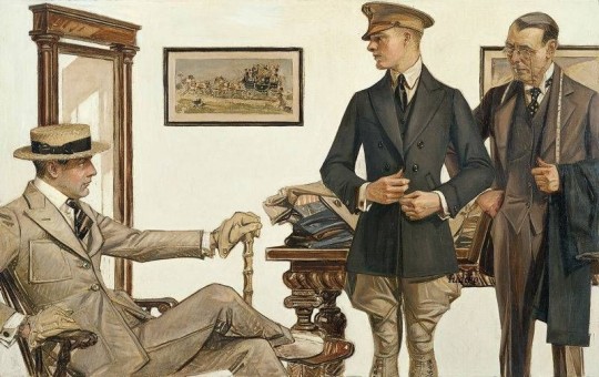
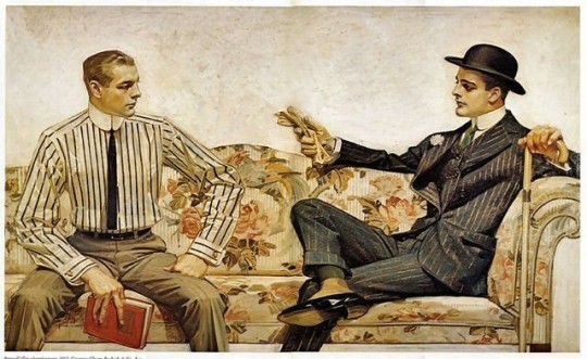

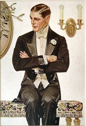

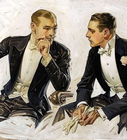
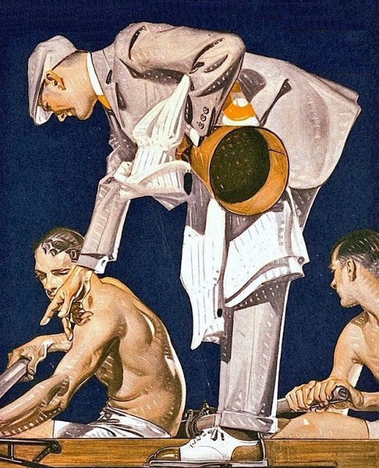
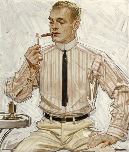
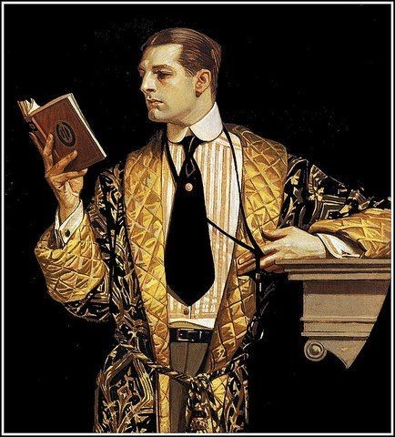
Portraits by Joseph Christian Leyendecker
“Many biographers have speculated on J. C. Leyendecker’s sexuality, often attributing the apparent homoerotic aesthetic of his work to a homosexual identity. Without question, Leyendecker excelled at depicting male homosocial spaces (locker rooms, clubhouses, tailoring shops) and extraordinarily handsome young men in curious poses or exchanging glances. Moreover, Leyendecker never married, and he lived with another man, Charles Beach, for much of his adult life, who is assumed to have been his lover and who was the original model of the famous Arrow Collar Man.” (The Arrow Collar Man is the blonde man in all these illustrations, apart from the sailor)
7K notes
·
View notes
Text
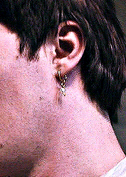
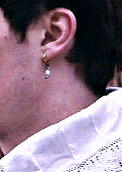
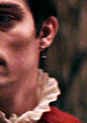
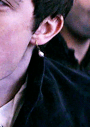
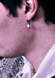
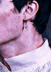

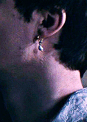
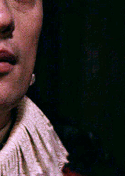

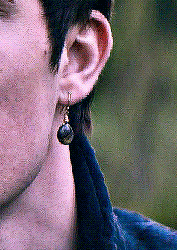
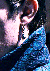


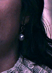
george's pearl earring™ evolution
2K notes
·
View notes
Text
W. Graham Robertson, inspiration for Dorian Gray and my very favourite Singer Sargent portrait. Apparently Sargent invited him for the portrait and “Why a very thin boy in a very tight coat should have struck him as a subject worthy of treatment I never discovered,” he reminisced later,” but he “evidently had the finished picture in his mind from the first.”

I also love that the book illustrator kind of used this painting in his drawings.

10 notes
·
View notes
Text
This infographic is amazing and inspiring - there has to be a way to make this happen...

The impulse to do a crossover of all the Victorian horror novels is a strong one, and I got to wondering how they might intersect...
33 notes
·
View notes