
Last Seen Blogs

impact-guns
Impact Guns
bansheephan
This Blog Is A Mess

thebookventureroftroy
The Bookventurer (of Troy)

selectively-mute-but-hella-cute
I’m A Disaster

keylatrice-blog
Reserve Soul.
Photo
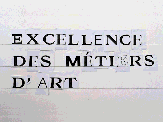
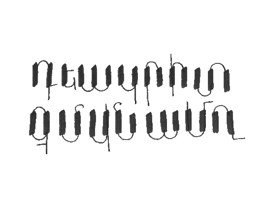
Typographic creation workshop:
Thomas Bouville and Sarah Kremer, two graphic designers & typefont designers, came to our school to work on the reimagining of the visual identity of the Bourgogne-Franche-Compté 's label of the Excellence des Métiers d'Art (EMA). This label highlights the quality of some educational establishments in the fields of art, design and crafts. Eight sectors are labeled: stone cutting, ceramics, wood art, design, ironwork, tapestry, sewing and tableware.
The EMA visual identity originally consisted of a logo. During this workshop, we worked on the creation of a typography available in eight different typographic classifications: an outline, a thin lineal, a bold lineal, an ornamental one with open lines, a didone, an elzévir, a hellenic and an egyptian.
The visual identity is based on the mention of "the EMA" with changing typographies, a use of these fonts generated randomly in order to create combinations in constant evolution.
Workshop de création typographique :
Thomas Bouville et Sarah Kremer, deux graphistes & dessinateurs de caractères, sont venus dans notre école pour travailler à la refonte de l'identité visuelle du Label de l'Excellence des Métiers d'Art (EMA) de Bourgogne-Franche-Compté. Ce label met en avant la qualité de certains établissements d'enseignement dans les domaines de l'art, du design et de l'artisanat. Huit secteurs sont labélisés : la taille de pierre, la céramique, l'art du bois, le design, la ferronnerie, la tapisserie, la couture et l'art de la table.
L'identité visuelle de l'EMA consistait à l'origine en un logo. Durant ce workshop, nous avons travaillé à la création d'une typographie se déclinant en huit formes appartenant à des classifications typographiques différentes : une outline, une linéale fine, une linéale grasse, une ornementale aux traits ouverts, une didone, une elzévir, une hellénique et une égyptienne.
L'identité visuelle repose sur la mention de «l'EMA» avec des typographies changeantes, une utilisation de ces écritures générées aléatoirement afin de créer des combinaisons en constantes évolutions.
http://www.ac-dijon.fr/cid147988/le-label-excellence-metiers-d-art-etendu-a-la-region-academique.html
#workshop#typography#font#writing#lettering#graphism#graphic design#sarah kremer#thomas bouville#esaab#crafts#arts
4 notes
·
View notes
Photo
3 notes
·
View notes
Photo
6 notes
·
View notes
Photo
12 notes
·
View notes
Photo
4 notes
·
View notes
Photo
8 notes
·
View notes
Photo
7 notes
·
View notes
Photo
4 notes
·
View notes
Photo

18 notes
·
View notes
Photo
6 notes
·
View notes
Photo

5 notes
·
View notes
Photo
10 notes
·
View notes
Photo

#calligraphy#alphabet#gueze#writing#writing systems#scriptwriting#alphasyllabary#ethiopian#eritrea#ge'ez#guèze
21 notes
·
View notes
Photo
6 notes
·
View notes
Photo
4 notes
·
View notes
Photo
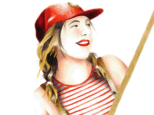
Portraits, 2019.
7 notes
·
View notes
Photo
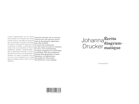
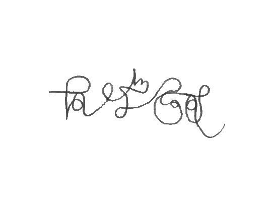
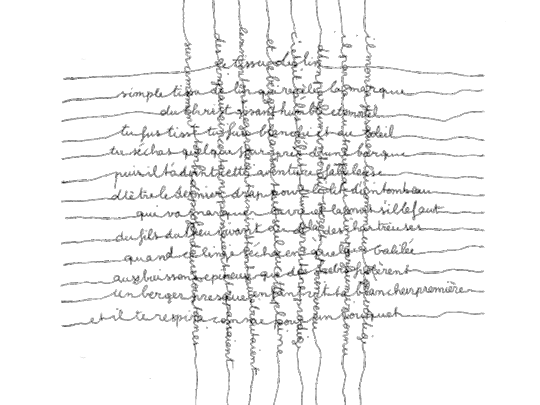
Graphic reformulation exercise for a booklet:
The work "Diagrammatic Writing" by Johanna Drucker, American scholar and graphic designer, does not have a French translation. It was an exercise in translating his work, both linguistic and graphic, with the constraint of a minimum format of 29.7cm by 42cm.
Exercice de reformulation graphique d'un livret :
L'ouvrage « Diagrammatic Writing » de Johanna Drucker, universitaire américaine et graphiste, ne possède pas de version française. Il s'agissait d'un exercice de traduction de son travail, à la fois linguistique et graphique, avec pour contrainte un format minimal de 29,7cm par 42cm.
5 notes
·
View notes